Transcripts
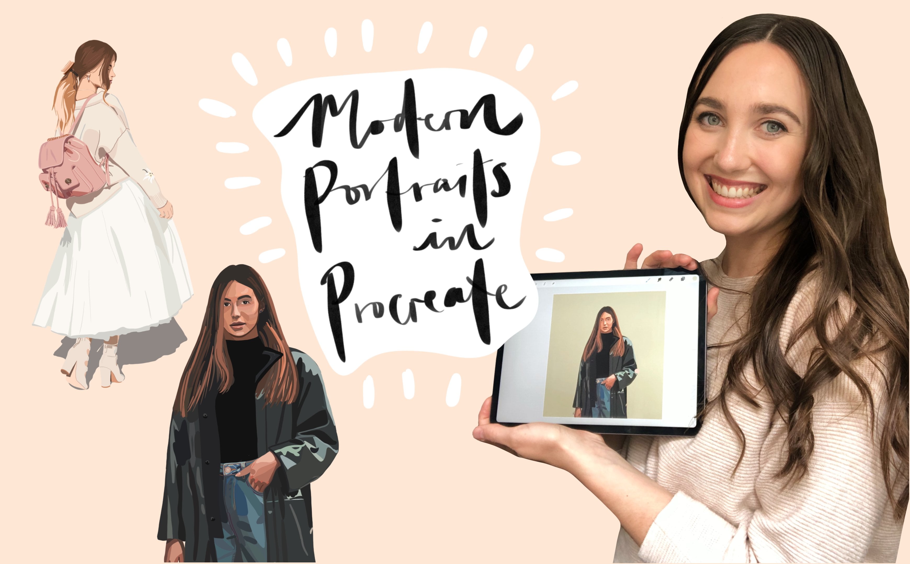
1. Class Introduction: Hi, my name is Natasha
Robertson and I'm afraid I'm still let's try
that and Skillshare teach. In the past few years, I taught myself how to
turn photos into at, and I've run a successful
business doing exactly that in 2020, I told you how to illustrate
digital portrait. Since then I've
developed techniques for tuning the pictures into
a tie width of that. And I wanted to share these
tips and tricks with you. For the class project,
you'll choose a photo to illustrate
alongside me. And by the time we're done, you'll be able to
gift it to and what, use it to kick start
your new business. This class is for anyone interested in turning
photos and to add, even if you're
already an artist, my goal is to pass on everything I've learned
so that you can shortcut the process and start producing detailed,
high-quality illustrations. I can guarantee
students who own labels will learn something
valuable and community. I'll see you in class.
2. Class Project: Now for the class project, I'd like you to
pick up your file and scroll through
your camera roll and truths with
you and a friend. Are you in a family mean bat or a couple of people
that you want to illustrate these and you're
going to use that photo to illustrate alongside ME using the techniques
that I teach here. I'll give you more
information on how to do except
to that as we go.
3. Tools & Applications: Now before we get fully
stuck into the specifics, I wanted to talk a little bit
about the tools that I'll be using and the toes that
you could use as well. I've often use in my
eliminate inch iPad Pro. This is the 2020 model among the effort pencil
TO the Procreate. If you don't have these
items, that's totally fine. Assigning a single supplier, regardless of what
tools do we use it. So don't get too stuck into
the mindset that you have. The HIPAA perfect
tolls in order to stop learning and practicing some other alternatives
you could use would be eating in
generation of iPad, That's a cool, It's procreate. And you could use the Adobe
fresco or Adobe Illustrator. You could also use a webcam
tablet or an Android tablet, just anything that
you can use with a stylus or what your
family guide to illustrate. Grab your toes and light-scattering day to
illustrate, to get up.
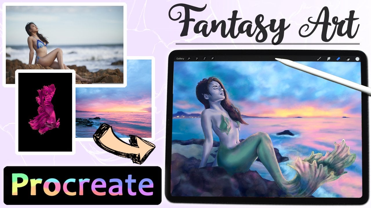
4. Portrait - Prepare: And now that you've
chosen the photo, you're going to illustrate it. You want to go over
here and consider, we want to make any changes to that photo before
we make a stack. This is something that I do with every single photo
that I illustrate. I'll examine the
picture and I'll decide if I want to crop it, just simply whether
I wanted to in it the colors to change the color balance
slightly so that it will translate into, into
an illustration. That also helps if
there's any lighting and balances like
as a photos to die. If it's not saturated enough, you can also eat the stomach
and it's far easier to gain her illustrate
from the edited image. I will use the viscous. It's a free app that
you can download on your foreign and use
to get the picture. But the picture
that I've chosen, I'm not going to change
anything about it or either to in any way because it's
already a beautiful image. And the colors that are already exactly how I'd
like them to stay. That I will insert a little demo here of may either
attend a picture and VSCO so that you can say exactly how I might do that if you
want to go ahead and do that. Now, now that we've got
out either to the image, we're going to go into the
software that we're using. And we're gonna chose
exactly what type of canvas size we want to
put the photo into. Now the picture that you've
chosen might already be a specific size or
specific crop nature. Keep that in mind. I'll show you what I'm gonna do. You will stay at high
screen hip hop hop and it's wiggling
typically for portraits, altering them and I by Tina. So that's what I'm gonna
do it with this one. Open up an API team Canvas
guide to NC at my photo. You'll see here on my
screen that I'm going to make the crop slightly so that it will fit the
height by T01 format. I'm just going to pull
those corners until it, that site by team, just in terms of
canvas size as well. If your head and ask business, it's really important to ask the person that you are
making the illustration for what size they would like
to print the illustration. Because what size
to design it in a little baby mix and
then size that it can be printed in without
losing quality.
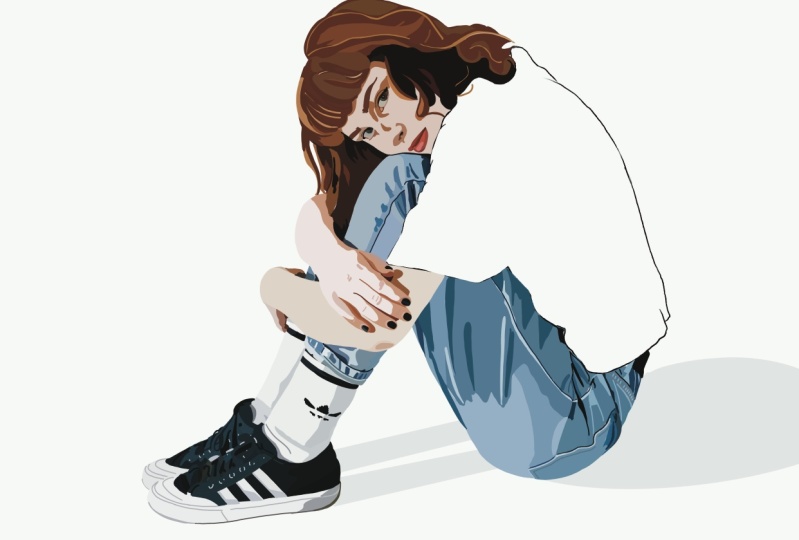
5. Portrait - Outlines & Main Features: So now moving on to starting
the actual portrait, what we want to do
is we can say we have our picture on layer one. We want to create a layer
above that and order term dot voting epsilon
naught picture where I start is by looking at the main shadows and highlights in the main
outlines of the picture. We're gonna focus on the fairest and we'll do the background
later on my screen recording, you'll be able to say what
I am looking at fixed. I'm going to use
the color picker TO church hose the color
that's already there. And just stop drink
over the picture. Now, I'm picking on you get
the outlines in the picture, doing the outline of her drinks. That's a pretty
straightforward process, but you just want to make
sure that you've gotten nice clean lines before you even start coloring in
with the Laney thing. It doesn't mean you have to
do every single outline, but it's basically
just picking up the main areas where there
are shadows and highlights. The darkest and
lightest areas in which in Bay working on Mars. So it is a swallowing study
crisis are showing me doing a little bit more for you before
we jump to the next day. Any rhyme or reason to this
aid that I just kind of jump around the image and pick out
what is standing out to me. Honestly, it's different
with the brick image. This is slightly bigger
shy of a shadow, or you can draw the drag and
drop color in the corner, enter the middle of the shape
and it will fill it in. And it's just a
faster way of getting shapes filled with
either live active. As you can say, I'm
zooming in quite a bit. That's just to make
sure that I'm getting a detailed as accurate
as I want them to stay. Also helps to keep zooming in and out on the image
so that you can keep looking at it with a
fresh to speak dead and picking out the
highlights and shadows, the ones that really
stand out and mean, you can zoom in
and fill the men. As you can say, you can
continue on the same layers for quite a while just by finding new areas that you
hadn't already status. But again, you can really take
guide until you feel like your capacity within
that layer as diminish and they
turned me down a layer. I'm pretty happy with the amount of outlining
that have done. So I'm fat, I'm just going to toggle off that bottom layer. You can see exactly how much
outlining I've done yet. Once you've done some outlines, I usually stop
picking the Shi'ites. That is Nick stock is still the 10k flatus that go
next to the outlines. And we're going to
work how white n.
6. Portrait - First Layers: Now we're going to start
with him without Elias. I'm going to toggle
back on the folder and I'm going to add a
layer underneath the layer I've already
been working on because we don't want
to work over that land. We want to work under it. So denier that we've done it first with the
outlines is going to sit on the very top of what
way drawing that I did names. For example, we can
pick the NIC Chez and start working our
way down after that. Creating layers alginate
until the portrait. You'll watch me do that. Now the great thing about defending the outlines
and name them by name, shadows and highlights
first is that usually underneath those things days
a main block color that you can come in and fully
highlight everything asked that how that's what I'll be sat into shortly and a great
way to do it quickly. It's just by increasing
the size of your brush. Just makes it so fast to
fill in all those areas. It's another thing to
mention is that even in late because of lucky with
the photo underneath, you've got a mess parts
of the illustration. This way, turn it off. You can see this little gets
on bits that I've messed. Now, I'm going to go back
and fix those just yet. Typically hourly
folks to the end because you'll often find that a lot of them can be
filled in just by one color or the sign Paula. And again, it's just a
much faster way of doing the Seinfeld and I'm continuing to create
lives on tonight.
7. Portrait - Final Layers: This is where I'm at
because you can say is that I have that I'm
just finishing my way down. Slowly. Having chicken
with you again soon. The hardest part to
get the feature Dr, a picture like the one I know, shredding where sign-on makes it similarly a lot
easier than dice on. And my opinion, because
the child stone happy as sort of a
carrot to person, how he benefits. Absolutely. Don't go to make the portrait
to look clock the Piton. He just had to take
a little bit in care when you add
illustrating theists. And just make sure
that you're getting all the little details that
make that person look like. This is where I still had that fear areas and portrait
that I made TO that'll end, as you can say, 19 areas in the faeces and the rest of the
clothing I find, I tend to do the
smaller areas first. So things like limbs or shoes
and typically the faeces, I'll finish last
just because they add the most complicated
part of the portrait. I'm just continuing on honestly, the technique of the parties
doesn't really change. It matches this point. I'm just going to
toggle back and finish coloring into
the pool chairs. Once I've finished, I
will cheat with you guys. Anyway. We'll talk about
what we're gonna do next. I do a new working on smaller areas like the
theists or the hair or you're trying to
achieve more detail in definitely decrease the
size of your brush. Another tip that I'll
just chuck in there as well is that I tend
to work outwards. So how we started
with the outline, I take from that, That's just my take bake that. Yeah, that's how I find
it easiest to do it.
8. Portrait - Finishing Touches: Okay, so now we're at a point where we had finished
the portraits, at least with the bright red. What we'll do now
is toggled off. Because we're gonna
pick up on the little gets in the
portrait that we missed. This is wider. I toggle off the
phone and then I make another layer right
at the very bottom. I'm just stop moving. And this is why we relate
this to last because we can save all the colors that
we might be a color red. So for example, I'm looking at degenerates and
the skin and then say a few areas that had
pretty much the cyan color. And to be honest,
from a distance, you're not gonna
notice if it's a slightly, slightly
different shy. Yeah, This is where you can
really do it quite quickly. I'm just going to
go around my quote, SRA and just fell in love
both little areas and ulcers. Another tip is just to stop making all the line strike that. If you notice areas where things don't quite line up,
little things like that, you can easily fix it now
as well because you can see exactly where
the culture is. Another top ten is to change the background color to something a little
bit more obvious. You're having traveled
to say exactly where the gaps can
be really helpful. And there's a lot of whites
for light colors Indian. I wish they are few in mind, and so I'm just going to
crank down the button. I'm going to change it to
make it much easier as well as me to stay the pots
and the area is that as best. Now the top ten is
that if you notice areas that you're not
completing happy with, that you wanted to go over that. They'll call to make the
lines in a nice way, to make a color blending
a little bit VNet. Then you want to go ahead
and create a layer at the very top of all your layers. And you can easily
make amendments that will show up on top of
what you've already got. For example, I'm going to just have a
quick clicker is her chin. So you can see if
I'm zooming in, it's kind of looking
a little bit jacket, which can happen
if you didn't get the outline and soon enough. So I'm just going
to smooth it out. And then maybe the other
area would just be like her here and you're just
making NADPH in essence. Maybe just pull out strands to the highest wearing. Really happy with the
Qualtrics that I've done. Gonna move anteriorly
backgrounds now.
9. Background - Plain: Now one tip before we get stuck into the backgrounds and said, we want to group all of
our lives to give a, we don't necessarily need to lunch in them all
together because we might want to paint
a little bit of flexibility with
going back head. If you were running out his
lightest at this point, you could duplicate the
projects that you're working on and
being in the truth, who Kit go hit and flesh and delays so that
at least you can go back to the original and work between the layers
and if he needed it. But in this case, I'm just going to group
the mold scanner, but because I've still in these layers and
I can work with, it just means that it's easy when you're looking at
background stuff to approach it when you can
toggle off the portraits completely with one
tick like this. The first time the background state we've gone
ahead to locate to get that as just a plain
colored background. This is definitely an
option that I often, when I drew commissions. And sometimes people just want the portrait without it looking like the whole folder
and just might want the portrait to stand
out a bit more gates, more book of block
colored background. Sorry, I forgot to create a new layer on two
out of the room. And when I'm hot, you can just play around with different
colors that you want to try to actually pick a color from the
existing background. Drag and drop that in and
just see how that looks. Unless potential of portrait, these fate looking a
little bit funny mix because the fate was
sort of an amongst some of the graphs at
the very bottom of the pool trip that stippling something that I took
into account when I was chosen this photo essay, I was working on commission someone and I wanted
to find **** brown. I will face through
the conscious of the fact that I couldn't see the whole fate and trying to make them look more realistic. That because went up with a stick with just
a plain background, I'm going to move on to the
capital of different types. I wasn't too worried about
getting me looking perfect. So with that in mind, and this is how I would
approach planning background to strike me
dropping different colors. Let's find one that way. I'm pretty happy with that
background color and it just is an option. Now what I'm gonna do is
I'm gonna click Gallery, and I'm going to select
the artwork, duplicate it. And then we're gonna move on to the beaks type of background.
10. Background - Detailed: This is fine. We're gonna be looking at a
more detailed background, which is going to make the portrait and look
in the whole photo. Or because we're also
reproducing the background. Let's get rid of that. Lay ahead and we'll toggle
back to the photo on. Now we're creating a new layer underneath the group
about portraits, working on a background
layer with basically going to type the same
approach as we took with the portraits
where I usually would start with the area I said
a standing after Mars. So the darkest areas
and the lightest areas. Once we've finished
that we're gonna be using the scientific
make witches. Jeffrey, I knew I is underneath. As we go after that, he kept creating background. Now in the picture
that I've chosen, we can say that affect ground is deliberately a bit Murray. And one of the things I'm
gonna show you once we've made the background is how you can use procreate to create
a blurred and fake tone. The whole background. Hands on how much is a background and
you want to blur it. If you want to go
the whole thing, you want to keep
the foreground and focus but didn't have
the background blurry. How I want it to look as how do you approach a stop
and recolor them is the way leaving at detailed first and then
I'll show you how to learn in the next class using the techniques I need
a chimp create a new land, and we're just going
to make a stat. So for example, I'm
looking at babies, staff the areas here
until the honest because I know that I'm gonna go in and blue this background. I'm going to have a
reasonably loose hand because all of the
day jobs when you blur the background as visible or shot as
they were before. So in that sense, you
don't need a whole lot of data on the background
you planning to blur it. You just want enough
that you kind of had the general color placement of weird things that
kinda looks realistic. This command kid, a lot FASTA, if you're plenitude
little background to current because
you're not too worried about getting all of those details page
from the heat gather. Olson. Okay. Sorry. The colors
of a background. As you can see in the loose
job that was intentional. What I'm gonna do now
is just by saying that the assignment is where
you terrific portrait. I'm just going to toggle
off by photo layer and the, and I'm discovering filling need to get done. And now I'm going
to show you how to achieve a blurry background.
11. Background - Edits: Okay. Because we are changing
the background. Again, I don't want to permanently
change what I've done. I am going to go back
and together re going to go back and turn
truth with cage. And I'm going to get
my duplicate and name. I'm going to erode flexion all of the background
layers to get because we make them all on the
sign line in order to replace an effect on what
is combining the lanes, you can do a couple
of different ways. You can just go ahead and pull together and
being direct combined into one the summaries and you can't figure
out how to do that and just go across slipped
every single way to go, group each group, type on the
group and just go flexion. Now that with Gulp, all of
our background layers and one layer weighted going to
come across to the face area. And I'm a slave to Golgi
and blue oscillate, then we can drag up
pin across the screen. As blurry as we wanted
to pivot around, including distinct
is what I have done. One turn, blue one area and
not really the other name if you would want
to and combine down the layers that you want
to blur into one aim. Do this technique basically, there's also some other fun of fakes you can play around with and the adjustments
Ted such as motion, that's a little bit different and state does
blur those things. So head around the same
when you are working on your background because
it's really fun and heard, adjust those different things
and just head on with that. Now that we've got
our background, how we want it and
our portraits, how it wanted the final thing to do that I always stirred that you don't have to target
sign and the pace, I'm going to create a layer at the very top of my project. And I'm just going
to make sure I had a nice smoke brush and sign my initials at promotion
right-hand corner, which is what I was always told an apps go missing
that just from a, it just finishes it completely. From now, I'm gonna show you
a little about exploring it. And how did your post 84 units?
12. Exporting & Editing: In order to export
the paces of hablo, different ways we can do this. We can go into the
wrench icon at the very top and to the shear action. Now create a great 12 years and few are going to be
printing the picture. For example. And he was singing it to the
left LAN or to a client, or just tell yourself
to the prints it out. 80th is quite a good
format for printing. You can go PDA, choose
the East coalescing, and choose where you
want to export it TO tiers pain Jason law, as I'm explaining it in order
to post it on Instagram. And just to give the client
can drag a commission, another version of
the commission, just in this pane D is great for uploading to the
Internet and using it as a screening center on your
farm that it's told to stop at Export as PNG as well. And you can choose
where you want to explain it to you from me. Okay, so now that we
do or how to export, I'm gonna actually show
you how I leave them, pulled it into Misko, which is the FBI years, in order to make some
final adjustments. If I feel like the
portrait could use it, I will show you that now, Wilson Center,
I've got my phone. I'm trying to hit
the wrench icon, export it as a PNG
is a termite barn. Then I'm gonna go ahead
and turn and push it. Leaked and girls, you can
choose different photos. If you want to apply. The adjustments tab, you
can adjust, take social, moral than if you
feel like it could use a little bit of
brightening or a bit of darkening or the
contrast saturation, which is fun to play around
with the totals that I use a lot in the scores fall
pretty efficiently. Photo before you actually
illustrate it and post it. So it is showing the full
truth after you download it. White balance where you can make the image warmer of cola. And the other one that I
use a lot is the grind. And now let's create a nice grainy and fix on new portrait. Once you're happy with the
A1c of magnitude just going mixed insight to Camera
wrong with them. So that's how I host
illustration and eat it.
13. Thank You!: And mix the end of the class. Thank you so much for joining me and illustrating
with me today. I hope that you have
learned some valuable tips and tricks for just found my
courses to be interesting, to kind of get a glimpse and on, I would love to see your class projects that
you've been illustrating alongside me as you feel
comfortable sharing game plays, a way out to login to the
Skillshare projects head. Or you could share on
my Instagram account. And I would've loved Herbie
tags so that I can see it and then I can share it
on my platform as well. Also, don't forget to review the class and let me
know what you thought. I would love some vague back. If you have any
ideas of classes, expect to see from me mixed, feel free to email me or DMA on Instagram has love
to get your ideas in place if you have any
questions at all or if something in the class wasn't
clear to you, please do. Ask again. Thank you so
much for taking this class. And if you'd like to class doc, you get to share it
with a friend who might also enjoy it. And I will see you in
the next one, thigh.
 Natasha Robertson, Artist & Illustrator