Transcripts
1. Introduction: Teoh illustrated from you Zealand in this class, I'm going to show you how to create a digital illustration from a reference but will be going from this to this I will be using and the live image I could part with the apple, Kenzo and the car create. If you don't have any of things, feel free to follow along with whatever tools you do because the same concepts apply, Let's get started.
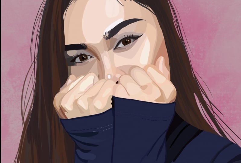
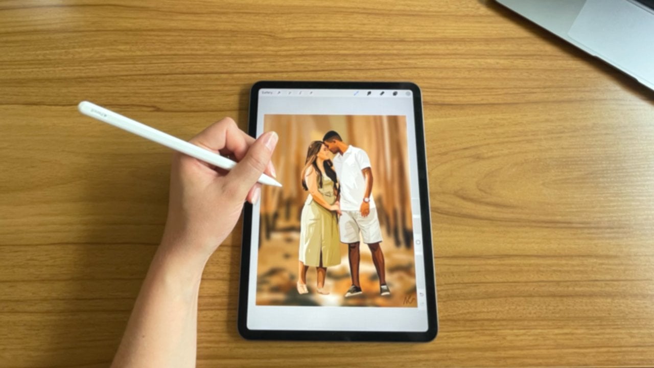
2. Choosing A Reference Photo & Class Project: Theo. First thing I'm going to show you is how to source a reference image. I use unspool, ash, but any royalty free images fine for this illustration, I have chosen to go with the image of the woman on the right. We're looking for a reference image. It's important to look for these three factors. Good quality, good lighting, an interesting composition. The image I've chosen here is high resolution. It has good lighting, particularly on the face, with some interesting highlights and shadows on the clothes. And I like the way the woman is posing in how that contributes to the overall composition of the image. Now that I've chosen my reference image, I'm going to download it to my device so that I can import it into procreate. You can download the same reference image in the raisel section below for a class project. I would like you to illustrate, along with me, using the same reference image and share it at the end. It would be so fun to see all the different illustrations from the same reference image and the next Listen, I'm going to show you how to set up your canvas and procreate so that we can start illustrating
3. Setting Up Your Canvas In Procreate: previously, we learned how to choose a reference image unless listen, I'm going to show you how to set up your canvas and procreate. Firstly will go into the procreate EP when you enter the this will be the screen you see on the right. You'll see a plus icon, which will allow us to start a new canvas. You will see that I have a range of canvas. Size is saved. Procreate comes with some default campus sizes. But most of these I've created myself to create a new canvas click on the plus icon at the top right corner and input the specifications, giving the canvas and name so that you can use this canvas with the same specifications in the future. Here I'm sitting up a square campus, the specifications of 3000 pixels by 3000 pixels at 300 d. P. I. This is a good canvas for uploading your illustration to Instagram. If you were illustrating for a specific purpose, make sure to check your specifications are correct before starting your illustration. Now we need to import our reference image onto a blank canvas. We can do this by tapping the rich icon tapping edge and then tapping and suit of photo. Your camera roll will then pop up for you to select your image. Now that we've got a reference image on our campus, we need to add a layer over the top to do this test the double square icon at the top of the screen on the right, The intent, the plus icon. We're doing this to ensure our reference image remains independent of our illustration. We have now finished preparing out canvas in the next Listen, I will show you some procreate basics to help you get familiar with the EP. If you are already using procreate, feel free to skip to the next listen.
4. Procreate Basics: Brushes, Colours & Layers: previously, we learned how to sit up her canvas in procreate, ready to start illustrating. And this listen, I will give you a brief overview of the procreate. Yep, looking at brushes, colors and layers and more detail. If you are already using procreate, feel free to skip to the next. Listen, let's start with the top left corner Tep Gallery on the top left to return to the gallery. Tech the Wrench icon to exist. Your actions here in the edge. Ted. You can insert a file in suit a photo ed, text and cut copy and paste in the canvas tab. You can crop and resize your canvas to non animation assist. Turn on the drawing guide, flip your campus and access your canvas information where you can also see how much time you've spent in the canvas in the Shia tear. But you can export your canvas in the many different formats and the videotape. You can export a time. Let's video of your illustration. I always labour's toggled on under preferences. You can change the color of your interface to light or dark change. Whether it's a right hand or left handed interface, change the brush cursor, predict your canvas onto another screen, connect a stylus and it a judicial controls. There are a couple of other options underneath that I just leave at the default. Setting. Under help is where you can restore purchases, excess advanced settings and learn more about procreate. If you test the procreate handbook, it will take you to their website. Tapping, Learned to procreate will take you to their YouTube tutorials. Next icon along is the adjustments toll. This is where you can make adjustments two layers, such as adjusting the opacity, the color and the brightness. The next icon along is a selections icon. Through this, you can easily isolate parts of your illustration. We won't be using this today. The next icon, as the Transformed told Hey, you can stretch, manipulate or resize your image. After this, we have the brush, library, smudge toll, the eraser, the layers and the colors to our right. On the interface is the brush size toll. Will waken resize out brush underneath. This is the brush capacity toll where we can change the opacity of our strokes under these other undo and redo tolls. Hopefully does has given you a brief overview of way everything as in procreate. Now we'll delve deep it into brushes before beginning out. Illustration. It's a good idea to know what brushes we want to use to access your brush. Library. Tet, the brush icon at the top, right of the screen. All the brushes I will be using today come with the procreate. Yep, Within the brush library, you will have the option to customize brushes or create your own folders. Easy excess of your brush favorites. My favorite brush for illustrations. The studio pin to customize a brush. Tip it. I like to bring the streamline of the studio paintbrush to 95% in order to ensure I have smooth lines. Wind roaring. Other popular brushes amongst illustration. Artists include Brush pin Morrow line in script. If you want to keep the illustration consistent in its texture, I recommend using the same brush for illustrating end of racing to change the eraser brush tip on the eraser icon at the top right of the screen to change the eraser brush to the same brush that you're using. Tap and hold. The icon now will briefly discuss colors. If we take the color icon Were presented with a color disk down the bottom, we can change the view of the colors to make it easier for us to choose the correct shade. We can adjust the value of the color here, too. At the end. On the right, we can access our color pellets. Here you can save certain colors to the boxes by tapping and holding. You can also name your pellets. If you select a devote color palette, it will appear on the color disc screen. Many people like to save color palettes and news thes, but I don't use this feature match. I prefer to start with fresh colors every time. There is also a very handy tool called the color picker, but I will show you how to use this in a later listen and now we'll discuss our layers. As you've seen, we can access our layers by tapping the double box icon on the top right of out interface. Here we can add new layers, change the layer, order around rename layers and grew players tep the background color layer to change the background color or make it transparent by un checking the box. We can also make any other layer transparent in the same way. Slide your finger to the right on the layers you want to select, and you'll have the option to delete multiple layers at once or group them after grouping. You can rename the group, slide each layer to the lift in order to lock, duplicate or delete the layer stepped in or more layer options such as adjusting the capacity. The layer order, plus grouping and renaming layers is an important part of my illustration process. I will show you these functions and how I use them in greater detail in an upcoming listen . So now that you know your way around the EP and you know how to use it and the next listen , we will begin our illustration.
5. Laying The Foundation: Previously, we learned the basics of procreate and how to set up a canvass to begin an illustration and this. Listen, I'll show you how to lay the foundation for your illustration. Firstly, chick, you're working on the layer above the image. I'm starting by taking a mid tone shade on the face, using the color picker tool. To use this, hold down for two seconds to grab the color in the reference image, then release. You will have automatically selected the color start to trace around the face and nick with your brush. I'm using the studio peon, then drag and drop the color icon to the inside of your shape to fill it. Make sure all the lines are totally connected before filling the shape. Otherwise, it will fill the whole screen. Next, toggle off the layer with the face and neck and create a new layer above this for her shoot . Repeat the same process for picking the color, tracing around and filling it in because I am coloring a dark area and it's hard to see where I'm drawing. I'm taking down the opacity of the image below, then toddling off the shoot layer. I'm repeating the same process by tracing the jeans on a new layer. It's fine to draw over the hand because it sets on top of the Jains next on tracing her hands and then I'll move on to her coat. - Now that we've done who coat, I'll move onto her here, which will be the top player I'll be repeating. The exact same persists again. Now I've completed all my layers. I'm going to toggle all the layers on in. Toggle off the reference image layer to see if there are any gets in my illustration to fix for this. Make sure you are working on the correct layer before going in to fix it. - After ensuring there are no gets in my illustration, I'm going to check all my colors and adjust them as needed. For this. It could be helpful to duplicate the reference image layer and make it smaller, bringing it somewhere you can see it so that you can pull colors from that and check the color accuracy. Once we're happy with a foundation layer, we can move on to adding color and dimension through highlights and shadows. We will explore this together in the next listen
6. Adding Colour & Dimension: previously, we learned how to create the foundation layer on our campus. Now we're ready to begin adding more color in dimension in the form of highlights and shadows. I'm going to start with the genes, burst any to add a layer above the genes, then pull across both layers in group them, naming the group tuggle off the base jeans layer to get started. My theory for adding dimension is to start with the most saturated highlights and shadows, and then add layers underneath those to create the more muted highlights and shadows. Here I am, starting with filling in the darkest and most saturated shadows. In order to clip what I'm drawing to my foundation layer, I create a clipping mask with all of my additional layers. This ensures that I don't need to worry about drawing over the lines of my base layer, but I can keep the layers separate. You can turn on a clipping mask by tapping the layer and selecting clipping mask. You can tell it is clipped to the bottom layer because of downward arrow Icon appears to the left of the layer, indicating it is clips to that layer. Any layers on top well below. This can also be clutched to the base layer. Then I move on to the highlights during the same with the clipping masks. After this, I'm adding some of the finer details over the top. Now I can start coloring underneath by creating layers under the layers I've just been working on. Next, I'm adjusting the brightness and saturation of my layers until they look at cure it to May . The goal isn't perfection, as we were going to make some final adjustments at the end, so don't worry too much. Once I'm happy with the jeans, I'm moving on to the hands. I'm doing the same as I did with the genes by creating new layers over the top, grouping them to give her naming the group and coloring in the most saturated highlights and shadows first. Then I'm continuing the same process with all of the other layers. - Lastly , and doing the face. Facial features can be difficult to draw, so take it slow and pay attention to the detail. I find that any small deviance in the detail can make a person's face look completely different, so take it easy with this one. I start by during the main facial features, like the eyebrows, eyes, nose and lips, and then go in with the facial highlights and shadows underneath. This once , where that 80% done without overall illustration will move on and the next listen, we're going to look at editing or tweaking some parts of the illustration and choosing a background.
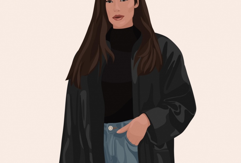
7. Editing & Background: the the theme last. Listen, we worked on adding more dimension and color to our illustration until we were about 80% done. And this. Listen, we're going to compare our illustration toe a reference image to see if we can spot some parts that need tweaking. I'm looking at my reference image here on a separate screen so I can keep working on my iPad without interruption. We'll also look at backgrounds and choosing a background color. A good way to spot something that needs tweaking is to zoom out your image by pinching your fingers on the screen. This could help to bring a different perspective. I also like to ask someone else to look at the illustration alongside the reference image and give me their opinion about what I could change. This is particularly helpful of feeling stuck. Obviously, I'm focusing my attention on her face, as I mentioned in the last listen. Unfortunately, the face could be the hardest part and can be difficult to eat it because all the facial features air so detailed and close together. I've noticed that the shadows on the face don't look natural, and so I am and differing two effects that I'm also editing some minor things on the coat and the here. At this point, I'm starting to consider the background. I like to leave the background plane for effect of my subject as quite detailed. It also wasn't a very interesting background in the reference image, so I don't think this would add any value to the illustration. I like to start by considering colors that are opposite to the colors in the illustration. As you can see, I am trying out a few different colors but settled on a muted salmon pink color. For now. Here I'm creating a new layer and signing my work as this is something I like to do. Here I am duplicating the project and procreate and flattening all the layers of the figure so that I could easily erase some of the here that wasn't looking. Right. Now I'm going back to the face. Is is a few details I've seen there that I'd like to fix. I'm using the adjustments told to adjust the brightness and saturation of some layers on the face. - After this, I'm reviewing the background color and I settle on a greyish green color which is a few shades lighter than the coach color. I'm really happy with my illustration in my background color now, so we'll move on to the next Listen, we will learn how to export our illustration and I'll share some of my final thoughts.
8. Exporting & Final Thoughts: previously, we edited parts about illustration until we were happy with it. And this Listen, we'll learn how to export our illustration, and then I'll share some of my final thoughts in order to export both versions of the illustration returned to the gallery screen Tep Select on the top right corner and select both illustrations. Then Tepes share. You'll have the option to export the illustrations and different formats, but I'm going to export them as P and Jay's been select where you want to export them to and then said, Thank you so much for joining this class. I hope you've enjoyed it and you've learned something valuable. Don't forget to upload a class project to skill, sheer sheer on instagram and techniques that I can see it. I'm really looking forward to seeing your illustrations.
 Natasha Robertson, Artist & Illustrator