Transcripts
1. Welcome: Hi. I'm Ashwini, and welcome back to
another Skillshare class. This time, we're
going to be painting some oranges with oil
brushes in Adobe Fresco. In my previous classes, we learned how to work
with vector brushes, pixel brushes, and even
watercolor brushes. But this time, we
are diving into Fresco's oil paint
brushes to create rich, textured and
realistic paintings. I'll guide you step
by step as we paint some super juicy oranges from the first sketch all the way to that perfect
glossy finish. You learn how to blend, layer, and build up color just
like traditional oils. This class is absolutely
beginner friendly. All you need is Adobe Fresco, a stylus such as Apple
pencil and your creativity. I'll show you how to
control your brushes, create depth with
light and shadow, and make your
painting come alive. By the end, you'll have your
own vibrant orange painting and the skills to use
Fresco's oil brushes for anything you imagine. Think fruits, still
life, portraits. The possibilities are endless. So grab your tablet,
open up Fresco, and let's start
painting together. I can't wait to see your amazing paintings in the
projects gallery. Let's make something colorful, textured, and totally
beautiful together.
2. New UI Update: So as of May 2026, Fresco has changed its UI. That means it might
look a little different than what you see
in the next few lessons. I thought I'll make a update
video for my Fresco classes. So here you go. As
soon as you come in, if I click on Home, this
is how it looks like. Used to see your custom
sizes and stuff over here, but now it looks something
like this, but that's okay. You can click on Create New and create a new document as usual, click on your files, and this is how the homepage looks like. Create new. You have an extra
bit here called the social. You have some social
media templates there, so you can use that. I'll just go to digital
and current screen size. The first thing you notice
as soon as we move here is that the toolbar has completely moved from
left hand side to top. I know I'm not too
happy about this, but yeah, we'll just
work with it, I guess. On the left side now you
have the brush settings. So this is the smoothing
which used to, this is the smoothing,
you go up and down. This is basically the flow
or the opacity of the brush, like if you have some charcoal pencil
and then yeah let's make it black,
and then you do this. This is like you
keep it all high, and then if you keep it all low, you see it's not
flowing so well. This is the flow of the brush, and this is basically the size of the
brush that you have. Again, click and hole and everything else works
exactly the same. The settings are almost
the same as well. I don't think we need
to worry about that. And on the top bar, you have all the other tools
that you used to have. This one is pose. It is a new thing which
is not covered in any of my tutorials, so I'm not going
to go into that. But basically, you have
everything in here, the last tool,
everything's up here. The shapes are still here. Text is again here, and then this is to add your images or photos
and things like that. The eyedropper tool is here and the color palette
is over here. You might see that
the undo buttons have moved here instead of here, but that's fine because your
two fingertaps still work. Also one thing is when you
click on something else other than the brush,
this panel disappears. They used to be your animation
or motion panel here, which has moved up and they used to be shapes like
a ruler and stuff and that has moved into this
bit here or drawing aids. That's what it is, and you have all the drawing
aids over here. Then you have your
symmetry here and the perspective
grid and the grids. When you turn it on, you can have grids and
snapping is here, so you snap everything, I guess. Apart from that, everything
else is exactly the same. And when you go up, you
get a full screen mode. The only disadvantage I've seen is that when you're
on the brush mode, before even if you were in the full screen
mode and drawing, your brush, this was a floating thing which you can move everywhere
anywhere you wanted, but they have disabled that. That means when you go
to full screen mode, your brush settings disappear. So if you want to go back and adjust your brush
size or something, you have to go back in, which I think is not a good thing. The motion settings
are still here, so that hasn't changed as well. And the most important thing that I want to include
is the brushes. Instead of having three
separate brushes, they merge them into
one single brush. This was done a while ago
when you click on brush, you need to go to all brushes, and then you can choose
what brushes that you want, pixel brushes, and then you can see all the subheadings
or whatever. All the brushes are here, but only thing is it's
all bundled up together and that's the most annoying
bit for me at least. I guess that's it. That's
the main change to the UI, and since this was a
significant change, I thought I will add
a updated video. I hope you go ahead and
enjoy the next lesson.
3. Setting up: Okay, so let's begin by
setting up our artboard and learning a bit about
the oil paint brushes. Click on Create New. Go to digital and
current screen size. You might have noticed that my iPad is in the landscape mode. That's why this shows up
in the landscape mode. If you want to change
it into portrait mode, click on this tiny arrow
and switch to portrait. I'm just going to click on
the current screen size. Let's bring in the
most important thing that is the texture. You can find the texture
in the resources stab, so go ahead and download it. Once you download
it, it gets saved in your files or photos. For me, it's in my files, so I'm going to go
ahead and get it. Click here, click on Files. I'm going to use
the canvas texture. This might take some
time to load because the file is quite
huge, but don't worry. And then use the corners here to extend this
beyond the artboard. Artboard is nothing
but the white area here where your drawing
is going to show up. Extend it, and click on D. So there's one setting here that's called artboard Preview. If I turn it off, you can see the extra bits that's
outside the artboard. So make sure you turn
it on all the time so that you know where
your artboard ends. Because when you export it, only the thing which
is on the artboard shows up in your artwork
or the final image. And this thing here is for
touch shortcut, this thing. You can keep it off if you want. But I like to keep it on because sometimes I like to experiment with certain settings with
oil paintbrushes with this. Okay, so let's set this up. So click here and
click on multiply. So whatever we draw
beneath this is going to have the amazing texture on it. If we don't choose
it as multiply, is just not going to show up. So click here. And you
can reduce the opacity if you don't want the
texture to be so obvious. There you go. But
I'm going to keep it at 100 and see where it goes. Maybe I'll change it later
on. Click here to go back. Perfect. Now let's go ahead and experiment with our
oil paint brushes. So as you might know, these
are the pig and brushes. These are the live brushes where you have
watercolor and oil, and this is the vector brushes. But we're going to go here
and click on our oil brushes, and I'm going to choose
oil paint chunky for this titoria. There you go. Now, this one, I want to
increase it to around 600. That's really big. You don't have to keep it at exactly 636. Click and hold, and you
can also type in here. What I mean 636 is around
600 should be okay. Then my flow is set at 68. I'm going to keep it at around 50s and this is the
paint mix, which is at 50. So I'm going to keep it at 50. So what this means is, let's do a little
bit of example here. I'm going to choose some yellow, and I'm going to mark it here
and let's choose some blue. Why not? And I'm
going to put it here. So now I have blue on my brush, so I'm going to mix it, and it's going to create this
nice green color. Now, this is at 50, right? So I'll undo that. I'm going to change this all the way to zero. B one, very low. I'm going to try and mix it, but you see the blue is
it has an upper hand. You don't see so much of yellow, but you see more of blue, so it's not mixing that well. If I had yellow, and then it would
be too much yellow. You see it doesn't mix well, I I keep it all the way up, I'm going to choose blue now. I try to mix it. The
blue doesn't get as much importance as it would if it was
at, you know, a zero. So this basically means
how well your color that is already on the palette is going to mix with the color
that you have on the brush. So, ideally, it's better to be at 50 unless you
have certain plants. So I'm going to two
finger tap to undo that. And there's one more setting
that you want to make sure you have one is canvas texture. I like to keep it at
canvas texture so that the brush itself
has some texture. Another thing is reload color.
Make sure it's turned on. So if this is turned off
and you're drawing Oh, sorry, it's turned off. Okay, let me turn it on.
And I'm going to make blue. I'm going to make yellow. And now if I mix it, this is the color that forms. But when I lift my brush up and paint, it's going
to show yellow. That's the color that
you've picked, right? So now if we undo that. Manto. I'll go back
here and turn this off. And now if I mix it, ta, I lift it, and I
try to draw again. It's not going to
pick this color, but it's going to pick the color that was formed by mixing. So obviously, if you'm
working on a piece where you need mixing your own
colors, then go ahead. Keep this off and it'll work
perfectly fine for you. But for me, for this tutorial, I need it on so that I
have separate colors. Alright, so the next bit is when we are
drawing this artwork, we're going to make
sure that we draw everything below
the texture layer. So as you can see, right now, this part, these things that I've drawn is above
the texture layer. So this canvas texture isn't
coming through, right? So if I click and hold and bring it below
this and drop it in, you see it has the
canvas texture. And this is what we
want for our artwork. So go ahead and make sure that you draw everything below
the canvas texture. So now that we have a little
bit of information about the pane brushes and setting up your artboard, let's
start drawing.
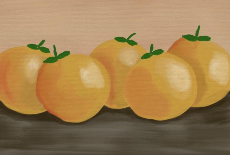
4. Let's Paint: Okay, so now that we are done, I'm going to use my two fingers, tap to undo things, or you can also click and clear layer and go to a layer
below the texture layer. If you don't have a layer
here, just go back to this bottom layer and click Plus and you'll have an A layer. So we're going to go ahead
and draw an orange right now. And for that, I'm going
to choose some colors. Can click on your color palette and let me just do this so
that you can see it better. The outer ring is
actually the color, and this one tells you
the hues, you know. So I'm going to go
ahead and go to orange and make sure
this goes all the way up to this
corner because that gives you the brightest
and the best color. So I'm going to drop
it down to make it slightly orange,
a light orange. If you want the
exact same colors, click on this HSB slider. Click and hold, and you get the type in whatever you want. Oops. Let's make
it 45 as it was. Perfect. And we are still
at oil pate chunky, and I'm around 600. So we're going to draw a sheep, orange shape like that. I want you to put in the
top part of an orange, keep the bottom part as it is. So if you're not very sure about drawing an
orange like brown, don't worry about the
edges. It doesn't matter. I don't care about it right now, so you don't have to care
much about it, as well. And by the way, if you feel
this brush size is big, you can go ahead and reduce it. Use the brush size that's
comfortable for you. That's really, really important when you're drawing with
these kinds of brushes because I might be comfortable
with a really large brush because I have been practicing with it,
but you might not. So just the brush size to meet whatever size that
you're comfortable with. See, I've kept it
at 3:37 because I felt the edges weren't
getting, you know, that great. So you can be on the same layer, and I'm going to co hat and bring this down to make it red. Like bright red.
I love this one. Or maybe make Okay, this one. That's 400 and hundred. And I'm going to go
ahead and add it here, and I think this would be better if it's a bit bigger 472. And again, I'm going to
make it round over here. And I'm not lifting my brush right now. Have you noticed it? That's because when
I'm doing this, if I lift, a huge block of
red is going to come over. And I don't want that. I want this nice orange to
mix with the red. I can lift it up now and
add a bit more color, lift, and now you'll
get more color. So when you want to add the color that's
already on your brush, then you lift your brush up. Otherwise, it's just going to work with the color
that you create, and that's amazing as well. Okay, so I think we have formed a bottom part of the orange. So you don't have to make
it exactly red like this. Use a little bit of brownish or maybe a little darker
orange that works as well. So now let's give
some highlights. So for this one, I'm going to go to a different layer
just to show you guys. I'm going to imagine my
light source is here. So, obviously, the dark
part is going to be here. This the shadow, opposite
of the light, right? This part, this whole part is going to be the shadow part. Let's go back to our orange. And I'm going to go
ahead and pick white. Go back to your brush,
and let's put here, like, exactly where
your light sources. We're going to put some white. And for this, I'm putting
a bit of pressure, and then as I move, I'm going to reduce
the pressure. So what I mean is let me take some color which you have
used recently, blue, maybe. Use a different layer so it
doesn't mix with the orange. And then I'm going
to put up pressure, and then in the edges, I'm
going to use light pressure. So you see it mixes because there's no other color around
here, so it looks weird. But if you have some other
color in the background, then it nicely
blends, I'll that. I'll go back, pick my white. You can reduce the size again
if you're not comfortable. I'm going to go ahead
and mix it a little bit. I'm going to undo
that because I want to start here with bright and slowly mix it around so that
it blends in a little bit. There you go. You
feel, no, no, no. Okay. And there you
go. That's perfect. That's a nice little
color as well. Now, click on plus, and we're
going to go into a green. Again, you can take any
green that you want, move this and move this
around, bring it back down. If you want the
exact same color, it's 92 85, 69. Maybe a bit darker. Okay. And this, I'm going to
go into oil paint detail because it's a bit fine
details that you need to add. So we're going to just go into a different layer
because we don't want to mix it with
this one, okay? And you can add this
anywhere you want, maybe. Add it here, I guess. Then like that. So I'm gonna hide
this demonstration or extra things that I put. This looks wonderful. So we're going to go ahead
and add more oranges now, but in different layers. So let's get to that.
5. Paint some more!: All right. So now that we have this orange, I want to add more. But obviously, this
is in the center, and I want to move it a little bit to the left. So
how can we do that? Go back to the
orange, the main one, and click on these three dots here and click on
select multiple. And we're going to select
the stock as well and use this fold icon for
grouping them together. And now, if I click on
the transform button, I can move it anywhere I want. And I'm going to go ahead and
place it here a little bit. If you want, you can
decrease the size. And turn it around,
do whatever you want. Click on done. So we're
going to go ahead and draw one more of this orange
over here or somewhere. You can also go
ahead and duplicate this and a great thing to do, but I want to draw it. So I'm going to go
ahead and quickly draw one more right next to it. I Okay, so I've
grouped them as well. So we have two oranges ready, and now it's time to
draw on next batch. So I'm going to go back
I'll move this sky here. I'll go back all the
way down and click on plus because I'm going to
be drawing my oranges here. If you feel like these
oranges are distraction, you can always go
ahead and hide it, which is a very good thing to do when you are a
complete beginner. But if you want to know where
these oranges need to come, so yeah, you can draw the base and then
continue, I guess. So I'm going to go into
my orange again and then change the brush to hanky. And then I'm going to draw here. Not there here, in
the background. And now that I know, I'm
going to hide these two, go back here and draw my orange in the same
way like before. This time, I'm going
to mix it nicely, and I want more orange bits, so I'm going to get more orange and make it more orange here. Like that. Perfect. And then you can add highlights, but we're going to skip on
the highlights for now. We'll just add the stock. Plus, now I'll bring these two because I want to see
where I want to add my stock. Sometimes you don't need to add stock because it's hidden, but sometimes you want to. So I'm going to add this here on a new layer.
Don't forget that. Perfect. I want to add one here as
well. I can just copy this. Duplicate layer and I'm going to transform and bring
it up here and I'm going to reduce
the size a little bit. Let's make a tiny orange hobby. There you go. You can
also go ahead and copy one of these,
click on Done. Now click Duplicate Layer group, and then we're going to
go ahead and transform. Going to bring one up here and I'm going to
make it like that. You can choose to do
it however you want. Make it a bit slightly bigger because it doesn't
look exactly like that one. And then done. Continue because it's going to be going
outside. That's fine. Continue. All right. And then I feel like
this one, the stock. I want the light
orange to be on top, so I'm going to go
here to the one, this one, click on transform. I'm rotating it so that the light color comes
here maybe move it. Done. Continue. See how easy that is super easy. And then we're going
to do something else, and that is adding some
shadows because do you see that the oranges are
blending and you don't know where this orange
ends and where this starts. So we're going to go ahead
and fix that right now. So I will group the one
with the stock together, these two so that we
don't get confused. Alright, let's go to
this orange here. Was it this one? You can use the i button to
figure out which one. What you can also
do is make sure all the ones in that layer
are together, so it's easier. Let's get in here.
Let's go to this. And now we're going to go ahead and click and use
that orange color, and we're going to
bring it slightly down to make it slightly
darker, not too much. 4599 and 82 should be alright. We're
going to add it here. Oops. Is it the same
color? Yeah, I guess. Min make is a bit darker
and maybe bit this as well. And when you're doing
that, make sure you lift your pen up a little bit when you're at
the edges, especially, reduce the size, like that. And then you can just roll
it out so that it mixes. There you go, and you can
see that color change. Between the two oranges, right? So we're going to go ahead and
do that for this one here, that is this one. So go in, get in there. You can also use
a clipping mask, but I prefer doing it
this way so that the color blends nicely like this. You can also use red
and darken it up. This works wonders as
well as you can see. It really depends on what
colour shadow you want to give. You can go ahead and change
this too, but that's okay. So oranges are slightly
different in colour, and we want to give
them here as well. Any overlapping stuff needs
to get colored like this. And sums ups because I didn't
want to fix that. Okay. There you go. All good. I'm going to add a bit of
orange to this part here. Want this to be
lighter slightly. Not too much. Let's do
the same over here. So I want you to go
there, that one, choose the reddish,
red that you choose. And then add a bit like that. Alright. That looks fine. And we're going to add more
now in the background. So I want you to go below
all that and click plus, and we're going to
add a couple of more here and here. Let
me quickly do that. As you can see, I just used
orange for the most bits. And then I'm going to add a bit of reddish
highlights everywhere, not making it too
much right now. And then adding a bit here. And we're going to
go ahead and choose the dark red we have
and bring it even further because
we're going to add shadows to these dark bits
here. Do you see that? So we have to add
shadows to that, and we have to have a
different kind of shadow, by the way, so we're
just going to do that. These oranges are
in the background, so they're going
to be much darker. Can increase the size to
help you in blending, because the bigger the size
it blends really well. So it looks much nicer. Okay, that looks good. And now in the end
in the background, I'm going to go back and plus. I'm going to add this.
No, that's not nice. That's really not nice. So probably I'll take some
of that brown that we chose, and I'm going to
add it everywhere, and I'll come back with red so that it'll mix
in nicely, alright? There you go, and then I'm going to choose that darker red, and I'm going to add
it just to where all the oranges are like that. And that looks better now. It might look too orangy, but you can also choose Black, by the way. Why not? Yeah. But don't press
the black too much because then it'll create that really dark tone
that you don't want. Okay. So now let's
go ahead and add some highlights now because
I feel like it is too, it's not exactly
looking like oranges. Alright?
6. Highlights and Shadows: Okay, it's time to
add highlights, and we're going to go
ahead and choose white. And I still am on
my chunky brush. I'll reduce it a little
bit, maybe 300 ish. And we're going to
add some highlights. This one will
definitely need it. So I'm going to go
ahead into that layer. Now I have to figure out
where that is. So this one. Yep. So I'll go there, and I'm going to add a
bit of highlight here. And probably this one. Oh, that's on a different layer. That's why. So we're
going to go into that and add a bit here as well. Slight mago. And this one doesn't need. And this one might be. Okay. It's in this own layer, so I'm just going
to add it here. If you feel like you need more
oranges in here and stuff, you can go ahead and
do that as well. I'm going to add a bit of
stock to some of these because I feel like
they might do, well, with the stock, I'm
going to go into detail, but now the green, I'm
going to make it a bit darker if it's going to be
in the background, right? So plus going to add like that. Maybe. That's not supposed to be
in that, but it's okay. We'll just add it.
Okay. Yes, that's fine. You can add a bit of this
reddish shadow in here. So I'm going to go here,
this one, and double click. Go into this and
add a bit shadow. I want it to be a bit darker, 'cause I feel like
it'll look much better if it's a bit darker. Let me undo that detail brush
setting that I did. Okay. There you go. Definitely, I
think it looks a bit better. And even this one mix it up a little bit. Blend, blend, blend.
That looks okay. But I want to add more stuff. I want to add a bit more
oranges. How about that? Plus steak orange
in the background. Should be here. Yep, there go. And obviously,
we're going to add colors. We want the darker one. This is optional. By the way, you don't really need
to add these things, but add some if you feel like. Okay. There you go. Your plate of oranges is ready. But in the next lesson, I'm
going to teach you a trick where you can clip it to a
certain shape that you want. Let's do that.
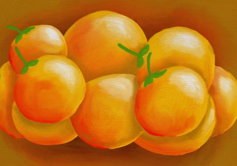
7. Clipping to Shape: Okay, so now your orange is ready and you can
export it like this, by the way, but I'll show you another way in which you can clip it to any
shape you want. So I'm going to go
into my layers here and I'm going to group
all the oranges together. You know what I
mean? Don't include the background layer,
but everything else. Select, click, select multiple
and choose everything that makes up these
oranges. Not the texture. Click on folder. If you
want to just quickly check, use your eye button to hide it. And by the way, if you
take out the texture, you can look at your
orange, what you have done. It looks good too. So it's up to you,
texture or no texture. Okay, so now, once
you have this, click on plus and
create a new layer, and we'll go into chunky and I'm going to select a big brush, maybe 900 or
something like that. And I'm going to quickly, not completely draw so that it doesn't cover the
entire artboard, but it does cover
some of it like that. You can use any other
brush if you want. And you see I'm letting
the texture show up in the end. Like that. And I can make this darker
so that it looks nicer here. But I'm going to keep
the textures in the end. So once I'm done with that, I'm going to go back here, click and hold, and
you can move it. Use the thing because
it's a group, you can't do a clipping mask. That's one more thing. So we'll click and duplicate this layer. And I'm going to hide this.
Now, this is my backup. If I want to make any changes, I can go back into the groups. It's easy to go
back into groups. You just double click to get inside. So I'm going to keep it. And this one click and say
merge layers in group. So now this is one painting. You can't do any modification. There are no layers in here. So now, I'll click and go back. I should have used the other
one, it doesn't matter, and click on clipping mask. And this is going to show
up with this texture. You can make the same
thing here as well. You can edit this,
like use your eraser, make it big and then, you know, erase this off because
we're going to put texture and then you can bring the pattern
however you want, like that. See what I'm doing? And you have your artwork on this
particular sheet. That's it. I'm going to erase this. I'm going to that.
And you see here. Now, this is what your
artwork is going to be if you export this as a as something without a
background or a texture. If you hide both
background and texture, what happens is you
get this checkerboard, that means that it's
going to export as something without
a background. But let's bring it in. That's
what is this. Oh, okay. Let's bring in the texture and
maybe reduce the texture a little bit because
then it's nice and bright. And there you go. You have your final
artwork ready. And in the next lesson,
we're going to export it.
8. Export and Save: All right, so it's
time to export this. Click on She, publish
and export, Export As. If you're going to
be exploring this with the background
and the texture, you don't have to
worry anything. You can export it
as a JPEG as well. Click on Export and save it onto device or
anywhere that you want. But if you want to
export this without a background and
without the texture, you have to always
select it as a PNG and make sure you remove
the background and the texture before
coming to this stage. P it. Click on You can also watch the T labs
preview, click here, preview Time labs, and it's
going to show you everything that you've done so far from
the beginning till the end. You can export that as well by clicking on
this button here. I'm going to go ahead
and uncheck this. And that's it. That brings us to the end of this pericular class. And I hope you enjoyed creating something with oil
paint brushes and hope it gives you some
confidence to create more art with this
absolutely amazing brush. And I would love to see
what else you can create. You can go out and experiment
the same way with apples, pears, blueberries,
one of my favorites, by the way, and the
easiest to drop. So go out onto that. I'll see you in the next class.
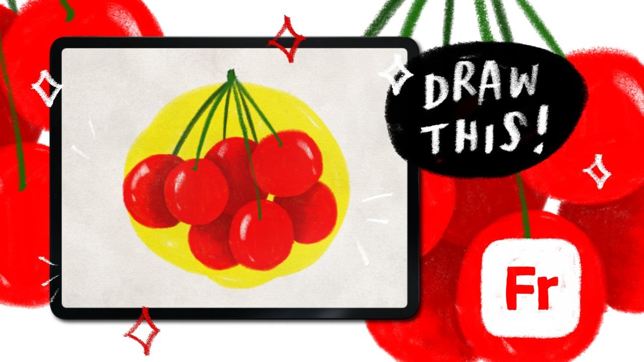
9. Class Project: So the class project is
going to be super simple. I want you to use Adobe frescos oil paint
brushes to draw something. Even if you want to draw a
single orange, that's fine. Go ahead and do that and upload it to the
projects section here. Otherwise, draw
the entire thing, and that's fine, too. You can also experiment
with other fruits, anything that you
wish to create. Okay, I'm excited to see
what you guys create then.
 Ashwini Pandeshwar, Artist, master procrastinator