Transcripts
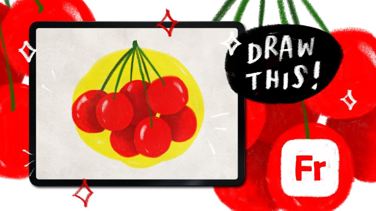
1. Hello!: Hi, everyone. Welcome to this class on creating
repeating patterns in Adobe Fresco. We'll be using the
symmetry tool and pick and brushes to create beautiful
intricate mandalas, and then turn them into
seamless repeating patterns. Mandalas or mandalas, as we
say in my native language, have always had deep cultural
and spiritual meaning. Growing up, they were a
natural part of my world, worn into rituals in daily life. Whether you're just discovering mandala art or you've been
drawing them for years, you'll be amazed at how
effortlessly you can create complex mesmerizing design using just a few simple strokes. By end of this class,
you'll know how to use Adobe Fresco symmetry tool
for mandala creation, work with pick and brushes
for rich textured effects, turn your mandalas into
repeating patterns. And build a collection by recoloring your
designs efficiently. If you join me for my previous class where we learned all about fresco and creating repeating patterns using Victor Brushes, this will be a
perfect next step. So grab your stylus
or Apple pencil, open up Adobe Fresco, and let's dive into the world of Mandala patterns
and pixel magic.
2. New UI Update: So as of May 2026, Fresco has changed its UI. That means it might
look a little different than what you see
in the next few lessons. I thought I'll make a update
video for my Fresco classes. So here you go. As
soon as you come in, if I click on Home, this
is how it looks like. Used to see your custom
sizes and stuff over here, but now it looks something
like this, but that's okay. You can click on Create New and create a new document as usual, click on your files, and this is how the homepage looks like. Create new. You have an extra
bit here called the social. You have some social
media templates there, so you can use that. I'll just go to digital
and current screen size. The first thing you notice
as soon as we move here is that the toolbar has completely moved from
left hand side to top. I know I'm not too
happy about this, but yeah, we'll just
work with it, I guess. On the left side now you
have the brush settings. So this is the smoothing
which used to, this is the smoothing,
you go up and down. This is basically the flow
or the opacity of the brush, like if you have some charcoal pencil
and then yeah let's make it black,
and then you do this. This is like you
keep it all high, and then if you keep it all low, you see it's not
flowing so well. This is the flow of the brush, and this is basically the size of the
brush that you have. Again, click and hole and everything else works
exactly the same. The settings are almost
the same as well. I don't think we need
to worry about that. And on the top bar, you have all the other tools
that you used to have. This one is pose. It is a new thing which
is not covered in any of my tutorials, so I'm not going
to go into that. But basically, you have
everything in here, the last tool,
everything's up here. The shapes are still here. Text is again here, and then this is to add your images or photos
and things like that. The eyedropper tool is here and the color palette
is over here. You might see that
the undo buttons have moved here instead of here, but that's fine because your
two fingertaps still work. Also one thing is when you
click on something else other than the brush,
this panel disappears. They used to be your animation
or motion panel here, which has moved up and they used to be shapes like
a ruler and stuff and that has moved into this
bit here or drawing aids. That's what it is, and you have all the drawing
aids over here. Then you have your
symmetry here and the perspective
grid and the grids. When you turn it on, you can have grids and
snapping is here, so you snap everything, I guess. Apart from that, everything
else is exactly the same. And when you go up, you
get a full screen mode. The only disadvantage I've seen is that when you're
on the brush mode, before even if you were in the full screen
mode and drawing, your brush, this was a floating thing which you can move everywhere
anywhere you wanted, but they have disabled that. That means when you go
to full screen mode, your brush settings disappear. So if you want to go back and adjust your brush
size or something, you have to go back in, which I think is not a good thing. The motion settings
are still here, so that hasn't changed as well. And the most important thing that I want to include
is the brushes. Instead of having three
separate brushes, they merge them into
one single brush. This was done a while ago
when you click on brush, you need to go to all brushes, and then you can choose
what brushes that you want, pixel brushes, and then you can see all the subheadings
or whatever. All the brushes are here, but only thing is it's
all bundled up together and that's the most annoying
bit for me at least. I guess that's it. That's
the main change to the UI, and since this was a
significant change, I thought I will add
a updated video. I hope you go ahead and
enjoy the next lesson.
3. Setting up & Colors: Okay, so first, let's set up our boe and talk about all the colors that
we're going to use. Open up Fresco, and then
this is your home screen. So you see two things here. One is home and another
one is your files. So instead of going to home, I'm going to click on
your files because this shows all my files that
I've ever created. Now I'm going to go ahead and
click on a new folder here. And let's name this
something maybe Mandala. And safe. That's
your new folder. You're going to click on it
and get inside the folder. The reason we are
creating the folder is to keep all our
files in one place. That is if you decide to create multiple versions of the same
file or multiple colors, you can keep them all here and you'll be really well organized. Now let's click on Create New. I'm going to go into digital, and I'll be selecting
this square here. So this is 2,100 pixels
into 2,100 pixels. So you can start with
a square of this size. But if you feel like
you're going to design this pattern for a
much bigger surface, maybe you can start off with
a bigger surface as well. Like, you can start off
with a four k square, but it has to be square, and that's the most
important thing. But I'm going to start
off with a smaller square because I think it's much easier for these
tutorian purposes. And also, I usually start off
with a small square anyway. Click. Your art board is ready, and there's only
one thing to do. Go into your grade right here. We're going to go into symmetry, click this arrow, and
turn symmetry on. And we're going to
choose this one here. Meanwhile, I'll go into
snapping and then turn on the rotation snapping
and alignment snapping. You can keep the
rotation snapping at anything that you want, maybe 45 or 90, it
should be right. Click Back. Now it's
time to bring in colors. So to bring in the colors, can you use the color palette
image that I've provided? You can just bring it in and use that, and we'll do that first. You can find it in the
resources section, so download it onto the device
that you're using Fresco. Once you ham it,
click on images, photos, and bring it
in. And click on Done. So when you bring
in a color palette or any image for that matter, Adobe Fresco
automatically creates a palette for you like this one. And if you don't see this, you can go into your
settings, app settings. Go General and in here or
to create color palette. Make sure it's turned on, and then bring in the
color palette again. But most of the times the
colors don't exactly match. Like for example, this red, if I click on this HSB slider, you see that it is 580 and 95, whereas this is 11 89 and
95, so it doesn't match. So that sometimes it happens. So if you don't want
that, just click and hold and it creates a color. Make sure you're in your pencil, go to your color and
check the numbers. And if they match, go ahead and make a mark
on your artboard. It doesn't matter what
brush you're using, as long as you make even
a dot, that's fine. The only reason you do that is because it shows up
in the resend stab. We're going to do the next one, next one, and just make sure I check the color 19198 and 95. Okay. And then yellow. 405-90-4905. So if you go into Resins now, you see all the colors that
you need, so that's perfect. And then you can hide this.
You can also hide this. The next method to get colors
is by using Adobe color. I have the Adobe color
theme shared with you guys. When you click on that link, it's going to take you
to Adobe Color website where you can just click
as Add to Library, and it's going to add
it to your library. And once you add it, you
click on your color palette, go to A and check the library
that you've added it to. In my case, it's your library, and you will see
the color theme. Okay, so we have
our artboard set, and now it's time to draw. Let's draw our first basic
design for this pattern. See you in the next one.
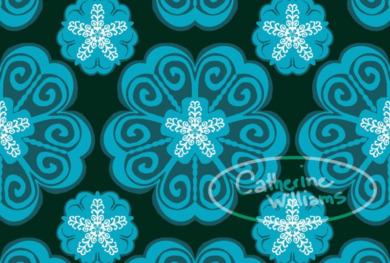
4. Let’s draw Mandala 1: Okay, so our artboard is
ready, and it's time to draw. I'm going to click on Plus
to create a new layer. For brushes, I'm going
to use a pixel brush. If you're interested
in knowing how to make patterns
with vector brushes, I do have a Skillshare class that talks about making
patterns with vector brushes. I will leave the link in
the description here. Click on your pixel brushes, and we're going to go into
Ink and Belgian comics. I'm going to set this to 70. You can click and
hold and type in 70, or you can also go up
and down like that. My flow is at 100, my
smoothing is at one. Although the pattern
looks quite complicated, it's actually nothing but few
strokes on your artboard. If you still think
that you might need some extra help, don't worry. I have a sketch for you guys. So go ahead and download it
from the resources section. And once you have it,
click on images, photos. And bring it in. Click
on Done. Go to evens. Click on multiply because
this kind of hides the white background and then reduce the opacity to
as low as possible. You can also do
this and type in. If you see any such
box with numbers, you usually can
type in the number. I'm just going to keep
it around 26 and click. Now, let's choose
the color yellow. So this mandala, I'm going to be drawing with the
help of these guides. But the next one, because we have two of them in the pattern, I'm gonna be freehand drawing
it because I just want to show you that even if you
just scribble some lines, it's still going to look pretty. There you are. I'm gonna zoom in with my two
fingers like that. And let's draw. Now click on plus
for a new layer. One thing you should note is
that I want you to create a new layer for every
single thing that you draw. That's because it gives
you more flexibility. You can go change colors. You can do whatever
you want later on. And since we're using
pick and brushes, it's much easier to change
colors or delete or, you know, just hide things if you have it on
a different layer. Let me just go ahead
and undo that to finger tap because I think I'm going to make it a little bit different something like
this. Yeah, better. Now, plus next layer, I'll use the light blue. I'm gonna do that. And
let's draw this like this. And plus maybe the dark one. Like that. Okay. Great. Now, let's go ahead and I'm going to go
below these layers here, go below and plus. Let's choose yellow again. We'll reduce it. So
this one is going to be all the way like
this and like that. And I'm going to
check the thickness. I think this needs
to be a bit higher. I'll keep it at 90s so that I'm going to put
a lot of pressure here. Oh, that's really big, so let's reduce
this to 70 again. So I'm going to put
a lot of pressure here so that it's thicker, like that. You see
what I'm doing. And then here, I'm
going to make it thinner and thicker like that. My hands are a bit shaky, so you see these shaky lines. You can avoid it by not having shaky hands or increasing the
smoothing a little bit. Maybe let's make it 14 and try
it out because on Sundays, you know, your
hands, I don't know, maybe because I haven't
had anything to eat or just it's not working. There you go. I'm going
to ignore my shaky hands, and I'm going to just
fix this like that. That's perfect. And now let's go ahead and add the black bits here
or the darker bits. Go back plus. Let's choose the
dark color here. I go to delete this off. Okay, the dark color here. And we're going to go ahead and add this and color
it up like that. It's time to add here. Maybe we can do it in
this same layer as well. And we're going
to add like that. Perfect. Now, plus, we want this on top
of this layer here. So, plus, we're going to go ahead and
choose the dark blue. This one. This they're
about the same, I guess. Anyway, it doesn't
matter. Let's go ahead and add this line here. That's good. And I'm going to fix this a little bit
so that it looks nice. I also want one here
on top of this, right? So, but that comes below this. So yeah, you can just
add that here or plus different layer and use a little bit of pressure
to add that. There you go. Maybe add a line. Why not? Okay. Now it's
time for this one. Let's choose. It should
be on top of this. So plus, I'm going to
choose the light blue, and we're going to add goes
like this and like this. Perfect. And now I'm going
to go This has to go below. So go back and plus. We then choose the dark blue. I'm gonna oops. Is
that the dark blue? No. There you go. You can actually
reduce the size of your brush if you feel like
it's harder to control. And go below that, plus, and we're going to
put the yellow bits. So yellow and There you
go. Let's color this in. Let's look at our work. Not
bad. It's coming great. So now I feel like
everything being blue. I mean, this one, you can
hide it to see which one. This one, everything blue
does not look that great, so I'm going to use the green
color, use my fill tool. And one thing you
should know with symmetry is that when
you're using the fill tool, it doesn't automatically
fill everything. So if I go ahead and put this, it's just going to
be for that color. So we're just going to do alternate once
now. There you go. And for the alternate ones, we're going to change the
color of these things as well. So let's choose blue. And let's go to this back here. Is this the one? Nope. This one, I guess. Yes, that one. So we're going to
choose that and color that off like that. And we choose yellow, go to the one here like that. Choose color that. Now, let's add these tiny
bits over here, so green. I'm gonna go all the way top. Plus, we're going
to add these bits. Oh, filtered, cancel,
go back to your brush. There you go. Let's
do here as well. So now let's add some
extra elements to this. I'm going to add one right
about this layer, plus, and let's choose white, maybe a little lighter,
but not too light. And let's go back to the brush. You're going to add like that. It need not be
uniform, so it's okay. There you go. I want
some on the green. So we go here plus and clipping mask because I
want it to be clipped. And there you go. Our
first mandala is ready, so now it's time to
make the next one.
5. Let’s draw Mandala 2: Okay, so we finished this one. So we're going to go back here now and click on Create New. And we're going to use
the same screen size that we used for the
previous mandala. So if you have used a four K
one, use that one right now. I'm going to go with
the Basic square. We're going to go into our
settings here on symmetry, turn this on, and I'm going
to use the same symmetry. By the way, for the record, you can use any
symmetry that you want for the second mandala. But only thing is when you're arranging it in your artwork, it might look a
little different, but you can work with it. So do go experiment with it. I think you'll have lots of fun. Okay, so now if you're
using a different artboard, you'll again have to
get in your colors. So that is when your library comes in handy because
it's always there. So do what is the best method for you and get your colors in. Alright, so let's start
drawing the next one now. Like I said, I'm going
to free hand this one, but if you do want to sketch, I will leave the sketch as well. So let's do this one. I'm going to go ahead and
use the same brush that is ink and Belgian comics. And for colors, let's start
off with yellow, I guess. And we're going to go
ahead. Oh, that's black. Let's choose the
yellow, and we're going to make a flower. And let's go to light blue. Go back plus. Well,
let's make a nice petal. Maybe thicker on the top,
thinner in the bottom. Go below and plus. I'll choose the darker one. I'll choose somewhere on top. Sco like this, like that, and up and circle. I'm going to choose one
more, and then up like this. It's not fully nice. I'm gonna go to my
smoothing and increase this so that it gives
me some control. So go up that and there you go. I think that should
be okay. I want to add something inside. So go back here plus. I'm going to add bit like that. Now go back down and plus. Let's choose some yellow. There you go, and maybe
thinner ones up here. Let's give some dark background
to the back, I guess, go back all the way down plus, and then choose the dark
color that we have. And we're going to
go ahead and make a circle like that and
then fill that in. We're going to make
one here as well. Maybe a little lower.
To finger to undo. Yeah, I think this is a very
good position for that. Okay, that's good. I feel like we need a
lot of yellow for this, so I'm going to go ahead and
try to get in some yellow. Maybe plus, let's be
in the background. That's okay. We're going
to choose the yellow. And make something like this. Okay. Let's make a
firework. Some fire. So. Some strokes, seriously, go ahead and enjoy this process, like draw to have fun like this. That looks fine, but I feel
like I might need some green. So I'm going to get
some green because the other one had green in it. So we're going to go
ahead and add some green. Just wondering
where I can add it. So maybe below this plus, and I'm going to add
some green here. No. Hold on a second. Let's add a bit of green like this there and maybe
add some here on top. So plus new one because I don't know if
this will look good. So we can do something
like this. No. I'm using very less pressure so that it doesn't
know, look very odd. Okay, I'm going to
use the dark color now and plus on
top of this green, and just add
something like that. Okay. And for the blue, I'm going to click on plus, and I'll choose white, or you can choose
slightly lower color. And again, with your brush, we're going to go ahead and make some lines like this. It's good. And then maybe on the
green as well, like that. And on the yellow, we can make things like that. And I think our
artwork should be, Oh, no, with the
center, let's plus. Let's make this white. And maybe put a little bit of blue in it. No, dark blue in it. Tiny bit. There you go. That's it. That's a second
one. It's ready as well. And the next step we're
going to try and get all these things to
make it into a pattern.
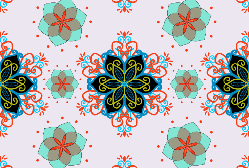
6. Making the pattern Tile: Okay, so we are done
with our two mandalas, and now it's time to put it
together to create a pattern. So now I'll just
go ahead and pick up my first mandala,
so click on that. So we're going to group
this together so that it's easier to copy and paste it
into a different artboard. You can continue working
on this artboard itself, but I like to keep my things separate so that I can always come back
to my original file. So I'm going to go ahead and
click on these three dots here and select multiple. Now we're going to
choose all the layers that make up this mandala. Just go ahead and click like that and make sure
you select everything. Do not select the
background layer and click on this folder. Now, to make sure that
you got everything, you can click on this i button, and everything should disappear, except the sketch of course.
We don't need this sketch. Then click back.
Good. Now, click and copy layer group.
Let's go back outside. We're going to
click on Create New and digital and square. So this square has to be the same size as the
original that you chose. So right now, if it was
four K for mandala, please select four K. Otherwise, I'm just going to go
with my basic square. Now click Paste
layer group. Done. Now click and merge
layers in group. So this is our base mandala, and we have merged
all the layers. So that means that now
you can't edit anymore, so they're all clumped together
and, you know, flattened. So now I'm going to click
and duplicate layer. I've made two of these. Perfect. But I'm going
to make one more, click and duplicate layer, and the bottom one,
I'm going to hide. The reason I'm doing this
is this is just a backup. But we don't really
need it because we have a separate file with
the original mandala. So if anything goes wrong here, you know where
to get it from. So now I'll go back to
one of these ones here, whichever, and I will
choose a pixel brush. It could be anything.
You can just go ahead and choose
the Belgian comics. Doesn't matter. And color,
you can choose anything. I would suggest choosing
a color which is not in your artboard, but
this is a mandala, so the elements don't go all the way to the end,
so it doesn't matter, but you can choose
bright red, pink, any color that you want and
mark the corners like this. And then mark on the
other one as well. You could have just drawn it
first and then duplicated, but yeah, sometimes my
brain doesn't work. Yeah, there you go. Both of
them have these corner edges. The reason we are doing this is when we select
the transform tool, now it's going to take the entire square
into consideration. If we didn't have that, I'll just show you
for the ones here. When we click on that, it's going to take just the design, and then we can't figure out how to move it with
the alignment wise. So that's why you need
those alignment guides kind of thing Meanwhile, make sure your
alignment guides are turned click on Transform
and move this to left. And you see these blue lines, they tell you exactly
where you are. And when you see these
blue criss cross lines, like a plus sign, S here,
it snaps, actually. So that means it is at
the center and let go. We're going to go and click on the other one now still
in the Transform tool, and we're going to
move this right. And click on done and continue. I'll take my eraser and I'm
going to erase this off, maybe make it a little bigger and go to the other layer
and erase this off. Now, click and merge down. So now, this is
one single layer. So if you want to
add elements now, like if you don't want
this blank space, this is the time you
go ahead and bring in some elements
and add it here. So we're going to bring
the next one now. Let's go back here. Click, group it together, select,
select multiple. I fold it up, hide and check, click
Copy layer group. Go back to your file. Click
Base layer group. Done. Click merge layers in group. Perfect. Click, Tuplicate layer. And we're going
to click and drag it down here and hide it. This is our backup.
Okay, so you have here, and you could go ahead
and put one here as well. So transform tool
and I'm going to decrease this in size so
that it fits in this gap. There you go. If you want it, you can make it further smaller, but I think now that's
fine. That looks better. So click and merge down. Now we're going to go
ahead and duplicate this and make it go
one up and one down. But before doing that,
let's add our markers. Make sure you don't
touch the actual design here and add it only
to the cornice. Click duplicate layer.
Now transform tool. And this one we're going
to move up. There you go. And next one, we're going
to move down. Done. Continue. Let's use the
eraser and erase this off. Perfect. Now this is huge blank space where you can draw or put in another design. So I'm going to go
ahead and uncheck that. Hold your transform tool and reduce this and try to bring it so that
it's in the center. You can also hold
your touchbr here and reduce it so that it reduces
from the center. I know. That's awesome. But if
you can't see this, I'll click on done,
you can go to settings and touch shortcut. Make sure it's turned
on. Great. But I want to rotate
this a little bit. So what I'm going
to do is click on my transform tool.
And rotate this. And you do have a 45 degree
and 90 degree turned on. So if you want, you can
rotate it however you want. But I think I'm
going to put it at 90 degrees so that it
looks a little different. Click on T. It looks a little different from the
one on top and bottom. So once you've done this, you have your basic
pattern tile ready. So I'm going to go
ahead and select select multiple,
select all three. Click March selected. So this is your
basic pattern tile, and this is when you can add
colors to your patterns. So I'm going to go to
the bottom and hide it. Click on Plus for a new layer and choose any color
that you want. I don't know what color I want, but I'm just going to maybe choose this and
see how it looks like. You can add vector or pixel
anything that you want. Maybe darker colors. Ah, I'm so terrible
at this, actually. Okay, maybe some
colors like this, and now you have
your tile ready.
7. Checking the pattern: Now click and duplicate
this four times, one, two, three, four. That's because
we're going to use one of them as a backup. And you're going to use
this transform tool, and we are going to
use the corner ones to transform them
like this one up, one this side, one down, and one in that corner and done. And now, that's your
pattern that is ready. You can make it bigger
by exporting this as a tile or you can just go
here and merge these four, select multiple
Click Mod selected. Now it's a single tile. Now you can duplicate
it again, two, three, four, and
use this to reduce. Just so you know, because I started with a
very small square, the quality might reduce when you try to reduce it like this, like decrease the size. So make sure that
you start off with a high quality pattern so that you end up with a
high quality pattern. And once you're ready,
you can click on Share, publish and export export as if you're using
with the background, you can just choose JPEG. But if you're using
without a background, that is you have this
background layer and the bottom layer turned off and you see this grid pattern.
Check aboard pattern. That means it's a PNG or
without a background. So when you do share,
publish and export. If you're using without
the background, use a PNG. If you use JPEG, it'll automatically take
a white background and click on Export and
save it wherever you want. You can also export
just the pattern tile that is this style, and you can upload to websites
like Red bubble and stuff, which help you create
pattern by itself, so you don't have to
worry about that. And in the next lesson, I'm going to show
you how you can make slight color
modifications to this to create a pattern pack, I guess, by using the
adjustment layer.
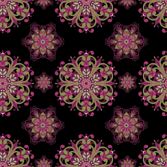
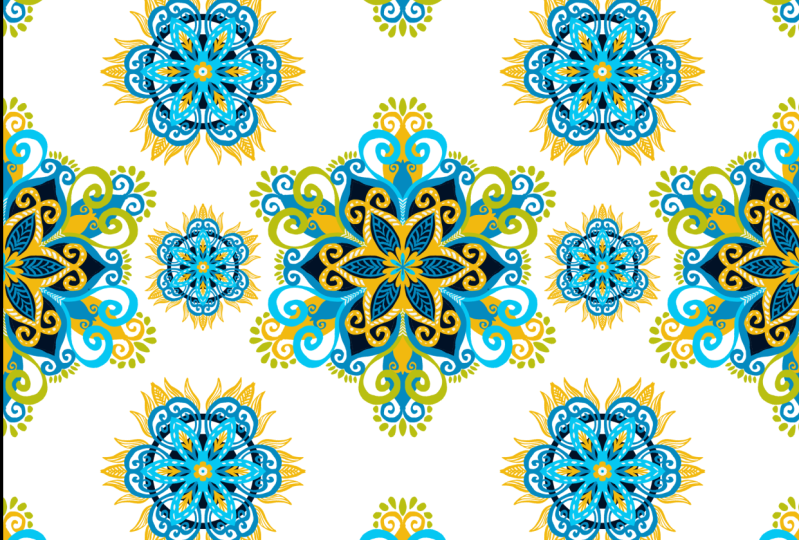
8. Color Modifications: So now we're going to do some color modifications to this one. I want you to go to
the top of the layer and then click on this
adjustment layers. And we're going to click
on Hue saturation. It's going to bring
up this panel here, where if you move these things, you can see the colors change. There you go. And you can move the saturation level as well to increase or decrease
in lightness as well. And then yep you can make it into any kind of
pattern that you want. Whatever means good to you. And once you have it, you
can export it just like you exported the previous file by clicking on Export,
publish and share. And then you can have
the same pattern in multiple different colors for
whatever you're working on. So that's the end of this class. And in next video, I'll talk
to you about Class Perjet
9. Class Project : So the project for this class is going to be super simple. I want you to draw a mandala. It can be this mandala
or any mandala, and you can make a simple
pattern out of it. You can take it up
a notch and put these patterns onto
mockups or onto websites like Redbubble
and upload screenshots of this pattern on products. I would love to see that. If you want to learn more
about patterns, there's another skin
share class over here. So do go check it
out on my profile. And if you create
something, don't forget to share it on Instagram. My name is Print M So Color. I'm also on TikTok by the same name and on
YouTube by the same name. Alright, then. I'll see
you in the next class.
 Ashwini Pandeshwar, Artist, master procrastinator