Transcripts
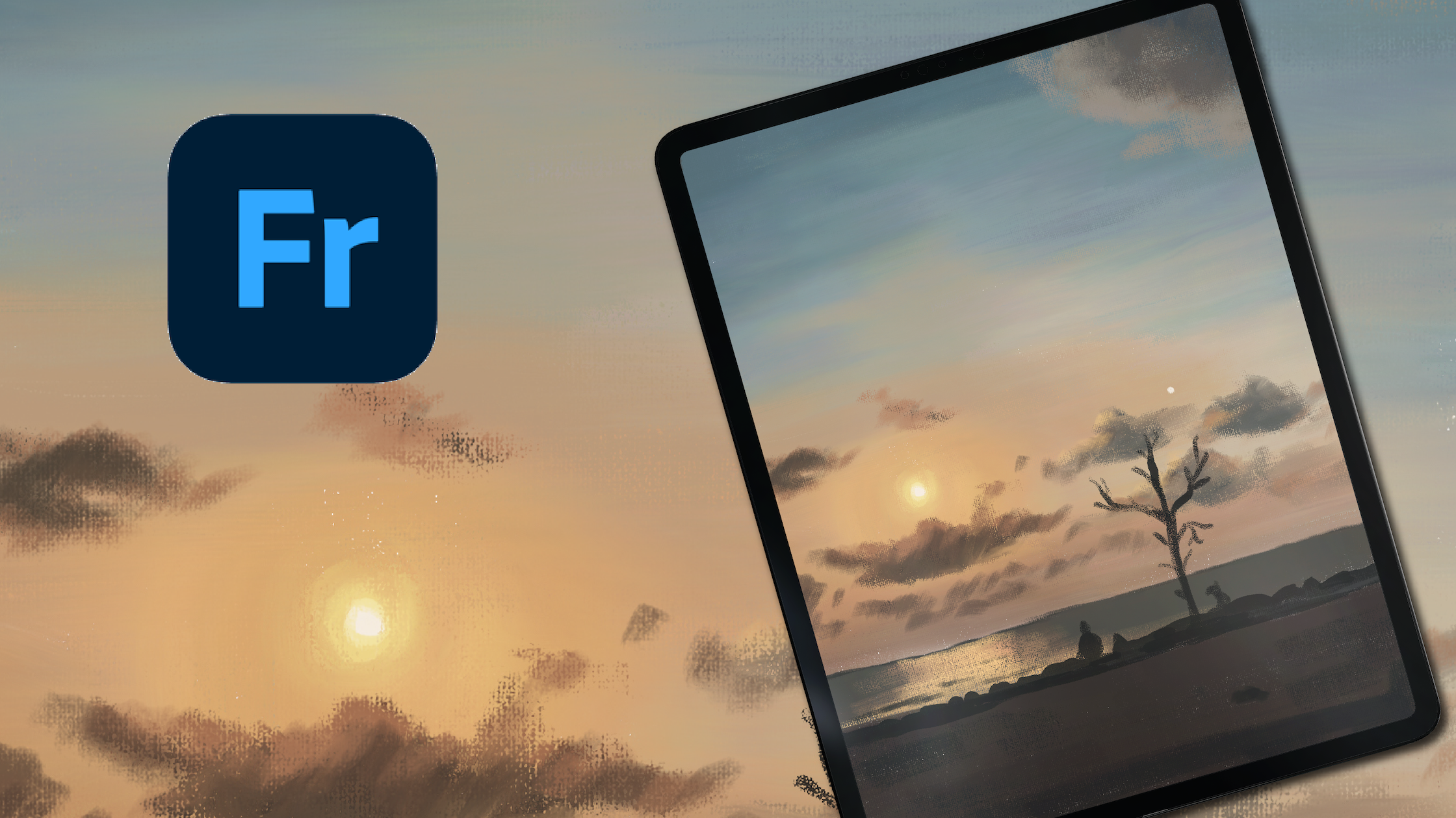
1. Intro : Hello, everyone, and welcome
to a class on how to paint a breath taking sunset
sky using Adobe Fresco. I'm thrilled to have
you here today. Whether you're a seasoned
artist or just starting out, you're in for an
exciting journey. My name is Ashwin, and
over the next hour, we'll dive into the
techniques and tips to create stunning digital artwork
of a sunset sky. Adobe fresco is a fantastic
tool for digital painting, and I'm excited to guide you through this process
step by step. We'll start from
scratch by setting up our canvas and
selecting our colors. Then we'll explore how to
create a gradient effect of the setting sun and blend those beautiful warm tones
seamlessly into the horizon. Throughout the class,
you can see me paint at stroke so you can
follow along with me. Feel free to pause, rewind, or just speed things up. This class is all
about exploring creativity at your own pace. By the end of our session, you'll have a stunning sunset sky painting that
you can be proud of. Let's dive in and unleash your artistic talents
with Adobe fresco.
2. New Update: So as of May 2026, Fresco has changed its UI. That means it might
look a little different than what you see
in the next few lessons. I thought I'll make a update
video for my Fresco classes. So here you go. As
soon as you come in, if I click on Home, this
is how it looks like. Used to see your custom
sizes and stuff over here, but now it looks something
like this, but that's okay. You can click on Create New and create a new document as usual, click on your files, and this is how the homepage looks like. Create new. You have an extra
bit here called the social. You have some social
media templates there, so you can use that. I'll just go to digital
and current screen size. The first thing you notice
as soon as we move here is that the toolbar has completely moved from
left hand side to top. I know I'm not too
happy about this, but yeah, we'll just
work with it, I guess. On the left side now you
have the brush settings. So this is the smoothing
which used to, this is the smoothing,
you go up and down. This is basically the flow
or the opacity of the brush, like if you have some charcoal pencil
and then yeah let's make it black,
and then you do this. This is like you
keep it all high, and then if you keep it all low, you see it's not
flowing so well. This is the flow of the brush, and this is basically the size of the
brush that you have. Again, click and hole and everything else works
exactly the same. The settings are almost
the same as well. I don't think we need
to worry about that. And on the top bar, you have all the other tools
that you used to have. This one is pose. It is a new thing which
is not covered in any of my tutorials, so I'm not going
to go into that. But basically, you have
everything in here, the last tool,
everything's up here. The shapes are still here. Text is again here, and then this is to add your images or photos
and things like that. The eyedropper tool is here and the color palette
is over here. You might see that
the undo buttons have moved here instead of here, but that's fine because your
two fingertaps still work. Also one thing is when you
click on something else other than the brush,
this panel disappears. They used to be your animation
or motion panel here, which has moved up and they used to be shapes like
a ruler and stuff and that has moved into this
bit here or drawing aids. That's what it is, and you have all the drawing
aids over here. Then you have your
symmetry here and the perspective
grid and the grids. When you turn it on, you can have grids and
snapping is here, so you snap everything, I guess. Apart from that, everything
else is exactly the same. And when you go up, you
get a full screen mode. The only disadvantage I've seen is that when you're
on the brush mode, before even if you were in the full screen
mode and drawing, your brush, this was a floating thing which you can move everywhere
anywhere you wanted, but they have disabled that. That means when you go
to full screen mode, your brush settings disappear. So if you want to go back and adjust your brush
size or something, you have to go back in, which I think is not a good thing. The motion settings
are still here, so that hasn't changed as well. And the most important thing that I want to include
is the brushes. Instead of having three
separate brushes, they merge them into
one single brush. This was done a while ago
when you click on brush, you need to go to all brushes, and then you can choose
what brushes that you want, pixel brushes, and then you can see all the subheadings
or whatever. All the brushes are here, but only thing is it's
all bundled up together and that's the most annoying
bit for me at least. I guess that's it. That's
the main change to the UI, and since this was a
significant change, I thought I will add
a updated video. I hope you go ahead and
enjoy the next lesson.
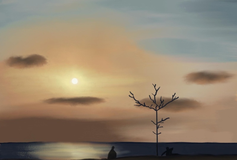
3. Sketch: This video, we will learn how to set up our
artboard and sketch. As you can see, I have my
iPad in the portrait mode. I'm going to go ahead
and just click on create new going to digital and
click on current screen size. Okay, so once I have this, I can immediately start drawing, but I have a reference
image for this video. So to use that and show
you guys together, it'll be a lot easier if I move my iPad into landscape mode. So I'm just going to do that. I'm just going to switch it
up like this. There you go. That's our artboard,
and obviously, I'm going to turn
it so that it fits in my screen right
here. Perfect. You don't have to do
all these things, but if you want to use
the reference image, when you're drawing,
then it's a good idea to actually flip it like
this so that you can keep the
reference image here. I'm going to make sure
I go to settings and then switch off the
artboard preview. What this does is, it lets you put your images right the side out
of the artboard. I'll quickly show
you what it does. Go ahead and download
the reference image. There's no sketch or
color palette for this video because we're
not going to be using any. Once you've downloaded it, click on your photos or files or wherever you have it and
bring it into artboard. That's my photo. I'm going to
click here on this handle, and I'm going to
rotate my 90 degrees. I have my snapping turned on. That is, I'm just
going to click on De now and explain
what it means. You can just go into grid here and click on
snapping and you can turn on snapping and
you can either do 45 or 90 degrees and help
you rotate it very nicely. Okay, so I'm just
going to go that back. Now, I'll go back to the layer. I'll press on select
or the transform tool. I'm going to make it as
big as the artboard. You can use the corners here. Like that and make it as big, and we'll move it right next to our artboard and click on D. Coming back to the topic
that I was talking about, that is the artboard preview. Now, if this was turned on, you cannot see anything
outside this artboard. This is basically what
is called artboard, the canvas or the white space. When you turn this
off, you can see everything that is outside
the artboard as well. Now we're going to make a
very light sketch from this. If you're not really
good at drawing. I would suggest that you keep the drawing right above
here. You know what? Maybe we'll try that.
Go to your image layer. You can see this tiny
image icon here, click on your transform, and you can bring
it back right here. Click on Dan, you
can go to levels. Now we're going to reduce
the layer opacity. This means how well
can you see the layer and keep it at some
level where you can actually see the artwork. Now, make sure you click on
plus and create a new layer. And go to your pixel brush. By default, it's
usually a pencil. If it's not, go to sketching, and then you can select pencil. You can slightly draw
the thing right here. But if I suggest doing this, only if you're really not
interested in drawing at all, because I personally
don't like tracing from images unless it's
something that I really have to because You know, I have to start drawing it
some time or the other. Anyway, if you want, you can
make the sun and then maybe make general the bigger clouds or something if
you want, it's up to you. I'm going to remove the clouds because I want to do it myself. Maybe keep the sun. That's okay. Then once you have
it, you can go and go back to
your sketch layer, hit on levels, and increase
the layer's opacity. Go back here and bring it right next to it. Click on time. Now let's go ahead
and start painting. I'm going to go to the
sketch layer, and again, reduce the opacity
because I don't want it to be so strong. A
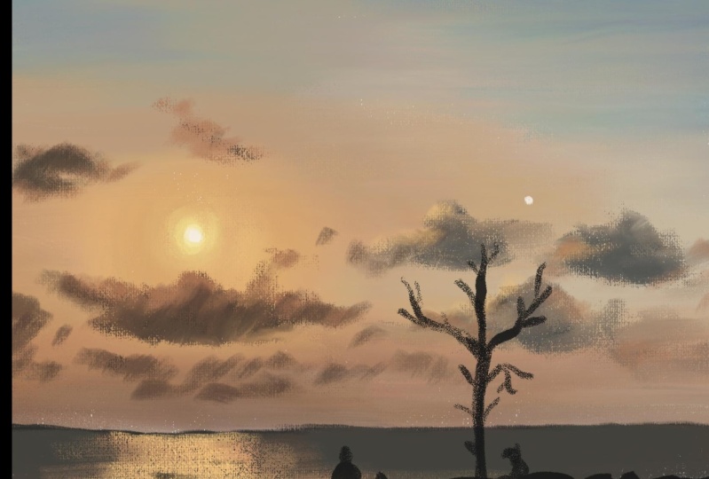
4. Sky Base Part 1 : Now it's time to stop painting. I will be using mostly pixel brushes for
this illustration, particularly if I go into pixel brushes and then
I go into painting, you can see this brushes
called Canvas brush, Canvas brush flat
and Canvas detail. These are the ones that
I'll be using mostly. You can also go ahead
and click on the star next to it so that it
shows up under favorites. So when you click on favorites, it'll be right here and you don't have to go
searching for it. You don't have to go
into painting and then canvas and things like
that, and it's super simple. Let's start off by painting the sky because that's
the main thing over here. So I'm going to go
on Canvas brush flat because that gives a very
nice canvas texture. I'm going to quickly show
you what the settings are over here in case you
don't have it set already. And mine is at the
basic default settings. You can just click on
this button here to reset everything and it
just resets everything. And then my flow, I would like to keep it a
little higher about 70s or so. This one, I haven't touched it. It's at one, and the size is
actually dependent on you, like what you are
comfortable with. So I'm going to keep it a little higher maybe about this
and let's try out. Yeah, it should be okay. Maybe 200 or something. Okay. That looks
better, I guess. Because the higher you make it, it gets more and more pixelated and then it doesn't
look that great. We're going to keep
it around 200 to 300. You can also use this to slide up and down
or click and hold, click and hold, and then you get this and you can type
whatever you want. I'm going to keep it at 240 ish. You don't have to follow
the exact same number, that is 2408 or something. You can just keep it
somewhere around that number. Now, let's go ahead
and paint the sky using the same colors
in this photograph. I took this photo on an
iPhone and you can see that it's a bit pixelated and
it's not of great quality, but we do have some nice colors that are
coming out of it. I'm going to start
from this corner here, click and hold, and you can see that little I'm going to make it smaller so that
you can see that. Click and hold, and you can see this little bubble pop up, and we're going to sellect
one of those colors, and I will slowly paint
that color over here. You sure this is dark? Oh, you know why this
is light. Look here. We're still on the sketch layer. I'm going to undo it
with my two finger tap. Again, click on a new layer, and now you see the dark color. That's perfect.
We're going to go ahead and add the dark color. I don't want you to go crazy
with the brush strokes. I don't want you to
draw them like this. I would prefer that you draw it in this direction
somewhat straight, and we're going to give
some here and some here. We'll be using some mixing tools to mix them later.
I'll show you how. I feel like this
is a bit lighter, so I'm going to
take that and I'm going to add a bit
lighter here as well. This is pixel brushes, they work like acrylic,
especially this brush. You can go ahead and choose colors and give it
however you want. I have a bit of
glare on my screen, so I'm not able to
see it exactly, but I think I'm doing okay. Okay. As it comes
towards this line, it gets lighter and
you can see that. We're going to do
just that and there's a bit of lighter color
over here as well. You see how I'm just not bothering too much about
exactly how it should be, so you don't have
to do that as well. I'm going to add a bit
more lighter shade over here because that's what it says a bit more light there. You can come back
from down as well. Let's do this darker
shade here like that, a bit lighter Make
sure you don't pick the colors from the clouds,
that's really important. We're going to give
that color as well. It's very bright and nice
and orange over here. We have to come back and fix this part later because
you see around the sun, it's a very nice gradient color and we're going to give
that later as well. Go to go pick more and make
it a bit more like that. The more colors you pick, the better your artwork
is going to be. I know it feels a
little like cheating that you're actually picking
colors from the photograph. But hey, at the end of the day, you do what you have to do to get the artwork ready, right? I'm going to put a round like this and I'm going to
start off with the sun. I'll click and hold the sketch
layer and bring it up like that so that I can
see the sun where it is because I want some
really yellowish color. I'm going to click and
hold and pick that yellow. And try to put it on this layer itself and
make it like that. I think it should be good. And don't worry
too much about it. Make sure you don't have
any white spaces, though, because that will bring out the white when we are using
the smoothing tool. So I'm going to fix that. And you can pick up
colors from here itself, if you want to match that
like that, and, you know, just color it off like this. Ones as well. That looks good. Okay, so we have put in our
colors for the sky, and now it's time to smoothen
all out to make sure that it creates a seamless
sky just like here.
5. Sky Base Part 2: All right. Now let's go ahead
and smooth this thing out. You need to go into
your smoothing brush. Go back in here
click again so that you go into the proper brush,
we'll go into painting, and we'll use the canvas brush flat again and then
click outside, and now you have everything
set to the same settings. That's amazing. Now you
have to smoothen this. Again, you need to be careful about your brush strokes here. I don't want you
to go up and down. And you see what happens. It creates this really
weird strokes and we don't want that
to finger to undo. I'm going to go ahead
and try to mix this up. My strokes are going to
be something like this. You can also use your finger. If you're using your finger, you should make sure there's one setting that
is turned on here, your settings, app settings, and in here, you
can go to input. Touch when apple
pencil is at you, your finger will do this, and you need to say
draw with brush. This is really important. Otherwise, your finger
won't act as a brush. You can also do this and you see the finger smoothing
comes out very different. I'm going to use it in the end when I really need
to fix things out. I will just smoothen
things out like this. And what happened there, I picked up some white and
that's why it's like that. And then over here as well, try to smoothen it so that
it looks a bit better. You can also increase this
size to make it nicer, as you can see.
Let's smoothen it. Can you use your brush, your
finger, whatever suits you. And I'm going to come here. I'm going to smooth in
it. You might wonder, isn't the color affecting this? No, it's not. The
color is not affecting it as much as the direction
in which you're going. If I use my brush from this
darker color and move it in, it's going to drag
the dark color. If I use my pencil from this lighter
color and move it out, it's going to use
that lighter color. So just look at what color needs to go
in there and you're going to try and use that color to make sure
it's blending properly. I want this a little brownish.
I'm going to use that. One more thing to
consider is the pressure with which you're doing
this. Light pressure. I'll show you this.
Light pressure gives you this really
light texture thing. But if you use heavy pressure, then you see it's
mixing like this. Depends on what you're
doing over here and you can mix it like that, and make sure you lift up your pencil and
bring it back in. Otherwise, things are
going to get really messy. Here, I want to mix it in a circular motion up
until a certain distance, and then I'm going to go ahead
and mix it up like this. I know it doesn't look like the photograph right
now, but that's okay. One thing you should know is, I am not so adamant or hell bend on
recreating this photograph. I am using this as
a reference image. So I want my art to look
somewhat like this, but my clouds might not look
exactly like that because I am not a artist who is
really good at realism, but I like to
create things on my own from the photographs. And sometimes I do
achieve realism, but it's not always true, and it doesn't make
me feel bad that my art does not look exactly like how it
looks on the photograph. That's okay because everybody has their style and
realism is not mine. It's completely okay. Don't pick up the
white. Whatever here, it takes the white
from the yard pot. Make sure you do
that. I'm going to quickly check if
everything looks okay. Obviously, the photograph
is a bit grainy. I don't want that grain
effect in my artwork. There's one more
thing you should know, the smoothing tool. I know this is a
color in the palette, so it looks purple and you feel like, it's not a big tail. But sometimes when
you're not using any color which is closer
to purple as well, sometimes these odd colors
do show up when you're using the smoothing tool and
you can do that and take it away if you
want. But that's okay. Anyways, I want this
really dark top, so I'm going to go ahead
and click and select that. And I will just add I'm
in the smoothing tool, go back to your brush and add it to the top a
little bit because I think that setting the ski
scene is really important. And I feel like this
will look nicer. Okay. I think my overall sky, the base sky is ready.
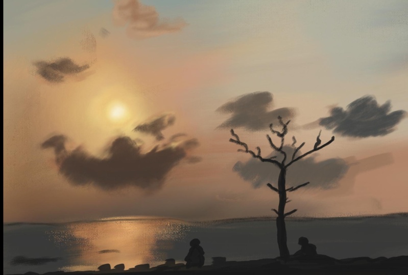
6. Clouds Part 1: Okay. Let's go ahead and
add some clouds to this. We see that there are
a few major clouds like this one right here, very nice and grayish, and we're going to try
adding that first. But I do want to add this
on this screen right now. Mostly because clouds are something which
takes a lot of work, you may not get it
at the first try. I want you to draw it
on a different layer. Can click on plus and
create a new layer. We'll go back to our brush. Let's see if this size
works, probably not. Let's make it a 200 is, we're going to go ahead and
select the darker color here. And then, whenever I click, if you want the same color, you can see the HSP here
and make a note of it, and then you can go here
and click on HSB sliders, click and hold, and then
you can type in here, and then you'll get your colors. And all the recent
colors do come up here. And this, by the way, is the colors that were picked
up from the photograph. You can use that as well, but it gets a bit tricky
knowing where to put what. So that is why I've been picking colors from
the photograph. And as you see, these are the colors we
have picked already. So many colors, right? Okay. Go back, let's
pick up this color. And I'm going to go
ahead and try this out. Okay, this brush is
not bad. It's okay. The size is fine. I'm going
to add some of those. Now, I'll come back and
choose something in between, this is the light, dark, so I'm going to choose that I'm going to add that as well. It's a bit brown, but
that's okay, I guess. Then we'll choose the white
one or the lightest one, and I'm going to add
that in this way. I'm trying to mimic it
as much as possible. But again, it's not
always possible, so I'll just go ahead and
add this This is okay, but I'm not too happy about it. So I'm going to just
add a bit more. I'm using very light light
what do you call it? Strokes like just
touching, barely touching. I want them to mix
here properly, and we won't be using
smoothing tool for the clouds because I think it won't look
that nice, if you do. We're going to try and fix
it using a brush itself. And, it's still not that nice, so I'm going to try and
use this color here. It's a bit orangish
and try to add. Let's give a bit
of pinkish here. You see that over there here,
we're going to give that. And usually these things
look much better when you scroll out and
take a look at them. And obviously, the dark part, and I'm going to layer
it a bit like that and a bit slightly slightly
and somewhat over here. Yeah. I think that's okay. Maybe give a bit
more whitter color and use this cloud at
the edge of the cloud. It's a bit nicer and
I'm going to try and give it here a little
bit, not too much. A little bit and make
it look like that. Does it look at least a
little bit like that? I don't know. I'll
use the middle one. That's why I told you that
these things sometimes take forever and sometimes
you get it at the first try. But like I said, it's okay. We're not aiming at
realism and we'll be okay. Okay. And a bit of Okay. Now, if you move
back and look at it, you should be able to
see a very nice cloud. If you can see that, that's
it, your job's done. I'm going to put a little bit
here so that it looks good. Let me see. That is not bad. All right. Now let's move
and draw the other clouds.
7. Clouds Part 2: And now it's time
to add some clouds. So let's do that now. So I see that. There's a cloud
over here in the corner, so we're going to go
ahead and drop that now. I want you to take
the outside color, like the lighter ones, so I'm just going to use a vector brush so that it creates a different layer
and I can show it you. So this ops maybe white. So you see the
shape is like this. Okay. It's an odd shape, and then there's this
outer ring here, which is lighter in color. I want you to pick this outer
ring color and draw first, so that's exactly what
we're going to do right now and make sure you're on a separate layer
other than the cloud. You want each cloud to
be on a separate layer. Now, go back to your
Canvas brush and I'm going to go into Canvas
brush now because I want to have more details and it's
much easier to control. If you feel you can't control
your brush with this pick, go ahead and reduce
it and make it as b small you want,
do that, I guess. We'll obviously go
to a new layer, and then we'll try to mimic
it as much as possible. So I'm going to go ahead and select the outside
that's the brown color. And then I will try to draw it as much as possible,
exactly like that. Like this. Then like that. Make it small, going to make sure that the
size is not too big. I'm going to increase this
to about 100, I guess, and then I'm going to go
ahead and choose the inside one and mark it. There you go. There you go. And that's it, I guess. This brown here. I'm going to quickly add that here a little bit of slides. And then take the dark again. I don't want you to spend
too much time on this, but if you can, that's okay as well. Now, let's go ahead
and make this one. So I'm going to go
ahead and choose the color so brown and
it's right above here. So I will go up then just
give it randomly like this. And maybe make it a darker over here and take some darker color. Bit. Just a slightly. It's fine. No, it's not. You can use your eraser
and erase it off. That's the beauty
when you make it in a different layer so that
you can just erase it off. So I'm going to go back and
go here and go to my brush, reduce the size
and raw this here. Choose some darker color and
add a bit. That's a lot. That's it. And now let's
make the other clouds plus. Let's go ahead and
make these ones now. It's supposed to
be super simple. Let's go ahead and use
the canvas brush flat, and I'm going to keep it at a lower setting so
that it's easier, click and select the
color that you want, the lighter version of it, and we're going to try
and mimic it like that, and round just
make it like this. You can actually increase it because I want to make
just a few strokes. I am not going to
spend some time, a lot of time
trying to fix this. Let's do dark again. Just like that. Like this. And there's one here. Like that. And then we have here or, like, booths, isn't it? And then we'll go ahead and
choose a lighter brown. You can just click and hold
and choose it as well. And I'm going to add
some here like that. Just a little bit. And bit over here, making
it look a bit better. I'm going to add
a bit like that. I don't want too much here, so I'm going to
go ahead and take that now and I'm going to add a bit to here because it's
a bit darker, isn't it? We're going to add some here
as well. So here as well. I think I'm going
to stop it at that. You can always use your
smoothing boh I think it needs a bit of smoothing up here
because it looks a bit odd. Okay. There you go. And mix it up a little especially
here as you can see. Okay. So now let's
do this main cloud, plus and a different layer. I'm going to go into
this cloud here and see the general size of it or the
shape of it, go to the top. Now we know where your son is. I think my son should
be here somewhere. It's a mood a little
bit, but that's okay. Now we're going to go
ahead and make that shape. Am I in the right layer
smoothing, go to your brush, and make sure you have something like a boot structure
here like that. And like this. And then we'll go and
select the darker color. I'm going to use the
strokes like this to put in some color because I feel like it's
much better like that. I see that it's darker down. And then up and we'll use some really light brown as
well because this one has, let's reduce this 44
or so, this is better. I'm going to add
it on top of it. Obviously, there is some
things here as well I'm add on top and I want to
smooth it out a little bit. Smoothing it out
is bigger brush. Okay, oops. I keep doing that
for some reason. Then I'm going to go ahead and select this one and we'll go back to our brush and I
have it at lower size, and we're going to
go ahead and add some random bits here like that. And don't worry about too much. Let's go to Canvas brush. So that we get some smooth. I'll make it full Okay. I'm just going to
quickly make the shape, but I'm not using any
pressure, by the way. If I use pressure, then
there's going to be a lot of color and we don't want that see I'm using really light strokes so that
I try to get this shape. I'm not going to
worry too much about the way it's turned out
and stuff like that. I'll try to go ahead
and fix this one a bit. I feel like it doesn't have
the yellow that it actually needs the brown or whatever. I'll just go here, make it
a little lighter, I guess. Let's try this. Is
it too yellowish? No, it's okay. Yeah, that's much better. The side and add some browns, light brown. Like that. And I think we should be
doing much better now. Oops not there. Go back to this. Add a bit of yellow
light light light so that there's light
reflecting over here. Okay, I think we have one here, so we're going to
click and hold and go to that and create
a new layer again. I go to make some clouds here. I think there's a lot of clouds, so let's just leave it at that. Now the clouds are ready and now it's time
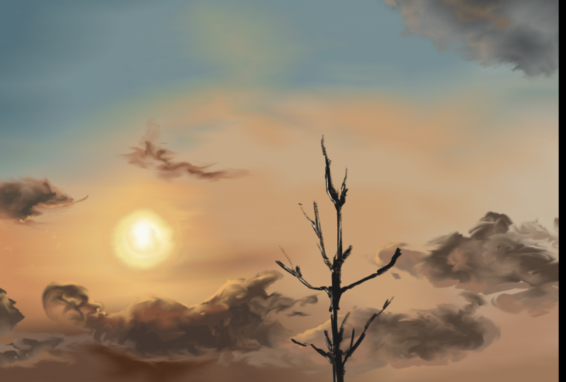
to move on to the sun.
8. Sun and Ocean: Okay. So now let's go
ahead and make the sun, click on a new layer and you
see the sun is bright white. I'm going to go ahead
and click that. I will use canvas
detail to make that. As you can see, the sun is a
little away from our sketch. I'm going to go ahead
and draw it right here in the center like
this. White one. You also see there's
a tiny moon here, so we'll just go here
and draw a tiny moon. That's good. Now
we have to put in the bright light around. I'm going to go ahead and select that white ish color,
lightly added. Now, go back into Canvas brush and then add
it a little bit more. Reduce the size obviously, no. I'll do that as well. Then I'll add this here and a bit of orange
so that it mixes, I'll go to my smoothing tool and I'll try to
blend in like that. I'll bring in the
orange as well, and I'll try to blend in. And go round and
round and round. Make sure you bring the sun
layer below the big cloud, so it doesn't affect it so much. A sun is okay. You
can make it more oranges or anything,
it's up to you. Now, let's go ahead
and make the ocean. Now let's go it to the
top layer and click on plus now we'll make the ocean. See the ocean color is
somewhat like this. Pick any color that you want, go back to your canvas brush, flat and we'll try to increase
it a little bit and then just draw ocean
using that color. And I'm going to go choose
other colors as well, that's a brown. That's okay. And we're going to go ahead
and add those colors. It's a bluish tint here, click and hold and go up, and we're going to
use that as well. And I'm not going to create
the exact same scene as that. I'm just going to go
ahead and draw this. Now I need to put this
nice little shiny thing, so I'm going to go
ahead and click and choose the brightest
yellow that I can find. Then right below the sun,
you need to do this. Plus a new layer and
a clipping mask. Then a little bit here. Add some like this. It's a bit more here, and we'll take some orange here. And let's add some here as well, a little bit of orange. And that's good.
Now, let's go to a smoothing tool
and I'm going to go ahead and mix it
in a little bit. Bring the brown inside. I know we are on
a clipping mask, but it's going to take the
things from the background. It's going to bring
in like this. Now, let's do that. You can make it even more
brighter if you want. Go ahead and do
that. That's okay. I'm just trying to keep it as simple as
possible over here. Then you can also
choose really dark. Yellow, go back and touch up a little bit so that you'll
give it more yellow. I'm going to use the sun color
and see if that'll work. That's too white. So we're going to go ahead
and try this itself. That's good. We'll make
sure we mix it up as well. Then I want to go ahead and
choose the darker color here. You see some are
dark with the waves. Go ahead and choose
that and I'll go back into Canvas brush. It's usually when
it's very tiny. I'm going to add a bit of
dark wave here like that. It's, I'm going to add
very lightly, like that. Just a few of them, and also go ahead and
add here if you want to. But we're going to
keep it at minimum because I don't want to mess up the ocean because we're not
going to keep it all blue. Why? Is this not blue? Okay? Let's see
if this is color. Yeah. That's the
color I want, right? So I'm going to go here, got
to Canvas brush flat and try to make it that color, it's nice blue that I
have. There you go. Now I want a thin layer on top. You see this horizon.
This is darker than this because it's a
little brighter there. We're going to go
ahead and choose that particular color and make it darker and go
back to the layer, which has the
background for the sea. Go back cross and in here, we're going to go
ahead and give you one thin dark layer right behind the horizon
horizon like this. I think it needs to be darker, so I'm going to go
ahead and choose the bluer version and
bring it down a notch and do that and make it really
dark horizon like that. There you go. If you want, you can see some
ships and stuff. You can go ahead
and do that, but I'm just going to skip that part completely and go ahead
and do the sand now.
9. Final Touches: It's time to make the sand. Let's just go ahead and do that. We'll go on top of these layers. Click on plus, click and select to choose some
color. You have that. Go to your canvas brush flat, make sure it's a little bigger, and we're just going
to color it bigger. Let's choose the
slighter color here. I'm going to add that as well. Oh, they look like
same, isn't it? Maybe add the darker
one, and then. So we're just going to
add that lighter color. And I'm going to make sure I cover till the sand
that the sketch. I hope you can see that
and cover it up nicely. There you go, all good. And you can obviously
choose this dark one here and I'll go
into Canvas brush. I'm not going to add a lot of details here, but obviously, I'm going to try and do
minimum as minimum as I could. There's a track So you can do that here as well. I can increase this. I think I'm going to use
the canvas brush flat. That looks better. Yeah, of course. Add some here. Like that. Can add a bit of brown stuff here
and there. Like that. Okay. Add a bit darker here. Okay. That's it. Now let's add the black outline or silhouette of these people. So I'm going to go here, go into your canvas
brush and make sure it's as tiny
as you can control, and let's select that really dark let's go ahead
and make this. Now, this one, I want
to bring it back to a higher opacity so that I
can see the skyline properly, go into a new layer for
sure, let's fill it in. And if you cannot fill
the people, that's okay. We'll use a tiny brush. You can also go into a lot of
other brushes, by the way. It's going to all in painting. You can go to blade or something and try to
fill it in as well. I'm going to undo this, and
I'm going to fill it in. I'll increase the size so
that this is nice and dark. And obviously, we need
to make the tree. This looks like a dog instead of a person, but that's okay. Okay, I think our
tree is good as well. Now, check the sketch, and you can see your
complete painting. And once you're done, you can go back and
hide that, go here. And it goes back like this,
so I'm going to flip it. And once you're ready,
You can click on Share, publish an Export and Export
as and you can select JP whatever you want and
export it onto your device. You can also click publish an Export and Taxpot then you can actually see the timeline or time lapse
of this document. You can see how you were
drawing everything, if you want to edit your artwork or if you want to learn from it, then you'll know how to do that and it shows up very nicely. Obviously, it's going to
export in this format, but you can always go ahead and take it out in
whatever format you want. Click and done done. Then That's it. That's the end of this class
and I hope you liked it. I hope you create some wonderful
wonderful skies as well. I've collected some sky
reference images for you guys, and I will put it in a folder
and share a link with you. I hope you go ahead and
try those skies as well, and you create your own
and share it here with me. I'm also on Instagram, so you can find me on
print me some color where I actually paint
with traditional media. I also do tutorials on YouTube. I really hope you create
many more skies and always, when you're drawing, don't get demotivated when you
look at it close by. Always keep it away from your eyes and see how it looks
because most of the time, they look stunning when
you're not close to him. Anyway, I hope you have fun and I'll see you in the
next class. Bye bye.
 Ashwini Pandeshwar, Artist, master procrastinator