Transcripts
1. Intro: Hey, there. Welcome to mastering digital watercolor
with Adobe Fresco. Hi, I'm Ashne an artist who's totally obsessed
with watercolor. I love playing with real
watercolors and then finding ways to transfer
it onto my digital canvas. I'm super pumped to take you on this fun journey into the
world of digital painting. In this class, you
learn how to use Adobe Fresco's live brushes to create awesome realistic
watercolor effects. Play with waterflow and
pigment spread just like the real thing and ways to make your art pop using
textures and splashes. It doesn't matter if you've been painting forever or
you're just starting out. If you're curious about
digital watercolor, this class is for you. By the time we are done, you'll
have the skills to create stunning and digital
watercolor art and a portfolio full of pieces
you'll be proud of. Grab your iPad or any device
that Fresco works on, fire up your Adobe Fresco, and let's create some beautiful,
colorful art together. Can't wait to see
what you guys create.
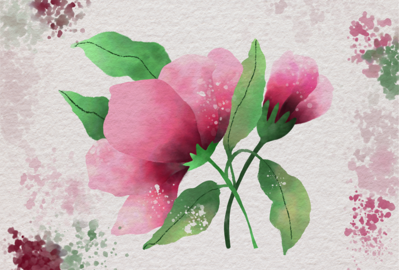
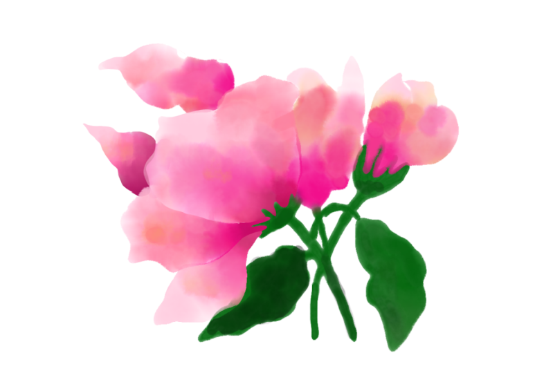
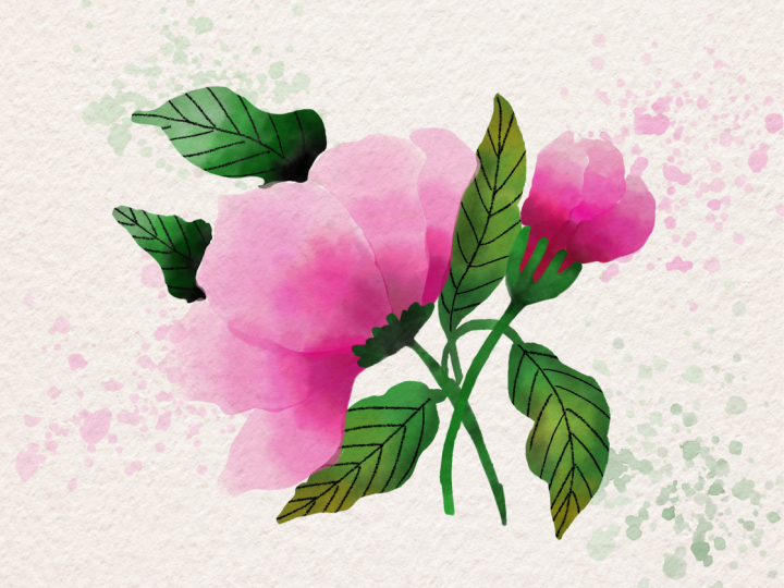
2. Class Project: So let's start off with
the class project, which is going to be this. So we're going to be drawing a botanical watercolor
illustration with Atop Fresco with
or without splashes. You can also choose to draw your own botanical illustration using your own reference
images and sketches. That's fine, too, but
don't forget to post your project in the project section so that I
can take a look. And yeah, I love looking
at what you guys create. All right, then, let's
jump into the glass.
3. New UI Update: So as of May 2026, Fresco has changed its UI. That means it might
look a little different than what you see
in the next few lessons. I thought I'll make a update
video for my Fresco classes. So here you go. As
soon as you come in, if I click on Home, this
is how it looks like. Used to see your custom
sizes and stuff over here, but now it looks something
like this, but that's okay. You can click on Create New and create a new document as usual, click on your files, and this is how the homepage looks like. Create new. You have an extra
bit here called the social. You have some social
media templates there, so you can use that. I'll just go to digital
and current screen size. The first thing you notice
as soon as we move here is that the toolbar has completely moved from
left hand side to top. I know I'm not too
happy about this, but yeah, we'll just
work with it, I guess. On the left side now you
have the brush settings. So this is the smoothing
which used to, this is the smoothing,
you go up and down. This is basically the flow
or the opacity of the brush, like if you have some charcoal pencil
and then yeah let's make it black,
and then you do this. This is like you
keep it all high, and then if you keep it all low, you see it's not
flowing so well. This is the flow of the brush, and this is basically the size of the
brush that you have. Again, click and hole and everything else works
exactly the same. The settings are almost
the same as well. I don't think we need
to worry about that. And on the top bar, you have all the other tools
that you used to have. This one is pose. It is a new thing which
is not covered in any of my tutorials, so I'm not going
to go into that. But basically, you have
everything in here, the last tool,
everything's up here. The shapes are still here. Text is again here, and then this is to add your images or photos
and things like that. The eyedropper tool is here and the color palette
is over here. You might see that
the undo buttons have moved here instead of here, but that's fine because your
two fingertaps still work. Also one thing is when you
click on something else other than the brush,
this panel disappears. They used to be your animation
or motion panel here, which has moved up and they used to be shapes like
a ruler and stuff and that has moved into this
bit here or drawing aids. That's what it is, and you have all the drawing
aids over here. Then you have your
symmetry here and the perspective
grid and the grids. When you turn it on, you can have grids and
snapping is here, so you snap everything, I guess. Apart from that, everything
else is exactly the same. And when you go up, you
get a full screen mode. The only disadvantage I've seen is that when you're
on the brush mode, before even if you were in the full screen
mode and drawing, your brush, this was a floating thing which you can move everywhere
anywhere you wanted, but they have disabled that. That means when you go
to full screen mode, your brush settings disappear. So if you want to go back and adjust your brush
size or something, you have to go back in, which I think is not a good thing. The motion settings
are still here, so that hasn't changed as well. And the most important thing that I want to include
is the brushes. Instead of having three
separate brushes, they merge them into
one single brush. This was done a while ago
when you click on brush, you need to go to all brushes, and then you can choose
what brushes that you want, pixel brushes, and then you can see all the subheadings
or whatever. All the brushes are here, but only thing is it's
all bundled up together and that's the most annoying
bit for me at least. I guess that's it. That's
the main change to the UI, and since this was a
significant change, I thought I will add
a updated video. I hope you go ahead and
enjoy the next lesson.
4. Setting up: Okay, so now that we
are ready to draw, let's go ahead and begin
with the basic things to set up the artboard
or our drawing space. I'm going to click
on Create New, and I'll go into digital and click on current
Screen Size. One thing you
should note is that my iPad is in the
landscape mode. So obviously, my current screen size also
shows up like that. So if you're using it in
the portrait mode and you just want to change
this orientation here, click on this tiny arrow
here to switch to portrait. And then click. So I have a sketch and a color
palette for you guys, so I want you to go ahead and download it from the
resources section. And once you have it,
we'll bring it in here. Usually, it'll get stored
in your photos section. If not, it might be in files. So mine is in photos, so I'm going to click
on this image icon and go to my photos and
bring in the sketch. Once it is here, click on done. We need to do a tiny
setting adjustment for this, so go into levels. Click on this and click to multiply. This is
the blend mode. It changes the way
the layer behaves. So now, even if you go below this layer and try
to draw something, you can still see it, although
it has a white background. I'll just go to that layer with a sketch and
turn this to normal, and you see you can't really
see what's beneath that. But if you put it as multiply, it automatically shows
what's beneath that layer. And that's exactly what
we need because we are going to be drawing everything below this layer sometimes. And I would like to have that option to be
able to see things. You can reduce the opacity of the sketch by using
this layer opacity here so that the
sketch is not too strong and it doesn't
disturb your artwork. I'm going to keep
it a little higher because so that you guys can
see it through the screen, but keep it as low as you want
so that you can get nice, crispier, cleaner
watercolor painting. I'm going to click.
I'll go here, click and clear this layer
because I want this empty. Now it's time to bring
in the color palette. Again, go into your
photos and bring it in. Once it's here, click on done. It's below the
sketch layer so you can see the sketch
through, but that's right. So once you bring this in, if you go into your colors
here and go into recent Sb, you should be able to see the colors that it just pulled out. You see this says Image
3419, that's this image. Obviously, there are
a lot more colors than here, but that's okay. We can just pick and choose. This is from the sketch.
So if you don't want it, click and delete palette
just to reduce the cloa. If you don't see this
automatically pull up, there's a setting that
you need to change. So go into settings,
go into app settings. And under general, you'll see something called as
AutoCreate Color Palette. Make sure it's turned
on, and then you can go back and bring
in your image again, and then it'll automatically
create the colors for you. And if none of this is
still working for you, you can pick the
colors yourself. Make sure you're in
one of the picks and brushes. Doesn't
matter which one. Click and hole to choose that color and then gently
draw on the artboard. You can just scribble a line. That's fine. And
check the next one. Scribble. It's going to create things on a
different layer. And once you have scribbled
all the colors that you need, click and delete layer.
Or you can hide it too. I'm going to go ahead and
hide the color pilot. Let's go check our colors. The colors that you
picked and drew, you need to make a line on your artboard for that
color to show up here. Are these colors? One thing you should notice is there's
this HSB sliders, which tells you the exact
number of the colors. So if there's some
color that I'm picking and you want
the exact same color, you can copy these numbers
onto your color thing as well. So you just click and hold, and it gives you a keypad
where you can type the colors. One thing I do want
to mention is that the colors that get
pulled out might be very different from the
colors that you hand pick because I have no
idea why that happens, but there's a minor difference. For example, this is 50, 97 and 95, and this
is 4595 and 95. So there's a slight
difference, but usually, it doesn't matter much, so I usually tend to
keep it as such. At the most, I change the
brightness level. Match things. One of the major things that comes to mind when you're doing watercolor digitally is the texture of the
watercolor paper, and you can achieve that
by bringing in a texture. I do have a couple of textures for you guys in the
resources section. Go ahead and download it. And once you have downloaded it, we can apply to this art port. There are two methods
to add textures. One is you can add it in the
beginning and then start working on your florals or
you can add it at the end. I would highly recommend that you add it
in the beginning, especially if your
texture is toned. That it's not pure white, but it has some I don't know, slight bit of yellowish tinge
or a grayish background. You know, if you
have those things, I want you to bring it in in the beginning so that you know, like, when you're drawing
or when you're painting, you know how your
colors look like. Usually, otherwise, what
happens is you are bound for disappointment because you
make a really bright painting, and in the end, you
bring in this gray or not exactly gray,
but not pure white. Watercolor texture,
and then it makes the whole painting look
completely different color, bit muted, maybe. And then
you will not like it. So instead, bring in
the texture first, and then you can
start working on it. So download the
texture and we'll bring it in. Go to images. I have mine in file, so I'm going to go ahead
and bring it from there. There you go. And
as you can see, it is slightly different, like a great tinge to it
than the original one. I'm going to pull these
corners to extend it beyond the artboard because I don't want these white
bits in the end. You can use your two fingers to go back and forth like that, and use only the corners, not the middle ones here. And once you have everything
covered, click on tone. And now we're going to go
ahead and make the same thing, click, and we're going
to make it multiply. That's because we just
want the texture. We don't want the other
background details from it, and we also need to be able to see the watercolor
that we draw. And the main idea
night now is to draw everything beneath
this watercolor layer. All the layers should go below this watercolor texture layer. You can add more than
one watercolor texture, and it will just
overlap when you use the multiply feature. For example, I'll
bring one more in. Okay, there you go. This
is a different color, so I'm going to
go ahead and pull it all the way out
and click on Done. And we can go here and
click on multiply again, and you see this has changed the completely different color. But there's also
this layer opacity, and you can edges this to modify your colors
and everything. So I'm going to hide the
one that was pure grayish, and I think I like
the pink one better, and you can see the
texture coming through. You can also increase
it if you want a darker texture like this. If you don't want it, reduce
it, it's totally up to you. It's your preference,
by the way. Okay, so we have finished
setting up our artboard, and now it's time to draw, I'll see you in the next lesson.
5. Lasso : So now that we have
everything set up, it's time to start drawing. Idally it would have been
nice to include a lesson completely dedicated to tell you about all the different kinds of watercolor brushes we have, but I believe in
learning by doing. So we're going to
illustrate this while learning about all
the watercolor brushes, how to use them, and they are different settings.
So let's begin. I'm going to go into my
watercolor brushes here, and then you have watercolor. You can try to remove this from here and pin it somewhere, but I generally don't like to do that because I want
my entire artboard, so I'm going to
click on cross here. I will just use this
to check what I want. So one of the main things with digital watercolors
is have to get crispy edges because
not all brushes will give you crispy edges. If you've never used
watercolor brushes with Adobe Fresco, you should know that this is one of the coolest things you'll find because it behaves
like watercolor, like it really flows and merges
and colors in like that. See how nicely it spreads. So that's the beauty of this. Use your two finger
tap to undo things. Okay. And one of the
challenges that we face with these watercolor brushes is
how to get crispy edges. And throughout this class, I'm going to show you
multiple different ways to get crispy edges
with watercolor. And we're going to
use all of them in the drawings so that
you can pick your favorite and use them in all your process. All
right, so let's begin. We're going to start
with the flour, and I want you to go below the texture file that
you just brought in. Anyway, it doesn't
matter anyway. And then click on
plus blank layer, and we're going to
choose a brush. So we're going to use
watercolor wash flat. Let's select that brush, and this is the brush setting. That is the brush size. You can either go up and
down while you're on it. The maximum it goes
is fight well. That's the setting, or you can click and hold and then
type in the number. Now, this one is the amount of paint on your brush,
that is flow. I usually like to
keep it around 70s. It doesn't matter 76, 77 or 70, but usually not at 50 because I like to have some
paint in my paintbrush, but also not completely full
because then it becomes too dark and doesn't
give a nice effect. So I'm going to
keep it around 70s, and this is the water flow. What this means is the amount of water you have on your brush. Again, this one, I
like to keep again in the 70s because I feel
like that works great. But if I'm doing some
details and stuff, that time I like to keep it way below so that I don't
have to worry about, you know, too much water
flowing in everywhere. So if you do this,
now this is 70, and if I go all the way down and you see it
doesn't move at all, so I'm just going to
show you how it moves. It doesn't move in here, but it moves because there's
a lot of water in there. Basically that two finger tap to undo and use three finger
to redo if you want. You can also use these
buttons, by the way. Alright, so let's
begin with the petals. And we have chosen our brush. We have put our setting
at the max 512, and I've shown you
all the settings. This is a feature
called draw inside, which will not be
using for this brush, and this one is the setting. And I will talk
about this later. Let's go into colors, and we're going to pick. Oh,
there you are. I'm just going to
delete this, click and delete palette,
click and delete. Alright, we're going to
pick some light pink now. So maybe this and I'm just going to make this
bright turf 100. You can use this arrow
to open it up like that. And now, to begin, you can just color like this, but you see, it's so hard
to maintain that edge. So I'm going to go
into my selection too. Make sure you're in Lasso. Like, if you click, and
then if you click again, it'll open this menu,
click on Lasso. And we're going to go ahead
and carefully select this. You can lift your finger up
like this and then continue. It doesn't matter because
it'll still work. And make sure you
join the edges. And once you have
it, you might see either like this
the marching ants, or you might see
selection overlay. So this is better for the tutorial purposes because then you can see what
area is selected. Now let's go to our brush
that we already selected. I have to reset the water
flow all the way up to 70s. And now let's draw up here. I'm not putting a
lot of pressure. If I put pressure, you can see what happens. I don't want that. So I want to put
light pressure so that's light bit of color. Now, go ahead and choose a
better pink, darker pink. Let's make it 100.
It's 344, 50, and 100. I'm going to add it a
bit over here like that. And let's choose
even darker pink. Maybe this one. And
you see like that. You can also in between
choose to dry your layer, click on the layer and
go down and dry layer. And now if you try to add, you can see it creates a
completely different kind of petal kind of effect.
That's good, too. And we're going to
use the dark red, maybe make it darker, like that. Go add some black, by
the way, in the bottom. Or you can click
here, select black. Gonna add a slight
bit of black here. There you go. And once you're
happy with your petal, if you're not, I feel like this could blend a little bit more. So I'm going to go
into my touch thing that I have, double click. Click so that the
center is selected. And when you draw, it
gives in pure water. You see the pure water here, so it just puts in pure
water and tries to mix it. So this water, like
how much water you're going to put depends
on the setting here. So make sure that it's not too low and then you can nicely fit. And see, even if
it's moving out, it doesn't matter
because you have the selection tool to help
you keep it in place. Gonna go back to my color, double click to get out of that. And if you don't see touch here, go to your settings and make sure touch
shortcut is turned on. I'm going to add
a bit more pink. I feel like it needs
a bit more color. And then we are good to go. Okay, so once I'm
happy with my petal, like how it looks
like, I can kill conti select. And there you go. Make sure you go
ahead and uncheck your sketch to see
how it looks like. It definitely has really
nice crispy lines, which is perfect for
what I was going for. And now I'll bring back the
sketch by clicking on this I. Let's go ahead to the
level below, plus. We're going to do the rest
of the layers like that now with all the selection
tool that we can use. I'm going to try to make it as close to the
edge as possible. There you go. And I can select multiple
things in the same go. That is already closed,
so I'm going to go ahead and use this one here. I have two of them selected. Can also select more up here. But let's do this
because this flower, we're going to use
a different method. Alright. So I'm going to go
back to my watercolor brush, and I use the same
colors because I don't want too much of a change. And you see, I'm going to add some brighter colors and
add some pink up here. I forgot the lighter pink. No, let's add that as well. And then, obviously, we want
some dark red, no, this one. And then and you can choose
black and drops and stuff. I like to add these
tiny drops like this because it kind of gives that I don't know
if you can say it. I kind of gives a
very nice effect. And sometimes I like to go
ahead and give some white. Mainly because it
makes it look dull, like, really, really light
pink, as you can see. And I don't like this invert. I'll use the marching ants because my eyes
feel so better now. And once you have it, deselect. And we're going to go to
our next layer and do this. Because if you try to draw
it on the same layer, it's going to mix with
the watercolor there, and then you'll have
um amalgamation. Have a mixture of colors. But if that's the look you're going for, go ahead and do it. Nothing wrong with that.
It's your drawing, your art. You should make it. However you prefer to make it. Alright, I'm gonna
put some white, I guess, and then pink. It's mixing with a white there. Just make it like a
little darker here. Alright. That looks good. Oh, I forgot this one,
so I'm gonna go ahead. You don't have to
deselect, by the way. You can just go ahead
and do this. Like that. Going to go ahead
and mix, mix, mix. Make it all pretty, add a bit more color.
Okay, there you go. Once you're done,
click on deselect, and you can see that your
first flour is ready. And if there's gap here, you can just go to that layer, so you can figure out
which one is what by clicking on this and be
in your watercolor layer. And just put that so that
it blends in a little bit. Mm. That was too
much. You saw that. So just a little so it goes
and joins in like that. And we have fixed Everything. Alright. So now, plus, we're going to go ahead
and add the stock to it. So for that, click on plus, and we'll add the stock. Let's get back the sketch. Now let's do the stock. Let's choose a green
color. Where are we here? Any light or dark
green doesn't matter. And then, obviously you
want your selection tool because we are doing
that method now. And we're going to go ahead and select our stock. Go
back to your brush. Let's draw it in. I want
it to be a bit darker, and then I'm going to go
in black because I want a darkish green tinge
in some places. And I see that it's a bit Okay, no problem. D select them. Our first flower is ready, and once you have
it, you can group them together for easy movement, so click, click on
select multiple, and we're going to select
everything that makes up this flower and fold it up. There you go. And our
first flower is ready. So in the next one, I'm going
to show you how to draw the second flower in a
completely different method.
6. Basic Watercolor Brush: Alright, we're done
with our first flour, and now it's time to
make the second one. Click on plus to
create a new layer. And we're going to use the
brush called basic watercolor. One thing you notice with the basic watercolor
is the brush shape. So with the
watercolor wash flat, you saw that the brush shape
was something like this, so it's harder to get
crispier nicer edges. But with the basic watercolor, the brush shape is a
nice little round. And you see the nice
little edge that you have. So it's much more easier to get a better shape with this brush. And so we're going to use that. Let me go ahead and
pick the color. That's the light
pink that I have. And my brush setting is at 76. I want to check if this
is the right size. Maybe a little smaller, maybe around 60, eight, 70s. Okay, that's good. That looks nice. And
my flow is set at 100. I'm going to reduce this
to about 79 80 ish, and my water flow is at 53. That means it has less
water on it. Not bad. Maybe I'll make it around 60s. And I'm going to try it now. And, yes, that looks nice. I'm going to go ahead
and put slight changes. I'll reduce the
opacity of the sketch so that I can see what
I'm doing better. There you go. Yes, go
back to your layer. And now we choose pink, and it's blending nicely, so darker pink a little bit. There you go. I'm going to
draw the edge again now undo. And the reason we will be using this brush
instead of using the Lasso tool is mainly to
get these organic edges, which looks like
it's watercolor. So in here, you see these
very straight edges, and sometimes it's
not nice to see that, and sometimes you want
these organic edges. And then this brush is a
very good option for that. And you can choose red
or black, whatever, and then gently draw in your pattern like
that. That's good. Let's go to the next layer, go below that and plus to
create the next layer. And let's do the same over here. Begin by gentle strokes, can lift your pen up and then draw again. It
does not matter. You don't have to
do everything in a single stroke to
get those edges here. Gonna use a bit
of black up here. And my sketch is very light, and it's a bit harder to
see, but that's okay. And now I'm going
to go again and plus to create a completely
different layer. And let's do the same
thing over here. And I want a bit of red in here. That's a bit too red up there. Let's make it here
and a bit of pink. Adding a bit it's going
to add a bit here. Okay, so our petals are ready. You can quickly check it by hiding the sketch,
and I like this. I really like how it has turned out and see the difference
between these two. So ideally you would draw an entire painting using only one technique
because then otherwise, it might look a bit inconsistent
like this one here. This looks very different from
this if you look closely. But this class is all
about teaching you stuff. So yeah, we're doing different methods
for different things. So once you have that, I want
you to go to the top petal and click on plus bring
back the sketch, obviously. Go to that layer. We're
going to draw this one now, and we need some green. And obviously, this size
will not work. It's too big. So you can go ahead and use the basin watercolor
brush itself, or you can go to
watercolor round detail. So you can see this
brush is tiny, but it is kind of detail. Like, it's really good to
put in details, as it says. So my size is at 48,
which is very tiny, and I think that works really well to put this detail once, and you do get crispier
edges with this as well. The flow is at 70 or
the paint is at 70, and the water flow is at 78. If you're not getting
the exact effect with the watercolor
brushes as mine, I want you to go
into the settings here and click on this here, which is Reset button. So what this does is it resets the brush to
its original settings. So in case you have
modified something earlier when you
were experimenting, you might have changed things. And maybe that's why you're not getting the same effects as me. This will help you reset that, and then you can go
ahead and change these things to
whatever I was using. Like, it's 100,
maybe make it at 70. You can keep it at 100, as well. It's too dark, but
I don't like it. Again, 70s and then
you're ready to draw. I can't see the sketch, so I'm going to bring it
up a notch like that, and I'll go to my
layer and I try to draw this in like that. And I'll fill it in. Of course, I'll get a bit of my darker
blackish or green dark green. You can get dark green as
well and add a bit here. We're going to go ahead
and make this tok here. And I'm adding a
dark green here. I'll go take my light green, and I'm going to add
a bit here as well. You see it nicely
mixes with your green, and you can also give in
a very nice edge in here. That's perfect. There you go. We'll hide the sketch and check our flower, and
there you have it. If you feel like this is not good because you can
see the petal through it, you can just go back
here and fill it in until you feel like
it looks much better, sometimes because the
watercolor layers are very transparent. So this happens. And
in our next lesson, I'm going to show you how
to fix these kinds of issues like where the bottom
layer is showing through. So that's the third
method which is going to answer or fix these
issues for you guys. Alright. See you in
the next lesson then.
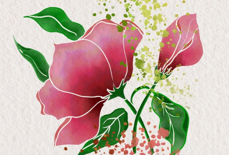
7. Clipping Masks: Okay, we're done
with two flowers, and it's time for
the third method, and this is called using
the clipping mask. So before that, let's
group this one together. Click, select multiple.
And group them together. Now, plus for a new layer, and we're going to
draw some leaves. So let's go ahead and
choose a pixel brush. So you have different
kinds of pixel brushes, and depending on the kind of texture that you
want, you can use those. Some of my favorites are under
dry media and hot pastel, which is what we're
going to use today, or the other one is under inks, Belgium comics, one of my
favorite brushes of all times. So you can use that as well. And if you want a
gritty texture, you can use the
brush and gritty. But no, we're going to use
the hot pastel under dry dia. For colors, we're
going to use plain white because that's what we
are going to give, alright? And then we're going to select brush size depending on
how big or small we want. We have to use this to color,
and only then we'll know. I'm going to change the color because I see that I
have a white background, so it's not going
to show up at all. So you can choose any
color that you want, but let's choose
something a little like that because we're going to go change it to white later on. So maybe some grayish
color like zero, zero, 81. And the brush setting is at
keep it as low as possible. Check how well you can draw with that size and then reduce
it as much as you want. I'll keep it at on 60s. My flow is at 87. This does not matter so much. Smoothing is always at zero
or one. That's the lowest. So now I'm going to
go ahead and draw the general shape of the leaf
that we're going to cover. And we're going to
fill it in. Like that. You can also use vector
brushes, but then again, it won't give you these nice texturally edges like you
get in this technique. And I'm going to
draw one more here. It's okay if it's going about
the leaf above the petal, I mean, because we're
going to move it later. And then we want
this one, as well. And obviously, in
here, it's ie thinner, so we're going to make
it a lot thinner and we're going to bring
it in like this. And I think it's just like that. Join up. This one joins here, I guess, to that
stock. That's good. And I want to fix it here a bit because it doesn't look
that great. All right. And make sure you fix
the edges as well, like the corners of the leaf. You don't want them
in a weird shape. I have all of my thing set. So now you can go ahead
and choose white. So go ahead and
fill it with white. And now you can see that you have put in this
new layer, right? Now, click on plus. And we're going to use the
clipping mask here. Tip. So now what this does
is the clipping mask. Whatever you draw on this layer, it's going to show
up only where you have elements in this layer. So if you draw something
here, for example, I'll go back to my
watercolor brush, I will again choose a
green, and I draw here. You can't see anything, but
there is green on that layer. So if I remove this,
you can see it. So we're going to draw so that only on this
leaf layer now, I'm going to show
you how to do that. Let's go back to a
different brush now. You can use watercolor wash soft or I'll go back
to the wash flat, and I'm going to reduce
it about 300 forth three, four, zero or 44. Okay. And then my
water brush, I mean, the water flow and the flow or the paint is going
to remain the same. We're not going to change
that. Okay. All right. And I want a really pale
green, maybe this one. I'm going to add it
in the top here. And you see I'm
adding it over here. Bit like that. And I will
choose a darker green. G to add a bit like that and maybe some
yellow this color. And here and there,
why art, right? And obviously, we need
some darker green. Let's go ahead and pick a
dark green 120-49-6305. I'm going to add that
here in the corners, and just add it up here. We're going to add it
everywhere here as well, up here as well. And you see it's
flowing in everywhere. So you can just color like that. And it acts like
your selection tool. But the only difference
is in selection tool, you'll get absolutely
crispy edges because of the way the
selection tool works. But with this method, you can try and choose
what texture you want on your watercolor
because the bottom layer, the paint or the brush
that you have used, if it's really highly textured, then your watercolor painting will be also highly textured. And I guess I am good
with that. Might be okay. And I want a bit darker color
right in the center like that where the lines or the veins of the leaf are
going to show up. Alright. So this looks good.
I'm going to go ahead and hide my sketch
to see how it looks, and you see how the nice
texture has come up. That looks pretty
nice, isn't it? Only thing is we need
to blend this a little. Okay, and now we're going to
add the lines that we need. I'll bring back the
sketch just to show. I'll go on top of the layer where we put the watercolor
and click on plus. So this will come
up as a new layer, and you want to click
on clipping mask again. So this does not become a clipping mask on
the watercolor layer, but it becomes a clipping
mask on the bottom layer. In this case, it
doesn't matter so much, whether it's a clipping mask on the watercolor layer
or the bottom layer, so you don't have to
worry about that. So that's really
important because if this was a clipping mask on
the watercolor layer, it can come up as lighter. But because it's on
the darker layer, because the brush that we used had higher flow, higher opacity. Watercolor layers are thin
and transparent, you know? So it's better that it
shows up like that. I'm going to probably do a
sketch. Go to your layers. And again, you can use
different kinds of things. I like charcoal,
charcoal pencil. You can also use
the rough pencil and y media. Rough pencil. Use that as well. No problem. I'm going to stick with the
dark green that I have. Or maybe let's use
the rough pencil. I'm going to use a rough pencil. It's at 12. Let's
check the setting. The flow is at 90, the
smoothing is at one. I'm going to go ahead and draw this. Let's draw this like that. Alright, so we're
going to go ahead and do that for the other
leaves as well. Okay, our leaves are ready,
and let's group this up, select multiple and
group up everything that makes the leaves
and fold it up. Now, I want this below
the flower layer, so click and hold,
and you can go all the way like this
and drop it in here. And now let's uncheck the
sketch and take a look. And there you go. This is what
your leaf looks like now. If you want to go and edit it, you can double click
here to get into the group and go here
and add lighter bits, whiter bits, whatever you
need with your brush again. And it'll still
work. It won't go outside because it's
still a clipping mask. That's the beauty of this
because it's better than the Lasso tool or selection tool because you can edit
it later as well, because here, once
you deselect it, that layers gone, you
can't edit it so well. But with this, yeah, that's the Puri You can
still go ahead and edit it, and it'll look pretty nice,
still, and wonderful. There you go. If you want
to get out of the group, just click on this
here to get out. Going to bring back the sketch. So in the next lesson,
I'm going to show how to draw these two labs in our final method for creating crispy
edges. Let's do that.
8. Eraser: Okay, so now let's draw these two leaves and use
our last and final method. And that is the eraser, too. Let's go ahead and go below
this big flower here plus. And we're going to use
any brush that you want, let's use the watercolor flat. You can also use the flat roll. Let's use that. And I'm
going to go into my brushes. The setting is at 2:26. Flow is at 100,
maybe make it 89, and the water flow is
at 60. That's cool. We don't want too much
water flow for this method. And I will choose the light one I think you might already know
what I'm going to do next. So I'm just going to add
these layers one by one and make them all
nice and clean here. And it's going to go out a
little bit, but that's right. And then put that in like that. Okay. So once you have
this, you guessed it. We go into the eraser tool, and in here, we can choose
different kinds of erasers. So my favorite ones are hard round variable
and brush tilt. So with this brush, it's a bit harder to
control the edges. You got to use a very
nice brush setting here. So, for example, this one, it didn't come out right, right? So I'm going to undo that. So I would like to use the
hard round variable. This is what I use mostly, and you can see that you
can increase the size. The flu the flu is at 83, smoothing is at one, and we're going to gently
erase this edge off. So this usually works when you have to do
tiny little areas. Definitely not something
that you would want to experiment with when
you're drawing a leaf. But, yeah, this is a perfect way to show you guys how to use this method.
So I thought, why not? So you go ahead and
gently draw around the shape that you want
to erase and erase the s, obviously, and go
ahead and draw this. So everybody has a favorite way. I've seen some of my students
come up to me and say that they actually love this
eraser method the best. Because apparently some people actually like erasing
the excess off. So yeah, choose your method, whichever method that you want. And then there you go. Your leaves are ready. And now to add the
extra details to it, plus and clipping mask, I think I left some here. Wait, let me just quickly
try to erase it. Hm. Okay. So clipping mask, and
we'll go to our brush, and we can use the
rough pencil again. It's better to use
the same one and then go to your darker
bed and let's draw this. You can't see the lines
here because it's the same color as
the bottom layer. All right. There you go. And now let's uncheck the sketch because we don't
need it anymore. And this is your final drawing. And you see that there are different different
ways in which your stalks look
the different ways in your leaves look like. See, this is the one with
a texture which I love. And this is one without
but clear crispy edges. And yeah, they're
different kinds. And the last bit is we're
going to add some splatter, and we'll do that
in our next lesson.
9. Adding Splatter: So let's add some splatter, and we're going to
add some splatter on top of all our drawing, but below the texture layer because we want the
texture, right? So let's go into our brushes
and select wet splatter. So this spatter brush
works in different ways. So it really depends
on your settings. I'm going to go ahead and
choose a bit of pink, maybe. And then let's go into settings by clicking on this icon here. So I want you to
quickly click on Reset so that you're at
the same point as me. And then I have these
settings here where I've increased the spacing a
little bit between things, and I've also increased the
scatter between these dots. So it's 87. You can click
and then type in 36 and 85. The shape dynamics, the
size jitter is 100%. That is, like, a
smaller and bigger. You want a lot of small and
big ones, so you do that. Angle Jitter is like the way
in which the brush is turn. That is angle control
is, again, pen tilt, so you tilt it in
different directions, and you can control how
it works. We did we go? Pressure dynamics. I
have set the flow to 100 for pressure in size
to a little bit extra. That means I don't
want the size to differ too much when I
put in a lot of pressure. I want it to pay
remain the same. But the flow, obviously,
it'll make it more watery, or it'll make it more darker when I put a lot more pressure. And then the velocity dynamics, I haven't
changed anything. I think this is the default. The flow I've set to 100, the water flow I have set to 60, and then you can see
the splatter like this. If you put thin splatters, you see them there,
but barely visible. Do you see that?
Barely visible, right? And if you put this splatter on the flowers that
are already there, for example, here, I'm
going here to experiment. If I put it, it's going to splatter and mix with
the colors over there. And that's really nice. And there are some
watercolor artists who use this method
traditionally. Like, this is what
happens, right? When you put splatter
on a watercolor paper, like in real life, they go
and mix with the watercolor. So if you want that effect, I want you to go
ahead and do this, and that'll create a really
nice effect, as well. I go back here, go to my layer. I'm going to choose
some darker bits. And put in some color here. That's a lot of splash, I guess. That's a bit tiny.
And I'll hold in. Hold it in to make it darker. And I want some dark green
probably coming out. Don't put too much because I feel like I sometimes
envy too much. You can just add a
bit here and there, very light, subtle ones
as well, and it's okay. And there you go. I think our artwork is ready. And once it's ready, it's
time to export this. In the next lesson, we
learn how to export it and also learn how to get
our time laps over weighted.
10. Exporting Artwork: Now that your artwork is
ready, click on Share. If you want to
view a Time lapse, click on Preview Time labs, and then you can view it here or export it depending on
what you want to do. So this is my entire time laps
of everything that I did, and then you can get it and
edit the video as well. And then otherwise, click on
Share and publish Export, and you can click on
Export As and give a name here by typing
in, you can select PNG, JPP PSDPE of whatever you want, and click on Export and save it on your device or send
it to wherever you want. That is a great
way to export it.
11. Final Thoughts: So that's the end of this class, and I really hoped you liked it and learned something
new about watercolor. And you can make absolutely
gorgeous artwork with that, something like this, flamingos, or something as simple as this bunch of berries. So, yeah, I hope you will
like to experiment and post your project down here
in the project section. And I would really love
to take a look at that. Alright. I'll see you in my next
Skillshare class then. Bye.
 Ashwini Pandeshwar, Artist, master procrastinator