Transcripts
1. Introduction: Hey, my name is Zulu and I'm an oil painter from the
great state of Arizona. And welcome to my class for painting the highlights
and the details. In this video, I'm gonna be sharing with you my
techniques on how I build up highlights and how
I go about painting different highlights on
different types of surfaces. I'll be demonstrating
how to pay on shiny surfaces using
highlights to contour subject. It's building up highlights
and also lettering. I have found that these
paintings techniques are great and have helped me to become the painter
that I am today. And if you're interested
in learning these, then this is the video for you and go ahead and
watch this class.
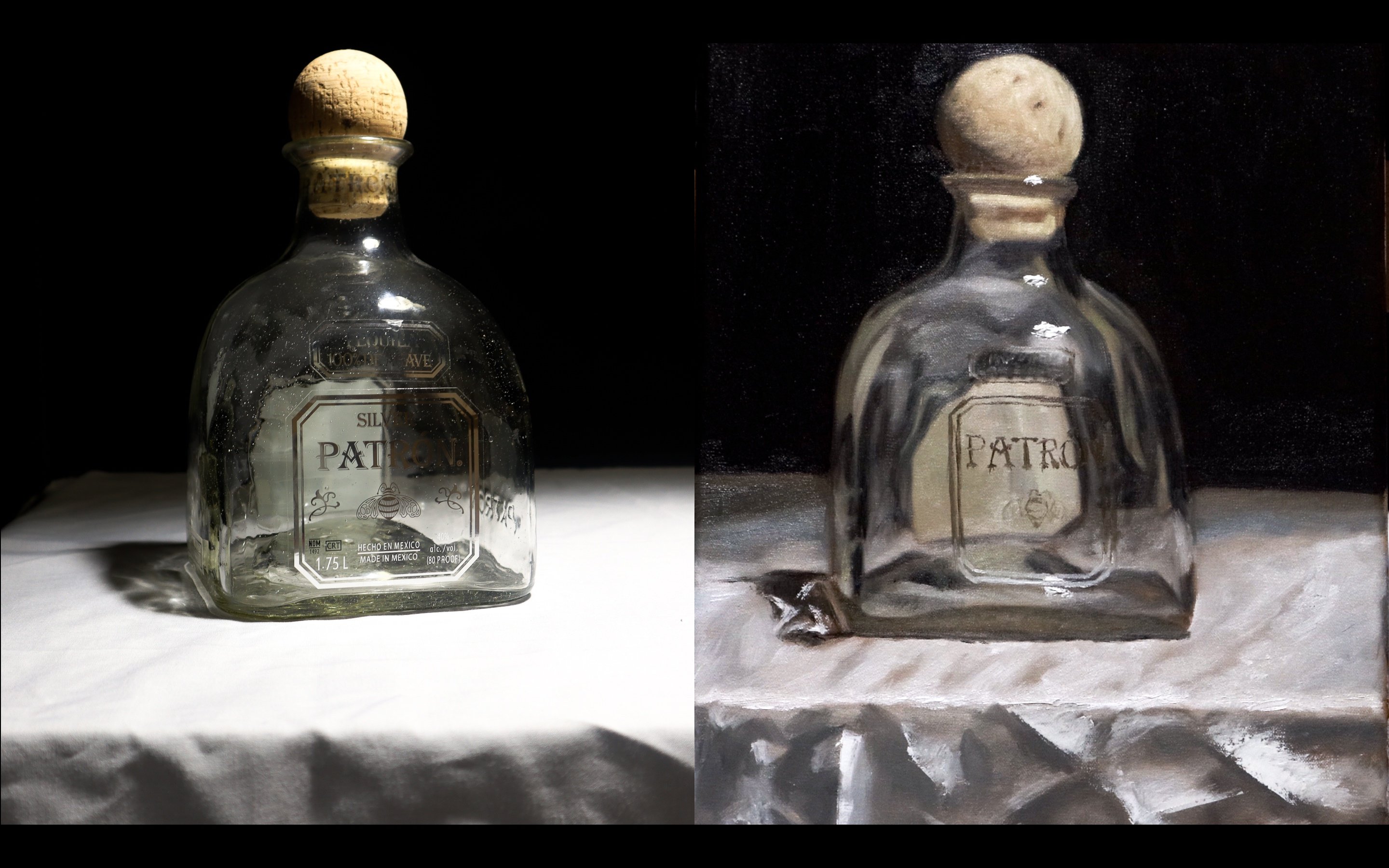
2. Building Up a Highlight: So here is how I
build up a highlight. In this section. I'll be demonstrating with
just one round brush, a small round brush.
If you were wondering. This is a glass surface
that I'm painting, the bright highlights are
gonna be really bright. And but I can't
just jump straight to it. I have to build up. What's on the brush right now. Is not total. Not a pure white, but a little muddied up
with a touch of gray. I save the best
highlight for last, which is what I mean
by building up. When you think
about a highlight. He never want to think. I just need to put white
on the tip of my brush and just put it on the area that it looks like
in wherever my references. One that may lose some of the, the realism if that's
what you're going for. There's less depth. What I'm going to
make sure I'm doing is for the highlight is making sure my
strokes are confident. And it looks like I
intentionally put them there, which I am intentionally
putting there. But you have to be confident in your stroke because it will be, It's pretty hard to remove the highlight once
you've placed it. Now I've probably moved
closer to a pure white. And I've put it where the reflection is on my
subject in the background. Then I'm painting
from I put it there. But it's kind of
dispersed throughout. Not just one spot highlight. It sort of fades out. I've put the pure white, right where the brightest
part of the highlight was. I sort of spread it to create
that disperse light effect. Now when you paint something, you want to make sure of course, you notice all the places where there's consistencies
in the highlight. That's same type of highlight. Those up there at the top
is very similar to this. Highlight this down
here at the bottom. Again. I believe some pure
titanium white. Put it in the brightest
spot in sort of spread it to fill in that
highlight area. And down here on
the bottom left, I had a residual
white on my brush. I lightly placed it on
that bottom left corner. And so it wasn't as bright. And there it is.
3. Contouring with Highlight: Here is an example of how I use the highlight
to help form the subject. Now, this may be the hardest type of highlight to accomplish,
in my opinion. Because in this case, you have to help form a subject with a very small
range of value, meaning that the darkest value, the darkest dark that
you're going to use, is going to be a
very light value. That color that I'm laying
down there is a mixture of different greens or blues. But that's also possibly going to be my
darkest value there. Now this happens when there's either direct
light on the subject or the subject's just not much
definition in the subject. Therefore, you have to use
a small range of values to help form the subject. The different curvatures
of the leaves, for example, in this example. Now the key to this is
to see the subtleties. Pay close attention to the different subtle
changes in the value. And if you didn't know a value, what I'm referring
to when I say value, it's simply how light
or dark the color is. Like I said, I'm not using a just titanium white out
of the tube just yet. But I will get there. Again. I'm building up the highlights to make sure
I get the depth that I need to display the
three-dimension of this plant. Now to see the the highlights, just not one big highlight. Because from a distance
that's what it looks like. It's just white
all over the top. The plant surface. What I do is close one eye. Look like get closer. Makes sure I see
all the subtleties. And then I go from there and
ends up working out for me. Now this plant was easier. The light that help form
this plant was just on the top edges of it. So all I did was
line that top edge. And as you see, I'm not
going in a straight line. I'm kind of tapping the brush on and off of
that of that surface. This is by virtue of the plant itself having spikes
on it and spines. Now you can achieve
the detail of having little spines
or spice needles. Something like this,
simply just by altering the stroke and not
going into a smooth line. You don't need to worry about
each individual needle. Which is one of the great
things about painting. The brain fills in
what's not physically there with like just by seeing the little gestures implying that something's there. You don't need to always paint exactly what you see there on yours in
your reference. Express, what's there
in your brushstroke. And it will appear as if it is there when looking
at the painting from a distance as it's
supposed to be viewed. Now adding those highlights
hope to bring out that glow. The plants, which wasn't, it didn't seem present before because that highlight
equals liking. But I did all the dirty
work first and forming it, forming the subject,
That's shadows, the mid tones and all of that. That all I needed to do
is apply the highlight. Just focus on that. And they brought the
whole painting together. That's how simple it
is to form an object. Using highlights.
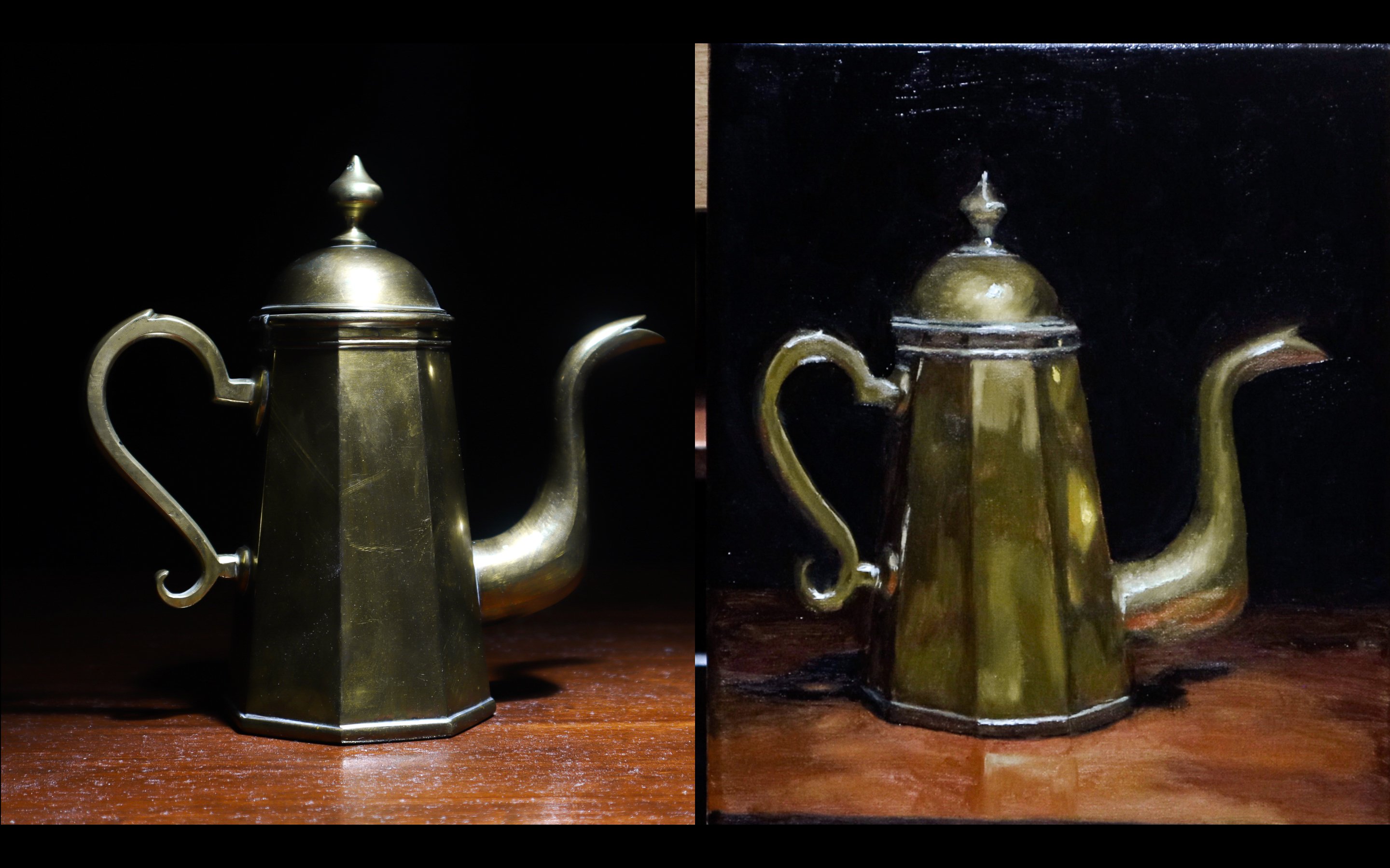
4. Shiny Surface Lighting: Now it's time for the fun part. For me, which is painting
those bright spot highlights. Now even when doing this, there's still a buildup
that has to take place. Before I go straight to those bright white highlights
on these shiny surfaces, I have to use a gray color because I'm
dealing with a black surface. Gray sort of made a
transition to the highlight. For us to have to use this
gray color just to build up to get to the point
where I can just use that titanium
white out of the tube. The reason I say this
is the fun part is because the great thing about
highlights, in my opinion, is you spend so
much time forming your subject with the shadows and the mid tones
and just all of the, what I like to call
the dirty work. Finally, after all those
hours of painting, finally, you get to
come to the point where all you need to do is
add some highlights soon. As simple as using one color. In this case, which now I've moved on to almost pure
titanium white color. I'm just applying it to the middle of that transition
color that I just used. It gives that illusion
that there's detail. That there's a lot
more detail than there is simply by just building
up to that highlight. Now on these surfaces, this aqua and golden
sort of bead. I get to have the luxury of just adding that bright white
highlight on top of it. No buildup needed. Because that reflective
of a surface, shiny of a surface already would just pretty
much a brushstroke or two per, per shape. Made that painting that much better than that
much more detailed. The satisfaction that comes from just the finishing
touches being just adding that last highlight
is a great experience. You guys will love it as well. Now as we get more
into the background, as I've constructed
this painting for the highly detailed views
to be in the foreground. And it kinda blurs out as we go to the
left and to the bag. Just get smaller
with the highlight. Maybe a touch less bright
with the highlight. But continue the same strategy that was used for the previous. That's what I did. For these gold pieces
of the bracelet. I've already laid
down the groundwork, all the yellows and browns and that gold in
the darkest parts. And all I had to do was take, you guys know how shiny gold is. I just added that titanium white to parts that of
course the brightest. And it gave the effect as if it was actually
reflective gold. Here for this cross. Same, same rules apply. Adding the bright titanium white to the groundwork that
I've already placed there. Here I'm going a
little random with it. Just holding the brush
at different angles to get different lines,
different diets. Because there's a lot of a lot of sign to this
object and it's not smooth if there's multiple
shiny points in it. So just to give that illusion of a sort of
diamond like sine affect, the light just seems to
continually bouncing around. I just put tiny dots of white some places different
shapes away, others, and eventually it gets to a
point where I'm fine with it. Now you guys see how far the painting came just from applying these
bright highlights. It was as simple as applying a base color or a
transition color. Then the highlight. And even on some
of the subjects, I didn't even need
a transition color and just add it the
white street to it. That, that's the
beauty of painting. Highly reflective or a
shiny objects such as this.
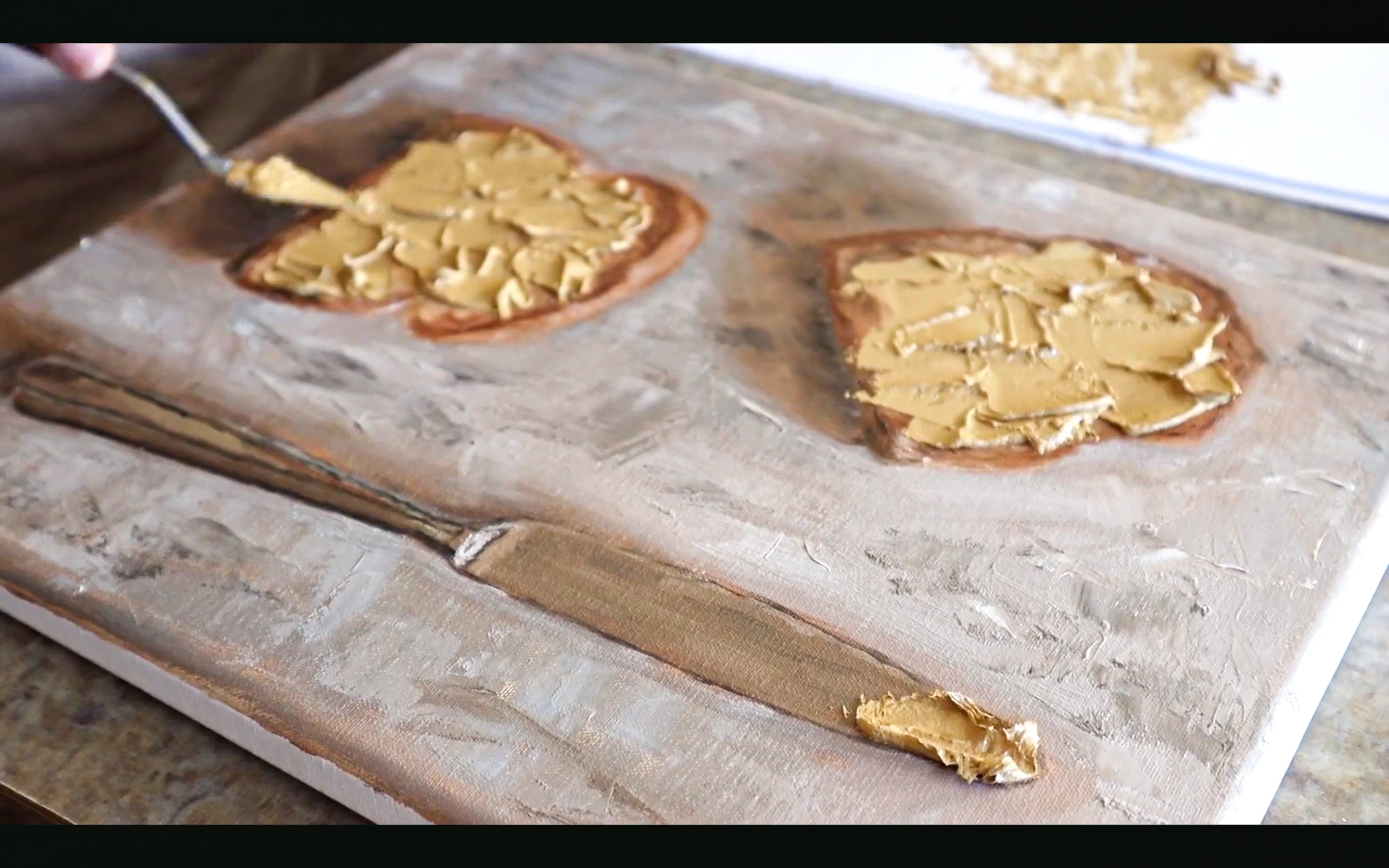
5. Textured Highlight: It's time now to place
texture highlights. Now this is the
type of highlight where usually is an instance where I just need to apply titanium white to
the surface to finish it off. There's something
is that bright. I'm using a palette
knife for this. This is the best way I've
found to go about this. The reasoning behind
the palette knife and applying it on thick is because when you have
this much paint is easy for it not to mix in as much as if you use the brush. Now using a brush, the colors tend to
want to mix together. But using the palette knife, adding a lot of paint onto it, the tip of it gives
a lot of control and places a unique texture onto whatever subject
you're painting. Another cool thing about
this is with this control, this stiff object like this. I can control the eye, can make abstract marks, which is good in this case because an orange
has texture is, has a lot of bumps and it has very textured
of the surface. Just adding this
abstract texture on the surface gives the illusion that there's also texture
going throughout. Just based off of the highlight. There's no real method to
the madness here is just applying the texture and just trying to make it
as random as possible. But again, I'm being very confident and
intentional with my marks. Now when using this
palette knife and thick, thick amount of paint, it'll be very hard
to remove any of it. So it's more important now than ever to be
intentional with your marks. Now there's different ways
to use the par knife. For highlights. This is a round objects, so I kind of have to play
around to contour the surface. But if I had a sharp edge and there was
a highlight on the edge, simply just paint on the
edge of the palette knife. Put it right up against that, that's flat surface or that straight line
of a surface and just start at the age
and push the pen across. Another reason you may decide
you wanted to do this, because it creates a
separation from the background when from Maine or increase
a separation in general. That elevated paint off the surface gives
the illusion that more light is hitting it
and actually lit room, a well-lit room,
more light actually will reflect off that highlight the lightest areas. Think about using more amounts
of paint in the shadows. The paint surface
being more flat, maybe possibly using more
medium in that area to keep it, keep it a flat consistency. Which is what I've
done in this painting is made my brushstrokes are really visible in
the lightest parts. And then the shadows
made it really smooth and more consistent,
flat texture. And it gives the illusion of realism that we're
looking for here.
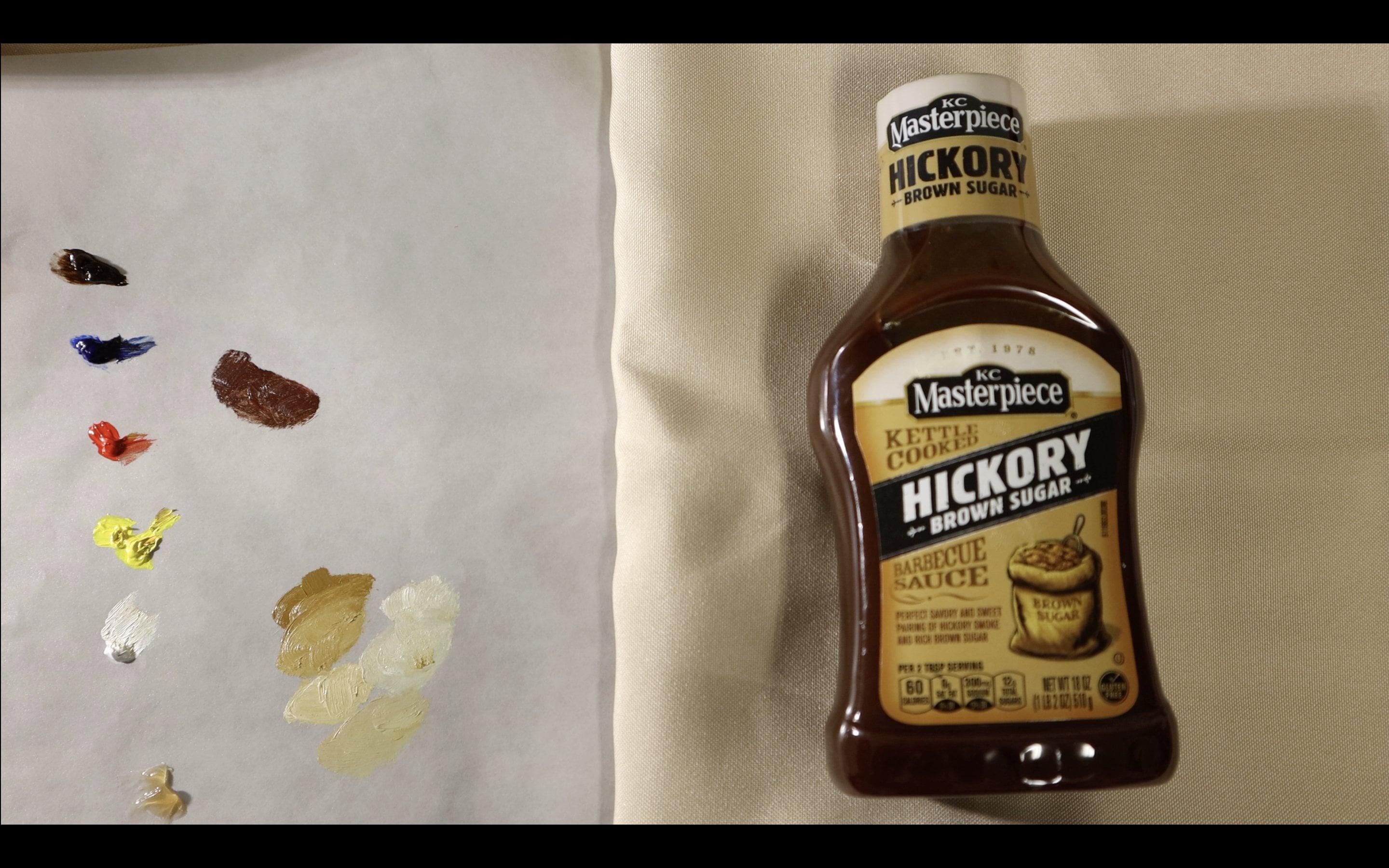
6. Lettering: Lettering is probably the hardest
type of highlight to do. At least for me,
for some people, is probably fairly easy, but I find it
difficult because one, my handwriting is
terrible to begin with. You can't, you can't
paint like you write. Just due to the curvature of some letters and the way
that the brush moves. It's not practical to paint letters in the
way that you would draw or write letters. On my brush, I have
titanium white. And then I'm painting here
is a bottle of ketchup. So I'm just writing
the brand name. Where you have to do
when you're doing this is break the letter
down into sections. So that was easy of course, because it's just
three different lines, two vertical and one horizontal. But for the letters
like the u and the n, you kinda have to break
it down into three parts. Then add, add the details
to the curve later on. Another thing, when
windowing lettering, makes sure that you know how the lighting is
on your surface. They are, you're painting on. For example, the light. This image is going from
the left to the right. I'll be more heavy
handed on the left. Then when I go to the right, you can accomplish this by
just doing it off the bat. Or you put a base layer
down first like this. And then later on go over
the light side first and gradually less white or whatever color you're using as you go to the side
with less light. Now when it comes
to smaller letters, sometimes you don't even
have to get the font right or even the letter shape right? To convey the, convey the message that
there's words there. I know that sounds
unreasonable at first. But just the idea of words being there makes it look
like words are there. That's sort of that illusion
that I talked about. When I'm talking about the
way that detail works. There's an OH, which
doesn't really. Again, when the letters gets the smaller the letters
get the list of fine. They need to be not
only because it's harder to define those
letters as they get smaller, but because it takes less to convey the message that the letters are there
when they are smaller. But obviously when
the letters are bigger than it needs to be
clear what the letters are. To show the show the full word. I'm trying to be so focused. You can see my hand shaking, trying to be precise. Take it from me. You don't
have to be the most steady handed to be good at painting or putting
highlights are being exact. You just need to
put the marks with confidence enough to convey
the message that there is, in fact some sort of
word that's there. But it doesn't have
to be understood. Just the idea of it. This is a wet surface
that I'm painting on. So this is a wet on wet. So make sure your
brush is loaded. And again, this is a
small round brush. And this is how I go about
lettering on painting.
7. Final Thoughts/Class Project: If you enjoyed the class, feel free to send me
a comment or view, or even do the class project, which for this class will be
to use any of the techniques they learned from this video and create highlights on a
three-dimensional surface. It could be a basic
three-dimensional surface or a complex one. But I just want to see the way you've used these
is to create a highlight. That would just be great. On that note. Thank
you for watching and see you in another class.
8. Check Out My Art Work!: If you enjoyed this class and you want to get to
know my style better, follow me on Instagram
at the toned canvas.
 Jaleel Laffitte, Painter