Transcripts
1. Introduction: Hey, my name is Joe Lula feet and I'm an oil pencil
from Phoenix, arizona. And welcome to my class about modern oil painting and
painting unique textures. This class is for those
who maybe not a pain, but once learn more about mediums and exploring
some of those, we're in the textures. I'll be showing you and
demonstrating to you what tools you will need
to create textures. I'll also be showing you how I, it's on a canvas and how to create a sketch
for the painting. And also different ways
of applying texture and using different
mediums to achieve that. I'll be using three main
mediums for this course. And those three meetings will be a perfect starting point
to spark your interest in exploring and
creating some of these unique textures
for yourself. And if that sounds
of interest to you, then this is definitely
the class for you.
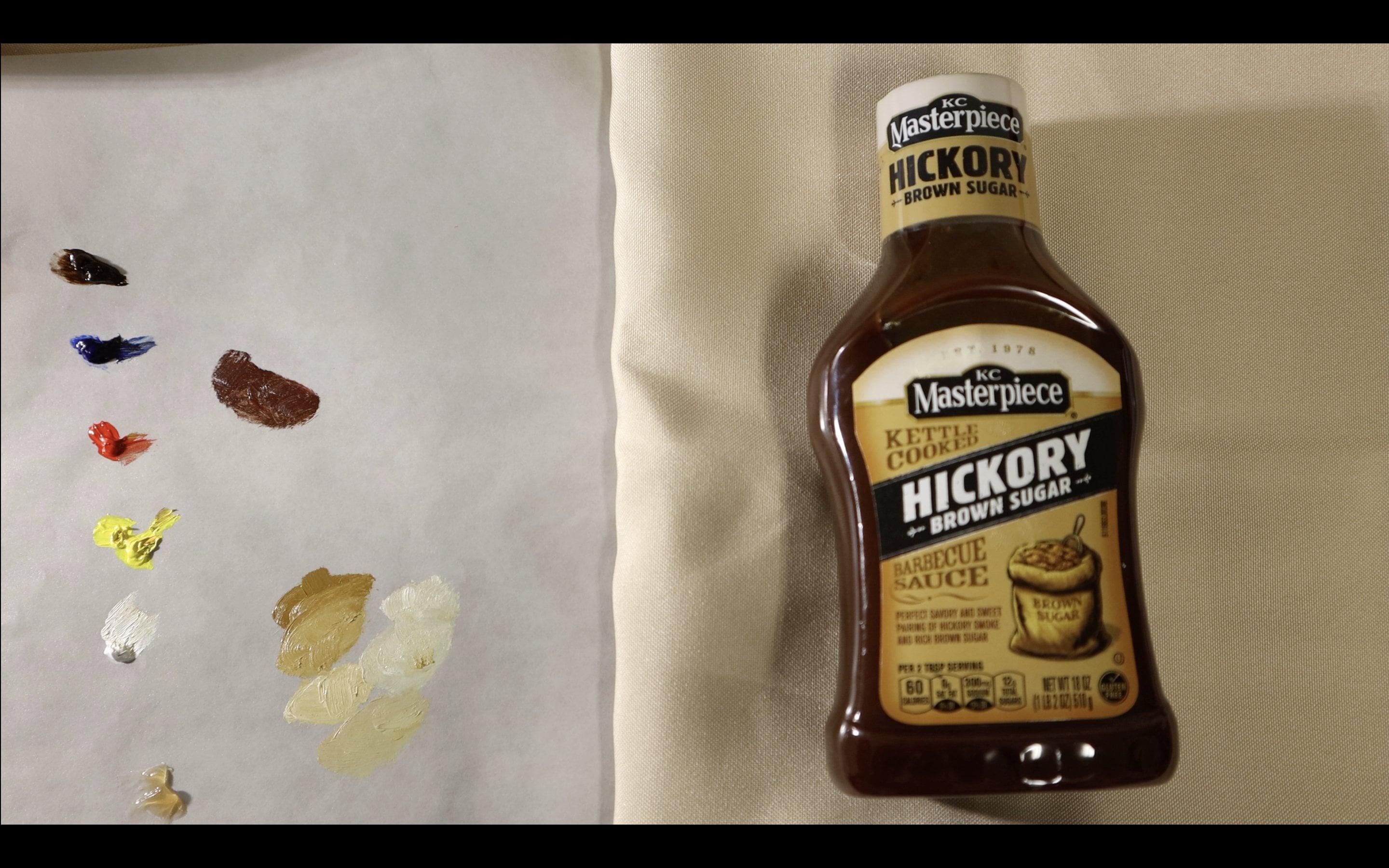
2. Set up and supplies: So these are the materials
that you'll need to participate
fully in the class. You're going to need
some paint thinner. It will either go buy paint
thinner, brush cleaner, odorless mineral spirits.
Any of it will do. I like to use just
odorless paint thinner, the brand that I
showed previously, the Mona Lisa brand. As long as it thins your
paint down, your good. Also, one of my
favorite things to use for probably any painting
is liquid original. I use it for every
painting, you know, makes everything stretches out the use of the paint
as much as I need it. And of course, pretty
much the star of this video is this liquid, Oh, Leo pasta medium gives it a
nice matt thick consistency. And it'll be great for
whatever you wanna do. Of course, you'll need some
palette knives to apply larger amounts of paint to the canvas or whatever
material you're using. You know, any, any palette
knife should do as long as it's whatever's
comfortable with you. And you want to just experiment
with the wave spreads. Just go for any palette
knife you want. And this is my setup is it's
just a canvas easel and, you know, some decent
lighting and that's pretty much all you need
to get started.
3. Underpainting: Now it's time to talk
about the under painting. If you've never heard of
an underpinning before. I guess this understandable
was sort of like the foundation of the painting before you even begin
adding any color. And is actually very
important step. It helps you find the
true tone of a color. Because right now
when will I have this stark white canvas? Is just, it makes everything. It makes dark colors same. Like darker values
that makes like if you were to put a ultramarine
blue or darker, more pure blue on a white canvas that would
actually almost look like. So. That's on every Canvas before
I begin painting on it. It just helps with
seeing the values. And also another benefit to it. If you know you paint
something that you don't cover all the surface area
of the painting in some of the canvas
shows through it. At least it'll be
a whatever color you use under attendees,
warmer colors. So at least there will be a warm undertone to my paintings. There won't be all
those white speckles showing through the painting. So of course that's another
benefit to Tony, your canvas. So all you're gonna do to turn your Canvas is just use some, some of that paint than or any kind of paint thinner
or mineral spirit. And you're going to put what you would like to
use is burnt umber. You can also use raw umber or, I know people that use burnt
sienna even or some sort of, you know, earthy yellow is
usually earth tone colors. And so yeah, my, my color choices burnt umber, just gonna take some
of whatever paint you choose and put a good
amount of paint thinner and I make sure it's thin
enough to so that when you paint onto your canvas
with a larger paintbrush, It's just, it's gonna go
on there pretty thin. So you have to worry about
having to wipe off like thick amounts of paint
from your your Canvas. You're going to wipe
it off anyways, you might as well make
it thin and make sure you don't sell on
your Canvas too dark unless that's
what you're going for, then by all means go ahead. See after you apply, you wipe it off with just you can just use
regular paper towel. And that'll do the trick. Just get as much of the
excess off as as you can. All right? And using the same paint
thinner and paint combo, you're going to want to sketch out whatever
it is you're going for. It doesn't need to
be very accurate, but I believe it does
need to be proportional, especially if you're going
for some type of realism law, you can of course, just do a loose sketch, a very refined sketch. I tend to just do
a loose outline. I don't even worry about
values or anything. I'm just getting
my shapes in there and make sure everything's
in the right general area. So that when I paint over it, I don't have to worry about proportions
as much as if I'm just I'll just
worded like freehand it. So yeah, I'm not the best
draw drawer in the world. As you can see here. Just like I said, just get the proportions right
and you'll be good to have your reference photo
or you're a setup, whether it be from life
or an iPad or something, just have it somewhere, you can see it and just make sure things look the way
that you want them to look. Now so I wouldn't want
to apply too much paint. Make sure, again, that
is very thin down. Um, because this
part is going to, the point of this
is so that it gets covered up is just sort of like a foundation and helps you get the general idea of
where you're painting down. And if you make any mistakes, like I did here, that the bread looks off, you can still wipe it away. This way. Use paint thinner. Use wipe away. What you
did wrong and you adjust things and it ends up taking
more time than it needs to, then, you know, maybe
you're doing too much, but as long as you do a nice base and get the
shapes right, you're good. Like here, I'm trying to get the shape pretty close to it. It needs to be in.
It's even something as simple as like
a bread shaped, like a rectangle or something. And I had a little bit of difficulty with right now. I'm just painting
out where right? Lining out where I
want my knife to be. So if you didn't
already tell, this, painting is a, is just two pieces of toast
with, with a knife. And the goal is to use that
liquid only o pesto medium to get the consistency of the paint to move
like peanut butter. And then I'll just end up
spreading it on top of the bread to make
sure or to try to go for a realistic consistency. Now I've actually narrowly
done this many times. So I'm kind of going through this
experience with you guys, kind of experiments
it for myself. So yeah, you don't
need it needs to be good at drawing at all. See you, uh, you know, be good at painting is,
or at least in my case, I know I'm not the best
drawing, like I said, and, you know, my paintings
don't have coming out fine. I think. So. C, I'm almost there. Kinda roughly sketched out. I actually didn't even
put any details anywhere. Like I said, you know, especially for this painting, The only thing I need
is the outlines is just bread and, and a knife. So all the rest of the deed. So I'll just do when I go over with my
other layers of paint. All right. So that's the underpainting. And then just make sure
whenever you paint you just have a good foundation. In the end, it'll end up
making your painting better than you than if
you didn't do it. And I'm only going based
off my experience, but I know a lot of
painters that do an under painting in
greatly benefit from it.
4. Applying texture: Part 1: Our, so what I've done
here is I've went ahead and painted out the base
after the underpainting. So, you know, just skip
this skip through, just painting out what I saw and just getting
the objects on there before getting to the part that I wanted to
share in today's class, which is adding texture. Are so you do the underpainting, you do, you know, you put what you want to put on there that you're going to, that you want to add texture to. In. What I'm doing now is just before using
my palette knife, just adjusting the color
of the background. It was just too dark. And so I just went ahead
and mix a lighter color, just added white to it and, you know, just applied it. Goes around at this point
when I was like, Okay, I think it's time that I
give my palette knife file, start adding that
texture that I want it. And what I'm gonna do here
is use liquid original. If you didn't start already. You just mix, mix a color. Put a lot of liquid
original in it to make it more spreadable, make it easier to move
around and make it extend the life of
the paint for lack of a better word and
just make more of it. And then I just
put the bottom of the palette knife off
through the paint and decided to just
start going for it. So what I'm doing is
using the edge of the palette knife to
kind of know why now, what I don't want to effect. So the shadow of
the knife there, I wanted to keep that intact. So I just put the edge of the palette
knife up to that shadow, blended up and just spread
the paint out from there. And here with the bread
I just again just line the edge and then just
spread away from it. Also that the middle of
those bread slices there are actually the bare
canvas just left untouched. There's no point in covering
that area with anything. Since I'm gonna be using
thick thick paint with that liquid only pesto
medium to cover it. In this, just find it
quite unnecessary really. So I just let the area blink. And again, like I said, that's the that's a great
purpose for the underpainting. Obviously, there's
practically unless you are you always doing
something like this, There's not going to
be that much area showing of an unpainted area. But it works great here
doing the underpainting. Because then I could just leave something like that blank. And let's say when I'm
applying my, you know, my spread texture over that part and I accidentally
leave an area blank. It'll still be actually,
I'm really lucky. It'll still be believable
as bread under the paint because it's sort of a similar
color to it anyway. But it won't just be white canvas showing through social, making more believable. Our SR just continue to keep applying paint
to the palette knife. And not every, I keep
altering the mixture that I put my palette
knife through. Some has more white
in, is lighter, some has more blue in it
to make the, you know, the gray color more
blue in certain areas, but overall, just apply a lighter layer
with the palette knife. It knows good contrast. With the dark underneath. So I'm going to contrast
a lot of texture. There really hopes
inherent enhance the surface area that the brand, the knife for r lying on there. It's also very satisfying. Using a palette knife if
you've never done it before, this is a great time
to do it because, you know, the first
time ever use the palette knife on a canvas. And every time I use it, honestly, it's very satisfying, especially when you
get the line right, the edge right up to whatever
you're painting. It is. This is great. In as you see, one
on the paint builds up on top of the pile and I if I just flip it over and try to don't poke your painting
with the palette knife. Bad idea. Just try to
get as flat as possible. Just get the excess
paint off of it and use it to enhance
the texture even more. Using a pound I versus just
painting with a brush. It gives us a texture that you sort of can't really
get from just using a brush on the canvas is, as you can see, is really
like and almost looks like, you know, something's been
it looks like a rough, it gives it a rougher texture. There we go, because
the brush will tend to blend things together. But I just loved this rough texture that you get from the palette
knife there. And again, I'm using liquid
original for this step. And a lot of it too, making sure I get a
nice spread from when I move the palette brush, pallet knife across the canvas. Otherwise there
would not be much, much long length out of these
scrapes that I'm doing, there'll be there'll be a lot more times that I have
to go back to my palette. And anything that you don't like having a harsh edge
from the palette knife. You just go back
in with a brush, blend areas together
that you need to blend. I'm probably going
to go back in, blend the shadows
of the knife in. Probably sounds of
the bread to honestly make him look more
natural and smooth. So you saw before. And now you see after I've
applied a lighter mid-tone. And just this loan is
a big, big difference. Almost looks like the
Brazil and some sort of summit or something,
some cool texture. And of course, after
you add something light to get some good contrast, you're going to want
to add something dark.
5. Applying texture: Part 2: And now that we've
applied majority of those lighter undertones, it's time to add some dark. When you think about painting
with the palette knife, you want to think about
how you are paying with a brush tool is similar. You, in most cases you
always want highlights and shadows are lighter mid
tones and darker midtones. There's a reason that
conscious exists is it looks very good, even with just the background adding shadows under the
bread like I'm doing here. You know? And obviously the
texture is going to be darker and the
shadows as well. So I added this color. There's mixture between burnt
umber and ultramarine blue. It's almost a black color. Just mixing it throughout. And maybe a little bit of
white to lighten it up. It's not good. I didn't want it to be too dark. I still wanted to
kind of blend in with the background
over this surface, sort of like a foreground
and a background honestly. But you know, the more
texture and contrast, while also staying within
a certain value range, I don't wanna get too
light or too dark details still midtones. But just makes it all
the more interesting. In the more interest
you're painting has, the more, hopefully
you'll like it, the more other people
should like it. And the more
attention-grabbing it is, which is the point
of this class, just textures are real
attention grabber and the better you get at it, the better your
painting will be. So here I am using the palette
knife to sort of blend that the surface
into the shadow. It was a little too separated. And I'm carrying on adding that darker value
to these areas. And in those areas were
blended into the shadows. I didn't really have much
paint on the palette knife. I was just sort of
use the axis does right before the
shadow and kinda just spread it in there
as best I could. And I can still go
over that later, just make sure everything
looks pretty cohesive. See, I just like before
when I was making the lighter mid tones, you're going to
mix a good variety of darker mid-tones
or, you know, you make a big mixture of your darker mid-tone
and then you sort of start to run out of v.
You add different colors to it and just make sure
you have a good variety. And again, I'm using
liquid original here. The thing about liquid is you start out using a lot of
it than anything is down. And then the less
unless you use, the better it starts sticking to his previous self because
it's less medium, It's just the pink gets thicker, cause more adhesive,
more easily. Adhesive to the surface that
you just put there before. So maybe there's a
little less liquid than before but still
a decent amount. And if you're wondering
if I have some sort of pattern in mind here. Hi, don't. Even with the reference photo. My reference photo has
a marble texture to it. Even with the marble texture, There's no point in
trying to be exact. Just being random with
I guess strokes here. I just want it to be natural. And it would take a very,
very long and tedious, be a very long and
tedious task to try to match everything you see with
a texture like this on a, some, some, some sort
of point of reference. So I don't recommend doing that. And also you on top of now I'm going to
go through that work. You'll also come up with their own original
sort of pattern, which is always good. We've actually added some
almost pure white there. Just to build on the
texture even more. Again, just makes
things look more interesting and that
sort of conscious there. So yeah, now I'm blending in the dark value that I made
with the shadow kinda was, you know, it's a little
too dark Louis Zoo. Sharp of edges in the shadow. So hat's a boom it out. You're not going to really
see much definition within shadows, even if the texture like a kinda diffuses the texture when
it enters into that shadow. So I went ahead and blend it
in with just a small brush. I think. Think of it right here. I was like, You know what,
I'm happy with how it looks. And I just decided, let me just let it dry like
this for a little bit. And then I'm going to
go ahead and put on the awaited passed on
medium mixed with the paint to make it look like I spread some sort of
peanut butter on there.
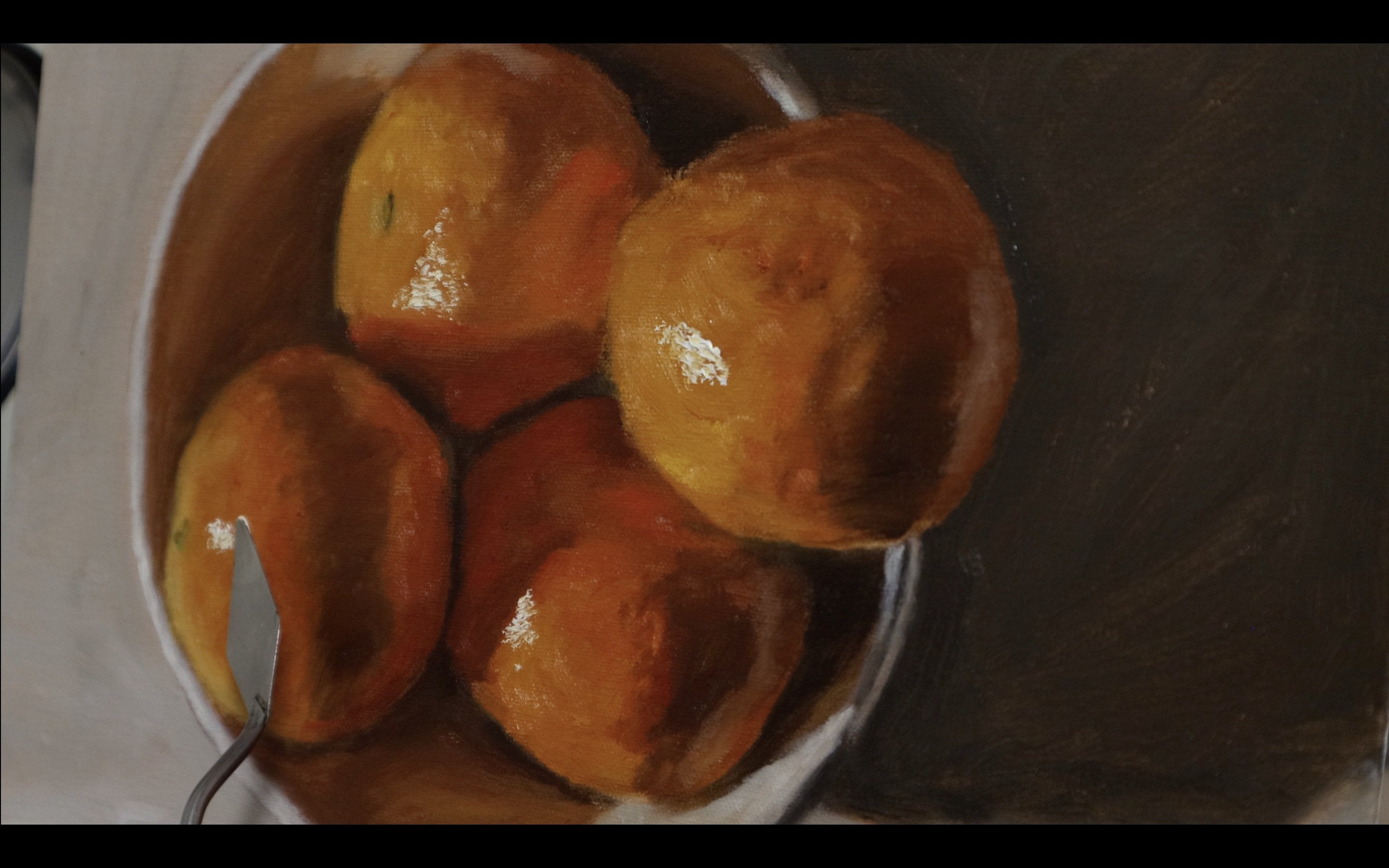
6. Applying texture: Part 3: Finally, the best part of this whole texture
experiment, in my opinion, getting our liquid
OLI O pesto medium, putting it in our paint
mixture that I've already makes to the color
of that I wanted, which is a peanut
butter texture. Actually use peanut
butter as the reference. And so here we go. I just have my
painting is pretty dry and I just have
my palette knife. And now I'm going to apply
the the paint to the canvas. We're whereas where
I left it blank and ready to cover up. A great tip is, do not apply this medium until you're sure that you're
at the code that you want. Because when you
apply this medium, it starts to dry really
quickly, like most. A lot of mediums like
enhance dry time, but this one is very quick. It also stiffens up the medium, I mean the paint. And also it makes it more of a matte color rather
than gloss finish. So yeah, just make sure you're
certain about your color. Then just put a lot
of this in there. The more of this
you put in there, the more of a thick
sticky texture you're gonna, you're gonna get. So at first I'm just
applying the paint in, making sure I have
pretty good coverage. And then later on I'm going
to worry about adding more, making it look more
like as if I spread the paint on with
with a butter knife. All right, So like I said, now I'm just adding more to
make it look like there's more knife indents and they're like imprints and
they're spread marks. And just like how
I said earlier, it's a good thing I had
had the underpinning there because I've missed
a few areas here and it all worked out because it ended up being the
color of the bread anyways, or of bread, some sort
of bread anyways. So ended up working out
for me pretty good. Now I'm just trying
to, you know, makes sure that things
look more natural and less less like sharp. Megastar use like every
bit of the paint that I need actually here to make it even more of
that paper texture. I put it, put even more
of the medium in there. Just the pain and the mediums together. That's all you need. If you want different strokes, use a different palette knife. You can get the longer one
like I demonstrated before, and it'll end up
looking pretty good. I just decided to go with
my standard shape one here and it turned out
pretty good, honestly. Now I'm just going in and
finishing everything off, given it the final peanut
butter look to it, or the spread look to it. Here. I'm just making
sure I get that, that peak to make it
look like peanut butter. And this is what it
ended up looking like, which had thought
it was pretty good. Looks very realistic and
abstract at the same time.
7. Final thoughts and Class Project: I really hope you guys
enjoyed that class. And if you did, feel free to
send reviews or comments, took my way questions. And also my project
for you guys is, of course to keep experimenting. That's the main way you'll
get better this honestly, one of the ways you
can find out what you like to invest in
this painting world. And also number two, what I want you guys
to do is create your own sort of spreadable. Like, let's say you
want to do a bagel, cream cheese or total stock
with avocado spread on it. Something like along
the lines of that, I'm really excited to see
what you guys come up with and thank you
for watching again.
8. Check out my Art Work: If you enjoyed this class and you want to get to
know my style better, follow me on Instagram
at the toned canvas.
 Jaleel Laffitte, Painter