Transcripts
1. Introduction: Hey, have you ever wondered how someone can pay
something transparent like glass and even make it
realistic on top of that. Well, if that sounds
of interest to you, then this class is
perfect for that. My name is Lola feet, and I'm an oil
painter from Arizona. And in this class,
I'll be teaching you my process on how to paint a transparent object like less. I'll be demonstrating
my full blast process from beginning process to middle processes to
the finishing touches. Now trust me, this is
one of those things that is definitely not as
hard to do as it looks. So if you want to come along
for the journey with me, then this is definitely
the class for you.
2. Blocking In: So there's my setup that
you're seeing on the left. That's pretty much what I'm
looking at it as I paint, except it's not a picture
is really in front of me. And also as you can see, I've already got
the background and foreground paint
it out so that we can just focus on the
star of this video, which is the glass. So to start out. And this is consistent
with all my paintings, no matter what the subject, I start from dark to light. That just helps me focus on an area that I want to
start out at rather than just hesitating to
even get started, not even knowing where to start. So you're definitely
going to want to have a process in mind
when you get into this. But in my case, dark to light. The beauty of my
background being black is that in those darkest areas, I'm able to just use the black mixture
that I made and put it there without any hesitation
as to what the color is. And also to make this easier, I've chosen a gray surface
for the glass to be on. That makes this whole process
almost monochromatic. Make, making it way easier than if I had a lot
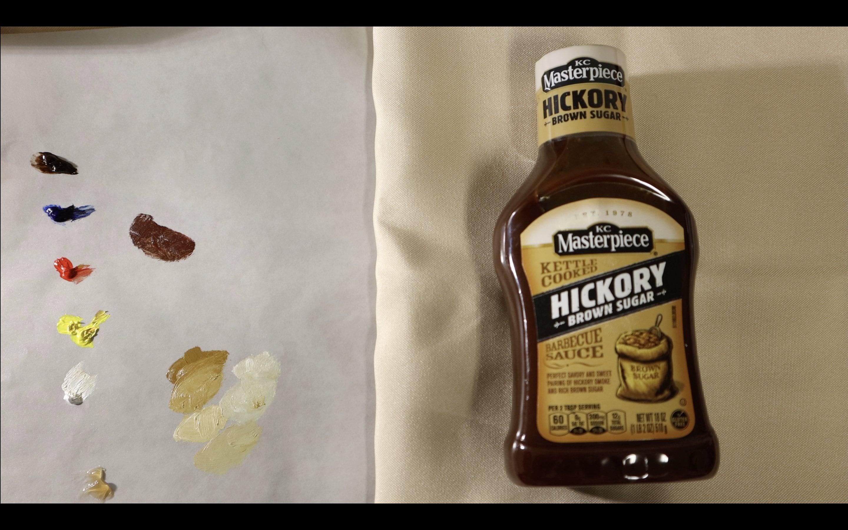
more colors going on. Also, if you were wondering, I am only containing five different colors on my
palette for this painting. Those colors are burnt,
umber, ultramarine blue, cadmium lemon, which is just
yellow, and titanium white. So you really don't
need a whole lot to make a painting like this. Now with glass is different than a lot of other subjects
because you have to sort of erase the pre-Qin, the
preconceived conceptions. You have glass in your mind. Because naturally one
might want to thin down their pain or lighten that, line things up so that
things look transparent. And you definitely do
not want to do that. One of the hardest things
to do when painting this is sort of see the color as you see it and not what you think the
color to be in your head. So in the picture it doesn't really do
it as much justice as looking at an in-person. Because the glass
looks a little, little more foggy in that picture than it than
when I was looking at it. But just like how I put
the black color that I made from the background directly in there.
That's what I saw. And I don't want to
automatically go lighter just to get the overall frequent
preconceived notion that I have for the glass. Also, I don't want to use all one color when I'm
doing this or when I'm seeing, when I see a large area, for example, that top
top area at the top, the middle to top left
where it almost looks like it's that
same type of gray. I don't want to use
one gray there. I want to use even the
slightest changes in value, slightest changes in
color that I see, that we'll just simply add to the realism of the whole piece. That's one misconception. There's no one color that you can use and something will
turn out looking clear, clear is not reload colors, just simply the color of your whatever is
around it, but distorted. And you have to pay as you see to sort of fill in
the space of the glass. I would say one of
the hardest things when doing this process is knowing where to paint next. I know I said
darkest to lightest, but it changes the colors and the darkness and
lightness changed so much throughout this that you kinda don't want to pay
on random spot in the middle of nowhere in case that will mess up
your proportions. This is a large
glass object here, and I want things
to be accurate. So I tried to keep
things connecting. So I start wherever. I've already painted
something just to make sure that my
proportions are correct and the shapes are in the same spot that they
are for what I'm seeing. So this process, this
beginning process where I'm just blocking everything in which is what I call it
the blocking and process. You need to do is just to sum this up is
pain as you see it. Dark to light. And make sure
your proportions are right. That's the main objective
of this process. And again, don't, don't dilute anything
because it's glass. Keep the colors as
saturated as you see them, and resist the temptation
to then things down. So I'm not going to bore you and continue to do this part. I've showed you the keys and
pointers to this process. So I'm going to
fast-forward a little bit, passed the blocking and stage. So you can see the
important pointers on the next part of the process, which is adding detail. And I know what you're thinking. What detail can add? Glasses smooth. There's not really any
sharp detail points or highlights or shadows. That's pretty much the
beauty of glasses. How smooth it can be in the
transitions and the blending. But in non-blocking end stage, you may have missed some things. You may have not noticed the the subtleties
between the colors. So and also the paint
probably has maybe absorbed into the canvas and
lined up a little or isn't as strong as it should be. Again, we want to focus
on painting as we see it, not trying to make
things thinner, lighter. So I'm just going
to go back in here and paint over those areas that I've painted almost with
that black mixture I made. Which is I never, I never use black because
black is sort of a, a killer of color. When you use it in paint. I use burnt umber and
ultramarine blue and pretty much a 5050 makes to make
the black that I use. But yeah, like I was saying, all I'm doing is going
back over those areas that were painted in before and making sure there's sharper and more saturated. Now this glass is kinda foggy. It's not like the
clearest glass possible. But I wanted this
specifically for this class because
there's some spots that are pretty clear. Especially those
areas that you can see the background clearly. And there's some areas that are sort of
have that glass fog. So this has a good
mixture of techniques to use or challenges too. Keep your mind on focusing
on what you see rather than trying to overcompensate.
3. Fine Tuning: Now if the glass or
painting does have like have labels or
stickers or anything, I try my best to remove them. This one I sort of
kept them on there because these stickers are
pretty hard to remove. And I thought it
actually added to the aesthetic of this painting, so I kept them on there. Just know that. Again to paint. As you
see that sticker on the back there isn't
isn't why at all. But in real life is It's like if I were to hold
it in the lightest white. But in this way ahead
is sitting in my setup. It looked to be
this sort of dough. Greenish gray colors. So painting it like they're kept it in the background
where it actually is. So I would say that this is one of the more It's not the most time consuming part of the painting because the blocking
end part definitely is. But I will say this is
the second toughest. I've, I'm sort of
breaking this down into three different parts. Blocking in going back and forth to refine everything that sort
of subtleties and details. Then of course finally
the highlights. So the glass is finally
starting to take form. That first layer things were
kind of light and faded. And this is just one
thing I have to say. During the process
of the painting. Especially painting,
something like this, which is a glass, glass, metal or anything
that this sort of illusion has a lot of reflectiveness to it or
has lot of transparency. It's never really
going to look like how you want it to or how your subject looks until
you get near the end. And even sometimes until you add those final
highlights to it. That's something I
sort of struggled with well, while doing this. But again, stick
to your process. You're blocking in. And then again, dark to light. And then after you block in, again, do your dark to light
and refine everything. The more, the more
you refine it, the more it's going to go
in a direction you like. So things still look, I mean, you can see the glass forming, but things still look
pretty flat to me. This is one of those
instances where the highlights
definitely help give it that depth because it looks
see-through, but it doesn't. The best side that
comes out towards us, the front of the glass doesn't pop yet till I add
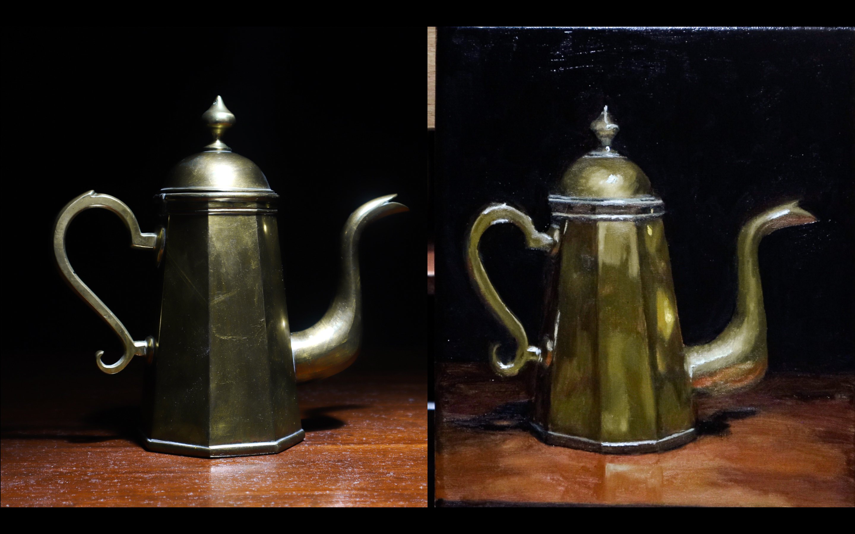
those highlights. So I made a class about metal on here and I would
say the difference between painting metal and
painting glass is probably how there aren't sudden changes in value throughout the piece. For example, in metal, there can be something
very dark and very light right next to
each other. And often. But when painting glass, there's more gradual changes
and gradual build-ups. And there's really nothing super dark ever next to
something super light, except for when I put
those final highlights and and even in those highlights there's
a buildup to the pudding. That's why you see
where the highlight is. In the glass and the
background there. I sort of put a
light gray around that area for me
in the painting. Just to give it the depth and to build
up to that highlight. Now one thing that I forgot to say during the blocking end
processes don't over blend. All that will do is make
things murky and foggy, or some artists call it muddy. When it gets to the point
where no matter what you do, the color will just turn into this muddy mess and you won't get that exact color that
you're trying to paint there. Just block it in as you see it, and then worry about going over it on the next step of it
in the refining process. Also, I did paint
this all wet on wet, so all in one sitting. It took me somewhere
around I want to say four or five hours. Probably four. Which is definitely not
long in the painting world. And don't let that
intimidate you. The time really flies
when you're locked in, you get into the process. So I'm slowly building
up those highlights. The glass is finally
starting to take shape. I'm just trying to
lock in and focus on the little things
I may have missed in the blocking in process. I want to make sure everything
is as good as it can be. Before we get into
those final highlights. Those final highlights are just for when everything
else has done for me. And I definitely keep
things loose when I paint. I'm not really
someone who tries to hyper-realistic with the detail and get out a small
pointy brush. So this is a very
achievable way of painting. Glass. Is actually
rather hard at first to sort of look
into the glass and see what small changes in, in darkness that
you may have missed or little details you may
have missed, any distortion. You may have not included. But over time, it gets, it gets way easier.
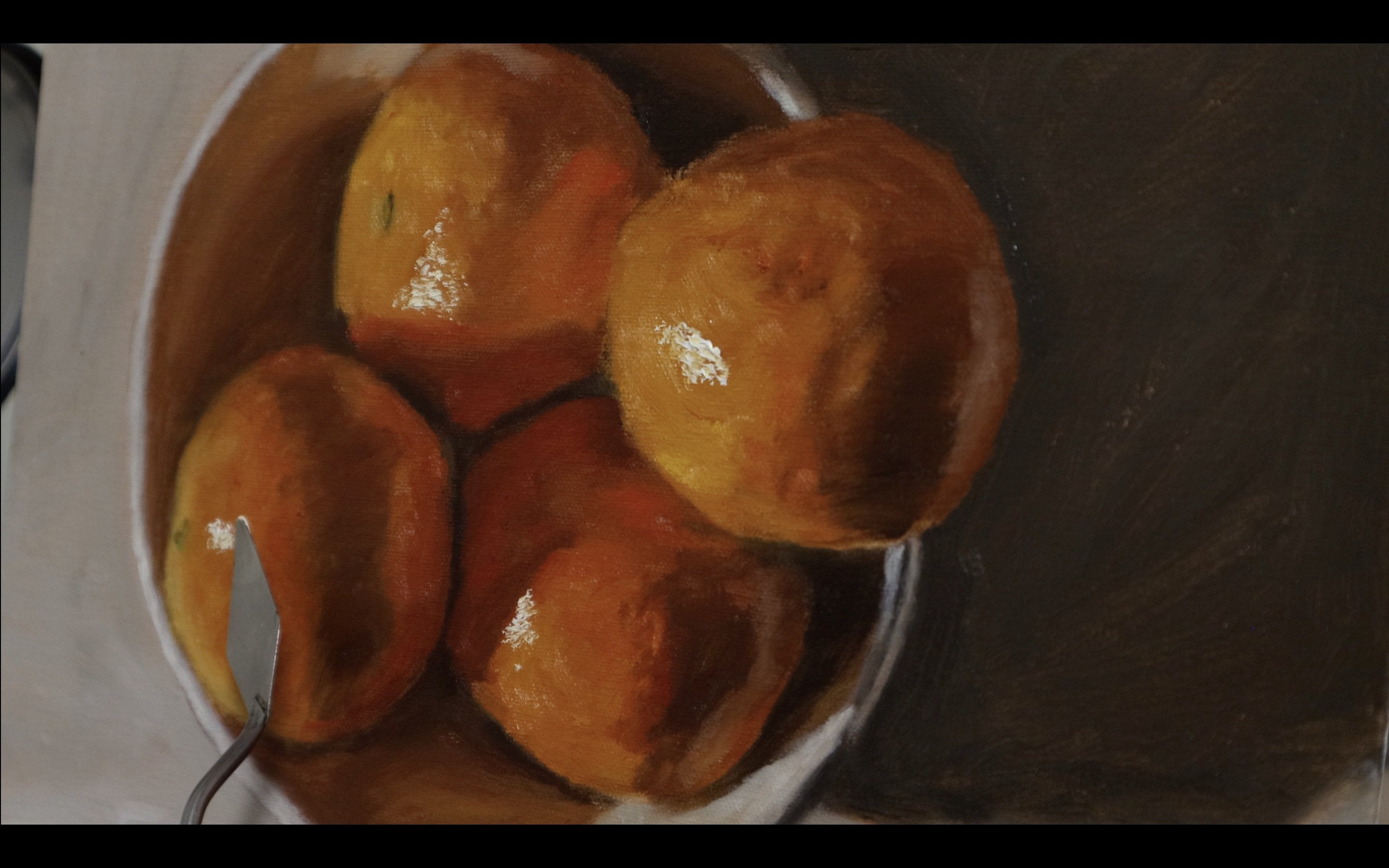
4. Finishing Touches: Right now I'm just adding some
of the distortion I didn't include when I
first painted this, I kind of painted things as if they weren't distorted for whatever reason or maybe I
just knew I'd fix it later, but no, I'm just adding in a little more of that
randomness in the glass, a little more movement. Definitely right there in the
top of that back sticker. You can even see it in this
picture on the left here. Some distortion in
there that I missed. I'm starting to try to
correct that a little bit. Something that may be hard
at first to conceptualize is that the painting doesn't look as refined up
close than in-person. And sometimes you
definitely have to take a step back,
especially with glass, because as you can see, I'm just sort of zoomed
in here on my painting. Up close. You see all the, the abstraction, all of the
brushing with the blending. But when you take a step back, the whole thing
looks as cohesive as when you look at the
subject as you see it. Overall, this process isn't
as hard as you think. One tip that I would
give to is that you'll probably want to keep the background and foreground
and surrounding area of the glass you paint as simple as possible
because whatever is surrounding the glass
is what's going to be visible in the glass
are reflecting off of it. So again, that's why I chose this simple black background
and gray, gray foreground. Again, I'm continuing to add some of that distortion that
I missed in the beginning. Because something that
you will get a lot with glass depending on the
way that you position it is. Some distortion which makes the glass look like lies along with the
highlights at the end. Now I'm getting to the
point where I'm going to really prepare for
those final highlights. So I'm going to go
back over that sort of top area where things are
gonna get really bright. Also, one other thing that I should have mentioned earlier is if you use certain colors, makes sure that you either
can mix that color again or you keep that same color
around because for example, the gray fabric that's
on the surface, use the same color
in the back of the back of that gray fabric is also present in the glass and same
with the background. And just luckily for me, the background is black and
the foreground is gray. So these colors were
easy to duplicate. Then I'm going to fast
forward through adding the details of
that cork up there and some other details
in the foreground. And also the label on the front. And we're gonna get
straight to the highlights. So after lots of preparation for this is finally time
for the highlights. If the highlight
is really bright, brightest thing in
the whole canvas, and it's sometimes can even be brighter than pure white
paint out of the tube. Well, you wanna do
is get a lot of it. And enough to sort of put it on there where
you don't need to brush it. You can either do this with
a brush or a palette knife. I'm doing with the brush here, so I have a little more control, more comfortable with the
breast and the palette knife. But I'm pretty
much taking white, titanium white straight out of the tube and putting
it on there. So there's a little bit
of texture going on. I'm not blending it in, I'm just putting it directly
on top where I see it in the subject in front of
me that I'm looking at. Here is where I really
like abstraction, where it doesn't need to
be a smooth highlight. Having it as a clumpy paint
makes it stand out a lot. Rather than sort of
blended in there. I'm just hitting over all
those areas that need it. I'm pretty much whenever
you paint something, there's very few areas that need that bright white highlights
straight out of the tube. Now all I'm doing is just
putting the finishing touches. And voila, here's the finished glass.
5. Final Thoughts: Hey, see, that wasn't as hard as it looked like I said before. And if you found this
to be a good class, definitely leave a
comment or a good review. And like all my other classes, I want you to try this on your own for your class project. That can be, you know,
appending glass, plastic, anything that's
transparent, and anything that this class helps
you with technique wise. So thank you for taking
this and see you again.
6. Check This Out!: If you enjoyed this
class and want to see my art work or get
to know my style better. Follow me on Instagram
at the toned canvas.
 Jaleel Laffitte, Painter