Transcripts
1. Introduction: Hey, my name is
Julia feet and I'm an oil painter from
Phoenix, Arizona. Welcome to my class for mixing
any color with o paint. This class is great for those
who want to learn how to make realistic colors when it
comes to painting realism. Or if you just see a
color and you wonder how to get to that point and you
don't have much experience. I'll be showing you my
base palette that I use to paint most objects also be demonstrating with a variety of just everyday household
items just to show that you can
match anything. Even be including some
specialty colors. I'll be sharing with you
the palette that I use to reach natural earthy colors, too, vibrant and natural colors that you don't find in nature. And if you're
interested in that, then this class is
perfect for you.
2. Basic Palette: This is the base
palette that I use for every painting that
is burnt umber. Crucial color that I use. French ultramarine blue, or
ultramarine blue we'll do, you'll also need a pallet. Disposable or wooden,
doesn't matter. Your glass. Cadmium red, very strong, powerful color will
overtake lot of colors if you don't
use this sparingly. Cadmium lemon. Probably the lightest color in the pallet other than white and helps keep that warm tone. Of course, titanium white, which is probably
the most used color. Don't forget the
liquid original. Help spread the paint.
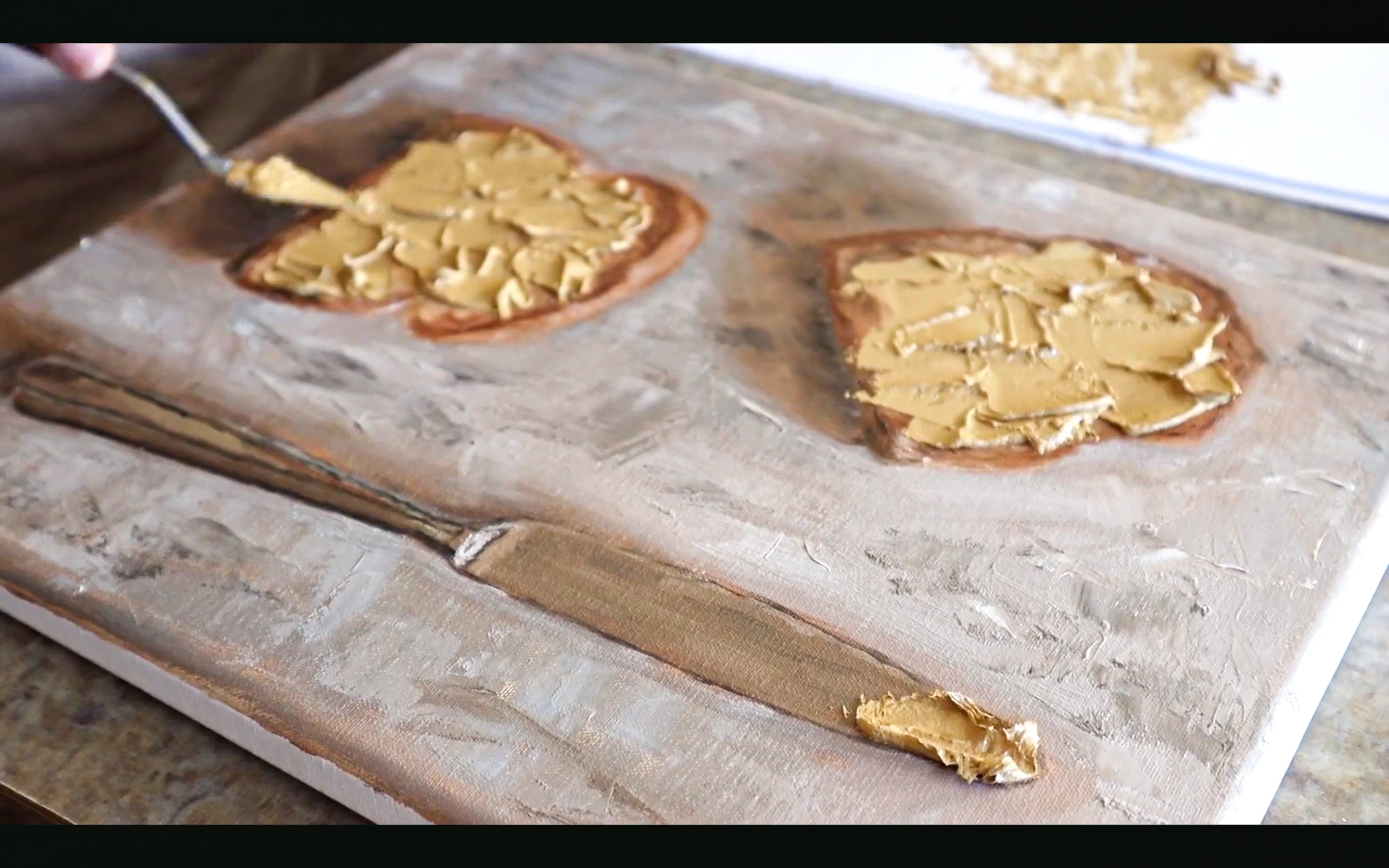
3. Matching Colors: Earth Tones Pt.1 : The first object that
I'm going to paint is this barbecue sauce. And the reason that
I chose to paint this object is because it has some nice earthy colors that
I liked and dark colors, a sort of mid color and a light color all
on this one item. I find that it would
be good item to paint. First. For this, we're just
going to keep it simple and use that base palette
that I showed you, which again is burnt umber and ultramarine
blue, cadmium red, cadmium lemon, and titanium
white state soon for later on because some of the items
that I'm going to be painting later will require what I like
to call a specialty color. But pretty much
it's just a color like that you would
not see in nature. So like a bright orange or strong purple color or rare in nature is
a better word to put. Every time I put my palette, I do it in this order.
I don't know why. Maybe it's just like dark
to light thing going on. But it just always works
for me doing it this way. To keep the consistency I
just, I just keep doing it. Was very important is
when you're painting as a medium or when mixing
colors, the medium, it just helps with the longevity or the spreadability
of the paint. Makes it go longer than if you just use
straight up paint. And no, It's good to just start getting
comfortable with mediums. If you haven't already. I started out with blue, yellow, burnt umber
for darker colors. What I like to do is start out with a mixture of burnt
umber and ultramarine blue. That's sort of my base
for a darker color. But here I'm starting with that mustard looking color on
the majority of that label. And so what I did was
I put yellow, red, and blue as the majority
of the colors because the complimentary
opposite color of yellow is purple or violet. So that what that
would do is mute it down to that sort
of mustard color. Then to control the temperature, I add more blue or more red. There. I'm just looking
to see how close I am. At the moment. It's good to know
the color wheel. It's actually crucial to know the color wheel when trying
to mix any color you want. Because even something as simple as just knowing the
complimentary opposite color, any color will be
enough to get you into the mindset of mixing colors more easily and
not being as intimidated. I'm pretty close. I tend to not add white to my
color until I get it pretty accurate as far as the
saturated version of it. Then I add the white
to adjust the value. So how light or dark it is, I just put white suggest
how light it is. But I save that for
last the most cases. You're probably not going
to want to paint on something that you have
around the house or just by. But just for the
sake of this class, I'm painting directly
on the label just to show you that how
accurate I got to the color. You can hardly see the
paint on the label, which was the goal.
4. Matching Colors: Earth Tones Pt.2: Now I'm starting to work on that top part of the
label, that lighter color. It's like a cream white. I'll call it. The good thing
about mixing that color, the darker part of
the label first, is that I could just play
around with white and just lighten it up and it
will retain some of the chromatic aspect to it. I did all the hard work early
and ends up paying off. That label was a little too
warm with all that yellow. So I added some blue that
mixture to kinda cool it down. Now it's just too dark, so I'm going to keep adding white to it until it gets to
the point where I wanted to put a little separate
whenever the color is value lighter step or a
step or two up or down, don't mix into the color
that you already had there. You're going to want to just make a whole another
pile because then everything will get all murky and you'll probably,
you probably won't. It'll be a harder time.
You'll have to use more paint to get to the
color that you want. I'll separate it that white
that I added to the side. There, I am adding
some more blue. When you think about
mixing colors, or at least when I do, I think about how
warm or cool it is. I think my color on my brush
is still a little too warm when I hold it up to that
label, so more white. And I put a little more
blue. Pretty close. Now, there I'm painting on the label again. And again, you can
hardly see it. Which means I got pretty
close to accurate. Again, don't paint on a product. You do not want oil paint on
something you just bought. I got so close. I
decided I just wanted to cover up the numbers.
I mean, the letters. Sorry. And you could you cannot. What's painting? What is actually a
part of the label? Also in-between light color like that and the dark
color that I'm mixing now, which I just put burnt umber, ultramarine blue, and
some cadmium red. Again, like I said,
for darker colors, I tend to use burnt umber and
ultramarine blue as the base and then go from there. So I did that red. I'm already pretty close with
just three colors in there. If you ever add too much
of a saturated color, you can just go back in
what that burnt umber or ultramarine blue and
help bring it back down. Bullock, I was saying
in-between mixing the colors, the lighter color like
that go into a darker one. Especially you're
going to want to wipe your brush on a paper towel and maybe paint thinner just to get some of
that excess paint off. Make sure your colors
as pure as it can be. You don't want any milky
or muddy colors going on. Kinda got it to light. Put too much right in there. Again, I put more per umber
and ultramarine blue. Again, I'm just testing
it by painting directly on the barbecue sauce. Still pending on there. Just to show you. I
got close to the color and That's how I
go about painting. Earthy colors, darker,
mid-tone, or lighter.
5. Matching Intense Colors Pt.1: All right, I just demonstrated
earth tone colors with using that
sauce as an example. And now I'm moving
on to more vibrant, saturated colors here
I have Winsor orange, which is any vibrant saturated
orange color would do. This is a color that you
cannot get to without using another color
to help with, at least with this palette. What I'm gonna do is just see
how close it is by itself. And then see what I
can do to adjust it. And in other cases, I'll mix as close to it
as I can first. Then I'll add my color, my saturated or vibrant
and natural color to help boost it to get to
the point where I wanted, the color isn't too extreme. Of course, I'll use
a red and yellow, which makes orange
and combine it with that orange out of the tube and try to get as
close as possible. Now you're not going
to want to use white unless you have to, or at least until near
when you're approaching that color because
that will kill the the saturation
in your color. I just keep holding
it next to it to get as close as possible. But in this situation there's not a lot of
margin for error. I just have to keep balancing. Going back and
forth with the rag, going back and forth
with the yellow, along with adding a good
amount of orange to it. Now, I think I got as close as I'm gonna get tested it to it. You can barely see it. That's how we'll
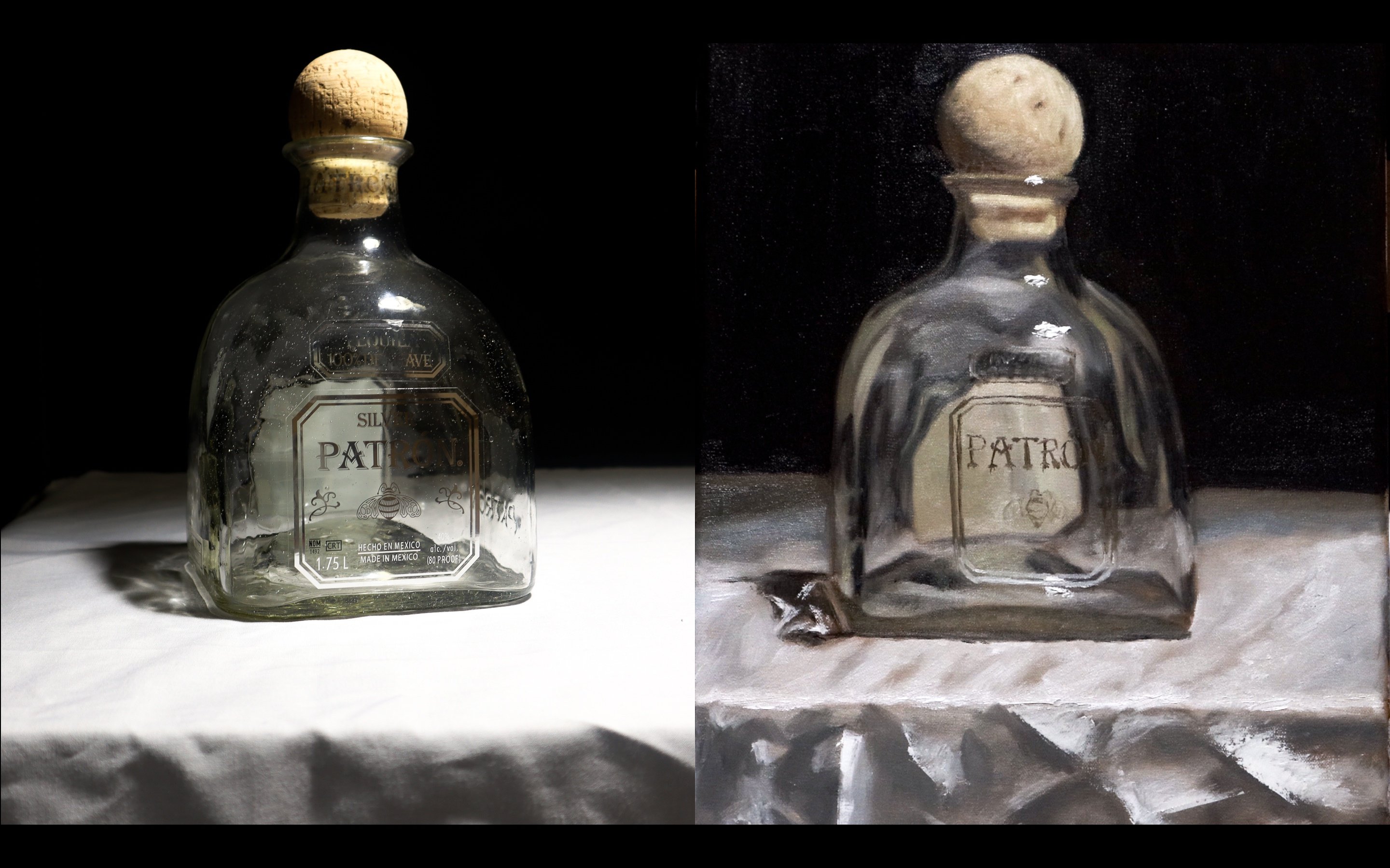
go about trying to match something like this. All right, Now onto
the next item That's, uses a color that's not
a part of my palette. Very strong. Violet or red color
or purple magenta. What I use is permanent magenta. You can also use a color
like quinacridone magenta. That'll also work. The strong purple color
that you can also cannot get from this pilot. I began making a violet
with red and blue. Then I'll just keeps
trying to enhance it to the point where
it is on the item. Adding in that magenta. Here, the color is way too dark. I can't even gauge how close I am to it without adding white. And in this situation, is the type of situation that I would add
white early on and then sort of add my saturated colors to
try to get it to match. This color is hard
to do with paint. Oil paint because of
how artificial it is. Because you can use colors
like white to get lighter. But what it also does
is desaturated color. The color down. There's
only so close you can get. The more color you add
to it that isn't white, the darker it gets. So certain range, unless
you find the exact color. Which in most cases you may not just have
the exact color of something directly
in your palette. I actually don't recommend having a whole lot of
colors in your palette. I'm not saying do
what I do and you use five base colors
and add as you go. But the simpler
palette you have, the more consistent you'd see. You have a cross your paintings, and I think that's a good thing. I know people that use 101112
colors, that's also good. But you never want
to use a colored directly out of the tube
unless you have to. I can mix most colors
with the palate. This is as close as I am
going to get to this color. So I'm just gonna try to
mark out the letters. I think I got pretty close.
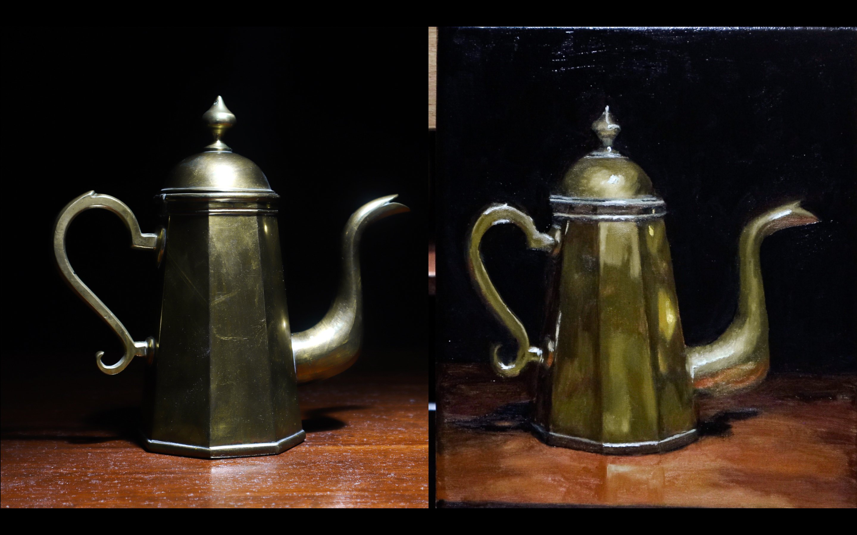
6. Matching Intense Colors Pt.2 : Orange and magenta are
colors that I have to use in some instances
when I had to enhance the color or a mixture, but also this Winsor green, or also you can
get phthalo green, the same color as
the same color code. I'm just going to add
that to my palette. And again, I'm going to
make my own green first, get as close as I can first. Then I'm going to add in that green that I
added to the palette. I'm gonna be going for that
darker green on the bag. Be able to achieve that with this new color that I
added to the palette. I'm already closed because
it's a simple color, but it's also, like I said, there's little margin for error when trying to
get a color exact, especially, especially when
it's saturated as this. So again, I'm just
holding my brush to it and seeing how light my brush
is compared to the item, how dark my brushes
compared to the item if the paint on my
brush looks warm compared to I'm the object or how light my brushless
too, the object. And that's what I've been
doing with all of these. I often use my brush to measure the different
qualities of the color. When painting, like
still-life, for example. And again, I don't usually
brush the item itself exactly. But just for the
sake of this class, I'm just song you
how close you can get using a simple palette and just a few colors
to enhance it. I think I've gotten
pretty close now. You can see those
darker paints spots. Those are my first few attempts. But now I'm pretty close to
the color that I want it.
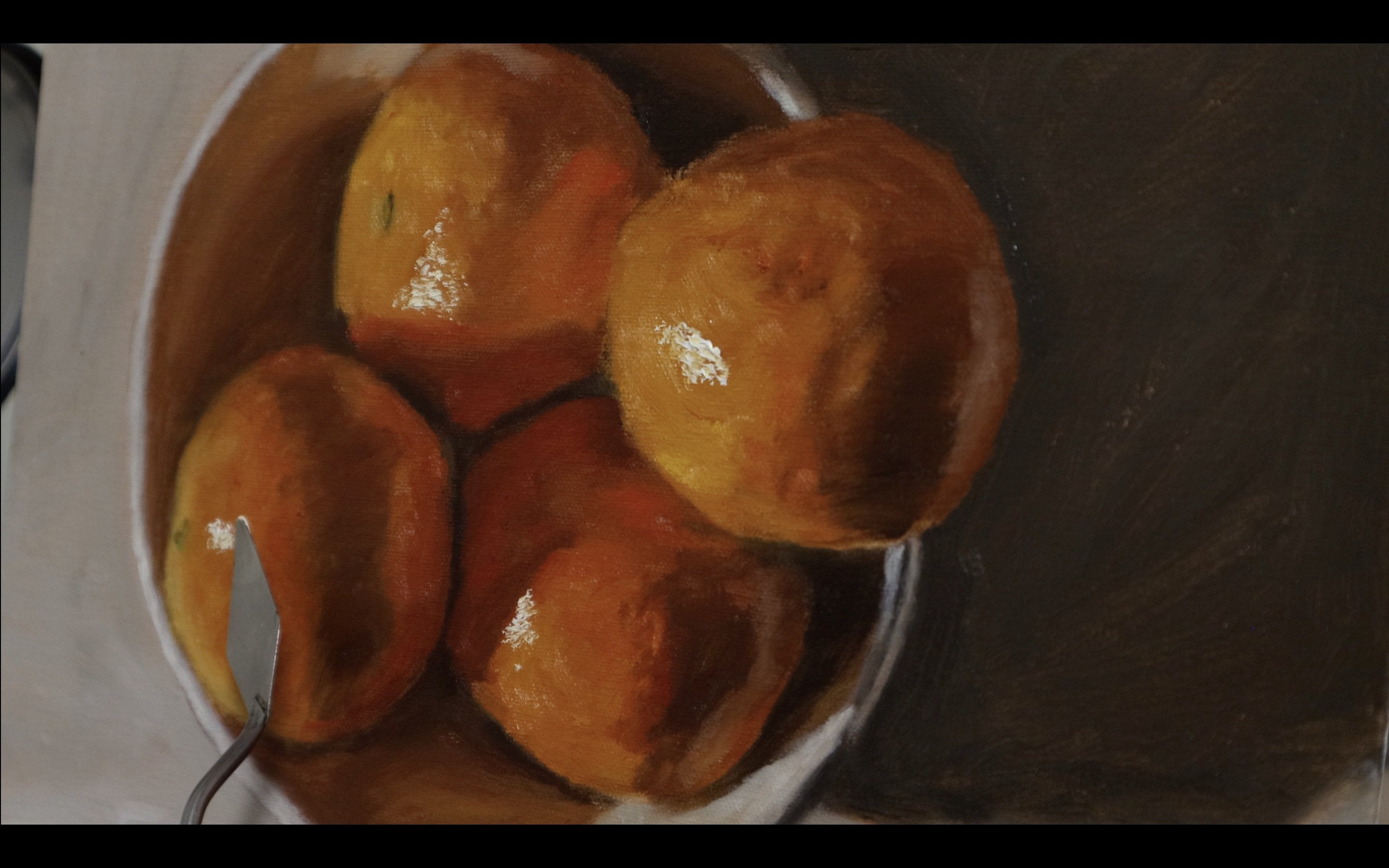
7. More Matching Pt.1: Alright, now that I've gone
over doing earth tone colors and the vibrant and
saturated colors. I'm now going to be going over
a combination of the two. You'll be needing a color like cobalt turquoise to pay
something like this. Or cobalt teal. Another name for CO
is similar to it. This object has earth tone color in that top cliff area where the same green color on the bottom that
we did for the bag. So to start, I'm
just going to start using that green mixed
with some cadmium red. Red is the complimentary
opposite color of green. That will mute it to that
point that is on that box. Right now it's a
little too saturated. I believe the colors
a little bit more blue and a little
bit more saturated. I added some more
yellow to make it a little more yellow, green, and red to tone it down, also added some white
there to lighten it up. Letting that value up. I'm already close to
the color just off of Winsor green or yellow, green straight out the tube. There's not much dirty
work that I have to do to get it to match perfectly. I just have to pretty much get the temperature and the value right and be all set. I did a little bit of that. Ultramarine blue because I felt that this blue was
a little too green. Now, I'm searching to
balance it back out. I mean, a little, I felt that this green was
a little too yellow. Now, try to balance it back out. Now I'm just playing with
how dark or how light it is. A little more white. As you can see,
I'm doing a lot of different tests is
looking pretty dark right now. More white. Like I said, there's
only few ways to lighten up your color and that's either with a lighter
color or with white. Like I said, Why? There's a balancing act. I choose lightness, saturation,
what I want to balance. Going with more of that special green color
out of the tube. I'm getting closer. Again. I'm still testing
it, still looking dark. But it seems that would
make it light enough, but the color wouldn't
be as strong. So again, I'm still
trying to balance it. A little bit more
white in there. Also, as I'm doing this, I'm continually adding
liquid original. Even though I may not need
it on a canvas right now. It helps with the movement
of the paint. My opinion. I'm really close to the color. It's still a touch dark. I'll have to go
over it again with perhaps a lighter
version of this color. But I'm pretty much right there. Little bit more white. I think after doing this
is going to be very close. And now you can almost came
in until the difference.
8. More Matching Pt.2: Again, like I said, try to find objects. I tried to find objects that have either different colors, different types of colors, like different
Earth's own colors and different vibrant
saturated colors. If you want a real
challenge when you're trying to do this, then do something like
this where you'll need to master a lot of skills
to get these colors right. Now I'm using that cobalt, turquoise, one of
my favorite colors to use whenever I need it. Just trying to get
the blue of that sky. Now it's too dark. To mute this color down. I use burnt umber. Burnt umber is sort of has
that warm coat quality to it. Sort of orangey enough
to counteract that blue. Right now, even with
adding a lot of white, I'm pretty dark compared to
the color on the buttocks, so they're a little bit it seems I'm a little
bit too dark still. May be a little bit too green. Would either have to
do is add more cobalt, turquoise, which I did. Ask something to counteract
how green it looked. Not only did I add some
more of the cobalt, turquoise, I added
some ultramarine blue. Add a little bit too much, so it got too dark, but then I added some white. Still too dark,
adding more white. Sometimes for some reasons, hard to gauge the value on your palate compared to
on the actual object. I'm adding more
white. I've gotten pretty close to the color, sort of dying that the
color figured out. Now I'm just worried
about the value. Well, there's still
something off. I have to keep making
separate piles until I get to that color. Again, if your color is
getting a little too murky or a little too many
colors are getting added. Do not try to
correct it is going to take too much paint or
too much work to correct it. You can always just either just create a new pile or clean
your brush first and create the new pile if
you don't want any of that color on your brush and you just want
to start fresh. But now I'm very close. And quite honestly,
this this guy took me longer than expected. I thought it'd be as
simple as using some of that cobalt turquoise and put in some white in it
and calling it a day. But it's sort of harder color to get to sense of how light
it is and how saturated it is at the same time on that green color
near the bottom, I just had to worry about the saturation more
than how the value. But here it's so
light that you can see the subtle
differences easier. Now I finally think I
got close to the color. I just start carving up
the guy here on the, on the graphics of the box
I think is pretty close. Now what would help
is if I blended it, which I mean, we're on a
box here and not a canvas. Hard to do that. But also don't just
such oil paint with your hands to
try to blend it. Just doing that
just to do it fast, but that's not something
you're going to want to do.
9. More Matching Pt.3: All right, So feel like I've
figured that color out. Now it's on to the rock
texture and that rock color. I don't want to go for
the darker ones because I feel that will be too easy. I'm going for that lighter
highlight part of the rock. And also that line near that goes across the box near the bottom middle of it. I believe that is the same color as the lighter mid
tones of the rug. What I did was I put
some yellow, red, blue, and burnt umber
in their grammar. And blue gives me that nice
dark base that I described. And the red and yellow add some chromatic aspect to it and making them
more colorful. I'm just added some white
for the lightness of it. Often in a painting you'll
find that there may, there may be a
color somewhere in the painting and it will also, you'll also want to put it somewhere else in the painting. And that'll, I've variety will
help with the composition. Sometimes you want to, you
a lot of the time actually, I want to save your
colors in the palette. Don't want to wipe
them way too fast. So you always have those
colors at the ready. This color I got to very easily because I work
with earth tones a lot. Just burnt umber will be your friend when it
comes to earth tones, red and yellow, cadmium red and cadmium lemon will
be your friends. Also ultra marine
blue to cool it down. Like I said, I believe that
they're the same color, so tested it up there. And it also just
blend it in and you can't even you can
barely see it. You can see all the tests marks. Obviously in a painting
situation on a Canvas, you're not going to
be able to just test. You'll just have to
compare your brush to whatever your references
or your palette knife to whatever references to make sure the code is or
the way you want it.
10. Final Thoughts/Class Project: Hey guys, I hope you
enjoyed that class. If you did feel free to send
me questions or comments. And also for you guys
as a class project, I would like for you to
just pick out a object that has a good variety of colors, like maybe like
three key colors. And it'd be great if it would
have some natural colors, some unnatural, Just,
just for a challenge. And I just want you to
create a palette for it and put it next to it, the palette that you may
just take a picture. And I'm really excited to
see what objects you use and how close to the code
as you get on your palate. Thank you for watching.
11. Check Out My Other Work!: If you enjoyed this class and you want to get to
know my style better, follow me on Instagram
at the toned canvas.
 Jaleel Laffitte, Painter