Transcripts
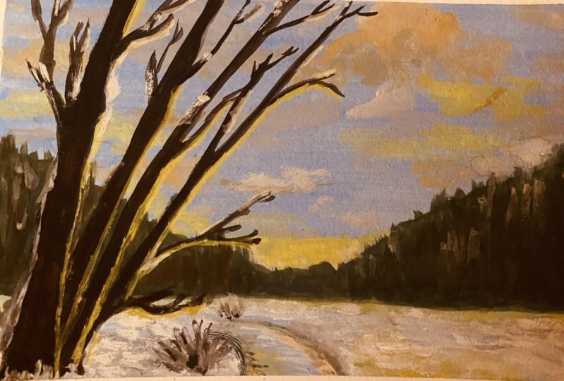
1. What's this Class about?: Welcome to the first class in the painting gouache
postcard series. In this class, we're going to create a winter impressionism. We're going to do that
obviously with washing me. I really love painting
with gouache and I would love to share
that joy of creating rough brush with you
and show you how you can create beautiful
landscape with a wash. Gouache can be used for
all kinds of subject. We're going to stick
to the landscape in this, in this class. I'm going to show you
just the first step in. I want to show you a little
bit the difference between watercolor and gouache and
how you can use squash. This class has an
interesting aspect. Where are we going to
limit our color palettes, but actually only going
to use two colors, yellow and blue, with
the addition of black and white to create
some tones and shades. I want to show you how to do
all of that in this class. You don't need much
for this class then just some brushes, some water, and some paint. But that will be explained in the first lesson
where I'm going to take me all the
possible materials. If you never have faded before, who washed is a great
medium to start with pink. If you already have a
background in watercolor, all different kinds of paint, I'd be a great addition to
your toolbox as an artist, gouache is often
overlooked medium, but this is really
a joy to paint with and it's actually
pretty easy to get into. In the coming
lessons. I'm going to show you all about gouache. So let's start painting this
winter impression together.
2. What you can use for this Class?: In this first video, we're going to look at
what we're going to need to create the squash postcards. Now officially we're going
to need some gouache, some paper, some
brushes, some water. But I'm going to take you
through all of these materials and what you can possibly
use for this class. Well, let's start
with the papers, since that is
already on my desk. But what I'm going to use
is actually not on my desk. What I'm going to use some
simple watercolor paper. This is really cheap
watercolor paper, a little bit of texture on it. I want to use this
for the postcards. You could get a different
block like this. This is totally
glued on four sides with a little bit more texture,
doesn't really matter. Or get one of these ready-mades, postcard packs like this. You could use that
to watercolor paper. So I'm going to use
mainly watercolor paper. So whatever watercolor paper you have laying around
and if you don't have any watercolor paper and go out and buy some
inexpensive ones. Now you can use the
expensive brands like here to scaling
Britannia, whatever. But to be honest for gouache, I'm not sure if I
even want to use these really expensive ones because they don't add
anything to the paper, because mainly the gouache goes on top of it
instead of watercolor, which really goes
into the paper. But if you have that paper, you don't need to get anything
else you could use it to. And this is by the
way, hot pressed. I'm going to use cold pressed. Alternatively, you could
use something like this. The paint on motor technique,
mixed media paper. This is with a green, with a texture which is nice, you could use, this
is more smooth. You can use that too
as an alternative. I think that's about
it yet some people do actually use pastel paper. So you could give it a try too. Now if you really
don't want to go out and buy watercolor paper
or mixed media paper, you could just use some
card stock, some white. Even a gray tone card stock
would work pretty well, would use a different color
than that. Preferably white. You have a little bit of a gray, light gray color that
will do well to, alright, but that's
not always need. We're going to need
some brushes too. Let's look at them now. The brushes, what I'm going
to use some simple brushes. I'm going to use a brush five, a brush 12th, and a
brush, fled brush 12th. So these are a flat brush 12th, round brush 12th and
round brush five. Something around these sizes is totally fine if
you don't have a 12, when you have a ten or 14,
doesn't really matter. You don't need large brushes
since we're going to work on a small paper like this, you don't need huge brushes. These are good. If you have smaller than
a five or four would do to six might work as well. So a little bit of arranged would that
would fit the paper. So don't go working with
brushes like these. Really huge because
she can imagine, although goes really quick, you really can't get
any details on it. Now that we're gonna
do many details because we're going to
do some impressionism. So we don't want many details, but still we need brushes
that fit the paper. Then the next thing you see here already is a glass plate. What we're going to use
a class played for, I'm going to mix my
paint on a glass plate. But if you don't have
a glass page and you have a palette like this that
would find or plastic one. Or if any of that than just a regular plate would
do to mix the pips, paint on something, to mix
the paint on plastic pellets, metal pellets, tear-off
pellets would work too. And I'm using a glass plate, just cut your food and
that works great too. Now if you don't want to paint
right away a sketch first, you need of course,
a pencil and I've provided the sketch. I
want to show you that. Here's the sketch I've provided. We're going to work
from this sketch. You can, this is attached. If you need to
sketch, then you can transfer this to your paper. And we're actually going to work on this photograph painting, impressionism of this painting. Alright, good. And then of course, let's see the last thing
we're going to need. Now what I'm going to use two, before we move to
the last thing, I'm going to use some
masking tape to, basically because I'm using
a large sheet of paper, I'm going to tape off the edges so that I
get the right size. But if you have a paper cut
to size, you don't need it. Of course, you may need some kitchen towel if you're
going to make a mess, but hopefully we're not
going to make a mess. Now the next thing you're
going to need is some water. I've got two bowls of water. One I'm using to clean my brush, the other one to mix
in with my paint. You can use a cup, two, jar, whatever you want as long as you've
got two of them and fill them with water. And the last thing, of course, you're going to need some paint. Let me get the painful of it. And there we go. Now, don't worry, you're
not going to need all of that pain,
so don't run away. We're only going to need
actually four tubes of paint. But why do I have
a lot of paint? Just to show you,
you can use any of these paints for this class, whatever gouache paint
you have, you can use. Now you could
technically use this. In pens, but the
process is slightly different from using tubes I'm going to use for this class, but I'm pretty sure one
day I'm going to do a set with the pen stew, but for now I'm going
to stick to the tubes. But if you have pens, of course do use them. The colors, what we're
going to use is we're going to use a black and white. I think these are
the same brands. And we're going to use
a yellow and a blue. Now, I do realize there's a lot of variation in
yellows and blues, black and white, not, not much blackest black or sold. Some call them night black, iron black out all
kinds of titles. You just need a black and white. And if you don't
have regular white, titanium white is fine too. So white and black, That's
what you're going to need. Whatever set you have, you
should have a black and white. And we're going to use this
to mixing some colors, but also use it for our snow, especially now, you see quite
a number of brands here. I've got a few brands on here. You saw the Qur'an dash
pens, they're gone. This is Santa Fe, this
is artist quality. Then here we have Royal
Thailand extra fine quality. This is a designer paints. And then I've got here, the
cheap paints are chooses. Philosophy or Prima marketing. I think it's called a set
like this with 18 colors. Whatever gouache paint
you have, use it. I'm going to
demonstrate that with these relatively
inexpensive paint, you can create a beautiful
painting if you want to move up a notch than
something like royal times, Winsor Newton is great. And if you really want to splash out and spend all your money, something like this
would work fine too. This is an artist quality. But if that's going to improve your painting and
experience, highly doubtful. I actually, if you're
going to start out, I would not even touched it. I would start with a
designer quality or with niche inexpensive brands, but not the really
cheap, cheap brands, but the better brands like our
teaser and art philosophy. Now to call us, you need
a yellow and a blue. Yellow and a blue. I've got a lot of blues here
on the Yoda, lot of yellows. And the problem is
every brand in his, in the basic set, because you only need basically
a basic set for this. Has a different columnar center, has, I think I'm going
to get them out. Get the blue. This is the basic set
artist quality paint. And what that has for
Carlos is a just a cadmium yellow and a I
think it's a civilian blue. Yes, a serene blue row. Thailand's on the other hand, if you get the standard set, you're gonna get a
regular yellow and you're gonna get an
ultramarine deep. If you buy the art
philosophy set e.g. you have a little
bit more choice, then you can get
an ultra marine. But there's also a
thrilling blue in it. And you have choice of yellows, you get a lemon yellow. And there is a dark yellow, but don't use a
really dark yellow. Don't go beyond regular yellow. It's either lemon yellow
or regularly yellow. I wouldn't go beyond that. Not darker than you can. Issues creating a
nice, nice light. Our teaser, e.g.
what does that have? I have no clue. Here's the black and white. Let's get rid of that. Artesia has a lemon
yellow, I think. Yes, a lemon, lemon yellow and Archie's
or has a surrealism, ultramarine blue,
also a civilian blue, sky blue that you could use. So we have some options here. I think for this one, really in blue and that, so what I would
recommend is either if possible and ultramarine
or a surrealism blue. But if you don't have that C and a light cyan would work too. Or sky blue. What did we have? But preferably ultramarine
or a surrealism. Now I'm just going to show you the difference, really blew. The difference between the two. Before we're going to start
painting with, of course, I made a few already of this. These are two of them. Can
I get them in the camera? Yes. There we go. Now, you already
probably right away. Not a huge difference
between the two. This one is a lot darker, colder tone, while this
one has a brighter, warmer tone, this
is done with lemon yellow and with D,
surrealism blue. This is done with the ultramarine blue and
regularly yellow. And you can see the differences. This is the center of the
artist and what I've done, I've styled with
a layer of blue, then put yellow on top of it. And you can see here
that it starts to come, green starts to come through. While at this site, the royal
talents designer, gouache, what you see, you hardly see that because discovers a
lot stronger than that. And that is probably
what you're going to notice with your gouache. It either covers really well or it is not completely opaque. Still a little bit transparent. And that just means
that you might need a few more layers to
get the wanted results. So if I wanted to get
rid of all that green, the yellow and the
blue, mixing the green, I had to add a few
more layers of yellow, but I left in the green
a little bit with here. That was a lot less work. So this might depend on
the gouache you have. You may need a few more layers to get a nice strong color. And the advantage of
using lemon yellow, civilian blue is that you
can start really light. While if you use the ultramarine
and the regular yellow, you already start a quite
a little bit darker. Though. For this scene, you
get a nice atmosphere. The code, this is
called atmosphere. This is a bit more war. Well, I think we've
got it all coffee. So you need some
gouache, some paper, some brushes, some water,
something to mix them. If you need to draw a pencil, if you don't want to draw paint right away like I'm going to do. You don't need anything else. Alright, let's move
to the next section. What I'm going to show you
a little bit different between gouache and watercolor. See you in next video.
3. Gouache vs Watercolor: In this lesson, we're going
to look at the difference between watercolor and gouache. Not above great mediums to
work with the pretty close, but they do work with different, because they do look different. We can approach it differently. Of course, if you used to watercolor and
never done go wash, that this will be very
interesting because she gets some options
you don't have. Now if you've never done
any of them before, then go wash might be your first experience even in painting. Still want to show
the difference. But you might want to skip the video and start
painting right away. But if you're interested
in a difference than I would say come along
with me in this video. Alright, for that, I'm going to need a scrap piece of paper. Usually going to need
some watercolor paints here or a tin of inexpensive
watercolor paints. And I'm going to need some of that paint I'm going to use. Actually, yeah, we're gonna, we're gonna use the art
philosophy is really in blue. I'm going to use
the Yemeni yellow. These two, I'm going to
demonstrate, alright, The main difference, let me
get just a brush with it. There's a pet, these
are pens of course, and these are tubes, but you can get
watercolor in twos. But what I'm going to
demonstrate first of all, which protocol colored
the normal ways to just start with
a light color. So I'm going to paint
some light color here. And as you can see,
that is quite wet. And this will now go
a little bit into the paper and will take
quite awhile to dry. So I need to wait for it to dry. And while I'm waiting and just take some of this and
get a plate with it. Little pellet with it up here. Squeeze out a little bit
for this demonstration. There you go. So while
the watercolor is dry, now, this, you can mix with
water as much as you want. You can do with pure, you can do it with water. And let me put the
same and it's actually the same color, the same yellow. But you can see the color
difference right away. I think, how much stronger
the gouache is in comparison to the watercolor paints. Now the watercolor
paint is still drying. What I'm going to do next
with the watercolor paint, I'm gonna put down a
really dark color. And I don't, there's probably
an ultramarine color. Prussian blue, one of the two. I think it's close
to an ultramarine. I would say. I'm going
to leave that here. And I'm gonna get
this really in blue. And I might just want
demonstrate and the difference between the civilian blue, the ultramarine blue, and I think I haven't ultramarine blue to go a little bit, please. Because it's only
for a demonstration. I'm going to wet my
brush a little bit. This is the cerulean blue. Nice. Still a cold color
balance is a warm, warm, nice warm tone. And probably you can see
already the difference, even though this
is a lighter blue, it's way stronger
than that color. I need to clean my brush and I'm gonna get that
ultramarine color. And you can see that this just
gives a lot colder Degas. Now, we're going to
leave this to dry. And the time it takes
for your paint to dry, it really depends on the brand. Some brands really
dry very quickly. Other brands take a
lot longer to dry, but also your papers
of influence. The more your paper
takes into paint, the quicker it will
actually in dry. So I get a different experience. Your painting session
might go a lot quicker than mine or
take a lot longer. That all depends
on some variables. Alright, let's take
a look at the paint. Let's see if it's dry now, the watercolor is
pretty much dry. This is almost dry. This is almost dry. What I'm going to do next is I want to lighten
this column. And so I need some yellow mix, some yellow in here, as you would do normally. And put that on top of this. Now, there you go. As you can see,
you get this idea, you get a green color, but you believe it might not
be a lot lighter than it is. And that is why with watercolor, you actually work the
other way around. Because if I now
take, let's say, a nice orange on
top of the yellow, I get a nice strongly Yellow Sea and I can blend this in
with the other color. And this works well. This doesn't work that well, but you get a nice
mix of colors. Now, I want to do
the same with this. I'm going to take this blue. I should have that somewhere. And now this depends a
lot on your gouache. But this should cover, if I put this over the yellow, I should get a nice
blue color that covers really an all your
yellow is almost gone depending on how
wet and dry you do. And now the other way around.
Let's see if that works. Do this depends a lot on the brand to
mix this a little bit because it's
still slightly oily. Not oily, but some of
the binder came LOS. And there you go. Now you see the difference between
these and these already. And I gotta get some
good yellow here. There you go. Student
on top of this two. And if I do a couple
of layers of this, leave that to dry. I could actually bring back
yellow completely with this. I'm never gonna get
yellow, yellow, yellow, Always the blue
is going to come through. But with this, as
you can see that the difference between
these and these, how different they
mix and how much stronger all of this gets and also how much
better that covers. So I'll leave this to dry. Now, this is done. The cheap brand. Let me get the more expensive brands too, and let me get a
light, really in blue. This is done the Royal
Thailand designer gouache. Clean brush. This is the first. From this. Let me get a little
bit more of this. On their day you go
get rid of that. First. This, this this tube
hasn't been used before. So that's why I get the
wrong color basically, see, that is the good color. And now we're going to get
some of this designer gouache. I'm going to leave
this to dry to, you. Probably going to notice that this might dry a lot
quicker. Let's see. How does this still wet? Yeah, that's still wet
while we're waiting, this should be dry again. So let's add another year
yellow layer on top of it. And as you can see,
the blue is still coming through because what actually happens, these colors, soon as you add water are
really starting to mix again, see you can blend
them in nicely. I'm never going to
get more yellow. Even if I put more on top of it, just keeps on mixing. I don't think these are dry yet, so I'm not going to do yellow. That's the choice you
have with gouache. You can put, if you
want to mix your color, you just go on it
while it is still wet. If you don't want
to mix your color, then you wait till it's dry, and then you are able to layer. Now how well your gouache layers depends basically on your brand that is determined by the brand. Some brands really still mixed. Once they get wet again, they mix while other brands stay bit more resistant
against water and we'll keep that layer on the
written nicely so that will depend on your brand and
that's why the sum of them, you might need some more leaves on it than the other ones. Alright, let's continue. Safety is pretty much dry
now, still quite wet. That one I should be okay. Let me kept some yellow with
the Royal Thailand's yellow. Let me add a little bit. There. You go. Clean the brush, get a
little bit of water with it. I think that is now dry. Let me put that on top of it. And you go and you probably see the difference between
these two right away. How much stronger does
yellow right away is? Alright, there we go. Now, if this is really dry, well, I don't think
that is still dry yet. Where is that? Yellow? Here it is. There we go. As you can see now, I'm gonna get a
lot thicker paint. And what I'm gonna do, I'm
gonna add that on top of it. And as you can see, they go if I would
leave this to dry, really well, I'm basically we'll be able to
bring back my yellow. And you can see the
difference between these in this one is now
already drying and blending in. So the more yellow I'm
going to add there, it's not going to do anything. The only thing what
will happen is my paint will definitely in
the end disappear. And that is the difference
between this and that. And if you really leave
this to dry well, you can add more layers
and more layers, contain the color and not mixed with like here, blend
away everything. That is a huge difference
between the watercolor. With watercolor, you
want to work from light to dark. With the gouache. It really doesn't matter once
everything is really dry, you can just add another layer. If you continue to
go with your layers. Eventually, if
it's nice and dry, you're gonna get a nice yellow
back like this one here. See, there you go. That is nice and
dry and I can just add the layer of
yellow on top of this and basically pretty
much get my yellow back. I think that is it for
this demonstration. Let's see, is the royal
talents dry? It's getting dry. Dry, pretty much. Clean brush. No, no. Let me add a little
bit on top of this two. And there you go. Now you already can
see not totally dry, but how strong pigment and
this is compared to that. And I almost cut my
yellow back again. So that is the main difference between gouache and watercolor. Now of course, you can work from light to dark with gouache, the same as with watercolor. You could build it
up the same way, but you could also work
the other way around, stuck with some darker tones, bring in some lighter tones. In the end. With watercolor, you
can't do that and that's a great advantage of gouache. If you want to, you
can actually use gouache exactly like
watercolor Omega. It really wet as you've seen already on the
demonstration a little bit. If you're going to
add a lot of water, it's just going to react
exactly like watercolor paint. If you do it more
dry at less water, it's going to react more
like acrylic paint. But with the difference, when acrylic paint is dry, it is actually sealed. There's not gonna be
any mixing anymore. And with watercolor,
sorry, with gouache paint. If you add some water again, then you could actually
mix the paints again. And they're not totally
waterproof as acrylics are. But they're also not as eager to take on the
water as watercolors are. Alright, well, that's a bit of a difference. Enough talking. Let's go painting.
4. The first Layers: Now I'm not cold and I'm not going to suddenly
switch classes, do something with
hairdressing or whatever. Although I didn't
have an hairdryer. Why do I have a hairdryer? I forgot to mention this in the materials one where we
went through the materials. You could use a hairdryer
to speed up the drying. So you may see me do
this once and awhile. Otherwise may take a long time, but you can use a hairdryer. Don't put it on this end. It's most powerful. You can do that. Don't put it knows how to
get a middle like this one is to want to use
that middle choice. The middle heat to dry, the paint will just
speed up drying off the page or you can
use a hairdryer for that. Don't want to wait too long. You want to speed
up the drying even more than it does
already with some of the wash dries pretty quickly. You can use a hairdryer. If you use a hairdryer,
make sure you don't go over your palate with it
where the paint is on, otherwise that's going
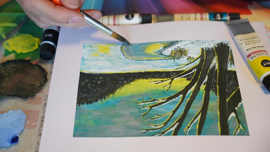
to dry pretty quick too. Well, let's start painting. In this session we're
going to paint. Now if you need that sketch, I wanted now's the time to sketch that on the paper
you're going to use. And then we can start painting. I'm not going to sketch, I'm
just going to use the photo as a rough reference and just
do the impression of it. Let's start. Alright,
I've got my paper here. I've got the photograph.
There it is. I'm going to put the
photograph sides so that I can still
see it and follow it. And you're going to follow it very roughly as you've
seen in the examples. We're gonna get
something close to this. I've kept my palette,
I've got my water. You just can't see the water moving them a little
bit closer there. Both with water. The first thing I'm gonna do is I'm going to use the tape. And we'll use this paper
actually where I've painted on the right size. Now what you're going to need is a ten by 15 paper or a four by six inch,
I think in the US, if you have a large paper
like that and measure it, or just use a different
card to just tape it so that you will stay inside the right
size for a postcard. Because we're going
to do a postcard, we're not gonna do
a huge painting. So what we wanna do first is
I'm on tape off the bottom. This is a sensitive
tape, by the way, masking tape, but a
sensitive masking tape. I can't get that off the hippo. And the next thing
I'm going to just do a piece right
here along the edge. And who use this as my guide? I'm going to put that on here. Then I get roughly ten by 15. And this would be the
other side's Diego. And I just only needs to top should turn this
around so that I can actually see better
what I'm doing. A little bit closer. And I should have
attended by 50. So this will be my frame. And by doing it like this, if you use the larger paper, you're going to get a
nice edge like this. If you don't want
an edge like that. And what you can do is just draw a frame and paint over it
a little bit of colorful. Cut it off later if
you do that too. Alright, I've got
a ten by 15 size. The mixture is insane. The few of the camera and
the rest I can put away. I'm gonna get my paints. I said, I'm going to work
with de Philosophie soda. Inexpensive one,
but not cheap ones. These are not cheap ones. These are decent quality. I don't want to get
my brushes with it that we are my brushes. You can see probably one. We're going to start
with the background. We're going to start with blue. I'm going to paint
this whole thing blew. So what I'm gonna
do, first of all, I want to just add some water. You don't want to
hit top of here. Fingers moving around, come on, stay where you want to make
sure everything is likely. Get some blue. And I'm going
to use debt like scholars. So I've got a civilian blue now, use the light cyan or you could
use the ultra marine too. I'm going to wet my
brush and I want to make a nice wet
pool of paint here. So even if you have very
pigment and strong pain, you want to paint, you want
to make a nice wet pool. This is our first layer. We want that to go
on reasonably light. Diego. What I'm gonna do, I'm going to just paint it
in like this, some strokes. And when I run out of paint, I'm just going to
add some new color. Basically, we're going to add
these colors all the way. Now, unless you have done
what to call it before, you already noticed
the difference probably is blends nicely, but you're running
out of paint quickly. What's the difference?
Why should we see me wearing my brush? Make sure I have enough
paint to go all the way. And let this blend and this
is kinda blends quite evenly. And that will basically be
my first layer of paints. Now got my background ready. So now if you have
that ultimately color, it's gonna be of course,
slightly darker. So what you wanna do then,
let me show you that. Well, let me first finish this. If you have ultramarine That
is very strong on that. I picked up the pure paint
and I didn't want that. So what I'm going to
do is I'm going to add some water so that I can pick up this pace as long
as this is dry, sorry, wet. It can move it around
pretty nicely. And move it a little
bit up and add some water on my brush so
that I can pick this up. Shouldn't have done that, but I'm okay with this. Alright, I'm gonna do
these edges a little bit. Better. Pick up this paint there too. If you feel it's running
out of paint to paint, so it's getting dry. Pick up some more paint. Or in this case, since
I need to spread this paint with better,
pick up some water. Now there we go. Alright, that is the background. Now, if you have a darker color, what you're gonna
do with a debt, let me pick a darker
color than we find that. Here it is. Extra fine. This is two. This is the style that I
want, that dark color. I've got them here.
Yeah, there you go. Ultramarine. Now that ultimately you're going to do
instead, pick that color. And as you can see,
that is very dark. Even if you've got a wet this, this will stay very dark and I'm going to demonstrate
it on top of here. I'm going to clean my brush. Alright, I'm going to pick
up this ultra marine. Where did they go? See that there's a very dark
color that is too dark. Because now you're going
to get into trouble with working if you want
to get this lighter. So what you're gonna
do is the next thing. What you're gonna do is you're
going to take some white, little bit of white
somewhere with your brush. Preferably use a
clean brush for this, but I've done this already. Mixed this. And as you can see, you get a nice tone to go until you get the
tongue you like. Like this is pretty nice. Then start wetting this. So I'm mixing it,
non-stop, wedding it. And if I put this down, see you get a very
nice sky color. Way better than the dark color. And you can work a lot
easier with this color. And especially if
there's dry ice, that should be nice color. So that's what you're
gonna do with deaths. And now I got these
columns I don't want, but that's okay. Alright, good. By wetting this stuff, I should be able to mix. That's the main difference. So don't use the
pure ultramarine, mix it with some white until you get a tone you like that. By now, this should be pretty dry and I'm going to fill that. But normally don't do
that. If this is not dry, what you're going to end up with is a finger mark in it
and you don't want that. So it was pretty dry. And if you really want
to make sure it is dry, now as set, you're going to
get that height hairdryer. Alright, switch
these turnarounds. Got to get that one there. This is where I
clean my brush in. And if this is really getting
dirty, you could have, of course, cleaning the
brush is pretty much fine. Let me get the hairdryer. If I want to make Like this. So don't do too hot and dry already. Good. There we go. We can continue now
with the painting. We've got our sky. Now the next thing
we're going to need is we're going
to need that, those mountains, the
mountains in the back. The stuff. We're going to get
the horizon line, which is around a
third, a quarter. And I'm going to put
it around the third, putting this mountain here, pulling this trees there. And I'm not gonna do
anything hard for that, pretty easy with
that same brush. Make sure I clean it. What I'm gonna do, I'm going
to mix some colors now. I don't want a black black. I'm going to reserve the black, the darkest color for the
trees that are upfront. So these are going
to be the darkest. These I want a lighter. So normally you
could use a gray, but a grey is too light already. So what I'm gonna do,
I'm gonna take a black. Here. She has solved that binary, which comes out with
a bit of that oily. Then you need some more paints. And the next thing
you're going to go and get is that yellow. And I need more
black than yellow. And what I'm going
to use these two, I'm basically going to mix them together and
you get a bit of a greenish black
tint now and not a total black black tenth later on we're going to use
the dark, dark black. But this I like slightly
different, different tone. So not as black
but bit of black. I might actually use
more yellow ones. Just a tint. You can see that? Yes, a tint lighter. When he gets some water on it. Not too much with this one. Just a little bit of water. I wet my brush, put it in. And what I'm gonna do
first now I'm going to go for that horizon line. So I'm keeping my
brush straight and I'm going to just draw
a line like this. And about a third of my paper. And there we go. Now it says, is this, this is an impressionism. I don't care if this is
really straight line or not. The next thing is
what I'm gonna do. I'm gonna add those
streets around here. So there are my trees. They go for now, That's good. The next thing I'm going
to add, that mountain, the mountain is around here and might bring it slightly
higher up. There you go. Paint that into Anish. You can see gouache
goes along way of, kind of way too much there, but I can use that later
on again for the trees. Hey, go and now I'm going to
just get this a little bit nicer and add some tree tops. And as you can see, I'm going
to go straight into this. And around here, a little
bit structured there. Make sure I've got some
tree tops there too. Alright, good. That
is my background. I want this one to
be slightly higher. Will leave this to dry and
that should dry nicely. Alright, we'll put this
brush aside for now. I'm going to take
that small brush. What I'm going to do next
is what that small brush, a little pick up that leg pains. And now carefully, I'm going to actually draw in this river. Now, if you have done a drawing, you just follow the river. If you haven't done a drawing, then we need to paint it
in and everything middle. And since this is
an impressionism, doesn't really matter
much where it is. I'm just going to put a very
fine line of the river, the river bank basically. They go and the other
bands is around here, slightly up there. And we're going to add that. That's gonna be my refresh and I've got my main things in. And what I can do now
if this small brush. Improve my horizon line
just a little bit, but I'm okay with it is alright. That's that we need this to dry. But while this is drying, I could add a little bit
of grayish snow tone here. So what I'm going to need this, I'm going to need some white. Let me first of all,
clean this brush. Now I've cleaned it in the jar. Pick up some white. I'm going to mix that here
with the black and move away from the black and
get a nice grayish tone. And that grayish tone, I'm going to add in as
that snow received. Yeah, that is right
here. That Snowden. I snow. Right. That is nice. So I'm going to add
that in right away. While I'm painting this in. I'm letting that dry so
that once that is dry, I can work up there. You go. A little bit down there
too. Alright, good. That a bit more
rough than it is. There you go. I'm going
to leave that to dry. I'm gonna go to the round brush, the thicker round
brush or use to five. Now I'm going to get
the figure round brush and that same color I have that grayish tone I'm
going to bring into my sky. I'm going to add
some of those clouds that I'm just going to do. Very, very random. I'm going to need
some more paints. Definitely add some black to it and add some water to it so that it's
a little bit wet. Mozart and distribute
slightly wetter than it. No one touched it. Black, Yes. And what I'm gonna do
next is I'm going to go back to my blue points, some points, little blue of him in it to
get a nicer mics, see you get a nice tone. As you can see, this is, this is just very random. Rather I like, I
just want to get a nice looking Skype
and impression of a sky that is slightly
getting dark already. But not totally
Diego, I like that. Then once you'd like something, I would say leave it except
for the corner here. You can see I'm not
paint dabbing and painting a little bit
and it's getting dry now that is perfectly one
that I'm going to get a little bit of gray
with the same brush. And to decide if the snow, I'm going to add a little bit
of a gray and pick some up, put some up there too. With that same gray. I'm going to actually
draw in painting, in this case, Dakpo. This bank here, which
goes up a little bit. We're going to add
white later on. But I want to know
where everything goes so that they have an idea. I'm going to paint
in everything. So now I've got my major parts except for the street of course, but the trees we're
gonna do at the ends. Nice guy. We've got, we just need
the yellow with it. Now, the tricky part comes, we need this to be
really dry or wise, this is going to go mixing
with the yellow really quick. So I needed to be dry. While I'm waiting what
I can do already, I can get some yellow. I'm gonna get some of
that lemon yellow. Team my brush. And
it's reasonably wet, not work, but reasonably wet. And what we're gonna
do in the river, I'm already going to add some yellow where I want
the sum to be later on so that I can get some
layers because I know this paint isn't as strong
as the designer one. So I'm going to wait
for that to dry. And it's already a little
bit of layers of yellow. As you can see,
what I'm doing now is under the horizon line, adding a line of yellow. There you go. I want to get some interesting
sounds like this. And at this stage, it doesn't really matter. Where it is or if it is exact. I just want some yellow in it. There you go as a base. Alright. I think we're up there. We should be pretty dry, so I'm picking up a
little bit more paint. I want this to be stronger. Nice, strong color. I'm going to add my yellow right there
at the bottom. Brush. So this is thinner. This is a bit thicker. What I have down here at nice color of yellow here. And now in the sky. Day go down there a little bit. We've got that
nice yellow color. Alright, bringing in some in the sky to go. Now I'm going to dry
my brush so that I can pick this up a little
bit better with a dry brush. There you go. Good. Now I want some paint back. Won't that? A little bit around here? Bit stronger than I have. It's alright, Good. Okay. Clean my brush. Pick up some of that blue again, and add debt right
there where I've put that yellow in mind as well. Some of that grade back, I'm gonna do that
once it is dry. I've got some tones
sung in my sky. Want to leave this to dry? I've got some underwater. I've kept this and we're
going to finish it. Finish it, we're going
to finish the lesson. We're almost going to finish
the lesson right here. What I'm going to do this,
just once this is dry, we're going to add a
little bit of a layer, pick up some of that white and black and create a
lighter tone gray. And we're going to basically put that on top of it and
let that blend in. This creates a slightly
lighter layer on top of it. That shoe blend in a
little bit and just bring it to a slightly
lighter tone down. Alright, now I'm going
to get small brush. Pick up some white, create a light gray again. Just some streets like that. Bit random. And do that here too. There we go. Okay. I've got some Payne's. Yeah. Let's get that
slightly stronger here. Answered, There we go. One thing I don't like is
down here, this is pickups, the brush with a little
bit of water and mix this in just a
little bit so that, that slightly too
bright blue blends. A little bit of a constant is a little bit of a transition. I'm just using a wet brush to do this thing where we're
leaving this to dry. So we've got our first
layers down now, we've got basically the whole
scene except for a treat. We're going to do that
in a later lesson, in the next lesson,
once this is dry, we're going to add to this, we're going to add our snow, but we're going to improve
that sky little bit. Add some snow, and then
finally also do industries. Alright, so I'll see
you in the next lesson. Once you're painting is dry to then join me again
in the next lesson.
5. Improving the Landscape: We already got a rough idea
of where everything goes. We already kind of quite
rough painting a setup which already looks a
little bit like painting. You can paint relatively
quickly with gouache. That's the nice thing about it. Now if you're painting is dry, you can join me in this session what we're
going to improve, what we have quite a lot. Alright, let's do this
before we can add our focus, the attention to detail
where everything goes. Those trees, we need
to make sure that everything else is
pretty much ready. Work on this a little bit more. I want to bring back some
of that blue in the sky. So I'm picking up some of this water mixing in a
little bit of color. Here you go. There we go. Actually
do this like that. Now I want to get
rid of that paint. Dry brush. You could actually also drive
and lift the dry brush. I want to make these strokes. And since everything
else is dry, that should not react. Now I get some interesting
things on my canvas, so I'm just adding
the blobs to it. And then I'm just with
a really dry brush. I'm going to add these colors until there's nothing
more to move. And I think that's
pretty much now. Again, a nice, interesting
sky like this. My new this again, at some
of those some of that paint. We're there to try that brush. It's pretty much dry. And do the same. This roughly dry
brushing this in. There we go now I think I might have pretty much
the sky I do like, so there's various
techniques you could do. Now, if your brush is
still a little bit wet, if you pick up
some of this paint That should work or pick
it from the palette. Moving back a little bit of
the grid at some points. And I'm working with a fairly
dry brush or whatever. It's still wet on my
palette will come. Okay, I think this is a pretty
interesting background. Let's get just a little bit
of wet hands off the black. Careful this is
probably going to be some brush strokes
here and there. Let that dry. Okay.
That's my background. I think I'm pretty okay
with debt's going to bring back in a little bit more yellow to get
a stronger here. Might do that with
that small brush. Make sure it is clean. I've got yellow here still. With a wet brush. I'm not adding a lot of water
to pick up some of that Payne's right at the bottom. And definitely some yellow. Some nice strong Tom's. Debian as you can see. More action painting. Good. Now that isn't
nice and strong. Alright, the next
thing which you need, I need to define this part here. And of course, now everything
is basically dark blue sky, that's fine, but I don't
want this to be all blue, so we're going to
need that work, that wet wet brush. I'm going to need them
whites that is here. And what's the wetter brush? We're going to start
bringing in our snow. And with the small brush
five, I've got for this. And I'm going to just add the snow like this on
top of everything. I'm wetting the brush a little, pick up my paint and push
it as far as I can go to. Stuck in my, on my paper. So William Rush, very
little bit picking up some paint and doing
the same here too. So that gives me a very
light layer of white, but not any lines or streaks. Or adding It's very strongly, but letting it blend in a little bit with
that background, we're gonna do the same
here. Some more water. Pressing my brush into the paper so that I can get
this interesting effects. Wedding it a little
bit, picking up some of that paint around the edge x2. So now we don't have really, we don't have white, white since we just picking up only a little
bit of the paint. But we're getting a
layer at the bottom, which we can work
with in a minute. We've got that part's
pretty much done. Okay, for right now, this should be dry
pretty quickly. The next thing
which I'm gonna do, I'm gonna get some of the pure
white on that small brush. And on the back there,
little bit of a line. And if it's not flowing enough, you can wet the
brush a little bit. But don't read it too much. Because then it becomes
watercolor again. And now I want it to
be more like wash. Here we go. A little bit. That's good. Now I'm going to bring in some stromatolites, bring in some lines, create that impression of snow. I can paint on my brush. There we go. That's down here. Some stronger pains. So more pure. And that looks interesting. I would definitely
be getting the idea that there is snow. I'm gonna do the same on this, create the impression of snow, although most of this
will later on pretty much be gone because there's a lot of black going on
top of death around here. There won't be much black. So I want to really
get this a lot. Wait a minute is to create
that impression of snow. Good. Let's see. Carefully a little
bit around this edge. Blends. Think I might have some left, which I'm painting on
top of everything. And there we go. Now I need
a little bit whiter again, sorry, little bit wetter again
so that it flows nicely. What we're gonna do
next on the river, just under the black. I'm going to add a
little white line to create idea of water off
a little bit of water. Shorelines see some more there. Now in the water itself. Bringing here and there. Just a little bit of
white brush in depth, a little bit Degas. And now this starts
to look more like. A reserve bank already
done it was alright. Me doing it around there too, a little bit random
and some whites create the idea of water. There we go. Let's see. We want some yellow cleaning. My brush. Got plenty
of yellow in here. Strongly yellow. We go down wet so that's
mixing softer, more yellow. Little bit line there
too again. There you go. Hello, leave it at that. Let's create another layer
of yellow from here. Just mix this in a
little bit nicer. I don't have all these blocks even around the bottom for
us should be wet enough. To create that. A little bit more interesting than it is at that
looks a lot better. Now I've wet at this
black little bit, so I need to be careful
into the yellow. Make sure I'm not going with my hands in whatever
I've cut down there. Alright, I'm going to leave
this to dry. Paint, brush. Good. Now this part
needs to dry. Let's see. There's, there's still too
much color on this side. So if reasonably dry brushes are just getting
rid of the water, picking up their white. Bringing that into this
a lot better here too, because I don't want that
much color in my painting. I definitely do want some
color in my painting. But at this moment, just too much color. Somewhat here to activate. There we go. Okay. Rid of some of that
blue around there. Around there too too much. I think my wife might be pretty much
gone and it's all white, whereas the whites here is
the white, Titanium White. Got some pure white. Now, I'm going to add that to my painting that we did show here. There we go. Now we got a little
bit of interest here. We've got our reserve. There are definitely some
more whites around here, but we're gonna do, first of all, it's
bringing those trees. And then we're going to
basically get this going. Now I ruined this a little bit. So let's add some thicker
white here. Good. Need to bring back
that little bit of wetting my brush just a
little bit so that I can spread this a little bit
better than it is now. Yeah. Good. I think I'm
okay with this. Clean my brush really well. While it gets some
of this black, I need to bring back my
shoreline little bit up a little bit, makes it
slightly into my water. We'll have a darker tone. And that really
thick black line, very little bit of black again. That Sean back a little
bit and now we've got it. Good. That's good. What I'm gonna do next
is I want to just let this dry verizon here. And once this is dry again, we're going to add our trees. That will be the next one. Alright, but that's
for the next lesson. In the next lesson we're
going to do the trees. Then play a little bit with those streets and see
how that works out. Then we'll pretty much
close to the end. Alright, well, if you
haven't done this, I would say paint this and do the colors you
like awesome in the sky. Make it like you want. If
you want to put some at some white here and
there to the sky, you could do it at some
more yellow to it. You can do that too. You can play with as
much as you like. Well, I'm moving to
the next lesson, so I'll see you there.
6. Painting the Trees: Welcome to the next lesson. While you may hear a little
bit of a difference in sounds because I didn't
have my microphone on. It was hanging
somewhere around there. I'm not even sure if we
can see the live video. I want to add later on, see if that's there or
not. But we'll see it. We're gonna continue. We're
going to add the trees. We've caught up basically
most of the scene already. We're going to add the trees, do some final details on
this painting is ready. Alright, now, if you have drawn your trees in the
probably come by now. So if this is totally dry, you can take a pencil
and draw them in again, or just follow me free hands. Okay, let's start. Now you probably see that
this is not totally dry, but the rest should be dry. What I've done is now I'm
going to use the same paint. So if yours is dry, just pick up some water and
activate the paint again. And I'm using the brush 12th, the large round brush. And I'm going to
bring in those trees. Now, again, I'm not going to
follow exactly the photo, but just pretty much
as close as I can. I'm going to add that
foreground tree first. I'm going to just
go in and add it. And since this
should be black and now we should have,
see that clearly. Here. We can see that clearly. My first street will
basically go here, picking up some of that water. The second tree
is gonna go here. And then I'm gonna
do a further three, which basically starts here. And then bends a
little bit there. We're going to make
them thicker. I'm just want to have a direction. And then the last tree
is going to go here. And I'm going to bend that
tree bit more than it is in the photograph. So you could go now straight, keep it going
straight like that. And then create bands
like deaths among, just think I'm going to leave
it like this, that's good. Alright, now let's continue with these trees. On, of course. Make this a nice fig tree. Fig tree, but a thicker tree. Here you go. Make sure creating
it a bit nicer here. And definitely a
lot thicker too, and I'm going to bring it almost to the bottom. There you go. Secondary, need
some water again, probably for this second tree and it needs to be thicker too, but basically not as thick. Definitely not as thick
as the other one, but still a nice thick trunk. Thicker down there.
There you go. The next tree is more
behind it, a bit thinner. But then again, not too thin. There you go. Let's add the
trunks a little bit there. And the next one picking up slightly a little bit of water. I'm going to add that last tree. And that needs to be a little
thicker there. Hey go. I've kept my three, so I think I like I
like this, That's good. If you like something, you're going to keep it. Only want this one
to be thicker. There you go. Around. There. Just one little bit thicker. Now that's looking a lot better. Now, a new stroke in front
of it for that tree. Behind here, I'm going
to paint just one tree. Let's say it's going
to come in an angle. And you could paint in another tree here are
just as I'm doing here, probably create this one
under an angle here. And something like this. Let that disappeared. Nice fig tree behind
the other one. I'm gonna do it like this. This is the front three, so making sure keeping that
in front of the other one. I might go with this. Nice, Good. I like that. Alright. Well, next thing is we've got these
main branches. We're going to need some
of these other branches. Let's see. We're going to add
a branch here. There you go. I'm
going to add a branch. There you go home. We're going to pay attention to these branches, of
course in a minute. I'm going to carefully
at a branch there. Let that branch
out to give some, pay some attention
to this branch. Let's see what are
we gonna do this? I'm gonna go one up, one down like that, That's good. And later on we're going
to pick a smaller brush. And what we're gonna
do, and there's some more branches around
here at the bottom, e.g. I'm going to paint that in. I need some water to
activate this paint. And I'm actually going to
do a branch right there. Now you can't see it, but don't worry that will get that will make sure it's going to stand out from the background that
will, will fix that. And this one, what
we're gonna do with this one back here. It's gonna get a
branch like that. Good. Well let's fork this branch then two again. Now
it's looking good. Alright, I think we've got
quite some nice branches now. Now there's another photo. There's a lot more branches. As you can see, I'm switching
brushes to the small brush. You can add as many,
as many brushes. You can add as many
branches as you want. So if I wanted a little bit of a branch day,
you can do that. I see I made a mess, so I got to correct
that a little bit. Brian, slightly thicker. There you go. And you can add
branches wherever you like. I'm not going to add
a branch right there, but I'm going to make this trunk I think slightly straighter. There you go. Okay. Good. Let's see. Do I
want more branches? I want this branch to
be more like a branch. Don't want to go. Okay, good. There's a little blob, so take care of that blob. There you go. Good. Alright, let's see
this branch here. A little bit off the bottom. Good. Um, I need some
water, not too much. Otherwise, I'm going
to get this problem here where everything spills,
where I don't want it. I want to have a
nice thin brush. Then allows me to add some nice thin
strokes, not like that. I don't tell them too much. Alright. Let's see this one. A bit disconnected. One, it's a bit nicer. And I'm think I'm pretty
much okay with this. Alright, good. Dry. Let's see. The next thing is there's
some bushes right here. So I'm going to bring those in. And just with thin strokes, I'm not pressing the paper. I'm just making very
short thin strokes. And I want to add some very
thin strokes up there too. And behind here. I want to do the same.
I think I'm okay. And around here, while
I have this brush, I'm going to add a little
bit of an edge right there. And with dose I think
I'm pretty much okay. I might just. Add some spots here and there. And with the water
there is of course a reflection of these branches, grasses, whatever they are, ego. And we're going to just
add some down here. Get an idea of a reflection in the water pool that a little bit, That's good. Alright, now, if this branch
a little bit more body needs some more black paints. Water, wedding this and I think I'm pretty
much getting there. Oh, my brushes to dry. There you go. Now we've got
a nice one. There you go. Good. Alright. Well, I
think I'm pretty much done with these. Sue you. This good. Some strokes extra. And that could get a few strokes extra and the rest,
I'm okay with. I like it like this. Good. Clean my brush. Let's check. Let's see what do I want? I've got that yellow. I've
cut that some yellow, I've cut this yellow. And now this is
looking a lot nicer suddenly because there is
something in front of it. I'm just keeping it like this. Yes, that's good. Let's see. Do I want to do anything
about the snow? I make clean this
brush really well. And I've still got that white. So I might just add a
little bit more white. You go, that's better. Even spread it a
little bit more. Back there. Definitely.
In-between there. Okay. Not too much there. Let's see. What do I do want to do? Get rid of most of this white, but still one adds a
little bit in the water. A little bit of the idea of
some reflection going on. There you go. Spread
this a little bit. And I want a little line there. So I may need a
little bit of water, get that wide and add a
little bit of shoreline. Right there. I'm gonna do that. Again right there. Some white there. Pick up some more white. Dude, adhere to create
debt shoreline. There you go. That's nice. In here. Just some
streaks of whites. Bit stronger. There you go. Good. I think
I might leave it like this. No, that's it. What you could do
is I could add a little bit more gray in the sky. I might actually do that. Clean this large brush. The large round, not that wet. Pick up some of that
black and white. Create that gray brushing. Some more gray hair and there, yes, that is better. Now careful with my branches. Bit more controlled. I would say around here. We can fix, of course
whatever goes wrong. Right? I like that a lot better. Spread this out slightly. At a hint of gray in it. The ego that is good. And then we're going to get
that small brush back again. That has widened,
going to wet it, get rid of most of that. Get that black on it. Make sure I keep my nice
point on it. Let's see. And what disappeared Here it is. That's back. Figure
of a branch there. And the rest, I think I'm pretty much okay with that. There you go. Good. Well, let's leave it
like this and let it dry. While I'm not totally done with the painting yet,
There's one thing. I'm going to add, some snow and sunlight
effect on the trees, but that will be for
the final lesson. See you in the
final lesson then.
7. Improving the Trees: Welcome to the final lesson. I said in the previous lesson, we're gonna do one more thing. I'm going to add a little
bit of a light effect to the trees to distinguish
between the trees themselves, which to me is what tree, a little bit of a better
distance from D. Let us, let us come out a little bit
better from the background. And then finally, we're going to add some snow to the branches, and then we're pretty much done. Well, let's do this last
bit, right, for that, I'm going to only use this small brush and we're
going to pick up some yellow. I got to move a little
bit closer myself. This probably is going to need some water to
be activated again. And if you need new
paint, of course, then go ahead and
get some new paints, but they should still be okay. Now I want to make
sure I'm having a nice point on my brush. What I'm gonna do is I'm going
to create a light effect, will show you that in this
painting on the trees. And by doing that, they
distinguished themselves. We better from the background
and amongst each other too. So we're going to add
some, first of all, the yellow and then later on
we're going to add the snow. We're starting with the yellow. So I'm starting with
the main tree here. And then making sure everything
is dry so that I'm not resting on something
that is wet and I'm getting it on me and
spraying it everywhere. So let's start with
the first one. That large tree. Let's see, I'm going to start
it right there. And it's not moving
as I want it to move. So I'm going to make this
slightly wetter so that it stays in a point. And I can make sure I'm
going to move this one up. We can still see that. Yes. I have some room to move on because I can't get
too close to it. But I'm going to get as
close to it as I can. The ego, that's the first line. Definitely add more to
Tunis so that I can get a nice sharp. Russia might need a
few lines for this. Let's see, the next
tree is there. And I'm going to
just paint that in. And whatever I paint
now, defined right away. Obviously, there are three different now and I'm
over the right tree. They go. And now probably there's
a huge difference between quality of paint, which one covers more, on which one covers less. Let's see, There's
this tree here. I want to get to bottom branch. And then there's this one here. And now by doing this, you probably noticed right away. Now you can see actually the tree and which before
it was a black line. And as soon as we
do that here too, It's gonna distinguish itself definitely from the backgrounds. You know, it looks
good. I'll just paint this giving
me some problems. It's slightly too thick. I don't want to wet it too much. Then it's not strong enough. Probably. Well, see if I can get a final line or I should
get very small brush. But I don't want to go to a very small brush because I figured not everyone might have very
small, small brushes. Alright, let's see. We're going to have this tree. This tree is in
front of that tree. So I'm going to bring in
this tree-like debts. Now belongs to that tree. And now you get that
sense of evening. She beautiful me. How does it work so nicely? Little bit there.
Kathleen, little bit debt. This we definitely need
to spread a little bit. And if it's too much, it's not a huge issue as it
little bit more on here. Get a little bit there. Good. We've got a dare. We need some on this tree. There you go. Distinguished
at three from the background. Not there of course. But on this branch, we're going to add
it to. There you go. It looks good, doesn't
it? And in the grass here or the whatever
is back here. And here too, we're
going to just add a little of yellow
to make it interesting. There you go. Good. And while we're
having the yellow, let's bring back some
yellow in the back. They go and we want some
definite yellow in here. And definitely there too. Here we go. Good. I like it. Let's see this one. Carefully. A little bit of yellow under it. And I think I'm pretty
much okay with that tree. This is now a broken tree or
make it into a broken tree? Yes. And that's that's
that. Let's see. What do we need now? We need to snow.
I think I'm okay with all the yellow
for the snow. We're going to need
nice clean brush. We're going to pick up
that white that is here. I'm going to
activate that again. And for this, I'm not
going to add lines, but I'm going to carefully
depth some snow onto it. I want to make sure I've got
a little bit of a point. There you go. Making
this wetter two. Then I get a nice
straight point. Just imagine there's some
snow on the branches. And how that would look like. There we go. Okay. This and we're gonna
do a little bit like that because it's
slightly too thick. Here we go. Good. Now, if you
have a really thin brush, you could use that for
this if you wanted to. I'm going to keep my self-harm by starting at the wrong side, should have started at this bag. I'm definitely going to
add some snow on there. And some snow. Alright, there you go. That looks good.
Let's see what we want some snow on here. Yes, we do. The hago. Makes it just a little
bit more interesting. Now around, Let's see. Definitely going to
need some snow on their on their definite. Now I forgot a
yellow line there. Top of here. There is snow. Snow there. Alright, I think I'm
doing okay with this. I'm going to add
some snow on there. And definitely some snow. There, although it's
kind of hard to see, we need some more
here. Not too much. Alright, that's ads
in-between these two. Just a little bit of snow
and let's do it adhere to. They go make it
more interesting. I think there's snow there. I forgot some yellow
there. Let's see. Do I got I got everything. Let's make sure this time. And a little bit of
snow extra there. And on there a little bit. I think I'm okay. It's here now these trees stand out nicely
from the background. Perhaps not the back here. Not as much should we could add another branch there to
really give that impression? Or do I wanna do that? I don't want to think,
I don't wanna do it. You could do that
like, let's see, on this painting here, where there's another branch
going actually behind there. If you add that, you get
the sense of more tree. But what are we gonna
do with this one? Get rid of most of them. White paint. And a
very light line here. Line. My brush is pretty
much almost flat. And by adding a very
thin line like this, I'm okay with that,
That's better. I'm gonna do the same here to make it stand out a little
bit better than what it does. Stare a little bit
of snow on there. That looks good too. Okay. Good. I think I'm okay. Except for that line there. Yeah. I wanted to really lead wet brush. Get some yellow. And let's add
finally hello there. Good. So let's extend this
one a little bit. So cleaning my brush and
pick up some of that black. You go correct
this a little bit. And I want to correct
that a little bit too. Right? That was slightly
too fake breasts, I don't mind, but that
was really thick. And touch up here a little bit. Go him might bring in
there a little bit more of the yellow. That's better. Okay, and now
there's yellow gone here. Let's try and add a
little bit there. Maybe bring back slightly, little bit. Black back. Again. There you go. That's better than the muscle. Too much of that yellow in it. Now this is quite dark. Well, we could do is
we could bring it just a hint of snow.
Clean the brush. Kenneth White, making
sure it has a nice tip. And just add some
spots here and there. I'm looking at taking up
the photograph with it. You can see that around here
are some white in there, so we're just going to bring in. Just a little bit of white. And once this dries, this should be
pretty okay. Right. It got some left, so one had a little bit back there as well. I'm headed bit
stronger snow here. That's two blue
hair to some white. That is the nice
thing about gouache. You can add just another
layer on top of what you have and then get
a tone you prefer. From what you had previously. Might have a little bit. Snow around this
bottom, definitely. Dabbing that on its here to get rid of that. Gray. And here, we're definitely going to add That's tricky. They go on a little
snow too. There we go. Good. Clean the brush. Get some black. That's too wet. Well, let's leave that to dry them and take some wet on black. Right. And move it
right in there. Good. I like that better. That's good. All right. We'll leave that
to dry that up slightly. I think I'm pretty
okay with this. Except for now that water
and that is tomorrow. So let's pick up some gray and basically brush
this in a little bit. Now, that is good. I like that. Up here too. Can be some gray in it, but that was too
some blue in it. That was too much now I
think that is a lot better. I think I'm going to
leave it like this. Except for take a wet brush, pushing those white
spots a little bit, that's a two white. Still want them to
completely disappear. Go but I don't want them to be as wide as they are. Good. I think that is a lot better. Then I can add some
of that gray to it. Create an illusion of
something going on back there. Alright, I want to
leave this to dry and then I'm going
to show you the final result in a minute. So I've removed the
masking tape and there is the final result of this
little painting, the postcard. Now I could just cut
it out on that size, send it to somebody. And you got a nice, lovely
postcards to give away. Now before I leave you, now we have all
these dirty brushes. What you can do best now is to clean them with cold water. Don't use warm water
because we use warm water. The pigments of the pains are going to stick
to your brush, rinse them well with cold water. And then if you can't
get them clean that way, what you can do, you
can take a bar of soap. Let's imagine this is a bar
of soap and water running, making it nice and wet. You can push it into the soap and just clean it
that way and then rinse it with your fingers and
repeat the process until you don't see any to paint
anymore on the soap. Regular bar of
soap work fine for that awesome dishwasher
detergent you can use to. But regular soap works fine. So that's for the cleaning. Now the glass plate and these
both you can of course, clean with warm water, That's not a problem, but
the brushes, cold water. Then we have our winter
squash postcard, an impression of it,
more impressionism. Then really going realistic. We give an impression
of this photo, what it looks like in
this gouache painting. Alright, well, next up is
the project. See you there.
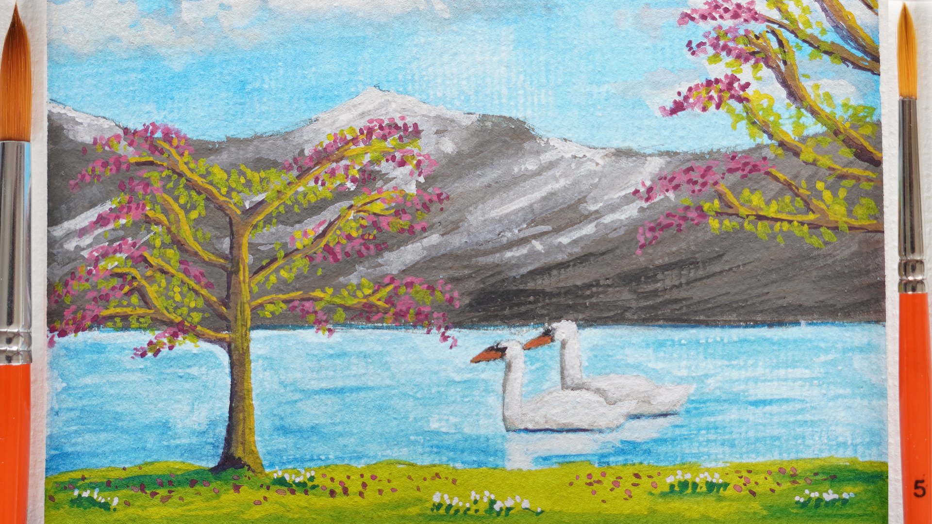
8. The Challenge: Now that our first
postcard is ready, I would really love to
see the result of it. That is not your project, but please do post it. Also, please do leave
a review because other students are really
helped to find this class. If you leave a review, then Skillshare as giving a little bit more
attention to this class. And it's easier for
others to find. Now the project. For the project, I've
added a second photo to this class of a
different winter landscape. And the project is that with the techniques we've now done, you just paint debt postcards, create that photo
into a postcard to and post it for
all to enjoy us, for all of us to enjoy. That will be your project, creating another painting from that extra photograph
I've added to this class. And I'm really looking forward
to what you will create. Thank you for being
with me in this class. And of course, this
is just the first of a series of postcards
will be doing so. In future, there will
be more postcards. So I would say
follow me to that. You get that notification
when the next class is ready. Or if you can't wait that long, There's other classes I have. You can pick up
some other skills. Don't forget to
post your results. And I hope to see you
in a different class.
 Benjamin A, Art Teacher, illustrator Art by Benjamin