Transcripts
1. Introduction: Welcome to this next session from idea to finished illustration. And as you can see, we're going to finish another illustration, but we're going to use different materials for this. And as you already may have guessed, we're going to use alcohol, Marcus. Well, I'm going to draw my drawing first with ink and then I'm gonna cover it with these alcohol markers. And I'm going to take you step through strap what my processes, I'm arriving at this illustration. As you can see, this looks quite different than the previous ones we've did, but it's a really nice illustration. Different touch, different look, different atmosphere, but still a great autumn scenes. Join me in this session where I show how to work with alcohol Marcus. So I'll see you in the next video what we're going to talk a little bit about materials.
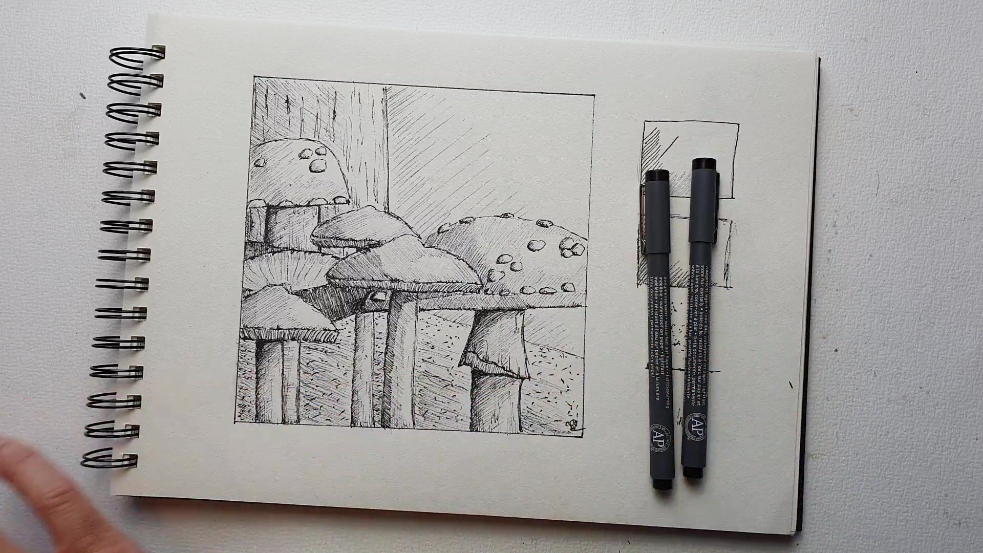
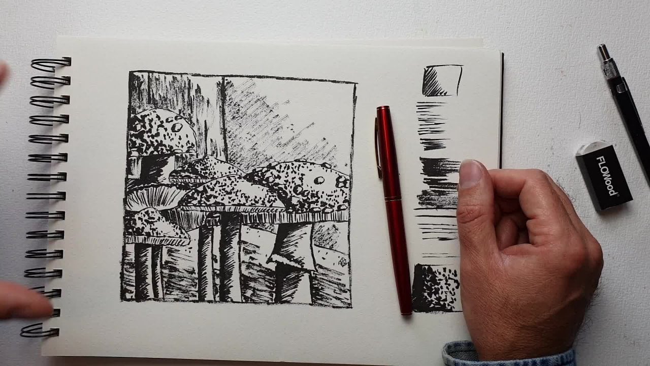
2. Materials: Well, to get this illustration, of course we need some materials and you see some materials already before you can start, you need the drawing and transfer it to different paper. We'll get two paper in a minute. You're going to need this one or this one. The shaded situations which Eating1 you made or perhaps both. We're going to use that as a guide again. And you might need a pencil eraser sharpener to do that. And I'm using an ink pen, its fountain pen, or I'm using sepia ink for this one, but you can just use blacking, blooming, reading, whatever range you have. Fine. Instead of a fountain pen, you could also use a brush pen. This one has, by the way, so EPR to a brush pen like this. Or you can just use a regular fine liner. I'm just like one of these, so that's where I'm going to enquire if we're not going to use the pencil for outline because that just doesn't look nice with Marcus. So you can draw it with your pencil, then engage with either a fountain pen, brush pen or a fine liner, and then erase that array. And then we're going to use alcohol markets. Now you see a lot of alcohol, Marcuse and these, these are just, I'm going to use cheap bonds. These are called Touch soft head. And the nice thing about these is that they have that bullet tip are like that. And here's another one called twin Marcus. She wants to kind of a bullet had bits more sturdier. You could use those. Or you just could use Capex. Fine too, if you want capex or what also is very nice Are these spectrum no asked is are calling the them spectrum alas Collins system but alcohol marks to these are lovely to. I just didn't have the right colors for this image. So any brand alcohol Marcus will do. And then of course, you need some paper. What I'm using, Let me put this all the way is marker paper. This is Schuller hammer, but there's different brands that have market paper. It's a nice mach paper. And the nice thing about market paper, it is quite thin, but it's bleed proof and as you can see, there is nothing on the next sheet While it shines very strongly through, as you can see here, it's bleak proof it stops the alcohol from moving fluids, but it also helps you to blend really nicely. Another paper you could use is something like this. Paint on multi technique or mixed media paper that works fine. Or you can use Bristol paper, just don't use this fell in one but used at smooth paperboard libri looks like paper that smooth one. You could use that to work scoop with alcohol markets, do I prefer the marker paper because it blends nicely, but hey, this works go to if you don't have that, just don't use regular paper. Use a smooth paper. Paper that is basically made for like this. Marker strings like this then works best. So these are made for markers. This especially market papers of course, really made from markers. And it helps just to blend ECM work easier, alright, yeah, such so you need some alcohol mark or something to English. You need some paper, either marker paper, milks, mixed media paper on Bristol paper to smooth one. And once you have that, let's get going to the next session where we going to work on this illustration. Alright, see you in the next session.
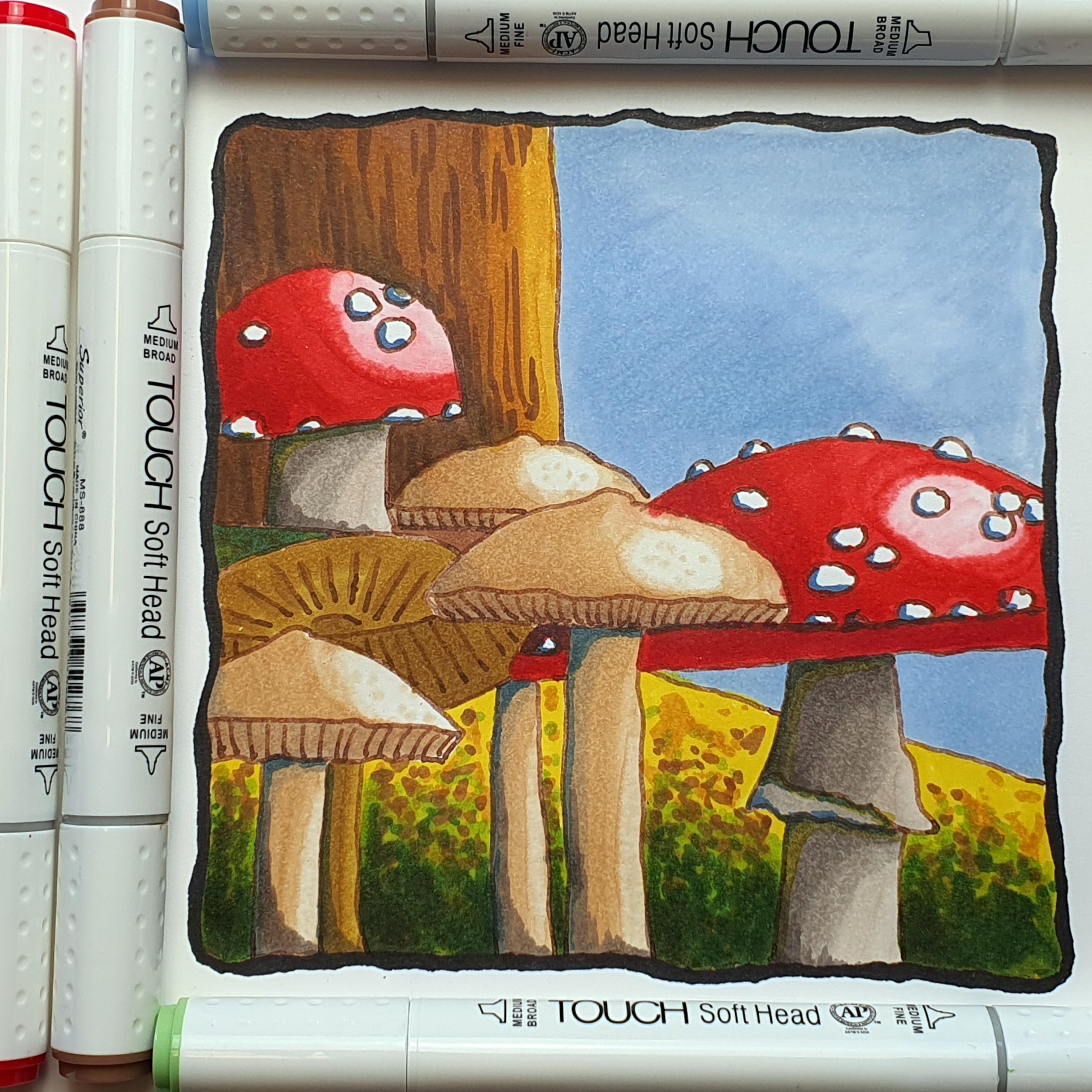
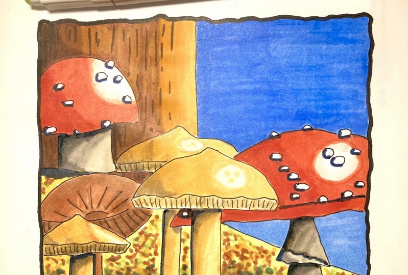
3. How to Color with Alcohol Markers: Welcome to this lesson. We're going to finish our illustration in this lesson, and we're going to finish it a little bit different than in the lessons before. We're going to use this alcohol, Marcus. And we're actually cannot mix a little bit of media. But let me first tell you what you're going to need. You're going to need this drawing, which we're going to work from. Your going to need one of these shaded drawings, which we're going to use for the shading information. You're gonna need your pencil eraser sharpener. You're going to need some alcohol markets. And you're going to need a fine liner or a pen. Whichever one you have, IU or a fountain pen for this one. Because and you need some market paper or mixed media paper. We're going to work on this one today. And as you can see, I've already done it so that I can dive right in and I'll leave you to it to create this by yourself. So before you can go with the alcohol markets, create destroying. And what I've done. As you can see, I've used slightly different style for this one. I used continuous lines instead of the sketching motion. I just made a different kind of illustration from it. And we're going to, this is ink and we're going to use that with the alcohol marker. So if you do ink, then draw your drawing, let it dry for a while and then once it's dry, Start with the alcohol, marcus, I've got various outcomes. Alcohol Marcus even have some sets our call out some of the colors and the numbers. I picked them from a color swatch i made from all the marks I have. And I'll be telling you which colors I'm using. We're going to dive right in and we're not gonna do basics. I'm just going to talk you through the basics while I'm drawing arrows, these alcohol marks. And the fun thing about alcohol, Marx is, as you can see from the swatches, you can do various tones right away with just one marker and we're gonna make use of that. Alright. Now, how come Marcus smell a little bit. We have various alcohol. Marcus, I'm going to use the ones who have this bullet tip. And I gotta read, I'm starting with a red. This is for a million and in my set, its number 14 in your set, it might be totally different. It's called familiar and I'm going to use that for a total tool up here. And what I'm gonna do, I'm gonna have a look at this image too. And I'm going to say, okay, I got this highlight there. And the thing is about outcome markers. I don't want to use pencil to define everything because afterwards it's really hard to get rid of. So I'm gonna go right in. And we're going to start with my this midtone and we're gonna do this whole part. And with alcohol markets, you want to define your areas little bit where you're coloring in. So I'm just going to column just you would do with a marker. And as you can see, that gives me really nice color in one go. And I'm gonna go up till there. And this stuff smells a little bit. But it also colors, as you can see, really nice. And the nice thing about using this marker paper is that it won't bleed through on the other sides. Alright, that is just one layer. And we're going to get strong highlights with this, but we might do something with later on. And what I'm gonna do now with my, this is my midtown with my dark tones. And when you use that same marker, and I'm just doing a second layer here right away. Around there I wanted, Alright, I'm going to let this dry. And while the Dries, I'm gonna go to the next one, I'll leave that layer to dry those layers. And I will go back in either with a darker color or with another layer. And I'm just gonna do right there. Now, it is a bit like water color. If I would go right here with a different color right away, it would blend in straight away. So you have to let your alcohol Marcus, dry a little bit. Unless of course you want to blend in things colors. And the highlight is around here. So I'm just going to put in the highlight there. And as you can see, I'm just coloring like you would when you were a kid. And don't let it dry while you are coloring. And so I don't mean so I wouldn't stop here, walk away, and then start again because then it will be hard to mix in your car as long as it is wet, these colors really mixing nicely. Then you get a nice even blends. So I want to do this to alright, good. I'm letting that simply dry. Now the thing with alcohol, Marcus, is light colors darken the work a bit like watercolor. You couldn't put a light color. You could lighten this a little bit, but not a lot. And that's the red and the nice red. Ok. And I'll leave that to dry and this should be tried. Another next color I'm going to use is a warm gray number one. And I'm going to use that for toads to the stem there. And I'm going to start with this one. And I'm gonna do I'm gonna do it completely. All right, K. Now if this one, I'm going to use a warm gray free. So this is my midtone, and the next one is a warm gray free. And we're going to add that midtone and creates the highlight. And now I'm going back home gray one. And I'm gonna blend it in a little bit. And now I'm gonna take my last warm gray. There will be a warm gray six. And I'm gonna do my shadow with this one. And I'm going to use that same warm gray one. I have blends that in a little bit. And I'm going to let that dry. I'm gonna do the same right here. So my warm gray one color this all the way. And as you can imagine, if your ink wouldn't be dry, the stuff, just start moving your ink round. And preferably, I would say you want to use waterproof ink to four inking it. Alright, that's nice and wide. Let's go for the next one, the warm gray free. I'm just doing in the midtone. And midtone goes around there. And I'll take that one. Right. And with this one, let me put down that long gray six right away to and while this is still wet, let me get that warm gray one again and blended in. And now the blending, as you can see, that's the wrong color. I wasn't gonna go for that color. So I'm going to stop this right away. Check victory on one of the big disaster. Making a bit of roundup motions to blend it all in a little bit. And as you can see, by taking that warm gray three, instead of the one, I blended this in too much or might go back in with, that won't grade six. And simply add another layer to get it back again. And now I'm gonna go in with the warm gray one and blend it in. There you go. Good. And that's step one. Now, we can go right away here, too warm gray one. You can see you get a whole different kind of picture. Spot. Six right away. And now I'm going to mix it all in with the warm gray one this time. Make sure I get the right one. Okay. We'll get down there. And you want to maybe via pics sepia instead of black, no black would look good too. And just like the natural color of this, alright, that would be the first one. Now we gotta do this one. I'm going to go back in with the same familiar number 14. Can I add subtle layer here? And same there. And now I've come over my border and status hard to correct. Or in other words, it will be impossible to correct. For this one, we're going to pick a slightly darker one, put down the side. Ok, I'm picking four that color on a serum chart. Let me get the right one. This one here. Scholars 13. The darker color. As you can see, it does mix in a little bit, but just not, not strong enough. I want this a bit stronger. So I'm hoping that this one will give me Yes, that one gives me a nice blend. And getting that same 13 familiar in 14. Let's blend it in. All right, and now we're getting a bit darker. We might just go even one darker in a minute. Slightly sloppy today I see mix. Mix. Right. A little bit, and we do a little bit here two. Alright, so let me try, let it dry this way. And I might look at my chart and say I got a deep reds, I need to find a deep red. Number ten are right, and I found my ten. I'm gonna do that down here. Let's see. I'm not going to mix that in. Just around that border a little bit. And there are two. Good, alright, now I got some tones. Okay, next thing I'm gonna do, I'm gonna take colorless blender and kind of make sure the column splendor is clean. Sometimes as a colour in it. And a call is blending you can use to light and colors. And I'm going to pick up their red color with it around that border. And as you can see, by doing that, I lighten that a little bit, but I also can a little bit of a transition here. So that is not all white, white. Let me do that a little bit. Tear to lighten a little bit. And walkaway these edges a little bit. Let it dry and doing the same here, we still have some color coding around that edge. Picking up the color and moving that into the highlighted area. And at the same time, I enlightening the border and adding in another layer of red. Alright, now I've got a nice area. Let the dry See how that nicely that rise. A little bit around the edge, circling a little bit like that. And now I like that. Put down here two. And once you do this, make sure on a piece of scrap paper, you just clean your tip. My piece of scrap paper like Here, see until there is no color anymore. Because otherwise if you go into your next work, then you destroy it. All right, now you get some nice, say like here, here two really nice highlight instead of that strong, why'd you get a bit of a different highlight? All right, now, all we have this, this nice, I want this to have a slight border and I'm going to use an olive green for that totally different column, but I'm one ad. Around the edge, a little bit of a shadow. And I want to do that in here too. And down here. That says, we're going to let that try to do the same with this one. And I'm going to let that dry bit of a color effects slightly more here. So you get a bit of colour in. It. Looks nice. They don't have to do that, but that just looks nice. Okay. I want to create some shadows on this read. And what I'm going to use for that is a royal blue. Gotta find the right way. And I'm going to just add a little bit of shadow around those edges. Not really thick edges for that. Now you could use you could use a caret for this to just don't move US. Black, black is so definite and so strong, but I like this blue sheen on it. Unless you can see I'm doing this rather lightly. I'm starting to look like a nice illustration like this, isn't it? Okay? And putting these colors, I've used a site. And I might go back later in with that royal blue to get some more shadow. I'm letting this be like this or so all the direct SCO aside and these warm grays. And I'm gonna go for these toadstools. Let's do these free. For those free, I want light color, I'm gonna use sand color and let's call me a $0.107. Let me see if I have that somewhere. There is. All right. And I have two mics in the second column of this tube, and I'm just going to color toadstools first. And let me see. Start with this one. I like cause there and the rest. I just coloring. And I might for this one, the darker tone used those warm grays I've used on that toad stool to alright, so this will be my main area. And let's do this one too. And we've colors. You may have to experiment a little bit before you can get the right colors. Putting aside, I'm going to go for that warm gray. Let me see if that warm gray one do will do anything. And let me start with this one. That won't do much. Just a little bit. As you can see, an a for the, that's enough for the Highlight. And let me do the same here too. And not the highlighted dark. All right, and I'm gonna go for that warm gray number 32. And we're gonna do an extra layer right here. So I've done there to just a shadow layer. I'm going to do that around there to bid-offer gradations. And here I'm just going to lightly there. And now we're gonna go back to the original sends color. And I'm mix this. Oh, let me not go all the way to the edge, this one. Toss layer a little bit. So I'm gonna make use of that. And not going all the way to the edge and creating their way better for highlights. Alright, that will be the first one. Somewhere there. And I'm going to get the black pen again. Pick up a little bit of their collar OMB much and might pick it from here and put it in there. Doesn't do that much. To light color. Let's lighten it a little bit. So we would definitely need a very, very light color in there. But I'm afraid I don't have that kind of light colors. So I am just leaving it. Let's make this slightly natural then put some dots here and there. And now let's get colors blend right away a little bit. Okay, that makes a good highlight. Alright, let's do the next one right away up here. Dominant seven. C where the light goes is under one rider. And I'm not gonna go do this one. I'll leave that alone for now. Alright, and now while it's wet, let me get that. Now. Let me put a few Datsun while it's still wet. Let me now move this around just a little bit. A good candidate right away. And now we're gonna go for that warm gray one at a dark tone right there on the edge. Let me do them warm gray. Free, mix it in wet. Okay, good. I'm gonna go back to that. One, gray or sorry, sends Gray and I mix this in a little bit. Alright, that's good for that one. Now I can go down here to write on this spot, will do that in the next lesson that stop for now. Let's stop here and continue in the next lessons I would say do this. And then once you've done that, come back and we'll continue.
4. Coloring Mushrooms with Light Colors: Welcome back. You've done this. All is well, everything is dr. So we're going to continue with this one. Now. This one is highlight. We're gonna have right there. And I'm going to color it in. Now I only have direct support them. That is a pity that landed that in a little bit on right? And since this is a larger area, I'm gonna go right. I'm going to not do this one. I'm going to stay with this. I need my colorless blender. Picking up, moving it around in there just a little bit so that it's not all pure white. And I'm gonna go my warm gray one, create a darker parts. And I'm gonna go free again to this end bit. Mixed it in. And as you can see, if you do it while it's wet, we've done it here when it was dry. While it's wet, it's blending in a lot nicer and I'm gonna go back with that 107 original color. And bringing back my midtone, but I'm not gonna touch that part too much. Just around the edge a little bit. And I'm letting this dry and our Can while this is dry, I can I can do this one. I'm getting that warm grey on grey one goes there. And I'm getting warm gray line in the middle of a shadow there. Alright, and now I'm getting back my sense color. Mixing this in, but I'm going to not touch the highlights like I've done there so that when this dries, This will be an automatic Highlight, okay? Right, I might just get colorless blender a little bit and plant this in my due to same there. Pick some other color. Oh, all right, good. And that's it for this. Now I can do this one too, but let me make sure I got the right column that send color again. And you might have noticed with every stroke, I'm trying to overlap the previews one a little bit so that you get a nice blend. Colors blend in really nicely. Almost the same color. Alright, I'll do it line dance. Okay. And we're creating that highlight. Don't go over the highlights. Now. Plans in this one, we'll take that color's blender, pick up some of their color around the edge, lending it in just a little bit. Trying to pick up a little bit of color here to letting them dry. As you can see there, I can pick out some of the color again, I can widen that a little bit. Alright. Her2 around it. Slightly. Good. Alright. If I can't fix slit, this won't allow it. All right. And that's it for this part. Yes. We've done these now. We've gotta do this. Notice is trying on its own nicely. And once this is dry, I'll go back like I've done here. Pick some of that cholera to create a highlight. The rest will lead drives nice. Yeah, got some darker tones. We cut that everything. Alright, ok. Next one, we'll do this one. You do this. And then if once it is dry, tried to pick out I gotta clean that I've been on that red. See if you can. Anyway, just a little bit of that highlight. Now that should work nicely. Wants that is dry. Alright, good. Next, we're gonna go to this one. We'll do that in the next one. So I'll let you do finish this and then we'll do this one. See you in the next part.
5. Creating a Background: Alright, let's do this one. What color did I have for that one, I've picked two colours here. A 104101, let's see, that is a 101 is the yellow ochre and a 104 is a brown gray base color. I will use this 101 and then also do some darker tones with that a 104. They should work nicely together from starting with a 101, that's a yellow ochre. And I'm going to do this guy right there. And as you can see, that is pretty much a lot darker than the ones in front of it. And that's the whole idea, isn't it? Highlights? Not really here and we're going to not pay attention to any highlight or just kinda Colloredo in. Alright. And that's it. And then before everything is dry, let me go right away in a 104 brown. And I want that on here. And as you can see, ten matches that column nicely. And guess a nice dark tone. And that's it. And we'll do that around and middle part there to add a little bit around here, another round, but around here a little bit. And we're going to let that dry. And then we can do this part here. We're not going to retard highlight here. We're going to take that away later on again when it's dry. And 00404 and just add the darker line there. I do that a few times so that I get a nice line. Alright, and we're going to let this dry and that's pretty much it waits. A little spot right at that. Let's do pit of lines around here that I'm doing that with a 101 second layer basically here to bringing in those lines just a little bit. And we're going to let that dry. Alright, and that's that. Although one quick thing that, well later on we're gonna take some of this color away again. I'll have to remember that. Alright, let's go for the next step is with my colors blender. I'll take a little bit just painted in and let them dry. Do the same on this PO2. And just A little bit dry. Nice. Well, let's do the tree. And the tree I've picked some colors for. I'm going to go with a 97 Raj Beijing. And I pick that as the scholar. I took that because I don't want that dark, dark color. I want the dark color in it, but not right away. I want to have this one. And let's start with layer of this one. And there's a nice, I'm gonna let them dry. Let me do my paper so that I can continue with the strokes open now. Alright, does that, and on the tree a little bit to that sets now I just need my highlights and let me see which column and pick one of this course, I have the yellow ochre I might pick for that. That is the first one. Is nice for I highlight. Okay, this is a yellow ochre number 31. And while I've done that, I need to make sure I might to this one to a bit rough, nice blends in. Changes to color a little bit, but I want to stop there. Alright, good. I'm letting them dry. And I'm going back to my which was not this one but the 97 at my dark tone. And as you can see with this darker color, this dark color around here that blends in. While it is dry, there's just simply adds. We have another layer. Let's do a little bit there too, and let's go to that yellow ochre. 31. I put their plants this n but not all the way. Okay. Now, letting it dry, alright, this is my tree. I want this to be slightly Data. Pay go. Alright, my tree in tones 97. Now, once it is dry, I'm gonna go with a 91 and really dark brown and add some stripes and things like that. I'm going to go with my blender, make sure it is clean. And I want to blend these in a little bit nicer. And this one to one stem will dry. That will be a bit more natural and letting that dry. Okay, well, leaving that to dry. Ok, that step for this, what's next? Sky now we're going to leave the sky for now. We'll do that later on. I haven't picked colors yet for the sky. Got to go for the ground. Now, the ground, I have some colors. And I'm going to start with a really nice tinge of yellow that is just lemon yellow. And as you can see, I have a different brands and brands doesn't matter. This is a nice yellow, a yellow one does this as a base tone for the ground. Makes a nice contrast. What's the rest? She could do? Pretty much. Alright, good. Few spots here and there and let it dry. Okay, that will be my forest floor. Yellowish yellow and now I have dyed yellow ochre. And what we're gonna do TSR tip, and I'm going to use a chisel tip. And I'm just going to basically add spots in it. Pressing, moving, CAFO, create a little bit of a hint of leaves and things like that. I'm not going to touch the edge too much, little bit. Touching up a little bit. Making some swirly motions. That looks good, doesn't it? Next color I have is a green, yellowish green. I'm looking that up for you. That's number 316, that is this color here. Free 16. I'm gonna add just some spots with that. Light green all around. Don't want too much of this little bit of that. And then I'm gonna go to a deep green 43 and mindsets. Deep olive green dots should be here somewhere. Deep olive green 43. Nice dark color. And I'm gonna just add some random spots here and there. Especially at the bottom. Switch to the other side for this, adding a bit more, creating a bit of contrast. This careful that you don't color on the toadstools. Let's say Bush. Little bit of a contrast when some brown in it, some leaves, the same brown. Brown. I can go here to create a bit of a texture, bit more down here. So we creating now that dark. And I'm using this column now to create my mid tones. Missing some green here. And adding a little bit of texture to that dark ring. The dark green we're missing right here. Alright, that's good. Now we have some nice contrast going on and the rest will just leaving. We're gonna do this. Alright, I'll leave, I'm leaving this to dry now. See, I missed a little bit there. Let me do that right away. Royal blue and some shadow there. Should do this. Now. Alright. Okay, stop here. We're gonna go in the next video, we're gonna do this blue and I'm going to pick a blue, light blue and just do one blue area now. Okay. I'll see you when you've done this. And you can do this differently if you want to speak or college you have from what you like previous experiment a little bit and create something interesting, alright? And yeah, I'll see you in the next one.
6. Adding the Sky: Alright, sky, I'm picking a pale blue light 185, It is mine. And I'm just going to call that whole sky in. Gonna do use the chisel for that one. Since it's a big area. So that I get a nice guy. I sleep. One is a bit light. Touch this. So you can see I'm making my strokes shorter and shorter to create a bit of a dark area and a light area there. Alright, good. I'm gonna get my colorless blender. Blend this in a little bit bad. Specially around that edge. Try to work away. Enlighten this completely. Now, let that dry. So I have a huge color difference up here, down here, and let's do something about that. Getting that same color. I'm going to give this couple more layers. And I want to have this darker. Otherwise it stands out so much. You could do one layer here. Really light, light blue. Alright. Okay. Sky. Get that little bit there. Okay, well, letting them dry, good. Well that's basically it isn't this curve. We see the colorless blender. I need to get some highlight. On which one was it this one. And I'm letting that dry, cleaning it up a little bit. Okay, good. Now I need to tree. Yep. The sky we've done now we do the tree. I'm getting a dark natural color. And I'm gonna just add the let that dry for a minute. Make sure I won't touch that in the tree some lines so that it looks a bit more like a tree. Right? And that's it. Alright. We're calling this pretty much. Let us look at it for a minute. Okay, last thing I wanna do is I wanna get the blue than royal blue. Whereas the royal blue here, and I want to add some shadows and some points. And I want some shadow around here. I want to shadow around there. And I want that shadow all the way there. I have to make it a bit around, so that's more natural. Just a little bit of shadow here with rounded let that dry right there too. This one doesn't, isn't rounded off line right there. And there. Around that a little bit. Here we want some rounded a little bit. And I think for the rest API it looks good. And the only thing I want this flow here, I want us to have a darker shadow to from the tote still light comes from here, so that totals two would be casting a little bit of a shadow. And I want to be the same around here too. And they're going down a little bit darker. Alright, good. Then this line here to ask a bit of a shadow too. And that area there, okay. And for the rest or letting it dry, we get that really light red for this one. Okay. All right, good. That's it. The rest. To dry. Cut our shadows. Some might do some shadow data. That shadow call defend point. Let's add that shadow there too. And that's a bit more to good. Alright, that sits now. Last thing. Get them warm gray freeware. Is that six, I mean, the warm gray 611 do here. Create little bit often. Patch dam. It can keep on going with dance. Night on there to write that a little bit. Okay, get a little bit more often, dark and light effects in a downloadable gonna leave like that. And this is pretty much, it could add one more layer of dark around here to look. That creates a nice one too. All right, and now relief it to dry. Now we get the light, dark shadow effect. That's alright, we've got this now. I, one thing I'm not happiness down here. I think the transition between the dark and that light is not nice. I want to pick a very light green pill, Green. And I'm gonna go over here, adding just pitiful layer there, lightening dad up. Maybe you would call that a bit of a light effects. Bit dots here and there. Alright, good. Now that is better. Interesting. Transition instead of one dark hair and then going into the light right away. Now you get a bit of a nicer transition this way. This is a lot better. All right, good. That's it. Now you could do a border around here. Really night with black, night, really tight with black, for example. We could do that. If I have a black somewhere, yes, I should have a black, of course. Alright. Color black, a 120 black. Getting rid of my sleeves and I won't go over it. And let's add. By doing that, you also get rid of any spouse we made. And now it looks like we need the colored inside. I'll accept four down here, perhaps. A bit of a thicker border. Nice. Alright. Second border there too. Nice. And let's do that here too, then. Thickening and border a little bit. And now we just need to do that here too. And that would conclude it nicely. Alright, now, by have done that, see a nice wide spot there I don't like so let's go for that. Corey Gray, that darker gray, warm gray six. And there you go. Congress that white spots. That's it. All right. And now we can call it done. Now it looks like an illustration for the bit, the back border, bringing out everything as if we have kind of a cut out. That's it. And then correct in this a little bit with that pale green, very light green, just to get a little bit of a transition. And that is basically, yeah, that's nice, that's it. Alright, so that's it with the markers. That would conclude this lesson to illustration with the alcohol marcus. Nice, tough blends nicely. Create effects you can do if it's texture here, some nice blends here and there. And that's it. Alright, well, I would say enjoy creating your own and I'm looking forward to what you will create.
 Benjamin A, Art Teacher, illustrator Art by Benjamin