Transcripts
1. Introduction : Hi guys, I'm Inga,
Freelance illustrator. I have been painting
for 15 years. I have a bit of
experience in this field. I'm obsessed with procreate, watercolor, magical
things, and cute stuff. In my classes, I constantly share knowledge
that I have about the procreate and how to create beautiful watercolor
illustrations digitally. Welcome back to my class
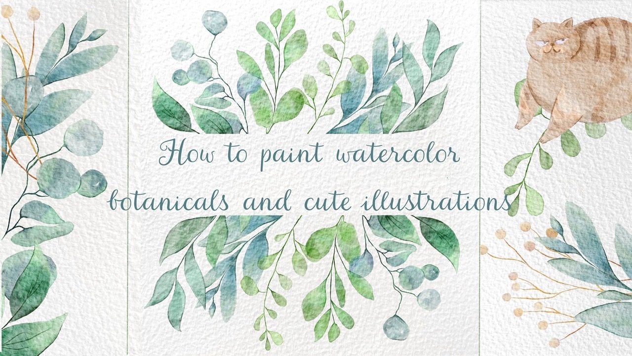
and let's dive into watercolor and pencil art
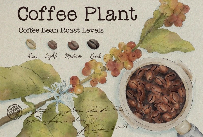
and paint altogether. Stunning coffee poster
that later you can print and hang it on Va.
At the end of my class, you will learn more
about procreate, especially where to
find inspiration. How to sketch in a
fast and tricky way. How to use layers,
clipping mask, how to create aticolor
texture paper, and how to add volume and
color variations to your art. And most importantly,
you will learn how to create vaticolor post in procreate using digital at color brushes in
fun and easy way. I will show you my whole process from the start till finish. First of all, I will
show you where to find all the freebies and how to import them into the procreate, along with creating
texture paper. Then we will talk about
where to find inspiration. Our next step will be
creating sketches. And finally, we will start adding colors, shades,
and highlights. Our closing step will be
adding text to your poster. I will also show you how to add color variations
to your art, so you will be able to change the vibe of your
illustration dramatically. And as a bonus, I
will share with you my own phone texture paper, custom brushes that I created, color palette, and my
own picture that I drew. This class is great for
intermediate level, also will be useful for experienced artists
and for beginners for everyone who is interested in digital watercolor art and
in poster illustrations. One more thing that
I want to mention, your opinion and your feedback
is very important to me. Feel free to tell me
what you think about the class in discussion
or review section. I will be glad to reply to you, my dear art fellows, I can't wait to
start this class. Definitely. I can't
wait to see what you applaud to project
section, let's not wait. Grab your ipad with Apple pencil and
let's paint together.
2. About Final Project : In this part of the class, let's talk about class
project and it will be next. You can follow my steps
and create lovely posture. Or think about the topic
you like and then paint it using the tips and brushes
that I gave you today, I will use Procreate for this class with ipad
and apple pencil. If you have it or some other drawing pads or
regular paper and paints. Please join our
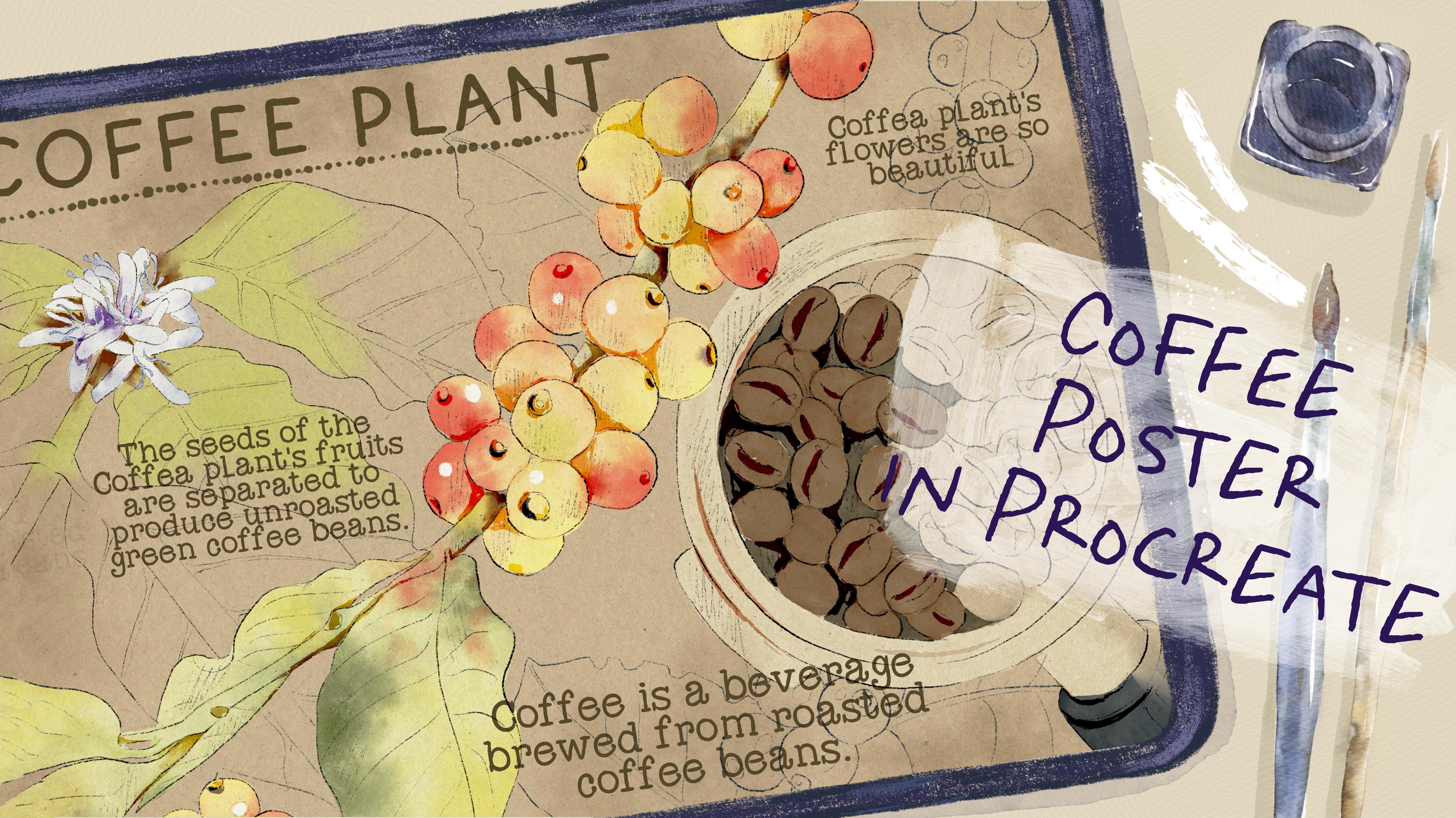
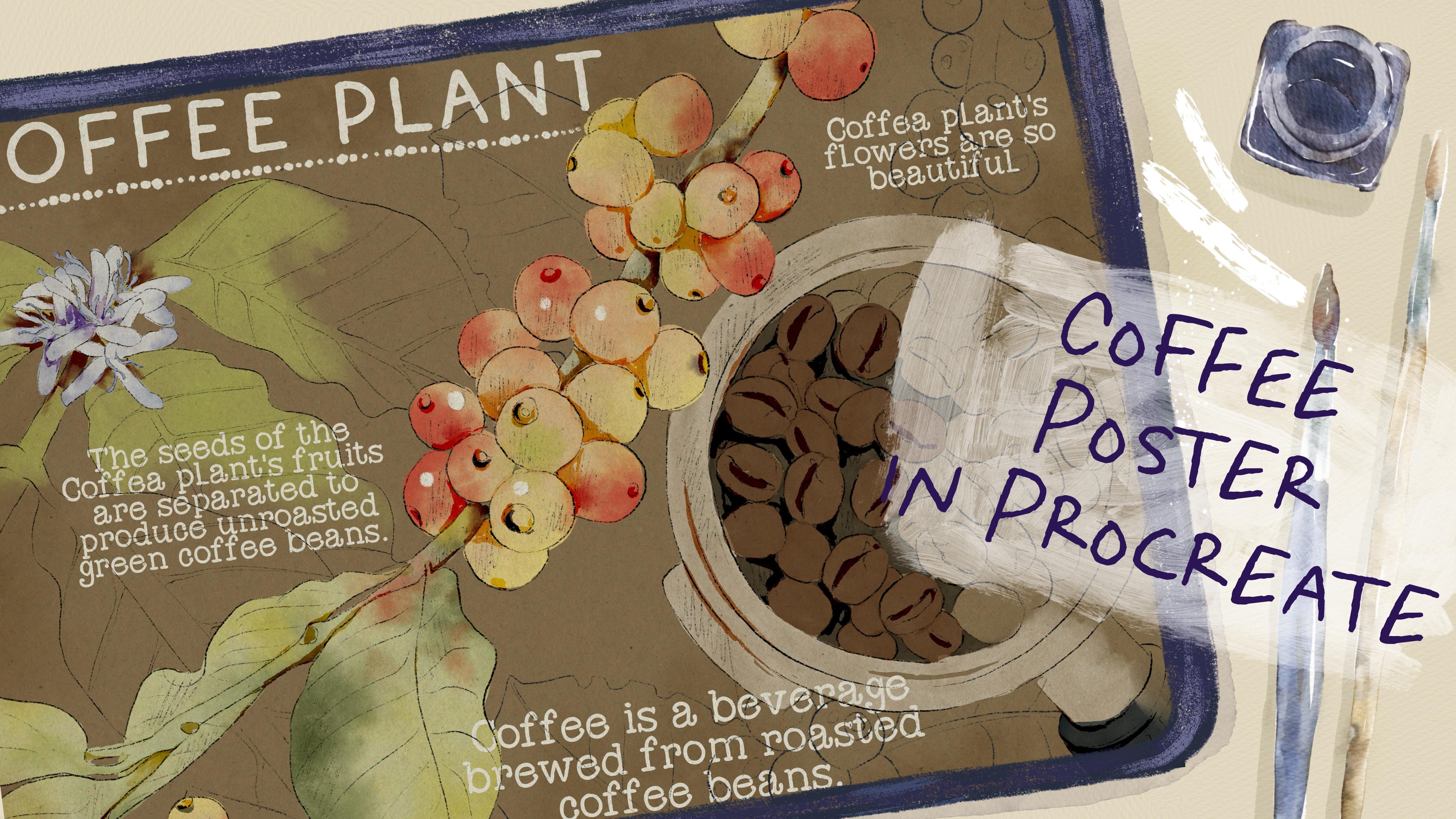
class and good luck. In today's class, we will paint poster illustration devoted
to topic of coffee. We will paint coffee plant
with its flowers and fruits. Today, we will combine
two mediums together, pencil and water color. Once again, you can choose a completely different topic
and draw something new. Try, experiment, and
enjoy painting process.
3. Where to Find Freebies : In this class, we
will talk about resources and where
to find them. It's pretty simple,
just follow the steps, go to projects and
resources section, download freebies,
then go to Files app and then import all the
freebies into the procreate. Also, it's hard to create watercolor illustration without
watercolor texture paper. We will fix this issue. Let's talk about it in details. My dear art fellows, I think
we are ready to get started. Before we jump into
painting process, we need to learn and
find out where to find all the freebies and how to import them into the procreate. Additionally, I will
show you how to use our paper and how to turn this
paper into texture paper. The first thing
that we need to do is open procreate and then tab here we need to create
custom sized cannabis. Let's tap plus again and
switch to pixels Hyde. Let's keep 3,000 pixels. I have 300 DPR resolution. Please make sure that you also
have the same resolution. Then create guys, like I
said at the beginning of our class today we're
going to create poster that you can print and
hang it on a wall. And what's special about
poster is the size. It's not like a four format. It should be a little bit long. Of course, depending
on orientation can be vertical or horizontal. I decided to keep it
horizontal because I think I can put more elements
in this way to my mind. If you want to create
poster illustration, the best orientation, the best pixel size, like I said, is
4,400.3 thousand. We created our lovely paper. Let's create a couple
of new layers. The next question
that we might have is where to find
all the freebies? And as you know, all
the freebies you might find as well in the
same skillshare class. For that, you need to
go to projects and Resources section
in the right corner under the headline Resources, You can find all my freebies and you can download them guys. Before you start doing that, please make sure that
you open browser. It can be Rome or Safari. Because if you open it
through the skillshare app, my freebies might
not be visible. So when you downloaded
all the freebies, then you need to
go to files app. You can split the
screen into two parts. So from the right side
we're going to have procreate and from left side
we will have our files app. Then you need to go to download folder and downloads folder, you will find all my freebies. The next thing that you
should do is to drag and drop all the freebies
into the procreate. I will drag and drop
it into the procreate. Then you go to Color See. And here about the
color palette, you can find it in the palette. We have coffee poster. Please make sure that
you set it as a default. You can do it by tapping
on three dots here, you will have option
set as default. Same you need to do with the brush set. Just
drag and drop it. The brush set you can
find on the top of your brush library,
I have it here. We also have more freebies
that we need to import. We also have strict and
perfection phones that I created. I feel free to drag and drop it into the procreate as well. We also have paper thing. We will rotate it fit to
canvas and keep it that way. It's a little bit smaller. In this case, you need to go to Uniform Tool and move it a
little bit to the edges. You will make sure that all
the areas are filled with. Then we need to go to one
more layer underneath. Let's make paper layer
invisible for a while. Great, we still
have our sketches. Once again, you can use my
sketches or create your own. Feel free to do
whatever you like. Then you need to grab my
sketches and also drag and drop them onto the canvas. Make sure that when you drag
and drop every new sketch, you do it on new layer. We've done with all
of our freebies. And then we can just
close our files app, and I think now we can
just rename files. Let's turn off the sketches
and let's turn on the paper. Before we jump
into the next part where I will tell you
about the inspiration, I just want to show you how to make our paper texture paper. For today's class, we'll not use so many layers as I usually
do during my classes. I will just move to multiply
blending layer mode. That will let us see the paper and see the
paint that we put on it. Make sure that you paper
on the top of your layers. Library also guys, why we don't need to have so many layers
during my today's class. Because I'm going to use a
brush which is called bu, hard edge watercolor, which
is already watercolor. You have this lovely watercolor
effect you see that will help us to reach
the authentic look. So thanks to this brush, we don't really
need paper texture. But of course with
paper we're going to have more vintage look. And that's what we need to
reach during my today's class. And if we start speaking
about the brushes, let me show you what we have. First brush. It's
native, procreate brush. I truly like it a lot. I use it as a blender, I use it as an eraser, and I use it as a brush. And you can do the
same HB pencil. This is the pencils
that I created which gives you pretty
sharp edge lines. Be B pencil is soft pencil. It's great for sketching and we're going to
use it today a lot. Be ink if you want to
add some sharp lines. We will use this brush
in the end of my class. Blue hard edge vata color is the one that I
was talking about. Very lovely at color brush. If you press lighter, we will have pretty
solid and open color. But gradient that we're
going to use also a lot. And we're going to add
some gradient lines and we will add some
color variations thanks to this
lovely brush booth of blender that you
can use as blender. How to use it. You need
to select this brush as a brush and then long
tap on blending tool. And here you select
this brush as blender. Same you can do with a razor. Booframe, lovely one for
adding some decorations. Bora, and I'm going
to use it today. Some handwriting that I
added to my brush set. We will have two options. First, we can actually use
the font that I also added. Or you can just use lovely
handwritings for your posture. You will have an option. So you can decide by yourself. Okay, I think we
are ready to jump into next part where we're going to talk
about inspiration.
4. Where to Find Inspiration : We finally move to the
very important class, where to find inspiration. What about reference pictures? And how to create
unique art also, what about poster
characteristics? What makes poster poster?
Let's talk about it. Please follow my
steps carefully. And if something is not clear, I'm always ready to help
you in discussion section. Well, now let's talk
about inspiration. Before we start
creating posture, think about the topic that
you might like to illustrate. At the beginning, you might face some difficulties
because maybe you don't know what exactly you want to draw or maybe you don't
know how to draw it. In this case, the
best option is to go in Internet and search for some inspiration,
for some references. You might go to the Interest. It's one of the options
where you can get some inspiration and
think about the topics. But like I said in
my previous classes, I try not to go there too often because I want to create
pretty unique art. And I don't want my art to be influenced by other artists. But once again, it's
totally normal if you find some inspiration
in other artists works. If I search for some topic, or if I need some references to know how to draw something, I go to Pexels.com or Unsplash.com Those sources are free for personal and
commercial purposes. So once again, think about the topic that you
want to cover. It can be like magical portions, the topics that we
covered in my last class. Or it can be something else. You can paint some botanicals or maybe flowers or maybe
animals or cute characters. I was thinking about painting botanicals and I think
that coffee plant is a good choice because we all know how coffee roasted
coffee beans looks like. But we don't really know
how the plant look like, like what are the flowers, what are the seeds. So I was thinking to dive deeper and learn a little bit more
about the coffee plant, what I did, I went
to Pexels.com and Unsplash.com and I just typed coffee plant here,
that's what we have. The tree fruits are so lovely
looking them, so colorful. And I like the leaves. I
like the way, how it looks. Then I wanted to have more
pictures for inspiration. And you can see it's so cool. You see the fruits, they have different colors. And here I have
another option is also very loved and
beautiful pictures. What I did, I just saved
the pictures that I like that I might use for my
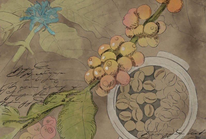
reference illustrations. For my today's art, I selected four
reference illustrations. Let me show you them. The first one here you can
see the planned fruits in details like close up, I
think I'm going to use it. Another one is coffee plant. Coffee flower. It's so lovely. I didn't even know that
coffee plant has flowers. So that's what we have now. Then I'm going to use
this illustration as our main illustration then. Like in the end,
what we might get from this plant
roasted coffee means. I hope now you know the way how you can get some inspiration where you can get
reference pictures without violating any rights. Now your task is to think about the topics that
you want to cover. Once again, you
can come along and follow my steps and create
lovely coffee poster. Or you can choose your
own topic and create the illustration referring to your own topic and
following your own steps.
5. Creating Sketch: Now it's time for sketching. Pencil part is super important. Today I decided to
show you a tricky way, how to sketch in a fast way. Depending on free
time that you have, you can keep adding
more and more details. Feel free to follow my steps
or use your own sketches, whatever will help
you to feel happy. Now let's talk about sketching. Here you have two options. First one, you just look at illustration and just
paint the similar one. You can grab a pencil brush, then go to reference
picture and move it a little bit to the here. Yes, we have enough space. Go to the sketch layer, which is about our
reference picture, and then just look
at the picture. Draw a circle, one finger, then ellipse go to circle Lexus. Then you need to create
one more circle for this. You can doublc,
the sketch layer, and this lovely pot
merge together. Then we need to paint a handle, and inside we're going to pay
in the lovely coffee bins. That's one option. But
usually it takes time, and sometimes you can
mess with proportions. Another option is
to just trace pi. That's one option,
but usually it takes time and sometimes you
can mess with proportions. Another option is to just trace the pictures
that you have. Once again, both options
are totally normal. It's just depending
on your style and depending on the
time that you have. You can decide the first
or second option here. Another option, what you can do. Let's go to this lovely
reference illustration. Lower the opacity like that. Go to Bobby pencil again. Let's just trace our lovely pins you might make the size of
brush bigger or smaller. Then you can use HP pencil to add some shades
or sharp lines, usually tracing you are using when you want to
reach realistic look, when you just don't want to spend too much
time on sketching. On the contrary, if you want to create some unrealistic
proportions, may be like intentionally, you must sketch by
yourself, not trace. Or if you want to practice painting skills like
sketching by looking at art, tracing can help to improve
your sketching skills. Whatever suits you, just use it and create a sketch
that you would like. Guys, what I want to tell you, if you want to keep
adding more shades, of course, feel free to do that. You need to go to HB Pencil. I think this is a great pencil. If you want to add tiny shades and just sketch a little bit, you see the brush strokes are not that obvious, and
I think that's perfect. If you want to add tiny, tiny sketch lines
about the shadings, like you need to know where
the light source comes from. Here, from the
reference picture, we see that the
light source comes from the top left side. It means the bottom right
will be in a shadow. Shades would help us to add some volume to our illustration, but if you don't want
to be too precise, if you want to have
like light sketching, you don't need to
add those shades. What I do, once again, it all depends on the
style that you have. Let's turn off our
reference. Mm hm. I think it looks
very lovely guys. Now I want to show
you some magic trick. How can you enhance
your shading for that? You need to go to curves. Here you see things
to the curves. It can be darker or lighter. I made it a little bit darker. Another option, you can ablcate our sketch like two times now. It will be way more darker. I will lower the opacity 50% I don't want
it to be too dark. And then I'm going to
merge it together. The first sketch is ready. What we need to do is
to keep sketching. Let's sketch this part. And then we can jump
into composition part. But once again, if you want
to spend too much time, you can just grab the
sketches that I already have. Like this one about this sketch. This is the same sketch
that I have here, but I just selected part of it. I don't need the whole plant. Just the most important part, the middle one about
the composition. I think the most important
rule that I use is the rule of thirds when we divided our canvas into thirds,
like nine parts. And then at intersections
of those lines, we'll have the most important
points where humans, eyes are mostly concentrated. Let's do it here, here, here, and here. We're going to have the
most important parts in our composition. Some people think that the most important is the
middle, but it's not. You just need to move
the objects a little bit to the sites like to
the left or to the right. And that will be the
most pleasant experience that people will have
after looking at your art. Let's follow the rule and move our objects a
little bit to sites. Now let's go to our coffee pot. I want to make it smaller
so that means that it will not put people's
attention from our plant. Let's just remove the
overlappins like that. The next theme is
our lovely flower. Again, I will make it smaller, make sure that you
have uniform selected. Now, also remove overlappins in future, I want to add some
headline in this part. In this area, that area. And here we're going to also
have some words that can be handwriting or we can use the font to add some
information about plant. But I still think
that some parts are a little bit too empty for that. I think I want to
add more sketches, but they will be less visible
and not that important. We will not add colors. Let's merge everything together. I think here we can
add extended the leaf. You see all our main objects are on intersections of the lines. We don't need our rule
of thirds anymore. Now we still have one more
sketch that we didn't use. That one, I will lower the opacity of our
original sketch. Now I'll just try to
place the last sketch in, in the most pleasant way. What I was thinking.
I just want to take some of the grapes and
I want to use them. Maybe that one like to
illustrate how fruits look like. I think I'm going to use this one and press copy and paste. It's on a new layer. Okay, about this part. I think I want to place it here, would look so cute, merged together with
the main sketch. Now again, I will make
the opacity over. And let's return to this
part of the sketch. And remove this leave. Because I want to change
the size of the leave, I need to erase it first. Then let's erase overlap guys, I decided to grab the sleeve, and so I just imported
the same skitch. Second time, copy and paste
and remove the base sketch. Great. Merge together. Now one more leaf,
flip horizontal. Now let's merge together the rest of the
additional sketches, and let's make the basic
sketch layer 100% visible. We've done sketch, now let's
jump into pending process.
6. Adding Colors to Coffee Plant: Now we are ready to jump
into painting process. Use the brushes that I
provided among the freebies, or native procreate brushes
or the tools that you have. Don't forget to paint on layers that are under
the texture paper. We will have very special
coloring technique today. Let's not wait, and I will show you everything that I know. Okay, we used reference
to add reference picture. It will be easier for us to understand what kind
of colors to use. But in our painting process, we're also going to use a few
tricks that will help us to save time and to add color
variations to our art. Go to paint here, layer. Let's start this first. Here we can write,
for example, fruits. Here we will have leaves. It will be easier for
you to understand and not be puzzled with the layers. Let's go to fruits and then grab be hard edge
watercolor brush. We can turn on the paper layer. Now we don't need our
references, we can delete them. Here we have options to choose. You can grab pretty lime color or you can go ahead and
grab pink or orange color. So, so elevens, you can just simply plan. Mm hm. Okay. The next thing
that we need to do is to add colors to
leaves and to the branch. Let's go and grab the
light brown color. Here. You see these branches turning into lime green color. For that case, I will go
and grab dark green color, splend difference, and
then grab Erasorans. Now I think I want to go
with pretty light color. The difference will
be not that obvious. Like let's start adding
colors to the leaves. Lime green color cresize. Greg, let's double
the kids of color. Move a pasty of 30 and merge together the
same these leaves, because this is
watercolor brush, brush strokes are pretty transparent how to
remove the transparency. We need to duplicate the
fruit layer one time. Go to lower layer and
then go to adjustments, press hue, saturation
and brightness. And then move the brightness to 100% That help us to make
the bottom layer white. We will merge it
together the same. These leaves duplicate. Go to bottom layer, go to adjustments, hue
saturation and brightness. And move brightness to maximum. Again, that help us to make
our layer less transparent. That's pretty much enough for the removing
transparency part. Why I did it, why I
removed the transparency? Well, first of all
because later we're going to change the
background color. I don't want it to
affect our lovely art. The second reason
for that is that I want to use clipping
mask and alphalog. Let's start with alphalog. Let's go to fruit layer
and press alphalog. Then I want to go and grab
this lovely let me find. Yellow color. Then I've gone grab a bull
soft gradient brush. Now that's where
the magic happens. Thanks to this brush, we can make some lovely
color variations. You don't need to
spend too much time and add extra layers, tap a few times
because like I said, this brush is also
semi transparent. The brush strokes
are very gentle, then go and grab this
pretty bright red color. You see it so lovely. Actually, the main color, the base color that we use, doesn't really matter
because on a top they can put any other colors
that we like matter, because on a top they can put any other colors
that we like. Okay, cool. What
about green color? Let's grab this
light green and add some green shade to
some of the grapes. Not grapes, They
look like grapes. I call them grapes. The
fruits of coffee plant. Okay, now let me show you the
way how make it brighter. So we are on a layer
where we have our fruits. We don't need alphalog anymore, so we can turn it off. Then go to adjustments
and press curves. Now play the curves you see. Thanks to curves, we can
make it brighter or darker. Next we'll go to leaves layer. Here I will show you how
to use clipping mask. It's very similar
to alpha log but the only one difference he said clipping mask is
used on a new layer. It means if you don't
like something, you always can delete it
or make it invisible. My suggestion to use
multiply blende layer mode. And we have the same blue
soft gradient brush. I think about the color, we can create a little bit
darker shade, darker color. Also, if you're going to have
the shadow in areas where two objects are next
to each other, Same. We can grab a reddish
color and add a little bit of red color as a reflection.
Yellowish color. I think it can look very lovely. Same If you want to
intensify color, you can go to cars, you can make it
lighter or brighter. And if you like everything, you can merge two
layers together. Great, we've done
with this part. Now let's move to the floral. Here, in this type of art, I decided to show you
different painting techniques.
7. Adding Colors to Coffee Flower: The first one is pretty common. The only one special differences that you can add some
color variations. Thanks to the alphalog and clipping mask and special brush. Here we can have another
way how you can add color. And at the same time, keep
sketch flower and leaves. Flower will be almost white, like light blue, blue, hard edge water color. And let's change
reference picture again. Don't be too precise. Now we can grab a
little bit darker shade like that. Let's remove that transparency because
I want to use alpha lock. So let's uplicate a layer. Go to lower layer adjustments, hue saturation and brightness. And move brightness to
100% merge together. Then press Alpha lock. Go too soft, brush and
grab dark blue color, makes the shade a little bit Id. And turn off alphalok. Then go to Curves. Now let's go to
the leaves layer. And again, let's grab this lime green color switch to pool hard edge
watercolor brush. So we're going to add color
to the stem and to leaves, but we will do it
just in some areas. You don't need to fill
the whole area with the color just next to the flow. I like this painting
technique because it looks a little bit loose
and at the same time, combined with pencil sketches, it looks very harmonious. I need to paint on a new layer because later I want to
make some adjustments. Like curves or your saturation and brightness removes
the transparency. And sometimes the color should
be a little bit different. Like leaves and flower, it's better to paint on new
layers, then merge together. I like this painting
technique because it looks a little bit loose
and at the same time, combining with pencil sketches, it looks very harmonious. I need to paint on a new layer because later I want to
make some adjustments. Like curves, your saturation and brightness removes
the transparency. And sometimes the colors should be a little
bit different, like leaves and flower, it's better to paint on new layers and then
merge together. Now I'll show you
that magic trick. Now we will go and
grab blending tool. And then you just
need to increase the size to move the
color to the sides. We will create the feeling
like the color blends into the paper like little by
little and just fades away. If you went beyond the lines, my suggestion to erase it, you will show clear line like that. Again, we can go to course and play with intensity
and color variation. One more thing that we
need to finish is to add some color to those
roasted pins. Let's do it.
8. Adding Colors to Coffee Beans: I think here we
don't need to add any color variations because I don't want it
to be too bright. And draw our attention from
our main coffee plant. So now let's jump into painting
roasted beans. Mm hmm. I want all colors to
be not too bright. Now let me grab
dark brown color. Okay, I think that's enough. And now let's add pins. Let's grab brown color, increase the size,
and add coffee pins. You can leave a little
bit tiny on white caps. Here we're going to apply
the same technique. You see I paint just half
of the spot with pins. Another half still will
be black and white. And maybe a handle also blending tool and blend curves. Then again, make it
brighter, more saturated. In next class, I think we
can add any details to our coloring part and then
we'll jump into final details.
9. Adding Contrast: In this short class, I'm
going to show you how to create even bigger
contrast faced, we need to grab be ink brush. Then go to multiply
planting layer mode. I created one layer and
I'll place this layer above of all our
painting layers. A little bit dish shaped next. Then I'll go to those parts. Don't worry, the color
later will be different so you can emphasize
some of that leaves. And even here is
our coffee bins. Okay, then I almost done. I think I want to add some
shades to the fruits. It will help you to separate each fruit one from each other. I can. Now let me show you the magic tricks that I was talking about. We need to change, blend in layer mode and see which one
you would like more. I like color burn, but if you like, you can
change to another one. Then we can go to course. Thanks to course. You can
make it lighter or brighter. We can desaturate. Yeah, like the way
how everything looks. So I'm going to keep it dark green color. You can go to the original
layer and add a couple of lines to make it look
like more realistic. Now let's jump into
our last, final part. We're going to add text
and color variations.
10. Adding Final Details: It's almost the end of a class. Now it's time for
the final details. We'll add text to our poster. And I will show you
the fast ways how to change the colors and
the mood of your art. Okay, I already added a headline and probably
I want to emphasize it. I grab brown color.
Dark brown color. You might grab any
other color you like. Bo frame one, Th form. I will extend it a little bit. Guys, here we have
a few options. The first one is you can
add some handwritings, some going to merge together, those two layers
about handwritings. You have plenty of them. I think where you
want to place the, my suggestion to place handwritings above
our painting layer, Maybe here we have the
biggest text in this area, we will have small handwriting, here's something like that. That's the first option.
Another one is in this area, we will have a small handwriting here,
something like that. That's the first option,
is to add an actual text. You can use the phone
that I added to the class or you can use your own pont
that you have the text. We can find some description
of coffee plant here. We can choose some
of the sentences, maybe something like that later. You can adjust the size. Let's keep selecting the
quotes that we might like. I add a text and
you see the size of some of the quotes is
a little bit different because I think that might
create a little bit place for atmosphere about
vintage wipes. You also have one more option, what you can do if you want
to create that filing, go to multiply and add
some background washes. I think you can add
grab brown color, go grab soft gradient, and say you can go to
Urs, make it darker. Or later I decided to make
it a little bit lighter. But like I said,
this is not the end. I want to show you how to add some color variations if you want to dramatically change
the wipe of your art. For that, you need to
create one layer and the knees and just grab
the colors that you might like and just
track and draw it automatically when you just add the color
to the background. If you change it
to a darker one, you also have the darker mood. In this case, you just need to go and erase the caps
that I left axis. Also, if you want, you can make our paint and
color even less transparent. That just go to our color
and duplicate it one time. It already looks very lovely. You also can play with
colorations and make it lighter or brighter
depending on the style. You also can play with
colorations and make it lighter or brighter
depending on the style, color intensities that
you like, like that. Another option, what
else you can do is when you choose
the dark background, so you can change the
color of our font. For that, just go
to the text layer. Select all of it together, then press Select, Grab
almost white color, and press Feel layer. I think I need white color. We will go to the text. Press Select, then press
Feel layer better. As you see, this
is another option. What else you can do
if you want to change the color intensity in your art? Another option.
What else you can do if you want to
change some color? Just go to our painted layer, then go to hue saturation
and brightness. Here you can play with color variations with
intensity and some hue. I like this purple
color, by the way. This is another way
what you can do. And I hope you enjoyed
our class and you learned something new about
digital watercolor art. And let's teach
us in next class. This is the end of
our today's class. I hope you enjoyed our painting process and now you know more
about procreate, where to find inspiration, how to use layers,
clipping mask, how to create watercolor
texture paper, and how to add volume and
color variations to your art. Most importantly, you
learned how to create watercolor and pencil
coffee posture in procreate using digital
watercolor brushes. In a fun and simple guys, I'll be happy to see what
you applad to project section and give me
your own feedback. And I would really appreciate your opinion about the class. You always can leave
it in review section. Let's see each other
in your class. Next time, we will paint cute watercolor character
in pro grade. See you.
 Inga Yoon, Digital illustrator and teacher