Transcripts
1. Welcome: Hi everyone. I'm Jay Johnson. Welcome to my studio today. In this class, I'm going
to show you how to paint big sky scenes like
this in soft pastel. We're going to start off
the class with a study on a piece of small scratch paper just to get the feel of things. And then we'll progress to a larger eight by
eight size like this with soft pastel
on pastel mat paper. Big skies are a
fascination of mine. I love painting the sky big and the foreground and
horizon area very small and impressionistic and
abstract in nature down there. But I want the clouds to be super soft and very
realistic and very powerful and basically command the center of attention.
And that's what these do. The best thing is you don't
even need a reference photo. These clouds paint theirselves themselves, They just develop. And that's what I'm going
to show you in this class. You choose some colors, you start laying out where
you might want your clouds, and then you go from there and they take on a
life of their own. It's a lot of fun
to do. I haven't created a bad one yet since
I started doing these. Because once I let the clouds take over
and develop themselves, everything just fell into place. It's a sense of
freedom, it's just fun. And you could do
any size you want, from big to small to super big. I'm going to tell you in this class all my
little secrets, my little secret tools, my favorites that I have that
I use and how I use them. At the end of the class, I'm even going to
give you a little tip on where to get some
really great frames. I hope you will enjoy the class. Have fun and create yourself your own favorite
big sky painting. Thanks for joining me today. I look forward to
seeing what you create.
2. Class Project: Hi everyone. Thanks so much
for joining me in this class on creating beautiful big sky
paintings in soft pastel. Your class project
for the class is to create a study like the
smaller piece on the left, which is about four by 5 " in size on a piece of scrap paper, just to get practiced. And then to create a larger one, which is eight by eight, After you get the feel
of how everything works, you will need to use soft
pastels on pastel mat paper. I have provided you with materials list in
the class resources. Please download that before you get started so you can
get what you need. If you don't already have it. I cannot wait to see the skies that you
guys come up with. Thanks again for joining me.
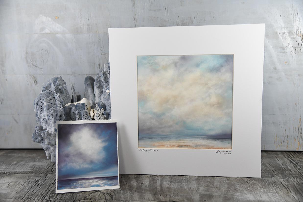
3. Pastel Supplies: Hello everyone. Before I start off talking
about supplies, I wanted to show you
just a few pieces of my big sky paintings. Let's see if you can see this. I'm trying to keep
my head out of the video here so
you can see the art. This is a real stormy sky one. I did on a piece of
gray pastel paper. This was just a scrap
piece of paper and this one turned out
exceptionally well. I've been hanging it by this little clip down
here in my studio, hoping at some point
I'll get a frame for it. But I like to work in the small sizes all the
way up to the big sizes, that is a stormy sky. One, here's another stormy sky. Let's see here. Trying to
keep that we can see it. This one is a dark stormy sky
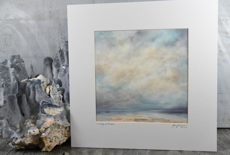
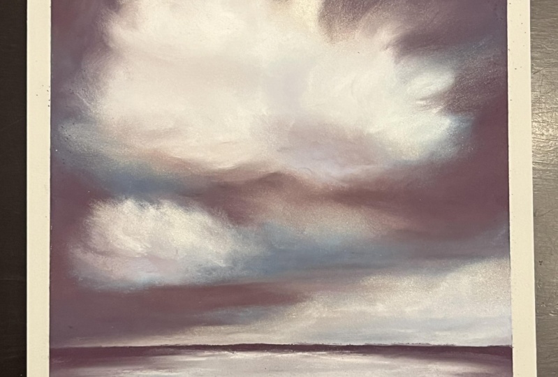
with quite a bit of color. I like the orange colors, like a sunset after a storm. This is eight by eight
pastel and it is framed in 12 12 white Matt. I have the, I ordered
the mats online. I can't remember the
name of the company, but I ordered it
online and I make the pieces specifically
to fit these mats. I have the mat made with the eight by eight opening
and the match 12 by 12. So it'll just drop in a 12 by
12 frame, Assign them here, and then the back is applied to the back of it to
finish it out nicely. Then here is another
one I just finished. I put in these clear bags. I get from clear bags.com I've
gotten them there before, but I've also got these bags directly from
where I got the mats from. I'll have to find
the name of that and put that in the PDF. That's going to list all of the supplies that
I use with links. Anyway, I love doing
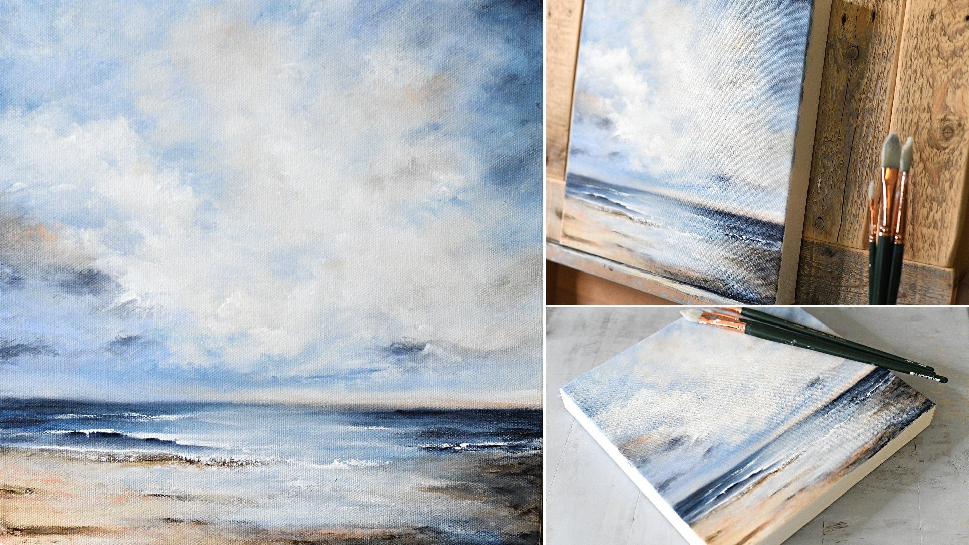
these scenes here. This is oceans are some of my favorite because it's my favorite place
in the world to be. I just finished this one. I thought, well, that
looks really nice. Now, I would like to do
something like this, but in the square
format like that, I thought that might be a
good lesson for this class. This is what the finished
pieces look like. I sign and date them, and name them, and write
the name on the front. That's why I just
started doing this. I don't like to sign on the actual pastel
because I feel it takes away from the scenic part of it to have a big
signature up in there. I do sign on the back
of the original pastel. If somebody gets it and
they want to take it out of this mat and put it
in something else, they still have the
original art signed. But now let's talk about supplies that I
used to make these. I'm going to pop these over
here on my easel behind me. Now when it comes to supplies, you can use whatever you want. You can use whatever brand
of pastel paper you want, whatever pastels you want. But you're probably
not going to get the exact same blending
results that I do, unless you use exactly
what I'm using. You might get results that
are just fine for you. But I've had people
buy a cheaper, cheaper pastels and then talk about how doesn't
blend like mine does. Well, that has a lot
to do with the paper you're using and the
type of pastels. I'm going to tell you what
I use and then you can watch me do this
seascape painting. I'm going to do in a
size eight by eight. You can decide based
on your budget and what stores you have around you or where
you can order from, whether you want to purchase
different supplies or not. But I'm just letting you
know ahead of time If you go to this was ordered
online from Blick, which I have the links to in the PDF that
I'm providing with the class because they don't
have this here locally. What they have here
locally is Hobby Lobby. And I love Hobby Lobby, but the pastel paper I
bought from Hobby Lobby, while it's nice paper, it does not blend near
as well as this does when it comes to making
skies blend like these do. I'm just letting you
know that ahead of time. If you use different paper and different types of soft pastels, then you might get
different results. But hey, it's all about
having fun and the process and just creating something
cool that you're proud of. Let me stick this behind me. I already mentioned. This passed down Matt. Now that dark stormy
one, I just held up. That was done on a
dark gray pastel mat. After trying the
different colors, I prefer to use
white. Like this one. This is white. I've started ordering all my
pastel mat in white. It comes in pads like this. It comes in larger
pads than this. And it comes in
great big sheets. You can make bigger pieces
with the big sheets, or you can cut them down to
get several smaller pieces. I find the pads for
the small pieces I do to be relatively
easy to handle. They're easy to store. The bigger sheets are
harder for me to store. They are in another room over that way because there's just no room in here for them.
They're pretty big. But I had to get some big sheets to do some bigger pieces, which I'm going to do for some places where
I'm going to have my art and I want some
big pieces to do. An eight by eight,
This is 9.5 by 12. This pad, I can easily get
eight by eight out of this. This is the one I'll be
using for this class. Now let's talk about the
actual pastel brands I like. Let's see if you can see it. Unisons. This is a full stick. I have bought half sticks
and full sticks from this company or from Blick
is where I buy everything. I bought half sticks and
full sticks of unisons. I love unisons. They are creamy,
they blend well. The colors are vibrant. That's one brand, and I
have a lot of unisons. Then in this little dish, see if you can see that. I have two other brands. This is, I believe
this is one of the Jack Richardson and
this is a Senilia White. I like those two brands too. I have tried a couple
of other brands, I wouldn't say I
didn't like them, but for soft pastels, these are my three
favorite brands. I started by buying the
Senellie Paris set, which it was half sticks, and it gives you a wide range
of colors to work with. Then I stepped up and bought some Jack
Richardson and some unisons, just to see how I like those. And I like those, too. In fact, I like the
unisons probably the best. The Jack Richardsons
are real nice, too. But I just the unison seems to have bigger sticks, more colors. I don't know, maybe Jack
Richardson has full sticks to, but I only ordered
the small sticks. There they are, about here's the size
different, where am I here? There, leave this all
the way so you can see. All right, see the
size difference. And I believe a half stick, this is a full stick, but the key is that they'd
be soft pastels. I very rarely use hard pastels, but I do have some
pastel pencils, and occasionally, if I need to do a fine line or
some detail work, if I'm doing a real tiny piece, I might use the pastel pencils. But for this, I won't be using the pastel pencils
in this piece. There's one other,
you can't see this. This is a worn down
piece of white. This white is from a company
called Art Spectrum, which is another brand I use and that's on the
list in the PDF. Art spectrum has really
exceptional whites. They're harder, but they blend real nice and they
leave a really strong white. And they're really good
for your cloud highlights and edging and your
final touches. I really like these and they have different shades of white. Like a white with a pink tone, with a golden tone, green tones, blue tones. I like the warm whites. I do use cool whites as well, but warm whites are my thing. I have a lot of these
regs now, these regs. You can get that's not what they're
supposed to look like. This one's wet and I wipe my hands constantly on
these while I'm working. And then I dry them on a clean, which is also dirty
but it's dry. White one. These
are T shirt rags. And you could take
an old T shirt, tear it up if you want to or you can just go to
your hardware store. They have bags of rags and it's basically
old T shirt material. Those things are priceless. Then also at the hardware store, I got the rags like this
in different colors. These are microfiber rags. These are really good for cleaning off a pastel like
this dark brown pastel here. It's gotten dirty and it's
got other colors on it. You can just take that and now
it's now it's clean again. See, the microfiber does
real good for that. That's really what I
use this for is just wiping off the pastel when it gets a little
bit too dirty. The white ones I usually
use for drying my hands. I'll wipe my hands
on the wet one, dry it on the dry one. And I keep those right
here at the base of my easel so I can grab them constantly when it comes to
finishing out the painting. I use this for a
fixative by Senellie. I'm trying to turn it right
for the video. There we go. Five fixative Latour. This is really good. People say fixative darkens whatever with these
brands on this paper. I have not found this
to really darken it. Yes, when you first spray it, it does get immediately darker. But within 30
seconds to a minute, that layer is dry and you
can spray another layer. Wait another minute or
two, spray another layer. But I do this just to
try to fix the pastels. It's not justing all
over everything. You can still smudge it though even after you've used
this several layers, you probably have
to use six layers or so of it, I use three. It can be smudged, they need
to be handled with care. Of course, pastels need to
be framed behind glass. Soft pastels. Another thing I use, and then I got these at
the hardware store, these rolls of blue
painters tape. I tape up my piece on the board, border it out around the edge, so that when I get done, I can untape it from there. Take it that way outside
to my brick wall. Attach it to the brick
wall with the tape. Spray it a few times,
bring it back in, attach it to my photo table, which is behind this
on another board. And take my photos of it
before I do anything else with it so that prints can be made later after
the original is gone. This stuff is invaluable,
this painter's tape. And I got different
sizes for just because my husband would pick it up for me and he'd come home with
whatever size he wanted. That is a must have, the tape. All right. Let's talk
about a couple of tools. I have links to these
that is in the PDF. I'm trying to, I'm looking around to see if I'm
missing anything. Oh, here it is. Okay, This is a mop brush. This is a size ten
silver mop brush, when the pastel might get on too thick if I
put too much on. If it's not blending right, if I'm not getting
the look I want, I want to take some back off. Just lightly dust in the area where there's
a problem with this. It'll come right off
and you can add more then it helps the pastel come. I don't blend with this, I blend with my fingers. This is going to be a
finger painting class, pretty much because I do all my blending with
my bare fingers. I don't wear gloves. It's up to you if
you want to do. I like to feel the paper and
feel the pastels and I just, like I said, keep wiping my hands during
the whole process. But this mop brush
is invaluable. If you get too much on there, it's not working
the way you want. You want to take it back
off and redo an area. Just lightly dust with this mop brush and it'll
just fall right off. That must have tool. My other must have tool
is this color saper. This is a number ten
color shape or by Royal Sovereign LTD and it's a number ten
flat, chisel soft. I blend my clouds with
this fine detail areas. I start blending
with my fingers. But as I get toward the end, I pull this out and will blend a little hard to reach areas
where my finger is too big. Because you can blend with
this little tip right here. You can blend with
the flat side. There's a angled
edge right there, so you can blend with that. You don't hold it like you
do a pencil like this, hold it like this, and
do it very softly. I don't press hard most
of the time, but you can, you can also blend lines
out, streaking the lines. This is invaluable, actually, because I'm going to actually do some minis that are even smaller than
this. Eight by eight. I've actually ordered
a smaller one of the soft flat chisels. I think I've ordered a number two which is quite a bit smaller than this for those minis to
get the edges of the clouds. But this is invaluable
for working these clouds. This is a must have tool. If you don't have
this and you try to with your fingers in
these fine detail areas, you might not get the
detail like you want it. I've tried other color
shapers, other brands. This one is the one
I found works the best with this paper
and these pastels, there's that I also
like, this is messy. This is a catalyst wedge. I've got several
of these things. This particular one
has a long edge here and a short edge
here, and of course, rounded over here, but you
hold it like this and you can, you can drag it
through the pastel. And I do this in
the horizon area of my designs to just make
some cool lines or marks, you can use either side. I don't use this all the time, but I do use it sometimes. If the horizon is not
really working for me, I'll just grab this
and just slice through there and draw a few lines
and create a few marks. It's really good
for mark making. I do recommend
having one of these on hand just in case
you want to use it. And I'm trying to think. I
think that's about all I use. And of course, I have an
easel here that I paint on. The board is separate
from the easel. I made this board a long
time ago and it's just a great surface pastel. I was using the easel for canvases that I was doing with acrylics and
things like that. I got back into the soft
pastel and I thought, well, I really need
a harder surface. I pulled out one of my boards
and put it on the easel, and I just my paper to
that you can work on a tabletop or a tabletop easel however way you're comfortable. I do recommend having
plenty of light. I have overhead
lights on in here. I have a light directly
on the easel and then out that way you can see the light shining
on my thumb right there. That's sliding patio doors
letting the light in. I have plenty of light and
I can see what I'm doing, but I don't need a very big
space as you could tell. I have a little table
just right here off to the side that I have
some of my supplies on. And then I have a little
table right there off to this side of the
easel so that I can put my pastels over there and I can reach
them real quickly. But this isn't a big room. I don't need a whole lot of
space to do this pastel work. You don't need some
great, big, fancy deal. You can work on these at your
kitchen table if you want. Now I will say they
make a lot of dust. Not to necessarily
advertise for Dyson, but this little handheld
vacuum thing is great. After the pastel
drops down here, take that and suck it right up. I do that on my floor too,
right around the easel. I keep that right here and it charges when when it stops
working, I have to plug it in. I plug it in across the
room when it's charged up. I bring it back over
here and I vacuum my easel tray and my
tray where my rags are. I vacuum that out because
dust will get down there. I vacuum my floor. This I'm in a
basement studio here. This floor is a concrete floor. But I've just stuck down some of those vinyl stick tiles on top to change the
look of the room, The cheapest ones I could find. I did that just to give my room a nicer look because
I didn't like the pattern on the floor. But it is a hard floor is
what I'm trying to say. You might not want to do this on carpet because the pastel does make a lot of it will hit the floor if you're
using a hard floor. Hard surface, it's
easy to vacuum up. If you're going to be
working in a carpeted area, you may want to get one of those pain or drop cloths to put down under your work area just in case that way
you can roll it up, take it outside, shake
it off, wash it. And I wanted to
mention on the rags, all of these rags,
they're all washable. I don't throw them away
when they get super dirty. I just throw a whole load
of them in the washer. I have a ton of them. They just wash right up and
you can keep using them. I think that's it for covering
what I use for supplies. I'm going to stop
running my mouth on this section and I guess
next we'll be ready to start a little painting
and I can show you what I do and hopefully
teach you what I do. So you can do it too. We'll see you in the next video.
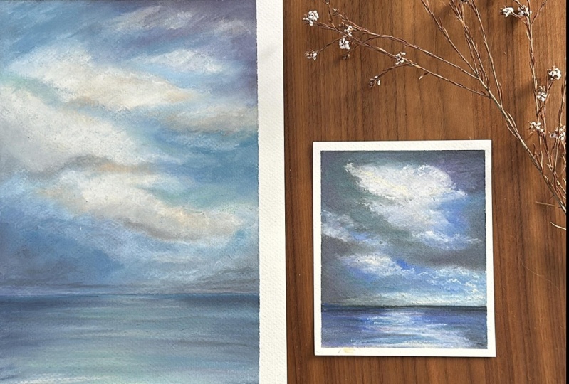
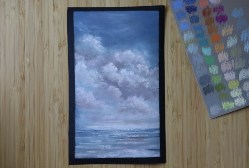
4. Cloud Study: Okay. Before I get started on the eight by eight
painting, I want to do. I thought I would
introduce you guys to a little bit about how I operate when it
comes to pastels. The first thing I do is
I pick out some colors. I put them in these
little dishes, these are actually old
ashtrays from an antique mall. I got a whole set of them for $1 They're perfect for
holding the pastels. And when I do a little
small studies sometimes, and I like to just pick out some colors that would
be good for the clouds. I'm going to go through these
little colors in here and I'm going to do it on
this little scratch pad, which I keep right
beside my table. If at any time I'm unsure of what a color
may end up looking like, I just make a mark with it. I set the pastels
off to the side, and I'm just going to hold
this little scratch pad up here and go through
some of these colors. Now the first color
I want to use in my sky is this
brilliant turquoise. Then I also have a more
neutral tone, down blue. I don't overdo it with
the bright colors. I have a couple
of lighter blues. I have this one which
is a bright turquoise, lighter blue blue. This is another more
toned down, lighter blue. I have a few shades of blue. That's enough for what I want to do in this little
study right here. Then also, I like to use a
lot of purple in my work. I have this purple right here, which is just a
medium muted purple. Then I also have a
super dark purple. It's almost black. That's really good
for shadow areas, horizon lines, things like that. Then I have this purple, which is a pinkish tone down. Then this one here, I believe it's a muted gray. A warm gray, but it's got a
purple cast to it in the sea. Then I have my white, which
is incredibly filthy. You can't really see that,
but if I go over top, you can see that's just a white. Just to do a little study here. Yeah, that's the warm gray. I've got four shades of blue, couple shades of purple, pink, and then a warm
gray and this white. I just wanted to
do a little study, to just do a simple cloud. Just to show you the
process on how it works. I'm going to put my scratch
pad off to the side and clean my hands off with this rag
that's wet and then dry. Now when I do my
big sky paintings, I will put a horizon line in. I usually just put that
in with a piece of tape. I like to keep my
horizons very low. I'm not really wanting to
do a full painting here, maybe just a little mini study, But I'm going to go
ahead and put a horizon in just in case I want
to finish it out. If the cloud turns out real
good, I may finish it out. I want my horizon, the edge
of my paper is right here. I want my horizon
like super low. So I'm just going to go, I'll just go right on top of
that line right there. Try to line it up. This is not a specific size, this is just a piece
of scratch paper. Pastel mat is very expensive. I save every bit. Even little bitty strips
I will save because those little bitty strips can be good test pieces to see how something's going
to blend on this paper. You could just paint
an abstract pattern on them and maybe turn
them into a bookmark. There's all kinds of
things you can do. I save every piece of paper. I save all kinds of things. The skies, they're typically
darker at the top. And as they get
toward the horizon, which will be this line of the
tape, they'll get lighter. I'm going to basically
negative paint where I might want to cloud. Let's just say I want to do one simple cloud
here in the center. I'm not going to do a
perfect circle around it. I'm going to go ahead and
start with my super bright. Turquoise? No, I I
changed my mind a lot. Let's go with the muted blue. And I'm going to clean that
off with the microfiber rag. And I'm just going
to start up here at the corners getting
some blocked in. There's a couple of different
ways you can make marks. You can make marks
as a straight line. You can hold it on
the side and makes, you can just scribble, you can break these
into smaller pieces. I just try to make a few marks when I'm doing
a little study on where the sky might be and
trying to decide how big I might want my
cloud and the shape of it. And I'm going to
leave that area open. Maybe we have a little tail of that cloud coming off
to the side over there. Maybe we even have another
little cloud right there. I'm going to come
all the way down to the horizon because I'm going to go over this with other colors. These are the first
layers of color that is muted, medium blue. Now, keeping in mind is going
to be darker at the top. And I'm just making
this up as I go. I'm going to decide where I want it to be the
darkest I'm thinking of, coming down from this corner and adding this dark
purple right in there. Then I'm going to
put a little bit of it over here on this side, just a little over there,
not quite as much. And then come down
with this edge. Then down here at the
horizon line on this side, just have a little darkness with this is going to
end up being lighter. Maybe this cloud actually
has a little darkness in it because I'm not sure if I really want to cloud there. But let's just put a little
bit of that purple there. Let's bring a little that
purple over the top. Now let's go with
the muted purple. This was not too dirty, I don't think I really
need to clean it. But let's go ahead and
come out on top of that blue into the cloud
area around there. Actually come up in the cloud because this
cloud is going to have some shadows and maybe that can become
part of the shadow. Just go over this,
maybe pad there. Nothing too fancy. This
is just a little study. Now, where might I want
that bright turquoise? I'm thinking maybe
cut in over here, this side of the cloud
and bring it right over. The purple was, is
it just layer one? Bring some of it out that way. Put a little bit of that
turquoise sky over here between. This is going to be
a cloud and this, what might be a cloud, maybe even bring some
of this turquoise down here underneath
and cut up in here. Okay, that's the turquoise. Now, where's that gray? I just marked these on my scratch paper.
This is the gray. How about if we make
this top side just a little bit lighter as we come down and
come over like that? If this is going to be a cloud, let's just put a little circular
cloud marks right there, just in case it
might be a cloud. Then I want this
area to be light. Bring that gray over that, maybe you can bring that gray
on this side of the cloud, just a little up under here. It really doesn't matter because these clouds are going
to form their self. I never draw out a specific cloud,
there's no point in it. When I get to blending, it's going to form itself,
which you will see. Now actually I don't want
this to be solid white. I'm going to go ahead
and put more of that gray actually in where
the cloud is going to be. And then find that lighter blue and work some of
that into the cloud. This will give the
cloud some shadows, just making little
sideways marks real quick. That lighter blue would
be good down here too, streaking a little bit. Maybe over in this
little bottom cloud if that's going to be a cloud. So it looks like a
big mess right now. And how about the
lighter purple? We got that in there. Anywhere?
No, I don't side where. Maybe a little bit
of that right there. Maybe just a few dabs
of it over here. Maybe even up here. Okay. I can't remember if
I've used this blue or not. Oh, that's that real
bright turquoise blue. Let's pop some of that in there. Just over top of that turquoise. This is all just the first
layer that will be blended. And I'm wiping my hands off, I'm going to grab that
white and go ahead and, oops, I just broke it. Put the bird piece
off to the side, and I'm down to a
real little piece. I'm wiping that off
with my G and I'm going to figure out where the brightest areas of
the cloud might be here. Maybe a little piece
coming out there, a little bit coming out there. I do these short little marks and squiggle it in circles
if that makes any sense, Just on top of the other
colors already put down. I might even come on up so the cloud doesn't look
so sharp right there. Just circle it on up. And then this little
piece here though, I said I might want
to drift off to the side, put a little white. There's some white down here
in this little horizon area. That's good enough
to get started and just practice blending
with a few colors. I'm going to wipe my
hands off and I blend the darker areas
first with my finger. And then before I go, that'll be over
here and down here. Before I go into
these lighter areas, I'll wipe my hands off
and dry them again. I get that all cleaned off. And I'm just going
to start and I'll use all my fingers
just whichever one, if one gets dirty,
I'll switch to another one if it
gets too dirty. I'm just turning my finger in little circles as I
blend that color in. Look how that
softening up get over here on this part where it's
dark and then this side of this little circles. Then I'll go up here
into this area. All right. Now, see how
dirty my finger is. We're going to clean that off. Before I do the
lighter areas dry it, make sure to dry it. You can blow your pastels off. A lot of people will put their pastel on a board that they can lift up and tap off. That's fine too. They say don't blow it because you
can end up inhaling it. But I haven't really
noticed I'm doing that. I'm going to start blending
this white area a little bit. I'm going to go right on out. Sweep it up. I'm
switching fingers. See, Because I got those now. See, I touched with
a dark finger, but that made a nice
shadow right there, my middle fingers clean. So I'm going to continue
blending with that a little. Now they're all dirty. Before I continue on, I'm going to clean
those off and dry them. And I'm not pushing
exceptionally hard, just enough to get this
color blended together. If it's too dry,
feeling like right here where I was just
doing it feels dry. So I might definitely need to add some
more color in there. Notice I'm switching fingers again and I'm going into
this blue down here. I'm not sure about that
tail on that cloud. If I really want
that, I may end up reshaping that a little bit. Okay, dry, you get this horizon. Usually I just go like this. On the horizons, I
try to go all the way to the edges so there's no white showing because when
I pull this tape off, I want a nice clean look. I'm not real sure
about that tail. I may work some of this
color back up into that and have it just misty
in the background there. This is all just
whatever you want to step back, how does it look? Where do you need to
do a little more work, a little more addition of color. This little piece over here that I thought
might be a cloud, it may still be a cloud. I'm just going to work
some of that color in, let it develop and
see what comes out. And then once again, horizon
do a little sweep there. All right, now I think I'd like a bit more of the
turquoise in there. Really strong turquoise. I'm going to add
some more of that. I'm going to come up into that tail I don't
really like that. Adds more of the
turquoise up in here. I lost some of my turquoise
and wants some there, that nice pretty bright
turquoise color. And then down here do a
little turquoise here. When you do something like this, it just gives you the
practice of adding colors and blending medium purple. I bring some of that
in and you can cut into the edges of the clouds to give it a
little different look. I'm basically working
on layer two now. I think I'll put some more
of this purple up here. Oops, went into my cloud
there, which happens. And go in with some
of this later purple. I'm looking for the gray, maybe that was the gray. It just looks purple now because I'm going on top of
that darker color. Bring some of the dark
purple back in there on this side and up here in this corner bring some
of that dark purple back. And over here on this side, maybe right here
just to do a little, you can use the tip and
form around the edge and start making the
look of the cloud. Let's say I wanted to come
on over and give this cloud a darker shadow underneath
could do that too, not real sure if this is
going to be a cloud or not. Let's go on top of that
with some of this blue. See if I can form
something out of that. And then this blue, the
little lighter blue or is that purple?
It's a lavender. Now, that still looks like a
big mess, but that's okay. Because I'm going
to blend some more. I like what's happened here. In the middle though, I'm pretty sure I don't want to
mess with that too much. I'm going to go back
to the darker edges where I cut in here. I'm going to actually
pull some of that in and then you can brush out with a cleaner side
of your finger. You get this turquoise
worked in there too. A little better. Then here's this dark area here
under the cloud, I've put to make a shadow. I'm just moving around
to different areas. Of course, fingers get dirty, clean them, dry them. This is a really small piece. It's hard to put a little
more dark purple right there. It's hard to blend with
the fingertips too long, you know, first layer two maybe. Just moving my finger back
and forth through a quick and letting some shapes just form by turning little
circles up here, I've got a mess. Let me wipe my hands. Let's see if I can
straighten that up a little if I want to take some
of that off right there. Just use that little mop brush, blow it off so it's
not so much on there. Try to, I lend out
some of that white. We got a nice little first
layer going on there, that's actually a second layer. Now, let's see, Now that's when I need to
test my colors on my sheet. I got this one blue and this more turquoise,
really bright blue. I don't think I need the bright down here in this dark area. So I'm just going to try to get a little lighter blue in here. May do extra cloud
formation right there. Maybe bring it down a little. Then over here maybe
even add to the side of this one with some of that color down here
in the shadow area. Just take away some of that. Even up there gets more of this lighter blue
back in the horizon. I've lost my light horizon there. All right. Get those little
side areas on this. I'm just touching
very lightly with different fingers
in circular motions to make that little whisky look. And I'll just keep after
it with the wiping and drying the fingers so I don't
get anything too messy. I decide which area, let's work on this area. There's no set way to do these because they're
forming their self. You're letting the clouds form. I'm not going to get
into to do this cloud, you got to do this and that. I'm not all technical into it, I'm into just beautiful
fluffy things that look like
clouds right there. Maybe streak it over a little bit and then work
on this horizon a little bit more blending that we're
making some progress there. I would like to extend this cloud like little
wisps maybe up a little. And I'd like to
brighten this a little. Let me get my, you get this little
gray, the warm gray. And do a little, a few little areas
where I can possibly extend this cloud out. Just little bitty lines maybe even right here
add to it a little bit, you just don't want it to
look too perfectly round. Then you can come down
here and do it like another cloud coming
over that we spin down. Maybe even up here a little bit that there might not
have worked real well, blow it off, decide we're actually not going to
add any weight right now at this point because
I'm getting into some little details and I don't want to mess up some
things I've already done. I'm going to get that
color shaper out, this tool right here, and I'm going to
use the corners, this edge right here, and maybe the corner
tips to just get on top of those areas in a circular
motion, move it around. To softly blend it with
what's already there. I'm just gently, I'm
not pushing very hard, I'm doing these little
circular motions really soft. And then getting
over into this area, let's see if I can
fix this mess right here that I might have gotten a little
too carried away with. I might blend this a
little more up into the purple and try to
fix what I've done. Then just really
miss this area out. Then you can also do like
this and with the flat edge, bring some streaks down. You can also go like this
and blend this direction, create that little
sweeping look there. Now see how dirty that is, because this is made of it
like a silicone rubber. You can wipe that off with your wet rag and then dry
it with your dry rag. And even though it
may still look dark, it will not have color
on there. All right. I think I need to expand on
the main cloud in the center. Now, do I want to add a
little bit of a golden, it's a golden hue into there? Maybe I'm going to reach
over to my palate, see what I can find. This is like a creamy
move my hostels around. If you can see this, this
is like a creamy white. It's got a golden touch to it. I want to add in some of that in a few spots into this
cloud to give it some different color and
give it a little bit of warmth and still
extending out. And maybe even come down here on this bottom
part with it, into this darker area.
All right, let's see. Joe, want to blend that with the color shaper or
try it with my finger. Because this is a smaller piece, I think it might be better to go ahead and use the color shaper. I want to pick the lighter side even though it
doesn't have color on it gently in a circular motion. Work that color in.
Now, if you have a certain mark that you
made that you really, really like, don't blend it out, leave it alone,
stay away from it. You got that. Someone go ahead and wipe
that on a dry rag, which will help
from transferring that darker color over here. You go sideways over here. If you want to make this
look a little wispier, you go sideways with that. Then over here, if it's
not blending enough, you can push a little harder. Go ahead and wipe that off. But I don't know if
you can see that this has got a little creamy color. I'm also going to bring
that creamy color down here into the horizon
a little bit. Just make some little
marks right there. I may bring it over here where this additional
side cloud that I can't seem to decide
on may be hanging out. That's the creamy color. Once again, I want to
make sure my color shaper is wiped and dried. And work on this a little bit. It's starting to look like a nice little whispy
cloud over there. Might need to bring
it down a little bit. Let me take care of this. Down here at the horizon, a little gold,
creamy hue in there. If it's too much, you can
press a little harder and scrub it out. But it still will have
that color in there in that horizon that might
be starting to look nice. I think I want to bring
this just down a little bit more with that
same creamy color. And I also have it coming into a little point right there. I don't like that,
so I'm going to put a little part
of it off there. Maybe even bring this out. Oops, I went a little
too strong with that. It's okay. This is
what blending is for. I wiped and dried this and I'm going to
blend this side in. First I got a little
excess pastel there which you can just
blow off if it's too much. Wipe it, dry it, hold this a little further
back to give myself. When you hold it further back, you actually do it lighter. Or if you get real here, you're tending to do it firmer. And I want to stay very light here to give it that fluffiness. And then I'm using the
little tip to blend that out and then
I'll just sweep it on the larger part to work
that in this right here, this whole side, I think it needs a little more
of that turquoise in there. Add this really rich
turquoise to cut back to this cloud and around
this wispy edges here, scribble That in real technical
terms here, scribble. But this turquoise is a, is a real integral part
of what I'm trying to do. That whole color that inspired me, that's a good way to do it, is pick a color that
you're inspired by and make that your
dominant color in your piece. There, I put that turquoise in. Again, I'm going to try to work it in
with the color shaper starting right here
on a bigger piece. I would use my fingers
more at this point. Still be using my fingers, But because this
piece is so small, the color shape or is
definitely the way to go, I'm just working that around
till I think it looks right. I don't want a bunch of like, little turquoise lines in there. I actually want that color
blended in with the purple. But remember, if
you cut too far in, we're going to go back with
some white on this cloud. Let's get this bottom part, scrub that in and then
back and forth like this. Work it into that cloud. Both of these clouds
I'm pushing hard now on this turquoise blow off the excess look at that
mess on that color shaper. Okay, let's clean that off. This turquoise is too
strong at this point. I'm going to go in with my
finger after I make sure it's clean on these
little turquoise areas. Sometimes you can
just touch real quick with your finger and
it'll soften it. But other times you want
to really work it in there because I want it
worked in with that purple, pretty good. It's a nice blend. I'm going to work on my cloud
whispies a little bit more. This right here, I seem to
have lost the cream color. I still got the cream
color in this big cloud, but I seem to have lost one of these little
whispies or two when I was blending the turquoise. I'm going to bring that back in. Just try to work on the shape of this little wispy up this way. I'm going to bring that cream
color back down in here. Let's bring more of it in
there. Okay, there we go. Although this right here, I think can use a bit stronger cream color there. All right. Do I want to
blend that with my fingers? The shaper. How
about the shaper? Always? If you're unsure, use the shaper first. Because if you put
your fingers in there and they're too big and
you're blending too strong, you might mess up
something you like. I'm just doing this real light just to work that cream
color in these wisps. Try to drag them out a
little to the right. I want them kind of laying
on top of my turquoise. There we go. Anytime
you feel in doubt, circles with the cloud. Now I actually want to do, want to blend this a little, soften, this is looking
a little too sharp. Anytime you could take
your fingers the side of your finger and very
gently just swoosh, then sometimes you might get a little excess color in
there you don't want, but sometimes it works. You can always take
that excess color back off or blend it in
with something else. I'm telling you there's nothing technical
about the way I work, but it is so fun
to just sit here and put colors down
and turn circles, whether it be with your
finger or the color shape. I think that cloud
is a little bit too sharp on the bottom. So I'm going to clean the color
shape or I'm going to get in the lighter area and
I'm going to pull down. Of course, I got some of the blue in there,
but that's okay. I'll lend it right over it. I do like to see if
I can pull down. Might work better with my hand. It almost looks like
a rain happening now. I don't know if you can
see that. I can see it. There's little lines
right there from where I drug with my pinky finger here. You see when you
clean your hands, remember to get that too, but just use whatever
finger works at the moment. Now let's work this
cream color in here. Work this blue up
into that purple. I still think I need a
little more blue here. Back to my bright
turquoise blue. And I'm just going to use
the side of it and make a few marks right there. I may just use my
finger and gently, barely touching, but it puts a layer of that
blue right on top. All right, let's go back
to this cream here. I think this needs to be
blended up a little more. And I'm pushing really hard now, kind of working
this in extending that horizon all
the way over here. Now I want to try something. This looks a little too blocky. I'm going to take that catalyst wedge, that straight edge, and I'm going to put it on
here about where the blue is, and just push it down hard
and drag to the right. If I can make it
happen a few times, just a few different lines. It just gives it a little bit of interest there and wipe off your catalyst
wedge to dry it. And then I can take
the color shaper and I can blend those little lines, soften them up a little bit. If I got them too strong, I can go up and down over them. If I decided I don't like them, but I really like that
little blue streak. It put right there, I think it may be time to go
back in with some white. Now, where is the
white there it is. That little bitty piece
of white which I broke. This is Senell'jttty
bright white. So, I want to put that in where my brightest areas
might be in this cloud, even in these whisky areas, because I want to drag that out. Now remember if it gets
to looking crappy, you can always redo it. Get a little bit of that
white down in here too, right along the horizon, trying to make my clouds
go together a little bit. All right, that got a
little white in there. So I'm going to use my finger. No, I'm going to use the color shaper on most
of this and just start working that white in on top of those cream colors
and those other shades. I'll just blend an area in circular motion until
it starts looking good. And then I'll get off of it
before I really mess it up. These little side whisky pieces, pull those out with
the color shape. Then when you get
closer to the middle, that's when it's
circle time again. I hear the paper is a little
bit dry on that side. I might not even have very
much pastel on that left. Pull this whisky stuff out and clean this every so often when you're
doing white and blow it off. Bring this out this way. You'll learn when you practice with the shap, er,
and the blending. Now, see I'm holding
it up close, I am pressing a little harder. But you'll learn how this works. This is why I want to do
a little practice piece. You could on a piece
of scratch paper, you could learn exactly
the feet of this. Because once you've
learned the fetal of it, each piece gets
easier and easier. Let me get down here
and get this white. There we go, mountain. I've lost some of my
creamy color in the cloud. I'm going to wipe off the cream color and I'm going to put just a few little
marks back in there. Sometimes the pastel
will just makes some strange and you'll think, oh, I don't know if I like that, but amazingly, a lot of
times it turns out okay. Blend that in with the shaper. I've got a little
dimension in there. Now I go back to the white, I'll make a few high light
marks there on top of that. One little technique I
like to use is the tapping with the finger where you
don't really blend it, you just tap it in. I got clean hands and I'm
going to do a little bit of tapping like that, switch fingers if you need to. That's a little bit
harsh right there. I'm going to use the shaper
and soften those up. Maybe even do a like this. Now I'm going to go
back to my turquoise and I'm just using the side, a little turquoise
back in there. It's a lot of back and forth. I'm doing that tapping
again to just tap that turquoise in there
with different fingers. I don't want it to look like I drew separate colors by piping. It just works it on in there. There we go. That cloud has got a really neat shape to it. Now, I really like the way this little whispy
down here turned out. I do think the white
on the horizon needs to come across just a little bit more actually,
where's that gray? Might need a little gray right here instead
of bright white. The gray and then a little
bright white dash in there. I just have a feeling I want
a little bright white there. I'm just going to use my
finger to soften that gray and my other finger
to blend in the white, Give it that look of
clouds wisping across. Let's see, where is
that super light blue? This one. This looks
a little too blocky. I want to bring in
some of the blue. And then I'm even going
to put a little dash the edge of the
turquoise in there. Now I'm going to
blend. There we go. It still looks too blocky
and bring in more turquoise. Let's use this shaper. See if we can change
up the look of this so it doesn't
look so blocky. Get a little blue in there. Now let me find that tiny
piece of white again. And I put a really
nice little brightness there and a little
streak through there. And take that color
shaper and work that in. It looks like just a
long whisky cloud there. Okay, that looks pretty
cool for a practice cloud. I don't want to
overdo it too much. I've got the big cloud here and some little wispy clouds
coming out over here. I'm not quite sure I like
the shape of that one, that I could always work on ending that on the
side of my finger. Oh, now that's interesting. My knuckle actually did that. Once you've got
pastel on the paper, you can use different parts of your fingers and bending
them certain ways to make little marks with your fingers that make
really interesting things. I do want to soften that
little edge right there. Blow off the excess. Now we've got a pretty
good sky going on. I'm going to peel the
tape for the horizon. Look at that blow off the
excess. You still with me? Let me make sure I'm
still recording hip now. I'd like to use the
color on the horizon. So I'm going to take
that little shred of dark purple and go just
right underneath that. That gives a little
dark background to it. I really have no plan
for the horizon, but I had that creamy
color in the sky. Let's just bring some of that in there,
overlapping the purple. Where's that gray? This is that gray. Let's bring a little bit of, just make some marks. Bring that down to the bottom. Let's see. I like to use the same colors in the
horizon that I used up top. Let's say here's a
little bit of blue. Let's get a little bit
of that mark in there. The turquoise, I hold
off on the turquoise. Let me just take my finger and blend this into the paper
and see where we're at. Right there up at the horizon where I made a real dark line, I'm going to use the
shaper to carefully and softly blend that in because I don't really want to
go up into the sky. That dark purple here. How about this medium purple? Let's bring some of that in. It's just a side portions of that give me that dark purple. Again, I have no set way
of doing this horizon. I will put a few
colors down and blend it just to give an illusion of what might
be going on on the ground. I got a little reflection going on here from
the turquoise sky. That's cool, Let me go back with some of
this medium purple. There's not a lot of horizon
and a little dark purple. Since there's not
a lot of horizon, I don't need to do a
whole lot with it. This blue and there, this is that medium
neutral blue. We have that lighter
blue kind of indicate some water where that cream color, so cream color has
gotten real dirty. I'm going to clean that off. Maybe even drag a little bit with the color
shaper through there. I usually go both directions to create some
interesting line work. See, that's cool.
I just like it. It looks like
there's little lines where the water may
be hitting something. I guess it's water go in
here with the cream color. Now one thing that's fun, that I like to do is
get on the very edge. If you've got a sharp edge
and just set it on there and gently pull down or press hard to make some
little fun marks, I don't want to overdo this. It almost looks like waves. And then we got the
little white piece, Where's the reflection
going to be the brightest? Maybe right in here, a
few dashes of white. I'm just pressing on the
side to make those marks. Then if I get a
mark like that one I just made right
there, that's too much. Just take the color shape
on both of those marks and blend that in right here. I don't like that. I got a little off track there going
up toward the horizon. So I'm going to soften
those up a little. And out here, you really don't
need too many sharp marks. But the sharp I'm
nitpicking now. The sharp marks give
it that interests. Now where's that, the
bright turquoise? I need to get some of that
because that's in the sky. I want that down here too. But I'm trying to decide
where I want it to go. I'm just going to tap
little areas in there. Maybe even do I like to get
on the side and pull down, maybe you can get
some of it up here. Sometimes I get on the
side and just drag real gently just to integrate
the color in there. If I overdo it, I can just drag the wedge through it or go back at it with
the color shape. I did overdo it on this side. I'm going to take
that, that dark purple with that dark
edge, hard edge, and oops, now really messed up because this purple
is really soft. Try to knock some of that off and drag some of that
down with the color shape, or soften this turquoise
up and blend it in with the purple on the ground level. I like to go up and down too, because it's not what
you expect to see. I'm scrubbing pretty
hard right here. Softens up those lines, then I can decide
how about that gray? This is the gray again. I'll practice on
the side sheet with the side of it pull down to
see what it's going to do. How about if I just take that
gray and get it in here. And pull down and then pull across and touching it. Just press hard on the
edge to make little marks. Maybe even this side
piece right here and get a mark like that. Is it a real organic,
interesting look? This is just a little
practice study. I have no idea if the eight by eight I want to do is going to look like this or use
these colors or not. I haven't decided yet. I'm just softening up
some of those marks. I want the strongest
marks to be where I pressed it real hard to
make these highlights. I think I might
want a little bit more lightness to the horizon, come out that light blue. I got a little point on there. Work some of that in
there and then gently use the color shaper to work it in. You can also, especially
when you're getting to the close to the horizon line where you got to
be very delicate, you can use the very edge of the color shaper and put
it straight up and down and drag through in
different areas. Looks like we've
got a little water waves coming from back there. Okay, I'm liking this
little practice piece. Remember I mentioned
the art spectrum white. Really good for adding
a few highlights in. Let's say I want to add a little highlight
into this cloud up here. I'm going to use the tip of, It's a really hard
feeling pastel. Even though it's a soft pastel, I'm going to use the
tip and just scribble a little bit in there in a few different areas like that. Maybe right here at the horizon. Draw a little bit with that. Now I don't have
to blend that in, I'm not going to
blend the horizon. I like the market made. It looks strong and I want that. I am going to blend this little. The thing is, am
I going to blend it with the shaper or my finger? If I do it with my finger, I'm just going to
tap. I'm scared to. So I'm going to use the shaper
because the shaper is a lot less aggressive
and a lot less big. You can actually use the tip
and the edges of the shaper. And I'm doing this like super, super soft here, just going
around in some circles. Very gently. Wipe that off. Now, I'll take a clean
finger and just gently tap where I put those
highlighted ones to soften it. Just pressing and
tapping very gently, that's a pretty good
highlight going on there. This is a quick little study. Now let me tell you, before you take your tape
off or anything, clean your hands because you're going to clean your tools
so you don't forget that. Put them off to the side. Clean and dry your hands because you don't
want to handle. You've got white edges
around this that you've taped off,
you do
5. Cloud Study Final Touches: All right. I have
taken this outside, I've sprayed it three times. I spray it at about they
say like 12 " away. Well, the winds
blowing out there. So spraying 12 " away. It just wasn't going
to work today. So I got a little
close when I sprayed, but I sprayed it three
times. Let it dry. At this point I come back
and if I know it's right, I don't tape it back down here. I'll go ahead and photograph
it and finish out. This is just a study piece. I'm taping it back up here
to take a second look at it because it's sprayed. What's on there is now. You can still mess it up with your
fingers though it's not that. But if I wanted to
add more pastel on top now to fix a few
things, I could do that. I'm not going to do that because I'm done with this piece. It's just a little study, it's not a bigger piece that
I would maybe want to fix. But I am going to show you a couple thoughts I had as I was stepping
back from it outside. Like I said, I tape it to
my brick wall outdoors. You don't want to use
this spray indoors? Let me say that again.
Don't use the spray indoors if I'm really
sensitive to chemicals. So I have to be very careful. But it's chemicals and you'd be spraying
those in your house. It's going to get
in your air, ducks. It's going to get in your nose and your pets
nose, and your kids nose. You don't want that If you're going to spray
spray it outside. Trust me, the spray stinks. But once it's dry, it's fine. You can
bring it back in. And it only takes a
few minutes to dry. Don't spray it indoors
anyway while I'm outside and I'm
looking at it from a distance because I step
back after I spray it, because I don't want
to be anywhere near that spray and inhaling it. I step back and I see a few things I could
have done differently. So I'm just going to point them out because these are
things to think about. This little section right
here is two squared off. I might have rounded
that a little more or even pulled down on that a little
bit more on one side, make it a little more
wispy like these. That little edge right
there is two squared off. That would be something
I might consider fixing. Another fun thing to do with your clouds is if you
feel it's too bulky, like it's, there are big white fluffy
clouds that have nothing from the sky
showing through them. But I could put a
little sky hole or two in here to break
this cloud up a little. With that turquoise
turquoise, I could do that. If I wanted to break
it up, I could. I would just put like a tiny dot of the turquoise in there
to make a sky hole. And I would use the
very tip of this tool to gently work that
in and blend that in. Well, what the heck, let's
just go ahead and do it. I want to pick a
spot where I want to sky hole right there, just tiny little marks. Let's just do that. I don't
know if it's going to work, but I've done it before. And I'm going to take
this color shape or just the very tip
and work that in. Faded out a little
bit extended out. It's a little bit
dark right there. Let me get the other tip. I'm just scrubbing
it and pulling, turning in a circle
with the very tip. And scrubbing and
pulling a little bit. Then if it's too much, take your finger
and soften that up. See, now there's a little sky
hole peeking through there. If I want to accentuate
that a little more. If you put white
next to any color, like you're bright
white, it will make that color stand
out a little bit. I put a few dots of white there. Wipe off the shape, blow it off, take the tip, and work
that white on into the clot around that little
hole or up over it even. Of the sky hole could have
been a little bigger, could go with maybe
the other blue. And tap on there and going
to go up a little bit. I'm going to end up
reworking this whole thing probably by playing with it. That gives you a little dimension
to have a couple colors there that looks
a little better. Then back with the white strong, a couple little circles there. Yeah, if I keep at it, I'll end up reworking
this whole piece. But that's part of the
fun to sit there and play with it and see how you can maneuver and manipulate your
cloud a little bit. I even go right over it. If you don't like it, you
can just scrub over it. And it'll blend in. There looks a little
bit more blended now, but there's a little bit
of sky peeping through. I don't know if I really like that as well as
I thought I would. If you don't. Now this is the Scenellia white, which isn't as hard
as the art spectrum. We let me grab that
if I can find it. Here it is, the art spectrum. White is just a little bit harder all because I wanted
to create a sky hole. But it just dawned on me that it would have
been neat to have a sky hole blend that in a little bit
while I'm at it. I probably should fix that spot up there that I
was talking about. And I'll probably fix
that with the cream. You can also
highlight a cloud by going around the edge like that, just using the very tip. But don't blend it too far out. And it would create some
nice little highlights. Of course, I don't want
it to be super strong, just trying to break up that edge a little bit
and not make it so square. That actually looks pretty good. Now it looks like
there's a little sky hole peeking through there. You could just sit
here and fiddle with it and change the whole
shape of your cloud, or bring your sky back in a bit. Like right here, I might like
to see a little bit more of the turquoise. How about that? Let's just put a few little
dots in there and using that shaper and the tip of it
gently blend in those dots. And of course you can get a firmer with it by getting
in a little closer and pushing a little harder and even scrubbing it like so brought a little bit
more turquoise in there. Now my clouds getting
kind of odd shape though because that little
hole is a little bit big. Where's that gray? This gray
right here I was using, it looks purple, but let's
bring some of that in there. It's a warm gray. And bring it over. That
turquoise circles. Circles are your friend. When it comes to clouds, I'm trying to back
up and look at it on the screen to see what
you guys are seeing. I don't know if that was
a wise decision or not. I still feel like I'd like a little bit more interest
right there with that cream. Like I said, I can sit here
and rework this now, all day. Some little edge highlights. You just want to make sure
that it doesn't look like a drawn on edge and work on. Giving it a little fluff
there on that side. It's better to get the sky holes in there when you're doing it rather than come
back and have to do it. But it can't be done, of course. Now if I was going to do
something with this piece, I would spray it again. I'm thinking I might want to go a little bit Too much straightness
up there to that edge. Again, I want to
bring some purple in that's that medium purple. And once again, just very
gently with the corner. And I don't have my right
glasses on when I'm doing this, so there's no telling what
this is going to look like. And then if you need to
cap in some of that, there we go, That's
a little better. But I just wanted to point out, you can rework it after
you've sprayed it, But if I was going to do
something with this piece, I'd probably go spray it again. Right now, I'm not going
to do anything with it. If you don't feel comfortable doing a full scene
like this right away, maybe get a couple pieces of scratch paper and
just do the sky with one cloud in the
middle, just a little cloud. I've done that before. Those are fun little exercises just to practice with the sky. Then maybe take a piece
of thin scratch paper. When you cut out an eight
by eight out of 9.2 by 12, you usually have a
thin edge left over. Remember I said, save
those scrap papers. Those skinny scrap
papers are good for practicing a little
horizon area. The key with my horizons is I don't want to
get too detailed. I want the sky to be very
realistic and very soft. But I want the horizon to be impressionistic
and not as soft. That's why I like these
little marks right in there. And I blended it out in the back a little because
as things are further away, they're going to be softer than things that
are closer to you. That's something to keep
in mind with the horizons. As it goes further back, it should be blended a
little more and then you sharper marks very strategically where you want to
put them up front. Practice with dragging the edges of the pastel across very
gently to create some marks. Like I said, if it makes
a mark you don't like, you can use your shape
or to get rid of it, can totally blend
it back out or use that mop brush and remove it. But sometimes those
little drag marks create some interesting texture in the horizon where
you want texture, you want texture on the horizon to give it that
impressionistic look. At least I do so in this did not take a
whole lot of pastel, didn't didn't take a
whole lot of colors. You could even practice
a sky with just, you know, four colors. You could do two
shades for the sky, a darker shade for
your darker areas, a lighter shade
for lighter areas. And you could do two
shades for a cloud and blend the two shades of
each together into the cloud. By doing your circles,
you could do that. I tend to like a little
bit more color than that. I've used 1-234-567-8910,
colors on this little piece. And half those colors
for the background, a little more than a half and
then a few for the cloud. About four in the cloud, six in the background, in the horizon area. But they all end up
blending together. When you do with your
fingers, the little blending, all right, I've talked
enough on this little piece. It's a good practice piece. You can just make
it up as you go and let your cloud for you can use a picture if you
have a picture of some clouds you want
to look at and try to form your cloud shape. But I don't draw them out. I just let them form their self. I might look at a
picture and say, okay, there's a lot of
light right here on this side and then
it swoops down. I might try to form it in
that same general area, but the actual cloud shape, I don't try to make it
look just like a picture. If I'm looking at a picture, normally I'm not looking
at a picture these days, I love doing the great big sky
and a little tiny horizon. That's the whole purpose of my series of big skies that
I'm working on this year. And they're turning
out fantastic. Even this little one
turned out pretty darn good for a little
practice piece. Let's pull this tape off now. I made sure my hands
are pretty clean. See, I don't have much of
an edge on this piece. Just a little rim. I keep my
tape pieces too, by the way, because you can always use those pieces on another piece that
you want to tape up. I just stick them on my
little table off to the side, and I'll grab them
as I need them. Make sure my hands
are still clean. Before I handle
this, blow it off. Look how nice this is looking. With the tape removed,
let me hold this down. Go this way there. Now, I didn't center that
right on that piece of paper, but that looks pretty cool. It could be framed up. I do have some little
white mini frames and that could actually go in one of those and I could
just trim off the edges. But for a practice piece, this is a pretty
good little piece. Go after it, try it, Get about anywhere 4-10 colors. If you're just doing the
sky, you wouldn't need ten. But I mean, you could try it and you can make your
clouds any colors you want. You can make your
shadows of your clouds any colors you want. Your sky, any color you want. Don't let anything
hold you back. You'll see people say, use this color for this and
this color for that. I don't do that. I use
whatever color appeals to me. I do pick a color that jumps out at me When
I first walk in my studio, and today, it was
that turquoise. And I thought, okay,
that turquoise is going to be in this picture, then I work with that
color and go from there. This is a predominantly
cooler color photo. I mean, not photo painting, normally I do warmer
colored ones, but because of the turquoise
and the purples that went with it so well on
my scratch pad I thought, well, let's just stick with that color scheme and not say, get out a bright orange
or some red or whatever. Not that there's any
problem with that. You can do that. I
do it all the time. But for this piece, these are the colors that
appealed to me. So this is what happened today. Anyway, I hope you
have enjoyed this one and your practice photos. I keep saying photos, I'm so used to doing
photography classes, Upload your practice paintings of your little
studies like this, and show me what you're
able to accomplish. I'd love to see what you come up with and what color
choices you make. Don't let anything
hold you back, make it look the way
it feels right to you at the time. Thanks
for watching.
6. Big Sky Clouds: Okay, I'm ready to get started
on the eight by eight. I have cut my paper here to about 9.4 My Matt
opening is eight by eight. And by cutting the paper a little bigger would be easy to tape on the back of the mat. And I used that paper pad I
showed in the other video. That was 9.5 by 12.9. By 12.5 this half piece, or it was a little over nine, this half piece is
what was trimmed off. And like I said in
the previous video, I saved these in case I want to do little practice things
or just test something out. As far as blending, this is
the actual pastel paper. I save all these little pieces in case I might need them now, I did tape this off already. As I'm taping it off, I'm paying attention to these borders where
I'm taping it. I'm measuring out. I've got just over eight
and a quarter length. I'm about that in width. It will be a little bit bigger, but that'll make sure the
pastel is behind the mat. I don't want some
little white rim showing around the mat. That's real hard to
square up for me. I prefer to have a little bit of the painting actually
behind the mat. What I haven't done is
put in a horizon line. For this painting, I
want to do a mostly sky, but maybe on the horizon just
a little bit of a seascape. Maybe a sandy look is
what I'm thinking. With some warmer
tones and I want to put some of those
warmer tones in clouds. But I need to tape off my horizon and I don't want
a whole lot of horizon. I want this to be mostly sky. That's why these are
called big skies. I'm going to get
my skinniest tape which is just under an inch and I'm going to line it up
with this tape right there. And that's going to be this little section where I'm taping right here is going
to be my horizon section. After I I'll do the sky first and then pull the tape off and do
the horizon that well, the sky colors don't get down here and maybe
get smeared and messed up. It is just less I
have to deal with. It Gives me a nice clean look. When I get ready to
start the horizon, I've picked some colors
because like I said, I want this to be the sea skate. I do want the sky to be a little bit brighter in this
one than the last one. Was a little bit more moody. The little study piece, instead of using that really
bright turquoise blue, I have picked out these blues. This is still a turquoise, but it's quite a bit lighter
and not quite as bright. And these are really
subdued blues, and these are lighter blues. This gives me a wide range of the blues to use in the sky. Then I have also picked out some purples
to put in the sky. We've got a light purple,
a brighter purple, a muted midtone purple, a light purple,
and a dark purple. Those can be worked
into the sky. Then in the clouds, I wanted to warm these
clouds up a little bit, I picked out some warmer colors. And they're not
really in order here, but this age this is
more of a golden color. This is a dark terra cotta, then this is like a, a
peachy orange color. I like to put those
little pops of color sometimes in the Hobrizon, also on the horizon and
along the horizon line. Sometimes I like
to do a dark line. I wanted a darker color
to use down here. But I will probably also use these two colors to
warm up in the clouds. Not sure about using
these in the clouds, might not just have to
see how it progresses. In addition to that, I let
me get these in order here. I have picked out some grays because you always need
grays when blending. They really help to
tone things down. I don't want this
to be cartoonish over the top, super
bright, bold. I want it to be
fine art subdued, really rich in color, but not over the top in color. I like to use some grays to help settle things
down when I need them. This is a warmer gray and
this is a darker gray. This is a really cool gray. Then I have that little bit
of white I used in the study. That's a real bright white. I've got two others up here. This is a peachy colored white, and this is a cream
colored white. It's hard to tell until you actually use it.
It's real subtle. I've got the ranges of white there and
three ranges of grays. I don't know if
I'll use them all, but I have them ready to go. So I thought I would do some test marks on my
little notebook pad here, which I've already got a little cream mark on
there. I just keep. This little notebook pad
is not pastel paper, it is a stone, just a
little stone hedge, white pad that I probably
got a hobby lobby. I just use it to scribble
out my palette marks. Really? You do some tests and I've already got
pastel on there. I do have my wet reg, Andy, and ready to go and my dry regs, but I thought I'd lay out
some of these colors. So, I'm going to start with the blues because this
helps me looking at this will help me determine what color to pick when
actually applying to the paper. There's the real dark
blue that's muted. And here's the lighter
one that's muted. Here's that one that's got that little bit of turquoise color, also pretty muted compared to the one in the last painting. Then we've got this blue, which is a brighter
turquoise shade of blue. Then this blue, which is
a cooler shade of blue. So that's the blues. Drop my dishes here, now let me go for these purples. This is a darker purple. This is that little
bit of midtone purple, which this stick looks darker than it did in,
for a minute there. But now I see after
putting this on the paper, this one is actually
darker than that one. That's something to keep in
mind. This is a lighter. All of these are still very muted Then this is my
super dark purple, that almost looks black. I use that for the
shadow areas a lot. And this is a light
pinkish purple. Once again, very muted. That's those. Now let's
address these golden colors. The one that's more
gold is this one. That's a pretty rich gold. Then there's this beige, more of a cream color. These I will use very sparingly because you can
overwhelm your piece. If you put these in the clouds, especially that darker one, you can overwhelm
those clouds with it. I try to use these
a little sparingly. Then for the horizon area, I've got this cota color. Then this peach, which is that
little bright papa color. It's not super bright, though. It's still pretty muted. But I wanted to make this
a softer, brighter scene. But not bright with color, more bright with muted
colors, but brighter overall. If that makes any sense, then we have the grays. We've got this gray here, which is a close to
that pinkish purple, but it's more on
the warm gray side. Then we have this one, which is a cooler gray, just a little bit
darker than that. Then we have this one,
which is a lighter gray. There's a few grays
because I do want the warmth to appear in
the clouds on the horizon. While the sky has the
blues and the purples, I'm thinking the clouds
on the horizon need these warmer tones
then for my whites. Now these are going to be hard
to see this. Is that pay. I don't know if
you can see that. Let's see, that's that peachy white then This one
is the creamy yellow, got more yellow tones. And then the real bright one. Just put that underneath. I'm sorry, I'm trying to look
behind me here to see this. There we go. Those
are my whites. Now, in looking at the whites, with these two
whites right here, being on the warm side, I might not need these
in the clouds at all. I might just reserve
these for the horizon. We'll, we'll see how it goes, but that's my palette
that I've chosen. You get my grays
back in order here, and I have my little dishes set out to my left and my tools. I have my mop brush and my color shaper in case I make a mess and need
to get some off there. That mop brush will help
and this color shaper. Okay. So I'm about ready
to get started now. I told you I don't
draw anything else. I can tell you what I'm
thinking though based on a picture that I had that I took when the last time I
was at the ocean on a kind of a cloudy day m, the sky was really
pretty with the blues. In the middle of the picture
was a big bunch of clouds. There was one
really strong cloud coming around here and
floating across this side, and then there was these
little other wispy ones coming down away from that. There was a lot of
clouds in the sky, but the one coming across
was really strong. Then of course the horizon was a hint of water and a
hint of sand because I actually put my
camera up higher to get this mostly sky because that's what I do
like to photograph skies, but I had a little bit
of the horizon in there. I'm not looking at that
picture to do this though. I did look at it before
I got ready to do this, but I'm not looking at
it while I'm doing it. Because when I
look at a picture, when I'm doing a painting, I tend to find myself
getting really picky about making it look
just like the picture. What I've learned with these is letting the clouds
develop themselves and letting them become
what they want makes the whole process more
free and more fun. And I'm not so tense
to get it just right. That's one reason I'm
doing these paintings is because I've been craving
that sense of freedom. And by getting too tied
up and technical details of making it look just like a picture that takes
away my freedom. I do look at the picture
to get it in my mind and study how the clouds went. That's what made me
like that picture, but then I put it away. I don't have to be tied up
with that when I'm doing this. But I do know that I want to do a big fluffy cloud all across the middle with a
little whispies off of that, into the blue, maybe just a little film of cloud down here to tie it
into the horizon. I do know that's what
I want to do now. Remember I said in the
previous video for the study, the sky is darker at the
top, later at the bottom, even though it may
be dark down here, which is it was a stormy day
when I took the picture. So it did look darker down here, but it wasn't darker
than it was up here. Even though I may have a
darker blue down here, this upper area up
here was the darkest. And then this was a more
medium tones of blue. And then down here was a mix of medium and darker
tones of blue as that storm was
rolling in that day. I'm keeping all of that in mind, I want to start off probably with one of these purples up here to create some darkness. I don't even know that I will use that super dark
purple in this. Because I do want
the whole picture to have a more lighter feel. Even though it's a incoming
storm, it's still bright. I'm looking at these
two purples here, that purple right there. And I have to remind myself, sometimes I'll pick up my
two purples and I'll do one. And then do the other. This one's the darker one. That's the one I want to
start with, with this one. Then next on top of that, as it comes down toward
the blue this was of what I was thinking a little bit of
dark up here in this corner. Maybe even bring some of
it down into the painting. Maybe even add a little
bit of that down here. I do like to use the colors in several places and I'll just lay my purples I'm using
right now off to the side. And I'm going to go over it
with this medium purple, the lighter shade, just a little dusting
of that in there. And then I want to get
one of these blues. And I'm thinking the
darker blue kind of work that in the very top, around the edges there in there. Maybe even a touch right
there. Set that there. And then I want this
side to be lighter, so I'm going to go with this
lighter blue over here. Trying to imagine some of this is going to
be wispy clouds, so I don't want it
to be too blue. I'm using a real light touch
just to have some blue shading in there over here. Then under where that cloud is going to come across the middle, you got to have some blue
there under this as well, across this bottom
part under the cloud. And I'll just form the blue marks under where
I want the clouds to be. I'm not like pressing
super hard here. I'm just slightly dragging it. All right, that's
the medium blue. Let me pull this more
turquoise, blue. Make a mark with that. Make
sure I know what color I'm dealing with and get
some of that in here. So you have to cover the paper pretty good with pastel before
you go to blend it. If you blend these
areas right here, right now, the paper is too dry. Let's get some of this
turquoise floating around in there because that color is pretty prevalent in my mind that it would be a really nice
color to have in there. Okay. Now what do I want to do? Maybe because this
is going to be a cloud whispies coming up and
this is the brighter area. I'm going to put some
of this later blue up here and start making some
circles to get it in there, just to get those shades
into the painting down here. And like I said, this was darker in my original picture because there was a
storm rolling in. So I might leave that a little darker and get some of this light dancing
around in there. You can see how outlined
where a big cloud may be, the white, wispy clouds will go over top of this other stuff. I'm thinking bottom down here to bring in some of this. This, I thought it
was a light blue, but when you put it
against other colors, it almost looks like a lavender. I do want a little bit
of light on the horizon, on this side because
this side is lighter, side will be lighter,
the side will be. I think I need to
darken that corner. Just a little testing and put a little purple in there to see if
that'll darken it. Not enough. I need bring
some of this there. We're looking pretty
cool right now. We need to get some warm
colors going on in here. This lighter trick or is blue, I very gently bring
that down into the clouds because they're going to be wisping across that. I do want some of
that tone to appear. Now, where are my grays here? Let's see what this
gray looks like. That's a warm gray. Let me start mapping out maybe where these
clouds might be. Maybe a little bit up in here where a whispy
might be coming in. Bring some up there. The darker shades you
have in your clouds, the more shape you'll get to your clouds,
that's that gray. That's the warmer gray. Because this is darker. Let me try to integrate
maybe some of this cooler gray up in
there under that one. Maybe over top of this one, this is all going to be
covered up and blended. I'm not really worried about how terrible this
looks right now, which you can basically
throw any colors down. As long as you have
a certain area designated for your cloud,
you can figure it out. I think I'm going to
grab this big color and some of that in here to get some warmth going on
across these clouds. I'm just trying to
decide where I want it. Maybe you can put some up here, a little wispy there. How about this peachy white? Get some of that in
here and actually start forming the
shape of some clouds. Now, I'm not painting
up and down with this, I'm using the side and
just wiggling it around. Maybe you can get
some going up in here because there's going
to be clouds over that blue. It'll shape out better once I start blending it with my
fingers because I have an idea. Let's bring some clouds
possibly coming out this way, more of that whisky stuff. Then I want a little drifts of it to come down
as well underneath here because this sky that I remember was
pretty cloud covered, but it was the strong cloud was in the middle and the
rest of it was more just like wispy, filmy looking clouds. So I'm just using a real
light touch there now. This is that yellowish white. I can go ahead and just make a few little marks
in there where I might want to drop
some of that in. Like I said, there is no that's a pretty
strong hard white. This particular
one, I'm not sure. This may be one of
those art spectrum. Now this is a sell, I think. I'm not sure. I can't remember. I have a bunch of whites in all the brands except
for Jack Richardson. I don't have many
whites in that unisons. I've ordered a bunch
of white art spectrum. I've ordered all
their whites sell. I've ordered a bunch
of their whites. This might be one of their. I'm just trying
to decide where I want some really more
white strength coming on and maybe some little
whispies up in here. These are really good for adding little whis, this
particular one, I'm not going to go in with the pure white that
much right now. Just little dots of it
across just here and there. And I'm just letting my hand decide where it wants
to go with that. Just to get some of it in there, I think I may have enough on there to go ahead
and start blending. I'm wiping my hands off. I'm going to work on blending the darker area first and
then getting in here, that looks like a big
mess, doesn't it? It looks like something a
five year old would do. This is probably
when I was five. I probably would have stopped
and told my mom, I'm done, look at my sky, that's fine, I got to start somewhere. I'm just doing the blending
again with my finger turning little circles a lot of the time and sometimes
up and down marks, dragging some of that
color around a little bit, trying to stick with the
more blue dark areas first. Before I get really into the
lighter colors I put down. Now at the bottom, I always
like to do this and drag it across that as it
approaches the horizon. The sky is softer
and more subdued and most of the time anyway. All right, I got that blended. Now I'm going to
wipe off my hand and blend the lighter
areas a little bit. Then that will be layer one. I'm going to start up here
circles and whispy that out. And I'll switch fingers
when I get one finger too dirty on these lighter areas because I don't
really want to be, I've got three fingers now. I don't really want
to be accidentally dragging that dark down into the lighter areas at this point. If I need to darken it later, I will notice the
circular motion. I'll switch fingers
in case that one is too dirty. Look at that. Looks like a cloud already. And then this one up here. And then you use my pinky
there a little bit. It's starting to take a
little bit of a shape. All right. Clean hands
again, back to it. This is my favorite part, I think is the blending. I hate to citing the
colors to put down where that I've learned as long as I've picked
out my palette. Okay, in the beginning and
tested it on the paper. I can usually do pretty good
no matter what I put where. Obviously I have the idea of the main cloud where
I want that to be. And that's looking a
little choppy right now, so that's definitely going
to need some more work. It's probably because
I don't have enough. This feels real dry
right here where I'm trying to blend
and I probably just don't have enough in
that area yet to try to bring this little wispy area down
now I've got blue on my hands again and dry off. Yeah, I don't think I have
enough to pass Stell right here in this area so
it feels pretty dry. So that's going to take some more work to see if I can smooth
that out a little bit. That purples a little dark. I'm pulling up from the horizon and bringing some of
that lighter color up and go all the way
around those edges. If I have a little white
edge showing though, it won't be too bad because this little edge will
be behind the mat. I do not like this how
this is framed out there. I think I'm going to just
take a little bit of the lighter blue
and bring that up, maybe some of it
over here like that. And break that
purple up a little. Notice how much I'm switching my fingers when I'm lending. We've got a good start there. Obviously the center cloud
needs to be stronger. That's what I'm going
to work on next. I will probably work on this center area without touching anything
else for a while. Work on this, Then I'll
decide what needs to happen in this outer area because this needs to
be the focal point. And I don't think, I don't
think I've got my drift. I wanted this drifting across, but I do like this. I don't know if you can
see that real well, but there's a real strong
bit of weight right there. It's curling up. I'd like to expand on that
and fluff up a little, but not bring the whole, maybe leave this alone over here because that's
pretty cool looking. But this looks
like a little tail and I'd like to
fluff up a little. Such technical
terms used in this. I don't consider myself
a pastel expert at all. If somebody is a pastel artist that is an expert and
they're watching this class, they're probably thinking, jeez, this girl don't know what
she's doing, maybe I don't. But I do know how to create a nice looking work of art based on the way
I choose to do it. Even if you don't know
all the technical stuff, I mean, I'm not going to sit
here and tell you, okay, here's the benefits of these pastels and this is what they do and this
is what they're made of. I don't care as long as
they do what I want. These brands that I
use are nice and soft and they do blend
nicely on this paper. That's why I picked them. I tried several
different brands. These three that I mentioned
in my supplies video, these three do very well and the art spectrum
for the cloud highlights. I'm going to take a
little water break for a minute to get a drink and come back and
then we're going to start working on this cloud
section in the middle.
7. Big Sky Cloud Highlights: Okay. Have a little water break. I'm ready to get back to it. I stood back and
looked on the screen. I'm recording on And I wanted
to mention one thing I do a lot of times when I'm doing a painting like this is I'll shoot a photo
with my cell phone. Because there's something about seeing it in a different spot, like on your phone or on
your ipad or your camera, where you can see what areas are working and
what areas are not. I'm actually seeing a couple
different cloud areas develop in here that
I didn't intend on. I was thinking one
big fluffy cloud, but I'm starting to see
there's a little cloud here, then there's a longer one
here that drifts across, and then there's a little
fluffy one up here. I think I might work with
what it's giving me, instead of trying
to force it to be something that I want it
to be, I'm going to work. Let's start with this
right here and develop a little bit more shadow area around this and
some color to it. I said I wasn't going
to use this gold. But I'm thinking I may
put a little bit of that in here because this will help tie
in with the horizon. Just get a little bit of
dusting of that in there, maybe as it drifts over here. Then in here, there's
a little hole is formed out here. A
little bit of that. You don't have to wait until you lay down
several colors to blend. I've put this little
bit of gold on here. I'm just going to go ahead
and gently blend that in with my fingers to see
if that's going to work or if it's going
to make it too yellow. That way I also know how
much to tone it down. If it does make it too yellow, that's pretty, pretty good. I think I might
want a little bit of purple in there though. So I'm testing my purples
on my paper here to see which one might work. How about this purple? I haven't used this one
yet, I don't think. I'm just going to
put a little bit of that down here under that gold area and help build
up some shadow in there. Now, I could use
the color shaper, but because I'm still in the
really beginning stages, I just want to go
ahead and smudge this real technical term there. Then I can see that over
here, I use too much. It did give it a little
bit of a shadow, but now it needs some more
of the lighter colors on top of that to build
that little piled up. Let me go with the base first, which is not my lightest. I'm just turning a little
circles with this. Work it in maybe even
over here a little bit. Blow off the excess and try
to gently blend that in. This is warming it
up quite a bit. That's at that tones down
the gold just a little bit. And I'll go ahead and blend
out some of that right there. Now, let's get some
more of these whites. We've got the yellow
white, the creamy white. So let me go ahead and start
with the peachy white. We start with this white first. I just form it where I want, very lightly over here. This one that's drifting out maybe a little
stronger at the top of it. And extend it out
a little bit more. Real light, this should be well, it's got a little bit of
a yellowish cast to it. I'm just very gently scraping that across the paper there. Maybe even wispy that
out down through here. All right, those are
those two whites. I still don't want to go
in with the bright white. I want to blend this first blow off the excess very gently. Just rotate the finger, I'm barely touching
the paper here. And just g blending that. We've got several layers
of color in there now that's started to look
like a pretty cool cloud. I think I need to
come down with one of those whites just
a little bit more. Maybe the peachy one that's got more of
the peach tone to it. Peach. I can't even describe these whites when
you're doing clouds, get all the different
shades of white. You can, it really adds to them. It helps clouds it make
them more realistic. You can bring some
of that over in here to have various colors in them because when
they're on the sky, little bits of color are shining
through in the sunlight, is hidden certain spots. And it's just they create a lot of colors
when they're in the sky. Okay, I like that. I'm not going to mess
with that anymore. That looks like a pretty
good cloud area right there. Except for right there. Tidy this up a little. I'm not sure I like this purple. As strong as it is right there. I may take that creamy color. You, when you're dealing with anything that's
yellowish or cream colored, you'll learn that blending with purples really
makes a nice effect. They blend really well,
they make a grayish tone. There's little bits in there. Float those clouds alone has
a little golden glow to it. It's going to brighten up
when I add the white though. But right now I'm thinking I got some
good little shadow going on in that one that
helped that one develop. What about working on this one here that goes up through here with some of
those same colors? Once again, let me get this gold out and bring some of that in, not too much, and
drift it around. Bring some of it
up over in here. I already know that I ended up adding some of that
later, purple to that. I'm just going to go
ahead and do that now. But not very much of that is what I learned
from the first one. I got a little big
glob of purple there where I didn't
want too much of it. All right, Let me blend out
this and see what happens. It's going to look a
little bit darker for a minute because this
is a shadowy area. If it's not blending enough, I'll push a little bit harder, still doing circles
with my finger. You can pull some of
that over this way. Okay, Now we got a nice little dark shadow area going on there. So let's go at it
with this base. And just kind of turn some circles with that
and work some of that in. Maybe you can bring some of
that up a little higher, have that color
dance across there. And over here a little bit
more too. That's the big. Let's go ahead and
softly blend that in. By the time you get the bijan, you got a lot of
yellow tone going on. We're going to have to
bring in those whites. I'll pull right down into this blue area and pull up
from this white area here, because I don't
want that showing as a dark line like
is showing now. I'm going to end
up softening that. All right, where's that, the
creamy white. Here we go. When you get to the
stronger whites, this is when it really gets fun. This one is, it's got
a peachy color to it, but it's very creamy feeling. You'll notice on
different pastels, even though they're
all soft pastels, some are harder than others, others go down like
butter, just real creamy. Come on up into
that blue a little bit, drift across there. That's the cream and white, then this is the
yellow, the white. That's a slight
yellowish tone to it. This one's a little
harder than that one. I was just using
the harder ones. I like to make little wisps with them because
they blend out very soft. I don't want the cloud to be
just like a ball or a line. Okay. I've got those
two whites in now. Remember I still haven't added
my brightest whites yet. I'm just building these clouds. That's the fun in
this. You can just work on a cloud for a
long time and build it. And if you get too
much on there, you can take some back
off with that mop brush, which I haven't had to do yet, I save the brightest
whites toward the end. All right, let's gently
work this around. Come right down into this blue, real wispy feeling and then
go up with your blending. Don't stay confined to one area. Just every once in
a while just do a sweep another direction. It doesn't look so shaped out. Just a little drag
marks sometimes at the bottoms can really
create a nice effect. I think in this area right
here needs a little more. Another technical word, umph. Let's go with the creamy
make little circles in here, up over that shadow
area a little bit. Let's go with the one that's got a little
more yellowish tone. Harder. Yeah, I have a few little dots in there, you can blend those out. Those look like wispy things. Now I got a big mess,
but that's okay. It's all white, so we're just
going to blend with that. I'm doing it very softly. I don't want to overblend
this and lose some of my shading in shapes because it's creating
its own little shapes. Look at these little marks here. Just by going like this, they
create a wispy cloud shape. Back up. Look at that. It's
good to stand back. Because you can see where you might need a little
bit more of something. I think I'd like to
take this right here on up a little bit more into
this blue and this purple. I'm going to do that with the, with the creamy creamy one. I'm just doing it very lightly and not necessarily
connecting it, just near it. Now, let's get a little
bit of the harder one with the yellow tone
and drift some of that across and bring
some of that over there, all that stuff, pretty
much white on my fingers. So I'm going to work
with that very gently. I'm trying to let little bits of Sky peek through as I go, so I don't have to
add that later. And I'm also trying not to
have a exact round shape. So you'll see me do
the scraping motion and even go back with some of the blue and pull that up in
there so it's not so white. If you've got white
on your fingers, you can even put some
of that down here and there and smooth that in there. Okay, I think I'm getting
somewhere with this, maybe time to tackle this
little one over here. Got a pretty good
shadow going on here. I'm thinking a little ring of
brighter cloud right there. I don't think I need to add more shadow on this
one because it's got some and this is the lighter
side of the picture, where the darker side
is on this side. I'm going to work
with the creamy color and go around this one, even right across
the middle of that, and off the edge
over into this too. Then the harder one that's got a little bit of
yellow cast to it, we got a little bit
too much there. Oftentimes I'll hold two
pastels I'm really working with at the moment in one hand
and blend with the other. Still trying to stay
pretty light with this blending and switching
fingers now on this side. I hope I didn't take away
too much of that shadow. But the clouds aren't going
to be as dramatic and strong over here because
this is the lighter side. I think this is too formed. I need some little
going up there. Maybe even just start right
here, away from that. That's the creamy one and
this is the whiter one that's got the yellow actually. Make some of that drift
around a little bit. Once again, really gentle
blending very softly. Need something here.
May just be able to drag some of that color up
through there and soften that. Yeah, I think adding a little bit right here to come across where
this purple is, then a little bit of the whiter. You'll learn which whites work for you when you get
several of them. That's why I say by several
different shades of whites because they really work well for clouds that broke that purple up a little
bit. Let me step back. The cloud cover is
looking pretty good. This area down here
is I'm going to take, as soon as I find it, this warmer gray here, I'm going to just
do a few little see that's quite a bit more
subdued than this, but it'll create some nice little wispy clouds
down in here. And maybe even work some of that up with this and pull it down. That's the gray, that's
the warm tone gray. I don't really want to add real brights from these
whites down there. So I'm thinking the base just
to highlight those just a little bit, not too much. That's a test. I don't know
if that's going to work. I'm going to go ahead and clean my hands off before
I blend that because they got quite a bit of
that brighter white on the. I'll probably add
a little brighter white to it because
I think it's not going to be bright enough that I didn't want to overdo it with
the bright white down here. And just gently work that in. And work it right up
toward that white one. It is real white. And then come down
into the purple area, a little sweeping motion
around the edges. I want these to be very
soft and not very distinct. Okay. They're quite a
bit darker than that, so I do want to add a
little bit of white. Very little. Wait a minute. What about this is lighter gray. What about adding some of that in there at the
high light areas? It's all. Just play and experiment and do
what you want to do trying to make these
kind of drift down. You notice I asked myself, what if a lot that really makes your work get
a little more interesting? I think because it
forces by asking. By asking yourself,
what if you are forcing yourself to consider
different things and try different things. Okay, that's pretty cool. I think I need a
little brightness down here in the horizon line. Bring some of that latest
gray like that in there, and then brush it across, soften that whole thing
up a little bit more. That's kind of a neat looking under cloud, I guess
you would call it. I've kind of lost my dark purple over here, but that's okay. Um, I don't know that I really need the
dark purple in there. What about this blue pull? Some of this you can go back in and cut into your clouds with some of these
other colors too. I don't know if that's going
to work or if it's going to. Mess it up too much by just pushing the pastel
around with your fingers. In different ways, you can
create whole different looks. And if you don't like it, you
can just go back over it. Let me get some more
of this gray in here. Do a little fancy
cloud stuff here. Make one drift and a few
little drift marks here. You know, I got
blue on my fingers. So I want to try to get that off first
before I blend that in. Okay, very gently, circular, and then wispy down
here, side to side. It's a little too much,
you go up and down. Wow, okay. That turned out
fairly good. I think. I think this purple corner
appears a little bit too dark, so do I want to put some warmth
up there or not? How about I bring
in a little bit of the dark blue and cut into those clouds and
then just a tad mix of that lighter gray
over top of it. We'll see what
happens with that. I just don't like it
to be all one color. I like to have the
different shades that looks a little better. Okay. I'm really
liking this now. Is it time to add
the bright weight? Syria, right here.
I'm still thinking, I don't know if
something's bugging me. I think it's too dark. It, I guess because I
have it in my mind. I want this one to be
a little bit later. So I'm going to take
that gray again, drift up some little marks here and once again drift
along the horizon. Let's see if that'll
fix that area for me. Very gentle blending. I won't press harder unless I realize it's not
blending out enough. I don't want to really see my little scriple marks
or lines right now. I'm wanting to blend a
little harder. There we go. All right, that looks
a little better. Backing up Pka, let
me just stand up Pka, stand back from it. And if at any time
it looks too choppy, which I'm thinking it may look a little too choppy right there. You can use the mop
brush and take some of that choppiness down, but I also don't
want to mess it up. Let me just you barely
have to touch with this. I don't know that that
really helped a whole lot. But let me go in with
the color shaper. The color shape, you can press a little harder
into the paper with it, so it'll get a little
smoother blend than you would if you're
blending with your fingers. You can using that
flat side of it still, once again doing the circles and the back and forth motions, you can push that pastel around and settle
it down a little bit in those areas where it might look
a little too choppy. I don't know if that
helped a whole lot, but I'm trying it do
it on this one too. There are some like
little sharp marks in there that I
actually really like. It gives it that interest by pairing some sharper marks
with some softer marks. A little spot right here in this blue area
that's bugging me. What's up with that, might need to come back in
with a little blue. Since this is the lighter side. Let me bring some of
this light blue just a tad in here there. Maybe you make some
of that dance around in here a little bit. Now remember, I hadn't even
come in with the white, the really bright white yet I may come in. This is the der harder
white right here. Just a little touch of
it on top of these. This one I like to do
because it's a little drier, I like to do some
streaking motions with it that brighten
that a little bit, but not too much because
I barely touched it on there and I'm
barely blending. I think this cloud needs to be accentuated a little
bit on this side. I do want a little sky hole
peeking through there. And I'm barely
touching, just tapping. And then kind of go up into this blue area, barely touching. Go into that blue area too, right there. A little bit out. That looks a little
more interesting. And I'll do this
stepping back stuff and I'll lay a little
bit down and roll back. I have a chair that
I'm rolling in, so I'll roll back in my
chair and take a look at it. From a distance I
just realized I don't even have my right
glasses on to do any of this. Which if this looks terrible, that's why I don't think
it looks terrible. Because when I go back from it, I think it looks pretty good. I've got this big
section across. I wanted it wisping
across the sky. Might need a little bit. Oh shoot. I didn't
mean to do that. Line a little bit more
blue up under this one. The cloud looks like it's
emerging with the horizon. Actually even pull
some. There we go, Sometimes you just make an
accidental mark and you go, oh, that's why I
used to tell my dog, Leave it there. That's
a little better. Okay. Let me put my right glass on for this and see if it even looks right. I knew something was off. Okay. That actually
doesn't look too bad. So now I'm ready to add
the brighter white. So I'm going to take a water
break and I'm going to come back and add the brightest
white to the highlight areas. And then take a look
at this background sky and see if any touch
ups need to be done there before
it's horizon time.
8. Clouds Final Touches: All right. I took a water break. I stepped back and
looked at this. There's only one cloud that's bugging me, that's this one. It looks like a round ball. I think I need to bring the blue down over that
just a little bit. Now the question is
which blue this is. When I take my blues and
go to my scratch paper here and see which one
I might want to do. I don't know if I've
used this one or not. I haven't used this one yet. So I'm going to gently just over top of the
edge of that cloud, cut in with a little
of that blue. And this is the blue, it looks blue when you
put it on white paper, but when you put it on
another darker color, it's got a lavender tone. I'm just going to gently, very softly weld that
in, whip that around. Now, that cloud
doesn't look quite as much like a round ball, which I mean, sometimes
they look like that. It was just bugging me when I said this is why you stand back because you can tell then you know where a
problem area might be. What might be bugging you. This little cloud right
here is tad bright, might bring some of
that blue right there. Work it in all around
to soften that. Because my focus
point I've decided is this little area here in there. I do want to bring some
white into there now. Some of the brightest white
which is that SeneliaI think I hadn't even got
to the spectrum white. I may not because that's a real strong white, the art spectrum white. But we'll see what
this white does. I believe this is the senellie, it's a cooler white, so it'll tone down
some of this warmth. I'm just going to go
right along some of the edges of this center section where I decided I
wanted my focal point. And I'm using it very sparingly and I'll probably
use the color shaper. I like them to little
marks to overlap. I just took this mark and overlapped it under the
bottom of this mark. Then this cloud down here needs some little high light to remember the lights
coming this way. This is the lighter
part of the sky. I'm trying not to put any
on the back sides here. I try to alter the shape on the edges to give
it some interest. And drag it around a little bit. If I get it to square
looking or whatever, I'll make a little piece go up. That may be enough. You don't want to do too much
of that at once. Let me take my color shaper now and with that corner of it, just gently blend that in. If it's too bright I can
go back over it with that white that was harder with the yellowish tone if
I've got it too strong. But sometimes just by pressing harder with the color shape or you can work it in well enough where
it's not super bright, but yet you could tell there's a difference in the
shading in that area. There's a little
highlight there. Let's get this one down here. I put a little bit more
down here on this one. This is a little, I'm pushing a little harder here
to work that one in because I got a
little bit strong. It's real subtle. The difference I'm pulling down
now to pull it into that creamy color
a little bit more. If I can't pull it in enough
with the color shape, I'll use my finger
because that will usually soften any
of those hard edges. See now there's a
little high light there on those two clouds. I'm thinking I might want to add some right here in
this little curve. I like that kind of, if you do want a sharp
edge on a cloud, the color shaper is the
way to make that happen. Because if you don't
blend very much, you can get a really nice
sharp edge. There we go. I'm thinking maybe right there I need to be
a little stronger. I like to usually have one
really good strong area, but I might have got it too
strong too boxy looking. Scrub it with that
shaper and work it in and then take your
finger, soften it. I do want, I'm trying to get the right little bit of white there that, that
I'm thinking of. And it may take a combination of finger blending
and color shaper. I don't want to put this bright white down here near the dark. Anytime you put
it near the dark, you're going to have a
lot more contrast and it's going to get a
little bit more dramatic. That other white,
this harder one that I couldn't
figure out at that Senellia or art spectrum. It's because it's a little
bit harder feeling. It does a little bit
more dryer application. It just blends out
a little bit softer and rougher the different ones. That's why I say get all
the different whites. You can be of the different brands because the different ones
react differently. You can, if you do have
some colored pastel paper, you can take your whites on a darker color pastel paper and mark them out and see
what their tone looks like, and then practice blending them. This one is real powdery, it is the harder one. Here is really good for the
whisky where the softer white is better for the full blending or for some really thick
highlight areas. How are we looking here? Let me stand back and I like
to take my glasses off too. When I stand back and
kind of take a look, she still thinks I might
need a little more blending. Those clouds look a
little choppy to me, so I can just do that
with a clean finger and gently I've got a mark right
there that's bugging me. I'm going to go across
that with that beige. I don't want a real
dark color there. I don't know what that mark is. It might be a defect
in the paper. I may just have to leave it
fairly strong right there. What you can do if you
put it on real thick and then just tap it in? Yeah. I don't know what
what's up with that. It's not one to not show
the mark. All right. Now, I got that beige in there
and it's a little bit too strong with that darker
yellow right there. And then maybe even that
later purple in there. Make a little more show
shadowy area in that section. No, that looks too gold. Okay. We're going to have to tone that down so I'm coming back with that real chalky
white on top of that. The real soft, the harder one. I'm going to go
ahead and press that in and get a little high. Maybe I could turn
that paper mark into a high light right there.
Use the color shape. No, the paper mark
is still there. It's just it's not going
to cover up paper defect. Let's get this chalky white
going on this side there. I've about got it. That chalky
white's a little stronger. Hey, I think I
might have got it. It's too rounded
at the top though. See, now I'm starting to
nitpick, which I end up doing. And this is why I don't like
looking at a picture because I'd be sitting here nit picking through the whole thing to get it to look just right, which is what I'm doing anyway. But at least I'm not trying to make it look
like something else, I'm just trying to make it work. So when I step back,
it looks nice. I need a little whispiness
off to the side there. When you get too much
pastel on the paper, you won't be able to
blend a whole lot either. So that's something
to keep in mind. I try to avoid that there's that creamy white. I think I'm want to come up into the shadow area
just a little bit more and I'm going to use the color shaper
just to fine tune that. Okay, I'm happy with that spot
and we'll leave it alone. I think at this point,
I'm pretty happy with the entire sky just studying it a little more. I think the shape of this
cloud is too straight along the bottom back to
that creamy white. And I'm going to cut
into that shape a little bit with that creamy white and break that straightness up. That's one thing about clouds. Even if they look straight, they're not really straight. There's always a wispiness
or a softness to them that takes away
the straightness. Now, that's better. Still trying to decide if I
need some more white right through this one decisions, I should probably
leave that alone. Yeah, I'm pretty
happy with this sky, this little purple
and blue section up here. I'm not
real happy with. I think I can fix that real quick by just taking clean
finger and getting on that white and pulling upward to make it
wisp off the page. Yeah, I'm getting nit picky now and I don't need
to be doing that. But you see how you can sit
here and like right now, if I didn't like this Mill
section, I do like it. But if I didn't,
let's say I wanted to break it up or
make it smaller, I could come in with
these darker colors from the sky and cut back in to those and make this cloud area smaller,
give it more sky. That's what I like about this pastel medium,
the soft pastels. They're dry and you
can brush them off of the mop brush if you don't like something or you can just cut back in to different colors. Or you can take your finger, like right here on a
lighter area and just do a so another swoosh to
tone that down a little. Doesn't tone down enough. You can add just a
few circle marks and tap and blend
at the same time, and then pull it out
with your fingers. You can change the
look of anything by just very little pastel, very little finger blending. I just love that I could sit here and play
with this all day. I wanted this to
be a lighter sky and lighter scene
than the last one, which was more dark and moody. And even though this
is moody in a way, it's, it's a lighter
feeling image. But if I wanted
to go real stormy and make it dark and
moody, I could do that. Just by darkening up the sky. I do think I still need a
little more lightness up there. Where's that light blue? That looks lavender. Just bring some of
that up through there to break it up a little. If I decide, well, it's even though I want a lighter
scene that's too dark. By adding the lighter
colors over the darker, you can tone it
down a little bit. Okay, I'm going to stop
fussing with the sky. Next we will get to the
horizon where we're going to use these tones here that
are in these clouds. We're going to bring
them down here, but we're going
to use these two, which we haven't used yet, to add a little bit of
color to that horizon. And I'll also bring these whites I've been working with down in there to indicate some
water or reflection. I'm not going to paint
anything exact on the horizon, It's just going to
be an impression of what might be there. When I have my next
water break after that, we'll get busy on the horizon.
9. Big Sky Foreground: All right, You ready
to start the horizon? Well, you're going
to peel this tape and we're going to put
that off to the side, save all your tape pieces, at least until they're unmanageable. Then
get rid of them. Blow off your painting. And I'm going to start with, I'm going to try to go with the blues and then come
into the warmer colors. I'm going to start
with these two blues. This is the darker one. I'm just going to
go along that line that keep in mind there's a little light right there in case I lose that
when I'm blending. I'm going to bring it back because I like that there's a little
bit of that blue. Now, we're going to go with
this more turquoise blue. Make a few little
marks with that. Not exact here and
there, like this. Just to get some of
those colors in there. Now maybe this really bright blue that we
used right there, spring, some of that in there. Over top of some of this, there's the lightest area
right there in the horizon. I mean, in the sky. I'm trying to tie in
with some of that. Where is that color? I can't remember if I use
this color or the blue color. This is where the scratch
pad comes in handy. Let's try. I think I use this one. It's the more lavender shade
that's pinkish right there. I'm not exactly sure what I use. Let's just use both. Oh, I
must have used that one. Let's use both of them. And just get some of these
colors in there trying to mirror some of the colors that are actually
in the sky right now. I'm going to wipe my hands off even though I haven't
finished the whole horizon yet. I'm going to go ahead and
blend what I've just put down the best I can. I mean, the paper is probably still not got enough pastel. But I'm going to
have to push pretty hard because it's pretty dry. That's okay. I can
come back over it, say there's not enough
on there blending. That's what happens when you
don't have enough pastel. Okay, how about this
super dark blue on the sides right here? Work some of that in. I don't want too much of that in there. I do have the purple in the sky, so let me bring some
of that in over the dark blue and
maybe even into this and blend that. Just blending a
little easier now. So I've got a little
more on there. I still don't have enough now. I'm going right over
the horizon line. Any lightness that I might
have brought in there, I may have to place it back in. But it ties the horizon
in with the sky so they become one in a way. All right, I need a lighter. Bring you some of this
lightness in there, especially over
here on this side. And I can use the
color shaper if I don't want to mess things up too bad to just soften that up. It blends it in pretty nicely and I'll just
scrub a little bit harder here. I got
it too bright. You can also use
your color shaper to trim that down by
using the very edge. I messed that up a little bit, so I want to gently rub
out that line I just made coming down into the dark area a little bit. You can press a little harder in a smaller area with a color
shaper and move it around. I guess that's why
it's called a shaper, Because you can move it
around a little bit easier, but you got to have enough on the paper, which
I still don't. I need to, so I didn't
mean to put that there. Make this a little more
slender right there. And you can also push up to
make it a little bit jagged, give it a little texture if you want to, which I like to do. I don't know why it looks like waves coming in. I
want to do that. All right. You need
to get some of these golden tones down. I don't want to
overdo it on this, I just want a little
touch of gold in there, which I'm going to cover
up a few little marks. Too much of that. Maybe then take
some of the darker, haven't used this color yet. Work some of that in this
can look like a sandy ledge. Bring it right over there, put a little bit right there. Then I'm, I haven't done
the peach color yet. That's going to be a little accent and I'm not quite sure
where I want to put it. I'm going to take the beige
and go over some of that. And around it, the
big and the gold is they're pretty similar. Then where's the creamy white? This is it peach white. Bring some of that in.
I'm actually going to bring that up over
a little bit more. I'm thinking of
reflections in here. Light from the sky, it'll
help blend all this too, because I don't have enough on the paper down here
at the bottom. I'm going to blend
this with my fingers now the best I can. Still don't have enough on
the paper, but it's a start. Let's get some more
of this creamy white. Keeping in mind that I want this to be a
pretty light scene. I'm going over the dark, but it'll show when
I go to blend it. At some point here,
I'll stop blending and just start mark making that
point is coming very soon. See, we've got a
little reflection now with the colors of the sky. With the addition of
this little dark, I haven't used this
peachy orange yet. I may go ahead and do that now. I'm going to clean it off first. And see I like to do
these accent colors, like using a flat side of it, but it's a round pastel. I'm just pressing it. And you can kind of drag it, maybe even just
pressing it in there. It's just like that color. Rather than blend all that in, I think I'm just going to use
the color shape and kind of go sideways and up and
down and work that in. Rather than blending
it with my fingers. I like that color. It's
a little bit too much. If you go put the
darker brown back in there in a few areas, it will brighten up that peach and it will also give
it some dimension. I just kind of work that in
do a little up and down, Sharp marks get messy with it and even extend it on into those other
areas a little bit. Now I'm going to go back with the creamy, the creamy white. Just drag it, help
tone that down. When you drag it on
a side like this, it gives it these little
sharp and rough marks which is great if you're trying to
indicate like a sandy area. See, I like that little
rough market made there. Then you can take that cast wedge if you want to create a
little line work in there. I like to just go
sweep it back and forth across and
make some lines. And you can also pull down on the wedge to create
some interesting marks. And a watery look
got going on there. And then if you mess up like I just did and got the
light color up here, and I didn't really
want to just take your color shape
and blend that in. I'm wondering about adding
a little bit of dark right there just to further break
that up and enhance it. The question is, what color dark do I want to try the dark blue, which would be this
or the dark purple? Before I've used
the dark purple, I don't know if I
want purple in there. Let me just try a little
touch or two of this blue, maybe even some over here. There's no hard inset, rule over this, but you see
I've put it in three spots. Usually when I bring
in a color like that into a certain area
like the sky or ground, I want to add that color
in three different spots. It's not just in one place. I'm going to take the
color shaper and see if I can just maneuver
some of that around. Up and down and sideways, and I don't even know if you'll see this
bottom edge corner. Once I matt it, you will. If I matt it up high enough, that might be a little
too dark there, but I haven't done my
really brights yet. I can actually take the
side of this creamy one and just put it on there, rest it and pull down real fast. Just put it right above it, and do that in a few spots, gives it some interest, a little bit of
texture in there. And then if you get too much on there and you don't want it, take the edge of
your color shaper and scrape wherever
you don't want it. You can also go up and down
with your color shape. Just like to give a little
bit of texture there, you can even just scribble with the color shape to
shape it like you want. But it softened that
blue just a little bit. Gave a little
interest right there. May even pull down. When you pull down like this, after you've made a
sharp mark like that, it gives it a watery look like the water is overflowing a edge that might be
present in the sand. I might put a little
that blue right there and do the same thing. Then once again with
the creamy white, put that in there and pull down and even then take
some of it back off. You can create some really
neat abstract abstract. Is that a word shapes
with this color shape? Or creates like a little ridge right there and I still feel like I want some
more white right there. So I'm just going to drag
this across a few spots and then pull down, or move up and down. I do it both ways. Now that's it for
the creamy white. I think I need a little bit of high lighting just
to add a little pop. I'm going to take that
really bright white, the lights coming from here, it's reflecting over here. I'm thinking about
adding just a touch, that white right in there, and then just a few
little scribbles of that white down in, through here like that. And then I don't want
the sharp edges on that. So I'm going to take the color shaper very lightly
and blend that in and cut into it a little bit like you would do with the
catalyst wedge cut into it. Say it creates some really
neat lines in that way, everything doesn't
look so structured because none of this
should be structured. By cutting into that white, you can bring back some
of the dark and create some neat little lines that looks pretty good based on what I'm seeing
with these glasses. Because it looks like we've
got some water coming in back here and then coming
down to a sandy area. And we need a lighter
blue in here. I think we do in this
water area on both sides. And that's a blue, but it looks lavender
when you go put it down. And I'm going to blend that in. I don't want the blue
color to be textured. A little bit of it is okay. Maybe even bring some over
here into the peach area, like some water is
flowing across there. I really like this light blue which pretends to be lavender. I really like that to bring that down over
the peach area. If you followed me at
all over the years, you'll know that my two colors are the blue and the orange. That's what I call
my power colors. I tend to use those
in a lot of my work, Not every piece,
but a lot of it. See if I can bring just
a gentle glazing of that blue in through there and the little color
shape of work there. So back, remember
by the horizon, it's always going to be softer then because it's going
to be more out of focus, more faded as things move back. I try to keep it
sharper up here and not blend as much
when I'm doing them. I keep calling the
bottom the horizon. I know you all are
probably sitting there irritated with that, but I know the
horizon is up here. This is the ground level
or the foreground. I guess I should be saying. I might even bring a little
of this blue right in there. I want it to look
like the sea and the sky have become one. Keeping it lighter over here and darker on
the other side. Foreground and see have become one that almost looks
like a wave right there. You'll see shapes develop
as you play with this. That's a lot of fun. Oh, I'm, I have done with this. What do you think? I think
it looks pretty good. I'm going to step back and
change laces or take them off. I like to look at things, how they're going
to look like across the room in that way, if anything jumps out at me, I can usually see
it from a distance. I know I'm pretty much alike. That's the way it is. I think I may call this one done yet. It looks pretty good
on the camera too. The next step will be
for me to spray this, which is going to be a challenge today because it's
raining outside. Remember, don't ever spray
the fixative spray indoors. It's full of chemicals
you may not want in your home or your studio unless you have a good
ventilation system, which if you're working in a home environment,
you probably don't. Now, I need to find
a way to get this outside in a covered
area so I can spray it. Once I spray it, I'll be able to photograph it and
then pull the tape. And that's the most
exciting part. I will be back after
I do all that, I will pull the tape, then we will talk about
some final thoughts on these panics and go
over a few little things. I'll be back shortly.
10. Final Thoughts & Tips: Okay, I have sprayed
this painting outdoors and I want to just show you what it's
going to look like. I've also photographed it. I want to show you
what it's going to look like with the mat. Now, I've made the painting a
little bigger than the mat. When I go to position it, I'm going to have to decide exactly how I want it
to look in the matt, how far over I want to be. If I go too far up, I'm going to lose my foreground. I'm thinking I'll probably
matt it something like that. That looks really good
to me because I want that dark area at the bottom
to be in the final piece. I just wanted to show
you what it's going to look like before
we pull the tape. All right, let's pull the tape. This is my favorite part. I has always saved the tape. I stick it over here
on my side table. Let's see, let's pull this
one first so then fall down, blow any excess off. Even though it's been sprayed, there may still be
some little pieces. Also, make sure you wash your
hands before you do this. When you handle the
edges and you can see I got it crooked
with my tape job, but that's why I
made it a little bigger than the mat that
it's going to go in, because this white part
will be behind that mat. Pull this, there we go. Now let's show you
what it looks like. Isn't that pretty? That
turned out really good. I'm surprised. I wasn't sure
how that was going to work. But that's the beauty of this. I'm never sure how
it's going to work. And the clouds form themselves. If I just keep after it, they eventually form something
that looks really neat. No picture involved. I did look at a reference
photo I got at the ocean, but I did not look at it while
I was doing the painting. I wanted that clear
brain to let it develop itself and
let go of control, and I think I managed that. I got a little spot
right there which is still a loose spot. So
I'll blend that in. Even though this has been
sprayed three times, you could still smear this. Be careful, don't handle it now, the pastel pads come with some sheets of glassine
paper in the pad. I use those if I'm not matting them to store
them between the sheets, but this one will be matted and it'll be put in one of
those clear bags like those original ones I showed you in the beginning
of this class. That usually protects
them well enough. A little dust make
it in the sleeve, but it's not real bad. Long as it's not
handled on the front, it doesn't disturb it. But this is now ready to
be matted up and framed. It is going to be in eight by eight Matt opening
in a 12 by 12 Matt. So it can fit in any
standard 12 by 12 frame, which can be found just
about anywhere these days. And I do try to prepare my work so it will fit in
standard frames. I'll tell you a
little thing that I do is I'll go to antique malls, Goodwill store,
places like that. I will find really good deals on some antique and older
wood frames that are in great shape or even if
the frame needs painting. I do that too. I will make
a piece to fit a frame. I often buy frames with really nice double
matting in them. That might have
been some somebody just wanted to get rid of. I don't ever take original
art out of the frames. I buy original art
sometimes at these places, but I never take them
out of the frames. I do take prints out
of old frames that people have decided to get rid
of if the frame is usable. And then I will use it to do my own pieces and I'll make the pieces to fit in those mats. And in those frames, it's a good way to
acquire frames. That often are very expensive
custom framing and matting. Because just last week I went to our local goodwill
store and I came home with, I think, six frames. And I know that at least four of those frames out of the six were custom
frame and Matt jobs. I have to take them
all apart and I have to touch up anything,
fix anything. If there's anything
that he's fixing, take the print out,
put my art in. Then I put them right back
together with new paper on the back that I have in my studio here and
finish them out again. The frame gets a new life
with a new piece of art. I get nice frames for
my pastel works at very reasonable
prices instead of having to take them all
to the custom framer. That's just a little tip. Let's see, what else do
I want to go over in the final thoughts
on this process? My main thing I
want to reiterate is keeping it light with your pastel application
and with the blending, you can always go
stronger later. It's a normal thing if you've never worked
with a soft pastel. When you pick it up, you're going to handle
it like you would a crown or a piece of chalk, and you're going to
push down really hard. This is why I say,
get some scrap paper, like my little
notebook I showed you. Play with it on
scrap paper before you use this good paper,
the expensive paper. Because if you're
going at it too hard, you're going to
fill up the tooth of the paper very quickly. And you won't get near as good of color applications
and blending results. When you get to this paper, the past paper, keep it
light when you apply it, don't apply it
super, super hard. When you do your blending, start off really light. If you need to press
harder than you can. Same with the color shape, or when you start with that, try to use the tool very lightly. And don't push hard unless you see that what you're doing
is not blending out. Then you may have
to push a little. That's the main
thing I've had to learn with going
back to this medium. I have not worked
with soft pastel, exclusively like
this in many years. I recently, just right before
the beginning of this year, picked it up again and said I've been doing
mixed media and digital for so long and I've explored
lots of different media. But I picked this
back up and I just did one piece solely
with soft pastel, no alcohol wash,
no water involved, just the dry media. That first piece
came out so well. I wanted to do it, do some more of them, and I
decided I loved it so much. I wanted to go for a while. For this year, my
challenge is to work with one media exclusively just for
my own personal challenge. This whole studio is filled with paint and ink color pencils and intense acrylic paints
and water colors, everything you can imagine, as well as the soft pastels. But I set up my workspace to just work in soft
pastels for a while. I have another workspace
in the other room. If I want to do some
mixed media stuff, I'll do it in that room. This room can be used
solely for this. I'm really pleased with
how this is going. I hope you guys will
enjoy giving it a try and working with these and
making some beautiful, big skies with lots of fluffy clouds in
your paintings too. Keep that in mind about the size because they
do need to be framed. If you make one at a o size, it turns out really good, then you're going to
want to frame it. If it's in a really odd size, you're going to have
to get it custom framed and that's expensive. Either make it to
fit a frame and matt you already have or
a matt you already have, That'll go in a standard
frame or make it in a standard frame size
like five by 78 by ten. But your practice pieces that like the one I did in the
first video for the study, that is a very odd size. I could kick myself for
that because it turned out really good and now
I want to frame it well, because it's an odd size, it's going to require
custom matt and frame. I could kick myself
for that one, I should have done that
in a standard size, but I used a piece
of scrap paper. And that's fine for practice, but sometimes your practice
pieces turn out really good. That's something
to keep in mind. Anyway, I would love to
see what you guys do. Upload your projects,
Show me your clouds, your skies, your foreground, which I've been calling
horizon the whole time. But hey, at my age,
things like that happen. I hope you have enjoyed
watching this and learning some things about
how I do these. I hope you'll be able to produce some really pretty
things like this too. I have no doubt you'll
be able to once you practice with
it a little bit. As always, thanks for watching. I hope you guys
have a great day.
 Jai Johnson, Painting My Favorite Subjects