Transcripts
1. Welcome: Hello, welcome to how to paint photos and procreate
October pumpkin. Painting your
photos is a fun and unique way to create
art in procreate. I'm Jay Johnson and I've taught the basics
of how to paint your photos and procreate
using the app on the iPad. It's several of
my other classes. In this class, I'll take you through an
adventure of painting two pumpkins to celebrate
the arrival of October. We will start with
the orange pumpkin. Painting, the photo
and the background. You'll see the orange pumpkin
go through three stages, super realistic,
just like the photo. A little more exciting with
more details, boost in color. And finally, more
expressive by using a few of my hand painted
stamp brushes. In the second part
of this class, we move on to painting the white pumpkin photo from a snapshot taken
with my cell phone. To eliminate the
messy background from the cell phone shot
will use one of my hand painted
texture backgrounds. Then with the same brushes, we paint the white
pumpkin creating this lighter expressive
work of fall art. In this class,
you'll learn how to set up your campus position, your photo on the
Canvas where you want it to paint the background, paint and blend with
the brushes provided. How to add excitement and interest with the stamp brushes. Blend your photo with the
background using mask, paint, just the photo layer, and then save that painted
pumpkin photo layer as a PNG for future use, which comes in handy
if you want to put your painting on a coffee mug or something with a
white background, it's good to have that PNG file. In order to complete this class, you will need an iPad
with procreate installed. You'll also need
an Apple Pencil. And you already need to
have a basic understanding of using Procreate and
installing brushes. And you will need to
understand how to transfer photos onto your iPad
before starting the class. Provided with this class
is my rich oil brush set. Three pumpkin photos,
one texture background. And in the class description
there's a link to download my expressive brush
set from Dropbox. So be sure to grab that
and be sure to get the oil brush set and the expressive brush set
installed into Procreate. And get the photos into your photo library on your iPad before
starting the class, that will make it much easier. Are you ready to
paint a couple of fun Pumpkins to celebrate
the arrival of October? If so, then please
join me in this class. I can't wait to see your
fantastic fun fall artwork. Your class project
is to paint one of the pumpkin photos I've
provided you with. Of course, you can paint all
three if you would like. But you can also paint
your own photo of a pumpkin or another object you might have that you wish
to try these techniques on. So let's have some fun.
2. Brush Overview: Hello everyone. I am here with you today to show you how to use my
new rich oil brush set. And we're going to
paint a pumpkin. Something kinda simple. But in a loose manner
that looks like oil. I'm sort of an expressive oil. Not too abstract,
definitely realistic, but I'm just a little bit stepping outside those realism
boundaries a little bit. So I wanted to go over
the brush set with you. This brush set only has
four brushes in it. If you took my other classes, it has the textural brush
down here at the bottom, which you probably already
have in from the other sets. I used that brush a lot, so I put that in
a lot of my sets. Um, but in the rich oil
we have a sketch brush, a main oil brush, brush that's got some
canvas texture to it. And then the textural. So very simple. I'm just going to make
a couple of marks here with it to show you. This is the well, let me get on the right layer. This is the sketch. So it's just a loose,
real sketchy brush. It can go big. You can also use
that brush bigger. But I liked that choppiness of the sketchy look gives
a little broken look, which is kinda fun. Then there's the main oil
brush, which is right here. And I don't know if
he could see that. It's got some really nice lines in it as if it's real paint. And that's really fun. Sometimes they'll show up and
it's kind of unpredictable. Sometimes they show up,
sometimes they don't. If you do very light strokes, you can get a real,
um, brushy look. And if you press down harder, you can get a real
thick look and it will blend some with
what's underneath it. So let me undo that a little bit because
I kinda messed it up. But like you can put
it down in here and it will blend with
some of that orange. And then there's the canvas one, which has the canvas texture. On this side over here. Um, I had press pretty hard, you press pretty
hard, you lose some of that canvas texture. But if you let up and
just go real lightly, It's a great way to add some canvas texture
into your piece. And then there's
the textural brush, which is very, very
unpredictable, but it's one of my favorites. And if you pressed and drag, you'll get these fun
textures out of this brush. If you press really hard, those will get thicker. So just play with this
and vary your pressure. And just see, just open up a document and just
start playing with it. Push real hard, lead up
and do real light drags. These all work as
blenders as well. And erasers of course too. But that gives you just a
little rundown on these. I'm going to show you
a couple of paintings I've done with these. So this is a resin
that I painted with this brush set and
along with my stamp brushes, which are in the brush sets that are in some of
my other classes. I would say download them all, download every stamp
brush you can ever find. Um, but I painted him with the ritual set and then use the stamp brushes to
accent some things. And then there's my
egg on toast painting, which is just a simple object, which is what we're gonna
do today with the pumpkin. And then there's
Hang on a minute. The seascape I painted. Now this, I tried to
stay somewhat realistic, but I did use some
texture brush and some stamp brushes here and there to add just a little
bit more interests. But as you can see,
they can create a nice landscape as well. Then let's talk about the stamp brushes and
why I like them so much. Stamp brushes are
made or at least mine are made from real paint and a lot
of others are two. They add interest and excitement
to your overall piece. And when they're
used on a new layer, you can size and shape
them to your liking, which is very helpful because
you can move it around. You can place the
mark exactly where you want it in your painting and re-size it and even stretch it out and make it a
totally different shape. They can add texture and
dimension as shown here is several different ones I've created with different
textural looks. And I'm, my advice is to acquire a
choir as many as you can. I often use stamp brushes from a variety of
collections in my work, not just my own brushes. I buy every stamp brush set that's out there
that I can find. You know, if they, if
they're decent sized brushes and they look like they're
made from real paint. I'm buying them, period. You cannot have enough
of these things. And at the end of this class, in the very last bone, I guess I could call it a bonus lesson because you'd
something that's optional. You don't have to
use stamp brushes. You don't have to do anything beyond painting the subject. But in the very last lesson, I will be showing you
how I use stamp brushes. I'm from one of my sets. And that's why I said go, go download them all. So that gives you a little
rundown on the brushes. And next we're going to get started with painting a pumpkin.
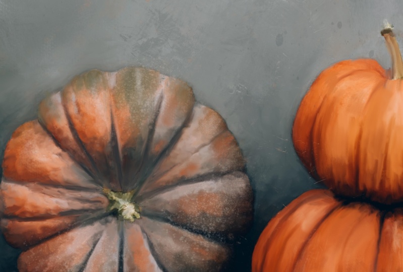
3. Paint The Background: Okay, we are going
to paint a pumpkin. Now have a couple of
pumpkin reference photos. And as you can see here, I've already started a piece. This is not painted. This is two photos blended together to create a composite and then blended with a texture. And I do that a lot
with my photography. Blend them with textured
painted backgrounds. And my intention is to
paint this eventually. But I didn't wanna do
that for this class. I wanted to, that might be a
little more difficult with the butterfly and I want to
keep this relatively simple. So we're just going to set
up a new canvas and start painting one of the
pumpkins from one of the photos that I'm giving you. Be sure to download those from the resources section when you
go download the brush set, download the pumpkin
reference photo so you can pick one
that you wanna do. Um, the first thing to do
is to set up a new canvas. Now, if you've watched any
of my classes, you know, I always do 6,000
by 6,000 pixels. So I click the plus button
next to new canvas. And I don't change anything except for what's in dimensions. I make sure the
DPI is set on 300. And for the width
and the height, I type in 6,000 by 6,000. And then as soon
as you hit Create, It's going to open the document. It's going to set it up
and open the document. And when you go back
to your gallery, the next time you
hit Plus again, you'll see down here untitled
canvas, 6,000 by 6,000. So you can just automatically pick that every time
you go do a painting, if you'd like that size, you can create whatever size
starting Canvas you want. The amount of layers. If you use a smaller canvas
size like 3,000 by 3,000, the amount of layers you'll
have available increase. Mine only has ten
layers available. So I'm just going to click
on one of those campuses have already setup and we're on layer one, We're ready to go. And I'm going to insert
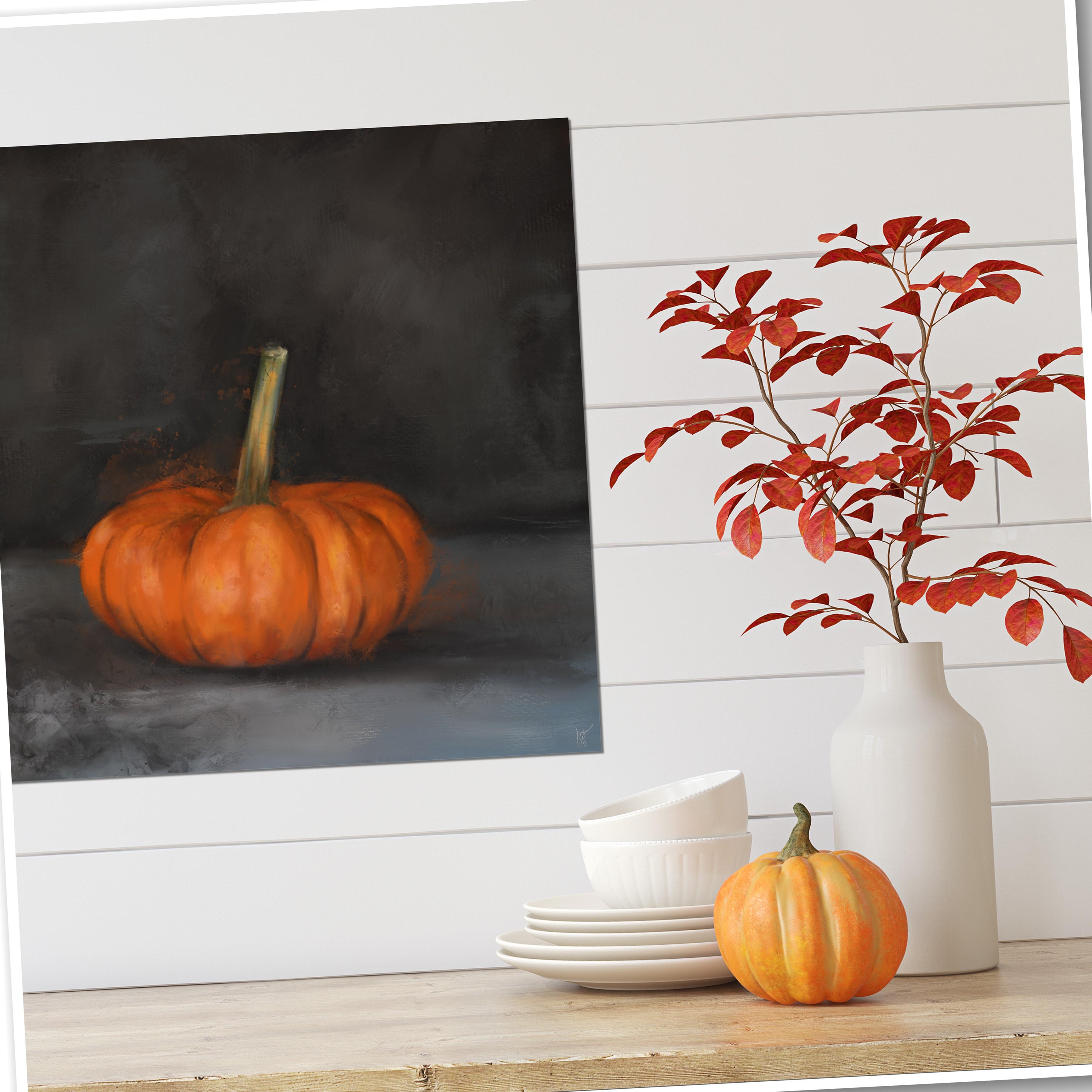
one of the pumpkin photos. Now the question is, which photo to pick? I've got this one
little pumpkin here on the white table with
a really short stem. I've got the white pumpkin, which I am kinda thinking
a coastal thing. Those are just shot
with my cell phone. You can take pictures with
your iPad, your cell phone, whatever of an object doesn't even have to be a pumpkin if you want to do
something different. And then I have my
original pumpkin photo I shot down here in my studio
on my little blue table. I love with a dark back
piece of wood as a backdrop, which is the one used
here with the butterfly. Because that was the original
photo I worked from. So I'm gonna pick one
of these pumpkins. And I really liked the one I
shot with the dark backdrop. So I think I'm going to go
ahead and pick that one. Even though the other one on the white table is the other
orange one is super cute. And then there's the white one, which I want to do with a coastal kind of feel to it
with some blues involved. I think I'll stay
traditional for this and just go with
this one right here. But you can pick whichever one. Now my photo is smaller
than the canvas size, so that's an easy fix. Just click this
arrow right here. And you can transform it
by pulling outwards on the corners and make sure it's set on uniform and
not free form. When you do this. So it will stay, the proportions will stay right? And then just pull it out
about to where you want it. And I really liked
those tones in that. And since they're
already in here, I figure, well, why not
just go ahead and use them? Now the next question is, do we want to paint from scratch or do we want to
paint the photo? And, you know, I'm a big
fan of painting my photos. It takes less time than sketching this out and
painting it from scratch. I can do either way. Um, it's up to you how
you want to do it. In this case. I think I'm just gonna go ahead and paint the photo because everything already looks
the way I want it to look as far as colors and
layout and things like that. And I want to do
this kinda quickly. So I'm just going
to paint the photo. In this case. Maybe one. Maybe I'll
do the white one next, and, um, maybe I'll do
that one from scratch. So I can show you
the differences. When you paint the photo, you want to duplicate
your photo layer. And you're gonna be
using the brushes as blenders to basically what's
on here is your paint. That's the colors
already laid down. So. We'll use the, the brush as a blender and I'll
start with the rich oil. Don't know, need to do is sketch since I'm
painting the photo, the opacity is set at
about 70% on that brush. As a blender, you can do 100%. It's a little strong. At 100%. Let me just show you
the difference here. We'll do a test. So let me get it big enough
or I can make them work. That's at 4% for 100%. And then 70. There's
a little bit less. Um, it's just a little softer. In this case. I do like the 100%. Um, when blending, I will
often lower that percentage because it's softer and blending should be a little
bit softer than painting. So I tend, when I'm using it
as an actual blender per se, I tend to use it at about 70%, but in this case, this, this really strong stroke
looks pretty good. So I'm going to get the
brush size about where I need it and figure out
where I want to start. Um, I think I'll
start on working on the background area first with a larger brush just to
get a feel for the brush. So I want to raise
that brush size up, pretty good size and just start scrubbing over this background, blending everything in
the little scratch marks and wood tone
variations in the wood. I don't need that
for my painting. I like the color variation
those things give, and as you do this, you will see you get those
variations of color, but you won't necessarily see every little scratch mark I'm not interested in depicting. Every little thing is
if it's photograph, if I'm gonna do that, I'll
just leave it be a photograph. And I mean, this is very dark and you can
it's hard to tell, but the there is color
variation there. And as I'm getting closer
around the pumpkin, I'm gonna go with a smaller size just so I don't go
over it at this point. If I pick up a little of the edging around the pumpkin
and it drags it out. That's fine. And then we've got
this line where the table meets the background. So I'm going to turn with two
fingers hold down in turn. And I'm going to try to
keep that straight when I'm blending it as
straight as possible. I mean, it's not gonna be
perfectly straight because it's just I can't paint a
straight line for anything. And I did get a little bit on the pumpkin there,
but that's alright. I'm going to work
around this pumpkin. And I'm still working
with a smaller brush. I'm just trying to
get this line first. Who I like how it
kind of accidentally brought some of that
orange up in there, but I want my my
table line to look. That's neat. See how it brought
that orange out. Okay, so let's look
at the table one now. That's pretty good. Now do I want to
leave these lines in the table or do I want
to paint them out? I'll probably paint them out. The shadow area. I do want there
because there will be a shadow under where
the pumpkin sits. So I'm going to use the small brush still and
work that shadow area, just back-and-forth, pulling
in different directions. I'm not scrubbing,
I'm letting up on the brush, tapping and dragging. And I'm not worried about the lines on the table
because I've decided I don't want to keep those just trying to get along
the bottom edge of that pumpkin to keep that
shadow area in there. Alright, there's
the shadow areas. So now I can go with a
little bigger brush. And I'm going to come
outwards from the pumpkin. Notice how it's picking
up a little orange and somehow I'm
putting that in there. That's because the brush accidentally touched
the pumpkin. But that's okay. It
looks kinda cool. I'm just gonna go
around him. Around him. I'm talking about this
pumpkin like it's animal. I'm so used to painting
birds and animals. I don't usually do objects, but I've been really having
fun with this brush set. And notice I'm painting at
the lines in the table. Can you hear the tapping? I'm not holding it
down and scrubbing, but you could certainly
do that if you wanted. So there we've got a
really loose painted look now to the background. And if I did want to blend in some of this a little better, we're not so harsh of a stroke. I can lower that transparency of the brush and
do that where it creates a nice soft blend and soften some of this up if I didn't want
those rough marks. But I like the rough marks, so I'm going to leave
it like it was. Alright, now we're ready
to paint on the stem area. Now I'm doing this all
on a duplicate layer. So you see that's before. That's after we're getting
to a painterly look already. We haven't even got
to the pumpkin yet. I could do some additional
things to the background and bring some additional tone
into this darker area. I think I'm gonna do that. I'm gonna hold down on there and it pulls a
color on the color wheel. And I'm just going to move that color upwards a little bit to get a
little lighter shade, and then go with that
rich oil as a paintbrush. Instead of the
blender tool just to paintbrush and scrub some
of that color in there, um, where I want it. Just kind of around
this top part here. Just make some marks. And then I'm gonna go back to the paintbrush as a blender. Make sure I'm on
the same rich oil. And gently tap and work that end with little
short strokes. Work that into the background. Just to give it some
color variation in there. So it's not so I mean, it was pretty dark. That would I do like that color variation
gives it that interest. And you can go with a
little bigger brush and do some bigger
blending marks. And just keep going until
it looks okay to your I saw a lot of this is for me is how
does it look to the eye? I don't want to blend
it all the way out. I want some of those
brush marks showing. Okay, now let's get, um, how about what happens if we grab a little
of this blue from the back edge of the table and we put a few
marks with that. Just playing with
brush size. In here. You see on top of
the dark background, it, it looks different than
it does over the table area. And I can even come down here to the table area and
maybe at the top, just add a few little marks of that shade in there,
just here and there. Now let's blend some more. So click on the
blender and go to town and just play with the
different brush sizes. When you vary the brush sizes, it adds more interest. I'm going right up
close to the pumpkin. Work in those colors in
playing with brush size still. If you lose too much
of the dark and can blend it back
toward those areas, or you can add it in. So let's add some in
because I feel like I did lose some of the dark. A little too much of it. Especially close to the pumpkin. There we go. Now to blend a
little bit of that. So we've got a really
messy loose painted look going on for the background now. And add a little more dark
here at some of the corners where maybe took away some
too much and blend that in. And another fun thing to do would be to try to
use the canvas brush. So I've picked that blue again at the back side of the table. Unless just let me
turn it this way. Let's just see if I make a
stroke or two here and there. Would that blue shade. And I can go different
directions with this two down and over. Then, let's go over here. Brush a few canvas
marks in down as well. I'm just touching
that wherever I think there could be some of that
color and put it in there. And then you can also use the Canvas brushes, the blender. And I've got it set at
about 82% and go with a fairly big brush
and just kinda tap over those areas I just
painted with the canvas brush, which this helps blend it in
and soften it up while still showing some of that fun
canvas texture in there. You can't really see it
over here on this side. And I'm just doing very soft, short strokes to blend
some of that end. When you use the canvas brush
as a blender, it doesn't. Um, if you do it real lightly, it will show some of the canvas
texture, but it's better. As a paintbrush,
the canvas one is, it shows the Canvas more than when you
use it as a blender, but you've got little
bits of Canvas now showing in there. And I'd like to put
a little bit of that canvas texture
in that table. So I'm going to pick that blue from the back side of the table. It's actually a warm gray
and I'm going to just, um, pull up on it a little straight up on the color wheel just to get
a little lighter shade, makes sure it switches
back to paint brush. And I'm just going to gently
brush strokes and that in just gently here and there. That's a little dark down there. I probably need to go a little lighter down here on the bottom. That's too bright.
Well, it's too dark. It's too strong. I push
down on it too hard. That's thing. This is a very
light touch brush. Now let's go back to it as a blender and I'm going
to turn this way. So I like to stroke in the
direction of the table, the table of the, the strokes. And I'm just gently
blending that down. And I really liked that
little bit of orange that accidentally ended up
beside the pumpkin. So I'm going to try
to stay away from that. So I don't mess it up. If at anytime you get
something you really, really like the look of oh, that's a neat mark right there. I don't know if you
can see what it just did right there. That's neat. And leave that. But anytime
you get something you really, really like and you don t know if you want to
mess it up or not. You can go ahead and
duplicate this before you continue on and save that in
case you need to go back. Um, I don't do that a whole lot because I usually end
up just fixing it. If I need to fix it. All right, I'm ready to start
painting the pumpkin now. I'm gonna go back to
the ritual brush. And in the next
video we're going to come back and we're going to
focus on the actual pumpkin. So stay tuned for
the next video.
4. Paint The Pumpkin: Alright, let's start
painting this pumpkin. I am on the brush as a blender. Rich oil, 100% opacity and pretty small brush size because I'm getting
ready to work on the stem. Now, I'm going to
just pull down in the direction that the stem is, except for this
little top piece. So I'm gonna go
across and around. Just pull those colors down. The colors are your paint. The colors in the
photo are the paint. Since I'd already designed
this photo. That way. When I blended it with the ER, when I shot it with
the background, initially, I figure why not just use those colors that are there
because I like them. So I'm just kind of going in the direction that
the stem is going, trying to keep it as accurate as possible while just doing short little marks, short little blending marks. Alright, there's the stem. So we can turn this
off and on and you can see it still has
the same colors. Does it have all those
little speckles? No. You can add those
in if you want to. But now I'm ready to start
painting the pumpkin. Now, these little creases in the pumpkin or darker,
and when they, when you blend them, they're gonna be
a little darker, but I'm telling you they're
going to lighten up. We're probably going
to have to add some. But I'm going to work
on little sections of the pumpkin slow back
section by the stem. I'm going to work
on that first with the small brush and just blend that and try
to keep that dark area. But I knew, I know I'm
going to lose some of it. When if you stroke one
way and it's too dark, struck the other way on a light starting on
a lighter color. And it will pick up the lighter color than
just short little strokes. Don't push down and drag it. You're going to blend everything together and it'll make it look mushed together like what
they call smudge painting, which I hate that
term by the way, paid it don't, don't
even use it with me. Now some of this where
this blue dark colors from the background
came over the pumpkin. I actually liked that, so I'm going to try to
just tap around those. I might need a smaller brush. I'm getting I'm losing a
little bit too much of it. So I'm going to
double-tap and undo, go back with the
smaller brush and kind of work around that and try to leave some
of that in there. I really liked that nice, loose, organic look that, that had on the dark lines at the creases in the
pumpkin that's going to give you your shapes so
you don't want to lose those. But they probably
still have to be dark. And here's some more blue
that accidentally came over. Now that may be a
little too much. On the other hand, it
kind of looks like a really nice accident. I'm going to blend
some of it out, but leave just a
little bit of it's showing with a small brush. And I'm gonna go ahead and
work the dark creases. And notice I'm turning
the painting as I go because I go when I'm doing a line
or trying to keep something specific
like a long line. I tend to do better
coming painting it from top to bottom rather than from bottom
to top if I go both ways, but the top-to-bottom
works better for me. So I'm just going to and I'll go from bottom
to top here on this line. But where the lines are, I'm going to work those in with while I have the
brush set to a small size. Here's a really dark spot. I want to keep that
best I can right there. And you can even pull
some of the blue on up in there and just go over all the lines first
where the creases are, where that dark edging is. Because that's going
to give your pumpkin the dimensions to make
it look circular. You don't want to lose that. Try to keep that. Here's some more
where the blue went over and work on
this top part of the pumpkin here with a small brush going
in the direction. Now, this blue that come over
here is a little too much. So I'm just going to
blend over that gently, but leave a little
bit of it in there. You know, these
little accidents that happened really make a piece. So any small areas
I'm working with this small brush, small size. Now let's turn it right side
up and see where we are. Okay, Now I'm gonna go with
a little bit larger brush, not too much larger,
just a little bit. And you might have to
make a stroke or two until you see where it's going and how
it's going to end up. And just do each section. And like I said, I'm not
worried about the speckles. And I'll even get a
little bit looser with the brush as I go to make those accidental marks happened
just very short strokes. And I'm just blending out those speckles going around
this center section. Now, one thing I don't
want to lose here in the center section is these
lighter areas in the middle. So I'm going to criss cross
over those with my marks. Because this is the focal point. So this is where the eye is
going to go, most likely, but by crisscrossing, it
gives it a different texture, a different appearance
right there. Instead of being so smooth, just pull color around
where you want it. You're moving the color, you're the artist, you decide
where you want the color. And that's a lot of this is
just artistic decisions. Now that looks really nice and painterly there in
the center of that. I'm going to continue on
with that same brush size. To the next section. There's a little
highlight there. Crisscrossing will
add interests. Who I got on that dark too much. I'm going to undo that. But crisscrossing
will add interests in those highlighted areas and make them look
somewhat different, which is what you want. I got a little bit
too light down there. I'm just undoing it and pulling
some of the dark upward. Now to the next section, I'm going from the bottom
up and then back down. The way I moved my pen. Very short strokes, very quick, not pushing very hard. And hoops. This final side over here. There's a bright
area right there. That in there, nice and bright. And even pull from the edge, pull some of that
blue that made it have a real nice look. So the whole thing
is painted now. So you can turn it off and on and look at it
from a distance, zoom out, you see it still
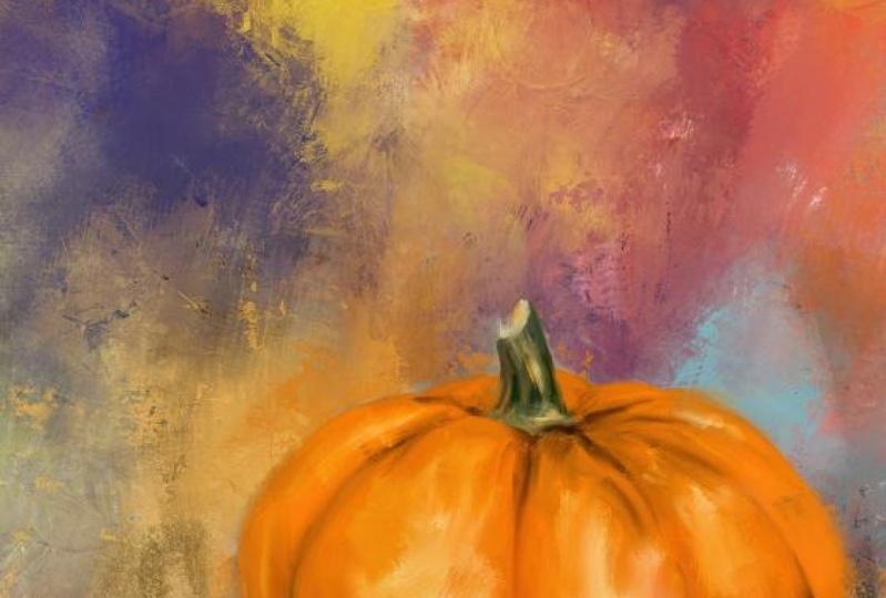
looks pretty realistic. I do think this dark spot right here got a
little too crazy, so I'm going to blend some
of the orange back up into that area and then smooth
it out a little bit there. That looks a little better. But notice our pumpkin still
has form and dimension. Now one thing I do
like to do is add some additional details and
more color into our pumpkin. And I like to bring
the background colors into the subject and the subject colors
into the background. Now I don't want to
bring too much of the subject Teller into
the background here, but I do have a few
little marks like the little orange bit that
ended up on the blue. And then here's some orange
that ended up there. And here's some overhear
that ended up there. So I don't really need
to bring a whole lot of orange from the pumpkin
into the background. But what I do need to do
is darken the shadow, darken the lines a
little bit more, increase the highlight
color a little more. And I want to bring some
of this lightest blue into the stem because it looks like there's a
little blue there. And I'd like to enhance
that by bringing some of that table color
into the stem. So we're gonna do
that on a new layer. So in the next video, we're going to cover adding those details
and blending those in. And we're gonna do it
all on a new layer.
5. Paint Details & Enhance Color: Okay, So to add our details and enhance
our colors a little, Let's, we've got the
new layer on there. If you don't, if
this isn't on there, go ahead and hit the plus
button and make it get there. This time we're going to
switch over to the paintbrush. Um, you can use the
sketch brush which is available to use it are pretty low size to get some
good fun detail in there. In fact, let me go ahead and do that with this sketch brush. And I'm at about 6% on the size, and I'm going to
grab this light, light blue color down here. One of these I'll
go with this one. It's a little darker. I don't know. I'm gonna go
with that one. No, I'm not. I'm gonna go with this
one. See I can't decide. And make sure I'm
on that new layer. And using the sketch brush, I'm just going to bring in
a few little marks in here. Sort of alongside
some of the green. And more towards the top. Just a couple for accent. And then I'm going
to blend those in using the rich oil that
I'm gonna do it with a really small brush. And lower the opacity
just a little bit. Just to give it a
little smoother blend. You don t have to
blend every bit of it. I'm just stroking over it. And if there's a
piece that doesn't get blended, that's fine. The key is to zoom out and see if it
looks too out of place, which it kinda does. So I'm going to blend a
little bit more of it in. Just pulling the colors around
it on up into the blue. And the blue is
on its own layer. So it's just got a little bit of that blue highlight in there. What I have noticed
on top of the stem, if I turn off the painted layer, you can see on the top
of the stem there's a little white rim
kind of outlining that circle around the top of the stem and that
is missing in here. So using that same sketch
brush, but instead of white, I think I'll grab this
creamy green color, which is a yellowish green, which is kind of light. Maybe I'll go a little lighter
with it to more ivory. And still using the sketch
brush, very small size, just make a few
little marks there. And actually the top of that
stem is a more golden color. So I'm gonna grab me, just move the color wheel around to a little bit
more golden color and make some little
short strokes in there. Now go back to the blender, which is the rich oil. And carefully just
short strokes, tap around that, tap and
pull and work that in. And then I do believe
this darker green here, turn that off and grab that
from the original photo. Dead matter, which layer you're on when you hold
down on your color. As long as you can see the
color, that darker green. I'm gonna go back to
the sketch brush and put that under here. Just a little bit
on this one side. And then back to the blender. And quick little dabs. Blend that in there. Now our stem looks like
it has a little bit more of that top piece and
blend that green down, just a little bit more. Pull down on it. So we've got a
little bit of blue in there now it's real subtle. You can turn off that layer and on just to see
the difference. Very, very subtle. Now I want to add this dark
color from the background, so I'm going to hold on that and still using the sketch brush. I'm going to darken some of these crease areas
just a little bit more. I'm just picking spots
were I think the crease would be pretty deep. Like this. At the top and
the bottoms of the creases. Their deeper looking over here. Just very light strokes. I'm not trying to be
real specific with it. Now. I can. Blend that in. And because it's
on its own layer, It's easy to do. Might go with a little bigger
brush to do that blend, which will soften it up. Smooth it a little bit more. Like I said, don't don't
worry if you don't get every little bit of
it blended some of that characteristics
of the sketch brush, those rough edges on that
brush are actually kinda fun. So I'm keeping it kinda
loose with my blending. And then back here at
the back by the stem. Just kinda dot those
areas to darken that backside and then pull back against it the
other direction. It was too strong. This will really give
you a good foundation in the blending. To practice with this as a paintbrush and
then turn around and blend it so they can zoom out. And now our creases
looked very, very deep. So you got two choices here. You can continue blending
to soften them up, or you can add in some
orange color and allow some of that orange color
to kind of blend over top of those dark areas. So I might do a little both. Sort of blend down some of them. A little bit softer
to start with. Just going around
picking and choosing. And if you zoom out, you can see it from a distance
when you're doing this. See it's just toning
it down a little bit. But I do want to bring some
more vivid color to this. Some looser strokes. So I'm gonna go back
to the paintbrush, but this time I'm gonna
get on the rich oil brush. And I'm going to grab
the orange that's there. And then I'm going to raise
up on the color wheel, pull it upward to a
brighter color, orange. And in these sections, I'm just going to play with
my brush size a minute and make some quick marks where
the orange color might be. Loose. Quick marks. Like so. That one is
kind of an accident. I didn't want to sign did it? And if you don't like a stroke, I'm doing one stroke
at a time and do it. That last one I did is
too bright for that area. That part of the pumpkin as it goes around is going
to be darker on that side because the light is more towards the
left and the center. So on that right side, I'm going to keep
that brightness down. Now I'm not going
to blend these. What I am going to do is
get this creamy shade, hold down on it and I
will make it brighter. I'm going to pull it more
almost to the white side. And I'm going to make a
few marks with it in here. Were those highlight areas are now that I'm not sure if there's a
highlight right there. So This doing really short light
strokes here and there. And if I don't like them and doing one stroke at a time here, folks, I like to bring a little more
yellow tone in there. So I'm going to move on
the color wheel toward the yellow and pull over to the right to get
more of a yellow tone. Let's bring some yellow marks in over top of that
highlight areas. And you can play
with brush size. Maybe even put a couple of
little yellow marks over there and there's a little
yellow in the stem. So I'm going to pull down, make a smaller brush and do
a few little not that small. Couple of little
yellow street marks up here in the stem area. Okay. Now let's go back
and grab the orange, but the darker shade. And let's go toward a
red on the color wheel. Red and yellow make
orange with the eye. So I'm just going
to tap some red. Over the darker
areas a little bit. Not too much of this. And trying to stay towards the darker areas and
even toward the bottom. The darker areas are if you
don't like one, undo it. And the nice thing, because
this is all on a new layer. You can erase parts
you don't like. So now our pumpkin is
looking really choppy, which is okay, we're gonna
blend some of that now. We didn't blend it at all while we rely on
those marks down. But now I'm going to blend some. I'm gonna go with
a bigger brush, a little bit lower
opacity down to about 70. And this is on its own layer. So I'm trying not
to push real hard. I don't want to lose some of that neat edging on those marks. And I'm just very gently
blending some of that color In working my way around it. It's toning down the
harshness of those marks. So say the left side I've done and most of
the center of them. But the right side is not done. You see the difference? The right size still
looks real choppy. Let me go ahead and
blend that side now. Very short. Gentle sweeps of the brush. Remembering that the pumpkin is darker towards the bottom. So trying not to pull those bright colors
down that direction. And Cris crossing over some of these strokes
when I blend. Because that adds interest. Starting to look like
the painting now. So if we take turn off
the layer, we just did. That's our pumpkin
to begin with. Very simple, very
plain, very realistic. Now we're starting
to dress it up. Make it look more
painterly all with this one couple of brushes here. And there's our original. So that's where
we've gotten so far. We're starting to look a
little bit more painterly. I want to do something
with the shadow area. It needs to have a little
bit more darkness. So I'm going to grab some of the dark from the background. Make sure I'm on
the rich oil brush. And make a couple of marks right up under
the pumpkin where it touches the table is going to be darker along that portion. Now that I've made some
of those dark marks, I'm gonna go back
to the brush as a blender and blend those
marks outward some. So our shadow is now
a little bit darker. I want to bring a little bit of this blue into the shadow. But I think I want to
paint that in with the canvas brush to
create some interests. So we're going to try it. Lower that brush size
down and gently. Just do a couple of strokes
and they're sharing there. That's too close to the
bottom of the pumpkin. Just gives a little
bit of interests. There. Can also blend that
with the canvas brush. Tone down that canvas
texture just a little bit. It's got some interesting
marks in there. Now. There we got a pretty cool Pumpkin
right there, as is. So at this point, you can look at it different
ways to look at it. Zoomed out. What's really small. All right. There's
our original photo. There's the beginning painting. There's our enhanced
painting. See the difference. Pumpkin is really starting to glow now and look
kinda painterly. Looks like a lot more fun now. This looks kinda
like a nice pumpkin. This looks like a more
exciting pumpkin to me, because color will do that. Adding in Marx and
color will do that. But at this point, I'm happy with what's on here
is layer three. So I'm gonna go
ahead and click on that and click Merge Down. Now that is merged with the
original painting layer. If you didn't weren't sure
about that. Let me undo that. Well, double-tap. Double-tap. There we go. I got it back. If you're not sure about
which version you like, you can click this one off. Click the wrench, click
Share, click JPEG. Save image. Okay, so I've
just saved the plain version. Turn that layer back on. Do the same thing, click share, because we're going to
continue on from this and save, Save Image. Now I have two versions saved. That one and that one. Now, click on that top layer, merge down and it becomes
one with this layer. So there's our photo,
There's our painting. Could stop right there. But you know me, I've got to bring stamp brushes
and I've got to do something fun with
stamp brushes. So in the next video, that's what we're
gonna do with this. And I'll be right
back to continue on.
6. Final Touches With Stamp Brushes: Okay, now we're ready
to have some fun. Now, like I said, you
can stop right here. This next part is optional, is just what I like to do. What I'm gonna do
first on this layer, before I add the new layer
for the stamp brushes is I'm gonna go to the blender
and the textural brush. And getting a pretty big brush. I'm going to set it down on a couple of spots
and pull gently, not pressing very
hard to just try to bring some texture
into this piece. Notice the little crack, the textural look at just put
over the stem. I like that. And it's putting some of
that into the background. So you can see it happening. It's very subtle. And if you do too
strong of a mark, you can come from the other
direction and go over it. Or you can just
double tapping undo. You can play with
the brush size. I like to pull some of that texture around
with this brush. And I'll, if it doesn't
appear to do anything, just you can double-tap
and undo or triple tap and redo and play with that
brush size some more. Just very gently push and drag. And you don't want to push
too hard. See you there. I brought some down
over the table, but I can just go across and gently and tone
that down a little bit. Actually, I don't
like it, so I'm going to double-tap and undo that just over that
little line of the table. I would like to have
a little texture showing up in there. I'm just going to pull
from different directions there some. Now it showed up. And remembering my
little orange bit over here, I don't want to lose. So I'm gonna be
careful on this side. When I do that. I pulled a little bit over into the pumpkin a little too much. So I'm going to undo that. And do the same thing down
here on the table area. Just pull that, did a nice
one right there and see this. That's what I'm talking
about. This brush is really unpredictable as to what it's going to do
when our like that. But I want to tone
it down so I'm gonna pull the lighter
color back over it. But now it's getting
some nice real paint texture in there. I'd like to do that
in the shadow area. That's too soft. So undo it. Me pull down. They're kinda pull outward and upward from the shadow
area around the pumpkin. And out, upward and outward. Just integrating some of
that texture throughout. So now we've got some
fun textural marks going on in there. And always zoom out and
look from a distance as he, that was Marcia, very subtle. But if somebody if
you do a print of this and somebody
looks at it up close, they're gonna see
those paint marks. And that's what really adds the interests
to these paintings. When you do things like this. And pull this up, get
a little going up. They're technically
whatever color you start pulling from should show up over the next color. It ends up on top of, but doesn't always
work that way. Like I said, this brush
is very unpredictable. So you just kinda have to
slowly press gently and drag in different directions to get some of those fun textural
effects throughout. You can go bigger. It's just all very, very subtle. But it just adds a
unique touch to it. Alright, let's get started
on some stamp brushes. Now I'm going to try to remember to put the
link to download, load these stamp brushes or the set that they're
in, the description. But if I forget, I'm there in my
expressive dog would flower photo class there
in the description. The reason the
brushes are linked in the description to
download them from Dropbox is because that brush is too big for the platform. Here. To accept it as a download. It's a fairly large set. But I've made a
new layer on top, and I'm going to go to that set, which is the expressive set. Um, it's a fairly large set in. But it's got a lot of
fun stamp brushes. These are my
favorites that I use a lot in different pieces. This one here, number two, is a big favorite. So I clicked on it. And I'm going to choose a color from the table right there. And make sure it's
on the new layer. And I'm just going
to tap and see what, what ends up where I'm
going to tap it in a few different spots and see if I like
and what it's done. Now, like I said,
this is a favorite, but for some reason it's not looking like a
favorite right now. Let me try number one. And this is just all
personal preference and you can resize these. Oh, I liked that. I liked this bottom
edge of this mark. That this one makes it very
interesting and very organic. And you can stamp it off one side and then stamp
off the other side. And you'll get the
other side of it. It's totally different look, because this is
on its own layer. You can then blend out some of those
edges you don't like, like this top edge that
it made right here, right there on top. I'm not really happy with that. So let me go to the Canvas brushes a blender just
for being a little different and just softly pull up on that edge and
blend that down. And then if I don't like these little circular
areas right here, I can blend those out some. I'm just kinda work it in
with what's underneath. You can also use the textural
brush on the new layer and drag it around to create
a different look. That was a little too big. So I'm going to redo it. Tone it down a little. This edge here. So either one That's the canvas
brush or the textual one, or even a brush from the expressive collection
can be a blender, as long as it's
not a stamp brush. This area right here
next to the stem. Stamp is laid down that needs
a little bit of blending. So I'm gonna get the canvas brush and
gently pull towards it. Just some sweeping strokes and soften up that
edge just a little. But by working the stamp
brushes in like this, you get a really
fun organic look. Now, that stamp I'm
real happy with, but I'm not sure if I want to
work on that layer or not. So I'm just gonna
put a new layer on. And I'd like to get some
of this lighter blue somehow in here somewhere. So I'm gonna go find
a different stamp. What about number three, which is interesting
mark like that. Let's put it as big as it'll go. And because it's on
its own layer now, I can move it around. I can resize it
and I'd like to do free form as a resize so I
can just stretch it out, stretch it around, see
if I like it anywhere, kinda like that rough edge
look on the table right there. That gives an interesting look. But it needs to be blended in. So let's go with
the canvas brush and we're going to pull
down towards it and across. Keeping in mind not to mess
with my little orange bit. Play with sizes on
the canvas brush. I'm just kinda work it in. But because this stamp brushes
are made with real pain, it gives your your piece
a real paint feel. I don't want to work
at totally out. There we go. See that's created a nice little edging right
there that didn't have, and that's kind of interesting and zoom out so you can see what you're doing from a distance when you're
doing this blending. That's why I'm
zoomed out so much. It's not that I don't
want you all to see. It's just that it helps me to see how much of that stamp
I really want in there. This just gives a nice little
edging to that right there. Okay, I like that. So I don't want to
mess with that layer. I want to go make
another new layer. I would love to. Mess up the pumpkin
a little bit. It looks too perfect. So I'm gonna grab the
darkest orange I can find sort of back
here by the stem. And I'm looking at
the backside of the pumpkin where I want to do this and I'm going to
find a stamp in this set. Here's a stamp that's kind of curved like the top
edge of the pumpkin. Make sure I'm on the layer
before I put the stamp down and just tap it. And then I can rearrange it. I can drag it. I can stretch it. I'm not sure I like
that orange though. I think that's a
little too dark. I think I need to
get out of that. Undo, undo, undo, and
redo it with this orange. There we go. That's a little better. It kinda looks like
a loose stroke just kind of accidentally came off the back of the
pumpkin right there. And okay, what I'm gonna do here is I'm like part of
this stroke on the pumpkin, but I don't like all of it. So I'm going to mask
away part of it. So I'm going to click on
that layer, click Mask. Go back to the ritual set
and the rich oil brush. And it's already gone to black. You want to make
sure it's on black before you try to
paint this on here, but we're painting on
the mask layer now. And it will just take off
the parts I don't want. And if we take off too much, if we take too much away, then you can paint with
white to bring it back. So let me zoom out
and take a look. Actually like what
I just did there. I trim that up a little. It's got this little mask on it. Okay, I'm happy with that. I'm going to squeeze those
two layers together. So I would like to do another mark on the other side on the
backside of the pumpkin. So let me go back to
the expressive set. And let's see what other
mark that I could do. That's kind of curved. This is a fun markets, a little strong, thicker paint. I'm going to put that
on its own layer and just put the mark down and drag it where I want it to go in the general vicinity. And I have it set on free
form so I can stretch it out, skinny it down, pull
it down a little more. Now that's laying right
over top of some of that. You can reduce opacity. To just leave a little hint
of that showing right there. Which I kinda like. Or you can leave at full
strength and mask away. But I actually liked just a
little hint of that showing. And I might want to
trim up right here. If you turn it off and on, you can see where it's on the
back edge of the pumpkin. So I may do a mask right there. Once again, go back
to the rich oil and just kind of make sure
you're on black paint, trim up that edge. So that's got a
little paint mark in there now that's kinda fun. This is just little
detail things. Let's see if I want to get a little more adventurous here. What would happen if we go
with the bright orange? Oh, I've got the
layer mask selected. Let me squeeze those together. And at this point let me squeeze everything
together there. So everything's
on one layer now. Now I'm ready to add
another new layer. And let me grab this bright orange color wheels
change too bright orange. Back to the expressive set. I have got some big fun splatter and splash marks that would be kind of interesting
in here maybe. And they may be too much. But we'll just say
I'm going to stamp it right over the pumpkin. Oh, now that's quite fun. Let me see if I can stamp
another splashy Mark. How about this tool number 28? Let's make it a little bigger. I'm just tapping it where
I might want it to go. Now that's a little bit much. Okay, so we've got this
one on here, right there. Somehow I've got a little
piece of it off to the edge. But because it's
on its own layer, I can click that layer and
reshape this and put it more. Where I want to
put it like that. That's kinda fun. Now, obviously some of that I don't want
over the pumpkin, but I do like what
it's done along that back edge and behind it. And I actually don't mind if
you turn the layer off and on some of the splatter
stuff on the front. It may be a little strong. Let's go ahead and do a mask. Now, notice my mask color did not go to black
when I did that. If you double-tap on the color, wheel, it down there
near the black, it will go to straight black. And I want to go
back to my rich oil. And I will turn the layer, the main layer off and on to
see what I want to take off. I know I want to
take off that stuff. That's most of it
that's on the stem. So I'm gonna go
ahead and mess that. And I've lost some of
my fun mark right here, some of that mask over that. And then this back
edge right here, I want to trim that up a little. Don't really like
the bright marks on the right side of the stem. This one here on the left
side is a little dark. I don't mind it being there. I'm going to undo that. I'm going to lower the opacity before I messed that
down and see if I can just tone it down
just a little right there on some of this down. So some of the splash shows
just kind of going all around it with a lower opacity masking brush, stroking numerous times. It looks like paint just kinda spilled back there
on the back and I'm zooming out so I can once again see how much I'm willing
to take away of that. At that low opacity, I'm having to do
several strokes. Basically just painting it to
get it looking like I want. There we've got some fun
splashy marks to it. Some of this that's
on the pumpkin, raise the opacity up a little on that mask layer and tone some
of those splash marks down. Don't want to take
them out completely. Just wanted to tone
those marks down. I want it to look
like loose paint. Just kind of splattered
accidentally as I was working. So anywhere where
it's too strong, I'm just looking at
all the sections. I'm using that brush
at that lower opacity. So now we can turn
that off and on. Its took a little
bit too much detail right here off of
that crease away. So I'm going to raise
the opacity and just go over that and
bring some of that back. Zoom out, turn that off and on, off and on and see where I want to bring some back
painting with that black. But it's got some interesting marking markings in there now. But notice I've taken
away a lot of the splash, but there's enough left
in there to add interest. Okay, That's cool. Let's see. I'm gonna go ahead and
squeeze these together. And I'm going to add
another new layer, staying on the bright orange. And I'm going to go back
to the expressive set and see what else I can
maybe stick in here. I got all kinds of
fun marks in here. I'm decisions, decisions. Some of them may work, some of them may not. This is one of my
favorites, number 67. And that creates a real
strong Canvas textural mark. I don't think I want that
in the bright orange, but it might be fun
down here in this blue. It's a purplish blue and go
to a little lighter shade, pull it up and stamp that on. It, makes sure we're
on our own layer, stamp it somewhere and then
resize and move it around. See where I might want to
integrate some of that, that I really liked, that
texture, that brush. Provides how about if I flip it? Let me zoom out and look at
it that may be too strong. So our choices are
lower opacity of it or blended in or
both, or mask it away. How about 70%? And let's blend some of it with
the canvas brush. Trying to keep some
of it in here. That I like. A little bigger sweep
over that. Whoops. Trying to keep some of
it in here that I like. But because I do like
some of that depth that that stamp brush provides
for up, sweep over gently. And I'll end up
taking away a lot of these stamp brushes
sometimes with blending. I took away too much. I'm going to undo some of that because I really liked that strong
part off to the left. They're kind of
looks interesting, but I'd like to add a
little something over that. I'm going to take this
blue, another new layer. And one of my favorite things
to add over top of stuff, especially toward the bottom
of the painting is a drip. I've got a couple of drips here. Let's see what stamped
31 looks like. That's kind of a splashy drip. See what stamped 32 looks
like but a smaller size. I'm going to have to come
with the color above it. I think smaller. Put a little drip in there
that drips not big enough. Come up. Like some of the paint
above their drip down. May need to go a little
darker on the color still. No. Just picking different
colors around the top there. That's kinda interesting,
but it's too much covering my stamp too much. There. I kind of
like those drips. I still think that could
be a little bigger. Want to redo it? And I'm not worried about the top part because I'm
going to get rid of that. I do like those
fun little drips. Alright, let's do a mask. Mask. Go to, and you can
mask with these. If you just tap on there, make sure you're on
black and then tap with any stamp brush you can
kind of mask some of that. Who actually liked that
total accident there. Now I want to go
back to this color and I'm going to add
another new layer. And I could sit here and keep going and going and
going with this. Um, there was a splash. Splash. I like a lot. It's very subtle. And of course it's too small. So there it is. I've
tapped it on there. It's on its own layer. Therefore, I can turn it, squeeze it, maneuver it, put it wherever I want to ask, just trying to integrate it into that area where
that lighter color is. Move it around, make it smaller. Just adds a little
interests there. Think I still need
something else though. This one number 42 is
just some fine lines. On tap that in there. Might need a little
darker shade. Now, I'm not sure I'm getting the right effect
I want with that one. What's 45 do? Oh, that's a really dark. Let's lower the size of that. My own, my own layer
with this note, put a new layer and then do it. That way I can move it around. I kinda like the effect of this to blend it in a little better. Positioning differently. Losing too much of
my detail there. That may not be the right stamp, clear the layer, tap on it. Lighter blue. I think I intended to go with a lighter blue and
for some reason I didn't worry is that 29? That's kinda interesting. Now. It's on its own layer. So that means I can resize it. Move it. Move it. Okay. Now I think I'm
getting somewhere. I like that. Okay.
That's pretty cool. I really like this now. So I'm going to squeeze
all of these together. So there's our original photo
and now we've gone to this. And I could sit here and keep
playing with stamp brushes, but you'd probably get
bored watching me, so I'm not gonna do that. But what I am gonna do is I'm going to
duplicate that layer. And I'm going to go to
the textural brush. And I'm going to try something. And this is on a
duplicate layer. So I'm going to try
to grab the edge of the pumpkin a little bit and
drag that textural brush. I don't know if it's going
to work to do this on. I'm trying to get some fun. A little rough edging around
the side of the pumpkin, like it is loosened
up a little more and accidentally went
over into the background. And it can even pull
the shadow area over the bottom of the pumpkin
with that textural brush. Oops. And if your thumb slips, you'll do something
dumb like this. So thank God for double-tap. I'm going to try to pull some of that bottom shadow area over. And this is on a
duplicate layer. So by using that textural brush and pulling some colors
around a little bit, it just gives it
that interests in dimension and it makes it
look not so structured. Who I like what it
did right there. This is a totally
accidental brush. Didn't like that. Oh, I like that. That's accidental looking. What about pull across the
bottom of the pumpkin? Nope. Nope. Pull the dark area. How about that? Even pull that
lighter blue area up. Hello. Know, you could do that though if you wanted to
do something really crazy. Like come right up over the top. And I'll do this sometimes when I don t know
what I'm going to do, I'll just pull from
different areas with that textural brush
and see what it does. Well, I kind of messed up
that edge a little bit. And this now how did I get this big smudge
mark in the middle? Say I don t know at what point I accidentally
got that on there, but that's not
supposed to be there. But I like all the
other stuff I did. So I'm going to create a mask on this layer and go to the ritual. And this mess I
made in the middle. Oh, I'm not on black. I was like, Why
isn't it going away? Notice my color. Nowhere near black.
Yeah, gotta be on black. Double-tap near
the black till it gets to black, then
it will do it. There we go. I have no idea how I got this
mess in the middle. When I did that. My hand did it. So now you can turn
this layer off and on. See, I got the edging
all messed up, which is what I
was wanting to do. I'm not sure about the drips. Now that I'm looking
at him again, I think they look a
little bit too out of place and of course I've
already put them in there and squeezed it all
together and all that, which this is what I
do, I make mistakes. So let's go with
this light color, new layer, expressive set. And worse that
edging I put on in the beginning,
stamp number three. I'm all re-put the edging
down, smaller right there. And play with opacity
a little bit. Nope. Instead of
playing with opacity, I think I'm just going to blend, blend with the canvas brush. Just one that around. I could mask some of that away, which I might, I
think I just mess it. Tried to do a messy blend. I've blended too
much. I'm trying to. Hi, the stamps. I mean, the drips a little bit. Now that I've decided I don't really like
them where they are. I'm not sure I like
this either way. I kinda like that. Um, what happens if
I change layer mode? Experimentation screen? Normal? What I think I need more of this darker color over here on this one bottom corner side. So let's make another new
layer and do another stamp. Let's try number four. Well that's too big. Lower that size. How about we messed that up with the texture brushes, a blender. See what we can do
with that stamp. Just pulling on it. Now, let's do another new layer using that same color I want to paint with the textural
brush right there. Let's try that. Bigger size. I'm zoomed
out so I can kind of see, okay, I don't like that color. How about that color
is kinda interesting. How about a little bit lighter? A little smaller? Oh, I didn't actually mean to make
that mark in that direction, but I kind of like it. Basically I'm hiding
what I did before. Not all of it, but some of it. And playing with
that texture brush has a paintbrush here. Not liking what I'm doing, so keep undoing it. I kind of made a mess right
there in that corner. Okay. Let's see here. I don't remember what that layer
mask is for 0 right there. Alright, let me squeeze
all of these together. Okay, and then let me
squeeze those two together. Bought a painting. Alright, I'm still
not sure about that bottom left corner. So another new layer. Pick a dark shade right there. Go back to expressive. See what else I got. Mike could work in there. What about something like this? And then this is
all just guesswork. Who? Kind of interesting.
Let's turn that. Move it around some,
stretch it out. Right up to the bottom
edge of the pumpkin. Actually kinda like that. I kinda lost my initial
light blue stroke though, but I bet I could
do a little mask on here and bring a little
bit of that back. What if I mask with
the textural brush? Make sure it's on black. Double-tap there. Before masking. Let's go to the textural
brush and try to get a little bit of that
top texture in there. That's kind of interesting. Um, I want to blend a
little bit of this. I do like where I'm asked it, so I'm going to
squeeze that together and then using the
textural brush, this little side
part right here, I'm going to blend out some. It's going to give it
some good texture. Well, blended it out too much. Come the other direction
with that brush. Zoom out. Undo. Okay, I'm going to
leave it alone. All right, I'm happy with this. We've ended up let me
merge that down now. So we've ended up going
from this to this, or at least I have with the stamp brushes and all
of my messing around. But they're messing
around is the fun part. So I'm gonna sign this one. And I'll just pick a, pick the blue, but I'm going to pick it's not even
blue. It looks blood. And go almost a white. And go to the sketch brush. Make it pretty small. It's almost to two white. Pull it back down to the gray a little bit, little smaller. My message signature. Want to keep that uniform
when I resize it. Resize it and then grab it. Well, let me grab it. Grab it and move it down
here where I want it. That's a little too
close to the bottom. Move it. Good grief. Apparently I can't move it
unless I'm really zoomed in. Move it up a little bit. Okay. There we go. My life. A little
canvas texture in here. With that lighter
blue underneath the signature, put a new layer. Canvas brush. Fairly decent size. Down here on this bottom area. Just looks a little too smooth. Maybe make it a little bigger. How about get the lighter
color? This color? A little bit lighter. Whoa, that's too bright. I went to light. I was just trying to
get a little texture down there to add some interest. On this bottom part. There. I got some nice
textural marks in there. Definitely interesting
looking painting now. So squeeze all those together. Photo painting. Now I'm going to save
this out as a JPEG save. So now let's go to
the photo gallery and take a look at all three.
And there they are. Let's see. There's this one. There's that one. And there's that one. So this was the first one. Very simple, very
smooth, very elegant. Then this is the second one. Or it's got some
good pops of color. Now this is the third one where we've really made
something exciting. So that's the one I'm
going to go with. And I hope you guys have enjoyed painting this
little pumpkin I, or whichever pumpkin
you choose to paint. The ones I've given you. And I can't wait to see what you do and how expressive
you get with your pumpkin. Because a pumpkin can be as
expressive as you make it.
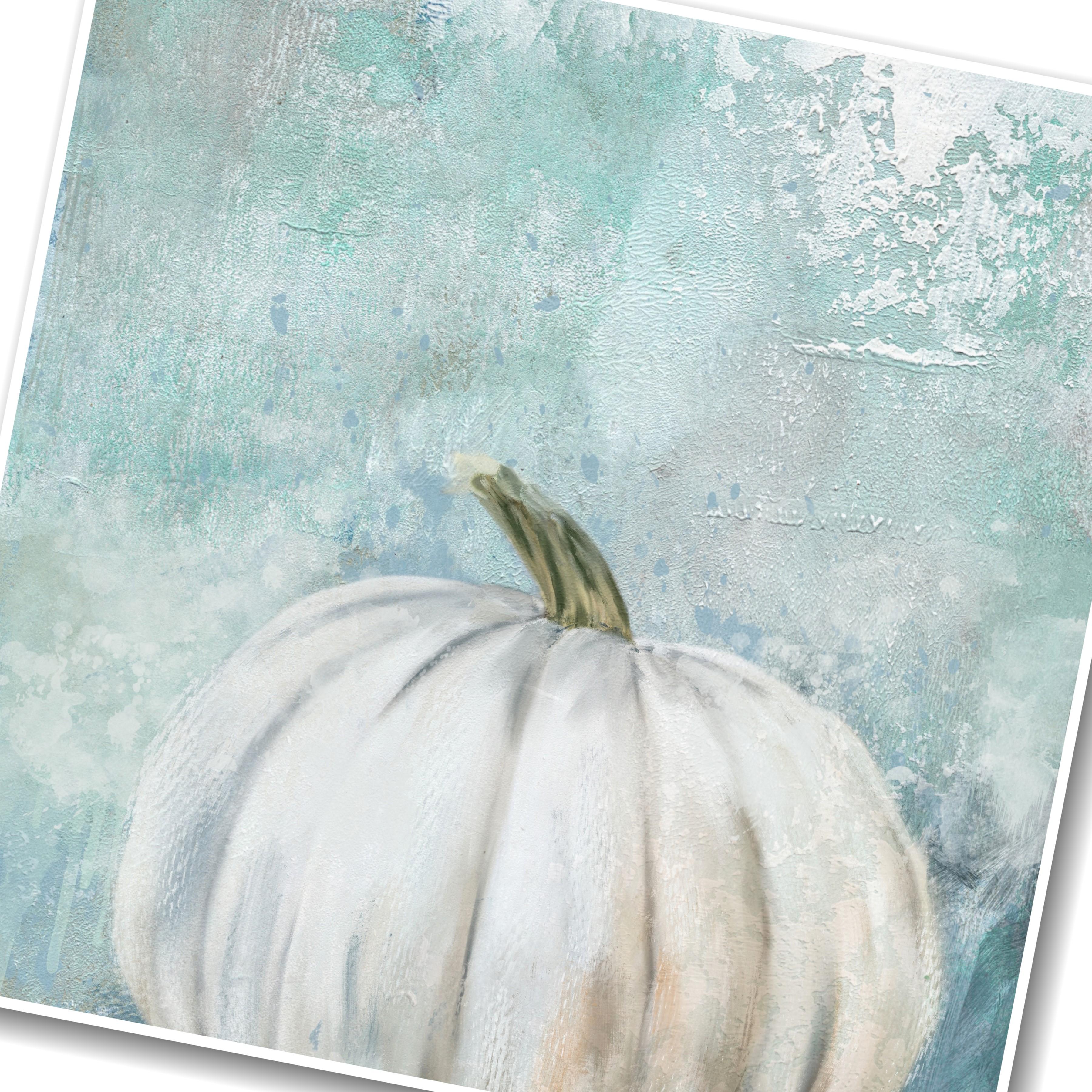
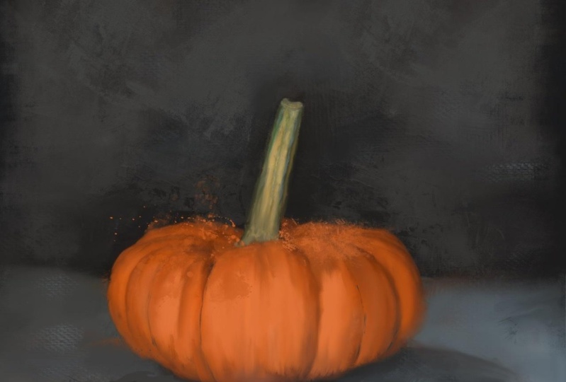
7. White Pumpkin Part 1: Okay, I have decided, I do want to go ahead and
do the white pumpkin, this one right here. But I want to do something
a little different. I have this background here, which is from my
farmhouse collection of painted backgrounds. And I thought this
background would be great to use with
the white pumpkin. So my thinking is how do
I want to set this up? Do I wanna do square
image like I normally do? Or do I wanna do a
horizontal or vertical? And I'm thinking the pumping might look good with
this area of paint. But I'm thinking of
flipping this around. Now, this texture, I've
provided you with it, a size 6,000 by 4,000. So I know that my
canvas size will need to be that
size but vertical. If I want to place
the pumpkin on top of this white paint
area right here. I tell people all
the time they can do their digital paintings
on top of my background. And I thought this would
be a good demonstration. So let us go over to procreate
and set up the Canvas. Hit the plus button, hits a new Canvas button. Now the texture is 4,000 or
6,000 by 4,000, 6,000 width. We're gonna do this
the opposite way. Instead it up 4,000 by 6,000
at 300 DPI and hit Create. And there is the
vertical canvas. Now I want to bring
in the texture. So go to Insert a photo to get it from
your photo library. And of course, as you can see, it is the wrong direction. So we need to rotate it. So click on rotate. And let's just rotate it
all the way around because I want that white
area on the bottom. Now let me zoom out
here so you can see. So you can take your
two fingers and squeeze or you could
drag the corners. I just decided to squeeze
and get it set in position. Once you click on the layers, again, it will set
that in position. Now let's make a
new layer on top. And I'm going to bring in the white pumpkin
photo right here. So there is the pumpkin. And I want the pumpkin to be large and down
here in this corner. So I'm going to squeeze
it about like that. And if you're not sure
on the placement of it, you can reduce the opacity and kind of take a look
as to where it will be. That's a good spot. Now, in order to get rid of the original background
behind this pumpkin, my messy background,
we're gonna do masking. Okay, we're gonna
put a mask on here. So we're going to click
the paint brushes, make sure we're on
the rich oil one. And I'm gonna go ahead and double-click
toward the black on the color wheel and
make sure we've got black because our mask
will have to be in black. So tap on the pumpkin
layer click Mask. Now we have a layer mask
ready to paint there. So start resize your brush
to whatever you need and start painting with it to get rid of this entire
original background. And as you get closer
to the pumpkin, you'll have to do
a smaller brush. This is just a really quick mask and you want to make sure
that you get all of it. Sometimes this brush
being a blender as well. We'll blend some of this and not get rid of all the
original background. I'm going to leave
a little bit of the dark under the pumpkin. I think for right now, get as close as I can
get a smaller brush. If you take away too much, you can go back to white
paint and bring it back. Like if you accidentally take away a part of the pumpkin
you don't want to take away. Let me get around the stem. Maybe a little smaller brush to get in around this
stem a little better. Go all around the
edges of the pumpkin. I'm still trying to decide
on the dark shadow area. Now I'm on to take it out. We can always paint a
shadow in if we need to. So with that small brush, go along the bottom
edge to mask that away. Now let's take a
look at our pumpkin. Was like it's floating
there a little bit. But our mask is pretty good. So I'm going to squeeze
those two layers together. And now we have the pumpkin, which is on a transparent layer. And if you turn
off the background and the background color, you can see that there's
some areas around the pumpkin that I
missed on the masking. If you want to trim those up, if you've done the same thing, you can click Mask
again while it's transparent and go
over those areas. Just to make it a
little more accurate, which you could then, because you have
this masked out, you could save this
as a PNG file. If you want to use it again on another background
at another time. It's trying to get all of
those little bits masked out. So you can save this as
Share and save as PNG. And then you would have that
pumpkin for another project. Alright, let me squeeze
those together. So let's turn on our background
color and layer again. And now we're ready
to paint the pumpkin. The pumpkin is a
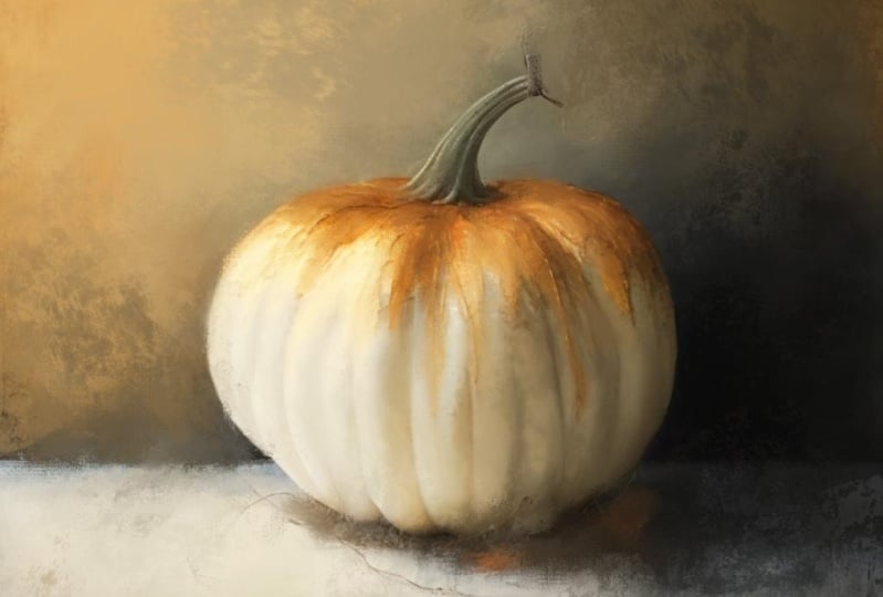
little bit darker. Could stand to be a
little bit brighter. So let's try to edit that. Click on adjustments and hue saturation and
brightness and layer. And let's go to brightness and let's try to pull up the
brightness a little bit. Brighten that pumpkin up. That's a little better than just click on your
layers panel again, and that will set
that into place. Now, do I really want
the pumpkin sitting on the white paint or
do I want to flip? Flip this texture. Let me get on the texture layer. Click the arrow, Let's flip it and see
what it looks like. I might like it better that way. So I can put a little
shadow underneath. And I can also, if I want to move and resize
the pumpkin a little bit, that may be too close. Let's see. Let's resize it down. Be nice to bring some of that white paint over
into the pumpkin. I don't want it
right in the center. That's not as interesting. I'm just working on sizing here. Alright, let's leave it at that. So now it's time to
paint the pumpkin layer. I'm gonna do that with the
rich oil brush as a blender. And I'm gonna look at opacity here if you reduce the opacity so you can see the
texture come through. But then you're also won't
have a stronger paint. If you reduce the
opacity of the layer, we're going to keep the layer at 100% and we're going
to blend at 100%. And we're going to
start with the stem. See what size brush
we have here. That's pretty good
size and just short. Choppy strokes. Work on this stem area. Using the colors from the
actual pumpkin as the paint. Trying to keep those
dark colors in there. So those stripes. But if we lose them, we can add them back. All right, there's our stem. Now let's start
painting the pumpkin. And I'm going to turn
this a little bit to get in the position I want
to be and I'm still using that same
size, smaller brush. I got that back section because I'm I'm close to
the stem and I don't really want to mess up the
stem with a big brush, so I'm going to keep
this smaller brush as I work on these areas
around the stem. And then the crease areas, I can go ahead and come down. I'm on the creases with that smaller brush and kind of work on those. Just the crease areas. Keep that slightly darker shade and around the bottom
of the pumpkin to going down all
the crease areas. And along this bottom edge
of the pumpkin as well. There's an interesting
little crease right there on that right side, bottom and then go
around the outside edge. These creases on the right. Okay. Now I can go with a
little bigger brush and it's kind of hard to see because it's white
where you've painted, so you may have to
really zoom in. I'm just going back-and-forth with this brush up and down. Just to get the center
areas in-between the creases of pulling up from the bottom to create
some nice shadowing, which will give the
pumpkin roundness. I'm going in the direction
of the pumpkin right now, up and downwards direction. Rather than crisscross. I saved the crisscross
for when I add my accent's just trying to get
all of this, paint it out. Give it a nice painterly look. I was going to paint this from scratch and then I decided, no. I'd much prefer painting
my photos that way. I have a lot more time to do all of the
paintings I wanna do. And I have so many photos. I'm, I'm talking millions, especially of birds and animals because I'm a
wildlife photographer. And that's why I like to paint my photos
because I have so many. Alright, the basics of the
pumpkin are all painted down. You can see those painterly
brush marks in there. But the pumpkin still
looks like it's kinda floating a
little bit there. I would like to integrate some stuff underneath
the pumpkin to kind of ground
it a little better. And there is this
blue in the texture. So I'm gonna get on that and pick that
color blue for a paint. And click on paintbrush
and click on. Let me try the canvas one. And I'm going to insert a new layer on top
of the texture, but under the pumpkin. And I'm just going to paint with that canvas brush to get
some of that blue in there. A little bit. Under the darkest
areas of the pumpkin. Might also be fun to use
a stamp brush in there. I'm going to add another
new layer for that and go back to that
expressive set. And let's pick a stamp brush
from the expressive set. I'm looking for something
to ground, the pumpkin. And I have a favorite one in here that I'm going
to try to find. I used it in the last pumpkin. There it is, 67. And I'm just going
to stamp that on. And I'm still
working underneath. You could turn the pumpkin
off if you want to there. But because this is on its
own layer now, I can move it. So I can click on the arrow and move and
reposition that around. That's got some interesting
texture in that one. And now I'd like to go to
a little bit darker blue. And let's pick
another stamp brush and put this on a new layer two. Because I'd like to ground that pumpkin
a little bit more. And I'm not sure which
one I want to use. 56 is a vertical stamp. Me turn off the pumpkin. It's a vertical stamp, but it's got a neat
mark because I just did that on its own layer. I can rotate that and move it. And even I could resize it if
I wanted or size it bigger. Let's put that there and let's
turn the pumpkin back on. It's okay, it's not dark enough. Let's put another new layer. We're just building
this under the pumpkin. Let me find something
that's got a little darker, darker touch to it. I'm looking for
something kinda thick. There's this 121. Let's see what that looks like. Let me turn off the
pumpkin and stamp that. Well, that's got a
nice darkness to it. Spring that on down about where it would
be under the pumpkin. Turned the pumpkin back on. Oh no, that's kinda cool. Little bit darker. Let's go even darker. And now I like all those stamps, I'm going to squeeze
all of those together. They're still on top of the original texture
layer though. Say. I'm going to
keep it that way. I am going to paint in with this darker color I
just chose though. So back to the rich
oil and the Canvas. And right underneath
the pumpkin in here. I'm going to paint
some wood that. And then I'm going to also go to the Canvas brushes, a blender, and blend some of that out just a little so it blends in with what I've already done. Here we go. You can zoom out and really see how I painted that directly on that layer.
Okay, That's okay. Um, let me just paint a couple more
strokes to blend that in. And then blend
that a little bit. It's blending the stamp
brushes too, but that's okay. It gives it a cohesive look. I didn't like that,
so undo that. I needed to have a little
bit more darkness. I'm going to put a new layer. So I don't want to mess up
my stamp brushes anymore. A little more darkness up under here and blend that
on its own layer. Now, I'm going to grab this green color. It's a mint green. It's a minty blue. I'm gonna go a little
darker with it. And on that same layer, let's put, just use
the canvas brush. Put a few little
streaks in there. Maybe a little too much. Just blend it a
little bit better. Alright, I'm going
to merge that down. No, I just created
a mask by mistake. I'm going to click
this and click Merge Down to merge
it with that layer. And then on that
layer I can adjust the opacity if I wanted to. But I think I'm just
going to leave it like that for right now. That gives a good place
for the pumpkin to sit. I'm trying, I'm thinking coastal theme here
with this pumpkin. So.
8. White Pumpkin Part 2: Now at this point
I'm going to add a new layer on top
of the pumpkin, and I'm going to add
some color enhancements with the rich oil brush. And we've got that dark greenish
gold that's in the stem. It is more towards the green, olive green, but a real dark. So I'm going to add in just a few little marks and
this is on its own layer. But I kinda lost
that dark shading. Say it's on its own
layer and I'm going to blend that with the rich oil as well in wood that
stem, just short. Choppy blending strokes to kind of enhance that
stem a little bit. Maybe also put a little dab
or two of the dark around here and blend that
into that stem. Then if I need to blend
it some more, I'll do so. Alright, now I
want to bring the, the pumpkin has both
warm and cool tones in, but I'm going to enhance
the creases with some. I just chose a dark blue. Enhance some of the
creases a little bit. Scott, warm and cool. The right side it
seems to be warmer. Just kind of lightly
sketching that end. Alright, that's the blue tone. Now I'm going to move
on the color wheel over here to the orange,
which is opposite. And I'm also going
to put down some of that brownish tone because on the right side
it does get warmer. Just doing some lines where
I think they should be. And at the top here is a little warmer as it starts to
come down from that stem. Now I'm going to blend
those in same brush. Just really loosely when those. So they're not quite so strong. Maybe a little bigger brush. Just really sweeping in the
direction of the pumpkin. Just get some of
that intensity of the additional colors added in. That's what we're
doing on this layer, just like on the last one, was keep blending
until such point as it is subtle but there
that makes any sense. And zoom out, always zoom out because it gives
you a better look. Like these are little strong, so I'm going to blend
those out a little more. Just keep blending,
blending, blending. Our pumpkin has a little bit
more depth and dimension. Now. Now let's add a little more exciting
color to the pumpkin. So let's bring some
of this blue Land. And I'm going to still
use the rich oil brush. And on the left side, we have more of the blue tones. I'm just going to
bring a little bit in, in a few spots that may be a
little dark, lighter touch. And then once again
move on the color wheel to the opposite side
where the oranges. And that gives
that little golden tone for the other side. And then even go a little
richer on the color. I don't know, maybe
a little too dark, go brighter on the color, like a peachy. There we go. And we can even go
to a really warm white to bring over top of that. Then spring that warm white over here on this side
a little bit too. Alright, now I want to
go to a straight white. So double-tap
somewhere near white. And bring that over. It's still looks a little
creamy double-tap again. Bring that over the blue area. And at this point
you could choose not to blend if you wanted to. And leave these brush
strokes really strong. But you may want to
blend little bits of it. And one way to make
it a little more interesting is to blend
with a different brush. So let's try the canvas brush. Just blend parts
of those strokes. Not the whole. Don't
want it all the way out where it's completely smooth. This is what gives it intrest. See those little bits
of Canvas in there. Just in a few spots. Just picking and choosing. We're words a little strong, the brushstrokes are
a little strong. I don't want to blend
some of that down. Usually at the edges of them, That's where their strongest. We've got some really fun
brush marks in there. Okay, The blue is too
strong on the left side. When I zoom out, I
could tell this. So I'm going to blend that down with that canvas brush a
little more on that side. Now you could paint
over it with white. I can go back and do that, but let's do it with the
canvas brush this time. Craves more interest. You see that nice
canvas texture there. And get around the edge to a little bit to
loosen up that edge. And then the highlight areas. Get the thumb that
white in there, right over that orange. You'll see these orange and
blue tones that I added in. You'll see those
underneath and I'm just touching real lightly. Now where I just started
that on the bottom. That whites a little
strong right there. So I'm gonna softly
blend that in. So it's not quite so
strong on that bottom. Because the bottom is
going to be darker. There we got an interesting
pumpkin and then zoom out. And if you're
white, canvas brush looks like it's too strong. Continue blending that just a little bit to soften that up. Looking pretty cool. I think I need to darken a little bit up here at
the top by the stem. I want to try grabbing
that dark blue. And let's try the
ritual sketch brush, which is a pretty small brush. And kind of put a couple of little marks right here along
the bottom of the stem, work comes, starts to
develop the pumpkin. Now let's blend that. Um, let's blend
it with the rich. All. I'm, I'm going
to turn this way, works better for me. And just kind of go over
that short strokes. Crisscross, even. Just tap on it
sometimes in blended. Alright, this upper left corner
is a little bit too dark, so I'm going to blend
that out a little more. And the right side
a little more. That gives a little bit
more dimension to that top. And zoom out. Even blend
with a little bigger brush. Create some shadowing. Would that blending by pulling that blue color out a little more from
those little lines. There we go. Well, I kinda lost that. Okay, It's looking pretty good. Now at this point, that's the upper layer C, C where we've been
and he's kinda, um, I swear I'm used to paint
and birds and animals, but the pumpkin is
kinda flat looking there after we first blended
the colors that were there. And now we've added more and
now it's got more to it. So I'm going to squeeze those two layers together
to make that one. And then anytime if
you want to save just the pumpkin,
turn off everything. And then you can save
that as a PNG save image, and it will put it in
your photo library. Alright, there's
that texture bottom. You could also save this
and that looks pretty cool. So I think I'm going
to save that as a PNG. Just make sure you turn off the background color when
you're going to save as a PNG. So now we've got to PNG saved. Okay? At this point I
want to duplicate the texture layer
because I want to integrate the texture layer
with the painted pumpkin. I'm going to move
the texture layer. I duplicate it on top. And I'm going to play
with some layer modes. And you can kinda scan through these and see what makes your
pumpkin look interesting. Some things will be too bright, some things will be too dark. I like to use a combination. Could even change the whole
color of your pumpkin. Alright, I like Multiply, but it's super dark. You can reduce the opacity
where it's not quite so dark. And I do this a lot. I'll use Multiply
and soft light. And I'll put the multiply
layer on about 30%. And then you can
click it off and on and see what it looks like. Now I'll duplicate
the multiply layer and change this duplicate
layer to soft light, which brightens things up. See, that's the multiply layer before now this is where
the soft light layer on. Or you can use overlay
if you want it a little stronger. Or hard light. I like soft light. And if you're soft light
opacity needs to be even more. You can pull it up
to brighten it up. But I tend to do around 30%, at least when I first
do it on both layers. And then I can turn both
those off, zoom out. I like to look at it,
zoomed out and then turn it back on and see what I think. And that brings some of the painted texture from
the background into the subject to make everything look a little
bit more cohesive. And I'm going to play
with the opacity on a multiply layer. Now I'm going to
stick around 30%. I don't want to overdo it. But that looks pretty fun. Now, on top of all that, I wanted to try to make
things a little bit more exciting for the pumpkin. Actually, no, I'm not
gonna do that on top. Let me backup,
delete that layer. Go under the pumpkin. And there's this
fun blue over here. I'm gonna grab that color, add a new layer. And I'm gonna go back to my stamp brushes and
the expressive set. And let's pick something
that might be fun. And I'm under the pumpkin. So I'm just going to tap that, added some of the
interesting blue in there and you can do it all the way around to get, oh, yeah, I liked that. That kind of enhances
things a little more. That's fun. Now what if I got
some of this green? Let's find a darker
shade of that green, just going to hold down and
move around until I land on a darker shade
of green like that. Let's pick another one. Here's the one with
the drips that I like and put it on a new layer. I'm just going to tap it. Oh, that's a little too green. No, don't like that one. How about this? There's a lighter shade
somewhere right there. Try the lighter shade. I'm just tapping.
Oh, that's kinda interesting with the drips. And if you want it
a little smaller, just adjust the size. Like him right there. That's fun. But on the
top of that layer, I don't like that, so makes sure I'm
still on that layer. Go to the blending brush, and I'm going to
choose the canvas one. And I'm just going
to brush out some of the top of that stamp. But he's got some nice
fun drips in there now, although this is turning
into a really fun pumpkin. Alright, What else
do I want to do? This dark shade of
blue down here, I'd like to do something
with that on a new layer. Let's pick another stamp. Let's see what the
scribble looks like. Well, that's kind
of interesting. Stamp that around and
oh my god, like that. Oh, I kinda like that. And anytime you
do a stamp brush, you can adjust the opacity. Or you can change layer mode to see what kind of work it
gives your painting. That's interesting.
Okay, let's see here. Let me go back to
let's multiply. And that's normal. Not a whole lot of
difference there. I'm going to leave it on normal. And I kinda liked that little scribble look that one gives. But I don't like this little bit at the top of the pumpkin. So I'm gonna go to the
blending brush and just kinda when that down a little bit and blend
some of this out there. I do like what that did over
there on that side though. Just having fun with
these stamp brushes. I've got several here now. I'm gonna go ahead and squeeze
all of those together. And you can turn everything off and on and see
where you are. Um, like to get a little this mint green over top
of what I just put there. Put a new layer. I would like something. Just very light right there. Let's pick one here. I really liked this
mark number 19. It may be a little big
yeah, that's a little big. Lower that down. See if I can get some
of that in there. Well, that's interesting. So you just stamping and undoing and stamping and undoing can give you some unique
looks that are quite fun. I think I might even like
to bring a little bit of white from the pumpkin out
here on the left side. And put that on a new layer, maybe one of the splash marks. Let's try this one. Now you can do these
on top or underneath. I'm just stamping it
around and undoing. Well, if we go to a top, move that layer on
top of everything. Now let's stamp it. Maybe a little bit big. That may, that may not be
the right stamp. Let's try. Um, let's try 44. Go bigger. There's a little fun,
watery look there. And it's on its own layer so
you can adjust the opacity, just gives it a little
interest right there. I think I still might
wanna do another one. So another new layer. And this number 49, that has an interesting line and of course that's too big, but because it's
on its own layer, I can resize it and
then move it and turn it kinda give that pumpkin an interesting little
bit of edging there. Turn it off and on. No, don't like it. Clear it. Anytime you don't
like something undo and clear. What about this 56? It might be better
under the pumpkin, but I'm going to try it on top. Now. Don't like that one. It's too light. Well, decisions, decisions. Alright, what about 27 stamp? Okay, That's kinda
fun. Is it that fun? Watery look. I stamped it over
there on the right. I mean, left foot stamping
on the right two. I kind of like that. And
let's bring some at the top. On top of the texture too, we've got a really fun little coastal pumpkin
thing going on here. Now. I do think the crease
here on the left, I've lost some detail there. So I'm gonna go back
to the pumpkin layer, go back to the rich oil, and get this blue town. And just paint in a little bit there and then
blend that a little bit. Pick a brush and blend. Blend it down a little more. Zoom out so I could see
better. Oh, that's fun. Yeah, I'm really happy
with this pumpkin. At this point. I want to squeeze everything
together. There we go. So just as a reminder, I'm going to bring in the
original pumpkin photo so you can see what we've done. That's what I started with
and that's where we are now. That's fun. Okay. I'm
going to take that off. I do think on the loan, the bottom edge of this pumpkin, there needs to be a little
bit more darker tone. So I'm going to
add a new layer on top and find a stamp brush. Again, my favorite
things in the world. I don t think it needs
to be super dark. I just think there needs
to be a little something. Let's try this 148. No, that might be too dark. Let's go with something
a little lighter. Little lighter. How about this 177? Now that's kinda interesting, but it's too big, so I'm
going to resize it down. I'm trying to tap
it in right where I want it at the bottom
edge. There we go. We're just kinda comes over that bottom edge of the pumpkin. Just a little bit. It's kind of a light stamps, so the pumpkin still
shows through. And I think at the very corner of the pumpkin right there, it needs to be blended
a little more. I can actually do that on
the pumpkin layer with, oh, we haven't used
the textural brush. Let's try that. Now. Just so I don't mess up
my pumpkin layer as it is. I'm going to duplicate it and
do this on the duplicate. So let's try the textural
as a blender to try to pull out some edging of that pumpkin. Make it not so
harsh right there. Maybe a little too much. Just kinda loosen
that up a little bit. Even pull. Now, that's too much. Undo that. I got one textural mark there. You go a little
bigger and pull down. No, that's too much. I don't know what I'm
trying to accomplish here. Honestly. I got one textural mark in there that look good by pulling. But when I tried
to do other ones, It's messing it up. But I did get one. And you can see the
difference here. If that's too strong, reduce the opacity, which I think it is
a little too strong. I just wanted to kind of intermixed the pumpkin with the background a
little bit better. Turn it off and on
from a distance. And a play with opacity, maybe about 50%. And I can even add a new layer here and get that darker blue. And let's paint with
the textural brush. Just kinda bring a poll. Now that's interesting. He kinda got a boo with
this brush and drag it slowly and from
different directions. And different sizes and
push different, you know, at different hardness
to kinda see. Just trying to rough up
that edge a little bit. Not that much though. Now I'm getting fussy. I think I need to be
darker, little smaller. Just trying to create
some interesting texture at the bottom of that pumpkin. That actually comes
over into the pumpkin. But not too much. And of course, if he gets some
night, I kinda like that. But if you get something
that's too much, you can always then go back
to the canvas brush or the rich oil brush and softly blend that
down a little bit. So it's not quite so strong. Because this is
on its own layer. Easy to do. Let's see, off on. Let's zoom way out. Off on. I do like what that's done. It's giving it a little
bit more grounding. So I'm going to
leave that alone. And then this is that other
line over here that I did. I liked. I'm going to merge
all of those and then look at this
one versus that one. And if you decide, well, this, I like this one, but
it's too strong. You can always reduce the opacity and meet
in the middle ground. And I usually do
that around 70%. You could leave it super-strong. I'm going to do it about
75% and then merge these. Now I'm going to
sign my painting. Grab a color from
the background. Go to the rich oil sketch brush. Make sure I have a
new layer to sign-on. Who resize my ritual, sketch, brush down to where I can
actually sign my name. And then you can
always adjust where your signature layer
is and how big it is. You can put it. Well, it's not wanting
to move for me. You zoom up closer. It'll move for you. Put your finger on it and you
can place it where you want to turn it like that. How are you going to do it? I usually do mine in
the bottom corner. And I'll zoom out to
see if it's too big. Actually kinda like that. It's not too big. But I'm
happy with my pumpkin now. So I'm going to save this
as a JPEG save image. So let's take a look at our photos here and
see what we've done. We saved the PNG of the pumpkin. We saved it with its, the background part underneath. And then there is the final
painting I just saved there. So we've done a really
neat coastal style. Pumpkin was some real pain involved and some real
paints, stamp brushes. That's been quite fun and it
looks quite a bit different than this original
cell phone snapshot. So there we go. We've made a piece
of art from that. How cool is that? Very cool. Delete. Okay, I've saved it. I'm done with it. I
hope you guys have enjoyed this class and enjoyed watching
this little bonus. Maybe you pick up a few tips on different things you can do with different backgrounds
behind your subjects. And I will see you next time. Thanks for watching
and have a great day.
 Jai Johnson, Painting My Favorite Subjects