Transcripts
1. Welcome!: Welcome to how to
paint photos and procreate farmhouse
style cow pain. Hello there, I'm Jay
Johnson and I teach people how to paint photos in
Procreate on the iPad. I wanted to give you
a little backstory on me as an artist and I love painting
on this device. I've been painting
since I was five and I've been a photographer
since I was 13. My favorite mediums are
colored pencil, soft pastels, pastels, acrylic
in various types of inks and some
watercolor here and there. I discovered digital painting
or in the year 2 thousand, and I started dabbling in
it with Corel Painter. Here's an interesting
fact for you. The pine or software was
originally acquired by corral and in 2001 to 2002 it was
rebranded procreate painter. Interesting. Before its transition
into corrals, full graphic, sweet, 22,003. I just thought that
was interesting. I originally learned
how to paint my photos using blending
brushes in chorale. For many years, I
switched back and forth between traditional
and digital art forms. In 2019, I acquired a
very serious allergy and I found myself
unable to use many of my traditional art supplies. Due to the allergy. I purchased the
newest version of corral pioneer
with the intention of painting my photos
digitally again. However, the software had changed quite a bit from
my previous version. And there was quite a
steeper learning curve. I just wasn't up
to the challenge of re-learning that software. Someone suggested Procreate on the iPad for digital painting. I didn't have an iPad, but my daughter did. I tested out procreate
on her iPad. I tried painting a photo using
the brushes as blenders. It was an immediate success. It literally took me a half
a day of playing with it to know that this was
definitely what I needed. I purchased my iPad Pro that afternoon and I've
never looked back. Many people have
asked me since then how to paint their
photos in Procreate two, which is what brought
me here now to teach others how
to do what I do. I love painting and we
photos in Procreate on the iPad because there's
no steep learning curve. I was able to create
mini paintings using the brushes which came with
Procreate as blenders. Before I ever purchased
other brushes. I don't have to
fool with a lot of computer functions
to use Procreate, I can simply just sit down, pick a brush and start painting. I love the portability
of the iPad. I'm not tied to my
desk to paint anymore. I can paint in front of my
favorite bird watching window. I can paint down
in my art studio. I can take the iPad with me
and paint wherever I go. I am passionate about
painting my photos this way. In this application
and on this device, my iPad has become my art studio I can use
anywhere and I love it. I hope you will too. And I hope you can see in
my classes how easy and how relaxing and how free it is
to paint in this method. In this class, you'll
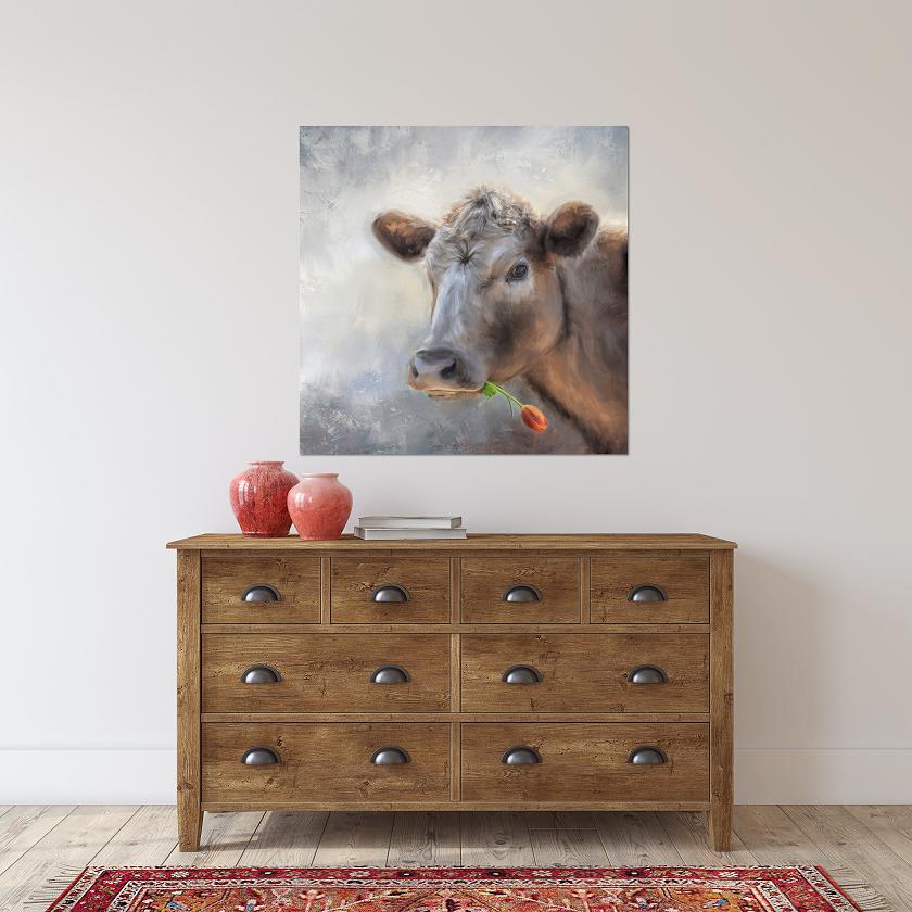
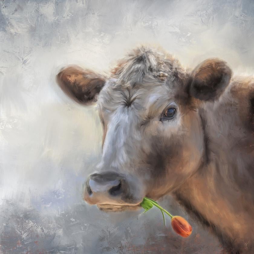
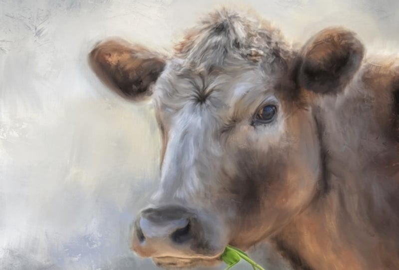
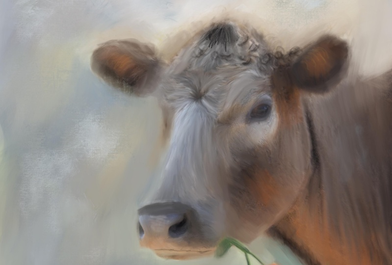
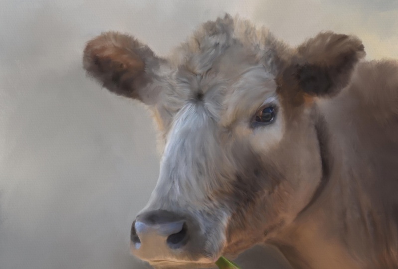
learn how to paint this cow snapshot photo
to create a fun portrait, which lends itself to a
farmhouse style of core. I teach you how to set up your canvas and
test your brushes. How to bring in two
photos to paint together. Had a match to saturation
between those two photos. How to soften and
paint the background. How to paint the cow and the flower using the
brushes as blenders. How to fix problem areas such as backlighting,
using painting. How to add detail
and enhancements. How to add real paint texture to finish out your painting. I also go over the editing
tools in your photos library, which can help you to
make adjustments to your beginning photos
before you start painting, as well as your final painting. If you desire. In order to complete this class, you will need an iPad
with procreate installed. You will also need
an Apple pencil. You already need to have a basic understanding of using Procreate and
installing brushes. And you will need to understand
how to transfer photos onto your iPad before
starting the class. Provided with this class is
the original photos to paint, which is the cow and photo and the photo and my portrait
painting brush set. Let's get started pining
this week cow photo. And let's give her
a lovely tulip to how adding just the
right amount of charm and whimsy to our
farmhouse style art.
2. Set Up Canvas & Brush Test: We're ready to set up our
canvas to work on our cow. I've got the photo
reference, photo, reference photos installed,
brushes installed. Now it's just time to set
it up to set up a canvas. I hit the plus button
up here on top. Once I go into Procreate the
new Canvases you set up, we'll be down at the bottom. I've already set up the 6
thousand by 6 thousand before, which is the size I work in. So I'm just going to delete
that so we can do it again. You don't have to
do 6 thousand by 6 thousand pixels at 300 DPI, you could do smaller
number like 3 thousand by 3 thousand or 2 thousand by 2 thousand depends on your iPad, the amount of space you have, whether you want to go
that high resolution. I have a lot of
space on this iPad. So I like to work
high-resolution because I do big prints of my work. I'm gonna click on
the plus button by the words and new canvas, which brings up
the custom Canvas and make sure you're
on dimensions. And as you can see, I
have DPI set at 300. You would just type
in the width you want here and the height there. And make sure your DPI is at
300 CEO, how good quality? Now if I were to do 3
thousand by 3 thousand, watch the layers, change
the amount of layers. You can have. C, I
could have 55 layers. I don't use that many layers. I usually merge my
layers as I work. I'm not worried about the
maximum amount of layers, but this is the way I'm
going to set this up as a square and hit Create. And it will automatically
go to it and open it. But it will appear back here when you hit
the plus button again, you'll see it on
your list so you don't have to set
it up every time. You can come back and
just click on that. And if you want to, you
can swipe it and edit it and rename it up here. Just type, click on
untitled canvas and type 6 thousand pixels or whatever you want to call
it, or square canvas. Let's just do 6
thousand pixels square. There we go. Save. Now it's got a name. You don't have to have
everything is untitled. That's not that important to me. I don't usually name
them sometimes I do, but anyway, we have it set up. Here. It is in Procreate
once we click on it again. Now it's time to take a look at what we're
gonna be working on today. The layer automatically
that's opened up for you. We're gonna go to the
wrench tool and click Add. And I have the
photos in an album. I put the photos for
this in an album. I'm gonna go to Insert a Photo, click on albums. And cow. There's the photos. The cow we're gonna
be working on. Is this cow right here. Now this cow is not 6
thousand by 6 thousand, but I'll be able
to stretch it out. I'm gonna go ahead and
bring in the tulip photo. There it is right there. So I'll just click
on it as well. On a new layer. There it is, the
tulip and the cow. We're going to use
both of these. But I wanted to show
you a little something. Let me get back out
of this and go to photos and the albums. All right, so this is
the cow we're gonna be working on that I've just imported on a new layer and there's the tulip I'm
going to give the cow. And I wanted to show you
some inspiration here. I'm thinking farmhouse
style worksheet. I do a search for farmhouse, art cow, something like that. I came up with these that
popped up on Google. One of my favorites
is this one right here because of the
real painterly look. And I liked the, the Golden it, That's kind of nice. I like this one, the simplistic look,
but very painterly. The one with the
flowers on the head. I like it, but I don't think
it's for me in this lesson. Same here. This one got my attention with
the flowers hanging out of the mouth. I kinda liked that. I don't want to put
my cow in a chair or at a tub or put
glasses on them. Here's some more with
the flowers on the head, which is a really cute idea
if you wanted to do that. And you have some
flowers or clip art, you could put that
on top and paint those in with your subject. It just depends on
what you want to do. In my case though, this one got my
attention the most. This is a very painterly cow. I mean, because it
was a painting, it's done very preterm labor is very simplistic and
very simple background. And I love the flowers
hanging out of the mouth. And I thought, well, I want
to do something like that. But you have to find
the viral photo. So I found this on Unsplash. I have a lot of
firefighters on my own, but this made me think
I really need to get flowers on the
stem like this if I want to put them in the
mouth of an animal and clamp them to a tripod or something outdoors and put a backdrop
behind it and shoot it. And that way I will
have different flowers, but like this on a single flower on the stem
was what I was thinking. I didn't have any single flowers on the stem that would
work with the cow. So I went to Unsplash and
I found this tulip and I just turned it around so it could look like it's hanging
out of the cow's mouth. That's the one I've chosen to use with a cow in this lesson. Let us go back over
here to procreate. As you can see, I have the
tulip there and the cow there. Those are the two we're
gonna be working with. I'm going to shut off
the tulip for right now. I'm going to go to the cow
layer and I'm going to resize it to fill my Canvas. You can do that by
clicking on the arrow. Let me make this
a little smaller. Click on the arrow. You'll get
your little resizing tool. It's on uniform. I don't want to distort
it or free form this, I'm just going to grab a corner because it's already
a square image. And then grab this
corner and pull it out. Now my count is in place, you just click on the
layers and it's in place. And then my tulip is right here. And we'll deal with
that tulip later. We're ready to start
working on the cow. And we're going to be using
my painting portrait. Portrait painting brushes. The Smooth paintbrush the
canvas brush the impressing me, brush the fan brush, and the masking brush. We probably won't use the
masking brush in this because I'm not going to
replace the background. I could soften this
background with this masking brush
by using it as a blending tool like this. Just kinda go over it and
circles and soften it. Which is a good way to, in fact, let's just do that. Let's use this as a softening. Let's just show you
how this brush works. And then it kind of softens
all the way around the cow. Of course, I should've
started that on a duplicate layer, but I didn't. But that's how it works
as a softening brush. I'll do that again
in a little bit. I just wanted to give
you a little rundown on these brushes. How they work is blenders. The smooth paint one is a thick paint stroke
with feathery ends, which is great for doing for if you push on it real light, you will see some of the photos
still appear back there. But if you push on it real hard, it gets real thick. I like to do criss-cross
strokes with this a lot like that. That's how that one
works as a blender, which is what we're gonna
be doing in this lesson. The canvas brush, turn
up the opacity on that. A little bit larger size. The canvas brush has a really nice canvas texture when you're using
it as a blender. I, when it's time
to add texture. This is a good brush
to bring into play. When blending. These can all be used.
His paintbrushes to which we will do. The impressed me brush is a
very unpredictable brush. If you push very hard and drag, you will see that it
let me raise that up. Push hard and drag. You'll see the leaves a
little choppy bits behind. If you do it very
lightly and drag, you will see that it leaves some interesting paint texture. I don't blend a whole lot
with this one until later. This works great
as a paintbrush to add thick texture accents. After the fact.
Then the fan brush. I don't usually use
this as a blender, but if you were to do
so, when you drag it, it puts a nice canvas
texture and it's real spectrally great for areas where you really want to
add some more texture. That's how those
work as blenders. And that's what we're gonna
be using in this lesson. I already showed you
the masking one. So the first thing
I'm gonna do is duplicate my original photo
layer so I don't mess it up. I'm just going to turn off my original photo
layer for right now. Don't need that on. We can do store. It, can show through a little bit if
you paint very lightly, and it can distort what
you're really seeing. If you leave this on, you may not realize
your painting so light on the top layer
with your pressure. So you just have to
end the pressure of somebody you have to play with
to get the look you want. If you turn it off,
you'll be able to see a true picture of what it's looking like
as you're painting. In the next segment, we will be starting to paint this cow and
this background. And then we're going to bring in that tulip and get
that in there. We will probably go ahead and
bring in the tulip first. Let's do that first. That way we'll have our whole picture that we're
going to paint. So stay tuned for
the next segment.
3. Masking The Tulip: We're ready to bring
in this tool up, and this is where
we're going to do a little masking here. Let's turn the tulip on. We need to re-size
the tool down. It's a little bit. Turn the opacity down first. We can position it and
see where we want it. If you click on turn the opacity down so you can see
and then click on the arrow up here and you
can move the tulip around. You just hold down on
it and move it around. You can use your two fingers
to hold down on it and make it smaller or turn it
however way you want. I have a I don't really want to
show that you love hanging out the other side. I just want to show a little
bit of it hanging down here. I'm going to turn it this way. Get the size, a little smaller. Position at where it might be hanging out in
the side of the mouth. Maybe a little bit
bigger. There we go. Like that. This top part
that's covering his face, that's gonna be masked away. And all you're gonna see is what's coming out of her mouth. I said His while ago, I met her. Just click on that layer. Let's raise the opacity backup so we can see what
we're masking. Zoom in a little bit. That layer is set in place
now and we need to mask away. And we're going to use
the Smooth paintbrush, a soft masking brush. I'm sorry, to do the masking. Again to get all this gray away. Now there are ways in
Procreate to select all the gray and get rid of it. I don't normally do that. I normally just do
a mask and paint away because then if I want
to bring something back, if I'm asking way too much
and I want to bring it back, I can I'm just going
to mask it away. So you click on
the tool of layer. You'll see the word mask. Click that and it should change your paint
color to black. When you paint with the
black masking brush, it will take away. And then if you switch to white, it will bring it back, which is really nice if
you mask away too much. I'm going to make the
brush pretty big. I'm going to start here
at this top corner, holding down pretty
good pressure. We're going to erase, mask away the leaf that's on his face because we
don't want that showing. Let's get the rest
of the background. Just kind of go around it with this big soft brush
getting close to the tool, but don't go over it. If you do go over it by mistake, you can bring that
back with white. Just get rid of all this gray obviously isn't going to
be coming out of his nose, so we don't need that part. Let's make the brush
a little smaller. Let's get rid of the gray and working on the gray right now. Come in as close as you
can without going over. It's actually a purplish
gray around the flower. Holding down. I'm putting quite a bit
of pressure on this. Let's make the brush
a little smaller. It gets us a little bit of of his Alpha of her mouth area. This gray. I'm not sure how much of this
leaf here I want showing. So the mask around it for right now and then
look at it and decide. Getting as close as I can. Brush is pretty smooth. So it's really
easy to work with. Have to go a little
smaller to get in there. Let us go down this side of the flower on top of the stem. Around the edge of the, look. I'm holding down on the brush, the whole town doing this. Unless I lift up to
change positions, we find the mask and a
little bit on these leaves, Let's see where I want it. Coming out in the mouth. The line of the mouth
is right there. So obviously, I don't
want the tulips showing at the top of that. I'm asked to weigh too much, masked away a little too
much because it needs to meet up with the edge
of the mouth there. So let's now change over to
white on the color wheel. If you tap near the white
and it's not exactly white, if you just double-tap
on there near the White, they will go to straight white. Now we can bring this back, it right along this edge. See how much room bring back. All right, now I'm
bringing back background. Now we need to go back to
black and it should be hearing your history so
you can just click it. But if not, you can
double-tap near the black and it
will go to black. And let's get rid of the edging. More of this edging. Now it looks like it's
coming out of her mouth. We've got to get rid of the rest of this background
from the flower. So let's go with
a small brush and get in real close on
the edge of the leaf. This part here. Then this area here. You can even turn
your painting by using two fingers
and holding down and turning it so you can stroke and the direction
is comfortable for you. This part. Make sure we get all this background out
around these leaves. The small masking brush. Work on this little area
that is in the corner. The leaf and the stem meat. I like to zoom in
really big here. I got a little nick
in the stem here. I can go back to my white, bring that back a little and
then go back to my black. It may be getting
smaller brush there. Let's look around the flower. I still have some of the
background showing right here. Go a little bigger brush. Go down around the
edge of that flower. Make sure we've got
everything off the bottom. Now let's look at it. I think that looks pretty good. So now we have a flower
hanging out of our cows mouth, so that can become
part of the painting. I'm going to turn
the flower layer off a minute and just look. I see a spot when
I turned it off. Right in here somewhere. There's a spot I missed. If you really want to make sure you've got your mask right, you can turn your cow layer off. And then you'll see the
background color is white. So you can come see
your mistakes here. You can come around
with your brush. Just refine those areas. Little bit. Depends on how perfect
you want to be at. Kinda blends in with
the background anyway, when you do this, it's
all gonna be painted. But if you have
some obvious areas, now you could save this tulip in case you wanted
to put this tool up hanging out in the mouth
of another subject. Let's just do that. If you turn off the background color,
it becomes transparent. So you can click the
wrench and click share and click PNG. And it will save it
as a transparent file in case you want to put it
in another image at sometime you will already done the
masking on it and just click Save Image and it will go
into your photo gallery. Let's turn background back on our cow back on leaving the original photo
layer is still off. I think I've got the mask
exactly like I want. So at this point, There's no reason to have the layer mask and
layer two separate. So if you just pinch those
together with your fingers, now they are together and you
could turn that off and on. Let's turn it off for
right now because we're going to soften
this background up around the cow using the same
masking brush as a blender, will do that. Next segment.
4. Smooth Out The Background: All right, we're now going to start smoothing
out this background. Why smooth out the background? Well, I want to, I want to paint the entire
background at some point here. And all of these little grass
pieces are distracting me. I don't want to see him. I kinda like the colors
in the background, but I believe I'm
gonna go lighter. In the meantime. I
just want to smooth it out so it doesn't
distract me. I've got the tulip layer turned off so that doesn't strike me. I'm gonna get on the layer
we're going to paint, which is the duplicate
of the photo layer. I'm going to go to
my blending brushes and choose the masking brush. And I'm gonna make
fairly big brush. Just kind of go in circles, holding it down quite a bit
of pressure and letting up. Or I want to drag color
from one area to another. And just kind of go
around the edges first. You can use a big
brush and not touch your subject and smooth
all of this out. And I'm letting up
here and there on the brush where I want to keep some of the color
because whatever color you start on is going to come down. If you want to keep some of these colors you let up
and you start again. Let's make the brush
a little smaller. The piece of grass has
got hanging out of his or her mouth on that side. I keep saying is not
necessary to keep. So I'm just going
to smooth that out. I'm doing little circles
while I'm holding down on this brush. You can do straight strokes, but I like to do those circles. So wherever this
brush size will work, I'm just continuing
to work with that. Coming in as close as I
can without going over. Now it's time to go a little
smaller on the brush. Zoom in here. Around the ears,
around the face. Go around the top of this ear, and around the top of the head. Not really worried about getting too close in here with
these little hairs. The hairs are very backlit. And I don't like that. That's going to be painted. I don't want the backlighting. This painting in the top of the firm here
across the back. I don't want the backlighting. I'll see if I let up and
grab the blue and come down. I'm going to bring blew down. If I start on the
lighter area and go up, I'm gonna bring the
lighter color up. This brush is a good
one if you want to make some really soft clouds in the background to really
soften things up. Let's get down here with a
little smaller brush and go in around the nose mouth. This is going to have
paint added to it later. Right now I just want
to smooth it out. Get rid of the distractions that smoothed out now. And this is, you can further smooth it out and play
with your colors and bring certain colors down
where you want them. I really liked the blue, not too fond of the green. And go with a really big brush. Really bring that blue noun
tone down some of that green. I'm not too fond to
that bright green. But this is a good brush to use. Let's say if you're editing a photo in Procreate on your iPad and you want
to keep the photo as it is, but you want that background
distraction tone down. You can use this brush to
basically eliminate it. But yet keep the colors of it. Like you said, this backlighting
going to have to work on that at some point because the backlighting makes
it look to photographic. Unless I was, I'm going to
replace the background with a very dark background to
indicate strong lighting, which is a more dramatic look. I'm not after that with this, I'm after this farmhouse style. In fact, I'm just going
to add a new layer. And I'm going to bring in
this inspiration photo here. Just so I can see how that's
a very matte soft finish. I really liked this work of art. I'm after a matte finish type of look and you see there's
no backlighting here. So that backlighting
is gonna have to go. I'm just going to turn that off and I'm going to pull it all
the way down to the bottom. You just hold down on it. Put it under my original photo later and just use
it as reference. I know you can open
up a photo here is referenced and do split
screen and all this business. And I don't want to do that. When I'm painting and painting, I'm not into a bunch
of computer functions. Just like to use my photo and my brushes and
do a painting. This is what we have now let's
turn the to look back on. And there's our tulip. And at this point, we're ready to start painting
the cow and the tulip. I'm going to take the to get on the tulip layer and
my photo layer here. And I'm going to the
while I'm painting on. And I'm going to squeeze
those two layers together. Now they're one and
they're ready to paint. Shoot, I forgot what
I was gonna say. While it happens. This happens when you get
older. You forget things. But I had I had something
important that I was gonna say and I don't
remember what it was, So maybe I'll remember
it in the next segment. We're going to
start painting The, Should we do the
background first? Should we do the cow first? I think we should do
the background first. Yeah, I think we should
do the background first. We're going to figure that out. At least bring some poking into the background and then
we'll work on the calf. In the next segment, we'll start working on the background. Some more.
5. Painting The Background: Alright, when it comes to
painting the background, have some decisions
to make. Color wise. What do I want to do? Well, I'm not a big fan
of the green color. I do like the blue color, but I don't like the
blue color where it is. I'm going to paint
the entire background and the cow would smooth paint. The cow will be painted
using the blender brush. The smooth paint right
now on the background is going to be painted
using it as a paintbrush. I'm going to click on
the Paint tool here. Make sure I'm on smooth paint. And then if you
just hold down on the color you want and let up, it will appear right here
in your color selection. I'm just going to get a
really big Smooth paintbrush. And I want to bring
this blue down here. Just little criss-cross. Little green still
there. Not a big deal. That stroke was too big, so I'm gonna lower the brush
and get in a little closer. Let's go ahead and lower
the size of the more. Get in a little closer
without going over. Go around here. We're going to have a lot
more strokes added to this. So I know it looks
ridiculous right now. Just trying to get these colors in here where I want them. And using the smallest brush, I don't go over the two-loop. Go right up against it there. And then up under his her neck down the side of the tulip. I'm just doing short strokes, not pressing too
exceptionally hard, is that's why you can still
see the green. Behind there. The more structure go over top, the dark route will get. Let's go around here. Just kinda scribble. Do what you want. Mark wise, it looks pretty
ridiculous right now. But as I go up this
bottom corner, I'm going to bring it
a little darker blue. So all you gotta do is
go to your color wheel where it's at and pull
it down a little bit. Let's add some with a big brush. Add some darker marched down here towards the bottom corner. Short, choppy, because
this is gonna be blended. And even up here. Then let's select
this blue again. And this time we're gonna
go a little bit lighter. So go straight up to get a little bit
lighter blue in there. As you get close. The cow has these lovely
blue tones in her for. So I wanted to do
capitalize on this blue and actually bring some of this lighter blue marks
over the other blue. Now let's go a little
even lighter on the blue. Goes straight up some more. If it's, the blue's
a little too bright, you can even go to the
left a little bit, which will gray it down some. Now, that's kinda dark, so we're gonna bring
in some light. I'm going to eventually get rid of the backlighting up here. This top part will be
painted in with some of the colors on the lower
part to get rid of this. But the backlighting
color is a nice white, which would work well to bring into the
top of this image. I believe. So. Let's try it. A little bit of the blue
in that corner there. And then actually come around here and bring some
of this white. And I'm just doing
very light strokes on top of the blue just to
tone it down a little. Like I said, we're going
to blend all this. Go even up here, a little
higher light strokes. All right, Let's grab tan
color in or a grayish tan. How about that? You can select any color you want for the
background that I want to just bring some of these cow colors
into the background. Just wherever you wanted to go. Maybe even down here
at the bottom a little and tone down
some of this blue. It's a little bit
rich of a blue. I want the blue in there, but I don't need it
quite that much. Lower the brush
size and where this green is showing
around the cone. Bring this color in there. All right, I'm gonna go select another color from the cow. And I'm thinking
kind of a yellowish, creamy tans on which kind of dragging my wheel around
where I might want it a little bit more to the yellow side and raise
it up to be kind of light. Let's see what that looks like. A pretty color. Just have to decide where I might want it
all kind of like it there. Maybe even up here a little bit. Just very lightly tapping
in that color and event, sometimes I get a strong
mark and that's okay. Where else could I bring that? And let's bring it right
in here a little bit. Now let's go back to
the white. Select that. Go with a big brush and kind
of go over that a little. We have a good mix of colors and even come down just to soften
that bottom a little. And then like that last stroke. So, whoops, I took
away too many strokes. Sometimes that happens. That's a really nice background. This blue down here, I think I want to grab
some of the dark, darker brown tones from the cow. So I'm just going to dark,
they're darker brown. And actually make
the brush a little smaller and bring some of that with that blue as
well. Thunder here. This is all just personal choice on how the colors you might
want in the background. I do like those colors. I will probably refine
them more later. But right now that gives
me a starting point. And I think I would like to actually
start painting in the cow now to get the cow
pain in the way I want. And then I will blend and refined the
background some more. But this gives me a
good starting point on the background and the whole image is
a whole painting. I'm going to stop on the
background right now. And in the next segment we're going to start painting the cow. And we're gonna work on getting
rid of this backlighting because that's very
distracting to me. It does need to be
a little lighter than the cow for
on the lower part, but it doesn't need to be
that blown out and bright. So we're gonna have
to work on that. In the next segment, we'll start actually painting the cow.
6. Reduce Saturation on Tulip: All right, Before we get
started in painting, something is bugging me. I'm going to attend to this and I'm going to show
you how to do it. If you wish to. If it
doesn't bother you, you don't have to do this. The flower is too
saturated and too bright. For the look I'm going for
the cow is not as saturated. If I was wanting to do a
really bright painting, I would up the saturation on the cow and match
it to the tulip. But right now the tulip is
too saturated and bright. In looking at my
inspiration here, you can see that the saturation
levels match everything's pretty much a mat soft finish and that's kind
of look, I'm going for. So I need to tone down for me. I need to tone down the
saturation on this flower. You can do that by clicking on adjustments and clicking on hue saturation brightness
and clicking on pencil. It's, my hue is at 30%.
I don't want that. If you double-tap
there, we'll go to 50. I want my hue to stay the
same. Everything's at 50. Now. You can take a brush. Let's take the masking brush. And you can lower the saturation down a little bit and
let's just do it on the tulip part and go
over it with the brush. That may be a little too low. So let's lower it a little more. Make the brush a little bigger, and just put the brush where you want to tone down
the saturation. I'm just doing that on the tool. And then let's lower the brush size and
do it on the leaves. Go over that with a brush. I'll overall the leaf areas. Then zoom out to get a look. That's quite a bit more
desaturated than it was, and that actually
is a better match, I think, for what I'm
after with the painting. So all you have to do then is click on your layers tab and
that will set that in place. I dropped that saturation
down a little bit on that tool up and now I feel
that's a better match. So that's just something
you can do if you wish to, if you like it the way it was, You don't have to do that step. The next segment now, we'll start painting our count.
7. Paint Eye & Nose: All right, We're ready to
start painting the cow. Let's take a look at our layers. We've got the painting
layer on top, the original photo layer, and the inspiration underneath. And those are both shut off. We're going to go to
the blending tool. We're going to use the
Smooth paintbrush. I like to do everything
with smooth paint at first and then bring in texture later. I always start even though the backlighting
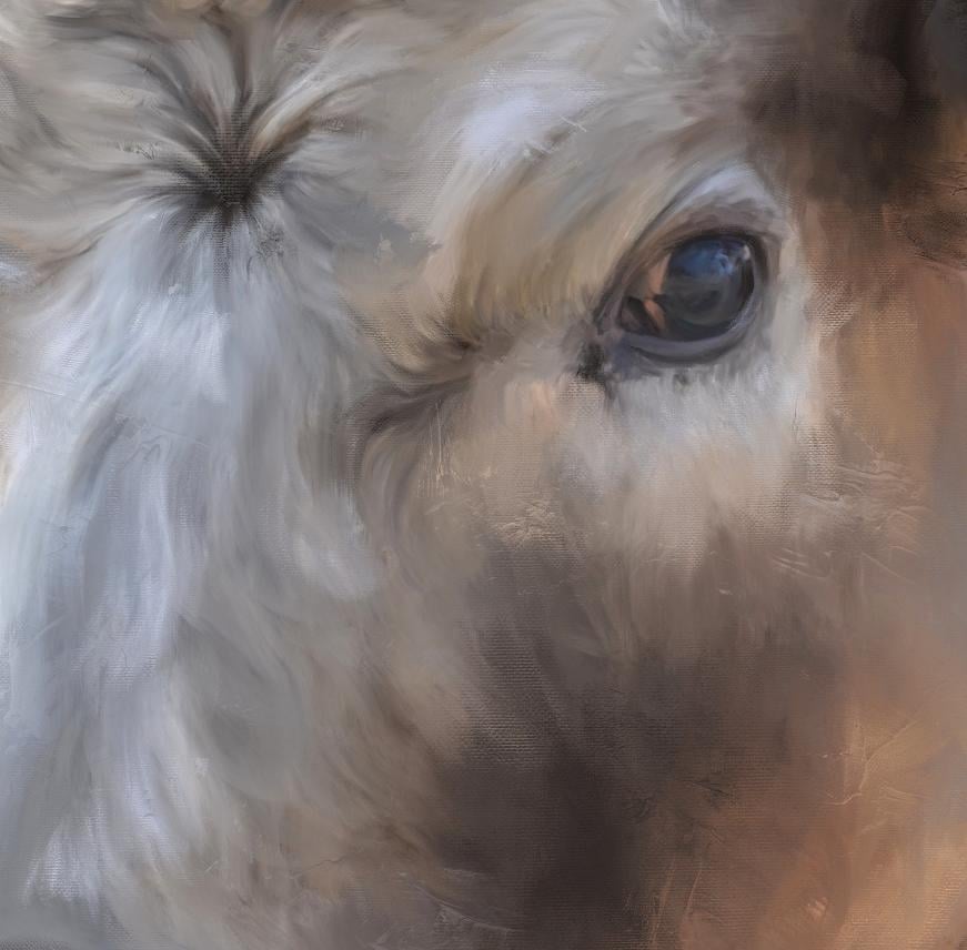
is bothering me. I always start with the eyes. Because if he can't
get the I right, then it's gonna be difficult to do the rest of the painting. And I wanted to show
you a little something before we actually begin on
how to make your strokes. I'm gonna put a new layer
on top and just grab that Smooth paintbrush
and just pick a red, red color here so
I can show you. You want a stroke in the direction of what
it is you're painting. When you're working on the eye, you want a stroke in a circular motion to go along
with the form of the eye. Like that. That's
the way you want to do your strokes in
that kind of motion. The nose is a very
smooth surface. So you probably want a stroke. The direction of these colors here with a very smooth stroke. Same within the nostrils area. Very smooth strokes in the
direction of the nostrils, the detail lines you want
to try to keep accurate. But when it comes
to the furry areas, this animal has short for
and it's fairly choppy. I would do short choppy strokes and following the
direction of the fur. Now this is when blending
I would do this like here, the first coming out this way. And appear It's going this way. I will I will stroke the same
direction and where it's coming down a stroke straight
down. When blending. Then here in this little
star area on the face, I would do this
fairly solid blend and then I was stroke
outward in the direction of these pieces of for short choppy strokes in the direction that
the fur is going. That's the way you want
to do your strokes. Now up here where it's
kind of curly and matted, even kind of swoop it
like that and follow it. Or you could even do like little scribbles when
blending in through here. Because this is a more tight
for area, It's kinda curly. The top of the
head you'll stroke the direction that it's going. And very often when I'm
working around the edge, I will pull from the
background and stroke toward the same directions to bring that background color
and the cow for color together along
the edges of the ears. I would probably stroke this way because there's not a lot of for poking off there. But from in the middle
of the ear where the first coming
down our stroke, longer strokes like
this when I'm blending. And then it can be
a little bit more solid here in the center. And then follow these
lines refer here. That gives you an idea of
how to stroke the fur. Here I would go choppy, kind of downward
because the firm is going downward like
this in this area. Under here. Same way. Then anywhere that for might
be coming out from the body. Just like at the top, I would pull down a little bit. When you pull out
a little bit and then you pull back
from the background, it blends the two
colors together. Plus it gives you a
little fluffiness factor. So it just depends on how fluffy you want
your subject to be. Now if you were
doing an animal with long wavy for most of the time, waves go like this. Think of an S with
a tail like this. I might stroke that way
on long, wavy firm. But on this short
for it's best to do. Short choppy strokes are even if you wanted to go
bigger and bolder with the brush and not even
paint the details in the fur and go big
strokes to block in those areas like that. And around the nose. Just depends on how big you want to go with
your brush and how detailed the bigger the
brush when you're blending, the less detail
you're going to see. I often alternate the size of my brush and then later
on I may decide, well, I want to go a bit bigger, so I would add paint with
a bigger brush later on. So that just gives you an
idea of how I'm going to stroke with the blending brush. Let's just delete that layer
back to our cow layer. Go back to the blending brush and now we're ready to paint. And we're going to
start with the eye. And we're gonna see if
our brush sizes okay. I like to keep these
little colorful areas. I'm just kind of
stroking around. And then I'll move outward. Brush maybe a little bit
around the line of the eye. Follow it, where there's
a little highlight. I want to try to keep that. Do short stroke. Then around the outer
edge of the eye, follow that curve of the eye. And then this highlighted
area here, I want to keep. If you blend too much though like that and you hold it down, you're not gonna be able to
keep your colors, correct. So I stopped when I get to a new color and
pick up the brush and go again with a new color. I found if you stroke one-way
and it doesn't look right, maybe try stroking back
the other direction. I'm trying to keep all
these little dark areas intact by using a
very small brush. And sometimes if you get
a really small spot, you can just tap and it
will make a brush mark. Now some of these
dark areas I'll have to adjust later on in darken up. Go follow the curve
of the eye again. This underneath dark area that
I try to keep that intact. Got some lovely
purple tones in here, which may be interesting to
enhance a little bit later. Little smaller brush up here
around this edge of the eye. You'll notice your blacks
and whites get less bright as you paint with
the blending brush. And you might want to
enhance those later, which we'll go over after
we have everything painted. I'm even going to try to get this small brush
around this corner of the eye and keep flowing
around the edge of that eye. This black area here. We've got this little
highlighted areas down here which I want to keep. We have this dark
line right here. Try to keep that. Let's go with a little
bit bigger brush and go around this top edge of the eye. Still going around
the curve to show the eye how it's curved. I'm pressing pretty good amount. If you do it real
light you will find like this mark here, real light. You will find that some of the grand shows through
from the photo. If you press a little harder, that will go away. There's nothing wrong
with a little bit of green showing because it
does add some nice texture. But you don't want a big blocky, you don't want to paint all
around this area and then have this big blocky section in the middle
that's not painted. So if you see areas like that, you probably need to
go back over them. Then this area up
here at the top of the I work on some of that short strokes in
the direction that first going around that
top edge of the eye. You can go downward and upward. I liked doing the short
strokes because you'd get some variation in
color and brush mark. Then underneath here. And we can even start doing
short, short strokes outward. Now it won't stay with this small brush except
for in the small areas, I will go to a bigger brush
because I like less detail. But if you wanted an
exceptional detail, you might want to stay
with a small brush. Now we're starting to get into some of this creamy colored for coming out here at the
top corner of the eye. Let's just back up and look at what we've
done and I'll do this zoom out so you can
really see what you've done. Let me turn the original
photo layer back on underneath and
we'll show you that. There's the original with the eye area and there's
our painted area. Original painted turn that
photo layer back off. I think I want this little
black area in the center of the I think I want to blend
that out just a little bit. So I'm gonna get a
little bit bigger brush and smooth that edge out, pull that dark color
out a little bit. Just sweep it real gently because I'm now going
over an area that I've already painted with
pretty heavy pressure by just want to light blend, since it's pressure
sensitive and you can sweep real gently over some of these areas to blend in those choppy strokes a
little bit better on the eye area. There we go. I think that looks pretty good. While we're using
this size brush. Let's go down and work on
the nose a little bit. Let's get the dark area in the middle of the nostril first. Try. It helps to not have to redo as much dark later
if you try not to lose your darks by
blending too much. Because the more you blend
your darks in your lives, the more they're
going to disappear, our amine get
lighter, more faded. So I'm following the curve
around the nostril here with these strokes and picking it up so I can get
advantage of the, take advantage of these different colors
that are in here. Because there's some
darker purplish blues and then there's some
brighter ones up under here. At the bottom of this area. I'm doing more sweeping
motion here rather than choppy strokes just
back and forth though, I'm letting up and putting
the brush back down. You can hear the tapping
of it when I do that. All right, let's get
this other nostril on the other side, starting with the dark
area in the middle. I want to keep this little
highlighted purple down here, so I made sure to pick my
brush up and I'll keep this creamy colored
line around it. Pick your brush up
and do those areas by their self that you want
to keep that color there. Especially around edges. That nostrils done let's
do the line of the mouth. Because you don't want to lose
too much of that darkness. We can come enhance it later. Up to the where
the leaf is there. Yeah, you can
enhance that later. Let's go with a little bit
bigger brush on the nose. Maybe even a little bigger. Keep these blue areas in and
blend the cream in with it, and follow the upper
line on the nose. And then as you come down, you can make your
strokes go downward. Just follow that curve
around those nostrils. I don't want to show
every little detail of for every little speckle. Make this brush a little smaller and getting
this creamy area right here following
the line of the mouth. Let's even work on this
underside of the mouth. Once again, following the line. Now as I get away
from that line, I will do the up and down choppy strokes to indicate that little furry
area on the lip. I got a lot of
colors in there and greens and rose colors. And just keep going around until we get to the
edge of the flower leaf. And then finish out this
left side of the nose. Blending it. Pull that dark up
a little bit more. A few speckles spots
in the center. Now I don't like the white
line under the mouth. So at this point we
can pull that for down over that toward
the background. Because he does,
he she does have little errors hanging
off the bottom there. Then you can pull from the
background into it and work that by going
back and forth between the bottom of the lip
and the background, you can get those colors
blended pretty good. We can always add more
detail later if we want. Because we've kind of lost
her edge right there, but real easy to bring back later. When we do our enhancements. Let's go a little
bit bigger brush and now this spur on the nose
is real short and choppy, but I'm not in the mood
to indicate all of that. So I'm just going to use
a big brush and kind of block in that color there that I don't want to
lose and go around down here. Am still going in the
direction of the fur. I'm just using a bigger
brush to block it in. All around this nose. Little short strokes. Now I'm going to grab this
dark area in the nose with this bigger brush and I'm
gonna sweep it upward, more. Sweep this downward area
under side area of it, and just sweep
across the top and bring that blue
down a little bit. I really like that
blue that this is, I'm just doing this real lightly now with the bigger brush, just sort of blend
those choppy strokes. We've done the eye and the nose. Let's take a look at that. There's before and
there's after. Four after.
8. Paint Upper Face: We're getting somewhere. Now, what do I want to do next? I don't know if I want to
do the flower quite yet. Just work my way up the face. I guess with this brush. There's some white right here. I'm gonna go with a
smaller brush and pull this white across
the top of the nose. And this white on
this outer edge. Still highlighting. So I'm going to go with
a bigger brush and pull that darker color out and
then pull the background in. You just kinda have to, when
you have something backlit, you have to work with it. But by pulling the color
out in the background in, it gets a little bit softer
and subtle, more subtle now, with that same brush size, I'm gonna work up the face, but I'm pushing the
strokes upward and pulling them downward in
the direction of the fur, letting up on the
brush in various areas so I don't lose or blend
all of this color. Let's keep going up the nose. I still got a little
green right here. I'm gonna pull some of that
background over there. All right. On up the nose, face area, down, pushing up, following that for direction. Letting up on that
brush when the colors really make a drastic change not in-between
every piece of fur. If you did this with
a very small brush, you could keep all that
fine detail of the firm, but I don't need it in my
work, so I don't do it. Figure if you want
to see the detail, you can see the photo. You're getting up
to that star area. Working on the for
under that right now. Now here we have a little
change in direction. Let's pull the brush size
down and keep that little bit of finer direction going there. Keep some of those dark parts following the direction
of those pieces of fur. Got to feel a little dark
areas right here where it gets this yellow color near
the I work on that, getting back towards the eye. As I work away from the detail areas like the
eye and the nose and such. I will go back to
the bigger brush and I like to do that as I work away
from something like this, get bigger with the brush
to loosen it up. All right. Let's continue. On this side of the face here. Since I've got the
small brush selected, I don't want to lose
this edging over here. So I'm gonna do this area
with a smaller brush to nice low creamy area right here. There's a hint of
an I right there, and here's some
eyelashes right here. I'm going to pull that out and then pull
the background in. Just to kind of soften
that up a little bit with that highlight
from the backlighting. Still working with
the smaller brush. Following the for getting
close to the star area. Back over here on
this left side or the LID area is keeping that small brush going,
working very quickly. This brush and enables you to go quick or very slow if you wish. I'd like to go fast. It encourages a
looseness that I'm after getting up here to this star area. So I want to work on that
while I have this small brush, that is an important area, that needs to be a
little more detail. So the small brushes
appropriate, I'm just going to do little
circle in the middle. I'm actually gonna
go a little bit smaller on the brush
and start pulling out from the circle in
the direction of the fur. Then here we've got
a little creamy first I pulled back on that. It's a back-and-forth,
back-and-forth. Then even pull some of this circle colored down
with that small brush. Because this is what's
gonna give him that her I keep saying that that little star shape
in the center of the head. And if you need to grab your canvas with two
fingers and turned, go in the direction of painting that's most
comfortable to you. You can do that. Sometimes it's easier to paint one
direction than the other, down and up and then
it is side-to-side. See here. Pull out some more
of this with a small brush. Pull out, push back. If I see too many speckles, I'm not putting enough
pressure on the brush, so I will increase my pressure. Here's a real dark
area for right here. See if I can keep
that, pull that in. Here's a dark area right here. Try to pull that down in there. Are star area is
looking pretty good. I think I'm ready to go with a little bit bigger brush and get a little looser with it. Now, as I move outward
from the star, will do the right side. Going toward that. I still following that for pulling back and going out. Kinda left to right. Working my way toward
the top of that, I butt lifting up on the brush so I don't
lose these colors. Wanted to mush
them all together. The pixels are your paint
on this type of image. You don't want to blend all
your paint colors together. So by lifting up on
the brush in-between some color areas that
keeps those colors. I see a few little
speckles there. Let's lower that brush
size and get into some of these little areas with a
little heavier pressure. Just fine detail here. Around the outside
edge of the eye. There's a little dark
area right here, and I'll use that little brush. Now. Anywhere there's really dark. Just tap in there
that little brush. Don't lose too much of it. Now let's go back
to a bigger brush. Continue for outward
from the star this way, forward and back, down and up. Because I've turned my canvas. See I've lost some of that dark using a bigger brush,
but that's okay. We can always bring
it back in later. I don't do a lot of undoing. If I make a mistake, I will keep going and
then just fix it later. Which we can do with
our enhancement layer. When we get to that. Let's see how we're
looking here. Pretty good. I've been doing this
for the photo layer on. Let's just turn that off. Turn that photo layer off now. Sometimes you get
it a little bit more accuracy with it off. Let's work on this side of the face before we
get to the top. Once I get to the
top of the head, we're gonna start messing
with this backlighting. Let's go ahead and
finish this area. While we're on the
same size brush. Just trying to follow
the direction curves of this curly. For up here. Up here, it gets
kind of messy so you can really get sloppy
with your brush. It won't matter because
it's kinda messy anyway. I'm just working my way up
away from the star area. Following the fur is the
most important thing here. Because it'll give
that sense of realism. We want to get a little
bit painterly and abstract here in some ways. But I also want to be realistic. I saw a term years ago
called abstract realism. And I mean, this isn't
really abstract. This is pretty darn
realistic right now I've gotten a
lot more abstract. And when you get
more experimental with the brushes
and other brushes, you can really have fun
with some abstract work. Which if you've seen
some of my other pieces, you'll know what I'm talking
about because I've done some fairly really
abstracted pieces. This little area right
here is bugging me. Working our way to the
top of the head here. Keep this dark area here. Some stick with
this small brush. These little fine white hairs, they're not really white. So it really doesn't
matter if I blend them down and really soften those up with brush marks,
brushstrokes. Well, I am going to have
to fix this backlighting pretty soon and this
is not real bright. We see how I'm blending it at, softens the real
bright white down. It does that. It'll soften your darks and your lights down. When blending. The micro more powerful when we
want to pull them back. If we wanted to do
have them there, we will do that through an
accent enhancement layer. I'm just getting really
messy crisscrossing, tapping here, going
down towards the eye, trying to get
everything painted. Then we can get to our
enhancement layer. Come down around this I keeping those darks
because we're getting to a line on the face where it's gonna meet
the side of his head. We don't want to
lose that her head. I did it again.
Why I keep saying his I think when you don't know the
animal personally and I didn't this this photo
was shot from a car. There were getting
getting in there pretty good on that face. Now I think we're going to, I'm gonna stop this segment and we're going to
do the next segment. And we're going to work
from under the eye and the side of his face and work
outward toward this back. I'm gonna save this
backlighting ears area for the last I think, because I'm really going
to have to fuss with that. In the next segment,
we're going to continue on with the
side of his face and neck here as it
moves into his back.
9. Paint Side of Face & Neck: Alright, keeping with
this same smaller brush, I'm gonna work on
these dark areas here where it's real kind of fluffy looking little short
strokes in taps in here. Around the right side of this I, where it meets the ear. There's a dark area here. This area where the head
meets the neck is important. You don't want to lose
that dark because otherwise you won't see that division between
light and dark. I'm going to keep
with the short, I mean small brush
and short strokes. This area. And work my way
down from top to bottom, going upward and downward and even a little outward with
some of these strokes. There's a little dark
area right here. But you want to keep that where
the dark meets the light. Working my way back
up that same line. All the way up here. Let's look at it right here. Keeping that dark,
keeping this dark line. Even over here on the side, we'll tap in there a little bit and keep those dark spots. Then under the neck here, we have a pretty good dark area. Just right at the top of it. I'm going to use
this small brush. Then I'll go with the
larger brush later. I'm actually going
to go down the line. Let's go down the
entire dark line. With that small brush. We can get a little looser as
we get away from the face. There's a dark line right here. Tap in there, and then tap the lights around
it. Crisscross. Then there's a little
darker orange right here. I'm going to sweep this area in the direction of the jawline. Come out from there a little
bit with that small brush. We've got this area
right here by the mouth. Go the little
smaller brush there. Next to the tulip. There's quite a difference
between light and dark Sarah, around this edge
where the tulip is. I'm actually even getting into the tool up a little bit there. I don't want to try to
go along that edge. And then this dark area right here. We go. Go up here a little
bit more small brush. All right, I think
we're ready to get a little bit bigger brush now and work the rest of
the side of this face. So we're gonna go a little
bigger and appear by the I. We're gonna start with that. Following the
direction of the fur, up and down, up and down. Then over here on the gray area. Working those colors. Right now we have some
larger blocks of color. We've worked away from the
eye with the smaller brush. Let's erase the
brush size a little more and get a little
bigger strokes in here. Just work our way down. Still following the direction
of the fur back and forth, back and forth one way
and then the other way. You might get some
little happy things that happen like
this little light in the middle of the dark, that's kinda cool, so I'll leave it still might need to go a little smaller
down here along this edge. You just have to play with your brush size and
the different areas. To get to what you like. Go back up in here
with a smaller brush. Let's get this side
of his face here. Same size brush up and
down, following the fur. That might look a little too
buzzy right through here. Just enlarge the brush size and gently sweep over some of that, which will soften it. We're ready to move on to
the neck area under here. Maybe a little bit smaller size. Same thing, direction
of the fur. One way and then the other way. We have a little white rim showing that backlighting
under the neck. We're going to pull right out
into that with the strokes. As we move downward. Right into that white rim. Because we want to lose that. Just work our way
down to the bottom. Then we come up
with some of this dark working away upwards. Now, let's go a little
bit bigger brush and actually get some of this
background area in here. Up alongside the Tulip, trying not to go over the tulip. Then let's pull that
background into that white rim under the neck. Just pull that background color in and you'll notice
the very look. And it's losing
some of that white. As you go downward and
pull it in toward the fur. Then you can go pull the
firm back out some more and just keep working until
you get rid of the white, the really white rim. You and work into the background was some of this blending. There's a hint of the
white rim. Little smaller. You could further work
on that if you wanted. And pull some of
that. Ferdinand gives him a little fluffy look. Pull some of that
background up into it. Even up here under the face, we still have a little white. So let's make the brush a little smaller in this
peachy color right here. Let's kinda bringing some of that and bring the
background up against it, just following the
contour of it. Getting a little messy
now, which is fine. Then just further work, this little section of
background blending it in here. Keep in mind you don't
want to go over your tulip. There we go. This peachy color here, it looks a little choppy. I don't want to go away, but I'm going to stroke a
little bit different direction. Grab some of that
and kind of make it a smoother, rounder stroke. I see some speckles in here were areas where I
didn't use enough pressure. Will go ahead and fix that. I'm gonna go with a
little bigger brush and just kind of maybe
even bigger swoop, some of this swoop new art term to smooth that out and blending
what I've already done. Even right here.
Whereas dark up here, plus swoop some of that down. Swoop it outward this way. Little too choppy. There we go. Following
around the edges. Pulling your, you're actually
painting with that color that's there and working
those colors together. And even up here, It's a little choppy, little smaller brush swoop, that swoop that dark. Got some backlighting
up here by this ear. Pulling some of
that dark outward. With this smaller brush. Let's pull some of these base
pairs back out, back down. Sometimes when
you're zoomed out, you can see better where you're choppy areas are and where
to work on your fur. But remember it doesn't
have to look exactly like the photo unless you just
are going for super detail. So I'm just kinda going over all this face stuff with
this brush and doing some real light swoops and sweeps to blend those
strokes a little bit more. All right, let's look
at our original photo. Okay. We're getting
somewhere now. That's time to do the
rest of this neck. We're going to take a little short break and
we'll do the rest of this neck area inside of his body here in
this next segment.
10. Paint The Body: All right. Let's continue
on with this neck area. Let us see what size brush I
have here around this ear. And we're gonna stick
with this size brush. We have some really
strong lighting here. I'm going to pull blend from going from downward to upward
into that lighting. Just to tone it down. Some. We're gonna have to probably add a little bit
more further. Eventually. Now we can go with
a smaller brush. And around the bottom
edge of the ear. Pull the color down into
what we just pulled up. Which will make some
more further there. I know this looks
real structured right now because I'm using a small
brush to do some of this. Even top, pull some
of that dark out. We're going to have
to add some color in here at some point,
but right now, little bigger brush and
pull from downward, upward into what I just did, makes it a little bit looser. When you use the bigger brush. Still got quite a good
highlight there though. Some of this gray up in there. Let's get the dark around the edge of the ear
and pull some of that down with this bigger brush
over those small strokes. That looks a little better. We've still got a
highlight there though. We're going to have
to tackle that. At some point. Beneath it. Keep pulling the dark down in the gray up then it
would eventually go away but just takes a little
while getting there. Little bit bigger brush, pull up in there to kind of
loosen that up some more. That's quite a bit better there. You can use the blending
to your advantage by pulling one color into
another to change the entire. Look. Go on this top edge here. I'm following the for
going outward now. Then here's going
downward again. Up and down. Looks a little better. I'm ready to go to a bigger
brush and sweep out, swoop out this area
in through here. I can get a little sloppy with
this and kind of go every which way with the brush. Kind of curving to the right, curving to the left. Down here. I'll just kinda go upwards
then out to the right, and then back to the left. Good fast way to finish
out that section. Move on down into
the lower part. This is where you
want the eye to go, is where you want the detail. This arm losing a lot of detail. But I don't want the eye to be centered on this area anyway. Then as you get down
towards the bottom, you want to keep this dark. So pull from the dark
into the lighter areas. As you come up from this corner. See a little area
of under the chin. It's a little choppy. Make the brush size
a little smaller and kinda settle that area
down a little bit. Few strokes in there. Now let's zoom in and see if
I've got speckles in here, which I do in a few spots, will just work those out. Make sure you get everything
around the edges. Appear. We we clearly have
an area that's not done with that brush out pull outward from
the edge, inward. Just looking very close
for these speckled areas. Still have some right
in here and I didn't get there we go. Then that area is pretty good. So that's before. And that's after. Let's turn that photo layer off. I keep forgetting to do that. All right, let's
work on this ear. See what size brush we have. Pretty good, pretty good size. The ear for kind of lays
smoothly across the top. Of course, where it's backlit. You can pull down
from the background into that to tone that
backlighting down. Same with the bottom of the ear. It kinda just curves around. There's a few little pieces that are coming off
the bottom of the ear. We can fix that later if
we want to add those in. Just following the
curve of the ear. Starting to look like in
oil painting in a way. Once we get some
texture in there. I'm gonna go in the
direction of this for keep, keep the dark the best I can. I may have to add that back
in later if I lose it. All of this for up and down, swooping it in the
direction of the fur. Worked on that background. A little. Air is pretty well done. We've got this strong
backlighting here. We can make a smaller
brush and pull some of this gray into that. And then pull from the ear, the dark colors of
the ear back into it. Pull the gray again. Just trying to tone down that
backlighting with blending. Pull from the dark area again into that white. Let's turn this way and go with a little bit
bigger brush and pull outward with the gray tones. I love this feathery
ends on this brush. It makes wonderful for
whether you want to do. Short haired animal is short for a long-haired animal
works either way, just depending on
the brush size. Got that backlighting
tongue down pretty good. The top of the ear, we don't. But we're going to
blend in some of this lighter
background with that, which we'll tone it down. Eventually, we're still
gonna have to add color into some of this to really tone it down. Zoom out so you can
see a little better. Go with a little bigger
brush around the ear. And kind of come from the background and bring
some of that color up in there and then come
back down over it. Little golden area right here. And I'd like to extend
that out a little bit, blend that in a little more. Little eyelash there. Which will probably have to add. Can't really see that eye, but you can see the eyelashes. Let's look at the photo. We've lost a little dark
spot right in here. We'll fix that later
with our enhancements. Alright, let's finish. Let's do this other ear. While we're working on this. Start with the dark area. You can kind of get messy. This one's a little
more nappy looking. You can kinda get messy along
the top edge of this one. To indicate that actually pull that dark upward into the white. More. Work on that middle
dark section. Lots of little
crisscrossing tap marks. And then here were the
first longer pull out, pull in, swoop it. We got a little
feathery look there, but let's go a little bigger. Brush and feather
in some of that dark and feather
out a little more. We'll have to add
some detail in there. Pull some of this
background along the top edge of the
ear and the back. We'll have to add some
color there to fix that. I'm just gently pulling some of that and it looks
like he's getting a haircut. Goes a little smaller
brush and pull out, tap and there's a
little dark areas. Little short, snappy
strokes here. As you blend that highlight, it will tone down. But if you blend all the background into this top part where
it's super white, you're gonna give him
a real big haircut and she has a lot more for. Then we'll show if we pull
the background down in too much a little bit of
light there is not too bad, but especially because I've put the lighter color in
the background up there, that might actually work. Maybe. We have our cow
pretty well painted. Apparently I left the
photo layer on again. We have him pretty well painted. This area right
here alongside of this eye looks a little choppy. I think with my
brush size I have. Let us go a little bigger
and just gently sweep over, tap and sweep over some of that. It will little too
big, toned down. Some of that choppiness. It's not quite as choppy. I really liked the
way at the top of his head looks nice
and choppy though. Because that firm has real
curly and tight up there. All right, How are
we doing here? I think we might be ready to
paint some of this tulip. When we paint the tulip, we're gonna have to work some of this blue
background I've put in. We're gonna have to
work that up closer. So there's not this light-colored
rim around the tool up. And that's somebody who think about we're
going to do this, that tulip with a smaller brush. We're doing pretty good. I think we'll do the
tulip Next and work that background around
the tool up some and then we'll do the rest of the background blending
on it some more. Then we will start
on our enhancements. So let's take a short break and we'll come back
and do the tulip.
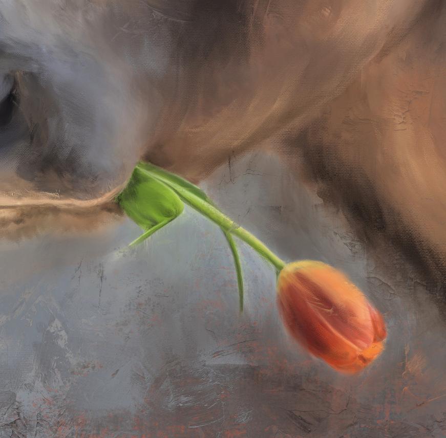
11. Paint The Tulip: All right, We're ready
to start the tool. I'm going to erase the size
up here so we see good. Let me go with a
pretty small brush and let's get this area blended around his her mouth. The stem edge of this leaf here. I'm going to blend the
background right up into it. I'm following the
direction of the leaf. Even when I do the
background area, coming toward the leaf and going doing strokes in the
same direction as the leaf. Trying to turn this white
rim down around the leaf. Gonna have to bring
this blew up a little bit closer into here, right up into the white. Go with a little smaller brush to get in this little
corner right here, down the center of the stem. Notice how the white is toning
down with the blending, which is good and don't want
that to be super bright. Do this leaf. Pulling the background
toward the stem. All right, I didn't get
the middle of this leaf, so we're gonna go
with a bigger brush, dark and light,
back and forth in the direction of the
curve of the leaf. We're going to pull
this blue little bit further towards the leaf. Let's work on this blue
under his her Chen. I'm going to say he
is throughout things. Just get used to it. Alright, back to the
stem and the flower. Pull this blue as close as
you can up against that stem. Which really tones
down that white. Which is what we want to do. We don't want that
white in there. And then let's do
the bottom area of this longer base here. Pull that blew up in their follow the
direction of the leaf. I'm actually coming right over into the leaf a little bit. When I do that with these
larger brushstrokes. If you see too much white
coming in and stopping, grab the color and pull that way to get a little
smaller brush to get in here. Now let's actually
work on the leaf. With that small brush. Pull from some of the dark and pull from some
of the lights, they will maintain
the color shading. You could even extend your
stem out a little over that white by going right
along the edge. And then pull a blue
back again toward it. Just working that white rim out. Got the bottom of it. So let's do that. There's still a white room
showing a little bit, so he needed to do a
little bit more of that. Pull that blew up closer. This blue up here. Closer. Let's see him pull some
of this darker blue with a bigger brush right
up against it, even going over it. Let's get the rest of the stem. Smaller brush. Now we're ready to work
around the flower area. Same thing, pull the blue
tightly up against it. You lose some of your stem, pull it back down. Start working the edge
of the flower too. As we go around this. Once again, sweeping strokes in the direction of the flower. Pulling that background
right up against it. Those background
colors we put it in. You can even come right
over into the flower. Working on tone in
that white rim down. Get around this bottom edge
a little bit smaller brush. Actually start working. The tulip itself. Now, as we go around
these petals, needed to turn your
Canvas, do so. Whatever way you can make
the strokes the easiest. Let's go a little
bigger brush and pull some of this darker
color up in there. Can do crisscross. Give it some variation. I'm just come right
over into the flower. It'll darken that edge. And we're going to blend
the flower next anyway. See that made a nice
little painterly section right there that actually liked. So I'm going to
try to keep that. Let's actually start
up here at the top. I've turned it upside down, so the bottom of the flower, but top of the screen, get this yellow area and pull in the
direction of the petal. The lines in the tulip actually look kind of like
the same lines is for, which is kind of neat. While we're working
with this size brush, Let's get around this edges
of some of these petals here. We go bigger on the brush. Might even have to go a
little smaller in here. Because you want to show the separation
between the petals so you don't want to mix
your colors up too much. Little short strokes in here. I'm trying to keep that edge. Keep that darker edge in there. These little lighter specks. So you can see the division
between these petals. Turn off. Sweep
this dark color up, toned down, this white. Bringing some of
the blue back in. Keep this edge here where
that petals lighter. Zoom out. See what we're doing. Keep this light yellow
edge here in the center. The best we can. Keep this yellow edging
and pink edge in here. It's a red to lipid only looks
pink because of the white. I'm going to pull some of this color down into this white. Then I'm going to raise
the brush size up and sweep upward and
downward right here. And then I'm gonna pull back down to give the
illusion of the lines in the petal a little smaller. That's really tone in that
white highlight area down. Then this red underneath. Let's actually sweep that up
gently over that highlight. Let's tone down this
by sweeping from here, down, from here down, and then even bringing
the blue over the edge a little,
there's a little light, they're still so let's go a little bigger brush and pull more of that blue towards it. And then let's pull the dark
blue in upward around it. Now we can do the big brush
on the rest of the flower. This brush I'm using now, size, it is still following
the direction of the petals and keeping the colors separate by
lifting up on the brush. And just doing a nice variation. This little dark red section, I don't want to lose that. That's an important
part of the color. Pulling down. And then let's
pull up and then down, and then up, down and up. Wow, I think we've got a tulip bottom rim around the tool of the
blue's a little bright. So I'm gonna go with
a little bigger brush and pull the dark
blue up toward it. And around the bottom. I like that little streak or
read it did out to the side. That would happen if this
was real paint sometimes. So I like leaving those things. If I can blend out some of
this lower background part. Still think we need to pull
some of this dark up here. Here's another little
fun painterly street. Those fun painterly
streaks I like to leave. Sometimes. They just appear depending on your pressure
and how fast you stroke. All that. Let's pull some of this dark up in here
with a really big brush. And I'm starting to
get looser now with the brush and a
little bigger because I'm into the
background blending, which we do need to do. We got this one dark section
here that's bugging me. I'm gonna pull blend
that a little bit. Just kinda scrub it. In there. Came over the edge of
the flower a little, grab the yellow and
pull that back out. Push some of the orange backup. Real loose sweeping strokes. There we've got a subtle up. Let's look see where we are. The original photo. We added the tulip mastered in, painted the softened the
background first and now we've painted everything
they were at this. But we still need to do some more blending
on the background before we start adding our enhancements as
a new layer on top. But it's starting to
look very painterly now. I like the way it's going. I guess we'll take a short break and then we will further
blend this background. Before we go to
the enhancements.
12. Add Background & Fur Details: All right, let's
work on the rest of this blending
of the background. Now this we can do with a really big brush and I
like to do this zoomed out. I'm not going to
blend it completely. I'm just going to
smooth out some of these areas where I
feel like it needs it. Just kinda move this
color around and I'm kind of putting the brush down and scrubbing it just a little
close to the pretty girl. You might want to
use a smaller brush. Just scrubbing, moving, putting the brush
down and scrubbing a little. And then it was I
get further away. I'll do some bigger brush. We're going to add some more
texture to the background. So I'm not really worried
about keeping what was there. If you go around the
outside of your subject, you can kinda like
on the edge of it. You can pull some of the
subject color right into the background just with a
gentle little tap and sweep. Just kinda working all
around under this flower. Still. Bring the background
and the subject together. Just by working around
the edges of it. Even made a mark there. I didn't mean to make
you can even pull, since we're zoomed out, you can pull some
subject features out a little more and
pull the background in. The background is just, I don't even know what the
word I'm looking for is. It's whatever you want to do. Could have duplicated this layer multiple times and kept
the ones behind it. But I've find pretty much all I'd all I want to
do is fix it myself, so I don't like to go back and redo kind of fix things as I go. Go with a big brush and
kind of smooth this out. Tone it down a little bit. Remember when you blend
any color tones it down. Which is why we do the
enhancements we do later. Bringing some new color in. Just scribbling very
lightly though, not pressing like super hard, just enough to blend down. What I've already done. Let's get here to
the top section. Work on this blue corner. Blending that in
better with the white. When you scrub this brush, you won't have the real feathery ends is when you sweep it. That's why I kind
of liked to scrub that I'm doing this very gently. Going across the top, get this upper-right corner, pull some of that blue
down and scrub it in with that creamy yellow
that I put in there. I accidentally just hit it undo. Putting two fingers down. So be careful with that. Come right up to
the four on the top and pull towards that hair. It looks like here, but we're going to add some
more hair there. All right, We've
got a pretty smooth apparently look now
just by going over that background
really carefully. Now we're about ready to excuse me, start
the enhancements. And I'm going to start where that's bothering
me the most, which is the top of the head. To do the enhancements, we're gonna do a new layer, and now we're going to actually paint with the paintbrush, but we're going to
use the canvas brush. You can do a little
scribble with, say what your brush size is set at and what you might
want it set at. Just tap, double-tap to undo. I'm just trying to figure out some good marks because
this is on a top layer. We can blend, we
can mask the way we can reduce the opacity
if it's too strong. What I do want to do is I
want this creamy color here, sort of a grayish yellow. I want to get some of that and
then I want to go a little bit more to the golden side, I guess on the color wheel. I don't want to put some for up here over
this white area. We're gonna do this in
a few different shades. I'm trying to stay pretty. I'm going to go
around the ears too. With that same color. I'm trained to stay pretty
low key on saturation and not pick a color that's
too saturated. But I need a little bit more for and some
division that appear. We've took away hair, so we need to add here. I've done the yellow color, so let's move it over
to the Orange family. See what that looks like. Might want to go a
little darker than that. Let's pull down over quite a bit more,
some more like that. I'm going to turn
it upside down. Because sometimes it's easier to stroke from downward strokes. I'm going to try to leave
the little yellow bits, yellow gold bits at
the top of the ears. Just bring some of this
color in underneath that. Closer to the head, actually into the
top edge of the ear. All right, let us see
where I'm at here. That might be enough
hair to pull out. Let's do a little
blending now with the canvas brush on
what we just did. Obviously, we don't
need it super huge. So let's bring that size down. Let's just do a little test
here on size and one that outward over that white in the direction that
the fur would be going. Might look pretty
good, but I'm going to do the same upside down business because I feel more comfortable
pulling downward, a little bigger on
the brush and pull these colors outward, downward. Just remember that the fur on top of the head is
kind of crazy so you can go every which direction
with your blending. It just basically
trying to tone down that white a little bit. And this is just the first
layer in doing that. Feel the brush maybe
a little too small. Let's go back over some of that and pulled toward the head and pull away from the
head. Both ways. Then this ear, turn it back and see where we are still
looks a little choppy. At this point, I'd like to
work on bringing some of the colors that are actually in the ear
into this top part. Various ones. I'm just holding my finger
on it to select them. As I go along, there would be some of this
color here coming out. I'm going to do that
all the way around. That colors kind of prevalent. So when you stick with that, scoot over a little bit, Let's see when bringing
some of this in here. Now we go back to this color and pull some of this color in. And then this darker
loops, this darker color. Pull some of that in. I'm gonna get this
yellow again, hold down. They're going to come over this way when I'm gonna go
a little brighter with it. Little bit bigger, brush
around that top edge. A little bit more
to give it give her a little bit more for that area. What other color might be good? How about if we pull a little
color from the two-loop, maybe even a little bit of
this yellow right here. Let's see, I might
be a little strong. It's sort of a greenish yellow. How about we brighten that up? Get a little brighter
color up there. Not too much, just a little. Now let's work on
blending some of that same canvas brush. Given a little messy
hair day look here. Pulling the darks out, pulling the lights in and
you can even pull from the background if the
yellow is too much. I just wanted to integrate a little bit of that
to look yellow in there to help tie
everything together. Since we added the tulip, those colors weren't in
the original cow photo. I thought it'd be nice
to have them in there. Just kinda work your way
around blending that. Given that little
messy hair, do look. The yellows too much pole from the background down towards it. The yellow may be
a little too much. Here's what we're gonna do. Let me grab this color and we're going to go to the
right just a little bit. We're going to put some
more strokes over that yellow that we can then tone that down
all the way around. Now, blending same
canvas brush back in. This is just a lot of
back-and-forth and playing To you get to the look that you like while toning
down the white. Let's go with this exact color and a little bigger brush and just kinda sweep that around those edges and go
over them a little bit. Won't even need to blend that. A little sunny
yellow hairdo there. I'm still not sure
about the yellow. I'm going to tap over that yellow a little bit more
with this color I have now. Then I'm going to grab
the dark color here. Play with putting a
few little taps so that in a few spots
around these ears, oops, did too much. You can actually blend. I don't like those two strokes. I'm going to undo that. Let me just blend what I just put in. A little bit. I'm getting ready to get
messy now with some of this like this rusty orange, but it needs to be enhanced. So go to the right on the
color wheel and maybe even up a little. Let's see. If we add a little
bit of that in the ears too big of a stroke. Even bring some of
that down in here. Over here. Maybe
even up around here. Now let's blend it. I have to go a little
bigger on the Blend. Blend it in when you
it'll soften it, but it'll still maintain
some of that color in there. Looks pretty good. I'm happier with the hairdo now. Now this little bit
of creamy yellow, Let's see if I can find that. Because I just thought I
want to bring some of that in to the ears with some this to be small, wispy little strokes. Let's see how that works. Let's kinda nice. So let's do it over
here on this ear to go in the direction
it would go. Then I have to make
that blend or a little smaller and blend it both ways. Bring this dark gray
up around here too. Just a little bit more. If you blend too much, you're gonna show that white again. So keep that in mind. It gives some wispy
little hairs on that ear to because this is
on a new layer. I can show you. That's
where we started. And this is where we are. We've given this cow a little bit more hair
layer gonna turn off. There we go. A little bit more hair. Not quite as bright on top. Now if that's too much, all you have to do is click on the N and
adjust your opacity. Which I do think it's
a little strong. I might pull the opacity
down to about 80. Let's turn it off and on. Zoom way out. You can look at it
from a distance. Still might be a little strong. Let's pull it down. 70 range. Off on. I think I like it
at the 70 range. But what I think I'd
like to do is this. I've had not wanted to work now. This dark color right here, I think I'd like to bring
some of that in there. But I don't want to mess
up what I did here. So I'm gonna do that
on another new layer. And I just want to bring
some little pieces. It's actually a dark
gray out a little bit. Just to make it look
a little fluffier in a couple of spots and maybe even along the top
edge of this ear. And maybe even right there. Now let's blend that
down a little bit. Just personal preference here. You might have liked
it the way it was, but I felt it needed a
little bit of this color. Brought in in a few spots. Here we go with
opacity and let's do, let's do about 60, almost one. There we go. I like that that little top part
of the hair needs to be for needs to be
very messy and choppy. I like what I've done there. I'm going to squeeze
these all together. So now we can look at our
photo and our painting. All right, it's time to do
some more enhancements. I do realize that
there is a spot. Ipads getting fussy. There's a spot right here under this eye area that
should be a little darker. Going along with that
same color brush. I'm just gonna put
a little dark in there with the canvas brush still and blend that
in a little bit. Kind of scrubbing it. Zoom out if you can't tell
when you're up close, how much you want and if you
need more, add some more. I just felt there should
be a little shadowing going on there that
not able to go on. And I'm zoomed out now
because I want to see at a distance how this is looking at if I've
got too much or not, blended it out too
much, Let's backup. Here's a little
shadowy area there. I did that right on the photo layer instead
of as a new layer. So let's do a new layer
and add a little bit more trying to see
where it needs to be. Right in there, I'm
in the right spot. So let's just kind of gently
scrubbing, work in it. Let's go back down to this layer and blend that up
just a little bit. Back to this layer. Squeeze those together. Got a little shadow
area there. Now. Now it's time to enhance the
rest of this to loop Beauty. Someone to take a
short break now that we've worked on the
serious problem areas. So we can start having a
little bit more fun with the enhancements since we've got all the details taken care of.
13. Paint Enhancements Part 1: All right, We're ready to start enhancing
this little lady. I know you might think what needs enhancing, it
looks pretty good. I think it looks pretty good. But you notice
what I did here at the top that really
enhance those. The curly for up there. And I wanted to bring some more of that kind
of enhancement in. I need to do a little work
down here around the tulip. And I need to darken all the dark areas
and maybe brighten up the lighter areas and then add some texture to this beauty. I also wanted to take a quick
look at the original photo. Looking right here down
this side of the nose. There's some brown
and green and gray. And it extends down pretty far. Looking at this, it looks
like that is somewhat needing a little attention right there just to define that
edge a little bit. That's another enhancement
I'm going to do. Down here in the
bottom of the mouth. Just little things
that need to be worked out through
the whole image. To get extra special. Let's add a new layer. We're still going to be
painting with the canvas brush. I'm going to go down
here where it's dark. We'll start with
enhancing these darks. I held down on the color
wheel to select this color, that's the color it is. And I want it to be
a little bit darker, so pull it down. Let's just kinda work
on this right here. I don't need that small
brush marks because I'm just blocking in a little bit of dark which will be blended. Now this layer will
look pretty horrible. When I get done doing all this. I'm going to look at the
original photo again. They're just studying
this area right here. I think I think I need a
little more dark here. Just to define that
a little better. Darken that nostril
a little bit there. This upper edge of the nose. Inside this ear. This is enhancing the darks
is what we're doing here. Even a little bit up here. These little areas
inside this ear, word be the most shadow. Right here on the
side of the face. Then maybe even pull some
of those dark over here, down in through here
a little bit more. All right. Now I'm
going to get that dark brown looking at
for the grayish side. How about that? That's not quite as
dark as the black, but I'm going to
get a bigger brush. Notice there may be
a little darker. Let's go with this color. That's right there.
Bringing us down. Add a little bit
of dark in there. Make the brush a little smaller. And bringing some of
that dark down here. Under this nostril inside
the ear a little bit there. Maybe in with this
black on this ear. I'm just dancing around
in different locations. Make the brush really small. And let's actually add
a little bit more dark. This, I further define that even on the outside edge, the eye, they're
just little areas I see that I might want to
pump up that darkness. Now let's I'm going to add, I'm going to take this
color here from above the, I raise it up willows, a bluish white. Just want to put A little bit of a highlight there on
the rim of the eye, which I will blend
all of this out. So I know it looks really strange right now
while I'm on this color. I'm actually going to bring in a little bit of
that in a few spots. Don't need that on the
nose. I don't think. Of course I have to make sure
to go blend all of this. There might be a little much, they're just maybe
just need a little, just a little tiny bit there. I'm working on enhancing
some of the highlights. Now. Let's look at this mouth area here
where there's this line. I think that needs to
be a little darker. So let's grab that color. Pull it down, go to a really small brush
there and just kind of sweep that in there a little bit with a very small
brush around this edge. There's some little dark
at the bottom here of this chin area that
I think needs to be extended just a
little bit and darkened. I'm just going to work on
pulling some of that around. Then even on this side
of the tulip here, maybe even do a
larger stroke there. Maybe even under here
because this is gonna be the underside of the face. And I think I might
even want to come down and bring it a
little darker there. I zoom out all the time to
see how I'm doing here. Let's work on this tulip. Now, we put the tulip,
the cow's mouth. We masked out the tulip
to put it in there. What we did not
consider is that if this tulip leaf and stem is
inside this cow's mouth, this section right here next to the math is
going to be in shadow. This is very bright. We need to get that get some dark green in there
to get that in shadow. And I want to, I don't want it to
be super bright. I'm going to pull the green
to the left and then down. I want to use a smaller brush in here and get some scribble, some shadow color in here to further enhance
the dark areas of the leaf and the darker
green areas of the stem. Get a little smaller brush. Now let's even go darker. Pull it down. Put the very darkest right up against the mouth,
hits the leaf. Bigger. Pull some of that out. Right here to this whole
stem needs to build darker. This gets some various shades
in there which will blend nicely and bring that same
dark in with that other green, but maybe not quite as much. Then who really needs some
division here between the stem and the leaf? So I'm gonna do a very
thin dark line there. I'm going to take
this bright green, pull it over to the left, a little too dull it down
and then brighten it up, doling it down because
I still feel that the leaf is a little
bit too bright. By bringing in some
of this color. In here you will see more
of the curve of the leaf. I'm going to grab the
dark green again and go around this underside
just a little bit. Kinda connect it up there. Now my tool, it
looks fairly messy. Actually bringing
some more of that dark green down in here. Trying to create that shadow which will look better
when I blend it. Just have patients. That's what you need
to remember on this. And this layer is all, it's all on this new layer. So if we do these enhancements and
they look a little strong, we can always adjust
the opacity down. I still wanted to do the
same thing on the flower. I want to grab the red color that's there and
darken it a little. And maybe even move it
to the left a little. When you move it to the left, you're moving it
towards the gray side. So you're toning down
that brightness. Just get some more
shades in here. The darker area. Then let's do the orange. Pull it down until the left. Just to get some little bit of different shading in there, maybe a little bit
on that brush right there, tap in there. And then we have these
brighter areas like that. We need that line there to
show the division and petals. But it's not quite bright enough because we lost some brightness. So we're going to bring it up. We'll bring it to
the left a little. You don't need it
to be pure white. If it was pure white, it would just not look as good and bring some of
that over here. Even in this little
pinkish area. Right there. Let's go back to the
dark because I missed a spot under this
petal that would put this lower panel and shadow because we've changed the
orientation of the flower. The flower was originally straight up and we've
changed it to go this way, to hang out of the mouth, which means the lower part of the flower is going to
be facing the ground, which means it's going
to be more shaded than this upper part here.
On the upper part. I may even brighten this a
little by pulling this up. Maybe even pulling it
more towards the yellow. Maybe even more, little more
brighter even right there. Bring some of that up. Let's bring a little bit
of this pretty yellow into the top edge of
the stem as well. We did not work on this
side of the face yet. We're gonna get this
dark brown here. And we're going to
work on I just feel like there needs to be a little
bit more division there. I'm going to play
with some color here. Bringing more to the orange side and bringing some of
this color in here. Because I just, I
love that color. And it's present in the ears. And I want to bring it into
more of these other areas. Put a little here
under this nostril. How about this side of the face? How about over
here a little bit. And even in here a little, I'm just kind of blocking
some of this color in trying to get a little bit of a color
variation going on. Maybe not right there, but maybe right here at the top. Maybe even bring a
few more strands of for appear in these leaves. Leaves, ears with that color. Maybe a little too many there, space them out a little
bit so we can blend them. Maybe even right up
here a little bit. Just playing with color, bringing in a little
bit richer color. I think the blues in the cow's face already tie in pretty good
with the background. I, if the cow did not have the blues and the face and
the background was blue. I would bring some blues from the background into the cow. I would like to get this
darker blue here and bring a little of it maybe over here and it doesn't look that dark when you bring
it over here. Just to show that a little
too much there. Just to Show some of that
color over there. Then maybe on this
shadow side of the face. Just playing with color. This is before we started doing
any of this enhancements. And now you can see the color
is really starting to pop. It's not blended yet, but
it's starting to pop. Would like to grab this color off the nose and
go a tad brighter. And just make a mark
somewhere in here. Right across the top. And marine some of
that up here too. Just to give some variation, which will help give the
illusion of all the firm without painting every
little bit of it. I'm just adding little bits of color where it needs to go. Okay, let's blend this in. So go to the blending
tool canvas brush. Same thing as when I
started the painting. I'm going to start
with the eye with the smallest wondering
brush that I can get away with and blend in some
of this color I've added. If I don't get every
bit of it and you see a little bit of the canvas
texture. That's fine. Because that's why we're using the canvas brush to add
a little bit of texture. That looks pretty good. And zoom out if you're not sure and blend a little
more if you need to. Let's take care of these ears. Find out where my paint is. I'm just blend out some
of these strokes appear this dark area and I
can kinda scrub with this brush and blend it in and then feather
it out to when the canvas brush works
well either way, this smaller areas just lower the size of
the blending brush. About when did that
one all the way out. Going in the
direction of the fur. Let's take care of this
side of the face where it's really been bothering me. Blend this color in. These colors. Don't want to blend
them away too much. But you do want them
blended some some of these areas of color I've
added to the nose, the face. Blending these with
the canvas brush the same web blended
the whole painting with the smooth brush just up
and down back and forth following the
direction of the fur. I've got some more of edit. Oops, I missed a swap to my paintbrush by
accident. Blending. Some more of added right here, more of this color right here. Pull that star, black on that
star out. A little more. Really enhance that. That's pretty good. Let's do this other
area over here. And then these
colors get some of that rich orange in there
and then the dark areas. And you can kinda scrub
inside there if you want. Because that area is kind
of what I call nappy. Were the first kind of
shorten all together. Then on the front of the ear, grab some of this darker color and this got this
bright orange in here. Move that color around. Under this I, or I put the white and not white
but lighter blue. Then we have this area. Around the face here, I'm gonna go in the
direction of the face. Now remember, this isn't
affecting what's underneath. This is adding to it. Don't be scared to really go
go after it with a blender. Go with a bigger
blender and pull. Need to add some
more dark there. Amount of blended too much. Some of that blue in there, this brown, this dark color
here I've put at the edge. Some of these blues
pull them down. That's the direction was going. This orange color down here. Scrubbing that in a little bit. Then we've got the really
dark area right down here. This bottom curve of the face. This is just round one
here on the blending, I'll usually do a little
bit more. On this layer. I'm getting kind of
messy now what you can do at this stage, all right, let's take
care of this nose area. You might need to go
with a smaller brush to blend this in. I darkened it on
the top a little. Then I put this little
white light blue highlight in their darken. This nostril, added a little that
pretty orange color here. Darkened around the other side. We have to blend this
line on the mouth. We're going to go pretty small. Blend that in a little better. Then a little bit bigger
here at the chin area. Just tapping and scrubbing as I'm going along there because that's kind of a
fuzzy little area. Could actually get a
little bit bigger brush and pull some of that out
toward the background, which gives it a
real fuzzy look. Still working on that math area. These got a little fuzzy
look or she she could grief.
14. Paint Enhancements Part 2: Let's take care of the tulip. This dark green in. Gotta be really careful with this little line right here
where I laid down some shadow and highlight together
shadow on the stem. Blending in nicely though. All the way down to the flower. Then this leaf. Let's work on this one here. Got to get this dark shadow
area under the math. Playing with brush size. I don't want to go too crazy with a big
brush right there. Trying to spread this
these different greens around and get a nice, I'm looking for a
smoother blend. If I got a little too much dark, I can pull from the
lighter area back towards it is leaving the nice
canvas texture in there. We're going to go
smaller on the brush for this little area right here. The highlight area,
even smaller. Edging. Here. I want to kind of blend
this around in a curve. I'm just turning the painting
around to make it easier. For the way I want to pull
down and stroke that. Loops. Zoom out, look at that. Now we've got a little
shadow going on in that leaf zooming out and let me know though it was a little bit too harsh right here. Now let us look. Because the leaf is kind of
twisted there at the end. By playing with the darks
and the lights a little bit, you can see that
a little better. This yellow along the
edge of the stem. Try to blend that in
a little bit better. Slavery, some nice
little bits of canvas texture which
I really like. Let's work with
the actual tulip. It, since I'm on
the small brush, I'll work with these
smaller areas. First. Blending in a little
bit of the darker shapes. Do this lighter bit right here. This lighter bit,
this petal dark, and then light into dark. Then go a little bigger. The brush and blend the
larger portion of the petals. Get some good color variation in there and some texture
at the same time. When you're using
this brush like this. I think that's
looking pretty good. That's before those
enhancements and blending. And this is after you
can just definitely see some difference there. And you can come back and refine any areas that might stand out to you and bug
you when you do this. It's looking pretty good. I'm going to turn off
the look at this layer. I think we need a bit more light to break up some of this
medium brown right there. Yeah. Let's add a little
bit more to this. Let's pick the
color that's here. I want to go more toward
the Golden and lay down some just a
few little marks there and maybe even
come upward here. Show the folds. Then blend that
brushes too small. Just kinda give some
good variation in there. And that's what we're
after at this point. It's just some variation
in color tones. Look flat by doing this flat. That adds just a little
bit more lightness. Actually liked that color. Where else could I put
some of that color there? Very top up here. Put a little dab
of it right there. We're else kind of put it, do it a little bit of work
here at the top of the ear. Blend that in a little bit. Else. Could I put it? I like this color. I want to put it in
some other places. About there. How about little
bit over here on this ear. And maybe even right here, sweep, blend that in. Just blend it till you
think it looks good. My advice for the day. Looking at the
bottom lip here on, we need a little bit
of dark speckling. Right in here. We're going to grab the
color of this there, go down dark and just do some a little bit
of speckle there. Even make this a little
bit more shadowed. Right here. Right here. Even that line darken
that a little bit more. A few speckles there. Now let's blend it a little
bit, but not too much. There's no set formula here. I'm just going to scrub
this a little bit. Tap and scrub. Just to get some
variation in there. When I zoom out, I'll look at it and see if I've
screwed up or not. The great thing is it's on
a new layer for screw up. You can mask it back
off and do that again. Needs to be blended a little bit more to the heart,
blended some more. Zoom out. I think we need to bring in a little tiny bit of
this light color. Right here along the
top edge of the lip. And under almost under
this dark line on the lip. And then even right here. Back to blending. That lovely canvas texture. I'm just loved this brush. It's one of my favorites. There. I think that's
looking a little bit better. Just turning things off, trying to get the right
thing turned off. I still need a
little bit more of the dark color down. And then just under
here a little bit, I'm just gonna do
a little scribble. And then a little
blend went in dark. I mean, went in dark
when in doubt scribble. Just see what happens. You can do that. Actually, if you wanted
to create a sketchy look, you could scribble a little bit. You could actually
do that on top of your image at the end of it, which is completely backwards
on how you're doing it. If you're painting it for real, a real painting, because real painting you would sketch
first and then paint. I mean, you could do
that here or two if you were painting from scratch, which we're not
painting this photo, still fussing with this
underside of the mouth. Feel like the line. The math is a little too strong. Grab that yellow color. The same color that's there, not changing it at all. I just want to sweep over
that dark line a little bit. Maybe adding, I'm going to
undo what I just did because I went too far down into, I just want the edge of the
canvas brush to come over that kind of softens that line without
blending it some more. Actually my poll that
dark color down later. All right, What have I got here? For? After, before, after. Before I screw anything
else up on this layer, I'm going to, I'm happy
with the way this looks, but I have some blending
over all I want to do. So I'm gonna squeeze
these two together on this layer now
under this mouth, when the canvas brush
where this dark area is, whoops, let's go with the
blending brush. Canvas brush. I want to pull that dark
line down a little bit. I know this looks
kind of choppy. But after I pull it down, I'm gonna sweep somewhat to the right and then
back to the left, which makes it look like
there's more of a shadow there, which is how it should
look instead of just a direct line
there that's better. And at the top, now I'm going
to use the Canvas brushes, a blender on the photo layer itself to add some texture
in here where I want it. So at the top of the nose
and I'm just gonna grab certain little
areas and sweep it, see how it leaves that
nice canvas texture. I'm not pushing very hard. But by sweeping outward
around a little bit. It helps blend
everything as a whole. But while adding texture, nice texture I just added just by using
this as a blender. And you can use the
canvas brush as a blender through
the whole painting. But I like the mix of the
smooth and the canvas. Because when you're
painting on canvas, you're gonna, you're gonna see areas that are thicker paint
and they're very smooth. And then you're gonna
see other areas where the canvas actually
shows through. So I'm trying to emulate
that with the way I work. I wanted to just
generally add a few areas where touch with
the canvas brush and just sweep
some color around. It helps to input that canvas texture
throughout the whole piece. Instead of just
where I placed it, I'm just picking a few
areas to really do it. Do this. Not pressing hard at all
when I'm doing this. And you can go with a
little bigger brush. Really input some of this texture and you
can press harder. The harder you press,
the stronger it will be. Just touching certain areas
that I feel could use. Tab a little canvas. And I'm working my way around. Check these ears, center
of the ears a little bit. The same thing. And the edges of the ears. Watch this, go around the edge of the ear a
little bit and you pick up that canvas stroke
when you do that. Kind of in the area to see it is right along the
edge of something. This top half where I got some of this really messy
firm will meet with a smaller brush and work on some of that original off. That's one. Meet
them you can do to really add some dimension is use the Canvas brush as a blunder on the final part of the painting to bring
some of that texture in. I'm actually going
to go a little bit large on the canvas
brush and do some of that here on the background
and a few spots. Because that way everything
it'll tie together. Oh, I forgot the flower. Let's do a little of
this on the flower. Well that's too big of a brush. Bring that down. Just some
little simple strokes. Not too many. Because you want
to enhance here. At least I do loops that Su Bei, undo that, come down. I just want to enhance
what's going on. Do a little bit
in the background to an up against the stem. Left, a nice little
canvas bit right there. How about this upper background? In a few bigger
strokes in there? I think this cow is
looking pretty good here. I think we need to add some
overall texture though with this impressed me brush and maybe even the fan brush. Let's take a look where we are. That was before. This is where we've gotten. Just to look at my
inspiration again, that was my inspiration. This is where I am, so I think that's pretty cool. I've gotten this far. I hope you guys
are going to have fun trying to paint this cow. I don't paint a whole lot
of cows then that may be why it's taken me a
little bit longer here. I've realized when you paint
something you're familiar with that you work
with all the time. That it's really an easy subject and you just know everything, which way things go, how things work,
how to paint it. But this is not something I've painted regularly. This animal. This is a little, a little, a bit more of a struggle, but I've really
enjoyed figuring it out and playing with different
things I can do here. I do see right in here, I'd like to add a few little feathering bits of color out. I could sit here all day
and do this honestly, but I know you guys
are probably tired and maybe you've started
doing your own already, but I could just sit here
all day and play with this. I know that's really
not feasible. I'm still fussing with it. I just need to stop.
At some point. You just need to say,
this is good enough for this piece and then put it down and then start and
work on another piece. But I'm still not
done with this. I want to add some
texture with this, impress me brush and
the fan brush to really pump this piece
up a little bit. And I'm going to do that
on the photo layer. But I'm going to duplicate
this photo layer first. So if I screw it up, I won't have to
go redo all this. I don't want to do
that at this point. We're going to take a break and we're gonna come back with that final, final touches. To make this piece
pop a little bit and finish out my farmhouse
cow where the flower, I don't know what else
to call this yet. Tulip thief comes to mind. That might be what it's called. I tend to just think of
ideas while I'm doing it and I like cute ideas for names. Will be back in the
next segment with the final touches to
finish this one out.
15. Finishing Touches: All right, ready to finish
this little girl out? I think she's looking fabulous, fabulous with her little tulip. That's just so sweet to me. And I just want to
do a few more things to really tie everything together and play around with
a little bit more texture. I've added a new layer on top. I wasn't planning on doing that, but I am because I would like to bring some of this tulip color somewhere into the background. So I'm trying to
pick a shade here. How about that reddish
shade right there? And let's go to the fan brush. And let's just see
what this might do. If we just dot a little bit of that along the bottom
edge right there and maybe even just off to the side a little bit to get a few speckles in her. Maybe over here on this side, I'm just touching it. I'm not really doing anything. Stroking wise. In a few areas. Let's see. Let's touch touch
near the top corner right there and just get a
little bit in the corner. Let's kinda cool. Now I want to go over that with the same brush with the blue which I just grabbed
from the opposite corner. Just kind of touch it, tap it. Bringing some of
that blue in there. Down here as well,
right on top of it. Then down here, I only get
the darker shade that's behind it and bring
some of that in. And I went over her for a
little bit right there. Don't like that. But I can simply go back
to the masking brush, which I mean the canvas brush, which is on the blending layer. And I could just using
the canvas brush, just blend that down. I got a little too much
over her for there. You can blend any
bits of it down. It's just a little thing
to add some interest. And we got it up in
her fur on the side, right side, tapping on that all around this side
where it got on her. That brings a little bit
of that color in there. It got a little on
the tulip though. I don't want it on the
tool. This is optional. This if you don't want to do
the fan brush, that's fine. I'm going to click on
that layer and make a mask and go to
the masking brush. And it's selected black when
I did that and work got on the tulip or too close to it. That layer, I'm just
going to mask it off. See, it's coming
off the flower now. Around the stem. Little bit on her for
now it's off the tulip, but they're just
brings a little bit of that tulip color into the piece. And going, I'm going to squeeze
those together now because I've
masked that already. I'm going to merge this down. Just, it's just a
nice little canvas, the accent, bringing some of that to lip color
into the background. Just for fun. But on, I'm going to duplicate this layer and turn
off the other ones. So I'm gonna go with the
impress me brush as a blender. Now the reason I
duplicated the layer is the impression may brush can
be kind of unpredictable. You might think it looks great close-up and then
when you zoom out, it's not and you can mask it. You can change opacity. But what you don't want
to do is do a whole bunch of work with it and then
say, Oh, I don't like it. I liked my painting
the way it was before. By duplicating it, we've saved that the way it was before. And I'm gonna go
with a large brush. Size and I'm going to grab here this top corner and just
gently pull and push. Some of this background
paint around. You can see some of
the texture appearing. Want more of this
lighter tones to go up. So I'm trying to drag it up, but I'm not pushing hard. The harder you push, the more texture
you're going to get. But you could end up with
a solid stroke as well. I just go different
directions with this. Because when you go
different directions, it creates just some
interesting looks. But you can see that texture
appearing in there now as I'm just pushing
it and dragging it, not pushing really hard. I can't describe it. You just have to play with it. And when you drag
a different way, it makes a different texture. But that's got some
interesting texture now, I'd like to do that over the whole background and
just kind of pull areas around where I want it to
get some of that flow, that heavy paint load and I'm
gonna do this on her too, but right now I'd just like
to do it on the background. A lot of times you can practice by doing it
on the background with this brush and then later
add to the subject. This is just a minor detail. Once again, this is
optional as well, and you might not
want to do it at all. I just liked the
unpredictable marks it makes. As a blender. Just moving around doing this in
different areas and go one way and then the other way. And if it doesn't leave
a very strong mark, I don't force it too
much because maybe it's not supposed to and
you can double-tap and undo if you do a
stroke you don't like. Well look at there
is pulled some of the color from the
tulip because I touched the edges of the tulip into
the background by doing that, just dragging it slowly around the tulip area and it
actually got some of the texture on the
tool of I liked that. And let's try it in the,
where the green is. That could do the same thing
with a little bit of green. Don't know that I like
it with the green. I might want to pull the, whoa, I don't want to pull
that much blue, I hope for the green. So we'll double-tap
that and maybe do a smaller brush to get in this
section where the blue is, you just have to play with it. There's some texture went
over there. It's just fun. This is the fun, The fun part of this brush and I'm starting to get into her. Do a little bit
on the leaf here. See if I can get a little
bit of fun texture there. As a blender with this. I already got some
on the flower, but let me try some more. Too much texture on the flower. But it's nice to have
little bits of it appear that you just
have to with this brush. You just have to play with dragging it and
see what you like. Dragging in different
directions. Now let's actually
go to her and work on starting on her
edge and pull outward. Then working up into her body. I'm pulling downward. And then I'll pull upward
and kind of sideways. Then I'll pull downward
again to the other side. But it really adds what I like, which is a thick painterly
texture to the piece. And just work my
way around doing this through the whole piece. Different directions,
very gently. Pulling. I don't really want
to blend color. I just want this thing to lay down some
textural brush marks. Let's see what I'm doing
with this area here where I've got some of this red. See if I can go with
a bigger brush and pull some of that around and then pull
it back the other way. Yeah. I'm liking that. Even up here. Pull in some of the white areas around oh, I like that mark. You'll get a mark you like. If you do, stop, don't even touch it
anymore in that spot. Let's see what it
does on the ears. Don't know about that. There are pulled from
the dark instead. Get a little smaller brush here around the top of the ear. The bottom of the ear. Let's kind of neat right there. How about this area here that I was fussing
with earlier so much. I liked that unpredictable
Blue Market made right there. Work on the face
area a little more. Now, one place I don't use this brush a
whole lot is the I. I do sometimes, but
the eye is supposed to be really smooth
and glassy looking. I tend to, once I've got
the I the way I like it, I don't mess with it too much. Don't like that. Mark. Just
go different way there. You'll know what you like and if you do one you don't like, you'll know it and you
can take it back off. But like I said, you're doing
this on a separate layer. So by doing that, you're protecting the
actual original painting. I didn't like that, mark,
so we're double-tap. Get that back out of there. Let's see if I can
make a smaller brush. Work some of that
texture up in here. In just a few spots. You won't see heavy
texture like this when you do a real painting that won't be that heavy everywhere. Which is why I'm
just doing it in certain areas that I just, I skip around and the same as with the canvas
brush. Skip around. And if you did over the
whole thing, it would. With this texture, it's
not gonna make sense. I'm just going around
different spots that I feel like
might want to play with it and get some good
unpredictable marks. Let's look at the
difference now. This is, that's what
we did just now. By playing with that brush. That's what we did before. You'll see it just adds a
little bits of texture and moves color in an
unpredictable way, which makes it look even
more expressive to me. I'm not real sure I did add
the red in the background, but I think it's still a
little bit too strong. I'm going to add
another new layer on top at this point and play with using the impressively
brush as a paintbrush. And we'll start up here
in this top corner and grab the blue. And I'm just going
to swipe down right there like I'm putting a
little bit more blue paint over top of that. That tone that
down a little bit. Here we go. It's got a
little bit of red in there. Still. Okay, let's get this blue. Oops, I just tap that
and that that appeared. But I don't want that to appear. I want this darker
blue color down here. Just pull up. Like you're laying that thick
paint on top of that now. Then over here I want to
get this darkest color. The darkest color. That's interesting. Maybe even get a
little darker in here. Has some really nice texture. I like what it did here, but it's a little dark. So instead of masking that, I'm just gonna take
a little bit of the nearby blue and
come down over it, which will tone it down. Now let's pick a few areas
on her that we can paint. With this brush right here. Now, that's too
strong of a color. Go a little bit lighter. You may have to do an undo. I don't like that. That's too bright. Back it up, double-tap
a few times. Let's go down a little
bit further on there. That's more similar in color. Then even this cream color here, maybe across the top of
the lip just a little bit. There we go. And
this orange color. Grab that and maybe
go a little darker. Just a little bit. No, that's too dark.
Orange color again. And just go a tad darker. Still too dark. Maybe I'm pushing too hard. Just kinda wanted to. All right, that one is not working. Like I said, this brush
is very unpredictable. How about we just use the color
of this there to enhance? All right, let's go
a little bit bigger. Let's go over here and get this color. Let's
get the yellow. And I'm just pulling
colors from in the painting and
tapping it nearby. Tap, holding it down and
dragging it very gently. Even this dark here. You can pull it outside
ways to if you wanted to. I don't like that, so
I'm gonna pull it up. Where else can I play with this? How about this creamy
Teller right here? That's too strong. Let me go to the canvas brush because
I do like this right here, but except for this
little spot right here, I'd rather blend that out. You can blend this out to if
it's a little too strong, wherever you've put it,
you can blend it out. How about up here on the ear? Get the orange color, tan color go a little brighter. And maybe do the same
thing over here. Then where the dark color is. A little bit of that in. Sometimes just tapping can
leave an interesting mark. And then if it's needed to be
blended and just go back to the canvas brush and
blend some over it. We're getting some unique
painterly effects here. I'd even like to try
this color over this I. You get a little bit of that
in there and then blend. The part I didn't
like. Over here. Let's see how that looks. I'll actually like that. You can actually use
this brush to create a really interesting
background texture. Just laying down some of
this purple color into the background right in there. And then I'll go
with a canvas brush. Sort of sweep down over
that a little bit. Just so a little bit of it shows playing with a
little bit of light. How about this color right here and bring this down a little. Note. This color maybe
I push too hard. If you push too hard, it will and drag it will
leave too strong of a mark. And if it's not doing
the mark you want, try going the other way. This color right here. Hello. Little smaller. There's two little spots
right there and we're trying to work on covering up. I'll fix that in a minute. Let's go back to I
forgot where it was. Enhancing with this, you
can see the difference. Now does this loop
pretty pharmacy maybe, but farmhouse backgrounds
are usually kind of light. I might want to get this
lighter color appear near the top and go The biggest
brush I can with that. And bring it up over. You still see a little
hint of the red. Then down here maybe even
come down a little bit. You still see some little
hints of the red I've added from the tulip. But a lot of it is
covered up now. But overall, I really
do like this piece. I think she's turned
out really sweet. I just see a couple of little
tiny things I want to fix. I'm going to merge this layer
down, merge, merge down. So that was before, after we finished the painting
and added the little red. And then this is what
the texture impress me, brush added in there. It just really gives
it some energy. When you do that in a little
bit of unpredictability, which I think is pretty cool, gives your eyes something
when you're looking at close to dance around and look at only have a couple of little things on this
final one I want to fix. There's a couple of spots. I'm gonna get on the canvas
brush right up here. I don't like how
strong that hole was. I'm just kind of going
over that gently. Then there's a spot down here. There's these two
marks right here. I don't like I'm pulling canvas brush
is too big for these. I don't want to lose all
that cool texture I got. I just want to
pull that over and downplay some of
those those two marks for some reason that was
bugging me to see those there. You'll find stuff
like that when you're using these various brushes, you'll find stuff that stands out that when you look
at it from a distance. And that's why I always
say zoom out and look far away and see what
you've come up with. Because when you
look at a distance, things look different
than when you're really up-close on it. Only other thing I could
see is the inside of this other nostril could stand to use a little
bit of this dark color. And I'm nitpicking now. This, this one too. I'm nitpicking only because I'm gonna publish
this and I want it to look the best it could be. For what I could do.
Blending a little bit more, that canvas brush, trying to
darken nostril a little bit. On the inside of it. I think I want to
blend some of this gray into the top of that
knows a little bit better. Okay. Now, I'm happy where there. Let's add a signature. I do that with a canvas brush by go, really, really small. I'll pick a color and I usually sign down here in the bottom. Right. I'm thinking about picking
something like this. A little bright. That's easy. What I say about right
move to the gray side, to the left. Still bright. Move down a little bit. That's better. Then once you've done your signature on
a new layer like that, you can reposition it
and resize it lower. And you could also
adjust your opacity, which were moved over here. She could see it. You can adjust the opacity down a little bit so
it's not so strong. You could even blend your signature with
the canvas brush. The canvas brush has more of a square end and sometimes
I like to blend that out to make it appear as
if it was little bit faded. There we go. Let's merge that down. There's my final image. And there was the
previous painting, which is just fine as it is. All of this final stuff with the texture and the fan brush and everything,
that's all optional. I just like to add a little
bit more energy to my pieces. And when you add
texture, it adds energy. It's amazing. But let's look at the original
photo where we started from there. Now here we are. Now let us look at
the inspiration. There's the
inspiration, farmhouse style cow with
flowers in the mouth. And here's my finished piece, farmhouse style cow with
one flower in the mouth. But for my first farmhouse
style cow I've ever done, I think that's pretty good. Now you can save this by clicking on the wrench
and then Share and JPEG. And of course it will
still save it in your procreate
gallery so you can go back and make changes or
work on it some more. I've saved it. But if
I want to adjust this, I can do this now
that I've saved it. I can either do that here in Procreate or I can
make adjustments right through the photo album
or what do you call it? We're in the iPad. Photo adjustments. Let's just go there and see. I should have saved
it down here at the bottom. There it is. Right there. I would duplicate this. Well, I'm sure there's a way. I just don't know
how select this. Not let me duplicate. I don't know how to
do that from here. But you can edit from here by clicking Edit once it's
in your photo gallery. And you could adjust
your exposure. Wanted to brighten
it up a little bit. You could do that. You can adjust brilliance. Same thing, brighten that. I do like to brighten and
sharpen a little bit. You can adjust your highlights and your shadows individually. If I wanted to make
my shadows a little darker and put more contrast
in there, I could do that. You could adjust contrast here. This looks more pastel. This looks richer. You can adjust brightness. Black point saturation. You can adjust the saturation. You wanted to tone it
down. On saturation. You could do that or you
could really heavily saturated warmth
if you wanted it. Warmer. Tones are cooler tones. If you're doing the painting
like this for a environment, you might look in the
environment and say is the color warm in this written, is the wall color warm
is the color cool. You might want to adjust the
art to fit the environment. You can play with the tint. Totally change the
hues of everything. Sharpness, of course, you can adjust and make it
really, really sharp. Definition. If you just play with these noise reduction we don't need because this
is no longer a photo, it's a painting vignette. If you wanted to add some
darkening around the corners. You could do that. Kind of nice. Sometimes to
do that to some artwork. There's just a lot
of different things here in this editing
that you can do that I just
realized recently. And so you can edit right
here on your iPad and then save the image and take
it inhibit printed. Or you can send it
back to your computer. As is like this. And you can edit
on the computer. Sometimes when you see it on the big screen of the computer, you may see a few more
things you want to change or a mark you might want to clone out or something. But I think overall, this is a fine example
of a farmhouse cow. And I hope you guys have fun
playing with painting this. I'm sure. He says, I don't paint
cows very often. It's just not a subject
I'm familiar with. I'm sure some of you will do a better job than I did on this. But I'm for me, I'm pretty happy with this. I hope you guys
try to paint this. Have a good time with it. And if you don't want
to paint this cow, would that flower pick your own animal that you
might want to paint? Say if you've got a right
angle where you can put a flower in the mouth
as if it's picked up a flower or holding some
flowers or something. Get creative with that. See what else you can put that the animal might have picked up. And try combining two images
together like this to create an overall painting from
a simple photo like that, just a snapshot I
took from the car as we stopped by a field one day. So see if you can take something like that and create
something like this using some of the techniques I've
taught you in this class. As always. Thank
you for watching. I appreciate it. And I hope you guys enjoy painting your photos in
procreate as much as I do. You guys have a great day.
 Jai Johnson, Painting My Favorite Subjects