Transcripts
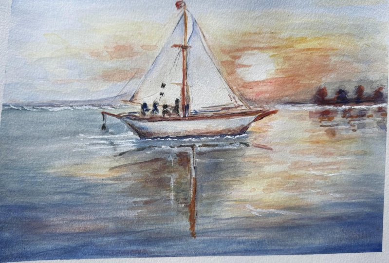
1. Welcome To The Class!: Hello, one. My name
is Will Elliston. And today, we'll be painting a tranquil sailboat
in watercolor. This subject is perfect for learning how
light sits on water, how reflections echo shapes, and how soft edges can create
atmosphere without fuss. We'll keep the
composition simple, focusing on a luminous sky, a quiet horizon, and a clean silhouette for
the boat and the sails. Expect gentle wet
on wet passages, a few crisp accents for rigging, and lots of breathing space, so the painting feels
calm and fresh. I've been a professional
artist for many years, exploring lots of different
subjects from wildlife and portraits to cityscapes
and countryside scenes. I've always been entranced by the possibilities of watercolor. But when I started, I had no idea where to begin
or how to improve. I didn't know what
supplies I needed, how to create the
effects I wanted, or which colors to mix. Now I've taken part in many
worldwide exhibitions, been featured in magazines, and been lucky enough
to win awards from well respected
organizations such as the International
Watercolor Society, the Masters of
Watercolor Alliance, Windsor and Newton and the SAA. Watercolor can be overwhelming
for those starting out, which is why my goal
is to help you feel relaxed and enjoy this medium
in a step by step manner. Today, I'll be guiding you
through a complete painting, demonstrating a variety
of techniques and explaining how I use all
my supplies and materials. Whether you're just starting out or already have some experience, you'll be able to
follow along at your own pace and improve
your watercolor skills. If this class is too challenging
or too easy for you, I have a variety of classes available at different
skill levels. I like to start off with a free expressive
approach with no fear of making mistakes as we create exciting textures
for the underlayer. As the painting progresses, we'll add more details to bring it to life and
make it stand out. I strive to simplify
complex subjects into easier shapes that
encourage playfulness. Throughout this class, I'll be sharing plenty
of tips and tricks. I'll show you how to turn
mistakes into opportunities, taking the stress out of
painting in order to have fun. I'll also provide you with
my watercolor mixing charts, which are an invaluable tool when it comes to choosing
and mixing colors. If you have any questions, you can post them in the
discussion thread down below. I'll be sure to read and
respond to everything you post. Don't forget to follow me on Skillshare by clicking the
follow button at the top. This means you'll be the
first to know when I launch a new class
or post giveaways. You can also follow me on Instagram at Will Elliston
to see my latest works. So let's get started and bring this peaceful moment to life
with flowing watercolor.
2. Your Project: Thank you so much for
choosing this class. I'm really glad you're here. Our goal in this class is to
convey stillness and grace, the way a sailboat holds light and mirrors
itself on quiet water, working with large shapes
and simple values, letting colour drift
to suggest movement, keeping the background
understated, so the boat and reflection
feel clean and elegant. How to mix warm
and cool notes for interest and allow edges to wonder where
the water softens. A few selective accents will be enough to suggest people,
ropes and timber. Think clarity,
space, and rhythm, and let the painting do
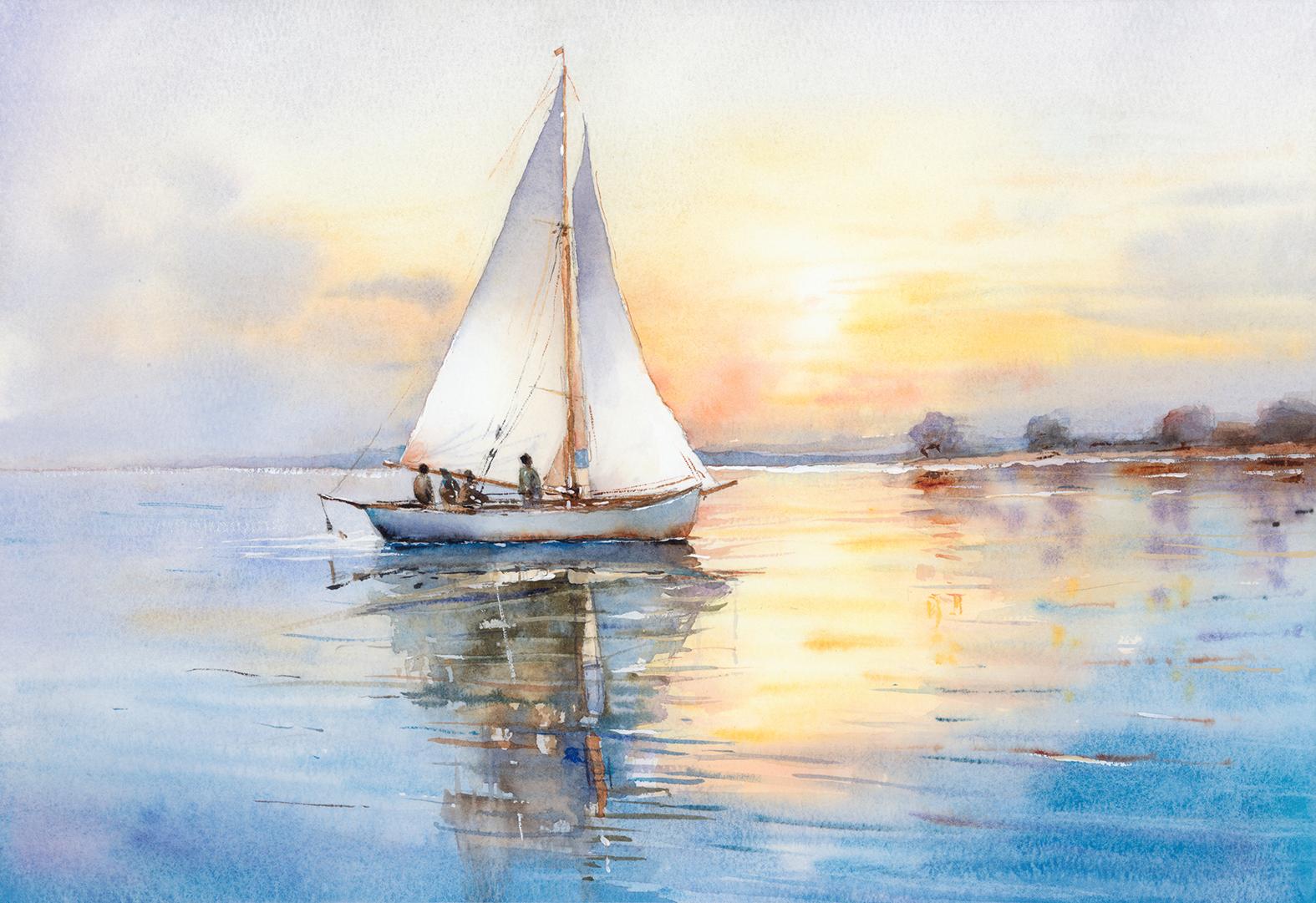
most of the storytelling. In the resource section, I've added a high
resolution image of my finished painting
to help guide you. You're welcome to
follow my painting exactly or experiment with
your own composition. As we're going to be focusing on the painting aspect
of watercolor, I've provided templates
you can use to help transfer or trace the
sketch before you paint. It's fine to trace when using it as a guide for
learning how to paint. It's important to
have the underdrawing correct so that you can relax and have fun learning the
watercolor medium itself. Whichever direction
you take this class, it would be great
to see your results and the paintings you
create through it. I love giving my
students feedback, so please take a photo
afterwards and share it in the student project gallery under the Project
and resource tab. I'm always intrigued to
see how many students have different approaches and how they progress with each class. I'd love to hear
about your process and what you learned
along the way, or if you had any difficulties. I strongly recommend
that you take a look at each other's work in the
student project gallery. It's so inspiring to see
each other's work and extremely comforting to get the support of your
fellow students. So don't forget to like and
comment on each other's work.
3. Materials & Supplies: Before we get started
with the painting, let's go over all the materials and supplies you'll
need to paint along. Having the right materials can greatly impact the
outcome of your artwork. So I'll go over all the supplies I use for
this class and beyond. They're very useful to have at your disposal and will make it easier for you
to follow along. Let's start with the
paints themselves. And like most of the materials
we'll be using today, it's a lot to do
with preference. I have 12 stable colors in my palette that I
fill up from tubes. They are cadmium
yellow, yellow ochre, burnt sienna, cadmium
red, Alizarin crimson, Opramarne blue, cobalt blue, serlean blue, lavender,
purple, Vidian, black. And at the end of the painting, I often use white gouache
for tiny highlights. I don't use any
particular brand. These colors you can
get from any brand, although I personally
use Daniel Smith, Windsor and Newton
or Holbein paints. So let's move on to brushes. The brush I use the most is
a synthetic round brush like this Escoda Purl brush
or this Van Gogh brush. They're very versatile because
not only can you use them for detailed work
with their fine tip, but as they can hold
a lot of water, they are good for
washers, as well. They're also quite affordable, so I have quite a few
in different sizes. Next are the mop brushes. Mop brushes are good for
broad brush strokes, filling in large areas and creating smooth
transitions or washes. They also have a nice tip that can be used for smaller details. But for really small details, highlights or anything
that needs more precision, I use a synthetic
size zero brush. All brands have them,
and they're super cheap. Another useful brush to have is a Chinese calligraphy brush. They tend to have long bristles
and a very pointy tip. They're perfect for
adding texture or creating dynamic lines
in your paintings. You can even fan them
out like this to achieve fur or feather
textures as well. And that's it for
brushes. Onto paper. The better quality
of your paper, the easier it will be to paint. Cheap paper qwinkles easily
and is very unforgiving, not allowing you to
rework mistakes. It's harder to create
appealing effects and apply useful techniques
like rubbing away pigment. Good quality paper, however, such as cotton based paper, not only allows you to rework
mistakes multiple times, but because the pigment
reacts much better on it, the chances of
mistakes are a lot lower and you'll be more likely to create
better paintings. I use archers paper because that's what's available
in my local art shop. A water spray is
absolutely essential. By using this, it
gives you more time to paint the areas you
want before it dries. It also allows you to
reactivate the paint if you want to add a smooth
line or remove some paint. I also have an old rag or t shirt which I use
to clean my brush. Cleaning off the paint
before dipping it in the water will make the
water last a lot longer. It's always useful to
have a tissue at hand whilst painting to
lift off excess paint. Also, you never know when an unwanted splash or drip might occur that needs
wiping away quickly. I also have a water dropper
to keep the paints wet. When you paint, it's
important to have them a similar consistency to what
they're like in the tubes. This way, it's easier to
pick up sufficient pigment. A hair dryer is useful
to have for speeding up the drying time and controlling the
dampness of the paper. And lastly, masking tape. And this, of course, is just to hold the paper down still onto the surface to stop it sliding
around whilst painting. Also, if you plan on
painting to the edge, it'll allow you to create a
very crisp, clean border. And that's everything
you need to paint along. I encourage you
to experiment and explore with whatever materials you want to use in this class. Now, let's get ready to
prepare the painting.
4. Preparing The Composition: This is actually a very
simple composition. We're going to start off
deciding where we want to place the boat using
a vertical line and then where the horizon is in the distance using
a horizontal line. Then we can roughly mark out
where the sails are using a triangle on one side and a bit more of an abstract
triangle on the other side than where the main boat is
at the bottom, not the sails. That's basically roughed out. And then we can put a few trees and a land mass
on the right hand side, and maybe we can very lightly
mark where the sun will be. And we can use the same
shapes as the reflection. And for the people, I'm
just doing little circles. We don't need to put details
into the people yet. Very abstract details
for the reflections because we're going to allow the watercolor to
do its magic there, so we don't need to
add more details. And even with the
people, we don't need to specifically detail them. We just need to
imply figures there, and then we can use big, large brush strokes
to simplify it. I'm also going to use
a ruler just to make sure that horizon
line is straight, and that will be my guide
between the sky and the water.
5. Mixing The Colours: So we're going to
start with the sky, and I'm going to mix
the colors first. This brush I just use for taking the colors
out of my palette. I don't actually use
this brush on the paper. I don't want to dirty one of the brushes that I am going
to use, so I just use this. It's quite a hard brush, so it's easy to scoop
out the wet paint, or if the paint has
dried in my palette, I can just agitate it a
bit to help pick it out. So we start off with
cadmium yellow and a bit of yellow ochre for the warmth
where the sun will be. And for the cooler tones, I'm using serlean blue
and a bit of ultramarine. In fact, if you look, I'm actually using a bit
of all my blues. I like creating a unique
mix just by feel. I'm not thinking I'm using
two thirds of Cerlean and one third of ultramarine. I'm just feeling my way. Maybe add a bit of purple. And it looks very dark on my palette because these
are translucent colors. But when I add water to it later and dilute it across
the whole of my page, it won't actually look so dark, even though it looks black when it's concentrated
like that. So don't be scared of it looking too dark on your palette. Adding a bit more yellow
ochre in that in between pan. We're going to do
a lot of wet on wet when painting the sky wash. So having the colors pre prepared allows everything
to run a bit smoother, because it's all about timing
when painting this wash, especially such a large
area like the sky, where we want to
have cloud shapes. Maybe we want ripples of
sunbeams and things like that. So having the colors
pre prepared allows us to time everything with accuracy rather than
missing opportunities, having to mix whilst
the papers already wet. Now, whilst I've been talking, I'm pre wetting where
the sun will be because although we think
of the sun as yellow, I want the sun to be the lightest part of the
background of the sky. So I'm pre wetting it, and I'm pre wetting
it larger than the area I'm going
to paint because I want it to transition to white. So I have to go further
than the area itself, and I'm allowing that to
soak into the paper a bit.
6. Starting The Sky: Now, choose a
fairly large brush. I'm using this calligraphy
Chinese brush, but you can use a mop brush. This just means that we can get the pigment onto
the paper faster and cover an area quicker than if we're
using a tiny brush, and it means that when it dries, it's going to be
more even as well. Be careful not to paint over the sails because we want
to reserve the whites. We could slightly paint
over the tops of the sails, but we want the bottom of
the sails to be pure white. And see how that dark
blue purple that we had in our palette is so
pale now that it's diluted. And now adding pure water
to transition it downwards. I'm aware of where that sun
is to the right of the sails, so I'm being careful
not to paint over it. I'm starting to incorporate
some of this yellow, this goldish almost
orange yellow. Horizontal sweeping
brushstrokes. I don't mind for this yellow to mix with the blue
because it's so faint. It's almost gray, actually.
But it's so light. It's just because
of subtle hint. And actually, the mindset for this painting for me
personally is serenity, calm. I don't want any
loudness, so to speak. Having these gray elements, having gray almost
muddy colors in there is actually something
I'm not scared of. I can always add a bit more blue and purple like I'm doing now on the top to make sure I don't completely
lose those blues and then we can add
more orange later. But whilst it's wet on wet, we're building it up lightly and I'm not so afraid of
creating a grayish color. Gradually working my way down. Whilst the paper is so wet
and glistening at this stage, we don't need to be
scared about brush marks because they're
going to dissipate and be so soft that
we won't see them. We're just going to
create gradients. But as the paper starts to dry, the brush works will
be a bit more clearer, and that's when we can
start adding clouds. So I've got a bit more
of a potent orange now, and I'm starting
cleaning my brush. I also change to a
smaller brush now.
7. Adding Warmth: Remember, I'm avoiding
painting the sails, and I've got tissue in my hand. So if I do accidentally
go over there, I can tap it and dab it rather and make
sure the sail is safe. But I want to create
consistency both sides, so I'm using the same color, both sides of the
sail, the orange. And then where the sun is, I'm using basically
pure cadmium yellow. But you'll notice
how, even though it's pure cadmium
yellow on my brush, when I use these brush strokes, it actually picks up the orange pigment that I
already have on the paper, and it intermingles
onto the brush. So I'm kind of mixing
the colors on the paper, not on my palette, and that
makes it very harmonious. Bring it all the way down
to the horizon line. Down here at the
bottom, I'm trying to make it pure pigment,
pure warm pigment. So there's no blues at
the bottom here because if we mix blues with
this orange now, it would take that vibrancy
of the sunset away. It's fine at the top
half of the sky, but down here where the sun is, I want to keep the yellows
and oranges quite pure. And you'll notice how the
paper is starting to dry now. It's not as wet. I wasn't so heavy with the water
in this bottom half. So when I apply these horizontal brush
strokes, it's keeping form. The brush strokes
are keeping form, and they're creating
warm clouds clouds that are almost
illuminated by the sun. And I'm adding a few more clouds on the right hand side
than the left hand side, because when the sun is behind all these clouds,
they're more obvious. They're more contrasted. But on the other side, on the other side, we'll
add cooler clouds. The sun will make these clouds warm on
the right hand side, but where the sun doesn't shine, there'll be cooler clouds
on the left hand side. And see that effect that we've managed to achieve
where the sun is, that white space on the sky, it's got that soft transition. There's no hard lines. Do one tiny streak of orange across the sun. By perceivable.
8. Painting The Clouds: Timing can be a tricky thing
when it comes to watercolor. I'm starting to mix a
blue now for the clouds. I'm using serlean blue,
ultramarine blue. And instead of using purple, just a touch of a
alizarin crimson, and that, of course, will make the blues
a bit more purple. And I've timed it so that
these brush strokes will hold their shape and still have
a soft edge for the clouds. And I'm trying to keep my
brush strokes quite organic. There's a little bristle
that's fallen off. That's the problem
with cheap brushes. But that's okay.
I didn't agitate the painting too much,
trying to get that off. I'm trying to keep some of that vibrant orange and then place a few drops
of these clouds on top. And like I say, timing can be a difficult thing because
if I was 1 minute earlier, these dark clouds would blur out completely into the orange and it'll look like a gray mess and there'll be
neither orange nor purple, and it would ruin the illusion. And 2 minutes later, it would dried too much, and there'd be very hard lines. So you've got to look at the
glistening of your paper, and it takes a bit
of experience, but the paper shouldn't
be soaking wet. It should just have
a slight glisten. And it's taken me years to work out something
that I could have just learned quite early on that it's so easy to jump the gun and apply your strokes
before their time. Especially when painting
skies, I found myself, I don't know whether it's due to the anticipation or impatience, but I'd always end up
with muddy skies with strange clouds because I didn't wait that
minute or two longer. And I found that actually, it's better to wait, and if you happen to miss
your opportunity, then it's better to have a
cloudless sky than to have your strong oranges and blue clouds completely
blend out into nothing. Something that I suggest you
do outside of this painting in class is something that
I do quite often, actually, just to familiarize myself with the qualities
and the feeling, the nature of watercolor, is to get a spare
sheet of paper, and papers very important.
I'll come to that in a minute. But apply a large wash like a big sky like
this, very wet. And at the very
top of the paper, apply a brush stroke
like you want to do a cloud and wait a
couple of minutes and then do the next
line down and wait a few more minutes and notice how far you can take it before it's a very hard line. And if you do this a few times, you'll get an intuition to what the timing is and
what the effect you want, how hard or soft you want
your brush mark to be. And Okay, you have to
sacrifice a piece of paper, but your results and your paintings will be much
better because of this.
9. Starting The Water: Now it's time to
paint the water, and I'm going to mirror the colors that we
used in the sky, which is yellow,
cadmium yellow and cadmium red, starting off light. Again, making sure we
don't paint over the boat. We can make it a bit lighter
where the sun will be, too. So achieving these nice
wet-on-wet shapes, these soft, ambiguous clouds and ripples that we're
going to include in a bit. Is getting a nice warm wash
at the moment, very light, just so that we take that
pure white off the paper, really, so that we have a
bit of cream background. I can start adding
very thick pigment. The thicker the pigment is, the more wet the
paper we can get away with because it's
more concentrated. If I diluted this pigment
that I have in my brush, it would spread out a bit more. Just creating the
feeling of ripples. Again, wet-on-wet. And paper makes a
big difference. There's no way I'd
be able to achieve these marks if it
was cheap paper. They wouldn't
necessarily be terrible, but they wouldn't be this quality and they'd be harder to control
and less forgiving, which is fine if
you're practicing and maybe it's in a
sketchbook or you just want to have fun exploring and your
goal is actually to achieve a complete masterpiece that you're not painting through pressure, you're
just having a bit of fun. That's perfectly
fine. You're just kind of getting
used to the basics, and then eventually you can work your way
to cotton paper. But if you're at a point where you no longer consider
yourself a beginner and you can't get
over certain hurdles because the watercolor medium isn't reacting the way
you want to react. It's most likely
due to the paper, because half the pigments I use are student grade
anyway, and very cheap. I don't use all the most
expensive pigments at all. A lot of them are cotton, which are some of the cheapest
pigments you can get. And I don't I haven't found that limiting to the
things that I want to paint. Likewise, with brushes,
this is a very cheap brush, and sometimes I like
using cheap brushes because if I'm using
expensive ones, I might be too
careful with them, whereas sometimes you need to be bold and agitate the paper. So a cheap brush like
this does me fine. Sometimes the bristles fall out, but again, I don't feel like it limits me as
much as the paper does. When you have
cotton based paper, you can start to learn the
predictability of the medium. But when it's wood based paper, pup, I can't remember what all these papers
are made out of. But when it's not
cotton, it becomes very unpredictable and unforgiving
and uncontrollable. I'll create pools
and sharp edges and uneven drying areas that makes it a very difficult
medium to work with. And it can become
frustrating working with it. Because the sweet spot to create those nice ethereal
wet-on-wet strokes that you can create
on cotton based paper is impossible to achieve
with other paper. But like I say, there is a time and place
for cheap paper. I use it very frequently as
well for just having fun, personal, expressive times where the goal isn't a masterpiece. Also, I use it for preparatory paintings
where I'm not trying to achieve a masterpiece. I'm just trying
to get an idea of the composition before I move
on to the expensive paper.
10. Adding Coolness: So you'll notice
in the water area, the orange colors that
we've used so far, I've made sure to use water to extend that wash so
there's no hard edges, so it blends out nicely. And I always do that when I want to create a little
checkpoint for myself, because I'm not quite ready
to finish that area yet. There's a few other
things I want to do before I move on
to the cool colors, like painting the
little skies in between the sails, the
reflections there. And maybe I just want
to take a step back for two or 3 minutes to consider which colors
I'm going to use. Also, I have to mix
the colors right now, which takes a bit of
time, and I don't want to create any hard edges where
I don't want them to be. So just creating a nice
transition out there, it kind of allows
it to flow together a bit more when I
want to reactivate it and I want to
blend back into it. If there are hard edges there, it would look very
strange because the water is meant
to be quite smooth. So I'm mixing a turquoise blue, a kind of greenish blue. It's definitely still a blue, not a green turquoise. And I'm getting using
my favorite colors for that serlean ultramarine and even a bit of viridian
green in there. And the orange wash that we've already got on the paper
has had some time to dry. I don't think it's
completely dry yet. But I'm making sure most of my brushes are either horizontal or vertical because I want to keep in line with
that kind of ripple effect. And if they're diagonal, it'll kind of break that
feeling of ripples. Verticals are okay because
they could be reflections. And to frame the painting, I'm going a bit
darker at the bottom. Using almost a pure green
there, clean blue rather. Using pure water to
soften some edges. Yes, I'm using pure serle I'm using it straight
from the pan really. I'm barely diluting it because
I want to hold its shape. I want to have some
hard ripples there. If it's too hard,
I can just scrub away because it's still
wet and wet at the moment. I'm trying to be a bit
careful with this transition from orange to blue
because they'll make gray.
11. Tree Reflections: Like I said when
painting the sky, the top of the sky
is slightly gray, and I don't mind having a bit of gray there when it's light. But I don't want
heavy dark gray yet. So where the orange
transitions to the blue, we do have a slight
bit of grayness there, but again, that grayness actually conveys some calm because it's like a light gray. This is always the case when using complimentary
colors like orange and blue or with
a sky purple and yellow. And even though we
haven't used it yet in this painting, red and green. If you're mixing those together, they will create
gray or muddiness. But that isn't
necessarily a bad thing. When we want to use it, we
can use it to our advantage. But if you don't want
that to be the case, there's a little trick or tip that I found helps
quite well for me, and that comes down to the the size of the particles inside the
paints, the pigments. For example, the orange that I've used very thin pigments. Even you look very close. You can't even see the particles in that paint because
they're so small. But the cerulean blue, if you look close enough,
very thick particles, and you can even see them
in the water when they dry or on the paper,
they're very large. And because of that, they
dry a different layer. They don't mix and combine with the pigments the same way. So even though you've
mixed and blended an orange and a blue together, because the size of the pigments, particles
are different. They don't actually look
so gray on the paper. Likewise, with red and green. When I use viridian green
here on my palette, the particles again, very big. So when I use a red like capon
or a alizarin and crimson, they're going to dry
in different layers. So even though they're
mixed together, they won't look so green
to an extent, that is, when you're doing large
washes or thin washes, if you're using the paint
very thick consistency, then it will
definitely look gray. Now I've used pure
burnt sienna to drop in a few reflections for the future trees
we're going to paint. I'm painting the reflections of these trees before we're even painting the
trees themselves, because, again, I want to
achieve that wet-on-wet effect. So I used burnt sienna, and now I'm using
violet or purple. Dropping it in quite randomly,
while it's wet-on-wet. And these will blend
out quite a lot. Bringing them down, allowing a few gaps in
between the ripples.
12. Starting The Trees: Now that the sky
is completely dry, we can actually paint the
trees themselves now. And I'm going to start
off with that purple, I think, just to get the general shape
of the trees first. I'm going to add a bit
of lavender into there. But it's not important if
you don't have lavender. It's basically just cobalt blue with a little bit of purple or violet,
if you have that. And the reason I'm
painting the trees blue is because it already keeps
in with the color scheme. We've got a bit of
purple in the sky, got a bit of blue in the water. And anyway, blue colours
recede into the distance, and these trees are
in the background. So although we could
paint them green, the blue actually helps
that feeling of depth. And we might add a bit
of green to it later, using this color at the
moment to help In fact, I'm going to get to add a bit of green now just a little bit. A bit of red, just to add variety and show that it doesn't really matter what
color you actually do use. It's more about the
visual language, the illusion we're
trying to create and the kind of agreement with the viewer that
these are trees. This is a bit of land, and as long as we get the general shape right and the tones right, it becomes a kind of
convincing illusion. We don't have to use natural colors in order to communicate that this is
land and those are trees. Maybe this land goes a bit
more out into the sea, so a thin strip, thin brush stroke can convey that using the tip of my brush. Notice I've left a bit of
white paper where the land is. That gives me a bit of freedom in the future
with what to paint it. See what calls to me in the moment when it comes
to paint that land. Dropping a bit more pigment. I'm trying to make it
feel a bit elusive, undefined, suggestive. And that's because well, for two reasons,
really, it means I don't have to rely
on lots of detail. And this ambiguity actually
adds to the ethereal feeling, that special quality
of watercolor, the mystery, the
excitement of the medium. And it actually gets the
viewer to participate a bit. It makes a painting theirs. Is what makes it engaging. If everything spelled out, then it actually becomes a
bit of a boring painting. So leaving bits unfinished helps you because it means
you don't have to pit all that labor into details, but it helps the viewer as well.
13. Adding Ripples: You can see how each tree
there is slightly different. We've got the first one, which is a bit purple, but it's a very muted purple. The next one slightly green. The next one slightly red. And the last one's a
bit ambiguous as well. I kind of reddish warm gray. And adding those splots of dark color wet-on-wet and then using a tissue
to blot them out. Again, makes them
quite suggestive and implies detail without actually
having to think about it. The water is about 85% dry, what should we say 90% dry, that means I can add these
nice little reflections, these little ripples using
the tip of my brush, which will hold their
shape very well, but we'll have this nice smooth, soft quality to them. With these ripples,
they're going to be thicker and darker, the closer they get
to the foreground, and the further they go
out into the distance, the thinner they'll be. And of course, the
closer they are, they'll be more spaced out. And because as they
get further away, that space, that
illusion of perspective, they'll get closer together. And I'm adding a few
more dense ripples to the left where the
reflection of the sail will be. And I'm using a
thirsty brush here, so I've cleaned my brush
and sucked the water out of a tissue and rubbing
against the water, and it kind of creates
these light lines. I'm agitating the trees now
just to scuff them up a bit. The edges were too hard, and I want to kind of
soften them a bit, agitate when painting this, I'm not thinking about the
exact hue or the exact color. I'm thinking about the
temperature of the color. So for example, when it
came to painting the water, I didn't think I want
a blue color there. I was thinking I
want a cool color to contrast that warm
orange and yellow. And I could have quite easily
chosen green for that. And it would still
have a nice result because green complements
the red quite a lot. And same goes with all
aspects of this painting. You don't have to be very strict with the colors
that you're using. You can shift them as long
as they're cool or warm.
14. Leftside Water: And going beyond
color temperature, one of the most important
things that I'm thinking about before color is tone. This whole composition and painting can work in
monotone, black and white. And because of that, it gives us complete freedom with
what colors we can use. We've chosen purple in the sky, yellow by the sun, and orange, but we could
completely mix that. Maybe we don't want any purple, maybe we want a completely
red sky with red clouds. And a bit of yellow and orange or maybe you want
a very green C, or maybe we want a purple C.
It really doesn't matter. Once we understand tones, it unlocks the key for color. It's ironic that if you're finding yourself
struggling with color, what color to use, or even why don't my
colors look harmonious? A lot of the times the answer
is to strip away the color, think in terms of tones, black and white, and usually that will sort out
the composition for you. Colors don't actually need
to be harmonious to work. What I mean is what I
actually mean is any group of colors can look harmonious or pleasing once the tonal
relationships are sorted out. So I'm using this brush
with a very fine tip. And at the moment, it's a
pure like lavender color. But I'm using the tip to create these little ripple
marks close to the boat, using the white of my paper. So I'm almost
chipping away at it, leaving some white marks there. If you find yourself
accidentally painting over that
area or if you're struggling to control
your brush to achieve those white lines of the paper,
you don't need to stress. You can always rely on the
white gouache at the end, and in fact, I might
use that to enhance it, and I'm definitely going to use whitewash at the end to apply little white ripples in different areas of
the composition. So you don't need to
stress about that at all. It's not cheating to use white guash instead of negatively
painting those ripples. So once I've applied
that cool wash, I'm charging it with some warm colors because that's how you make
it quite dynamic. Going back to the
temperature relationship, when we're doing a
cool wash and charge it with some warm colors, it makes the wash exciting. Likewise, if we do a warm wash, we want to charge it
with some cool colors like we did in the
sky and the clouds.
15. Connecting The Water: A lot of these things happen in nature naturally,
especially with sunsets, we naturally have the
warmth of the sun and the blue of the sky and
that transition from warm to cool the clouds and the reflection
obviously repeats that. But we can be a bit more
expressive with the water because can imagine the water and the ripples distort
what's being reflected. So we can be a bit more playful. But inside this chaos, we have to somewhat anchor it. So you can see the pencil drawing and a few of the warm marks
that we've painted, and I'm adding a
little bit of blue in between this little
gap between the sails, just so that it's not completely chaotic and the eye
understands what it is. And then we can be quite
abstract around it, knowing that we have that visual anchor to
hold it into place. And now I'm just
being playful with the colors with cool colors. So I'm using purple, maybe some greens, some blues. You can play around
with this. You don't have to be so specific. Just because you may use blue in an area that I've used
purple or vice versa, it doesn't affect the
composition in a dramatic way. It's still possible to
create a lovely painting by experimenting and
changing these colors, shifting the hues a bit. I'm trying to match
the direction of these ripples
with the other side, so you can follow this
line straight across. And that helps guide the eye and gives the whole
composition a bit of flow. There's a lot of implied lines going on in this composition. I mean, technically,
you can start from the sky where
the clouds are. It comes swooping
down from the left. If you draw a line on the
top of those clouds going across all the way across
the sun to the trees, nice diagonal curved line. And then it comes back across the horizon line to the
ship, the boat rather. And then it zig zags all across, so it guides your eye all
around the composition.
16. Adding The Land: So I've allowed it
some time to dry, and now we can go back in and paint some ripples, like
we did on the other side. I've changed my brush to
It's a smaller brush, but it still has enough to
pick up a lot of pigment. But what I like about it,
it has a very fine tip. So we can add some
nice sharp ripples there using a thicker pigment. Again, looking at what ripples
there are already there, the soft ripples that
we applied before, and kind of adding
to that direction. Maybe some in the
distance there. This helps give the painting
a bit of depth because we've got some nice sharp
ripples in the foreground, and then the spacing of them changes as we go
deeper into the painting. Now I'm applying a thin
line, a warm line, a bit of red and mixed
with burnt sienna, just to imply a bit of land
mass there in a very distant. You could experiment with
not painting horizon. Maybe the sky seamlessly
blends into the water. I just wanted to add
some distinction to it. Keeping it nice and
soft so it blends out. I feel like this helps the composition and
makes it feel more grounded because we've got a kind of X structure going on. We've got the horizon going, of course, horizontally
from left to right. But then we've got the sails the mast of the
ship of the boat, however, going top to
bottom vertically. And that creates kind of X, which is a pleasing
grounding composition painting a little bit in
between the sails there, but I don't think
I like that color. I'm going to come back later on actually to paint the sky
in between the sails. Now I'm mixing this brown and
I think that's the color. I'm going to paint
the ground, doing a light little glaze over the white of the
paper where the land is that just makes
it glow a bit. Brown is in the orange family. So with all this blue going
on in the composition. It works well. It
works well together. Then we've got to agitate it
and work it into the trees, but moving on to the water in between the
sails and the boat, getting rid of the
whiteness of that paper. It's a small little detail. And now we can start
painting the boat.
17. Starting The Boat: I'm going to use the blue
that's already on my palette. I want on this right hand
side to be dark onto light. Then on the left hand side, it will be light onto dark. So there's a bit of
a transition going. Notice that it's also
blue onto orange. I can use pure water to
wet the left hand side, so we don't need
to use pigments. The whole of the boat
at the moment is wet. Actually, although it
would be nice to have a transition from light to dark and dark to
light on the boat, I want to make it a
bit simpler actually. So I'm using a brush just to scrub out some
of the background, using a tissue to
lighten it a bit. Notice how I wet a larger area than the intended area just so there's no
hard edges again. And I've made the
water a bit lighter so that the whole of the boat
now will be dark on light. I can use the same blue and
wet the whole of the area, and then we can
start dropping in color or tone, as I should say. Because again, even
with details like this, I'm thinking in tone, using cobalt blue as a base color and then
using neutral tint. I don't want to use
pure neutral tint because I want to make
it a bit more exciting. That's why I had a little
bit of blue in there, and I just draw that in, charge that into the bottom. And because it's already wet, it'll gradually flow upwards with a little bit
more encouragement. I certainly dropped
a bit of water. The problem with using
small brushes like this, I try to not use any brushes smaller than
this particular one. Even with this one, it
can be quite tricky because you're constantly
having to load up your brush, and if it ever gets overloaded, then it splats and drops
onto your painting, and that's already
happened a few times. But for a detail like this, I quite like it because
it has a nice fine tip. So we can start moving
from left to right, using a tissue to dab
out if we over paint. Notice how I've left a tiny little white
gap in between the top of the boat and
the water above it. That's just an easy way
to indicate and define where the end of the
boat is and the sea begins without having to
add a lot of a detail. Using warm colors on
the right hand side. It's always darker
at the bottom. So we can start off with a
nice confidence stroke and then add water on top so
that it blends upwards. That warm color is Burnt
sienna and a bit of red. And crimson, and I
just clean my brush, and I'm just dabbing
it with pure water and encouraging it to go
upwards by itself, allowing it to flow upwards. I won't happen straight away. You got to give it time
for the pigments to move. Then maybe you can drop a bit of coolness where the red is or
where the warmth is rather. Again, so all those
warm pigments blend around with
the cool pigments. And as long as the
tones are correct, it'll visually make sense.
18. Adding Some Lines: It's another area where you can experiment with
different colors. Maybe you don't want
to use brown and blue. Maybe you want to
do green and red. Maybe you want to do
yellow and purple. Maybe you want to do brown and green or whatever color
combination, you can experiment. And you can see,
as long as you get the tones correct,
it'll make sense. You can make the boat
whatever color you want. It's your boat to design
however you want to design it. And that goes for the
sales will paint later. I'm choosing to keep
the sails white, but now that we have
those sails white, we can actually use
the whiteness of that paper to paint any
color sail we want. Maybe we want the transparency of that whiteness to
make a nice strong red, some strong red sails or green sails or
yellow sails, even. I just dried my brush, and now we're painting
using dark, thick pigment. Again, it doesn't
matter what, as long as it's dark and thick,
it can be black, it can be even ultramin
blue or burnt sienna, because when you use those pigments with
thick consistency, they almost look black anyway. And painting, I don't know
the anatomy of boats, but some of the
ropes on the left, and I've added a
little thin black line to indicate the other side of the boat just above
that white gap.
19. The Left Sail: Now it's time to paint the sail, and I'm going to keep it white, but I still have to
affect the tones and alter the tones to give
it a sense of realism. But you can do the same process and make it a different
color if you want. The whole idea with
this sail is to have it light on the bottom against the darkness of the background. And then as it transitions
upward to a lighter sky, you're going to
have a dark sail. So we've got dark on
light and light on dark. So I'm pre wetting the
whole of the area first. If you wanted to add
your own color to this, you still have to wet
the whole of the area and then you can add a
base color if you want, like yellow ochre, if you want
to make it a yellow sail. I'm mixing a purplish blue
starting from the top down. I've got pencil
lines to help guide me because it's already pre wet. We don't have to worry so
much about the transition. I already nicely transitioned. Nice fine tip at the top. Then gradually we can start
making the wash a bit weaker. On the left, we can
define that edge. Even though it's a purple, it's quite grayed out. It's like a nice cool
gray. Clean my brush. Now I can start improving that transition a
bit with pure water. Bringing it down a bit. I decided I don't want it a pure white because it just
doesn't look natural. Really, the whites that we see in real life are actually
the lightest colors. At the moment, this white
is equal to the sun, which is meant to be
the brightest thing, so I have to tone it down a bit. I'm adding the same kind
of orange that is in the sunset and mixing that
in so it transitions nicely. The key to a clean transition
is keeping it even. You don't want certain
areas to dry completely whilst the other half of the
transition is still wet. And you use your brush to help
monitor and control that. So if you're finding there's
too much liquid on one side, you can create a thirsty brush to draw out some of that liquid. And if you need more time, if you don't want it
to dry that quickly, then you can apply
a bit more water. But you don't want to serge
it with water because then it will create unevenness. So in this bottom
left hand corner, adding a bit of orange glow, maybe where it's aged a bit or where all the creases come together and it
makes a bit darker. So now that it's dried a bit, I'm adding a few
lines where these creases in the sail might exist wet on wet lines,
so they're soft.
20. The Right Sail: Now I can start working on the other side.
The same concept. But this time, I'm not
going to pre wet it, so you can see how to
do it the other way. So again, filling up
the top area with that same kind of
mid tone cool gray. Start bringing that down. And as we do that, we can
add a bit more liquid, clean the brush, add the water, more diluted, bring that down. Clean the brush and repeat. That's pure water
down at the bottom, and now we can
gradually transition. See how I dabbed the sponge
on my top right hand corner just to monitor the moisture.
There was too much. So I'm drawing it out.
Filling the area, using a tissue because
it was too wet. I think for this one on
the right hand side, I'm not going to add that brown. I want there to be
high contrast there. But we can still
darken the corners a bit and maybe take some
of that whiteness away, but not as much as
the other side. So it was dabbing a little
bit in the corner there. A bit of brown. That's too much. Dab that away a bit,
clean my brush. Bring it across a bit.
Barely noticeable. Just taking some of
that whiteness away. Maybe adding a bit of
warmth. Just a little bit. It's one of those things
that it's not noticeable, but it does make a difference.
21. The Mast and Rigging: Now I've given it some time to dry and we can start painting some of
the sharper details, starting with the
little flag at the top, which is just a little triangle. Bit too strong,
so dabbing it off using the tip of my brush. It's just a nice kind
of wood colour brown, which is basically an
orange, a muted orange, painting the mast I of course, in between the sails,
helps differentiate, bring stability to it. Doesn't even need to be
a strong straight line. There's a bit of a
curve on the left of it where the sail can
be overlapping. Now I'm applying a
few horizontal lines where maybe the mast is
giving support to the sails. A few dry brush marks to give
the sails a bit of form, applying a bit of curvature. Very thin lines because the
boat is the focal point, so we need to be sharper
with our details here. And I don't mean you have to put loads of
precision into it. I just mean more
sharpness, more texture. We can even use dry brush
to imply some details. Instead of painting
all the rigging and whatnot or what's on a ship, we can just use a
thick dry brush mark to imply lots of bits and bobs around Then there's a very, very thin line that goes parallel to the
edge of the sail. A little bit of rope or string
that follows the sail up. It's almost a detail that you don't need
to put in, actually. Then a bit of wood at
the bottom of the sails. It helps differentiate
the sail to the water and it creates
a nice bit of contrast between the dark and the light and helps the eye focus
on this focal point because the use of
lines are really nowhere else in the painting except this center
of attention here, concentrating on the figures.
22. The Figures: Okay. Paint the
figures now starting off with a kind of
background wash, using the same brown, actually. There's three or so
figures, I think, and we've got one primary figure to the right and two
kind of obscure, ambiguous figures on the left. So we can keep the ones on
the left brown so they kind of fade and don't
steal the attention. And then with this
main one on the left, we can make a bit more contrast there using a bit of green. We haven't used green anywhere
else yet in this painting. But because there's
red in the sky, we can use green perfectly well because
they look nice together. And by using green
on this figure, it gives us an excuse to make the reflection interesting
and fun as well. We can add green
to the reflection. I'm keeping the forms
very simple and easy to read, ambiguous. I'm just dropping pigment in, basically creating a silhouette, and then dropping pigment
in areas of interest. So the head, maybe the trousers, so we can differentiate the
torso from the trousers, maybe where the arms are. But because it's wet on wet within the silhouette
of the figure, I kept quite ambiguous. As long as the
silhouettes are strong, we can get away with a lot
of mess and randomness. Because the eyes recognize the silhouette quite
clearly as figures, and that's good enough
to trick the eye, so we don't need to paint a fully formed
rendered human being. We understand that as a human. Painted. There's a little
rope on the tip of the boat going into the water where the
anchor is connected. I just painted the reflection of that rope with anticipation to painting the rest of
the reflections later. When it comes to painting the details on the
boat itself, luckily, because of the perspective that we're looking at
it at this angle, we can't actually
see inside the boat, so we don't need to
paint all the details. We just have to do a lot
of thin horizontal lines, and that kind of creates
the illusion of things, maybe a few dry brush marks. We can enhance that mask
to make it a bit darker. I
23. Starting The Reflections: Now we're going to start
painting the reflections, beginning with the top
and working our way down so that we can use the flow of water to go downwards. I mix a medium thick, like a creamy kind of pigment. Blue. I'm going to use a
deep, kind of greenish, slightly greenish blue
thicker than I want it to be so that I can charge it with water
and bring it down. And I've left a
minuscule white line, even a broken white line. It's so thin between
the water and the boat. And that's because
there's going to be a little ripple of reflection where the
water touches the boat. And I clean my brush
using pure water, and now I'm just touching that, and it's going to flow
down and we're going to allow the watercolor
to do most of the work for us in
filling it out. One of the reasons I used
brown for the boat above is because I was aware I'm going to use a nice blue for the water and
the reflections. So having them next
to each other like that in the vocal
area creates a nice, like, atension grabbing
area, which is what we want. And the combination of blue and brown works
so well together. If I wanted I could have changed the brown to red
and started with green. And that would have
created a nice dynamic and attention
grabbing scenario as well. I'm using a bit of dark
pigment just to drop in some elusive shapes. I want it to be very
dark in the area between the boat and the reflection where the water meets the boat. Where that white line
is, I'm just dabbing some thick black pigment
in between that area. So again, we've got a nice contrast between the darkness and the little
white reflection bits. And now I'm going
to start mixing the main reflection a bit. I mix quite a lot on my palette so that I can
always come back to it. And I'm using green, which kind of hints at the
green figure that we've used. Of course, that green from the figure wouldn't create a
reflection quite this big. But because we've got
so much red in the sky, the screen looks so lovely. Starting with a
thicker pigment and then using that as a base, then we can connect
it to the blue above and allow the watercolor
to blend it by itself. Using a bit of
cerulean blue now.
24. Creating Interesting Textures: When I want to create interesting
textures with watercolor, I do the complete
opposite of what I'm trying to do when I want to
create a nice clean wash, which is create a
lot of imbalance, some dry areas, some wet areas. So I start off with a lot of thick pigment and
then serge it with pure water or a very
very diluted wash and then agitate
them in between. And then as they're drying, I agitate them even more. And that's how you create these spontaneous
looking effects. I just applied a mix of yellow
ochre and burnt sienna. And you can see how actually these reflections don't
match what's above, but somehow it still works. That's fine because we're basically keeping to the
same triangular shape. We're just distorting
it a bit more. Following the ripples that we added before when
painting the water. So when it comes to this stage, other than trying to
keep a rough kind of triangle shape that
mirrors the sails above, I'm actually purely
thinking of how to create interesting textures because if you look at this area
isolated, it's very abstract. It's nothing in particular. There's nothing that you can
grasp and make sense of. So this is the area where we
can have fun and be loose. There's just a few areas within it that will help anchor it, such as the little gaps that I'm saving in between the sails, where the sun's peeking through. And there's a little gap
between the boat and the sail at the top that I'm keeping the
lightness of the sky in, which will make more
sense if you look at the final image because it's a bit difficult
to see at this stage. If you look, you can see these little ripples
that I'm adding. They're consistent with the
flow of the other ripples, like I just said, and that
helps anchor it, too. So even though it's abstract, it's kind of a
grounded abstract. It's no detail, but those little wet-on-wet lines continue on from the other ones, the ripples that we painted. Along with little gaps. There's a few little
white gaps that I've left unpainted that roughly
match those ripples, too. So we're moving on
to the other side. Similar idea, we can just
vary our colors a bit.
25. More Ripples: When I first started to paint, I had a tendency to get
really close to the painting, lean in almost so my eye was just a couple
of inches away from it. And I learnt that
actually created bad habits because
then you find yourself focusing on small little
details rather than the idea of capturing
the essence and learning to be economical
with your brush strokes to create the message
a powerful message with the least amount of
brush strokes possible. Not only does this make the
painting process quicker, but it makes it easier on their eyes and more
captivating for the viewer. And I've learned by keeping my head back by not zooming in, not looking very close. I've trained myself to see things from the
bigger picture. And that's really helped
my compositions to become unified and connected with a
sense of unity and rhythm. Especially for the
details where you'd think getting closer would help. Ironically, that is
the time when you need to step back and
paint from a distance and only put enough
information in to suggest what you're trying to paint without over
describing it. A bit like a story or a book. You don't necessarily
want to read pages and pages about a description. You just need the description
to enhance the full story. The full story is what
we're trying to convey, people on the boats
during sunset, not what the exact kind of
rigging or ropes are involved, or how many exact
leaves on the tree in the background and leaning
back helps paint that. Also squinting helps as well. Dropping in a bit more pigment where the reflection
meets the boat, where the water meets the boat, because that's where
the reflection will be darkest, really. And I'm using a
scraper palette knife. You can use a toothpick
or a nail or whatever, maybe a blunt knife, just to scrape out some of the pigment to create that
illusion of ripple as well.
26. Some Refinements: And now we're coming close
to the end of the painting. This is the area, the time where we've
got to ask ourselves, what more can we
add to enhance it? And if we add more, will it actually
start taking away? And when we actually get to
a point where we're actually making it worse than improving it, that's when we should stop. And sometimes that's
difficult to work out, especially if you're
starting off, if you're still learning
and getting grips to it, maybe you have to
disconnect when you feel like you're
in that gray area, that gray zone where it's almost finished, but
you're not sure. You can I know it's difficult, but just take a step back
at least 10 minutes, maybe even a whole day, if you can, come back. Of course, that's not
always realistic, but sometimes when you were
in the painting process, it's understandable that you
get very absorbed into it and you almost get
tunnel vision, and it's something
that I do a lot. And there's really no need
to render everything out. And a lot of the time, the things that look like
mistakes now actually become the more exciting parts later on once we've
disconnected from it. We end up seeing more in our
painting than we do now. So I'm just adding
smallest little nuances, maybe refining a few little
things with a tiny about, nothing big, enhancing rather
than editing at this stage. Making sure the focal point
is the star of the show, which is that figure there. I think I'm going to
add a leading line or at least a directional
line by adding a little shadow or something on this sail that is
directed towards him. So the eye naturally goes
a bit more towards him. Then we can dry it off and
apply the white gouache, the opaic paint, adding a little fine line
where the land is. I guess not really necessary, but it adds a little bit of that sensation
of water of ripple. Then next to these
dark little ripples, we can sparingly
add a few lines, maybe define that area there, the white gap in between
the boat and the sails. Make more sense of this chaos. If when painting the water to the left of the
boat next to the boat, you couldn't manage to paint
those little ripples before, you can go back with this
white watercolour and paint those little ripples
right next to the tip of the boat,
the front of it. But other than
that, that's done.
27. Final Thoughts: Welcome back and
congratulations on completing this class on how to
paint a sailboat scene. I hope this made you feel
relaxed and comfortable, as well as inspiring. We explored how
reflections echo shape rather than detail and
how soft lost edges, paired with a few crisp accents create atmosphere and focus. We simplified with
big value shapes, saved clean paper
for sparkle and let restrained color
suggest space and quiet. The same ideas translate
beautifully to harbors, lakes and rivers and to
any subject where clarity, rhythm, and reflection matter. Remember, watercolour
painting is not just about technical skills, but also about expressing your creativity and
personal style. I encourage you to
continue exploring, experimenting and pushing
your boundaries to create your own unique
watercolour masterpieces. As we come to the
end of this class, I hope you feel
more confident and comfortable with your
watercolour painting abilities. Practice is key when it comes
to improving your skills, so keep on painting
and experimenting. I want to express my gratitude for each and every one of you. Your passion for watercolour
painting is so inspiring, and I'm honored to
be your teacher. If you would like feedback on your painting, I'd
love to give it. So please share your painting in the student projects
gallery down below, and I'll be sure to respond. If you prefer, you can
share it on Instagram, tagging me at Will Elliston, as I would love to see it. Skillshare also loves
seeing my students work, so tag them as well
at Skillshare. After putting so
much effort into it, why not share your creation? If you have any questions
or comments about today's class or want any specific advice
related to watercolor, please reach out to me in
the discussion section. You can also let me
know about any subject, wildlife or scene you'd
like me to do a class on. If you found this class useful, I'd really appreciate
getting your feedback on it. Reading your reviews
fills my heart with joy and helps me create the best
experience for my students. Lastly, please click
the Follow button Utop so you can follow
me on Skillshare. This means that you'll be
the first to know when I launch a new class
or post giveaways. I hope you feel confident
painting light, water, and reflections. I look forward to seeing you in future classes until
then happy painting.
 Will Elliston, Award-Winning Watercolour Artist