Transcripts
1. Introduction: Hi, and welcome to painting. A river seen in watercolor, layer is filled with
all kinds of surprises. The structure has also complexity
and variation in rocks, trees, leaves and branches. Water is involved. It can often be tricky to paint. It can shift in tone and color depending on
the surroundings. In this class, we'll be
learning how to paint all the above elements
side-by-side. Learning how to combine
elements of a scene together by creating soft
or hard edges is crucial. It creates continuity
and connectedness. This is an important
feature in nature. We're interactions create
a sense of harmony. But how do we make
those connections by using a brush and paint? Understanding how
to plan and compose your painting from a sketch
is crucial in the beginning, he creates a foundation, a blueprint that
allows you to focus on painting techniques
and detailing. There are only two
main techniques you need to know in watercolor. Wet in wet and wet on dry. Both the crucial and by
the end of this class, you'll feel confident and
applying them to any landscape. So join me in this class. I'm excited to get started
with you to show you all the best kept secrets on painting and
amazing reversing.
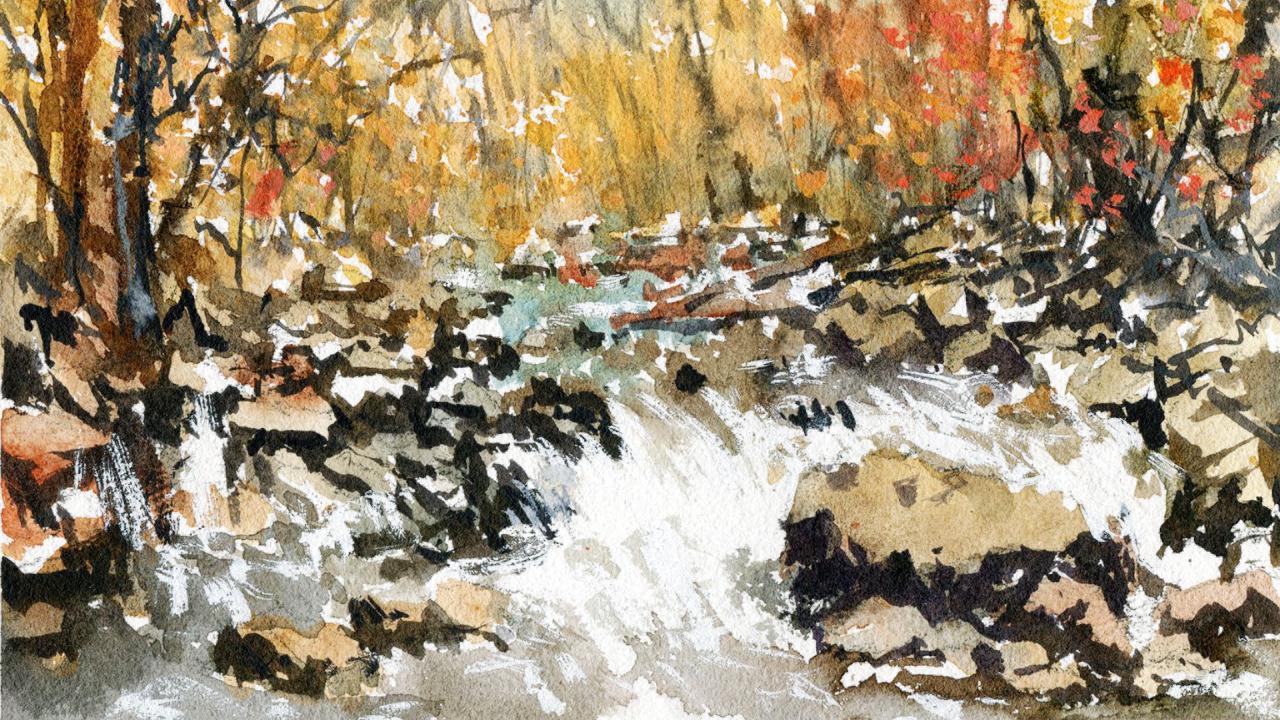
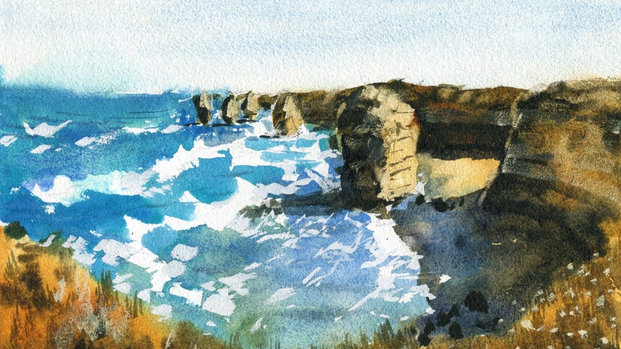
2. Drawing: Starting with the
drawing, is one of the most important aspects of painting and making sure that you've got
a good planning. And especially with
this scene here where we've got quite a
complex looking scene. We've got all these rocks, we've got trees in
the background, but mainly the rocks. And we've got the
water also just rushing down over the top
of some of these rocks. It's really important to plan this out so that when
you start painting, you're not thinking about all these aspects and
where they fit in. The easiest thing that
I always start off first is I look at
the big shapes and the separation between
the sky and the ground down through difficult to see the sky here that I
think it's even visible. But what we can
separate out is where the treeline starts or where the trees hit the
ground and where the grad is. Kinda of having a look
through the scene. I can almost say that it's about a third
of the way through. You can see all the
way in the back where those trees with the orangey, yellowy leaves off in the back, they finish off just around a third of the
way through the page. So about two-thirds of the page, we basically all
of these rocks and this stream of water
coming through, but we've got a little bit of those trees in
the background now. There's a bit of
leeway here as well. You can change it up, you can lower that further down if you want to make
the trees more of a, a piece in this
particular scene, I'm going to try to
keep it somewhat faithful to the reference photo. So I will add in that
line roughly about here. Okay, so again, about a third of the way from the
top of the page, I want to make sure that
there's enough of those. I want to make sure
that there's enough of those trees as well because you I think they just create a lot of
interests with the color. Go ahead and just put in a
bit of a line like that. Notice when I'm drawing as well, I'm using like the edge of the pencil and I'm holding
the pencil near the end, I will actually
draw a little bit darker for your benefit. Normally I draw pretty light, but just with a camera, I will draw a little bit darker so that you can
see what I'm doing. So the ego can see that line roughly about
a third of the way. In this case, it's actually a bit more than a
third of the way, but it doesn't matter. Let's have a look now. I know that there's a whole
bunch of these rocks in here. And we can start off
probably by just creating some of these leaf
shapes that are closer to us. So we've got a tree runs up like this. You
just get that in. Just comes out of
the scene like that. There we go. Just to this shape just
running up like that. We've got another tree kind
of running out as well. I mean, down here. There we go. It's another tree there, like a tree trunk or what? Have you got a bit of a branch coming off to
the left there as well. We've got a tree also
coming over here. The great thing about natural
landscapes so that you can really just pick and choose
what you want to include, exclude the branches and
everything like that. I don't have to be
perfect because trees come in all different
shapes and sizes, so there's no need to
overthink it at all. Although this area just kinda be an orangey mix in some greens in there
as well to keep it, keep it looking interesting,
but I do want to preserve some of these
beautiful warm in here. I may even emphasize a bit more coolness
and the water is in greenish type of color here, but I will perhaps potentially adding a little
bit more blue in here. Already. In this stage of the painting,
stage of the drawing, I'm thinking about different
compositional aspects and thinking about
how I'm going to, I'm going to follow
through with the painting. So I think it's really important to spend your time with
the drawing and do some of that thinking already so that you've got a
bit of time later to focus on the other
aspects, mainly the painting. So you can see here there's just these larger
bundles of trees, foliage here in the background. Okay. I like that. You've got another tree
coming out like that. Again, this is pretty
simple because I don't want to make this drawing. Again. This is more of planning. Some of these trees.
You can notice them. They're kinda coming
in on a bit of an angle just branching
over to the left. I like that sort of that
feature there it's written notice not so much of an
angle as I've drawn it. You've got a few more here. There's one coming up like that. Let's just get something
like that in there. There's one there's a few
more in the background. And look how quickly I'm
drawing this in as well. I'm not spending all day
trying to work this out. I'm just picking out a
few trees that I like. And later on I can
just add in some more. Okay, but just
having a couple of them that are a little
more detail does help. And I'm also creating some
negative shapes for later with a bunch of
these tree trunks. I think just making sure
that you leave them white. And then you can add
in some more colors and stuff later on or just leave them white helps contrast
against the background. There's all these little
twigs and things you can see. I'm just coming in
from the side here. This is interesting.
Again, a lot of this stuff I'm gonna be
doing with the brushwork. Okay, but let's go here. Let's sort of getting some
of these rocks as Iraq here. There's one here like that. I'm just spending some time
planning this one out. As we get closer to the foreground or the midground really that we're looking
at at the moment. Notice that the rocks just
start to increase in size. The light as well seems to be coming from directly above or
perhaps above to the back. So you notice there's actually the shadows cast over
the front of the rocks. So you need to keep
that in mind as well. Let's have a look
some more rocks here. You can make them a bit more exaggerated as well,
just like a trunk, a tree trunk that's
fallen into the ravine and put that in
quickly like that. Some more rocks and look at
how they overlap as well, making sure that you've
got a sense of continuity. In these rocks case. You've got just this bit here, this one joins onto this
other rock here like that. And you can even just start
doing a little shading. And that helps. Just, that already kinda
helps you start planning. So I always like to do that. A little bit of
shading Here, here. Larger rocks over on
this side as well. Of course, one of the biggest rocks that we have
is over here in the water. I'm gonna just draw the
one behind it like this. And then you've got this
larger section here and again, loosely basing it
on that reference. This large one. Look at that. It's like just start
off simplified down. What does It's kind of
like, it's almost like an oval shape on this
rectangular overly. Think that just start drawing the bit that's
in the light first. It comes down and tapers down
to a smaller point here. And then we've got
a share shadows. The in front of this rock, there's a white, lighter
colored rock here. Okay. I have not left enough
room here at the bottom. But that's okay. Because because I
made that tree line a little bit further down. Another rock here at the
base and another one, of course here as well. Just kind of overlapping, overlapping shapes are so
important because they create the illusion of
depth in a painting. So you need to make sure that
you have that portrayed. Here we go a little jaggedy
bit then sort of shadow again from that
rock because we've got the light source
coming from behind. A bit of shading like that. Just to save yourself the trouble later
from having to figure out what's what is in
front, what's not. And you know, you
can just get that in with some watercolor
is pretty dark. There's a bit of texture
on top of that rock, but I'm not going to
bother too much with it. The main thing is
get that outline of that rock in fairly accurately. Especially when
you're dealing with shapes that are
closest to the front. You do want to make sure that you're spending
more time with the detailing. Okay, because often you'll find, if you make everything in the foreground a little
bit more detailed. Again, it just helps with
that depth perception. And this also does happen
when we look out into scenes and we're looking out to a mountain range
or something like that. You'll notice that as you
move to the distance, things get more blurry
and less detailed. So we need to portray
that as well when we are doing our paintings
if you want to maintain a sense of realism. So there's another
rock or something. This one is so well,
but it doesn't matter. We can always change
it up a bit later. Again, some of
these rocks here is really big rock and
you can see there's some water and some white sort of gushing water behind there. And let's get this other
rock coming out like that. This is a darker rock there. Alright. The point is, don't
over think it there. Don't ever think it's just getting a shape that looks like a rock and carries over into
the background like that. This big one I think is really important because
that's the centerpiece of the scene and you've
got all this water coming behind it as well. This can be interesting
line with the water. We're going to have
to leave a bit of the white on the paper so that
it just looks a bit more, a little bit more realistic. So I'm going to turn out sort
of pencil in roughly where the water is hard to
exactly put place it. But you can see here
that's maybe a bit of where the water
starts rushing down. Here. Got larger rocks over
on this side as well. I've been messing around with
some of these rocks here. On the right-hand side. I may just quickly drop
in a few more like this. We can just figure this
out later on as we go. Um, no big deal. Again, just smaller ones
here really helped add to this detailing and overlapping as well, overlapping quality. And I always try to look at the reference and pick out
a few rocks that look at touch different because I tend to repeat the same
shapes over and over. If I'm not careful. In nature, you don't get often these types
of scenes anyway, you might get a general
repetitive structure, but all the rocks are
different in shapes, so they vary slightly. So to keep things interesting, you gotta do the
same thing as well. So there we go. I think that right-hand side looks
pretty good for a plan. And let's work on
this left-hand side and we'll do this quickly and
hopefully get started soon. There we go, the big big rock, but it's kind of sitting up
the top there like that. There's a rock here, these slabs of
rock, interesting. I like that. Bit of darkness
underneath like that. And then here we've
got another kind of a white edge rock or something
coming out in front here. Rather than looking
at the atom is rock. So just look at them as
shapes and the tone, whether it's light or dark. It's the most important thing. Like a tiny little bit of
water falling down like here. This is kind of an angular
type ROC looks like it's got a darker shape here. Like that. You can figure this out. A lot of this on the
way, but just getting a few bits and pieces
like that does help. Okay. Then you got to just
darkness underneath in here. There's like a platform
there and a bit of water running downwards
there as well. I'm a bit more of like a little
bit of water running down here to more water. This sort of hits like a rock here and a bit of
water coming down. There is a larger
sharp edged rock here with another one
here in front like that. There we go, again using
the shading technique. There. Another one here in the water. Let's have a look. There. You go. These flats, sort of rocks here in the water. A lot of them are obscured with water just
rushing over them. The difficulty, I think in this scene is getting
that motion of the water. It's going to be tricky, but I'm going to show
you how to do that. And a lot of it
requires just a bit of self-control in letting. Leaving those white
bits of white paper. And cute because some more
rocks here and they kind of just join up and they sit
on top of these ones. Okay. It doesn't
have to be perfect. Just get that. A few of
those little shapes in here. Here's another one there. You've got these rock
sitting in the water. Okay. As well. There. What what else do we have? They kind of go up a
bit further. There. Another slab, larger
slab over here. Okay. There, there. We are pretty much
done with the drawing. I'm just going to
emphasize this tree here. Because I think, again, like I said, having a few trees that just look a
bit more detailed. And this is really
just a guide for me to cut around that tree
later so that I don't miss out on
it. It really helps. I think that's pretty good. I think that's pretty
good for a drawing. Let's go ahead and get
started with the painting.
3. Painting Light: To start off, I always like to get in all the
kind of warmer colors. And that includes the slides
kinda warm from the rocks. It's very subtle,
but these bits of lichen and brownish colored, maybe even yellow ocher
colored rocks as well, but mainly the leaves. So we've got a lot of a
lot of that foliage there, which is orangey
yellow in color. And I've got a couple of
mop brushes I'm going to employ such as these
two little ones here, can probably going to use the smaller mop
brush to begin with. And what we'll do is, I'm just going to
begin with a bit of quinacridone, red, orange. If you just use any
orange that you've got. This is very vibrant, so I like to mix in a bit
of yellow ocher in here. Remember at this point
of the painting, you're really just trying
to get in a light wash. So concentration of paint I'm
using here is mostly water, 80 per cent water, if not more. And just drop it in like that. Nothing can do in this stage. You can just tap that brush on like
that and look at that. And you can create these
little impressions of leaves, very quick little impressions. I know it seems a bit haphazard, but really it saves
time and it just creates some different at different looking
shapes in here. Okay. So a little bit of
this tapping and if it goes down further into
the rocks, no big deal. Just let it, let
it do its thing. But I find these tend
to dry a little bit differently and create some
interests which I like. So continue on. Don't forget back here as well. There's some bits and pieces. This can be really messy
and I don't do this all too often actually because
it goes all over the place, but, um, I think it makes a
difference just a little bit. And of course we're
going to start putting in like larger shapes of these, which you call it these leaves. So I'll just drop
it in like that. And the reason why I'm doing
all this warm stuff versus because if you start
putting in all the greens, you're going to very easily lose sight of all these warmth. So I tend to drop this in first and then work around
it with the greens. We're just going to
be darker than this Brown's as well in
here, bits of gray. What else do we have in here? Really just this, even perhaps a bit of coolness
that I could imply, like I could add
in a tiny bit of purple for some of
the darker areas. It's not there, but of course, like having some
cornices I think would look nice, just helpful. Having a contrast in there. So there we go. Just dropping in
some of this paint. This is all just, as you
can see, quite quick, little sporadic
bits, bits of paint, and I'm dropping it in
very quickly as well. I'm not spending all too
much time doing this because I find with enough with
these nature landscapes, the more you start fiddling around with
all of this stuff, it just becomes just
starts looking unnatural. She could just go with
it, go with the flow. Bit more of this stuff here, bit more orange, a
little bit more yellow. Okay, drop that in here. K. Let's see where else
can we put some of this here as well? Just maybe near the
water, maybe the trees. You can see here that
they're starting to come down a bit. The more hansa yellow, this is a kind of
a vibrant yellow and I'm missing
some of this stuff. Tiny bit of this vibrancy here. More water with that. I'm here, Okay. Here. Bit more vibrancy,
bits and pieces. It doesn't look all the same. More yellow in here.
Hansa, Yellow. Great color. To increase that vibrancy. I used to use it too often actually in my paintings
in the beginning, putting in Hansa yellow
everywhere and it would overwhelm my paintings with
just too much vibrancy. These days, I tend to just try to simplify and
use less colors in my work and focus more on the tone and the
story that I'm telling. I find that freeze my mine
up to to work on the scene. There we go. Just a
bit of color there. Okay. So it's all starting to, start to slowly come together. Of course, one of the things to do as well as we did
talk about the green. So I can pick up a
bit of that green. I've got some here run out. It's a bit of just a bit of undersea green because due to that drop that
in there in the sky. I'm just indicates some of that foliage or whatever
in the background. Um, let me see if
I can put it in a bit of cerulean
with that as well, just to subdue it a touch. Here. I'm just trying to keep
this fairly light as well and blend it with
some of the orange. Okay, so we've got, of course, bits of whites in there, but also a bit of a contrast between the
orange and the green. And I love how these two colors
granulate nicely as well. Creates a kind of like
a seamless integration. Just like that and cutting
around some of these trees. I just wanted to get it in
another color maybe for the trunks of the trees. But what I'll do as well
as just continue on with this idea that I had of the
orange, yellow and stuff. I might put a bit more
in here, forgotten. Forgotten some of that. Just a bit more like that. Sometimes you find them. You got to work it out along the way you would like, okay. I think I could do with
a bit more yellow here. It'll be a bit
more yellow there. The paper, if you
notice, is still wet. And due to that, you can continue just
going into this scene and add little changes, little modifications here
and there, like that. And just continue on. If it's starting to dry. What I tend to use is also a little spray bottle that
helps to keep it alive. But I'll go up, go
down and let's just, let's just see what this does. This undersea green here, perhaps a tiny bit of blue, a little bit of this cerulean
blue to drop in here. Because it was, I know
there's not really much of a sky in the reference photo, but I'm having some coolness here is going to help me to contrast a bit with
all this warmth. And you're going to find, as
the paper starts to dry off, you can cut around this orange. But I want to make it quite smooth here in the
background first. And again, just light. Again, you're using
mostly just water. You want to see those pencil
marks going through there, like that bit of green in here. Here, here. Here. Read more here. Okay? So they start
to come together. I'm only there, but at the
base of some of these trees, you notice some greens
in here as well. It's important to integrate, integrate everything
together. Here. I'm just putting a bit
of cerulean as well to dull down that green, just subdued a bit, so
it's not so not so dark. Sometimes I can pick up a bit
of this grayish color here. There's also I've got a
bit of brown and a bit of brown in there is going to just change things up a
little bit like that. Why not just drop that in? And it could be shadows, a little little indications, hints of darkness
in there like that. Good. Okay. So let's go ahead and
work on these rocks. And again, quick
indications of the rocks, I'm just going to
pick up bit of white. This is just a tiny
bit of buff titanium. And I'm dropping
that in with some of this some of this
color which is Brown. Do you fight? Okay. I just want to guess
Sandy rock color. Let's start maybe with that one. I might change it. We can put in a bit
yellow ocher as well. Okay. Just as long as you've got a
kind of a weak, warm color, you don't want it
to be too warm, like in the background trees, but you certainly do. I think you'd want a
bit of warmth in there. So I'm just sort of alternating, putting in a bit of
yellow ocher and a bit of this brownish color
that I mixed up. Okay. We're not worrying about the shadows of these rocks
or anything like that yet. We're just trying to put
in color on the rocks. Just trying to put
in some color here. Knowing that these
start going up into the background,
touch there as well. Don't be afraid to leave
a bit of white in places. That helps. Okay. Funny enough, a
lot of this starts to come out once you
put the shadows in. But for the time being, don't worry about the shadows. Just look at getting
in a little bit of light color there. Okay, Good. Continue on. What else do we
have? We've got more here. There's even some really
light colored rocks. You can see just right above here that I can
indicate like this. Okay. Darker rocks as well. Can pick up some little bit of darker paint and adding
a little bit of that. But I think you'd be, you'd be best off, especially if you're starting out learning this type of stuff, would be best off
just going quite light in at this point. And then I'll show you how
to add in some more of the dark bits and
pieces afterwards. You look at that just
rocks and things. More brown. In this nice warm,
some warmth in there. You're going to need
that. Burnt sienna is a great color as well. Look at that. That's a nice kind of burnt sienna soil color. Okay. A bit of a nice wash
over the top like that. This rock here is kind of like a much warmer,
lighter color there. There. Okay. Notice I'm just
referring to things. Warmth or the colors
and just warm or cool because I don't I'm not too concerned
really of the color. The exact color anyway. You got this this is
that tree branch or whatever log cutting
across like that. There there's another
one like there as well. Really all in the background. It's just rocks and water. I like to do these rocks
first and then you put in the water
because otherwise, if you do the water first, it's just going to
start blending onto the rocks and you lose track
of where everything is. But looking at how the
scene that we've got here, a lot of it a lot of it
is really just cutting around the water where we've got some some of the stream running
through the white parts. Okay, so let's go ahead. And again, I'm just trying to these Roxanne
quickly so that we have something something in there quickly is dropping
a bit of paint in there with more brown. Good. Okay. Good morning Here. Okay. Yeah. So let's start
with some of the water. And again, I think being able to cut around is gonna be
really important here. I'm gonna be using
a smaller brush. For smaller brushes,
maybe the mop brush. And this one here. So it's a number eight round
brush and just a mop brush. Right? Let's put in, I'm going to mix up a bit
of this greenish color. Another thing you
can do here as well while you have some time. I know this area hasn't
completely dried yet. I pick up this rigger brush and I'll just pick up
some neutral tint, bit of brown and neutral
tint mixed together. And you can just drop in indications of branches
and stuff like that. Trees. Often the
distance that you might want to
indicate like that. Okay, Just all the way
into the distance you can, you can do that and that
just creates a soft kind of impression of those
branches because this area is already
wet as you can see. So you're not gonna get
a huge amount of spread, but it's still going to move
around a little bit so that those trees don't look
all too stuck on. Okay, So basically one of the few times that
you can do this. So I tried to maximize
that as much as I can. And actually this tree, I'll leave a tiny
bit white bit of white in there as well. Okay? But for example, look at
some of these ones here. There's just so the branches
are very, very dark. And as you move towards
the foreground, that's something
you're going to have to keep in mind as well, just making sure
that you increase the contrast between
shapes in the foreground. And also just work on extra
little bits and pieces here that I might just
drop in a bit of gray or something here and
getting the branches, tiny little branches like
this Here. Let's see. It's getting a few more. Holding that rigger
brush at the end. It just makes it so much easier. I'm not I'm not interested in fussing around and getting all these
little details in it. It kind of bugs me really to
spend too much time on that, but a little bit of that. Just kind of like branches
coming in, of course. I think afterwards what we will do is just
work on getting some more contrast in here with some gouache
or something like that. Another thing you can
do is you can scratch out branches while
you're in this area. So I can use a little blade. This is kind of started to dry and so you can do
this type of thing. Scratch out a little bit of highlights like
that through here. A little bit so that there
have we done everything, we've done the left-hand side, anything we want to add the grid that rigor again,
wherever it's gone. Okay, Let's do some here. This is a bit of the brown on that tree,
bit of that brown. Why not just add some
of that ONE quickly? There? He had just a touch of that light washer, that brown. I'm leaving some of
that white as well on the tree coming down like that. And again, looking at some of this darkness that
I might be able to infuse in here and create some branches
going across in here. That's probably a bit too
dark, but that's okay. It will fade off later. There we go. That just connecting up
where the whitespaces are, making sense of
those whitespaces. And connecting them a
bit with the foliage. If you really look
into the background, it's really quite complicated. You've got all this stuff going all the way up into the sky and we don't have
time to do that. We just want to get in a few
little strokes like this. The rigger brush is great for
this stuff because you only just implying bits
and pieces there. Because you don't
want to make it too complicated or
detailed because that's going to bring
forwards those trees. So keeping it nice and light, really help you out here. Just always remember that. Good. I think that's looking
okay with the background. Let's work a bit on some of this stuff on the
foreground again, you can just go in there
with that little blade and scratch out some bits
and pieces if you'd like. The water, that's the
important part of it. Now, I will start putting in, let's put in some green, little bit of green
and a little bit of turquoise mixed together. That's trying to figure out what kind of color
we can add in here. Okay, Let's drop that in. I may actually make the water potentially a little bit
darker than the reference, but let's just see how we go. Some of the rocks just cut it around a bit to them like that. A little bit more of this
cerulean color as well, because we do have
a little bit of that blue in the sky
just up the top there. So having some reflection
of it would be nice. Okay. That just cutting around these rocks like that there. And making sure we're leaving
some white in here as well. This is gonna be important, just making sure that we're
not coloring everything in. Okay. Water is a kind of a
greenish brown color. And just popping that
through like that. We know over here there
is some white water. So I'm going to just
cut around a bit there, leave that okay. That it will look down over
this side bit of butter, that darkness in here. I'm here. Okay? Of course, I find that
afterwards you can use a bit of gouache to bring
back some of that water. Okay. But I'm kind of get their
spray like effects. What do we got here? There's a large rock and you can see it just start off
like around here. And then underneath
it's just white. So I don't want to touch that. But I do want to emphasize
these rocks a bit more. More here, here. Darkness under some of
these ones as well. Okay. Let's start darkening
some of these rocks. I've just got some gray here on the palette
and bits of brown. Around here is where we were playing around
with this rock. And I'll use a smaller
round brush as well. I've been painting
almost everything with this other brush, which is basically a
basically a mop brush. But for something like this, you can use a look at, this is just a small
round brush going around, just cutting around
this rock here. It might be a little early, but I'll just make
do with that here. Okay. Let's see if I can just getting a little bit of softness there as well. Here, that water here as well. This can be a bit of
like a little fall, bit of water coming downwards. This bit of water coming
down here as well, just leaving some white. It's all indications really. What she leave out a
lot of time in these, these paintings tends to be
more important than what you paint in darkness.
Bit more here. Okay. I'm good. I think what I'll do is I'm
gonna give this a quick dry and then I'm
going to go over and finish off the rest,
get in the water. I think getting the I'm getting some of the shadows
and stuff on the rocks. So it's just a really quick dry.
4. Painting Shadows: Okay, let's continue on. And I'm going to
start putting in some really dark contrasts. Neutral tint, bit of brown, even a bit of purple. I think it would be nice, just
cool things down a touch. And I can just work on, say, this rock here. Let's see if I can get in some bits of darkness
on the rock like that. Yep. Here they're showing that previous wash is really
important as well. So look at that, just
cutting around that rock, especially that rocket
the front like this, to bring it out of the
shadows like that. Sometimes if you just work with these nice sporadic
brushstrokes, although they're
not as accurate. They tend to look more natural when you're doing
landscapes like this. Because if you start getting too precious with
everything with landscapes, then you fall into the trap
of making things look to, to sort of stuck on
edges like that. What else have we got? Kinda cuts around that one. There's a bit of
a something here, so it will look
underneath this rock. We need to just indicate the
bottom of that rock as well. Like that bit here. Just sort of mashing
my brush on the page to pick up a bit of color. This darkness, okay, here, here, the darks are going to
be so important because they basically just
bring up the light. There. There is a, oh, here we go. There's a, this can be a shadow underneath
this rock like that. And then bringing
forth these two rocks underneath like that underneath. You notice how dark
it sort of gets near the front of
the scene as well. And you can start merging
a bit of greeny color, greeny brown color here
in the foreground. To combine the two together. Okay? But of course, leaving bits
of whites in here as well. That's important. Good. All this stuff here
is just going to be water rushing down and I will potentially add
a bit more gouache to emphasize that further. Okay. I just don't want
to get rid of all that. Water. Does look a bit
funny at the moment, but I'm I'm thinking
you'll be fine once we get to the
end stages of this. Here, shifts some of this color over to
the left like that. And again here this is where we've got
a bit of water just rushing downwards and it's
kind of just white in there. So I don't want to mess
too much with that area. Just leave that. Let's
focus on the rocks. Bit more on the rocks,
bit more purple. The shadows of the
rocks is like here. Look, there's a bit of that
shadow for one of them. In here. You've got a bit of
darkness as well. And this is where that,
this smaller round brush really becomes handy. Because if you don't have
a smaller brush like this, It's very difficult to get
here in these little details. Let's put in a bit more green
in here underneath that, a bit more on here. Okay. Bit more darkness. Let's see. What else have we got? Rid of? Shadow for this rock here. Some here, beaten here perhaps. Just kind of helping outline
some of these rocks. A little. Okay. It's like a tree
trunk here as well, just to beat a
darkness at the base like this here as well, just imply bit of that shadow. Okay? The thing I like to
do is just see if I can join some of this
on to a branch, retrieve something out here, just dry off that brush and then continue just bringing that up or something like that. It could be a tree, it
could be who knows what. But I'm joining some of
this darkness here on. And this is just creating
an extra layer of detail in the trees off in the background,
some sharpest stuff. Going on because you've
got all this really soft, softer looking shapes
here in the background. But of course, you've noticed
in the reference there are some sharper looking
shapes as well, sharper looking tree
branches and things. But keeping them, keep
them pretty light as well. That's the main thing because that's going to
help to push them back. If you start getting
a bit too too dark, just make sure you keep
tissue and new and lift off. A bit of that paint
will save you. I'm using a pretty
large brush for this, but I'd recommend you use maybe like a rigger brush
or something like that. If you're not confident with this particular
stage because you don't want it to look too harsh. Sharp. But I'm
controlling that edge, that tip of the brush very, very carefully and making
sure that I'm not pushing too hard as well. I'm just layering, putting
little bits of details. Having that persistence
and the faith that this will work
out once we're done. Okay? Sharpness contrasted
with softness and the opposition of those two. I'm hoping, will result in something better than
either of them alone. He began to look
this little rock or something here
in the background. All it takes is a little
touch there that, that can be the bottom of the
rock like that. Like that. Again, I've got what I was
saying for leaving out. A few things will really
make it look better. Now, I have not painting
every single detail in there. And letting the viewer, the viewer is mind filling the blanks that touch a
touch you in the background. If it's too sharp and
starts to look a bit funny, I always just touch it off. What we'll look at
couldn't join it on to a tree or something here. There we go. There it's like a tree. You can see there's
like a branch or a trunk there
That's pretty dark. So I can just join that
on this continuity. Not just darkness and
then it stops over sudden it goes up
and then fades. So this is a little trick I do. It's hard to really explain
exactly what I'm doing. It's after some time that sort
of comes naturally to you, but you're getting like you carrying some
of this darkness upwards and making it making
it fit in a bit better. It doesn't just stop
all of a sudden. Like a very sharp contrast. Let me go look at that. Because certainly
getting there slowly, but surely we aren't
getting there. Let's have a look here
on the left-hand side. What do we got to do this a lot. Start again with some shadows. The darkness here
underneath the rocks. Here. Again, it's not rocket
science in terms of getting every
little detail of that rock which
just leaving a bit of a sliver of white
on top like that. Okay, like that. Here, there's another
bit of darkness in here. In here. These trees and things you
just need, sorry, not trees, but these rocks need
to be really sharp at the base because they kind
of stick out of the water. You can see the
water just coming down over the top of them. More darkness, bit more
brown or whatever. Here. Here. Here. That's a bit of water
coming down as well. So again, I am just playing it by ear and remembering that
the shadows underneath, okay, of course, and
shadows underneath. Here. You got to be the shadow
for this one as well. But a darkness like that, that they always look a bit
funny before they've dried. So don't fret. Wait until later. You see what I mean? Worst thing you can do
is start fiddling around too much with them and thinking, Oh no, I've painted that
too dark or what have you. It will make sense afterwards. Once we have the rest
of the details in. There, we go a bit more. Here. Look at that just, again, just playing around with
these shapes and getting in extra darkness
underneath the rocks. Here. Here. There. Okay. I like that. Start putting into maybe
a few rocks further out in the water like that. That semi rocks. But just paint the shadows, look at the shadows
where they begin. And I get a bit of that
color in there like that. Okay. Separation between the light
and the dark of these rocks. Okay. What else do we have? A few more bits of rock or
something up to top like this. They just overlap
with each other. Larger rock here like that. That underneath this rock, we're going to have a little
darkness in here as well. Just feather it off
a touch like this. I'm Peter, darkness
underneath here. Okay. Just vertical marks like this. Good. Just a bit
more water here. Like a little bit more
darkness here in the water. And I'm using some kind
of greenish color. Very watery though. If you notice all this
really dark bits, I've used. Less water. Less water. Then as we've
gone into the water itself, gone into the water itself, we have got lighter wash, so I'm using larger
concentration of water to paint. Just going to reshape
this rocket touch and make it look a bit more. Just be more realistic
or something. You can do this forever. I mean, you can just
sit here and continue on this path for
Avalon you want. But I don't wanna do that. I want to get this
out of the way. I'm going to just start
doing this tree bit more. There. There's just not
enough tree shapes in here that I think you
need to imply there. Now this shave another
tree or whatever, like a branch reaching
upwards like that. This joining part
where it kind of the rocks join onto the trees. Quite crucial so that it
looks a bit more natural. So what I just tend to
do is I just repeat this rock structure or whatever coming up
here a little bit. Here, There's just a bit
of darkness or whatever doesn't have to be perfect
or something like that. Bit of color in there. And also like to
use some gouache afterwards as a bit
of a finishing touch. But I don't want
to rely on that. And I recommend
you don't either. Because you need to use you need to know how to use gouache and a very sparing manner and I'll show you
how to do that. Okay. That we've got quite a
bit going on in here. I'm just seeing what
else can we do to really bring out bits and pieces of the rocks
and stuff like that. I do feel like it's
looking more and more like what I want to portray. Slowly. Feel like you have to add in
all the dark bits as well. Just yet you can go ahead and alter it later on down the track and just
put in some more. The another thing
I really want to do is just some more darks, darker bits in the background,
perhaps like this. Like a tree shape, like just connecting
up to the rocks, touch, creating that
sense of continuity. And just especially in areas where we don't have much
contrast like here, I didn't realize there's
just not much of a contrast between the ground and the
these trees in the back. So I've just redone
some of those trees dark and the bid
up the back there. Okay. So I'm gonna give
this a quick dry. Actually, before I do that, I will just play
around and add in a few more details of this tree. So like I said before, I feel this is lacking in
just a touch of detail here. Especially this tree where
it's so close to the front. The foreground, having a little
bit more color in there, a little bit more darkness
is going to be perfect. Even this one here
you notice it's just not strong enough. They're just a bit
more something like this and there's actually some branches and
stuff coming in. We've enough from
that left-hand side, it's very, very subtle. But I might actually
leave that up to the gouache afterwards. Another thing I might
do while I'm here, I might pick up this old, our old round brush. And I'm going to
start putting in little bit of orange or something
here in the background. A little bit of orange, but like a bit of maybe a
bit of yellowy orange color. And emphasize again
some of this, some of these Blake leaves. Okay, I'm using an old brush
because it just creates these splotches of
sporadic looking paint that's just not to organized. But this extra layer
of warmth on here, you notice the leaves not all so soft in the reference
photo, the leaves. This certainly a
lot more sharper in some areas of the painting. So I want to get in a bit of
that, a little bit there. Especially here, look at that.
There's just little bits and pieces that you can drop in. This will help somewhere
in here as well. Some of them just
sort of overlap here. Here. It's tapping
technique also can be good. Let me pick up a bit
more of this paint, bit more of that yellow, a little water and just
tap through barriers. Again, that sort of brush. Just hopefully it's all
kind of mixes and mingles together to create another layer of complexity over the
top of what we have. If it looks too weird or two, sticks out too much. Just get a spray bottle
and just give it a quick spray that will help it melt in a little bit to
the, to the background. But this can also be
done with some gouache. Later on. I'm just having a look. What else do we need to
potentially add in here? I don't think we
need anything else. Now, especially with the water. We've got some of this. I'm just going to just put
in a little bit of the dirt. This is marks on the edge and the top
of the water to imply some directionality
of the like that. Okay. Let's give it a try.
5. Finishing Touches: Okay. Some finishing touches and did mention gouache before. Let's squeeze out a little bit of that gouache on the palette. I'm gonna be using it just
with a little bit of water and watch and a brush
that I use. Let me think. Maybe I can start with this
mangled kinda round brush. And I'll see if I
can just get in a little bit an indication of some of the waves and stuff. You can see them just crash
over the top of these rocks. But little bits have the water
coming through like that. Okay. You've got to use
this sparingly. I find like if you
almost one step away, one brush stroke
away from making it look funny if
you're not careful, try to do it quickly as well, not be too precious with it. The water coming down like this. I'm going to be coming
off in the background, maybe splashing on the
rocks in the distance. Just an impression of what
is happening back there. Okay. Here are some of
the water may be flowing The downwards like this. That trust trying
to join this on. It's tricky. But having that dry brush, if you notice a little bit of that dry brush that's going over the top of that rocket kind
of helps to imply that. We'll try a bit here as well. See, look at that dry brush like a little stream of water coming over the
top of that rock. There's some maybe coming
over here as well. Just get a little few little
bits and pieces like that. This bit of water here. Just a bit running
downwards there, here. Little bit in here as well. Just use dry brush, dry that brush off. But pickup the gouache
and try it off a little bit so that you get these skipping motions of water because the the brush skips over parts of the paper. Okay. It's joining onto the
rocks is so important. Just trying to find bits pieces
even here, look at that. This is kind of
like bits where it just joins on this water. Here. I'm there. That it's a white here. Here, but here in
the front as well. Okay. Starting starting to
look like something. Okay. I don't wanna make
it too obvious, but a lot of the work
was already done just by leaving out the
white in that previous wash. Okay. Good. So I think that's
looking somewhat decent. Let me just shape this
rock a little bit more. I will have to again, just fix up bits and pieces. This directionality
of the water. See how I'm putting, making the brushstrokes look like this movement in the water. It's tricky, but it's worth
it once you get it. Okay? The only thing that you
can start to think of ways you can bring back some
highlights or what have you. In some areas. They talk a little bit about before using some gouache
into this background area. I think I'm going to continue
with that same notion or use some white gouache
and mixed with a yellow, maybe a bit of orange. Okay. And let's see
what we can do. Can we get in a few
little bits and pieces to say, try more orange. I want it to be like a
really light orangey color. It's tricky. Like that. Just a little dabs
of color in areas. You just got to be careful
with this because you can start removing the beauty of the watercolors
if you're not. I really want to vibrant
orange, but it's hard. It's very, very difficult. But we can get an a few
little splotches here or they're here and they're
bits and pieces here. Some more. It's just try
some more over here. Okay, kinda like contrasting
bits and pieces. Okay, oops, that's
too much there. If you do that, just remember
tissue you can lift off. Here's, well, I've started to incorporate a lot of this
opaque bits of opacity, opaque watercolors in
my work because it adds an extra dimension on top of the watercolors in a way, combining them but
not overdoing it. You can see really helps. And it means that you can not worry about cutting around
and focusing on the wash, the intricacies of cutting
around everything. And just focus on
getting a good wash in. And if you miss out bits and pieces like some of the light, you can just do this
because go over the top. So I know some watercolors
and not so keen on this, but I also know a lot who are. So I find it's just so much easier as another layer of
dimension on your paintings. But as I said, be careful. I want to don't want to
turn to wash painting. Okay, we're getting there. Great. So I think
the final bits, really now I'm just going
to see if I can add in some highlights of
some extra highlights, awesome branches or something coming in from the
side like this. So if I just pick up the
color and look at adding in, um, some branches or whatever. I don't want to
overdo it, but just going over the top of what
we've already painted. There, you might
get some more here. Just a bit more on the tree. For example, you might
think to yourself, Hey, I want to get some more branch like structure is coming off. You can do that. Just pick up your paint and
drawing those branches. Painting those
branches, I mean, here. Keep going on and
doing this forever. Some point I've got to stop. What I'm just trying
to do is get in as much of these little
contrast as I can. So she in some of the
areas where we've got really dark shadows, it's weird. Look at that the rock is
directly next to the water, the stream of water here. Okay. Just thinking there's
a bit here that could be reintroduced back
there like that. You think wash better
that gouache again? Yeah. Okay. And that's finished.
6. Class Project: Your class project
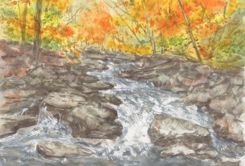
is to draw and paint your own river landscape. This can be the scene featured
in the class or based on one of your own
photographs or scenes you've observed outside. You can also refer
to the scan drawing and painting templates
attached below, which will allow you to trace the drawing if you
choose to do so. I recommend drawing the same. Freehand. Drawing is an important step in improving your
painting skills. It provides you with
an opportunity to compose and plan your painting. Once you've finished
the drawing, usually watercolor
steps and processes included in the
class demonstrations to complete your painting.
 Watercolour Mentor (Darren Yeo Artist), Art Classes, Mentoring & Inspiration!