Transcripts
1. Welcome!: Do you want to
learn how to paint when school animal portraits? Or maybe you want
to learn how to use all the colors of the rainbow in a
very harmonious way. If so, this class is for you. Hi there, I'm Charlie. I'm a watercolor and textile artists were
Atlantic Canada and I specialize in rainbow
colored animal portraits. In this class, we
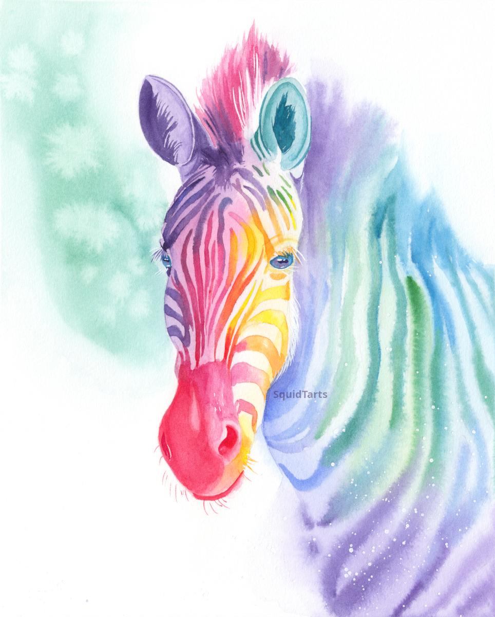
will be painting a rainbow colored zebra, and we're gonna be focusing
on harmonizing colors. I've laid out this class that
each layer is zone step, which is a very
beginner friendly, but intermediate artists
might also enjoy practicing a variety of watercolor techniques
in this course. Thank you for joining me and
I hope you enjoyed the class
2. Your Project: Your project for this
class is painting a rainbow zebra in watercolor. We'll go over the
most important part of remote painting, which
is color selection, will break the zebra down
into multiple layers and steps and make it very easy
to complete the project. At the end of the project,
you should have a good idea on how to paint whimsical
animal portraits. I want to complete your project. Please make sure to share it. I'm really excited to
see what you'll create
3. Materials: The materials you'll need
for this project are a good cotton watercolor paper. You can use either hot
press or cold press. But if you're a beginner, I
recommend using a cold press, which is a textured paper. You also want a
selection of colors. I use a split
complementary palette. So a cool yellow
and a warm yellow, a cool red and warm red, cool blue, and a warm blue. And then I also have
an extra violet just because I don't really
enjoy mixing purple, but you can use whatever
colors you enjoy most. You also want a selection of
brushes in different sizes. And how many brushes you use is completely up to you and
your personal preference. For this zebra piece, I used a number
eight round brush and a number zero liner brush. But you can use any
brushes that you enjoy or have on hand. Few miscellaneous items
that you'll need are, of course, water and a palette. A porcelain palette is ideal. Remember that any paints that
you get on your palette, you can allow it to dry and just reuse them
later by React. But even with a bit of water, you also need a reference photo, which I've included in
the materials section. I've also included my sketch
and my finished color comp. So you can use
those if you don't want to draw the zebra yourself, or select your own colors
for selecting my colors, I use a digital application
called Procreate. But you can use any digital
application that you like. Or you can print off the
black and white photo and then apply your paints directly over top of it to
see how they'll interact
4. Planning: To make a color composition, the first thing I'm gonna
do is I'm gonna take my reference and converted to black and white and
remove the background, is that it makes it nice
and easy to kind of see where the image is going. I'm going to take the
black and white layer now, and I'm going to decrease
the opacity a little bit. So we're going to
make it around 85%. You can make it a little bit
lighter or darker depending on how dark your reference
photo actually is. Just one itself. The blacks don't actually
look completely black. Let me pick a new
layer, put on top of our reference photo and
change that layer to color. This is going to allow
the color to show through anywhere on
the reference layer where there's anything
darker than white, all the whites are going
to stay pure white. The grades are gonna
be lighter colors and the blacks will be
the darkest colors. I use this layer to test out how my reference photo is going to look with different colors. I have a pretty strong idea
of how I want this to look. I definitely want pink and
yellow around the face. And I want the yellow to be in the brightest area of the zebra. So that will make it
look like it's glowing. Because our eyes will see the yellow and the darkest
areas and think that that must be a very bright,
highly lighted area. From there, I'm
going to use colors that are near these colors
on the color wheel. For pink, I'm going to go
into purple or red or yellow. I might go into orange or green. And I'm just going to move
those around the animal until I've filled out
the entire composition. Because this is a color
layer is going to keep the background pure
white for right now. I find it really helps to test
out a few different ideas. So even though I have
this idea that I want the zebras muzzle to be pink
and the face to be yellow. To try having the zebras
face and a bluish color. It's kinda funny how
often I'll start out with a strong idea of how I
want the colors to look. But then when I'm doing the color composition
and they just looked terrible and going the
opposite direction and actually works
out a lot better. I'm just going to
repeat this process. I'm going to play a bunch
different colors in much different ways until I find a color map that
looks good to me. Whichever colors picked out, you can start painting
5. Base Layer Whites: Now that we've decided on
the colors for our zebra, and we've transferred
the sketch over to a good quality cotton
watercolor paper. It's time to lay down
the first layer. For the first layer, we're
just going to focus on the shadows that you can
see across the white. Prevent the entire zebra
ignoring where the stripes are. Going to break this
down into chunks to make it a little
bit easier on myself. So I'm going to start with just the face and then we'll
go on to the body next. I'm just adding an even layer of water across the entire face. And you want this area
to be shiny with water, but you don't want any pools depending on how
absorbent your paper is, you might need a
couple of layers of the clean water to
get the desired results. Just being careful to
go around the eyes, because I want the eyes to
be a different color than the body of the zebra. And where you cut off zebra's
head is entirely up to you. I'm keeping the head pretty closely cropped
to the face and muzzle. I'm not going too much
into the neck and I am going to include the ears. And good quality
watercolor paper is going to suck up a lot of water. So you might need to
go over this a couple times to make sure that the surface stays nice and damp. And I'm just testing
to see a dark my color is It's a little bit too
dark. Now, a bit more water. And that's just going to start
at one end of the muzzle. So anywhere that is
not pure white will get nice coating of color
in this base layer. But again, we're not worried
about the stripes right now. We're just worried about where there'll be shadow if the animal was completely white. I'm actually going to err on the side of
caution with this. And I want to keep
it a little bit. On the lighter side. I want the stripes
to really stand out, especially in the yellow area. So I want to keep them
whites. Quite pale. Nancy, on the
reference photo that the entire right side of the
zebras face is in shadow, while the left side, towards
the body is in sunlight. You want to keep
the left side is lighter than the right side. I have a bit of a
hard edge here where the pink meets the main. I'm just going to use
some clean water and just soften that a little bit with the first layer on
the face complete, I'm going to go on
and let that dry. And then what the body and
can you move their face dry? I'm going to continue
on to the body. So just like what the face, we're going to pre wet this
area with some clean water. And this is a good time
to consider what sort of edges you want for your piece. So harsh edges tend
to draw the eye. And those are best around areas like the face where you
want to be a focal point. And softer edges, what's
known as lost edges, tend to be less eye-catching. I actually want it to fade out the zebra
shoulder down here. So I'm going to paint water
outside this shoulder area. Then when I add paint
over top of it, the paint will disperse into that water is something that you should plan in your
planning stage. But you can also choose to be a little bit more
relaxed about it. This is a pretty
simple portrait, so it'd be pretty relaxed
about my edges, right? So again, we're just
focusing on what would this animal look like
if it were completely white? Where would these shadows be? This area on the
zebra is quite light. I want to make sure that
my colors aren't coming down too low in this area here. Tap some of that back, just getting a little bit
too into that lighter area. And I'm just using a damp brush to blend into the white,
nice and lightly. Going to bring some of that Open to the main a little bit. There really isn't much of a
shadow on the main at all. So I'm going to keep
that fairly light. Now feel you've gone too
dark with the color, then you can easily use your damp brush
to pick it back up. So I'm just making this shadow
a little bit less intense. So I really want to emphasize
that highlight there. I'm just dabbing my brush, wiped off mostly water and just pulling it back long that area. I'll go ahead and draw this. I'm gonna do one more layer
on the light areas and then we'll be able to
move on to the stripes. Well, the first layer
complete, you can see where all the
colors are gonna be. So I really want to look
at my reference photo very closely and see where the shadows are strongest across the white
areas of the zebra. So I can see that there's
a very dark area on the forehead and down along
the right side of the muzzle. So the animals right side or the left side of
the picture plane. So I'm gonna go in here. And again, I'm going
to free wet this area just right across zebras face. Using our existing colormap, I'm going to apply colors a little bit darker than before, where I see those
strong shadows. So this is quite a strong
shadow here along the muzzle. And because this area
is mostly black, we're going to come
back and darken that. Came back in with some
of this cooler red. This is quinacridone rose. And want this area to be a little bit
darker but not super, super dark, with a
little bit of yellow. Just over the eye here. And here around the jaw. You can see it's not
moving very much. So I'm just going
to take my brush is clean with a bit of water and help that move
around a little bit. I'm going to add a
little bit of purple. I should be careful with
colors like purple because a little bit looks
extremely dark. So definitely make
sure you're testing your colors before you
put them on the paper. This entire ear is in shadow. So I'm just going to fill
it in with some purple. And likewise, other
ear is in shadow. I'm going to come in and
fill that in as well. Now, keep in mind that there is this strong highlight in here. And again, it's completely
elective if you choose to include that in
your final piece. But if you want, make
sure you're saving it. So be careful to
paint around it. Once the highlight
is gone, it's very, very difficult to
get it back again, just like in the previous step, I'm going to come up
here with my damp brush. There's a lot of the
top of the head bleed in to the main, might have gone a
little bit too far in the forehead here
with this dark shadow. So I'm just going
to lift that back with a clean, damp brush. Just looking at my
reference photo and trying to make sure that I can serve all the
highlights that I can see. It moving on to the final layer
on the white of the body. Again, I'm just going
to pre wet body. And this just ensures
that the colors blend together nicely and then we
don't get any harsh edges. I'm seeing that the
strongest shadow is down here on the shoulder. So definitely want to
get that a bit darker. I don't actually want this
area to be extremely dark, not as dark as it is on
the reference photo, because I want this area to really stand out
as much as the face. Our eyes are naturally drawn
to areas of high contrast. So we want to keep most of
the contrast around the face. If you want to keep that
lost edge that we created, you have to make sure that
you soften off the shoulder. Just going to add
little bit more here. That kind of fade off back here. I think that's pretty good. So I'm going to stop there and then we will come
back with the stripes
6. Face Stripes: Now we have the whites and
the base layer I'll paint in. I'm going to come back
in with the stripes. And the first thing
I wanna do is paint in this muzzle of the
model actually quite dark. So I'm going to use a pretty thick consistency
of my red here. Just paint that all in its own. Pay attention to
the shadow shapes. So red comes up around this nostril and then
down here along the face. And I'm painting
this on dry paper. And I'm just going to soften off this edge here with my clean, damp brush gives me that area. It looks quite soft on
the reference photo, you can achieve a similar effect by painting water on your piece. First bit of a shadow
area here that fades in to a mid-tone red paint, a little bit of red in
here and soften that out. And again, I'm just using the colormap that already
created for this. So I'm just following our guide of where
these colors should be. Right now I'm using a
mid tone in the paint, so I'm not going as dark
as it can go just yet. Just blending those
colors together by feathering the pink
over top of the red. Using my clean damp brush to feather this red into
this highlight area, and feather this pink down
into this highlight area. This shadow blend
upward a little bit. I'm just adding a bit
of paint on my dry paper and feathering it up with a clean, damp brush. And then let's move
on to the stripes. It doesn't really
matter where you start, but I'm going to start
just on the edge. And you do not have to have these stripes look exactly the same as they do on your
reference photo effect, that's extremely
difficult to do. So I recommend not doing that. I'm just pre wedding where I see the stripes are where I want
my stripes to me. Then dabbing in a
little bit of paint, just letting it
flow it will follow the basic design of the stripes
so they feel realistic. You don't need the exact
stripes that are on the animal. I've painted in. The stripe
with some water and I'm just dabbing in some paint
and I'm letting it all mingled together
in the stripe. And I'm gonna do that for each stripe that I
won't paint it on SAML, we seem to be several stripes
that converge here, right? Vendor zebras, I am going to
paint those in with water, grab some paint and dab that in. I'm trying to do pre wet
too many, too quickly. Or you'll end up
with your stripes drawing before you can
dive in the water. Now, if you don't want your
stripes color to mix as much, then you can just
paint these directly on dry paper that
it's going to give you the most interesting
results if you paint them on wet paper and then allows several colors to
mingle altogether. Gonna go above this, I add
a few stripes up this way. It looks like they go from
the eye towards the forehead. So I'm just going to
get that general feel. You might add a little blue in here just to shake
things up a little bit. My paper is drying
before I can get to it. So I'm just going to
gently reach with that. Then we can add a
little bit more color and come here with some pink, pinky purple slit that
all mingled together. It looks like this
one comes down across the eyelid as well. So I'm just gonna go ahead
and add that in there. Few smaller stripes here. Just going to paint
those with a dry brush just to make that as
easy as possible. It's very difficult to wet
and incredibly small area. So it's usually best to
draw burst those ones. And you can mingle the colors manually by just dabbing
more color over top of it. Let's move on to the stripes
that go down the face. This is quite a long stripe and in a delicate little area. So I'm going to go almost
to the end of this one. What am I to? Several color
changes in this one. I want it to be
predominantly pink Emil, have it end in a
little bit of red here, right next to the muzzle. Maybe come up into a little bit of purple
here at the top. Just a bit of a pinky purple. There we go. And likewise
paint the one next to it. And this is most of
the process is just painting the stripes
methodically and always just try to
pay attention to your reference photo and how
the stripes should look. So they seem to get
wider at the top and narrower as they come
down towards the muzzle. It's good to mix up your
colors a little bit. I'm moving pink into red here, and then back into
pink down here. And the real trick to
detail piece is just to break it down and
take it step-by-step. Again, pink down here. Maybe I'll move into a little
bit of blue here as we start to approach that
ear that's in blue, it's going to make
a nice purple. It's a little bit different
from the other purples. This one's a nice
pink command and bring it into some yellow here. Let's just because we're
approaching this yellow area, I want to start introducing
the color before we hit it, just to help maximize the amount of color
that we're seeing. A bit of warm red to this before bringing
it down into the pink, because red is the color between pink and yellow makes it nice little orange
color if you're working in a yellow area and you need it to be darker
than you can use a warmer or cooler yellow to make it look a
little bit darker. So I want this stripe to appear a little bit
darker on the edge. So I'm just going
to add a little bit of a orangeish yellow, but I can also add a little bit of a green yellow instead. Anything that brings it away
from the center is going to make that yellow look
a little bit darker. Shops give the zebras face a little bit of a rounding
appearance there. On areas where the
stripes are very light, might actually just not
even complete the stripe. So I added some water there
and then I just dabbed my yellow paint in and let
it dispersed unevenly. And that'll help give
the stripe a lighter, broken appearance,
like you can't see it because the light is
reflecting is just too bright. In these areas of
higher highlight, especially if you're
using a darker color, you can really help to make sure the color is a little
bit paler on your brush. So if it's purple, I'm using a pretty faint purple just for this wider area is compared to this dark purple over here
and this shadow area. We're gonna go back and add a little bit more darkness to the stripes in
the shadow area. After we finish filling
in at most one stripes. Starting to pull a little
bit of blue into this yellow because we're moving towards blue for this ear here. And these areas are quite light. So I'm not going to have
too much detail in them, just gonna try to make
the colors cohesive. So I want this area to be
a bit more blue and green, and this area would
be but more purple. So I'm going to gradually add more blue to the purple
as we come over. Then this area here
and the zebras main is all quite dark, right down into these stripes. I'm gonna go ahead and wet around the main and add
in my colors there. So I went with a pink mane. But I also want to be mindful of the colors that I've used in the stripes leading
up to this point, just using a flicking
motion with the end of my round brush to create
that main texture. Adding a bit of purple
in there because I want the main come down
into a purple area. This area here, the
inter-domain is quite dark. Again, just making that
flicking motion wound bit of flicks here where it's coming into the striped
area on the forehead. Can even add a few flicks, bringing it into the
stripes themselves, you getting any harsh marks, you can solve them off
with tip of your brush. But you don't have to be too
concerned about it because any stray marks are going to
look like more for detail
7. Body Stripes: Let's face all done.
We're going to move on to the stripes on the body, especially number to a
larger brush for this. And again, I'm going to
wet this entire area. And this is because I want the stripes in the body
to be out-of-focus. If you want stripes
to be in-focus, then skip this
pre-writing stage. In strand, you'll just
pretty wet the stripe area, just like you did on the face. I'm being careful to bring
the water outside of where I wanted the main attend to make sure that the
main also fades it. I'm going to start on the
far side of the zebra. So the area that I want
to be in the least focus because this area
is the wettest, it will allow the
stripes to flow and be softest as
the paper dries. Because I moved more
towards the face, the stripes will become
sharper and more in focus because the
paper is drying. Just like on the face. I'm adding multiple
colors to these stripes. Stripes are blooming
up quite a bit. If you want them to be
a little bit tighter, then you can just wait for your paper to dry a little bit. Again, I don't want the stripes
to be super dark because I want the body to be of
lower contrast and the face. Funding that this area on zeros just a little
bit too wet stills, so I'm just mopping some
of that color back. Well, I'm just gonna wait
for it to dry a little bit. Again, when you're
adding stripes, you really want to pay attention to the natural markings
of the animal. You don't have to follow your
reference photo exactly, but you do want to follow
the general pattern. So for example, you can see the white comes
up into the main. I want to make sure
that you're capturing that some of these
stripes zigzag, you want to capture
that as well. And that is the first layer
on the stretch of body
8. Face Second Layer: The body has dried. I want
to come back to the face and do a final pass
to darken some areas. You want to look at
your reference photo and see anywhere that's
especially dark, and make sure that that
corresponds in your picture. It can help to take a photo and convert it
into black and white. You can see which areas of the peaks are a
little bit too light. So firstly, I'm seeing is that this nostril
needs to be filled in. I'm using a fairly small
size eight round brush, but you can use a
larger or smaller brush depending on whatever you're
most comfortable with. And I'm just making
sure that I'm getting the correct shape of
the nostril in there. I'm using the color that we
laid out in our first wash. So using a bit of
red there looks like there's a bit of
a lighter shadow here. Seeing there's a bit of a stronger shadow
above the mouth here, I'm using a bit of an
orangey yellow instead of the pure yellow that
I was using before. And that's just because orange, yellow is going to look
a little bit darker than a pure yellow. And I feel like that nostril needs to be a little bit darker. So to come back in here
with a little bit of pink. And because a pink or a cool
red has a bit of blue in it, it's going to look a
little bit darker than a neutral red or a warm red. Likewise, there's a nostril on this other side that
needs to be drawn in. And I'm just going
straight in with my cool red for this one because this area is already
in a pretty dark shadow. And then you don't
need to get too wrapped up in the details. You just wanted to include whatever it looks
important to you. Bottom jaw needs to have
a nice strong shadow. Really emphasize that
petty zebra lip. I'm just going to
soften that shadow a little bit with my
clean damp brush. This shadow across the
red can be a bit darker. So I'm coming in here with a
little bit of my cool red. So that's my pinky color just to darken that
shadow a little bit. And switching up the color also adds a bit more
depth to the piece. Makes the colors look
a little bit more lively and vibrant
when you mix them. Bringing that right up
into the stripes here. And it looks like that
shadow ends about there. So again, just always referring back to my reference photo to see where I need colors
to begin an end. This part to be a
little bit darker, just down the stripe
a little bit as well. No stroke actually be a little bit darker just around here, making sure we're
getting that shape incorrectly and have finished. You want your piece to look
is entirely up to you. He may decide before this step that you like where your pieces and all you
have to do is add the I, I find this last finishing
step is very satisfying. I like to include it. Alright, so the stripes on
this side or in shadow. So I'm gonna go ahead and give them another layer just to
help darken up a little bit. But again, this is
completely elective. It's trying to keep the
same general color scheme. So these ones are and purple. I don't wanna go too dark, so I don't want to
lose that luminosity. Adding just a little bit
of extra color really help give that zebra
a nice wrapping feel. Make its face feel
nice and soft. It looks like there
is a bit of a stripe for this lower eyelid that
I missed painting earlier. So go ahead and
paint that in now. Nice and dark to help the I pop. Adding a bit of a shadow
here just over the eyelid. And likewise, Can we go
over to this eyelid? And a bit of a shadow, again is all details are
not absolutely necessary, but they can help
the piece feel a little bit more realistic. If that's what you're going for. It looks like there's a
little bit of a stripe here. Let me keep that
one fairly sharp. Then the next step
is I'm going to paint some nice blue eyes. So making sure to paint
around the eyelashes. I'm using blue because purple is a compliment to yellow and blue is a
compliment to orange. So it's going to stand out quite nicely against the yellow, orange color that we have
on this side of the face. I really want this eye
to be the focal point. I'm going to drop a
little bit of red in there to add some contrasts. Little bit of interests
9. Final Details: Let's say another
dried and go in with another layer and
just on dry paper. And I'm a shadow around the edge and underneath
the eyelashes. And that'll just
help the I feel a little bit more round and verbally that I'm gonna go in with either a dark blue or purple because those
are my darkest colors. And I'm going to
draw in the pupil, zebras have a pupil that's
like a horizontal line. So a bit like a equal
sign. Just one. So make sure you're
getting the shape correct. If you want your zebra
to look realistic, It's been a sideways
peanut shape. Here we go. Little pupils are
drawing and go back and make sure I haven't
missed any shadows. So I can see that I need
a bit more of a shadow right here around
the horses mane and across the forehead. And that's easy to just
paint on nice and lightly. And I can also darken up some of these stripes
in the main here. And I'm just using a
dry brush for this. So damp brush, wet
paint on dry paper. And these extra little
flicks will help create more depth in zebras for now because there's
areas and highlight, I actually want to darken the body a little bit
just around the head. I'm gonna come in here
with my brush and wet just around the neck area. They're gonna come in here and with a bit of a shadow color, I have some purple here. I'm putting down to
darken this area, bring that down here
into a bit of blue. So we're still
following our colormap. Don't want that to
come out too far, but I do want to make sure
It bleeds out enough. And that helps the zebras face
pop forward a little bit. And that was just an
on-the-spot executive decision. If you liked it better before, then absolutely can
leave it that way. If you try putting
down the color or decide you don't like it, well, the paper is still wet. You can add water and lift up that color
that you just put down. Those eyes are dry. I'm going to come back in
and add the eyelashes. So I'm using a small
liner brush for this. And one more thing we can do
to help bring this zebra to life is to add a little
bit of a background color. I like to add a little bit of
a splash behind the animal. So I'm just coming in here with some clean water and
wedding behind the zebra. Now, I often plan out the splash color on my reference photo when I'm
planning my other colors. But I find that
sometimes changes based on how the image changes
while I'm painting it. So sometimes colors will shift in the final piece compared to your
color composition. And you may need to
change your colors a little bit to
accommodate that. I feel like nice green, blue splash in the
background will help the purple from
the zebra stand out. I'm just taking a little bit of greeny blue and I
feel like that is a nice continuation between the green-blue we have down
here on the zebras body. So a nice little swoop and
bring the viewer's eye around. And I'm just going
to add a few dabs of water in here for a
little bit of texture, going to wait for that to dry. And then the final step is to add a little bit of
white highlights. If you preserve your highlights
start from the start, then you won't have to
worry about this step. So I'm adding a little bit of white highlights to the eyes. Then you want to make sure
that you're following the curve of the eyes. Adding a little bit of white
down here to this lid, strongly episodes or
isn't eyelid down there, It's pretty light area. Can add a few flicks of
white in the eyelashes. And same over here on this side. The lower lashes as well. It's a nice little chin hairs, will see these ones as much just because
of the white paper. You can definitely
add them in there. And some extra texture here. Round bottom of the face up here in the main. And how far you want to take
this is entirely up to you. Some people love their
white highlights and some people do not
personally for me, it depends on the piece. Don't add too many
highlights to the body. Want to keep that area
to be pretty soft. I just want to bring out
this jaw a little bit. Got a little bit
lost in translation. There are a few little spots on the muzzle you can add in. I think that's pretty good. Just getting out
a few splashes of white on the bottom here. So I'm gonna take
my sketch paper and cover zeros face that don't
want that to get splattered. And then just add a few taps
of white down here to really simulate some dust particles
that this piece is complete
10. Wrapping Up: In this class, we created a rainbow portrait of a
zebra using watercolor, we discussed how to select
appropriate colors. Use of contrast both in
value and in color hue, and how to harmonize colors. If you have any questions about this class or your project, please leave them in the
comments section and I'll get back to you
as soon as possible. Once you've completed
your painting, please be sure to share it
in the project section. I'm really excited
to see what you create and I'm sure your
other classmates are as well. Thank you for joining me and
I hope you enjoyed the class
 Charlie Proulx, Watercolour and Textile Artist