Transcripts
1. Introduction: The world around us is
beautiful and interesting. There are a lot of
things that I see in everyday life that I want to turn it into a cute painting. Have you also had that feeling, but don't know where to
start and how to do it? If yes, then you are in
the right place because I'm going to help you
with it. Hello everyone. My name is Ritika. I'm a portrait artist and an illustrator from
Tamil Nadu, India. I mostly work on portraits with pencil shading techniques
and digital media. I have done a lot of
portraits for my clients, and I've been taking
commission since 2018. Recently, I have also found
my interest in illustrating things other than portraits
like places and patterns. Switching from traditional
to digital has not always been so easy to
learn the right techniques, tools, and most importantly,
learning the software. I wouldn't say I have learned
everything on my own. I have learned from a lot of tutorials and classes
of many great artists. Learning on your own is possible, but it's
time-consuming. Taking help from those
who have already figured it out by trial and error
is a lot more beneficial. In this class, I wish to share my tips and techniques to create your own unique illustration and not just
recreating an image. I'll be using the application
Procreate on iPad. I've been comfortable
doing realism, recreating an existing picture, but I struggled when it
came to illustrating from imagination on how to develop an idea to a
finished painting. I want to share with you what I wish I knew when I
started with it. We'll be focusing
on the basic idea, developing it into a thumbnail, choosing the colors,
coloring the illustration, and how to grab the
audience's attention by focusing on a certain part. You can utilize the skill to apply it on your own style or apply these methods with other mediums that
you have worked on. You can even experiment
this with portraits. By looking at my
final illustration, you might think
it's very complex, but it's totally achievable as a beginner because
we're going to break it down into achievable and digestible
steps and work on it. I've been asked by many
of my followers to create a beginner class
so this is for you. It's an absolute
beginner-friendly class. I'm so excited to share my
tips on using Procreate for illustrations and I can't
wait to see what you create. This is something that you were looking for. I'll see you there.
2. About the class: Hey guys. Thank you for joining
me in this class. I'm sure the next two
parts are going to be powered by with lots
of information. Before that, this lesson is going to be about
why this classes, why you want to take this class, and how it's going to help you with your digital
illustration career. Also, I'll guide you on how to watch the lessons for
your ease of practice. If you want to
skip this part and get started with
the next lesson, you can do that as well. This class is a complete
beginner friendly class. I'm going to take you
through each of the steps in creating an illustration from scratch in Procreate on iPad. I'll be explaining about the Procreate tools
and techniques. I will explain how to come
up with an idea or a concept then to turn that rough idea or a concept into a
thumbnail sketch. We will also see
what a thumbnail is, why it is important, and how that affects
the whole illustration. Likewise, we will sketch
the idea and then we will dive deeper on how to choose the color theme for the class. Then take a break for
yourself and create all the required projects
before we get into coloring, so that in the next lesson, when I start coloring, you can also paint
along with me. But of course, you'll be developing and painting
your unique idea. If you'll follow along with me, you'll be able to create stunning illustration
at the end. I'm sure you'll be surprised. If you have a question within yourself about why you
should take this course, then let me tell you, when I first got into
digital painting, I don t know which
software to use, I didn't have a proper guidance, I didn't know where to
learn and how to learn. I wasn't even sure if
learning digital painting was going to help me or it
wasn't going to be worth it. You will find this class as an answer to all
these questions. I started practicing
digital ad with Procreate and I have loved
the application ever since. I have to mention it's very user-friendly and
easy for beginners. If I could learn it by myself, I'm sure you'll also
be able to learn. Along with my tips, it will be even more
easier for you. You can actually learn a lot of quick tricks by
following my class. I want to stress
here that you can learn these techniques
by yourself, but if you are learning by
taking help from someone else, you're going to see a lot of time because that person
might have figured a solution for a
problem in many ways and they're going to deliver
the output for it with you. I don't know how to
work with Photoshop, but with a bit of research, I came to know that procreating is almost similar to Photoshop. You can actually apply
almost every technique that's present in Photoshop
in Procreate as well. For a person who knows Photoshop and then
comes into Procreate, it will be very easy. But for a Procreate artist, it'll be a little difficult
to adapt to Photoshop. When I was discussing it
with my artist friends, they mentioned
Procreate is a lot more user-friendly
than Photoshop. You can use either
of these techniques.
3. Class project and Freebies: Now, let's talk about how
this class is going to help you achieve your goals
and learn new skills. As I told you earlier, I will guide you through each
step in project creation. But the most important thing
is that you'll have to put effort and time to put these
techniques into action. The most essential thing in improving your art is practice. Art is something that
only can be improved by practicing with
the right methods. The project for the
class is creating an illustration
based on an idea. That project can be divided into small parts if it is
based on each lesson. So watch a lesson and then
implement the steps or methods [inaudible] There is
no compulsion that you have to finish the
class at the stretch. You can actually watch
one or two lessons per day and spent 15
minutes watching a lesson, and then practice
for 20 minutes. Set yourself a
schedule and allocate 20-30 minutes per
day for the class. I promise you'll be amazed at
your results after 10 days. To encourage you a little more, I'm going to give you this
little class planner. You can cross each day
after watching the lessons, and color the thumbs-up
if you have implemented the techniques or if you
have practiced for that day. Also one one thing that
I want to mention, is if you need any sort of
guidance or feedback from me, you can simply throw your questions in the
discussion session. Next, moving on to the class materials,
tools, and supplies. The first thing you can
take is my free workbook. You can download it in the
class projects section. Next is the iPad, Apple pencil, stylus, and the
Procreate application. If all these are ready, we should get started, and not only that, I have some free
goodies for you, I hope that you'll love it. To know about it, please wait until the end of the class and then grab
your free goodies.
4. Procreate basics: To start with a class, first, you have to know how to use
the Procreate application, so let me show you that. This is the Procreate app. You can download it
on the App Store. It's around $13, ₹1,000. I guarantee you every
penny is worth it. Once you have downloaded it, open the app, and here, you can click on the plus
icon to open a new canvas. There will be a lot of
preset canvas sizes. You can choose one from it, or if you want your art to fit
to A4 or any desired size, you can choose that. Now this is a canvas. You can pinch and zoom
like this or pinch back to fit the canvas
to full screen. This is the brush icon. Here you will find all the
brushes that you have. These are the default
procreate brushes. You can actually download a lot more like gouache brushes, oil painting brushes, brushes for drawing
hair, and many more. I have to warn you
that collecting brushes is a little addictive. You will believe this after
looking into my brush sets that I downloaded free from
various artists and websites. Few of them are paid as well. I will include all
the free brushes in the Resource section and
also all my favorite. In the workbook, you
can use them too. Next, this icon here
is a Smudge tool. That is when you add two tones and when you
want to merge them, you have to use this icon and then choose a brush for
blending your sheets. Next is the Eraser
tool to erase. Here as well, you can choose
the brushes to erase. It will erase that
particular shape or the texture of the brush. Next is the layer panel. Here is where you add layers. If you don't know
what a layer is, we use layers to draw
or to undo a process. For a lot more reasons, you will see why we use
layers while we're drawing. We can use one
layer for sketching and another layer for
painting on top of it so that you don't have
to erase or paint on top of it like we do
in traditional mediums. You can also hide one layer
by deselecting the checkbox. Now, go and download lots
of Procreate brushes from the workbook and prepare
yourself for the next lesson. That is the idea or concept.
5. The idea/ Concept: What do you all want
to draw in this class? I get it. This is really
an overwhelming question. Some of you might have
wanted to draw something on your iPad while you're just
scrolling over my class, and some of you might
have joined just to know how I paint the illustration that
is in the thumbnail. There'll be few others who don't have any idea on what to draw, but you just have
the urge to create something today or to
learn something from me. If you fall under any of these categories, it's
completely normal. You can just sit, relax, and join with me in my process. I'm sure you'd be absolutely able to take away a
lot of information. Initially, when I thought about teaching some basics
of Procreate, I wanted the subject that I paint to be attractive
but simple. I thought of the one thing
that really attracted me. That's when the little
glowing butterflies that I painted in one of my
illustrations came to my mind. I was just wondering
really how the small thing actually I feel
a lot of charm to the piece. So I wanted to just show you the little magic that the
blending modes can do. If you're wondering what
the blending modes are, I'll explain too in
the later lessons. That's how I finalize what I
wanted to paint and teach. Likewise, think of
any small thing that you adore or that caught
your attention recently. Have that as an idea and
then let's sketch it. If you can't think of
anything to draw now, here are some of the
prompts for you to choose. You can have a closer look
at it in the workbook. Once you have got the
little idea or the spark, the next step is
to build the idea. Let me show how I sketch
and develop my idea. As I decided that I want to draw something glowing
like the flies, I'm going to draw
them like in a jar. So first I'll draw that. I'll draw a jar and then we're going to draw
the flies inside of it, or like it's flying out of it. That you can develop it later. I position this to the center. So to move an object
that we sketch, use this tool, and if you move it over here, it will just select the entire layer that is
selected here and it will move. So now I want to draw like
a girl is holding the jar. So first I'll draw a
rough sketch of it. I'm going to position
the girl like here, sitting on the
floor or something. This is just a rough
sketch just to imagine the concept and see
if it's working out or not. So I think the jar
is bigger than girl. What I'm going to do is use
the Select tool that is here and then you select
the option freehand here and just circle this and click on the Move
tool to resize it. Now you can resize it
and I'm placing it here. If you want to move the
entire layer or enlarge it, just select the arrow tool. You can just enlarge it. As I said, I'm drawing it like the girl is sitting on the
floor or some old lawn, so first I'll draw this. Next, I was thinking
of the expression that a small girl will react when she is holding the glowing jar. Obviously, she'll be
delighted and be surprised, so I want to reflect
that joy in her face. Later we'll do that
in coloring stages. So this is my rough sketch. This is enough for now. Later, we will develop
the sketch with further detailing by sketching
this into a thumbnail. One more thing that
I would like to suggest is taking breaks. Yes, once you have got
the initial spark, I will usually take
some time to think it. Usually when I do this, I'll get different thoughts, different opinions, or
even different ideas. Likewise, when I was thinking a lot of ideas or things
for this illustration, and even while
browsing on Pinterest, I thought of painting this
scene in an underwater. In the next lesson, let
me show you how I'm going to develop this
idea into a thumbnail, so there'll be a lot of
changes in the process. Follow along but
make sure you give yourself some time
to gather new ideas.
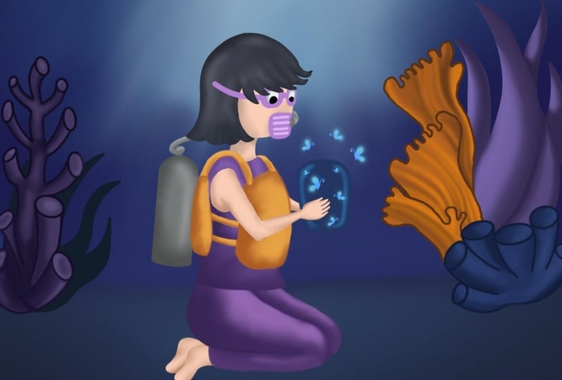
6. Thumbnail: Talking about thumbnails. What is a thumbnail? A thumbnail is a pictorial
representation of an idea, or a concept that
can be used to get the overall picture of the
artwork that is to be made. It can be helpful to see if
the placements are correct, the color combinations
and so on. Here is an example of a
thumbnail for the class. Likewise, you will have
to create a thumbnail and then will turn that
into a defined sketch. Let me show the process
of how I develop the idea to a thumbnail and
then to a finished sketch. I'm going to create 2-3
thumbnails based on this idea. For that, I'm going to export
this photo. Click on Share. If you turn off the
background color here, it will only export the outline. I'm going to select the
option PNG and save it. Next, what you're going to do is open the thumbnail template on the workbook and
you'll get this. Here select a new layer. These are all my old files. You don't need that. Just select on it and open a new layer. Now select Settings and
then here click Add, and then insert the photo. This is the last drawing sketch, so I'll select that. Here it is. First I'm going to create
2-3 variations of this idea. First I'm thinking of drawing
like the girl is sitting on the lawn and surrounded
by dark forest. It's going to be full of
trees and it's going to be completely dark so that the glowing of flies will
create lighting effect. This is going to
be my first idea. For the next one I'm
just going to duplicate this layer and click
and move it here. To move it, just see if the layer is selected
and then click the arrow button
and just move it. This is how you move, or resize. Let's erase this. For this, instead of actually
going in a realistic way, for the second thumbnail idea, I'm going to draw like an underwater scene that
I mentioned earlier, like the girl is sitting
in an underwater. There will be a lot of
flora and fauna here. I made a sketch that
there'd be a lot of plants and here as well. This is going to be my
second thumbnail idea. Next for the third, I'm going to duplicate
this and move it here. I release all this and I'm going to just create a small variation
of this first idea. I'm going to draw
like a open lawn. It's going to be full of grass. All these area is going to be a grass and the girl is
sitting on the lawn. There will be a
distant open lawn and a tree here with
bright sunlight. This is going to be
of a bright daylight, and this is going to be with the cool aqua color that
is an underwater scene. This is going to
be a deep forest, so it's going to be dark. All the three thumbnails
are of different ideas. Draw all the three
and decide on which you want to sketch it further
into an illustration. Now, It's project
time for the day. Go ahead and take your ideas and convert
it into a thumbnail. Also, one important thing is once you have
done the sketch, give yourself some time,
rethink your decisions. Once you have done
the rough sketching, just observe it and
see if you can do any small tweaks to
improve the idea. Now with this thumbnail, next I'll show the
sketching process.
7. Sketching: In this lesson, let me show you my process of our planning. To outline any subject, you can use various
methods like grid, geometry, and
freehand sketching. Freehand drawing is the one that I'm going to
use in this class. As the name says, it's done without using
any guide or grids. Let's start sketching. This is my Canvas. I simply chose A4 size Canvas. First, I'll draw the
horizontal line to represent the
surface of the lawn, then I'll start with
drawing the girl's face. While sketching, I'll have a reference on the
side like this. Since I'm going to draw a
girl sitting on the lawn, I simply searched for those
images and I got a few. From that, I chose one. Likewise, based on your radar, search the reference
for your subject. If a man is walking
and you want to draw a subject of the idea,
search for that. If a boy standing or
a girl is sitting, just search in Google
or Pinterest for those images and you will
get a lot of images. From that, choose one and
have as your reference. I felt the face is
looking a little flat, so I'm redrawing it now. This time I'm drawing it a little chubby and
sketching her hair slowly. Also since she is an underwater, I added this line due
to the water pressure. I'll make sure to draw
that while I color. Next, I'll draw her eyes. Instead of just
drawing her eyes, how about drawing goggles
due to the underwater scene? I'll draw the goggles. I will also sketch
her eyes inside it. Let it be very minimal and
then similarly drawing nose. I'm going to draw the
breathing tube that people will use while
swimming in under waters, instead of drawing her nose. Let me draw that. I'm drawing a few strands of
hair flying here and there. Next let me start
with the dress. I'll simply draw a
top or a T-shirt, draw her hands from a
little distance from the top or just a little
closer to her neck. Also always check for the
proportions while sketching. Sometimes you might
draw her hands bigger or inappropriate
than her body. At times, make sure to recheck
and correct the outline. This is a beginner
friendly class, so in case if you are following the same idea or the theme as mine and if you find
it difficult to sketch, I will attach this
sketching file for you so you can get
some guidance. Or even you can use this to skip the sketching step and get started with the
coloring directly, but the important thing and the challenging part
is that you have to try and sketch the idea
that was in your mind. Search for images, you can have any number
of reference images, just try to recreate the pose or the posture from an image
and try drawing your idea. Then I'll draw the legs. Since she is in ground, her legs will be folded. Additionally, I'm
also thinking she's wearing a wet suit
or a life jacket. After this, I'll
be drawing that. I'm opening a new layer
to draw her life jacket. It's because in the later
stages if I need to do any changes or if I just
wanted to remove that part, I'll be easily able to delete
it because I'm going to just simply erase or
delete that layer alone. Make sure whatever the
new thing that you draw, you are drawing it
in a new layer. Then I'm drawing the jar
that she is holding. Now, she's holding the jar, I have to draw her hand. What I'm going to
do is search for reference images like a girl
holding a water bottle, a girl holding a flower or
something and then take that hand reference and just
draw it in your Canvas. I'm going to resize
the hand a little as I felt her palm is very small
compared to the body. Another thing that I felt is if she's holding the jar,
she will be looking down, but my head here is
actually looking straight, so I'm tilting that towards
the jar that she is holding. I'll also resize her leg's
size because I feel it is a little bit small
and it has to be adjusted a little,
so I'm doing that. Next, I'm going to position this entire subject at
the center of the Canvas. Make sure to select all the layers that
you have sketched. See, I'm selecting all
and now I'm moving it. I'm sure I'm resizing it. Moving to the foreground plants, I want plants around her. For that, I'm creating
a new layer and I'm taking reference images
of aquatic plants. Let me sketch some of
the plants behind her. Please think of
the little things that can be present
in your idea. If suppose your idea is a little boy standing and
playing or leaving kite, then think of the things that
will be surrounding him. Either he can be in his terrace or he can be in an open ground. Think of the things that can
be added on the terrace. Just like that, search for the images and references
and just draw that. It's that simple. Don't sketch too many, at the same time, don't
keep the background empty. It has to be filled, but not very filled. Just [NOISE] understand and
try to keep it realistic. Fill it with appropriate
amount of elements, also draw them in
separate areas, just as I told. In case if you change your mind about any part of the sketch, you can easily go
back and change it only if you draw new layers. Both these sides are done. Next, I want to fill the
bottom line also with plants, so I'll draw a few there. That's it, my sketch is done. Once your sketch is done, it's very important to
check a few things. Check if the
composition is good. It means the subject
should be well-placed, it should be at the
center of attraction, and if the elements
surrounding it are placed well without disturbing
our focal point. Our focal point here is our subject and the jar
that she is holding. Make sure you don't
disturb that. Next, check if the outlines
are proportionate or not. Lastly, I wanted to tell you, if you have any doubts in just recreating the idea that you
had in mind as a sketch, please feel free to throw
your discussions in the discussion tab or
just ask a question. I'll be happy to clarify your doubts and answer
your questions. Now we have seen how to
sketch it with freehand. As I told you, there are
many methods to outline. If you want to learn how to sketch using geometric method, you can check out my class, three-step recipe to illustrate stunning portraits in Procreate, in which I explain how to draw a realistic portrait
using geometric methods. By watching the class, you can see how to use the
geometric methods for drawing. You can apply that method
to draw any subject. While I wrap this lesson, keep in mind to choose the sketching method that
you are comfortable with. In the next upcoming lessons, I will show you how to pick the right colors for
our illustration.
8. Color theory: I'm a fan of black and white, be it art or patterns etc. But there's a reason that we don't see the world
in black and white. In this lesson, let me show you about the
Procreate color wheel, what are the tools and
techniques that we can use from Procreate and
benefit out of it. Most importantly how to choose
the colors for your art. The foremost important
thing while choosing the colors is choosing a
balanced color palette, that is the color in our
art shouldn't be a lot desaturated like having a
lot of gray or muddy sheets. At the same time, it shouldn't
be oversaturated as well. So the colors should be balanced with saturated and cool tones. First I'll explain the
color wheel in Procreate. Here is the procreate
color wheel. Here is the default
color palette. This is the disk view. You can move around
each color like this, the white, the gray tones and the muddy tones
or the browns, and here are the bright tones. Likewise you can
just move around for each color and select it. This is the default colored
disk and below this, here is the history that
is the lastly used colors. They will be displayed here. Here is the history. It will show you the
lastly used colors. All these colors you can identify that they are
the lastly used ones. Here is a palette, I'll show you later. The next is the classic palette. Here is the classic palette. Instead of this
circular view here, it is presented in
a square box and here you can move around
for different colors and here you can adjust
the saturation like this and here you can
adjust the brightness. You can add whites
or go to the black. This is the classic view
and next is the harmony. This harmony actually
helps in selecting colors. So if you need a
complimentary color, that is the opposite color of the color that you selected, you can use the
complimentary option here. If I'm selecting a blue, it will show you the
complementary color of that particular too. Next if you can select
split complementary. The disk it will show you the opposite colors and these two colors will
also be complimentary. Next is analogous, that
is the adjacent tones. It will show you 2-3 options of adjacent tone of
that selected color. The next is the triadic. It will show opposite colors in this direction, and tetriadic. You can choose four
color options here. If you move around, it will also change the color options. Next is the value. Here, the colors will
be listed based on hue, saturation, brightness,
and the RGB tones. You can change the hue here, the saturation, and
the brightness. Here is the RGB, you can adjust here as
well but you don't have to know all of these things while you are just starting out, it's just for your
understanding, I'm explaining. This is the palette. Here you can find various
color palettes or you can download one color palette
from the Internet and use it. In case if you're inspired
from another image or a drawing and if you want to use the same color palette
for your artwork, you can simply click
on the plus icon and you actually find
four options here; create new palette,
new from camera, new from file, and
new from photos. In case if you want to create your own unique color palette by selecting the colors
randomly here, you can use create new palette. It will create a
new palette and you can choose on the colors
that you want to add here. Now if I want this
blue I'll add this, if I want this red, you can add this and you
can save it for later. If you want to create a
palette from the image, like I said earlier, you can choose new from photos and you can just
choose one image. If I'm choosing this option, it will select all
the colors from that image and it will
display in this palette, so you can use that. This is the palette option. I'll just delete this. Now coming on to my thumbnail, since I've chosen an underwater scene for the background, I'll choose a bright blue. First I'll go to the disk
view and go to blue, so this is the blue
I'm looking for. Now I'm going to choose a
bright light blue, this. I'll switch my brush
from sketch round to soft airbrush and
just color it and see if this is good or I can
go a little towards right. I can use this color. I'll save that color here. Next for the darker blues, choose the disk view and
just go towards bottom. This is going to be
my darkest blue. I'll save that. See, I was saving the
color palette here, so I'll just name it as
Procreate illustration, and I'll save the
next color here. This palette is what
you'll get it here. You can see the
Procreate illustration, it is titled data and you can keep on saving the colors
that you want here. Now I'm going to switch from this blue to a little
more deep blue, like this and I'm going
to choose 4-5 blues. Select a combination of
bright and dark, both. I have chosen the
background color, now it's time for you to choose a balanced background tone
for your illustration. In case if you're still
confused about it, I have a link to some
example illustrations in the workbook to
get inspired from. Just observe their choice of
colors, the combinations, how bright or subtle it is, and then go ahead and
choose your colors. Suppose if you're still confused or want some feedback from me, you can feel free to post
a discussion regarding your sketch idea or a color
theme that you want to go. If you have gotten your color
palette in the next lesson, let me show you how to use these colors and
color the background.
9. Coloring the background: Before showing my
coloring process, I'll give a quick tip to
approach the painting process. Be it a background, foreground, or the
subject itself. Start with the local tone or the base tone and
then add shadows, two shades, dark and darker
value of the local tone. Add any saturation or tints
to it and then add textures. Lastly, add highlights. That is of 2-3 shades, white and lighter values
of the basic tone. Now, let's use these steps
for painting the background. First, I'll use the local
tone of the background. Since it's going to be blue, and as I showed you how
to select the colors, I've selected almost 8-10
colors based on the blues. See these are the different
blues that I selected. You can see this
is a very bright blue and here are darker tones. I will actually insert this color palette in the resource section
for your reference. Likewise, select different
variation of the tone that you need in case if your team is
going to be like a forest, select lots of
greens and browns. Select a lot of options so
you can filter it down later. For my illustration,
I've chosen blue tones. These are the blues that I need. Let me show you how I color. To start with the
background, as I said, the five pro tips or
the steps to color. Start with the local
or the basic tone. This is going to
be my local tone. Open a new layer and just fill
the entire canvas with it. Then you can use a new
layer to color above it. Once you have selected the
basic color or the local tone, chose dark shades of it. Next I'm going for
a darker blue. This is a darker blue. I'm going to first
color the bottom here. Add two dark tones or
even three like this. I'm using a simple
soft airbrush. You can use that or you can use any color or any brush
that you will need. Next I'm going for even
more dark tone like this. Likewise, I'm going to
color for the top as well. I'll choose this. Why I'm leaving out this page is because this area is
going to be bright. I'm going to select
a lighter blue. I'll tell how to fix the
lighting and the brightness. For now, we have added the
local tone and we have also added 2-3 shadows. To show a little variation, I'll add this blue or this blue because
it's very saturated. Just choose 2-3 options. Next to blend it and also again, using the soft round brush. To blend these colors, zoom in like this and see. I'm keeping the brush size
like this and just blend it. You can see the colors are
blending together like this. You must not able to
see the separate line, that is what the blending is. If you blend it properly, this line will disappear. I'm blending it
slowly like this. You should get a soft
and smooth gradient from dark to light. I'm going to go back and add these tone a little
because I think it is very dark and again,
I'll blend it. Next last thing is once the basic tone is done
and the shadows are done, next is the highlight. For the highlight, I'm going
to use the bright blue. I'm going to have a
light hitting from here. All my light source
is going to come from here and hit on the curve
and spread like this. I'm using this bright blue here. Next, blend this. You can also undo and
redo with the shortcuts, or you can use the
undo or redo here. Next for the highlight, I'm also going to use white. I'm going to draw like the rays. Again, let's merge it. To create the lighting effect like these light
rays are hitting, I'm going to smudge this darker blue inside towards
the light like this. Once you go deeper, you will not be able
to see the light like this so you don't
have to add it here. I'm just adding it on
the top, like here. My background is almost
done. That's it. Now you can paint anything
with these five steps, not just for the background. You can use the same five steps for coloring your
subject, the background, the flora and fauna, or whatever the theme
you have chosen, you can use the same five steps. Just remember to start
with the local or the base tone and
then go for shadows. Then I add any saturation
or tint that is the blue, or the yellow sheets or the pink shades that you
need in your illustration, and then go for the highlights. That's it. I wish to
add one more thing. Just to make it even
more realistic, I'm going to use the soft airbrush again or you
can use any texture brush. I'll use Kyle's real oil. I'll list down all
these brushes in my workbook. You can use that. I'm going for bright white and I'm going
to open a new layer. Click on the plus icon. I'm going to draw
the layer like this. In case you're not
able to create a realistic effect
in the older steps, this step will definitely help you to create
the ray effect. I've drawn 6-7 lines. What I'm going to do is use this adjustment tool here and
click on "Gaussian Blur". Since it's a new layer, it's going to blur only
this part and then tap anywhere on the
screen and just drag it. You can see the blur is
actually blurring it. You see. Now I'm going to blur
it a little more until the line
disappears like this. Next, again, like I
did with the white, I'm going to do for
the lighter blue. I'm going to select this blue, reduce the brush size, and draw blue lines
in between the white. One more thing that
you can do is click on the layer panel like here
and you can see N here. If you select that, it
will show a list of options that these are
the blending modes. It will actually change
the color in your art. Since we are selecting
in this layer, it's going to change only
the color in this layer. If I go for a darker color, select this layer, click
on the N and more. You can see it is actually
changing the colors in it. I'm going to choose
Color Dodge option. If I choose color dodge, it's showing a bright white. We already did for white, now I'm going for
multiply option. When you compare it and see
the normal and multiply, it's actually showing
a different look. I think here the light
is very evident, so I'm going to reduce that. For that, what I
can do is select this white layer and
reduce the opacity. If you click on the N here, it will show you
the opacity option, you can just drag it
down or increase it. You can see the opacity
of this is changing. I'm just reducing
it a bit like this. Also for this blue,
I'll reduce it. I'm going to use this blue here. If you click on this button, it will help you to choose the color in your
image, any color. I'll click here. It will give you that color. I'm going to add that here. I'm doing all this
again in a new layer. You can actually recolor or smudge until you're satisfied. I don't want such deep trace. Again, I'm going
to use this color and color on top
of it like this. Since it's a soft round brush, it'll only color it lightly. Also, there will be
smooth gradient in it. Or you can use this
blue and color it here. If you want to
select this color, you can select it here and select here or you can
just use your fingers. If you long press, it will
help you to select the colors. I need this tone and I'm
going to paint here. I'm done with the background
shading. That's it. You can paint anything
with these five steps. I'm done with the
background shading. If I feel something is unfinished or a few things
that I can improvise, I will do it later
whenever I feel so. Go ahead and paint your background with
these five easy steps. Once done, hop on
to the next lesson. I will paint the
foreground object with the same five steps.
10. Coloring the subject: In this lesson, let me show you the process
of painting my subject and the plan surrounding the
subject and everything else. Before starting to
color a subject, there's one more thing that I want to add in the background. That is, here it is actually
the surface of the land. That is going to be not just blue but also muddy
colors will be present. For that, I'm going to
select a sandal tone from here and move on to
the wheel here and select a sandal tone
and what I'm going to do is just paint on
top of it like this, and what we're going to do
is use the blending mode. Click on "Neon"
and use multiply. This will help you to merge
the tone with the blue. But the darkness
of it is very high so I'm going to
reduce the opacity. You can see, this will
give you a color that is mixed both of
blue and the sandal. I'm also going to try it with another sandal or
a brown option. I'll just unhide this and use a little
more darker brown, and I'm again here to use multiply and reduce
the opacity like this. I'll switch both these
and see which is good. This or this? I think I'm going to
go with this brown, so I'll erase the first one. I'll even reduce the
opacity a little more down. Now I'll start with
coloring my subject. First to choose the
colors for my subject. Since everything here is blue, I'm going to choose purple
or violet shades for this. First, move the color wheel
and go for this violet. First I'll choose a local tone. I think this color is good. Just color it and see. You have to go for a new layer and see if it is a normal mode. [NOISE] This violet
looks good and I'm going to select one more
darker violet like this. [NOISE] This is looking
good. I'm going to save it to my palette. I'll save this here
and the lighter color as well I'll save here. [BACKGROUND] For the top, I choose this color. For the darker shade, I'll go a little bit this color. I'll save that as well. Now to color it properly
I'll erase these extras and I'll erase her hands. Now I'm going to blend
these two purples. I'll use a soft
tone pressure pen. [NOISE] Blend like this. Here there's this purple that is actually present on
top of the pants. I'll erase these on the edges
and clean up here as well. To color it actually, you can use one more
method that is, at first unhide the control
again and I need this layer. Click on "New Layer" and
I'll choose that purple. What you can do is [NOISE] reduce the
brush size [NOISE] and actually outline like this. What you can do is next
click on this tool color, click on the color, and
just drag and drop it. That's what it looks like.
This is one shortcut that you can use to
save a lot of time. Likewise, I'm going to
draw the outline here. Therefore we need it or you can also outline
the entire part together. [NOISE] [inaudible]
It's still messy in part. It will still be
the entire layer so ensure that is entirely same. To show that, I'll again, unhide this and
create new layer. We need to draw the outline. Please don't leave any parts. Later we can actually erase all these areas that they
don't need this purple. Now just drag and drop. It means I've left out
something else to place. To change that, I will increase the size of the brush and just
draw another line. Sometimes if it
is the add brush, it will fill the entire
layer so instead you can use some other sketching brushes or you can use any
lettering brush. Because the thickness of the pixels in that
brush will be higher. Selecting this lettering brush. Now, this is
actually very thick. I'm trying using that
brush and drag and drop. [NOISE] I have to erase this and now also you can erase these extra parts that you don't need this part. This is the life jacket, so I don't need to
color here as well. [NOISE] This is good. Here I
think I left this portion, you color here as well. This is one shortcut
that you can use to save time and she left this part. I'll go to her pants
layer and color it. [NOISE] You can also group the layers to
avoid confusion. These are the layers
that I've done for coloring my background. What I'm going to
do is select this, this, this, this, this, and this. Then going to click on
the "Group Option" and bringing your layers background. I'll also bring this
also to the explain. Everything will be in
one layer together. Next always, I'm going to select "Together" and
group it as my subject. Whenever I'm going
to color something which is related to the subject, I'm going to color in
this group option. Click on here and
click on your layers. It will create a new layer
inside this group itself. Next, I'm going to shade this
wider by adding a shadow. Since we have already
selected the color, I'm going to use that and this time I'm going to color it
with a texture brush itself. I'll choose this Kyle's
realize texture brush and now I'm going to add
the shadows like this. To color the shadows and
give the highlights, first you have to
think logically. Since the light is hitting
from this direction, the top of her head, the top of her clothing, all will be lit or
hit by the light. Here it will be bright. That means, here it will be bright and the shadow
will fall below it. Now, since I've selected this light violet to toggle between the light
and the dark tones, that is the present color or the lastly used color you
can use this shortcut. Just long press over here and it will
automatically switch. Now I'll shade the
shadows here and here. [NOISE] Next I'll
smudge it again with the same textured brush. Now I'm going to add
highlights for the pants, so I'll go back to that layer. Now to select the highlight
tone for this pant, click on this color and choose the color wheel and just more
towards the top like this. Increase the brush size a little and add I'll
just shade it. Next, I'll use the smudge
tool to smudge this. I like the texture of the brush. Just to create a little
bit of fun here, I'm just using the
textured brush. Instead of keeping it
very plain and simple, using texture brushes
can create a lot of variations in the drawing, so I'm smudging it like this. I will add a little bit
of darker violet here and highlights here,
and I'll smudge it. Now I want to have the
bright highlight even more, so I'll go for here and
create lines like this. Shade it until you're
satisfied with the shading and the textures and smudge
it again like this. Usually, my other
hand will always be present here to
change the sizes. Until you're comfortable
with painting, just explore it and
once you've explored all the different techniques
and tools in Procreate, your hand will automatically move towards wherever you need. Next, I'll color
her life jacket. Whenever you click a new
layer inside the group, it will only create a new
layer inside that group. If you want to create a
layer outside that group, just click here and click outside the group and
select your plus icon. Now to color her life jacket, I'll erase this line first. To see in which this line is actually
present, I'll select NC. Here it is. Select that
layer and erase that line. Now for her life jacket, I'll go for this yellow. I'll open that layer and color. Till now, we have colored
below the outline layer. Next is, we have to erase this outlines or just hide them. You can do both. You can just erase the
outline, I'll show you. Go to the outline layer and just erase wherever
you don't need. You can do this as well or
what you can do is grab this group and take it
just above the outlines. Now automatically the outlines will go below the
coloring layer, but you can see it is really
unfinished like this. What you can do is
reduce the opacity of the colors like this. Now understand where
the outline is and color it properly with
all the finishes. Now the coloring
is actually neat. This is another way that you
can hide the outlines or the other thing you
can do is actually color on top of
the outlines, etc. Next I'm going to
show you how to color on top of the outlines. For that, I'll just duplicate this layer
in case if you need the outlines for later and
I'll duplicate this as well. I'll hide the duplicates and just use the
previously used ones. Now I'm bringing back all the colors towards
the original opacity. See, since we colored
below the outlines here, these are all not
blended properly. I'll take this outlines
on top itself, make here, and now what you're going to do is color
on top of the outline. This is another method
to hide the outlines. Now I'm painting on top of
the outline itself like this. You're going to erase some
of the extras over here. This time make sure you
don't see any black. Your coloring should be
made without any outline. I'll combine these layers, all the purple ones, together in one layer. See now I can see the
outline of this that is present on top of it, I bring it below. Now, it is all the
blacks that are extra. Since the yellow layer is
just about the violet, you'll not color on top of
it since it's present below. Now, just smudge it and
blend it together like this. I think shape of the yellow
here is a bit unformed. I'll correct it like this. I'm going to use the
bright yellow to shade the highlights here, here, and here. I'll use oranges and browns. One more technique that
you can use just to avoid coloring
outside like this, what you can do is click on this layer and click here
and click "Alpha lock". If you select Alpha lock, it will not color
outside the object. That is, if the
yellow is selected, it will only color inside the
yellow color, this layer. If this layer is selected, it will not call
outside that layer. The other way that you
can choose Alpha lock, you can just swipe this layer to create Alpha lock of
that particular layer. Now I have created Alpha lock, so now it won't color
outside this layer.
11. Coloring the subject - Skin: Next I'll color the
skin of the girl, for that I'm going to
choose light skin tone. I'm going to select this orange and go towards the
lighter tones like this, and use a new layer
and color her skin. For now I'm going to
choose the sketching. I fill round calligraphy brush because it will give
a neat outline. What I'm going to do
is actually bring this layer to the
top of the yellow. Now I'm going to outline it
and I'll drag and drop this. Next for the neck. I'll keep this outline
until like color that. Next I'm going to add
shadows for this. For that, I've
chosen this brown. This is the skin tone
that we have chosen. Now I'm just coming
down here and choosing this brown as
my shadow for the hand. Before outlining this,
what I'm going to do is I'm going to use an
option called clipping mask. I click on this layer and
select clipping mask. What this layer will
do is it will help me color only inside this. To outline this, what I'm
going to do is I'm going to click on a new layer and I'm going to click
clipping mask. What this option will
help me to do is it will only color inside
this base layer. So this is our base layer that is the coloring of the hand. It will not color. If I color on top of this layer, it will not color outside
the hand you can see. So this is a use of
the clipping mask. So I'm going to switch on that option and I'm going
to outline the hand. Likewise, I'm going
to color for my face. So I'll go to this
face layer and click on Plus icon and again
click on clipping mask. She's inside water, her hair is going to be
flying here and there. That is why I'm just drawing
random has like this. Now once I've outlined it, I'm going to drag the color, I've missed out
some of the areas, so I'll again outline it. Drag-and-drop. See
here, straight out. Now again, I'm outlining it. Now I'm going to
use a lighter gray, I'll use black first. Next I will smudge this,
and blend both the shapes. For now let it be like this. Or I release some extras. Next, I'm going to
go shade her eyes. First I'll take white and I'll use the outlining brush for
this because I want it to be neat so for that I'll use this brush and I'll draw her eyes and I'll drag and drop. Next, I'll draw her eyeballs. Before drawing the eyeballs, I'm going to shade this
white with little bit of gray to a wider coloring
outside of the wide, what I can do is I use alpha lock so it won't
go outside of it. Now, I'll, shad gray like this smudge it,
lighter like this. So this will create
a shading effect. Since she's facing down
towards her jar or her hand, I'll draw her eyeballs
like this and her goggles. For the goggles, I'm going
to go with gray or I can even go for a
cool tone like blue. There's a lot of blues in our artwork so I'm
going to go with the light pink or
purple like this. I'll create a new
layer again for this and I'll draw her
goggles like this. Whenever you draw an object
or shape and procreate, and if you hold it for long, it will create a proper shape. If suppose you are drawing a line and just holding it long, it will create a straight line. If we want to draw a circle, just draw it with free hand
and just hold it longer. Then you will create
a perfect shape. So now, I'm going to use that technique to draw
her goggles like this. Add move a little bit here
and fill in the gaps. The eyeball shape is a
little deformed here so I'll go back to this layer
and before correcting this, make sure to de-select
the Alpha Lock. Only then you'll be
able to draw outside. I'll actually redraw
this anterior, drag and drop and now I'm going
to select The Alpha Lock. Again, I'm going to
shade it with a gray. I'll let it be bright, so smudge and now
for the eye ball, I'm going to draw the ball here. Now she is facing towards her hand and for this I'm
going to use the same color. So I'll draw the
oxygen cylinder, for that I'm going to draw
that separately first. Now click and move that here. Can also change the
angle by tilting this. Now I have the oxygen cylinder, I'm going to fill it with gray and there's going to
be a nozzle here. From that, I'll be
connecting to this. I don't want this line to
go just straight like this. Instead I'm going to show it like it's coming from the back. So I'm going to the bottom
layer below her face. Now I'm going to
draw the line in gray and only a little part of this tube has to be shown
here, so this is good. Next I'm going to shade this. I've left out these legs, so I'll shade that now. First I'll draw the outline, and then drag and drop. I've not drawn this line, and now drag and
drop this in here. After I did these outlines here, so I'll go back to that layer. This is the outline here. I'm going to erase this. Next I'm going to add the small little details in
the head and everything. First, I start with her hair. I will go back to
the hair layer and I will use this brush. Or I have one more
favorite brush that is flyers gouache brush, and use that as well. I'll select "Alpha Lock" just to avoid going
out of the layer. I'm just using dark blacks. First, I'm going to see
the outline that I had previously and check
the shape of the hair. If I reduce the opacity of this, I can understand this better. What I'm going to do is just
draw above this outline. I'm going to keep my previous
colored layer as it is. I'm going to use lighter
gray to outline this, to understand the
shape of the hair. Next, here as well. For the shape I will
outline with gray. Now, I have actually drawn it on top
of the outline itself. I'll undo this again and draw it on a new
layer like this. Now, I'll hide the outline layer and increase
the opacity of the black. Now, you can see the
shape of her head width. Now I will smudge this layer. Or you can actually
combine this gray outline with that of the hair by
merging it towards like this. Blending the black and
the grays together. Now it looks good. Smudge it very well. If you feel that a
lot of gray is in it, add a bit of darkness
to lighten it. Now, her hair looks good. I'm going to work a little on
this oxygen cylinder here. I'm going to select
the darker tone here. I will outline this. Next, I'll smudge. This is actually to
create depth in it. I see there's a lot of
depth here. I needed this. Now, I'll switch to this
brush and also shade here. Since that is in
a separate layer, I'm going to select that here. I'm going to outline this. Reduce the size of the brush. You smudge this as well. Now, this looks good. I think there's outline here, so I'll correct that. This outline here looks very evident so I'm going
to smudge that. Now, I'm going to draw
a few hair strands, flying out like, flying here. For that I'm going to use black and draw those hair strands.
12. Coloring the plants: Now I'm going to color
all these plants here. First I'm going to use appropriate tone similar
to her pants or the top. I'll select this color, and first I'll go out of this group and
create a new layer. Now I'm going to use the
outlining brush to outline this, to color this first
outline it like this. I'll draw a line over here
so that when I color it, it won't go out. I'll use a little
bit lighter violet, so that I will be easily able
to identify the outline. Likewise, first I'll draw all the basic shapes
of the plants here. I'm going to use dark blue for this plant behind this because I don't want to many
colors in my illustration. I want to keep the
colors minimal. I'm going to use this. First, I'll outline it
in a new layer again. But I want that layer
to be below this plant, so I'll go like
this and color it. Again, bringing all these
layers below our subject. Later, we can erase the
outline in the black. Because since it
is an underwaters, it will not have
very bright colors. All the color of the
plants will be actually hidden by water a little. I want to show a
lot of blue in it. For the next figure, I'm thinking of something related to this
sandal or yellow. Let me choose this
color and steam. Again, a new layer. First I'll outline this. I will take this layer
below this blue plant. This drag and drop. Next for this, I can use something gray or I can
shade it with blue. Just because I want to use
a minimal color palette, I'm going with the same
blue, gray and everything. I'm not going for a
lot of new colors. For here, I think
I'm going to use green colors just to show
some variation from this. I will use a new layer and
outline the leaves here. Now I'll fill all these colors. Here, I'm going to use some
blue shade or the purple, I think I'm going to
go with this one. Once I've colored all
the basic colors here, I've left out this plant. For this, I'm going to
go with an olive green. I'll chose this green
and outline this plant. First I will finish
it off one by one. Here I'm going to use
darker green to shade. Before all that,
I'm going to use Alpha Lock and I'm going
to use coils or oil brush. Really dark green,
and shade here. I will mix all these tones. After the shadows, since I'm going to keep
the background and the plants varied
or less detail, I'll show how to
detail it later too. I'm going to give us some
good finishing touch for all these plants later. Now I'll add shadows for this, I'm done with the
shading of the subject. One thing that is left
is the glass jar. Let me show you how I shade
it in the next lesson.
13. Magical touch 1: Don't forget to have fun in
the process of creating. Now the illustration
is almost done. I just have to paint
this jar here. We'll do that now. Our initial idea was based on this glowing chart or
the glowing flies. It has to be the main
focus in our illustration. Now before giving all the finishing touches
to our illustration, I'm going to draw this here so for that I'll use
a soft round brush. I'll start drawing this job. For that, I'll use a new
layer and outline it first. Now once I've filled, I'm going to use a
new layer and I'll use bright blue or a
neon light blue here. I'II move towards right. I'll select this blue, and I'll draw flies. Just two or three here. Slowly match it with the
rest of the background. Now, let me draw the flies I
will draw flies and a medium blue like this the
sketching brush. Now I'll draw the butterfly next to add the
glowing effect of it. I will actually
much hotter blood this layer, very little. Before matching I'll
duplicate the layer and key, I'm actually
duplicating it again, and now I'm going to
blur one of the layers. I'll duplicate it
for more price. Next is I'm going to add a
little bit of dark blue for the flies to identify
it's shape there. I'll do this on top of
all those lowing layers. Make sure that
each time whenever you're doing a new thing, just to open a new
layer and do it. I will draw these flies here and there in
our illustration. I think I'm going to increase the size
of all these flies. I'II select everything
and now, just resize it. I'm going to use bladder again. To enhance all
these butterflies, I'm going to even more
darker the background. On top of all those blue shades and the race that read it. Now it will hide
all the light rays. Now I'm using multiply and
then reduce the opacity. Now you can see it will also show the background
color and the texture.
14. Magical touch 2: Now I'm going to detail each and every part of the illustration. First, I'll start with the background that
we did it initially. Everything is almost done here, but I'm going to
add a little bit of texture to the background. Now let me add a dark
black surrounding the illustration to make the
illustration very bright. They just should be
very dark for that. I'm going to the top
layer above our subject. Now I'm going to use black and set this
layer to multiply. Now I'll just color
it on the edges like this and also here
wherever needed. Now I'm going to use black. You can see the gradient effect and now reduce the opacity. Keep it just a little like how much of a
darkness you need. I think I don't want this
darkness to be in here, so I'll erase these areas alone. Wherever I need brightness, I'll erase this black. The rest of the things,
I'll smudge it. Now I'm going to detail all the plants and
create highlights here. For that I'll use a new layer, and for this plant
I'm going to select this color and go for a
lighter green like this. Likewise, I'm going to
do for all these plants. I've drawn head for all these plants and I've used a texture brush
here. I'll show that. I have used the
Habook canvas brush, and I've used a light
blue and I've shaded it. You can see for these plants. Like this you can create
any textures and color it. This plant, I'm going to just use a little
bit dark green not very light green because
the plant is very dark. I'm going to use this and use a texture brush like this and
create textures right here. You can go around and play with it until you are satisfied, but don't undo it or overdo it. I think this is good and
this is enough for now. Next, I'm going to
detail the subject from each part of her
face and everything. You can use clipping mask as well so that it'll
not go out of it. Next her clothing
and the life jacket. For the clothing,
I'm going to use this violet and take
the lighter tone of it and I'm going to
highlight it here and there. For the life jacket I'm going to go with
a lighter yellow. I'm through with the brown. I'm going to draw a few lines here and there to
add some textures. As I said earlier, you can actually toggle
between the present color on the past or the
lastly used color which is long pressing here. This is good. To make it
even more interesting, you can actually use
textured brushes. I'll use this [inaudible]. I'll use this brush here [inaudible] and I'll
create some textures here or I can go for a different texture brush but it has to be used in a very small size and
create lines like this. Next, for the pants. I'm going to use lighter violet. I don't like these brushes. I think this I'm going to use this violet and use these
textured brush layers. You can also use the oil brush
to create few strokes or highlights and I'm going to draw a few strands
flying around like here. I'm going to adjust
the base color here for a minute and I'm
actually going to use a different textured brush and bring out this
blue from here to here because it is
sand over here, so it will be not very even. I'm just creating few textures
like this on brushstrokes. Here, the yellow is very bright. You can see, so I'm going
to erase that a little. Next obviously when
a girl is sitting, there will be a shadow
formed behind it. For that shadow, I'm going
to create a new layer. Use a dark blue or a black
and draw it like this. Since the light is falling from here there will be only
a little bit of shadow here and now I'm going
to smudge or blur it. I can blur it like this and I'll reduce the
opacity very little like this. I'll draw a strap like the oxygen cylinder
is being held by the life jacket and just
few things logically. I'm going to add some bright blue and violet
light neon colors or pink. We can do that with the help
of color dodge and all this. See, if you keep
it in color dodge, it's giving a very bright
neon like it's radium. I'm going to use that to create few textures
around the plants. This is creating interesting
textures and colors. Use this green. Since we are in the color dodge, it will create a bright green. Thanks for the flies or the surrounding the flies as well. I'll use the color dodge and I'll smudge it
actually this time. I can also use blur. Let's match it with
the surrounding. I think I'm overdoing it. I see what if I add
a little glow to this yard because everything
feels very bluish. so I'm going to add an
edge loop and smudge it. I'll set this layer to color dodge and create
a variation here. While using Gaussian Blur, make sure that the
layer is not in alpha lock or else it will
not blur or spread the color.
15. Finishing touches: The illustration is almost done. We just have to take
care of some finishes. I feel here there is
a lot of blackness, so what I'm going to do is, I'll go to this
layer, like that. I'll go to the colors,
we arrived at. Yes, here, I'm going to
smudge this loop with this. I'm going to use this blue. Actually to see
that layer alone, you can actually long
press this layer. See. It will only
display this layer. Now I'm going to smudge. I'm going to lighten
this part like this and smudge it well. Now again, if you
long press this, it will select all the layers that has been
previously selected. I still feel the darkness. It means this darkness is present due to some other layer. I'll toggle and see. I'm going to select
Eraser tool and reduce the opacity and reduce the
shade a little bit here. Now I'll smudge it. You see now it looks better. Yes. Here as well I'm going
to shade it a little. Now this feels good now. One more thing that I want
to do is see the plants are actually of the same tone
from the top to the bottom. Instead, I'm going to add
a little bit of darkness here so that the edges
it will be dark, and while it comes
up it looks bright. That I'm going to
use this darker tone and open a new layer, shade like this, and set this layer to multiply. Now, you smudge this layer. Now the bottom looks dark. I'll show the difference now, see this and this. You can see the difference well. Likewise, I'm going to
do for all the plants. On the edges, I need
the plants to be dark. Now, it all looks good. I layered a few flies with white tone and I'll
set this to color dodge. Instead of all the flies
together present in one place, I'm going to erase a few and spread it across
the illustration. Notice they're better
than the first one, because everything was
together here in a clumsy way. So I'll go ahead and
erase one more fly. I'm going to erase
this completely, and I'm going to change
the color of one of the flies to
completely white. Now it all looks good. Maybe I can add a
little bit of glowing or the blur effect to
newly drawn flies, now I blur this. I'll place it below the flies. Always you can reduce opacity if you'd feel
it is very bright. I'll keep this and add layer. Now it's perfect. I can add a dark line
because it's very wide. So I can add a dark blue
or a little bit dark blue. Not very dark. Just like an outline. This is enough, and our
illustration is done. This step is highly recommended
because you might not notice these mistakes that are present throughout the process. First, tackle the top or
bottom or one corner, just try to spot
the mistakes and parts that require some changes. Just see if you have to complete
or shade certain parts. If you have left some parts without highlighting, do that. Before finalizing the art board, you can identify mistakes by discussing with
friends or family. If they are non-artists,
that is okay too. You just have to ask
them if something seems unproportionate
or inappropriate, or if this method is something that you
cannot apply and see, to find the mistake, that is one more way you
can rectify your mistake. Just flip the canvas and then the whole perspective
of the drawing tenders. You will be able to identify areas that needs some
changes or corrections. While I was just observing
my illustration, I thought I can add
a little bit of depth and contrast
to the subject. I can also adjust the size of the flies because I felt it was small compared
to the subject. So I'll do that and show it. I'm adding the contrasts
using the darker tones. You can also set the
layer to multiply. Now see if it's adding a
lot of contrast and depth. You can also adjust the
opacity to the desired amount. Similarly, I'm going to
do for the top as well. I'm just merging it and I'll blend it along with the
rest of the colors. You can just do it
in a new layer also. Likewise, you can observe
what's wrong in your Canvas. You can also flip your
canvas and see what's wrong. I'll show where the
Flip option is. Go to Settings, canvas
and select flip. While flipping, the whole perspective
of the art changes. You will be able to identify a few areas that needs change. Now I'll resize the flies. Go to that layer that
you drew the flies. This is my layer. Now, it should be
selected to adjust that. So I'm selecting
all these layers. Now I'm using the select tool and then I'm selecting
it and resizing it. While moving the
colors might change. I'll show how to
merge it at the end. Now I have resist all this. Next, I'll adjust the
background color. For that I will
toggle and see in which layer I have painted that. Then select that
particular layer and march the shades
with the background. Now the illustration is done, and I really love what
I've got. Just don't stop. Do share your class project because I'll be so
glad and filled with joy to see what you people draw from the techniques
you learned from me.
16. Final Thoughts: Congratulations and thank you for taking this class with me. I hope you're feeling
confident now, learning some
really good tips to create illustrations
on your iPad. Try different stuff and play
around with your ideas, imagination, and just play
with your creativity. You can't use up creativity, the more you use
the more you have. As promised here are my
free goodies for you. I'm giving away ready to
print illustrations for you. You can download it and
have it as a poster, wallpaper, or a frame art. Also there's a special
coupon code for you to shop on my [inaudible]
website because they're all freshly launched
patterns and I'm super excited to start my surface
pattern design career. That's my second
freebie for you all. You should definitely
share your projects with me on the project section. I'm really excited to
see what you create, so don't forget to upload them. Also click on the follow
button on my profile to get notified whenever
I publish a new class. You can also find me on Instagram
@ritika_sridhar in case if you would like to tag
along in my art journey. Thank you for joining me
on such a lovely day.
 Ritika Sridhar, Artist, Illustrator