Transcripts
1. Class Intro: [MUSIC] Are you the one
thinking that you need an amazing imaginative skill or creative thinking to create standing illustrations
from imagination. [MUSIC] I'll tell you, there's no need of any special
creative thinking power. You just need to know the
procedure to brainstorm your ideas and sketch an
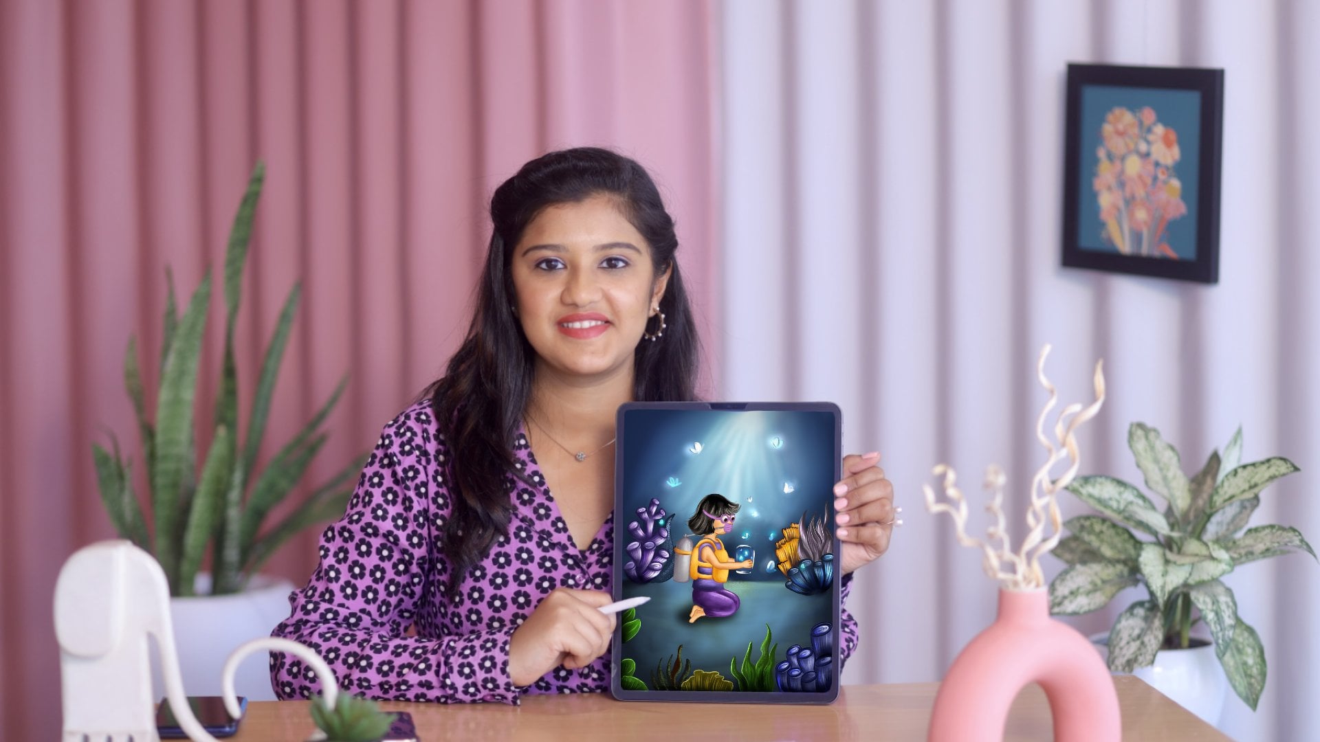
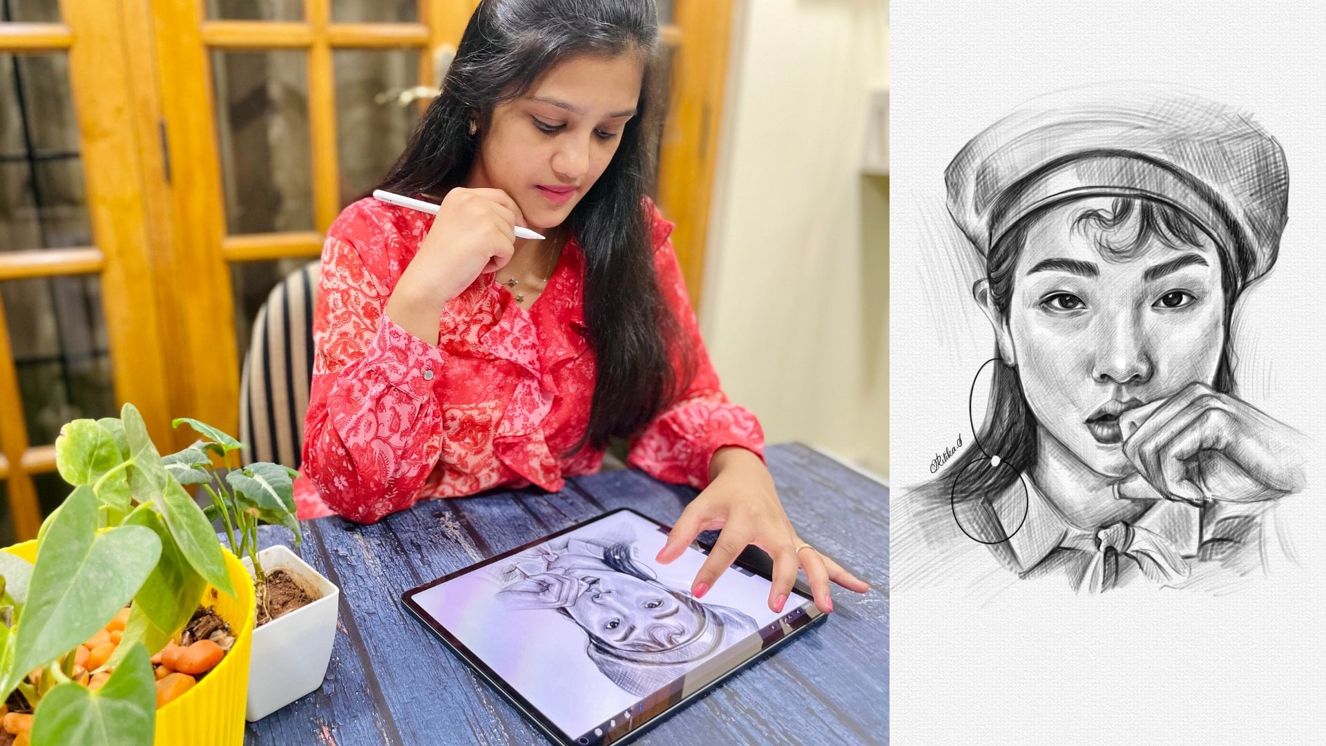
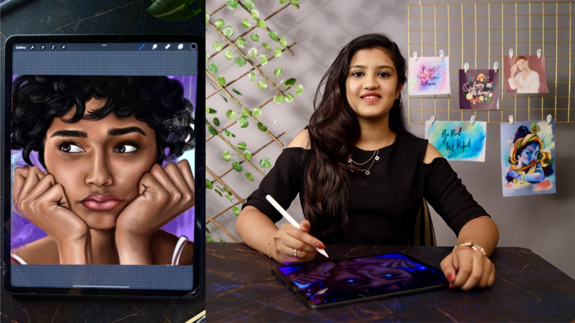
imaginary illustration. Hi, I'm Ritika, a freelance portrait artist illustrator and a to
teacher on Skillshare. Those who know me already from Instagram or on Skillshare know well that I love painting portraits both
on pencil and iPad. Apart from that, I also do client works and
other commissions. In this class, I'm going
to teach you how to create a beautiful imaginary Christmas
illustration by breaking down the fear of imaginary illustrations that
most of you might have. Of course, this holiday
season is amazing time, and what more special can it become if you're able to create an illustration on
this theme and turn it into a Christmas card for
your friends and relatives, or even sell them out there? This class will
help you brainstorm ideas from the given
set of prompts, and then sketch a
few thumbnail ideas. Later, we will select one thumbnail idea and turn it into a beautiful illustration. This class require some
basic knowledge about Procreate because this class doesn't contain many
Procreate tutorials, so I recommend the basic
knowledge in that, and also sketching figures
and other options. I won't be getting
into the basics of human anatomy or
still-life drawing, it's going to be all
about implementing your sketching skills into
an imaginary illustration. I'm so thrilled to teach you in this class because creating an imaginary illustration
that doesn't completely rely on a reference
have always [inaudible]. I also wanted to help you people overcome the fear, just like I. Without further delay,
let's jump into the class. In the next lesson, I'll tell you the
class breakdown, what the class project
is, and so on.
2. Class breakdown: [MUSIC] Hi again. I'm so glad
to see you join this class. Let me break down
the steps that we're going to go through to
create a masterpiece, that is the beautiful
Christmas illustration. First, I want to list down
the prompts that you can use. Then we will collect
reference images for these prompts and create
a mood board out of it. Then we will create 2-3 thumbnail sketches
and finally, choose one. [MUSIC] We'll sketch
the thumbnail idea to have finished a
sketch in our Canvas. Next, we will also be choosing a color theme and
deciding on the lighting. Following that, we
will paint the objects first and then we'll move
on to painting our subject. After that, we will also paint the environment or
the surrounding. Lastly, we'll be giving some finishing touches to make [inaudible]
illustration pop. This class will be
super helpful for those who already
know sketching and painting techniques on iPad and want to create stunning
illustrations which later can be used for
greeting cards or you can use the concept behind
this to create magazines, book covers, posters, and so on. In the next lesson, let me
tell you what a class project is and how you can
approach to create it.
3. Class Project: [MUSIC] Project of the class is nothing but a Christmas
illustration. But I have broken that down into simple projects
for your ease. The first project will be
to create a mood board. Then the second is going to be creating 2-3 thumbnail ideas. Then next is sketching the idea. The fourth is
coloring 2-3 prompts. Finally, the first one, it is the finished illustration. It might sound a tedious
process for creating such a big illustration
that is why I have categorized the project into smaller projects
like mentioned about to motivate you at each step in project
creation along with me. You can check each
project with me and get feedback from me
within 24 hours. Also I have to mention that
if you are able to follow along with me and
create a class project, you'll be eligible
to join me giveaway because I'm going to conduct
each quarter of the year. You will need an iPad, Procreate app, and a
stylus or an Apple pencil. But if you'd like to follow
along the concept in traditional methods, then
that will allow too. [MUSIC]
4. Choosing a Theme and Prompts: [MUSIC] The theme that I've chosen for the
class is Christmas. I recommend you also
do go ahead with it, so that it will be easy
to follow along with me. But incase if you have
other useful theme, you can choose that as well. I have gathered a prompt list
for our theme, here it is. I recommend you choosing
around 5-10 prompts. I have chosen eight
or nine of these, but based on the idea
that I'm coming up with, and based on the composition, and before they're adding
or removing the prompt. I have my prompt list here. You can go grab them
from resource section. I have 30 prompts here. Let me go through each
one and see which I like. I will take the ones that
I'm going to use for sure, and I'm going to circle or keep a dot next to it if
I'm a little doubtful, if I'm going to use it. I guess I'm going to use, I'll start with using
a Christmas tree, and I think, yes, I'm going to use candles. Snowman, okay, maybe, candy cane a tick, Santa Claus, fireplace,
hot chocolate, ornament, yes, gifts, of course, Christmas lights, maybe I want or I'll lot. Then I'm going to use
snow globe. That's nice. Maybe I can use a toy
train somewhere here and there on the light
or on a table. I'm going to paint a feast, maybe I'll be using it. Ice skating, nut
cracker, maybe not. I think it's enough now. I have around nine. These are my final
selected prompts. The next step is collecting reference images for
all these prompts. It doesn't have to be with
the exact Christmas theme. Anything similar to the
prompts will be better. I'll show you how I gather my reference images
from Pinterest. This is my Pinterest board of references for our
Christmas theme. I have a lot of
images that includes the images of all the prompts that I've showed you earlier. I have snow globes and I have a card with
the Christmas presents. I have sent a Clause
like this as well, with all the details in it. Then I have penguins, reindeer everything with
the Christmas theme. You can go ahead
and check it out. What I'm going to do is
I'm going to search for other prompts and I'm going
to gather a few more images. When I searched Christmas tree, I got this and I'm going to save a few favorites to
my Pinterest wall. I like this. I'm
going to save this. Next, I'm going to
gather reference images for our next prompt
that is snow man. I'll save this, I will go for our next prompt because there's nothing
much in snowman. Next is the hot chocolate. I'm going to save a few
images of that as well. I like this one with
marshmallows. I'm saving it. Next, I'm going to
save our search for fireplace ideas.
I like this one. I'm actually searching for
a fireplace illustration so that it will be easy for
us to paint the fire. That's exactly with a
Christmas theme. I like that. Like that I gathered
a lot of images for all the prompts that
I use or that I like. This is my Pinterest board of
references for this theme. Looking at this, I'm going to further filter the
selections and gather references that I think
it will be more accurate, and then add them all
and create a mood board. Now look here, I've downloaded few references that
I like the most, and then what I'm going to do
is add it in a mood board. That is, create a
new file and add all those images that we saved and then you'll get
this mood board like this. Here is my mood board. You go ahead and create
a mood board for your team or for your choice, and just share it with me
in the project section. That's it for this lesson. So far, we have seen
the prompt list, how to collect the
reference images and create a mood board out of it. Go ahead and keep
your prompt list, mood board, and Pinterest board of
reference images ready. If all these these are ready, let's proceed further with
sketching our thumbnails.
5. Thumbnail ideas to Final sketching : [MUSIC] It's time now to
warm up ourselves and gather a few ideas for
our thumbnail sketches. I have a thumbnail template
consisting of three so you can download
it below the class. First, I'm looking at
my reference images. I really like the
snow globe but maybe I'll think of what to do with
snow globe a little later. For first I will
draw my borders. This is where I'm going to
sketch my first thumbnail. What I'm going to sketch, I think I'm going to start
off with a Christmas tree. I'm having a Christmas
tree in the image on my left and I'm
just sketching it. I'm just using a texture brush. Don't worry, you can find all these brushes in
my resource section. You can also use the same. I have drawn the Christmas tree. What else can I add here? I'm thinking of
adding a snowman, so I'll draw the snowman here. This is just a very rough idea, you don't have to be very
accurate or anything. It's just a random idea that is coming to my mind and
I am sketching it. Once you've collected
all your prompts and your reference
images you just have to think what
at all you want to include in your illustration. I like the snowman, the Christmas tree presents. I wanted to also
include Santa Claus but not everything
in one single idea. In this, I'm going to
keep it simple and neat. Since I like the presents
I'm also drawing them. Here, my main concept is
the Christmas tree alone so I'll be decorating the tree with a lot of Christmas decorations, lot of lights and everything. I'm not going to add any
other bigger subject here. I'm going to keep this first
idea very little and simple. I'm adding some ornaments here. I'm just looking
for or thinking for some little things or
prompts that I can add here. I'm also seeing the prompts and I'm thinking of
what more I can add. I think I'm going to add Christmas lights here
on the top like this. You can add whatever you
want and whatever you wish. I am trying to keep things
simple in this idea. Next I'm going to
draw a toy train. Maybe a different, like this. It's completely up to you. Actually, you don't have
to draw the same thing, you have to create your own
ideas and try to sketch it. It's just a practice session so don't stress much if you're
not getting any ideas. It's even enough if you just draw a Christmas
tree or just draw a snowman and if
you just color it with bright and vibrant colors, that will also look good but try to incorporate 3-4
prompts, at least. Next, I'm thinking of
adding a candy cane. Just like this, try to add different things in
one illustration, that is your imaginative
illustration, nothing else. I think this is enough,
this is sufficient. Here I'm erasing these areas so that I'll be adding
ornaments and lights later. Side-by-side I'm
looking at my prompts. I think I am going to add a gingerbread or I
can even add a cake. It's completely up to you, you can add whatever you want. Just try to fit everything
in one single image. It shouldn't be like a
collaged image but it should create a real poster-like
thing or a poster-like feel. I've got my first
thumbnail idea, here it is. It's done now. Now, let me save this here and open a new layer and
sketch my second idea. It's better always
to categorize and name your layers so that
you'll be very organized. Next, for my second
thumbnail I think I'm going to start with the snow
globe, I really like it. Let me sketch a snow globe. I'm thinking of what
to add inside it like this snowman or penguin, something like that has
to be added inside. Maybe even a Christmas
decorated house. That can also be added. While I'm drawing, I'm
just thinking over it. Always have your
references on the side. Maybe I'll draw a
Santa like this. I think I like this. Maybe I'll draw a tree or
stars on the right like this. I think I had another image
like this one, like a path. Maybe I'll add a path. I'm going to draw that here. I think I'll add a door where the path and
the snow globe meets, like this, a tiny little door. Don't worry, it's
just a rough idea. We'll work on the anatomy in
the final sketching later. I'm going to draw a car in this path going inside the
snow globe, that's nice. Then what else can I add? I'll draw presents on the
top of the car like this. After that I'll have a snow land at the bottom
surrounding the path. I want it to be snow. Then after this I will draw a Santa sitting on
the couch like this. I'm drawing a coach here. It's just my rough idea. First I'll be seeing if this
idea is coming out well. Only later, I'll be working
on proper sketching. Just ignore my rough sketching, it's really crappy. [MUSIC] I'm going to draw
like this [MUSIC] Or instead of wasting
time with a rough idea, first, we have to know if
that idea is coming out well. What I'm going to do is, I'm going to use a
reference image like this, and I'm going to erase off the extras and just use
it as a color like this. Because this is just an idea or a rough sketch to know whether the idea is
going to come out well. Once the idea's good
and we really like it, we can just proceed
further with sketching. I have my reference
here and maybe a fireplace here because there's a lot of warmth
in the reference, but not just because of that. We also had a fireplace
in the prompts. The idea is well, and
what else can we add? This is my Thumbnail 2. We'll later work on it further, but for now, I'm just
keeping it simple. Next is my Thumbnail 3, I'm going to open a new
layer and sketch that idea. For that what I'm
going to sketch is, I'm going to draw
the borders first, and then I think I'll
draw a hot chocolate cup. I somewhere saw a reference
image of a snowman standing inside the coffee cup. [NOISE] [MUSIC] For that I'm selecting this hot
chocolate itself with no further ado, See like this. I saw a penguin in a
hot chocolate cup, I'm going to draw my cup. It's just a similar idea, but I liked it, so that is why I'm drawing here. Maybe you can add
different colors, and explore different
lighting themes in it and make it very unique. I'm drawing my mug, I'll have my Christmas lights
here, it will be fun. It has snow here and
there on the mug. Instead of the penguin, I can draw a reindeer as well. But here I will go with
the penguin instead. I'll draw this. Like, I did in
earlier, thumbnail, I'm going to just erase off the extras and have
the penguin image. If this idea is what
I like and if this is something I want to proceed further later I'll
be sketching this. Closer to the penguin
and inside the mug, I can draw some other
things like a candy cane or popsicles, anything I want. I'll draw a ginger man here, and I'll draw some
way for biscuits. That's it. This is
my third thumbnail. I'm going to work
further on that. Later I'd be choosing
one among these three, and then we'll work further
with all those details. This draft sketch of my ideas. Now, I'm going to
select one out of these three that
I liked the most. Don't choose the
idea that you like, choose the one that you cannot ignore
drawing or painting. While doing so, you will have the encouragement and
passion to finish it. Next, I'm going to
choose one of these. I like the first two, so I think I'll ignore this. I really like the first and
the second thumbnail idea. I'll be working
further on these two. For finalizing one, I will
go with my Thumbnail 2. I guess I like the idea, and there'll be a
lot of chances to incorporate a lot of
prompts in the second one. I'm choosing the second one. I really loved the idea
of the snow globes, so I'm going to choose this one. The next step is to sketch them clearly with proper
anatomy and details. That is the time where
we can try and see adding more or removing
some of our prompts. Let's see how I sketch it. [MUSIC] Go ahead, finish your idea
into a beautiful sketch, and also you can share it with
me in the class projects. Please do remember,
you can always throw your questions to me in
the class discussion. I'll be happy to help you.
6. Color and Light: [MUSIC] The next step in creating our imaginative
illustration is choosing a color theme and
deciding on the lighting. Let's start with
the color theme. Before deciding
on a color theme, I want you to go through some amazing illustrations
and their themes. For that, let's create another Pinterest board
of our favorites. You can actually
gather images from my favorite artist
or as well as yours. I will list down some of
my favorite artists that inspire me and the color theme they use really attracts me. I'm not getting into
the technical side of the color and light area, but I'm just giving you
an example of how to get inspired about color
themes from other art. I've already saved a few cool and amazing vibrant
illustrations. When you create this, this
is really cool and this one. See the light that is
penetrating through the whale's tail
and the shadows. Everything looks very good. I like the color
theme of the art. Here, I love the flow in this. See how bright it makes
the illustration. The next one here as well I like the light
coming through and penetrating in the
water and how it reflects on this
object. This as well. This is another one. I really like this color. This is what I'm going
to use for my Canvas. I'm sure about it. These colors are just amazing. Look at this. Actually, I like the snow and
the windows like this and the rough
texture in it. I may be implementing
this in my illustration. This is one of my favorites. I really like the color and the color of the
land that is coming, and it really makes
the illustration wow. Next is this one. See how the palette is, it just has a few colors, greens and blues,
but it is amazing. This one as well, it has
a limited color palette. It's just amazing. I love how the
colors are vibrant. This is another one
that inspired me a lot. This one. See the textures. This is also my favorite. See the color and the light that is acting on this object. I've saved a lot of
images like this. You can also refer to
this or use any of your favorite images as well
by selecting a color theme. Gather all these references
that you like in a Pinterest board and finally
choose 2-3 color themes. At last, create one
color palette that you think that will
suit your illustration. Now, I'm going to choose 2-3 color palettes
that I really love. This is the first one. Next, I'm going to
choose this one. This was my absolute favorite. Then for the diamond, I'm going to choose a
gentle Christmas theme so that I have all the common
colors for Christmas. The red and the
green, everything. Next, I'll show you
the color palette that I created
from these images. In case if you don't know how
to create a color palette, you can check out my e-Guide
for the instructions. These are the palettes. Now, I'll show you one
more image that I used. I'll actually
compare and show you from which I derived
this palette. I'll open that image. This is the image
that I used to create this palette and the
second one is this. This is actually
the topmost one. You can identify
the colors easily. The one more palette, I actually
got it from this image. This is the one. This is the image I used to create
that color palette. These are the color
palettes that I have chosen from these images. If you don't know how to create a color palette from a
given reference image, you can check out my e-Guide for step-by-step instructions. Then think of the idea of other artists and color
palettes that we've picked up earlier and try to
incorporate those in our color palette. Pro tip. While creating your
color palette, make sure it's not
very desaturated. Also before even finalizing
your color palette, keep in mind how it has to
be warm, vivid, or bright. Ultimately, you have to see how you can make your
color palette the best. Next think of the light sources. I'm going to choose one main
light and key light that comes from the objects
in our illustration. That is, in my illustration, it is going to be the candle. Now, I'm going to represent
the lighting with these little yellow arrows
in my illustration. Here, that will be
light illuminating from the fireplace and
next from the candle, and my main light source
is going to be from here. This is going to illuminate
our entire subject. Go ahead and decide on
your lighting theme. So far, if you have selected the light theme and the color, next let's see how to paint
our illustration. [MUSIC]
7. Painting Prompts 1: [MUSIC] Hello guys. Have you
got the sketch ready? If not, no worries. You
can simply start off by using my outlines from
the resource section. But I don't advise that. But in case if you want to just start with
coloring and painting, you can go ahead and do that. You also open my
reference image. First, I'll pick
the color that is present throughout the
subject, that is the blue. It is a major color
that is present in our image so paint
the candle with blue. After that, I'm going to paint the pink tone that is
present in the candle. I'm changing the background
color so that I can now observe the color that I'm
painting a little more clear. Then I'm adding the
pink tone that I see in the candle then slowly, gradually add each and
every color that you see. These are the mid-tones, which is not very
dark or very light. I'll tell you about
one more thing. Whenever you go to the further process or
whenever you add a new color, it's advisable to open a
new layer and paint it. One more thing is
you have to actually duplicate the file aspect. Once the sketching
process is done, it is better to duplicate your sketching file and then start coloring
in a new file. Sometimes you might lose the original file
so for safer side, then and there, after finishing a little process or major part of the process, just repeat
duplicating the files. Once some basic colors are done, it's now time for us to
paint the highlights. Here I'm painting the
highlights in the blue color now so to be a pale
blue or even white. Next, I'm going to paint
the highlights on the top. Usually there will be
lot of highlights here because our candle
would have melt there and we'll also
get the lighting so the light will
directly hit on the candle so there'll be
a lot of highlights there. You don't have to stress much about thinking of
the highlights, you can just rely on
the reference image for this to understand the lighting, if you are a beginner
or an intermediate. Those who have a lot of
experience about painting and light and shadows will know where to
add a lot of lights, where to add a lot of shadows. You can now use a
reference image. Now I'm smudging it a
little here and there. Here I'm painting the
highlights in the pink. It is going to be bright
pink or a light pink. If you observe the image closer, see here the candle
has melted down so closer to that there is
a dark shadow with blue. For that, I'm drawing a
few lines with the dark blue and I'm smudging it
with the rest of the paint. I'm observing the reference
image a little more clearer so we'll see on the top there are
a lot of shades, there are a lot of highlights. There is a bright pink
on the left and on the edges of the candle so
that is what I'm doing now. I'm also painting the highlights that are present at the dark. It is because of the
glowing of the candle. Next for the flames, first, I'll add yellow and white mixed in a new
layer and painting a huge yellow circle and then I'm going
to use caution blur. I've painted yellow
and then I'm setting the blending mode to color dodge and using caution blur for this. I'm also adding a bit of
orange and white in the flame. If you don't know how
to use a caution blur, you can just check out my e-guide where I've just given
the step-by-step guide. First, I did it with yellow. Now I'm just doing
it with orange and red to spread the light that is coming out of the
candle and picking the various tones of
the flames and I'm just coloring the flames. For the other candle, I'm just duplicating
that flame and replicating it and just
making a few lighter changes to the candle because I don't want both the candles to be of the same color
and the same tone. A little bit of shadows in the highlights
has been varied. Next to paint this side table. I'm just using the
basic tone as a brown. After the basic tone, I'm going to add a lighter orange and then
shade the highlights. After that, moving to
even more lighter orange for very bright
highlights and lastly, ending it with sharp
and fine dark shadows. To make it more interesting, I'm going to add those shades
again and just layer it. Also I'm trying to
make it interesting by painting some of the colors
with some texture brushes. Don't worry, you can always find them in the
resource section. I would have mentioned
it wherever I used. Next is the shadows, there will obviously
be a shadow between the candle and the table that is actually called the
occlusion shadow. [MUSIC] You can actually notice this in your daily life, wherever there are
two objects that lies close together you will get an occlusion shadow,
so that is this. Then the sun table
looks a little empty, so I'm going to paint that
with little ornaments. I would like to stick with
the Christmas color palette, so I'm going to paint
this with red and orange. After adding the
shadows with some dark red or brownish red, I'm going to add
the highlights with orange, with some textures. After that, let me also paint
some leaves on top of it. [MUSIC] I'm going to add one more small ornament with orange shade. Again, here is where we have to add the shadows, highlights. If you want, you can add leaves or you can just simply leave it.
8. Painting Prompts 2: [MUSIC] To start painting this, I'm thinking of keeping
red as my major color. I'll paint the basic tone first, shades of orange and dark red. I don't think there's
much to explain here, so let me speed up
the process and meet you wherever the
instructions are needed. I'm just using red, orange, and dark reds wherever
needed to shade it. [MUSIC] Now I'm using a pale orange or that is similar to white with
a textured brush, you can use any textured
brush from the given set. Or if you have any
other options, you can go for that as well. [MUSIC] Some different colors,
you can go ahead. But I'm painting the car's
window with blue because of the night sea that I'm going to paint later in
the background. My background is going to
be dark like at midnight, so I'm using this
same blue color that I'm going to paint
for the sky later. [MUSIC] I'm trying to draw
the steering wheel in the front seat. I'm an Indian, so usually, there will be steering wheel
on the right in India, so I'm just drawing that. Next, I have to paint
the wheels so I'll pick a dark black or brownish-black and
I'll paint the wheels. [MUSIC] Then I'm going to proceed painting the Christmas tree. [MUSIC] First I'll start with a
dark sap green first. After painting the whole
with the basic tone, I'm going to gradually
reduce the tones with lighter greens. After that, at last, I'm also going to use yellows, that is going to
be my highlight. You have to look for
the light's direction when you paint the yellow. After that, don't forget
to paint the shadows. Here, there will be a shadow. To paint the presence, I'll choose some colors
from my color palette. I'll go with purple, pink, blue, and yellow shades. It's very vibrant,
so I chose those, whatever you want you
can go ahead with. Whenever you choose your
colors in your illustration, choose them with a reason. Then I'm simply sharing them, keeping the lighting
in the mind. There's no much of work here. Just think of the lighting and shade it with
highlights and shadows. [MUSIC]
9. Painting Prompts 3: [MUSIC] To start painting this, first take out the reference
image of fireplaces or fire camp and then I've started with orange
and yellow shades. Then I'm just shading the logs with browns and ocher tones, and also add the
shadows to the log. Keep in mind that this
is a light source so obviously there'll be a lot of light coming out from the fire. Don't forget to add them
as well in the logs. I'm also drawing a few lines in the logs to bring the
texture of the wood but don't work too much in it
because it's just going to be a tiny little part
of our illustration. Lastly, to paint the light
coming off of the fireplace, I'm creating a new
layer of color dodge and painting bright
yellows on the fire, and also in the wood and logs. After that, it is some
of the extra paint, not only yellow, I also
used red here and there. [MUSIC] I'm adding
the vibrant red tone that I achieved by setting the
blending mode to multiply. Paint wherever it is needed. Once I've painted the
red wherever needed, I'm going to use the
Gaussian blur to spread the light
across the fireplace. After that, I'm going to use
the same thing and repeat the process with red and
orange shades as well. Before that, I'm
erasing some extras. [MUSIC] [NOISE] A low tone and again, repeating the process of using the Gaussian blur
to spread the light. I'm also reducing the
opacity a little. Again, in a new layer, I am changing the multiply
blending mode and then I'm using orange shade to do
the same process again. I'm looking for a
little more light and glow in the fireplace. Now I'm combining all the
layers of the fireplace into a single group and renaming it as a fireplace so
that it will be easy for us to identify later. Next, I'm going to paint the background with
the dark brown. [MUSIC] After painting
the background, you can see that there's a lot of light that
way, especially red. I'll move to that
layer and I'll be erasing some of the extra
light that I don't need. Keep it real. Make it minimal also. After that, what I'm going
to do is draw the flames. Usually the smoke will come. And to create the smoky effect, I'm going to use
grayish white or white. And then again, I'm
using Gaussian blur. To use Gaussian blur
you must have used the gray and white in
a separate new layer. I'll reduce the brush size. First, I used it with a
little bit bigger brush. I don't like that, so I'm going to reduce the brush
size and draw a few flames or lines
like this in a new layer. Now I'll be changing
the blending mode. [MUSIC] Now I'm going to paint the stonewall
surrounding the fireplace. I'll start off with gray. I'll paint it entirely. [MUSIC] After painting it, I'm going to partition
the stonewall. [MUSIC] Next, let's shade it. First, I'll start
with the highlights. For that, I'm using
light gray or white. I'll paint on each
and every stone. Based on our lighting, the highlight should actually
be present at the top. After the white or gray, I'm using a little bit darker compared to the
light or highlights. I'm using a mid tone of gray and then I'm painting
the rest of the areas. Later, I'll be smudging
with a suitable brush. You can actually use the soft airbrush or even
a texture brush if you want some textured effect
to be present in the stone. But here I'm simply
using a soft airbrush. You'll be able to learn the information about
all the brushes that I'm using in each and
every lesson in the e-guide. You don't have to
hesitate to check it out. You can find all the brushes and textures that I'm
using in this lesson. [MUSIC] There will be a
bright white light on the partitioning of
the stone as well. In that partitions also,
I'm drawing highlights. [MUSIC] I'm doing a little
more of blending and smudging wherever it is needed. [MUSIC] After that,
I'm also adding shadows closer to
the highlights. Usually there will be a shadow just closer to the highlight. I'm not talking in depth
about light and shadows here. But just understand that
there'll be a shadow just below or opposite to
the highlight as well. I'm drawing the shadows. If you're not able to understand where your light and
the shadow will act, you can just use the
reference image of a fireplace or a
stonewall and just try to add the same shadow and the highlight in your
illustration. [MUSIC]
10. Painting the Snow Globe : [MUSIC] From my favorite color palette, I chose this color
for the background. Wait I'll show you that. This is the color
I'm going to paint the background inside the globe. I'll open that and keep it
as my reference image here. I really like the darkness in it because I think this would
suit well for my illustration. I'll pick all the different
variety of shades that is present here and
paint it in our illustration. I'm taking this tone and
first I'm painting that. [MUSIC] Adjusting my brush sizes and I'm just drawing
a line here, picking the tone
and painting it. [MUSIC] Next, there
is a different shade present just above so pick that, so you can see the
radiations very well. We'll just do the same for the entire background inside the globe and just match it. [MUSIC] I think giving variation
in the shade will have a nice look rather than
seeing a single boring color. I'm adding a different
orange that is like similar to the
magenta or the purple that I've shaded and then
I'm blending it. [MUSIC] After that, I'm also
going to add highlights, because since it
is a glass globe, there'll be lots of
highlights and shadows here. First, a light or
mild shadow here, or a reflection that will be
seen if it is a glass globe. Later we'll be working a
lot on it to make it real. For now, just, let's
get the basic shades. [MUSIC] We have a Christmas light here, for that I'm using a neon brush. I'm doing this in two colors. First, I'm using
a neon brush and setting my layer to color dodge. [MUSIC] To using a low color, I'm going to use white as well. [MUSIC] To bring the globe the light, let me do like we did for the
candle and the fireplace. I'll paint yellow circles and then blur it
with caution blur. Now after the lights are done, I think I'm going to
add the brightness and the glow in the
candles as well. I'm doing now because we
have added the background after that the glow of
the candles has reduced. I'm using a yellow color and then setting the blending
mode to overlay. Nothing like you have to
use the same blending mode. Just scroll and see which
of the blending mode gives the best desired output
for you. Use that. I want to use the Gaussian
blur to spread the glow. Erase the glow a little more, I'm duplicating this layer
and setting the layer to add. As I said, use
whichever blending mode gives you best results. You might have used a
different background color so accordingly, you set the blending mode. I'm doing the same thing for the fireplace as well. I did bright yellow match it here and there and then later I'll be
using Gaussian blur. If you want you can also
reduce the opacity. Now I'm going to just
move and keep it. There's the extra light
that is coming out of the globe [MUSIC] to
reduce the opacity. I'm also changing
the blending mode. [MUSIC] I think the light is too much here and there
on the stone walls, so I'm going to
erase on the edges, because there'll be depth in the fireplace so
obviously there will be lesser light inside
the fireplace on the edges of the wall, so I'm erasing here and there, like you see. [MUSIC] Things I'm of the light on
the stone walls as well. Where there are shadows,
the light will be lesser, so erase those edges. I'm going to increase
the glow a little more. I have duplicated
the light layer and I'm duplicating and
reducing the opacity. Think which amount of light looks good on
our illustration. The light to the desired amount. I'm actually trying
to hide and see a few layers and I'm actually reducing the opacity
for a few as well. Whichever amount of light
looks satisfied at here, I'm just going to
stop with that. [MUSIC] There's enough now. I'm just erasing
a little outside. I'm going to combine the
layers and just rename that. [MUSIC] I decided to paint the floor with
a wooden texture, so I've created a new
layer and also renamed it. Since it's going to
be a wooden floor, I'm going to paint
it with brown. [MUSIC] Then some extras, some dark brown on the
edges for the shadows. [MUSIC] I'm also adding some light orange because
there will be a light coming from the fireplace
and also near the candles, so I'm painting that as well. [MUSIC] In one of our previous lessons, there will be an
occlusion shadow where two objects meet. Here, sofa is lying
on the floor, so there'll be an
occlusion shadow there. I'm painting that shadow. Add little more shadows, especially on the
edges of the floor, and wherever you have
objects on the floor. I'm also extending the shadow
to the left of the sofa because our light is falling
in the opposite directions. [MUSIC] Paint some light from the fire camp and
smudge wherever it is needed inside the globe
and the floor is done. Next, let's see how to
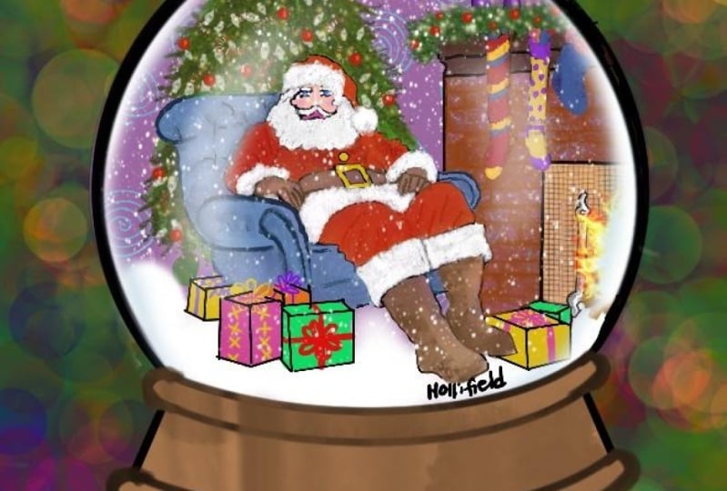
paint the Santa Claus. [MUSIC]
11. Painting Santa : [MUSIC] Let's paint the
protagonist of our illustration, that is the Santa Claus. You don't have to rethink the color palette for our Santa because it's
obviously going to be red. Then for the shadows, we're
going to use maroon, brown, and lighter shades for highlights like pink
and white, etc. First, as you can see, I'm painting it
entirely with red. Then let me add some shadows and highlights, variable you see. Here is a highlight and next time I'm
shading the shadows. I'm also taking the
outline to the below layer because we have to cover
the outline anyways. I'm just keeping it below
and reducing the opacity. I'm actually using
a texture brush. After that, while blending, I'll be using the
airbrush itself. I'm adding the color dodge as a blending mode so that
it will be very vibrant. [MUSIC] I'm going a little more in-depth with the
shading and the blending. [MUSIC] That is a little bit dark in the pants, so I'm using a darker brown and using less of
lighter shades here. I'm going to paint
the fur with white. Now, I'm going to shade it with the dark and light grays. While I shade, I just
didn't use the grays alone, I'm also using a little bit
of purple or violet shades, or [inaudible] to
the wall as well. In the Santa's face, I won't be going in
very depth because our illustration already
has a lot of details. I'll keep it a little light. First, I'm painting
with a skin tone, I'm using a new layer so I can
adjust or go back anytime. Now, to shade the face. First, I start adding dark brown and pink shades to the cheeks and
slowly blend them. Now, I'm going to draw the eyes after blending these shades. Once I've blended
the skin tones well, I'm going to paint the eyes. For that, I'm going to reduce the opacity of the skin layer, and then I'm going to
sketch the eyes roughly. I know I'm not painting the
eyes with much of details. I want to keep it very simple. I know I'm not
teaching here how to draw eyes or how
to shade the skin. As I said earlier, my focus is to help you create
an illustration that is not completely relied on
a single reference image. We're using a lot of references to create a unique illustration. The important thing here is the idea which is
completely ours. In case, if you're
struggling with shading or drawing eyes, there are other classes of mine that includes
drawing portraits, focusing on eyes, and other facial features. Also, there's my latest class about digital portrait painting. You can check them out
if you have to learn the basics of shading
and face drawing. It's not a promotion, just an additional
information that will help you to create your
illustrations much better. Painting the face is just like
shading any other object, you just have to know
where the lighting is present and paint the
shadows and highlights. Painting appropriate light and shadow will help you to shade whatever object
or the subject it is. The eyebrows. I'm
going to paint are Santa's mustache and the beard. First, I'll be coloring
it with white, after that, I'll be shading
it with gray and blue shades. Adding the shades, I'm
going to blend that. I will add a lot of lines with gray, white, and darker grays because basically the
beard is just hair, so there'll be a lot
of hair strands. [MUSIC] There is a lot of shadows that are just
below the stocking cap. It is formed by it so
I'm going to shade that. I may add some highlights in the face. I think I'm going to add
a little more shadows to the beard because it
looks a little flat. I'm going to add a few strokes with dark
grays and then blend. That looks a little stout so that he cannot
fit in the sofa. I'll reduce this side a little. Our Santa is almost done, I'm just left with one hand, socks, etc, which I'll be
painting in the later lessons.
12. Painting the Background: [MUSIC] Before shading the
outer part of the globe, I'll l erase the outline inside the globe because we are
almost done with this part. Then for the entire background, I will add a deep
ultramarine blue. Kindly ignore my
reflection of the face, I know it's a distraction for
you so better let me go and paint the land covered
in snow first. I've painted with white. For shading, I'll be using
grays and blue tints; that is violet, etc, and also a little bit
of gray of course. First the road. The edges of the
road has to be dark, so I'll use darker
violet for that. Now I'm blending it entirely. I'm adding some
textures and lines, and adding a darker
blue on the edges of the roads, just like I said. After that I'm smudging it, being a little bit
dark on the edges. Then I'm adding some lines in the part and I'll
blend them a little. I'm adding some more
dark shadows on these edges and the cars of the road with
a textured brush. Again, smudging it
especially beneath the car because the car might
have formed a shadow there. Keeping in mind, I'm
shading that as well. Until you're satisfied with it; a dark or light shades, I'm trying to keep my
road alone very dark, just like in my reference image. Just see the line
covered in snow and the road has a lot
of variations in tones, so I'm just trying to do
that in my illustration. After that, I'm going to
paint the rest of our land. I'm shading it with a
slightly violet-ish blue to just finally blend them. I'm adding wherever
it is needed. You can see I actually used a
textured brush to color it, but it's totally not necessary. Use any brush, whichever
output you like. At last when I'm blending, I'm just going to
use the R-brush, so obviously the texture
is going to hide but just I randomly pick the
texture brush and paint it. Now I'm just blending the
textures and the shades. After blending, I feel
it was very dark, so that is why I added
whites on the dunes. Now I think there
is enough white, so I'll go ahead and blend it. Blend it smoothly with
the rest of the tones. I'm blending it enough
until I achieve a smooth shading and gradual
decrease in the tones. While blending, you
might lose some colors, so now again I'm adding a
white because I think here, adding some more white
will make it feel good. The land is not just flat, it has lots of ups and downs. That is why I keep
adding whites and I just try to blend them with
the other part of the land. Let me add a little
more depth to the sides of the
road, like this. There will be a lot of darkness because from the dark
edges of the road, the land will actually
reduce the tone gradually. There will be some darkness
here as well, I'll show you. Here, there will
be a little bit of darkness because from the
dark edge of the road, the tones will decrease
only gradually. Reduce the tones step-by-step
and then blend it. I've drawn a blue line. I'm going to blend it, I'm also adding one more
tone of purple or blue. Adding that, I'm just blending those both colors with
the surface of our land. Next, to shade the
base of the globe, I'll go with the gray tones and then add a little
bit of violet in it. First for the basic color, I'm using only gray, and then for the highlights, a little bit lighter gray. Dark shadows here as well. The highlight will
actually be present at the top because of
our line's direction. I'll add those
highlights after this. This is our highlight, and then slowly blend
it with a softer brush. Blend it until these colors
don't disappear too much. It shouldn't be very flat, so blend it lighter. The globe is actually
looking a little lengthier, so I'll erase these parts. It has to be looking
like the land is covered with snow and the globe is just
present inside it, so it has to be
covered with snow. I'm doing this. Some highlights with the texture brush, they're a little bit noticeable. Reference now. I think I've left the door of
the globe unpainted. For that, I'll use a dark brown, and then I'll shade it with lighter browns like this then I'll
smudge it a little. Next, I'm going to pick a
even more lighter brown or an orange for the highlights. This is the orange and I'm painting it with
a textured brush. Let it be like that,
it looks good. After all this, I'm just slowly
looking at my references. I see what else can be
added to our illustration, or to know what else
should I work further. When I saw it, I feel like I can add some more
prompts to the land, it looks a little bit empty. I'm going to include it in the bonus time-lapse because this is only a simple
process. [MUSIC]
13. Painting Northern lights: [MUSIC] I want the sky
with the northern lights. Luckily, I've got one
reference like that. First, I'll use those colors. I will add a slightly lighter
blue then on background, I'm adding actually 2-3
different kinds of blues, and then I'm just blending it. [MUSIC] Let the edges
be a little bit dark. Then for the northern lights, I will be using a cyan blue
with a textured brush. First, with a little
bigger brush, and then I reduce the size of the brush and draw the
lines on top of it. After that, actually I'll
duplicate the layer, you will see why in a minute. For now, I will hide
the second layer, and then I'm reopening
the first layer, and I'm using
Gaussian blur effect [MUSIC] like we used to do. [MUSIC] Then you hide
the second layer, and it just smudge it
with the textured brush. [MUSIC] I'm using
a textured brush, and I'm going to smudge this layer like this to bring the effect of
the northern lights. [MUSIC] Just use
the textured brush and bring the effect
of the northern light. I'm also going to
reduce the opacity of it a little
because I think it's too much. That's it. Adding northern light
is very simple. [MUSIC] After this, what I'm going to do is blend
it a little here and there. You can see it like this. [MUSIC] Then next I'm
going to add some stars. For that, I'm looking
for the right brush , so I've got one. I think I'm going to use
speckles, it's not right. This is the speckles brush. [MUSIC] Sorry, this is not the speckles,
the one I said. Think I'm going to take white
color or cyan blue color. [MUSIC] I have to add
it in a new layer, but I have reached
the layer limit, so I'm just combining
a few layers. Always remember, you
can only combine the layers that are of
the same blending mode. [MUSIC] I've got
my speckles brush, and I'm adding some stars. Then I'm going to reduce
the opacity a little, and then I'm going to
repeat the same process in a new layer to
add some more stars. The last thing I want to do
with the background is to add some darkness on the
edges of the sky. [MUSIC] I'll pick
the dark deep blue. [MUSIC] Then I'm going to
paint the edges of the sky. I have some other brush, so I switch it to my regular
brush or some other brush, then I'm going to
paint the deep dull blue on edges of the
sky, just like this. Then I'm going to just blend it. [MUSIC] I'm also going to add some amount
of light or glow, so that can also be added. Again, I'm using cyan blue color and using Gaussian blur. [MUSIC]
14. Finishing Touches: [MUSIC] Here in this lesson, I will show some of the
finishing details that I missed. I actually added a mug and I even didn't paint the
gloves in the Santa's hands. So I did that as well. You can check them out in the bonus lesson as
a time-lapse video. I felt that the
Santa's left hand has to be shown a little. It feels somewhat unfinished, so I'm drawing that with the
darker shades like this. Then I feel there is
something wrong with the position of the socks, so I'm going to change that. I'll do it with the transform
tool and change it. I will also reduce the
length of the leg; it feels it is very long. I have reduced the
length of the legs. I'm just blending here a little. I'm going to erase off some of the extra fur because it seemed
a little unproportionate. Then the most
important thing is to improvise the
globe's glass walls. For that I'll first draw
a line outside the globe with pale pink then
I'll adjust the line, and then I'm going to
take it to the top layer. Then I'm going to use
Gaussian blur like this. See, you are getting that all glass affected
little by little. I'm also smudging a
little inside the globe. I've taken the reference
image of a snow globe on the side to absorb the colors that forms
the glass reflection. If you observe it closely, you can see a darker
shade on the top. For that, I'll use dark magenta. I'm opening a new layer
and then I'm going to shade the dark magenta here
and then I'm smudging it. The dark magenta is the same color as we
used inside the globe. Again, I'll do the same process. It is awesome extras. I'm going to add that here as well and I'm smudging it inside. Then to paint the
reflection of the glass, I'm painting white here and
I'm going to smudge it. I'll also reduce the
opacity because you don't have to have it
too bright like that. You can see there's also
present in the reference image, that is what I'm doing. Then I'm going to paint a
bright white for the highlight. Before that, I
combined a few layers. I'm just going to add a
little more of darkness here, just the same step. I'm also reducing the opacity
to the desired amount. Then the bright highlight
here on the top right. You can then smudge it
using the Gaussian blur or just smudge it with
the smudging tool and erase some extras that it'd be a little bit sharp
and fine like this. Then I'm going to add
some dark brown to the bottom or darker gray. See I'm choosing something
in between the brown and the gray at the bottom of
the globe like this. Because if you think and see, you will know the
shades will be dark while the spear goes inside. I hope you understand
what I say. The edges will be dark. I'm painting that
and I'm smudging it. Lastly, you know what
I'm going to go? I'm going to give a magical
touch to our illustration. I'm looking for this
glow in the windows. I'll pick a soft round brush and set my layer to color dodge. I have this reference
image on the side. I've set my layer to color
dodge and I'm going to color the entire window to see you are getting the glow
inside the window. I like this than the
boring deep blue. Now, this is giving a light
effect to the windows. I'll also add some of the
glow or the light that is coming from the
window on the wood as well that is surrounding
the glass like this. After that, you will have to add the light's
reflection on Santa as well, I'm going to do that. I'm painting some of the blue in Santa's head,
mustache everywhere. Also on Santa's cap,
we have to add it. On the beard, I'm drawing few lines with a
light blue color. Just don't go too much with it, just add a little amount. After that, I'm going
to add the glow in Santa's stocking
cap just like this. When you paint the
dark blue color that is with the color
dodge planning board, it will give a magenta tone when it is painted on
red. So that is fine. This is how it will look when the blue light falls
on the red cap. So that's normal. You can just reduce the
opacity if you want. I'm actually choosing
a different blue for it and painting it light. I'm also adding a line here, like a reflection, and
I'm painting Santa's cap. I'm going to smudge it now. Next, I'm going to add the bright highlight
in other objects, like in the mug, so far, side table, etc. I have added the highlights
in the face as well. Because it's very
direct to the window, you don't have a lot of
highlights and reflection. So that is why I'm adding that. A few more lines in the beard, and then for Santa's scuffs. Next, I'm going to
add a reflection in the sofa and then I'm
going to smudge it. These are just some
little things that you can add up to your
real situation that can make it extraordinary
from ordinary. I like all these things. This is what makes
your portraits or illustrations unique. I'm also covering here with the reflections
and also there is some little grooves on the
sofas for that as well. I'm adding the
light's reflection. Then I'm going to
add some reflection in the mug like I said earlier. You can keep undoing and redoing it because I'm not
satisfied with it. Now I'm adding a white highlight for the mug and for gloves. Then for also the
side table, gifts, and also this plank, I'm adding some blue light. I'm reducing the opacity to the desired amount and
also to the fireplace, I'm adding some glow. I'm also adding gloves
on the other hand. Then I'm lastly
adding some flames to the Santa's fireplace. I'm also going to
draw some stars here which is going
to be glowing. Either paint it with
the Neon brush or use a color dodge planning
mode and as usual, use Gaussian blur
effect to spread the glow in the stars
with the surroundings. Then I'm adding some
highlights to the globe and some reflections in the
ornaments like this. Lastly, I'm going to add
a snow at the top of the globe because I'm going to draw snowfall
in the bonus lesson. You can watch that as well. First I'm going to paint snow
at the top of the globe. I have actually shaded with
the same tones that we used for the snow line and
also for the Christmas trees. I'm using the same grays, violet, and blues
to shade the snow. I'm also adding some snow
to the ornaments and the sides of the
roads just like this.
15. Final Thoughts: Congratulations to both of us. For me, it's because I have
wanted to take something apart from focusing on
portraits for a longer time, and congrats to you because
you have now learned the concept of imaginative
illustrations. I'm beyond excited
to see what you all sketch and paint
with this technique. You can absolutely
take anything, any prompt and create your own illustrations
and share it with me. You have now learned the
concept of creating, imagining to illustrations
from scratch. If you really enjoyed
this class or if you find a few
tips very helpful, please do share a class review, so it will be easier
for other students to identify whether this class
will suite them or not. Do connect with me on
Instagram @ritika_sridhar. Tag me in your post, and when you share
your projects, I'll be thrilled to re-share your works in my
stories and on my post. I share my portrait commissions and other works on Instagram. You can just follow
along with me if you'd like to tag
along in my journey. Also, don't forget to hit the Follow button
on Skillshare so that you can catch up on
all my upcoming classes. A reminder, you can draw
anything with this technique, not just illustration that
we saw in this class, but you can also incorporate a few more prompts
with portraits, and create a unique
illustration. You can create scenic
illustrations too. Practice until you feel
confident about creating unique ideas and getting a different color theme
and light themes. You should definitely share
your works and assignments and also the finished
illustrations that you chose. Thank you for joining me
on such a lovely day. Create more and spread love.
 Ritika Sridhar, Artist, Illustrator