Transcripts
1. ABOUT THE CLASS: [MUSIC] Hi. I'm Ritika Sridhar. I'm an artist and a calligrapher
from Coimbatore, India. Welcome to my Brush
Lettering course. This course is for
complete beginners, where I'll be starting
from the scratch. Firstly, I'll be demonstrating the working of the few
common brush pens. I will show how the tip
of the brush pens work. It is not necessary for you to use the same brush
pen that I'm using. You can use any of the
brands that you have. Even if you don't
have a brush pen, you can start it
off with pencil. Following that, I will show and demonstrate all
the basic strokes that a beginner should practice in order to start
with lettering. I have ensured that this
class is broken down into categories so that
every beginner can understand it easily. You can also download free practice sheets in
the resource section. I have created a basic strokes
and common mistake sheet; followed by that, you can get few other lettering sheets. You can download and print the sheets and practice
it along with me. I will also be teaching the basic anatomy of
each and every alphabet. After that, I will also teach
how to style the alphabets. Following that,
we'll be seen how to form words and how
to style them. At the end of the class, you'll be able to create
beautiful and flourished words. So you can easily
follow it along with me and practice
brush pen lettering. Don't wait for other;
jump into the class and learn the techniques
of brush pen lettering.
2. BRUSH PENS DEMO: [MUSIC] Hey, welcome to our next class
in the class than wonder demonstrated a few brush
paints that I use regularly. Here is Tombow Fudenosuke, and this is Karin markers, and this is the
Camlin brush pen. I'll demonstrate how all
these three pens work. If you're using Camlin,
the tip is a little bit thinner when
compared to Karin. It is also not as firm as Karin. It bends so much, and Karin doesn't bend so much. I'll demonstrate
all of these three. Then Fudenosuke is
a small tip pen. See, it doesn't even
look like a brush pen. You can use this for
smaller light rings. I'll demonstrate all
these three now. [MUSIC] This is Camlin brush pen. You can see the tip is
thin and also larger. That is, it bends a lot. It is very flexible. You can get a really
broad stroke. See? If you're going for an upstroke, it'll get it like this. I feel it is difficult when you do alphabets
and words because it bends a lot and then
you will get like this. See? Since the tip
is very flexible, it's very difficult to
get the thin strokes. It might be different
for each and every one. [MUSIC] This is how Camlin
brush pen works. The next one I'll show
you is the Karin markers. It has a broad tip but it's not much flexible
like the Camlin one, I'll show you the broad strokes are not so much
thicker like this. When you do an upstroke,
it's very fine. Then you do an oval. I think it's very
smooth and very good. I don't find any difficulty when I switch between thick
strokes and thin strokes. This is how Karin
markers work and looks. Then there's the Fudenosuke, as is told you, this
is a small brush pen. This is the thickest stroke that you can get from the Fudenosuke. I have to zoom in for you, so let me do that. Now, an upstroke
and then an oval. [MUSIC] Now I'll write and
show you few words. [MUSIC] Now let me show you with
the Camlin brush pen. [MUSIC] This is Camlin. The next one is the
Karin brush markers. I'll show you how this works. [MUSIC] This is for Karin.
3. BASIC STROKES: [MUSIC] Let's get started
with the basics first, I will demonstrate
all the strokes. It's very important
that you practice these only then you will have
a strong fundamentals. [MUSIC] I have a
guideline on my sheet. You will also have the same in the practice sheets that I've given. Let's get started. The first one is the
downward stroke. It does not embark slanting
line, just like this. It should be evenly thick from the top to the bottom line. Even if you change the angle, it's fine but you have to give even pressure
throughout the length. I'll do this once again, hold the brush pen like this, a little slanting and
a little away from the tip unlike the
other normal pens, and put even pressure
throughout the length. Whenever you practice
these strokes, leave even space so that
you'll get used to it and it'll be easy for you when you form
letters and words. Once again, I'm doing this. It goes like this. Make sure to take care
of the slant angle and depression, and the shape. If you were a big
unites completely common to have shaky
lines at the beginning. Initially, you might
be disappointed by it, but once you start practicing, you will get firm strokes. See, your strokes
might be rough like this or you might
get uneven strokes. But you will have to
understand that you have to give even pressure. [MUSIC] Once you're
done practicing this, next, you have to
practice the same one like this without the slant. This is it. You have to put even pressure
without the slant angle. It should be straight
thick lines. Keep practicing this
for a few lines of pages until you feel confident
about these strokes. [MUSIC] Next is
the upward stroke. For this, you have to start from the bottom and reach
till the top line. It has to be very thin. Again, I'm doing this,
put even threshold. I mean very light
pressure like this. First, initially, you might struggle with this, but with practice, you can
master any kind of stroke. The next one is similar to this, but with a small change. The starting of
the stroke will be a little curve like a tick mark. I'll do that. [MUSIC]
It goes like this. It looks like a tick mark. [MUSIC] Like this. This is called the entry stroke. You might not be
needing it a lot. But when you start an
alphabet like this, if you have an
alphabet like this, you have to add this
stroke in front of that. Just like this. When you learn the basics, it is better for you to
learn every single stroke. Practice this also. Let me mark the directions
for it, for your reference. This is the downward stroke. It goes down like this. There's also the
similar downstroke, you have to start from
the top to the bottom. These two add up to a stroke. It goes like this and like this. [MUSIC] The next one
is the overdone, which is a combination of both the thin and
the thick stroke. At first, you have to
start from the bottom. Get a thin stroke followed by a smooth curve, and
then a downstroke. Again, start from a thin stroke, then the downward thick stroke. When you change the thin
to thick the stroke, it has to be very smooth. Start from the bottom line, get an upward stroke, and then a downward stroke. Always remember that
upstroke has to be thin, and the downstroke
has to be thick. Next is the opposite of this, which is an underdone. You have to get a
thick stroke first and then transfer it into
a thin upward stroke. Just like this. Again, I'm doing this. This is it. [MUSIC] I'm
marking the direction. You can find all
these directions and instructions in the
practice sheets. The next one is the
compound curve, which is a combination of
both the above curves. First an overdone this, and then forward by a underdone. First, thin stroke and then a thick downward
stroke then again a thin upstroke. See this. It's just the combination
of these two strokes. These two strokes combine
together is the compound curve. [MUSIC] I will show you all
the important strokes that we've seen so far. Thin upward stroke,
a downstroke, and then an overdone, underdone. Then the compound curve. Next is the entry stroke. Then the flat thick stroke. But our thick slant angle. Moving on to the next stroke, which is the ascending loop. For this, start from the waistline with a
thin upward stroke, and then go down to the bottom with the thick downward stroke. I'll do this again. Start like this and
take it to the bottom. I'll mount the
direction for this, it has to start from here, and then end like this. Next is the descending loop. In this, you have to start
from the middle line, go down with the thick
downward stroke, and then the upward thin stroke. Just like this. Practice until you get
it very smooth and form downward stroke and
then the thin upward stroke. We'll use this for
definitely d and g and n. Practice all these. Then we'll move on to
the next basic stroke, which is an oval. This is the most important one. Start from here, and then
thick downward stroke, and then join like this. Make sure at the join point you don't get any double lines. It has to be very smooth. Getting an all rate would
be really difficult. But keep practicing
until you achieve this. Because most of the alphabets
will be needing an oval. This is most important one. [MUSIC] All our basic
strokes are complete. I will show you
all the remaining one that we practiced
in this sheet. The ascending loop, the
descending loop, next the oval. Practice this for
many pages and many lines until you feel confident
and strong about these. [MUSIC] In addition to all this, you can also practice one more
stroke that is like this. Like a triangular cap. Thin slanting upward stroke
and a thick downward stroke. You can add this one
also to the factors. Once you feel confident
about all the strokes, you can move on
to the alphabets, which I'll be teaching
in the next lesson.
4. ALPHABETS A - N: Hi, thanks for jumping
into the next class, which is the
lower-case alphabets. I hope you are done practicing
all the basic strokes. Now, you can join with me
and practice the alphabets. I'll start with the a alphabet, which comes with an oval
and then an undertone. Almost half an
undertone like this. You will see me wearing the
basic strokes a lot for the alphabets so that
it looks better. You have to make the
basic strokes more flexible for making a comfortable and a
good-looking alphabet. For b, I'll start with
an ascending loop and then an opposite-sided
oval like this. You can also do it as a
straight line and like this. It is in a opposite-sided oval because you start in
the opposite direction. Next for the c, it is an unfinished
oval like this. You can extend it a
little bit as I told you I'll be wearing all
the basic strokes later. Next for the d again, we have to start with
the oval like this. Then I'm going to start the ascending loop with a
little bit of undertone. Here, e and for the f, starting with the
ascending loop, then I will just have
curve like this. Next again, an oval for the g, like this, followed
by a descending loop. You can also extend it
a little bit like this. I'll mark all the directions
that I'm done so far. When you draw an oval
and then undertone, make sure you leave
a gap in between. You can observe that. Again here, you have to identify the basic strokes
individually. Here again, for this an ascending
loop like this and an oval then the
descending loop. For the h, I'll begin
with an ascending loop, then followed by a half
compound curve like this. Then for an i I'll have the entry stroke and
then an undertone. Similarly for the j. You have a descending loop
for the j with an extension. Next for k, I will begin
with the ascending loop, then reverse over like this with a slight radiation and
an extension like this. For the l, it is an ascending loop mixed with
an undertone like that. For the m, go like this with
two slanting overtones. Similarly, the n. If you have any difficulties
in forming these alphabets, you can always throw your questions in the
discussion section. I will be there to help you with whatever kind
of help you need. I'm marking the directions
for your reference. The i goes like this. You can see me using the
entry stroke only for i and g. But wherever you think
you need an entry stroke, you can use that. But make sure you're using the right strokes
wherever it is needed. You have to easily identify the thin and
the thick stroke. There should be a lot of
differentiation between the two. Only then the
lettering will look good and it will
have a clear look.
5. ALPHABTES O - Z: I'm continuing with the rest of the alphabets here. Next is the o, which is nothing
but a normal oval. Then for the p, I'm going to
use a thick slanting line. If you want, you can use an entry stroke. I'm using it directly and then an opposite-sided
oval like this. For the q, it is an oval and
then a thick slanting line. Then I would like to have
a small curve like this. Understand the direction. Understand where it should
begin and where it should end. Differentiate the thin
and thick strokes. For the r we have to start with an
entry stroke like this, then a small loop, and then an under-turn. It is a half and under-turn. These are the directions. Similarly, for the s, start with an entry
stroke and then a loop, and then a curve like this. Then for t, start with a thick slanting stroke
with an under-turn. Moving on to the u, it's a complete under-turn
with a half under-turn then the v with a sharp edge
at the bottom like this. You can see all the alphabets are
almost a combination of the basic strokes or with
a slight variation of it. For the w, two undertones
together like this. Next, for the x a
reversed unfinished oval, and then an unfinished oval. For the y, an
under-turn followed by a descending loop like this. Then we have the z, it goes like this.
6. STYLING A - K: [MUSIC] Hey, everyone. I hope you watched my previous classes and learned all the basic strokes
as well as the alphabets. Now this class is to learn
how to style the letters. It's very easy. You can just try to
style the letters with the help of
the basic strokes with a slight
modification itself. Now you see for the
first alphabet, I extend the underturn a little. For the second one, without joining the oval, I just extended it. For the third one,
I have started the oval in front
of the underturn. These are the various
ways to style an alphabet with the
basic strokes itself. For this one, I have extended
a loop at the ending. These are a few
examples for the ways to style and flourish
the alphabet. I will be creating various
styles for each alphabet. You can also sit and
try it along with me, or you can try your own style. [MUSIC] This one is a normal b
and the previous one was a slight modification
for the oval. Without ending it properly, I have created a loop for that. Now for this, I created a slight variant
of the first one. You can see the loops
are a little bit loose. For this, I have created a loop inside the
ascending loop on the top. Like this you can try and
explore various loops. You can find various
styles on the net and try to impose that
in your letterings. [MUSIC] Here, I will extend
a little on the top. This I'll make it
thin and taller. For the next time I'm
creating a loop at the top. This is a regular
d. For the next, I'll be creating an extension
on the top like this. You can observe all the
variations that I'm creating. [MUSIC] The key point that you have to note
when you flourishes, I don't usually
flourish at the start. I finish my alphabet mostly and then only
do all the extensions. But when it has to
begin in the alphabet, I do it first. You can see all the loops
on the ascending d's and b, I'll be doing at the end only. For that, this video will be helpful for you so that you will know when to start
flourishing and when do the it on the end. Now you've seen me
flourishing all the a's, b with the ascending, descending loops and the
entry strokes and everything. Now it's time for you to try the same thing and then
create your own flourishing. Next will be a
walk-through of me styling various alphabets
with different styles. [MUSIC] Don't start flourishing the
alphabet straight away. In the worksheets
that I have provided, there are loops and curves
that you have to practice. Practice those first separately, only the curves or
only the loops I have [inaudible] Once
you practice that, then start flourishing
the alphabets. [MUSIC]
7. STYLING L - Z: This is a modern m, where amusing bounce lettering. Bounce is nothing but
jumping off and on the line. Here I am on to adding
an entry stroke to the n and also flourishing
at the end with a loop. For the o, what you can do is you have to differentiate only
where it joins, like when you begin
and when you end. That is the point where
you can flourish. This is again a modern b where the oval is a
little bit loose. One more thing that you have
to keep in mind when you flourish an alphabet in
a word or a sentence is, you cannot flourish each and
every alphabet in the world. It will be very congested and it will not
look good at all. What you can do is
either flourish it at the starting
or at the ending, just like with letters
in each of the letters. You can see that I am only flourishing at the
starting or at the ending. Similarly, for a word, you can flourish it where it begins or you can flourish
it where it ends. But at some point, you can flourish even in the
middle of a word. When you have alphabets
like a, m, n, so that it will end down, you can extend and have a loop, just like I had now in the x. Or if you have a descending
loop like y or g you can go ahead and style it in the middle
of a word as well. But make sure it is very even and it has a flourishing look
than it looks congested. In the next lesson, I'll show you how to
flourish your board.
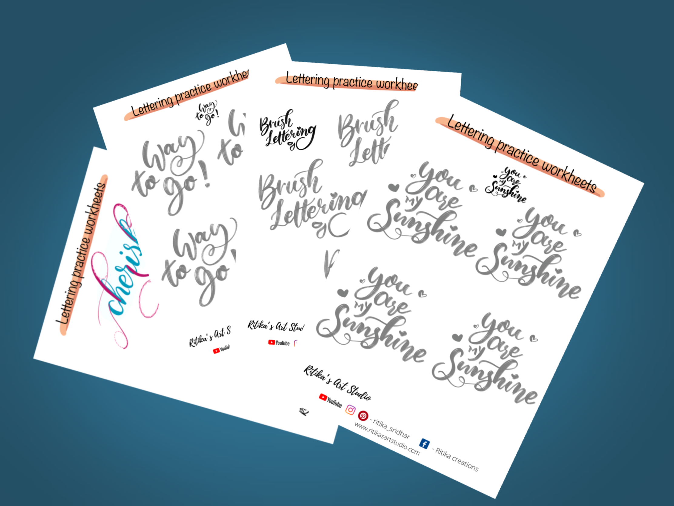
8. ABOUT THE FREE WORKSHEETS: In this class, I'm
going to talk about the practice sheets that
I've provided for you. I have all the basic
strokes in here. I have the first one
with full transparency, and then the next few will have less transparency so that
you can practice about this. You can have your brush pen
and practice like this. This following
example I showed you. If you have iPad
and a Procreate, you can also practice this
in the iPad like this. If not, you can take
printout of these sheets and try them out with
your brush pens. I also mentioned
the direction of the stroke so that you'll
understand that better. This will go like this. I've mentioned all
the directions. Here as well, I have the rest of the basic strokes along with the direction
with the numberings. I have numbered it
so that you will know where to start
and where to finish. Then I have a sheet
with common mistakes. [NOISE] I'll be listing out
the common mistakes with all the basic strokes that
usually beginner steps. I have circled the mistake once, and I'll mentioned that in the sheet so that you'll know what to do
and what not to do. Again, this is for the same. I'll also be mentioning about
everything in this video. Then you'll have
all the alphabets. If you want to practice these alphabets by tracing
that out, you can do it. You can place the
tracing sheet above this and just letter
it over this. Then there will be
two sheets which describes the anatomy
of the alphabet, which I'll be showing
you now in detail. I've mentioned all the
anatomy, the direction, and all the rules that
you have to follow when drawing or
writing an alphabet. Then you have the
last two sheets, which is forming letters
and styling them. This we are going to
see now in detail. Now, let me explain about
the anatomy that I've mentioned in the worksheet with this practice sheet
that I have done. Then you take the
thick downstroke. It should be even from
the top to the bottom. You shouldn't have any rough
edges or an uneven stroke. Then for this one, you have to have thin upstroke and it should have the same angle as the
rest of the lines. Then for this, check whether if the soft, underturn fits into
an oval like this. Also this. Why is this necessary? Means it should have
a proper shape. I've already told you about the shape, angle, and pressure. If you have a proper shape only then your letterings
will look good. Try to understand that almost every basic stroke or every lettering has to
fit inside an oval. Also these two lines
has to be parallel. Next, again, for this, you have to make sure that
this fits inside an oval. If you take and
placed it again here, it should also fit
inside the oval. Moving on to the next one. Here again, there's a loop. Here, where you have to place
the oval is, like this. You should form a
small oval at least. See to that your lettering
fits into this criteria, so that it will look good. It is not a rule or it is not the thing that it should
be perfect like this, but I just told you this because it should be neat
and with the proper shape. Then an oval, which again, you know that you have to
have the proper shape for it. Here also, the oval
should fit in here. You don't consider this
part. Consider this. You have an oval here. This is what I'm talking about. Your lettering should have
an anatomy and a shape. Now for the alphabets, same way for the basic stroke. If you write an a, it should have an
equal space over here, or a proper oval. Similarly for d. For b, since b is in a opposite
side of the oval, I have like this, but you can also have
a proper oval also. These are the slight
modifications that you can do for
your letterings. Then here again for g, then you will have
the same open for o, for p, for q. Then you can place
an oval for y here, for a z here. Then similarly, you
have it for g, for j, and a lengthy thin oval
for l. Again here, a lengthy one for k. I'm not talking about the length
or the shape of the oval, but it should have
equal space like this. Hope you understand
what I'm talking about. See, similarly here as well. Have a proper and even spacing. Next for the flattish alphabets, I will add all these
scanned copies of these in the description
of the resource section. I haven't added them in
the practice sheets, so you can't find the
scanned ones there.
9. FLOURISHING WORDS: [NOISE] Now let's talk about lettering and then styling the letters when you
have a single board. I'm going to write
my word first. Make sure you follow
all the basic rules, especially the thick
and the thin strokes. I have my basic word first. The next step is to analyze
wherever you can style this. Usually, you can style
the letters where it is beginning or
where it is ending. Here I would like to style
something like a capital C, but I find that there is alphabet which is
higher than this. If I also make this higher, it won't look very good. What I'm going to
do is I'm going to start the see from
here, like this. This is one option
that we can do. If not, the second one is, I mentioned all the possible
ways that you can style. First, this one, you can extend this like this, and then have your C like this. If not, as we saw in
the previous lessons, different styles of lettering. You can have a loop like this, but make sure it
doesn't look like a C, you can have this. Select that. There are many possibilities
for flourishing. For the next one, it
is H. What I would do is I can have something from
here or do something here. There are two possibilities
that I'm taking off now. I mentioned those two here, starting from this
side and then having a loop here for the H, or I can have the H like this and style this
side like this. You can do anything here. You can have an oval along that. This is one method. First, analyze what are all
the ways that you can do. Next, I don't want to
flourish this because if you style each and every alphabet in the word
it will be very congested. If you want, you can do this. You can flourish this one. I'll show you how
you have your letter R. You cannot flourish
about it but instead, when you're in here you can
do something like this. You can extend it like
this and just leave it, or you can take your alphabet, and you can have this
type of flourishing. This will suit very
well when you have letters after that alphabet and letters before
that alphabet. When it is in middle, it will look very good for this. I don't want to
flourish I and S, I would like to
flourish this so that the starting and the ending
has a nice style for that. I can add this H
or this H to this. Let me show you the
flourished lettering now. For this H, start from here and finish the alphabet
and then do like this. This is how you have to style letter when do a brush
pen calligraphy. You might have seen
me flourishing this one but if you're not that strong with your basic strokes or if you're not
having that flow, you will not get
these things right. You have to practice a lot
and get the flow going, only then you can flourish
the alphabets like this. In the practice sheet, you can find this word
and also another one. You can also find many examples like this
in the practice sheet. One more thing that I want
to mention to you is, all these flourishings
should also have an anatomy. You might wonder what
is the anatomy here, but I'll tell you now. See, this should form
an oval like this, and this one should form an oval or the side
of the oval like this. Similarly, here as well. You must be able
to form an orbit. This is what I'm talking about. If you make sure that
your flourishing will fit into an oval, then it will have a proper
and the demand of propulsion.
11. FINAL THOUGHTS: Hey guys, we have come to
the end of the session. Hope you enjoyed
learning and creating beautiful letters and
flourishing them. Feel free to share your practice works in
the project section. You can also check
out my other courses. I've been teaching
two other courses in Skillshare so far, which is Portrait Drawing course and Realistic Color
Pencil Drawing. Thanks for joining the class.
I will meet you soon in another beautiful course.
 Ritika Sridhar, Artist, Illustrator