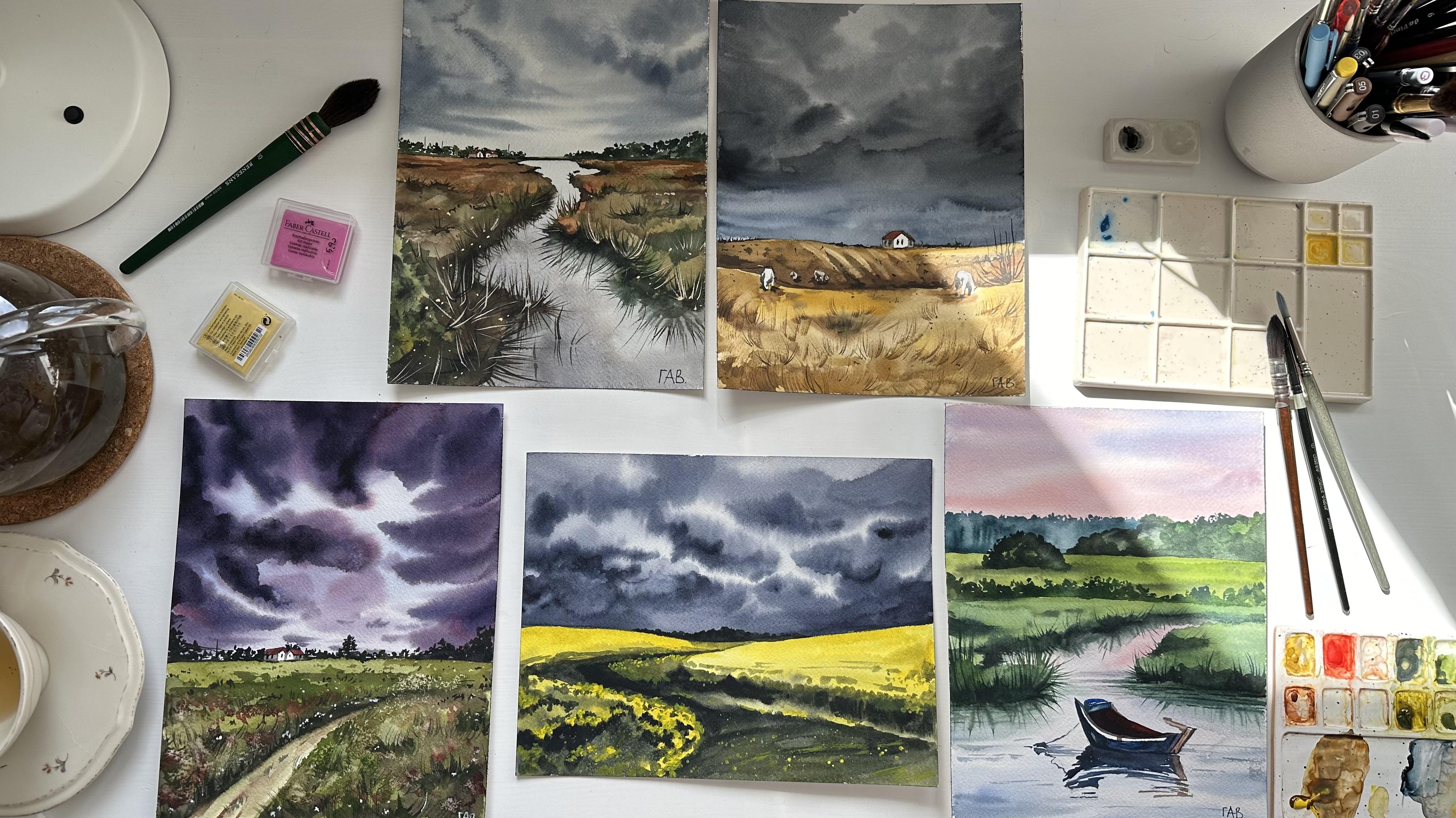
Transcripts
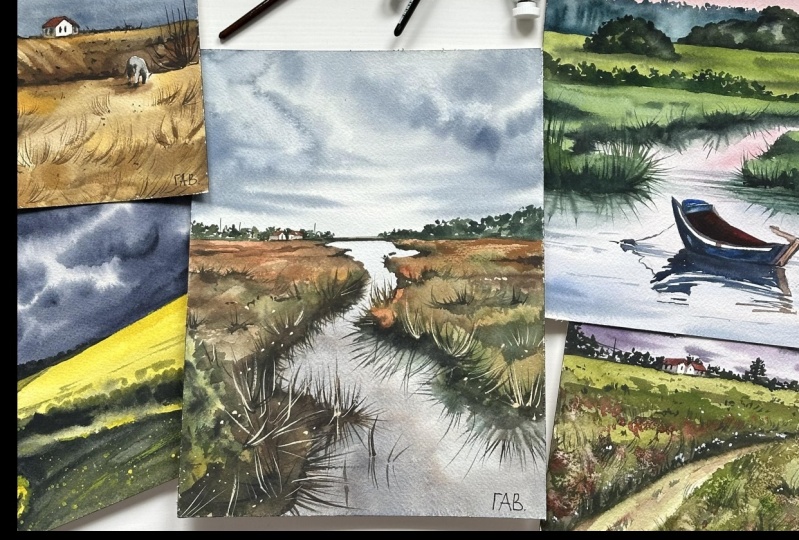
1. Welcome to the Class: Welcome to the magical world
of watercolor landscapes. If you ever wondered how
to capture the beauty of a sunrise sky or the drama
of a stormy landscape, this class is for you. Hi. My name is Alexandrna
and I'm a watercolor artist. In this class, we will paint five breath taking landscapes. I will show you how to paint different types of scenery from the yellow field before the rain to the peaceful lake at Sunrise. Before creating this class, I asked my students, what is the most difficult about painting
landscapes for them. Based on the answers, I decided to add a special lesson about creating textures
for the foreground. I will show you art materials
and main color mixes. I'm using full landscapes. We'll keep things simple yet stunning by using a
limited color palette with just a few
essential hues that you can find even in a
small watercolor set. This class is suitable
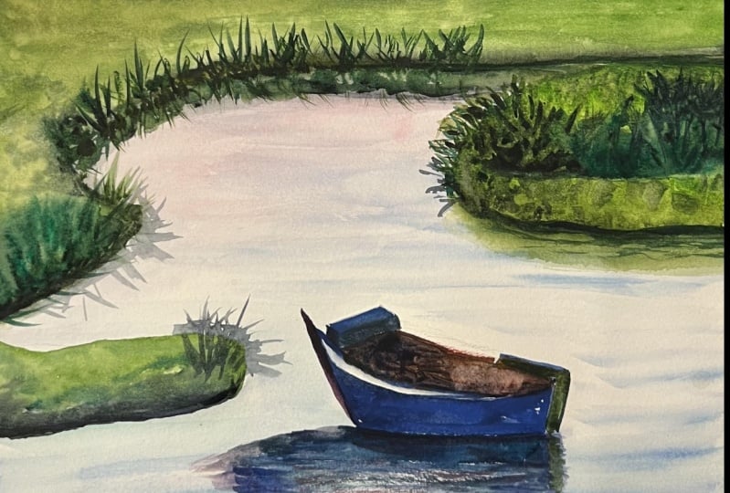
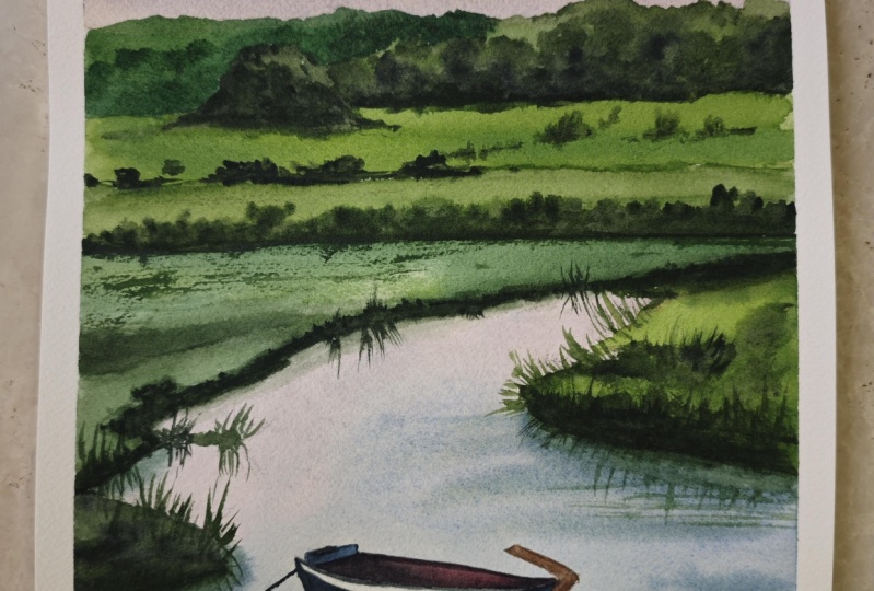
for the beginners and to make sure that you will
get your dream landscape. I added some simple lessons with exercises for painting sky. As a project, you
will paint one of five landscapes from the or landscape by
your own reference. And remember, your
feedback is invaluable. So don't forget to share
your thoughts in review. Let's create something
beautiful together. Hope to see you in the class.
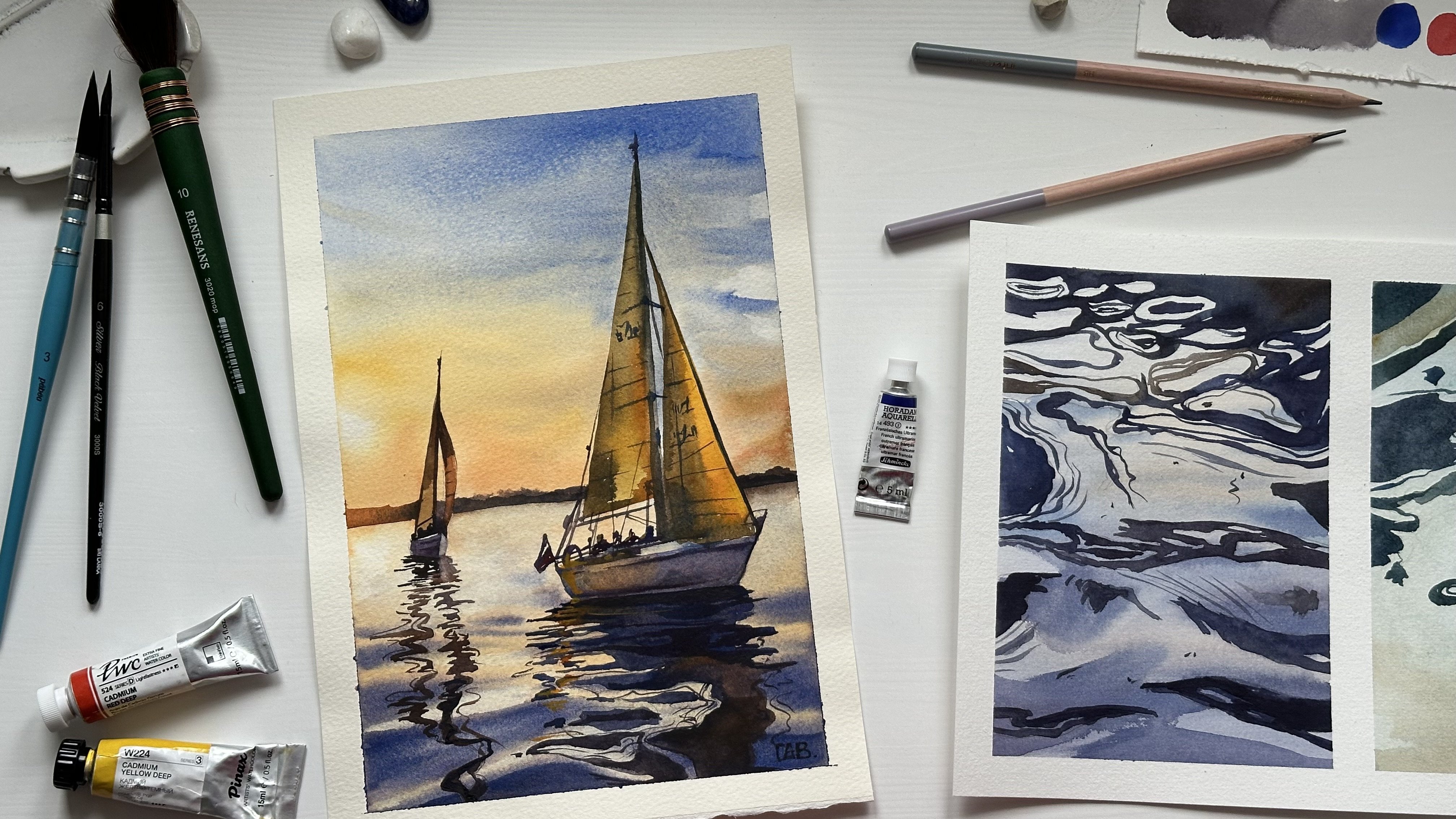
2. Art Materials: Hello, and welcome to the
class with landscapes. Let me show you the
basic art materials I will use for these paintings. Most important is
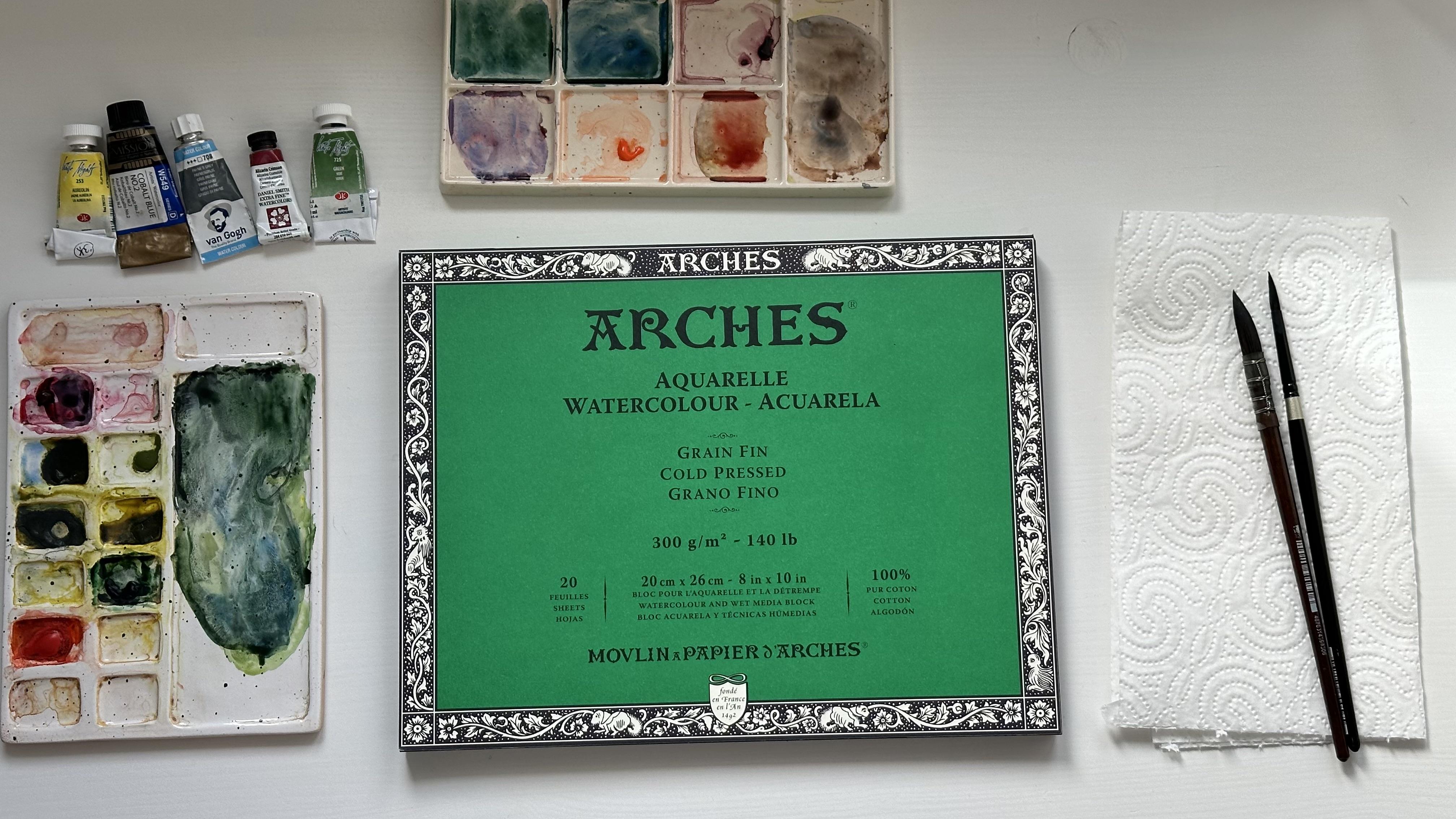
watercolor paper. I'm using paper by arches, 300 of 140 pounds
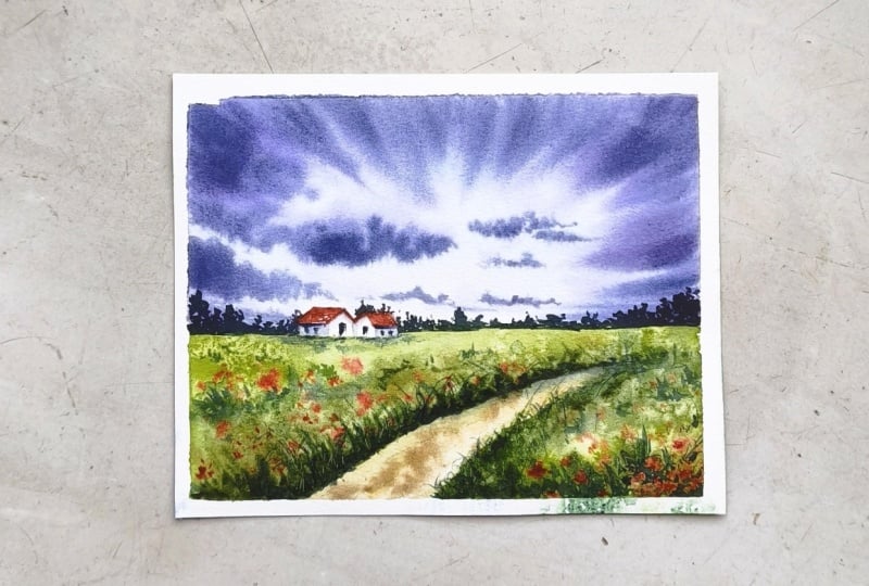
grain thin texture or co breast and 100%. You can use other paper, but it's really
important that you use paper with the same
characteristics. Now, let's talk about brushes. I will use two main brushes, number eight by peanux quill, or mob brush, and number
six by silver brush. So why these two brushes? The big one helps to absorb a lot of water and
cover big surface, and the round one will allow
you to work on details. Most importantly, round brush should have a very
sharp and pointy end. And about this
brush number eight, it has very special holder, which called French holder, and it helps to absorb and hold a lot of water
on the brush. Point sketches, I will use mechanic pencil by
pencil 0.3 millimeters. But you can also use
an ordinary pencil. It's totally fine. Particular colors
and color mixes, I will show you before each class project,
each landscape. But it will be also good
to have white watercolor or an Brilliant watercolor
for painting the foreground. Now, let's talk about some
additional art materials I will use for
painting landscapes. You will need ceramic
or plastic palettes. I'm using two palettes. It's very convenient for me. You will also need
nedable eraser. It's not like ordinary eraser and it doesn't damage the paper. You will also need
ordinary eraser to remove the very hard lines paper towel to clean and dry your brush or remove some color
from the paper. And some ordinary
tables sold for creating textures
on the foreground. Now, let's move to
the simple exercises before we start painting
the landscapes.
3. Exercise 1 Painting Sky: I'm so happy to see
you in this class, and let's start painting
the landscapes, and we will start by
practicing painting the sky because it's a very big part of
painting landscapes. So we will learn in
this lesson how to paint gradient sky and
stormy sky with clouds. Fixated the piece of
paper with masking tape. If you don't have a glute pad, I suggest you do
the same when you move to painting landscapes. When painting the sky, we always start by covering the surface of the
paper with clean water. If you see that your brush has some leftovers of
the previous color, you have to clean it with water and dry it out
on the paper towel. Main colors that we will use for painting this sunrise clear sky. It's cobbled blue and
Alizarin crimson. Basically, you need some
blue color yellow color and red color for
painting the sky. I will start by covering the surface with cobbled
blue from the top. Then I will add a mix of cobalt
blue and zarine crimson. The paper is wet so the color
is easily blend with each other without any rough
edges and rough spots. And now I will add some yellow color to
the palette to create this very nice warm shade by mixing yellow and
alizarin crimson. The most important
thing when you paint the sky is wet paper. So make sure that your
paper has enough water. And also cotton paper dries slower than
the cellulose paper. So that's why I recommend
to use cotton paper. And we can add some color at the top and just blend the
colors with each other. The second exercise
is about painting stormy sky and I will use two colors cobald
blue and paints gray, and right now a mix in paints gray with cobald
blue on the palette. And we will start by covering the surface with clean
water as always. Then I will apply the mix
of cobalt blue and paints gray where cobalt blue
is like 80% of the mix. You see that I have two puddles
of cobalt blue and pins gray and the differences that
one has more water in it. I cover the whole surface
with even and light color. If you see that
there is a puddle on your paper like
too much water, you can just dry and
clean your brush and remove excess of the
water from the paper. Also with this technique, you can create the
highlights of the clouds. Now, I will load my brush with a dark mix of paints
gray and cobbled blue. If you see that there is too
much water on your brush, you can just dab it
on the paper towel. I will apply the dark
mix to the paper, and I will keep some light areas between
these dark areas. Basically, it's
like the clouds and the clear sky that we
can see through them. And gradually we will
building up the color, introducing more
and more intense blue and paints gray
color into the surface. The main thing is to
keep your paper wet. You see that when I apply
color to the wet surface, the color doesn't travel
a lot on the paper. If you find yourself struggling with controlling your color
in wet wet technique, probably it means
that your paper is too and it has
too much water. You have to wait until it
will get a little bit more. D. You see that my brush strokes
are quite chaotic, but they still have
some direction, and normally the brush strokes of the dark sky from the top are moving towards the center of the sky where
the light area is. And the brush strokes at the bottom are more
horizontal and. Yeah. Now, you know how to pay a gradient sky and
the stormy sky, let's move to the
next lesson and learn how to pay sunset sky.
4. Exercise 2 Sunset Sky: Welcome to the second
exercise where I will show you how to
paint a sunset sky. I will use same color
mixes I used before, cobbled blue and paints gray and also alizarin crimson
and cadmium yellow deep. And we will start by covering the surface
with clean water. For this painting,
I will use also my brush number eight by Panx
For mixing orange color, I will use alizarin crimson
and cadmium yellow deep. You can use just
orange if you have it. I will prepare two
mixes on the pallette, the pure orange one and
dark one for the clouds. And I will start by introducing orange color to the
bottom part of the paper. And we following the same steps as we did with
painting sky before. First, we will cover the whole surface of the
paper with some light color. Then we will add some dark areas representing clouds on top of it while the surface
is still wet. In this painting, I will
also create a gradient from the blue color on the top and orange
color at the bottom. The colors are
nicely blending on the wet surface
just like I showed you in the previous exercise. Now, I will clean my
brush in a clean water, and I will dab it to dry
it out on the paper towel. If you don't clean
your brush properly, the color will
appear green because the colors will just mix on the brush yellow
and blue one. And now let's paint the sun. I'm just removing some color from the wet surface
with paper towel. And I will just make these
edges of the sun smooth, just dragging the color
around with almost dry brush. Now I can move to paint
in the dark clouds. When you're painting with
wet on wet technique, you might struggle with amount
of water and damp paper. Because sometimes you have
to wait until the paper will get a bit dry than it
is in the beginning. So if you see that color
travels a lot on the paper, it means that your
paper is too wet. And you see that I'm
making the strokes and the color basically
stays in the same area. Allowing me to have the gaps of the light between these strokes. It doesn't get all
muddy and all. Gradually, I will build
up the color by adding more and more dark shades
into these clouds. Now I will use mix, but with a little bit more cobbled blue
than it was before. We are done painting
the Sunset sky, and now let's move to
the next lesson where we will learn how to create
details for the for.
5. Exercise 3 Foreground details: In this lesson, I will show you four simple techniques to create textures for
the foreground. I will start by covering two top squares
with green color. Before creating this
class with landscapes, I asked my students
on skill share, what are the main difficulties when they paint landscapes. The most common answers were color mixing and details
for the foreground. And that's something I
can agree on because details really make
the landscape alive. But of course, we're
not going to paint each and every grass
flower and a bug. Our main task is to learn how
to create this feeling of rich field and diverse landscape with just simple
watercolor techniques. And I will show you some simple techniques that I know and I use in my landscapes. Our first technique is
splatters of water. First, we need to
cover the surface with color and let it
dry a little bit, so the paper will not be so
wet and not fully dried. Meanwhile, I will cover the
second square with color, and the second technique will be s and creating texture
with ordinary table salt. I see that my first
square is still too wet. You see the shining surface. It means that there
is too much water, and I have to wait a bit more before I will
make splatters. So I will apply some salt into the second square
and we'll let it dry. Let's move to the first square. For making splatters,
I need to put my fingers down into the
glass with clean water. Then I need to make a few abrupt movements
with my fingers. And we've got a nice texture. The main thing is
to not overdo it. Otherwise, you will have a
puddle of water on your paper. The salt is getting
dry very slowly, so I will remove it in
the end of this exercise. Meanwhile, I will cover the
two squares with color, the left one with the
light green color and the right one with
dark green color. And I will let them
both get fully dry. Now, I will show you
the third technique for painting grass on the field. For this technique,
you will need dark color and a big brush. First, I will tap my
brush on the paper towel, removing excess water
from the bristles. Then I will press the
brush to the palette, and I will twist it around. Until the hair of the brush, the bristles will get separated. I'm twisting the brush until the bristles will get all messy. Now we can paint the grass. Barely touching the surface
of the paper with brush, I create these
very light strokes that remind the
shape of the grass, and I'm just making it
in different directions. Of course, you have
to try it out on the scrap paper and practice, but it's a very
nice technique to create this diverse foreground. For the first technique, I need white
watercolor zinc white. I will just place this
water color on my palette. Now we will create
splatters of white color, so we need to cover other squares with
just some paper paper. I will add a little bit of water to the white water
color on the palette, and I will use a round
brush number six. First, I can create
a small dots that can represent the white
flowers on the field. Okay. Then I will load my brush with the white color and
we create splatters. All you need to do is to heat the brush against the finger
of your opposite hand. These splatters are
very small and th, and if you find yourself making the big and more
watery splatters, it means that you have too
much water on your brush. I can also switch to the
smaller bruh number zero or number one and create some brush strokes
representing grass. But to be honest, I find it quite challenging
because it's really hard to control the amount of water and
color on the brush, so the lines will
look very nice. And now I can come back to the salty square and remove
the salt with my fingers. You can already see the nice
texture I got with the salt, and to be honest, this is my favorite technique to
diversify the foreground. Now, I will remove the
masking tape so you could see all the techniques that
I showed you in this lesson. We will use all these
techniques in our landscapes, and I hope that it will help you to create your
perfect landscape. I will see you in
the next lesson where we will start
painting landscapes.
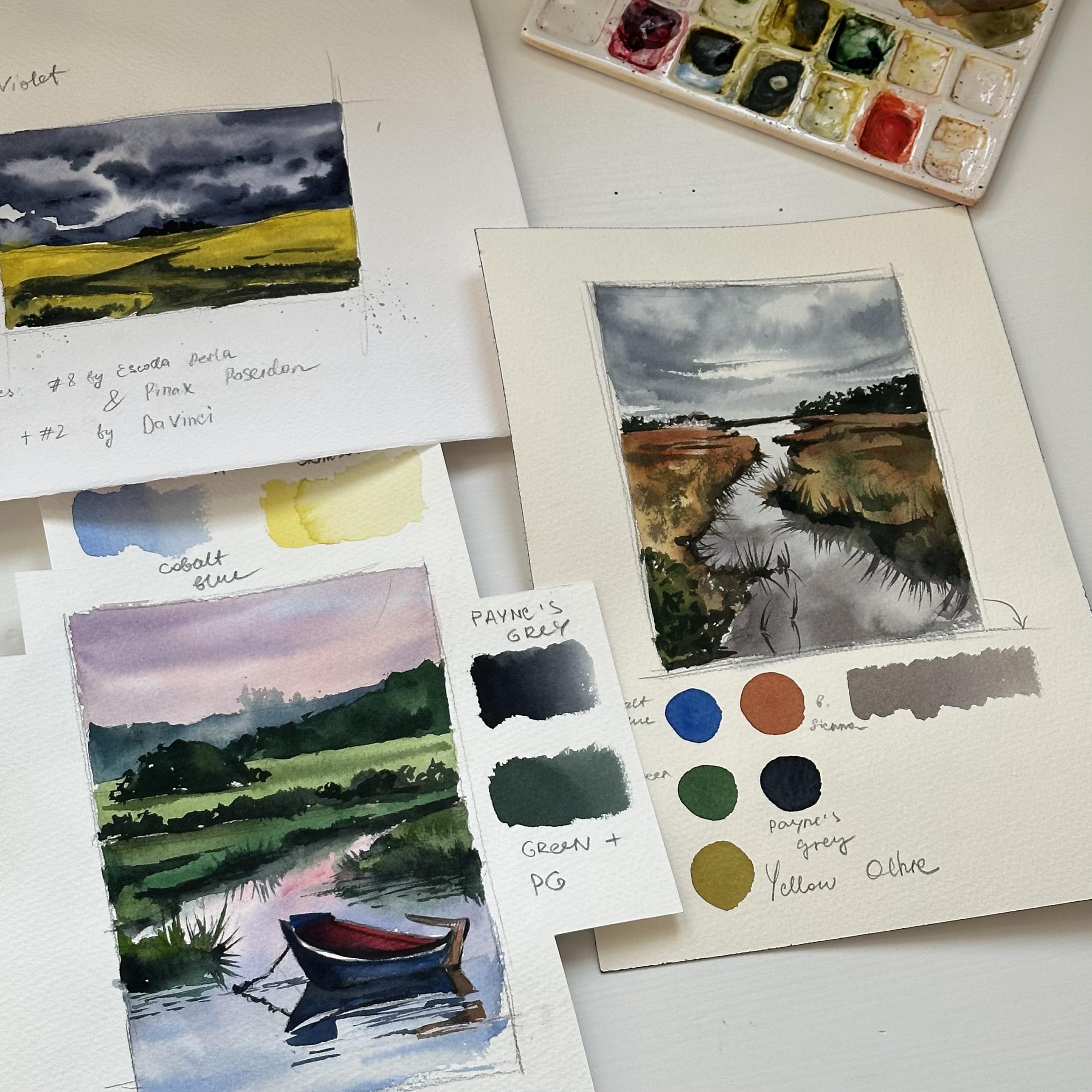
6. 1 Color Mixes: Let's start with the materials. I will use two brushes
squadra number eight Perla and Pax number eight paid. It's a mob brush and it's very convenient to use for
painting sky and landscapes. For drawing a sketch, I'm using mechanical
pencil, 0.3 millimeters. You can also use
ordinary pencil. It's totally fine. Here is the watercolor paper I will use for all landscapes. It's paper by arches, 300 GSM or 140 pounds,
100% quantum press. This texture allows us to create very nice
watercolor effects. You can use other paper, make sure it has the
same characteristics. I already prepared colored
sketch for this landscape. It helps me to understand color mixes and colors
that I will need, and I will need
three colors yellow, dark blue and dark gray. I'm using Aurelien as yellow
shadow violet, as dark blue. You can use indigo
if you don't have shadow violet and pins gray. Pines gray is very useful color in practically any landscape. Now let's see the color
mixes that I will need. Mix of yellow and
shadow violet creates a very natural green color that I will use for
paint in the field. M. Okay. Different amounts of each color creates
different shades. So for this yellow
greenish color, I'm using 80% of yellow
and 20% of shadow violet. And also the other way around, I'm using 20% of
yellow and 80% of shadow violet to create this
very darkish green color, almost gray that I will
use for these dark parts. I'm also preparing some mixes of pure colors mixed with
water on my palette. So here I have shadow violet that I will use for
painting the sky. And also paints
gray color that I will use for painting
the sky and the field. That's basically all the
mixes that you need. Now let's move to
drawing a sketch.
7. 1 Sketch: Let's start by drawing a sketch, and we always start by
drawing the horizontal line, normally the horizontal
line will be lower or upper than the
middle of the paper. I'm just drawing some. Straight line, it's
not totally straight. You don't need a ruler for it. Just draw it as you feel. You can use a ruler if you
are not feeling confident, but it's okay if the
line is quite wavy. For the landscape, we don't
need some complex sketch, just a simple one with understanding
where the field goes, where the background
is, and that's it. I will see you in the
next lesson where we will start painting
with watercolor.
8. 1 Painting the Sky: In this lesson, we
will paint sky, and we will start by
covering the surface of the sky of the paper with
clean water using mop brush. I suggest you to
have a paper towel next to you to clean and
dry your brush easily. I will start by adding shadow violet color to
the whole wet surface. Once I cover the whole
surface with one color, I'm adding more color to
create intense clouds. And I continue introducing more color, creating
darker shades. The most important thing is to not let your paper gets dry. We're working in wet on wet technique using
the wet surface. Sky will get to the
horizontal line, so it will create a very nice contrast between the yellow field
and dark blue sky. When painting this stormy
dramatic gray sky, it's really important to keep the light areas
between the dark ones. And to do that, you have to
have your paper not too wet. So you have to practice
on the scrap paper to understand and
when you can apply the color because if you see that the color travels a lot and blending with other colors or it just covering
these light areas, and you cannot control it. It means that you
have to damp paper, and you have to
wait a little bit until the paper
will get more dry. Yeah. Yeah. Once we painted the sky, we'll let the paper dry and then we'll come back
to paint in the field, and I will see you
in the next lesson.
9. 1 Painting the Field: In this lesson, we
will paint the field, and let's start by putting our yellow color on the
pallet mixing it with water. Let's start by
covering the surface of the field with
a yellow color. I didn't cover the
surface of the paper with water because I need the
color to be very intense. I already prepared on my palette mix of
shadow violet and line, and I will create
even bigger paddle. Because when you're painting
with wet technique, it's very important that you have enough color
on your palette. And I'm just adding this color at the bottom of
the light area of the field. Now, I will add some
darker shade of shadow violet and line to the
bottom of the light areas. And I always get this question, how do you manage to
make 80 20% of mix? So it's just approximate amount. You just mix colors until you get the shade that you need. D. D. I painted the foreground
quite dark and now I will add some table
salt to the wet surface, it will help us to create
a very nice texture. While the area with the
salt is getting dry, we will move to
paint in the road. When you paint and add salt
for an interesting texture, remember that you have
to wait until the paper gets fully dry before
you remove the salt. No. No. I need to increase the contrast between
the field and the road, so I will add some very intense
dark color to the road. Using the mix of shadow violet paints gray and a
little bit of yellow. I don't use pure black color because it won't look natural. But at the same time, I need to create this area as
dark as possible. In some places, I can add
even almost pure pines gray. Yeah. Now, the first layer
of the field is, and we will leave it and I will see you
in the next lesson. Okay.
10. 1 Painting background: In this lesson, we will paint some trees on the background
using paints gray. But first, let's separate the right and the left
parts of the field with the mix of
shadow violet and yellow that we already
have on the palette. You can let it dry and then let's paint the trees
using very dark color. Yeah. This dark background
in landscapes helps us to increase the contrast between foreground
and background. Yeah. Yeah. Yeah. Now, the paper is
fully dried and we can remove the
salt using fingers. We are almost done
painting this landscape. I will see you in
the next lesson where we will paint details.
11. 1 Final Details: In this lesson, we will add some final details
to the landscape, and for this, I will use small brush number
two by Da vinci. First, I will take some
pure Aurelian color from the palette and we paint
flowers on the foreground. No. Then let's add some dark
areas using Bains gray. Yeah. Go. Good. Go. I'm using mix of
reeling and paints gray or reeling
and shadow violet that I have on my palette to create some areas at
the bottom of the light I want to add some light areas representing the yellow
flowers on the foreground, and I'm using pure
yellow color and very small dots or brush strokes holding my
brush almost vertically. Now, I want to add some splatters of yellow
color on the background. But first, let's
cover the surface of the field and sky
with paper towel. And our landscape is done. I hope that you
like this painting, and let's move to
the next landscape. I will see you in
the next lesson.
12. 2 Materials and Color Mixes: Now, let's paint
another landscape with a lake on the sunrise. I've already prepared a color
mixes and color sketch, and I will show you color mixes in this video and other
materials you will need. Let's start with the brushes. I will use two brushes, number eight by panox mop brush, and round brush number
six by silver brush. You can use other brushes that you normally
use for painting. Also, I might need
a smaller brush, and I always have it next to me, some round brush number
zero or number one. Here is the watercolor paper I will use for all landscapes. It's paper by arches, 300 GSM or 140 pounds, 100% quaton called press. You can use other
paper just make sure it has the same
characteristics. Now let's talk colors. I will need five colors. Paints gray, by van go,
cobbled blue, bamjea, green by white knights, Alizarin crimson
by Daniel Smith, and A Lin by White knights. Here are some color mixes that
we will need for painting. First, the color for the sky. It's a mix of a
lizard and crimson cobbled blue and a
little bit of yellow. Next one is mix of
green and reeling. It creates very nice
warm green shade that we will use
for the foreground. We will use mix of
green and paints gray for creating darker
shades of the field. We will use mixes of green
and cobbled blue to create this cold green shade for painting trees
on the background. Prepare your color
mixes on the palette, and I will see you
in the next lesson.
13. 2 Sketch: Let's draw a sketch. I'm using glute patch, so I don't need to
fixate the paper. If you are using separate sheet, you need to fixate it on a drawing board with
a masking tape. As always, we start with the
drawing horizontal line, and horizon in this image will be upper than the
middle of the paper. You can use siting
method to measure the proportions of each object
in the reference image. I'm roughly sketching all
the objects I want to paint like forest
on the background, bushes, on the foreground and the shape of the grass
around the lake. When you're sketching the boat, make sure that there is enough space under the boat for the reflection on the water. A Okay. When our sketch is done, I'm using needle
eraser to remove these hard pencil
lines from the paper. Prepare your sketch and
move to the next lesson.
14. 2 First Layer: Let's start painting this
landscape with watercolor, and we'll begin by painting sky. Let's cover it with
the clean water first. I start introducing colors with the cobalt blue on the
right side of the paper. I'm moving color on the sheet
so the colors will blend. And now I will add some Alizarin crimson and
mix of alizarin crimson and. I also have this mix of cobbled blue and
alizarin crimson, and I also add to the surface. Just make sure that
the colors are not too because the sky and water are the lightest
parts of the image. Oh. And we will do the same with the water. First, let's cover
it with clean water, and then we will move
from the pinkish color at the upper part to the
bluish color at the bottom. Now, I want to
paint some waves or reflections on the
water using mix of cobbled blue and a little
bit of green because we see the reflection of
the grass in the water. I have a separate
exercise on painting water reflections in my other
class with the sail boat. I add some dark color
with more green in the mix under the grass and
bushes above the river. Now I will use mix of green and cobbled blue for
painting background. We see the difference in the color of the forest
on the background. On the left side, it's more
cold and on the right side, it will be warmer. So I leave it for now, painting only the left side, and I'm moving to
paint in the field. For the field, I'm mixing green
and a little bit of rein. Bob. Bob. Bob. Bob. Now, let's paint this dark
tree on the foreground, using mix of green
and Paints gray. Okay. I'm using the same color to paint the background
on the right side. And while the surface
is still wet, you can also add some small brush strokes on the field to make
it more diverse. Now, using these two mixes of green that we
have on the palette, let's paint bushes
on the foreground. The first layer is almost. Let's move to the next lesson
d p the rest of the field.
15. 2 Foreground: In this lesson, we will paint the foreground and the
grass above the lake. I'm using the same mix that
I have on the palette, but I will add a little bit
of cobbled blue into the mix just to make the
colors a little bit different from the
ones I used before. No. Now, I will add some darker
shade at the bottom of this area that I already painted with the
light green color. I will use of green
and paints gray. Yeah. Yeah. Yeah. Now, let me clean my brush and load it with
the clean water. I will apply this
clean water dragging the color down to the
surface of the water. I will add some dark green color again closer to the field
surface than to the water. So you see that the
green part with the field and the grass is darker than the
reflection in the water. So we just have to create this very smooth and blurry edge between the water surface
and the grass itself. Using the very tip of my brush, I'm creating the
brush strokes that represent the separate grass. I will do it like
on the surface of the water and on the
surface of the field above. When we are painting the reflection of some
object in the water, we are mirroring them the same way as we see them in real life. Basically, you have to repeat the same shape and the opposite
direction of the strokes. Now, let's paint the
right side of the grass. This part will be lighter
and in terms of color. So I'm mixing green with yellow. Now, I will add some darker
shade to this green area. In general, when you
are painting the field, it looks like it's all green. But in fact, it has
different shades, it's more blue,
it's more yellow. So we have to use
different shades of green when we're
painting some green stuff. It will in the end. To paint the reflection
under the grass, I will do the same as
before I will clean my brush and apply
some clean water, dragging the color down. The reflection is quite
so I need to reapply the dark color paints gray
and green to the wet surface. With the very tip of the brush, I will paint the reflection
of the grass in the water, just like we did
before and repeat in the same shape and
direction, but mirroring it. I will also pain ripples on the water creating
horizontal brush strokes. Since I already have this dark green shade
on the palette, and on my brush, I decided to paint this tree on the background
with green color. Don't cover the whole
tree with the dark color, just some areas and
smog them with water, creating again diversity
in this object. Using some clean water, I can just drag the color
into different directions, creating this blurry
shadow under this tree. Now, I'm looking
at the landscape, and I ask myself where it looks boring and I add
some more shades, strokes and details
to that area. You can use on dry technique
using almost dry brush with a little bit of
color on it and just creating these textures
on the foreground. Yeah. Yeah. Yeah. Yeah Don't forget that it's all about your
artistic vision. If you want to add some
textures, some strokes, feel free to do it because when we are
painting the landscape, we're just playing with
different textures, creating different objects that reminds us that this landscape
and this grass is alive. And in real life, no object looks
boring and simple, it all complex with
different imperfections. Try to make the imperfections
as you feel it. I will see you in the
next lesson where we will paint the boat and
the reflection under it.
16. 2 Painting the Boat: In this lesson, we will paint the boat and the
reflection under it, and let's prepare our
color mixes first. The boat is the darkest
part of this landscape, so we will need paints gray for our color mixes
to make it dark. And we will need two
color mixes mostly. It's paints gray
plus cobbled blue and paints gray plus
alizarin crimson. Also, I will mix some color
for the wooden part here. I will mix alizarin
crimson and yellow. Let's start by painting
the upper part of the boat with the mix of
cobbled blue and paints gray. Well, to be honest, when I'm painting on
different tutorials, it's a struggle for me to see some small details
in a big video, and I'm trying to make a close up shots
from time to time, but at the same
time, I'm trying to get you to see my palette and
the color mixing process. And I'm always happy to
hear and see your feedback, your class projects,
your paintings, so please share your
feelings after this class, how you feel, what would you improve or if
everything was good. As you can see, there is a white line in the
middle of the boat, so I draw it when I prepared a sketch to avoid
painting over it. And right now, I'm
covering the part of the boat below
this white line. The color should
be pretty thick. So use not a lot of water and
more color in this mixes. In the middle of the boat, I use more light color, just pure cobbled blue, and I'm blending
it with dark color that I used on both
edges of the boat, mix of pins gray
and cobbled blue. Above this white line in
the middle of the boat, it has a grayish area. To prepare this gray color, I mix in cobbled blue Azar
and crimson and paints gray. Adding more water
than for the mixes before to make it light a bit than the
inside part of the boat. Of course, you can
ask why shouldn't you use paints gray as a
gray part of this boat. But normally in painting, we are mixing colors, trying to create unique shades because in the end
your painting will look more interesting and picturesque with
different shades, not with the pure colors. Now, let's paint the
reflection under the boat with mix of cobbled
blue and paints gray, and the reflection
under the boat will be darker than
the boat itself. That's why we're using more
pins gray in this mix. The color under the boat
will be the dark ones, so I add more paints gray right under the boat in
the reflection on the water. All objects in the
reflection will be repeated and mirrored and
the same with the color. So when I'm painting this wooden part that
hold in the boat, I will also paint the same color in the
reflection in the water. As you remember, I mixed
alizarin crimson and yellow to create this
shade for the wooden part. But also I added some paints gray in this mix to
make it more natural. Because if you will mix just alizarin
crimson with yellow, it will appear very orange and to make
it more neutralized, I added some paints gray
and maybe cobbled blue, just some dark color
from the palette. I want to add this
small thing on the top of the boat with a
pure cobbled blue color. Now let's move to paint in
the inside of the boat. The last part we have to
paint in this landscape. I'm using mix of Alizarin
crimson and paints gray, and I'm going from the right
side to the left side from almost pure and light
Alizarin crimson to the darker shade and
area on the left side. F, Now, I can add some final details, darken some colors if
I feel like I have to. But basically, our
painting is done, and it's up to you if you want to add some small
details right now. I hope that you like
this landscape, and I hope that you will share the final painting with me and other students in
the class project. And I will see you
in the next lesson where we will paint
another landscape.
17. 3 Color Mixes: Okay. Welcome to another class
project where we will paint this gray
sky and the river. For this painting, I will
use two brushes number six by silver brush and
number eight by Pax. You already seen these brushes
in my previous lessons. We also might need some
smaller brush number one or zero for painting
details in the foreground. Here are the main colors
yellow ocher, cobbled blue, burnt sienna, green,
and paints gray. Now, let me show
you the main mixes we will need for this painting. In the top row, I
placed the swatches of the colors from yellow ocher to burn seen to cobbled blue, green and paints gray. The first mix I will
use for painting this gray reflection of
the sky in the water, it's mix of cobbled blue and burned that will create
this nice gray shade. Okay. Next mix is Burn Ciena
and Paints gray. It will create a dark brown
shade that I will use for painting some
shadows in the field. And some very light and warm green shade that I mixed from yellow
ocher and green. I will use it for
painting some green areas in the field and some
bushes or grass. Some colors will mix
right on the palette, and we will use different shades in the middle of painting. Prepare your color mixes
and I will see you in the next lesson where
we will draw a sketch. Okay. No.
18. 3 Sketch: Let's draw this simple
sketch of the landscape, and we will start with
the horizon line. As you can remember the
horizon line should be higher or lower than the
middle of the paper. I think how to understand
where the middle, you can just measure
it with your pencil. So right here is the
middle and somewhere here, I think we will make
the horizon line. Here we have some forest. And we have some land
on the horizon line. And then again, we have some
forest and some houses. Here will be some green
part like a tree or a bush. Oh. I'd like to keep here more
space for just water. So I will move it
here maybe not so And of course we will
have here some grass. And here as well. And I think that's it. Now, we understand
the measurements of different parts
of the landscape, and I will just remove the pencil lines
with the need ble eraser. And I will see you
in the next part, we will paint with water column.
19. 3 First Layer: In this lesson, we will start
painting with watercolor. I already prepared
colored sketch. It helps me to
understand color values, which areas will be brighter and which
areas will be darker. I suggest you do the same
if you feel like you are scared of a white paper that
happens to a lot of artists. Let's start by covering the
surface of the paper in area of the sky with clean
water with brush number eight, or other more brush that you have I painted green field before with this
brush and some of the color left on the
belly of the brush. So I'm trying to
clean it before I will move forward in
painting gray sky. And for the sky, I'm mix in
cobbled blue and paints gray, and I cover it with even color. Now, let's paint some darker
clouds on this bluish sky. Using the same technique
I showed you in the exercise in the
beginning of this class. P. If you want to leave some
highlights and light areas, you can use dry and clean brush to remove the color
from the paper. We are done with the sky and now let's move to
painting water. And we will start with a very light color next
to the horizon line, almost just clean
water with a bit of color mix of cobblig blue
and paints gray on my brush. And moving down,
I add more color. No. At the bottom of the paper, the water will be
more gray and dark, so I will use of burned
and cobbled blue. I'm building up the color, adding more and
more of this shade, and cotton paper normally
absorbs some of the color. So when the paper will get dry, it won't look dark. The water a bit
on the left side, so I will add some more
color on the Okay. Now let's leave it
dry and I will see in the next lesson where we'll paint the banks of this river.
20. 3 Painting Right Side: Let's move to paint in the
right bank of the river, and I will use yellow ocher
burn Ciena and green. Of course, I will add
some other colors that I have like paints
gray and cobbled blue. But now I will mix yellow
ocher with burn Ciena and green with yellow ocher creating different
shades of green. I mixed all my colors, and I will start by covering this part
with the clean water. As I can see on the reference, the upper part of
this field will be more burnt Ciena and more dark
and closer to the bottom, it will be more green. While the surface is still wet, I will add the dark areas at
the bottom of these banks. Let's continue building up the color with mix of burned
Sienna and paints gray. And with the tip of
my brush number six, I will create some brush
strokes representing the grass. I painted dark areas at the
bottom of this grass part, and now with the clean water, I will just drag the color down to the surface
of the water. It should create a very
blurry and nice effect. And as in previous lessons, we will add some dark
color to make it like a water reflection
reflection of the grass in this lake with the mix of
green and paints gray. And now I will repeat
the same brush strokes, representing the grass
in the water reflection. We will paint the
grass on the field later when the
surface will get dry. As you can see, I'm
leaving some space between the brush strokes in the
water reflection and the bank of the river because this thing and bright brush strokes
representing the grass, I can make only on
the dry surface. So when I dragged the dark
color with clean water, I didn't apply a lot of water. I just applied it next
to the dark area. Now, I will add
some more details on the surface of the field. Well, I know it's not the field, but I hope you understand what I mean because I'm not sure if I should refer it as a banks
of river or something else. So you can just watch the video and understand
where I'm painting. So I will add some
random brush strokes. Somewhere it will
be just dark areas. Somewhere I will try to paint
the shape of the grass. And as I told you, the cotton paper absorbed
some of the color. So I'm trying to make this for than it appears
to be right now. Right now, I renew the color mix of green
and paints gray on my palette to make this mix as dark as possible
for painting background. The background on the
right side is almost. Now I will add some pure
burniena on the field, and we will move to
the next lesson.
21. 3 Painting Left Side: Welcome to the second part
of painting first layer. Let's move to the left
side of the painting, and we will start by covering the surface
with yellow ocher. I will start introducing
the burned Ciena color, closer to the horizon line just as we did on
the right side. It will be very
bright and almost pure color in the upper part, and to the bottom of the page, it will be more green. I will also add some green shade into the wet surface to make
the color more diverse. Of course, I will add some green color at the
bottom of the painted area. Don't be afraid of creating
this messy color of green and burnt
sienna and yellow ocher in the down
part of the paper. My intention is to make
it as dark as possible. And then in second
maybe third layer, I will add some white or
maybe light yellow flowers and grass and details
that will look nice in the contrast
of this dark area. But now our main task is
to create as diverse as possible first layer in terms of colors and dark and light areas. As you can see, the left side appears to be more
brown than green. The right side was green and
this one will be more brown. By brown, I mean mix
of burn pins gray, and maybe a little bit of green, all these shades, but mainly
burna and paints gray. I started to paint some grass growing
almost out of the water, but it's very difficult
to not get carried away by different details
because right now, I have to remember to paint the reflection of
this dark area, and I will do the same. I will clean the brush and with a little bit
of clean water, I will drag the color down
to the surface of the water. And I will add darker
color once more. Then we will paint the
reflection of the grass. I decided to darken this
area in the corner, and I will add some
more green color. Like it's a bush or
area with leaves. M. Hey. And I'm doing the same
with the grass reflection. I repeat the same
shape and direction of the grass in the
reflection in the water. But I have to darken this
area. I will do it later. Right now, I will paint some
single grass growing out of the water with a
very careful touch of the very tip of the brush. Hey. While I'll have this dark color on my brush and on my palette, I will add some more dark dark details
into the foreground. Okay. Now, I will move to
paint in the background, and I will start
with the roofs of the houses with a mix of
burned and yellow cher. Now, I'll make pens gray yellow
ocher and a little bit of coald blue creating
this warm gray shade. And I will paint the
rest of the houses, leaving this front and the side walls with a
little bit of shade. Okay. Now I can mix the color for the background
on the left side, and it remains the same mix
of green and paints gray. Let's repeat the
same that we did on the right side with
the otic strokes. I'm creating a curve line of the trees surrounding
the houses. Even though the background
is very dark and it has purpose of dividing the
skyline and the field. It still has different
shades of green, and I'm using different shades, as you can see on my palette. The trees behind the houses than the roofs and
the houses itself. So the wide building
would pop up. And while I have this
color on my brush, I can add some more
details to the foreground. We'll work more on
the final details and the for in the next lesson,
and I'll see you there.
22. 3 Final Details: In this lesson, we will work on the final details
for this landscape, and we will start by
darkening the left side, the foreground here
in the corner. Then we will add
some light spots. I'm using mix of
Bernciana and Panes gray. I'm done with the dark spots, and I will let it dry and we'll switch to the
light watercolors, brilliant and white watercolor. I will use a silver
brush number two, and you can also switch to the smaller brush that you
have with the pointy end. And first, I will put the
color on the palette. If you don't have
an brilliant color, you can add just a little
bit of yellow och into the white watercolor or even use pure white
watercolor instead. I will just start
painting separate grass with a light and
thin brush strokes. If you see that some
brush stroke fills off, you can just remove it
with a paper towel. Now, I want to darken a foreground on the
left side a little bit, so I'm adding paints gray into the mix that I have on the
palette to the green shade, and I will paint some
grass on the left side. Now, let's leave it dry and it's a good time for
having a cup of tea, and I always have tea next
to me when I'm painting. It's quite dangerous sometimes, but I love it. I came back to the painting, and I mix again, John brilliant with
water just having this very thick
color on my brush. I will start making the same brush strokes as I
did before on the right side. The brush strokes should be
in different direction to look like the grass because
it doesn't grow similar, so all the brush strokes
will be not straight lines, but some curve
lines and different in terms of thickness
of the line. I will also add some small dots. It might be flowers or some
bugs or something like that, and it just makes the landscape
looks more interesting. You can also use splatters as I showed in the exercise in the
beginning of the class, but just don't forget to cover the other part of the
paper with paper towel. Okay. And I hope that you understand now why I
told you that we need to create a darker layer for the foreground because in
contrast of this dark layer, we can paint this light
grass and it will look nice. And now we can also add some more dark spots on the background or like
foreground background because now it's the time to look at your painting and
analyze where it looks boring or where you want
to add more diversity and to add some more
brush strokes details and maybe diverse
the color value. When I'm painting
the final details, I'm using the colors that
are left on the palette. I can also add some colors
that I used before, and now I'm adding some niena to the color mixes
that I have on the palette. H. You can also add some dark grass next to the light ones to
enhance this contrast. On that, we can finish our painting and move
to another landscape. Just before we move
to the next lesson. Let's put our initials or artist's name on the right
corner of the painting.
23. 4 Sketch: Let's paint our
fourth landscape. As always, you can find the reference photo in the
attachment to this class. I already prepared the colored
sketch of the painting, and let me show you
the colors I'll need. I will use five colors
yellow er burned, bald blue paint gray
and alizarin crimson. We already used these colors
in the previous landscapes.
24. 4 Painting the Sky: In this lesson, we are
moving to the painting part and I already have my
colors on the palette. Now let's mix all the colors that we will need for
painting the sky. I mix in cobbled blue and
paints gray in one puddle, and in another puddle, I will just place pure paints
gray for painting sky. Let's start by covering the whole surface of the
sky with the clean water. It has some gray shade
in my case because I just mix gray colors and
it left on the brush. Now, I will introduce the
paints gray into the paper, and we will start building up the color as
always working in wet on wet technique and creating more and
more intense color, adding more and more
color to the paper. The color of the
sky will be more blue to the horizon line. And in this landscape, it's so don't be
afraid to use colors. I'm using mix of cobbled
blue and paints gray, and I avoid painting the houses, so I go around the roofs and
buildings of the houses. So in this landscape, sky has basically three colors and moving from
up to the bottom. We see the light area of the white clouds in the very
upper part of the paper. Then in the middle, we have dark gray shade, and that's why I'm painting
with pure pines gray color. And closer to the horizon line, it has also pretty dark
but more bluish color. So that's why I'm using mix of cobalt blue and pines gray. Sky already looks
pretty good to me. But I think that
there is a lack of intensity in the color
next to the horizon line. So I will build up
color in that area. Hey. Our sky is, and I think it looks stormy. Let's move to the next on
where we will pin the field. Hey.
25. 4 Painting the Field: In this lesson, we
will paint the field. And for that, I will mix
yellow ocher and burn Sienna. I will also add some pins
gray on the palette, mixing it with burniana to
create this very brown shade. In a separate paddle, I will prepare a mix of yellow ocher and just
a little bit of pins. I will start by covering the
surface with yellow ocher. I'm painting around the animals, avoiding covering them with the color because we
will keep them white. And I'll start introducing some dark shades
into the surface. I'm creating some
random areas with the otic brush strokes just
to diversify our foreground. We can also paint some dark shadows under
the animals right away and move to the further part of the
field with a color. Here, I will also avoid
painting the animals. If you have skin liquid and you find it more
convenient in this case, you can cover these areas where animals will be
with a skin liquid. I'm moving closer to
the horizon line, and I'm almost done
with the first layer, and I think that I will just
make particular direction of the brush strokes
to make it seem like the field and to highlight
the perspective of this. I'm lifting some color
from the wet surface, and before I do that, I clean and dry my brush
on the paper towel. As we remember, the secret of an eye catching painting
is in contrasts. I have to enhance the
contrasts between the further part of the field and the part
that's closer to us. So the part that's closer to us, the foreground is lighter, so I have to make the further
part than it is right now. So I add some darker shade right on the edge of
the further part. Now, I will take the pure paints gray
color and will paint the dark areas on the animals
representing the shadows. Then I just dry and clean my
brush and have some water on the belly of the
brush and I drag the color to the
surface of the light. But you can actually leave it white as I did on the sketch. I think it looks better, and I will try to do
it with the horse. I'll switch to the
round brush number two. Since I have dark
color on my brush, I will start working
on the background and foreground and I decided to paint some dry and strange
bush or a tree that actually, I think suits very
good this landscape. I will also paint some darker lines brush
strokes on the background, representing the trees
and the bushes and some just little spots
and lines on the field. We are done with the field, and let's move to
the next lesson and work on some final details, improving our foreground
and painting the house.
26. 4 Final Details: One, two, three. Let's paint the final details
for our fourth landscape. Now I'm mixing the color
for the roof of the house. I'm mixing laser and crimson and mix of yellow
ocher and burn chien. Basically, the colors
that I have on my ballet plus red color. You can use other color. Maybe you have Ruby or mine
or some other red color. You can use it as
well for the roof. I used my brush number
six because it has a very pointy end and
it's convenient for me. But you can use
other smaller brush if it's not really
convenient for you. And we cover the surface of the roof basically
in one color. I have some light mix of
paints gray and Bernina, and I add a little bit
more water into this mix, and I will use it for painting the side
wall of the house. I will switch to the
brush number eight, mop brush or heel brush, and I will just twist it
on the palette like I showed you in the exercise in
the beginning of the class. So my brush will be very messy, but it will help me to create these strokes for the foreground that will exactly like grass. Now, I will switch
to the brush number two to increase the shadows on the animals and to add more contrast grass and maybe
bushes on the foreground. Maybe it will be just and dots. D. D. Our painting is done. Let's put our signature in the right corner and
move to the landscape. Okay.
27. 5 Color Mixes: Let's paint our last landscape and we'll start with
the color mixes. I will need four colors
Alizarin crimson, sub green, cobalt blue,
and shadow violet. You can use paints
gray if you don't have shadow violet or
maybe even indigo. Our first mix is cobbled
blue and Alizarin crimson. We will use this purple
color for painting sky. Next one for the sky is shadow violet and
Alizarin crimson. For painting the field, I will use a warm green color, a mix in sub green
and alizarin crimson. For the shadows on the field, I need dark green color, a mix in subgreen
and shadow violet. Prepare your color
mixes on the palette, and let's move to
the next lesson where we will draw a sketch.
28. 5 Sketch: I already prepared colored
sketch for this landscape. Don't pay attention
that I mentioned paints gray because it's
actually shadow violet. I just misspelled it, but you can use paints gray
for sure in this landscape. We will start by placing our horizon line lower than
the middle of the paper, and this landscape, it doesn't have reference because it's
basically out of my head. Instead of the reference photo, you can download
my final painting in the attachments
to this class. Like in many other landscapes, we will split the
field in two parts by the road in almost the
middle of the paper, and I will also paint
the background, and in the background, there will be some houses. Dark trees on the
background will help us to separate the sky and the field and to enhance this contrast between
the sky and the field. Our simple sketch
is done and we can move to the watercolor
part in the next lesson. Okay.
29. 5 Painting The Sky: Let's start by covering the
surface of the paper with clean water using mob brush
quill brush number eight. I will start by introducing
the cobbled blue color and covering the surface of the
paper with this color evenly. Try to avoid painting the houses because we
need to keep them white. I'll start introducing the color by mixing cobalt blue
and a lizard crimson. And I start from the edges. A. I will renew my color mix on the palette, but I will add more
alizarin crimson. Let's add some
shadow violet into the mix and darken the colors. Our sky is done, and we can move to the next lesson where we
will be in the field. I keep the light
areas in the middle and darken the corners
and the edges. I see that paper got almost dry and we don't need
these sharp edges. So I'll use a paper towel to remove some color
from the paper. Dry paper means that I
have to stop painting, and I done everything
I could with the sky and we can move to the next
lesson and paint the field.
30. 5 Painting the Field: I'm mixing on my pellet
subreen and Azaren crimson and sub green
and shadow violet. I'll start by covering
the surface of the field with
light green color. The field around
the road will be, so I'll use mix of shadow
violet and subgreen. For the road, I mix in
alizarin creams and b green, but I add a bit
more zarin creams than in the previous color mix. And, we are using a lot of water and a little bit of color. While the surface is still wet, I will add some
more reddish spots in the middle of the road. And also, as I told you earlier, the grass around
the road will be. So I will add intense color mixes of
shadow violet and sub green. And you see that
colors almost don't blend with the layer that
is already on the paper, it means that paper is
already almost dry. I will add some more intense and back color to
the foreground. Because later we will create a nice texture with
this foreground, and on top of these layers
that we're painting right now, we will add some white spots
like flowers and grass, and it will look very nice on the contrasting
dark background. I will add some Alizarin
crimson on the palette, and then I will
apply this color as a small dots on the wet surface and not wet
surface of the foreground. Now, let's add some
interesting texture as I showed you in the exercise. I'm creating splatters of
water with just my fingers, and then I will add some salt. Now, I will leave the paper
dry and the salt as well, and I will see you in the
next lesson where we will create the final details
and paint the houses. Okay.
31. 5 Final Details: When you use salt
in water color, it's really important to wait until the paper
will get fully dry. Some artists using hair dryers to make this process faster, but I like just to make
a cup of tea and wait. I will prepare some
dark color mixes using sub green and cobbled blue and sub cobbled blue
and alizarin creams and create different
siades for the foreground. I removed the salt and now
you can see the texture that I got some details
to the foreground. I will use mix of
shadow violet and sub green and the
brush number six, and I will just paint some
dark grass around the road. Highlighting this
contrast between the light road and dark field. Let's also apply some
darker color on the road. I have some yellow
ocher on my palette, so I will add it to
the existing mix. If you have it, you can use
this color if you don't have the mix that you created before and a very light
consistency of the mix. You today. Now, our task is to make the foreground as
diverse as possible. I'm using mix of subgreen
and shadow violet to create different
shades of green. And I apply just a simple brush strokes the shape of the grass, the direction of some
bushes and just spots. I can also use dry
brush and just create these textures
on the paper. I will switch to my quill
brush number eight, and with the mix of sub
green and shadow violet, I'm just twisting my
brush on the palette, creating this messy
brush just like in the exercise that I showed you in the
beginning of the class. I will create some
very light strokes, barely touching the
paper with the brush. Now, let's paint the background, and I'm renewing my mix of
sub green and shadow violet, making it and intense. Even though we know that
background should be very dark, I'm changing different
shades of green, creating a very thick mixture of sub green and cobbled blue or sub green and shadow violet just using different
proportions of each color, so the mix will look different. While I have this
color on my brush, let's add some small dot strokes
lines on the foreground. Normally, when you're
painting the whole picture, you don't work on
one subject object. You just link all the objects in your painting with the color that you
have on your brush. Even if it will be
just a small stroke, but this is a small
art that will help your painting very Okay. When you paint in
the background, you can also add not just
silhouettes of the trees, but also some shapes that
reminds of the city or of the village silhouettes of electricity poles or just buildings or
something like that. Now, I will mix the
color for the roof. You can actually use
burnciena if you have it or mix alizarin crimson with sub
green like we did before. When you have a lot of
water on your brush, it's hard to control the very small details when you're painting it
with brush number six. So I dab my brush on the paper to before
I apply the color. Now, I will use some
very light mix of the colors that are
left on my palette, and I will add a little bit of bald blue to create
this very light and neutral gray shade to paint
the side wall of the house. Let's add some
darker color behind the houses and under the houses like shadows to
highlight them even more. And some little windows with a shadow violet
mix with water. Let's also add some dark line under the roof as a
shadow under the object. Now, I will add some small
dots, brush strokes, and just small lines that will make this area look
like the field with grass. Now I will take some
zinc white color, and I will use it just
from the tube and a smaller brush like number zero or number
one will do just fine. And I will take this color, and we will make our
foreground even more diverse. Okay. I'm creating a very
random dots and shapes, very small ones that look like small white flowers
in the field. And you see how nice these white little spots
look on the dark background. So that's why we needed a pretty dark and intense
first layer of the foreground. You can also use a yellow
color if you want to add some yellow flowers on the field and maybe some
splatters with a white color. Our final landscape is done, and I hope that you like the result and
the painting process. I will see you in the next
lesson for the follow up.
32. Final Word: Congrats on finishing the class. Now, you painted
five landscapes and you learned how to paint
any scenery that you like. At the end of the class, you can share your painting on Instagram and tag my account, Art Card Goff and I will share your
painting to my stories. I hope that you like this class. Please submit a class
project and leave a review, and I hope to see you
in my future classes.
 Aleksandryna Gromyko, Watercolor tutorials for everyone