Transcripts
1. Introduction: Have you ever wondered
what is the secret of an eye catching
watercolor painting and how to create one? If you have stop right there, this course is just for you. Hi, my name is Alexandrina. I've been painting
with watercolor for over a decade and I want to tell you that
there is no secret. It's just the right technique
and the color theory. In this course, I'll
teach you how to create a stunning watercolor background that will make your
white objects pop. We will learn about color theory and how to prepare a
sketch for your painting, and to analyze objects proportions
using sighting method. This course is perfect
for beginners, but if you're confident with watercolor and you want
to learn something more, it will be useful for you
too as a class project, you will create a painting
of a white goose on a dark watercolor
background with wet on wet and wet on dry
watercolor techniques, and using just three
primary colors, red, yellow, and blue. I'm so excited about this course and I can't
wait to meet you. Let's get started.
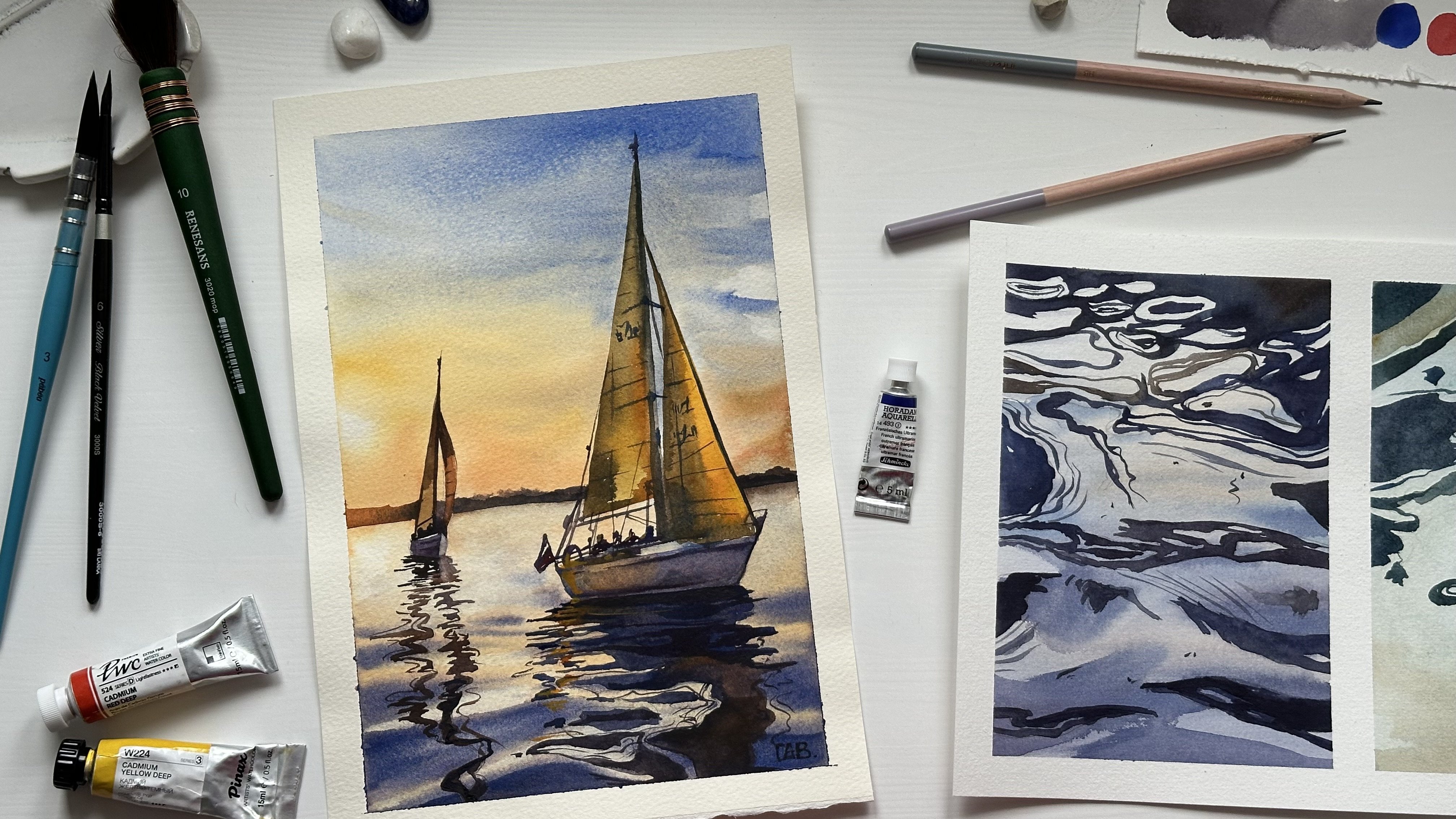
2. Art Supplies: In this lesson, we will talk about three main art supplies. Watercolor paper,
watercolors and brushes. Watercolor paper comes
in various weights, typically measured in pounds
or grams per square meter. Lighter weights, such as 200 GSM are great for
practice and sketching. But for finished works, it's best to opt for a heavier weight paper
like 300 GSM or higher. This thicker paper can
handle more water and are less likely to work the rough
three textures of paper, rough, cold pressed
and hot pressed. The texture you choose can significantly influence
your paintings. Final look and feel. I normally use cold pressed
and rough paper rough. This texture creates a
granulated texture effect. It's excellent for landscapes
and expressive loose works. Cold pressed, it has a moderate texture that strikes a balance between
rough and smooth. It's versatile and suitable
for various styles. Hot pressed, this
texture is very smooth and works well for
detailed and precise paintings. It's also great for
pen and ink drawings. Watercolor paper can be made
from cellulose or cotton. Cotton paper is considered the gold standard for watercolor because of its durability and ability to hold up
well to wet washes. If you want to achieve
the best result, investing in 100% cotton
paper is worth it. However, cellulose is
great for practice. The brand of
watercolor paper can impact its quality
and performance. Established brands like
Arches, Canson, Clarefontaine, and Honey Mull are known for producing high quality
watercolor papers. It's worth experimenting with different brands to find the one that suits
your preferences best. Watercolors are available in two main forms, tubes and pens. Tubes are concentrated,
allowing you to control intensity
of your colors. Pens are convenient
for undergo painting. Choose the format that
best suits your workflow. Focus on building a
basic color palette with warm and cool versions
of each primary color. This will give you a broader
spectrum of options. In the beginning, it's hard
to pick essential colors from a big variety of
available watercolor shades. As a beginner, consider
starting with a watercolor set. These sets come
in various sizes, often containing a palette
of essential colors. Look for a set that
includes primary colors, red, blue, and yellow. Besides the watercolor tubes, there is also one
different type. It's liquid watercolor that
I'm using in this class. Selecting the right
brush can make a world of difference in your
watercolor painting experience. There are three main
shapes to choose from, Round, flat, and field bird. More often, I use round brushes. Size matters.
Smaller brushes like number zero or two are
perfect for details. While larger ones, 12 or 16, are ideal for ball
sweeping strokes. I suggest to have at least one small
brush number one or zero middle brush
number four or six, and a big round brush or
more, brush number 12. There are two main bristle
types, synthetic and natural. Synthetic brushes are durable, easy to clean, and work
well with details. Natural brushes like
sable or squirrel are known for exceptional
water holding capacity. I normally use natural brushes or imitation of the
natural bristle. Now, armed with this knowledge, let's move to the next lesson.
3. Color Theory: In this lesson, I wanted
to discuss with you color circle or color
wheel, and color value. Let's start with color circle. In the color theory, there are only three
primary colors, yellow, red, and blue. You can get all other shades by mixing primary colors
with each other. In order to create
secondary colors, green, orange, and purple, you need to mix primary colors In order to get orange color. We are mixing 50% of
yellow and 50% of red, and we get our orange color. We are moving to the
next color, green color. It's a mix of yellow and blue. As you can see, I got
quite warm green color. This is because I used quite
warm yellow for this mix. If you, for example,
using lemon yellow, it will be more cold because the lemon yellow is more
cold than Indian yellow. And we are doing
absolutely the same to get purple color by
mixing blue and red. Once we're done mixing
secondary colors, we can move forward and fill our color circle
with other shades. We're still using
mix of two colors, but we add more of one color. For example, the closer
shade to the yellow, I add more yellow than red. I get this very warm
yellow color here. For example, I mix blue and red, but I add more red than blue. The shade that lies
closer to the blue color, I add more blue and less red, I get different
shade, and so on. Basically, this is how you can paint anything with a
very small palette. For this class, I picked primary colors so you could test how they're mixing works. In the color wheel,
there are also complementary and
analogous colors. Complementary are the opposite
colors on the color wheel. Analogous are the colors
with a similar temperature. Either warm red, yellow, orange, or cold
green, purple, blue. To become more confident
in mixing colors, you have to practice and to mix colors from your palette
with each other. Also, you may paint your own color wheel to
understand how the mixing works. My question is, which colors do you need to mix to
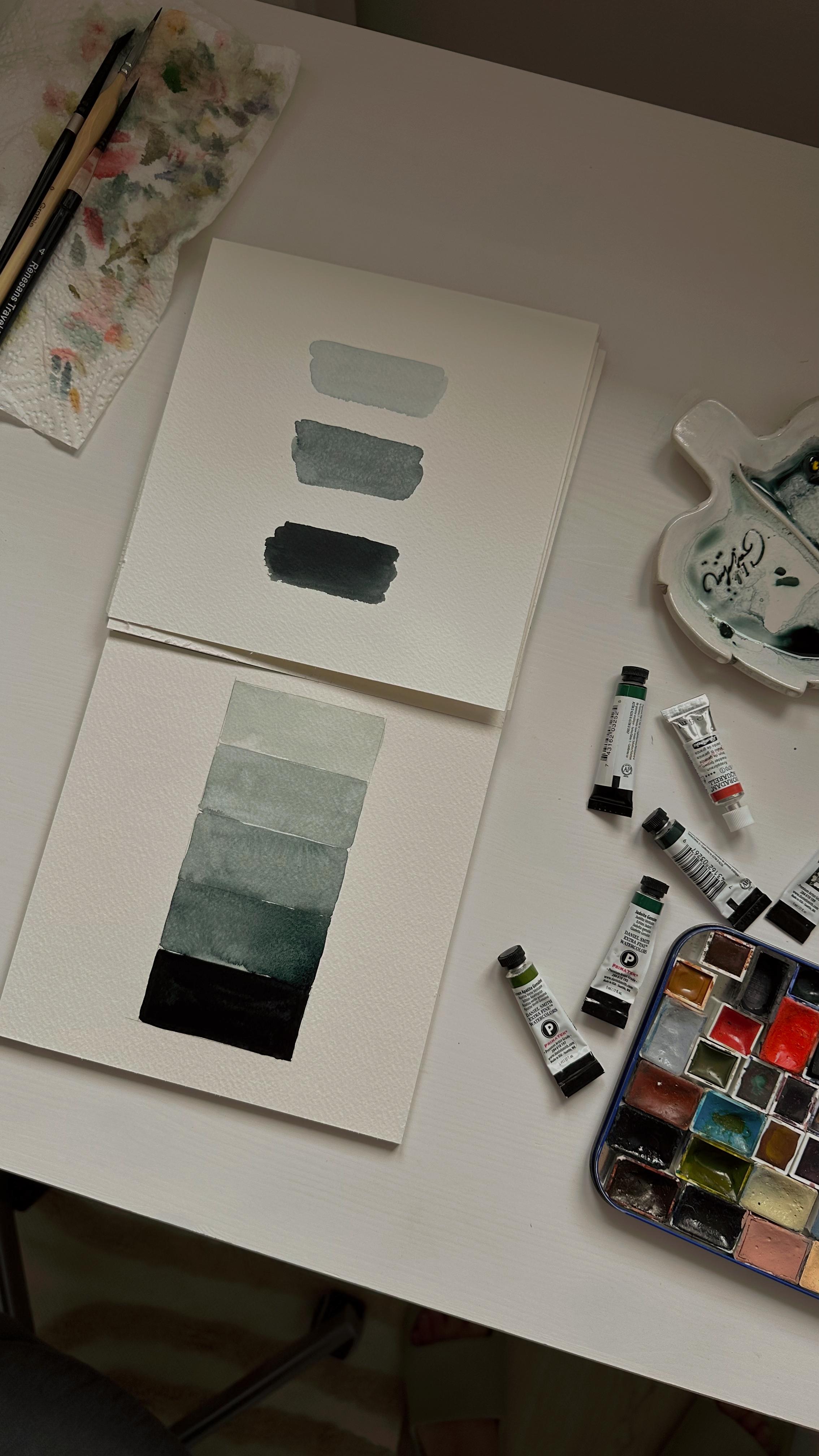
create a brown color? To explore color value, you will need just
one color and water. By mixing these two ingredients
in different proportions, you will get colors from nearly transparent
to very saturated. The three states of watercolor called tea, coffee and butter. Let's move to the
next lesson where we will learn about
watercolor techniques.
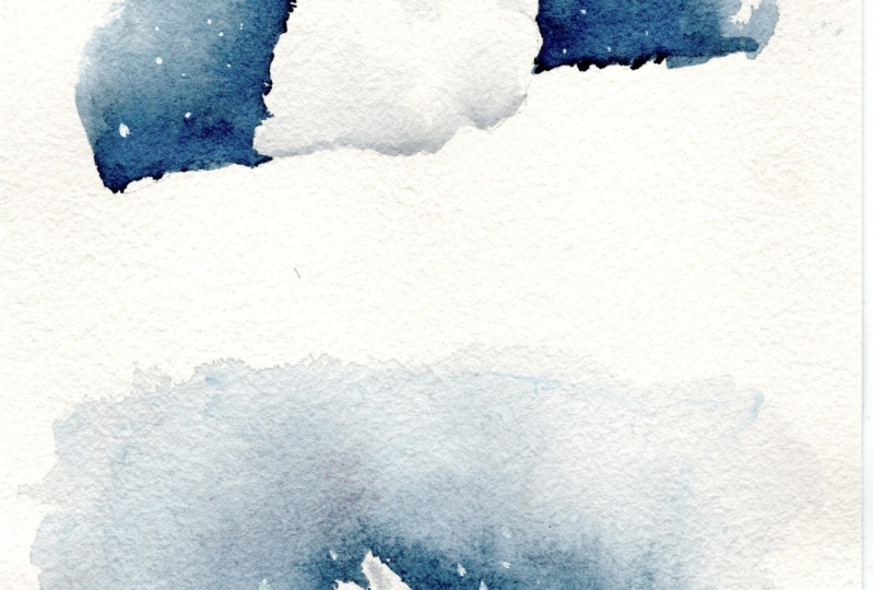
4. Watercolor Techniques: In this lesson, we will discuss two main
watercolor techniques. In this technique, you
wet the paper with clean water before
applying the paint. This allows the colors
to blend and flow, creating soft and diffuse edges. The wet on wet technique is excellent for creating
smooth gradients, atmospheric effects,
and soft backgrounds. With wet on dry technique, you apply watercolor
to dry paper. This technique
offers more control and sharp edges
in your painting. It's ideal for adding
precise details, sharp lines and distinct shapes. It allows layering and building up colors with clear boundaries. Before moving to
the next lesson, practice in both
watercolor techniques to become more confident.
5. Sketch: In the lesson four, we will learn how to prepare a sketch. For preparing a sketch, you will need a pencil, just ordinary one
or mechanical one. You also will need need
able eraser to remove the pencil strokes from the painting before
you apply water color. It's very soft and it
doesn't damage the paper. The most difficult part of
the sketch is to evaluate the right proportion of the object and to
transfer it to the paper. That's why I'm going to show you how the sighting method works. To do sighting, we keep our arm holding a pencil
stretched to its fullest. Keep your elbow locked
when you sit in, the proportion would be consistent each time
you look at the object. Then you need to
close one eye and measure the object
you see with pencil. To measure the proportion, you need to hold the
pencil so the tip of it would be visible on one
edge of the object, slight your thumb to
the opposite edge. So you would measure
the unit for widths, Keeping your thumb at the unit. You need to turn pencil and
compare this unit to height. You can measure each part of the object and compare
it with each other. Now it's time to transfer these measurements to the paper. Once you have your
proportions on the paper, you will have to draw the
shapes of the object. I suggest you to use round
shapes as it helps to see object as a whole and
then go into the details. Start by identifying key
points on your subject. This could be the corners, edges, or any
distinctive features. For example, when
sketching the goose, I identified the
top of the heat, the beak, and the legs. Try not to push pencil
a lot as we don't want to leave a lot of pencil
marks on the paper. There, there, there, there, there, there. When sketching,
I'm also analyzing the darkest and lightest
parts of the object, and I'm marking it on the paper. When I feel like the
sketching is done, I use needable eraser and slightly press it to the paper to remove
the pencil lines. Now when our sketch is done, it's time to move to the next
lesson and start painting.
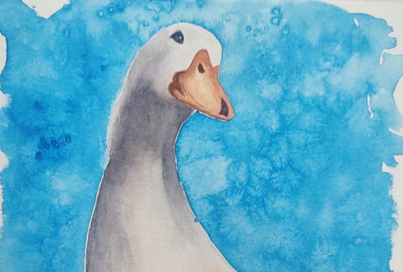
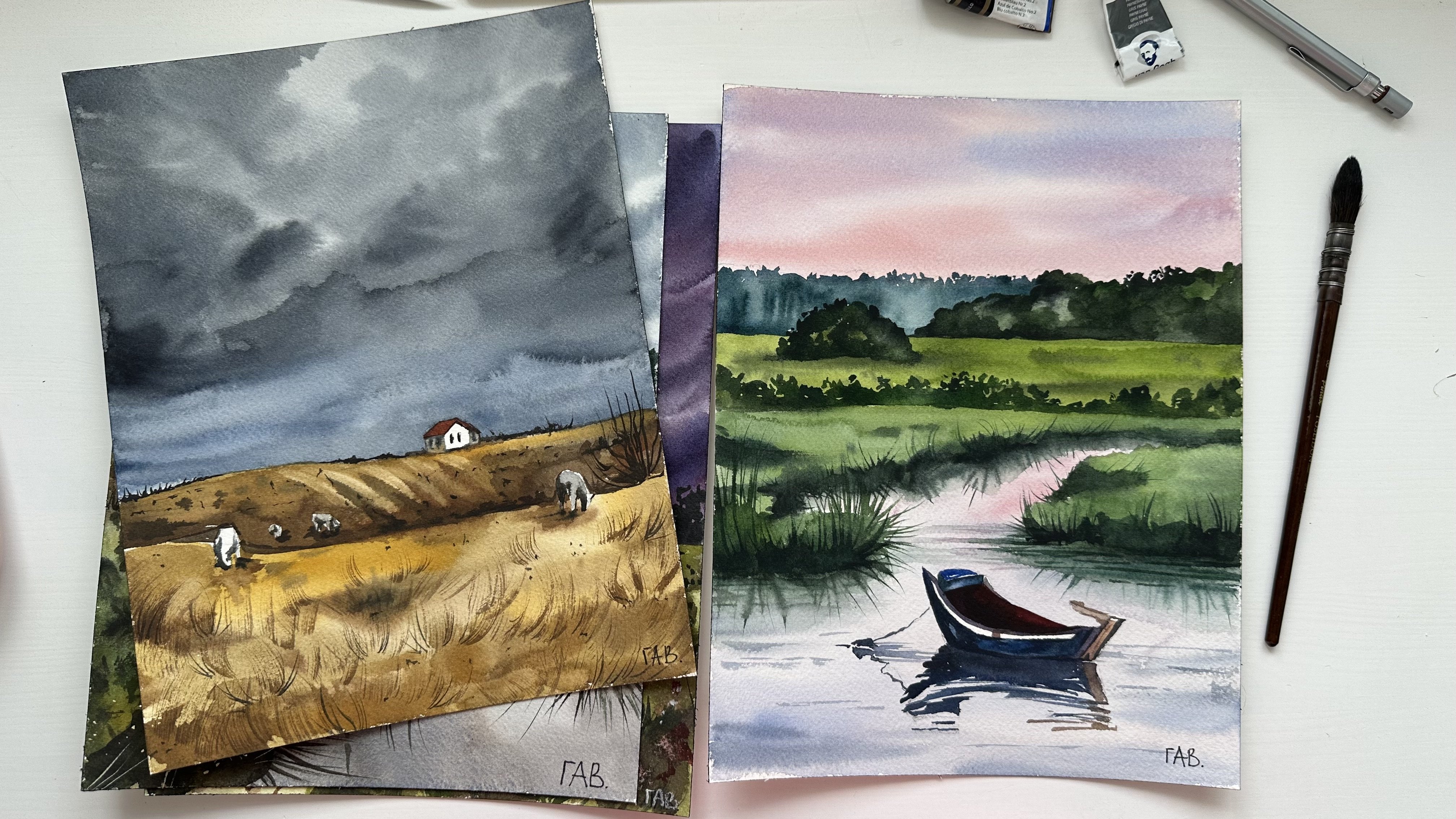
6. Secret of an Eye-catching Watercolor Painting: Before we start painting, let's discuss what is the secret of an eye catching
watercolor painting. Over the years of painting, I was trying to
understand what is the secret of an eye catching
watercolor painting. Because some works you
like more than the others. And I was trying
to understand why, basically the most
important thing for our eyes is to catch
contrast on the image. That's why if you are
painting white objects, it's really important to
create background around it to create this contrast with
darker color than the object. If you're painting dark objects like this dock on
the right side, it's okay to not
add background as the white piece of paper is already contrasting
with the object itself. Sometimes blurry
backgrounds can create particular atmosphere and mood. Again, you use contrast to make it more appealing for eyes. Dark colors next to
the light colors. Dark backgrounds also can help you to emphasize
the highlights. Like here on the God's face, the lightest part of the image. It's not always necessary to use dark backgrounds
around white objects. You can use analogous
colors, or colors, from this image that
you used already, and to create surroundings
for the white objects. The secret is to use this opposition not only
in terms of colors, but also in technique, like detailed hand on
a blurry background. When I talk about
contrasting background, I also mean contrasting objects
lying next to each other, like leaves surrounding flower.
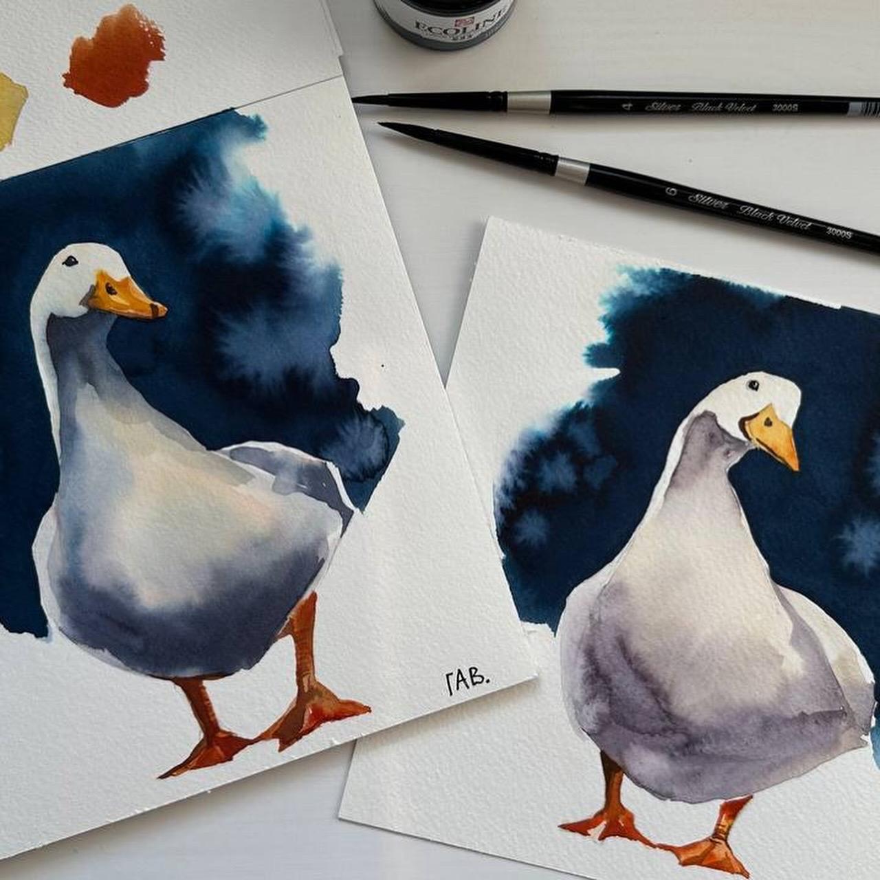
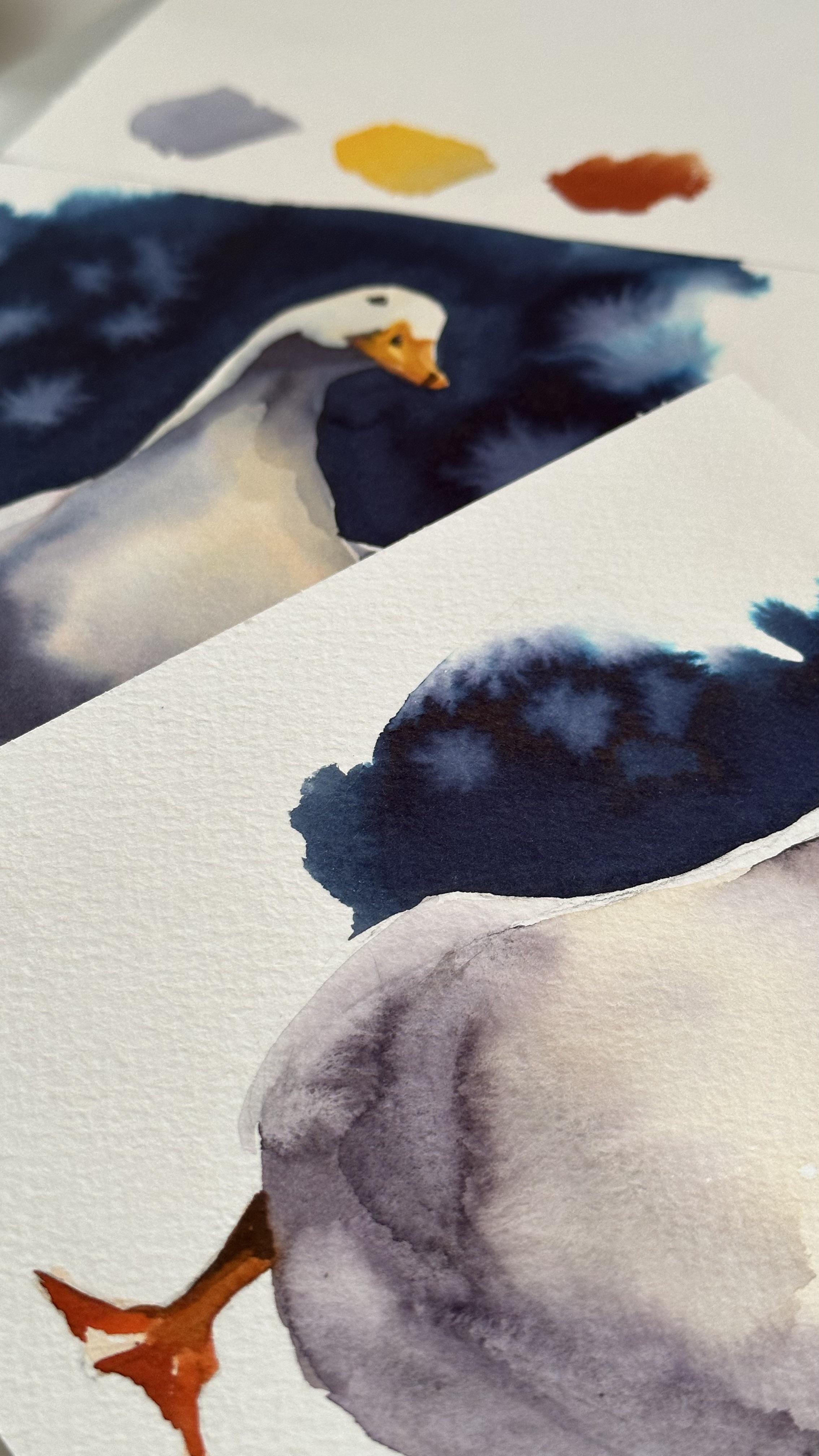
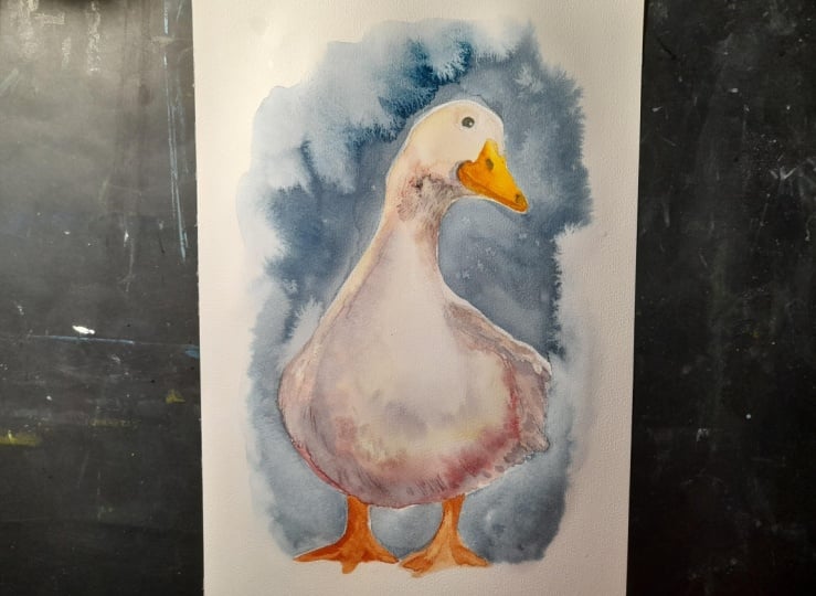
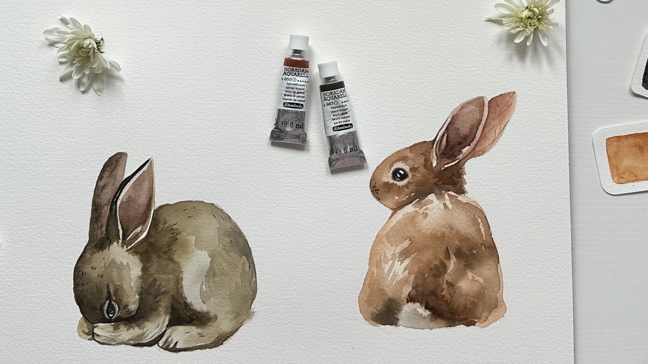
7. Painting a Goose: Welcome to the lesson six
where we will paint a goose. For this painting, I'm going
to use two round brushes, number six and number one, Liquid water, color by Ec, line in color, Indigo. We will use it for the
background and for the color mixes colors in tubes. Indian Yellow, Biv and Go
and carmine Bin brand. You may also use water
colors in pants. You will also need a
palette for mixing colors. I have a ceramic one, but you may use
plastic one as well. Also prepare some small
piece of paper where you can test your color
mixes before painting. Also, you will
need a paper towel to remove water from the brush, to dry brush and to clean it. Also some small things like
glass of water and erazor. Before we start painting, let's mix our colors
on the palette, as we have only three
primary colors, and we are going to mix
them with each other. For the goose body, I mix carmine and
indigo with each other. And I want to receive
this purple shade. I add more carmine until
I get this purple shade. Now I need to test my color mix on the paper
to see if it works for me. I will just show you
here on the paper. You can control transparency of your color mix by adding
more or less water. Now I want to prepare a
mix for the goose body, for the light parts. For this purpose, I'm using Indian yellow, a lot of water, and just a little bit of
indigo mixed with carmine. Basically, we mix
all the colors, but we use more yellow
than other colors. Now we are going to prepare
the color mix for the beak. So we need to get orange color. For this purpose, I use yellow and red as in the color circle. We have Indian
yellow and carmine. Right now, I'm controlling
the amount of yellow and red to get the precise
orange color that I need. Now we can move to
the painting goose. We will start by painting beak. I apply some dense color
on the edges of the beak. And then I just drag
the brush and create some lighter color in the
middle to make it more yellow. Now I will add just some shadows on the edges of the beak. To make color for the shadows, you can just m some
colors that you already have on the palette in different amounts
to make the color. Like I have orange color and I just add some of the indigo, some of the carmine, and
it becomes more dark. Now I'm switching to
another brush and I cover the body of the goose
with just clean water. We will use wet on
wet technique and apply this light
color that I mixed before for the light shades of the body straight to the
paper while it's still wet. I take this purple color
that we mix before and apply it straight to the wet surface of the
paper to create shadows. I'm using some very light
color or even clean water, trying to make smooth
edges between two colors. We wouldn't see the borders
like straight borders between light part of
the body and dark part. Also, I add more shadows just color on the
still wet surface. Don't forget about the
shadow under the hat. We're trying to work very fast
with wet on wet technique. But if you see that
paper is already dry, you can add some
just clean water and then apply the
color for the shadow. To make a shadow, I dry my brush with a
paper towel and take some color from the palette and apply it straight to
the steel wet surface. And now we are moving
to the light parts of the goose and edges of the body. And we use a very watery mix, like 70% of water and just 30% of the color
that we had on the pallet before we cover
all the surface of the head and some neck
with a very light color. You can also dry your
brush with a paper towel so you can control the amount
of water on the paper. Now, I want to paint a small thing on the
back of the goose. I don't know what it is, but we are going to
paint it as we see it. So I'm trying to make a dark
red, reddish orange mix. So I'm adding just more of the carmine and indigo
to the existing color. Let's also paint an
eye to our goose. And we're using
mix of indigo and a little bit of carmine
and less water. Now we are moving to the
last part of the goose legs. First I cover the whole
surface of the leg with a very watery mix
or just clean water because we will start working like a wet
on wet technique. Then we will make some details. We're using the
same orange color that we had for the beak. We just cover the whole surface
of legs with this color. Now, while the surface of
the legs is still wet, I add some darker colors to make shadows on the edges of the
leg and under the body. When the surface is already dry, you can add some
darker shades to highlight the structure of the leg of the
goose before that. And to understand where
the darkest parts, try to analyze the image
that you are painting. The object that
you are painting. Our painting almost done, but I want to make
our shadows more dark as you remember our eyes
trying to catch contrasts. So we have to make these
contrasts very sharp between white head of a goose and
dark shadow of the neck. Remember to leave light
spot on the left of the goose because our light on this image comes
from the left side. So we have to keep the lightest parts of the
goose on the left side. Look at this, our goose
is done and we can move to the next lesson and to learn how to paint a background.
8. Painting a Background: Welcome to the last lesson
where we will paint a background using wet on wet technique and
liquid watercolor. Cover the surface
around the goose with number six
with clean water, try to avoid the edges of
the goose levered dry. If you have a bigger
brush or more brush, it's convenient to use the
biggest brush that you have. This purpose while the paper is still wet, I apply liquid water color to the surface of the wet paper. Now using the brush, I'm trying to combine the water and to make
it more smooth and blurry and precisely go by the edges of the goose
with the dark color. If you haven't done this before, it's better to practice
before painting When the surface
around the goose is covered with color
and is still wet. You may add some drops of the clean water to create nice blurry water color effects. Using the small brush, you can make some final
details to your painting. We finished our painting and the last thing is left to put your name in
the right corner. Now you know how to use
different watercolor techniques. How to prepare a sketch
for your painting. How to mix colors, and how to paint white animals on a
watercolor background. I hope you feel more
confident after this class and you got inspired to practice
more in painting. I can't wait to see your class project and
your amazing goose. Please don't forget to share
your view about this class. This will help me a lot to
understand if this class was helpful and what are
the areas of improvement. I hope to see you soon
in my other classes.
9. Class Project: Painting white objects with watercolor can be intimidating. With this class project, I want you to overcome this
fear and to learn how to create a perfect background so your white objects would pop. I pick this reference of a white goose on a
dark background. I think this is a perfect
stage to try your skills in creating watercolor background
with wet on wet technique. Also to practice preparing, sketch and to mix the right shade with your
limited color palette. While painting white goose might seem a little
bit challenging, this photo is actually quite
perfect because you can easily spot darkest
and lightest parts on a white bird's body. Let's move to the materials you are going to need
for this painting. You will need just
three watercolors, Indian yellow, or
any other yellow that you have in your palette. Carmine. Or any other red that
you have in your palette. As a blue, I'm using indigo
liquid watercolor by Ecoline. You may use also indigo color in tube or pen watercolor paper. I used Aurora watercolor
paper, 300 GSM. Cold pressed, 100% cellulose. And you may use any
other watercolor paper, just make sure that it's 300 GSM because it
holds water perfectly. As a brushes, I use only two brushes and you
need only two brushes, number six and number one. You may use other brands, but I use silver brush and
grabby for making a sketch, you will need a pencil. I'm using mechanic pencil, but you can also use
just ordinary pencil. For this purpose, I use
mechanic pencil by pencil, 0.3 millimeters, I
find it perfect. Here is also the ceramic
palette that I'm using, but you can use just ordinary
plate or plastic palette. Also the paper towel and needable eraser that
will help you to remove pencil lines
from your sketch. Prepare the class project
by the following steps. Download the photo reference
attached to this class. Prepare your pencil sketch. Prepare your color
mixes on your palette. Start painting goose in
this sequence, Beak, body, legs, and the final step, paint a background with
wet on wet technique. Once you're done with painting, please make a photo
of it or scan it. Then attach the image of your
work to this class project. I'll be happy to give you my feedback and help you
to improve your skills, may the art be with you.
 Aleksandryna Gromyko, Watercolor tutorials for everyone