Transcripts
1. Introduction: Hi, everyone. Welcome
to my painting lecture. My name is Macheta and
I have been working as a painter and
illustrator for 15 years. My works are represented in private collections
across Europe, the US and Canada. Today, we will paint together this fine gentleman, Mr. Duck. We will be using oils, and this lecture is designed for complete beginners as well as intermediate level painters. However, advanced
artists are also welcome to join us
and paint along. I hope you will have
fun. Let's get started.
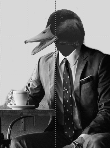
2. Step 1: Linework: In the description, I provided two versions
of our reference photo. At this time, please take
the black and white version. This photo was taken
last Saturday when I went out for lovely
cup of tea with Mr. Duck. Just kidding. It's an actual clash. I created from two photos. I downloaded from pexel.com. I recommend using this
platform for reference photos, since the images
are copyright free, ensuring we won't be
stepping on anyone's toes. Now we can move on to
the actual drawing. As you can see, I have divided the canvas
into several fields. I have only four fields, but your reference photo
has been divided into more. I recommend dividing your canvas in the same way as
your reference photo. The purpose is to copy as precisely as possible from
your reference photo, focusing on one field at a time. This approach makes it much
easier to get the proportions right by breaking the overall
picture into smaller units. As illustrated in the video, I first drew the line work for the first quarter
of the image, and now I'm proceeding
with the other sections. Always, keep in mind to
check the proportions. Remember how far
each line reaches and what proportion of the
whole field it occupies. For example, whether
it extends to half of the field or
one third or else. Take your time.
There is no rush. Focus on getting the
line work accurate, as it will serve as a
foundation for our next steps. At this stage, we
don't need to worry about shading or values. We simply want to ensure
the line work is correct. It would have been much
more challenging without dividing the canvas into
four fields or more. If I had to draw everything at once and get the
proportions right, there would be a significant
risk of mistakes. Now, let's focus on Mr. Duck's beautiful eye,
this kind smile, and his lovely neat appearance. Once this initial sketch
is satisfactory, we can move on to the next
step, the painting process.
3. Step 2: The Underpainting: We are now already
with the linework, so we can now begin
the underpainting. The underpainting will be
done in acrylic colors. I'm using black, white,
and burned sienna. While burned sienna
is necessary, it can add a little interest to the picture if you
are more advanced. Otherwise, feel free
to leave it out. The purpose of starting with an acrylic black and
white version of the picture is to get
the values right. Values refer to the darks and the lightest lights
and everything in between. Getting these values
correct is crucial as they form the foundation
for the entire painting. When we start painting with oil, I always recommend doing
some form of underpainting, whether with oils
or with acrylics. The key is to ensure the values are right
from the beginning. This type of
underpainting is called Grisel because it lays down
all the shades of gray. As you can see, I started
with the darkest areas, applying blacks and mid tones. You can approach this step, however, feels most
natural to you. The great thing
about acrylic colors is that they can be
easily corrected. Don't worry about
making mistakes. You can always lighten or darken areas as
acrylics cover well. Now, why are we using acrylics? Simply put, they
dry much quicker than oil pans because
they are water based. This allows us to continue with the next steps without waiting for the oil
to dry completely. Additionally, one of the
main principles when painting with oils is
to layer fat over lean, meaning we should use more
condensed colors later. By avoiding oil in
the first layer, we adhere to this principle
and ensure we are not painting a slow drying layer beneath a quicker drying one, which could lead to
cracks in the painting. As you can see, I'm now applying
the darker shades to Mr. Duck's head, which
is a deeper gray. Don't hesitate to
go bold with darks. There's always a way to
lighten things up later. We are gradually working our way through
the underpainting, placing the colours, shades and lights in appropriate location. Make sure to take your time, don't rush, enjoy the process. We have already established the proportions and composition, so we have a solid foundation. You can see I'm working
on the background now. The background color is slightly darker than
Mr. Duck's peak. This ensure that Mr. Duck stands out as he should, allowing us to see
his beautiful smile. I mixed a bit of burnt
sienna into the background, which adds a touch of death. However, as mentioned,
this is not necessary. Notice that my background
is not uniform. It is darker in some
areas and lighter in others to create contrast
and avoid visual monotony. We want our eyes to
engage with the painting, so having some structure
and variation is important. Try to keep in mind that nowhere in the picture
should be two areas with the same shade
of gray next to each other unless the area
is meant to be uniform. This makes sure that the picture will have proper plasticity. Now, let's focus on the beak, which can be tricky since its value is close to
that of the background. We need to ensure it is lighter than the
background color. If you are unsure, you can leave the edges
white and paint gray on around the middle of the
beak to maintain contrast. As I work on the suit, I'm careful to keep the
shades of gray distinct. You can see that when
there is a dark shade, I always ensure a lighter
color is adjacent, creating a smooth transition. This technique prevents the
contrast from disappearing. Remember, do not worry too much about detail
at this stage. When working on the suit, it often helps to view the reference with
your eyes help lost. This will blur everything slightly and assist
you in determining the various shades of dark in each area, simplifying the task. Again, you don't need a perfect
copy of your reference. You only need to identify where the darks and
lights should be. The underpainting will shine
through the upper layers, significantly
reducing the workload compared to painting
directly on the canvas, la prima, it is called, where you would need to keep
everything in mind at once. A As I walk on the right side of Mr. Dove, which is in the shadow, you can see that it is darker due to the light source
coming from the left. The upper side of his hand
will receive more light. So we will have some lighter
shades of gray there. And In general, it is beneficial to translate your reference photo into
black and white when painting. If you are not planning
to do under painting, at least spend some time
studying the values in a black and white format to
identify the light and darks. You can, for example, do a small sketch before
painting just with a pencil. Don't worry about
making mistakes. There's always a way
to correct them. Be sure to step back every few minutes to view your
painting from a distance. This will help you see the overall composition and to assess if everything
is in propportion. Now, we are nearly finished
with the darkest shadows. I have added some burnt
sienna under the table, since this era is part of the background and
doesn't require much detail. This portion can be a symbolic representation
of the era under the table. There's nothing particularly
interesting there. Just the leg of the
table and some shadow. I have added a few
final details, and we are almost
done with the darks. The lightest areas
are left white, reassuring us that we are
moving in the right direction. Now let's add the last
bit of shadow between Mr. Duck's leg and suit. I'm using a smaller brush
to add more detail. The tie presents a challenge because while the
fabric is dark, the sunlight hitting it should create a
lighter appearance. I will paint it black
and add highlights later as the fabrics nature will likely yield natural roof. I'm also adding shadow
under the table, ensuring it doesn't blend
into the color beneath. I'm using a relatively
dark color that transitions into a lighter
shade as it approaches Mr. Duck's body,
maintaining contrast, since he's sitting
in a tables shadow. S. I know many of you are already experienced, so I won't belabor the details. However, I understand
that starting can be challenging and I don't want
anyone to get frustrated. You can see I left
the left side of Mr. Duck's body quite light. I thin the paint until
it was very, very thin. Ensuring this part remains
lighter than the background, since it is exposed to sunlight. Now, we just have
the coffee mug and a few details left and
we will be almost. Take your time and break
the process down by working either from light to
dark or from dark to light. Avoid trying to work
on everything at once, as this could lead
to a flat picture with uniform darkness
or lightness. We want to incorporate
deep blacks and bright whites to
enhance the painting. Now, for a few final touches, I'm adding detail to the attachment to the
table, and we are done. With our chrysal
underpainting credit, we can proceed to the final and most
important stage of our painting process,
the actual painting.
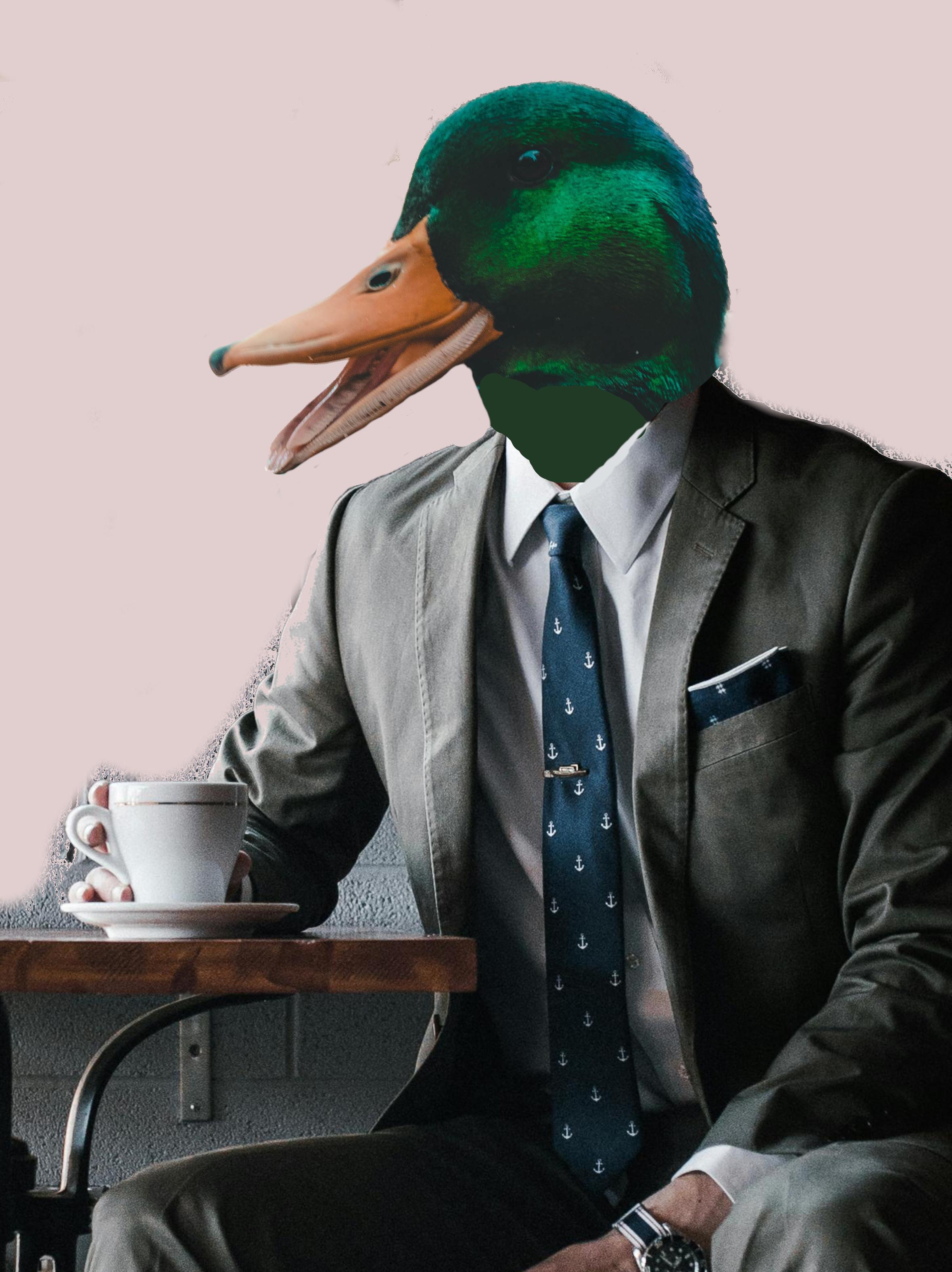
4. Step 3: The Painting Process: In the description,
I have uploaded the reference photon that
I have been following, feel free to download
and print it out. As you can seeing, I have jumped right in and started
with the head. The head will be the
main focal point, so we need to ensure
it is accurately represented and
beautifully rendered. Rendered. To achieve the green in the darker part of the head, I have mixed cadmium
yellow and Prussian blue. Be careful with
the prussian blue, as it is a very strong
color and covers a lot. So make sure to thin it down. To create some interesting
hues in the head, I am layering colors on
the top of one another. I will go back and forth, ensuring the values
and hues blend naturally without turning
into a muddy mix. Now we will paint the beak. I will add the
darkest parts first, focusing on the tip
and the left side, which will have a light shadow since sunlight hits the
beak from the right. I'm blending cadmium
yellow and cadmium red with some white for the
lighter sections of the beak. Make sure to keep it
all light and soft. I don't want the brush
stroke to be too harsh. I have switched to
a smaller brush to start adding
the last details. Remember to soften your strokes. You want everything
to blend nicely. So you can see now I'm working on the peak for that I
have used amu orange. There is a nice green, nice green light under
the Mr. Duck's eye. This, this was a light
green which I used. I will put them all in the
description of this class too. And on the very top of his head, there is also a light frame because his fetters are changing colors depending on what kind of light and what angle of
light falls on them. So we want to also
represent this in our No. Don't worry too much about darks yet because we can come
back to the darks later. In general, we can put more saturated colors into the dark areas because that will also represent the shadows, but don't worry
about it too much. As long as you mix the
color transparent enough, then the values will be taken care of by our
underpainting already. As I said, since the
head is the fox point, we also want probably the highest level of
detail in that area. So do not shy away from spending a little
bit more time on that. Since whoever is going
to see the picture, it is going to judge its
quality from the way how the pine head of the Mr. Duck will look. The painting style I'm
using is rather rough. I am using mostly one
size of a brush and I am using energetic strokes and do not worry much
about the detail. This is all purposeful
and made the picture and gives the picture special
moose painted quality. And You can see me painting the background color and all kinds of shades of pink. This color choice
has its purples, since pink is
complimentary color to many shades of green. With that, I mean
that pink next to green together make the
highest possible contrast. In practice, it makes sure that the picture looks lively
and that the head of Mr. Duck stands out. To balance this out, I have also added some
green to the saco, which creates a harmony and
balance together with Mr. Duck's head in opposite
to the pink background. You can see me thinning the
color for the background. So the underpainting shines
through and is visible. This gives the picture also
quite interesting effect, and it doesn't look
so monotonous. So Now, I I said that we already do have shadows
and lights on place, but it doesn't hurt to take black oil paint and add some of it to
those darkest places. The simple reason
for that is that black acryl color is slightly lighter than
black oil color. Black oil color is really
black in its $0.02. So if we wouldn't have done it, we would get maximum very, very dark gray, and that
could make the look dull too. Now you can see with
light side of Mr. Duck's Sacko, I'm just
using simple light blue, which also could be complementary to
certain shades of pink. This is why it also works and
makes the figure stand out. And since the head is in
the middle of upwards, we want to add a bit of color
and saturation onto the eye because eyes are windows to the sole and soul of
fine gentleman, Mr. Duck is pure and beautiful
and we want to see it, so we want to bring
attention to his eye. You will probably also
notice that I didn't put almost any attention to
the coffee c on the table, since we do not want it to steal the focus from the head of Mr. Duck, so it does not really
need much detail as such. Thank. All right. And as the last thing, the signature to the
right lower pin, don't forget to add yours. And we can hold
the picture ready. Thank you for joining me
today. I hope you enjoyed. I hope you will show me your creations and
upload your project. And if you want to
hear my feedback, don't hesitate to contact me. And if you like this video, you can check out
my other lectures. Thank you. And bye. Or.
 Marketa Cenker, Oil Painter, Illustrator