Transcripts
1. Introduction: Ect So s. I got a hole. Hi, guys. Welcome to my studio. Today, I'm going to show you how this painting came to life. I will guide you step by
step through the process, how I painted this nocturnal
view on the harbor. And simultaneously,
I'm hoping to make it possible for you to paint something similar and have fun. This is not going to be the
typical tutorial lecture. I am of the opinion that step by step manuals about how to create art are not only
unbearably poring, but also not really helpful. I think that everybody
should be able to find their own muse and enjoy
their own creational process. For that, I will try to share with you some
tricks which will hopefully help you to get the result which
you will be happy with, which will look
professional while having fun in the process.
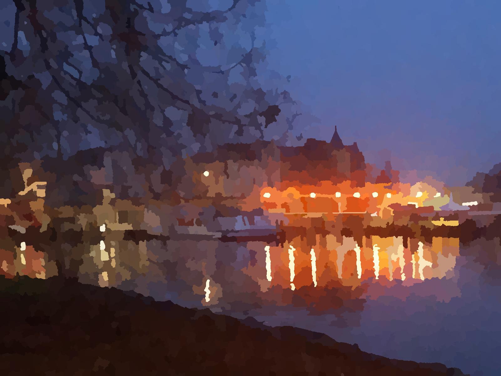
Let's get started. Okay, guys, let's get started. What you see on the screen
is our reference photo. This is the image which
we will be painting. I took it during Sylvester night in
German City of Sherine. But before we start, I have a bit of theory for you. It is useful to know in
general before painting. There are three basic
characteristics to any painting, and it is useful to
clarify those beforehand. They are as follows. First of them is
composition or focus. Second, are values,
dark and light. And the third one, are colors. Let me introduce
them one by one.
2. Focus: First of those is
composition or focus. Simply explain, this is where your attention goes when
you first see the image. This is the path your eye
travels while looking at it. These are the most noticeable
aspects of the image. The objects, their placements, their size, how they
interact with each other. These are all aspects
of composition. When looking at the image, we are not seeing everything
at the same time. We first see the most contrasting,
most noticeable part. Then we move to the second,
most noticeable part, then the third one, and then maybe we explore some details. The reason is that
our eye simply cannot comprehend everything
at the same time. If we would make into
the detail everything, that would become
too overwhelming. When painting from a photo, we already have the most
aspects of composition given. However, we still have to decide where do we
want the focus to go and how do we want to guide an observer's eye
throughout our image. Another way of thinking about it would be if we would have to eliminate the image in one main era and two
supportive ones, which ones would that be? To clarify this, I have prepared for you
a small exercise. For that, you will need to take a sheet of paper and a pencil. And now look at the picture and draw areas which your eye lands first,
second, and third. Feel free to pose a video for
as much as you would need. When you are ready,
I will show you my own process of going through this exercise and we can
compare. See you later. Time to draw together. What really helps is to
keep your eyes half closed. With that, what
gets better image? What is the important part
and what can be omitted. We have a horizon,
and then we have the lights which go like
this. I set, I will do it. Very rough because the
point of this exercise is not to make magnificent
copy of this photo, which we will all put behind
the frame and keep forever. The purpose is to see what
is important and what we can keep bloody in
future painting. Here goes to show Here
will be the boat. The point of the boat is that it stands out because
of the light behind it. It does not stand out by itself, and here are the lights
exactly like this. Another important
part is the tree. The tree is also not completely
detailed everywhere. It's good to know that we
draw the branches. All right. The idea will be that when
the observer sees the image, the first, they will look here. Then the eye will
travel direction here and see and enjoy
hopefully this part, Then we can just
balance everything out with a few details
here in the corner. We complete a triangle. With the three branches
pointing here, we will lead the eye
back to the beginning. It will be triangular movement, how hopefully the viewer will see the final
picture. All right. I think I can live with it. I think I'm. Let's move on.
3. Values: The next lecture in our
lesson is about values. Darks and lights. I think it is safe to say that values are the most underrated
aspect of painting. However, they are
incredibly important. It is a foundation on
which any painting stands. Here you can see example, what sort of magic can be achieved if values
are done correctly. This image is highlighting
mostly lights and leaving the rest with the
darker shades of gray. But still the effect
is pretty cool. Here you can see how
the image looks. When the emphasis is on dark. You can recognize very well which areas of our
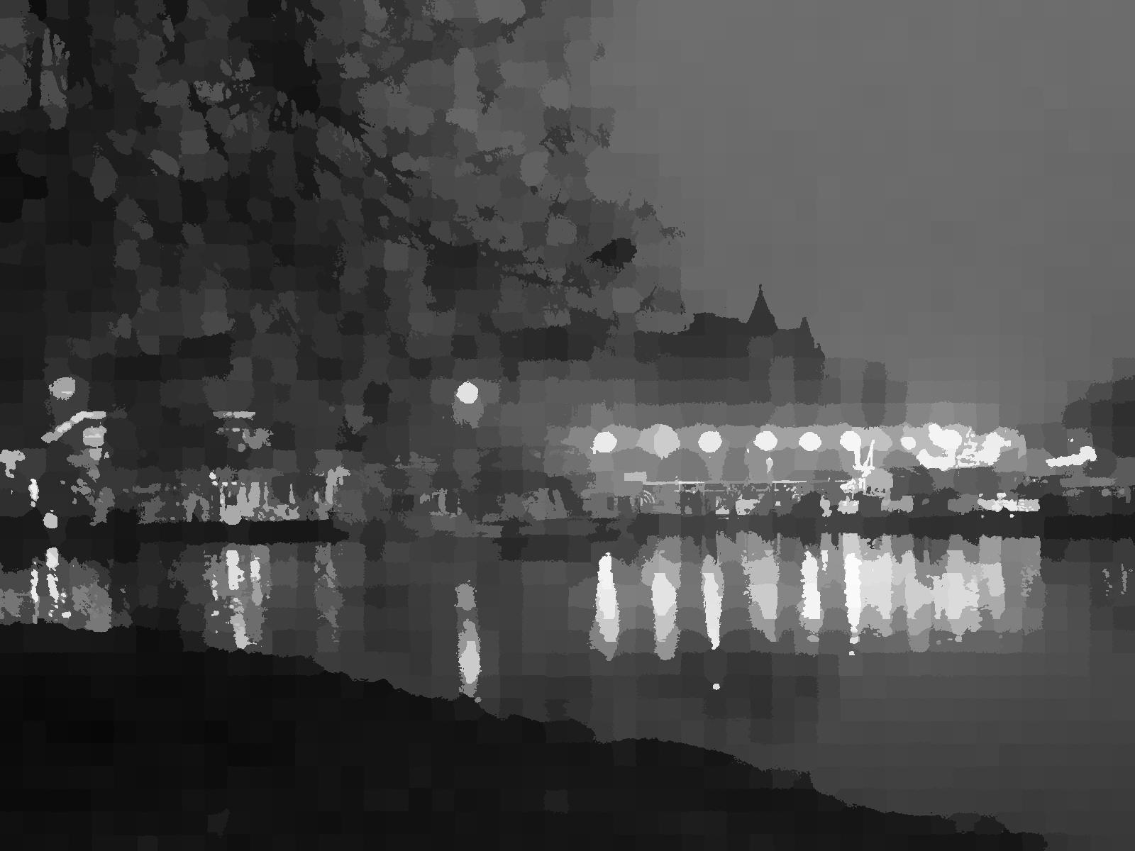
image are the darkest. To illustrate exactly the
values in our reference photo, I have used the filter which breaks it down to
different shades of gray. As you can see. To the right side, you can
compare with the gray scale, and you can see where
exactly are the darks, where exactly are the Lights and where are the middle tones. This is all very
valuable information for our painting later. You can also see
exactly to what degree. The blacks whites and grays are represented
within the image. Typical mistake in values would
look something like this. You can see that neither
lights nor darks are represented on
its full scale, and the resulting
image looks flat. For our next exercise, I would like you to
take a pencil and try to draw the photo
as you can see it. While trying to represent all the values in the picture
as closely as possible. Use the gray scale to
the right as your guide. Do not get discouraged if your image does not
look like the photo. The purpose of this
exercise is to get a feeling to different nuances between lights and shadows. Pose a video for as
much as you need. After you are
ready, we will move to the next chapter color.
4. Colors: I The third part of our
three preparatory chapters, we will cover the last aspect
of any painting colors. First, let me introduce
you to my brushes. I have used altogether
three sorts of brushes. This pointed oil painting one, rounded brush number 12, and the white brush
from homeware to cover big areas
of the painting. For painting itself, I'm
using pure linseed oil. For underpainting, you can use any other less mineral
spirit you may want. However, it is not necessary. And now, please don't faint. This is my palette. For me, it works, but if
you are on a less me side, please feel free to
get yourself normal. A. So as we can see in the picture. There are all kinds of shades
of blue purplish tones, so what we can see. We can take as a
base. C out blue. I will show you on
the canvas because I assume it will be better than
in my crazy cotic palette. So this we will use for basics. We can go from there. And then from there. We can use shades of azure blue. H. Prussian blue. It's
not necessary, but it is good to have because the majority of this picture
is in some shades of blue. The more shades of blue
we have to work with, the better the picture will be. But Prussian blue
is very strong. It's pigment is very aggressive. When you are working
with Prussian blue, you need to be very careful. Otherwise, it will take
over all the other colors. You can see the pigment
is very strong. And at the end, this one is amazing. This is a light bloom. Here, I can show you on camera, and it works as a fantastic way to make the color light without
having to use white. This Of course, I
will need white. Now, another side node. This is a titanium white. It is extremely important, which white will you
choose for your painting. Titanium white is a bit
similar like a Prussian blue. It's pigment is very strong. You will be able to
make a beautiful, shiny white surfaces with that, and it covers very much. When you are using
it, you need to be careful to tin it down and
use only a little bit. Otherwise it will take over. I did not use any other shade
of white for this painting, just for the simplicity of. Then very important
for this painting, I have used cadmium
orange for the lights, and for the reflections. The block here. And I have
also used brilliant rows. But I can imagine any type of the purple red color
would do the job. Doesn't need to be exactly
this one if you don't find it. You can see, it's very
rich, very strong. And the red deep red from
this massive monster tube. So here we are. I haven't
used black as much, but I had a bit for the horizon line mostly
and for some branches. But I will show you how
to substitute black. Some of the lies have some
green in them as well, so green we can use two. Of course, what would
we do without a yellow. This is Camo. It's
poisonous. So please Do not eat. Let me put it here. And now, it is important to understand that each color has its value to its brightness, means the consistency of the
pigment and then the value. The droness of lightness
of the color itself. Rule one when mixing the colors. Use as little white
or black as possible. Because what happens if you
use white and black is that it sucks out the pigment and the result will
be a little bit gray. If you want to have
beautiful bright colors, try to lighten with other
colors like for example, this blue or yellow, depending on the situation. As you see, a. Color before painting needs to have just right consistency. So especially for the
beginning layers, we do not mind
that it is liquid, so we can make a really thin
layer of paint like this. You can see we can also
cover picker surfaces, at some point, we
will to mix it. We will t this tool. Once we are happy with the
consistency and thickness, we will just enter
and now First, first mixing result
is not as I wished. What I do, I wipe
I wipe my brush, and I continue mixing
a step further. If it is a little bit closer to what I wish, the color is. Darker than this one,
lighter than this one. We can of course
mix much further. If we continue what we get is this beautiful scale of shade. You can do this with any color. It's not difficult and a set because we have
the underpainting. It's not as important. Don't worry if it doesn't
work for you perfectly. What is important for this
particular painting we have that you learn before starting
painting to tin the color. The surface you are
making is very, very. Very, very tin down. A lot of oil, lot of bed oil, and not as much color. We do not want to
have big layers of colors places and if then
only very, very sporadic. Basically, the trick
is really just to use a bit more of oil than
you would think you need. Now, you can see
this brussian blue. This brussian blue
is very strong. It wants to take over.
And dominate the palette. But it's also beautiful color. So when we want to use it, it needs to be really tinned
down for our purposes, then we can mix it,
for example, here. Other shades of blue or even lighten it like
this. You can see. It may be probably causing some struggles
in the beginning, but it comes with a practice. Just before you start painting, try to get yourself a palette
or aboard piece of paper, and just practice
mixing the colors. Practice tinning down
the colors like this. You will get, very in layer. Because of transparency. You can see because
my brush was dirty, I'm immediately getting blue
from this white as well. But I don't care because I'm
just exploring the shades. So if this is the scale with which we can already
work nicely. And the same we can do with
the lights as well and with. Just be very careful
to to brush properly. Also have a clean oil, not like me right now. Before processing to
any lighter color. As you see, I'm having
so much oil on my brush. So much oil that
it is resulting in really regularly
tin color surface. Severe orange. There we go, it is almost like
painting with aquaral. It becomes easy with
practice. Here we can. This is how we make lighter
without losing brightness. This is very important
because as you see, it is still very strong. However, let me show you what happens if I want
to lighten up with ite. Let's tick this orange and now let's borrow
a bit of white. You see? It is not bright. It is softer. But
you compare it here. It is not even close
as fy as this one is. It makes it for better again. This one is still
rich on pigment, didn't lose its vibrancy. This one became much more soft. Be careful when you are working with light
in our pictures. We do not want to
lighten with white. Or if we do we need
to do it with purpose like in the center
of these lights. When the light is
the most intense, there we can use the white, but not in the around as because those need
to be very saturate. Now, this one is very beautiful, and it works for the
picture really really. Because it already
goes direction purple and a purple works
really well with blue, so we can either
make it more purple, to achieve contrast next to each other or more purple
to achieve other shades, depth, or let it shine. Or we can put it next to orange and yellows and achieve more contrast with it like this. Wh colors, it very much depends, which colors will you
put next to each other. This is how you create contrast, but this may be a topic of
another video because here, we do not necessarily need
color theory for our painting. This purple will serve
for us in order to achieve and to complement these beautiful
blues and the sky. You see that the Prussian
blue it works really well. It will work very well
also with blues here. Also here with a light blue. It just create very
interesting effect for an eye without disturbing
the unity too much. Here we are getting to the red, which is also very strong. This one I used for
the underpainting, as I will show you very soon, and I used it, very sporadically
in the painting. Most of the lights are
actually done with orange. You can also mix the bit
together to get darker orange. I would advise you to avoid the pink one as much as
you can during painting because it will create contrast because this one goes
already cold direction, and these are all warmer colors. They will be a
little bit fighting, and we want to use it to our advantage, not
just randomly. This one, when we use it, mostly next to those to create a contrast to make
something stand out. Otherwise mix only these
if it makes sense. An last one green. In the picture, there
is nothing green, but little bit of green in yellow reflections
usually provides also really interesting
effect and also depth. We can a little bit of yellow
and mix it with the green. You can see, just
creates a scale because this green is already very much yellow
direction like this. You can see, I'm really
still keeping it very thin. I'm not making any
thick layers here. We will have to
save them for the later if we will use them
because the technique we are using here is
glazing and glazing builds on use of very,
very thin layers. As you can see, same as I
showed you with orange, if we use white for lightening, we use the chroma. Here for lightening
of this green. We got a We got the green, which is a little bit more blunt and the same with yellow. I would advise you to play
around with these things. I forgot to introduce you
also to my last color, which is pale roles bruh. Blush. It's not necessary
for this painting. You can do pretty
much without it. It's just nice to have for
lightening because it fulfills a bit similar role like
light blue in the top. It is lightening the colors
while preserving there. There vibrancs. Let me show you how it looks. S on its own, it looks a bit too industrial. But then when we mix it
with any other color. For example, here with yellow, it creates a very
nice shade of yellow, which we can then
use if we like it to just make the painting more interesting at certain places. As you can see, there's a lot of space to play around.
A lot of options. What else this pink, I can as well show you since it is working as
complimentary to green. Creates contracts next to green. Also it can work very
nice next to blue. Little bit like this pink. They can also blend together, and then they can create also a nice effect and provide
depth for the night sky. These are the basics. Don't worry if it doesn't work
out as you would wish to. Just try to play around with mixing the colors as
much as you enjoy it. The only thing which you
will re really need while painting this painting is to plan how to put the color
as thin as possible. How to paint it without bring the whole block
of the paint on the canvas and then not having losing the
transparency of the piece. Otherwise, if this is too
much, if this is frustrating, this mixing, you can
as well just use colors from the tube. I think you will still
achieve very nice result. You don't need to
worry about that. One thing, if you
want to do dark, black is usually
the last option. Black is very strong, instead, what I have been using is
here, a Prussian blue, but this time a
little bit thicker, not as thin together
with this red. This one. You put them together. And you have really nice dark shade, which will also be in harmony
with the rest of colors, is richer and more interesting than if we
would use a normal black. This is a trick to remember. To sum it up, things
to take away from this use blacks and whites
as little as possible. Instead of the black, e Prussian blue with red. I can imagine it does not even need to be
exactly this red. It can be I think It doesn't need to be
deep red, it can be red. It will give you similar result. Max prussian be and deep red
in order to replace black. Uses titanium white, but
be very careful with its opacity because let me also show you what happens
if you take too much. To see is completely takes over. It covers the colors. The same since we will
be working in layers. We want the colors underneath
to stay transparent. If I take too much color
and use it like this. Then I take another one
and use it like this. Then we get into a situation
when these colors mix, we have a shade which
we didn't wish for, and we have a hell of color which we don't
know what to do. This is the reason
why I keep repeating, keep it as done as possible. Okay. These are basically the most important texts
from this chapter. I hope I was understandable. Please give me feedback if
you have any questions. And yeah. Let's move on
to the underpainting. Before we actually move
to the underpainting, I have prepared for
you one last exercise. For that, take a small
canvas canvas board or paper or piece of paper and try to
make as many shades of colors as you see
on in the screen. I've prepared this
image for you, so all different shades of the colors are clearly visible. Try to pay attention to the
consistency of the color while painting and avoid
using thick layers. Don't stress too much
about being perfect. Conc on exploring how do different pigments behave
if you mix them together. Once you have tried ad, please feel free to proceed to the next chapter. See you there.
5. The Underpainting: Before we start with an
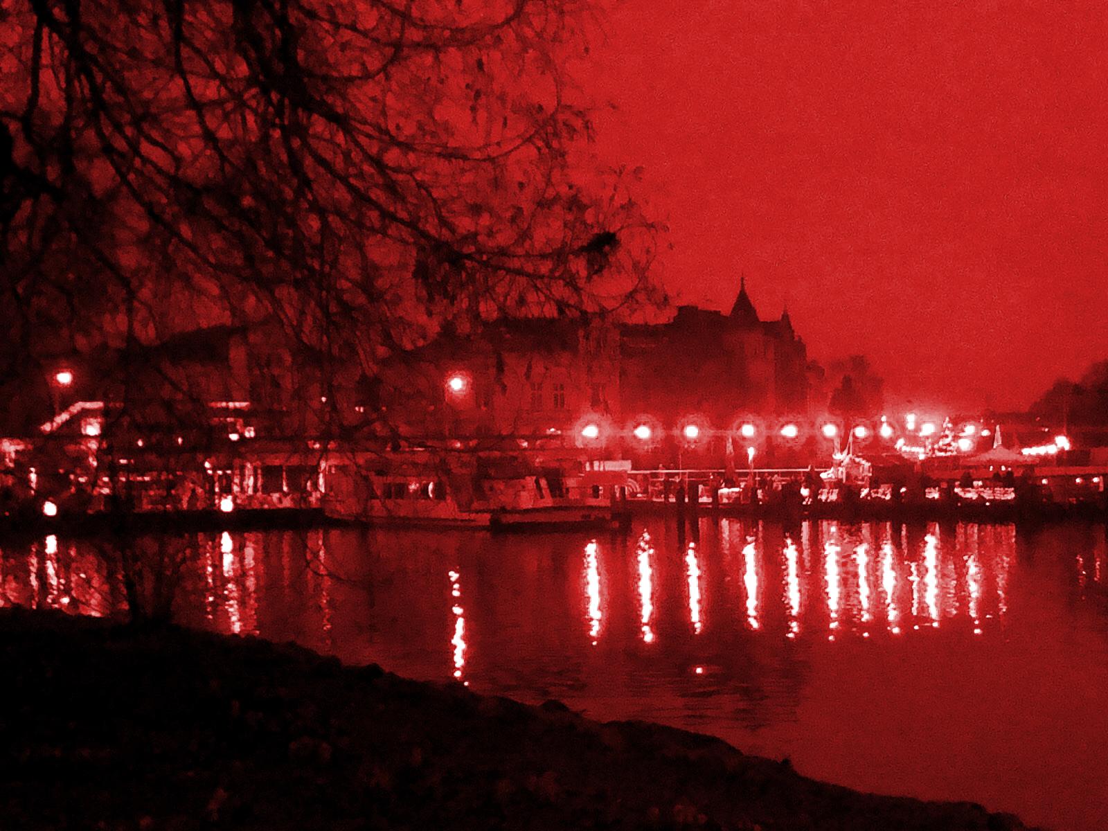
actual underpainting, I would like to clarify
for you why you are looking at our
reference photo in red. You see, I like to do almost all my underpainting
in red color. Firstly, it gives
painting more depth. Our eyes are sensitive to the red light because it
has longer wave length. This makes red hues
naturally stand out. Apart from that,
underpainting brings piece together and it provides it
with unifying color harmony. Second reason is to lay out values for the
future painting. Remember when I said
that values are one of the most crucial
aspects of the image. With proper attention
to the underpainting, we will set them right
straight at the beginning, and we'll have less
work in the future. Hey, everyone. Welcome to
my studio number one and I will show you how to paint an underpainting.
This is a garage. I'm going coming to
paint here is a garage, which I have together
with my partner. It is mostly because
for an underpainting, I like to use the spirit, which is poisonous, which
makes poisonous fumes, and I do not want to have
this at my home because the other Ather studio I have the little corner
is in our apartment. And it is obviously
not very healthy to breathe the dinner
in your flood. So it is really cold. There is a snow outside, and it's freezing, and there
is no heater around here. So we will have to be quick. So let me show you how here. We are having new empty cvs. So this cvas needs
to be prepared, and then we will make
an underpainting on it. Let me show you how this
one prepared the cavas. A very old friend came by today cause he was telling
every for one time of the love that he found
and Marie's name of his Lady plain He
talked and talked. And I heard him say that she had the
longest blackest hair, the prettiest crees
and Marie's name. His lady is splain.
Though I smiled, the tears inside
the word burning. I wished him luck and
then he said a goodbye. That he was gone, but still
his words kept him turning. What else was there
for me to do with cry? Would you believe
that yesterday, this girl was in my
arms and swore to me. She'd be min and Mies the
no his lady is splain. Oh I smiled, the tears and
sigh of word of burning. I wished him a look and
then he said in a good bye. He was gone, but still
his words kept turning. What else there for
me to do and cry. What do you relieve? Laddie yesterday. This girl was in my sworn to me. She'd be my turn
and Marie's name. Probably spin. Yeah Marie's name. Probably spin. Oh Marie's name. So as you can see, I am wiping now of the colors where
the lights will be. This goes a little
bit better if you dip your cloth in the or less mineral spirit or
the linseed oil, whatever you are painting with. When the cloth is
a little bit wet, you can wipe the
color with it better. You can also see I'm literally
just putting the covers in and not really worry about the color dropping or
about the details. The reason is that what
I really want here to see is in the first
place a structure. I actually do want
color to drop. I create all kinds of
interesting structures, which will be a
little bit visible then through the
future layers of paint and will make the picture much more
interesting to look at. I'm using white brush and a piece of toilet paper
to write off the color. Occasionally, I take original
wrap of the convase, and I crump it in my hand and also use
it for scraping and imprinting the color on of the canvas because that also gives us a really
nice structure. I'm not really worrying about
the details at this point. I said, the most important
is to get in the values, the darks and lights, and that correctly, as
correctly as possible. So the darkest darks and the lightest lights
should be there. The second aim which we have
is to have the red paint on place because that will make our colors so much
better in future layers. The third aim is to
get as strong of a pattern as possible to
make picture interesting. You can see I'm now
stamping with a piece of toilet paper into the paint
to get a bit of color off. I am then blurring it with a brush and it's stamping again. That gives us really
interesting effect. Don't really worry about
painting each individual branch. There will be enough
time for that in future. Here, we need to get the
values and the structure. Now it's slow, seems
to be coming together. Now I'm putting in
more contrast next to the reflections of the light in the water and a little bit more brying
it with a wide brush. It seems to be done. Now we need to let it rest, have it perfectly dried. I cannot stress this enough. The reason why why I am using the odorless mineral
spirit instead of oil because it dries quicker. So for this picture, it will probably take only one
week to be completely dry. If you have used oil, I would advise you to
leave it standing now for at least one month because underpainting is the base
for all what comes next. And if it is not properly dried, you will not get the
result which we want. So I will say it again. Leave it now be, let it stand
until it is perfectly dry, and then we will move
to the next step. Do.
6. The Process 1: A. All right, guys. Let's get to the
actual painting. As you can see, my
underpainting is fully dried. I have it prepared
in the studio, and I have started to
cover the sky with a light blue and a little
bit darker shade of blue and immediately wiping
it off with a cloth. This technique is
called glazing. It means literally
that you will put the color no matter what
consistency on the canvas, and then wipe it off again. And what will be left will be only very thin
layer of the paint, which will then cover the previous layer with a
certain level of transparency. And provide it with a
very interesting effect. You can see, I've expanded already over the tree and now
I'm working on the horizon. Don't worry, really. There is pretty much nothing
which can move wrong as long as the
underpainting is perfectly dry. You can literally
put on the paint, spread it a bit and
then wipe it off again. If you can try to make sure
that you use all sort of shades of blue because we don't want all picture
to look the same. So to make something
interesting to look at. Here you can see I also don't worry about covering
the light spot. I just paint over them and
then wipe it off again. Just a reminder, as I said
already during underpainting. When you want to wipe
off color completely, it's good to tip the
cloth or toilet paper, whatever you are using
tissue into the oil, and then wipe off the
paint from the canvas. Here, as you can see, I am
using red or brownish red. I believe I have darkened
it a little bit with blue. The trick which I
have showed you, and I am covering the grass. It is one of the darkest
spots on the picture, so we don't need to worry
about using too much paint. But I also don't want it to be the only attention
grabbing spot. Remember the exercise
which we did on focus. This is why I am not going full on with darkness
because I want to see how it will look in the unity with the
rest of the picture. Here I am trying to give it
some interesting effect, the blue blending into the red. And then wipe it off, so we can still see this nice, interesting pattern which we achieved from underpainting
dripping down. If you want to blend, the best way how to
do it is to use oil. And yeah. If you don't like anything,
just wipe it off. So, as you can see, I'm using a little
bit more liquid color and with that co with a blue area into the red
area and create transition. Here in the co too, Yeah. Here, I'm just making
them blend a bit better while trying to preserve this nice
button which we have. And as you can see, it
is such a simple trick, and it already looks
pretty interesting. It is not something
You would immediately know how the person achieved
well paint this effect. This is why I really like
to use this technique with underpainting and with a pattern underneath because together
with upper layers, the effect can be quite nice. Here I'm starting to
adjust the values. Remember when we
talked about values. If you still have the
exercises which we did, in chapters before,
have them at hand, they are very useful
to sometimes look at and just to clarify which
places need to be dark, which places need to be light? Where does the contrast lay
where does the focused co? Here you can see This area above the lights
needs to be dark. So the lights can stand out
because if you remember, we decided that this
row of lights needs to be one of the first objects. Our eye will lend on while
observing the picture. So this is why I have made it a little bit
darker behind them as one of the first
places also to balance out this big piece of
land in a foreground. While working, don't
worry to take also a few steps back
from time to time. It helps to see the
picture as the whole and not only the area
you are just working on. Now I'm starting to put
the yellow mixed with white into the left
part of the water. As I said, be careful if
you mix yellow and white. The titanium white
is very strong, so make sure to
tin the color down very well and if necessarily
wipe it off with a tissue. What we are basically doing
is just toning the canvas. Do not worry about
any details yet because we will get
to them at the end. And if we are successful, details will crystallize moly
on their own by themselves. I am now just making
more contrast, but immediately again
wiping it off because this is only first
layer and it serves to just roughly lay down the
basic shades and don't forget, values are very important. Let's try to have
the values right. Darks and lights. This
is very important. This is why we also had the underpainting to
make sure that we know where the darkest spots
and lightest should be. So there to the left,
if you remember, there was supposed to be the second most contrasting
spot in the painting. We do not need to worry and we can go full on with a contrast. I'm still using dark blue, Prussian blue mixed with
a little bit of red and only sometimes little
hint of dark gray. But it is by no
means full on black. This we can say for
the later stages when we will be adding more
contrast and more detail. Now I'm working more on the
reflection in the water. Now the middle part.
The middle part also needs to have some
contrast because there is this one prominent reflection of that one light in the
middle of the water, and for it to stand out, there needs to be some
shadow present close by. So this is what I'm
doing right now, and at the same time, just blighting it
and wiping it off, tinning it down, so we do
not lose that nice pattern. We have aid while doing
the underpainting. As you can also see, I am not very much
worrying about the boat, which is in the foreground, but for us not really
because we have decided already before
starting to paint that the focus will not be
on the boat itself, but it will be on the lights and the reflections
on the water. Because of that, we do not need to do the boat into
the biggest detail. We can just try to make it about the same value and tone as its environment around
and make sure that only the lightest parts are
being highlighted there, but we do not want that the bolt catches all the
attention immediately. It looks I'm using
very light color, but actually it's
more middle tone. It is not very light. This part which I'm
working right now, this will be the bright part. There the contrast will be. There the light color belongs. Now the lights. This will be literally just
to slightly tone them. So that we need to be very careful to wipe the color again off because we do not want to have a thick layer of
color on these spots. Because these lights
will be center of focus. Therefore, we will
need to work on them later and into
bigger detail. This is just the first layer, setting the basic
tone, the first layer, which should be very, very thin, and the rest will come later. So Be careful just to
put it very very in. Once you have enough
pigment there, wipe it off. Yeah, when there is light, it will obviously also
reflect on its environment, so we can expand it a bit
to the boat, to the water, to the horizon, even to the sky and to the
buildings behind. You can see me working my
way through these lights. Exactly. Now, I'm starting to put again yellow
mixed with white and orange to the right part because there is a little bit more going on and not only
the street lights, but also some port,
traffic lights. I think there is
one Christmas tree that will all come by the end. A Now we can see I am making the centers
of these lights fed with the list oil and I am immediately wiping
all the pigment off. With that, I am achieving the
white spot in the middle. So this orange pigment,
which we have applied, will not keep the space from the brighter color which we will want to put there later. The same happens with the
other light also to the left. Now we can see I'm
putting a little bit of the t to the up part. Again, I am trying to spread
it, to make it blurry. If it is too strong, it needs to be wiped off. Exactly. As you can see, if you look at the
picture as the whole, it already starts to
show some progress. If you compare it with the under which we
had in the beginning, it starts to look a bit
closer to our reference, and we didn't even
need to do that. We basically just put on the color and wiped
it off again. So With a little steps, we are approaching slowly
to the desired results. As said, do not worry
about any details. We just want to bring
in the general tone. Everything is correctable later. Everything can be changed
in next steps as well. A bit of tone in contrast
to the reflections because the reflections together
with the role of lies should be the
center of attention. We want there the
brightest color, the most contrasting colors and also a bit more detail. Yeah. Now you can basically have
fun with this face forever. You can always try to add some interesting
colors here and there. You can explore the reference and find the different shades. You can look at your
previous co study, which we did in the
other picture and try to introduce other shades
which you have from before. Because the more
that is happening, the more interesting and the better will the picture
look at the end. This is basically just the second step of the
underpainting, so we don't need to worry
about being precise, having perfect detail, having a perfect perspective
that all will come later. Here and there, a bit of
water, a bit of plume. Just make sure to keep
the values in mind, darks and lights and the focus. More we do not need. Okay. And with that, we are slowly approaching
the end of the first step. So as you can see, there is
still a button preserved, which is great
because we wanted it. The color was thinned down exactly as I told
you it needs to be, and we already have achieved
some really nice effects, which will be looking good
in the final picture. So this phase went well. Now you need to let the picture dry again as much as possible, but doesn't need to be perfectly dry like the underpainting.
7. The Process 2: Hello, and welcome to the next step of our
creative process. We have now the basic
colors and tones laid down, and slowly we can move
towards the details. So what you can see me doing is to start using a little bit thicker
consistency of the color to increase the opacity and to occupy myself with some most prominent
details to the left. I'm starting with one of the main areas where the
most of the focus will be concentrated because
It's good to have these areas covered as first to see how the picture
work together as a unity. And then we can still see
how much more detail does it need in these areas which
are not that much visible. So you can see I am
doing that these finos, a bit deeper contrast, bit dark, dark, already the
first first branches of that little
bush to the front, and also first
branches of the tree. Now you can see me highlighting
the back of the ship, going along the horizon
line, adding contrast. Lights. Now, you can see me using pure white color,
pure titanium white. You know that I have
warned you that this titanium white
is a monster. If you do not tame it, it will be perfectly white
and take over the rest. This is exactly what we need at some places
of this picture. For example, these lights, their can be p white. We want that for the contrast. And you can also see that
it works pretty well. The reflections, I have mixed a little bit more consistent
titanium white with yellow and made the exact
shiny shiny middles. Remember what I told you about the saturating colors when
mixing them with white. In the middle of
the light source, this is not a problem. The middle of the light
source can be pure white or something
close to white. But around The continuous
ring of light, we need to have saturated. So this is why I am not worrying now about
using these reflections and mixing them with
white because I will add the saturated
colors afterwards. Now I'm making some
lighter shades of blue. Above the horizon
because this is where we will be able to see through
the branches of the tree, and we want some light sky to be visible and to
have some contrast. I have already also highlighted the most prominent
branches of that tree. Because if you remember, as we decided when we were
making the study about focus, we want these branches to point to observers eye
back to the horizon. So we want to hide a little
bit that boat in the middle with them and to guide the
eye back to the light source. So this is what I'm
trying to achieve here. So if any place is a
little bit too strong, we can always try to blurry it, blend it with a background, or add a little bit more
oil and wipe it off. This always works. Here I'm adding some contrasts, this time with per home color. This was red, mixed with
a little bit of blue, and immediately I'm proceeding with adding contrast
behind that little bush, which stands in the front, little bit of
yellowish reflections, and now a little bit
more detail to the back. Remember, this will be
the very busy corner. Lot of things are
happening there. We actually do want a lot
of detail in this place. This is the place where we
will spend a lot of time. So now you can see me also laying the
basics for the tree. I would advise you when
proceeding to that tree. Do not move immediately
to painting the branches. Try to first lay the values. Meaning, try to close
your eyes half, so you can see the
reference photo blurry. And as we did with a
picture as the whole, try to do the same when doing the tree area
and horizon area. Try to determine which
places are the lightest, which are the darkest, and just try to lay them
down in a blurry way. Do not start with detail just yet on that tree and on horizon. Because the ting
could very easily take over the focus and lead the observer away from
the light source, and this is what we don't want. So less is better in this case. Now you see me adding stronger and stronger contrast
to that horizon line. Now I have mixed
russian blue with red. I know it looks black. It is not. It is due to the colors
which lay next to it, so yellow and red,
it looks so strong. We do want attention there so we can do strong contrast
at these places. And continuing with
the horizon line. The reason is as
mentioned before, that we want to have
the most focused places laid down as the first ones, so we can see how much
detail we need to the rest. So this was also the purpose
of that very first exercise when we used the pencil and drew the areas which attracted
attention the mot. So we do not get lost in
the detail unnecessarily. This is very common mistake, and it's very difficult, oftentimes not to get
lost in the detail. So now we continue
working on that boat. Perspective is a little bit off, but we do not need to
worry because it is a night scene and from that boat will not
be visible much. So if your boat is not perfectly aligned
with perspective, just try to do it
roughly correct, and then we'll hope that really the focus will stay
with the light source. And the boat will be
hidden into the shadow. A lot can be forgiven. A lot of mistakes
when you are painting the nocturnal s
because our eye can be confused by the darkness and
oftentimes it happens that we already in the reality do not see the things correctly. I said, don't worry
about perfection. The most important is
firstly having fun. Secondly, having values correct. Now I'm playing a little
bit more with the detail. And yeah. This was the first detailed
venture we have done. Feel free to rewatch. If you have any feedback, let me know and see
you in the next video.
8. The Process 3: Hello, everyone. Things are slowly starting to
look promising. In this video, we are having
a big challenge ahead of us. As you see, I'm painting
the branches of the tree. Now, my tip would be choose, let's say, for the start, four most prominent ones
and start with those. Yeah, you can see I am now doing basically three
bursts of branches. But be very careful about that
because as I said before, we do not want to
mess up our focus. So very important at first is to check where the
branches are being dense. And where from the tree, we want the focus to be. So let's see. I'm concentrating
the focus above the boat next to that very
light spot because there, it will serve our purpose and it will be covering
the boat itself, and then the same time leading the observer to look
towards the light source. We do not want the
observer to come and spend all the time watching
the tree. That's not our e. This is not why we are spending so much time painting the
lights and water reflections. So in order for it
to be not as strong, make sure to not use
very dark color. What I'm using is brown. It's a middle brown, even though it looks
darker than it is. It is a mixed with a dark gray and red mixed
with the blue. But both of these shades
are not that dark. Now, you can see I'm using more blue side
that looks darker, and I'm using it only close
to the horizon line and to the roofs of the houses because this is where
the values are darker. The rest of the branches
can pretty much be painted with middle brown. In order not to
disturb too much. If anything is way too strong, you can always make it blurry. You can always blend
it or wipe it off. Don't worry about that.
Another tip would be, try to use from time to time
slightly different tone, different color for
sketching your branches, not all of them look the same. That would be boring. Now we can see I have done
quite a bit of detail there. But mostly above that boat to create the triangle we talked about in the
first exercise. Most of them are pointing towards the boat and
towards the light. Now I'm working a little bit
on the water reflections. I said, it is quite important
that from time to time, you stand up and
make a few steps to the back and see how
the picture looks from the distance because
that really helps to clarify the priorities
where the focus so be strong, what should be strong. Now you see me working
on a background, which makes the houses
stand out, that all again, draws the attention closer to this line of light
where we want it to be. It's pretty good. We're drawing attention away from that tree. Now turning a little
bit more the sky. Exactly. Working the
way through the sky. Obviously, the blue
will be lighter. The closer it is to
the light source. If you have some nice patterns underneath from
your underpainting, you can tin the color
down a bit more, so these patterns
still shine through. That will be very nice
if you can achieve that. It's always really nice success, and to balance it out. I'm now bringing
the similar shade of blue also to the water. But again, I'm
tinning the color. We do not lose
that nice pattern. We wanted to stay. Somewhere stronger,
somewhere less st, but it's good when it is
a little bit visible. We see when I put this layer of blue close to the
lights reflection. It creates really nice contrast. That's because some
shades of blue are complimentary to some shades
of yellow and orange, and it makes really nice
contrast where we want it to be. We can see the lights are
starting to nicely stand out. Now I'm adding a little
bit more saturated color around the white center
of these lights. Exactly as I told you. And now you see me taking
the very saturated, white and yellow and
putting in the details. Now, at this point, do not tint the color down. Here you want the
real consistency, so it covers because with
these little details, we want them really to shine. We want those details
to stand out. And also to draw attention where we want the
attention to be. So whatever is there, these little light
dots, little bars, poles of the lights
that all can be now drawn with as much attention
as we can give it, and with a really
saturated layer of color. And now you see I'm
doing something very similar to the light
reflection in the water. Now is the time to not
tin the color down. Take it that detan white, mix it with a bit of yellow, but make sure that your
brushes perfectly clean. We do not want any blues or
greens or the arcs in there. We want really clear, shiny, bright yellow white
color to make it stand out and to make this reflection
really really strong. Now, around these reflections, I like to paint a bit of orange, bright orange, or
bright purple border. That gives it also very
interesting effect. You don't need to do it. You can also just
do the red fields around or whatever
works for you. There, you can be very creative. But I would advise to use very saturated
colors next to this, very bright yellow and white. Here, you do not need to be afraid to use the colors
directly from the tube. The orange, the red, we are happy to have as much
saturation as possible. Here you can see me a
little bit doing of a water butter because water shapes some net like ornaments, which can be also a little stimulated and here
the middle reflection. The middle reflection is having slightly different color
than the ones to the right. If you look at it, you can see that there is
much less yellow, much less orange, and it all goes more purple pink direction. What I have done, I have
done very white center and then purple edges
around it and pink. Now, these slides which
you see me doing, they are already going
more green direction. There, one can even sneak a little dots of
green now and there, especially to the
edge of the light to make it to distinguish them a little bit from
the lights to the right. Here, I'm also playing a bit more with the branches
of the tree to the front. There we do not need to
worry about overdoing it because this tree is helping us to bring
attention to this place. We can make the branches
actually pretty contrasting. No, I'm just putting one last touch to that
light in the middle. We want it to be very bright, very contrasting, little
bit now and there. A little bit more
detail to the left, a little bit more
saturation to the right, depending on the situation. Now a bit more attention also to that light in the
middle above the board. And of course, now final touch to the light contrasting details
under those slides. So all that little detail. I hope it was understandable. And I see you in the next video.
9. The Process 4: And we have made it to
the final painting video. Within this video,
we will be busy. Just adding the details, really. You can see I have
add a little bit of lighter pink to the boat. Just to add a little
bit more harmony because in my opinion, the boat was too blue. And now you can
see me working on those trees on those branches. I am making sure that they are not too sharp,
making them blurry, since over there in the corner is a place
with a higher contrast, I have added some lights to that to also balance
out the picture. Otherwise, all the light and all the contrast is
concentrated to one line, and we also don't want that. We do not want the
t to be too strong, but we still want it
to be able to balance out the rest of what is
going on in the picture. The houses in the
front still need some details like
windows and roofs. Here I am a little bit
adjusting also the tone, the color of the
houses, and the slide. There is a corner which
reflects the light, so it needs to be lighter. Of course, the
branches are breaking the shape of the houses and
hiding them also a bit. Now at this point. You do not have to add
too many details. This last video is more
or less voluntary. If you feel like you would
like to, you are having fun, it's you are too worried that you would destroy that
it wouldn't work out, it's perfectly fine to
stop and cold picture. Now, around the horizontal
line and around the roof line. I said there is good
idea to add more detail. I'm putting little
blobs of color to add contrast and to simulate
the play of light in there. With adding these lighter spots which shine through
the branches, be careful not to use too saturated blue that would immediately overweight
the rest of the picture. Better more. And now the branches again. These roofs are a bit tricky. So I have used the free to
use 12 to have them straight. As we have found
out when we were making a study of the
darks and lights, the roof area of these houses in a background is one
of the darker spots. So we want to also
paint it like this. And you see Mo adding some windows and some details
overall to the scene. A bit more details at the
end of the tree because this is the point where
the branches are pointing back in the
triangular shape, so that detail is. We want attention to go there. Here we can see
details of that boat. As you can see that boat is not standing out
because of itself, it's more or less the
same sheet of purple, blue, and the gray as the water. And it stands out because
of the light behind it. You can see me working
through the numerous details to the left. 00. There is literally
eternity of options. How much detail do we
want to have because in those areas of pocus focus, there is never enough. You can go on forever. This is where we
want detail to be. I'm making it a little bush
and forefront stand out. In contrast with the
lights in the background. Adding some more saturated
colors to that area. And the reflection
here and there. Here you can see I'm
using some middle tones. This is a purple gray. It looks much lighter than it actually is because it
is on the darker gravel. Don't get yourself be confused. In these neutral areas, it's always better to use a little bit darker color than to light
because two light of a color would mean too much deviation of our
value structure here. Now, I'm again using a saturated titanium valve to put in some more
lights from that area. And the only light reflections
on the front of the boat, which makes it a little
bit more plastic. But as we, you do not
have to put it there. It's not necessary. The boat is fine also
as it was before. No a little bit more detail, no a little bit
more detailed edges of the lights and
saturated colors, just to give some
food for an eye, and slowly, Slowly we are
approaching the final. You can see that to
the right there is still some work to be done, and on the reflections. I'm once again going
over the reflections, making sure that the
values are right, that the values are fitting and adding some strong colors. There for the picture to have this vivid quality and drama
which nit scenes have. Now, finally, the
last few reflections before the houses in front are having their values a little bit incorrectly, so
we had to fix that. They were not supposed
to be all that dark because they also catch the light from
the street lights. Only to complete was the darkest and the rest for some different
shades of darkness, but not completely dark. I was still hay with the
tree slowly getting there. Have you see me making in
the very last details of that scene with a color
which is not down. As I said, this color
we want to shine and take over some
saturated shades of red. It is all very much detail work. There's not much
to say about it. As said On the places where
the focus is concentrated, you can add as much
detail as you want. You can go on forever. And then the edge
of the painting to bring the picture
nicely together. On last correction for the values because
the right side of the horizon should
have been darker. Also a bit more detail
and value correction. So not all the
reflections look the same. And here we are. The picture can be
proclaimed ready. I can imagine this last part could have been a bit
overwhelming for you. Please make sure to go with your own tempo at only as much of detail as you
are comfortable with, feel free to rewatch
if you need to. Give me feedback. Here you
can see that the pattern from our underpainting gave us
really really nice effect, and saved us a lot of
work on many areas. If you look really close, you also see that the picture is not
very precise as such. That's the point of it,
that's what we want. Pat as such happens
partly also by itself. We cannot control the
full painting process, and that's the beauty
of it because we can just go with the
flow and enjoy it. I hope you had as
much fun as I did and see you in the last video.
10. Conclusion: C. All right. And
this is the end. We have finished our project. Thank you for watching.
Thank you for sticking with me and
with the process. Please feel free to
upload your result for me through submitting the project I would love to see. Do not hesitate to reach
out with any feedback, any comments, whatever
you may wish. I am also happy to
provide feedback on your pictures or any of the
exercises we have done. I only hope you had fun. And if you have liked it, I will be grateful
if you follow and maybe we see each
other in next widow. Have a gs
 Marketa Cenker, Oil Painter, Illustrator