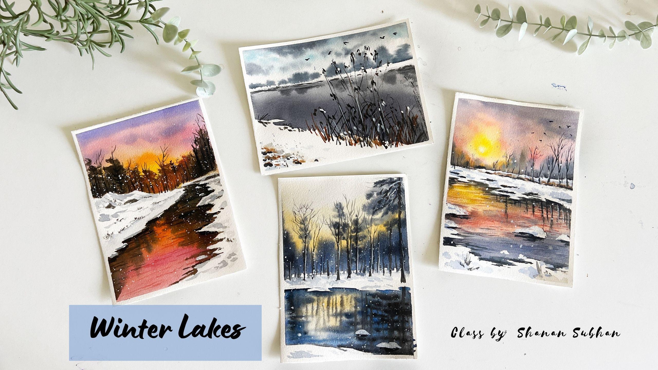
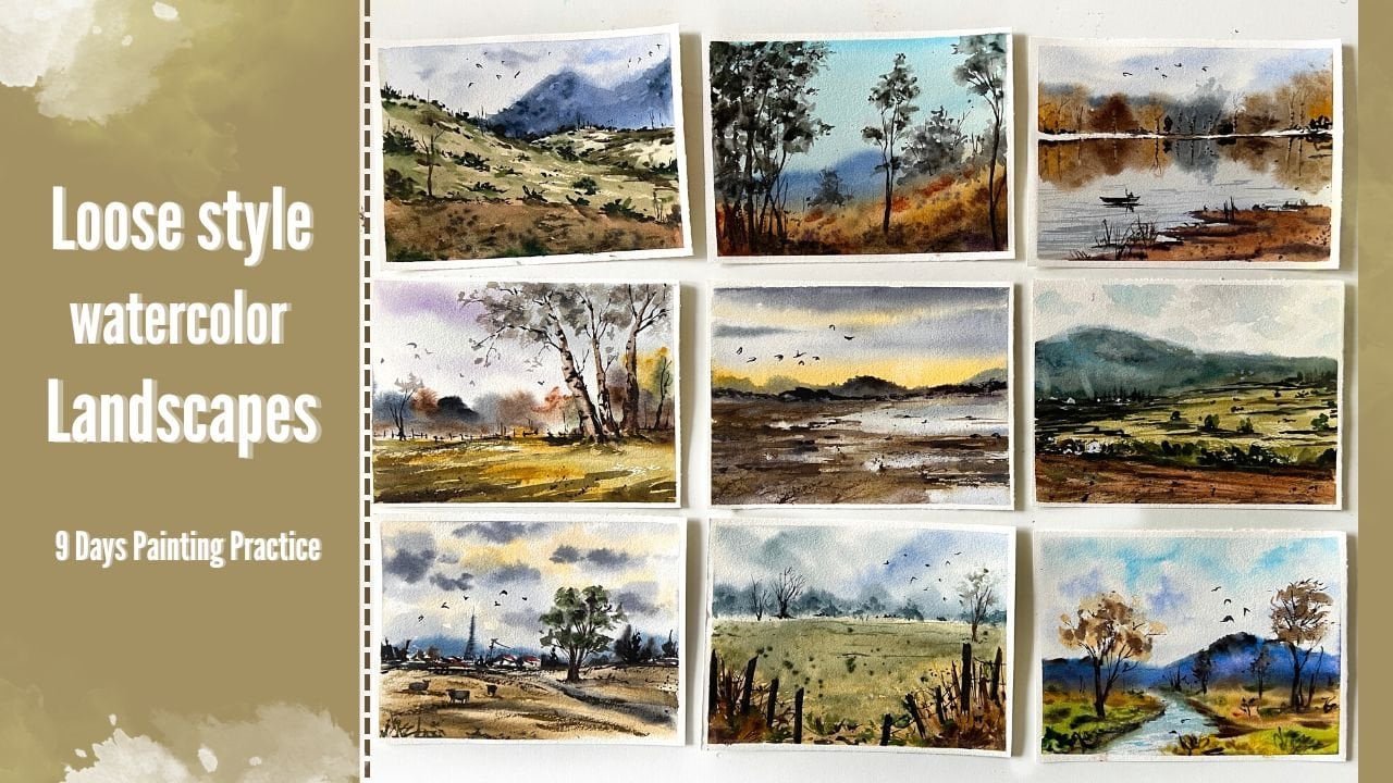
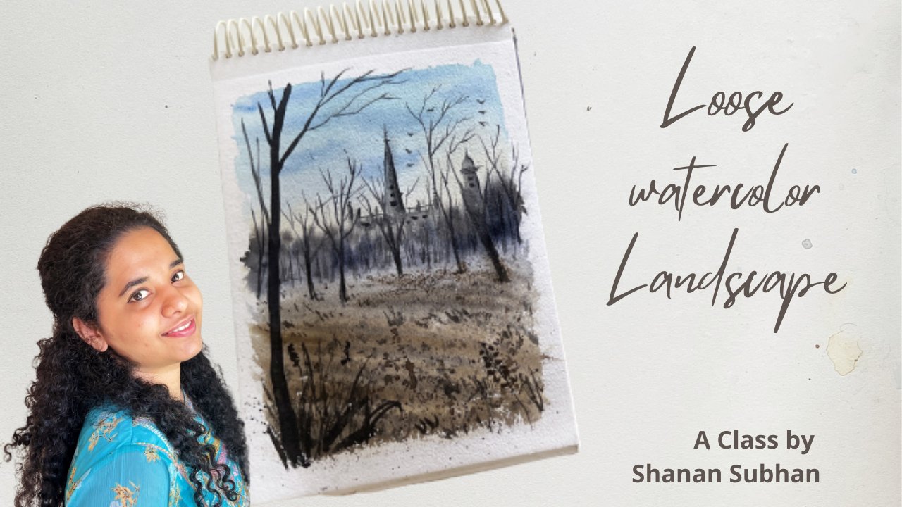
Transcripts
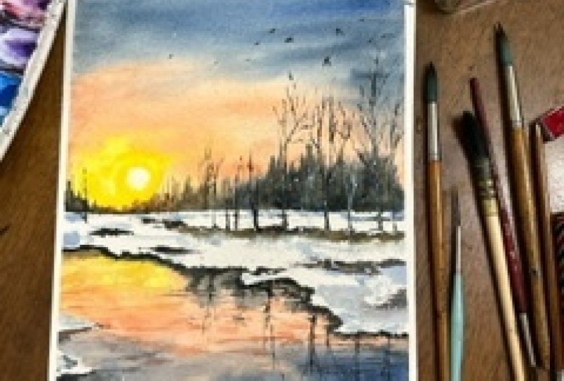
1. Winter Lakes - Introduction: Window is a season that brings immense sense of magic
and wonder to me. Lucky, or those
who get to witness the breathtaking
snowy landscapes. I come from a place where
there is no snowfall at all. I have for lithium the snow, formal photos and videos. And I've always craved to be a part of this
mystique wonderland. With my paints and brushes, I transcend into these snowy landscapes
of my imagination. Hello, I'm Shannon to want an artist residing
in Bangalore, India. I love to paint landscapes
and things related to nature. To me, art is like a
meditative process. Welcome to my class on painting winter lakes using watercolors. In this class, you
will learn how to paint winter themed
lake paintings. I'll be explaining agent, every step as we paint. And I'll walk you through all the supplies that will
be required for the class. I'll help you understand the techniques with
some examples. I share all the details
about the colors and the composition before
starting the project. Along with the winter legs, you will also learn to
paint beautiful skies, trees, reflection, and
many such elements. So without any further delay, let's get started
with the class.
2. Art supplies used: Hello and welcome to my class. I'm so glad you decided
to join my class. I'm going to walk you through all the art supplies that I'm going to use for the project. So let us have a look
at the papers first. The papers that I've used here. These are both Hong 300
GSM cold press paper. As you can see, it
has mild texture. I have used the
backside of the paper, the smooth ER side of the paper. So these are all belong
cold press paper. Next, let us talk
about the colors. I have used. Artist grade paint here. So these are the
shades that I'll be using for the class projects. This is my regular
palette that I use for almost every
paintings that I do. And it also has these
multiple wells where I can mix my colors so I don't need an extra
palette for mixing. This comes in really handy. I keep it by the side of my
clipboard by Liping so that I can have access to all the
paints and the palate. Now, let us talk
about the brushes. I'll be using these six brushes. This is Princeton
Neptune, size six. I use it as small brush
for wetting the paper. It holds lots of water in it, so it's easier to apply water. And the larger areas. This one is size 12, silver black velvet,
round brush. I use this for larger
brush strokes. Then I have my mid-sized silver black velvet
size eight round brush. This is for the
medium sized strokes. Again, it has slightly
pointed tip which I use for a little bit
detailing while I paint. Then I have silver black velvet. I used to, I used this majorly for fine lines and
detailing purpose. This is an old brush. It is actually size for
our use it for creating foliage effect by just dabbing or just random brushstrokes, mixtures, Princeton,
velvet touch, round brush. This is all fine
liner detailer brush. So it has this very
detailing pointy tip. Size 20 by zero. Uses very rarely in my project where I need to
create any details. So that was all
about the brushes. Lakes, we would need a
pencil for sketching. Next, we would need white
gouache paint to add some highlights for the
snow and for the trees. Then I'll be using this rough paper to
draw the thumbnail. It would need two jars of water. One you can keep for
washing your dirty paint, brushes, and other one
to take Clearwater? Apparently, both my jobs
have dirty water in it. Make sure to use clear water
when you start the painting. I would also need masking tape to tape down
the paper while painting and Clipboard
to tape down the paper. So I'll keep my paper like this on paper
down with this ape, a blow dryer to speed
up the drying process. So yeah, that's pretty much it. So let us move on to
the next chapter.
3. Techniques for backgrounds: In this top row, I'm going to be talking about the
techniques that I've incorporated in
the class projects to achieve these
different background. So let's consider
these two paintings. If you see this
first blue painting, it has blurrier,
soft background. In this pink painting, we have some hard edges for
the background foliage. So how do we achieve this
variation in our paintings? I'll help you understand it with the help of some examples. So first, I'm going to paint two set of background washes. Before that, let me draw
two boxes for the example. Okay, now, I'll wait
another box as well. Okay, so let's start applying
paint on both the areas. Here. I'm using a low color. Alright, so our
background washes ready? I leave the upper
area wipe as it is. Firstly, I'll show you how to achieve the blurrier effect. So here you need to apply
paint when the paper is wet. So I'll take some darker color and apply on the wet surface. You could use any color. I'm just showing you e.g. this is wet on wet technique. So I've used this here
as well in this project. You wouldn't hear all
for this background. Ollie, for this painting, I'll be using the other method. I have to let the paint dry. The paper is completely dry. Only when it is dry, you will take some darker paint. So here I'll use my old brush to create
the foliage effect. So here I'm applying
paint on a dry surface. That's why we are
able to achieve this hard and sharp edges. So these are the two techniques, how you achieve
different effects. So wet on dry technique
is for the pink painting. Wet on wet is for
the blue painting. Next, I'll show you
how to paint the snow. As you can see, these snow areas and nothing but the
blank white paper, along with some diluted colors. These are diluted colors can be mixed by using ultramarine
blue or Payne's gray, which suggest cool
and warm colors. Let's say this is we
have this area here. This area. So I'm
going to use diluted ultramarine blue with a
slight touch of burnt umber. To make it neutral. You could use any
color for the snow. It could be warm or bluish
color color or neutral color. So you see, I'm just randomly
applying some color. This helps us to build a sense of dimension and
shadow in the snow. In this painting, I've used
just ultramarine blue. Let's say you have
a heap of snow. I'm just going to apply some. Hello. You can blend it with
clear water as well. Now, if you have some
darker areas around this, the snow part will be
automatically highlighted. Similarly here, you
can see I've added darker colors to
enhance the white snow. So I hope this was helpful. Let us move on to
the next chapter.
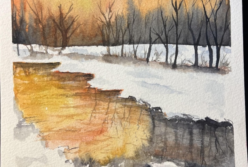
4. Thumbnail #1: Before we start
our first project, let me walk you through
the thumbnail of this painting so that you understand the composition
in a better way. So I'll first draw this
rectangular shape. Remember your paper
needs to be in rectangular form so that you
get the competition right. So somewhere here, we
have the horizon line, another line here
for this boundary. Then we have the
boundary of the leg. I'll be drawing this in a
zigzaggy or blue shape. Now let's draw the boundary or I don't know,
foreground area. And then we have smaller heaps
of snow in the lake water. Next we have the sun in the sky, and we have the yellow
hues around it, followed by pink hues. And around the corners we
have this bluish gray Hughes. Same will be reflected
in the water. Okay. Then there is some trees here. Reflection of the trees and the water will walk some
shadow areas as well. So yeah, that's pretty much it. Now let's have a look
at the colors required. Here for this LRU. I have used permanent
yellow deep. You could also use cadmium
yellow or yellow you have for the pink to use your use
crimson plus orange, and then a bit of white
to achieve this color. I've used this color
in a diluted form for the sky over here. Then. For this guy, who was your, I have mixed
ultramarine blue and Payne's gray along
with some white. So it will give
this kind of color. For the slow. I've
used ultramarine blue with a touch of raw umber. Then for the trees
have used black, or you can even mix burnt
umber and Payne's gray. For the highlights on
the trees and the snow, you would need white
gouache paint. These were the colors required
for the first project. Now let's get started.
5. Project #1: Let's get started. First, tape down the paper. Okay, so the paper
is taped down. Once you're done, just run
your finger over the edges. Make sure it is tightly sealed. So let's mark the
composition of the painting. I'm just going to roughly
mark the composition. In the upper half, we will
have our horizon line. Then I'm going to mark another line just to
indicate the snow part. Next, I'll motto,
boundary of the lake. Drawing this line in
a wobbly mine up. Next, I'll draw the boundary
in the foreground area. Draw it very lightly. Make sure that I know
Pentel dent on Paypal. These areas you see here will depict heap of snow
in the lake water. Here in the distant area, we will have some trees, but we'll do it as
n when we paint. I don't want to sketch any shapes that will be very
restricting while painting. So I wanted to have
a clean area so that I can form my
own shape of trees. When I paint. First, I'll
be painting the sky. And for that, I'll be inverting
my people and keeping an object under the cardboard so that the paper is
slightly tilted. Okay, so let's start. I'm going to use wet
on wet technique. So I will first
apply water using my size two round brush. Notice how I'm applying
water only for the sky area and not for
the other sketched areas. I'll allow the paper to
solve water for some time. Let's say the paper
reduce about 50, 60% of moisture, then we
will apply the paint. So wait for some time. Then let me mix the
colors required. I'm going to need a low. This is permanent yellow. You could use any
yellow you have. Next, let us take
Clemson, some orange. And I add a little bit of white. So basically I'm trying to
create a peachy pink color. If you have a ready-made
color, then go with that. Next, I'm going to make
some bluish gray color. So I'll take ultramarine
blue and Payne's gray and add a bit
of white to it. So before we apply the paint, make sure to check the
wetness of the paper. It should have a
sheen on the surface. Alright, let's start
clean my brush really well and switch to
my size eight round brush. So I'm assuming the
sun to be here. A small circular shape. Pick the sun. I'll clean your brush and apply this
fellow that we have mixed. I think I shouldn't have mixed a little more paint in
advance. Never mind. I'm going to mix it now. Apply this paint
around the area. Next on the top area, I'm going to apply
the bluish gray mix. The paper has absorbed
really good amount of water. So you can see that the paints
don't bleed very widely. It is blending in a
controlled manner. Your brush strokes and doesn't have to be exactly like mine. The overall aim of
this is to paint or something like a low area in the center and then some
pink colors around. And in the corners we
have this grayish color. Now, just Payne's gray. And add some decision trees. So here you have to
paint the trees inverted shape because I papers
in ordered position. When you come around this area. Fake born Tiana are born Dumbo. With a bit of orange. Create the sunlit effect. Adding any brown color. Sunlit effect on the trees. Again, in the bottom part, I'm adding some Payne's gray. This will add a sense of
dimension for the trees. Now, I'll turn my board
back to normal position. And there you go. This is the sky and
the distant treeline. Know, I'm going to
define some tree shapes. So I'll use Payne's gray
for these trees here. Next I'm going to
paint the water since these two areas
are not correlated. So I let it dry naturally and I'll be painting the
lake water meanwhile, apply clear water inside
the sketched area. Leave these tiny areas that we have resolved
for the snow, not apply water
inside that area. Okay, so we'll create the exact replica of
the sky in the water. Not exactly, exactly, but
somewhat similar to those guy. So first I'll start
with the yellow hue. And then I'm going to apply
this peachy pink color. Next we will apply the
bluish gray color. For that, I need to
mix the color first. Ultramarine blue and Payne's gray with a bit of white color. Apply this paint around
the foreground area. Gently apply and
on the boundaries. We do not want to skip
this wobbly shaped. Now apply some
tiny brush strokes around the pink areas as well. Again, though,
reflection of the trees. I'm using the pointed
tip of my brush. So if you notice, I'm adding some
zigzaggy brushstrokes and on those no boundary. Alright, now let's dry this
layer using a blow dryer. Alright, no paper, it
looks completely dry. So now I'm going to
take ultramarine blue. And I got on the horizon area. This adds a sense of character to the snow and
the distinct area. I'm just roughly
creating the texture. Doesn't have to look
exactly like something. Just randomly add some texture. And even in the foreground area. Apply this to all those
new areas that we have. I'm going to mix a bit of burnt umber to the
ultramarine mix. This will create a darker color. Now, add this to the
background areas. Next we'll take raw
umber and then makes a bit of burnt sienna.
Mix it together. I'll take this mix and apply
in their distinct area. This will act as the partition and the ground
below those snowy area. We don't want to have sharp
lines, hard edges, right? So I'm blending it with clear water or adding
some Payne's gray. This will add a sense
of dimension to the area that we just painted. Moving on, let us paint some trees in the
background area. So I'm using this size four round brush to
paint the trees. And I'm using black color. Notice the size of the tree and the upper area that I
have left in this guy. Let's paint some more trees. I'm going to paint trees. A lot of trees in this area. So we can draw as
many trees you want. So I'm drawing tiny
lines and sunset area. Next, I'm switching to my
point it in brush to paint the fine branches
and tiny tweaks. This is optional step. You don't have to
do it compulsorily. Adding these tiny
little details, add a little extra
beauty to the painting, makes it look realistic, even though we have painted with the loose style approach. Next, I'm going to create the reflection of these
trees in the water. Try to create a similar
looking effect in the water. Doesn't have to be exactly
like 100% perfect shapes. You can incorporate some
zigzaggy brushstrokes to depict a sense of
movement in the water. Next, I'll take this
peachy pink color and I'll be painting the
ripples using the same. Since the water is
slightly pinkish ER, because of the reflection. Same will be with
the repulse as well. I'll reduce the density of these zigzaggy lines as I
approached the main area of the lake again and on the corners and
around the snowy part. I'm going to make it
a little bit end. Increasing the intensity of the ripples towards the
foreground area as well. If you notice, towards the
boundaries of this lake, I've painted with darker
colors and in the media areas, I've kept it very subtle. So that's what adds a sense
of depth to the lake. Now, I'll now can do reflection of the
trees in the water. Next, I'll be using
yellow color for the LRA pulse here
towards the left side. Now, I'm going to
take this clean brush and spread the sharp
edges that we have. Also applying some
diluted payne's gray towards the
foreground area. Brown color. Mix it with blue. Find, draw some grasses. So he only made randomly
adding some grass blades. Next, using my fine liner, I will be applying
some darker color. So making these
tiny patches here, this will suggest
no water paddles. Next time take white
gouache paint. You can also use
white watercolor. I apply thick, wide gosh
over those snowy heap. Also introducing some
new heap of snow, some tiny ones in
the foreground. Also adding some
thick white paint on the sides of the trees, creating a highlighted effect. Now I'll give some
depth over here. I'll add some Payne's gray. I didn't get in the
shape of ripples. That's when the
white areas will be highlighted here as well. Finally, I'll add some
birds in the sky. Some simple shape of birds. You can skip them if
you don't want to add. But lastly, I'll add some final
touches here and there. Okay, so we are done
with this painting. Lastly, we will splatter
some white paint. I'm using thick
white gouache paint mixed with little bit of water. Alright, so we are
done with this. Let us gently remove
the masking tape. This is how our
painting looks like. I hope you enjoyed
painting this with me. Share your class project. I would love to see your work.
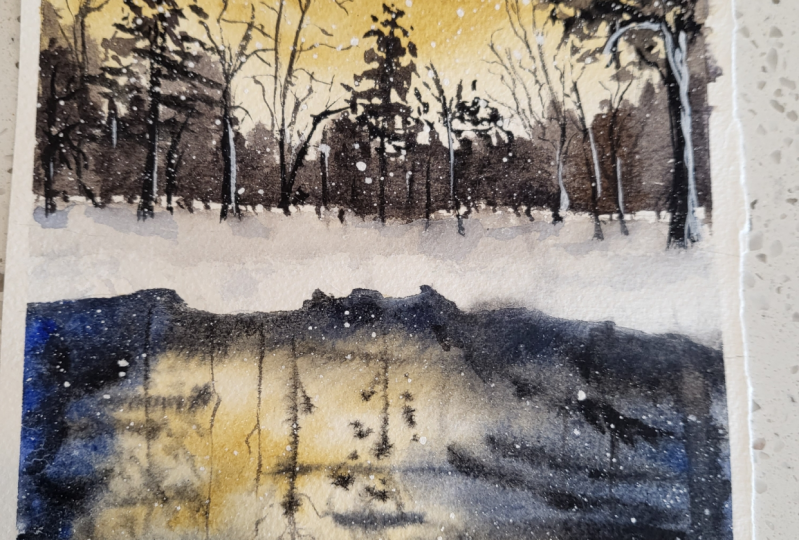
6. Thumbnail #2: Okay, so before we start
our second project, we will draw a thumbnail to understand the
composition in oh, by the way, like I said earlier, I'll be using a
rectangular paper in portrait orientation. So let's start the composition. Somewhere around the
center of the paper. We have some heap of snow. In the center, we
have a water stream. This is the lake, and on either sides
there is snow. In the background. We have
a tree line makes with bare trees and some trees
covered with foliage. Behind the trees, we have partially visible sunlight and the tree is IPOs
and late as well. So here we will be using yellow and orange juice
for the sunset IPR. And then above that, we have some pink hues. And on the upper area of the sky will use
purplish blue color. Then we will create
the reflection of the sky and the
trees in the water. And in this new area, we'll add some more depth and some guiding lines
using diluted colors. So yeah, that's
about the thumbnail. Moving on, let us talk about the colors required
for this project. For the sundries, I'm going to use permanent yellow and orange. Then for the upper pink, cuz I'll be using crimson. For the purplish
or violet shade. You'll see that I have mixed
ultramarine blue and violet. I'll be using these
colors in a diluted form. For the tree foliage. I will be using black
and burnt umber. You could also use Payne's gray for a different brownish shade. And then here for
the sunlit effect, I'll be using burnt sienna for the reflection of the sky
and the trees in the water. I'll be using all
the similar colors. And we would also need
white gouache paint. So that's about the
colors and thumbnail. Let us move on to the
painting project.
7. Project #2: I have already taped
down the paper. Now, let us start by sketching or marking the
composition of the painting. I'm going to draw the horizon line somewhere in the upper half of the paper. Then I'm going to mark the
area for the water stream. Draw the stream with
some wobbly lines. And as we approach towards
the foreground area, we really tried to make the
stream broader insights. Around the horizon area. We will draw some slopey curves
depicting a heap of snow. Here, I'm going to darken
some areas to suggest the shadow or the depth
under those node. Just doing it to remember
the shadow areas as I bend. Okay, So let's begin. We're going to apply
water about this area. Where thing though,
entire sky area. So first I'll take
permanent Hello. Apply some circular strokes. Then around that, I'm going
to apply some orange strokes. Thicker consistency because
our paper is already wet. So it will become like a
diluted shade later on. Next, let us apply some pink hues in the
media areas of the sky. I am using crimson and some purple,
ultramarine blue. We'll mix these two shades. Same thing will repeat for
the lake water as well. Okay. So here I want the shadows to
be very intense. So I'm applying wet
on dry technique. The sky was painted
with wet on wet. The reflection doesn't have
to be exactly like this guy. I mean, you can try to maintain around 90% of the sky
in the reflection. Carefully, apply water and on the boundaries of
the water stream. Notice how I blend
the colors here. I'm going to paint the
shadow of the trees. At this moment itself. That is, I'll be
mixing brown and blue. Here. I haven't already
painted the trees, but I want to add the
shadows at this point because it will create a
nice wet on wet blend. So based on the
reflection of the trees, you can then paint
to actual trees. Currently, I do not have a
particular shape in my mind. I'm just trying to
build some shapes. Since the paper is already wet. We're getting nice and
softer blend here. Be careful about the
paint consistency. If you're having
too watery paints, you're gonna get some blooms. So avoid using a lot of
water for this area. Around 70% of paints and 30% of water around the boundaries. I think some lines trying to define the shape of the snow. Next, I take slightly
darker color, mixing a bit of black. And I'll simply add some horizontal lines depicting the movement in the water. So now I'm going to
make this area dry. I lose my blow dryer. All right, Now the paper
has dried completely. Next, we'll move on to paint the tree line in
the horizon area. Next, I'm going to take my
old brush and I'll be mixing a very darker shade that
is burnt umber and black. Now, I'll take the paint, dab off all the extra
paint that's there. As you can see, I'm
dabbing the brush, creating some random strokes. This will depict the tree
foliage and the distant area. When I reach around the area
where we have the sun rays, I'm going to add
some brown strokes. Create things and lit effect. Here. To achieve the sunlit effect, I'm mixing burnt
sienna with brown. You could also use
some orange-ish brown. Next, I'll add some
red color there. It will add the intense
sunlight effect. Or in the treeline. I don't want this area to be
just red or orange in color. So I'm adding some darker
color foliage as well. Try to keep a mix
of different colors here that will create a nice
harmony in the distant area. Now take black. Paint the trunk of the tree. I'm using a fine liner brush here to achieve
these tiny lines. I love how this has turned
out in the center part. Just look at that
intense sunlight effect on the treeline. You can add some branches as well to define the tree shapes. Next, I'm adding
some darker color for the shadow areas
to define the snow. So I'll take black. And I did on the areas where I had
marked some pencil lines. Also mix your own black.
That's up to you. Now, I'll use Payne's gray
bit of ultramarine blue. And I apply some shadows for the snowy heap
that we have created. Now we will add some
guiding lines from foreground to the
background area. This will create
an impression that this area is leading
towards the background. Also adding some shadows on
the right side of the stream. I think some branches. We'll know we're painting this
in a kind of loose style, but adding little bit of
details here and there, like these branches adds a sense of realistic
touch to your painting. So go ahead and add
whatever details you want. Next, let me add some
grasses on the snow. With this darker color. I'm just adding some random
dots here and there. This will create a sense
of dimension in the snow. Next, I'm going to use midtone consistency of
the gray color we used. And I'll be adding some
dimension to the snore. Next I'll use white
gouache paint. You could also use thicker or white
watercolor. It's up to you. I'm taking this
white color directly from the tube and applying it as smaller snow areas
in the background part, or adding one in the
foreground as well. Next, I'm going to take the same sky color that
is orange and crimson. And I'll be adding some ripples. So just paint some horizontal
and zigzaggy lines. Lines. They suggest a
sense of movement in the water with black color. Some ripples over here. We're adding these lines based on the existing base color. Wherever we have
the darker areas, we will use black and wherever
this pink and orange, we lose the respect of color. Right? So we are done with
this painting. You can splatter some
white snow as well. Take thick white paint and mix it with a
little bit of water. Like ten goes into photo,
splatter the paint. Alright, let's remove
the masking tape. Alright, so we are done
with this painting. I hope you enjoyed
painting this with me. If you have re-created it, then please do share it
under the projects gallery. I would be really happy
to see your work. I'll see you in
the next chapter. Until then, bye bye.
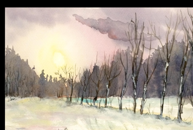
8. Thumbnail #3: Welcome back. Before we
start our third project, let me walk you through the
thumbnail of the painting. So I'll be using rectangular
paper for this project. The orientation will
be in landscape mode. Okay? So somewhere here we
have the horizon line and I'll be leaving some
gaps for the snow here. About the horizon. We have some trees. You can paint any
trace of your choice. Then we have the reflection of the trees here in
the lake water. Towards the foreground,
we have this snowy area. We can draw this in
some random shapes. And closer to the
viewpoint we have some grass blades and some flowers and birds
on these grasses. So here you can see, I have left this whitespace. This is the color of the paper
and not white watercolor. So that's the beauty
of watercolors. You can make use of the
color of the paper for snow. And here I have used some
colors to depict the ground. Underneath those. You can alter some of the
elements if you want. And here we have some clouds. That's about the thumbnail part. Next, let us move
on to the colors. The colors that I
have used to heal our Payne's gray
for the water here. Indigo and Payne's
gray for these trees. Black color for these grasses. Diluted, ultramarine blue. You could also use cobalt
blue and burnt sienna. Little bit of burnt
umber and Payne's gray. For the bluish hue in the sky, have you settle in blue? And also, once you are
now for these grasses. And also you will need some white gouache paint for some highlights and
detailing work. So that's about the
colors for the painting. Let's move on to the
painting section.
9. Project #3: Welcome to day
three of the class. Let's get started by
taping down the paper. Once you're done with this, just run your finger over the edges to make sure
it is tightly sealed. Okay, So let's start
the sketching part. As always, I'll roughly mark the composition
of the painting. Here we have our horizon line. And gently mothers from your, we have another line to depict the snowy lined in
the distant area. Towards the foreground, I'll
mark the area for the snow. In the center here
we have the lake. Rest of the details we
shall add as we paint. I'm going to invert the board. Keep something under the under the board so that we
have a tilted position. Now, I'm going to use Payne's gray and
I'm going to apply this mix on the lake area
towards the foreground. I'm starting with thicker
concentrated Payne's gray. Notice how I'm applying paint only around
the foreground area. When you apply your just
create some random shapes. This will be helpful to suggest the unevenness and
around the snowy. Brush. A little bit of water and pull the
paints downward. So this way we are creating a nice and soft graded
effect in the lake water. Next, I'll move my board
in different direction so that a nice even know
looking effect is achieved. So now, after some time when
the paper is about 50, 60%. Now at this level, I'm going to add the reflection. I'm using my fine liner brush. And with this, I'll be adding the reflection of the trees that we are going to paint next. So here I've created for
some time and I loved the paper to dry
for about 50, 60%. Then I've applied the paint. The paper needs to
be partially wet in order to achieve
this kind of effect. If you observe the brushstrokes
are not so sharp or quiz, yet they're not
very soft as well. So it's somewhere in between. Now I'll invert the board
again to normal position. Let it dry. Okay, so this is completely dry. Now let's paint the sky part. I'll apply clear water with indigo, Payne's gray. I'll be painting some trees. You can use any darker
color of your choice. I have used a mix of
indigo and Payne's Gray. Also makes sure to leave
this tiny whitespace here to suggest those nodes
around the horizon area. I'm painting that raised
in different sizes because I don't want to
form that symmetry tool. Make sure you're
painting the trees, same as that of the
reflection part. Next, let us paint the sky. So here I'll be using civilian
blue in diluted form. You could use any
color of your choice. Also leave some white spaces in-between depicting the
white clouds in the sky. Next, let me add some clouds in the sky using Payne's gray. These are darker
clouds in the sky. You can keep your sky
plain and simple as well. No restriction on adding
these darker clouds. I'm adding some Payne's
gray on the tree foliage here in order to create a
separation from the clouds. All right, We are done with
the sky and the lake part. Now let us pain doesn't know. So let me take
ultramarine blue in a very diluted form that I have not captured
the color mixing part, mature, you have to
just hide or around ten to 20 per cent of
color and lot of water. With my size eight round brush. I'm just dabbing my brush, creating its own chip. I'm intentionally
keeping this area blank. Next, let us take
burnt sienna in the medium consistency and
we will dab the paint again, creating some smaller
dot like shapes. You might ask, what is
this that I'm creating? It is the ground area that is partially visible
through the snow. X. I'll be using a
mix of burnt umber and Payne's gray
creating a darker color. And I'll be applying this around the brown areas that
I just painted. Next, load your brush
with the same darker mix and flatter it on the
bottom-left area. So this is like a muddy surface that's visible through the snow. Next, I'll create
the similar thing and on the boundary of the leg. So the other boundary doesn't
have to be that prominent. Just keep it very
light and minimal. Next, I'll take a
thick black paint with a darker black mix. I'll be adding some grass blades around the foreground area. I'm going to vary
the pressure in my brush to paint
these glass plates. If I apply same pressure, it is going to create a very uniform like lines.
I don't want that. So I'm just randomly applying these lines with varied
pressure in my brush. Next, I'll take burnt sienna
in thicker consistency. And I'll repeat the same
with this brown color. You could use any brown
that you already have. Now, I'll be painting
some taller grass blades. Okay, and now I'm feeling
scared that it might ruin my painting with the ticker
and bolt brushstroke. There you go. I did it. I think it's quite
normal to be scared, but it shouldn't stop
you from doing things. So these lines, you'll see they shouldn't be very minimal. And for that, your brush should have very little
amount of paint. Now, let me add some birds
and flower-like shapes. Again, the position
is quite irregular. There is no fixed shape
and size in my mind. Go ahead with the flow and
do whatever you want to. Next, I'm adding some
brown brush strokes at the bottom area of these glasses to make
it look a bit fuller. And then adding some random grass blades
and leaf-like shapes. The end, it should look
very wild and irregular. Alright, let me try this
area using my blow dryer. Alright, the paper looks dry. Alright, so we're almost
done with the painting. Lastly, we will add some final details using
white gouache paint. So take wine, Gosh,
or thick watercolor, white watercolor, and apply some white lines around
these glass plates. So this will create
a nice highlight. In the grassy area. I'm adding some white color
on the flower and the buds to suggest a sense of
snow on these areas. Next, I'm adding
some grass blades around the boundaries
of the lake. So here I'm using black. You could use brown or any
color of grass you want. Let's add some boards over here. To add some depth. I'm
giving this darker shadow. So when I will be want any white area or lighter
colors to be highlighted, we simply apply
some darker colors, making it look darker and it automatically highlights
the lighter area. Use this rule in almost
everything I create. Alright, so we are done
with this painting. Now, let us remove
the masking tape. There you go. This
is our painting. I hope you enjoyed painting. This would mean Boucher, your class projects
and other projects. Gallery. I would really love
to see your work.
10. Thumbnail #4: Welcome to day
four of the class. Before we start the project, let me walk you through
the thumbnail of the painting so that you understand the composition
in a better way. So the paper is in rectangular shape and I'll be drawing it in portrait form. Okay? So somewhere in the mid section we
have the horizon line. And then there is this
section for those snowy area. Here we have the lake. So here we have some trees. This tree is starting
from rest of the trees are little further
away from the viewpoint. Where you start these trees decide is the distance of
three from the viewpoint. We have the trees here right? Behind that we have a
low hills in the sky. The upper areas, I've
kept very transparent. And here you'll see there
are some background trees. The same will be
reflected in the water. And we have some snow
heaps in the water. That's about the thumbnail
of the painting. You can alter it a little
bit here and there. That's okay. Now,
let us talk about the colors needed for
the background sky. Here, you could either go
with permanent yellow deep, or yellow ocher or any L0 you already have.
That doesn't matter. Next, for the
background blue color, I'll be mixing ultramarine
blue and burnt umber. You could also go with
indigo murder not use cobalt blue since
it is a warmer color. When you mix cobalt blue
with the background L0, it will turn greenish in color. Next for the trees, I'll be
using black and Payne's gray. Like I said earlier, for the
mutate background color, I'll be mixing ultramarine
blue and burnt Dumbo. And I'll also be using
white gouache paint, further details
and the snow here. You could also use white
watercolor in ticker form. So let us move on to
the fourth project.
11. Project #4: Let us start our fourth project
by taping down the paper. Once you are done
taping the paper, just run your finger over the edges to make sure
it is tightly sealed. Now let us sketch the
composition of the painting. First. Let us mark
the horizon line. Right next to that. I'll resolve the
area for this note. Below. This is the lake part. Next, I'll draw the boundary of the lake around the
foreground area. So the area in between these two lines is
resolved for the leg. This is our lake. This is the ground part
covered with snow. And you're really
have some trees. Right? So let's get
started with the painting. I'm going to apply clear
water above the horizon line. Read the paper thoroughly
and wait for some time. So I'm going to use yellow
ocher plus a bit of permanent. I'm waiting for the paper
to absorb somewhat. Oh, it should be an
owned 40, 50% weight. While I'm waiting for the
paper to absorb some water, let me mix another color, which is my mutate blue. I'll be mixing this with the burnt umber and
ultramarine blue. I'll be adding just
about 20 per cent of burnt umber to 80%
of ultramarine blue. Make sure you're using a
cooler blue because Walmart blew my greenish color
when applied on a low. So be careful with that. Now take a clean brush and
load your brush with no color. Hello, aka. I'll
apply this paint. I don't dismiss area. I mix this in medium two diluted consistency do not apply thicker paint. And the upper part, we will leave it as
it is white in color. Do the same thing.
Lake water as well. I'll read the third phase first to go with wet on wet technique. I'm directly applying
the paint on wet surface and I will not wait for the
paper to absorb some water. Next, I'm going to take the Mu, brownish blue mix and apply some vertical brushstrokes depicting the background trees. Try to paint these trees in
different sizes and shapes. We don't want to form a symmetrical shape
here in the background. No, I'll extend this tree shape by adding some vertical lines. This will act as the
trunk of the trees. Since it isn't distinct area, we don't have to worry a lot about all the
detailing part. And with clear water,
just soften your next I'll mix slightly darker
shade of the same color. So here you can add more
burnt umber to the mixture. I would still want a
little darker mix. So what I'll do is I'll add a little bit of black
to the same mixture, which will make it darker blue. Okay, so this color
looks perfect. I'll add another layer
of these three shapes. With these two shades, we have formed two separate
layers in the background. You don't have to paint
the exact same shapes, but make sure it
looks like trees. No, I want to paint
a bigger tree here, so I'll dab off all the extra color
and with a damp brush, I'll just apply some minimal
colors at the top area. This will act as the base for the tree that we will paint. Next, I'll paint another tree
somewhere in the center. Let's add some more
trees around this area. You can add as many
trees as you want. Now we'll take concentrated
mix by taking black and ultramarine blue
and some brown. Just apply some
zigzaggy brushstrokes depicting the tree foliage. This tree is present
somewhere in the mid ground. Using the same darker color. I'll be painting some trees
in the background area. Painting trees in
multiple layers helps us build a sense of
depth in the painting. Now, we'll revisit this area. You can take a large brush
and with single stroke, you can read this area. Otherwise, if we're
applying multiple stroke, the chances are that you might
live the existing paint. So here, I'll take
ultramarine and black, makes this mix should appear like a mutant blue
color once applied on paper. I also apply some
ultramarine blue. Trying to have a variation
in the reflection area here. And my idea is to
preserve the area around the left center part. So I'll carefully
apply the paint here. Next, I'll take some black
in thicker consistency and apply some horizontal
brushstrokes depicting the ripples
in the water. Next, I'm adding some black
again around the boundaries. Be careful of the brush strokes. If you are applying very
thicker horizontal strokes, you might cover up
the entire area. Next I'll take my
fine liner brush and with this roundness black. To make our darker brown mix. I'll add some tree trunks. Now, I'm going to add some vertical lines
depicting the tree trunks. These folly ages are going to look like some flying trees. You can add as many
tree trunks you want. No fixed number as such. For this tree in the right side, I'm going to paint the
trunk a little bit thicker. So since this tree is bigger, so we'll make the
trunk of this tree, they go and it will
start somewhere. So this creates a
sense of distance. Now, paint the branches
connecting to the foliage. Okay, So we have
painted the trees. Now, same thing needs to be replicated in the
reflection as well. I'll try to paint similar
looking effect in the water. Don't worry about creating
pixel-perfect replicas. It is okay if it is little
bit here and there. I'll add some more trees
to make it look dense. And I had a sense of
depth in the background. So I'm adding smaller
chunks as well, which will depict the trees
that are in the father area. You can extend the branches
and add some tiny twigs. It's up to you, or you could even paint some simple
straight lines. The choice is totally yours. I'm defining the tree trunks mainly around the bottom part. So here, if we start the trunk of the trees
from different areas, it will create a
sense of distance. Next I'll be painting though. I need to send branches
using a very diluted color. I could use any
fine liner brush or a rigger brush to paint
these tiny details. Now, I turn my paper around and paint the
branches easily. This will really help you to paint them in
different direction. Why I'm painting like
this is because I cannot keep my
hand on the paper. Right? Sometimes the
paper will be wet. So if you keep your
hand on the paper, it will lift off
the existing paint. That's the reason why
I always use or hard board API people and not a
paint directly onto the table. Painting these branches
very irregularly. You can overlap the
branches you are. You don't have to
create perfect shapes showing exactly which branch
belongs to which tree. You don't have to be very clear. You can leave that up
to your interpretation. I'll paint some branches on this midground, three as well. Alright, I'll turn my paper around to its normal position. Now, let us add some
reflections in the lake water. I'm just painting
some vertical lines. Using downward brushstrokes. Next, let us take ultramarine blue in a diluted consistency. Use this color mix and apply at the bottom
of the tree part. This will add some dimension in the snowy area and some
in the foreground. Next, I'll take whitewash paint. You could also use thick white watercolor paint directly from the tube and apply a little bit
of water to it. Load your brush with
this white mix and gently splatter it on
the whole painting. This will suggest the snowfall and also some thicker paint
that ONE door tree trunks. This will act as
the highlight and the snow on the
trunk of the tree. On the areas where you want to create some
highlighted effect. Next with same thicker mix, I'm going to apply
it on the lake, suggesting a heap of snow and add some depth
to that black color. All right, so we
are done with this. Let us gently remove
the masking tape. Okay, So this is how the
painting looks like. I hope you enjoyed
painting this with me and do share your class projects
under the projects gallery. And also, if you
have any doubts, please feel free to ask me
in the discussion section. I would be happy to
assist with this. We will wind up this class. I'm really thankful to
each one of you who have watched my glass
shared your projects. That really means a lot to me. I'll see you in my next
class until then. Bye-bye.
 Shanan Subhan, Watercolor/Gouache | Art Educator