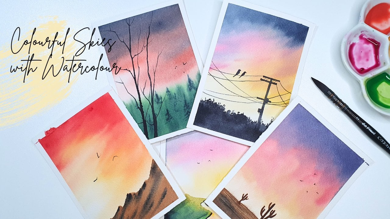
Transcripts
1. Welcome to the class!: Have you ever felt
enchanted by the sight of a clear night sky brimming
with millions of stars? I have always been mesmerized by the vastness of the universe and how tiny we are in
comparison. Hello there. I'm Sucheta, a work artist
and an engineer from India, currently living in Europe. You can see my artwork
under the Instagram handle. Sucheta underscore Ken Nature has been my biggest
inspiration all the time. Sunrises, sunsets,
chirping birds, night sky, waterfalls and
anything that gives the sense of tranquility
is near to my heart. In spite from my
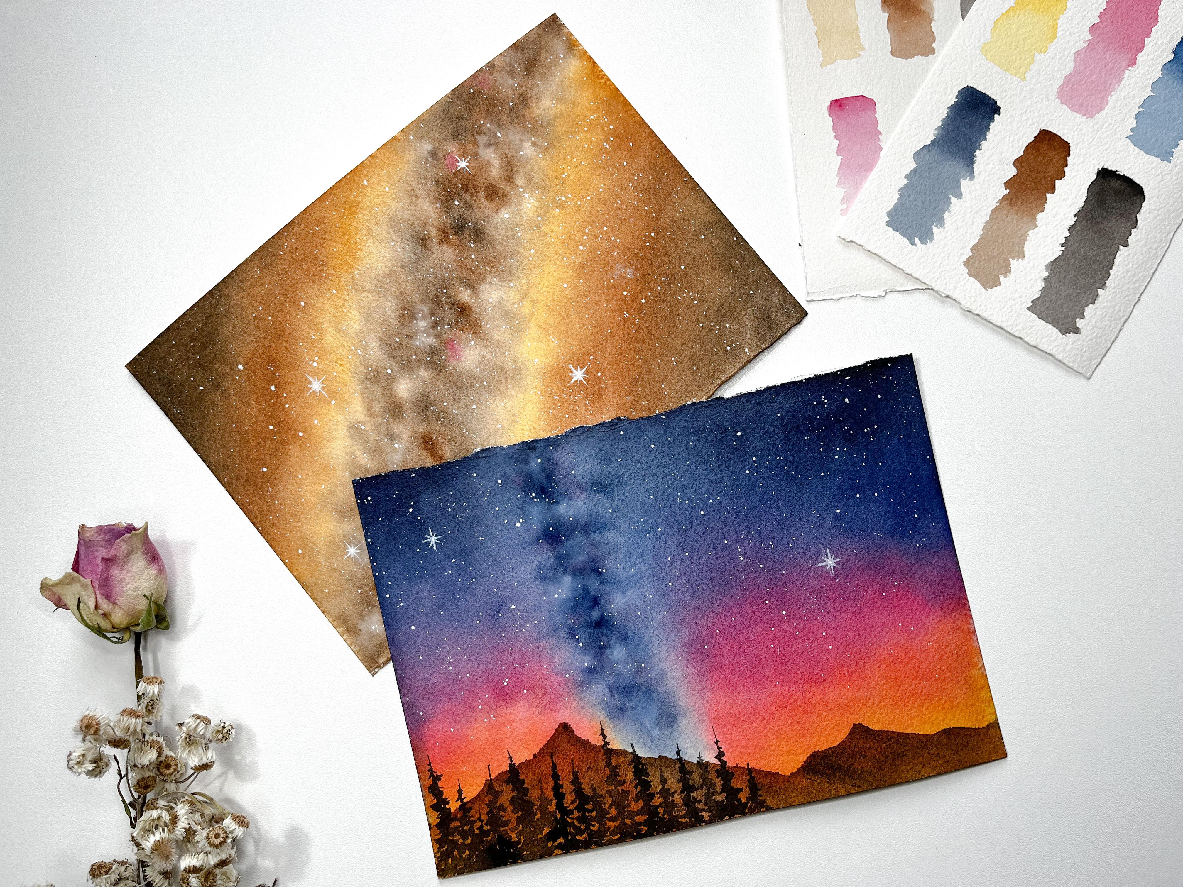
late evening walks, I have chosen two paintings
of the Milky Way. As our class project, we'll be painting the Milky Way with two different perspectives. One would be a zoomed
inversion of the Milky Way. And the second one
is we'll be painting the same with a different
angle of observation. In this class, I'll explain different techniques
such as wet on, wet color, blending,
re, wetting, et cetera. Class projects will
give a good opportunity to practice all these
techniques that we will learn. I'll also highlight where it
can go wrong by painting, so that can help you to avoid such mistakes in your
painting as well. In the next sections, I'll walk you through
the different materials that are required for the class, the techniques that are
involved in the class project, and then a detailed guide
to complete the painting. Don't worry, even if
you are a beginner, as I would be explaining each step of the painting
process in detail, you can easily follow along without further ado.
Let's start painting.
2. Materials Required: Let's talk about
all the materials that are required
for this class. For the paper I'm using, art is 100% cotton
watercolor paper. It is cold pressed 300
GSM and is of four size. But for the class project, I'll be using five size paper. I highly recommend using 100% cotton paper as it really helps in layering
and blending the colors. You can use any
brand that you like, but just make sure that it is 100% cotton and of
at least 300 GSM. For our project, I'm
using colors from different brands such
as Daniel Smith, White Nights, and also
from Winsor and Newton. You don't need to have the
exact same colors that I use or you don't need to have the exact same brand that I use. Any good basic set
will be sufficient. I'll be explaining
in detail about all the colors that we are using in the beginning
of each project. Now for the brushes, we need a big brush
to wet the paper. For that, I'm using Winsor and Newton round brush of size 14. I'm using silver black velvet
brushes of different sizes, 4812 for different purposes. For example, I'm using the size 12 brush
to apply paint to the larger surface area and silver black velvet size eight brush to paint
the Milky Way. And also the small brush
I'm using for detailing, I'm using a rigger
brush of size one. This is from Princeton. I use this brush to paint
the twinkling stars. We need a palette to
mix the water colors. I have a ceramic palette that I bought online a few years ago. Have been using it for
quite some time now. Still, it looks
very fresh and new. I really like it. I also have plastic one, I can
show you here. I store all the
colors that I usually use and I mix it right here. Choose whatever you
have as your palette. Don't worry about that. I'm keeping two jars of water. One is to clean the
paint out of the brush, and hence it gets
dirty pretty quickly. And the other one is to wet the paper or to mix the colors. We need a paper towel to
dab off the excess water. You can also use a clot. Choose whichever you prefer. I'm using this acrylic board
to keep my watercolor paper. In the class projects, as we would apply water on
both sides of the paper, there's a good chance
that the paint can get into the other
side of the paper as well, then it'll be a real mess. This board that I'm using helps to keep the
area nice and clean. I have some masking tapes here. We don't really need it for our project because
as I mentioned, we would be wetting the
paper on both sides. We don't need them. But for
the practice sessions I will be using one.
That is all we need. Get your stuff ready, and let's start painting.
3. Techniques - Wet On Wet: Yes, welcome back. In the next few sessions, we shall see some of
the key techniques that are used in
our class project. The first technique is
painting wet on wet. To demonstrate that
on the left side, I'm taking my big brush
and wetting the paper. I'm putting good
amount of water. Also, I'm making sure that it evenly spreads all
around the paper. Now, on the left
side of the paper, it is wet, and on the
right side it is dry. Let's take Quin
Rose, for example. I'm applying it on the
wet side of the paper. See how the paint
is flowing down. The underlying water
layer helps the paint to spread on the dry side. I'm applying paint
directly here. See how dry it? It doesn't flow as much as it did for the wet
on wet technique. Even if I apply more paint
here, it doesn't flow. Now let's take Telo
blue for example. I'm going to drop
the low blue color here on the wet side. As soon as the blue
color touches the paper, it spreads because the wet paper helps the color to move around. I do the same thing now
on the dry surface, it doesn't spread at all. But here, if I do that again, it spreads, but here it doesn't. That's the difference between ton wet technique and
ton right technique. We also use the ton
right technique in our painting to
paint the details. For example, I'll show you the pine trees that
we're going to paint in our class project. I'll start by drawing
a straight line. Then from the top I start
with smaller strokes. And while moving downwards, I make bigger strokes. Just make sure that
the brush strokes are of different lengths and of different sizes so that
it doesn't look symmetrical. At the end, it comes
to preferences while choosing which technique
to use in the painting. As our class paintings involve a lot of layering and
blending of colors, Ton wet technique
is really suitable. Okay, this is all about
ton wet technique. In the next section,
we shall see another important
technique called blending.
4. Techniques - Blending: The next technique
that we are going to learn is blending of colors. On the left side, I have
already wetted the paper. I start with new gumbos, then I take the
Quinocridone Rose. Our next is Prussian Blue. Here I'm adding the colors
one above the other. I have applied new gumbos, Quinocridon Rose
and Prussian Blue. I'm not blending any of them, I'm just stacking them
one upon the other. Now, I'm wetting the paper
on the right side as well. Let's supply the same colors
in the same order as before. Now, the only difference is that we shall blend the colors. To do that, I'm taking
a smaller brush. I'm washing my brush and
dabbing off the excess water. And now I'm slowly moving quinocrodons towards
new gamboge. I'm washing my brush again, wiping off the excess water. And I'm moving quin rose down. I'm not adding any
extra paint here, only blending the colors with
the help of a damp brush. Let's blend the quin
rose and Prussian blue. Now, I'm adding some
quin rose here. And then we'll keep
blending the colors. Now I'm washing my brush again, dabbing off the excess water, and just moving the
colors every time. When I move some colors, I wash my brush because I don't want to create a mix
of unwanted colors. Let's keep blending for some more time so that there
will be nice mix of colors. Now, let's wait for it to
dry. See the difference? Yes, as this is right,
let's compare them. On the left side, we have a
clear separation of colors. Prussian Blue, then
Quinocrodone rose, and then New gamboge. But on the right side, we have blended the colors. The edges are softened and the
transition is very smooth. You can also see
intermediate colors, like purple here in between
Prussian Blue and Quin Rose. In between Quin Rose and New Gamboge, there's
a peach color. Now we have learned how cool the blending of
colors would look. In the next section, we shall understand another
technique called vetting.
5. Techniques - Rewetting: Another important
watercolor technique that we are going to
discuss is revetting. Consider an example where we are in the middle of painting something and the paper is almost right now,
what shall we do? Or take the example from our previous practice session where we didn't blend colors. Now we want to have a
nice blend of colors. What shall we do in this case? We can fix this by
retting the paper, then adding another
layer of colors, and then blending them. In order to do
that, we'll have to apply water on the
painting again. But this works only when the
painting is completely dry. Now let's take the same example from our previous section. I'm taking my big round brush and I apply the
water again on this. Look how slowly and gently
I'm applying water. I'm not putting
any pressure here. Now the paper is wet. I can start adding the colors. This technique of
applying water on the already dried painting
is called re wetting. Let's apply the same
colors in the same order, and to blend them,
I'm washing my brush, wiping the excess water, and moving the colors. I have used the same set of colors and applied them
in the same order, and I have blended them by using the technique that we have discussed in the
previous section. Let's wait for it to dry
to see how it looks. Now this is look how nicely all the colors
have blended together. This retting technique is such an important technique that comes handy all the time. Remember, for retting,
paper needs to be completely dry if the
paper is still drying. And then if you try
to wet the paper, then there will be blooms
that will spoil the painting. In the next section,
let's look at the colors needed for
our first class project.
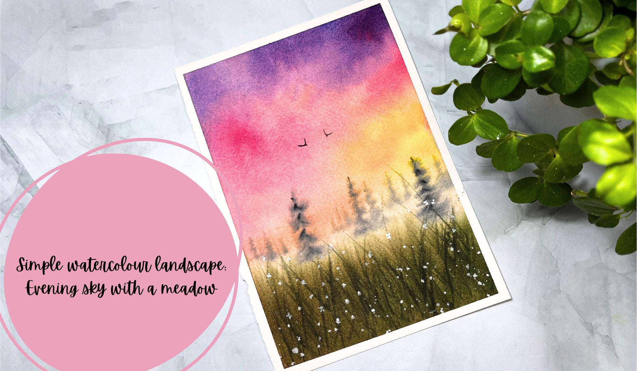
6. Class Project 1 - Colour Swatching: Let's go through
all the colors that are required for our
first class project. We need yellow ochre. Let's squeeze it right here. Then we need burn timber. Next color that we're going
to pick is ivory black. These are the main colors
that we are using. We also need a little
bit of quinochriydone rose and also white quash for adding details. Let's watch each color
and see how they look. Now I'm taking yellow ochre. Let's take the bun tumber. And now, or black, I'm taking quin ocre on rose. So we have all the
colors in our palette. Now, in the next section, we shall use these colors and create a beautiful painting.
7. Class Project 1 - First Layer: So let's start our painting. But before starting,
just make sure that you have everything ready
including the paint. Now, the first step
is to wet the paper. This is an important step which really helps
the painting process. I'm taking my, A five
size watercolor paper and turning the paper over so that
the backside is facing up. With the help of a
big round brush, I'm applying water to the
backside of the paper. Now I'm flipping the paper and applying the water
to the front side, as well as the back of
the paper is already wet. It easily sticks to the bold. We should spend more time
in applying water to the paper because it helps the paper to stay
wet for longer time. As a beginner, I made the mistake of not
wetting the paper enough then I never had sufficient time to
work on my paintings. So I would say wetting the paper thoroughly
is really important. Also, while doing this, make sure that you apply the water uniformly
throughout the paper, not leaving any blops of water. Once the wetting is done, we should remove the excess
water from the sites. If you observe around the edges of my paper
there is water. I'm wiping it off because
if I don't do that, the water will flow back to
the paper and create blooms, which I don't want to happen. Now I'm taking silver, black velvet round
brush of size 12. I'm loading my brush
with yellow ocre. I'm leaving the white space in between and applying
the color diagonally. Look at the way I'm
holding my brush. I'm holding it loosely and
making circular strokes. Now I'm applying the yellow ocre to the other side of the
white space as well. Let's take the burn tumber now and apply it on the
right side of the lower, and also on the left
side of the ellocer. Let's add the burn tumber again, as it looks very light on the middle part. We
haven't applied any paint. It rise faster to avoid that. I'm applying clean water to the white space in
between the colors. Now let's supply
black color on top of the one timber on
both the corners. We have our first layer
of colors in place. Loc burn timber and ivory black, but they look lighter, right? So let's add the same colors again to get more
saturated look. Now I'm taking thicker
consistency of low ocre again and applying it the same places like before on both sides. Next, let's take burned timber and the next color
I'm adding is black. Once this is done, we
have to blend the colors. Now the colors look separated. We should get a smoother
transition between them. Before that remove the excess
water around the paper. Otherwise, as I
mentioned before, it'll flow back
and create blooms. Now I'm taking my smaller brush, silver black velvet size eight
brush to blend the colors. For that, I'm washing my brush, removing the excess water. And now I move the barn
tumber towards yellow ocher, and black towards barn tumber. I'm repeating the same process
on the other side as well. Moving the burnt tumber
towards ello ocher, black towards burned tumber. I don't want to have hard
edges in the middle. I'm cleaning my brush and
softening the edges there. Now it's time to
paint the Milky Way. I'm taking the burned timber and dropping it here and there. I'm gently touching
the surface of the paper through
the tip of my brush. Also, I'm making sure that the white spaces are
not completely covered. Now, let's try to blend these
colors with the background. I'm mixing the burned timber
with a black here and dropping it at different places to have some color variation. You see I'm randomly
adding these colors. Let's add some black as well. Now it is time to blend. With the help of a clean, damp brush, I'm
smoothening the edges. Let's give some more colors to the middle part so that
it looks much vibrant. Starting with burnt timber, adding the black color, adding the mix of black
and burned timber. Now let's blend them again. While doing this, make sure that you're not covering the
white spaces completely. In case if you have
lost the white space, you can use the lifting
technique to fix that. In order to do that,
clean the brush, wipe off the excess water
and then pick up the color. Using brush, we shouldn't add any more water to the paper. The brush should just be damp. Maybe I can add some
more brown here. And that's it. Let's
wait for it to when it, it'll be much lighter. So we shall add a second layer of colors in the next section.
8. Class Project 1 - Second Layer: Welcome back. Now, this
has dried lighter. Let's apply the next
layer of colors. The same colors in the same order we are using
the riveting technique, which we have discussed
in the practice section. I'm taking my big
brush again and applying water on top
of the dried painting. Make sure that your painting has completely dried
before applying water. See how carefully
I'm doing this. If we put too much pressure, we might disturb the
underlying colors. That shouldn't happen. I'm applying the
water again as I want the paper to be
wet for longer time. Okay, we are done
with the re, wetting. Now the paper is wet again and we get more time to
work on our painting. Before that, make sure to remove extra water
from the edges. Now picking up the yellow
Oc again and applying it on the right side and also on the left side
of the Milky Way. Next let's add burn timber and applying it on both sides. Next, let's take black and add it on both the corners. Once we have all the
colors in place, the next step is of course to blend them with the
help of a clean brush. I'm moving the burn timber
towards yellow ocher, and black towards burn tumber. I'm repeating the same step
on the other side as well. Now I'm removing the excess
water from the sites. As you already know, water
color looks much lighter. After it, I'm adding the same colors again to
get more saturated look. When we apply paint
to the paper, we are in turn, adding
water along with the paint. But if you observe
the middle area, I haven't added any paint. So it tends to drive faster to avoid that I'm
applying clean water. I'll continue with
blending the colors. You might ask me,
why do I keep adding the same colors instead of going to the darker value
from the beginning? When it comes to
the water color, we can't work from darker
tonal value to the light. If you want to have
some color variation, it should always be
from light to dark. And can't start
with darker color first and add lighter
colors later. It is always best to start with lighter tones and
work in layers. Now it is time to add some
more colors to the Milky Way. I'm repeating the
same process here, taking the burned timber. Now next I'm mixing the burned timber
with the black. Now let's take the black. When we use different
sides here, that will bring depth
to the Milky Way. Whenever we add new
colors to the paper, the very next step
is to blend them. Now I'm taking my smaller brush and adding small lines
towards low ocher. It kind of looks like small ans add extra color if you
need like I'm doing, I felt it is more
brown shade here, so adding black color. Also, if you feel you have more darker regions,
lift some colors. Here I'm lifting some colors
so it looks a bit lighter. Now let's take the white quash and add it to the Milky Way. You can choose the
darker regions of the Milky Way to add white, so it gives nicer contrast. Now we shall blend it. I'm repeating the same
process of adding white gash because even guash
when it rise looks lighter. I'm adding the
mixture of brown and black on top of the white quash. It kind of gives smoky effect. At last, I'm dropping the
darker value here and there. The painting is drying now
before it dries completely, let's add some quin rose. This addition of quin rose suggests the presence
of nebulas over there. Also, it brings more color
variation to the Milky Way. Okay, now we're done with
a second layer as well. The only thing
that gives left is adding some starts to do that. The painting should
be completely dried, so let it dry and see
you in the next section.
9. Class Project 2 - Colour Swatching: Welcome again. Are you ready to paint our second project then? Let's see, what are the
colors we need today. I still have some colors left
from the previous painting. I haven't removed them. We need Quinocridon, Rose and Gamboge. Next is Prussian Blue. Also we need indigo. Then burned timber. I already have it here in the palette from
our last project. And black, I'll use
the same place, these two colors we're using to add the details At the end. Also we need white quash. This we're going to use
to paint the stars. These are the main
colors that we need. Let's watch them and
see how they look. I'm starting with new gum Bog. Now next let's take Quin Rose. I'm taking the Prussian Blue. Now it is indigo. Next I'm taking the burn tumber. And the last one is ivory black. These are the colors that we're going to use along with this, we'll be using white Bosch. Like I said before,
you don't need to have the exact same
colors that I use. It is totally okay to use any similar
shade that you have. Now we're done with
the swatching. Let's meet in the next section and start our second painting.
10. Class Project 2 - First Layer: All right, let's start
our second painting. The first thing we have to
do is to wet the paper here. I'm not using any masking tape and hence to avoid buckling, I'm wetting both
sides of the paper. With the help of my
big round brush, I'm applying water to the
backside of the paper. Now the backside of
the paper is wet. Let's do the same for
the front side as well. I'm going to turn this over
and stick it to the board and apply water to
the front side. This is where we
will be painting. I'm giving more
water to the paper. Take your time with this step. Apply water multiple times so that it stays wet
for longer time. And also, I'm applying water uniformly without leaving
any puddles on the paper. I think this is good
enough to start with. Before starting, remember to remove the excess water
as I mentioned before, otherwise it'll create blooms. The first color I'm
picking is new gumbos. I'll start from the lower part. I'm applying paint on the right side and then on the left side here as well. I'm going
to leave the middle part as it is without
applying any paint. Let's apply some more
of the new gamboge. Now I'm taking the quin rose and applying it
above the new Gam Busch. Next as. Let's take the Prussian blue as our third color and apply it
on top of the queen Rose. On the topmost part,
I'm applying indigo. Observe how loosely
I'm holding my brush. Once we have marked a
position of all the colors, now we can increase
the saturation by adding the same colors again, Let's pick up the
new gamboge now. And then the quinocdon, and applying it on both sides. Next, Prussian blue followed by indigo. Now, if you see the middle part, we haven't applied
any paint right. It dries faster in order to avoid it get right and also
to get some more extra time. I'm applying clean water. Here it is. Okay if the colors from
the sites get mixed up. Now I'm taking my smaller
silver black velvet brush to blend all these colors. Before that, I'm
washing my brush, wiping off the excess water. And now I move the quin
rose towards yellow. Similarly, let's move the quin rose towards Prussian
blue as well. Now let's move the indigo
towards Prussian blue. This is not the perfect
blend that we could achieve. But as we'll be applying
another layer on top of this, we can blend the colors again, to get smoother transition, let's add some colors
to the Milky Way. Now, otherwise it'll get red. I'm taking the indigo and
I'm dropping it randomly. As the paper is wet, the color spread nicely. That is what we actually want. They should blend and become
part of the painting. Now let's take the Prussian blue here. When the Prussian blue
is mixing with a quin rose, it is creating
nice purple shade. I'll keep adding
the Prussian blue. If you see, I'm trying to
lift some colors here. As you know, watercolor
flows when the paper is wet. If you feel it did spread a
bit more than you expected, lift some colors with
the help of a clean, damp brush, but don't add any
extra water to the paper. We can add one more color
here to get more contrast. That is, a mixture of
Prussian blue and quin rose, which gives a beautiful
purple shade. I'm dropping the purple at random places just to get
some color variation. And I'm blending them. I'm also lifting some colors as I'm losing the white
spaces around. Also on the lower part, I'm keeping the colors
lighter and not blending them or adding
any more colors. That is because of two reasons. One is when the blue
is mixed with yellow, it gives a green shade,
which I want to avoid. The second reason is we'll
be painting mountains there, as this part would be hidden. We don't need to
add the details. This is our first layer. After this, let's supply
the second layer of colors. See you in the next section.
11. Class Project 2 - Second Layer: Yes. Now this has
completely dried. I'll wet the paper again. See, I'm careful enough not to disturb the colors that
are already on the paper. Every time when I'm
moving my brush, the camera is
changing its focus. I didn't notice it before.
I'm sorry for that. Now, we are ready to apply
the next layer of colors. Before that, I'll remove the excess water present
around the paper. I'm taking a smaller brush. Now let's take the same colors, again, starting
with yellow here. Now we take the quin rose. If you observe I'm
applying it on top of the yellow region because
I want the PC shade, that's a mixture of
nucubose and quin rose to be prominent here. Also on the upper part, I'm pushing the quin rose
towards the blue region. It would be nice to see some
purple shades in there. Now let's take the Prussian blue and apply it on both sides. The last color is indigo. Once we have all the
colors in place, now you know that we have to blend these colors with a clean, damp, moving the quin
rose towards yellow. Look at this orangey
shade that is created. Let us also blend the blue
and the pink colors here. Now I'm moving the indigo
towards Prussian blue. I would like to make
both the Prussian blue and the indigo a bit darker. Let's blend them. Oops, I accidentally dropped
some water here, but we can anyway fix it by
moving the colors around it. So no need to worry. Now, let's not forget
the middle part. It dries faster, right? So, I'm adding indigo. My paper is still wet, so the colors that I'm
adding are spreading slowly. As I mentioned, I'm keeping
the lower part lighter. The next color we are
adding is Prussian blue. I felt the pink is more prominent and the
blue looks lighter, so adding another layer of blue. But now, if you notice the
colors are not blending well, let's quickly add
some purple shade to our milky way before
it completely dries. You see, I can't do much now. The paper has mostly dried, so the colors are not blending. I think I need to go
for another layer. If your paper is wet enough, you can keep working and
skip the revetting part. You don't need to add
the third layer at all, but for me, I can't blend them. Now, I'm going for third
layer in the next section. Let's re the paper and
blend these colors.
12. Class Project 2 - Third Layer: Yes, the painting has tried. I want to read it, the paper
now and blend these colors. Let's supply water again. If you see now the blow
layer of colors are moving. It is okay. We can fix it. I feel my yellow
part is quite all right. I don't want to apply
the yellow again. Maybe I'll add some
quin rose here. I guess my brush had
blue shade in it. That's why my quin rose
looks more purplish, adding the Prussian blue and some indigo, making
the top part much darker. Let's keep blending them. On the right, it is
more pink shaded. To balance that, I'm adding a bit more pink here
on the left side. Let's give some more
colors to Milky Way. Starting with indigo,
then prussian blue. I'm mixing the blue
and quin rose to get purple shade and blending
everything with the background. Now let's add some gash. As the paper is still wet, the white color spreads as
soon as it touches the paper. I'm adding some colors
on top of quash. When it blends, it
gives smoky effect. I'm lifting and
blending the colors. I'm just dragging
colors outwards and drawing small lines here as it was very relaxing to
see the colors blending. I kept adding the same
colors again and again. I didn't even notice that I've been doing it for a long time. Feel free to stop at
any point here now. This has almost, Do you see
the blooms created here? At some point, I forgot to remove the
water around diages. It did spread when the paper dried and created
these patterns. Luckily, it is not
that prominent. We can hide this with all the details that
we're going to add. Remember not to
repeat this mistake. Always make sure that you remove the extra
water around ages. Okay, now let's meet in the next section to add
some final details.
13. Class Project 2 - Adding Details: Okay, this looks good time
to add some details now. Let's start with
painting the mountains. For that, I'm taking
the burn tumber. I'm mixing thicker
consistency of brown. Starting from the left corner and moving towards the right. I'll cover the lower
part of the Milky Way. I'm trying to vary the
shades of burn timber. I'm thinking to add another small mountain
towards the right. Now I pick some black and drop it on the burn tumber
on these mountains. When we use different
tonal values that can make our mountains
look more interesting, I'm adjusting the shape of the mountain so that the
lower part of the Milky Way, where we didn't add much
details would be hidden. Adding some black and brown trying to get this
mountain which is behind, a bit darker so that we can see the separation
between them. Now I'm using black to
paint some pine trees here. This is the wet on
right technique that we discussed in
the practice section. Starting from the left
corner and drawing a vertical line like
we discussed before, I'm starting with
smaller strokes from the top and
painting bigger, uneven strokes while
moving towards the bottom. We want our trees to be
of different lengths. I'm going for a
smaller tree now. Let's paint a few more trees of different sizes and lengths. I'll stop this tree halfway and adding another
bigot tree here. They suggest that
the smaller tree is behind the bigger tree. By this, we can create
depth in our painting. Let's go for a few more trees. I felt this looks
bit empty here. I think we need to fill up
this gap with more pines. Let's add some stars, using light as we need to cover the mountains
and trees while splattering. Otherwise, it feels
like snowfall. I'm loading my brush
with good amount of white and using my index
finger and tapping the brush. So we get nice
platters all around, I think we can add some
more splantters this time I'm using my index finger for support and tapping
the brush on it. You can either use the
first method or this one. Now, I haven't covered the
mountains while splattering. I've been careful. Even then there are some white dots
on the smaller mountain. Let's quickly wipe
it off before it. Let's add one or
two bigger stars. For that, I'm making a bigger
white circle and softening the edges Using my rigger brush, I'm drawing small
lines like cross. Those lines that we add
shouldn't be so thick. We should spend some
time on this step because even though the starts
we are adding is small, those details can make
a huge difference. Let's add one more
star on the left side. I'm using the same rush now. I'm carefully adding
the thin lines around. I'm going over the stars again to clearly
define the details, the lines around them, and we are done with
a second painting. This is how our painting
has turned out. It looks gorgeous, isn't it? I love those bright colors and the way they have
blended together. I hope you like this class
and learn something from it. Thank you so much for joining. I look forward to see
all your creations. Please do share them in
the project section, and I see you soon.
 Suchetha KN, Watercolour Artist