Transcripts
1. Introduction: Are you a watercolor artist who wants to try painting
different subjects. Are you someone
who is looking for an easy but still
captivating projects. Space is one such
subject for me. It is huge, memzing, in, and at the same time, it lets my imagination flow.
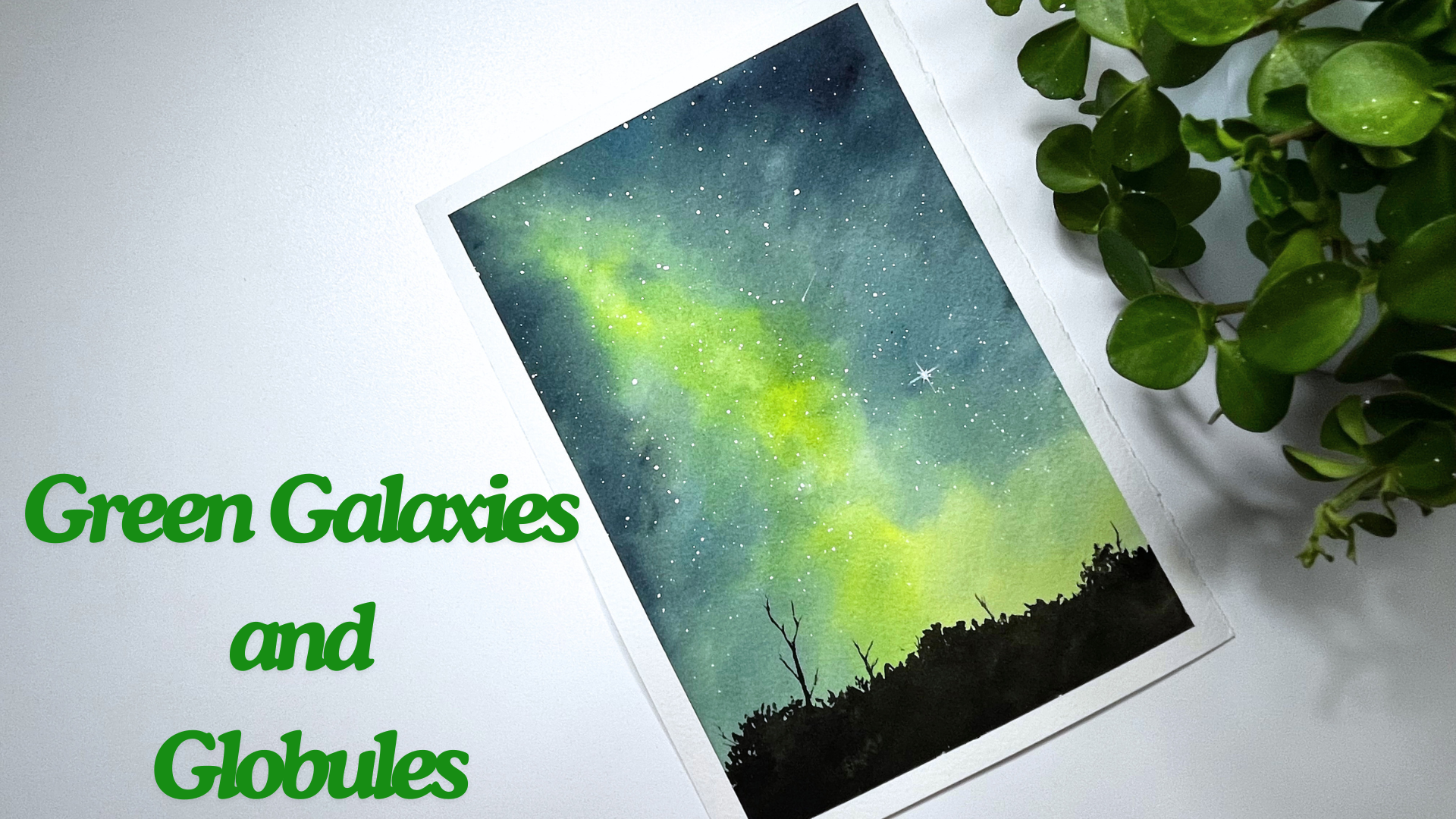
Hello, everyone. It, a watercolor
artist, an engineer, and a skill share
teacher from India, currently living in Europe. In this class, green
galaxies and globules, there are seven
beautiful projects, you know, I do have a special
love for the green color. So I came up with this class
where in every project, one of the main colors
we use is green. In this class, I talk about
the materials required, and there is a
technique section which explains the splattering
technique that has been used. To make it easier to follow, I have added the
practice session followed by the main project. I'm very excited to
start this class. So let's not wait and begin
our journey together.
2. Materials Required: Let's talk about
all the materials that are required
for this class. I'm using R 100% cotton
watercolor paper. It is 300 GSM, cold pressed. For the class project, I'll be using A five size paper. I recommend using
100% cotton paper because in our class projects, we'll be using different
techniques such as layering, blending, et cetera, and 100% cotton paper is really
useful in that case. I'm using four
different brushes here. This one, Brust size four, I'm using it for initial washes, and I'm using silver
black velvet brush of size eight for
all class projects. This one, silver black
velvet brush of size four. I'm using it for detailing. And this one rigger brush
from Princeton of size one. This I'm using it to paint
twinkling stars, for example. These are the brushes that
I'm using in this class. I'm using colors from different brands such
as Winsor and Newton, White knights, and also
from Daniel Smith. I'll be talking about
all the colors that are required in the beginning
of each project. Then we need a palette to
mix the colors and a jar of water for the initial washes to rinse the brush and
also to mix the colors. We will need a paper towel or a cloth towel to wipe
off the excess water. I'm using a masking
tape to stick my paper and using the
scissors to cut the tape. I'm using a pencil and an
eraser in the class to sketch. I'm using an acrylic
board to stick my paper. In our class projects, while adding stars, we might
need to cover some areas. For that, I'm using the sheet. That's all we need
for this class. Let's get our stuffs ready and then start
with our paintings.
3. Technique - Splattering: Okay. Welcome, everyone. Let's talk about this technique called
splattering technique. We use this
splattering technique to add starts in our paintings. So let's just dive into it. I'm preparing the
paper by vetting it. Applying good amount of water evenly
throughout the paper. But I'm not spending
too much time on this, as our focus here is not
the background layer, but the details on
the foreground. I have some colors
left on my palette. I'm going to take Prussian
green from it because it is dark and the stars we're going to add would
be clearly visible. Let's apply the Prussian
green throughout the paper. From the top, I'm going down and making
horizontal strokes. I think I'll go multiple times to get a
darker background. Here, we are just preparing our paper before doing
the splattering. We need to have a
background right. I'm keeping the lower part
lighter because I'm going to add another color there just
to make it more colorful. Now, let me take the second color that
is permanent brown. And starting from the bottom, I'm going upwards where
the green and brown meat. Let's blend these two colors. One last time, I'm
applying the same colors, starting with a Prussian
green and making horizontal strokes
and going all the way down picking up some brown and applying it horizontally at the bottom and moving
towards the top. I'm blending these two colors again to get a
smoother transition. Okay. Now let's wait for it to dry and then add some stars. For spluttering the stars, I'm taking the white quash, and I'm using the stray
to squeeze the paint. I'm taking my silver black
velvet brush of size four, and then adding a bit of water to the paint
and activating it. Observe the consistency of
this It's not too watery, not too dry but kind of milky
consistency, I would say. For adding the stars, I keep my finger as support, and then I tap the brush on
top of my finger like this, and I move my hands
all over the paper. You see? Shall we do
that one more time. So again, I keep my finger a support and just tap
the brush all around. Look at those platters. Now we have a lot of stars. I can add one or two
picker stars like this. This is just random. Add few big stars that are
scattered around the sky. Now I'm going to show you
how to add a twinkling star. For that, I'm washing my brush and I'm removing
the excess water, for example, we can take
this one as our star. So what I'm going to do is, I'm just softening the edges. I'll wash my brush again and
then I'll lighten the edges. This is like the glow
around the star. Observe my brush
is clean and damp. It doesn't have any paint in it. I'm keeping it around. Now, I'll take the
white gash again, and I'm putting a.in the middle, which is like the center of
the star with an aura around. Now I'm taking my rigger brush. It has thin pointy edge. I'm washing my brush, and let's take some gah now I have to add some
lines around the star. I'll start with the
first line going down, something like this. And then from the center, I'm adding a line
towards the right. Make it quick so that
it's nice and thin. And then a third one from
the center towards the top. And the fourth line
towards the left. In between these four lines, I'm adding smaller
lines like this one, two, three, and four. Like watercolor, guash also dries lighter and hence
I'm making the lines. By the way, if you don't
have the white quash, you can also go for
the white watercolor, but take the thicker
consistency of white watercolor for
the better visibility. I have added the second
star in the same way. Now let's add a shooting star. How do we do that again
for the shooting star? We can take one here, and then quickly draw a line. Let's make this line bit longer. I'm dragging it a bit.
That's a shooting star. When you're adding
multiple stars, make sure that the lines
are in the same direction. We don't want to have lines that are in different
directions. This is one way of
adding the stars. There are many other ways. Sometimes I just skip to add the glow around
that's up to you. We'll be following the
splattering method in all our class projects
to add the stars. And that's it for slaughtering. In the next section, let's
start with our first project.
4. Project 1 : Green galaxy from earth - Practice session: Hello, again, let's start
with our first class project. We shall see all the colors that are required
for this project. I'll be using Hansa
Yellow Light. It's a cool yellow
from Daniel Smith. Then it is Russian blue. It's another beautiful
blue from Daniel Smith. Then we would need Indigo. The color I'm using here
is from White Knight. And for detailing, I'll
be using ivory black, which is from Winsor and Newton. We also need some white quash
here for adding starts. I have a small container which I usually use for
the white quash. I'll squeeze the color into it. These are the colors that we need for our first
class project. Now, before moving
to actual painting, let's do a practice session. We need to prepare
our sketchbook. For that, I'm using
a masking tape to have a proper border. The sketchbook I'm using
here is quite small. It is just ten into
15 centimeter. So now I'm using my masking
tape to have the borders. Now, I'm cutting the
tape with the scissors. I'm leaving a bit of
a space on the right. This we can use to
swatch the colors. And one more on the top. Yes. Now, let's
watch the colors. I'll start with Hansa yellow. It's a cool yellow. If you don't have Hansa yellow, you can use either lemon
yellow or transparent yellow. Next, let's take
the Prussian blue. It's also a cool color. Instead of Prussian blue, you can go for
Thalo blue as well or choose any cool
blue that you have. Next is indigo. Again, if you don't have indigo mix a blue with gray or black, that should give you a shade
which is similar to Indigo. Let's take the black. I'm using ivory black here, but you can go for mass black
black or even gray color. These are the colors that
we need for this class. But see, we don't
have any green in it. As the title of this class says we should have green in
our paintings, right? So how does this work? To get the green color, we will mix the Hansa
yellow with Prussian blue. I have the Hansa yellow here and Prussian blue
here. Let's mix them. As they have already dried, we need to activate them. Do you see the green
shade it is creating as both the Hansa yellow
and Prussian blue are biased towards green. They do create a
beautiful green, so that is what we want. Now, let's do a small
practice sketch. I'm taking my morash and
applying water to the paper. Here we are using
ton wet technique. As the name says, we need to wet the paper f before
adding the colors. Here, I'm making sure that
the paper is wet enough, but it doesn't have
too much water in it. I'm taking the yellow
now and then I'm creating a cone shape here from the top
towards the bottom. I'm applying the yellow color. When it comes to the bottom, I'm making it wider, so it is creating a cone shape. Now, let's take the Prussian
blue as our second color. We want to create
this green color, we should blend blue and
yellow to get this green. I'm applying the
Prussian blue on both sides of the yellow now, but see I'm not covering the
yellow region completely. I would like some
yellow to be visible. Now I have applied
blue on both sides. We need to blend these colors. For blending, I have cleaned my brush and removed
the excess water, and with the help of
the clean damp brush, I'm moving these colors. Picking some more yellow
to get more green shade. Do you see the green
it is creating? I feel the blue color
is more prominent here, so I'm adding the yellow
to get more green shade. I would like to keep
some yellow intact, so I'm not covering
the yellow completely. Now, in the next step, I'm adding indigo on the site. As well as on the top, to get darker tone. Now, I'm washing my brush and
I'm blending these colors. My paper is still wet, so I'm still be able
to blend these colors. Remember, for blending,
the paper needs to be wet. Otherwise, the
colors won't blend. Let's add some more yellow to get more vibrant green shade. I really love this
yellowish green here. We need to blend
all these colors. Otherwise, they look separated. So we shall keep blending. Now, we have painted our galaxy. I've used the Prussian
blue and Hansa yellow to create this
beautiful green, and we have indigo at the edges to get this
darker region of the sky. Let's wait for it to dry, and then we can add some
small trees and bushes here. The painting has dried now. For adding the details, I'm taking and painting
small bush like structures. I'm not going to go
for any details here. I'm just showing you how
this painting would look. Making quick strokes with
the tip of my brush. And I will not add any stars
in this practice session. We can do that in
our actual painting. We'll be using the splattering
technique for stars, which I explained in
the technique section. That's all. Once this tries, I will remove the masking tape. Now it's time to remove
the masking tape. This sketchbook
is bit sensitive. I should be careful here
not to tear the paper. We're done. In the next section, let's get into our
actual painting.
5. Project 1 : Green galaxy from earth - First layer: I have my watercolor
paper of size A five and stick it into the board
by using the masking tape. To start with, we need
to wet the paper. I'm using brutro size
four brush for this. This is one of the
round brushes I have. You can use any brush here, but with a bigger brush, it'll be easy to cover
the larger surface. So take the biggest
brush you have. Here, in all of our
class projects, we'll be using this
wet on wet technique. So we would start each
painting by wetting the paper. This is an important step. Take your time with the step. We want our paper to be
wet for longer time. If you want to know more
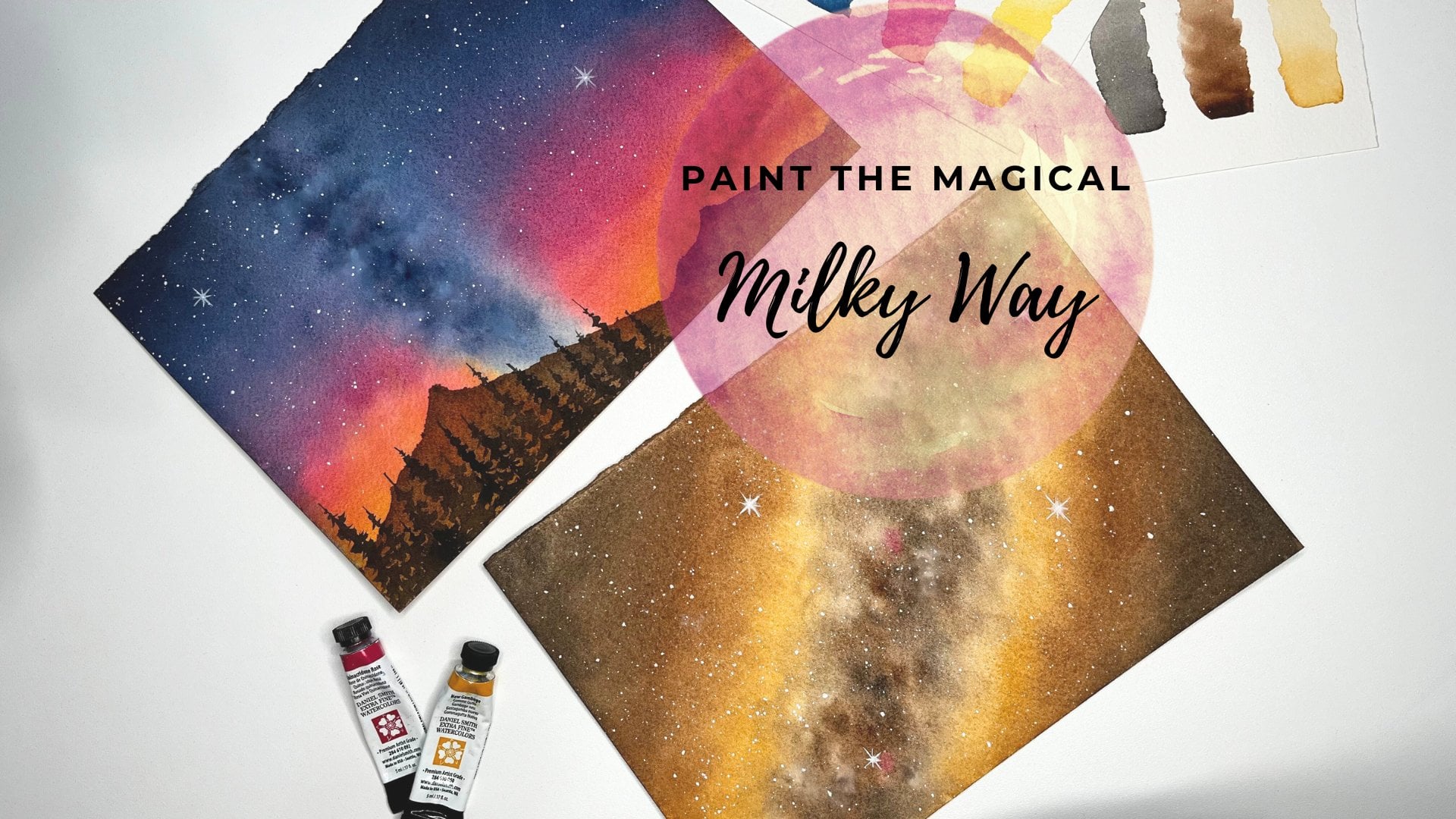
about ton were technique, I recommend taking my class, paint the magical milky way, where I have explained ton
were technique in detail. It includes examples as well, which helps the beginners
to understand easily. Cotton paper needs some
time to absorb the water. So I'm slowly moving my brush up and down
throughout the paper. I'm going over it again and
again and I'm making sure that the water is uniformly distributed without
leaving any puddles. When the paper is
wet for longer time, we get more time to
work on our painting. It is easy to blend, lift or move the colors. This is the reason why
wetting of the paper for good amount of
time is important. We are done with the
wetting of the paper. I'm taking the first color
that is Hansa yellow light and applying it like a cone like we discussed
in our practice session. This part we are painting
now is the sky region. I'm making quick and
loose brush strokes here. This looks lighter right, so I'm applying another
layer of yellow here. Let's take some more color. This yellow should mix with blue and create a
nice blend of green. Absorb the cone shape
that I'm painting here. The top part is narrow, and as it comes down, it gets wider, right? Now, I'm washing my brush, removing the excess water, and I'm taking my next color
that is Prussian blue. Let's apply it on both
the sides of the yellow. Both the yellow and the blue we have are bias towards the green. So we get a nice
green shade here. Do you see the green
that is forming due to the mixing of Hansa
yellow and the Prussian blue? Now, I'm washing my brush again, wiping the excess water and
just blending these colors. Every time when I
blend the colors, I wash my brush, remove the excess water, and then blend these colors again with the help of
a clean damp brush. Remember the brush
should be damp and we shouldn't add
more water to the paper. If you want to understand
more about blending, check out my class, paint a magical milky way. I've talked about
blending technique, the difference between
blending the colors and not blending them along
with the examples. I'm going to keep
blending them for some more time to avoid a clear separation
between the colors. Here, I'm moving the colors down to keep this part
wet for some more time. You see it is already drying. When we are applying the colors, we are in turn adding
water as well. So it helps the paper to stay
wet for a little longer. We want some saturated
look to our painting. So let's add the same colors again to keep it
nice and bright. I'm taking my hansa yellow and applying it to the same
place like before. I'm picking some more yellow. Now, if you see it's
not yellow anymore, it feels more green, right? That's the color
we actually want. Now, I wash my brush, clean the excess water and
pick the Prussian blue. I'm applying the Prussian blue on the right side of the yellow. And applying the blue on the
left side of the yellow. The next step is to
blend all these colors. Let's blend them with the
help of a clean damp brush. I'm washing my brush and
blending the colors. 100% cotton paper really helps here to get
a smooer blend. I accidentally dropped
some water on the paper. This happens to me all the time, but that's okay as my
paper is still wet. I can fix it by moving
the colors around. We can add some more blue
color as well to cover that. Next step, I have to apply
indigo before my paper rise. So I'm picking indigo and
applying it on the sides. I'm not covering the Prussian
blue color completely. The blue color should
be visible as well. Let's make this part
a bit more darker. In that way, it gives
a nice gradient. This is the top part
of the sky region, which is further away. I have to be quick here. We need to get a nice
blend of these colors. Our sky is standing
out quite nice. So we have a darker
indigo on the top, which gets lighter towards
the Prussian blue, and then we have bluish green followed
by the green color. I'm going to add a little bit of yellow to get some
green shade here. I'm adding more colors when I feel my painting
is missing them. You can also add some
more blue or yellow, depending on how you want
your painting to be. I'm adding Prussian blue
as it felt a bit dull. But we should do it
before the paper dries. Otherwise, this will
create hard edge. In my case, the
paper is almost dry. See this lower right corner has already dried,
but that's okay. We'll be adding
some details there later so we can cover that part. Now, I'm moving the colors
slightly wherever possible. The top region is
still slightly wet. I will try to blend
indigo and blue. Okay, it's not that
bad as it looks, I'm able to move some colors. I wanted to blend these
colors a bit more here, but my paper is drying. I don't want to touch it now. I think it looks good enough. Once it dries completely, let's add some details
in the next section.
6. Project 1 : Green galaxy from earth - Adding details: The paper has completely dried. Let's add some details here. We need some black color now. For adding the details, I'm activating the color with water and picking nice amount of black and with the help of silver black velvet brush of size eight here at the bottom, I'm adding bush like structures. I'm holding my brush
almost at the middle so that my brush strokes are loose and not very controlled. I'm adding little
leaves here on the top. I want to add details, but let me finish adding
these bushes first, and then we can go for
adding more details. I'm going to pick more
black and add the bushes. I want this part to
look really dark. Now, time to add some
details towards the edges. With a tip of my brush, I'm making tiny strokes
around the edge. Those strokes suggest
small leaves popping up. Let's repeat this all the way. You know, my brush
has pointed tip, which helps me to
add little details. If your brush doesn't
have a pointed tip, and if you struggle to
get the thinner strokes, go with a smaller brush. Now, I don't have enough
black on my palette. Let's squeeze some more black. I think I'll also shift to a smaller size for brush
for adding more details. To add small leaves, just touch with the
tip of your brush, like I'm doing, which makes
little dot and lines. Then nothing but are
leaves and twiggs. I'm defining the shapes as well. It looks interesting to have bushes of different
sizes and shapes. Now, again, observe the
way I'm holding my brush. It's almost like
towards the tip right. That's because while
adding the details, I need to have a controlled
movement of the brush. I don't want to have
loose brush strokes. Moving the black color
evenly along the bushes. That's because I
don't want to have some parts lighter
compared to other parts. As we have no light
falling on these bushes, all should be dark. Adding small twigs and leaves. You know, this also
looks a bit flat. Let's add few more leaves
here for this bush. Now, I'll pick some more black and add a small bare tree here, like a small tree popping
out of this row of bushes. I'm keeping it simple. You don't need to add
much details to the tree. Few twigs here and there
should be good enough. Keep it small and thin. We don't want our focus
to be on this tree. Sky should be the
highlight of our painting. You know, I was trying to add a thin branch and I was holding the brush close to the tip that had blocked
the view completely. But don't worry. I'm just adding some tin lines in
different directions. Nothing else. Now we're
done with one big tree. We can continue with few
small trees as well. If you want, you can skip this step of adding small trees. I'll add another small tree
here at the left corner. Don't need to spend
too much time on this. You can add a few small twigs, one more tree at the right
corner. This is enough. Now, this part is done. The last thing is we
have to add some stars. The details we added just
now is still drying, but let's cover that
part and add some stars. I'm taking white wash. Now with a smaller
brush size four brush, I'm picking white quash. Look at the consistency. As we have talked in
our technique section, this shouldn't be too watery. It's thick enough,
but not too dry. Before splattering, we need to cover the bushes that we added. Otherwise, it would look like
a snowfall on the trees. We don't want that right, so let's cover this.
Then to splatter. I'm using my finger a support, and then I'm tapping
the brush like this. Look at those white dots
on the blue green sky. They suggest the
presence of stars. I'm going to take some more white and do this
plattering again. I'm doing it all over the sky. While adding stars to the sky, I added stars to
my plant as well. I can see white
dots on the leaves. Now our sky has a lot of stars. We can add few big stars here. I'm just making this
dot bit picker. One more here, maybe. Before finishing, I'd like
to add some small details. For that, I'm taking
my rigger brush. It has a thin point edge. It helps a lot to
get thin lines. How about adding
a shooting star? For the shooting star, I will add a small dart and quickly drag a line. That's it. We can add one
twinkling star here. Quickly add the lines around like a cross in
all four directions. Adding a second line. Third line and the fourth one. Then add small lines in
between these longer lines. I want to be very careful here not to make
these lines thick. Even then, sometimes it
doesn't come so well. Don't worry. If you don't get it right for the first time, it gets better with little
more practice. That's all. I think this looks good enough. I don't want to add
any more details now. Let it try completely, and then we can remove
the masking tape. Okay. Our painting has dried. I'm removing the masking tape. Be careful while doing this. Remove the tape with an angle so that it won't
tear off the paper. Nice. This is how our
painting has stand out. Those blue and green colors
look so lovely right. Now, let's meet in
the next section and start with our
second painting.
7. Project 2 : Spiral Galaxy - Practice session: Welcome again. We shall start with our
second project now. Let's see what colors do
we need for this class. Still have some colors left from the previous class project. I did not clean it. For this class, we
will need indigo. Here I have it already, so I'm using the same place. We need burn tumber. I think I'll use this place
to squeeze the color. Next color is sap green. Brown and green are the two
main colors for this project, and we also need the white
quash for painting the stars. So now let's do this watching. I'm starting with a burn tuber. It's a nice brown color
from Winsor and Newton. Brown tuber is made
from a brown clay, which is naturally available. Now, I'm washing my brush
and taking the next color, which is sap green. I'm using the green I have. You can go with any green
instead of sap green. This green goes quite well
with the burn tumber. Let's watch the indigo. But here in our class project, we don't use the
indigo directly. Basically, we mix
the sap green and indigo to get a
darker green color. I'm mixing the sap green and indigo to make the green darker. Do you see the difference? This we are going to
use in our class. Now, you see the
design goes like this. I'll do a small pencil sketch. I'd be painting
something like this, like a spiral with
one color, right? And by using the second color, I'm painting another spiral
in between like this. Basically, this is it. I guess this will be more clear when we do the
practice session. For our practice lesson, I'm wetting the paper. I'm wetting the paper evenly, giving some time for the
paper to absorb the water. As this is also
100% cotton paper, it will absorb the water. So we have to apply more and
more water to keep it wet. Let's start with a brown. This is our first color. I'm taking darker consistency of brown and like a show
with a pencil sketch, I'm starting from the center and moving like a spiral
towards the edge. This is our first round. I'm going all the way
towards the edge. I'm making circular
uneven strokes. We don't want these spirals
to be of uniform thickness. Now, we have to fill that
white gap in between. For that, I'm taking
the second color, which is nothing
but the sap green. Again, starting from the
center in between the brown, we shall add the sap green. And consider now this arm
comes down towards here, like it starts from here, comes down, and then it
continues to here as well. It's like a spiral. Now
to get a darker green, we will mix this green
with the indigo, and I will add this
darker green color, which is a mixture
of sap green and indigo on top of the sap green to get
some color variation. This is all for our
practice session. Actually, we have to
blend these colors, but I don't want to spend too much time in the
practice session. This is just to
understand the technique. We shall do the detailed
work in our actual painting. Yes, this is how our
painting would look. In the next section,
let's paint this pig.
8. Project 2 : Spiral Galaxy - First layer: We shall start our
second project by wetting the whole paper. I have used a masking tape to stick the paper to the board. Starting with our first step that is wetting the
paper thoroughly. If you have a bigger brush, choose that to apply the water. The brush I'm using
is a bit small. So for me, it takes longer
time to wet the whole paper. As you already know, when we use the wet on wet technique, we expect our paper
to be wet for longer time as this gives more time to
work on the painting. So this preparation
step is very important. This is going to take some
time for me, as I mentioned, I'll keep applying water
so that the paper can absorb more water and
stay wet for longer time. The paper around the edges
is starting to dry here. So let me apply some more water. I'm slowly and carefully
applying the water, especially at the edges. If you have water around the edges of the
paper, wipe it off. Otherwise, it can flow back
and spoil the painting. I'm almost done here, but feel free to add some more water to the paper if your paper is drying faster. Now I'm taking the first
color, which is burned tuber. Picking nice and thick
consistency of burn tuber. And then let's start
here from the center. From the center, I'm moving outwards in the same way that we discussed in
our practice session. I'm holding my brush loosely
and making circular strokes. In that way, the arm, the spiral we are adding, it doesn't look so flat. Now, you see, it is
taking some shape. Consider this arm
comes here, right. Then it goes up like this. Probably it will come here. So we have defined the
shape of our spiral galaxy. Let's go over it again and
add some more brown color. The water color when it
rise looks much lighter. So in that case, our
painting would also look dull if we don't
add enough colors. Also, it is always good to
work from lighter colors to the darker colors as it
gives depth to our painting. So now, before our paper dries, we should quickly apply
our second color. Our second color is sap green. So I have washed my brush, have cleaned the excess water, and picking the green now. It's too much green
here on my brush. I add some water to
adjust a consistency. Let's apply the second color in the white space
between the brown. Basically, it's like filling the gaps here between the brown. I feel this pattern that we are trying to achieve resembles the pattern on the
snails shell, isn't it. Apply the colors loosely
and let it flow. That way we can achieve
this fluffy look. Applying the green color
here at the bottom, as well as on the top, which is like a
continuation of the arm. So I have filled all
the white spaces now. These two colors
brown and green. They go quite well
with each other. I'm taking some more
sap green now and adding it to the painting
to have a saturated look. I will go through the
same colors again, starting with a
nice and dark brown and following the same
path like before, starting from the
center moving outwards. I want our background
to be darker. With a darker background. The stars which we
will be adding at the end of this project
would be clearly visible. This arm your painting need not be uniformly
thick all the way. It can be thick at some places and tin
in some other places, and also the edges
need not be smooth. So we don't have much
restrictions here. It's up to you to decide how you want your
painting to be. Okay, we made the
brown area darker, and let's make this
green darker as well. I'm picking some amount of indigo and mixing it
to the sap green. And then following the
same path as before, applying the green
between the brown. See how adding the indigo made this green to look so dark. Now my paper is trying.
I can feel that. I should be faster.
Otherwise, we wouldn't be able to
blend the colors. I'm trying to be quick, applying the darker green
which we got by adding the indigo to the soap green
to all the green areas. Let's blend these colors now. We use a clean
brash for blending. We want to move the existing
colors and not to add more. So I'm washing my
brush and cleaning it and moving the
colors on the paper. Every time I'm washing
the brush, cleaning it, and not picking any extra color, I'm just blending them. Just a little bit of
brown in the center because I feel the shape
has been lost here, so I'm adding a bit more of brown and maybe some
green color as well. Now this looks better. I feel these colors
need bit more blending. I'll move these colors
with a clean damp brush. If you already have too
much color in your brush, you won't be able to move
the colors on the paper. So wipe off the color from the brush every now and then
that helps in blending. We are done with everything
with a first layer. But I observed that around
the edges of the paper, I see extra water. If I don't remove it now, when the paper dries, that extra water
will flow back to the paper and we'll
create blooms. I'm removing the water, which is on the masking tape with the help of a tissue paper. But be careful here not
to spoil the painting. So we are done with this. In the next section, we
shall add some stars.
9. Project 2 : Spiral Galaxy - Adding details: For adding the stars, we need white quash. If you don't have
the white quash, go for the white watercolor. It's just that the gage
has better visibility. You can apply it on the
darker background as well. I had the paint already
squeezed into the container, but it all dried up and
then I'm activating it. So now, it's again the
same way like before, I use my finger as support, and then I taped a
brush on my finger. Letting the paint to
splatter on the paper. So let's take some more gage
and repeat the process. Again, by keeping my finger as support and
tapping the brush on my finger and I'm spreading the splatters
all over the painting. We have good amount
of splatters now. To make it more interesting, we can add some big stars. I'm randomly choosing some
stars and making them big. I really like this
color combination, the green and the brown. They look so well together. Also, the fluffy
look of the spiral, I think it makes the
painting quite interesting. Okay, I have added
enough big stars now. Let's add one or two
twinkling stars. I can add one here with the
help of a clean damp rush, I'm softening the
edges around the star. So when I use the clean damp
rush to spread the colors, the color, whichever
color it is, we can make it lighter. So here, I soften this dot
so that it gets lighter. Also, I'm keeping
it round as well. Now, let's take some paint and add a.in the middle with
the tip of my brush. Okay. Now with the rigger brush, I'm adding the lines
around the star. They're like the light
rays coming from the star. Add the four main
lines like across. Adding the first line
towards the bottom, second line towards the right, and the third one to the left. And the fourth one
towards the top, and then add smaller
lines in between one, two, three and four. I want to make all these
lines slightly thicker, painting over the same lines. You know, it is always
tricky to add thin lines. It can easily go wrong. If you feel it is difficult
to add these twinkling stars, add only splatters and some big stars that
would still look good. Same like before, let's add one more star
towards the bottom. Again, I'm choosing
one smaller star and I'm making it bigger. And then I'm softening the
edge to spread the colors. And then adding a white.in the middle to show the
center of the star. Now with the help of
the rigger brush, I'm quickly adding
the four main lines. I want these lines to be thin. That's why I don't wait. I quickly add these lines. Here we should follow the
same direction as before. So when we have two stars, all the lines which we
add should be uniform. I'm aligning these lines
towards the first star, and I'm quickly adding the
small lines in between. Okay, now we're done
with the details. Let me remove the masking tape. While removing the masking tape, always be careful not
to spoil the painting, remove the tape with an angle. Okay. This is how our
painting has turned out. This is an easy
project to attempt. Hope you enjoyed painting this. See you in the next section
to paint our next project.
10. Project 3 : Green globule - Practice session: For our third project, we would be using
most of the colors that are already in our palette. We will need indigo, which I have right here. I think it is enough. We
will need ivory black. Again, I have it here from
one of our previous projects. We need sap green. The sap green in the
palette is not enough. So I'm squeezing
some more green. Next is Hansa yellow light. Just a small amount
of yellow is enough, and as always, we will need white quash for
painting the stars. Let's watch these colors. Starting with Hansa yellow. This is a cool yellow
from Daniel Smith. All the cool yellows
are bias towards green, so they can make a
good pair with green. Second color is sap
green mixed with indigo. We will go for a darker green by mixing the sap
green with indigo. This is much darker than the Sap green and gives a
nice contrast with yellow. Third color we are
using is black. This we will add around the
edges to get a darker tone. If you don't prefer
to use the black, you can go for gray color. These are the three colors that we would need
for our project. Now I'm applying
water to ta paper. This sketchbook I'm
using is quite right. It doesn't buckle so
much when I apply water. It's a good sketchbook,
if not the best. Our project is an easy one. Basically, we are applying
colors in layers. Now I will start with
the Hansa yellow light. I'm picking good
amount of yellow, and I'm applying
it in the middle. This is the center of our
painting, which is lighter. The next color we will
take is the darker green, which is a mixture of sap
green and the indigo. Then I'm adding it like this
around the yellow region, starting around the edges of the yellow and then all
over the white region. Now, our painting
shows two layers, central yellow layer and
the green layer outside. Then I'm directly
going with black, taking nice and thicker
consistency of black, and I'll apply it
towards the edge. It mixes with the
underlying green and makes it greenish black. I'm taking more black
and adding it around. This creates depth. It feels like yellow is inside, then the green layer, and then the black. Do you see the
pattern created by the green color on top of
yellow? I really like it. Similarly, let's pull
this black color inwards to create some shapes. Like I said before, so we
shall make some lines, making these black
region bit darker, especially around the edges. And that is all. I have
removed the masking tape, and this is how it would
look in our class project. So to paint this, let's meet in the next section.
11. Project 3 : Green globule - First layer: Okay. I have all set here with the help
of the masking tape. I have stick the
paper to the board. Let's start with
wetting the paper. I'm using my big brush
to apply the water. It requires multiple layers of water to keep the paper wet. Especially 100% cotton
watercolor paper can absorb a lot of water, and it can get very fast if
we don't add enough water. So add plenty of water. After adding water a few times, you can give it a break of one or 2 minutes and let the
paper to absorb the water. Then again, add more water. This way, we are giving some time for the
water to sink in. You see, I'm moving
my brush up and down all over the
paper to distribute the water uniformly
so that there won't be any blocks of
water on the paper. Now, let's take our first color, that is Hansa yellow light. I squeezed a color
into my palette and kept it open for
quite some time now. Water colors tend to dry
when they're exposed to air. But we can activate them just
with water, so no big deal. I activated my dried
yellow color by adding water and applying
it at the middle. Like we discussed before
in the practiceon, we will go from lighter
color to the darker color. This is our lighter color. I'm taking some more yellow
and applying it again. Okay, this looks good. Now we shall go to our second
color that is darker green. I'm picking the sap green and mixing it with indigo
to make it darker. This darker green goes well
with a lighter yellow color. I'm mixing some more
indigo and green, and I apply it almost at the edge of the yellow
region because you know this green can spread too fast and cover the yellow
region completely, then we will lose
our layers, right. So to avoid that, I'm adding the green outside. Now, when we apply the
green towards the edge, even if it spreads, we would still have some
yellow region intact. I'm applying the
green all around the paper by leaving the
yellow region as it is. But if you observe the green is spreading towards
the center as well, that is okay as long as it doesn't completely cover
the yellow region. The green which we added before is of lighter
consistency. So I'm picking the
dark green again and applying it all
over the place, starting from the edge of the yellow region
and outside as well. When we apply the
color to the paper, in turn, it helps the paper
to stay wet for longer time. I can see the green
color is moving towards the center forming thin lines. We can come back to
that a little later. First, let's apply
our next color. Otherwise, I think
the paper would dry. I'm washing my brush, picking up the black, which is our next color. It got dried up as well. So when the color has dried, it takes time to
activate the color. Meanwhile, our paper
would be drying, right? That means we'll get less
time to work on our painting. To avoid that, you can add little water a drop or
two to the dried paint. If it's some time to
absorb the water, if you prepare your colors before you start working
on your painting, that saves a lot of time. Now I'm applying the
black around the edges, leaving some part
of green as it is. Okay, we need some more black. Let me squeeze the
black into my palette. And now I'm taking the black
again, adding it around. See the black is mixing with the underlying green and
creating a nice blackish green. Now we have to
blend these colors. We need to give some
shape to our ba. I'm washing my brush and
removing the excess water. With the help of the
clean damp brush, I'm just dragging the darker
color to the lighter region. But you know, let's not
try to get a smooth blend. If we go for a
smoother transition, then we would lose the depth. Now, if you see some colors have moved towards the center. There is a blob of water. We shall fix it by lifting the extra color to
lift the color, I'm using a damp brush and picking the color
from the paper. Do it a few times
until you remove all the extra water or
color from the paper. Okay, this looks better. Now, let's drag
this green inside. I'm moving the black as well. You see our nebula is
taking some shape. When I do this pushing these
colors towards the center, you see those lines
created, right? They are pointing
towards the center. So when we look at our painting, the focus will be on the center. We should keep
moving the colors. But while doing
this, we should be careful enough not
to add extra water. I wipe off the excess water from the brush
every now and then. Also, this works only when
the paper is not dry. If it is dry, then the
colors won't move at all. At the same time, if the paper
has quite a lot of water, then the colors and we
won't get these lines. So the paper should
be in between. Now, I'm thinking to
make the center part b lighter by lifting some
colors from the middle. My brush is clean here, with that, I lift
some yellow color. Do you see the whitter
region at the center? My paper is almost dry. Now if I move the colors, they won't blend well, but that also works
for us, you know, because now when we drag the
colors, they won't blend. Instead, they
create these lines. These brush strokes
would be clearly visible even after
our painting rise. Those lines they define
the shape of our nebula. I'm going through
the darker region and dragging colors
towards the center. Here, I don't follow any
pattern or anything. We just have to get the
layer of colors like we have now whitish
followed by Hans yellow, followed by the darker green
and then followed by the b. I'm lifting some more
yellow from the middle region, as the white region is
not that prominent. Picking some more
color from the center. That's it to our painting. Once it dries, let's add some
stars in the next section.
12. Project 3 : Green globule - Adding details: He. To add the stars, I'm taking the white quash, with the help of my small brush. I'm picking the white, and same like before, by having my index finger as a port I'm tapping the
brush on the index finger. This gives us nice platters. I'm repeating it to have
splatters all over our painting. You can decide how much
of splatters you want. Stop when you have enough stars. Now I will add some big stars. Maybe one here, one to the
left one at the bottom. We shall add few on
the top part as well. Spread them across the painting. In that way, it
looks much nicer. I'm making this bigger. One more at the top, maybe. I have to be careful here not to touch those platters
that we just added. This is enough. Now let's go
for adding twinkling stars. I think I choose this one here. Now with the damp rush, I'm softening the edge and
also trying to keep it round. Maybe I'll take another
one on the top. I'm making the circle bigger
and softening the edge. This is like the glow
around the star. Now let's take the rigger brush and add those thin lines around. Quickly, one towards the bottom, one to the top, and the
next one towards the right, one to the left. I'm quickly adding the four
smaller lines as well. As it is not that bright, the lines look dull. Let's make these lines
a little bit thicker. While doing this, we can define the size and the
length of those lines. Now for the second star, we shall add the lines around
I'm making some space here. Okay, drawing a line
towards the bottom, one to the top, one to the
right and one to the left. Keep them as thin as possible, and also you can make these
lines longer, if you wish. Adding those four small
lines in between. Adjusting the shape here. Making them thicker and longer. You know, the splatters that
we added are still drying. They haven't dried yet. So I'm not disturbing them. That's all. I'm removing
the masking tape. Don't rush here
slowly with an angle, remove the masking tape. Okay, this has turned out good. Let's meet in the next section to start with our next project.
13. Project 4 : Elliptical galaxy - Practice session: Welcome again. I'll go through all the colors needed
for this project. I have some old colors
left in the pallete. We will be using some of them. We would need Hansa
yellow light. I already have it here. We need indigo. It's here in the middle. Next is Sap green. I think this is not enough, so let's just
squeeze some green. Prussian blue is the next color. We have it here
that is sufficient. Next one is ivory black, which I have it right here, and we need white gas
for adding the stars. Let's watch the colors. Starting with the yellow I have, which is Hansa yellow light. You are already familiar
with most of these colors. Next is Sap green. This would be our main
color in this project. Next, I'm going to take Indigo. Indigo, we will use to mix with green to
get a darker green. Next color is Prussian blue. I know you don't see the
colors that I'm picking. Here in this practice session, let's focus mainly on the techniques that we
use for our painting. We would anyway see
the color mixing during our actual painting. And at last, I swatch the black. Now, let's start by
wetting the paper. I'm using the big brush and
applying water to the paper. Let's repeat this
process of adding the water until our
paper is wet enough. I'm trying to distribute the water evenly
throughout the paper. If there is more
water on the paper, than it is required, you can remove the extra water by lifting with a damp brush. This is okay. Let's move on
and start with our painting. Here, we want to keep
our center lighter. I'll start with the
lighter yellow color. I'm picking thicker
consistency of the yellow and then painting an
elliptical shape. You see? I'm keeping
it as slant as well. Let's make this ellipse wider so that when we add
our next color, that wouldn't cover our
yellow region completely. Now, I'm taking
the second color, which is sap green and adding
it outside of the yellow. We should add our colors
in the elliptical form. This green we're adding would cover most part of our painting. Don't cover the
whole white region, leave some white
space at the top, as well as at the bottom. Consider this ellipse that we created has an arm
coming out at the end, like it is going out like this. Now we added an arm on the top. Let's say, on the other side, there is another arm coming out. This is the basic shape
that we want to achieve. Now let's add some
color variation. To do that, I'm using the indigo and mixing
it with the sap green. As I said before, I'm concentrating
on the techniques and the essence of the painting. We can see the color mixing in the actual painting itself. Now with a darker green. I'm adding some
elliptical strokes, but I wouldn't cover the
lighter green fully. You know, I'm trying to
make only some part darker. Now I take the Prussian blue and I mix it with the sap green, applying it in the same way
like elliptical strokes. Don't entirely cover
the lighter region. We can use this bluish green
to highlight some areas. At the center, we can add some thinner strokes by
the tip of the brush. Observe the angle in which
I'm moving my brush. I'm keeping my brush loose and making these angular
curvy lines. Okay, we haven't
added the black yet. We should use that as well, taking the black color and
using it only at the edges. You see? We painted an
arm coming out, right? So this would be dark
to show the separation. Adding black to the edges. And also around the upper arm, let's add the black color. So when we add this black, it shows the separation of the arm from the main
elliptical shape. That is all for our project. Just to summarize, we
started with Hansa yellow, and we have used the
sap green outside. We mixed the sap green with the indigo to
create darker tone, some Prussian blue
mixed with sap green, just to give you
some highlights, and at last, the black
color around the edges. I have removed the
masking tape now. This is how it has turned out. In the next section, let's
paint this together.
14. Project 4 : Elliptical galaxy - First layer: Okay. Let's start with
our actual painting. I'm using the big brush and
applying water to the paper. You see, I need to pick water
just after fused strokes. This is a cold pressed paper. It has a texture. So it takes more water to
vet the whole surface. Also, bigger brush
can help here. You know, we can cover
the larger surface at a time if we use
the bigger brush. I'm moving my brush in all directions to help
to absorb the water. Distributing the water
evenly throughout the paper. Sometimes we tend
to forget edges. As the paper around
the edges dry faster, we should make sure that
it has enough water. Adding some more water and distributing it
throughout the paper. Now, after applying the water, I'm taking the first color, which is Hansa yellow light. Let's add a bit of
water to activate it. I'm picking the yellow
color and adding it to the center
like an ellipse. I'm defining the shape by
going over it multiple times. Also, observe I try
to keep it slant. I'm making the ellipse bigger so that when we apply
the second color, it will not cover the
yellow region completely. I'm cleaning my brush and
taking the second color, which is the sap green. This is the main color
of this project, picking the sap green
and applying it around the yellow region
like an elliptical shape. You know, this yellow is
the center of the galaxy, and the green is the outer part. This layer of green
we added is lighter. That is because at
the early stages, we are just deciding
which color goes where, and we will add
the details later. Go over the ellipse one more time and adding
the sap green. Make sure to keep the
center region lighter. Now, let's add an arm coming
out from the ellipse, which is like an extra line emerging from the main object. Similar to the one we
added at the bottom side, we shall add one more arm
sticking out at the top. I'm adding them in the
opposite directions. We have defined the
shape of our galaxy, and now we shall give
more colors to it. I'm taking the indigo and
mixing it with the sap green. Now we have a darker green here, and then I'm adding it
on the green region. I'm keeping my brush loose and adding these
angular strokes. Basically, redefining the shape with a darker tonal
value of green. Now, let's take the next
color that is black and adding it to all
the white spaces we have here in between
the main ellipse and the arm and also
at the edge here. Similarly on the top region, I'm adding the black between
the arm and the ellipse. I picked up the
wrong color here. I'm washing my brush
and taking the black again and adding it at the edge. This is like our first
layer of colors. If you see there is a blob
of water at the center. I'm just removing
the extra water with the help of a clean brush. I'm wiping off the
extra water using a towel so that the brush is ready to
pick some more water. See, I repeat it a
few times picking the extra water and cleaning the brush and doing it again. Now, this looks okay, but that also removed the
yellow color from the center. Let's apply the
same colors again. Starting from the yellow. At this point, I would
like to add more details, adding these angular
strokes around the center. Next, I'm picking the green and adding more details
to the green region. Black we add it is
quite light, I feel. So let's add some more black to the same
places like before. You know, I try to work faster, but my paper is drying. In most of the places, it has already dried. I can't apply more
color to the paper, but this is not finished yet. So we have to go for. For re wetting, we have to wait until the paper
is completely dry. So let's wait for the paper to dry and then apply the second layer of colors
in the next section.
15. Project 4 : Elliptical galaxy - Second layer: Okay. Now the paper
has dried completely. Let's ret this and
add some more colors. We need some yellow here. Now to ret the paper, I'm picking water and
gently applying the water. I'm not putting
any pressure here. Also, I'm moving my brush
from top to bottom, like in one direction and not going back again
from bottom to top. You know, that is
because we don't want to disturb the colors that
we have already applied. At this stage, this doesn't
take long to wet the paper. If you have a big flat brush, you can use it to
re wet the paper. I think it'll be easier
with the flat brush. Before adding colors, make
sure that you have applied the water uniformly
all over the paper. Picking the extra
water from the center. We are using the same set of
colors and reapplying them. Starting with the yellow and applying it
here at the center. See, previously as the green
had moved to the center, the yellow we are adding
doesn't look that bright. It has slight
greenish shade in it. I'm taking the next color, which is sap green. And adding it on top of the green layer,
we already added. I'm covering the entire
ellipse including the arms. As the paper is wet now, the color that I'm adding
blends with the other colors. Next step is to add the darker green to get the
darker shade of green. I'll mix the indigo
with a sap green. We have a darker green now and applying it on top of
the lighter green. You can pick any
other darker shade of green if you don't
prefer to mix colors. Go for these loose
angular strokes. Keep the center
elliptical shape as reference and add
strokes around it. But you see, we don't want to cover the lighter
green region fully. Let's keep the sap
green visible in some areas so that it
creates a nice contrast. As I left some lighter
region intact, we can see the different shades
of green in our picture. Then let's pick the black color. Taking thicker consistency
of black color, and I'm adding it to the
same places like before. In between this main
ellipse and its arm sticking out also at
the outside edge. Similarly, at the top region, I'm adding in between this
elliptical galaxy and its arm. I'm trying to keep the shape
of the ellipse as well. So while adding the black, I don't add it in
a straight line. Instead, I'm making
these angular strokes. This would anyway look
lighter after it rise. To have the saturated look, I will add some more green. Doing it the same way, adding this darker green in quick curvy strokes
to the entire galaxy, but making sure
that we still have lighter green visible
in some areas. Now it is time to
blend these colors. I have cleaned my brush. There is no paint in it with
the help of the damp brush. I'm softening the edge. It is spreading towards
the green region, and forming small thin lines. I lift some colors at
the edge of this black, then we can get rid
of these lines. On the lower region,
those thin black lines spreading towards the
green are clearly visible. I'm moving my brush carefully
and spreading those colors. We should do this around
all the black areas. So I'm using the dam prash to clean these
bleeding colors. Make sure that the black we
added in between the arm and the galaxy becomes thinner
as it goes further in. Adding some more
black at the edge, also in between the
arms of the ellipse. We want to keep this black
region as dark as possible. I'm adding more black. Now it is time to
add some highlights. I'm taking the Prussian blue, mixing it with a
sap green to create this bluish green and using it mainly to
highlight some areas. At the center, I'm adding thinner lines with
the tip of my brush. Also, I would like
to keep it lighter. When we keep the center lighter, we would be imagining
some light source, then those lines we add should
also be of lighter shade. Now, I'm not adding
any more colors. Instead, let's move the colors that are already
present on the paper, trying to get a better
shape for our ellipse. With a damp rush, I'm going over the highlights we added and
trying to make them smoother. Keeping the other colors
visible is very important. If we don't have this
color variation, it would just look flat. The water we added to the
paper has moved to the center. Let's remove that
with a damp rush. We have placed all the colors, and let's adjust the shape now. I'm keeping some areas darker
and some areas slighter. You know, I'm still
be able to work on the painting because
my paper is wet. If not, you cannot
move the colors. If your paper is dry already, you can stop here. I'm only making some
small adjustments. Towards the center, I
keep the strokes thinner. You can also add some
small green lines on the yellow area
at the center. Taking some more dark green
and highlighting some lines. With all the details
that we added, our ellipse has a
better look now. Let's Santa black one more time. Those black areas
should be really dark as they are located
away from the center. It is like they are away from
the light source as well. While adding the
details like this, work faster so that you can get some time before
the paper dries. But in any case, if you couldn't finish
and the paper is drying, then wait for it
to dry completely. Slowly reapply the water and then start working
on the painting. But we must wait for
the painting to dry. Otherwise, the colors will
move and spoil the painting. I have talked about the
re wetting technique. In my class, paint the
magical milky way. You can refer that
if you want to know more about the
re wetting technique. My paper has also
started drying. That is why the lines that I'm trying to blend have hard edges. On the wet paper, these colors would spread and mix
with other colors. But it is okay. I'm almost done. Some final touches
here and there. This is all to our second layer. Let's add some starts
in the next section.
16. Project 4 : Elliptical galaxy - Adding details: For adding the stars, I'm taking the white quash. Look at the consistency
of the color I'm picking. It's like milky consistency. To add the stars, I use my index finger as support and tap the brush on my
finger to create splatters. See those white dots
that are falling. There are some big drops. There are some small drops
all over the painting. These dots are our stars. Let's repeat it one more time. I'm picking some more color
and adding slatters again. I would like to have some
bigger dots as well. Adding one here one
more to the left. Our painting looked so different
before adding the stars. Now with these stars, our painting looks
more attractive. So at the top as well. On the black area, let's
add one or two big stars. I'm making sure that
these big stars are added at random places. Go for much bigger
dots if you prefer. Let's add twinkling stars now. For adding the twinkling stars, I'm taking this star and
softening it with a damp brush, making the dot bigger
and keeping it round. It is to represent the
glow around the star. I'm also adding a small
white dot at the center. Now with the help
of my rigger brush, I'm quickly drawing a line. You know, the brush with
a pointed tip helps here, go for the smallest
brush you have. Otherwise, it can be difficult to achieve
these thin lines. Also, making quicker
brush strokes helps to get pointed
end to those lines. Here while adding the
lines around the stars, I always try to make it quick without
stopping anywhere in the middle so that I get
those thin pointy lines. Anyway, we can adjust a
size and length later. Adding smaller lines in between
in all four directions. Adding our second twinkling
star now somewhere here. It's the same drill
all the time with a clean damp rash
softening around the dot by keeping
the round shape. Adding a small.in the middle to suggest the center of the star. Let's add those
four lines around. Adding one towards the bottom, one towards the top. As the slaters that we
added haven't dried yet, I'm finding it difficult
to rest my arm. Somehow I managed to
add four longer lines. While adjusting the
length of these lines, I keep the first star we
added as my reference. Now, let's add those
tiny lines in between. Once the lines are in place, then we can adjust
the length and shape. We are done with this. I'll go ahead and remove
the masking tape. It's always good to remove
the tape with an angle. Some tapes can't
tear off the paper. Sometimes the paper
can be too sensitive. This is how our painting looks. Pretty, isn't it? I hope
you will give it a try. Let's meet in the next section to start with a new project.
17. Project 5 : Colourful Nebula - Practice session: Welcome again. Let's start with our new project, a
colorful nebula. Now, I'll go through
all the colors that are needed for this class. We need new gamboge. It's a warm yellow color from Daniel Smith. We need coral. This one is from White Knights. Next is indigo. I'll squeeze it
here in the middle. The next color we need
is Prussian blue. I think small amount of
Prussian blue is enough. We need ivory black. This is to add some details. As always, we will use white quash for
adding the splatters. Actually, I forgot to mention, we need sap green, which is our main color. Let's start with swatching. Taking the new gamboge. It's a warm color which
is bias towards orange. Second color I'm
taking is coral. Another beautiful color
from White nights. Next is our Sap green. I have used it in
most of our projects. Next, I'm taking Prussian blue. My brush still had
some green in it. Do you see that? I'm
swatching Indigo now. This we will use to mix with
green to get a darker shade. We will need black as well for
adding some small details. I'm using a special
color called coral. As this is not an usual color, most of you might not have it. So this is the coral
from white nights. If you see the pigments here, it's a mixture of P R 242, which is French
vmlion and PW six, which is nothing
but titanium white. So let's mix the red and white and try to get a
similar shade like coral. These are the two colors I have. I have Pralcarlet
from Daniel Smith. It has a red pigment P R 255. This is a different red pigment than the one used in coral. And I don't have
the titanium white, so I'm using the Chinese white here from Winsor and Newton. I'm using these two colors. I'm picking the warm red color and squeezing a tiny amount. Next, I'm taking the white and squeezing a small amount
for mixing these colors. You see I'm grabbing the red
with the tip of my brush. To make it lighter, adding the white to it. See, now we got a similar
shade compared to the coral, If I swatch them now, This is the color
I got by mixing the pral scarlet
and Chinese white. I'll swatch the coral now for
comparing the two shades. They look very similar. Right? Of course, they're
not the same because the red and white used are different in
both these colors. But you know, in
our class project, we don't use the coral directly. Instead, we are using
along with yellow. Basically, we mix
it with new gamboge to get this light orangey shade. And we will be using that
in our class project. Now we shall do a
practice sketch. Starting by wetting the paper, using the big brush
to apply water. This layer of water helps the
color to spread and blend, trying to get an
uniform distribution of water by moving the
brush in all directions, moving the extra water
out of the paper. I'm done with the
wetting of the paper. Now starting with
our first color, which is a mix of
newboj and the coral. We will randomly add that color in the middle of the
paper like this. There is no fixed
shape or anything. Just pick the color and
drop it on the paper, but make sure to leave
some white space at the center as well
as in between them. I'm taking the Prussian blue as my next color and dropping it in between
this orange shade. But I will leave the
center as it is. Next, I'm adding the sap green around this center
object we have, basically adding it to
all the white regions. Next, let's add the darker green along the
edges of the paper. This dark green is a mix of
sap green and the indigo. Okay. I want to lift some
colors from the center region. Even though I kept that part white colors from around
had moved to the center. Now you have to
blend these colors. I'm going over the green
color and trying to blend. As the paper here is too small, it is difficult to see the
color variations here. All the colors are smudging. Let's try to blend the
central nebula as well. Again, don't control too much. Keep some colors as they are. It is okay to leave some
white spaces as well. Now at last, I'm taking the black and with
the tip of my brush, adding some dotted lines. Again, in no particular order. Just taking the center point as reference, and around that, adding these dotted
lines to represent some gases or dust
particles. Keep it light. We don't want them to be more prominent than our
nebula itself, and add it on the wet paper so that they will look softer. That's all to our
practice session. Let's paint this on a bigger
paper in the next section.
18. Project 5 : Colourful Nebula - First Layer: Okay, let's start with
our actual painting. We shall begin by
wetting the paper. By using the bigger brush, I'm adding water to the paper. As the paper I'm using is cold pressed paper,
it's not smooth. It has some texture, so
it takes time to wet it. I'm moving the brush
in all the directions so that the water will
be distributed evenly. Also, I'm making sure that the paper around the
edges has enough water. You know, while adding the
water around the edges, the water blops can stay
on the masking tape, and when the paper dries, they would flow
back to the paper. This would create blooms. So if you have water drops
on the masking tape, wipe it off before you
start the painting. Do you see my papers glossy and it reflects
the light I have. It is because of the thin layer of water, which is on the paper. I feel I have added
enough water. Moving on to the next step. Let's start with
our first color, which is a mixture of
new gamboge and coral. I'm taking the new gamboge, and I'm taking the coral, which is nothing but
a mixture of red and white mixing the coral
with new gamboge to get this light orange shade and adding that color
randomly at the center. I'm just picking the color
and dropping it on the paper. It can be of any shape. Let the color flow on its own, but leave some white
spaces in between. Okay. I'm dropping this
yellow orange color at different places and letting
it to define its own shape. As the paper is wet, it
helps the color to spread. Let's take the second color
that is Prussian blue. I'm adding the blue in between
this yellow orange shade. But I do want to keep
some regions lighter. Let's leave some white spaces. The shape which we
are creating now will not stay the
same until the end. I'm letting the watercolor
to do its magic. The colors will spread
and create something very different than we
actually have planned. Now, I'm picking up the next
color, which is sap green. The sap green adding all around by covering
the white spaces, but I'll not add that
green in the middle in between the orange and
blue colors that we added. Let's leave that
white space as it is picking up some more green
and adding it all around. We would need green more
than any other color here. This is the main color
of our painting. While adding the green, you can leave some white
spaces here and there. It is actually good. Now I
have added the sap green. I'm going to add
the darker green. Let's make this sap green darker by mixing
the indigo with it. I'm adding this darker
green around the edges. Do not cover the lighter
green region entirely. We need to have this
color variation. We don't have enough sap green. I'll squeeze some green
into my palette and again, mix it with the indigo and
add it around the edges. You know, we have to
be quick here to add all the colors before
the paper dries. Previously, I have left
some white spaces, but now if you observe, they're not that prominent. The colors have moved around. I'm trying to lift
some colors so that we can have some
lighter regions. If you are also
lifting some colors, do it with a damp brush and do not add extra
water to the paper. Now, let's blend
the green color. Here we want to achieve a smooth transition
between the green shades. I would like to make this
blue bit more vibrant. So dropping some
more Prussian blue with the tip of my brush. Let's continue to
blend the colors. I add a bit more dark
green and blend it. I would have added the dark
green all around the edges, but my paper is drying. I can feel that. So I don't
want to try anything more. Only thing I can do
now is to blend. Just move the colors,
especially at the edges. They should look like they're
part of the painting. But I don't want to
disturb the center region much because I like the way the colors have blended there. You see I lifted
some colors before. Again, the colors have moved, and we don't see
the white anymore. It is always difficult to
preserve white in watercolors, especially when we are using
the ton white technique. In that case, we can lift some colors from the
paper like I did. This project is
actually an easy one. We don't need to care about
any shape, shade or anything. Just drop the colors
on the paper at random positions and let them blend with one another,
and that's all. You can also try to use
different colors here. But while adding
different colors, only thing is just to
make sure that they won't create muddy colors when they
blend. We are mostly done. But before wrapping it up, let's add some small details. I'm picking up some black and
with the tip of the brush, I add these dotted lines. It is to represent the dust or gaseous particles
around the nebula. I'm keeping the center as reference and adding
the lines around it. Add those lines in any
direction that you prefer, but keep it simple. If we add too many lines that would dominate the
underlying colors. I'm going to lift some more
colors from the middle. Now to add these
black dotted lines, we have to do this
before the paper dries. Otherwise, they won't spread. So make sure your paper is wet enough to
create such blends. Look at the shape of the nebula. What we added in the
beginning was much different than how this
has stand out, right? That's why even if we
follow the same procedure, every painting would
look different. This is all. We shall add some stars once this layer
dries in the next section.
19. Project 5 : Colourful Nebula - Adding details: Now this has completely dried. Let's add some stars. That's the only detail
we have to add now. To add the stars, I'm
taking the white guash, and with the help of my silver black velvet
brush of size four, I'm picking some gash. Now with my finger as support, I'm just tapping the brush on the finger and thus
creating the splatters, which are nothing but our stars. Repeating the same process as we have to add stars
to a larger area. I think now we have
enough splatters. Its time to add some big stars. Make it random, distribute
these bigger dots all around. You can make these dots much
bigger than what I'm adding. Either way, it looks good. To vary the size
of the splatters, you can change the
consistency and the amount of gas you're picking and
add the splatters. This will create splatters
of various sizes. In that case, you don't
need to add extra dots. But if you pick the paint, which is too watery, then it can create big blobs. You can test that
on a practice sheet before splattering
on your painting. Okay, I have added
some bigger stars, and let's add some
twinkling stars now. For that twinkling star, I'm picking this dot
and softening the edge. It's only a damp
brush I'm using. Now with the rigger brush, I'm going to add four
lines like a cross. Let's say one goes
down one to the right. One towards the top. And one in the left. When adding these lines, I make quick strokes so
that we get thin lines there adjusting the size
and length of these lines. Adding those small
lines in between. Try to keep an uniform length
for these smaller lines. Similarly, let's
take another dot, one at the bottom,
and let's soften it. I'm also keeping the round
shape while softening it. Now with a rigger brush, adding the four main
lines, one to the top, one towards the bottom, one to the right and the
fourth one towards the left. Also, I'll add smaller
lines in between. Let's adjust the size and the length of these
bigger lines as well. They should look more prominent than the small ones in between. Let me add one more
star at the top. Maybe this one. I'm softening the edge with the damp
brush and making it big. Also, I'm making sure
that it is round. Now with the rigger brush, quickly drawing the lines. I'm holding my brush towards the tip to get
controlled movements. Picking up some more color and adding a line
towards the top. And another line
towards the left. Adding these stars can
be tricky sometimes. If you don't get thin lines, it won't look that good. If you find it difficult to
add those lines with a brush, you can use a white marker
pen to draw those lines. It is much easier. I'll go through
each of the stars and adjust the length
of these lines. The direction of these lines for all the three stars
should be the same. You can add the stars
of different sizes, but the direction of the lines
should always be the same. Like I mentioned, go for white marker pen or even pencil to draw
the twinkling stars. You can also skip this step. Just a dot with a glow around it without any lines
will also look good. This looks okay to me. I have added three stars. Now let's remove the tape. This is always the best
part to remove the tape. I feel excited to see how my painting would look
once the tape is removed. Here, beat gentle while removing the tape so that it
won't tear the paper. This is how our painting
has turned out. I really love the subtle
yellow orange shade and the contrasting blue color. Hope you had fun painting this. Let's meet in the next section to start with a new painting. See you.
20. Project 6 : Spiral galaxy with blackhole - Practice session: Welcome back, everyone. Let's look at the colors
needed for this class. We would need olive green. I'll squeeze it to my palette. We need Prussian green. Let me squeeze it next
to the olive green. The next color is
permanent brown. It's a rich brown color
from Daniel Smith. Next is ivory black. We only need little
amount of black, and at last, we use the white
gash for adding the stars. Let's start with the swatching. I'm starting with
the olive green. If you don't have
the olive green, go for any green you
have, it should be fine. Next I'm picking
the Prussian green. I chose the screen as it
gives a nice contrast. Let's take the
permanent brown now. This brown goes quite well
with the green we have, and at last the black color. You can also go for gray color if you don't prefer using black. This is it for swatching. Now let's start with
a practice session. I'm wetting the paper with
the help of my big brush, picking the clean
water and applying it evenly throughout the paper. I'm moving the brush in all the directions so that
there won't be any dry patch. Also, it helps the paper
to absorb more water. We should avoid having too
much of water as well, then it will not let the
colors to spread nicely. If you have extra water, you can just pick it
up with a damp rush. I'm done with the wetting. Let's move to the next
step to start with, let's take the black, and I'm making a circle at the center. But as the paper is wet, if you see the black
color e spreading, it's not keeping the
shape, but that is okay. Let's fix that later. Now I'm taking the second color, which is olive green, and around this black circle, I'll add the green
to make a spiral. Starting from the center
and moving outwards. I'm making these quick
angular strokes. O bserve that these strokes that I'm adding are in
the same direction. This is something
important to keep in mind, and at the borders, let's leave some white spaces because we are going to
add another color there. Next I'm picking
the Prussian green and adding it on top
of the olive green. The brush movements
are same as before, starting from the center
and moving outwards, I'm making the quick
curvy strokes. I'm using two different greens here to get some
color variation. They mix with each other
and create a new shade. I'm taking the fourth color now that is the permanent brown. We have left some white
spaces around, right. So let's start from there, starting from the edge, I'm making curvy strokes inwards in the same direction as before. Wherever we have left
the white space, let's add this brown color. You know, the thumbnail in
the practice session is just to understand way to
place each of the colors, how they behave together, and the different techniques
that are involved. So this is to give a basic
idea of what is good to know. I'm adding the brown again around the edge of
the spiral galaxy. Look at the brush
movements here. I'm making curvy strokes and
all in the same direction. I'll take some
Prussian green now because we want our green
and the brown to blend. So I'm dragging the green line towards the brown and
letting them blend. We want to achieve a
smoother transition here. For the greens, if you
have only one green color, then you can mix it with yellow, brown or black to get
different shades of green. Blending looks all right. Now, before the paper dries up, let's make the black circle
at the center more visible. So I'm adding some more black and trying to get a round shape. We need to blend the
edges here as well. Otherwise, it doesn't feel
like a part of the painting. So with the tip of the brush, I'm dragging some
black color from the edge and pushing
it outwards. You see it is only with
the tip of my brush. I'm dragging the black. Here I still want to keep the
center a circular shape. So I'm adjusting this a bit. Some more blending
of the black with a background, and we are done. That is it. We have added
the black at the center, followed by the olive green
and then Prussian green. And at the end, we have added the brown and
blended everything. I'll wait for it to dry and then I'm going to remove
the masking tape. Now our painting has dried. I'm not going to add
more details here. Let's keep it for
the actual painting. Yes, this is how our
project would look. We are done with the
practice session. Let's move on to
the actual project.
21. Project 6 : Spiral galaxy with blackhole - First Layer: Welcome again. Let's start with our class project to get
the circle in the middle, I'm using this masking tape ring and slowly drawing the circle. In the practice session, I try to add this circle
without any sketch. Both works actually choose
whichever you feel easy. So now let's start with
wetting the paper. I'm using my big
round brush to pick the water and adding
it to the paper. As I have to cover the
larger surface area, this step takes some time. Also, I'm using
100% cotton paper. This needs quite a bit
of water to stay wet. So let's take our
time with this step. If you use a bigger brush, you can cover
larger area faster. Actually, I do have a
bigger brush than this. But as I don't paint
with this brush so much, I wanted to make
use of it somehow. I'll keep adding water and distribute it uniformly
all over the paper. We should aim to not to have any blobs or puddles of water. So I'm moving my brush
in all the directions and making sure that there
is no such water blob. Okay, I'm done with the wetting. Now we shall start
our painting with a first color that is black. I'm picking thicker consistency of black and adding
it to the center. I'm slowly adding the
black within the circle. But still, I can see
that it is spreading. As the whole paper is wet, we cannot stop the
paint from spreading. It is totally fine.
We can fix that. With a clean brush, I'm just
picking some extra color, which is outside the
sketch, we added. Now let's take the next
color that is olive green. And then you see, I'm making these curvy
strokes around the center. Start from the center
and move outwards. But I also added some strokes starting at the edge
and moving inwards. Both way works, but
it would be easier to adjust strokes when we
start from the center. Notice that these
strokes that we are adding should be
in the same direction. Keep adding them until you
finish the entire circle. Observe the brush strokes again. I'm quickly lifting the brush
at the end of each stroke. That's how you get
these pointy ends. I will go over the
spiral one more time. Main thing here is to
add quick strokes and lift the brush at the end
to get the pointy edges. If you observe the lines we are adding are
smudging together, that is because the
paper is quite wet, but we will add multiple
layers on top of this, so this will not
be very prominent. I'm taking the next color, which is Prussian green. It's a darker green compared
to the olive green. With a Prussian green, I'm adding the similar
brushrokes like before. Here, the center black
region is our reference. You don't need to have the
exact greens that I have used. Go for one lighter and one
darker shade of green. If you have just one
green in your collection, then mix it with
yellow or brown or even black to get
another shade of green. I'm using two shades to
get a nice contrast. So do not cover the olive green completely while adding
the Prussian green. Now, before our paper rice, let's quickly apply the
brown around the edges. We have to cover
those white regions. The brown I'm using is
such a vibrant brown, and it goes quite well with the other colors
that I'm using here. Let's follow the
same pattern and add the brown to the
top region as well. I'm starting from the top edge and moving towards
the green region. The plant I have
here is too close, and every time when I'm trying to move my
brush, it gets stuck. I didn't see this coming. Let me move my plant a bit. Now I have enough space. Let's add the same colors again. Starting with a brown and making these quick
strokes from the edge. Here to get a nice pointy end, quickly lift your brush when
you meet the green region. Now, let's pick the olive green. I'm keeping the
center as reference and adding angular
strokes around it. It's okay if the
colors get mixed up. Actually, we want that
green and brown colors they shouldn't feel separated. Let's bring some brown as
well towards the center. See how nice this looks. Next time taking
the Prussian green and adding it to our spiral. I started from the
outer green edge, but the tip of each stroke I added looked thicker
than before. Now, I'm adding these strokes, starting from the center and
moving towards the edge. Let's continue to add these curry lines all
around the circle. The center black region has lost its shape due to all these
colors we are adding, but we have our sketch visible, so it can be easily fixed. Now let's blend the
green with the brown. I'm dragging the brown inwards so that it gets
that continuation. I'm doing this on
both the bottom as well as the top region. These strokes that we
are adding now would be visible even after
our painting dries. I'd like to go through the
green region one more time. Now let's fix the center part. I'm taking the thicker
consistency of black. There is not much water in it. At this point, we shouldn't add extra water because that would spread and
spoil our painting. I'm carefully adding the black
inside the sketch we made. You see, now it doesn't
spread so much. That is because the
paper is already drying, and also the paint I'm adding doesn't have
so much water in it. This time, we should be careful not to let
the black spread, so I'm slowly
adjusting the shape. Before we wrap up, I'll take
a little amount of brown and add it to the green region to get
this overlapping feeling. This black circle needs
some blending as well. With the tip of my brush, I'm carefully
softening the edges, and also dragging
the black outwards in the same direction
as our spiral. Yes, that is all for this. Let's wait for the painting to. Then we shall add some
stars in the next section.
22. Project 6 : Spiral galaxy with blackhole - Adding details: Okay. Now everything has dried, but the center black
region hasn't dried yet. We shall cover that part
while splattering the stars. I'm using a tissue
to cover the center, and as usual, I'm
taking the white guage. Now with my finger as support, I tap the brush on my finger. The brush has a lot
of white paint. When I tap the
brush on my finger, the paint will fall off and thus creating dots of
different sizes. We have some bigger stars, and we have some smaller dots. Let's do that one more time. I'm picking some more
gouache, and again, tapping the brush on my finger
to create more splatters. I'm moving my hands all over the paper so that the
splatters are distributed. This looks good enough. Now let's remove the
tissue from the middle. If you observe around
the black circle, we don't have enough splatters. I'll add some small
dots around the center. To add these dots, I'm just touching the paper
with the tip of my brush. Here it is good to use a
brush with a pointed end. Then we can easily
get small dots. I'm adding some more splatters. Next is to add the
twinkling stars. I think I'll pick this one. With a clean damprah, I'm softening the edge. At the same time, I'm trying
to keep it round as well. This is to represent the
glow around the star. Let's add a white.in the middle, which is like the center. Now with the ger brush, I'll pick some gouache, and then add a line downwards. Okay. It doesn't look good. The line should
be straight here. Let me quickly take that
tissue and rub it before it. It looks better.
Let's start again. With the tip of my brush, I'll draw a line
facing downwards. One to the right,
another line to the top, and one more to the left. Now, the four main
lines are in place. We need to add smaller
lines in between. You know, I wanted
to show you that while painting
something can go wrong, it happens to everyone, but there would be
ways to fix it. Now I'm adjusting the
lens of these lines, making the bigger
lines more prominent. Let's add one more
twinkling star. I'm choosing this one at the bottom and repeating
the same steps. With a clean damp brush, I'm softening around the edges, then keeping a
small.in the middle. Then with the rigger brush, I'm adding four main lines, one towards the bottom, one to the top, one
line towards the right, and one towards the left. Now I'm adding the
small lines in between. As this looks too light, I'll go over these lines again, taking some more white and
making these lines thicker. If you find this difficult
to add thin lines, you can use a white marker pen. If you don't have
the white marker, then maybe you can
draw these lines using a pencil and then use the
white quash to trace over it. Having a sketch makes the
whole process much easier. But keep the sketch lighter because we don't want the
pencil marks to be visible. I feel the center region of
both the stars can be bigger, so I will use the damp rash
to soften the center region. I'm not adding any extra paint, just spreading the
existing white color. I'll repeat the same
for the second star as well. This is enough. I won't be adding
any more details, but if you wish, you can add more stars of
different sizes. I'm going to remove
the masking tape. As always, remove the tape with an angle to avoid
tearing the paper. The tape I'm using
is not super strong. It is good enough to stick
the paper to the board, but doesn't harm the paper. So most of the times I have managed to get it off without
spoiling the painting. Yes, this is how our
painting has turned out. I really like it. Now, let's meet in
the next section to start with a new painting.
23. Project 7 : Green Comet - Practice session: Oh. Hello again. Let's start with the final
project of this class. Now I will take you through all the colors that are
required for this project. The first color is viridian. I'm squeezing a small amount
of it into my palette. Next is Tal blue. Let's squeeze this
next to the viridian. We need sap green. I think a little amount
of it is enough. Next color is ivory black. I'm squeezing it in the middle. And as always, we need white
wash for painting the stars. I have prepared the sketchbook. Let's watch these
colors and see. I'm starting with Viridian. It's a beautiful green shade
from Windsor and Newton. Next, I will take
the Tello blue. This color is from Daniel Smith. Next color is sap green. This is also from Daniel Smith. The fourth color is black. I'm using the ivory black
from Winsor and Newton. In our class, we use
the mixture of viridian and to blue to get this
turquoise blue shade. I really love this color. For the practice session, I would like to show you
a simple pencil sketch. This is a comet we're drawing. We shall start with the
front end of the comet. I'm drawing a blunt concave
shape. Hope you can see that. Here we should keep the sketch
as light as possible to avoid it being visible even
after we finish the painting. From this front end, let's draw two lines all the way to the
edge of the paper. One from each end
of the concave. I'm drawing the second line
which goes up to the edge. The distance between
these two lines gets shorter as they
approach the edge. I'll go through the
sketch again to make these lines darker so
that you can see them. Then I'm drawing the
lines on both sides, starting from a bit above the middle point and dragging
it towards the edge. So this is the
sketch of our comet. Now I'll erase the sketch. Otherwise, these lines
would be visible, even with all the layers
of colors we add. Keep it as light as possible only to know which
colors to add. As we are using the wet
on wet technique here, the first step is
to wet the paper. With a big brush, I'm applying water to the paper
and spreading it. To start with, I'm taking
the first color now, which is turquoise
blue and adding it to the tail of the comet between the two main
lines that we added. Here, I want to keep the
head region lighter, so I'm stopping at the middle while applying
the turquoise blue. As this feels more blue, I'm mixing a bit more
viridian green with the turquoise and applying
it to the tail region again. Now, for the head region, we did not add any colors right. So I'm slowly dragging these
colors towards the head. My brush is clean and damp. I'm only moving the colors
that are already on the paper, not adding any more colors. Also, we want to keep the concave shape at
the front as well. Our next color is sap green. We should add it to both
the sides of the comet. I'm adding the sap green on the right side now and
also on the left side. Now, to give some more
depth to the painting, I'm mixing the sap green with the turquoise blue and adding it on both the sap green layer and the turquoise blue
layer, we added. But do not entirely cover the underlying colors.
That is very important. Next, I'll take the black color and add it all around the comet. You don't need to wait for
the other colors to dry. Go ahead and add black, but be careful not to spread the black to
the comet region, especially the head part. As the paper is wet, there is a good chance
that the black will spread towards the white
area of the comet head. To avoid that, take a thicker consistency of
black with less water. I still have black
color in my brush. With that, I'm adding some
highlights on the comet. We should do this when
the paper is still wet. If the paper is dry, the black color I'm
adding will not blend. I'll make the surrounding region darker by adding
more black color. See I wasn't careful enough and added some
black to the white region. To fix that, I will adjust
the shape of the comet head. It looks better now. We have to add the stars
to the black region, but let's do that in
the actual painting. I have removed the masking tape and this is how our
painting would look. Let's meet in the next section to start with our
actual painting.
24. Project 7 : Green Comet - Sketching: Okay. Now let's start
with a simple sketch. I'm starting from the
head of the comet. I'll draw a concave shape, which represents
the head region. At this stage, I'm
keeping my sketch lighter because I might need to
adjust it along the way. But don't worry if
you don't see it now, I'll go through it again and make the sketch
more visible. Now, adding the lines
on both the sides of the concave shape and extending the lines to
the edge of the paper. This is like the long
tail of the comet. Make sure that the
distance between these two lines gets shorter
as they approach the edge. For the sketching part,
you can wait until I finish and then write because I usually
keep adjusting it. I'm going through the
sketch and making it more visible as the
lines were lighter. Hope you can see this now. Here, even though I'm
making the sketch darker, I don't put pressure
on the paper, we should be able to
erase it at the end. I felt the front part
needed some adjustment. I'll erase it and now
let's draw it again. Keep the head blunt
like a semicircle and extend both the
lines towards the edge. They need not be uniform. Also, I'm not drawing
a realistic comet. Some imagination on top of the different
pictures I have seen. Now, I'll add a line like this, starting from the point where this blunt end meets
the straight line. Similarly, adding
the second line as well and extending
it towards the edge. Basically, this part, which is the front part will be white. This part would be
turquoise blue. On both the sides
would be green, and outside, we will add black. That's it for sketching. As we want our sketch
to be not visible, I will erase it, especially the front part as we
are leaving it white. But I still can see the sketch, even though it is hard to
see it through the camera. So do not erase your
sketch entirely. Keep little lines as
hints here and there. Now let's meet in
the next section and add some colors
to our sketch.
25. Project 7 : Green Comet - First layer: Okay. Let's begin our painting
by wetting the paper. I'm using my big brush
and applying the water. In the beginning stages, the paper needs a lot of water. To make this process faster, you can keep the
paper under a tap and let the running water
to fall on the paper. In that case, we need to make
sure that it is evenly wet. Here as well, I'm
moving my brush up and down to make sure that
the paper is evenly wet, and there is no blob of water. 100% cotton paper
can hold more water and hence it absorbs the water
we add and rise quickly. We have to give
sufficient water for the paper to stay wet until
we finish our painting. I'll repeat adding the
water a few more times. If I have to work on the wet
surface for longer duration, then I would spend three to 4 minutes for
wetting the paper. If you have a big flat brush, use it for wetting the surface, that makes the
process much faster. Now the wetting part is done. Let's move on. To start with, I'm taking the yal blue, but we don't use the
thyal blue directly here. We mix it with the green. I'm taking the viridian, which is a green shade
and mixing it with the yal blue to get this
nice turquoise shade. Let me add some more green
to dilute the blue shade. I'll pick the turquoise blue and apply it to the tail region. I'm starting from the
edge and moving inwards. Here, we don't want to
cover the whole body. The head region would
be almost white. I'm adding the blue inside
the sketch we made, but it spreads slowly, especially around the edges. This is good because when
we add the next color, they both blend well. Now, I have washed my brush, remove the excess water, and with a clean damp brush, I'm moving the
turquoise blue color towards the head region. It is to get the softer end
for these brush strokes. We have stopped these blue
lines abruptly at the middle. It doesn't look good if
we leave it like that. So let's move these colors around to have a smoother look. I'm taking the sap
green as our next color and adding it to both sides
of the turquoise blue. I'm adding the green
to the left side, and now to the right
side of the comet. I'm also making sure that
the transition between the blue tail and the
green areas are smooth. So I'm blending the blue
color and the green color. Do this blending when
the paper is still wet. Otherwise, the colors
won't mix well. I'm also using the blue to add some highlights to
the green areas. Now, the green here is spreading towards the blue region.
We don't want that. I'm picking the green shade
around the edge where this blue tail meets the green tail with
my clean dam brush. Now I'm moving the blue
color towards the head. This step will take some time
because the transition from the blue tail to the lighter head region
should be smooth. We should have a color
gradiation here. I'm picking some more green and adding it to the
green tail region. I can see that the white region around our sketch
is starting to dry. I'm quickly moving my brush
over the white region to add some water which I had in my
brush. Let's not wait here. I'm taking the black
color and adding it to the white region
around the sketch we made. The region around the comet
should be really dark. Go for the thicker
consistency of black here. Again, be gentle around
the head region. Don't let the black to spread
towards the white area. Here, as the white region is
drying, we need to be quick. Adding some color means we are in turn giving
water to the paper, hence it will stay wet
for longer duration. As my first layer of
black is lighter, I'll add more black. Watercolor when it rise looks
way lighter than before. If we want our painting
to be more vibrant, we should add more pigments
and multiple layers. Here we assume that
the region around the comet would be dark
without any light. This will make our comet to pop. Also, when we add the details
like stars at the end, they will look brighter
with a darker background. While applying the black near
the head area of the comet, be slow and careful, we shouldn't change
the shape of the head. Follow the sketch and keep
the concave shape as it is. Our paper is still wet, so the black is forming little
lines around the edges, if you see, I'm cleaning it with the help
of a clean damp brush. Just press the brush and drag it around the edges to remove
the thin lines formed. Next step, let's make
the green region der. I'm applying the
sap green again to both the sides and also blending the
edges with the black. Similarly to the
other side as well. I'm applying the green. I'll use the same green to add some highlights
to the blue region. They are mixing and creating
bluish green color. Let's add some highlights
to the green region. I'm picking black and adding thin strokes over
the green area. My paper is still wet here, so the black I'm adding is blending well
with the background. Let's add highlights to
the right side as well. And When I look at
the green areas, the left one has more green
than that of the right, and they look uneven. I'm applying the black mainly to the left side and
reducing the green area. I'm taking the right
one as reference. I'll add a little more
black to the left side, trying to keep them even, adding more black
to the area around. I'll spend the next
some time for applying the black around the comet
and making it darker. Also, I use the black to add some lines on the tail
area of the comet. Our comet is taking
some shape now. I'm happy with the way
it is turning out. I'll use the brush
to pick up some of the black that is spreading
towards the lighter regions. To lift the colors
from the paper, like I'm doing, the
brush should be damp. We cannot add any more water
to the paper at this point. Most parts of our painting are drying and adding extra
water will create blooms. Before lifting,
make sure that you remove the excess
water from the brush. We are mostly done. I'm
adding some small details. This I could do as my
paper is still wet. If your paper is dry, then don't go for more details. You can stop at this point. But if you still want to add more details and your
paper has already dried, then you can go for re. That's it for this one.
Let's wait for this to dry, and in the next section, we shall add some starts.
26. Project 7 : Green Comet - Adding details: Okay. Now let's add some stars
to the black region here. To add the stars
to the left side, I'll cover the remaining area. I'm taking the gauche now, and with the help of my silver black velvet brush of size four, I'm picking some gauche. And as usual, I'm
using my finger as support and taping the brush on my finger to
create splatters. Similarly, let's
add some splatters to the right side as well. So I'll cover the other areas
and pick up some gouache. And again, it's the same drill. I tap the brush on my finger
and create splatters. Here, we don't want to add any splatters on
top of the comet. That is why we are
covering that. Let's do that again.
I'm picking some more white and taping
the brush on my finger. Thus, the white paint splatters around and creates the stars. Now the front part needs
some splatters as well. I have loaded the
brush with white paint and tapping it to
create these tiny dots. If you feel some black areas doesn't have enough splatters, you can add some
dots like I'm doing. I'm going over all
around the black area and adding white dots wherever
I feel it is required. You can also vary
the size of the dots to show that there are
stars of different sizes. This time, I'm not going to
add any twinkling stars, but you can add
some, if you wish. Follow the same method that I showed in the
technique section. So that is everything. Now let's remove
the masking tape. I'll start from here and
gently remove the tape. As I mentioned before, remove the tape with an angle and don't let it tear the paper. Do you see there is
a black spot here? Let me cover it with a white gah so that it
looks nice and clean. We are done with our
final painting as well. I hope you enjoyed this class and learned few
things along the way. Thank you so much for your time. Please upload your creations
in the project section and also leave a review that would help others
to find this class. You can find me on Instagram under the handle
Scheta Underscore KM. Thank you once again. I
hope to see you soon.
 Suchetha KN, Watercolour Artist