Transcripts
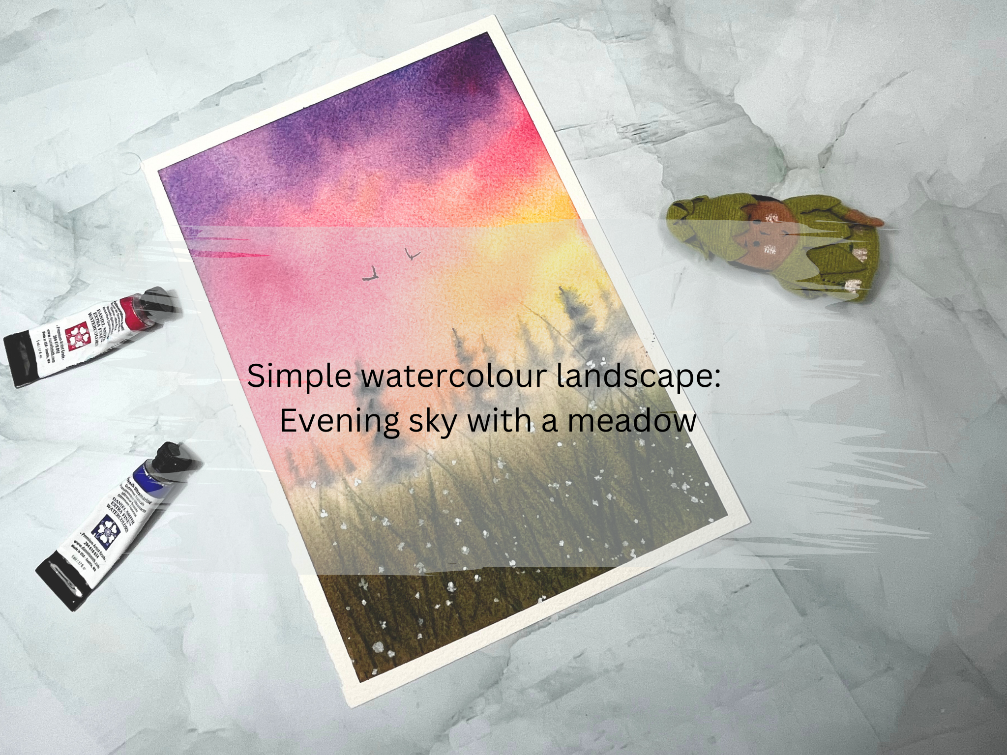
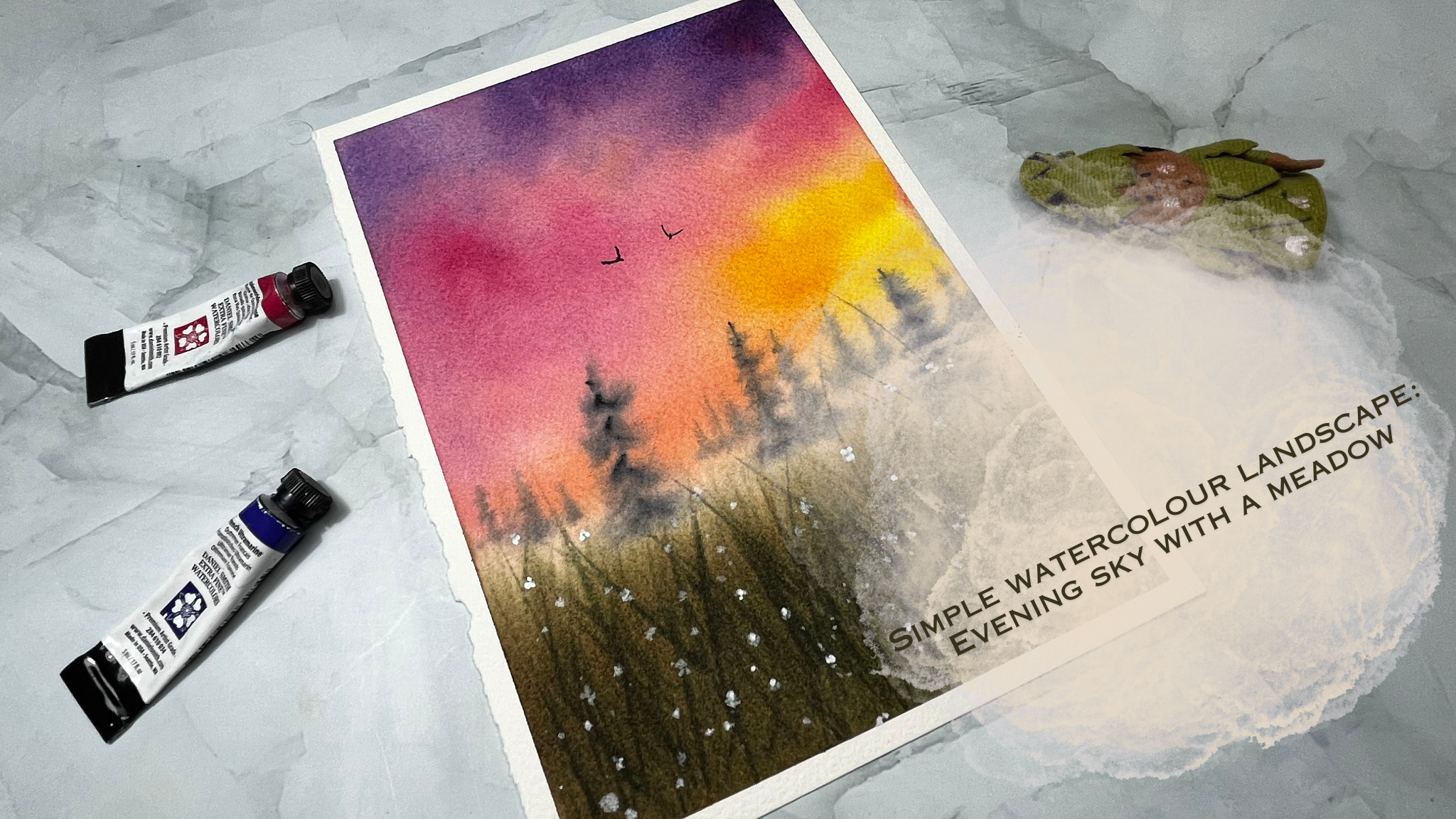
1. Welcome: Hello, everyone.
Welcome to the class. I'm Scheta, your
instructor for this class. In this class, we will paint a beautiful
landscape together. First, we will see what
art supplies we need, and then we prepare our colors. In the next sections, we
shall paint step by step, starting with the sky, then the pine trees in
the background. And finally, the foreground
meadow and some details. Here you will learn how to
give depth to your painting, how to paint the grass, how to make the sky
vibrant and interesting. If this class interests you, join me in the next section.
2. Art supplies: Let's talk about the art
supplies needed for this class. Starting with a paper,
I'm using arches, 300 GSM, 100% cotton
watercolor paper. I highly recommend using 100% cotton watercolor paper to achieve similar results
as of our class project. For the brushes, I'm using brutro size eight brush
for the initial washes, and I'm using silver black
velvet brush of Size eight. It's a round brush for painting
the sky and the meadow. Then I'm using silver
black velvet brush of Size four for
adding the details. I'm using a rigger
brush from Princeton, which is of size one, again
for detailing purpose. For the colors, I'll talk about all the colors we need in
detail in the next section. I'm using colors from
different brands such as Winsor and Newton, Daniel Smith, and also
from White Knights. I'm using a palette
to mix the colors. It comes handy all the time. I'm using a jar of water for the initial washes to mix the paint so to
clean the brushes. Then I'm using a pencil and an eraser and also a
scale for sketching. We also need a cloth towel or a paper towel to off
the excess water. I'm using a masking
tape to stick the paper and a pair of scissors
for cutting the tape. I'm also using an extra sheet. This is to cover some part of the painting while
doing this flattering. So we would need
watercolor paper. We would need
watercolor brushes, some colors, and a palette
to mix the colors, and a jar of water,
a masking tape, and a pair of scissors, and a cloth towel
or a paper towel. Eraser, pencil, and scale, and also a sheet of paper
to cover while splattering. That's all the things we need. Let's meet in the
next section and see what colors we
use for our project.
3. Let's prepare the colours: Let's see what colors we
need for this class project. We need French ultramarine. It's a warm blue color
from Daniel Smith. Next is Quinocydon rose. It's a cool red again
from Daniel Smith. Next, we have New Gamboge. It's a warm yellow color
from Daniel Smith. Then Cadmium red pale. This is from Winsoran Newton. Next is Hookers Green light. This is also from Winsor Newton. Then we would need burn Tumber again from
Windsor and Newton. And we need paints gray. This is from white kits, and we also need white ah
for adding the details. Let's watch these colors now. I'm starting with a new gamboh. It's a warm yellow color. Go for any warm yellow you have, for example, Indian
yellow or cadmium yellow. Next I'm taking the
quinocdon rose. If you don't have quin rose, you can use other cool reds like Aserin crimson or
carmine, et cetera. Next is cadmium red pale. Again, if you don't
have this color, you can mix the warm red and warm yellow to get
an orange shade. Next time picking
French ultramarine. We will not use this blue
directly in our painting. Instead, we mix it with the Qin rose to create purple shade. Next is Hooker's green light. Go for any green color here. We will anyway tone down the green by adding
the brown color. Let's take the bun t umber now. We will use the burn t umber along with the green
to paint the meadow. At last, I'm swatching
the paints gray. If you don't have the gray, go for the black color. That is all for swatching. We have all the colors here. Let's meet in the next section and start with our painting.
4. Painting the sky: A I have taped down the
paper using a masking tape. Now let's start a painting
with a simple pencil sketch. It's just a horizontal
line, nothing else. I'm taking my scale and pencil. This paper I have taken
is of size A five, if you see the length of the
paper is 21 centimeters, I divide it like three
parts, 77 and seven. I want to leave the two
third part to the sky. Let's make a mark here. Similarly to the left side, I'm making a mark by leaving 7 centimeters
from the bottom. Let's join these dots now. I would like to keep this
line as thin as possible. This shouldn't be
visible at the end. I'm also using an eraser to
make the sketch more lighter. But don't worry if you
don't see my sketch. It doesn't need to
be exact division. This is just to get an
outline for the painting. Now let's start with
the sky region. We have to vet the
whole paper to begin with because we are using
wet on wet technique here. To wet the paper, I'm using brushro size eight round brush. I'm wetting the paper
now with clean water. It's a slow process
because, you know, I want to make sure that the
whole paper is evenly wet. I'm moving the brush up
and down multiple times. This will give the paper enough
time to absorb the water. This step is really important. If we don't give enough
water to the paper, it will drive faster, and then we have to do the re
wetting of the whole paper. Instead, it's easier to spend a bit more
time at this point. Keep adding water, but make
sure that the paper is uniformly wet without any
blobs of water in the paper. I think this looks
good. Let's move on. Now, before starting
the painting, I'll remove the extra water from the edges by using a clot. This is to avoid the water from flowing back to the paper. Here you can use a paper
towel as well to do this. I'm taking the silver black
velvet brush of size eight, and let's paint the sky now. The first color we will
need is new gamboge. I'm mixing bit of water and loading the
brush with the yellow. Now, I'm going from the right
side to the left like this. Let's do that again with
some more neu gamboge. I'm going over the yellow
region to make it darker. We need some quin rose, taking the nice and
bright quin rose here, and I'm adding it above
the yellow like here. I'm holding the brush
almost at the middle. That gives me these loose ropes. I'm also adding the quinocrdon rose to the left of the yellow, little bit of blending
around the edges. Now to the top part of the sky, I'm taking the
ultramarine blue and mixing some quin rose to
get this nice purple shade. Look how beautiful
this purple is. Let's add this purple color to the top region
above the Qin rose. See. And it's okay if there
are some white spaces. It looks nicer with
uneven tonal values. Picking some more purple. Now let's blend these colors with the help of a
clean damp rush, a moving some colors here. I would like to leave
some light areas as well as it gives a
nice look to the sky. Probably we need some
more quin rose here. It looks very light. But you see, I'm only using the tip of my brush
to pick the color. I don't want it to
be too vibrant. It shouldn't dominate
other colors. Now I will add a bit of an orange at the lower
edge of the sky. You know, the boundary
here is the line we added. We don't need so much
of orange color here. Very few strokes of
orange is enough. Let's repeat the same steps again to get more
saturated look. I'm taking the new gamboge and adding it on top of
the yellow region. Next is the quinocrdon rose, and I'm adding the quinocydon
rose as before in between the purple and yellow and also
to the left of the yellow. Next, we want some purple. That's a mixture of ultramarine
blue and quin rose. I'm adding it to the
top region of the sky. You don't need to add it evenly. It's okay to leave
some regions lighter. Now, I'm blending these colors
with a clean damp brush. Always remember to remove the excess water before
you start the blending. Here, I'm not adding
any extra colors. Instead, I'm only moving
the existing colors. Okay. Now let's add
some cadmium red. I'm adding a little bit
of yellow as well so that there is a nice blend
of yellow and orange. We are mostly done. I would like to spend some time in
blending these colors. In this step, no extra water should be added to the paper. If you add more water, it will move the colors
and create blooms. I'm adding some more orange
because it felt bit dull. If you don't have this color, you can mix red with warm
yellow to get a similar shade. So this is all for the sky. In the next section,
let's paint tomato,
5. Painting the meadow: Okay, now we shall
paint the bottom part. Here we will be painting
wet on wet again. I'm taking the burn timber now. We don't want our
paper to be dry, so we have to be quick here. I have loaded the
brush with the brown, and then now I'm starting from
the bottom part like this. I'm taking more of burn tumber and making the
bottom part darker, and slowly moving upwards. Now I'll stop here and wash
my brush and clean it, and with a clean brush, I'm just blending these colors. Dragging the orange color down and also moving
this brown color up. The idea here is to keep
this transition lighter. Again, I'm having the darker
brown here at the bottom. Then I'm washing the brush, removing the excess water, and blending the colors here. Repeating the same step again. Now this region
between the sky and the meadow has a hint of
brown and orange color. Now let's give some
green to the meadow. I don't want it to be brown. I'm mixing the burnt umber with the hookers green to get
this brownish green shade. If I use the green
directly here, it is too bright and it doesn't go well
with the other colors. By mixing the brown,
I'm muting it down. Adding some water to get
more thinner consistency. And now, I'm holding
my brush like this, holding it loosely and
doing these strokes. See. Now let's do that. Hold a brush loosely almost at the end and quickly move
the brush up and down. See, it's like blades of grass. Picking some more of
brownish green color and painting the grass again. Make quick strokes and lift
the brush quickly at the end. This way, you can achieve pointy ends to the grass plates. Also, try to add these strokes
in different directions. Then it shows that the grass
plates are different ways. These strokes are smudging
as the paper is still wet. This looks good enough? We have some patch of grass now. Next I'm taking
my smaller brush, silver black velvet
brush of size four, picking some paints gray. See, I'm making it really light. I'm picking tiny amount
of the pigment and adding lots of water to it because we will paint
some background trees. They have to be lighter. I'm removing the extra
water from the brush, and then do you remember
the line we added here, which is like one
third of the painting. We shall add some pine
trees around that line. With the tip of my brush, I'm painting small trees. These are far away trees
in the background. By keeping it
lighter and smaller. We are showing that
they are distant trees. The trees we are adding are
smudging and becoming blurry. Actually, that's the intention of working on the wet surface. I'll keep adding some
more smaller trees, but I don't want to cover
the entire horizon line. We will anyway add bigger trees to the
front of this line. Now, let's paint some big trees which are nearer to our view. I'm adding one to the
left to draw a pine tree, start with the vertical line, and then from the top, make smaller brush strokes. As you move down, make
bigger brasttrokes, and make them uneven so that
they look more natural. The shape of the trees
like a triangle, which is broader at the base
and tapers down at the top. Now let's go for the
second big tree. Where shall we add one?
Maybe here to the right. I'll start again with
a vertical line, starting from the top, adding smaller brush strokes and making them
bigger as we go down. You see, I'm also
keeping them uneven. I'll add one more in the middle. Again, I'm adding
a vertical line. But this time, I made it shorter than the
other two trees. It means the stream you're adding is behind the big trees. I think I'll add one
more tree beside this. The base of both the trees
are in the same line, and hence it shows that
they're almost together. I'll wash my brush now, remove the excess water, and then with a damp brush, I'm softening the
base of each tree. If we don't do
this, it would feel that the trees don't
belong to this picture. By softening the base, they just blend into the scene. I'm going over each
tree now and defining the shape again with a bit
of darker tonal value. This add some more
highlights to the tree. If you observe, I'm
not adding water to the pigment,
picking it directly. That is to avoid it spreading. If the pigment has
water mixed with that, it s adding some small trees to the background as
it felt empty there. Remember to keep them lighter. I'm also wearing the
length of each tree. We don't want them
to look uniform. But I'm not putting effort
to draw exact shapes. They're more abstract. I want these trees that are in the
front to be more prominent. Picking the paints gray again and adding some more highlights. That is all with the trees. Before finishing, I'm
taking my rigger brush, it size one brush
from Princeton, and I'm using the same
brown green mixture. And adding some quick random
strokes here and there. Let it smudge. I'm still
working on the wet paper here. In case if your
paper is drying or already dried and
you get hard edges, then I recommend to
wait until your paper is completely dry and
then ret the whole paper. I have talked about
the reveting technique in detail in my other class, paint the magical milky way. You can check that if you
want to know more about it. Having a rigger brush
really helps here. In the initial days of
my watercolor journey, I had difficulty in
painting the grasses. No matter how much effort I put, the results were
not as expected. Then when I shifted
to the rigger brush, suddenly became easier
to paint the grasses. One last time, let's go over these trees and add
some highlights. The color we added previously
did spread slightly, especially in the background. That's all here. Let's add some final details
in the next section.
6. Painting the grass & flowers: Okay, Let's add
some more grasses in the foreground with
more darker color. You see, we have this
green brown mix, and to make it more darker, I'm adding some
paints gray to it. Now it's like a darker green. And we are just doing
the same thing. We are adding quick thin strokes
in different directions. Absorb my hand moments here. I'm making quick strokes, and also I'm quickly lifting
the brush at the end. That's how I'm getting these
thin edges at the end. It looks more
natural in this way. Also, sometimes I start my brushroke at the
middle of the meadow. Do you see that? That suggests there are some grass
blades hidden behind, like you only see half of it. This is also a way to achieve
some depth in the painting. I'll keep adding more grasses maybe longer ones this time, which are popping
out of the meadow. Here, we work from
lighter to dark colors. We started with lighter
shade of brown, and then we added
green to make it. Again, we mixed gray to make it. In this way, it feels that there are more patches
of grass behind. This line is not visible at all. I just want to make it
darker in the middle. I'm carefully going over it. I don't want to mess
it up at this point. Looks much better now. I'm picking the guage
to add some flowers. This is of milky consistency. With my rigger brush, I'm
adding some wild flowers, easy. It's spreading lightly as
the paper is somewhat wet, and in this case,
I think it's fine. But at this point, if
your paper is dry, don't worry, it's still okay. Both way works, actually. Just keep adding flowers
at random places, some to the top, some at the
bottom, to add the flowers. I'm only using the tip of my brush and
painting the petals. Like one, two, three, and four, just with four petals. Now I'll cover the top part
and add some splatters, more towards the bottom. You see, some small
drops, some big ones. I have some splatters
in the sky as well. We don't need that. Let me quickly remove it
before it rise. And now I'm taking
a different brush, silver black velvet
brush of size four, and then adding some
more splatters. We need a lot of flats in
our meadow. This is nice. I like it. Let's add
one or two birds now. I'm taking the paints gray
again with my rigger brush. I'm adjusting the consistency. But before starting, I'll dab off the excess water
from the brush. You know, at this
point, we don't want to add more
water to the paper. Now, to paint the birds, it's an easy technique. We'll just paint
a simple V shape. I'm adding a small
line in the left, drawing a second line
to the right and another small line in the middle to suggest
the body of the bird. Similarly, let's
add one more bird. You can vary the size and shape of the V structure to
have some variation. If you prefer you can
add few more birds, but I'll keep it simple. I'll not add any more birds. Before finishing, I would like
to add some more flowers, maybe defining some shapes. They are more like
blobs of paints. Let's add petals to them. And in the top region, we don't have many flowers. I'll add few in this area. Many of you might not have the white quash with
you. But don't worry. If you don't have the white ash, you can use white
water color instead. But take thicker
consistency of it. It may not be as
bright as quash, but it still works. This process of adding
flowers is very relaxing. I'm imagining a huge grassland with wild flowers everywhere, and with a small path
in the middle to walk, it would be awesome
to be at such place. Don't you think so?
That's solve to this. Let's wait for it to dry and then remove the masking
tape in the next section.
7. We are done: Okay, the painting has dried. Now let's remove
the masking tape. We should always
be extra careful here while removing
the masking tape. You know, some tapes
can tear of the paper. Always remove the tape with an angle and pull it outwards. Then we have less chance
of damaging the painting. Let's remove the last one. This is how our painting
has standed out. Nice, isn't it? I hope you enjoyed painting
this landscape with me. Thank you very much for joining. I highly recommend you
to try this project. It's not that difficult. Share your works and thoughts. Please upload your paintings
in the project section. I'm looking forward
to see you in the next class until
then, bye bye.
 Suchetha KN, Watercolour Artist