Transcripts
1. Introduction: Imagine sitting on the
top of a mountain with a cup of coffee and
witnessing the setting sun. Or maybe sitting on a beach listening to
the waves crashing against the shoreline and watching the sun
slowly going down. Isn't that amazing? Sunsets and sunrises can bring
colors to our daily life. Hello everyone. I'm Suceeta, a watercolor artist and a skillshare teacher
originally from India. Currently living in Europe, you can follow my artwork
under the Instagram handle. Suceeta underscore Ken. Today we shall paint a
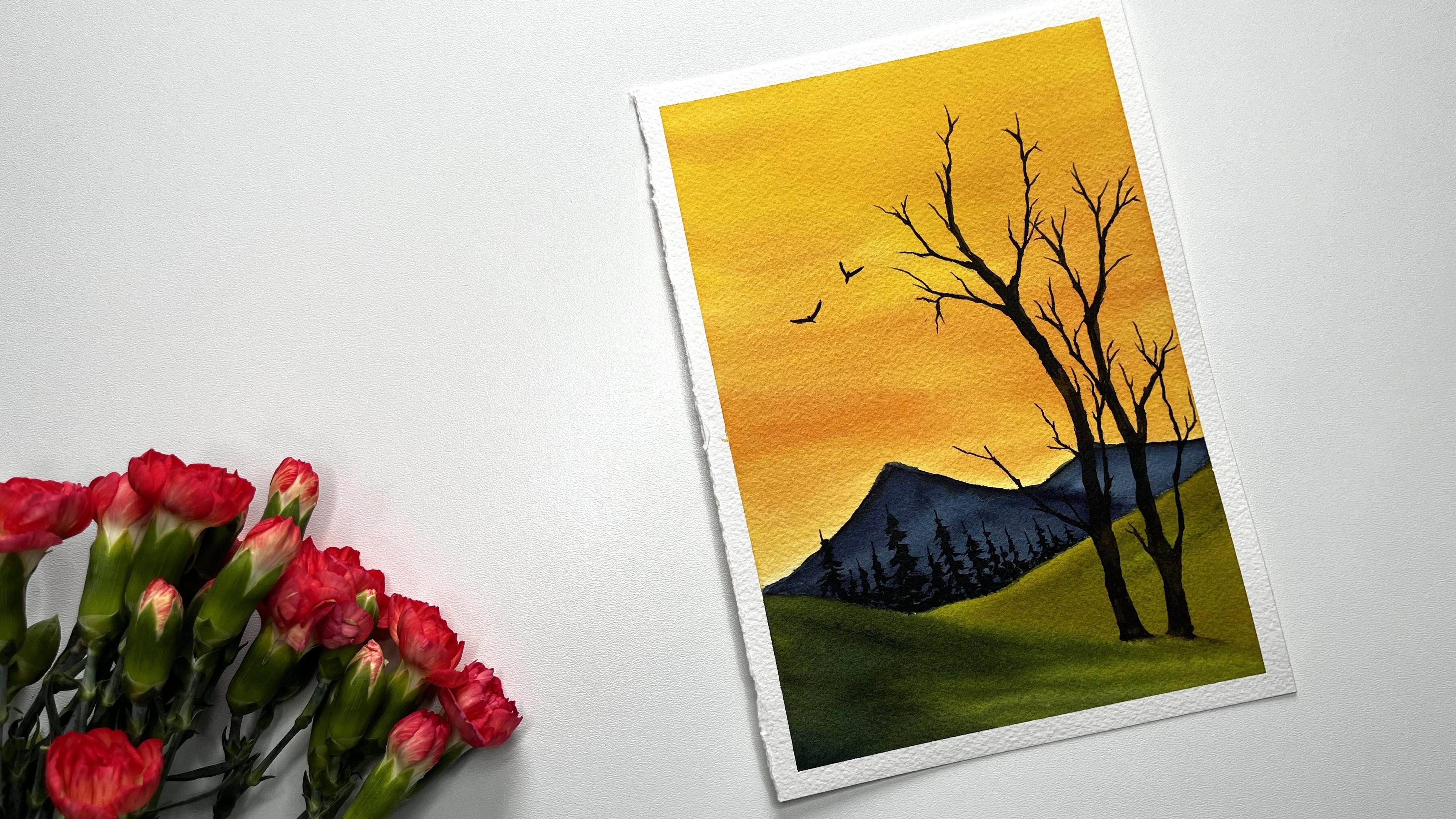
vibrant evening sky. This is an absolute
beginner friendly class. I've chosen simple painting
as our class project. In the next section,
we shall see the materials required
for this class. Then a simple sketch, followed by a detailed guide
to complete the painting. We'll be breaking down
the class project into small parts and painting
them step by step and it doesn't demand
too much of time either. At the end, you will have a beautiful painting
in your collection. So let's start
painting, shall we?
2. Materials Required: Let's quickly go through all the materials that are
required for this class. I'm using Arch is 100% cotton, 300 GSM watercolor
paper of size five. But for this class, it
is okay if you don't have 100% cotton
watercolor paper. That is because in
the class project, we don't paint multiple layers. And also we'll be
working part by part. The paper doesn't need to
be wet for longer time. For the brushes, I'll be
using a big round brush of size 14 from Winsor and Newton
for the initial washes. Also I'm using silver
black velvet brush of size 48.12 At different stages, I'm using colors from different brands such
as Daniel Smith, White Nights, and also
Winsor and Newton. The colors needed
for this project are new Gamboge, pyroal, scarlet indigo, sap, green
burned timber and ivory black. We also need a palette to mix the colors and a jar water
for the initial washes, to mix the colors. And also to clean the brush, I'll use an acrylic
board and also a masking tape to stick
my paper to the board, we need a cloth towel or a paper towel to wipe
off the excess water. We need a pencil and an
eraser for the sketching. That is all for this class. In the next section, we shall start our painting
with a simple sketch.
3. Sketching and Swatching: Hello again. Let's start
with the painting. I have taken my watercolor
paper of Pi five and stick it to the board by using the masking tape
for our painting. Let's do a simple sketch
on the lower part. I'm starting with The Meadows. It is just two lines
from both sides. Starting from the left side, slowly drawing a line
towards the right corner and bit above the center
of the first line. I'm adding another line
towards the right. You can adjust the shapes here. On the top of the meadows, we shall add some mountains, something like a triangle to suggest the shape
of the mountains. I'm adding two of them, a big and a small one. Now we have the meadows
and the mountains. On the foreground, I'll
be adding two big trees. This would be our main
focus in the painting. For the trees, I'm not
adding any details, it's just a rough sketch. I add more details while
painting the tree, but I'm making sure
that the lower part is thicker and when it goes
up, it gets thinner. I'm keeping my pencil
sketch lighter, not putting any
pressure here so that those marks will not be visible when I
finish my painting. Also, I have attached the sketch for this painting
in the resort section. You can use that as well
if you don't prefer to sketch adding some
small branches. Now, take your time
with the tree. You don't need to have exact
copy of what I'm drawing. This is just a rough sketch to know where to place the tree. I add more details to
the tree while painting. The shape of the tree
might change as well. I'm adding a second tree here. While adding the
tree, I'm making sure that the tree is
not just a straight one. I'm adding some bent
branches as well. Even here, I'm not adding much details
to the second tree, but we shall do that later. When we add colors to our trees, I'm making my second tree
smaller than the first one. These small details make our
painting more interesting. Maybe we can add some
birds here to do that. Draw an open V structure. I'm adding a small line in the middle to
suggest the body of the bird C. That gives a simple
bird without much effort. Similarly for the second bird, I'm changing the shape of the V structure just to
make them look different. That is all to the sketching. Now let's prepare our colors. Before starting the painting, we need new gamboge. This is from the
brand, Daniel Smith. I'm squeezing it to my palette. Next color we are going
to use is pyroal scarlet. This color is also
from Daniel Smith. Next color that we
are using is indigo. This is from White Knight. The next color we
need is sap green. It's a beautiful green from
the brand Daniel Smith. Then I'm taking the barn tumber, squeezing it to my palette. Finally we need ivory black. Both the ban tamber and the ivory black are
from Winsor and Newton. We have squeezed the
colors into the palette. Now let's watch them and see, I'm starting with new gamboge, Taking a nice consistency
of new gamboge here. If you don't have new gamboge, you can use Indian yellow, cadmium yellow, or any warm
yellow shade you have. This is one of the main
colors of our painting. This we use as the base
color for our sky. Next I'm taking the
pyroll scarlet. It's a vibrant red shade. Instead of pyroll scarlet, you can use any red color
you have like permanent red, cadmium red, or vermilion. In our class, we won't add
the pyroll scarlet directly. Instead we are mixing
it with a new gum, boh, to create orange shade. Let's watch the sap green. Now if you don't
have the sap green, you can use olive green, Hookers green, or any
green that you have. If you have some dark greens like Prussian green
or thalo green, you can tone down them by
adding a bit of a yellow. We are using the green
for the meadow region. I think I had a bit too
much color on my brush. When I washed my brush, the water turned
completely green. Next, let's watch the
indigo in our project. We are using the indigo mainly
to paint the mountains. If you don't have indigo
mix a bit of Tallo blue or any blue shade that you have to paint gray or maybe to black, that will give a shade
close to indigo. You can use that mixture
instead of indigo. The next color we are
using is burn timber. Burn timber is a dark
brown earth shade. Use any brown shade you
have in your collection. Burn timber along
with ivory black. We are using this mixture to
paint the foreground trees. The last color in our
list is ivory black. Use any other black
like Mars black, or lamb plaque, or even paints gray if you don't
prefer using black. These are all the colors
that we need for this class. But we shall also create some more new shades by
mixing these colors. Now we have done the sketching. We have prepared our palette. And in the next section, we shall add some
colors to our sketch.
4. Painting sky and meadow: Welcome back everyone. We shall start our painting with the sky. Let's take it step by step. I'm wetting the sky part only. Now to do that, I'm taking my big round
brush of size 14 from Windsor and Newton and applying
water to the sky region. Take any big brush you have. It'll be easy to apply water to a larger surface if
you have a big brush. If you don't have a big brush, it is still okay. It just takes a little
longer to wet the paper. Let's keep wetting the
surface of the paper. I'm carefully
applying the water, not to touch the
mountains over there. We are using ton
wet technique here. If you are a
beginner and want to understand more about
ton wet technique, then I recommend
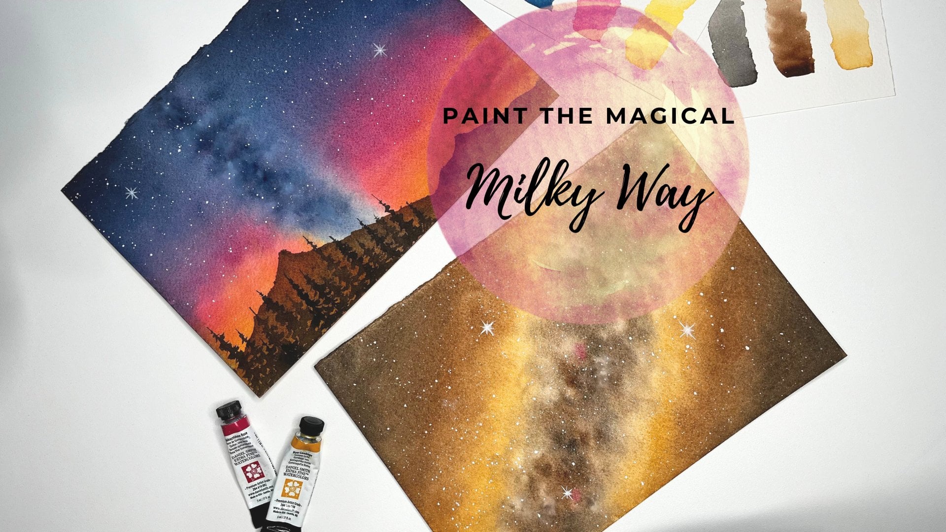
taking my class paint, the Magical Milky Way. There I have explained in
detail about ton wet technique. With example, take your time in this step and wet the paper well so that it stays
wet for longer time, especially if you're not
using 100% cotton paper. This step is very important. We're done with
wetting the sky part. I'll take my silver black
velvet brush of size 12 and loading it
with new gamboge. It got bit right up, activating it again with water. Now I'll apply it to the
whole of the sky region. As I'm using a bigger brush, I can cover the entire
sky region very quickly. This gives me more time
before the paper dries. As of now, we shall
paint the sky region. Only I'm avoiding
touching those mountains. Picking up some more
yellow and adding it to the sky region to get
a saturated look. Making those quick
horizontal strokes here not to have smooth
look to the sky. The water color when it
rise looks much lighter. To keep our painting vibrant, we should add more
colors to the paper. I'm adding another layer
of yellow to the sky. Next, let's take pyroal scarlet. I'm mixing it with new gum bosch to get this
nice orangy shade. Now I apply it to the
lower region of the sky. As the paper is still wet, The orange we are adding is
nicely blending with yellow. I started with the lower
region of the sky, but I ended up adding orange shade to the upper
region of the sky as well. But I think this is okay. Still looks good. Now the sky is a mix of yellow and orange. It gives a nice contrast. You can add a bit more
orange color if you prefer. I guess that is
enough with the sky. Now we can move
towards the meadows. To paint the meadows, let's apply water to
the meadow region. Again, I'm using
my big round brush and adding a good amount of
water to the meadow region. I should have moved
my board a bit more upwards while painting. I didn't notice it.
Sorry about that. I'll keep adding extra water because my paper
needs to be wet, at least for some
good amount of time. Now I take a smaller brush that is silver black velvet
brush of size eight. You can also go with
smaller size brush like I'm doing picking the sap green now and mixing it
with new gamboge. See how creamy it looks? I'm applying it to the right
side of the meadow region. Let's add the same colors, again, only to the right
side of the meadow. This region on the right has
more yellow shade in it. I'm assuming that this
part gets more light, and hence it looks lighter. On the other hand, the
left part of the meadow is getting lesser light
and hence it is darker. We shall add some darker tone to the left region
of the meadow. To have that color variation, I added green mixed with yellow to the right
side of the meadow. Now to the left side, I'll be adding the
sap green directly. But adding the sap
green directly did not make the left region much darker compared
to the right. To get the darker
shade of the green, I'm mixing the sap green with indigo and adding it to the left side of the meadow
on top of the sap green. Look at this dark
green mixture that we got by mixing the
indigo with sap green. See, I'm not covering the underlying sub
green layer completely. I'm leaving some parts lighter. Such color variation
which we add, give depth to our painting. Let's add some darker shade to the right side of
the meadow as well. Because it's a single color, now I'm directly adding some
sap green on the left side. Let's add some more indigo
to make it bit darker. Picking a thicker
consistency of indigo and adding directly to the
left region of the meadow. Seeing our meadow has
different shades of green, we just had one green color, but by mixing with other
shades we got lighter. As well as darker greens. We don't really need to have all the colors in
our collection. We can always mix and
create new colors. I noticed that I did not remove the extra water
around the edges. It did flow back to the paper
and created this pattern. As my paper is still wet, I can fix it by
adding dark green, which is a mixture of
sap, green, and indigo. But to avoid it happening again, I'm taking a paper
towel and carefully removing the excess water without disturbing the painting. To avoid such blooms, always make sure to remove the extra water round diges
now let's wait for it to dry. In the next section, we will add the mountains and
some pine trees.
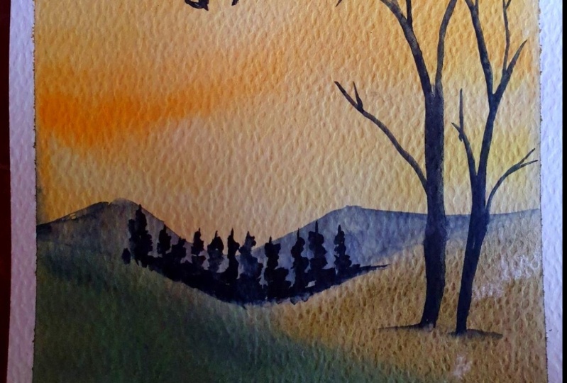
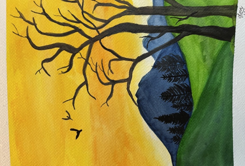
5. Mountain and pines: Now this has dried. Let's give some colors to the mountains. To paint the mountains, I'll be using silver black
velvet brush of size eight. I'm cleaning my brush and
picking up some indigo. I'm applying the color
to the mountain. Here, I haven't done the
wetting of the mountain part, the surface is still dry. This technique of
adding the paint to the dry surface is called
Ton right technique. Again, in my class paint, the Magical Milky Way, I have explained in detail
about Ton right technique. You can check that if you
want to know more about this watercolor technique here. I'm quickly going over my previous stroke
because if I let it dry, that will create a hard edge. We don't want that to happen. Taking some more indigo, we have painted over
the pencil sketch of the tree while adding
colors to the sky. Now, while painting
the mountains, we'll be going over the
pencil sketch again. It is okay if we paint over the pencil sketch of
the trees anyway, we'll be choosing a darker
color to paint the trees. We don't need to
worry about that. I did a mistake here. Accidentally, I added more water than what is actually
in the paper. The water is spreading
quickly and creating blooms. But we can fix this later. I don't want Indigo to
spread to the meadow region. I'm being careful here
using the tip of my brush. I'm slowly going
around the edges of the mountains and
adjusting the shape. As I mentioned before, I
made a mistake by giving extra water to the bigger
mountain, which created blooms. But it's okay, mistakes happen. We shall fix it by adding
more darker shade of indigo. I've taken the thicker
consistency of indigo and painting
over the blooms. Observe the mountain region of my painting,
hasn't tried yet. Still be able to
move the colors. Now we don't see
the blue anymore. With watercolor painting, it is always easy to make mistakes. For a beginner, this medium
can be challenging as well. But with practice, one will also learn how to
fix these mistakes. I'm trying to spread the indigo. I would like to have a separation
between the mountains. For that, I'm making the bigger mountain darker and keeping the smaller
mountain lighter, adding some more indigo to the bigger mountain to keep
the smaller mountain lighter. I'm cleaning my brush, removing the excess water. My brush is mostly damp now, with the help of my damp brush, I'm lifting some colors
from the smaller mountain. I still feel the bigger mountain
needs some more colors. So adding indigo again
to the big mountain, especially around the edges. Now we clearly see the separation between
the two mountains here. When it is drying, I could see some yellow
shade on the top. This is from the sky region. When I was adjusting the
shape of the mountain, I went little
outside the sketch. That is why we see this
yellow color here. But again, we can fix this with the help of darker
tonal value of indigo. I'm taking thicker
consistency of indigo and adding it over the mountains just to cover that
yellow region. We have to be careful here not to disturb
the meadow region. I still want to keep the smaller mountain lighter
compared to the big one. Now the mountain part is done, let's wait for it to dry and then we shall
add some pine trees. Now the mountain reason
has completely dried and it is time to add
some pine trees for that. I'm taking my smaller brush now, silver black velvet
brush of size four. You can also go for
a smaller brush here because the pine trees we are
adding have to be smaller. I want to use the
black color to paint the pines as the
color has been dried. I'm activating the black
color with the help of water. Now, picking up the black color, let's add the pines
along the edges here. By using the tip
of my small brush, I'm drawing a vertical
line after that. Starting from the top, I'm painting smaller,
uneven strokes. Towards the bottom, I'm
making bigger strokes, thus creating a tree
like structure. We need to add some more trees along the edge of the meadow to hide the quick transition between the mountain
and the meadow. Let's add some more trees of
different sizes and lengths. I'm randomly adding re, spines of various sizes. Some are small, some are large. Add these trees like
the way you prefer, but make sure that they
don't look symmetrical. Adding another small
tree to the left, I feel this area still
looks quite empty. So let's add few more trees
to fill up this space. I think I'm going to add some
more details to the trees. A few extra lines
here and there. Here on the right side, I don't want to add
any more pine trees because we'll be painting
the big trees here. But on the left side, maybe we can add
one or two trees, one more big tree here. We have painted the
mountains and pines overall, Everything has turned
out very well. In the next sections,
let's paint the foreground trees
as well as the birds.
6. Foreground trees: Welcome back everyone. The pines we have
added is still drying. Anyway. We can leave this
behind and paint this part. To paint the foreground trees, we'll be using a mixture
of brown and black. I'm taking the burn timber
and mixing it with black. Look at the shade,
this is creating, adding some more black to the burn timber to make
the mixture more darker. Now I'm picking up this new black
brown shade that is created and filling it inside the pencil sketch that
we added here I'm using my small silver black
velvet brush of size four. You can choose any
brush that you prefer, but the trees become
thinner towards the top. To add these thin branches, it helps to use a smaller brush. But then it doesn't
mean that you need to have the same
brush that I'm using. Choose any small brush
from your collection. Adding a small branch here, Due to all those
colors that we added, my pencil sketch is not
clearly visible here. My tree shape might change compared to what
I had in the sketch. One more branch
towards the right. We shall go over
all these branches again and add more details. We are painting
over the mountains. It shows that these
mountains are behind and a big tree
is in the front, slowly adding the colors to the trunk region as I haven't defined my
tree clearly before. And also the pencil
sketch that I have added is not
clearly visible. I'm stopping every now and
then to check if I have done it right or do I need to
make any adjustments. If you observe every time
I'm mixing the black and brown with different ratio
and painting the tree, Sometimes it has more black and sometimes it has
more brown shade in it. Instead of going
with one shade and using it to paint
the whole tree, I mix these colors. It would give a slightly
different shade every time. This gives a nice color
variation to our tree. Now I'm focusing on defining
the shape of the tree. I'm quickly adding some
branches here and there, but not in detail. Later. Once we are done with
the main shape of the tree, we shall add some
more smaller details. As the upper part of
the tree looks empty, I'm going to continue
adding some more branches. We can extend this trunk part
and create another branch. Similarly, we can add one
more branch towards the left. Don't make it a straight
line all the time. Move your brush in such a way
that it creates branch like shapes while adding
the branches. Make sure to adjust
the shape as well. The lower part of the
tree should be thicker. As it goes up, it
should get thinner. And at the top region it
should be much thinner. I'll keep mixing the black and the bond tumber to
vary the shade. Now let's start with
the second tree. I'm adding colors to the trunk region based
on the sketch we made. Though, my pencil sketch is
not clearly visible here. I still see some faint marks. Actually, we don't
want our pencil sketch to be prominent
because sometimes, especially with the
lighter shades, it is really hard to
hide those marks. It is always good
to keep your sketch lighter when you're
working with watercolors. I'm adding a branch
towards the right. Look how this mixture
of black and brown, making our trees to stand
out in the whole painting. Another small branch
towards the right. There is this branch
from the other tree crossing in a
natural environment, if there are two trees together, obviously the twigs will
be on top of one another. To depict that, let's have a
branch from the first tree crossing the second observe, I intentionally try to add bend shapes as it
looks more natural, adding small twigs at the end. Now it is time to add
some more details. I'll be going over
all these branches and defining them more clearly. Look how carefully I'm adding those branches
at the end here. We want them to be
as thin as possible. These two trees are the main subject in
our sunset painting. I'll keep adding little
details everywhere. It is going to take some time, so bear with me here. But if you want to keep
your trees simple, you can stop at any point. At this point, you can use a much thinner
brush if you want. If you have a rigger
brush that will also help to define those
thin twigs at the end. But I think I will continue with my silver black velvet
brush of size four. As it has a nice pointy edge, I can easily add
smaller details. We shall add branches
of different lens. Here, I'm adding a small one. Now let's move to the top part of the tree to add some details. Making some space for my hand. Observe the way I'm holding my brush while
adding the details. I'm holding the brush
close to the tip. This will give more
control over the strokes. Do you see the different
shades in our tree? At some places it is more. At some places it is more B. This is what I was talking
about when I was mixing the black and brown every
time to vary the shade. Now I'm trying to add these small branches in
different directions. As we go towards the edge, the branches will get thinner. This we need to keep in mind. Sometimes I add a branch, then I don't like the
shape or its position. Then I try to change it by extending or adding some
more details around it. This is what happening here. I didn't like this branch and
ended up tweaking it a bit, but that doesn't
work all the time. Sometimes it would
even get worse. But luckily for this painting, I managed to get it right. If you prefer, you can
practice these strokes on a paper and then paint
that senior painting. I'm highlighting every
time when something goes wrong while
painting that way. I can also show you how to fix some of the common
mistakes that we do. For example, what happens
when we add more water, Or what happens if
we don't remove the excess water from the
edges around the paper? Now you know how to
fix those things. And the other thing
is we tend to get demotivated if something
doesn't go right. I wanted to show that
it is still okay. There would be a
way to fix that. But if something happens with a painting and there
is no way to fix that, I would still say
it is no big deal. It's just a paper
that we wasted. And on the other hand, we would learn so much from our failures. Everyone would be in this place at one point or the other, so just hang in there. Things will eventually
come around. I'm again, adjusting the size of the trunk and adding
the colors as required. Let's add some more details
to the second tree as well. Maybe a little branch
here would look good. I would like to make this
right branch prominent, adding more colors
and details to it. Some branches that we added here might not be
very important. It doesn't make much
difference without them. But this one we are working with now is a significant one. If we don't have this branch, then it would change the
look of the tree completely. When it comes to
adding the details, it is always tricky to
say how much is too much. I tend to overwork my paintings, sometimes I wouldn't
even notice that. But I can say with more
and more experience, I'm getting the hang of it. If you also feel that it is hard for you to
decide where to stop, just get away from your painting and take a look
at it as a whole. If it is good enough, you can stop right there. Otherwise, you can go
with little more details. It takes some experience to
get this intuitive feeling. But don't worry, it
comes with practice. I would like to make
this branch thicker. It is like the extension of
the main trunk of the tree. Overall, I'm really happy with the way the painting
is coming together. The multiple shades of green we added to the meadow
makes it very pretty. The sky with a bright yellow
and orange looks vibrant. I wanted to keep my
mountains much lighter, but ended up adding
multiple layers of indigo. Then it got a
saturated look still. I feel it's good with
a big bare trees here. The painting gets the
sense of tranquility. I think once we add
those flying birds, it would be more
complete As you know, I would be going over all these branches
and fine tune them. So this is going
to take a while. Feel free to stop at any point. I think this looks good. Maybe we need to have something more at the top of
the second three. Okay, let's add another branch. This process of
adding colors and branches to the tree
is so relaxing. I can keep adding more
and more branches, but I need to stop
at this point. Our painting shouldn't feel
like it is overworked. Now, the bottom part of both the trees is not
blended with the background. They have hard
edge to soften it. I'm washing my brush, wiping off the excess water, and slowly spreading the colors. But to do this, just make sure that your brush doesn't
have too much water. We should only use a
clean, damp brush here. Now we are done with a tree. Only thing that is left is
to paint those little birds, which we shall do in
the next section.
7. Final details: Okay, here I started
to paint the bird, but for some reason my
camera did not record it. Anyway, I'll be
painting them again. To paint these birds, I'm using black color. Loading my brush
with a black and slowly painting over the
pencil sketch that we made. This shape represents
the flying bird. These two lines of the
represent the wings. I'm making it thicker
by going over it again. Also, I'm adding a small line in the middle to suggest
the body of the bird. I'm carefully doing this, even though these
details are small, they can impact the look
of the whole painting. I have had many
paintings that look bad just because of the
birds that I added. Let's repeat the same process
with a second bird as well. Painting on the top of the
pencil sketch we made, adding black to the V shape and then adding a small
line in the center. Now we have our two
flying birds in the sky. We are almost done, but before finishing, I see
some patterns created here. Do you see that the transition between the mountains
and the meadow is not smooth to cover that part I'm going to add some small
trees around the edge. They don't need to be too big because the focus here
should be on the big trees. It shows that these pines
are far behind in the scene, whereas the big trees we have
added are near to our view. But make sure that
all these pints that we are adding
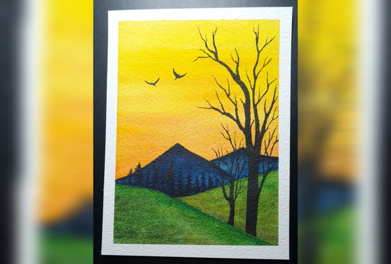
don't look the same. Yes, we're done with
a class project and let's remove the
masking tape and see how our painting
has turned out. This is the best part of finishing the
painting, isn't it? I would always feel excited
to see how my painting would look after my tape is removed
while removing the tape, be sure to remove it with
an angle like I'm doing, hence, it doesn't disturb the paper and spoil
the painting. This is how our painting
has tanned out. I really love these
bright colors. Thank you so much for
joining the class. Hope you enjoyed painting this. Don't forget to upload
your creations in the project section so
that I can see them. Also, if you share this on
Instagram, me at Suceta. Underscore Ken. Thank
you again. See you soon.
 Suchetha KN, Watercolour Artist