Paint Sparkling Seawater in Watercolor | Malcolm Dewey | Skillshare

Playback Speed


1.0x


  • 0.5x
  • 0.75x
  • 1x (Normal)
  • 1.25x
  • 1.5x
  • 1.75x
  • 2x

Paint Sparkling Seawater in Watercolor

teacher avatar Malcolm Dewey, Artist and Author

Watch this class and thousands more

Get unlimited access to every class
Taught by industry leaders & working professionals
Topics include illustration, design, photography, and more

Watch this class and thousands more

Get unlimited access to every class
Taught by industry leaders & working professionals
Topics include illustration, design, photography, and more

Lessons in This Class

    • 1.

      What You Will Learn

      1:00

    • 2.

      Materials and Big Idea

      2:23

    • 3.

      First and Second Wash

      11:16

    • 4.

      Final Wash and Reveal

      8:29

    • 5.

      Conclusion

      1:05

  • --
  • Beginner level
  • Intermediate level
  • Advanced level
  • All levels

Community Generated

The level is determined by a majority opinion of students who have reviewed this class. The teacher's recommendation is shown until at least 5 student responses are collected.

24

Students

1

Projects

About This Class

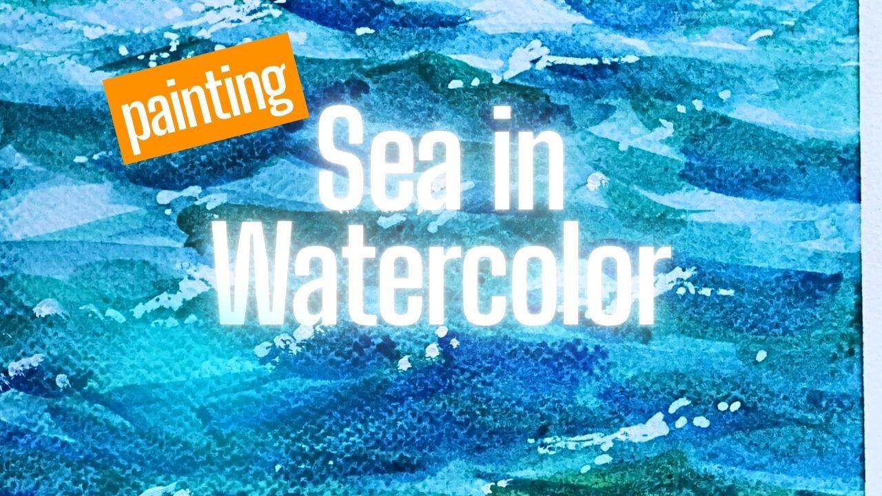
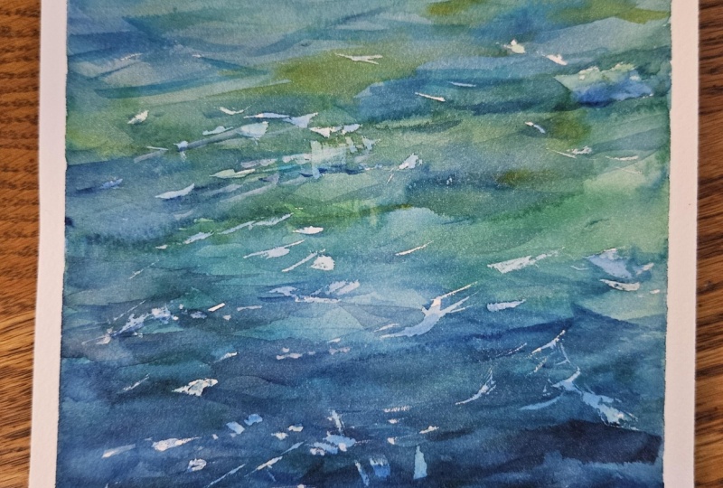
In this short watercolor class, I’ll show you how to paint an impression of sparkling seawater using subtle value shifts, layered color, and masking liquid for crisp highlights.Rather than painting every wave in detail, we’ll focus on the essential elements that make ocean water feel alive: movement, transparency, saturation changes, and the contrast between deep blue-green passages and bright reflected light. This class is ideal for beginners with some watercolor experience as well as intermediate painters who want to loosen up and create more convincing water effects. In the lesson, you’ll learn how to:

  • simplify the surface of the sea into abstract shapes
  • Use value changes to suggest movement and depth
  • build rich blue and teal color mixtures
  • vary saturation for a more natural water effect
  • Apply masking liquid to preserve sparkling highlights
  • Finish a small seawater study in one sitting

This is a quick, practical class designed to help you build confidence with watercolor seascapes and create a study you can complete in one session. By the end of the class, you’ll have your own small painting of shimmering seawater and a simple process you can use again in future seascapes.

Meet Your Teacher

Teacher Profile Image

Malcolm Dewey

Artist and Author

Teacher

Professional artist and author. I work in oils painting in a contemporary impressionist style. Mostly landscapes and figure studies. I have a number of painting courses both online and workshops for beginners through to intermediate artists. 

My publications include books on outdoor painting, how to paint loose and content marketing tips for creative people.

My goal is to help people start painting and encourage them with excellent lessons that they can use for years to come.

See full profile

Level: Beginner

Class Ratings

Expectations Met?
    Exceeded!
  • 0%
  • Yes
  • 0%
  • Somewhat
  • 0%
  • Not really
  • 0%

Why Join Skillshare?

Take award-winning Skillshare Original Classes

Each class has short lessons, hands-on projects

Your membership supports Skillshare teachers

Learn From Anywhere

Take classes on the go with the Skillshare app. Stream or download to watch on the plane, the subway, or wherever you learn best.

Transcripts

1. What You Will Learn: Well, I want to welcome you to this short lesson, and it's about painting water in watercolor. More specifically, seawater and how to get a sense of movement, a bit of energy. A suggestion of realism, but leaving it store very loose, very painterly. And also, how do you get that sparkle in the water? There's a couple of little techniques I'm going to show you, but this is all designed to be a quick subject that you can do right away. Work through a weekend and get something down and see how easy it is to get that sense of water using watercolor. Let's begin. 2. Materials and Big Idea: Ma'am, ma'am. Okay, let's have a quick look at the materials I'm going to be using, keeping it once again, very simple. We're just painting water. So just a few colors, some watercolor paper. And I'm going to be using something that I don't normally use, and that is a masking liquid. But this is a masking liquid pen, and it's entirely optional, but it's one thing that you might want to use to get some extra sparkle in your water, and one that I finally feel a bit more comfortable using. Otherwise, if you don't have that, it's not a problem, either. It's all about the brushwork and color. I also want to look at some references. Now, there's no perfect reference. Sea water is basically what you're looking at here. It's not particularly rough seas. It's just the water, the motion of the water. And that's what I'm focusing on. And what I want you to look out for is the lights and darks. You see there's a shadow side of these small waves, and then the top is catching the light. And then the other movement of the ripples of the water creates these subtle diagonals, leaning one way and then the next. So you've got a play of values, shadow and light, and also composition elements where there are the diagonal brush strokes. And, of course, there's going to be the horizontal strokes that represent the flat water, and the flat water is picking up the reflection from the sky, so those will be the lights. And that's it, really. So if you get those elements in your painting, you should be able to create the illusion of water. Anyway, that's what we're going to be trying. So let's begin with the painting. 3. First and Second Wash: Mm, whim. Alright, it's time to paint, and I'm going to be starting with a basic wash and let that dry and then get into adding more color over that, working the values, lights and darks, and just trying to get some movement and suggest the seawater in a way that you instinctively look at it and feel connected to that scene. And you can see that it has a sense of realism, but also very loose, very painterly. Okay, let's go for it. Well, I'm painting on 300 GSM coal press paper. And I've got my paints in this little set of plastic compartments. Getting out the large mop brush, and we're just going to get some dark washers going at the bottom. I think I just need to wet this paper a little more, so I'm going to keep things wet with a spray bottle and just atomize some water over it from time to time. And you can see just basic gradated wash with ultramarine blue, some thalo green. You can use viridian, as well. A little touch of lazarin crimson has got in there as well. Just let that just get nice and wet and just run a bit and settle in. A lot of these organic shapes will all settle down and fit in very nicely, as you can see, just making the brush strokes a little smaller as they get up the top of the page. Let that run a little, not too fussy. Most of this is going to disappear. And I'm going to actually lighten the top up not just for the sky but also the water that's seawater, that's closer to the horizon line. Better to actually use a cloth and not tissue doesn't disintegrate on me like this. So we're going to have larger strokes at the bottom. Let that dry five to 10 minutes depending on the climate. And as you can see the a fair amount of color at the bottom, but very light from the middle up. I've now got a basic round brush, and I'm going to just figure out a horizon line leaving the sky pretty much blank, might just warm it up a little, but we don't want. This is just water. This is nothing fancy, no boats, no yachts, no little fish, just water. I want sparkling water. Okay, moment of truth. My first time using the pen version. My first use of the pen version of the masking liquid. So in the foreground, I'm going to have a few, but you can see they are going to be a little less sparkly than the ones at the top, because there's lots of bright sparkle further ahead. A lot depends on the angle of the sunlight, et cetera, but it's generally, you'll get all that bright sparkle further away from you and closer up, you'll get more saturated color and a sense of depth in the water. Now, this pen, you can shake it. You can also, in fact, you need to press the nib down, and that sort of pumps the liquid towards the nib. So considering the direction of the sunlight, basically coming from left to right. So the sparkle is going to be sort of on the left side of the small waves and a little less on the right. Kind of just planning ahead. And now I've got to make sure in my pain strokes, they sort of fall in line with where I'm putting these dots of masking liquid. It has to sort of make sense. So that dries for 10 minutes or so. And while that's drying, I'm going to add a touch of warmth with a very loose wash of yellow ochre in the sky, and that should take care of the sky. And from this point on, I can just focus on the water. My brain may be just bringing a little touch of ochre into the water as well to reflect a bit of that sky color. As you can see now I'm making a dark stroke on the right hand side of the sparkle. And it'll be mostly lighter value color on the left hand side of where the sparkle is. In the foreground, not too important. I'm treating it more or less as a deep shadow color in the foreground. Now, brought in a touch of the green. So we're going to have a variety of blue and cool, transparent greens to get that nice sense of seawater. As you can see, they're just pulling the brush up to get a thinner line towards the tail of the wave. Variety of thickness of stroke as well is important. In general, though, the strokes get narrower towards the top near the horizon, due to the effect of distance, of course, we want that sense of recession of the waves. Lighter in general, as well, towards the top. And slightly warmed up now, a little bit of ochre, which once painted over the blue gets a sort of greenish look to it. Don't worry if you put a touch too much ochre, like I've done there, it will all settle in, and there'll be a few subsequent layers as well. Just reserving some lights as well. Straightening up that horizon there. But yes, I've got to reserve a few lights as well. So that will sort of mimic the possibly breaking these little breaking waves and just suggesting a bit of lightish foam on top of the water. I think the important idea is that I'm not painting big crashing waves. This is sort of gentle seawater, and I'm more interested in creating a sense of light and also depth in the foreground. As we build up the dark and light shapes, this brings some variety to the overall surface, and I'm not looking at simply a flat, single color. So if it is looking a bit flat and too light, you need some darker values, so you got to get some shadow waves and now I brought in a touch of cobalt blue and thalo green or viridian, either one will do. No particular reason for the cobalt, other than that, I have it on the palette and it will work very nicely. Whether you've got ultramarine or cobalt, it doesn't matter, although I'd probably use ultramarine as the foundation color with a bit of green into that will look very nice. So we've got a real foundation here. Let's call this a blocking in stage. And I'm just trying to make sure it's interesting or heading in that direction. Using this sort of midsize mop now to build up a little bit of variety, slight value shifts, painting wet into wet. Making sure I've still got some lights in the sort of middle to distant areas and dark values and big strokes in the foreground to enhance a sense of space and depth and also a little bit of mystery in the foreground. Variety, blue and green. So it's coming together. I'll let this settle a little but not too dry completely. From this point on, we're always painting wet into wet. Depends on the degree of wetness, and it doesn't have to be soaking wet. You can always sprit a little water over it just to liven it up as well. 4. Final Wash and Reveal: Ma'am, ma'am. And now it is just foot down, and we go for it and see it through, and then assess at the end. The main thing I want with this lesson is for you to just let go, have fun, let it happen. It's really nothing to get all tense about. And when you get tense and nervous, bit anxious with watercolor, it never works out quite how you want it to because watercolor on you to come to the party re because watercolor wants you to come to the party relaxed and just having some fun. And once you've finished with this painting, you can start the next one. It's as simple as that. And that is how you're going to just get more comfortable with it. But trust me, just go for it. Take your time and have some fun. Don't worry about the outcome. Worry. Don't worry about the outcome. Enjoy the process step by step with me. Right, let's get into the rest of this painting. But in this stage, we start refining the surface some more. Basically, once the watercolors have settled a little, not completely dry, but settled, and you see the surface starts looking a little bit flat. I'm just actually wetting the surface with the sprayer just slightly just to help the water to be absorbed and to try to increase the sense of depth in the foreground and also raise the surface in the distance. As I said, it tends to look a bit flat, and that's why I'm coming in with a few darker strokes because value contrast is what keeps the surface from looking too flat. If everything is very sort of middle value, it tends to just, well, you know, look a little boring. You want light and you want dark, not just middle value. Even lights and just middle values is going to still be relatively flat looking. So some of these waves must have fairly strong dark value, basically, shadow values. There are shadows out there, as you can see in the reference, and you've got to communicate that shadows against lights to create a dynamic surface, one that suggests movement. Increasing the brush size, bringing in a bit more deep green. Still transparent, of course. There's no opaque colors going down, trying to keep it as transparent as possible, but not that it looks lacking in pigment and saturation. So you want to have blues, overlapping greens, dark blue, light blue, and that gives a nice watery sense of depth and makes you want to look at the surface. Kind of interesting. Bring in a bit more ultramarine, once again, getting those dark shapes in lifting the contrast in the foreground. And you have to be patient. You have to know also when to stop. And I'm very careful about avoiding the middle and the distance getting too opaque with dark color. Saving that more for the foreground and you kind of step over the dark foreground and head off into the distance. So once this is settled down and dried a bit, I'm going to remove the masking liquid. Now you have to let the painting dry completely. And when it has dried, it's the exciting time of removing the masking liquid. You can use a stiff brush and rub the masking liquid off or as I'm doing, lightly with the finger. And just gently take it off. And if you see your paints coming off and you are worried that it hasn't dried completely, obviously, stop, let everything dry down. And then the masking liquid should come off quite easily. And as you can see, it reveals a nice bit of strong light, creating a little bit of sparkle. So it's a really nice way to get an effect which is otherwise really not possible with watercolor to leave reserve voids that are so small like this. It's just not really going to happen, especially against dark value shapes. So make sure you've got all the masking liquid off. It's actually quite easy to overlook some of it. Since it is blue in color, its a problem with this palette. But there's some coming through there. So in the foreground, there was a little bit of blue wash already, so it's not going to be quite as bright, and that's really what I wanted because the foreground is somewhat in a shadow of some sort, almost an imaginary shadow, but one that I felt was necessary to create a sense of depth in the painting or at least help to get that effect. So we're still getting the appearance of bubbles, perhaps, and things like that. Is it enough? I'm feeling I need a few little bits of sparkle in the foreground, after all, so I'm going to get a tube of white gouache paint, dip the brush in and get that white gouache out neat and put a few select dots here or there, being very careful not to overdo it. But I just felt we needed a couple more in the foreground, and the guas does actually dry down and become fairly dull in its own way. If you're familiar with guash, you'll know that it settles down quite dramatically and dries and it gets dark as it dries. So it's not going to be too demanding. Nevertheless, I think it does look consistent with the entire painting. So that's it. Let's get the tape off. And overall, it's been a fun painting, very simple concept, but nice to look at a little bit of sea that you've created with watercolor. So I think it's now time for you to have a go with this fun little project. 5. Conclusion: So there we have it a quick project for you to try out this weekend and just work through it have as much fun as you possibly can because this really is, I think, a subject that's going to surprise you with the end result and you're going to be pleased with it. We're not going for perfection. I certainly wasn't trying to achieve perfection, and I was enjoying myself with this little sketch, as well, and that's all I want with you. Have fun, learn something, and look forward to the next project. And then share your work. That's the idea behind this. Do the painting, upload the photo. I'd love to see your work, and other artists as well, would love to see your work and share their experience. So don't be shy. Share your painting, and let's all enjoy and learn something new with watercolor.