Transcripts
1. What you will learn: Hello and welcome to
loosen up your painting. What can you expect
in this course? This course continues from my foundation course called
learn to paint with impact. Now we're going to take
all that information and learn how to create paintings from start
to finish that have that loose and
painterly effect. Remember, a loose painting
is one that is giving the brush a lot more
expressiveness. There's more paint. This emphasis of
light and color also, it's about getting that
energy in the painting. We don't want something
that is drawn laboriously and over painted
and overwork to be flat. We want something that
is little vibrant, a little more expressive, a lot more energy behind it. Visible brushstrokes,
texture, and that essential quality that makes it look like
a real painting. When you can admire across the room straightaway and
then go up closer and enjoy that texture and
brushwork and there's juicy paint color nodes. So start off by looking at
some brushwork techniques, the kinds of brushes to use, a painting knife, what you can hope to achieve with
those simple tools. And then we will look at how
to speed up your painting. A painting that is
done quicker but store effectively will have a lot
more painterly qualities, will cover different
subjects as well. Landscape or seascape, sunset, sunrise, all those things
that you love to paint, you'll be able to do with
a lot more confidence and with something that
is giving you pleasure, more impressionistic,
more expressive. That all sounds good to you. Then let's begin with the course and explore how to
loosen up your painting.
2. What Brush to Use and Why: In this lesson, we're
going to look at the paint brushes that are used. And you may get some tips on what brush could work the
best for you as well. Of course, brushes are one of the most important
tools in your studio. A lot of artists enjoy
using a painting knife, but I always suggest that the brush has the
most personality. Although sometimes the painting enough gets a lot of attention. The most complete way of getting an image on your canvas is
going to be with the brush. And as you practice more and
more with your painting, you're gonna get more and
more confident with creating many different effects with
the old-fashioned paintbrush. Now one of the most
important tips that I give every
artist who wants to loosen up the painting
is to use a bigger brush. Most artists,
especially beginners, or are struggling
with confidence, are using a small brush. Very easy to fall into that trap as you're painting along and
you're using a small brush, I would say anything
from a number four downwards is going
to be very small brush. But unfortunately, a
lot of artists will try and do the entire painting with a small number four brush. This is number eight. Still quite big. This is a long flat. By contrast, a number four
brush looks like this. This one is a little bit worn, but you can see the
huge size difference. Now, this brush is fine for
creating a small shape, but for loose painting and end an expressive
impressionist work, a large brush is critical, especially in the first
Three-quarters of the painting. Bring the little
brush in at the end for some smaller details. A branch or some small rocks on a road or
something like that. You could use the smaller
brush, but you know what, You could make those shapes
with this brush as well. It's got a thin, flat side and a corner. And you can create a very expressive but smaller
shapes that way. So as I said, the most
important way and the quickest way to loosen up your painting is stick
with a large brush. If you feel
uncomfortable with using a brush like this, persist. You will find, you
will get accustomed to it and you will enjoy
the loose effects that it gives you without even trying this brush is going
to save your painting. Now, what size brush to
suggest for a large brush? Well, first of all, I'll
start off with the idea of use a brush that is so large, you feel kind of uncomfortable
with it at first. So a small 10-by-12 painting. You can do half
the painting with the size brush very
easily and effectively. And you will see me do that in some forthcoming
lessons as well. And then when you've
got the blocking in them and the second stage
where you've refined shapes, you can start looking at
those smaller shapes that may be easier with
a brush like this. But until you are comfortable
with these big brushes, use them for your entire
painting if you can, just to see how it works. So start to finish. Use a number eight brush on a ten bar 12 or six
pi eight panel. You can use the number six brush as well in the latter
stages perhaps, but nothing smaller than that. Long flat brushes or
a long, full build. I'll show you those in a moment. These are the brushes
that are going to give you that
spring you need. And the big shapes. Very versatile. You can make all sorts of shapes with the different
ends of the brush. Another important part of the
brush is the handle, right? I've already shown you some
of this in brush techniques, but use the long handle
for as long as possible. You've coded with a long
handle and your arm out. You're gonna run a void. Painting those little pen
or pencil type shapes. When you holding the brush
like this, it's no good. Hold it like this. And along your four fingers like this and held in
place with the thumb. Just lightly close your
fingers and use the brush, almost like a magic wand. And it'll be just as rewarding. But with those motions using your forearm and your shoulder, to put the strokes down, you're going to get
a stroke that is more expressive and looser, not pushing down into
the layers of paint and stabbing at your easel to try and get
something to happen. It's not the reason I can put wet wet paint without
messing it all up is because it's a light stroke gliding across the top
of that wet paint. Alright. Just play around with that idea. Just with no pressure. And a blank canvas or
something like that. Just practice putting down paint gently and in big shapes. Alright, so that
is a critical tip. I can give you a now let's go into the next
video and I'm going to just give you a quick
rundown of my favorite brushes. And maybe you can stock up on a few of
those for yourself.
3. My Brush Selection and Cleaning Tips: Alright, let's have
a look at a few of the brushes that
I use every day. And you can see if
you need to stock up on a few of these brushes for your studio tonight to keep my brushes in a
roll-up like this. You can make when you
solve if you want to, just held together
with an elastic band. Now the typical brushes
that I'm going to use will be a long
flat like this. It says a number eight. And this is actually
a brush made by Raphael called Paris classic. But any number eight brush
in this range will do it. If you struggle with finding a brush that looks like
this as the number eight, this is probably half
an inch wide as well, so that might help you. Some of the numbering
can be very different. So this is, as I said, a long flat and our preferred
long flats to short flats, because I have more spring that will slow way down and eventually they'll
become a short flat, which I use for scrubbing
in first layers preps. The long flat gives
you a great shape. The next one I'll
recommend you get is a full bird that's
got the rounded shape. This is a number six and
it's very versatile shape, I think probably preferred
by portrait artists, but also to make
more organic shapes without that
distinctive hard edge, the full Bird is great for that. Another important shape that you'll come across is a round. This is a long Brazil around. Or cell number eight are
perhaps I use around very seldom comparative,
too long flats. But there was a very
pleasant to use and without rounded head give you a
sort of a softer edge. Painting stroke. And other signs that are recommended for long
flat is number six. Brushes that you're
gonna be using typically will be a number
eight and number six. So if you have two long flats, Let's can handle pretty much most paintings situations
I do not recommend. Beginners get involved
with very large paintings. Certainly, brush like this
would not be easy to use. The smallest brush
that I would be using as a general painting
brush would be a number four. It says along flat bristle
made Bar Pro Arte, also very nice brush. All of these are standard
hug, Hey, bristle brushes. And I use those
for oil painting. If I'm going to
use acrylic paint, our users synthetic
hair brush like this. This is a Georgian,
it's called cooler. And synthetic. It works much better with water. Brussels. Don't like water, these
natural bristles. And it comes to cleaning. I'll use a solvent
to clean these. What solvents do I suggest? Well, during my
painting process, I will sometimes dip the
brush into a pollutant. This is called existed. That's nontoxic or say as a
pleasant citrus smell to it. So what mass to use? So what I do during
my painting is poor a little bit of that
in a container. So as I'm painting, and if I need to give the brush a little
bit more of a clean, I will drop the Brussels
into that liquid and then put off with some tissue paper and
carry on painting. Or don't use
turpentine or kerosene or anything like that
during my painting process. Because those pollutants
are extremely strong, I don't want them to break
down the paint color. For the most part, during the painting process, I will only use tissue
paper to wipe off paint and then acquire more clean paint and
carry on painting. So very little pollutants take, are involved in my painting
process for the most part, clean off with a tissue. Carry on painting. Now one other brush that I use, and that's the smallest
brush is a rigor. And it's got this
long hair, very thin. This is a number to
George M. And this I use for your OPT
masks for instance, or as the name suggests, rigging, maybe some
little twigs shapes. And of course, to
sign your name, you need a brush full that on
this regular will do that. But this usually comes
into the boards. The end of the painting. 90% of the painting
is covered with number eight and number
six brushes and a rigor. If only just to sign your name.
4. Clean Color Notes : Hello, welcome
back to my studio. And this video I'm
going to talk about rather vague topic of
clean color notes. Now why clean color notes? Well, first of all, what is a color note? When I talk about coming notes, I'm really talking
about each mark I make with the
brush on the canvas. So every time put on a
brushstroke of paint, it leaves a mark, and that is a color note. On a color note relies
on the actual color off M6 and how it works next
to all the other colors. Like Kim, musical arrangement. Of course, if you put all the
notes in the right place, the music sounds great. And you put your color
notes in the right place. The painting looks great to
know at least the calendars, color notes, or about
the Kelly and mixed, but also getting them
clean is important. I want each color notes
that I've put down to work and be right in
the place I've put it. So I've got to mix
the color correctly, but I've also got to
apply it in a way that makes the color
stand out to best effect. So brushwork is critical and something that artists
very often ignore, focus on the paint and etc, but the brushwork sometimes
just leave to chance. Let's have a look at a
painting I've done recently, this painting over here. When you look at it up close, you can see a lot
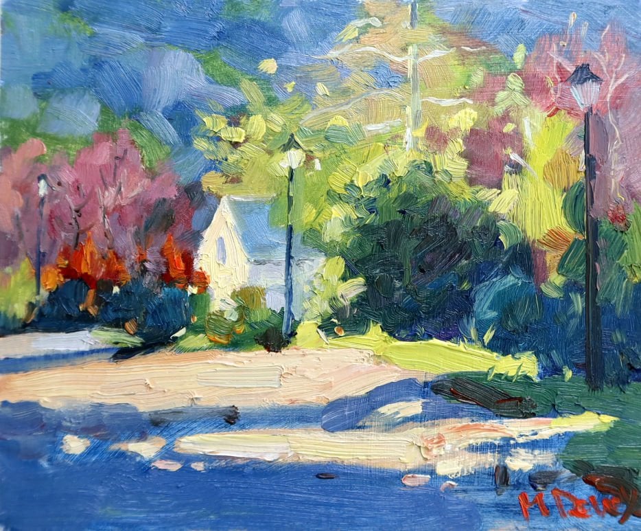
of the brush marks. In fact, you're looking at many, many color modes or arranged. Over here. The yellows are
very similar in value, but you can still
make out the front. Brush marks, some a little dark, others lighter, a little
warmer or cooler. We are perhaps more obvious
with a strong value contrast. The color nodes of the
blues and the colonists, the orange, more obvious or
apparent when you look at it. But what I want is
when viewed up-close, you can see interesting
brushwork and color notes. All of those individual
brushstrokes have given a
different color note. Their own day, their
own special moment. And all of those notes hopefully
working nicely together. Don't blend your
brushstrokes away. Fiddle with them when
you put them down, because then you're
probably going to mix in other way to paint and
muddy it up and lose the vibrancy you had with that paint that you
took all the trouble to mix as well and then lost it on the canvas when
you put it down. Let's have a look at master painters, especially
the impressionists. Consider the painting is
not just about the subject, but how they've applied paint brush strokes while that color is used
next to another color. And the shape of the brush stroke as
well all play a part. And if you consider each brushstroke and color note as put down with an intention. And you're trying to
achieve something, you respect that brushstroke lot more and you'll give it
closer attention and ultimately end up with
a more vibrant painting and color that
really is beautiful, warm or cool or whatever
you try to achieve. You got the idea across. And it looks so much more impressive when the
colors are working. Clearly a tough
subject to explain. Hopefully it's giving you
something to think about and apply with your painting and get intentional brushwork
into your process as well. Alright, so I've added a
few videos at the end of this video for you to
look at on the end rolls. So have a look at those. They may also give you
some useful information. Excellent, Well, if you
enjoyed this video, give it a like if you can, that would be fantastic. I'll see you again probably
next week with another video. So if you've subscribed, I hope to see you
again in the meantime, enjoy your painting
and chairs for now.
5. Loose Brushwork Techniques : The first brushwork
technique is one that's very easy and everyone
should be using it. And it's using thick
and thin paint. The typical situation is if
you're painting some shadows, It's good to use a thin paint. So let's say for example, That's our shadow
across the road. You keep that nice and thin. It's a cool color and
clearly it demonstrates a shadow area because next
to it is going to be a warm, light, sun-filled
part of the painting. And with that, you
can use thick paint. Really get it onto
your brush and put that down next to
the thin paint. And that contrast between thick and thin hopes to
emphasize the shadow. You can go over the
light area with more layers and really
build it up as well. The other important thing about brushwork is how you
actually hold the brush. You've got a nice
long brush handle. So use it. Especially when you're
starting a painting. Try and hold the brush at
the end of the handle, using the arm to move
the brush round and get nice big, bold brush marks. When you are developing
the painting, you'll find that you may want
to hold the brush closer to the head of the brush
to get more details, controlled and finer strokes. And that's a good thing. The other thing about
holding the brush is done. Hold the brush like a pencil. You're not writing
with the brush. The ideal way to
hold the brush is simply as if you're holding
a baton across the palm. And the four fingers. It's comfortable. It's not a white knuckled group. It's comfortable and loose, but gives you the ability to vary the manner
you hold the brush very easily and also the
strength of the brushstroke. Loose lines. Try and use as
many loose lines as you can, rather than worrying about getting lines
perfectly straight. So for example, if I'm
painting branches, Let's imagine this is a tree. And I want to get the branches across the face of the tree. I'll use a rigger brush like
this and use loose lines. The technique there is
simply to hold the brush slightly between thumb
and the fingers. And you can roll the brush or twisted as you're
doing the line. I'm also using my whole arm. Now let gravity just
pull my hand and arm down and at the same
time drag the brush, twisting as I go. And that helps to get what we
call Lost and Found lines. It looks very organic. This creates a natural
break in the consistency of the line and that is
quite appealing as well. Another example is if you're
doing masks on a yacht. Instead of making the masks perfectly straight
as if you using a ruler just to
the mask quickly. And you get lovely
impressionist view of that master instead. Another important technique
is what are called the dry brush scramble. Scumbling is a great
way to get light across a darker
surface. For instance. Let's imagine this is the
surface up some water. And to create a nice
impressionistic effect of light across that, I'm gonna get a lot
of paint on my brush. Load up the paint
nice and thick. Don't dilute it. And make sure your surface
is not too thick and weight. Ideally, it's dried
a little overnight. And then simply holding the brush parallel,
again quite loosely. Just simply drag it over in a confidence stroke and you
get this broken light effect. Using the dry brush
scramble gives wonderful sense of light
across a flat surface. The next technique
involves Debs, lines and mass shapes. We've got in a mesh shape here, which is the foliage
of the tree. Add some interest. Break up the space
by adding dabs, either slightly overlapping
of the main shape. Or also creating gaps between the marks and the main shapes. Between these dabs
and the main shape. You can still imagine there
are joined by thin branches. They're not necessarily
viewed by the viewer. But you know, in your
mind though all there. Of course, you can also add
a few extra lines as well to help the viewer make
these mental connections. Also add touches of warm
light here and there. To add extra sparkle. Our carving out a shape. Sometimes we're so focused
on the positive shape. Let's say the tree trunk that we forget that we can
actually create positive shapes by painting
in the negative shapes. So for example, the
negative shape here would be the sky
behind this tree. So why not make some scar
halls and at the same time, carve out a few
other shapes that might add some more
interest to the tree. So I can prep suggest
something else. Creating a positive
shape between the light shapes there,
another branch. But it's quite an
interesting shape simply by using the negative shape
to carve that art. And we're not carve out
these positive shapes. I like to use a fairly
good amount of paint on the brush and keep
the brush straight, fairly short and make a
deliberate brush marks. The point here is
don't always be fixated on the positive shape. Also consider carving art, or sometimes referred
to as cutting in. So you can make a shape
smaller by cutting in, reducing it in size and getting a generally a more
interesting shape. Another handy thing to remember, the brushwork is to
use direction lines, for example, on the road. Another example is if
you're drawing a hill, you may want to use
brush strokes to indicate the or a centroid, the direction of the hill. Like this. The natural contours
and curving shapes are given better effect
when you use the brush. Descriptive brushwork. Something similar. But for instance,
here it can use soft flowing lines
to suggest grass, perhaps moving in the direction of the wind blowing
through the grass. Other animate things
and inanimate things all have characteristics which
you need to keep in mind. So think about what it is
you're actually painting and trying to adapt the
brushwork accordingly. Another example would be if
you painting rocks, clearly, a rock consists of
a hard surface, hard edges, and therefore strong hard lines will
accentuate those as well. But if you're painting
something soft, Let's say a dress or lines of a dress that's, that's flowing. Soft lines, the
left softer edges. And you can drag the
brush in a sort of direction that suggests a
moving or flowing lines. Other ways I like to hold a brush or applied
paint is using a twisting motion
to put the paint down and then leave it alone. Let's say you put on a
good amount of paint. You don't have to smooth
it all out and flatten it. What you can do is apply, twist the brush, get the
pan off and liftoff. Put the paint down. Loved. And this way, you create a lot of
texture and you don't lose all of that thick paint. You just put down. Getting that nice and
juicy thick paint. And that all helps to create an exceptional painting
that has good brushwork. And it's interesting to look
at not only from far off, but also close up.
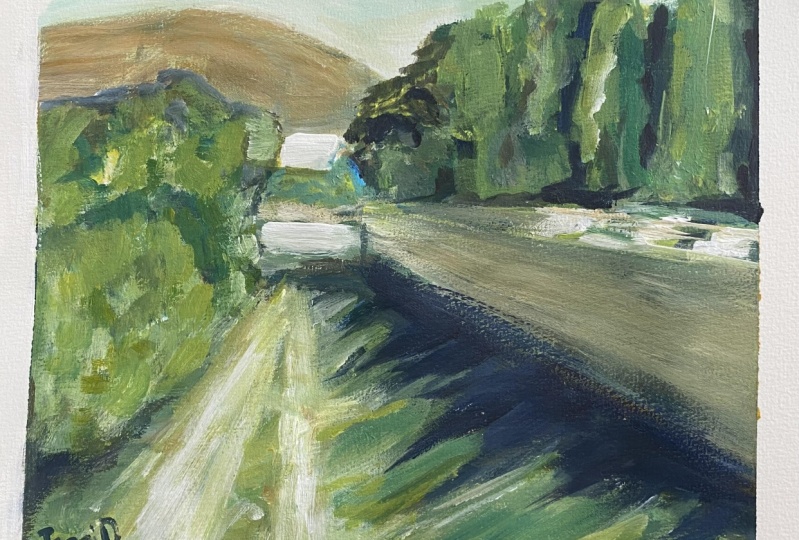
6. Loose Brushwork Demonstration: Now let's put the brushwork
techniques into effect. With this exercise. I'm using number eight,
bristle brushes only. I've got a number of them ready. And I'm going to try
and get this study done in a loose and
impressionist fashion, just using the big brushes. So starting off with the
ultramarine and a bit of burnt sienna to get the shadow family soaps
or blocked him first. As you know, the process basically start off with
your darkest darks. And from there you can
go into middle values or the lighter slides very often go straight into the
lightest lights off towards. But as long as you get your
dark mass shapes in first, It's much easier to relate to other values to
that darkest dark. What I'm cutting the horizon
line and related the wall to that horizon line or the eyeline which is the road at
the end of this path. I'm putting a little
blue into the mix here to get the dark green
Store working with the darks. Slight values shift
but not much. Now a little bit more color, just where the lights are going, but it's not the
lightest lights yet. Stall in the shadow
family for the most part. Now, the Buddhist cerulean just to cool those shadows
down a little. So this is important. I'm not bringing any
white paint in as yet. So the blocking in is
strictly with color. Getting these first layers in. And then I will go
over these layers and adjust values or temperature. But any value adjustment
in the shadows or the lights is going to
be relatively slight. Remain within the light
or shadow family. Colors. What you've
learned to sing, learn to paint with
impact, perhaps already. With a bit of yellow
and yellow ocher. I'm gonna do the light hills at the back and also
the path in the front. Appendage here is pretty
much my standard palette, except I have put
in a cadmium yellow deep in addition to the
cadmium yellow, lemon. For the rest, ultramarine
blue, cerulean, red light alizarin
chromosome, yellow, ocher, and burnt sienna
make up the palette. Now I've swapped brushes
for these lighter colors. Just to start bringing in
the green color notes. Although there is some
mixing at this stage. I got the white paint
or titanium white, and I'm going to start
with the lighter colors. Cerulean and alizarin
in this white paint. And more or less where
that house is gonna go. It's gonna be pretty much
consisting of two shapes, the side of the
house and a roof. And you may say that is way too little information
to suggest that horse, but you'll see as I get
the positive shaping and then cut in with the
negative shapes around it. It will read correctly as
a house in the distance. No details required. But of yellow ocher
into that cool mix. Just cooling it down a little
more to get a gray for the wall that is going to
be in front of that house. Little yellow, yellow
ocher and white. And that will be the road
which is quite light. But because it's some
way in the distance, are still need to
make it less light or less warm than the foreground
lights are going to be. The perspective is very
much a centroid ID in the reference photo with a
relatively wide angle photo. And I'm getting a little more. I'd say creative with
the perspective in the painting to get some
perspective certainly, but not down that
long tunnel effect. Now going over this yellow ocher with mostly cerulean
and little white. And therefore I'm getting
a cool wall color. And basically the two. Colors, cerulean
and yellow ocher, creating a cool
yellow for the wall. The sky, very simple, just some white and a
bit of yellow ocher for a warm sky is not enough sky there to really
make much more of it. So it's simply there
as a light shape, the extreme light, loosely
carved in now around this. The mountain.
Helping to describe the mountain as well as the
scar or with one stroke. But of cutting in
around the trees. Just watch out for picking up any paint that's going
to contaminate your lights. Make sure you wipe that off. You can see that just
keep those colors clean. Alright, now, second layer
over the road colors. Getting the value
but more accurate. But nice and light and warm. Much warmer than the
road in the background. But of course, this
exercise is about getting yourself familiar with big
shapes and big brush marks. It's not about that perfectly
completed painting. But I can assure you
that if you follow this procedure with the
subject through to the end, you will get an
attractive painting that is loose, vibrant, full of light, and pleasing enough with sufficient detail
to satisfy the viewer. Because the details consist of big shapes of light and
dark and warm and cool color. Not pebbles and leaves and twigs and a 101 little insignificant
details and a painting. Those are insignificant
details because they don't add to the
effect of light. We are painting light
and atmosphere. And how those things
affect the big shapes. Be looking at some
mostly cadmium, yellow, lemon, and
little bit of blue. To make these
atmospheric greens. The darker greens
get ultra marine. And cool, lighter greens
get more cerulean. And that's how our
vary between colors. The relative warmth or
coolness of a color. Ultramarine is a bit
warmer, Syrians, but cooler, cadmium yellow
lemons cooler, cadmium yellow, deep, warmer, titanium, white will always cool
things down further. As far as rates are concerned, cadmium red light is warmer. Alizarin crimson
is the cool red. Right? Getting variety with
these poplar trees behind the wall simply by
making more shapes. Now the hill at the back gets adjusted with a second layer, lots of juicy paint
on the brush. Calvin there to suggest
that roof of the house. Try and do these shapes with as few brush marks as you can. And there'll be more
expressive and interesting. Carve into the tree is little
to add a little variety, putting a few scar holes, just dab of the brush. And that's it. Going over that wall there, making a little more of
a cool yellow ocher. The main wall on the right
gets touched, more lights, knows where it's filtering through the tree is hitting
the top of the wall. The greens down the middle of the path are warmed up
with a bit more yellow. Cut in again. Just to get a little
more interesting. Very few straight
lines in nature. So let's a little
bit of cutting in, make things a bit more
erratic but more interesting. Slightly orangey colors on the top of that tree
and the distance. Although there's a lot of
warmth and color in the scene, I'm not using colors
straight out the tube and straight paint
onto the canvas. I do break the colors a little, either with white
or another color to desaturate a little
straight from the tube, it's simply too saturated. So in nature, most colors are slightly gray or even
substantially grey. Could be a cool or warm
gray, but nevertheless, you need to adjust the
colors a little or a lot depending on what
you are looking at. Side of the house getting just a little more
definition with a cooler gray made up of
cerulean white, and alizarin. So this is pretty
much already done as a blocking or a
quick study, maybe. Just with one size brush, lots of paint, big shapes. And isn't that
surprising how much can be suggested with large
shapes like this? Remember, I'm painting on
a small surface as well. This is an A5 size piece of
paper that I've just sewed. So what's that more or less a
six by eight panel perhaps. And that's all you need, ten by 12 at the most. Small surface, but in big shapes and
generous brushstrokes. And that's a lot of fun to get a quick Alla prima
painting like this. So practice this practice, these quicker study is
working a little quicker. This could perhaps
take you an hour to do no more than that. And try and work with vigor. Intuitively. Look at your subject,
squint a little. If you need to isolate a shape, it makes it put it down as say. So what do you need to
adjust the values slightly, or the color temperature
must be warmer or cooler. Work accordingly and you'll
get that looser look. Helped a lot by your brush. And of course, an
attitude of adventure. And you'll be avoiding
that tightening up where you're sweating over little details and getting
more and more anxious. You don't want to be anxious, you want to be free and
easy and having fun. I've left the shadows at
the base of the wall, as you can see, pretty
much untouched. As the ultramarine,
thin and transparent compared to the thick
light colors tape off. Let's have a look and
have a go yourself.
7. Final Thoughts: Well done. You've reached the end of this course and
you've learned a lot. I hope you're
feeling inspired to try a few different things
with your painting. Make a few changes. Try a bigger brush, whatever it may be to try
and get some progress or stimulate a new
direction in your painting. But remember, it's not
all plain sailing. Painting is a lifelong
passion for all of us. And to get the best out of
this course and your painting, you need to work
regularly every month. At least try to complete
one or two paintings. Ideally, you painting a
couple of times each week. More the better practice. These lessons, do, the
demonstrations more than once. You'll find, each
time you'll learn something new and there
will be some improvements. By practicing the exercises
and doing the demonstrations. You will cement all
the information and things become
more second nature. You get that muscle memory going and you'll
find it much easier. As you go. Dd, you're going to find your own references and scenes to paint and
look for scenes that you particularly
love and enjoy. That will certainly help your painting
process and help you connect to the
subject a lot more. Well, enjoy the journey that doesn't end at keeps
getting better. So have fun. Remember to share
your progress and your painting
results in the learn to paint community as well. And let me know any ideas or
questions you might have. I'm happy to help. Thanks for joining the course. And happy painting.
 Malcolm Dewey, Artist and Author