Transcripts
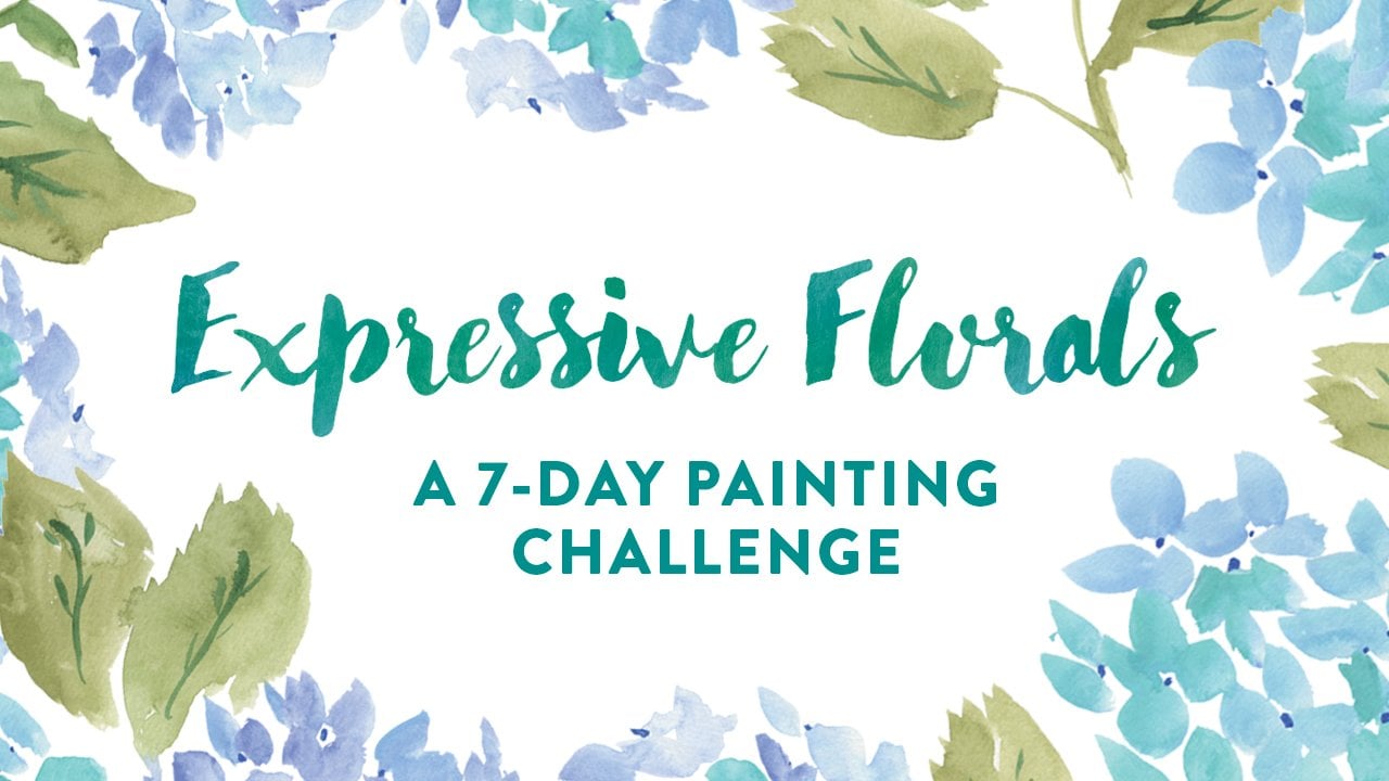
1. Intro + About the Series: Hey everyone, my name is Juliet Meeks, and I'm a designer and artist. I do a lot of surface pattern design and watercolor. This seven-day watercolor challenge is inspired by a 30-day challenge that I did a while back called 30 Painted Things. You can go back and check out the challenge under the hashtag on Instagram, #30paintedthings. This is a new series of classes I'm doing. Each challenge is going to be themed with different fun things to paint. The first one in the series is called expressive florals, so if you want to start with that one, you can, or you're welcome to start with this class too. This class is perfect for watercolor beginners, but it can be for anyone of any experience level. I'll be going over all the basic watercolors supplies you'll need, some warm-up exercises, and just taking you through very step-by-step of painting seven different types of objects. Even though this is formatted as a seven-day challenge, you can definitely start and stop at your own pace. I encourage you to try and paint your objects seven days in a row, just because it will really keep you in the group, and start to help to develop your own sense of style with your watercolor painting. As you're working through this class, I encourage you to find ways to put your own spin on your objects, whether that's different colors that you like to use, or adding special details that are unique to you. It's really going to make your objects quirkier, and more unique. I'd love to follow along with your paintings as you're doing them, so please share your paintings to the class project on Skillshare, or you're definitely welcome to share your paintings on Instagram. We have a class hashtag for everyone to look through, and it's #quirkyobjectschallenge. You can also go back and look at my first class in the series hashtag, which is expressive florals challenge. If you're ready to get started in the next video, we'll be going over all the watercolor supplies and some warm-up exercises before we start on Day 1.
2. Supplies + Painting Warm Up: We're going to get started talking about the basic watercolors supplies you'll need. I've got a square watercolor journal here. It's not the highest quality paper, but it's fine for our purposes. I'll have a link to all of the supplies in the class description. I have just a binder clip here to keep the pages flat as we're painting. I've got a whole bunch of brushes here just to show you a variety of what I use. But in general, for this class, we'll probably be using brushes on the smaller end. I tend to paint things on a smaller scale, and these brushes are great for adding little details. These are just a lower and synthetic brush that I really like to use, whereas these are non synthetic brushes. All great brands, really awesome to play with. This one on the left is a mop brush, so you can get a really nice tip, and also just to a bigger blob of paint, which is really helpful. You'll need a paper towel and also two jars of water, one for cooler and one for warmer colors so they don't get muddy. This is a plastic palette that I got on Amazon. You can also use a paper plate or a ceramic dish or something like that. I've got a variety of watercolor brands here. I like to use tubes as well because I find it easier to mix colors then the pan watercolors, but you can use whatever's up to your preference. These are Holbein watercolors, which I find to be pretty opaque. So you can always add a little bit extra water if you want that really watery effect. All of these watercolors are by Winsor and Newton. There's the cotton line, which is the lower price line and the professional line as well, and I like using both. I just started trying these watercolors by Daniel Smith and they're really nice quality. I encourage you to just experiment with different brands to find the one that you really like. That's it for supplies. We'll move on to doing some simple warm up exercises to get you started. I'd recommend doing a warm-up exercise before you paint each day's object just to loosen you up. I'm grabbing my mop brush here and just a little bit of paint that I already have on my palate. A lot of water gets held in this brush. I'm just adding a little bit to the page and then I'm going to grab even more water, and just really let it blend to show you how light you can get that color. I'll add a little bit more of the watercolor to the left side just to create this Andre effect. You can play with the watercolor a lot when it's wet. Even when it's dried a little bit, you can use a paper towel and gently erase something that you don't like. It's not going to be perfect, but you can get it off the paper for the most part. What I'm going to do here is just play with different shades of blue, and create these connecting dots and letting them blend in with each other, and really just creating unique colors across every dot. Now I'm just going to paint some lines with a different brush, not creating perfectly straight lines, but getting different thickness just to add some variety and loosen up my stroke making. I'll do a similar practice of blending with the warmer colors as well. You can see I am just getting right up to the edge here and letting that red blend into the yellow. Lastly, I'll grab some different greens and just paint some simple leafy branches. Just an easy thing to start with because it doesn't really have to look perfect or like anything in particular. You can just leave something like this up to your imagination. That's it for warming up. Again, I encourage you to try and do this every day before you paint your objects, and don't forget that the link to all of the supplies, is in the class description.
3. Day 1: Donuts: Our first object is going to be relatively simple donuts. What I've done is, found an image on Google and printed it out just to have as a reference. I just use this black and white printer, which is really fine because then you can really focus on just the shapes and making the colors whatever you want. I'm just going to grab this yellow ocher watercolor, and I mixed a little tiny bit of burnt sienna in it, just give it a little bit more of a brown than yellow effect. But I didn't want to do too much, just want to keep it nice and light for the background, so that when we put the icing on top, that part is really opaque. So I'm creating this really organic shapes, and starting with the outside and using lots of water, and then mixing in some pigment, and then again water. Not worrying about creating perfect circles because I think they're a little bit more charming that way when they're irregular around the edges. Then, I just make my away inside to make the donut hole. Then we're going to let that dry. It's very important to let it dry because you don't want your top layer to get muddy with the layer beneath it. I grab this pink watercolor for the top part of the first donut. For some reason, I noticed this color gets extra bubbly, although it does get better once it dries, but you can always fix any bubbles in photoshop really quickly with the Healing Brush Tool. I've got another cobalt green for this other donut. I just think it's a cute color to go with the pink. Then for the third donut, just a slightly different shade of pink. This one, since I use so much water, it started to blend in a little bit with the background of the donut, but not too bad. And then finally, just making sure that that layer is dry, you just paint your sprinkles on top. I like to use colors that makes sense for the icing color, so nothing that would blend in too much. White always works really well, and then just lighter tones, especially for this green donut. Then for the other pinks, you could use red or just darker colors to make sure that they don't blend in perfectly with the icing behind it. What I did once everything was dry, was scan it in and pull in to Photoshop and clean it up. If you're not familiar with how to do that, I do that in two of my other classes. In my class, from painting to pattern, how to turn your watercolors into repeating patterns, I go through that really in detail, especially for watercolors, of how to clean up your designs, scan them correctly and turn them into patterns. So any of these objects that we paint today, would be fun patterns for sure. I also show you how to clean up your water colors a little bit in my last seven day challenge class, which was expressive florals.
4. Day 2: Potted Succulents: Welcome to Day 2 of the challenge. Today is a fun one. We're going to be painting potted succulents. I've found an image from Google that I really liked, and a pot that I liked. But you can use your imagination when it comes to painting the pot. In real life, this pot is actually gray, but I'm going to make it pink, and that's going to be your first step is painting the pot. The style that we're going to be going after is more of a flat illustration style with a little bit of final details painted on the plants on top at the very end. I'll also be adding a little subtle pattern to the pot as well. I'm just getting the shape right highlighted here. Don't want it to be too small because I don't want it to look small compared to the plants. Then once I get this right, I'm going to make sure it dries fully before I move on to the next step. Now for step two, we're going to be painting our succulents. I like to use lots of different greens when it comes to painting the actual plants. Feel free to grab all the different greens that you have. Then you can also mix different greens together to get a fresh color. I'm starting first with the biggest succulent right in the front. Not worried about getting a perfect shape of the plant, I'm just getting the general leaves down, and I'll be adding details later on top of this layer once it dries. [MUSIC] Next, I'll grab a new shade of green to make the next succulent. The one next to it is obviously darker. These leaves are a little bit more round, so that's what I'm focusing on. Just keeping them imperfect, which I think ends up with a more charming, quirky illustration. One thing that I do like to do is have a variety of shades within that green color, so you'll see that some of these leaves are darker, and then some are lighter because I'm using more water, and I think that's just the beauty of watercolor, and add some more interest. I'm going to move on now to the little stripy plants on the left, which are super cute. One of the main reasons why I picked this potted succulent because I just really love those little details like that. I'm just quickly thinking about composition here, keeping the feel really organic, and trying to make sure that the left and the right sides are balanced out somewhat, but again, not super perfect. [MUSIC] Now I'll grab a lighter, more yellow, olive-green for the little bunches in the back, and these are really fun to paint. Again, I'm making sure the greens next to each other, on the other types of plants aren't exactly the same shade of green. [MUSIC] Now that the pot is also already dry, I'm going to go ahead and add my little dotted details on top. I'm just doing all types of different little dots, not exactly perfect polka dots, just to mimic more of a texture than a polka dot. [MUSIC] I'm also just going to grab a little bit of brown just to add some little patches of dirt. Then I felt like my pot could be just a little bit more 3D, so I'm just adding a little rounded detail on the back edge here. Now we'll just let this dry until we move on to the details step, which is my favorite part. You want to make sure it fully dries, because we're going to be using white on top of those little spiky plants if you make one like this, so you don't want the colors to mix in together. I'm just going to grab my white and get my smallest brush out, and just add these tiny little stripes to this guy over here. [MUSIC] Then what I'll do is get an even darker green than the succulent right in the front, and just mimic some shadows along each of the little leaves, just to give it more of a 3D effect yet still keeping that flat feel. I'll do the same with the one on the right. That's it. In the next video, we're going to be painting a fun patterned rug.
5. Day 3: Patterned Rug: Today we're going to be painting a patterned rug, which will be mostly up to your imagination. I've got this one that I grabbed from Google, and I'm really just referencing this for the shape of the rug, and I'm going to make up my pattern for the rug completely. I'm going to paint the base of the rug first, and I would suggest either doing a really light color or a really dark color that you would use lighter pattern elements on top of. I'm going with one that's really light. I'm going to use pink because that's my go to, and I'm just going to make sure it's nice and light so that the elements that I paint over it are really visible. So just make your rectangle shape first I'm using a good bit of water. I'm using one of my larger brushes. Then once you have the general shape down while it's still pretty wet, I'm going to do the little fringy elements on the end. I'm going to use a smaller brush for this, of course, just so I can get the really little details of the fringe. I could have maybe used even a smaller brush than this, but I think that it works. Just going up and down using lots of water, letting a go out to the sides a little bit just to add a little sense of movement. Then we're going to let the base of your rug fully dry. Now that your rug has fully dried, This is really the fun part. It's up to your imagination. You can use any color palette you want. You can create any type of pattern you want. You could do something floral based. I'm going to do just some basic geometric shapes and make up the color palette as I go. I've got a small brush here, since this is pretty detailed and small, and I'm starting from the center and just doing a basic diamond shape and going from there. I like the idea of playing with some elements on the corners just to draw your eye towards the center, and also keep the pattern moving around. So I'm going to move on to my next color. This process is really meditative and even get carried away creating all types of little tiny rugs and all kinds of patterns. I just love doing these, there is so much fun. I'm going to bring in some solid lines in again. Since that green is right in the middle, I want to tie it somewhere else. So I'm putting it on the sides here, to give you a little bit of insight into how I choose colors, it's become a very intuitive process for me and it will definitely get easier as you continue to play with fresh color palettes. But I like to use contrasting colors often. So if I'm using a lot of pink, I'll add a touch of green or something like that, or if I'm using more colors that are analogous to each other, I'll use different shades of pink and red all within one design. I think it just adds a lots of variety and interests rather than just using one solid color across everything, and there you have a cute tiny little rug.
6. Day 4: Ladybug: Today we are painting a little lady bug. I've got my image from Google. This one I did make sure and double-check on the computer just to get my colors right since I am printing it on my black and white printer. If you do the more classic ladybug you just need red, white, and black. I'm going to start with the red part of the body first and, since that's the biggest part and I'll be adding details on top of it later, just to make sure that it drives all the way. I'm using a good bit of water here so that the black details on top will stand out. Just let this part dry until we move on to the next step. Now I'm going to grab my black and paint the rest of the body. You'll see, with my style it's imperfect, a little bit wonky, which I like. Now I'm going to add the details on top. There's a line going down the center, but I'm not going to make it a perfect line. I'm just going to let it break, wherever. It's really just a personal preference. I just feel like it looks a little bit more organic and wonky. Then we'll let this fully dry. Next, I'm just going to add a couple of tiny little white details. This really, I think, ties it all together. In the next day of the challenge, we're going to be painting some floral tea cups.
7. Day 5: Teacups: Today we'll just be pulling images online and finding your favorite tea cup. I like to do more vintage style tea cups. Then I chose two that have floral illustrations on them, because that's just what I'm drawn to. We're going to start with the base of the tea cups. I'm using lighter colors, so that the details on top can really stand out. Just going to start with the rim of the cup here and creating the outline. But what all we doing is using water to just get rid of that outline and blend it in with the fill. I think that looks pretty good. I'm going to move on to the next one. I'm just doing two today to have a variety and paint some different fun patterns. Like I've been saying throughout the class, you can see the shapes of these cups aren't perfect and they're really meant to be that way. It just gives them more character. Then we'll want to make sure this layer is fully dry. I'm looking at the patterns on the tea cup examples I've got. I'm not really going to match them exactly, just going to be playful with them. I love how these vintage tea cups have illustrations on the inside of the cup. That's what I'm focusing on. Sometimes with these tiny details like this, I don't like to use a ton of water. As I'm painting these yellow flowers, I'm realizing I may be used a little bit too much water. On the next florals, I'm going to use a little bit less and give it more even opaque look and easier to paint with when you're painting really small. I usually like to paint the petals of florals first and then add the leaves later. You could do the opposite and just make sure that the leaves below fully dry. This leaf was a little bit to light, so I'm adding some darker layers on top. On this pink cup, I'm going to do lots of greenery instead of more floral. Now I'm going to add a little bit of lavender to this one just to give it more of a popup color, and then also tie in the other tea cup. Now I loved how this tea cup had these white coconut, so I definitely wanted to include those. One thing I do wish I had done with these tea cups after I made them, was made the little handles more detailed, because I think that would be a fun, quirky or element to add in than just like the simple shapes. Now I'm just going to take this gold as if it would be a metallic gold rim. Then we'll let this dry. I'm going to paint a super light, subtle pink stripe over this pink cup just to give it some texture. Then what I'd like to do is take a really, really light wash of black watercolor. It's really just like a tiny dot of black mixed in with a lot of water just to create a simple shadow. That's it for these cute tea cups and for the next day, we'll be painting a glue.
8. Day 6: Globe: Today we'll be painting a globe and I've grabbed my image from Google, found one that has a nice contrast so that you can see the shapes of the countries. Then we'll be starting with a light to medium blue as the base. I'm not really making a perfect circle, but just something that has a slightly wacky shape than a perfect circle. Then we want to make sure that's fully dried. Now we'll grab a smaller brush to start painting the countries. It's nice when you're painting the countries to make them recognizable, but still have their own character because they aren't going to be the perfect exact shape of the actual countries. It just makes them really charming. Make sure you include the countries that are along the side of the globe because that really gives it more of a 3D globe effect. Then I like to include the smaller countries and islands as well. Now I'll be taking some burnt sienna mixed in with a little bit of yellow ocher to paint the rest of the globe as a base. Then we'll also be adding details on top of this as well. I'll use a different brown for the very bottom of the base. Then we'll let this dry. Now I'll just add a tiny bit of black to the brown color that I had made to paint the details on top. Just looking at my reference photo to get the shapes right. I added some lines here just to give it a little bit more definition. Then I decided last minute to go in and add some of the text on the globe and also the equator line, I just think it looks really cute. That's it for the globe and for our final day of the challenge we'll be painting a floral bouquet.
9. Day 7: Bouquet: For our final day of the challenge, we're going to paint a floral bouquet. I've grabbed a couple of different images here from online, just to have a variety of shapes to pull from as inspiration. The type of bouquet that we're painting today is going to be one that's tied at the bottom with a little ribbon. I like to start with the green area of the bouquet first, getting the general shape down with different stands. You can always add more later if you want to keep it fuller, or you can keep it more simple as well. I'm also using a variety of greens as I paint these and different shapes of leaves which helped keep it interesting. You can do different thicknesses for your stems as well. As you can see, I'm gathering them all at the bottom where I'm going to be painting a little bow on top. Then we'll want to make sure these are fully dried. Now this is an even more playful part. I'm just choosing a variety of shapes, having some fuller blooms, having some with tiny little buds like this one. You can really be playful here, especially with your color palette to, so using different shapes and colors is going to make your bouquet more interesting and fun. When I'm using a color, I like to disperse it around evenly not all on the left side. I'll usually like to use a color about three times in a bouquet, but sometimes less. Now I'm going to bring in this pop of red. Kind of looks like a carnation, and then I'll add this lighter pink little flowers, more of a classic shape. As I mentioned before, if you're interested in painting lots and lots of florals, the first class in this Seven Day Challenge series is all about florals. You can go back and check that one out as well if you haven't taken it yet. Now I felt like this needed a pop of yellow. These are going to be fine to add some little darker details on top of. I'm going to go back and fill in some stems with the extra flowers I hadn't added and keeping them really thin just since most of the other stems are fairly thick. I'd just like to have some variety, and I felt like it was mocking a little bit on the bottom, so I'm going to add one more over here. Let's add another pop of red on this side. This is a really organic process and as you're painting, you'll probably find if you paint more than one, that no two are going to be a light even if you try. Okay, so we've let that dry just to add some final details on top. I love adding these little tiny dots, which just gives it a fun texture. Now we're going to paint your final bowl on the bottom. Just kind of where it seems to be gathering the most, is where you paint your bowl, and you want to make sure that the color that you choose for your bowl will really pop over the all of the green. That's it for the seven day challenge. I hope you had a lot of fun painting these objects, and don't forget, I'd love to see your projects in the class project page. Also you can share them on Instagram with the class hashtag, which is #quirkyobjectschallenge, and also have included an additional seven day prompt of other objects that you might want to paint. You can find that PDF in the class description as well. Thanks so much for joining and look out for my next Seven Day Challenge class. I'd love to hear the kind of themes you guys would be interested in. Please feel free to post them in the class discussion page.
 Juliet Meeks, Designer and Artist