Transcripts
1. Introduction: S. Have you ever wanted
to paint olive trees? I find the subject irresistible. All of those expressive
tree trunks, branches, the light, the color. Old olive trees are
fascinating subjects. Now I'm going to take this
idea further in this course. You're going to see how
to create a painting that's inspired by the
modernist master Henri Matis. We're going to be using vibrant colors,
something different, creating a pattern
and motif that is modern contemporary,
vibrant, exciting. I'm going to be using a limited palette of colors as well. So you're going to learn how to mix color at the same time. Just using the primary
colors and titanium white, you'll see how easy it is
to get vibrant clean color, a painting that looks different, and you're going to
be really pleased, I think, with the end result.
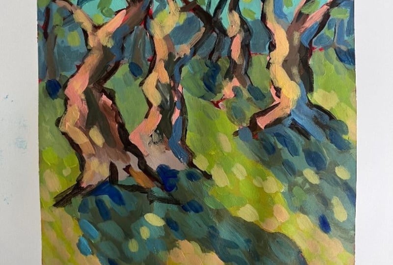
2. About Matisse: Now, Henry Matis, a
favorite artist of mine, I love his works, and we're going to
be inspired by him, and as you can see
paintings that he has done of trees
and groves of trees, we can find so much inspiration
from those colors that he used and the loose expressive
nature of his brushwork. Henri Matisse was a French
artist born in 18 69, and was one of the
most influential figures in modern art, known for his vibrant
use of color and his pioneering role in
the four sm movement. Are the key points
about Matisse's style. One is vibrant color use. He believed in the
power of color to express emotions
and often used bold non naturalistic
colors to convey feelings and moods rather
than depicting reality. Also expressive brush strokes. These loose and
dynamic brush strokes contributed to the expressive
quality of his paintings, breaking away from traditional more controlled techniques. Now, the ideals of modernism. Well, basically,
Mattis was emphasizing the painterly quality of brush
strokes, the strong color, and his work often featured simplified forms and a focus on the overall composition
rather than a specific subject and
its particular form. So we're going to inspired
by this and use some of those influences with a limited palette
of vibrant colors, using loose and
expressive brush strokes to get the essence
of the scene rather than precise details and focus on creating some sort
of emotional impact, using color and
form to convey more than simply trying to
depict a realistic scene. So hopefully we can bring this out in the painting
exercise coming up.
3. Materials and Mixing Tips: So let's have a look
at the materials, as you can see, a very
simple palette of colors, and I'm going to show you a few color mixing
techniques and also tips that is
going to help you create vibrant, clean color. So important when
you're painting, and especially a
subject like this. Let's have a look. So
a very basic palette. I'm using Amsterdam acrylics
made by Royal Talans, a good student quality acrylic. Synthetic brushes,
mostly long flats, an inch and a half inch
around and a rigger. I've got this atomizer, to spray a bit of
water onto the paints, and that helps to keep them wet, obviously, some clean water. And I'll be working
on a tear of palette. Well as I have some tissue
paper and a pencil handy, of co to help you with your composition, if
you require that. The tear of palette, very convenient for me. Although you can use
anything you like. Don't forget a painting knife to help you mix your colors. Helps you get good clean colors. Although while the
painting gets going, I generally tend to mix
color with the brushes. These paints are ready
to go out the tube. You don't have to
add water to them. And I don't try
to do that during the painting process
because that just makes the paint or weakens it, weakens the pigment strength,
little bit of water, perhaps in the beginning
to draw a composition, but for the rest, nothing. Just spray that over
to make sure they don't film over while
we are talking. Now getting the painting knife. I'm going to mix some color. Let's start off with a
selection of greens, basically working from
a dark shadow green through to a light sunny green. I try to keep white paint
out of my mixes unless I have to put them in
because white paint, especially with
acrylics, is very cold and dulls the vibrancy a lot. Where I can get away
with no white paint, I will do that, or at
least very, very little. You can see how we've got
a nice range here from cool shadow green right through
to a light filled green. The lightest, of course, more like a yellow green, but that's what it's like. Nice and sunny color. Let's try a bit of orange and with the
lemon yellow and red. We won't get a very
rich warm orange, but still a good orange. The palette of colors I'm using helps with a more
contemporary looking painting. I think someone like
Andy Worrell would probably use these
type of colors. But if you're going for
more traditional landscape, then perhaps instead of cyan, you'd use ultramarine blue and perhaps a deep yellow
instead of a lemon yellow. You can see the yellow is actually fairly transparent
and mixes very easily, but it's not a very
strong tinting yellow, it's not a cadmium yellow. It's more transparent, like
a permanent range of color. If I put a little touch
of green into that red, you can see how it cools it down and knocks
it back a bit, almost turning it
into a magenta. So Let's try some violet with
the blue and red violet, very important color
for shadows as well. Straight off with the
red and blue gives a very deep transparent purple. Add more blue to cool it down or add more red to warm it up, you'll see when we
add some white to it, the violet will really
come through then. At the moment, it's very
much a transparent purple. As I said, great for shadows. Let's try to mix up
some burn yellow. With the red, blue and yellow. Well, I'm going to try add
more yellow here to get a bit of a bit more of
a yellow ochre as well. On the left, we're getting
a bon ciena on the right, more of a yellow ochre. You can see the yellow ocher is not coming through
quite as easily there. I need to actually bring
in some of that orange. It's just the nature of the
particular colors as well. I would find that mixing your bone Ciena is a little
easier with cadmiums, than these transparent colors, but we can still get there, and just getting this orange
in I think is going to help quite a bit and getting a
bit more of a yellow ochre. Not that I'm going to really
be using yellow ochre in this particular mix
for this painting, but it's possible and you can see the deeper orange bringing out the burnt sienna. And I think it's
quite acceptable. When I'm painting in
the normal course, I will simply use a burn sienna, yellow ocher pre mixed as
my only convenience colors, it's just because it is convenient and they
are fairly forgiving. But for the rest, I'm
going to mix colors. From the primaries. So there we've got a
light yellow ochre now going a little
to the red side, but still acceptable
for a painting. Okay, so that's fairly easy to actually mix burns
a and yellow ochre. Although it takes a little
extra time, of course, putting white into
the blue and red mix, and we're seeing that
warm and cool violet coming out very clearly
now with the white paint. More red to warm it up, more blue to cool it down and a very pleasing
shadow violet. And you have pretty much all the colors you
need for a painting. Let's just represent that
in a more graphic way. There's the burn sienna, and it's actually quite an attractive reddish burn sienna. Now, imagine a bit of light on there and it turns a
little bit of orange and then a highlight
is that yellow. Then onto the shadow
side, could be a tree. We're getting that
magenta color and then the cooler
violets and blues. You've got a whole range there. Let's imagine there's
the tree on top. We've got some shadow green, a mid value lighter
green and then heading into the highlights. And going back to the shadows, mixing up a strong purple. And you can see we've got pretty much all the variations
of light and dark we need and warm and cool color from those
three primaries. A few little
brushwork techniques. We've got the rigger
brush for finer lines. Branches, details,
anything like that. For the most part, I'll
be using this flat brush, a long flat, half inch brush, and it can give me a variety of brush shapes, impressionist, broken color shapes,
very versatile brush, and it pretty much covers most uses for my
style of painting. You can get a whole
range of shapes by overlapping other shapes. So that sort of overlapping dappled brush
stroke is also very common in my kind of painting, and of course, the
lines, et cetera. So you can do just about
anything you want. And that's it. That's pretty much what we're going to
be doing in this painting. When you've finished
with your palette, give another sp so
it stays moist for the next painting session. O
4. Painting Demonstration Part 1: Okay. Onto the painting itself, we're going to start with
a very simple composition, what I call the
blocking in stage, just getting things
set up correctly, getting the first
layers down before we take it further
in the second step. Let's get started. All right. I'm working on a piece
of 300 gram p paper. It's going to also be
used for water color, but great for critics too. Starting off with a
toning of the surface, using the red paint bit of water and getting it loose and
then toning the paper. The reason I tone the paper is to get a start
with the painting. We're going to paint a
fairly vibrant scene, and a warm layer of toning can contribute to the
painting and it also gets rid of all
that white paper, which is quite cold. There's the colors that we discussed earlier in
the material section. Now I'm going to start
with the composition. Just using a rigger brush or any smaller round brush
will be fine for this. I'm just doing a loose painting of the shapes I
want for the trees. Trying to get the
shapes interesting. The gesture of the
trees is so important, inspired by the reference, but not following it 100%. As you can see, the paper I'm working on is in
a square format, which also gives it a
modern contemporary look. I'm not working on the
landscape version. As mentioned, the gesture
of the trees is critical. We want to get an interesting
arrangement of shapes. Or complementing each other. You can see the
ones on the left, curving inwards
and on the right, also a branch heading
off to the left. There's almost a tunnel, and we can see the
inspiration behind this dark line approach
that Matis used as well, starting off with dark outlines. Don't forget your
shadows as well. The shadow pattern, get
that in at an early stage, so important to connect the trees properly
to the surface. Just putting a few
trees in the background there as well to give
a sense of distance. Now let's start with
blocking in the sky, white and blue, a touch of yellow to add a bit
of warmth to the sky. Now I'm going to start this
block in quite loosely, not working up to the lines
exactly because I'm not trying to do a coloring exercise of the shapes that are there. I will build up the blocking
in in the loose fashion and it will help to create a
looser painting as a result. There's a lot of shapes
that are going to be filled in as well. Start very loosely
with the blocking in. Now This more grayish blue for
the hills in the distance. Merely a suggestion, there's
not enough room to go into those background details in much as realistically as we can. There's no space for that. I'm simply putting in
that darker shape at the back touches of yellow to it as well and that
will suggest the hillside. As I do the branches
later on then, I'll start with more sky
color filling things in a little more neatly. Just build it up though. Step by step, don't
get too caught up in trying to be too neat. As we did see with Matis
paintings like this, he kept things very
loose, very gal, very erratic even at some times. You can see how transparent
the paint is without white. I've just added a bit of
red touch of white as well to just warm that paint up slightly
for the foreground. Keeping the initial
blocking relatively flat. We will build up broken color with some dappled brush tkes and little temperature variations
in the color as we go. Now I'm just trying
to make sure that I leave spaces for the
trees in the background, also an idea of where the
shadow shapes going a little bit cooler in the
middle distance there so I've added a touch
of blue to the yellow, and that's to create a slight
sense of depth as well. This is still a
representational scene, but just done in a
different style. So somewhat more stylized, as inspired by those mates
paintings we saw earlier. Now I'm going to mix up
Burnsena, the three primaries, little touch of white, very little bit of white, and we've got quite a nice
Bncena, nice and warm. This will just be the
foundation for the tree shapes. The light is coming
from the left to right, as you can tell by
the shadow pattern, and we'll also obviously
use that idea to bring some lighter warmer colors onto the left hand side of the
tree trunks and branches. Adding a little
bit more blue for a shadow side to the tree and some of the
branches can be a bit darker. Other branches will be lighter, so there'll be variety. Very loose shapes for those
trees in the background, obviously smaller as they
are some distance away, giving a sense of depth. So what we call aerial perspective
shapes getting smaller. And that's the variety
I'm talking about, lights and darks,
warms and cools. Not every shape has
to be the same, some will be warmer and cooler. In the next video, we
will take the blocking in a step further. S
5. Painting Demonstration Part 2: Right. We've got some
real progress now. Now let's press on, develop the painting further, and just let the
painting unfold. Don't get too stressed out
about it with the critics, that the paint
dries very quickly. You can go over your mistakes. It's a great medium to
learn how to paint. So let's just carry on and see
how this painting unfolds. Right. Let's continue
with finishing off some of the sky colors. The shapes negative
shapes behind the trees. Now that we've got a few
more of the main shapes, positive shapes in I can
just finish off getting a few of the sky
shapes cut in there. But there are still few branches that have to be
painted in as well. So it's a back and
forth type of approach. Do a little bit of
negative shapes. Now go back with the
positive shapes, getting this time using
blue to restore some of the outlines of the trees
and also get a few of the smaller branches
put in as well. The blue receding compared
to the reddish burn sienna. In some of the cases, it's simulating
branches in shadow or distant trees you'll see some of the blue and blue
violet branches like this one receding into the background because of
it's the cooler color. As you go through a painting, you'll be losing a lot of the
dark shapes you've put in, some of the outlines, and maybe shadows as well, and you've got to go back in
and restore some of those. That's just part of the process. Just going back in
fixing those up. All right. Mixing up a bit of a lighter brown color and just getting the under painting of the more sun filled
side of the trees. I'm hoping to bring in
some good vibrant lights, warm lights, pinks,
orange colors, that sort of thing to really fire the whole modern
look to this painting. You're putting in the
shadow starting with that. Some of these sort of
kind of a violet gray, and then I'll go over it with
a bit of green and blue. When you look at the
reference of at olive trees, you can see they are pretty much in shade for the most part, but also not exactly
colorful trees. Why make these trees so
colorful in a painting? Because it's the emotional
expression of the scene. Like the shadow that I'm putting in with dappled light colors, practically turquoise
in one instance, and then the grayish
greens and a bit of muddy color to suggest ground showing through It's this
emotional expression, it could be a hot day. How do you depict that
heat, that strong light? You're going to use warm colors that we associate with
those conditions. And that's what I think Matis was doing,
for the most part. He was not painting
just a realistic scene. He was painting how he felt
about a particular place, time, and he'd use color, strong color to create
that impression. Let's do some of that
now and we're getting this orange red on the
lights side of the tree. And some empasto. I love these times in the painting where you
set things up and then you can go in with the
thick juicy paint, put that down in empasto strokes
bringing things to life. You can see these bright
warm lights against the dark outline creates
that stained glass effect, is one way to think about it. Somewhat stylized, of
course, expressive emotive. All of these ideas
come into play. We don't want something that
is just a cold gray shape. These variations now of the broken color suggesting
perhaps the bark on the tree, putting some violet in the
bosen colors in the shadows. Not just a dark brown, you see, that would be that
would lack expression. Use violet, e a pink, use a dusky red, that prompts a reaction
from the viewer as well. We'll go through the
painting in this way, creating the sustained
glass effect, losing some of the shapes, restablishing those
shapes once again. S
6. Painting Demonstration Part 3: Onwards to the conclusion. It's really looking good, and we're just going to
get some final touches to this painting and bring
it to its conclusion. Something that's going to
be really eye catching and fun to have in your home
perhaps or a gift for a friend. But in the end,
you're going to be very with the result.
Let's carry on. Okay. Time to just re establish
some of the dark lines, putting a variety of lines in different
colors, some dark, some blue, and this just gives strength to the particular concept
of this painting. You can see I just
twist the brush and it gets that
variety of lines, variety of lines so
important, the width, the color thicker lines
closer to us thinner lines further back and lighter cooler lines for the
background areas. You don't want to put
a strong dark line right in the background, it'll come forward and
confuse the viewer. That variety of line and adding a few more branches
as well while I'm at it. So degree of outlining can help with the concept of a
modern looking painting. And now adding more texture with the lights and
warms and cools. Some of the yellow is cooler. Warm it up, we're adding a
bit of red and that gets it slightly more deeper yellow
or even to an orange. Stil the brush to get
these dabs and dashes, all adds to the energy and interest of the
painting surface. Ally in nice color, this almost a turquoise bloom, starting to suggest
some leaves as well. Not entirely necessary, but there are leaves
with olive trees. They don't lose all their
leaves in winter, for instance. And I'd like to suggest some leaf canopy
as well. Not much. It's not really necessary. This is very stylized
kind of painting, and I don't want to fill the top third of the
painting with leaves. The design of the painting
requires branches, et cetera in that area. I'll go over that again
with more branches. Once I've done
with these leaves, merely representation of leaves. Not trying to paint
individual leaves, painting huge clumps at
once with one brushstroke, repeating some of those
shapes on the full ground, and now reestablishing some of the lost branches just to add a cohesiveness and
join things up. Let's get some more warm color, some nice thick impasto strokes on the sunny
side of the tree. That's the thing with
acrylics to really make acrylics work and pop, you've got to put on the layers, and that's easily achieved
because your paint dry is nice and thick and quickly, so you can paint over it. You don't have to worry
about paint cracking or anything like that. I think it's coming
together quite nicely, a real modern look to
it, almost pop art. Certainly, I think Mattis
wouldn't be disappointed. Even if we've actually
made the painting a little more representational than some of his landscape paintings. I think we're in the right
idea, range of ideas. Touches of blue in the shadows also adds a
bit of z to those shadows. I don't like shadows
just to be black. Photographs make
them look black, but in reality, shadows have a lot more light and
color than we think. They just must be cool. A shadow must be cool where
the sunny parts are warm, and that creates the
shadow contrast we want. A few more lights
in the top canopy. Of course, acrylics do tend to dry a little dark at times, so you may have to re establish some of your lights as well. Coming along now, I
think we are almost there and want to get a bit
of warmth this for grounds, so some of orangey yellows. A good tip is to always stand back and have a look
at your painting from across the room and see what's missing where it's lacking a bit of color or
a bit of strength. You can attend to that
pretty quickly when you notice it across the room. Some of these blues building up the branches in the canopy. Some of those background
branches as well. So just see where the painting
needs a bit of firming up. Just a final few highlights. They were pretty much done. I think it's time to just
sign off the painting. Let's get the tape
of, have a look. I say it's been a lot of fun doing this painting. I
think you'll enjoy it. It's a n expressive, colorful painting, and
it'll look good. Oh.
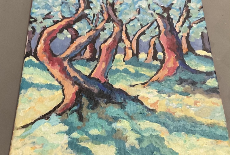
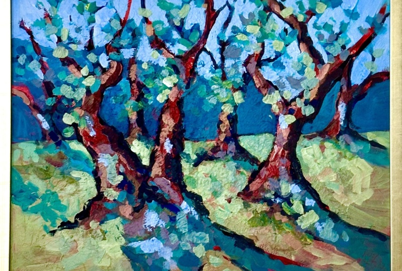
7. Conclusion: There it is, our
modernist olive grove completed in the spirit
of Henri Matisse. We've got this
beautiful olive grove created in an expressive style. Only with three
colors and white. That's pretty good, I think. Don't forget to download
the reference photo, try the painting
out for yourself. Share the result with me. I'd love to have a look and
give you my thoughts as well. Have fun. And until
next time, has for.
 Malcolm Dewey, Artist and Author