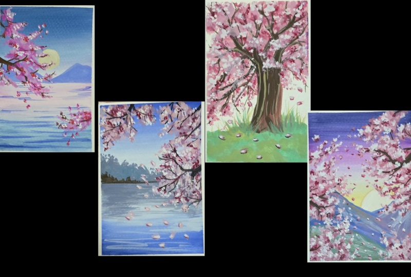
Transcripts
1. Welcome to Spring: With just a few
taps of the brush, a simple branch can suddenly
bloom into cherry blossoms. In this class, we'll paint four beautiful cherry
blossom scenes using gouache step by step. This class is a
celebration of spring. We begin by understanding the different type of materials
required for the class, and then we move on
to understanding gouache with a few simple
practice exercises. From there, we dive into
our final projects. Hi, I'm Madu, a watercolor and gouache
artist and teacher, and I love helping artists discover how simple
it is to paint. By the end, you'll have four
cherry blossom paintings and the confidence to
paint your own scenes. So grab your brushes and
let's start painting.
2. Materials Required: Let's talk materials. We're going to need a
range of materials, I'm keeping it super
simple and bigna friendly. The first thing we're
going to need is our watercolor paper, 300 GSM, cold press, perfect
for using gouache. We're going to need four
different sheets that are cut into A five sizes
for our projects, as well as some practice sheets. Next, gouache paints. Get a range of gouache colors. You can get them in a
tube form or in pants. I prefer the tube
because I feel like it stays creamy and perfect to use. Next, we're going to
need our brushes. I'm going to use
two basic brushes. One is a thin brush
and a flat brush. These need to be
watercolor friendly, so keep that in mind
because they are much more softer than
acrylic brushes. These are the main materials that you would need
for the course. Apart from that, you would have some additional materials like palette to mix your paints. We would need a bowl of water. You can use two bowls of water if you don't want
to keep getting up. I usually take it as an
opportunity to stretch my legs once my water gets dirty and fill up new water every time. So I just prefer it that way. You would need masking tape, a spray bottle.
This is additional. If you have one,
it's going to be very useful to make sure that
your paint doesn't dry out. And that's about it.
We're ready to begin.
3. Mix your Color Palette: Let's talk color palette. I'm going to show
you a couple of different colors
that we're going to use for our upcoming projects. The first is a very
simple scarlet red mixed in a little bit of water, so it's very creamy, and we're going to use this
for our cherry blossoms. The next color we're going to
mix is a light pink color. So taking a little bit of scarlet and a little
bit of white, take your mixing palette, add a little bit of water, and mix it all together to
get a very pretty pink, which we're going to use again
for the cherry blossoms. And finally, we're going to have scarlet with a lot more white. So the proportion
becomes one is to two, and you're going to get even
more lighter pink colour. Now for the background colors, we're gonna be using erleimblue or if you have another
blue in your gouache set, you can use that with
a little bit of white in equal proportions to
get a light blue colour. It's going to be creamy, rich, perfect for our sky. For the soft glowing sun, we're going to mix yellow ochre with equal proportions of white to get a light yellow shade that is perfect to just
brighten up our painting. Let's mix in a green using the light blue that we just
created with the light yellow and more white to
create a soft moss green. Now for the tree park, we're going to use burnt sienna. And then finally black. These are the main colors
we're going to require for our painting along with white. Very easy. Keep them ready
before you start painting so that you are prepared
to go over the layers. Gouache painting does dry, so make sure you just prepare a small quantity every time
you work on a new project.
4. Let's Learn Gouache: Let's dive into some
practice exercises and get comfortable
with gouache. The first thing
we're going to do is take a little bit of gouache. I am just using a palette to take a little
bit of the paint. We're going to add
some water to it. Now, this is very important. The amount of water you add really makes a difference
to the gouache. If you add just enough water, you will end up with a nice, creamy mixture, and that is ideal for our
painting generally. Now, if you add more water, you're going to end up
with a little bit more of a very translucent layer. It acts more like watercolors
when you add more water. This is great for
the base background if you want to keep it
very soft and flowing. The one thing you want to
avoid is keeping it too thick, because this might lead
to cracks once it dries. So make sure that you play
around a little bit with this, get a little bit
more comfortable and get your mix proper. So that it works just right. Following this, let's
work on some blending. I'm taking a little
bit of yellow ochre, just two lines of it. Once you have that, we're going
to take white wash white, start from the top, gently, very soft
strokes across, bringing the color downwards. Keep your wrist very soft. Don't press too hard on the paper because it's
going to lift more paint, so you just gently moving around the paint till you get
a very subtle blend. I love how smooth
that turned out. We're also going to play around
with a dual color blend. So if you have two colors, you'd follow a similar step, and it takes a little
bit of practice. But as you get more comfortable, you're going to find
it a lot more easier. We can start again
with yellow ochre, gently moving downwards. Next, I'm going to take
a secondary color, a soft pink, starting from the midway point,
gently blending. Now, you want to
wash your brush at this point, very important. And then go ahead
with the yellow again and layer it on top. You can see how that's
already pretty soft, very smooth and creamy. Now, continue on with the
pink going lower and lower, and then we can use gouache
white and blend it downwards. This is such a great
technique for skies, and we're going to
be using it a lot. So practice it a little bit, get more comfortable before
we dive into our projects. Instead of white, I decided to go for more of a light pink. Since we're going for the
theme of cherry blossoms, this is going to be one of the color combinations
we're going to use a lot. Just keep it very soft as you're blending,
going back and forth. Always go side to side. That's really important to avoid having lines
once it dries up. This is looking so great. Again, test it out a bit, try different combinations and get really comfortable
with your blending. If you have any questions, please leave them in the
discussion tab and I can add in some bonus
tutorials if required. Now we're going to
do a little practice of cherry blossoms. I've taken my deep rich
pink that mixed before, and I'm starting with
just a little bronze. You can see how I
created a blob, and then I'm having these extended thin lines
moving upward. This is going to be
our paste layer. Once we let that dry, we can go in with a couple of more layers to add some
depth and highlights. First thing I'm going
to do is create or paint the branch using black. We don't need to make
the branch to perfect, as in we're not going to
connect all the lines. We're going to leave
gaps between them. A couple of years back,
I had a chance to visit the cherry blossom
season in Japan, and it was the most
incredible experience being surrounded by
these pink flowers, the city being full
of pink blooms. It was magical to say the least, and I'm so happy
that I'm working on this project because it takes
me back to that moment. And even if you haven't had
a chance to visit there because it's not that
easy it is further out, I still think just enjoying this painting itself
is an experience. So let's continue along. We're going to do our branches, adding a couple of
branches here and there, and we can wash our
brush completely, and then we're going back into our pinks and layering them up. Guh is all about layering, and the more layers
you can add in, the more details you can show. I try to keep it simple
because I want to have a much more fun flow feel than
having it very realistic. And that is my style of art. If you've noticed, I
like the more fun style. So we're going with our light pink and you
can see how I'm making these spots a little bit more thinner and just adding
a couple of dots. I'm mainly focusing
towards the outer ends. Letting it rest some more, and then we're going
to go ahead with white and add a
couple of more dots. These ones are more towards
the outside, if you noticed. It's to show that
the light is coming up towards from the right side. So we're focusing
all our highlights, all our light shades there. So usually, this would be the
point that we would stop. But I noticed with
hurry blossoms, it's very nice to add
a little bit more of a deeper scarlet red to add
more shadow to the trees. So we're going to take red, and we're going to
add it closer to the branch to show that these are more
in the shadow area. Again, adding couple of dots, so not making it too full. Isn't that absolutely stunning? In just a few steps, we've gotten our branch. Are you ready to begin
with our main paintings? Well, I am. Let's dive right in.
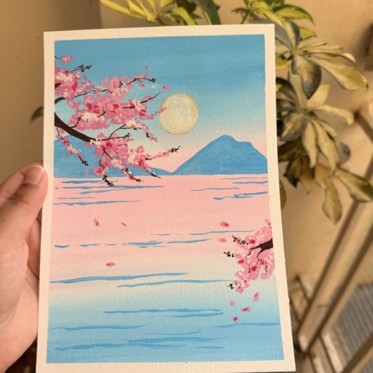
5. Project 1 - Mountain views: Let's set the mood for
our painting today. This is some of the videos
that I captured when I was traveling that we're going
to use to inspire us today, starting with a light blue, we're starting right on top
and filling up the space. As you place these
first strokes, you might start to notice how relaxing this process
starts to feel. There's no rush. Just let your brush
move naturally. I'm mixing in some white, and we're gonna blend it
with the blue gently. We're creating a
very soft background for our cherry blossoms. Just trust your brush for a
moment and see what happens, gliding it through the paper, allowing it to
create a soft blend. Add more white if required, or wash your brush if
you feel like it's filled with too
much of blue paint. Right now, I've washed my
brush and I'm taking white again and going ahead
and just blending. Make sure to go side to side, you cover all the spaces. Time to add in some soft pink to
the background. Remember that your
layers need to be creamy and not too thick. You can sprit some water on your mixes to just
keep them more moist. After completing the sky, we're going to
move to the ocean, starting with the
similar shades of pink, white, and then blue. Make it gradual, gentle, like a calm ocean. I love your painting
to rest completely, and then we move on to adding some mountains in
the background. Using the same blue color, let's first outline
our horizon and then using the blue at some
simple mountains. Guache layers are a little like stacking blankets of color. Each layer is like adding another detail to the painting
and bringing it to life. Notice how I switched my brush just to get
thinner details. Now, adding some thin streaks
of blue along the ocean, just to show that there's
a little bit of waves happening and giving the water a little bit more character. I'm already falling in
love with this background, and we haven't even
gotten to the best part. We're going to now
move on to the sun, starting with our aca yellow
that we've mixed before, and then using white to
really fill up the space. This white is really going
to lift up the painting, giving it some brightness. Letting everything rest before we continue with our
cherry blossoms. Cherry blossoms look like soft clusters of cotton
candy floating in the sky. So when we play around
with our pinks, we usually cluster
them together. While painting cherry blossoms, we're going to cluster them towards different directions
to frame the painting. Using pink, I'm going ahead and adding spots of the
cherry blossom. Have a look at the shape. It's generally a full cluster with some few branches
just leading away. And In this painting, we're going to have
our cherry blossom coming from the top left to the middle and then from the midway right,
meeting the two. So it's going to be a very
interesting positioning that's really going to
highlight our painting. Continue to take
your time adding the little details of
the cherry blossoms. It doesn't have to be perfect, but you can really
play around with it. I think of cherry
blossoms, like, little confittiEspecially that candy pink is so interesting. It looks so pretty. Try to go very thin
with your dots, basically your
little flowers when you use your brush along the edges and really filling up the middle
of the clusters. Now that we've done
the top portion, let's do the bottom one
that connects to the top. As per our practice exercises, we're now going to go on
to adding the branch. You can use a brown or a black. Here, I had some black that
I mixed a little bit of pink with and then I'm going to
use it to add in my branches. One of the tips that
I love sharing with gouache is that you do need to mix your
paints in advance. That can get a little tricky because sometimes the shades change as you mix
the same color. So what you can do is you
can get air tight palettes, and that is available, and you can store your
paints that way. If not, mix small portions
of the color and try to complete all the
painting at one shot so you don't end up with
dark and light shades. Using the brown, we're
going to continue with our branches as we
practiced before, not trying to get all of them, but just some of them. It really peeks through
and looks realistic. I sometimes stepping back for a second helps you see the whole image, whole
painting forming. I like to do that when I'm a little unsure of what
I want to add next. Notice how a few simple strokes already start to look like blossoms continuing to add
all the little details, and then we're going to switch
over to a lighter pink. Using light pink,
we're going to add in little clusters of
flowers mainly towards the sun little pink spots just enough to give
it more color. A Something I noticed when I visited the cherry
blossoms is that a lot of the flowers and petals
actually fly in the wind, and that's what makes
it more realistic, which is why I decided to add these little petals
flying around. It adds to the realism, and that's how it is, especially when it's windy. It's like the air is
filled with pink. You can use the light pink
to add a couple of dots to these falling flying petals. Now we switch to white and we use the white to
add more detail, more highlights to our flowers. Using the white more
towards the sun, keeping it very, very light, not too much to take away
from the previous layer. A Moving on to the next step, we're going to use our scarlet
red and add in some depth, some shadow to our painting. Notice how I'm
trying to bring it more closer to the branch. Adding a little bit of that red to some of the flying petals. You might find that the
lighter your touch, the soft the bloom looks. Be gentle through this process. We're almost towards the end, we're going to use white and just add a couple of more
details to the ocean. I like the entire composition
for this painting. I think it works perfectly in creating enough of
mystery and interest. That's very important when you're placing your
cherry blossoms. You also want the
painting itself to look really nice and to
be inspired by it. You can play around with
the same technique with different colors for the ocean and the different
colors for the sky. You don't have to use the same
that's what's really cool. Once you know the techniques, you can just get creative. Make sure to let
everything rest. And once it's completely dry, you can use you can
remove your tapes on all four corners to reveal
your final painting. I would totally paint this for a greeting card and
give it to a loved one. It is just so perfect with a little space at the
bottom for a message.
6. Project 2 - Pink Clouds: Let's dive into another
project from this class. In this one, we're going to play around with cherry blossoms, but we're going to change the placement and create
something different. Get your colors
ready mixed up so that you can dive
right into painting. Let's start with
our light blue from the top gently moving downwards. Make sure that your layer
is smooth and creamy. Wash your brush
completely so that you can take in the
new white color. Gently add in the white. And you can see in the
process I'm actually lightening up the
colors as I progress. Wash your brush again.
Let's take white again. This time, I'm going to start
a little bit away and then gently move upwards
to get a nice blend. Take your time
through this process. It's all about getting comfortable and letting
your brushes speak. Go ahead and continue
adding in layer by layer. We're now going to
go in with green. I've switched to
my thinner brush, and we're going to
add in some trees. Keeping the edges rough like
the edges of the leaves. Let's add in a layer, dividing our sheet by half. Continue this process. You can also add in a
little bit of blue, just to give a little variety so that the trees look a
little bit more natural. Trust the process. This is all about relaxing, having fun, and just
enjoying cherry blossoms. We now work on the
water section, starting with green
for the reflection of the trees using a flat brush, gently add in the
lines to show that the water is reflecting the
trees with the same green. We can move on to white, and we're going to
place this white in the middle portion, lending it downwards, and
finally blue to match the sky. Okay continue adding white
and blending the colors so they fade into the background and just look very,
very natural. You can keep adding white. The important part
is to make sure that your painting is still wet as
you continue this process. If you wait too long, your layers are going to dry up, and then when you go in, you're not going to be
able to blend as smooth. So make sure you work fairly quickly as you progress
through each section. I'm so happy with
the result here. You can add some thin lines
with blue or white if you'd like to just to make it a little
bit more realistic. Time to work on our
cherry blossoms. So we're going to use pink and start with our
cherry blossoms. Let's frame our painting. So we're going to
do different edges more towards the right side, following the same steps
that we did before, adding patches of pink. Make sure that your
previous layers have dried so that this layer lays properly and the colors
don't mix along too much. Gouache is such an
interesting medium to work with very similar
to watercolors, as well as has the
opacity of acrylic. It's so versatile and there's so much you can
do with this medium. I'm just going ahead
and adding pink, as you can see in
different sections, trying to get a little bit
of that cherry blossom to frame the main painting. You can take a little bit of the light pink as well and
just keep switching it. The one thing that I really like about gouache is that
it's water based. So when you add water, it moves and it does a lot
of really cool things. It's also matte finish, so it looks really pretty. Going back to our painting, because I wandered out
a bit with my talking. I'm adding in some leaves just by strokes of pink to show that the leaves are flowing
down to the water. Continue adding pink until
you're happy with it. And we're going to let
it dry completely, and as we've practiced before, we're going to layer
one at a time. Step back from your painting
and just have a look and see if you're happy
with the overall look. Until now, everything
has been really pale. This pop of black is going to be perfect for adding some
contrast into the painting. Using black, we can add in some branches for
the cherry blossoms. With cherry blossoms,
they actually have a very thick branch from where
the flowers come through. We want to make sure
that we highlight that thick branch and then some smaller branches
towards the ends. Use a thin brush because it's
easier to control for this. Completely trusting the process here because it might
look a little messy. It doesn't look as great. It's flat. So let's continue. I'm sure we're going to end
up with a beautiful result. So trust it. This is the hard part of
painting where you need to actually continue and
wait for the result. Adding a few more
details with our black. I love how this is turning out, and then we're
going to go in with a couple of more layers of pink and that's really going to make everything
come together. We're doing so great. I'm so proud of you
for getting this far. I'm also curious to
know which one of the four projects is your favorite because I
have my favorite, and I think it's what
started the entire theme. What I usually do for
collecting or choosing ideas for my classes is I paint a lot of
different things, and then the one that just clicks where it feels like, yes, that is something
that I would love to teach is the one
that I elaborate, I get more projects, and I create something out of. So that first
painting is usually my favorite because it was what inspired or sparked
the idea to create more. A little side note. I'd love to hear which one you
really enjoyed. And when you post the projects, do share them with me and let me know what you
enjoyed about it as well. We're going into our light pink back into the painting and
we're adding in our layers. Remember this time that we're trying to get more of the pink to the edge and more
towards the sky. You can see how I'm making sure that I add
those highlights, those light colors
towards the edges. Now we take white. We're going to use white
to add more highlights, and this is just going to be
a couple of little details. We don't need too
much just enough to really brighten up the
painting and liven it up. Again, keeping to the
edge of the branches. We move on to the most
important part here, which is taking our scarlet red and adding in our shadows. This is really going to boost up the painting and make
it look so great. So first thing I'm doing is those little petals,
little flowers. I'm going to add a
little scarlet to those. And then we move on
to our tree branch. And then we're going to use that scarlet closer to the
branch to add more shadow. The more relaxed your hand is, the more natural the
blossoms tend to look. Even experienced artists rarely get every stroke
just exactly right. So trust your intuition. Try to get more of the scarlet
red closer to the branch. And you can see how
I'm doing that. This is very important. So your highlights
always come to the edge towards the light, and your shadows always come closer to the
center or the branch. Just a few more touches
and the tree is blooming. Feel free to add more
pink if you would like, once you're happy with
the entire painting, allowing it to dry completely, we're going to remove
out a masking tape from all four sides to reveal
our final painting. Are you excited? Are you ready for
this? Let's do it. This is so pretty, am I right?
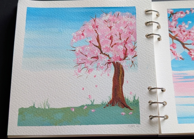
7. Project 3 - Cherry Blossom Tree: While preparing for this class, I wanted to get some stories
about cherry blossoms. In Japan, cherry
blossoms are admired, not just for their beauty, but for how briefly they bloom. The flowers last
only a short time, and so it reminds people
to appreciate the small, beautiful moments
while they are here. I think that is so important, so beautiful, and
definitely something that will stay with me. We're going to start with
this painting where we begin with our green for
the bottom for our grass. I had to move the plant
because it got painted. It was in the way. Now, we go with
our sky with blue, and then we're
going to take white and blend it downwards. Just keeping a very subtle
blue sky at a lot of white, so it really blends in. In this painting, our tree
is going to be the focus. A Now we move on to the next part, which is adding our little
details for the grass. Sometimes confidence in painting comes from just
trusting the process and not overthinking
or expecting it to look perfect from day one. Continue paint, enjoy the process of
painting and creating. I'm adding a little bit of
yellow to lighten up the green a little bit as we
continue painting it. A couple of thin lines for grass and then continuing
on filling up the bottom, making it a little more textured by adding
blobs of yellow. Now we take Brown
and we're going to mix it using our thin brush, add a little bit
of water so it's nice and creamy
and we're going to start by painting the
trunk of the tree. Now notice how the trunk is
not right in the center. It's slightly towards
the right side, and that's really important
in terms of placement. If you're adding any elements, especially if it's just
a singular element, it's nice to actually
have it move a little bit towards
the side instead of right in the center of the page. This is a very quick
tip into composition. Keep adding a little
bit of brown. You can add a little yellow
to give some variation to add a little bit of
detail to the branch. Then we're going
to just continue painting the tree branch. Let's now move to the pink. I'm using a flat brush so
I can cover more space, and I'm just going to paint
the entire section pink. A couple of straying
lines and dots. And then continuing
with the process. Remember, there are
no wrong steps here. Just have fun, add in the pink and see
where it takes you. Once you're happy with the tree, let's use black and add in
the branches and trunk. We don't need to add too
much, but just enough, so it looks and represents
cherry blossoms. You can also add a
little bit more black to the trunk if you feel like
it became more brown. Painting is all about
testing and trying and just seeing where your art
takes you. It's a journey. Here, continue adding pranches. I'm going to just speed
up the process a bit. You can have a look at it
and then create your own. A Now that we've created our tree, we're going to go in with
our next layer of pink. Make sure that
everything is dry so this layer comes
together perfectly. If the layers below
are still wet, what's going to happen,
it's going to mix with the pink and
not look as great. Make sure you've dried
up your painting, and then we're going
to take our light pink and we're going to start
adding in some details. Gently tap in the pink on
top of some of the branches. We're trying to keep this
lighter pink color towards the edges of the tree. So in the middle, as
you can see right now, but a lot of it
towards the edge. As I was talking about stories that I found about
cherry blossoms, cherry blossoms
are also found as an official signal
that spring has arrived after a lot of winter. So these trees just
burst with pink and are such a great way of
celebrating the new season. Interestingly enough, the flowers if you've seen cherry blossoms,
you know this, if you haven't, the flowers actually bloom on
a specific day, but before that, the plant
actually looks dead. There's no leaves,
everything has gone away. It's all fallen
through the winter, and so on the day of the
blooming, it's magical. But before that, you hardly can recognize the tree because
it's just branches, which I found so interesting. It's almost like one
day it looks dead, it's just all the las
leaves have shedded away. And then the next moment, it's
blooming this bright pink. I found that so fascinating. And if you live near cherry
blossoms or have seen them, I would love to hear your
stories in the discussions. Please share them because
I find it so fascinating. I'm still so surprised
that this is a concept, especially coming
from where I'm based, where there's not even
plants really are very rare, and there's hardly any flowers. This feels so special. So I'm adding in pink dashes, just quick lines to represent
the falling leaves, makes it very natural. Also looks like the
painting is moving, and that's why you have some of these flowers that
have fallen down. It creates movement. Using light pink, we're going to add
a couple of dots to these fallen flower petals. Now to take some
green and just add more grass because a little
bit of it got painted over. Moving to the second color, that actually third at this point because we
have the base pink, the middle pink, and
then now we have white. Let's add white. Again,
to some sections, we're not adding it everywhere. Mainly to the edges of the tree. So in between. You can
see how I'm doing it. I'm just kind of making
it a little patchy. This might look a little
bit off at this point, but trust me, it's going
to look great in a bit. We still have one more step, and that's really going to
bring everything together. A Time to take scarlet red, and we're going to add it
closer to the main tree trunk. We're going to add some
more color layer by layer. You can see that burst of color is stunning and just creates so much of vibrancy and just makes everything
bloom out of the page. As you continue adding, make sure to blend it all, so it looks really great
and comes together. Now for some finishing touches, let's use yellow and add some
details for the tree trunk. Just quick little details that are really going to change and make the painting look
even more special. Make sure you completely
dry your painting. And then we're just going
to add a couple of details like brown along the
falling flowers. And you can remove your tape once you're ready
for the reveal. This is amazing. I love the colors, love the playfulness
of the branches, and I cannot wait to
see your recreation. H.
8. Project 4 - Pink Clouds: Are you ready to dive
into another new project? So this is the last
one from the list, and I wanted to go for something that's more like a sunrise. So we're starting
with a light blue. Make sure that you have your
colors prepared in advance before you get started so you can really get
into the painting. I love this subtle blue color, so soft, so calming. Once you're happy with this,
let's get into some pink. Now, pink and blue mix to give you a little bit of a
purple, and that's okay. We're going to embrace that
purple and continue painting. Et's continue adding pink
as we move downwards. Make sure that
your paint is wet. You can see minus
dried up a bit, so I'm going to make
sure that I sprit some water and then
we can move on to white and blend it
completely so we get a really nice soft background. Next, let's use
white gouache and continue blending the mix
all the way downwards. H. At this three fourth point, we're going to add in yellow, gently blending it up, and you can see how the
sky looks so dramatic, a lot of beautiful
shades coming together. For the sun, we're
going to use white, gently placing it
in a semicircle. We're going to layer
this up as we go by. So for now, you can just do
one layer and let it dry completely before adding
a second layer later on. Time for some mountains. We're going to use blue with a little bit of pink
and just add in some really subtle mountains so that the sun can
peek through them. To keep it more interesting, you can mix a little bit of the pink as you
blend the mountain, so it has a little shape to it and that's going
to look a lot more realistic than a flat
one color mountain. Let's do another one with
a similar technique. Here's where you
can play around. If you have a little
bit of green, you can add in another
mountain at the bottom. A et's now switch to our thin brush and we're
going to use white and add more details to the mountain to make them look
more realistic. You can see how I'm adding
in layers of lines. It's all following the
grain of the mountain. I love your hand to
be loose and let your wrist just gently
blend in the colors. The layers are still wet, you can see how the white
just easily blend into it. I'm really happy
with how it's going. Let's get a little
inspiration from these soft cherry blossoms. We're gonna add a cloud of
them across the painting, making them fun and playful, starting with our deep
pink using the thin brush, gonna add puffs of pink. Make sure to leave
some gaps between and add in small clusters. At this point, I'm
sure you're an expert at painting cherry blossoms. Adding these little pos, little clouds of pink. What we want to do towards the edge is to make
sure that it thins out. This is really important. And you're going
to see me do this. Continue adding your
pink on either side. I'm going to have
a little bit on the right, a little
bit on the left. I decided to speed up the
process, as you can see. You can add as much as you want or as few cherry
blossoms as you want. I really wanted to
fill this piece with this flow of color, and so I've added
quite a bit around. Once we're done with this, we're going to let it dry completely, and then we move on to adding our branches like we
practiced before. Using black, you're going to connect the different
clouds together. All connected to a main trunk, not trunk, sorry, main branch, and that's going to
be fairly thick. Again, one of the few, I think, important elements of cherry blossoms
that make them unique. Once you're happy with
the overall look, we're going to continue
adding in on layers, moving to our light pink, and here we're going
to cluster them up, try to get them
closer to the edge, and also make sure that they are in the area
where the sun is, and you're going to
see how I do this. Keeping my wrist
very light and soft, gently tapping the
brush onto the paper for small little flowers. Continue this process
through the entire painting. I love how fun and
playful this is. It's so relaxing. And I feel like I'm actually
stepping into a new world. I'm stepping into this
world of Sherry blossoms, and it's bringing me so
much of joy when life gets really stressful and you
need to take a pause. Painting can be very relaxing and having a focus of
something that you can control in this world
where everything feels difficult and it's
tough to control is amazing. So taking this
moment for yourself, just enjoy these little flicks of flowers through
your entire painting. Once you're done with
that, we're going to use white as well to add in more and that's what you can see.
I layered it up. Then we go in with our
darker pink and add some deeper colors to the
areas closer to the branches. This is our shadow areas. Continue playing around
with white and pink, adding more shadow, and really bringing
this painting to life. We're almost done. You can add some stray flowers,
stray petals. You can also add in morse colo to deepen the colours
a little bit more. As I keep looking at this piece, I feel like tweaking
it even more, adding a little bit more pink, a little bit more
pink. There is no end. I feel like this is where you have to stop and
take a break and go like, This piece, this painting
is over, I'm happy with it. Or what I like to
do is step back, step away for a bit, and then come back
to the painting and see if I need to add
a little bit more. I felt like I needed to
add a little scarlet, so I decided to
continue adding that. And once everything was done, just letting it dry
completely and then removing out the tape to
reveal our final painting. I absolutely love
how this turned out. I think the white edge
also adds the painting. It gives a little colour,
just brightens it up.
9. What comes Next?: Thank you for
watching this class, and I really appreciate
your participation. I hope you enjoyed all the little details
that I added in, and I'd love to
hear your thoughts. Please leave a review and let me know what you loved
about the course. I'm also excited to
see you continue on your journey to learn,
create, and grow. Feel free to add the project
that you created from this class onto
your project tab. I can't wait to cheer you on would you like to
learn more from me? Well I have a variety
of watercolor, mixed media and gouache
classes all on Skillshare.
 Femvisionary, Watercolor Artist and Instructor