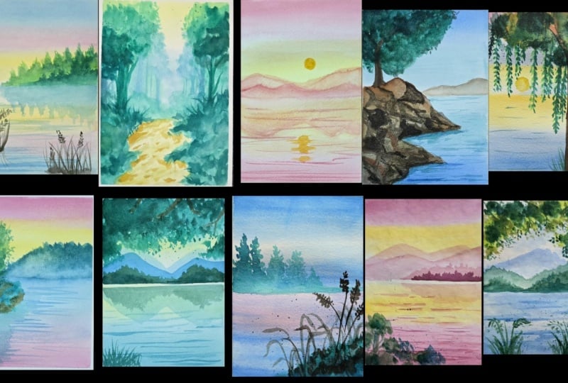
Transcripts
1. Welcome to the Challenge: Have you ever sat down to paint hoping it would
help you relax? And instead, you found yourself overthinking
every brushstroke. A lot of us come to
painting looking for calm, but somewhere along the way, it starts feeling like
pressure instead. This year, I invite
you to join me in the journey of exploring
the art of watercolors. Watercolors is such a relaxing, soothing medium, and often we forget that in the rush
and pressure of it. Let's step back, Let's
enjoy the peace. Let's try something relaxing. This ten day
challenge is a chance for you to just paint
without any rush, any expectations, and
without any pressure. Hi, I'm Madhu. I'm
your instructor today. I'm an artist, published author, and I love painting nature. Every time I paint nature, I feel like I'm stepping into the world
that I've created, and it always brings
me so much joy. And I want that for you. Over the next ten days, we are going to be
painting simple, soothing landscapes skies,
mountains, and water. One small project at a time without rushing or trying
to make things perfect. Each lesson is short and
easy to fit into your day. You don't need fancy supplies
or a lot of experience, just your paints, brushes and
a willingness to show up. After the material checklist, we will practice some
simple exercises together. Your goal is to
complete all ten of the 15 to 20 minute
projects with ease, taking aside a small amount of time from your busy schedule. By the end of this
ten day challenge, you will end up with some
incredible paintings that you will cherish forever. So get comfortable, take a
deep breath, and let's begin.
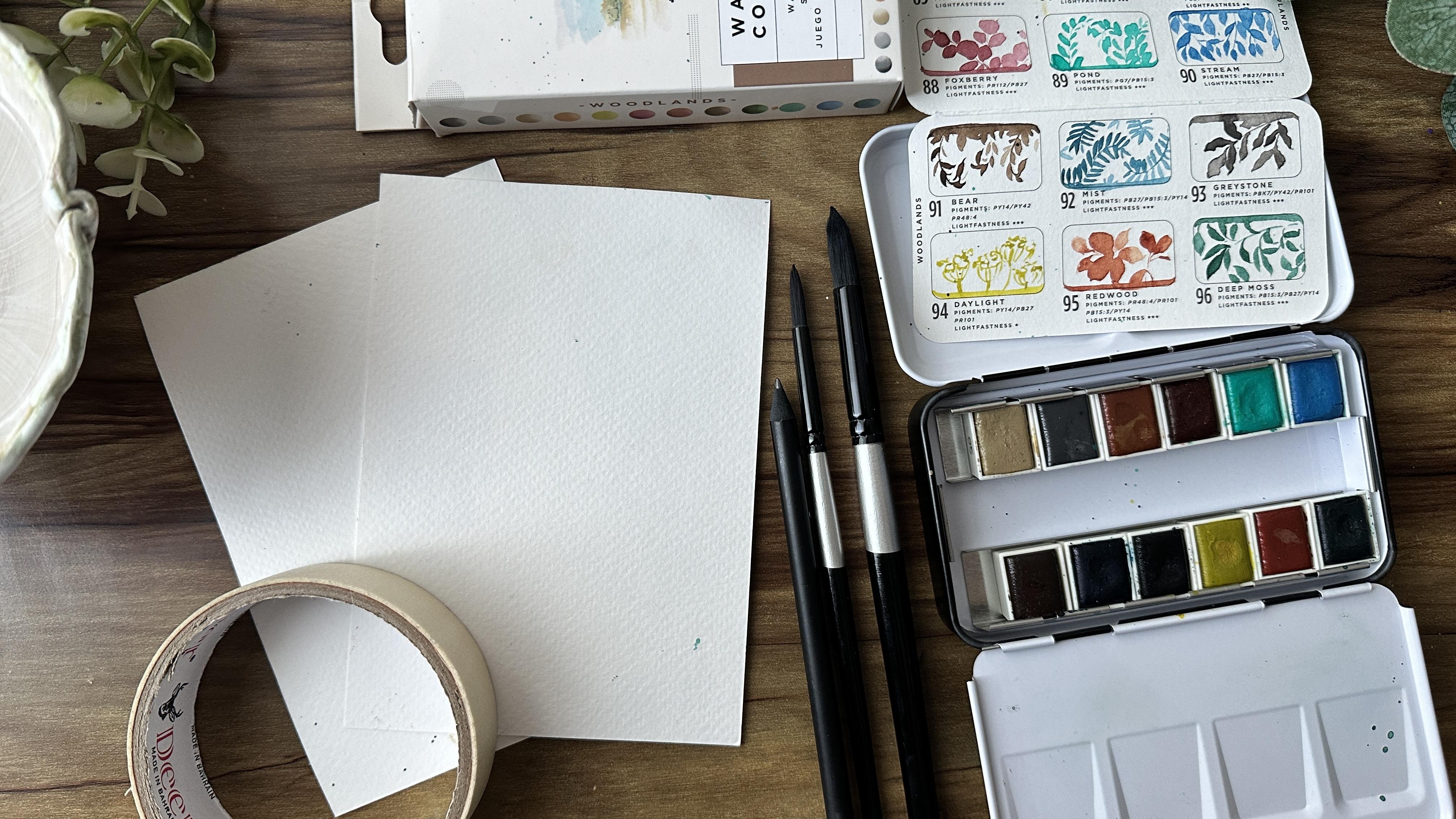
2. Materials: Let's dive right into materials and what you would
need for this challenge. We're going to be doing
ten beautiful paintings in a five watercolor sheets. This is Cold Press,
300 GSM sheets. All the materials
are listed below. If you have any questions, please add in a question
in the discussion tab. So we need ten of these. We're going to do
a little bit of practice before we begin, so a little practice
sheet would be great. Also, we would need two
different round brushes. One is a size two, and the other one is a size 12, one that can be used for
backgrounds and larger spaces, and one for the smaller details. These are basics and
it's going to be really useful for our paintings. Next we're going to need a
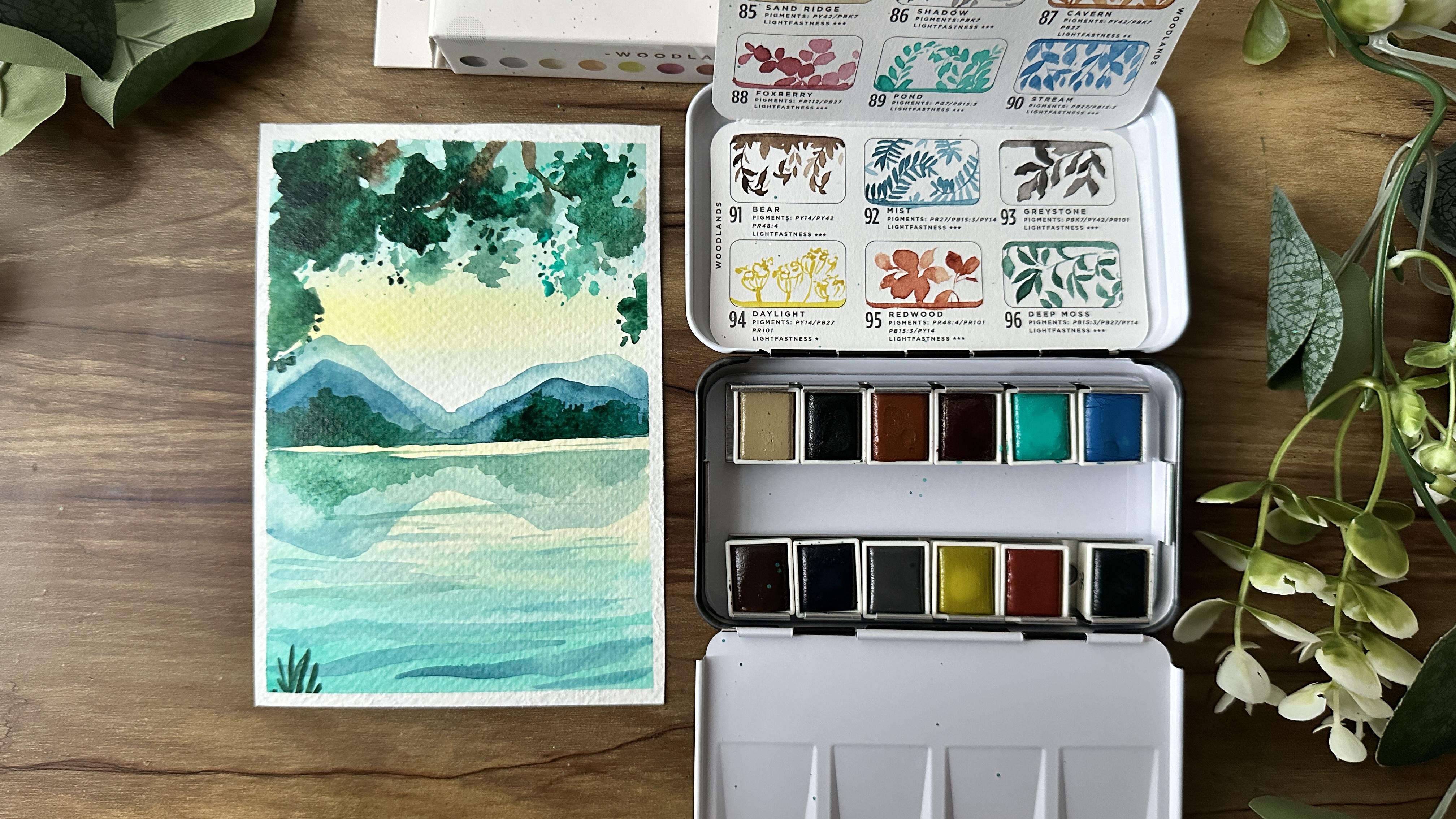
beautiful watercolor set. I'm using the Art
philosophy Woodland set, which has a beautiful
mix of browns, pinks, blues and greens. This is going to be
perfect for our painting. This set has all the
beautiful colors that we're going to be
using for our projects. From the browns, you would need bear sandrig, some blacks, such as greystone,
even a pink Foxberry, two type of greens,
which is pwd, which is a lighter
green and deep moss, which is a darker forest green. I love the blues that they have. Again, two shades of
blue, one is stream, and one is mist, which
is an indigo blue. And then you have your
daylight, which is a yellow. If you have your existing set, you can pick the similar shades, and that's good and
works really well. It's the standard colors
that you could find. I think some of them
are unique like pond is harder to
find in other brands, and that's why I like this set, and I'll be using this
for the entire challenge. Additionally, we'll
need some masking tape. This is going to be useful for
the edges of our painting, as well as some pencil, some water cup, rubber
eraser tissues, and the other basics
that you would need in terms of
watercolor painting. Once you have all your
supplies ready, let's begin.
3. Let's Practice: So I want to dive into a couple of mini exercises for you to get a little bit more
comfortable with watercolors and so that when
you get into your painting, you're not too scared. This is to build a little
bit more courage and to also share some key pointers on
what to do and what not to do. So taking a little bit of color, I'm just spreading
around the paint. Notice how I don't
lift my brush, and I try to go side to side. It's always important to have
these long brush strokes, so you avoid more of brush lines coming through
as the paint dries. Now I'm doing two sets. The first one, I'm going
to let it dry for a bit, and that kind of happens. Maybe you're busy or maybe you took too much time
doing that first layer, and I'm going to show you
what happens with that one. So let's move with
the second one. I've added in a secondary color, adding in a third color. And notice every time
I add the color, I start from down and
then gently move up. What happens is you end up with more clear colors instead of everything getting mixed
up and getting muddy. This is so important when
you get into painting. So always start from down
and move the second one, sorry, going back
to the first one, you can see how I
did the same thing. But because it had dried up, there's a patch of line in
the middle that is layered. So try to work quickly with your painting instead of letting it dry and then
getting back into it. So that's a really
important tip. Now for the final one, I've taken a lot of water and paint, and here I'm adding the
color right on top. You can see how it's
a lot more muddy. And it just looks a
little bit mixed up, going into the next
color, the yellow. And you can see,
again, it's become green because I
painted it on top. So make sure, as I
shared to always start from away and then move upwards on top of
the existing layer. Once you're done with the sky, let's say you've created this, let it rest before you
attempt to do anything. Do not go back and try to paint over it again
and again and again, allow it to just be. When it dries, watercolor
kind of surprises you. Sometimes it turns
out beautifully. Sometimes there are lines. If there are lines, you
can always paint over it versus trying to fix it
while it's still wet. So that's super
important to remember. Try not to fix your painting
when it's still wet. Let it dry, see how it turns
out before doing that. Now, here I wanted to show you two different colors and how
you can create some clouds. Now, there are a couple
of different ways and there are a couple
of different techniques. One of the really cool ones, and you'll see me do this at
times when I'm trying to get a misty effect is that I
would wash my brush fully, dry it, and then take a dry brush and lift up the
paint while it's still wet. Get some tissue in
hand for this process, and just dry out your brush. And using this dry brush, you can lift up the paint. Look at how cool that is. If you're getting too much of
paint on your brush, again, wash your brush,
take that dry brush, and again, lift up the color. This is great for clouds. It's great if you want
to do something misty, if you want to blend
in the colors a little bit more because it
lifts up the paint. Remember that
watercolors is kind of learning techniques and learning how to get more in
control of them. And sometimes you may not get
it right, and that's okay. You can always try again. So having these tools and
tips in mind is so helpful. Don't you think you're
feeling a little bit more confident to get started? Well, let's keep going. The next one I wanted
to show you is a quick sample of
painting mountains. It's all about how
you hold your brush and how you fill it up
and what you can do. So I'm going to take
some brown on my brush, and I'm just going to
paint some mountains. Mountains have a little
bit of a jagged edge. So you can see how
I'm doing that. It's not soft, nor is
it completely stiff. So it's a little bit
more in between. Once you do that, add in some clear water and
blend out the edge. You can see how that creates a misty look almost immediately. You can even take a dry
brush and just smooth out that blending even more. The next cute little
practice we're going to do is bushes as well as trees. It's forage. So taking green, let's just
mosh around your brush. So you're literally just moving it round and round
on your paper. I'm really pressing it down so that the whole of the brush
is touching the paper. Once I get to that, you
can add in a couple of strokes to represent leaves
at the edges of this. And you can see it's the
starting to look like a bush just by this
simple technique. Adding a little bit more of darker green, deep moss green. And you can see how
now I have a shadow, and the other side
has become more lighter and this has
become more darker. You can go in with a
little bit of misty blue, so a little bit of
indigo and deepen it up. And look at how that looks.
It looks like a bush. If you add a tree trunk, branches, it would
look like a tree. It's such a fun technique. A really interesting
trick to add in thin lines is to keep
your brush perpendicular. So just the tip of the
brush presses the paper, and you can see how easily you can create some thin lines. If you press down your brush
a little bit of an angle or you're noticing that your lines aren't thin and looks like this, it's because your brush is at an angle and isn't
perpendicular. Now we get into some leaves. We're going to use
this for again, a couple of projects, taking a thinner brush, adding in a thin stem. And one thing to remember
is you want to make sure that your brush
is perpendicular, as we discussed before. So making sure you do
a nice thin tip and then pressing down your
brush for each leaf. If you've been
painting for a while, this is something that you'd
be very comfortable with, but I just wanted to go
into it in case you're new, in case you're not sure and to see a little bit of that
placement and how it looks. Now for some trees, let's start with a thin line, keeping a little bit
of gaps between, and we start by
adding a couple of leaves from the top
following a conical shape. I just moush my brush around and then add
in some dots towards the end to create the tree. Adding a little bit of
gaps, pressing down more. And you can see how
as I press down more, even the paint is
getting lighter and it's almost creating its own misty effect without
even trying. And that's how simple it is. You can try another
one right next to it. Similar techniques start small from the top and then just press down more and more
as you go downwards. Try to not take more paint. You can see I started
with some paint, and I'm just using the same
amount because as I go along, the paint is getting over
and it's more of just, you know, water, and that
looks so interesting. So these are just some of
the exercises that would be useful when we get
into our projects. I wanted to do a final one. And this is just to show grass. So when you're doing grass, we're just doing
flicks of your wrist. It can be side to side, but it's all starting
from down and going up with simple flicks
of your wrist. Practice these
movements a little bit before we begin
with our challenge. I'm so excited to get started and happy
painting, everyone.
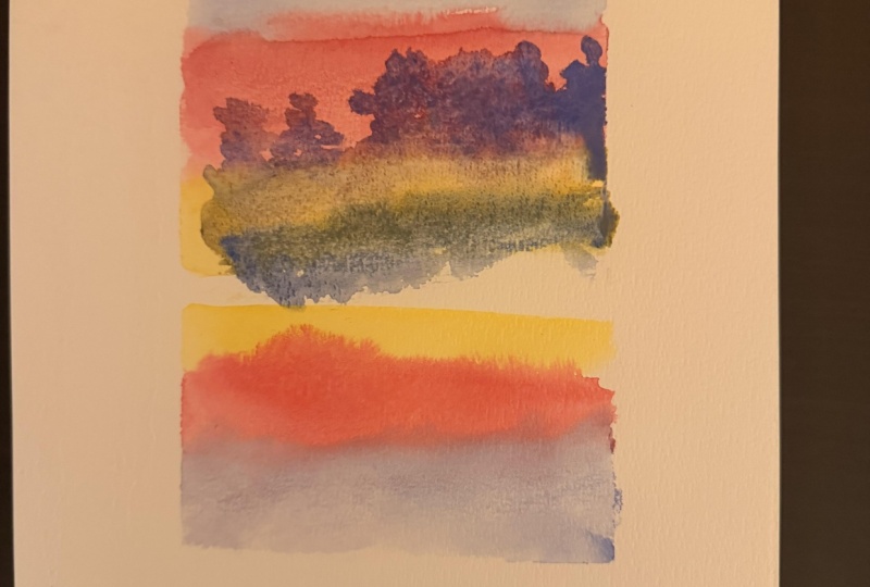
4. Day 1 - Soft Skies: Take a moment. Today, we are going to be diving into
this beautiful piece. Let's start with our
AFO A five sheet, and I've tipped down all the
four edges with my tape. Starting with the subtle blue, it's a beautiful warm color going all the way from the top. Make sure that your
brush has enough of water to really
smoothly move it. Starting with the next color. It's a beautiful pink color. Gentle shade, starting from below and slightly
moving upwards. Now, if you notice I do my skies with quick rapid
motions from side to side. This is so important that you bring it all the
way from side to side. That way you don't
leave any gaps. With watercolors, things
can dry up very quickly. So you want to
make sure that you cover all the edges
before it dries up. Take enough of the yellow
to gently move the brush. And I've left a
little bit gap in the middle just using
water to blend everything. Going back and forth
with the pink, and this is for the sea, for the water part of it. So I'm just actually copying the top layers on the opposite, having blue at the bottom, pink above, and then
finally yellow. You can see how that turned out. Very quick, very gentle. And now we're going to let
the whole thing breathe, let it rest, and we can
start with our next layer. Time to switch to
the smaller brush. Go to start adding in some simple trees
in the background, using the same blue that
we used for the sky, or you can take a
slightly darker indigo. That works well, and I'm
gently building up the tree. As I move downwards, I'm not taking in more paint, so it becomes a little more subtle and fades
into the background. Remember to keep the shape of the trees where you
have that pointed tip and gently moving downwards in the
form of a triangle. We're going to build slowly and just layer up
all the details. At this point, can
you feel the calm? Can you feel the
relaxation? The peace? Isn't it amazing just to take this moment to just
disappear into your art? As we move downwards, what we're going to do is take more water and
we're gently fading this layer with
more and more water so it becomes more transparent, keeping it very subtle, and this is also going
to be our horizon. So make sure that you
add a straight line, adding a lot of
water to the mix. I like using my palette for
this so that I can really mix in and make sure that I
get a very light layer. You can notice how I hold
my brush in this step. It's more like I am
swishing it about. I'm going back and forth. It's not like the background. And so that's really important. You're moving your
wrist a little bit more here and trying to create more of a scattered
playful movement. And that's what's going to give it a better look and feel. So try to avoid having
straight lines going in and just play around
with your brush. Adding in more water
to blend it out and so that a whole mountain or the
background just fades in. Time to take some blue, and we're going to add
in the reflection. So adding a lot of water, let's start by adding
a straight line. And we're going to just
add the reflection for this mountainous treetop
that we just painted. And all you're
going to do is flip the design or the elements
and paint it downwards. Make sure that you
have enough water so that it is much more subtle and leave a little bit of a white space between
the two layers. There is no rush, no deadline. Take your time in this process, trying to get it to look very similar and create that
beautiful reflection. While doing the bottom, it doesn't have to be perfect. You can see how I'm
just squiggling it out just to try to show that
there are tree tops. A We're now going to take a little bit more of the blue and add
in the gentle sea. I love painting the ocean. It's so peaceful and
it's so relaxing. And just yesterday, I was talking to a friend
and I was just telling them how much I love the ocean and just
being near the sea. I don't really enjoy swimming, but I just like
being around water. And that's when I
realized that I've always lived in the city and even if
I was living in an island, I was more towards the center, so I never got to spend too
much time near the water. So that's why it brings
me so much peace. It's something
that I don't have, and that's why I
enjoy painting it. And even today, I
decided to paint this because the ocean is there, but it's kind of far away, so let's create it at
home in the comfort of my home and just feel that
peace and create that feeling. So what I've done is added
in quick water lines, and you can see how I just
did that by swiping my brush from left to right quickly
to create a very thin line. I'm using my thin
brush for all of this so that I can get really
into the details. Now, we're going
to let this dry, and if it has dried at this
point, we can continue, and we're going to add
in some little nature in the water to give
it some movement, to give it some composition, and just make it
look really nice. Using black, I'm adding
thin strokes for grass. Just very quick lines and keeping my brush
perpendicular to the paper, so I'm making sure that
I'm almost just waving my brush from on top to
create these thin lines. Once you get all the way to the bottom and you're
happy with the lines, let's add in some
stalks, some details. This could be like a
quick floral detail, but you can't see it
because it's on shadow, so it's just going
to be dark in color. And I'm just gently tapping my brush to create this
very similar to the tree. If you notice, it's
very similar design. Once we have that, we can
just fill up a little bit of the bottom in case there's
a lot of white spaces. Let's do a similar
set a little bit further away to the left. This is all love to
be easy and gentle. So take your time and
just enjoy the process. You can practice this a
bit before starting with your main sheet if
you're not sure and just gently flick your wrist to create these beautiful lines. Bree all of these little
crust from the center, and then we can add in
some more of the flowers, fill up a little
bit of the bottom. A The next step is
really important. We're adding the
reflection for these. I've added a little bit
more water so it's not as dark as the original. That's what shows that it's a reflection and blending
it out a little bit more, but just making it
a bit more subtle. Now, allowing the
piece to dry up, and I am getting
into the next step. This is the final step, adding another
layer of mountain, and that's going to kind of lift up the entire
piece and just give it a little bit more
of vibrance and spark. These small details can really uplift the painting
with watercolor, since everything becomes
a little bit more subtle, this pop of color and layer ring really helps the piece
look complete and bolder. I'm going ahead
with my dark green. You can use even indigo, that's going to be really
nice and we're creating the same trees this time making them bolder
and more prominent. This is your landscape
and your pace. You get to take how much
of a time you want. You can slow down. You can go quick,
add one tree if you want to or just add
a bunch of them. So there's no wrong answers. Just have fun with this with this next layer that is
popping off the sheet. Finally, adding some clear
water and blending out this layer so that it
fades into the bottom. Once the painting is completely dry, we can remove our tape from all four corners to reveal
our beautiful piece. Notice how it feels
to have slowed down and just with a gentle
quick approach, create something so beautiful. I
5. Day 2 - Into the Forest: For this painting, I wanted
to create something unique, a walk in the forest and make sure that you
take your A five sheet, tape down all four corners, making sure that
it's extremely flat. We're going to start
with our bigger brush and starting with
our bright yellow. This is our daylight
yellow from the woodland set using clear water to
blend out the colors. We now move on to our brown, our sandy sand
ridge brown color, just to subtly blend
the colors through, using a lot of water to blend this layer and creating a
very subtle background. Slow is powerful, and
this is love to be easy. So just enjoy the
process step by step. We now move into one of my
favorite colors from the set, and this is called pond. It's a greenish blue
color, beautiful, bright, vibrant, and I'm so
obsessed with it, and this is going to
be the background for our forest today. Remember that painting
is a process, and it's not always perfect for it to still
turn out beautiful. So even if your
background doesn't look as great and
it's a little messy, that's okay because as you keep painting and
adding more details, you can work on it and
it looks beautiful. Time to create our
footpath using Sandig the brown shade
for a very subtle color. I've used it in the
middle of the pathway, and then using darker green, the deep moss,
adding in bushes and a little bit more
of the forest along the sides of this footpath. Notice how I've switched
around my brush and how I'm kind of dabbling it
and just making it mushy. I'm not going for
straight lines. It's more like
switching it around the paper to give a little
bit more of texture. I'm still using my bigger brush, and I haven't moved on to my smaller one so that
I can cover more area. This is still the background, and we haven't gotten
into the details yet. Try to go a little bit
more with the green. It will lighten down, and that is something
to remember with watercolors that the
colors will fade. But that's okay, and
that's why we layer out. This is where the painting
needs to breathe. You can use a dryer
to dry it up, or you can just take a break and come back to your painting. We're now going to
go into some trees. I think a forest is so important when you add in
these layers of trees. We're trying to make
the layers softer and more subtle as we move away. So the closer the trees are, they're going to be
bolder and in our face. So you can see how I'm
adding a lot of water to the mix and just
giving subtle shapes. So it's not obvious that
they're proper trees, but they're there is just a shape or a
silhouette in the backdrop. Going very light
with the colors, you can go in for a
light blue or a green, just adding a lot of
water to the mix. Let's add another tree. Here I'm going for a little
bit of a deeper blue color. This is mist from the set. Then you can see how I'm making it a little
bit more bigger. It's longer, it's more obvious and it's going
all the way to the top. Adding in some branches
in the shape of s a very quick trip tip here. If you're starting to
paint and you kind of have these questions on
how to do a branch, remember that your branch
doesn't need to be straight. It can be a little
bit crooked trees don't grow completely straight. There's a little
bit of movement. The other thing is when you
create branches is to make sure that your branch is
thinner than your main trunk. And that is very obvious. But I've noticed some
people don't realize it, and then they make the branch
thicker than the trunk. And then that looks off
and it doesn't really suit the painting because
that's not how it is in nature. So we're trying to
keep a little bit of, I would say a little
bit of concentration of how nature looks and
just following that. Adding more of this beautiful
green for the leaves. Still using my bigger
brush for this, and I'm just cushing
and pressing down my brush with the green. And you can see how I'm
just focusing it more on the top part of the painting. You can switch around to
a little bit of blue, so you have a little
bit of mix of colors. As you can see, it's so
interesting and so powerful. This is all about
excitement and joy. And imagine like you're actually
walking down this path, how your mind calms and you feel that sense of relaxation, just feeling close to nature, feeling like you're just
breathing in that fresh air. Taking more of the
deeper moss green and adding in more
details to the grass. As you can see, I'm
adding thin lines along the edges and then adding some quick strokes to
create the effect of grass. Again, press down your brush and smoosh together
some of the areas. What this does is create some
texture in those sections. Now that we've done one side, we're going to continue and do the other side with
a similar technique. Maybe deepen some
of the branches, add in more branches
for the trees. Let's just make this
whole forest vibrant. I As you keep painting, you will notice that some of the areas have dried
and we can add in more color because it just becomes so soft once it's dried. So now I'm going
full on with the moss green and just building
more deeper layers. Notice along the
edge of the leaves, I add a little bit more of strokes to show that the leaves are maybe
pointing outwards. We're taking advantage
of nature here. And as you've been painting, some areas of your painting
would have already dried. So you don't need to
take a pause and stop. You can just continue
painting like the footpath. It would have dried by
now because we've spent so much time working on the
trees and things like that. You can allow it to
dress for a bit in case it hasn't if it is done, if it's dry, let's
continue adding in some thin lines using Sandrig. Beautiful brown color
that just creates some depth to the footpath and also makes it a little
bit more imperfect. Drying time is part
of the process, and I read somewhere that it's
actually part of painting. It is an actual technique. I found that very
interesting because it's so true in watercolors, how much time you keep for
drying and how well you dry your piece is also so
important to your painting. It can actually help, you know, avoid messy mixes and also protect your art if you can just give that time to dry. If you can use a dryer
or a blow dryer, that is also
convenient and you can work much more quicker,
which is what I do. I do use a blow dryer, but sometimes in some
of the paintings you will see in this challenge,
I just took a break. I decided to walk around my room and just maybe think
a little bit about gratitude or think
a little bit about the positives that
I enjoy or just value the fact that I
could take some time for myself and paint and then
get back into the painting. I decided to take the
pause as a way of working on myself and
feeling a lot better. I think that was so interesting, and I think it was much needed. Instead of just rushing and rushing and trying to paint and making it perfect and trying
to get the piece done, I decided to just
take that break. So we're going into adding
more depth to the painting. Let's go back to the painting. And we're going to use a
little bit more of the mist. So it's an indigo blue. Or a little bit more
of the deep moss, and we're just adding
more depth by adding more layers to what
is already dried. As you can see with the tree, I just went in and added
some darker layers. Same thing I'm doing on
the left side as well. And you can see
how that has just kind of lifted up the painting, and just made it
a lot more bold. Gently tapping your
brush, on either side, for some splatters
to come in for it to give you a little bit more
of a grass leaves look, not grass, actually leave
suits on top of the trees. And we're almost done
with the painting. I just wanted to add
a little bit more shadow along the footpath, adding a little bit brown just
right below shadow areas. Wherever the grass goes forward
where the footpath winds, just adding a little bit more
of depth in those sections. And we're done
with our painting, we can let it dry
naturally or use a drier and then remove out our tape from all four corners to reveal
our beautiful piece. You didn't rush this piece, and that is what
matters. Enjoy it.
6. Day 3 - Calm Ocean: Today's painting is all
about how you slow down. And there going to be a lot of pauses and breaks for
the painting to dry. Take that as an
opportunity to just sit down with yourself
and enjoy the piece. Yes, you can use a blow dryer or a dryer and dry up the
piece and paint quickly, but just take it as a
practice to slow down, step back and let the
paper do its thing, and you can just feel the calm. I've started with
a foxberry pink. It's a beautiful
color in this set, and you can see how
it's bright and bold, starting right at the top, using a lot of water to just
glide it through the paper. Now, the next layer of sand ridge basically
a subtle brown shade. Connecting it to
the Foxberry pink. As we move lower,
just wash your brush, and let's pick up
some daylight yellow, bright yellow to just add that pop of color
to your painting. One of the important
things I learned about watercolors is to not
over work the piece, to let it just be
simple strokes, let the colors blend into each other and don't force them. Once we do the sky, let's repeat the same
thing for the sea, the ocean by repeating the
similar shades at the bottom. Remember, again, don't go back
and forth too many times. It's going to create more lines. So it's important to just
be as gentle as possible, just a few strokes back and
forth and letting the peace, the water do its thing. So just a few moments later, I decide to mess around with my sky because I felt like
it just wasn't right. It's interesting that looking at it from the video,
it looks great. But in person, I felt like there was something
off that I had to tweak. Now, one thing I would say that even if you want to
fix it and I know some of you have OCD and
I have a little bit of perfectionism in me that I
need to get it exactly right. If you're doing
that, just try to do a couple of quick swipes. Don't go back and
forth too much. So we're going to take a pause, let the piece dry, and then we can get back to it. I took a little bit of a
break and just decided to think about all the things
I'm grateful for this year, make a list of five things, and really feel into
the gratefulness. Just enjoy all the things that I kind of forgot
that happened in the month or the week
and just remember that I'm actually really happy with things that
are happening in my life, and it can be the
smallest of things like having tea in the
morning that makes me so happy or something as
big as launching a course, just the tiny things,
the big things, and just taking that pause
to feel a little bit of gratitude before getting
back into our painting. So here I've tried
to do the sun. So I've taken yellow for the sun and then
adding the reflection at the bottom on the sea by
following some quick lines. Once you're happy with it, let's get into the Foxberry pink and add in some mountains. I'm keeping the layers for
these mountains very subtle, so add in a lot of water, switch to your
thinner brush so you can get more detailed
in this step. Your art is unfolding and so just enjoy it and take
it layer by layer. Adding a little bit more of that Foxberry pink
along the top, and you can see how that creates
a beautiful effect where just the top outline has a
little bit more of that pink. Let's repeat that on
the other side as well. Now, wash out your
brush completely, and using clear water, let's just blend out the color so it fades into the ocean. And you can see how
this is already bringing such a
soothing, calm effect. Let's now mix Foxberry
with a lot of water and add in the
reflection of these mountains, keeping it very gentle and soft, adding a lot of water. So it's very subtle following the shape of
the mountain on reverse. Reflections are such a
beautiful part of painting, and it really adds in
so much to the piece. It completes it and really shows how crystal
clear the water is. It's interesting how confidence can quietly grow
stroke by stroke. Every piece that you paint, you just end up
feeling more relaxed, more confident, and more
sure about your skills. And that's what I love
about these exercises. This challenge is meant to
make it easier for you. Gently taking in some
deeper Foxberry pink and gliding your
brush back and forth. We're keeping the
movement very light. And remember to keep your brush perpendicular
to the sheet, so just the tip is
touching the paper. And that way you can get
some really thin lines using your thinner brush. It's really useful to switch brushes when
you're painting, and you will notice me do
that in every project. For the background, I use the bigger bolder
brush so it covers more space and then using the
thinner brush for details. Allowing your piece to rest for a bit and then we're going
to go back and work on it. As I said, this painting has
a lot of bricks where we let the paper dry and rest before
moving on to new layers. As you add in more layers, your piece also
gets more vibrant, more energetic, and
just beautiful. Again, using clear
water to blend out these mountains gently. And we're done
with our painting. I love the painting to completely dry before
you remove your tape. This is so important. There have been times
where I've been a little bit impatient and then just removed out the tape while
it was still wet, and I ended up tearing my paper. So just make sure that
you take that time, dressed it completely to unveil
your beautiful painting.
7. Day 4 - Mountain Views: Welcome to today's
incredible painting. It's full of color,
super vibrant, and we're ready to
just get started. Starting with our Foxberry pink, let's go all the way
from the top and gently glide the
brush downwards, using a lot of water so that the paint blends
gently into the paper. Once you're done with
that, we're going to go ahead and add
beautiful layers of color just to brighten
up this sheet of paper. Whenever I paint landscapes, I notice that my
breath slows down, and you might find
that that happens to you as well without even trying adding a bright
daylight yellow gently bring it downwards, using a lot of water
to blend it out. Now that we've done the sky, let's move on to the ocean using the Foxbery pink,
starting from downwards, gently moving up, adding a
lot of water as you move up, the layers just lighten and playing around
with it a little bit. Add more water
towards the edge so it blends into the paper. After this, once you're
happy with the overall look, we're going to let
the painting dry, let it pause before moving on. Time to add in some
lovely mountains. We're building form slowly
layer by layer using mist, indigo blue to create some
mountains along the backdrop. Keeping the mountains
very subtle and making sure that the edges
are more jagged. We don't want to
have a perfect edge, dropping some more paint
along the ends and using water to blend
out the remaining. Now to create some mist, wash your brush and
using a clear dry brush, just pull through
some of the paint. Let's do that again and dab
out the s, water, and paint. And you can see how that
creates a beautiful misty look. Maybe we can do
that one more time, and you can see how I do that. Just pulling through
and dabbing it out, pulling through, dabbing it out. I can see how that's fading so much more into
the background. Meanwhile, let's drop in some deeper indigo at
the top for more depth. Time to add in some
lines for the ocean, using blue, going
back and forth. And once we're happy with that, using water to
blend out the rest. Notice how I'm getting it all
the way to the right side, so it is actually
the reflection of the foresty mountain
that we just painted. So trying to get more of
the color on that side. Pause for a bit before
moving on to the next layer. Once everything is dry, you can tap it gently with your finger to
make sure it's dry. Let's go on to our
thinner brush, and we're going to add
in some beautiful trees, some bold leaves, and
just pop some color. Starting with brown, it's adding a little island for all
the trees to sit on. Drop in some green to the mix to form the basis
of this little island adding in more green, adding another brownish color. Something I've been enjoying through all of these paintings, and we've just halfway through, is that every time I paint, I kind of feel a little
bit more calmer. I feel like I'm near the ocean, and it's bringing
back so much of joy. Don't you feel the same? Do you feel that calmness
when you paint or just this piece of creating
something beautiful? Or if you're struggling, you're kind of seeing
some parts that you like and some parts
that you'd want to enjoy. And each painting is
just so fun, isn't it? So we're going to
take the trees. We've added in some branches, and now let's go ahead
and add in the leaves, taking in deep moss to do this. Notice how I'm just gently
wishing around my brush, adding some thinner dots
along the edges of the tree. What I'm trying to do is create a conical shape that moves all the way and because the background
is a little lighter, has a little bit of yellow, as I move upwards, the green as well
becomes lighter. So I'm not switching
around shades. I'm just continuing painting
with the same brush, not taking in more paint, but just using what
is left in the brush. And that's why it's lighter and lighter as I move upwards. This is a very important
technique to use when you're trying to lighten up color so that they
just blend in. You don't need to
wash your brush and add or take more
paint all the time. A little paint actually
goes a long way. Now again, I've filled
my brush up with paint, and then as I move upwards, I'm not going to be
taking more paint and just using what is
left in my brush. If needed, if my brush
feels really dry, I can use a little bit of water, but that's about it. A time to use green and add in the reflection for
this little island that we just painted out. Okay. These sort of landscapes
remind me of the US so much. When I went to US, I
think I saw so much of these kind of
beautiful settings. Every time when we drove
from the West Coast, we would stop and see the
mountains and the calm oceans. It was so nice. And I think same
thing as Scotland, as well, has its
beautiful mountain views. It's just so relaxing. And I feel like I can sit there for hours and
just stare at the water. I feel like after a
point, I might get bored. But I think I still enjoy that calm even for
five 10 minutes. Continue adding in your lines to create more effects of water. You can see how those thin lines really brings through
the painting, makes it look like the water is just there and it's simmering, and it's very calming. By the end of this session, you may realize that you
created more than a landscape. It's a moment of inner reflection
that you gave yourself. And that is so important with how noisy the world is
and how many things going on and all these
stresses that we all carry with the start
of the new year, it's nice to just
do something for yourself and to let it be fun and let it be a moment of peace and
a moment of pause. I'm adding more
shadow to the layers and you can see how by just adding a little
bit more green, you add in more depth
to the painting. At this point, I feel
like the painting needs to dry before I
can add more depth. I couldn't get as much depth
in the previous layer. So once I let it dry, I feel like I can add in. So adding a thin line of
black along the bottom, and you can see how
that's created shadow, we're going to add a
little bit more on the island as well
to give it more. I feel like with this painting, I felt like reworking it and painting over and
over and over again. So I decided to put a stop
and then just go like, This is it. I'm done. This painting is over.
Usually, when I get to the darkest layer is when I know that my
painting is completed. So there's always a
background layer, a secondary layer, and then a third where it's
much more detailed. And at that point, I stop. That has been kind
of my go to way of figuring out
if my painting is complete and not overworking it and adding more and
feeling the need to do more. Once the painting is dry, let's remove the tape from all four sides to reveal
our final painting.
8. Day 5 - Framing through Leaves: Now we move on to this
beautiful ocean view painting. It's going to be beautiful
blues and yellows and greens. Get your paper ready, taping down all four sides, and we're going to
start one by one with our beautiful and bold. I'm actually thinking should
I do the pond or should I do the stream B I really
like both colors. So I decided to
go with the pond. Such a vibrant color, I cannot get enough. I think every time
I see this color, I feel like painting more. I used to think that
I had to control every brushstroke until
landscapes thought me that I had to just enjoy and love the
painting to come together. Following this beautiful pond, we're going into daylight, so the bright
yellow color gently weaving it all the
way to the middle, keeping a little bit of gap. Let's start again with the
yellow and move downwards. And here we're painting
out the ocean. I'm using a lot of water to just really dilute the colors
and make it very subtle, creating the perfect
background for our painting. Moving back to pond, let's start from the bottom
and gently move upwards. As we went through the
practice exercises, remember when you're adding
in a secondary color to always start from
down and go upwards. That way you don't
muddy up the colors, and they still remain
vibrant and visible. Now, let's take pond directly from the pan, a deeper shade, and we're just adding some
quick strokes all the way to the middle to showcase the water and create
those water lines. As you keep adding the colors, you will see that it's becoming deeper and much more vibrant. We're going to let the
painting rest for a bit, or you can use a drier and dry out the painting before
moving on to the step. Now we're switching to details. We're going to start with some really simple mountains and some leaves and trees and just create some
greenery to the painting. Starting with deep moss, a dark green color, going ahead and just
swishing around your brush to create
some leaves at the top. Notice how I'm still using the bigger brush so I
can cover wider area. We still haven't
gotten into details, so there's no pressure to
be perfect at this point. You can just have some fun. But one thing I would say, which is so important as you
continue painting is to not overwork your painting
and just to let it be. There comes a point where
you can overwork it, and then there's a point
where you underwork it. So this is, I think the
most important part as an artist to learn
to get good at. So I actually tell my
students to try both. So if they use a lot of water or not sure about how
much water to use, I tell them to go
above and beyond, use a lot of water and see
how things turn out and then go to the opposite end of using very little water and
see how that goes. And that way, you can figure
out what your point is and you understand a little bit
more of how much is required. I've also noticed that people
tend to naturally do this. So I have students
who are just scared of using water,
and if that's you, I understand because
you've heard so much or seen so
much where it's like, Oh, my God, if you
use too much water, you're going to
destroy your painting. So you hardly use anything. And that doesn't work. So
a little practice exercise of testing this out
will really help. Now, you can see I've kind of
painted a couple of steps. I had to skip some of it because I ended up making
some I forgot to record. So what I did is
the first layer, as you saw, I loved it to rest, and then we're going in
with a deeper layer. We've done this in our
previous painting, so you already know
how to do this. We're just layering on top
of the other to give more. Adding in some brown for the
branches of the tree on top. And here you can see I've
switched to my thinner brush. So I obviously forgot
to dry this completely, so there's a little bit
of merging going on, but I'm going to use
it to my advantage. It's okay. There
are no mistakes. You can actually fix anything that goes
wrong in your painting. So you can't, some you can. So something like this,
I can very easily fix. So I'm just going to
continue adding in the branches through the
top part of the painting. Now, let's take some green, the deep moss green
color and paint on top of the area that blurred
a bit because of the water. I'm also deepening up the color a little bit
more in that section, adding more of the green to make it much more vibrant and adding some dots to showcase the leaves that are
peeping through. This makes it more realistic and also shows that it's leaves
instead of just random blobs. I think it adds a little
character to the painting. A Once you're happy with the top part
of the painting, let's add in some shrubs
to the bottom part. I feel like this in a way frames the art so that the
mountains become the focus, but then you also have this
beautiful greenery around. So quick strokes,
gentle wrist movement to add in a little bit
more for the bottom. A quick thing that I'm
going to do here as well is add in some
splatters to the top. This is also going to give a little bit more of character. Take your brush, take a little
bit of that deep green, use a little bit of
water and gently tap. I use a secondary
sheet to cover up my mountains so that they
don't have splatters on them. Then you can lift it up and
you can see how this is just going to look much better. I Finally, I wanted to add a
little bit more of green in the mountains
because it's blue. I felt like there's
something missing. So taking deep moss, let's go ahead and add in
another layer of trees, mountains at the bottom. Continue adding in
those pushy lines or just swishing
around your brush. To give it more texture. And you can see how that green
actually adds a little bit of pop of color to the painting. It's these small details that
really add to the piece. We're almost done
with our painting. We're going to take
a little bit of the deep moss
forest green color, and add the reflection of what we just painted
onto the water, showing that the water is so crystal clear
that you can see the beautiful reflection
of these trees. Let yourself feel quietly proud
of painting this artwork, letting it dry, and
then you can go ahead and remove a tape
from all four sites. This is a painting
that you created, be proud of yourself. Look at what you did right and see what you
learned from this.
9. Day 6 - Rocky Beach: Welcome to today's peaceful,
soothing painting. It's gonna be effortless, natural, and just
fun. Are you ready? Let's begin. Taking
my A five sheet. I've taped down
all four corners, and we're going to start with our blue and just
go back and forth, adding more water
and gently creating a soft Backdrop using pond for a little
bit of dreamy skies. Adding more water, more green
to blend into the backdrop. Once we're done with
that, we're going to add some deep blue color, mist, and from downwards, moving upwards for the ocean. There's a natural softness
to this painting acernity. Using clear water to just blend all the way as it
connects to the sea. Keep your touch very light so you don't end up with
harsh brushstoks. Make sure to go all
the way side to side. To make sure you
don't have any lines or anything that just
doesn't sit well. There's a quiet confidence
in this process, and trust that it'll turn
out exactly how you hoped. We can take a little bit more of that mist and gently
move upwards. As I go upwards, I'm being more intentional
to keep the lines very thin and very soft. Now, let your painting dry
for a bit before moving on to add our rocky landscape. Using a dark brown, let's add a rocky wave. We're going to add in
some color to this and create a very crisp edge. Don't worry about the
colors as of yet. We're going to play around
with it a little bit more as we continue
with the process. As your brush moves, the scene comes together, and you'll end up with
beautiful results. Sorry. So trust the process and just enjoy as we go along, creating a fun painting. While this is drying, let's go on and add in
some leaves for the trees. We're translating
a feeling through this painting and
capturing a mood. So using our deep mose, let's add squishy lines just swishing around
your brush at the top, leaving a couple of dots at the edges to showcase
the leaves. Okay. I've learned that trees
don't need to be perfect. It's all about getting those little details like
those thin lines that add character and make it
look more real in a way. Now, let's allow the
entire thing to dry. But meanwhile, we can paint some of the areas that
are not touched by these sections like a simple, soft edged mountain
in the background. Use a blow dryer and dry up your painting before proceeding. We're going to take a
darker brown and just paint the trunk and then
add in some branches. Like I mentioned before, the branches need to be
thinner than the trunk. That's very important. We can then take in
some more details, maybe adding a branch
towards the edge. Keep your hand loose while continuing to
add more details. I've also switched my brush
to the thinner brush, so I can really get
smaller strokes by switching around my brush on
the paper using deep moss. This gives it such a natural
look and also creates depth. Add in a couple of
lines to represent leaves along the
edges of the outline. And that brings it all together. So our tree is done. We have a couple of
more details like the rocky shoreline as
well as the water lines. First, before that, let's add in some
splatter to the top, create some texture
before continuing. At this point, I
would suggest taking a break if your
piece hasn't dried, but if it has, you can
continue with details. So I'm taking in the brown. This is called
Cavern on the set, and you can see how I'm
blocking out certain sections. We're going to keep
switching around colors, different shades of brown to
really build up the layers. Painting rocks is very interesting. So it's all about getting
those dark lines. Correct. So you can see I'm Now, starting from the top top part, we're going to just block
out areas with brown. Just follow along how I
create these sections. I'm making sure to
leave in gaps between the lines and those areas that are a little
bit more uplifted. At some point, I was
thinking that I should do a class on how to paint rocks. And if that's something
you're interested in, just comment in the
discussion tab, and I'll keep that in mind as I continue planning out
my new challenges. But I think rocks would be
a very interesting topic. It is a little bit more
complicated to do. So what we want
to do is actually get darker spaces and
lighter sections. Rocks are all about
creating light, and that creates its dimension. I remember talking
to a fellow artist, and she was just
telling me how art is honestly shouldn't
feel like shackles, it shouldn't feel like
stress and pressure. And let's say
you're beginning to paint and you make a mistake
or you don't get it right. The maximum you're going
to do is, let's say, waste a little bit of paper, waste a little bit
of paint. That's it. You can always buy more paper. You can always use more paper, and you can always
use more paint. It's not as, you know, it's not So scary. And so, just remember that if
you make a mistake, you can always just take
a new sheet of paper, and it's not anything
big mistakes happen, and more than that, learning is a process and it's
learning over time. So don't be that
scared to try it. And don't be that
scared to stress. Just enjoy a love yourself
to make mistakes, a love yourself to
try again and again. And remember that all you need
to, let's say, buy again, would be some paper and paints, and it's not that scary. I think that really I
found it very interesting. I've been painting for a while. It never I never thought about
it until she mentioned it, and I felt like it
was such a good thing to tell anyone
who's a big ner or just starting and
is a little bit scared. They don't
have to worry. It's just paper and some paint, and they can always
buy another paper, and they can always
buy some paints. And watercolor uses very little. So a little goes a long way. Now you can see how I added in the little bit
of rocky textures. All I did is actually
leave spaces of the base and added
in darker sections. Now, adding a little bit
of blue for the shadow of this rocky space. Let's add in some water
lines very gently with pond. I was thinking about
how I could mix pond. It's the bluish green color, and I actually don't know what I could mix to get that color. You could try mixing a little
bit of blue and yellow, but you need to have
the right amount of white to get it to
look like that color. It's not a very easy color
to come by, but I love it. It's beautiful. It's so bright. And it's just so rich. Continue adding in
those soft lines, keeping them relaxed and just layering them up. A Time to add more depth to these rocks. So you can see how I'm
adding black just along the bottom side of any
line that I painted out. So notice how I'm not
getting it all the way up. It's just the downward sides. And I think that makes it
a little bit more easier. I'm not, again,
painting all of them. I'm not layering
them up too much, doing those bottom
side of any shape. This touch of black is
going to make it more realistic and you can
see how the rocks now are starting to
look more like rocks. The more layers you can add in, the more realistic it becomes. Once we're done, we can
allow the piece to dry. I see dry as invitation to
pause and take a break, remove your tape to reveal
your final painting. Remember that some paintings are about learning and
not just finishing. In this one, we learned
how to do rocky terrain, how to do those
beautiful branches and leaves a subtle backdrop and creating depth
within your painting. And that is such huge progress. Don't you think so?
10. Day 7 - Sunrise: Of all the projects
for this challenge, I think this one is my favorite. It's just so fun and playful. At the same time, it makes me want to stare at it
for a really long time, just feeling the breeze, imagining I'm right there. And if you live in a place
that looks exactly like this, then that is amazing. Starting with a little
bit of pink from the top, let's gently add it
in swishing up brush, side to side, adding more of that pink so it
deepens up at the top. This section isn't going
to be seen as much, but I still thought that pop of pink color was so interesting. Using in water to
just blend through the pink gently as
we move downwards, a little bit more of pink. Very subtle. And now we can switch to another
color. Let's do a blue. Now with the blue, I'm being a little bit careful
and not going over the pink as much because blue and pink is
going to give you a purple. We're going to be a
little careful about that and just make sure we
don't go too much into it. Switching to another color, yellow, again, starting from down and moving gently upwards. Every time I switch colors, I make sure that I wash my brush completely so that there's no
residue of previous color. You can use a dry brush to just gently blend these
two colors together. Blue and yellow
generally gives a green, so we're trying to avoid that. Let's continue on this process. Line at a time. Moving on to the ocean, we're going to use bright
yellow followed by water, clear water, and
then finally blue. So just flipping the sky
when we paint the ocean. You are on the right
track with this painting. So just keep going, adding more and more color
as you get to the bottom. So we're really fading
into the background. Um, when I first started
painting landscapes, I felt like my painting
looked very flat, and I thought that meant I
was doing something wrong. And then I realized
that as I was painting, I needed to create layers. So the paws, the breaks, allowing your painting
to dry was really important in creating
something special. So don't worry if
your painting is taking time or you had to stop for a bit and
then layer up. The more layers you can create, the better your painting looks, and it starts looking
much more natural. Now is the time I step back, make some tea, and then decide how I want to
proceed with the painting. Usually, I would rush this
part of drying the piece, and then I realize that
even using a dryer, if you go into the
highest fastest speed, you sometimes move
around the paint, and I would notice that my
water has moved up a bit. So I started actually start
using it in a slower speed. And then increasing
it as I went along. Even allowing to just let it dry naturally had a
better effect as well. But it depends if you have
the time to spare, you can. Otherwise, you can just take a little bit of a
pause and continue. Let's add a little
sun using orange, a simple circle right
at the horizon. Lift up a little bit of
the paint in the middle to create a little
texture for the sun. You can see how I'm doing that, using a dry brush
and just lifting a little bit of that
paint along the center. To create more interest
in the background, I'm adding in also some very soft subtle
mountain using blue. It's just very transparent, but it gives a little bit of detail and it makes it look
more natural and aesthetic. Using your thin brush, let's add some quick
lines for the water. And this feels very natural. Nice. Let's keep going. We're going to continue
with our tree, starting with our trunk
followed by some branches. Let's get brown ready
for this purpose. One really interesting
trick that I learned while painting trees with sunlight, add in a little darker brown in the areas
that are darker. So you can see near the water, it's more darker in color, whereas near the sun, it's
more of a light brown. That gives a very
natural shadow effect and makes it much better. You can see also
with the branches, I've just split it across, making sure that the branches
are thinner than the trunk. Again, very important. I mentioned this a lot
because I've noticed it happen with students, and it makes the painting
look a little bit off. And it's these small
little details that these small little
techniques that can really make your
painting go form. Oh, that's okay, too. Oh, that looks amazing. And I think that's
what a lot of artists when they say practice
makes perfect or, you know, art is a skill, it's because as
you keep painting, you learn the technical aspects of how something should look, whether it's a tree,
whether it's sunset, you learn the technical details. And they might be
such a small detail, but even those small details
can really turn a painting from basic to incredible. Now smishing down your brush to add in some leaves for the tree, starting with a
very light green, and then I'm going to add in deeper colours to give
more of a shadow. I really like how this is going. The painting is coming
together already, and it just looks so
bright and vibrant. Switch to a darker green, and we're going to
add more depth, and you can see how I'm
not doing it everywhere, but just areas that
are kind of closer to the trunk so that it looks like those are
more in the shadow. Continue by adding little dots along the edges to
show the leaves. All these tiny little marks really add to the painting. Mh Now comes a very
interesting part, we're going to take
some time through this. I used to rush this process. I used to rush this
part and I would try to just add in some dots, and it really showed. And then I realized that
I needed to slow down. And instead of just
trying to mush together everything where I would
have usually stopped, I decided to slow down
and add in some leaves, one leaf at a time, having some of those
branches falling down, those leaves really framing that sun tries or the morning
sun, I would say. And those little leaves, it takes a while, but
it looks so nice. So in this part of the painting, go slow, paint each leaf
and take your time. We're switching to
our thinner brush. Remember that any of the smaller details what we want to make sure
here is to go slow, add in a couple of
strings of leaves, but really stand out and
showcase and frame the sunrise. Going a little bit darker to
the edge of the paper using our beautiful green continue through this process using different leaves in
some of the areas. Really filling up the space. There are no wrong ways to
do this. So just have fun. And if you want, you can kind of play around with a
different type of leaves. You can add in some circular
leaves or if you want to use a marker or a sketch pen, just play around and
have fun with it. Aren't you enjoying
this process? I feel like this is
very calming and just really brings
you back to painting. This looks so good. Am I right? We're almost finishing
up with the painting. We have just a few steps left. As you go closer to the sun, you can even switch around the green to a
lighter green shade, and that's going to create
a very natural effect in terms of making it look like the light is
hitting the leaves. Again, a really, really
fun way to create color. Continue with this process until you've filled up
the entire section. We'll add a couple of grass at the bottom near the tree trunk
because it just looks like it's standing in
between the water and add in some splatters and we're almost done
with our painting. A Now, let's protect
everything that we've painted and add in some
splatters to the tree. I'm just using a rough
paper that I had, and then taking some
paint on my brush, gently tapping it onto my tree to give some
little texture. I like this little
splatter effect because it just brings everything together and
makes it look really nice. You're doing so
well at this point, and I'm so proud of you for getting this far and
for completing this. Look at how pretty that looks. And with a few simple steps, we were able to get here
with ease, isn't it? So let's allow this
to rest for a bit, and then we're going
to remove a tape to reveal our final painting. We just have few projects left
for this challenge to end. How are you feeling
at this point? I think it's been so fun creating artwork with the intention of
peace before we began, and that has made the whole process so much
more better and intentional.
11. Day 8 - Fog and Mist: Welcome back. And today, we're painting this miss team. I would say interesting piece. Start by taping up all
four sides of your sheet. And making sure that it
lays flat on the table. This is great for
when you do seas and landscape and use a
lot of water so that the paper goes back to
its original shape. We're starting off with mist, which is our indigo, going all the way from the top, adding a lot of water, and blending it into the paper. Use your bigger brush so
you can cover more area. This is one of my favorite parts because skis are very forgiving, as far as you don't go
back and forth too much. If you can just do
a couple of lines, add in lots of water, they come out really great. They don't need to be
perfect, which is amazing. So as you lay down your colors, don't overthink it, enjoy it. Let's start with our next color. Gently blending in the blues, so it really fades
into the background. You can go in and
deepen a little bit of the indigo right on top to
darken the sky a bit more. Now, the paint is still wet. We're going to go in
and paint in the sea. For the sea, I decided to
go with a different color. I mixed in a purple. So for purple, all you're
doing is mixing blue and pink to get a
beautiful vibrant purple, and that's what we're
going to use for our base, and then continue blending it with blue all the
way to the bottom. Using a lot of
water in this step, so it really fill out and
blend the sea gently. I'm adding in blue
to the edges to give a little bit more
depth to the water. Now that you've gone all
the way to the bottom, let's go ahead and add
in more deep indigo by swiping across your brush
quickly to form thin lines. You're doing so well. Give yourself a pat on the
back for getting this far. Once we have this
beautiful base, we can allow it to rest, breathe for some time before we go into
adding other details. Remember that watercolors
is a process, and the pause is as
important as painting. For this one, we're
going to add in some very subtle forest
trees in the backdrop. And for that, I'm
adding a lot of water and just creating
a very soft mix, starting at the top, gently painting our conical
tree to a midway point. Notice how I'm not
taking in more paint, and so it gradually
fades out and blends in. Let's do another tree
right next to it. Remember, like we did in
our practice exercises, to use some dots along
the edges to really show the leaves in a way. Continue this process,
gently adding in trees. You can see as we continue on, it really fades into
the background. And one of the good things is
we're going to let it dry, and that is going
to really soften the colors and make
it much more light. Now that we've completed that, allowing your piece
to rest for a bit, we can go on and add
in more details. Here, what we're trying to do
is get in some foreground, and we're going to
add in some grass, some details that
really focuses the eye. I think, along with
painting landscapes, knowing compositions
really helps in creating something beautiful. And it's something that
I have been kind of working towards and
creating something unique. Making that bottom
layer really dark, and then we can add in some
quick lines for the cross. Remember to switch to
your thinner brush at this point so that you can
really get those thin lines. Let's take another break so that we can deepen
up our colors. You can see how that
once it's lightened out, once it's dry, the layers become subtle and just
merge into the background. And that's why we let it rest. So now we can layer it again and make it
even more bolder. I'm going in with a
really dark color. You can go for a
black if you have. I'm going for a
midnight blue just by mixing shades
that I had with me. And let's start at the bottom filling up that grass section. So adding more layers, and you will see that
it's a lot more relaxing. Don't you find that
painting is calming and a little break in
life being so busy. Using my thin brush, I'm
just gently adding in some lines to showcase
the long grass. I'm taking this process slowly, so I get really pretty grass
that looks and makes sense. I also want to take my time
because it is the foreground. It is the focus
of this painting. One of the big
things as an artist to understand and learn is to build courage courage to
try out your painting, and to create the brush
strokes that you want to. It's the courage to
continue painting, even when you're not sure how the piece is
going to turn out. I think watercolors
really puts that in perspective because there are many times that I've painted, and midway through the painting, I just feel like this looks bad. It doesn't look great. It's not going to turn out amazing. I'm not happy with it, and
then I trust the process. And when I do, I
see that there's a shift and the painting
starts looking amazing. It's kind of like life where sometimes you
just have to sit through uncomfortable situations to get to the other side. And when you get
to the other side, it feels like it
was all worth it. Or you learned
something that made you realize that it had to
happen for a reason. You'll notice as you go along painting landscapes
and just getting into art that you feel more confident with
your brush strokes. Let's add in some quick dots to show the shadow
of some flowers. One quick tip is, if you notice
the way I did the grass, they're all not pointed
in one direction. They're moving here and there, and that creates
movement in the piece. So you want to have some
of them falling down, some of them going sideways, some short ones,
some longer ones. And that variation really makes everything look so unique. There is no wrong in this step. And if you've gotten this far, just give yourself
a little pad on the back and just
enjoy creating. For the finishing touches, let's use some splatters
around these grass elements. So take another paper
and just lay it down to protect your sky and trees. And then we're going
to take our brush and gently tap it to add small platters at the bottom,
creating some texture. And I like how this is going. It's working out really well
and looks very natural. Let the piece rest for a bit, and you can remove the tape
from all four sides to reveal your beautiful
painting for today. See you in 24 hours
for the next painting.
12. Day 9 - Pink Mountains: Welcome back to a new project. The softness of the sky is
that it always is changing, and we're going to have
so much fun on this one. I initially recorded this
for a different course, so there is a shift in terms
of the paint supplies, but it's colors that we already have and that we can easily mix, so don't worry about it. And the other thing
is that I haven't taped down the four sides, so we're going to paint
directly onto the sheet. Starting with my bigger brush, let's start with a
little bit of purple. If you have something that
is a deep blue or a pink, you can mix the two
together to get a beautiful rich purple. That's what we're going
to do for our edge. This entire project is going
to have very few colors, maybe two or three colors maximum and that's going to
be really fun to play with. We're then going on
with our yellow, adding a little bit
more of that sky and playing around with
the different blends. You may notice at this point
that you feel like you're trusting the water more and your painting is starting
to come together easier than it used to when you first
started this challenge. You're more comfortable with painting skies and that
is as we go along, you have gained more
confidence in your skills. Make sure to go all the way back and forth with the colors, taking a little bit of pink, all the way side to side. Et's now continue
on downwards to the ocean continuing
with the pink, moving slowly downwards,
adding more of the yellow. Very gently tapping your
brush onto the paper, soft movements, and then
going back to the pink. Using a lot of water
in this process, you end up with a very
subtle soft background. Time to add in purple
back to the base. And what I've tried
to do is create a reflection of the top layers. The sky had purple, yellow, pink, and so the ocean
has pink, yellow, purple. It's the same
combinations in reverse. When I first started
painting this, I initially thought I would make it a mini course where it would be five different projects
that you could learn. And as I continued and I
created this challenge, I felt like it made more sense to add it to this challenge. You guys get an incredible piece to paint that brings
you that calm. And I think ten days is the perfect timeline where you can really tap into that mood. And anytime you feel like life is getting a little chaotic
or you just want to pre, you can always come back to these projects and
paint them again. I'm using a dryer to
dry out my painting, letting it rest, and
then we can get back to it with our next
set off. Layers. First, we start back with a very soft translucent
layer of pink, adding a lot of water, we're going to do a
base mountain layer. Adding a lot of water and creating some gentle
edges for the mountains, going all the way to the horizon point and making sure that
it's a straight line. Using the pink,
we're going to add some quick lines
along the ocean. This is a love to be easy. Relax, release the pressure. You don't have to
control the outcome. Just get curious of how
it's going to turn out. Using those thin lines
going back and forth, all the way across
your painting. You can see how subtle
that is that it just gives an impression
of what can be. Now, again, letting
your painting dry. This painting, I think, has a lot more layers because I was trying to really
build up depth, and you're going to
end up with something bold and beautiful
at the end of it. So it's totally worth it. Now that the painting
is completely dry, we're going to go ahead and
add another layer of pink. This time, making it a
little bit more bolder, so it's going to have less mix of water and more
of the pigment. And we can add another
layer of mountains. Can have them go upwards a
little bit gently blending in. With this layer or this pigment, we can add it from the
bottom of the paper and just bring it up more
for the water part. I actually haven't seen pink
yellow mountains in nature. I've seen photographs,
but not really in nature, and I think I would love to
see it. It would be amazing. Until then, I'm going to
make do with creating beautiful paintings where I get to see them and enjoy them. I think what's also great is I don't know if it
actually exists in nature. I think it does because
I've seen enough pictures. But even if it doesn't
the really fun part about art is you can
create your own world. You can add in the
colors that you like. If you love purple, you can do, you know, the entire view, scenic
view with purple. If you like blues, you can
do everything in blue. It's your choice, and you get to create whatever you want to. You can add in some flowers.
You can add in birds. It's your it's your
world, in a way, and when someone steps into it, they're stepping into your world when they look at your painting. And that is so incredible. And it just is exciting. So we finished this part, letting it dry again, taking a little bit of a break and just thinking about
how we want to proceed. If your paper buckles a
bit or is bending a bit, just make sure you just turn
it around the other side. You can leave it underneath
some books if you want to once you finish to kind of flatten it up
a little bit more. Now that we have this, we have few more details to kind of
continue with our painting. I'm going to do one more
layer of mountains because I feel like that's going to
make the entire thing pop, and this is going to be a
darker pink compared to before. Adding more water, let's add
in the reflection for this. One thing to note is
all of the layers of mountains are different shapes. You have the top one
that was taller, the next one a little
bit more shorter, and then the final,
which is much more smaller as well in
width and height. And that's what also creates
the differentiation. If they're all the same, they kind of would merge
into each other. We are going to let
this rest for a bit. And if you want, you can
kind of continue painting. I just decided to take a
little bit of a break. I wanted to get some tea in hand before continuing
with my painting. And now we have a final layer of very deep pinkish purple. This is the same color that we used in the
background initially. So a little bit of pink, a little bit of blue. We're making this layer
really deep in color. You can see how because of that, all the other layers are
popping out of the paper. Using this to add in some thin strokes
along the water as well. Something I'm really enjoying about creating challenges is that it's very focused on one topic in a
way or one theme, one mood, but it also gets you to explore
different paintings. Then you have this range of paintings that is so unique to the theme and every time you can look back at it and
remember how you felt. Kind of becomes a representation of how you felt at that moment, and I think that's very special. So for me, this collection will always remind me of
the start of the year, the time that I felt like I was very overwhelmed and I
really needed a break, and this is what came about. And every time I painted these little snippets
of painting, it made me feel a little
bit more centered, and I want that for you. And that's why I
put it together, and I kind of created
this space so that you have that momentum center yourself and feel a
little bit more grounded. Um, I think I really
needed that this year, especially right at the start. So it sets us up for
a good year ahead. Now going into a couple
of more details, I wanted to have a
couple of shrubs or greens poking out of the water poking
out of the frame to create a little
bit more of focus. Adding in some branches at the bottom to frame
the painting. Using greens, just
press down your brush, adding little
squish not squishy. I would say a little bit
of bubbles or texture. I don't know how to actually
describe this shape. It's a little random, but you can see how
it's coming along, just adding a little
bit of shrubs, along a branch, especially
towards the bottom, left. And this is going to
frame our mountains a bit better as well. There's no wrong way to do this, so just have some fun
and enjoy this part. You're learning
at your own pace. So you can pause this, you can replay it or you can watch it on full
speed if you want to. Now let's add in some
splatters at the bottom. So just using another sheet
to cover up your mountains. We're going to gently tap our brush to add
in some splatters, and that's going to create a nice texture to the painting. I initially tried to tap it, and then I realized
that my mountains are going to have some paint. So let's not take that risk. Let's take another sheet
and protect my art. For this piece, because
I didn't add in a tape, I don't really have to do much, allow it to dry and
it's ready to go. I hope you enjoyed
painting this piece, and I'll see you guys in the next 24 hours for
our next painting.
13. Day 10 - Peace and Calm: Let's dive into another
interesting quiet calm painting. We're going to take a little
bit of time on this one, enjoy the movement of
the flow of water, and just relax while
we get into it. Starting with a very
interesting background, I decided to do some clouds. We're doing a good background so that as we move ahead
with our next steps, it gets easier and really
fill up the space. Using a soft blue gently, add in the clouds by just
pressing down your brush. Gently. The beauty of the sky is that it's always changing and you can't
really control it, so you're just allowing
it to do its thing. Once you have some clouds done, we can move into adding more details such as
a simple mountain. Keeping the edges a little
jagged and not so perfect. We're going to fill it
up with clear water and blend it into the background, so it just fades in. These soft subtle
mountains really add to the painting
and it's just going to bring it so much more depth. Let's go into the water, starting with the same blue and gently working our way up, using a lot of water to
blend through the colors. Good job. Keep going. Add in more water, more paint, and slowly build in
the color upwards. Remember to take your
brush side to side, you end up with a straight
line instead of gaps. It looks more natural
and reflects the water. As we continue, let's
add a little bit of blue and add some thin
lines for the water line. This is going to really add
some movement to the piece. If this is let's
pause the painting, and I'm going to continue
while we're drying it up, I'm using a dryer to dry it up so it speeds
through the process. If this is your first time
painting landscapes and this challenge has been
your first step towards it, I would encourage you to take more time and experiment
with different colors. One thing that got me
into painting nature, which I used to
resist for a while, I didn't really enjoy it. I was like, It's in the
nature. You can see it. But then what I started doing is emboding how I felt
when I painted nature. So it wasn't just that I was painting this
and it looked fine. It was more like I felt
like I was almost there. Like, I was sitting in
front of these mountains. I was feeling these the breeze
you know, just comfort me. And that changed the painting. It made me feel
like I was in it, and I was just painting a part
of the scenery around me. And I think that's what got
me more inspired to paint landscapes and to reflect a
little bit more within me. It became part of my
meditative process. It became a part
of my self love. And I think I started liking
it more because usually I just do florals and I love florals and I paint
florals all the time. But painting nature is still, I think, not something
I was excited about. And now every time
I need to break, I need a little bit of a pause. I go back into
painting landscapes, creating these soft,
flowy landscapes that just make me melt
into the painting. So as you can see,
I've used green to add another
layer of mountain. I'm not going into too much of the detail because you know
exactly what I'm doing. So now we're going to add in some leaves at the
top of the sheet, and this is going to frame our mountains a little bit more. Using light green,
just swish around your brush and add in
a layer right on top. It doesn't have to be perfect. You can see how I'm just kind
of messing around with it. Some sections are coming
a little bit lower, some are a little bit
more towards the top, and we're just playing
around with that. There is no need to be
perfect at this time. We're just having
fun, aren't we? Once you're happy with
this overall layer, we're going to let it rest, take a pause, get some cup of coffee or tea, and
just sit back. We're going to start
with our next layer. Here we're going in
with our darker greens, and we're going to layer them on top of our previous layer. And this is going to give
a little bit more of brightness and a little
bit more of depth. Starting with the mountains, I'm going in with a
darker bluish green. If you have green, that's great. If you want to use a dark
indigo, that works as well. And you can see how I'm
gently adding a very mixed, you know, irregular
shape to showcase the trees and the bushes and that it's very
foresty in this mountain. Et's continue the same
technique on the other side. Now, this immediately lifts up the painting in the sense that all the colors
get a little bit more vibrant and layering is
so helpful with watercolors, and the more you layer, the
brighter your piece becomes. And it just gives
so much more depth. Again, this is something I
think that only watercolors as a medium can achieve
with oils and acrylics. It's not as easy to do, and the medium is a lot more flat with watercolors because
there's so much of flow, there's really fun techniques that you can play around with. Once you have those really
fun mountains at the bottom, we can go back to the top and add in the leaves and branches. We're going to start
with some branches, and notice how I make them
a little bit more stiff. Not really painting
the entire branch but breaking it
up into sections. We might paint over it, but we just want to
have some branches showing through once we're done. There is no right
way to do this. I think as someone who is a perfectionist or
if you have OCD, it's such a struggle
to just let go. There's this need to make
everything symmetrical, everything perfect,
everything exactly the same. And that's not how nature works. Nature is very messy. There's a lot of fluidity. There's a lot of asymmetricity when you look at it as a whole. And so that's what
we want to capture. Don't get into too
many details of, Oh, this has to be exactly
the same shape or size or angle
that she painted. Just let whatever is
happening happen. Now we're pressing down
our brush and we're adding our next layer of leaves. Again, swishing it around. We can add more deeper colors. Here we're being a little
bit more careful along the edge so that we can
really get some details. You can add in some dots or something details to make
it look like leaves. As you do this, the base
layer that we created, the light green almost fades
into the background and creates very interesting
background to this. It's such a fun
process to layer up. With the green, we're going
into some of the sections, adding some dots along the
edges and having fun with us. While you're doing this process, try to tune into
how you're feeling. Do you feel the calm? Do you feel the peace? Are you enjoying yourself? And just really dive
into the moment. Now, to make the
details a little bit more bolder and much more clear, we're going to add in some
lines or strays of branches. So you can actually draw in a proper branch and add
in some very thin leaves. Make sure to use
your thin brush for this so you can do it with ease. And you can see
how this extending protruding branch with leaves looks so interesting
and actually adds a little bit more
detail and playfulness. One of the main tips here
is to not make it straight. So just curve your stem so it's more flowy and creates
movement into your piece. You can add as many as
little or as few leaves as you want. It's up to you. I wanted to go a little bit more bolder and I really was enjoying the process
and the piece of it. So I am going to do a little bit more of these and
just tune into myself and just give myself
a little bit of repetitive painting to just calm down to be in the moment. And to just trust that it's
already looking so beautiful, just like life, things
are always working out, and sometimes stressing
creates more stress, and breathing in and just relaxing can be
more of a benefit. Aren't we doing so well? I'm so proud of us
for getting this far. We have a really
interesting painting, and we're just going
to add more details to the bottom because it
looks a little empty. And just start with the
same set of leaves. We've been doing this,
and I think this is also my moment of feeling a
little bit more of play. These small details add
movement to the painting. Composition is such
an important part of creating an
incredible artwork. And when you can create a
very interesting composition, you can create
something beautiful. I'm adding some leaves. You can add in some flowers
if you want to have fun. If you want to just
do leaves like me, you can just add in
some thin lines. I'm using my thin brush to
really get into those details. We don't want to add too much. Just keep it subtle, soft, and just enough. Recently, I posted um a photo on my Instagram,
one of the paintings, I think it was just this
one that I had posted, and I mentioned breathe in, calm, and breathe out stress. And the next post was the only thing you can control is how you feel about something. And I think that's so powerful, and we forget that
so much of the time, and we try to focus on
control other actions and how they are thinking
or what they're doing. But the fact is all
we can do is just focus on ourselves and make
ourselves feel better, and that is our power, and that is our strength. Time to protect our mountains and everything that we've painted and adding
some splatters on top. I love how soft this looks and just makes
everything so natural. When I first started
painting landscapes, everything felt a
little bit flat, and I thought that that meant I was doing something wrong. And soon I realized by adding these little textural elements, I was able to create more playfulness and
movement in my piece. And look at that. Take some time to step back and just look
at your painting. Be proud of yourself
for getting this far and for creating
something so amazing. Through this entire process, remember that art is for
fun and it's for learning, but it's also for enjoyment. And this was your
chance to do that, and you created some beautiful
paintings along the way. Adding a couple of more details, like a couple of lines, adding more depth, and we can keep working on this
painting forever. So we can stop right
now and just let it be.
14. Thank you and What Comes Next: And just like that, we are at the end of the
ten day challenge. I hope you were able to
get back a little bit into the calm and peace
of enjoying painting. This is not about perfectionism, and I hope you kind
of were able to step back and just fall in
love with watercolors. It's not about how perfect
your landscapes turned out. It's about showing up even for a few minutes and
letting yourself create. If you haven't
already, I'd love for you to share your projects
in the class section. Whether you finished
all ten days or just one or two painting,
it truly counts. Your work might inspire someone else to pick
up their brush today. If you enjoy this class, it would mean so much to
me. If you left a review. You can simply share one thing
you loved about the class, maybe the relaxed space, the short lessons or how
the painting made you feel. Your feedback helps
other students decide if this class
is right for them. Thank you so much for joining
me in this challenge, and I hope you take
a little bit of that calm and confidence
into your future artwork. I can't wait to see you
in another class soon.
 Femvisionary, Watercolor Artist and Instructor