Transcripts
1. Welcome to the Class: Are you ready to go on a
calming painting journey, one that fits into your day
no matter how busy you are? Or maybe you've been dreaming about painting
beautiful landscapes, but want something simple, easy, and not overwhelming
to start with. Well, this is for you. Welcome to this 25 day
landscape painting challenge. In this class, we're
going to paint together one small
project at a time. Each lesson is just ten
to 15 minutes long, designed to feel light, relaxing, and completely doable. By the end of this journey, you won't just
have 25 paintings. You'll have a habit,
more confidence, and a style that feels like you. We'll begin with soft, simple landscapes and slowly build into more detailed scenes, rivers, mountains, rocks,
and flowing water. So if you're ready, let's
begin this journey together.
2. Get to know your Materials: Let's talk materials. So the first thing
we're going to need is watercolor paper. This is 300 GSM,
cold press paper. All the details are mentioned
in the about section. So you can have a look at that. We're going to need
25 sheets because we're going to do a
25 day challenge, and we're using an five size. So it's half of oh,
sorry, it's an A six. So it's half of an A four. So if you put them all together, you should get an A four sheet. So just divide it into
four different parts, and you will get
your A six sheet. Once you have your
paper, we're going to begin with our other materials. The next thing we're going
to need is our tape. This is going to be
our masking tape. You can use your white
tape where you can write. Those work really well. They also sell artist
tape in the market, but I feel like this
works really well. Now, we're going to tape down our sheet on all four sites. You can see how I'm leaving just a small frame on the edge, and I'm going to do
this for three sides. And then the fourth
side, I'm gonna leave a bigger portion so I can maybe
write a message or if I want to label the painting. As you can see, I've
done all four sides. What this does is
keeps the paper flat. So when it dries, it actually lies really flat and
works really well. Even if your paper bends a
bit with amount of water, it is going to dry flat. And that's why we
tape it to our table, so it's fixed in place. Now the next thing we're
going to need is our paints. Now, this is a really
lovely set that I got from art philosophy. It's called their
watercolor Confections, and this is the tropical set. You can see the lovely
colours they have on you. It's so pretty and vibrant, and it's going to be perfect for our class for our challenge. I'm going to just go over
the different paints. So if you have similar paints, you can use the same
or if you want to buy the set or you have it
at home, you can use it. So these are the colors, making sure it's all in place. And there you go. Really
bright, beautiful colors. The first thing
we're going to do is just make sure that
we wet the paint. You can do this with
a spray bottle. If you have one, this one
I just filled with water, so I have this ready anytime that I need to
make my paints wet, and now the paints are
activated and can be used. The next thing we're going
to go into is our brushes. So we're going to use about
three different brushes, mainly two, but I'm just going to give
you a third option. So these are round brushes. They are a size four, a two, and then we also need a detailer brush,
something like this. And this is like a size one. So just make sure you
have these in hand. They're going to be really
great for our painting. Anything that's larger in size, we're going to cover
with our big brush, and anything smaller
with tiny details, we're going to use
our detailer brush. Now let's dive into our paints, the ones that we're
going to use, and also a couple of mixes that we're going to be
using for this class. Beginning with the yellow,
this is a basic cadmium yellow that we're going to be
using for this challenge. You can see it's bright, it's
bold, it's full of color. The next color that
we're going to be using is our burnt sienna. It's labeled differently
in this set, but it's basically you can see a brownish yellow color
these are the yellows. Next, we move on to our pink. So you have a very light pink
that we're going to use, which is basically taking
a little bit of that pink, adding a lot of water to
get you a very light mix, or using it directly from
the pan for a deeper color. This is quinacridone pink. Additionally, we're
going to need orange. Then we're going to
be using purple. Now, purple is a color
that either you can buy, also known as dioxin violet, or if you want to mix it, all you're going to do
is take a little bit of that pink and mix it with
a little bit of blue. Let's get a little
bit more blue going. Make this color a
little thicker, deeper. And you can see how
that has turned out. So very similar shade. If you don't have this color, you can just mix your own. Next, we're going to
be using our blue. So the blue I'm using
here is a cobalts blue. And we're going to
use a erleum blue, or you can even use an indigo. You can see how
rich the blue is, and it's two different blues. It's gonna be useful for us when we're doing certain paintings. Now for black, I'm
actually mixing my black instead of using for a set. I'm going to take
my cerulium blue and taking a little
bit of brown. This is a vandyke brown. When you mix the two,
you're going to end up with a very dark green mix. Let's get a little
bit more brown. You can see how that actually is a black color, very rich. It's not an exact black, but it's deep enough for us
to use for our paintings. This is a little bit
about color mixing, just for you to get a little comfortable
with your colors. I also sometimes add in
an orange to the mix. Adding a little bit more blue. You're going to see, again, this goes into a brown
very dark Vandyk brown. Finally, we work in our greens. We're going to use a lot
of different greens, and some of them we're
going to mix on the spot, some of them we're going
to keep ready in hand. This one is a sap green. Very light, works really well for all of our
lighter paintings. Next, we're going to
have a forest green. You can see how that's
much more darker. I like to mix in a little bit
of that forest green with indigo or serulem blue to
get an even darker green. You can see how that's
just one shade darker. We can add in a
little bit more blue. And you can see how that
gives you this rich, rich, rich green color. So these are the general
colours we're going to be using for our painting. Additionally, we're also
going to need white. For white, you can either
use gouache white. So this is just a white
color with gouache paints. So something opaque
or you can use acrylic white as
well. The same thing. Gouache is a little
bit more runny. It's more like
watercolors in some ways, but acrylic is going to
be a lot more thicker. Either works really
well for our challenge. Once we have our colors,
we have our paper, we have our brush, the only other items that we
would need is our bowl of water, some tissues, pencil. Eraser and a microtip pen. This we're actually
going to use in a really fun, unique way. We're going to add in some
really interesting details using microtip
some sketch lines, and it's going to
change our landscape, give it some texture. I call it texture, but
it's just interesting. I love adding,
like, quick lines. These sketch lines
are just going to be so interesting
for our paintings. You're going to see it as
we dive into our challenge. So having a black microtip pen is going to be really useful. And that's about it. I think we cover all of our
materials in this. Remember that when you're
removing your tape, you're not going to
remove just straight up. You're going to always
remove it diagonally. So try to make sure
that your paper is this way and you're
brewing it diagonally, and you can see how
your line is a lot more crisp than if you had just
pulled it straight out. This protects your
paper from tearing. Finally, I forgot one of the most important items
that I use in watercolors, which is our dryer. So, you do have craft
dryers that help a lot. I use a basic hair dryer,
and that works really well. I've kept this aside
for my watercolors, and it's going to
be great because it has three different settings, as you can see, has
three settings, works really well, covers
the entire portion. It's going to make our
process of painting a lot faster and just much
more fun, as well. So you're not just
sitting around waiting for your
painting to dry. And that covers all our
materials for this class. Now, this is a big
nerve friendly pro tip. When you're using your paints, let's say I'm going
to take some water, I make sure that I don't
have excess water like this. You can see how it's almost
dripping out of the brush. It's completely changed
the shape of the brush. And we're going to
try to avoid that. So instead, what you
want to do is take your water and gently
tap it along the edges, and that is what we
use for a damp brush. Trying to focus it a bit. Okay, you can see here that the position the brush has come back to
its original shape, and it's still wet with water. And that's what we
need for our painting. Anytime you take water, make sure that you
tap out the s. And when you're
washing your brush, make sure you go
all the way down and really press
down at the bottom, so it really moves
the bristles and you can actually end
up with a clean brush. You can see how
that's back to shape. This is so important when you're getting into
your painting, and if you have any questions, please ask me in
the discussion tab. I
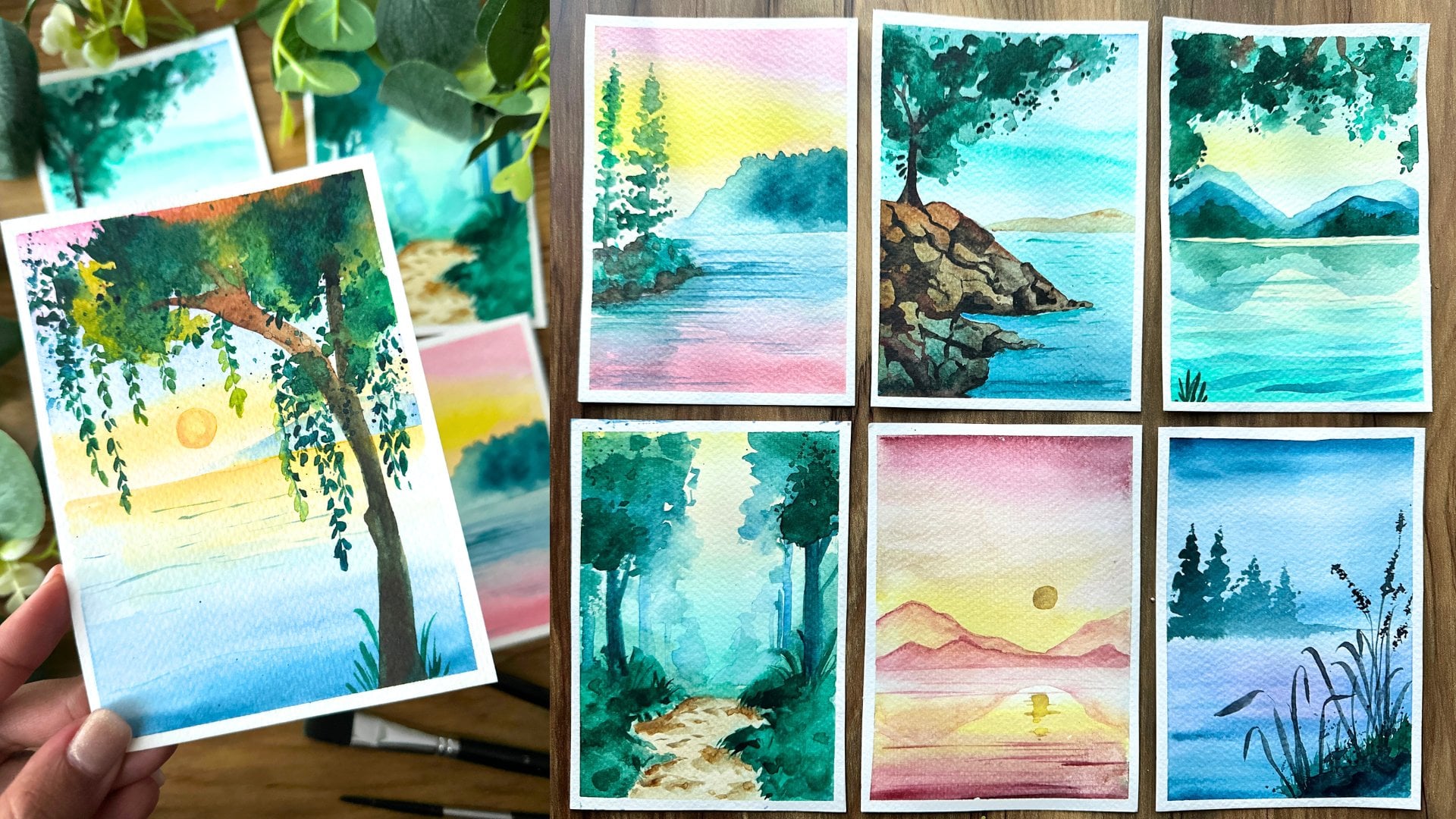
3. Day 1 Silent Reflections: Are you ready to begin
with our first project? We're going to keep this
really simple so you get really comfortable
with watercolors. So starting, I'm drawing a
line with my pencil to divide the page into two parts
for the sky and the ocean. Once we have that ready, we're going to begin by adding a little bit of
detail with our pencil. Let's start with a
simple mountain. You can add in a couple
of smaller mountains as well to create layers
within the painting. Now, wash your brush, take in a little bit of
water on your palette. We're going to take a little
orange and mix the two, so you get a very soft layer. Gently blend that
into the background, going side to side. This is really important. You can take a little bit
more of orange directly from the palette and
use it right on top. This is going to give
you a very soft blend. Now we go in with our ochre, and we're going into painting. I'm just going to paint
the entire section, and that's going to give
you a better result than just painting
above the mountains. Wash your brush and then
take in some clear water and gently blend the
two colors together. These colors work really well, so it should be
fairly easy to blend. You can take a
little bit more of a bright yellow and use that
just for a pop of color. Now, we're going to
do the same thing for the ocean, for the waters. It's a reflection of the skies. So using our yellow and then
going into yellow ochre, gently blending in the
orange right at the bottom, moving side to side. Something really important
to remember is that watercolors tends
to dry lighter. So always go in
with another shade of color if you want
that area to pop. So I'm taking a little bit
more of orange and adding it at the bottom
directly from the pan. And that deep orange is going
to create that variety. Let's now try this layer. I'm using a basic
hand held hair dryer, starting a little bit away from the sheet and then
gently moving closer. Make sure that your
sheet completely dries. You can even press down your
paper if it feels like it has buckled a little bit, and that's going to
help it lay flat. Now we begin with the mountains. I'm going to take in green, adding a lot of water, making it very transparent, and starting off
with the layers of mountains one at a time. Keep this layer, this
wash very light, and you can see how
I've added so much of water and just really mix together the paint for
a very soft light color. Adding a little bit
more of pigment towards the edges to give a nice shade. Notice how along the bottom, I'm going to add more
pigment to deepen the color. But again, lot of water in this layer
that's mixed together. If you feel like your brush
is scraping the paper, then your brush is too dry. Once we've done this,
we're going to do the reflection of these
mountains onto the water. So adding a lot of
water to the paint mix, I'm replicating, mirroring the top
mountain on the bottom. You can see I've
tried to maintain the same shape as
well as the height. Once you're happy with
this, let's try it again, keeping it further, and
then moving it closer. You can also pat down
your paper once it's dry just make sure that it
completely lays flat. Let's move on to the next layer. We're going to go in
with a deeper green. And we're going to
follow the design, the lines that we had drew
out before using the pencil. And then let's do another
one on the other side. This one, we're going to
make it even more darker. So I've taken paint
directly from the pigment, and I'm just going ahead and
painting it onto the sheet. Mirror these two mountains, keeping it lighter,
adding more water to it. Now we switch to our thin brush, and we're going
to use orange and adding some lines for the water. Gentle ripples,
going side to side, keeping these lines really thin. And we're going
to keep them more concentrated at the bottom. You can see how I'm
adding more lines down. This is our first project
for the challenge, so I wanted to keep
it really simple, play around with colors. So we're going to
dry our painting, and we're going to
add one more layer, and we're almost done. Super easy, very simple,
just very relaxing. As you go about each day, you're going to get
more comfortable and really enjoy the
process of painting. Now that it's all dry, we're going to take our
paint directly from the pan and doing a very dark layer of
a smaller mountain. This is going to give a
little depth to the painting, and then you can add in the
reflection along the bottom, following the same shape. Maybe use a little bit of that blue and add in some lines. Again, for the ripples of the sea and we're done
with our painting. This is such a quick
painting, barely 10 minutes. The perfect taster project. Remove out your tape,
and one thing to remember is always when
you're removing your tape, remove it diagonally
instead of straight. Diagonally, you're
less likely to end up with ribs on your
paper or any damage. And there you go. This
is our first painting.
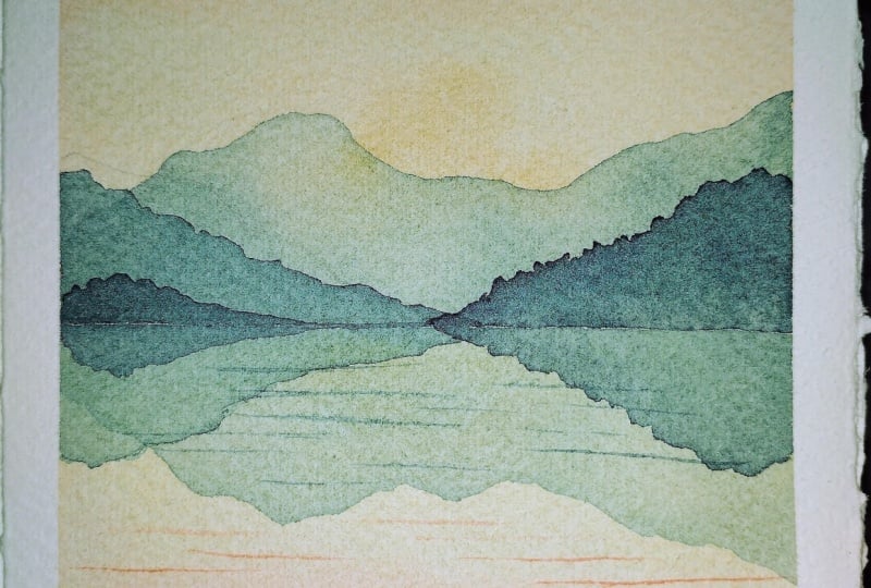
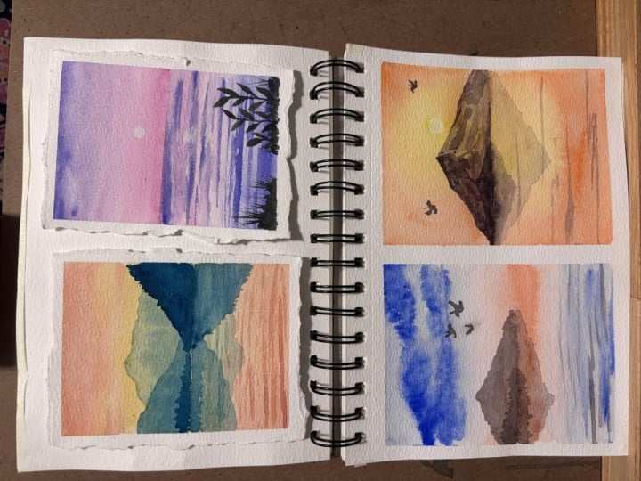
4. Day 2 Calm Seas: Let's begin with
another project. We're going to make it
really fun by playing around with some interesting
colors like purple and pink. I've drawn out the horizon line, and using a very soft pink, adding a lot of water gently
blend the background. You can go ahead and add
a little bit more of a deeper pink along the bottom. Add more water as you move
upwards, gliding gently. Now, as we move upwards, let's go into purple. So we're going to
start right on top, add a little bit of pink
and purple so that you get a nice warm tone and add
more water as you move down. Let the two colors collide. And you can see how that looks a couple of quick lines with
the purple on either side. Now that we've done the sky, keeping it really minimal, let's go ahead and paint the
water using the same pink, moving downwards, and then using purple to mirror the sky. While everything is still wet, you can go ahead and
add a little bit more purple so that it really
brightens up the painting. I'm keeping my wrist very light and not really
pressing down into the paper. Time to dry the
painting using a dryer, gently moving it back and forth, making sure that your entire
sheet completely dries. You can also use your hand
and tap down the paper after a while to make sure that it lays flat or even place a book. This way, your paper remains
straight and doesn't buckle. Drying your paper is
such an important part of watercolor painting, and if you skip that step, you're not going to end
up with the best results. Now, let's start back with our purple and try
at the Horizon line. I'm just going ahead and
adding more of that purple using some thin lines as I move downwards to show the
ripples in the water. You can even switch to
your thinner brush, so you have more control
over this process. This is such a fun painting. It's so simple, and you can do this with any color
combination you choose, and it's always
going to end up with some really interesting results. Using my thin brush,
detailer brush, just going ahead and adding more quick lines side to side. Keeping these lines really thin gently gliding
over the paper. When I started this challenge, I decided to create the first
few paintings very simple, as I mentioned, so that you get a little
bit more practice. It's also a good way to
motivate yourself to stick through and complete
the 25 paintings. Now that we have our water
with the beautiful ripples, we're going to use white
to add highlights. You can use gouache white, as I mentioned in the
materials or acrylic white. I noticed acrylic white is really great because
you end up with a very bright white color
versus if you use gouache, which sometimes mix in with watercolors and ends up
being a lot more dull. So using acrylic white, you can take a new
brush that is meant for acrylic so that you don't
spoil your watercolor brush. And then we begin by
adding some thin details. Let's start by
adding a simple sun, just bright white circle. And then we're going to add
the reflection of that, mirroring it onto the C. Add in some thin
lines to show that the water is
reflected and then at that middle section where
the sun is, add more white. Now to add some little interesting details
to our painting, I'm going to take our navy and then mix it with
brown to create a black. It's a deep dark brown color instead of an ivory black color. I feel like that looks better. It has more depth than
just using black. Once you have that, let's paint some really simple leaves. Keeping your stem really thin, paint each leaf at a time. Changing the heights of the stems also creates a
very interesting effect. A as we complete the last one, we're going to take
a little bit of this color and just
paint the bottom, keeping it really rough, and then adding in some
quick lines to show grass. Let's repeat the same
thing on the other side. Very simple with quick flicks
of your wrist for grass. We're going to create
some hatching effect onto the grass. So quick straight lines
equidistant along the section. And then our painting is done. You can let it dry completely, Row out the tape to reveal
our day to painting. I
5. Day 3 Indigo Waters: Ready for another fun painting. This one is more
relaxing than anything. We're going to start off
with our lighter colors, a beautiful blue backdrop. So I'm starting with
a very soft blue. This is a cobalt blue color. Adding a lot of water
to the mix to get a really smooth sky. Gently add water
and blend the sky adding another layer of blue. You can choose a different shade of blue if you'd like to. I'm using a erleum blue. Or you can stick
to the same one. And then once you
have that ready, just blend through the sky. We're next going to take
orange and paint the horizon, keeping it very soft
by adding a lot of water and leaving a gap between the two colors
so that you have this white space in between. Now we move on to the ocean
or the seas, using orange. This time, I'm going deeper
with my color and then adding blue towards the bottom and gently blending it upwards. While the sky is still wet, we're going to take blue
directly from the pan, so it's very saturated, and we're going to
paint some clouds. Because the paper is still wet, you're going to have
the color bleed through a bit and
create natural skies. For clouds, we start
with thin lines and then just very roughly
create fluffs of cloud. You can see how I'm
doing this directly taking the cerulium
blue from the pan. Let's take a little
bit of that blue, and we're going
to do quick lines along the water for the ripples. It's okay if it
blends into the page, dry up the entire thing. Make sure that it is completely flat and ready for
the next step. Let's now add to the backdrop and we're going to use black. If you have black with you, you can or you can mix
blue with brown to get a nice deep color just for a very misty mountain
off in the distance, but also highlights the
horizon a lot more. Once you have that, we're
going to add in some birds. I think this is the
perfect painting for that. Before we go into that,
we're going to do the mirror mountain onto the water to show that
the water is so clear. Now let's practice some birds. Start with an oval for the body, a circle for the head, and a triangle for
the tail feathers. Extend the wings, keeping one side larger and the other
side just a quick thin line. And that is as simple as
you can do for a bird. Let's do another one
facing the right, similar technique, breaking it down into geometric shapes. Once you have that,
just paint in the entire thing with black. This is slightly
larger than what we're going to need
for our painting, so we're going to try
a smaller one next. Now let's do the same thing, but we're going to
use a thin brush so we can make this really small, the same circle for the
oval shape for the body, circle for the head, triangle
for the tail feather, and then the wings. And you can see
how tiny that is, and that's the size we're going
to need for our painting. It's really small almost
half a centimeter. But if you can get that
little detail into it, it's going to look so
much more realistic. Let's go back to our
main painting and add in a little bits whenever you
are painting something, it's nice to have
little focal points. Like, in this case, you have
something interesting like the birds to create
movement into the painting, the ocean being
really flat and bold. These birds create
lightness and movement. Now that we have that, we have just a few steps remaining. Our painting looks almost done, but I wanted to add a
couple of more layers. Add in some ripple
lines using the black Make sure to dry
your painting completely. And then using a black pen, we're going to add in
some hatch lines along the mountain just to deepen
that color a lot more. And then we're done
with our painting. I love how this one turned out, especially the dramatic
clouds. So pretty. The birds have turned
out very interesting. And that little subtle orange, I think is the
perfect pop of color. And
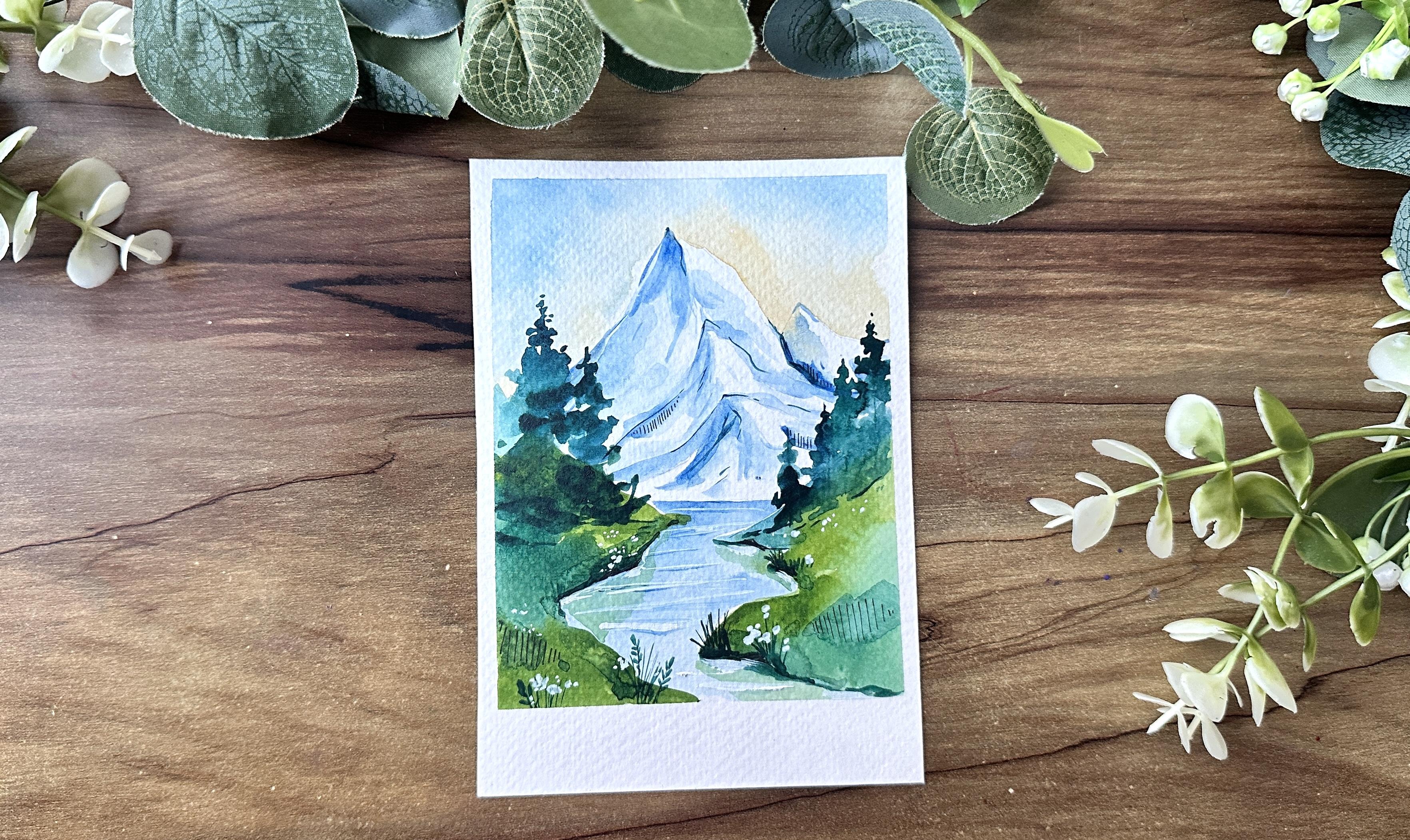
6. Day 4 Ocean of Stillness: Let's dive into another project. This is going to
be a really good practice exercise as well, where we're going to
explore mountains. Let's start with our sun. In this one, we're
going to leave a little white space around for the sun and then add
in yellow around it. Make sure to keep this layer
light by adding lots of water just so it's a lot
more easier to blend. Adding more clear water,
blending it away. And let's take a
little bright cadmium yellow and adding that
little bit of color. Continue layering it
up with more water, gently going over it
a bit so that you can blend it into the sheet. Let's take a little
bit of orange, foam away, and then just
blend it towards the yellow. Taking more orange. And you can see very softly
with a lot of water, blending the two
colors together. Keeping my wrist very light and also not pressing down
too much into the paper, we just want to glide our brush. If you press down too much, you're going to end up
lifting the existing color. So we want to keep it
onto the paper and just make sure that we're just
moving around the paint. Let's keep a tissue handy, and we're going to lift up
a little bit of that paint. What that means is I'm taking
a dry brush and just going around the section and
pulling up that paint, that yellow from the sheet. This is called lifting, and I'm using a
dry brush for it. Another way to make
sure that the sun is white is to use
acrylic paint. So if you can keep your
white acrylic paint and use that to just make sure that the
circle is completely white, here you can see it just kind of changed proportions a bit, which happens sometimes
with blending. So this is a quick fix for that. Once you're happy with the sky, we're going to move
on to the water. The water is a direct
reflection of the sky, so the similar colors
are going to be used. Let's start with the
yellow right on top. This rich cadmium
yellow just adds a lot of brightness to the painting. Then we add in our orange and gently blend
it along the side. Notice how the color just smoothly blends in
as you add more water. Using our blow dryer, we can dry the painting completely before moving
on to the next step. For the next step, we're
going to paint our mountain. I'm using a simple brown color and then just painting it out. You can use van **** brown. It's a very nice brown shade that works really well
for the painting. Now notice how I'm making the edges of the
mountain darker, especially the area that
is away from the sun. If you have a little black, you can use that to add a little bit more
depth to the mountain. This is going to
be our main focus. So we're going to really
make it elaborate, add in a lot of details, and make it look realistic. In other paintings that
we've done till now, the mountain has just been something that's
in the backdrop, just part of the painting. Over here, we're using it
as our main main focus, starting with
adding a mirror for the mountain using our black. You can see how this
is lighter in color, so it shows that it's reflecting
onto the clear water. As we continue
adding the layers, we're going to let it dry for a bit and once it's
completely dried, we can then move on to the
next step of adding details. We can start by adding a
smaller mountain at the bottom. This is going to just
separate the two much better. And once we have that, we can start adding in some thin lines. I've switched on to
my thinner brush, so I can really get into
those thin details. Start by adding
some rocky surfaces to the mountain using black, mixed in with a
little bit of water. We're going to repeat the same along the water as a reflection. Let's add in some details
to the water as well, show the ripples on it. Time to focus on the mountain. We can start with
a thin line just to add in the lines for
the smaller mountain. Follow along, have
a look at what I'm doing and try to
create the same thing. We want to keep these
lines really thin. So using a thin rush
is really helpful. If you prefer, you can even use a pen to get those details. You get them really
nice and thin. So the side that's
away from the sun, we're going to make
it a lot more darker, and the one that's you the sun
is going to remain bright. So not that many details, but a little texture
goes a long way. Now using black, let's add in the outline
for the mountains. You can see how I am connecting it to the
peak of the mountain, adding in the line
for the edges. I. Add in more lines, just quick spots, quick details. All of this adds to the painting and makes it
look a lot more realistic. Time to add in our little
birds using black. Use black, and then let's just
paint over the main line, the dividing line, again, deepen up the color
a little bit more. Now using our pen, a microtip pen, we're going
to add in some sketch lines. Start thin and then go
taller and then short again. These are going to
give a little bit of texture to the
paintings as well. These are parallel lines that are very close
to each other, and it's really helpful
for technical drawing. You're going to see
me use this through our paintings
because I feel like it adds a little interest, some texture to the painting, and I really love how it looks. They're used for
shading as well. So you can see how I've
added those thin lines very, very carefully just
around the shadow areas. Now remove your tape to reveal
our painting for the day.
7. Day 5 Misty mountain Escape: Let's dive into another project. I think this one has
turned out so pretty. You all have different colors, a lot of different shades that we're going to be
playing around with. The first thing we're going
to do is prepare our sheet. Make sure that you
have your tape on all four sides and mark
your horizon line, and then we begin
with our purple. Add a lot of water to the mix, so it's very soft and light. This forms the
basis for our sky. You can keep adding in
more color if you'd like. Going downwards, let's start
with orange and gently move we want to keep
enough of space between the two colors so that
they don't merge together. Add more orange at the bottom, really building up that color. Make sure you add
a lot of water so that it really blends smooth. Let's now add burnt sienna, a soft, warm yellow to the mix. And you can see how it gently
glides into the orange. It's the perfect
compliment to the color. Moving downwards, using the
reflection of the water. Start with the same
shades of color. You have your
orange, your yellow, and then finally purple. Make sure you move your
brush side to side, so usually fill up the space. Time to play around
with our purple. Starting from the bottom, let's add purple, gently
blending it into the mix. And Time to now add in more purple to
really build up the color. Right now, it's very
subtle and soft, and when it dries, it's
not going to be noticed. So let's amp up that color by adding a little
bit more purple. Gently gliding your
brush side to side. And while the paper
is still wet, we're going to add
in some clouds. For the clouds, all we're
going to do is take more of the purple and just create fluffy patches. I think that would be the
best way to describe it. So we want to start
thin and then build up the volume and then
become thin again. Take your color directly from the pan so you get
a deeper color. And you can see how
I'm just adding in clouds right on top. Painting clouds is all
about your wrist movement. So keep your hand light and just swish around your
brush onto the sheet. Let's now add in a
mountain in the backdrop. This one, we're really going to blend into the background. So start with your purple, add a lot of water. So it really blends through. You can even see a little bit of that yellow and orange pop
up, which is so pretty. I think that's why
I love watercolor so much because even
through the layers, you can see the
underneath layers, and that looks so interesting. It gives us softness
to the painting. I'm quickly adding in some
ripple lines using the purple, keeping the lines very thin. Now I've taken a damp brush, and I'm just going over
the edge of the mountain. You can see how that is allowing the outline that
was so I would say, so stiff to almost fade
into the background. It looks like the whole
thing has blurred in a way, and so that you can focus
on the front detail, which is going to be our plants. Dry up your entire sheet. I love using a
dryer just because it's so quick and so handy. And once that's done, you're ready to get into the next step. Let's begin by adding
another layer of mountains, and this is going
to create contrast. The darker color is going to
lift up the entire painting. Now, this color I have created
by mixing blue and pink to give you an interesting
purple or a magenta. I think it would be
considered more of a magenta than a
bright purple color. And this is what
we're going to also use for other details
as we continue along. Now, moving on to the
foreground of the painting. For the foreground, we're
going to add in some leaves and little flowers
to really pop. Start off by
switching our brush. You can take your thin brush
and we're just going to add in the magenta right
at the bottom, really build up that colour, add in some quick
lines for grass. A keep adding in purple lines until you're
happy with the results. I like how this is
looking so far. Let's add a couple of more
cute details that is going to really highlight
this foreground. So I'm starting
with my thin brush and just adding in some flowers. You can see how I'm doing this simple flowers
that are side view. You can do them in varying sizes as well as different directions. So some of them that are
moving towards the right, some moving to the left, this creates a little
movement to the painting. H Now that we've done a few of them, we're going to let this dry, and then we're going to
take black, or in my case, I'm going to be mixing
blue and brown to create a very deep brown color. And I'm going to use
that for the next layer. This time, I'm going
to go ahead and start with the base again
and build from there. This time around, let's
add in some leaves. We can go really detailed. You can add in different types of leaves if you'd like to. I'm keeping it simple by using some leaves
that I really enjoy. Quick leaves that create movement that create
interest in the painting. Add as many as you'd like. Similar to the flowers
that we did before, we're going to add
the same thing with the darkish brown color, and this is going
to be in front. So it really pops
when you have a look, adding in more grass, some leaves, and really
just playing with it. You can see how that soft purple is almost with a backdrop and it looks like shadows and the front looks bright
and full of color. H. Continue along until you're
happy with the result, you can go as many flowers
and leaves if you'd like, you can even change around the
different type of flowers. Now using a Micro tip pen, I'm going to add in
some sketch lines, parle lines along the mountain to give it a little
bit more of a shadow. And you can see how
that looks very interesting some
towards the grass. Just a quick, easy
way to add shadow. And there you go. We're
done with our painting. You can add a couple of
details, couple of tweaks, and once you're happy
with the entire painting and have let it rest completely, we can remote our tape to reveal our day five misty
mountain escape. This name is so apt for this painting with the soft misty mountains
in the backdrop.
8. Day 6 Coastal Rocks: I'm so excited
about this project, where we're going to be
exploring how to paint rocks. Let's start with
a practice paper. I'm using a pencil to just draw some rough shapes of rocks, keeping the base
straight almost, and then the top a
little bit more cut off. Now, we make some
cut lines to show where the rock breaks. What we try to do is add in
shadows in the areas right below because this
is the area that is that doesn't get
a lot of light, make sure that it's dark. You can fade a little bit
of that color on top. You can see how it's already
starting to form and it almost looks realistic
with just these few steps. Now let's paint in
the whole thing. Starting with yellow for the highlight areas
right on top, and then we can mix blue with
our brown to get a vandyk brown or a darker brown shade and then use that to paint
the shadow sections. You can start by adding the dark color in the areas
that we just sketched out and that really already brings a little bit
of structure to the rocks. Then we have some
shaded sections. The interesting part about
rocks is if you can create different shades for
different sections of it, it looks more realistic. Now let's try the entire
thing once it's dry, we can go ahead
with another layer. Adding in a couple
of more details to make it look a lot
more realistic. Let's go ahead and I'm just
darkening up that area again, adding a little bit of shade to the top of the mountain face, adding more shadow the bottom. And once we have that, we can
add in the connected lines. And this really brings
it all together. By breaking down the rocks
into different shapes, it makes it a lot more
easier to control, and as we proceed
with the paintings, you're going to learn
more and more how to use this in different
ways in your paintings. I like adding in a couple
of dots with the black. Now with white, we can
add a little bit more of highlights at the top where
the light hits the rock. For more details, we can
use our black pen and add some quick sketch lines
to give it more shadow. Drawing out more of the details and making it
look a lot more realistic, giving it more
depth and three D. Now for the reflection, just mirror out the entire shape of the rocks along the bottom. This one doesn't need
a lot of details, so we're just keeping
it really flat, adding more color as it
connects to the surface. There you go. Are you ready to start
with our new painting? Take down all four sides
and once you're ready, let's draw out some rocks. I like planning
out the placement of these rocks
because it's going to be really helpful as we
proceed with our painting. I'm keeping rocks on either side so that they
really focus the painting. Now let's draw the horizon line where the sky meets the water. Since we have the
overall placement, let's begin with our painting. For the sky, let's
start with our yellow. Adding a lot of water to it, so it's a very soft color. Moving your brush
from side to side, bringing it all the way down. Let's add more
water and blend it. Once we're happy with this, we can add some pink to the mix. I'm using a little
bit of a warm pink, mixing the pink with orange
and using that for the sky. Again, moving your brush side
to side to gently blend it. Just go back and forth. You end up with a very
soft smooth blend. For the water, we're
going to continue with the reflection of the
sky on the water, using pink, gently blending it, and then adding yellow
to finish it off. I feel like the pink is so soft. So let's add more color to this. Let's brighten it up a bit more. And then add more pink because I feel like
it became too orange. You can do this while
your paper is still wet. In case it dries, then it's a bad idea to go ahead and continue
adding more color. But if your paper is still damp, then that's the perfect time to play around even more
with your colors. Let's take a moment and dry our sheet before we continue
with the next step. Now, let's start right
on top of the water. We're going to use a
very soft layer of pink, add a lot of water, and just gently add in the
ripples for the water. It's going to give more
character and movement, and that's exactly what we want. Gently glide your brush side aside to get these thin lines. You can also go ahead
and use the pink to add the reflection of the
stones and rocks as well. Now, let's work on our rocks. We're going to mix in black
by adding in blue and brown. Add a lot of water to
create a soft layer. Et's use a blow dryer and dry up this layer before we move
on to the next layer. I like how this is turning out. It's actually really simple. It's one of the easier
exercises, easier paintings, and it just creates such
interesting results. Now, we're switching to our thinner brush and we're going to add in the shadows
for each rock. Follow what we practiced
before adding the space layer, really building up the color, and then letting it
dry before moving on to adding more details. It's all about
layering when you're creating rocks so
that you can get the best result and the most
realistic three D effect. O. Let's now move on and add
in the final details. We're going to use a thin
brush to outline the rocks. Add in some more shadow to the details to make
it really three D. Next, we add the
shadow for the rocks. Let's add quick cross
This is so great. A really fun detail to add in on either side
of the painting. Now, let's add some details. Add in some quick lines. You can see how this actually
creates movement into your painting and
gives it a little bit more of a playfulness
sing our black pen, we can add in our sketch lines. This is the final step. Let's use white and add in
some highlights for the rocks. And there you go. This is our final painting. I love how it turned out. We're making so much
of progress and I'm so proud of you for
getting to day six. See you tomorrow for Day seven.
9. Day 7 Purple Views: Today, we're going to
be painting one of my favorite artwork
from this challenge. I love the colors. It's so bright, so bold, and so mysterious, I would
say, is the right word. So we're starting off with
our sheet well prepared, and we're going in
bold with our purple. So directly off the bat,
let's add our purple. And then we can go
in, wash our brush, use some clear water
and take pink. Now, we're going to use
pink for the remaining, and you can see how
bright these colors are. Purple and pink work so
well together for the sky. It's really unique. Pops off the paper, and I love how it looks. Now let's wash our brush. We're going to take yellow
and then continue on. Blending from yellow to pink is very subtle and it
works really well. So it's very easy to work with. Just go back and forth with your brush gently
blending in the colors. What you want to do is make
sure that you do this all in one setting and don't take too much time
through the process. So your paper remains wet. Now we can take a
little bit of purple and just add a little
bit to the side, and you can see how that looks. It's already coming together. Let's drop in more purple, make it even more brighter. Let's now work on the water. It's a basic direct
reflection of the sky. Similar process that we've been doing through all the paintings. Start off with yellow, move into pink, and then purple. A Now, make sure you dry
the entire layer completely before moving
on to the next step. We're going to then use a pencil and just plan out our
painting a little bit, start with the mountains,
add in the rocks. We're going to add a lot
of different sized rocks, some small ones,
some bigger ones, really fill up that space. Now for the mountain,
we're going to use purple and create
a very soft layer, a lot of water, so it really
blends into the yellow. A Let's now work on the rocks, mix in black, and
start with our rocks. This time, I'm not
going into too much of detail because they're all going to be really in the shadow, keep it flat, just painting out each of the rocks
completely with black. Once you've painted
all the rocks, let's add in the
reflection full of rocks, using the same purple
mixed with water. You can see how I'm following the exact same
shape as a mirror. Using the same purple, let's add some
quick lines side to side for the ripples
of the water, give it more character,
more movement. Time to go ahead with
another layer of purple. This one we can directly
take from the pan, it's going to be much
more deeper in color and just paint out
some of the rocks. I thought it would be
nice to add in a bunch of leaves to pop
through the painting, going really deep
with the details, adding in a thin line, and then adding in
each leaf at a time. Let's create a little
bit of a patch here. You can really see those
leaves come through. I'm just going to paint
through that entire area. You can see how I'm creating a plotch and then having some
of the leaves come through. You can see how it was
really busy on the side and some of the leaves were
able to show through. Creating creating an
interesting detail. I like how this painting
is turning out. It it draws you in
because the colors, I think, and also that bright
yellow that really pops. Add in some grass
lines for movement, flicking your brush, keeping
your wrist very light, and using a thin brush, you end up with very thin lines. Add in some circles to
the end of the grass. Time to remove our tape from
all four sides, make sure everything
is dried before you do that to reveal our
final painting. I like the frame of
that white space because it really makes
the painting pop within.
10. Day 8 Dancing Tulips: Let's now dive into our
new project for the day. This is tulips. I think this is
going to turn out so pretty, grab your brushes, get your paints ready,
tape down your sheet, and let's dive right in. I'm starting off
with a light blue, adding a lot of
water to this mix, and then blending it firm up, going all the way to
the edge of the tape and gently swishing
around my brush. You get some
movement in the sky. This color is quite subtle, so I'm able to take it
directly from the pan. You might have to add a
little bit of water on your palette and
use it that way. Now I'm taking in a deeper blue, a cerulean blue, and adding
more towards the edge. Trying to build a
layer of color, adding to the vibe of the sky. Add enough of color so that it really deepens up and
really shows through. And we're just doing this
till a midway point. Then using clear water
gently blending the sky. I'm keeping my
movement very light, so that way I don't move
around too much of paint, and I can blend
the sky downwards. I'm keeping enough
space for the tulips, which is going to occupy
that bottom section. Now, using a tissue, I'm dapping out some of
the paint from the sky to create little clouds
gently tap your tissue, and that is actually going
to absorb some of the paint, creating these white patches, which is perfect and works really well for our cloudy sky. Let's try the entire thing before we move on
to the next layer. Now we begin working
with our tulips. We're starting with some
pretty pink tulips. Take a little bit of pink, add a lot of water, and we're using our thin brush, so we can really get those
details for the tulips. Tulips are so playful and such a perfect addition
to any painting, especially if you're looking for something spring,
something summer. They just dangle in the sky
just looking so colorful. So I'm keeping the
shapes really simple, just trying to do two petals
connected to each other. You can see how I'm doing that. Forming a U shape. You can have some bigger tulips, some small sized ones. Varying the size
of the tulips is going to make it look
a lot more natural and realistic instead of having
them all the exact size. Also, play around
with the placement, maybe having them up, some of them higher, some of them lower, smaller. The angle can be changed pointing right side,
pointing left side. There's a lot of
things that you can do to make it look more rural. It also creates a little bit of movement into the painting. I'm using a very light pink, so it almost fades
into the background, and then I can layer it up over time and deepen the colors. While it's gently blending in, let's take pink directly
from the pan and add a little bit along the
bottom of the tulip. Maybe just painting one petal. This is going to
give it a little bit more of color and make it pop. Keep adding more tulips until you're really
happy with the result. For the final step, let's add some outlines
using the deeper pink. Start with the tulips
that I've already dried and just go
over the petals, adding some quick lines
to give it more detail. Tulips come in so many colors. So let's add a few
more with yellow, and I think that's going to add a little bit more pop of
sunshine to the painting, following the similar
step of adding subtle yellow lines in
the form of a shape, different sizes,
different placement. And then we can move on to our next step of
playing around with grass and adding in some leaves and really filling
up our field of tulips. We're going to start by
adding in some deep lines, and we're really just making it really full
towards the bottom. And then as it moves upward, just keeping it really thin. So filling up that bottom space
at the edge of the paper. Now, let's connect the stems
to each of the tulips. You can play around with the
different greens, as well, adding some darker greens, mixing in some blue so it becomes even more
deeper in color. Continue the process
until you're really happy with the results, adding in more leaves, and really playing around. Once you have the final look, and you can see how I've just
skipped a couple of steps, we can use our ballpen, our black microtip to add
in some wavy details, adding more movement and
play to the painting. Add some parallelines, to create more of a
sketch like effect. Remove out the tape to reveal
your final painting. M
11. Day 9 Painted Peaks: Give yourself a pat on the back. You have gotten so far. We're on day nine painted peaks. I think the name works so well for what we're
going to do today. Starting off, let's get in
our purple right on top, blend it in with a lot of water. At this point, you should be so comfortable painting skies. And if not, don't worry, we have a lot of
days to practice and create these
incredible paintings. After the purple,
going in with orange, and I'm adding a lot of water, and that's why it's blending so easily because if you
add lesser water, then you're going to end up with very saturated
colors which easier, which is harder to blend. So add more water. Make sure that your paint is moist and perfect for blending. So for the ocean, flipping the colors
like we've been doing, starting with yellow,
then going into orange and finally ending
with a little bit of purple. Dry your painting completely before moving on
to the next step. We're going to use a pencil
to mark out our mountains, starting with planning
the horizon line and then adding the
mountain details. I'm adding about three
layers of mountains, and then we can just
have fun with it and see how it goes
as we paint along. Let's start with purple, adding water so it's really
relaxed and blending it in, so it really fades
into the background. You can add more of
the purple towards the edges to deepen the color. So you have a nice outline
for the mountains. Let's do the next one
with a similar technique. Darker outlines and
then water to blend it. And Now, we use green to add
in our landscape. You can see him just going
ahead and painting the green, adding more valleys
into the painting. I've been really enjoying this challenge
every day painting one artwork just for
a couple of minutes, barely half an hour, has been so calming. And I think a challenges work so well when you have
a busy schedule or when you just need those
couple of minutes to create it brings something, and I never realized it
until I actually did this, and life has been going through a lot of things right now. It's been really tough. And I realized just taking
those moments to paint, making the time for this
has actually been so therapeutic and I never valued it as much and
I didn't realize it. So give yourself that time, the energy, the space
to just zone out, and to just create what
I'm doing now is adding the reflection of these
layers onto the water, starting with the green valleys and then the mountains as well. Time to allow all of it to rest. And once it's completely dry, we can move on and
add in some trees, little greenery to give more detail to our
painting today. I really like this
sky combination of purple, pink, and yellows. I think it's turned
out so pretty and very interesting to
look at very vibrant. For the trees, starting
with different heights, just making it really rough, you can kind of pause, have a look at this
as I add in layers. Adding another tree in middle
and then a few to the side. So we're just kind of clustering
them in different areas. A Remember that further away, the trees need to be smaller and shorter versus closer up, you make them larger and bigger. So here, it's much more smaller. You can even add
in just some dots to show that there
are trees there at some lines to show the area of the grass is
much more darker in color, which also works really well. Let's now mirror
the trees as well, showing the water
is so crystal clear that you can actually see even
the trees being reflected. I've left a little
gap between that. There trying to get as much detail in terms of
the height as possible, keeping the layered light. Let's add in some quick ripple
lines from side to side. And we're done with our
quick painting for today. Can remove out the tape to
reveal your final artwork. If you want, you can
also use a black pen and add in some sketch lines like we've been doing for
the previous projects. Quick parle lines that add a little bit more
depth to the painting. Tomorrow is going to be
our day ten painting. As we progress, the projects are going to get a little
bit more harder, more interesting, more detailed. So I encourage you to
continue the challenge. See you tomorrow.
12. Day 10 Lush Green Lake: It's Day ten. I'm so excited
about this project. Let's begin right from the start drawing our mountain
lines, different valleys. And any other details? Let's start with our
indigo right from the top, using water, blend it through. Now, we're going to
add more indigo to the top really deepen the
color a little bit more. Once we're happy with that
with how rich that color is, use water and bring it down gently moving your
brush from side to side. Now, right above the
mountain using purple, let's blend through our colors. I fades in. You can see how I've outlined the mountains in that process. Now, let's use some indigo
clouds side to side. You can see how I just
added a quick flick, and that looks like a cloud. Super easy to do. And now we can continue
with our painting. Let's start by tackling
our mountains, using our deeper cerulean blue. Let's start with our first
mountain right on top, using water to blend
through the colors, so it really fades in what this also does is creates a little bit more of a misty look, which again, creates
an air of mystery. Moving on to the next mountain, following a similar step. Now, let's play around with
various greens to add in some valleys and add more
green to the painting. After adding that
light green initially using a deeper green
along the edges. I love how everything
has blended through. They're going to repeat the
same thing as a reflection. The same shades of green
add a lot of water. So it really blends. Let's continue that
with blue and fade in. Next, use purple for the
sky and then indigo, exactly following
the same details we had above as a reflection. This is very common
when it comes to landscapes to show that
the water is very clear, you have the repeat of it, and it looks so pretty
and so natural. Now, let's use blue
and then add in some quick lines and then
gently move upwards. You can also switch
to your thin brush. Now, let's try the entire thing, and then we're going
to continue adding more details to the landscape. Start by adding in some
little grass details along the meadow. You can see how I'm
using my thin brush, so I can really get
into those details. Next, we can continue
and add in some trees. With trees, it's really simple. We're just trying to
form triangle shapes, not perfect shapes, but keeping it very rough
in different heights. And that looks very natural. Creates a lot of interest. A a Since we have so many of these
trees right at the back, let's add one that's going
to be a focal in the front. This one is going to be larger
as well as more detailed. Have a look at how
I create this. I start with a thin line on top, start with building through the layers one step at a time, gently creating the shape
as they go downwards. Adding a little bit of water. Let's add few more trees. Let's repeat the same for
the reflections as well, keeping it very light,
adding a lot of water. These ones don't have
to be too specific. It doesn't have to
be too detailed. You're just trying to
get the heights of the trees as accurate as possible and also making sure they're in line
with their counterparts. Let's allow this
whole thing to dry, and then we're going
to use our microtipPen and just add in some details. Let's start by adding in
some lines sketch lines, just straight lines to show
shadow in those areas. This is an easy way to add in some detail without actually
having to add in something. I've been really taking this as something interesting to add
into this entire challenge, something new and
something playful. You can see how this
looks very interesting. It's so small, but it really adds something to the paintings. You can go ahead and add
a little bit more of a green to really
separate the two layers, like the actual
ground and the water. Add a couple of more lines with green add more detail
to the landscape. Now, let's use our thin brush, add in some ripple lines, and then use white to add more lines for the
water, especially. We now move on to our grass, use your thin line
and add in grass. You can see how I'm doing this, adding a little bit of
depth through the layers. I I really like adding in some more details
if you want to add flowers, you want to add some
long stems, some grass. Anything to make the painting
more playful, more fun. Once we're happy with
the overall look, let's allow everything to dry and then remove our tape to
reveal our final painting.
13. Day 11 Meadow by the Lake: Let's begin with our
Day even painting. It's a fresh new day, and we're going to
start with our paper all de taped on all four sites. This painting is called
meadow by the Lake. So we're going to play around
with some green grass, purple skies and really
let the colors flow. I'm doing a basic drawing allowing a river to flow
through these meadows. This is just a general idea, so we have like an understanding before we begin of where we
want to place everything. We can start right on
top with our purple. So I'm going back and forth, adding a little bit of
water to this mix so it blends in and really
glides into the paper. You want to work a little
bit quicker during this process so the
layers don't dry and keep your brush moist so that it has enough of
water and can blend. Let's take in our blue,
starting from away, gently moving upward
towards the purple, blending the two colors together to create a
very dramatic sky. Finally, we can use some
clear water and blend that blue downwards into
a gentle fade away. Now we move on to the river. We're following the same
color scheme that we used for the sky to show the
reflection of the water. Starting with the
blue on top and mirroring the colors downwards with the purple
right at the bottom. Next, we can continue
painting the meadows. Let's start with a bright yellow and then we're
going to continue adding in different colors
to really make it vibrant. The bright yellow
is just a nice pop of color as we continue. Using green, we can paint
up the entire section. Keep a little bit of gap
because the layers are still drying from the
water and the sky. As the layers dry, we can go ahead with
a deeper green and really fill up the
entire section. Before moving on
to the next step, we're going to completely dry our painting
and make sure that it's prepped and ready for
the next layer of colors. Starting right on top, I decided to add in more trees with the
purple in the background. It's really important to play around with your
background as well in paintings because
they add to the art. If you can just add a little
mountain, some branches, bushes, trees,
anything that can add some details to the
background works really well. I've been enjoying this series. I think it's exactly
what I needed because it's so relaxing
and then you end up with these vibrant
landscapes that you can really place around your home
and brighten up any room. I'm even contemplating
converting every wall in my house into an art gallery because I really enjoy seeing my paintings because it just
makes me so happy. Now, using black or
a mix of purple, we're going to add some
ridges to the meadows, just to show that
the banks where the river touches it is
a little bit more stony, there's a little texture to it. You can see how I've done
these triangle shapes, adding in couple of grass patterns by adding
some quick lines. While painting meadows,
it's all about texture. Adding in thin lines, grass can add so much to the painting and that's
exactly what we're doing here. We're adding in a couple
of areas with purple, some quick lines to show
that there's grass. Adding in dark green for some more depth Next, we're going to add in patches of green to give the
painting some character. You can see how I'm using green and adding just a fluff of green colour and then adding in some long lines for grass. Let's create another patch
of that green colour. Et's continue adding
more layers of cream. Now, if you notice our river looks quite
empty, it's just plain. We need to add in reflections. Let's add in the reflection of the meadows using a deeper blue. This shadow reflection
looks so great, gives more movement
to the river, adding in some quick lines
to show the ripples. Now, I'm letting everything dry, and then you can go ahead and use more patches of
green if you feel like. I felt like that yellow was
so bright that I wanted to add a little bit more
green to mellow it down. We're going to add a
little bit more depth by adding in some black pebbles, a little bit more shadow. All these little details bring
together the painting and any painting can be made fairly easy by breaking it down
into different sections. Just taking the
painting step by step. Now, using a black pen, let's add in some black details, thin lines, thin paddle lines to show the grass
to show texture. H. Next, we're going to use white
to add some highlights, keeping them to the
edge of the sections. S. Adding more vital highlights to the water as well, showing that the
light is hitting it and making it softer. We can add a tiny moon. Just in the background, the colours are de fading. It's going to become
nighttime soon. So that's a perfect placement. And there we have
our final painting. Remove out the tape. How are you feeling so
far about the challenge?
14. Day 12 Beyond the hills: I think every challenge requires
a foggy misty painting, and that is what we're
going to be doing today. Just something moody and it feels like you're
just taring at it, and the world is
doing its own thing. So let's start by
taking our paper, making sure that it's taped
down on all four sides, and then we're just going
to plan our mountains, just making sure that the
layers work well together. The heights match for the kind of design or painting
that we want to create. Now, let's start right on top. We're going to go with
our blue from the top, adding a little bit water and just blending the
color downward. I found that it's very
good and helpful to have a nice range
of colors that you can play around with when you're getting into
your painting. Sets like the one that I
use really inspire me, and I think that also helps. So if you can gather
the colors that you know inspire you, you're more likely to end up with really interesting
paintings as well. And that's what I do. I actually get sets of colors
that I love and enjoy. And then when I
get into painting, it's just so natural and I'm very inspired
by the painting. I know a little bit of
a side track because I was just so excited about
the colors we're using, moody blues, keeping
it monotone in a way. Um, yeah, I think we're
mainly keeping it blue. So it's one of the
only paintings, I think in the entire challenge, that's just going
to be one color. So I've used my blues to
create a very moody skyline. And then we're just going to use our dryer and dry up the painting before we
continue to the next step. For the next step, we take
in our first mountain. We're going to tackle it. We're going to make sure
we add a little bit of water and keeping the tip of the brush towards the
edge of the mountain, so we get a nice crisp edge. Time to let it dry, and then we move on
to the next mountain. And this is what
we're going to do. We're just doing layer by layer. Here, I'm taking a deeper blue. And then I'm going to use
water to just blend it. And this is going to
give us a misty effect. Like there's clouds there, and that's why the mountain
isn't fully rich in color. You can go ahead and
add a little bit more of your blue to the
edge of the mountain. I love adding in trees to a landscape like this
because it gives it texture. With the mountain being
so straight and majestic, the trees create movement. So I started doing a
thin line for the trunk, and then I'm just
swishing my brush and trying to
create a pine tree. Notice it's all about
the shape of the tree. It's more conical, and
that's our main focus. How about we add another one before moving on to
the next mountain. Always remember to dry your
layers as you proceed. Having a hair dryer on
hand is so so comfortable. You can even use a craft dryer. There's a lot of
different options, but it's so handy and it
saves so much of time. Moving down to the
next mountain, again, starting with
even deeper colors, you can even switch to a deeper blue so
that you can really fill up the paint and then
use clear water to blend it, creating a very misty effect. Et's add two more trees
to the left this time. That way we create
a little bit of a balance between the
two within the painting. We are down to our last layer. This one, we're going to
make it really dark so you can take your paint
directly from the pan, adding maybe a little bit green if you want to or just keeping it monotone and really
building on that color, making it really dark. Notice, with the mountain, our edges aren't just straight. We try to keep them a little
bit rough and jagged. Time to add in more
trees to this. I Let's allow everything to dry, and then we move on
to the next step. I'm going to use my black
pen to just add more shadow to some of the mountains by
adding in our parallelines. So you can see how I'm
adding it to the last layer. This gives a little
bit more shadow. We can add it to the edge
of the mountain, as well. Since our sky looks
a little bit empty, let's add in a bird like we did in our
previous challenge. A simple bird to create
a little movement, little perspective in the
painting. And we're done. It was so simple to do this, but it looks so nice. So let's allow
everything to dry, and then we're going to remote our tape to reveal
our final painting.
15. Day 13 Gentle Current: Of all the different paintings that we have been going through, gentle current is one
of my favorite ones because it actually makes me
feel calm after painting. There is something so
calm about the colors, and it's just so green and luscious that it just
pops from the screen. So the first thing we're
going to do is draw our horizon line dividing
the sky from the landscape. Once we have that, I'm
going to just jot out a very rough River flowing
through the landscape. We're also going to have
a couple of mountains in the backdrop to ease the eye. Once we have that, let's start with bright cadmium yellow. We're starting from the bottom
and just moving up gently, adding a lot of water so
the layers really blend in. We're being careful with
how much water we use, and this is a little bit of
a trial and test method. If you feel like your paper or your colors are
notar sitting well, there are a couple of
reasons this could happen. Yes, it could be because
of too much water, but I've noticed a
lot of times it's actually because
of a paper itself. So making sure that you
get the right paper is so crucial for better results. If you have any questions
in terms of paper, if you have any questions
in terms of materials, please do feel free in the discussion tab to
ask me your questions. I'm so happy to answer them, and I can even add in a
couple of tips and tricks into these challenges so that
you can understand more. Now, going back to our painting. So I've done the river with a reflection of the sky
with the same yellows and now adding in blue around
the edges for the landscape. A let's do the same thing
on the right side as well. I'm not getting it too close to the river line that
I had drawn out, but just enough so it blends in. Remember, the water
is still wet, so we don't want to get too
close because everything is going to blend together and
it's just going to be a mush. Using the same blue, we can just add a couple
of distant mountains. Blue and yellow mixes
to give you green, and that's why we have
green on our paper. And that green just works
really well with our painting because it's a mix of
the blue and yellow. While everything is still wet, I'm just going to
go over the edge of the mountain just to
create a blurry line. You can see how instead
of keeping it crisp, I'm just gently fading
it into the backdrop by adding a little bit of brush
movement along the edges. This way, it doesn't have sharp peaks and
it's just blurring. Giving it a more misty look. Now we're going to
let our layers dry completely before we move
on to the next step. We're going in
deep with our blue and starting off with
adding some distant trees, swishing around your brush so you can really
get that color. I could use green for this, but I feel like the
blue just works so much better to create the effect
that we're going for. Once we're happy
with the backdrop, let's start working
on our landscape. We can start by adding in the
green along the river bank. In this step, I'm making it a lot more, I would say clear, making the lines a
little bit more crisp, adding more green
along the edges. Let's do the same thing on the left side as well,
repeating the process. As you can see, the blue
from our previous layer has become much duller and it just has faded
into the painting. So let's go ahead and take more deep forest green or even the same blue
and layer it up, build that color towards
the edge of the paper. What we're trying to do is
add more shadow towards the edges and keeping a much lighter green
near the river bed. Now, let's take blue again. This is an indigo blue
that I've been using, and we're going to just
go over the river bed, add a little bit
dimension to it. You can see how just the
section that is below, I'm adding a little
bit blue to it, and that adds some more
depth to the painting. Now we're going to
work on the river. So using blue, we're going
to add in some lines, and this is what
makes it realistic. We've been painting
so many landscapes, and you would have noticed
how these thin lines really shows that it's water and actually adds to
the ripple effect. So it's such an important
part of painting rivers. A Another important thing that we're going to add now is the shadow of the river bed. You can see how just
in those sections, I'm adding a little bit of color to show that it's
reflecting onto the water. Keep this layer
more transparent. Time to let everything dry, and then we're
going to move on to our next step of adding white. You can use white gouache
or acrylic white. I mentioned this in
the materials as well. Remember that the materials
are a recommendation. If you don't have the materials
or have any questions, as I mentioned at the
beginning of this tutorial, please feel free to ask
in the discussion stab. Now using white, I'm just
going to go over some sections and adding a little bit of
highlight because right now, if you see, our painting
looks a little flat. There's just something missing. There's a little
texture missing. So using the white,
I'm going to add thin lines for grass, and that you can see is
popping out of the painting. It's always nice to have
that little white part. I really like how this
is coming together. Let's add more grass,
Just adding parallelines. Finally, we're going
to switch to our pen and just add more details. I'm just going over those
edges, the river bed, adding couple of lines, making it a little
bit more jagged. Adding in some parallelines along the trees in
the background. This is going to give it
more texture as well. We're also going to take this as an opportunity to add
in more grass, as well. It looks like there's
patches of greenery missing. So we're going to use our
pen to add more detail. These little tiny, minute
lines might feel unimportant, but in the overall painting, they make a difference. Now that the layers have dried, I feel like I need to
add a little bit more of the indigo blue
along the curves. This is where you can step
back from your painting and just notice if you want to add
a little bit more details, maybe more patches of green. And once you're happy
with the overall look, we can remove out the tape and
reveal our final painting. It's very interesting that
even when the painting looks amazing with the tape, when you remove the tape,
it just looks finished. A gentle current with
yellows and green.
16. Day 14 Blooming Flowers: Can you believe
we are already on day 14? This is amazing. Congratulations for
getting this far. Inspired by dancing tulips, I decided to create another
project inspired by Flols. So we're going to start off
by wetting our background. So the whole background is
going to be very misty and blur so that we can hyper
focus on our flowers. So add a lot of water to
the base of your paper. Just go back and forth, make sure you cover all the edges. We don't want too much of water, so not blobs, but just enough. So just moving
around your brush, so your water really
fills up with water, and it really seeps through. This is a basic wet on wet technique where
we wet the paper, and then we're going to
add wet paint to it, and you're going
to create a very interesting backdrop
for our florals. I'm going back and forth, making sure that I
cover all the edges that is so important. And then we can start
with our colors. So let's take a mix of colors. We're going to experiment with a really interesting background, starting with orange
right on top. Gradually, adding more of a yellow or a burnt sienna to
the mix. Blending it in. And then a bright cadmium yellow to really
perk up that sky. Now, if your colors are
really moving around too much and isn't
as smooth as this, it means that you
have too much water. And in case it is very dry and your paint is
just kind of staying, that means you have
very less water. So it's a delicate
balance between the two. Now, I've taken blue, and I'm going ahead and
adding my first mountain, just blending it into that background while
everything is still wet. You can see how it's
blending together. Et's add in purple to
create another mountain. You can see how I'm not going ahead and taking
more and more paint. I'm using what's in the brush, and that's why it fades
into clear water. Then we can take in green. This is for our meadows, right at the bottom, leave a little white
space in the middle, and we're going to drop in
some bright yellow to it. Every time I take a new color, I make sure that I wash
my brush so that I get a really nice bright mix. Once we've put down our yellow, we're going to wait for
a couple of seconds till it slightly dries up, and then we're going to add some splashes of green
onto the yellow, so it's not so bright. This is a delicate balance, and this project is
going to teach you so much about water control. You might have to try
this a couple of times, but it's so worth the effect. Now, I'm taking a tissue and I'm just dabbing out a little sun. You can see how I
just dabbed out a little bit of that
paint right near the mountain and that created a glowing sun with such ease. Now, I've switched
to my thin brush, dropping in some green
on top of the yellow. Being very intentional
about the placement, not just clumping
it all together, but just adding a
couple of patches. You are doing so great. Using the detailer brush, I'm just going to fix a couple
of things that went wrong. Like, if I feel
like the mountain just went a little bit off, I'm just going to go over
it a couple of times. And this is with a dry brush, so I'm not taken in
any additional paint. I'm just moving around the paint that's already on the paper, making sure that everything
looks a little better. It's not just a messy blob. Once that's done, we're
going to let this dry. You can use a blow dryer, and you can see we
have our final result. That looks so great. It looks like it's out of focus. It's blur. This is perfect for us to continue
with our flowers. Now, here I'm going
to do a little trick. We are going to mix a little
bit of that white gouache or acrylic with cadmium yellow. This is going to
give us a really nice bright yellow flour and also make it opaque so that
it sits on top of this layer. If I use the yellow as is, it's just going to blend
into the background. But adding that little white is really going to make sure
that it stays as it is. You can switch to a
brush that is more for acrylics if you
feel like and you don't want to ruin your
watercolor brushes. That's important because
using the same brush for acrylic and watercolor is
generally not advised. Once you have that
going, mix enough of paint and really
mix it together. So you get that
really nice yellow. You can lighten it up a bit. I felt like mine was
a bit too bright, and it would kind of pop out
of the paper a bit too much. Now we go into adding
a little florals. So I'm adding a couple
of small petals, just making this so miniature. And this takes a
little patience. Just step by step, adding one small but at a time, adding in three
different petals. And you can see how I'm just really gently pressing
my brush onto the paper. Continue the process by adding in a couple of flowers
in different sections. I'm bunching them together. So when I do a stem, they all connect together. Adding in some buds by just
gently tapping your brush. If you feel like doing
larger flowers, you can. I just wanted to
keep this very small and kind of match with what
we've been playing with. With a project like this, you can really get creative and you can really
have fun with it, playing around with
different floral colors, and there's so much
experimentation that you can do. But I think this
is just so great. I still love how that mountain
background turned out. Adding a couple of buds, just go with the flow. There are no right or
wrong way of doing this. While I'm at it, I'm
going to stack on little white on top of
some of the petals, and this is going to give it
a little variation as well, and that's going
to make it again, a little interesting instead of having everything one colour. Using white, let's
add a couple of dots to represent some
smaller flowers. A couple of flowers
that we maybe can't get that much of detail because
they're not that clear. So we're just showing
them as little dots, little spots maybe
added in some buds, all with the white, so it
creates more to the painting. Now we move on to the next step, which is adding in the stems. I've switched to my thin brush, so I can really get
into those details. I'm using the same purple
that we use for our mountain, so it really stays in line
with what we've been painting. And we're going to be
really careful with this. Just trying to get some
nice crisp lines all the way from the bottom
connecting to the flowers. Pay a little attention to how I've clumped
together the flowers. One of the things I notice
is that some people tend to, like, cross over the stems where it looks a
little unnatural. So all we're trying to do
is just kind of get them straight in line all the way
to the bottom of the paper. We can add in some buds like I'm doing just in groups of three. You can see how that
looks so great. Adds a little detail
to our flowers. Continue this process
across all the flowers. One thing I'd like to mention is also notice how I
placed my flowers. I had some of them
that are higher up, and then the rest
were more down. What this happens is create contrast and gives
something to look at. So it gives you a little
perspective where you focus on the flower that is right
above that's taller. Right? So these small
little tips and tricks can really make your
painting look better. So just having one
that's longer, and you can see how I'm also
adding more buds to it, adding more detail,
and the rest are just down there being part
of the painting. A Now that we've finished this, we have just a few more steps. We're going to just increase the depth of that bottom grass. So add more of dark
green and really add in some quick lines
just to fill up that. And you can see how that
deepen the color down, and that looks much better. Now you can add in some birds. We just learned how to do birds
in our previous projects. So you can really add in some detailed little birds that also fills up the sky so the sky doesn't look too empty. And this part is
really up to you. I'm adding a couple of
dots with the yellow, just to show that there
are some more flowers in the distance that maybe
you can't see as much, maybe some dots with
white, more birds. It's really up to you how you want to fill up the painting. But overall, we've got
our main focal flower. We've got our blurry background, and that already creates the perfect little project
that we've painted for today. Make sure you let everything dry once you've added
all your little details, and then you can remove out your tape to reveal
your final painting. I always find it interesting
that once I remove the tape, I actually love my painting more because it actually creates this nice crisp edge
to the painting. And there we go, we're done with our quick project for today.
17. Day 15 Scenic Escape: Of all the projects
in this challenge, this one is my
absolute favorite. Something about the colors, the bright florals just
makes me so happy. So we're starting off
with our horizon line, planning a little bit
of the mountains, planning a little bit of how we want this
painting to look. And once we have a rough
idea of the shoreline, we can then continue with
our actual painting. Keep the lines very light
so they don't affect your watercolors and you can
create something incredible. Let's start off with pink. I'm using a lot of
water mixed in, so it truly blends, add a little orange to the mix so that we
get a warm pink tone. You can see how that
is a little bit more calmer and just really
matches with our mood today. Starting right above
the mountain line and then gently adding
water as we move upwards, creating a very gentle blend. Let's drop in some
blue right on top. So we have a gentle blend of
blue and pink for our sky. Once we're happy
with the results, we can move to the water. The water is going to
be a reflection of the sky using the same
colours of pink and blue. Time to move to the shore line. We're going to start
with a light green. Notice how I'm keeping
a little gap because the water paint section
might still be wet. So I'm being a
little careful so I don't mix up
everything together. But I was a little impatient because I really
wanted to paint. So instead of waiting
for everything to dry, I just continued on leaving a small gap between the layers. So this is a little I
would say, not a trick. It's actually a bad habit
where I kind of don't. Have patience sometimes, and I want things to be
painted very quickly. I think it's also why
I chose watercolors as a medium because it is one
of the quicker mediums. If you get into
oils and acrylic, it's a lot of layers. It's overtime. Every section is built, and you have to do so much, whereas with watercolors,
you can end up with something so beautiful in
just ten to 15 minutes. And I think that's what draws
me into the medium and why I take advantage of not waiting
and letting things rest, I just immediately
start painting. So what I've done
is gone ahead with my dark green and added
in some patches of green. Now my layers have dried as time went by and
I'm able to get a little bit closer to the
shoreline to add in some cross, some plants, some leaves,
adding more details. How do you feel so far? Are you seeing the result? It's already coming
together so well. We can take our blue next
and just paint our mountain. Now that everything is dry, so it's not going to merge
and blend and create a mess, it's going to just
stay right there. You can add a little
shading if you want, by adding a little darker
blue towards the edges, and you can see how
that slight blue just gives a little bit of a shade dimension
to the mountain. Using some thin lines to represent the
ripples on the water. Make sure that you use a thin
rush for this because it's so important that these
ripple lines are thin. Now, I've let everything dry and actually used
a drier this time, a blow dryer and actually
let it rest. No impatience. This is when we
take our time and actually play around with
our flora, our fauna, adding in some really
pretty leaves, maybe some flowers, some
quick grass, as you can see. So we're going to
enjoy this process and really see how our
painting is coming alive. Continue adding in
patches of grass, some trees around the painting. One thing to note is that
whenever I'm doing the grass, I keep them long
closer to the viewers, so closer to the
edge and keep them shorter as they move closer to the mountain
or further away. This small little tip actually creates depth
within your painting. So just that small shift
in size of the grass, the height can really make
your painting look spaced out. Like, everything is a
little bit more trey. Now, adding a little
shadow below the mountain, below the shoreline
that I created, adding a little shade. Now we're going to take white, and we're going to use that
to add in our flowers. Every time that you're using lighter colour flowers
on a deeper background, you need to add in white
so it works really well. This can be the acrylic white or guause white. Either works well. I'm using my thin brush, and I'm just going to go into
some quick little daisies, and you can see how I'm just gently adding each petal at a time in the
form of a circle. You can add as many as you
want or as few as you'd like. It's really up to you. I wanted to have
that bottom section really filled out with flowers, maybe some side flowers, some buds, having
a variety of them. So it really looks
like this pretty shade of white in our painting. Similar to what we
did with our cross, we're going to
make sure that the flowers that are further out, that are further away, that are closer to the mountain are going to be smaller in size. You're just adding little dots instead of really showing
them and painting them out. And this again shows depth. It looks like since
they're further away, you cannot see them clearly. Time to mix in some yellow to the
white and paint the center of our
flowers for our daisies. A Let it rest for a bit, and then we're going
to use our pen to just add some details
to the painting, adding in stems so that the flowers are not just
floating in the air. They're actually connected
to the grass or the ground. Maybe you can add
in some leaves. It's a little bit more
easier to control a pen than a brush sometimes. And it could also add
a little fun effect. We can then use our pen to add in other details
maybe some lines, maybe more grass, and you can see how I'm just
playing around with that. A a For the final step, I wanted to add in a sun. So using yellow, is
adding a nice circle, adding a little
white in the middle. So it really glows
through that sky. And then let's copy the
same sun onto the water, the reflection of it. And we're done
with our painting. Just a simple very
quick, actually. 15 minutes is a very short time that we were able to create
something so pretty. And this is our
painting for today. See you tomorrow for
a brand new painting.
18. Day 16 Peaks at Sunrise: As you can see,
this painting peaks at Sunrise is going
to be so interesting. Definitely completely
different shade of colors, and we're also
playing around with a little bit of
transparency here. So let's dive right into it. I've drawn out my horizon line
in not really the middle, but a little bit
lower than that. And then planning out
where I want to have those edges where I
want the rocks to sit. Just a general idea. As we get painting, you can kind of plan it out a
little bit better. But this gives us an idea, especially of where the
water is going to go. Now we start right
in the center. We're going to start
with a nice circle using ar cadmium yellow. Gently swish it around so that it becomes
a little lighter, add some water and blend it. Now, let's go into Burnt Sienna and continue
with this layer. It's a little tricky
painting circular blends. So you might have to practice
it a bit, but don't worry. You're going to end up with
such a beautiful painting that it's going to
be totally worth it. Now I'm going into orange. Again, gently
blending the color, trying to go around
the entire sky. It's all about a process
of adding more water or removing some excess
water as you continue. And then we have pink. You can see right now that the blend isn't looking as great. It's kind of messy,
but don't worry. I'm just trying to
get my colors in. And then once I have my colors, I can wash out my brush, and then with a clear brush
that's just a little damp, you can kind of go around over your lines and blend the colors. So just washing the brush, let's gently use a
little bit water to move around the
colour on the paper. And you can see how that's
kind of coming together. It's okay if the center
kind of disappears. We can use white
and add it again. But our whole point is to
get that circle going. Another way you can keep
that white space is use a tissue to dab
out that section, to remove the paint there
so it remains white. So many different ways
to do the same thing. Now, one of the things with watercolors is unless it dries, you're not going
to know what you actually did with the blend. It could look really great, and then once it dries,
it could be a mess. So we're just going to kind
of fix as much as we can, and then we're
going to let it dry and then see if we need
to add a little bit more. Notice how I'm also making sure because I'm
doing it in a circle, I move my brush in
a circle, as well. It's all about that
wrist movement when it comes down to the
sky for this painting. As I mentioned, we're
go to let this dry. Let's move on to the
next step, our water, starting off with
cadmium yellow, just below where the sun is. This is going to make
sure that it's bright and yellow and it's reflecting
onto the water, which is very realistic. And then we can add in
some orange away from that section on both sides
and then finally a pink. So really reflecting
the sky onto the water. While we were doing this,
our sky is dry now. We can check back
in, and you can see it's not as perfect. Some of the colors lighten down, which is what happens
with watercolors. So now we can go ahead
and add a second layer, starting with the
pink right on top. We can go into the orange, our burnt sienna,
and then the yellow. So just adding
those colors again, they're going to make
it a lot more vibrant, and we're going to be able
to blend now that we have this base already present. This time the sky
looks a lot better, and let's hope once it
dries, it looks really nice. If it doesn't, you
can go in with another layer or just add color into some
of the sections. We're going to trust the process completely and move
along with our painting. Let's start with our
stones and other elements. So using brown, Vandyke brown, or if you're using
a mix of blue, pink and orange, I think
that's what I had shared. You can look at the color chart, which is in the about section. Blend out our colors
and get our base layer, going with sap green. And Rulis filling up the space. You can see how it's
not so perfect. It might look like a mess, but we're trusting the process. Lay down the color and then
just let everything dry. Now we can actually see
what we're working with. Does look like patches of
color, but don't worry. This is truly a process of trusting how it's
gonna turn out, and you're going to
love the final result. Let's start with
adding some shadow. The first thing I'm
doing is adding in some black or dark brown. I'm just adding in
some more depth. You can see how just
the area below, I'm adding more color. The shadow is going
to be our way of differentiating each layer. So adding another shadow. This is not a reflection. It's just the area that
doesn't have light. Using the same
color, we can add in some grass just by quick lines. Adding more cross as we
continue this process. You guys know how to do this, so I'm not going to go
into too much detail, but try to make sure
that your layers far away are shorter and
the sections that are closer to the edge
are a little bit more taller just to give
the painting some depth. Let's continue on with the shadow reflection onto
the water of these sections, the little rock, following the same shape when
you reflect it onto the water with a lighter black. We can add a little
yellow to the top of I'm going to say shoreline rocks because I really don't know
what else I can call it. So please have a look at the painting in case you're
having any difficulty. So using thin lines for
the water reflection, I felt like this is
such an important part. When I used to paint earlier and I didn't know much
about landscapes, I would just leave the water as it is with just
the same color. And I noticed when I did
that, it looked off. It looked fake. And when I added these thin
lines, the ripple lines, it made it look more natural, and I was like, Oh, that
actually looks like water. It's such a small step, but it really makes
a difference. Using the black mixture
or dark brown mixture, we're going to use
a very light layer, and this is our transparency that we're going
to show through. You can see how the sky is seen through this layer
because it's so light. And then you can add
in some darker colors just along the edges. So in the middle, it's still really transparent. Time to add in some flowers. We've let everything
dry using red. I'm just going in and
adding a couple of flowers attached to our grass to give the piece
some more color. We can take white quash or
white acrylic to fix that sun, just make it look a
little bit better because some of the
shape might have gotten ruined when you
were doing the backdrop. It's okay. So this is where
we're going to fix it. And maybe adding some
thin reflection lines onto the water using the white. Make sure that it's perpendicular
right onto the water. Using white, we can add some ripple lines of the
water with the white. This is actually going to
make it look like there was reflection that the sun hit
it and that's why it's white. You can have that,
add a little bit of white to the edge of the rocks, maybe add some to
the grass to give it some more brightness. A for the final step, we're going to just
deepen the grass at the bottom so that once
we remove our tape, it's going to look really nice. So use that dark
green and just add some flicks of grass
at the bottom edge. And just like that, we're done with our project for today.
19. Day 17 Sea, stone and Sky: It's day 17, and
our project is Sea, Stone and Sky, a great project for us to uplevel
our skills a bit. All our projects so far
have been simple and easy, and now we're going to start just leveling up our projects, adding more elements,
and bringing together much more
vibrant pieces. So starting off the horizon, we've got a nice mountain that we're painting at the back, and then we're going to add
in some stones in the front. You can see how I'm doing this, just giving a little
bit of an idea. So I know in my head
where the water goes. As you know, with all
of our paintings, we paint the ocean first, so it really helps to know
where it is going to be. Now for the rocks, the
ones that are closer, we're making it a
little bit bigger. And then the ones that are
a little bit further away, that little island
is going to be a little smaller to show
that they're further and, you know, we're
showing the depth. Again, such an important
tool for painting because these small little
details really make a painting look great. Once you're happy with
the overall look, you've got your basics. We can just dive right
into our painting today. Let's take a little purple, add a lot of water to it, and start right on top, creating a beautiful,
soft blend of purple. To top it off, we're going
to use a yellow cloud. Use the cad yellow to just
create a cloud like effect, laying down the color,
and this is going to create some vibrance to our sky. Just towards one edge, you can see how light that was. Nothing massive. Just
soft and subtle. Using purple again,
we're going to paint out our mountain
that's off in the distance. You can see how I'm
painting a layer and then I'm going to use water
and blend it out. Similar to our projects from, I think it was day ten or 11. You can see how we're
using the tools and techniques that we learned
from before for this painting. Now moving on to the water, similar shades of
yellow and purple. But notice how I'm using
the yellow just in the area that the
cloud formation was. And then the purple in
the rest of the sections. So this again, is a
reflection of the sky, and that's important to keep
in mind that every time you're adding the
reflection of the sky, you're following the
exact same colors as well and placements as well. Use water to blend
the two colors. Now, I'm being very careful with this process because yellow and purple mixed gives
a very muddy color that we don't want
in our painting. So being careful with our placements and
using enough of water. This painting is all
about technique and trying not to overwork
your painting by mixing and mixing and mixing. Using the purple again
to add the shadow of these rocks going to add a gentle shadow of
the mountain as well. Both of them very light
being very gentle. I'm not adding too
much of color. It's just very soft
like it's there, but it's not going to take
away from our painting. Once we're happy with that, we can just continue
to the next step. We're going to use
green to paint the second mountain
that's closer to us. This one is going to be
more green and luscious. And so we're adding a
lot of green to it. Similarly, for the stones, we're going to use gray, just a soft color before we can let it dry and then
continue with our layers. As we practiced rocks before, it's all about layering it up. This is our base. Let it rest. Use a blow dryer if you want to make sure everything is dry, and then we can proceed
with our details. The first thing I
want to do is fix that mountain because
the top wasn't as clear. It kind of blended
into the skies, which is making it a little bit more crisp using our purple, making sure that we maintain those blends that we worked on. Next, we can use
our purple lines for the ripple
lines of the water. On the mountain,
we're going to add in our first tree using dark green. This is a pine tree. Like we practiced in
our previous projects. I think that was day 12. I feel like I'm
mixing up my days. But we've been
practicing these trees, so I trust that you're going
to be able to handle it. Let's use a little bit of that green spread a little
bit more into that mountain, so it has more depth that's
not just flat color. Adding more water so you
create some softer trees like they're in the fog and they kind of just fading away. Once we have that ready, we move on to our rocks, going into the first
layer of adding those shadows right below. It might look messy, but it is going to look
great once we finish. Just filling in those
areas with gray to show that it cuts in those angles. Using some of that gray
on the mountain as well, and blending it all together. Once that's done,
we're going to go into our first tree that is more clear that's in front of us where we're going
to add more details. Starting right on top, just a couple of lines going to gently add more branches
and bring the tree down with more of that green You can add some water or
generally just continue the process and
you'll see that the color lightens as you continue. There was a little problem, I think, with the recording. I blurs in and out a
bit, but don't worry, it will clear up in
the next section, but it gives you an overall idea of how the tree should look. We've done this before, so I felt like this
is something you can handle. You've got this. Now going into the next
layer of the rocks, you can see how
this darkening of the shadow is making it much more clear that these are rocks. I've also switched
to my thinner brush, so I can really get
into those details, adding a little
shadow to the rock, so it deepens it up, makes it more clear. Shadows generally or shadow, especially reflections,
really pop the element out. So it's very important. It's all about
fixing those rocks, just making sure we add
those lines for step two, show that it's a rock and then adding the cuts
for the surfaces. Let's use black to add a
little bit more depth. I feel like the purple
is still so light. So we're going to add
more shadow for the rock. So it's really just
a dark reflection of the rocks themselves. O. Letting everything dry and
now it's all about the trees. We have a final tree to add in right next to the
one that we painted. This one can be shorter. Maybe we can add in more details following
the exact same steps. A We're almost there, just a couple of details. I'm going to use the dakreen to add another
layer of mountain. Adding a couple of
lines with the green, we're going to let
it dry completely, and then using our black pen, adding some parallel
lines along some of the surfaces like the
rocks, the mountains. This just deepens the
color a little bit more. We're also going to
use white to add some highlights to the surfaces. This is just a
very subtle thing. It's not necessary to do, but I think it really
helps the painting. That little white at
the edge of the rocks, some of it between the ripples maybe for the trunk of the tree. And there you go. This is
our final painting revere.
20. Day 18 Painted Views: Let's create this painting for today with just a few colors. I've planned out my horizon slightly below the
middle of the painting, taped down my sheets, so it's prepped and ready. Let's start with a bright
pink right on top. Using water, blending it out, just gently creating
a soft base. We can add a little bit
more pink because remember, it is going to dry
much more lighter. So we're going to
take this opportunity to deepen up the color. Let's take in burnt sienna, add in a little bit of that
yellow as we move downwards. Cadmium yellow is going
to be the perfect add on to brighten up
this entire sky. Once we have that, we can move to the ocean very
similar colors, bright cadmium yellow,
followed by burnt sienna, and then to finish
it off, the pink. In this painting, I
wanted to show you one of the common mistakes
that might happen when you are blending
and how we can fix them. There are a couple of ways. I'm going to just
do the easiest one. So when I added the
second layer of pink, I added a lot of water, and you can see how the cloud like effect is already forming. Once it dries, it's going
to make it's going to become worse and more obvious, and we're
going to fix that. Meanwhile, we're going to let it dry right now isn't the
time to fix anything. Let's continue with
adding a couple of clouds of pink to the sky, making it a little
bit more dramatic. All I'm trying to do is gently tap my brush, creating
little clouds. The most important thing is
to make sure that you have some thin lines that become bigger and
then smaller again. So it's just creating
patches of color, repeating the same thing on
the reflection in the water. Now, while it's still
a little bit damp, I'm using my burnt sienna and just painting
over the section, that could have
been a big mistake. You can see how that
got fixed so easily. Just going over the color again, with a brush that is
also filled with paint. Now we've let everything dry. Gonna take our pencil
and plan out our rocks. So I'm going to have
a bunch of rocks, especially to the right side. And we're gonna have a
couple of more on the left, and we're creating something really dynamic in this painting. You don't need to get into so much of detail around the rocks. I just want to have
the basic shape and where the shadow
is going to hit it. The section right next
to the water where it is least likely to get sunlight, that's going to be
the darkest section, and that's going
to be our shadow. Once we have that, let's mix in our dark brown or in my case, I'm going more of a greenish
black and using water, let's place our first layer. Painting the entire rock
formation with this soft color. We're going to keep
stacking up the color, so it's going to look a lot more vibrant and more realistic. At this point, we just
want to have a base color. I Time to add some soft trees in
the background, using the same
color, using a lot of water to just keep it subtle. It's not going to take away
from our main painting. It's just there in
the background. Because it's so light, you can actually see the sky through it, which is so pretty and the whole thing
just comes together. While it's still wet, let's
drop in a little bit more of dark green along
the horizon line. And then we can add
a little bit more. You can see how that just adds a little bit more color so
it's not completely faded. Let's repeat the same
thing on the other side. As the trees have dried, we can go in with
another bright tree that is more in the foreground,
that is more visible. And once we have that,
we're going to add the shadows of these
trees onto the water. A simple way to do that
is using the same greens and adding in lines that represent the same
shape of the trees. You're going to
understand this in a bit when I get
into the painting. Going in with deeper
green and just adding in lines at the same
height as the trees. There's a direct
reflection onto the water. While I'm at this,
I'm also going to add some ripple lines
around the rock. This is definitely something
new we are doing here. Just in circular semi
circle movements, we're adding the soft gray color around the rock to show that the water is actually
moving around it. Next, add in the
shadow for the rock. We're going to add more
details as we continue. We're right now
just doing some of the softer layers before
building up the color. Time to tackle our rocks. So start with our shadow, the line of the rock
shape, the cuts. Using a thin brush so you can
really get those details, keeping it really thin. You can even use
a pen if you feel like if you can't get
those thin lines. Go ahead and painting
out another rock, similar getting that
shadow section like we had practiced and then adding those thin lines to show
where the rocks are. To balance the painting
on the left side, we're going to add some grass to show that there are going
to be some flowers there that are just peeking into
our landscape painting. Adding some thin lines for longer stems where we
can place our flowers. This never fails to surprise me. Look at how bright this
is, and then in a second, the colors have lightened down now that everything is dry. So we will go in with another
layer to darken our rock, make the shadows a
little bit more vibrant, maybe add a little bit
more green for the grass. So we're going to keep layering and layering till we get
the result that we want. To the h to the grass, we're going to add a couple of the flower beds for us
to place our flowers on. Just some small circles. Oh we don't really want
to fill up the space, but just enough to
make a difference. For the flowers, I'm going
to use acrylic white because it's going to
be nice and bold and show through our painting. Have a look at your painting, see if you need to
add anything more. I'm really happy with the rocks. I'd added in a couple of
lines for the ripples, and that has really
come through as well. Overall, our painting
is looking great. We just need that small
little add on flour, and I think we're going to have a beautiful painting for today. This time for the flowers, keeping it really simple, just some fluffy white circles. And that's it. You can
go details if you want, but I'm keeping it
really simple because we do have a lot of
different focus areas, and the flowers are almost
just complementary. They're just there to
add to the painting, but they're not the main focus. I like how the colors for this painting
just came together. It's pretty much a few colors that we've been able to
create so much with. Congratulations on
completing day 18.
21. Day 19 Shades of Green: It's been an interesting
journey until now, and as they say, it takes
19 days to build a habit. So for this painting, we're choosing the calm, we're choosing
relaxation, and we're just loving on greens. It's going to be like
you're in nature, looking at trees,
sitting and admiring it. Starting off with our blue, blue and green are such a great combination because they work really well
with each other. Blue mixed with green is just going to give you a
blue green that is so rich and so
juicy, I would say. So I started with a light
green for the bottom. We're not even focusing
on the sky this time. We're just going to
get to our ground, create some layers, some cross, really build it up, make
it look very interesting. So I'm going in with some
deep green, the forest green, mixing in with a little bit
of a light green and just playing around with all these
different colors of green. Everything is still wet and
it's all blending together. And once it all dries, we're going to be able to see a little bit more
of what we created. Now, using the light green, I'm actually just
painting a nice big blob, I would say, is a good word. But basically, it's the
starting of our tree. As you get the light
color green on top, we're going to have
a deeper green. You can actually
add a little bit of the forest green
with the light green, get a secondary shade
that we're going to use as we go lower. This looks like a
mess. Don't worry. We're going to let
everything dry, and then we're going to see
what we have to work with. Now, let's get to our tree. So starting with that
deep forest green, adding a little bit of water, let's paint out some branches
of leaves sticking out. You can use your
thinner brush if you want to really
get those details in. I just wanted to have some of them poking out of the tree. It's going to create
a nice effect. Then just pressing down my brush and really
filling up the space. Let's go deeper with our green and add a couple of more of those
leaves that are hanging down. Continue downwards. Again, another set of
leaves just falling down. Time to tackle our
landscape, the ground. We're going to add
some cross with dark green quick lines. This is going to be
great for the edge of our painting once
we remove the tape. Creating another
section right on top. You can see how I started
big and then went shorter as I moved away to
the center of the painting. Let's do the same thing on
the other side as well. Then let's add in some
grass in the horizon. Even adding in some
quick lines immediately differentiates the sky
from the landscape. H Time to jump into painting our tree. You can take Van **** brown, and we're going to paint
a nice thick trunk. And from there, we're just
building out our branches. Remember, the branches are
always thinner than the trunk. There's something
I notice people do if they're just starting off, and that's what makes the
painting look a little bit off. So make sure that
the branches that you as they break become
thinner and thinner. Another tip I can
give you while adding branches is to make sure that the line is
actually straight. The bigger or thicker
the branches, the more straight
it's going to be, the thinner or
smaller the branches, it can bend a little bit more, which if you think about it, makes sense in general physics. So your trunk is
usually straight, and then as you get
those smaller branches, they are going to be able to move around and be more curved. Adding more leaves. This is again going to show through because it's
right in front, so it's going to be
very interesting to have these leaves popping I'm really enjoying
the leaf process. So let's add a few more to the branches that
we just painted. Remember to move
around your leaves, so they're not all in
the same direction. Some of them can be
moving downward, some of them are
smaller, bigger, so just have fun with it. But you're creating
a nice variety, making it looks like it's
flowing in the wind. Now, let's add in some patches of green with some
leaves popping out. We're going to do a
couple of these patches, and this is going
to make the tree look fuller because right now it looks a little bit empty. Like, there are leaves, but it looks kind of
like things are missing. So this dark green layer that we're adding
in now is going to complete our tree
and just fill it up. Oh So far, so good, a tree looks great. Now let's work on the bottom. We're going to add some
quick lines for cross, some tall lines, and just play
around with more details. Using a black pen, let's add some straight lines. As you saw, I added in some
leaves for the grass as well. Maybe we have some of the weed plants that are popping up. Now we're moving on to the interesting bit of adding white. So we're going to
use white to add in some details for
our painting today. First, let's start off with
adding in some leaves. This is going to be great because we have a
lot of dark leaves, so this white is going to
create a very nice contrast. Just few of them, not too much. We don't want to take
away from the painting. We're also going to use the
white for the trunk and also the grass to just give it a little bit more space because right now everything
is so green. So this white is going to
be the perfect contrast, maybe adding in
some grass lines. Can see how that
looks really great. It just adds to the
painting a little bit more. Maybe adding in a couple
of small dots for flowers. We can add as many or
as few as you want. And then once we're done, let everything rest and
we can remove the tape to reveal our Day 19
painting shades of green.
22. Day 20 Lakeside stillness: I hope you're seeing the
progress in the paintings in your skills and really tapping into that painting
habit every day. This painting is going
to be really fun. We're starting with our purple
right on top for the sky, getting in some color, adding in a little
bit more of purple, and then blending
out with water. Next, let's take some pink
and continue with our blend. We're creating a soft sky that really makes an impact
just with color. We don't need some crazy clouds, just the softness
coming through. Next, we're going
to take blue and start from the horizon
line all the way upwards, very gently blending
in the colors. I'm trying to not paint it over the pink because I don't
want the two colors to mix, so I'm keeping a little
gap between the two. Adding a lot of water, so it really blends now, one thing to remember, and I feel like I
mentioned this before, but I'm going to
mention it again. When I say take more water, a lot of people
assume that they need to take water in their brush. It's actually you need to add
more water to your paint, whether it's taking it
in a separate palette or adding more water
to your paint pan, your paint needs to
have more water, and that's what actually softens the color and makes
it more subtle. Because through this process, what we're trying to do is
make the paint more liquid, more watery, right, and
reduce the ratio of paint. And that way we get
a softer blend. So keep that in mind every time someone says a very soft blend, a lighter shade or every time you're trying to
paint a light color, you're just adding more water to the paint and not to the brush. You can see I added the ocean, added more of a darker
blue for the bottom. Once that's done,
let's just plan out where we want
to place our rocks. And also where we're
going to place tree. These are the two main
elements for this painting. After mixing a soft
layer of green or black, adding a lot of
water to the paint. I'm just creating a very
soft layer for the rocks. Adding a little bit more
of that deeper green in those areas of shadow where
it's touching the water. Let's continue that process
for the other side as well. The other rocks. We're going to let this
dry after some time, meanwhile, while
everything is still wet, let's just continue
with our painting. We're going to add tree. Adding a nice trunk
followed by some pranches Once we have the tree trunk, we can go ahead
and start painting the leaves using green, adding in patchy areas and then also some leaves towards the edge like they are
popping out of the tree. Similar to what we did before. Now using a lighter color, so we really bring a mix
of shades to our tree, and it looks a little bit more natural instead of very
fake with one color. The duality of having
these multiple colors are going to really
make it stand out. With a light creen
adding some of the leaves that are just
drooping off the tree. Using more daka green to
really fill in a color And there you go with
just a few simple steps, we're done with our tree. Now we can add some quick
lines of grass that are just popping out of
the base of the tree. You can add in some
flowers if you'd like to or if you just want to do
leaves, that works as well. Just giving it some
more movement. Let's now work on the rocks. The first thing we're
going to do is add the shadow the reflection of
the rocks onto the water. I think I keep calling
it shadow in some of my previous paintings,
but it's the reflection. As you can see. So the
reflection is always the same height and shape as much as possible
of your rock. So keep that in mind
when you do it. And then once we have that, we can also add some
curved lines to show the ripple of the water
surrounding the rocks. Adding in some water
ripple lines and then also some trees
off in the distance. I Once we're done with the paste, we're just going to let it dry. Use a blow dryer, if you'd prefer whatever
is handy with you, and then we move on
to the next step. For the next step,
we're going in with deeper colors and
really layering it up. The first thing we're working
on is the rocks themselves. So start with a very gentle
outline and then go into the different cuts and adding in more shadow areas like
we practiced before. Now, the rocks are almost done. We might add a little bit white. I also decided to add a little darker green
patch to the tree because it felt like
it looked a little empty and the colours had
dull down once it dried. So just that little patch
is going to, again, pop up the color and
make it more vibrant. Now we use white, whether you're using gouache
white or acrylic white. But can you use white to add
details to our painting? Taking a thin brush so you
can really get those details. Let's start by adding some thin lines to the
edge of the rocks, giving it a little highlight. Once that's done, we move
into the water ripples. We're going to use white
lines for our water ripples. And you can see how
I'm just creating a thin line close to the rock, and then some lines that are
a little bit more further away breaking them so
they're not perfect. Curves, having a little
bit of gap between them. With the white, we can also
add in some ripple lines, small details to bring
together the painting. What I also like to do
in the process is add some leaves of
white to the tree, like we did before
because it just adds a little added effect and really complements
the painting. Gently tap your brush to add in some
splatters to the water. I love everything to dry, and then we're going to use
our black pen to just get in some thin lines
closer to the tree, maybe getting in some
texture if we can. Let everything dry and then remove the tape to reveal
the final painting.
23. Day 21 Whispering Pines: It's date 21, and this project is called
Whispering Pines, which is such a perfect
name for this painting. So let's start off with
just planning where we want our mountains to go so we can
plan where we paint a sky. We're going to have
a lot of different rocks at the bottom, just creating some landscapes
that are just interesting. So pine trees,
everything just coming together perfectly to create
such a calming landscape. You don't have to get
all the details for, let's say, the rocks. I'm just trying
to show you where everything is placed so you have an idea before we continue
and jump into the painting. This one is going to be so
great, especially the sky. I think, as I've gone
to painting landscapes, I think if you can get the
perfect colors for the sky, it just works so
well because you can really make the painting
interesting just with that. It's all about the color. It's all about creating
that environment. Now that you have a basic idea, we can just jump right
in to painting the sky. So I'm taking my brush, making sure all my paints are
activated and ready to use. And we start with our pink. Go right on top,
right at the tape, and we start a light
shade of pink and orange. The pink and orange work really well together because
they blend into a very interesting color palette using water and just
blending it out. We can add a little
bit more pink, I think, on top because I feel like the pink
just faded away. Add a little bit more orange. Both are just going to brighten up the sky a little bit more. With our sky prepped and ready, we can move on to our landscape. And this, we are going
to add a light green, start with a lot of light green, then add in some darker greens, especially near the stones, so you add some depth. And There is no specific way of adding the greens. All I'm trying to do is get some deeper green color towards the bottom of the paper because
when we remove the tape, it's going to look really nice. I'm trying to avoid the
stone that I drew out. So just painting around them. This is actually called
negative painting where you paint
around the object. But what it's going
to do is create a nice white base for
when we add in our rocks. Otherwise, you're going to have this green tint to the rocks, which I think would ruin
our painting today. So we're just going to be
careful making sure that we leave those white
spaces in between. Let's take dark green
and add in patches. We're going to add a little
mountain of green as well. A now that the sky has dried, while we've been working
on the bottom half, we can move to the mountain
that's right next to the sky. We're going to do a black, really add a lot of water, so it's very gray, and then just paint
out the base. We're going to try to create some depth and detail
to the mountain. Till now all the mountains
we've been doing have been quite flat and
just in the background. Here we want to have a
little detail going. So all I'm doing is
adding in color with a little patch of
white in between. And then we're going to layer it up with more color
and make it more detail so then you can actually see the mountain with
all of its detail. We've done all we can
for the first layer, so we're going to let it dry. And now with our dry painting, let's dive into
our second layer. So this is all about details. Starting with our mountain, let's deepen up the color
for those shadow areas. So this is where let's say the mountain has turned and
it's a little bit shadow, and it's going to give
us different sections. Kind of like rocks, actually, it's a similar technique
that we're using, where we're adding dark
depth to some sections. Adding a little outline, and you can see how it's
kind of coming together. We always try to make sure
that the area that is below the one that's next to the land has a little
bit more depth going. I follow along. What we've tried to do is all the areas we
added darker color, we're just going in and
making it even more darker. We're trying to
patch out some areas that are going to be light
and keeping them light. And then adding a quick, subtle outline for some sections to bring it all together. This is just our first
layer after the base, so we're going to do another
one once that's dry. For now, we're trying
to get a base, just something going on. We're also going
to add in trees. So once we add in the trees, we'll also know how much of the mountain is actually
going to be seen, and we can just
work on that part. We don't want to do this
whole effort of getting this perfect mountain and then covering it
all up with trees. For the trees, ticking in your dark green, you
know what to do. You guys have done this before. We're going to just
add a row of trees. Vary the height of the tree, so it creates a little
interest and also looks natural because trees don't
grow in one height, right? Some of them have
been planted earlier, some of them grow slower, so we want to have
those variations, but it's all about getting
that shape of the pine cone. The trees that are closer to us, we're going to make them bigger, and we're also going to
increase the height. You can see because
of that small shift of the height increasing, it looks like it's
actually closer to us. It's such a subtle difference, but really makes an
impact on the painting. We're gonna let all of this dry. Let's work on our
stones meanwhile. So I'm going to take yellow and just add a little bit of
that yellow to the stones. This time we're doing things different in terms of the color. Instead of keeping a gray
color, we're going for yellow. It looks like the sun kind
of maybe hit those stones, and so they are a little
bit more lighter in colour. H. Next, we're going to take
our deep greenish black, which we've mixed before
in our color mixing chart. Remember that the
chart is there in the about section for you to
refer at any point of time. The first thing I'm doing is
actually adding in a couple of stones as if they're a
little bit further out, and then going ahead and adding a little outline to the
stones that we've left spaces for adding
a little shadow by just making the base a little thicker and then
going ahead and adding a little realism to the stone. A a Time to let everything dry. And then we're going
to add in maybe some grass that's peeking
out of the stones. Maybe we have some leaves
that are showing through. If you really want to you can
even add in some flowers. We've kind of painted
cluster flowers before, so you can use that. It's really up to you. You can make the piece your
own by just small details. M Using a black pen, let's add some parallel lines, sketch lines to our mountain
in the shadow area. And you can see just that add on has fixed the
mountain. It looks great. It has that pop of black color, adding a little
bit of those lines around the rocks so that they look a little
bit more crisp, adding some of it in
the shadow areas. Again, making those colors
a little bit darker. H. For the final step,
we're going with white. We've added shadow.
We've added our colors. Now it's all about the white. The white is going to be used very sparingly in
just some sections. For example, the mountain, the area that was supposed
to be highlighted, we can add a little bit of white there to lighten
it up even more. We can do the same thing
for the base of the trees. Maybe a little bit
for the stones. Add maybe a leaf set with the white, small
little details. This is where we can
step back and look at our painting and see if
everything looks great. I felt like there needs to
be some splatters of green. It'll give it a
little more texture instead of everything
just being very blended. And then using that green, let's also add some
shadow for the stones. I feel like they've
kind of gone missing, and it just looks like the
stone is part of the painting. It doesn't look like
it's a three D element. So adding a little bit of that dark green or dark black there's nothing
called dark black, so dark gray just below
the stone is gonna really help it create some
more three D effect. And you can see how
that looks so great. It's kind of coming together. And we're done, so we
can remove our tape and reveal our final
painting for the day.
24. Day 22 Whispering River: In this painting, we're going
to try something different. We're going to focus
on our mountain, and here we're going to really practice how to paint mountains in this simple 15
minute project. Start by just planning
your horizon nine a little below the
middle of the painting. And let's just plan out
maybe the mountain, how tall we want it to be. Just a couple of details
so we know where we want to paint
our sky and so on. And I'm also adding in a gentle river at the bottom, so having that in
mind also helps. Let's start right from the
sky using burnt sienna. Let's outline the
mountain that we just drew with this burnt sienna. Adding a lot of
water to the mix, so it surely gives
a subtle color which is going to make
it easier to blend. Next, we're going to add
in some blue right on top. Now, be careful when you're adding the blue because blue and yellow can mix into green.
We want to avoid that. Make sure that you don't
paint over the yellow, maybe a little bit close to it, but keep that in mind. Now for the river, we're going
to follow the same blue. The sky is done,
the river is done. We move on to the next step, which is painting a very subtle green
or subtle blue color for the mountain. I'm trying to divide
into multiple mountains. You have the topmost, then you have the next layer, and then another one that
is even more shorter. Gently painting V shapes. You can see how that
actually already is creating dimension and three D by just adding those
triangle shapes. This is just the
first layer so we can continue and really
work with it. For now we're just laying
down all the base colors. So we can use our
green and add in the side mountains through
which the river is passing. Using lighter green towards the edges and maybe
the darker green towards the paper edge. You can really play
around with it. There's no right way to do it because again,
the base layer. When we move on to
the next layers, we can actually play around a little bit with
the color so it matches the look and
feel of the painting. Et's add in the shadow
for the mountains. We're going to let everything
dry before we move on to the next layer. Let's go back and
tackle the mountain. So I'm going in with
a little deeper blue using my thin brush so I
can really get more detail. And notice how I'm just
painting each mountain. So the first one, the lowest, I've added in a
couple of shapes, add in a little bit depth. Now we move on to the next one, just making the color a little
deeper around one side, and then leaving the
other side light. And then having one more
mountain right on top. Again, keeping the left side, having a little bit more
detail in color and leaving the right empty. We want the edge to
be a little jagged, so it doesn't have
to be perfectly straight because it is rocks, and you can see how
there's a fourth mountain towards the back. So that one as well, we're
going to do the same thing. Separate the two layers
and then try to get one N, which is the left side a
little bit more detail, and the right side
remains white. So what we're trying to do in this process is creating shadow. So the left side has a shadow because that side
is not getting the sun, whereas the right side has sun, which is why it's brighter
and doesn't have much detail. Let's tweak this, add a
little bit more color. I'm going very slow
with the process, so you really understand how
I'm building the layers. As you get comfortable,
you can just do this in two layers. But here, I'm just going slowly, so you can see how every layer of blue is just adding to it. Next, we move on
to our pine trees. We're going to add
lots of pine trees on either side of the river. Try to keep them spaced
a little uneven, having a couple of them closer, some of them further away. Add a little green along the river bed to have
a little shadow. Just in the bottom
section on either side. Tend to use a black
microtipPen and add in some lines along the
edge of the river bed. Using dark green or
you can use black. Adding a little grass
that's peeking through. This makes it a little
natural and you can see what I'm trying to
do is closer to us. I'm adding more detail, so you're not going to see too much when it's further out, but closer to us, you
can see a little bit of that grass that's popping up. Time to use white to add
in some subtle flowers, just a couple of dots,
cluster them around. Next, we're going to
use the white to add in some ripple lines
onto the river. We're almost done
with our painting. Let the painting dry completely, and then we can remove the
tape to reveal our day 22 painting Whispering River. I
25. Day 23 Gentle Lake: It's Day 23 Gentle Lake, a very interesting project
where we are going to add in multiple different
elements that we've been going through in
the past paintings. We're starting off
with our rocks, having few of them on the right, further away, you can
see how they're smaller, shorter in size, and then few that are closer
to us on the left. So they're much larger in size. This is such an easy way to create depth in your painting. As you're painting along, I hope you notice
how you're finding it easier and easier
to paint rocks, to paint the various elements because as you practice
through each painting, your skills get better and
you feel more confident. And that's the whole point of doing a challenge like
this because every day, you're pushing
yourself a little bit more so after doing
that little drawing, getting some of the detail, we can start with our painting. I wanted to go back to one of our favorite color combinations for the skies the
pink and the blue. I think pink and blue is one of the easier skies that just
look good no matter what. It's so easy to create and always ends up
looking very nice. Starting right on top. Let's start with our pink. Make sure your paints have been activated by adding water. Get your brush ready. Make sure that it's clean, has a little bit of water, and then we can
pick up some paint. Let's start by taking
a little bit of pink. You could mix this with orange, as you can see, I'm getting
a little bit more of a warm pink instead of
just a bright pink. Starting right on top, making sure that
the edge is clean, gently gliding downward, adding more water
and blending this. Let's do the top of the sea. This time, instead of
mirroring the colors, I'm just going to use pink right on top and
then the blue swam, actually, following the same
color layers as the sky. Just a little switch around
from what we've been doing. Now we can take blue, and we're going to
start from the bottom and gently blend upward. Make sure that that bottom is really vibrant with
color as you move up. Repeating the same thing for
the sky, adding that blue. But this time, I'm going
to give a jacket edge. So it's actually not
part of the sky. It's going to be
distant mountains that we're just seeing through
this very soft blue color. And because everything
is still wet, you can see how it's slowly
blurring out in the distance. Okay. To let everything dry. And once it's dry,
we're ready to continue with our next step. First thing we're going to
do is tackle our water. Let's start by adding some
thin ripple lines with blue. It just gives water
some texture. And we're doing this
with our thinner brush. So we want the
lines to be really thin and it's just straight. So we're not doing
a little wave, we're keeping it straight
because often the distance, you won't be able to
see a lot of the waves. Adding a little
shadow to our rocks. Very important makes
it a little bit more realistic instead of looking like it's floating in the air, and then continue
adding your lines. You can even go
for a darker blue to show that it's a little bit more closer to us and
the colors are darker. Off in the distance, let's add another layer of
this darker blue, adding a little
mountain very far away. But this is just
going to highlight the colors and make the sky
a little bit more vibrant. Next, we move on to our tree. Using green, this
is forest green, we can start by just dabbing
a little bit of paint right on top on the
left side corner. You can have some of
the leaves popping out like we've done before
in some of our projects, and then just continue
building the color. A a It's all a work in progress. So now we're moving
into adding some grass for our rocks just to show that somethings
are popping out. Again, making it look a
little bit more realistic. So you can go for dark green
and using your thin brush, so you have a little
bit more control. We're just going
to add long grass. Switch to a lighter
green if you'd like, and add more crust. We're creating a little
contrasting colors, making it all pop. Let's deepen the
shadow for the rocks. One of the things is that
since layers dry up, you can have a look and see that sometimes even though
you did a dark layer, it's just dried up
and it looks dull. So it's important to go
over it a couple of times. You get the colors as dark
as you want them to be. Now you can see that
the rocks really have shadows because I added
in that secondary layer. Now, we're almost doing
everything around the rocks, but we will get to it just
mixing in your colors, and we can start off layer by
layer as we've done before. Start by just painting
out the rock, keeping the shade very light, so we can then layer on and make it darker to add in our shadows. Here, instead of using gray, I decided to add a little
bit more of green. You can see how the rock
kind of is greenish color, which also looks like the
rock is covered by moth, which is very realistic as well. So just a quick switch in color, and it looks different. We've laid down our first layer, let everything dry, and
then we're going in with our thin brush and getting
into all those details, adding a little outline, adding in those cuts
for the sections, using our darker color and
just bring it all together. Let's add a quick little
detail for our gross. Adding in some stock. Quick thin lines. It's gonna create some interest instead of just having
plain old gross. You can add in some
flowers if you'd like. That would be
interesting. I wanted to keep it a little simple. At the same time,
just have enough Let's go back to our tree and just add another
layer of dark green, maybe add in some
more leaves that we can actually see
like branches that are just falling down and finishing up that section
before proceeding. We have just a few parts left. I using gray, I'm going to just line
up the ripple line, the folds that are
seen on the water, giving it a little shadow. And the last step is
actually adding white. We're going to add in
more of the highlights because you can see
right now the rocks have kind of just faded in
so that white is going to pop it out and
make them more clear. I think white is one of
the most important parts of a painting because
that white space actually gives the painting
a fullness and completes it. So using gouache or you
can use white acrylic, make sure you use the
brush accordingly. So if you're using acrylic, don't use your
watercolor brushes because you're
going to ruin them. And if you're using
gouache, then it's fine. So just keep that in mind. And we're going to
do a thin line right on top for our rocks, a couple of highlights. Adding in a few highlights
along the water as well. For the final step,
using a black pen, and we're just going to
go over the shadow areas, maybe some of the
outlines and just adding in our parallelines, the sketch lines, and
completing the painting. And this is so pretty. I think this one
turned out so nice. And you can see how far you've come from your first
painting to this, the skills you've learned and how the consistency of
this challenge has really improved your skills
as well and how much each day has created
this habit of painting. We have two more days. I'm so excited. And the last two are my
favorite projects as well. I kept them to the end, and we're going to do so much. So let's dive in to another day. Make sure you let
everything dry, remove the tape to
reveal gentle lake.
26. Day 24 Quiet Grove: I decided to leave
this project for the last two because it's one
of my favorite projects. It literally feels like you are walking through the forest in this quiet grove and
enjoying the birds chirp while feeling
the fresh air. It's such a fun painting, and it's so relaxing. The first thing we're going
to do is take our paper. We're going to just plan out where we're going to
place our walking path. The section that's
further away is going to be smaller
or shorter in length. And as we get closer, it's going to be wider. You're going to
see this in a bit, but these small little
details are really going to help the painting
look more realistic. Get some of the lines
going for the trees. Doesn't have to be too specific. When we get into painting, you're going to
understand a little bit more of what we're doing. This painting took me
a couple of tries, so don't worry if you don't get it right the
first time around. Just enjoy the process and all the learning you're
going to do as you continue. Start by adding a little
blue to the upper part. So this is the sky, but
we're fading it in, so keeping it very light, adding a lot of water, and just blending it out. You can use your bigger brush
so you can really fill up the space and work a bit faster. That's the reason we
use multiple brushes. It's more of a purpose of working quickly because as you know with watercolors,
things dry. So if you feel like
layers are drying, sometimes it could just be
the brush that you're using. Now, while it's all still wet, I'm going to go ahead
and paint a tree trunk. This is going to completely
blur out once it dries, but we're just
going to still add it so it fades into
the background. This is going to
look like our forest has a lot more going on. There's a lot more trees. So even if it fades in, we're still going
to do this process. Now, while that's drying up, let's continue and paint
around the footpath. Using a little green, painting around the edges. Switching to a lighter green and continuing on with this
narrow winding path. I wanted to create something
where it looks like the footpath is not straight, but it has a little
bit of flow to it. And that's going to
create a little motion and movement to the painting. Continue on with adding in
the green to the sides. You can add some darker colors
as you get to the edges. Very important that shows that the edges are a little
bit more deeper in color. And you can see how I've created
that little midway path. I'm going to be
very careful here and add in a little bit of gray. So it's going to be in
the middle of the path, but I'm being very
careful because the layers around
it are still wet. So we want to make sure that
we don't touch any of that. And you're just laying around
a little bit of color, you can add a little
bit of a deeper color. But don't worry,
we're going to get into it as we move on. For now just lay in some color. We're going to let the whole
thing dry before we proceed. With the darker brown, I'm just adding a
couple of stones, and you can see how I'm creating
a little stony footpath. It's all go to merge in, and it's all going to
blend once it dries, but this is just going to
give us a hint of color. Don't worry about getting
it perfect because this is just a process
of having fun. Now, while everything
is still wet, we can go ahead and
take a little bit more blue and add
in another tree. Then let everything dry. You can see how the layers have dried down and we can go in with more blue and add a little
bit more of a defining tree. Still keeping it very light, let's continue
adding more trees in the backdrop using the blue. You can kind of play around with the shape so they are
not exactly straight. You can see how some of them are bending, splitting into two. The only thing I would remind
you is that the trunk is always bigger and thicker
than the branches. So always keep that in mind that your branches
that are splitting away from the tree trunk
are going to be thinner, and that difference
is very important. After adding trees on either
side, let's continue on. We're going to play
around with our grass. Let's go with dark green, and we're going to just add
in a lot of different grass, create some more texture
to this section, which looks more blurry. So starting off, adding in some quick grass closer
to the tree trunk, we can blend in a little
bit of that color, add in those quick wrist
movements to create grass. M I thought it would be nice to have some
of the leaves seen as well. So you can have some of the
little plants with leaves. It looks interesting. It's a small little detail instead of just having
a lot of gross. Remember that I've switched
to my thin brush because I can get into any of the details
using the thinner brush. Really going in deep with
that color with the green. And you can see how
the trees actually look a lot nice or it looks better just by adding in that second
layer of green. Creating another patch of
grass and leaves closer to us, following the same process
of adding a patch of green, adding some quick lines, and getting in
couple of details. Now, adding along a little
shadow in the bottom part, you can see where it curves. Just in those sections, I'm adding a little bit more of a deeper green and quick cross. Very important. It shows that these elements are three D and they're not just
flat on the paper. We're going to repeat
the same process on the other side as well, the same patches of green, the same shadow areas. You see how I'm doing that. It's the same repeat process. I really like how
this is turning out. Let's go into the stone path. We're going to make this
footpath a little bit more clear because
right now it's just all blurry and just
doesn't make any sense. So we can take in our brown, and we're just going to go over each little stone and
create a very thin outline, add in some details to it. If you've gotten this far, you are doing so great. We have just a couple
of more steps. Completely trust the process. This is going to
turn out amazing. So now we're going to add
in more bolder trees that are closer to us that are
going to be filled with color. So taking black or if you
want to use dark green, we're going to add in our trunk and then have some
branches coming off it. You can see, because
this is darker in color, the light blue trees
that we did on the back look like they're
fading into the mist. This is such a cool trick of just using color to create mist, to create a very mysterious look let's do the same thing
on the other side. And the other fun
thing to do is to make sure that your tree trunks
aren't just straight. We're having them curved. We're having them moving. We're creating
movement with them. And that is also
important because you're framing your painting. Especially for trees
like this in nature, they're not exactly straight. So we're following nature and
taking inspiration from it. Now, letting everything dry, I'm going to use white quashe and add in couple of flowers, cute little flowers
that are just going to pop by along our footpath. You can get as
detailed as you want, or you can just keep
them as little dots. The closer they are, you can see how I'm getting a
little bit more detail. I'm just adding in the petals. But the further out you
can just add in dots. Use white to add in
some grass stems. When we're basically
done with our painting, we just have a couple
of more steps, and this is where I like
to look at my painting, step back for a bit and see if I want to
add anything more. I'm going to mix
yellow with white and get some yellow dots for
the center of the flowers. And the last thing we're
going to do is use our microtip pen and just add in some quick lines where we feel like some of the
details are unclear or maybe we couldn't do a lot of outline, simple sketch lines. And that's it. Our
painting is done. You can see how just a few steps by breaking down our painting
into different parts, you are able to create
something so pretty. Using the microchip pen, I'm also adding the
circle for the flower. Have a look, let it all dry, and then you can remove
out your tape to reveal our day 24 painting. We have one final painting for this challenge
to come to an end, and that one is my
favorite painting. We're going to do a
beautiful fountain that's just gushing with water. So see you tomorrow.
27. Day 25 Hidden Waterfall: Welcome to Day 25
Hidden Waterfall. This is one of my
favorite paintings, and we're going to do so many different cool
techniques to create a wonderful waterfall that
is so unique and special. So we start right on top. This time we're doing things
differently because we have our waterfall that's
going to come on top. So you can divide your
sheet into three, and on the top part, you're going to just
have a line go in, plan out a little
bit about how you want your waterfall
to be placed. Just a gentle line
with your pencil. Get a line for the
base of the water. And once you have
an overall picture, just maybe adding some
rocks along the sides, we've got our paste ready
for us to start painting. This is going to be such
an interesting project, and it might take you a
couple of takes to get there, but I'm sure you're going to end up with a beautiful result. I'm so proud of you
for getting this far to keeping to this habit
of 25 days, it's not easy. I can I struggle with
being consistent. And if you've gotten this far, kudos to you. Good job. And let's just continue, finish this project,
and then celebrate. Let's begin right on top. We're going to add
some greenery to the top of the waterfalls. You can pick your
different greens and just go in and smoosh around your brush to create
your soft forest. What I'm trying to do is get lighter colors along
the middle portion, and then darker greens
along the edges. You can build through the
colors layer by layer. So you really are creating more detail to your painting just with these simple steps. Going in really
dark with my green, or you can even pick in a
blue. This is what I'm doing. I'm going with my indigo blue, and I'm just continuing this forest towards the
sides on both sides. I love adding, and you would have noticed
through these projects, mixing in blue with my greens because it just
creates such a beautiful color. The bluish green is so
great and just so vibrant. So instead of just
tacking on greens, you can just go in
with a little bit of blue to mix around the shades. You can see how the
top looks really nice, that yellowish green on top, followed by the dark
green, and then blues. Now let's move on
to the waterfall. Now, we're taking our blue
and adding a lot of water. So this needs to be really, really transparent,
very soft in color. And we're just adding in thin lines where the
water is falling. This is the gentle reflection
that is coming through. I'm sure you know this, but I found this very
interesting that water actually has
no color, right? So all the color you see in water is actually
just reflections. So the blue color that we see is the reflection of
the sky onto the water, and that's the color we look at. But actual water is
just transparent. So we're just capturing
the reflections right now. Now, I'm doing the
light blue base. Again, with the very soft
light blue in the middle. You can go ahead and build that color as you go
away from the waterfall. I've kept a little gap. We will go in and fix a
little of these details. This is just our first layer. And as you know, and
we've been practicing, your first layer
is just the basis. It's not the final result. It's just laying down color. So quick thin lines along
where the water is gushing down a little bit more of a deeper blue base where
the water has fallen. Let everything dry and then
we move on to the next step. Here, I'm working
a little bit on the rocks that are on the sides. Let's get a little
color on there. So this one ended up
being a little bit green, which is fine. Or if you want to
use black, you can. I just mixed in my colors like I had shown in the
color mixing chart. And I'm just laying down a little bit of
color on the sides. It's a similar technique to
what we did with our rock. So we're trying to
get our shadows in I'm also painting around some of the rocks for
the mountain, for the cliff. You can see how I've
just created, like, the faces of the stone, and then I've added in color
to that section for shadow. Let's do the same thing
on the other side. Adding little rocks at the bottom where the water
is touching everything, and then the cliff, which is just a straight line. We'll get into more
detail as we continue. Y one thing we want to make sure is that we get a nice thin line
along the edge of the water to show that that
section is where you can see how it already
looks a little bit like water is falling down. It's already got those
elements, right? And remember that in the area that the water is
splashing down, I've left it white. I don't have a lot
of paint on there, and that's important
because it's the splashes and the
foam that's coming out. So we're just
keeping that section white until we're
ready to work on it. Now I'm going ahead
and mixing black. And we're just going to
go into those trees. Everything is kind of dried now so we can get into a
little bit more detail, add in some tree trunks, add in some branches, just filling up that top space, so it's very luscious
and full of vibrance. If you've gotten this far, I'm super proud of you. Really good job. Stick to it. I know it could look like
a mess at this point. If you've kind of
seen it's like, What is even happening? But trust the process
we've been doing so well with every project. So give it some time. Let's get through the entire
painting and then judge it. We're going to let
everything dry, and now we get into the details. So mix in your black. And what we're going
to do is just go over our cliff and we're going
to add little details. So pay attention to this. You can just watch this entire process
before you try to paint. So you can see what I'm doing. I'm trying to break down the cliff into
different sections. You can see how I've kind
of added a patch on top, and then I'm adding straight
lines connecting below. So it looks like the
rock is broken down. It's not just a
straight piece of rock because that's
not how nature works. It has a lot of cuts and
faces and things like that. So I'm just adding those
little straight patches of dark black color and then thin lines to
connect them down. It's a very interesting process, but just trusted, it's
going to look so great. The main focus of our painting is anyways,
the waterfalls. This is just a side detail, but we're still trying to
get it to look natural. Once you have those
little straight lines, those cuts in the cliff, we can continue and work a
little bit more on the rocks. At this point, I feel like
you guys are experts. You know how to do your rocks. It's just adding thin lines
to show the cuts of the rock. Adding a little
outline on top to show this is the rock
that we're working on, getting a little
bit more color in those shadow areas.
You've got this. You're doing so well. A repeating the same process that we did on the
right to the left side, using the bricks,
trying to create more structure to the cliff. Now, what I'm also doing is making sure that
that space where the water is touching is
falling down is still white. So I'm not adding a
lot of detail there. I am keeping that space empty. That's really important
to keep in mind. But cutting that rock face by just adding a line of black and then adding thin lines going upwards
can do the same thing, some lines going down as well. And this makes it look like the rock isn't just
completely straight. It has a little detail. And then we work on the
smaller rocks at the bottom. You guys know what comes next. We're adding the shadow
for all of these rocks, so they look more three d and not like they're just
floating in the air. Follow the same shape of
the rock at the bottom, using a little
transparent color. So it's not the
exact same shade. Just add a little bit water, so it looks like
it's blended in. You can add in some
thin water ripple lines with the same blue. Wing everything to dry and
we're getting more detail. We're going into our trees. We're adding in little
leaves or branches that are falling down that have a
little bit more of detail, adding more green to deepen the color because
everything faded in. You can go in with
a little bit more blue to really brighten
up that color. We're making this
background really pop, having some of those
leaves come in, having some grass at
the base of the tree, repeating that process on
the other side as well. You can even add a couple of
other trees if you'd like. But it's all about just making those colors pop a
little bit more. Next, we move on to our water. You can see how the water
all day looks so great, but we're just going in
and adding little tweaks. So using a very thin brush and be very careful
with this process. We're using a
little darker blue, and we're going in
with very thin lines. Not too much, but just enough. This is where the
water is falling, but you can probably see
through it to the cliff. We're showing that
the water is still transparent and you
can see through. It's not just a pale
sheet of white, right? So this gets it a
little bit more realistic, small little detail, add a lot of water
and just go over that little white cloud
that we had kept the foam, just to soften it up a little bit so it
doesn't look so dark. We're also pulling a little bit of that color up and down. You can see how that
white space doesn't look as white anymore. It looks a little foamy and that's all by adding
more water to it. Now, using yellow,
we can just go over the rock face and add a
little bit of yellow on top. We're at the final step, we're going to take our white
acrylic or white guash, and we're just going over the
top of the water fountain, and we're going to add white. What this does is also create a little bulge on top because the water isn't flowing flat. So it needs to be a little
bit above the base. And you can see how that
looks a little more natural. You can add white
to that foam side, add a little bit more in
case it became too blue. This is your chance to just
fix that a little bit, going over that section. And then we can add in white to a couple of other areas that we think need a
little bit more highlight. Maybe it would be good to use the white for some
of the water area, so it looks more foamy and
it looks more natural. So just following along
that curve that I had painted before with white. This is where you
can step back from your painting and just see if
you need to add more white. I felt like a little
white is needed on the rocks because they had a lot of color or
even for the cliffs. Not necessary, but I thought it would be nice to have
that little white because it was just
getting a lot darker. Small little detail,
not necessary. You can use a black pen and add more branches, more leaves, maybe add a little
bit more shadow for some of the rock sections, so they really deepen in
color. And we're done. Look at that painting.
It's turned out so great. And don't worry if
your first time didn't come around that great. Try it again because I'm
sure you're gonna get it. What happens when you
first time painting, it can be a little bit uncertain because you're just following along what I'm doing. But the second time, you
know what to expect, so you're more likely to end up with better results, as well. And this is our final painting
from the 25 day challenge. I wanted to kind of
push you a little bit, motivate you to
just tip a little bit out of your comfort
zone in this project. It is a little intermediate, I would say, but I'm so proud of you for
sticking with it. Once you're happy with the
painting, let everything dry, you can even add
in some birds in the background because
now you know how to do that and remove your tape to
reveal your final painting.
28. Conclusion: I am so proud of you
for getting this far for completing
the 25 day challenge. And it's not easy,
and you kept going, so give yourself a pat on the shoulder for doing
such a good job. Art is all about creating and it's making yourself
find that moment of peace between a very busy
day or very crazy life. I hope you enjoyed this, and if you love this and would love to see more
challenges for me, please leave a review or add
a little discussion post, letting me know that this is something
you're interested in. I love seeing your comments, I love seeing your reviews, and I definitely can't wait to see all your projects
from this challenge. Hope you have a
wonderful month ahead, and I can't wait to see you in my next class. Happy painting.
 Femvisionary, Watercolor Artist and Instructor