Transcripts
1. Introduction: Discover the magic of gouache painting with this
bagina friendly workshop. Hi, everyone. I and mother. I am an artist, surface
pattern designer, as well as an author. I started painting when
I was really young, and I dove into gouache
just a few years back. I really enjoyed the medium, and as soon as I
started painting, I fell in love with
it instantaneously. In this workshop,
we are going to be exploring various
gouache paintings. I will teach you everything you need to know from materials, techniques so that you can create breath taking landscapes. With eight different
paintings to choose from, you'll have plenty of chances to practice and
perfect your skills. I'm sure you're excited
to get started. Let's begin with materials.
2. Materials: L et's materials. The first thing we're
going to get started with is our watercolor paper. This is coal press 300 GSM. The details are mentioned
in the above section, so you can have a look at that. Now we are dividing
our A sheet into different rectangles that we are then going to use
for our paintings. We need eight of them
for our final set. Get them ready before you get
started with the paintings. Now that we have
our eight sheets, we can dive into the
next set of materials. The next thing we would
need is our masking tape. A white masking tape is
because it works really well and you can tape it down
to the edges of the sheet, so you end up with a
nice crisp backdrop. Next, we have our
gouache paints. I'm using the brand ime, but you can use other
brands as well. We're going to need
our base colors, which is green, blue, white, red, and yellow. If you have dark
brown, that's great. Just a variety of
colors for painting. With the guage paint, make sure that it's mixed
up and ready to use. With ime, for example, the paints do end up drying up. Make sure that you
spray them at water, mix them with your
tool so that it is ready and moist and then creamy in texture
for you to then start. The next thing that we
would need is our brushes. Starting off with our
flat brush of size six. This is going to be create for our background and
covering up larger spaces. You'll need a
smaller flat brush, which is maybe a size two, and this is going to be created
for the smaller sections, and then finally a
round brush size zero. Something that is
a detailer brush for those details and leaves. Along with these materials, you will also need the
basics such as pencil, eraser, scale, or
ruler, and so on. Keep your materials ready
so we can just diver in once we have
our table set up.
3. Gouache - Tips and Tricks: Now that we've
discussed materials, let's dive into gouache and
understanding the medium. This is a very important step. Even if you know gouache, I would suggest you go over again because we
are going to cover some important points
that we would then later on use for our
projects and paintings. So, starting off gouache
is beautiful medium. You get it in different
forms, as I mentioned. So I'm using mi gouache. And what we're going to do
is start off with mixing, and I want to start
with the bare basics. So taking a little bit of
paint on your palette. Let's take a dry brush and just take a little bit of the paint and start painting. Automatically, you can see
that it is extremely dry. You can see the
texture of the paper, and this is a good idea for
you to know that, right? Now, What the ideal way you want your
guage to be is creamy, where it's moist, where it's moving around, it's
flowing around. And that's exactly what we need. So not too much of water. Keep adding a little
bit of water at a time and mix
around your paint. Now, you should get
something as smooth as this where you can't see
the back of the paper. It's a nice opaque wash. And it spreads evenly
and very smooth, and that is your
ideal guage opacity. L et's now take a little bit of that guage and a lot of water. So now you can see the
transparency come through, you can see the paper beneath, and it's starting to act
more like water colors, where you can see that. Now, this is two water, depending on what effect
you're going for, it's great. But for our projects, we're going to try to keep it at the second smooth
creamy texture. So in case you add
a lot of water, you can see how
light it becomes and how actually looks
like water colors. And this is
completely to watery. Again, depends on what you're painting and what effect
you're going for. But for our projects, this is too much of water. So we want to avoid the
three options and make sure that we have our garage at creamy throughout
the process. So let's mix around our paint, and then we're going to go into a couple of blending techniques. Time to get a couple
of colors in. So we're going to do white
and a little bit of blue. So our first blend is
going to be pink to white, a one blend. Start with your medium
or small size brush, that's your size two flat brush. Let's do a little bit
of that pink on top. Get enough of pink so
that when you blend, it's not completely gone. So at least three
lines would be great. Then wash your brush completely dry it because we don't want to add water to our
already mixed layer. So take that creamy texture and start from below
and gently move up. Now, when I get to upwards, I'm actually pressing
down my brush even more. That way, I'm lifting
up the color from the pink so that it
blends much better. Go all the way to
the top so we get a very nice blend through. At this point, I'm going
to wash my brush again, dry it and pick up
that creamy texture. The creamy white and then
start again going upwards. And you can see how now the
blend is getting much better. It looks more evenly spread out, not just in one section. And then you can go
all the way to the top if required or just stay in
the middle portion depending. As you go higher, you're
lifting up your brush more, so it's not as pushed down. Going to see it from the side, so you understand how
I'm using my brush. I felt like this is very
important for you to understand when painting because
it's all about your brush movement when
it comes to blending. So I'm starting off
with blue this time, and we're going to do
a blue to pink blend. So let's take our blue, make sure you create
that creamy texture. Add more water, if required, if you feel like it's very dry let's do a couple
of layers of blue. Now, wash your brush, and let's take pink, and then start from below, and we can move gently upwards. You can see as I go
to that middle point, I'm pressing down my
brush even more and trying to blend those
colors together. And you can see how it's giving you this beautiful purple hue. Go back and forth, you get this really nice blend. And then you can
go up a bit more, so it blends again
into the blue. At this point, you
might have to take a b of pink in case you lifted
up too much of color, or you might have to
take ale bit of blue. So this is a process. Sometimes, you would need
to go back and forth. It really depends
on how you paint. So just make sure that you have that middle mix of purple
and the blend comes through. All this while, we've been
doing straight line blends. Now we're going to
do something that's a little bit more rough. So starting off, I'm taking
a little bit of that pink, and I'm just doing small
dashes with that pink. And then I'm going to use
white and to blend that out. This is great for skies. It gives a nice texture
and looks very relaxed. So wash your brush or
using the same brush. Let's take a bit of white, and you can see
alterity in the brush, it's mixing into
a pink, which is. Go all the way to the top trying to mix more of that
pink from below. And you can see how
that's coming through. At this point, wash your brush. Let's take more white and start from down and
move upward again. So you can see how I'm actually losing a little bit of my pink. So let's try using the pink and going from up to
down wash your brush, and let's start with white
again and move upward. Gently again, start with white
and then move upwards and. So you can see how
this blend was. It's more rough,
I would call it, I don't know what
term you could use, but it just explains it. Now, the next thing
we're going to talk about are mountains. I just wanted to go through it, just so you understand
what's happening. So Mountains are conical in
shape their triangles, right? So exactly like the pyramids, that's exactly how you
can imagine a mountain. So if the light is
hitting the left side, then the right side becomes
automatically dark. On the opposite se, if the light hits
the right side, then the left side becomes automatically dark.
It's in the shadow. So this is how you kind of
do your basic mountain. Now, mountains are not
just three triangles. There's a lot of layers of these triangles on
top of each other. So when you get into
your actual painting, unlike the top version, you're going to get
something like this. I'd like you to just
practice this a bit just so you understand it before
we dive into our projects. Because in our projects,
I'm not going to go into the pencil line. I'm going to directly
start painting. So imagine that this
one mountain has all these triangles
coming through or projections and
things like that. Doing that same
three fourth line, imagining that the light is
coming from the top right, which is where the fun is. Your shadow would
be at the bottom, and also along the fold. You can read about this more or if you're going into drawing, it's gonna help you
understand it more. I don't want to dive
too much into this. I just want you to
understand the basic, and that's more than enough. L et's use a little bit of blue, and just paint this so you can see how this looks overall. And this is going
to come through and create a realistic version. The other thing to notice is that straight line that I
drew the three fourth line, is it going to be straight
when it comes to mountains? Again, naturally, it's
not going to be straight, it's going to have a
little bit of a zigzag. So keep that in mind as well
when you get into painting. And there you go. You can see how this looks, very sal, and this is how
the light would work. So it's basically like inverted triangles that are
formed with the shadow, depending on where
the light sources. And this is something
we'll go into as we go into
different projects. The next thing
we're going to dive into is different
type of plants, just for you to again understand
how to hold your brush. The first one we're going
to do is pine trees. So starting with a thin
line for the branch. You can do a very broken branch. We don't want a straight line. Is connected. So keep
a little bit of gap. Start from the top
with small dots, and we're creating
a triangle shape. So as you get lower, you can go extend
the width even more. All the way to, I would
say three quarter or even half of the tree. As you get lower,
start pressing down your brush even more to fill
up the space in the middle. What you can then do
is just the edges. You can make them
thin, so it looks like those leaves were poking out. Let's try this again
for the next one. So start small on
top with small dots. And then as you go three fourth way down or
even halfway down, press down your brush
more so you can cover more asia in the
middle of the trunk. And the edge of the plant, you can just use dots
so that it looks like the leaves are
separated at that point. Moving on, the next one we're going to do is our basic plant. This is going to be the
one that is very visible, especially if you're going to do leaves that are standing out. So start with a stem. O stem always needs to
be curved because it co look more natural than
having straight stems. It also breaks a from all the other elements
that are straight. And when we go into the leaves, you can have them
small, big, falling. And this is again,
going to look very, very natural because leaves are not just stiff
and standing, right? So we want to
create that effect. We're using the thin
brush for this, so keep that in mind and really
pressing down the brush. So you create these
beautiful leaves. The final element we're
going to practice is our bushes or forests. So for the bushes and forests, let's start with our blue, and we're going to
do a bushy finish. Now, this again can represent forest, can
represent bushes. Use your thin brush and press it down so
you cover more space. Because as we get
to the next layers, we're going to make
it even more smaller. You can see how I'm doing gentle circles to
create the edge. Now, we're going to let this dry before we go on
to the next layer. Now that it's dry, let's go into a green and to the next layer. So you can see how this
doesn't reach all the way to the edge in some places, and we're just doing
a portion of it. So we're going to
do mainly the left where the light is
hitting the bush. You can do a little
bit on the inside as well to show that
that area maybe was pushed out or is
more in the light. Again, let this dry
before you move on. Now that it's dry, we're going
to take our lighter grain, so make sure you mix
a lot of white to it. It's much more lighter in color. And in this part, we're going to make it very, very small dots. So we're being very intentional. And this is actually
going to make it look more realistic, right? Cause you won't be able
to see all the details, but you can see
those lights coming. So make sure that you keep your brush perpendicular
and gently just tap in. We're going to just do it in the small portion in the middle, maybe a little bit at
the inside as well. Depending on the painting,
we can stop here, otherwise, we would go on
to adding a depth as well. We would add shadow
by using brown. I. With the brown, we are going to be adding it right below the
light green layer. The middle green layer, so not completely the light
one, but the middle one. Again, clump it up, so it's not just
a straight line. For a more natural effect. Continue the brown on the
right side to show that that entire section is in
dark, is in the shadow. With all the practice
exercises in hand, we're now ready to start
with our projects. Let's get started with
the first painting.
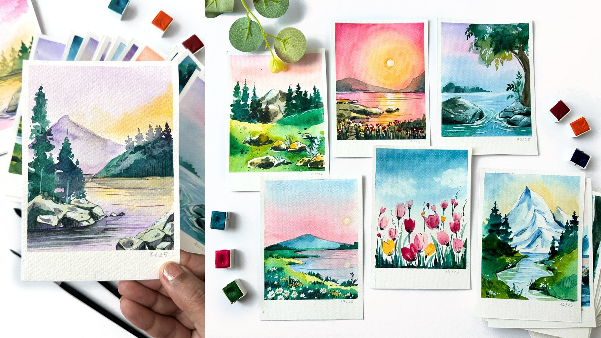
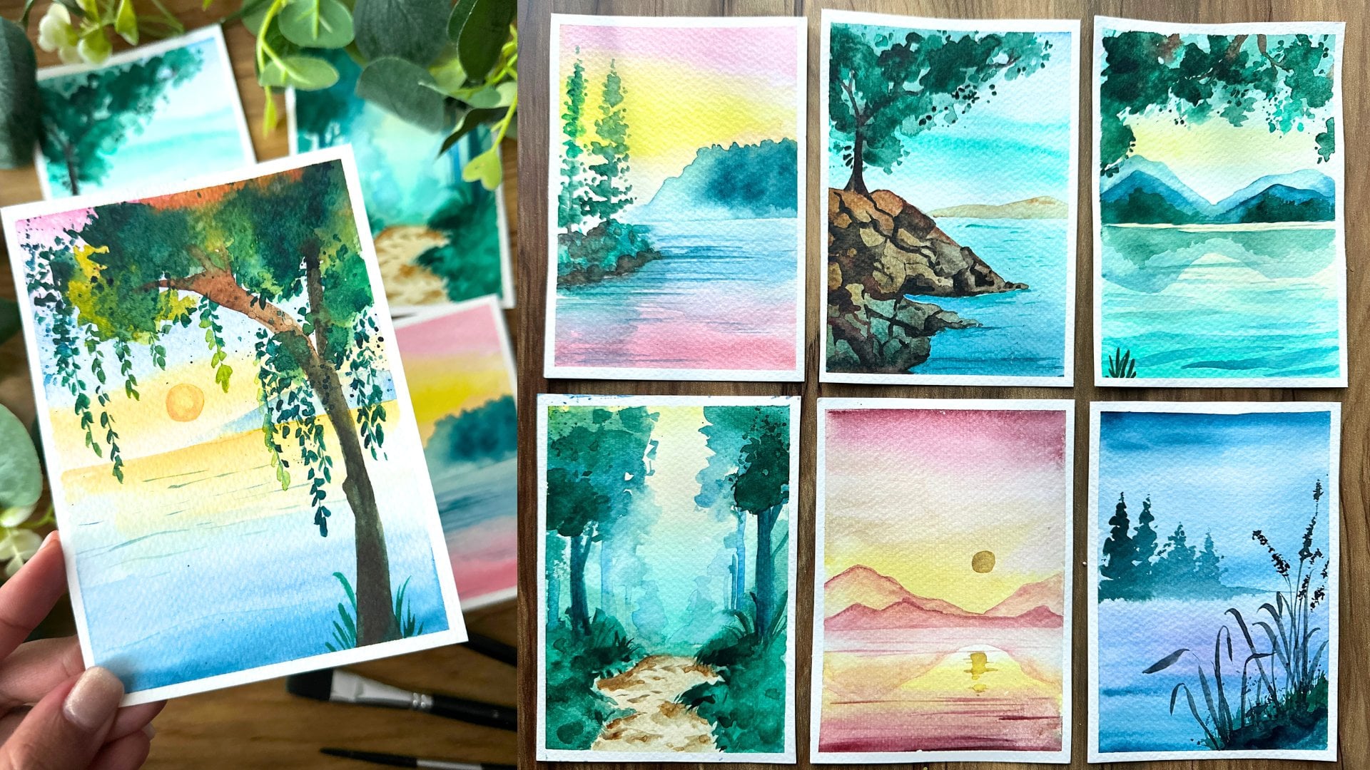
4. Misty Mountains: L et's now begin with our first painting,
the misty mountains. This is a great first piece because it's going
to be monotone, and that is going to be a good way for us to get
started with goulash. Starting off, let's use our
pencil and draw out a line, so we know exactly where our
mountains are going to be. When you're doing
your mountains, just layer them up,
as you can see me do. L et's start by
mixing our color. So I'm going to take
a bit of the blue. And I would say two dabs of blue and a
little bit of black. Just a little bit because
black is quite a strong color, so even a bit mixed in will
really darken up the color. Next, we're going to take a
lot more white to add in. Now, add in drops of
water to the mix, and then using your thin brush. You can go ahead
and mix the colors. If you'd prefer, you can
also use your spatula to mi or an old brush that way
you don't damage the brush. As you can see, we already have a dark blue gray
mix that's come in. So let's add more white to
it so we can lighten it down and make a perfect
background perfect sky. For this piece, I'm
starting off with the size two flat brush and using the bluish gray at
the bottom of the mountain. We're actually
going to paint out the entire top mountain and then later on come back and
add in some depth to it. So go ahead, paint that base. Wh out your brush completely and make sure that
it is dried up. And then we're going
to take some white and paint the
remaining of the sky. You can see how I'm just
going back and forth, gently mixing it in and as
I mix in with the white. Automatically the
shades get lighter, and you end up with a
really beautiful gray tone. Make sure you go all the way to the bottom so that way
it's more uniform, and we don't have areas
that are, you know, muddy. Do. Now, wash your brush
and using the same brush, let's mix in a little bit
more of the blue so we get a darker mix to continue
into our next mountain. Fill up the entire space. And every time you feel like
your guage is becoming dry, add a dab of water, and that is going to
activate the paint again. Now, adding in more of
the blue that we have. Let's do the next mountain deer, and this should be even darker
than what we did before. You can even go directly
into the blue gray. So you get a much
more darker shade. Wah out your brush, add a little bit more of the
blue and make going even darker for the slower mountain. Sure you end up with a creamy
mixture as we discussed. This is very important because if you're going to
end up with something dry, it's not going to paint as well. And if it's too watery, that it's going to
look more watercolor and act like watercolor, which is not what we want. Just keep that balance
between the two. Now, I really enjoy
switching over to my smaller brush and going directly in with
that blue green color, that greyish toe, and adding some texture to
the top of the mountain. Doing the same thing
on the other side. And for the other side, we just going directly
in with the color, no adding white, so
it's quite intense. Add a little bit of black
and we're going even darker. So you can see how that shade comes really, really pretty. And the piece is al giving
some dimension to it. Go back to the top mountain. I'm just doing a thin line, and then taking in some gray that we already have mixed in, just trying to bet out the
remaining of the top mountain. What we're trying to do is
make it very, very light, so you can keep adding
in white to make sure that we end up with
a very light mix. Something that almost
merges into the sky. Let's do the same for
the previous mountain, just adding a little darker
color along the edge. Now that we've completed
the top section, we can move into the bottom
where there's water. So we're going into
the same bluish gray that we had at the
top for the sky. And we're going to do the two ends the right and the left coming from the
edge of the paper, and then connecting
as we go lower. You can even go darker in color as we move away
from the mountain. Just go back and forth
so you end up with a very nice mix of colors, a beautiful blend in
swift flat lines. In case you have any flat lines, just go ahead and take
more of the cree and go over it all the way
from top to bottom. L et the painting dry a
bit before proceeding. Once it is dry, let's take our thin brush, and we're going to add
in a mountain on like an island mountain in the water. Using our dark gray color, just paint out that mountain. We can add some cute
trees to this mountain. We are now going to add some reflection for the
mountains onto the water. So mix a little bit of
white or gray to our color. And you're going to add some quick lines in the opposite direction
of the mountain. So following the same height. Once we have that ready, we're going to add a little
bit more depth to the piece. Depth can be added
by adding black or shadows to what
we've painted. So let's take black
directly from our paint, add a little bit of
water and just paint out the start of the island. So we're not doing it all the
way through just t middle. And covering the bottom
of the island to show that the shadow is
much more stronger there. Wash out your brush
and now using white. We're going to add the light
reflection onto the water. So this is going to
be at the middle of where the mountains connect, and you're going to do
quick lines with the white. Try to make them as thin as
possible as they move dos. It really helps to
use a thin brush, so that way you end up
with a thinner line. Using cray, continue
adding reflections to the water by using
some quick lines. As I mentioned, we are doing the same height as the
mountain at the bottom. If the height of the mountain
is about 1 " on top, you're going to do the reflection
all the way 1 " below. If you can, the closer you can get to the
shape of the mountain, the more alistic it looks. T. Once we've completed that, let's use the same gray color and paint out the
bottom of tion. This is much further
away from the light, and so it's going to
be darker in color. Blend it out by going
back and forth. You can add more
water to the mix, so it evens out. Gently also go a little bit in between our existing
white lines. This gives those lines
a little shadow, which is really pretty. The bottom section still
feels a little incomplete. Using light gray,
we're just going to go back and forth in that area. So it blends out better. We're almost done
with the piece. But looking at it,
I felt like it needed a little bit more depth. So Using the black. Let's just add a
little bit depth to the bottom of the mountain. So just a thin line
along the bottom. And this is our first painting. Make sure you remove out your masking tape to reveal
our finished artwork.
5. Greenary: Are you ready for
our second painting? So get your paper prepared with your masking tape
on all four sides, and we can get
started with mixing. So I'm starting with blue. We're going to take a
little bit of blue, and then we're going to
mix a variety of colors. It's easier to mix colors on a palette or a disposable sheet. So I'm taking a lot of
white for the next mix. And more blue. And this time, we can
take ale bit of green, so we get a blue green shade. And then finally a green. Let's add a bit of yellow on the side
so that when we mix, we have that color ready to use. Finally, let's get some white
on its own along the side. Again, it's just going
to be easier for us to mix the colors
on the palette. Now I'm going to switch to either an old brush or a basically anything that's going to make it easier to mi. Add some drops of water
to activate the paint. Mixing our white and a
little bit of the blue, so we get a nice
shade for our sky. We can go to the layer on top, which is mainly the blue, and it has a little bit
of white in the brush, so we're going to get
a nice creamy mix of a slightly warm blue, which is exactly what we want. I'm going ahead
with the same brah mixing in my green and blue mix, and this should give
you a blue green color. Again, a very,
very pretty color. Gently move around your paint, so you really get the mix going. If you need to add more paint, go ahead, Gage can always be reactivated
when you add water. But remember to have enough of paint because when
you get into mixing, we want to be able to paint, you know, quickly and
with enough of paint. If you don't have enough, then sometimes your painting will dry and you're not going to get the
look that you want. So you can see what I did there. I added a little bit of
the yellow to the green. So we have three shades
of green that's going on. I can add a little bit
more white to this. So it becomes even more lighter, and we've got this
mix of colors. As we paint, we're
going to explore more. Now, with a pencil, I'm just planning out how I
want the mountains to look. Just getting a base idea. So we've got about
one, two, three, four, five mountains layered,
beginning with the sky. So I've switched
to my flat brush, and I'm going in with
the dark blue color and just painting the
top of the sheet. Making sure I go all the way to the edge so that I
don't leave any gaps. Now we can go with
the litle blue. Gently mixing it in, going all the way to the top. We want to avoid
any brush marks. So try not to do any fixed
vertical or horizontal lines. You can see how
I'm just layering them on top of each other, so it's a much
more gentle blend. Doing the edge of the
mountain and adding in white as I go lower because
I really want the mountain to shine
to look obvious. I don't want it to be
taken away by the sky. Added in a little bit of green. You can see that bluish
green that's come through and just
adding that color. Using white to mix
together the colors. It's much easier to do this with a flat brush because we
can cover more space. Now, I'm washing my brush, and then just taking
a little bit more of that dark blue and
going over the section. Just go over the
entire area again. What we want to make sure
is the paint is still wet so that it blends naturally. If it dries up, you would need to paint
that section again. Now, going to the next mountain, unlike what we did in
the previous painting, we're going to go in
with our blue directly. And this is going to
be a much darker blue because previously for the sky, we ended up lightening it out. So this is perfect. We want that bright
blue color coming in, especially around the
top of the mountain. As we go lower, you
can light it out by using the light blue ls. Make sure you use the edge of the brush so you
get a crisp finish. Now that we've completed this. Let's go into the next mountain. Here I'm using green. But mixed in with blue. So I didn't wash my brush with that blue that was
already in the brush, I continued with the mountain. And so you end up with
this bluish green mix. Now, as I get to the center, I'm going to add
little darker green, and you can see how
that darkens it up. Makes it look like
it's in shadow. Moving on to the next mountain, making it even more green, adding a little bit of blue
to give a mix of colors, and I've switched to
my thin brush so I can get that grass like
effect along the mountain. For the next mountain, we're going to start off with this light green that we had mixed along the side edge, as well as the next mountain, again, doing that edge. Now continuing with a green, painting the remaining
area of the mountain. Just be careful when
you're blending. We don't want to blend
it out too much. We still want that yellow
color to come through. If your paint is
feeling a little dry, make sure to add in water
because as we keep painting, water evaporates, and
so we might end up with a much more dry mix than
what we initially started. So just make sure
to add in a drop of water every
time that happens. And we've caught
our next mountain. Let's do even the base. Similar process
we, light yellow, and then using green
to complete that area. Next, we're going to do some
bushes. No bushes. Sorry. Branches of trees along
the edge of the painting. So I'm just making an assumption that we have a tree
that's peaking in. And so we have this
green color leaves that are just showing
through the edge. So using our mild green color, we're going to just paint out
just a very happy thought. You can see I'm making sure that there's a little
bit of texture, so I'm not going back and forth. I'm kind of just
trying to get more of a on and off look by
swishing around my brush, as we get to the edge
of that section, making it even more textured
by adding more smaller dots. Now, let's add a little bit
of black to this green. Or you can use a brown. I feel like the brown
is a little bit better. Black tends to darken up
the paint a lot more. You can use this dark green, and we're going to add
depth to the piece. So I'm starting with the
top of the mountain, just adding this dark green to show the trees that
are there in that using the light green to
continue on with the trees. Doing the neck, doing the same technique for
the below mounted. L et's also do the
section that is right next to the
base with the screen. Going to our other mountain, adding that dark crane just
in lumps of cloud lumps. Basically, it shows
that there are shadows in those
areas and it's ge is completely flat and
gives it more texture. Using the dark green,
we're also going to add a layer for the branches. You can see this layer is
much smaller and doesn't go all the way to the end like our previous
light green layer. Now let's take some dark brown and we're going
to do our branch. So doing a thin line
with dark brown and some branches and stems. He seeing black, we're just
going to add some depth. We just stride below
those sections of trees that we added in a
little bit along the base. We can also add in some trees, and this black is going to
lift the entire painting. It's the area that
is in the shadow, so it's truly
important and it gives the entire piece more depth. Finally, I love how
the pas turned out, but I wanted to add
in a couple of birds. So birds are very easy to do. You just do a circle, very small circle for the body, and in curves in the shape of a or inverted W for the wings. The sizes to get
different sized birds. And as simple as
that, stick to three. I think that looks good. I ended up doing more, which I did regret ly drawn, and I could have
removed it by just adding another layer of garage. But I thought it kind of
worked, so I let it go. Once you're happy, the
piece is completely dry. Remove out your tip. And we have completed our second stunning
painting from the series.
6. In the Shadows: This is a really
fun painting that we're going to dive right
into in the shadows. So let's start with
our pencil sketch of planning out our details. So we're just going to have
three mountains in this one. I wanted to pick
a color that was a little bit different from
what we've been going for. It's rare to find more
of purple shades. So I thought it would
be very interesting to kind of create
something in that. You can get purple
by mixing blue and crimson with a little bit of white should give you the shade of purple
that we're going for. So let's take a
little bit of purple, and then we're going to
take a lot of white to get a very light pastel sheet. Now, using clear water, to add a drop to the mix, and then with an old brush, just move around
the paint to mix through the color to
get a very light. I would say a lilac color. Lavender, it's more
lavender than purple, and that's the color
we're going for. Using a per, let's just check the color
before we proceed. I wanted to make sure
it's a light shade because sometimes when mixing
the colors look different, and then when they dry, they turn out darker. So once we have the shade
that we're happy with, let's go ahead and
paint our sky. Continue painting with white. So we gently blending
in the white to lighten up the color
as we move upwards. In this painting, I'm just
going back and forth with the white so we get a clean line instead of what we did before. Now, using the whe, let's add in some clouds. Clouds, it's all
about the shape. You want to go for
an oval shape, and that's perfect
to get your clouds. We're not focusing too
much on the clouds, it's just to give a little
bit of mist to the piece. Continue with the white
as we go higher and higher all the way to the top. Now at the top, we
are going to continue with a little bit more
purple just at the edge. Blend it all, make sure
that it's very nice and clear for we move on to
painting some clouds. Time to paint our mountains. So going in with the same
purple add a little bit of the darker lavender color and continue painting
the topmost mountains. So this is going to be a
very shaped difference, too. Keep it very, very light. Yeah. L et us add more lavender
to the mix so it becomes slightly and paint in
the next mountain. Moving lower. So we're going to again add a little
bit more lavender. And here, we're going to
try to mix in the shade, so it's not just toe
or a flat color, so we're going to play
around with that a b. So as we go down, we're going to go
into a lighter shade. By adding in that light mix and completing the
entire mountain. On the other side,
we're going to keep the dark color at the top. You can see this is very, very dark compared to what
we've been doing. And then as we go lower, just adding in the lander
and filling up the space. This gives it a little bit
more and more details. We're almost done
with the backdrop, Let's use a little
bit of white and just extend the cloud the mountain. So that way it looks
like the mist is come, and that's going to just
really add to the painting. Now, for the bottom section, let's add black and green to paint out the
base of the landscape. Start with black towards one edge and then add more green as you
get to the center. Time to switch to
our thin brush, and we're going to add in trees. We are going to be
doing the trees in the d to your lines, and I'm clumping together. Two, three sets together
and then keeping a space. Had in the trees like we practiced in our
practice exercise. So start small and then as
you move your way down, create the conical shape. After completing the trees, we're now going into
the foreground. So let's use a little
bit of white to this green mix to get a
lighter shade of green. We're now going to add this
as bushes in the foreground. Start by gently dabbing the brush to create multiple
dots next to each other. We're doing this in clumps, so it's not all over. It's not like an outline. You can see how I'm
clumping together sections in a very
random asymmetrical way. When I'm happy with the result, I'm going to add a little
bit more white to this, so it lightened down
given and we're going to add highlights
to the bushes. So the highlight will come just along where the sun
would hit the bushes. Highlights are generally even, so we're going even smaller. You can see how the
details are tinier. The dots are much smaller, and we're just doing
it along the top. Not as a straight line, again, we don't want to look
too symmetrical, but just in clumps. Follow what I'm doing,
so it's easier for you. After completing our background, we're going to add a
couple of obvious leaves, and this is going to
highlight the piece. So just following again, the practice exercise we did before and painting out
some simple leaves. Remember that the curve of
the stem is very important. It gives movement to the piece. Since we have our trees
being very straight, this curve movement really
really makes a difference. So make sure that you create a beautiful curved stem
and then the leaves. And we're done now. If you want you can use a lighter shade of the
green to go over the top, remove the marking tape along
the edges once the pieces come to reveal our
painting from the series.
7. Focus Mountain: Let's dive into a new painting. Prepare your sheet in advance and we can get started
with our pencil drawing. This one is going to be fairly
simple in terms of layout. We have our mountain in
the middle and a couple of smaller crener
mountains at the bottom. So in a way, our main
focus is going to be on the mountain
that is right there. So beginning, let's
mix our colors. The first color we're going
to mix is a skin tone, a pale yellow color. So add in a little bit
of red yellow and white. Your proportions might need to change a bit as
you keep mixing, so don't worry about
it. It's a process. The next color is
black and white. This is going to be
mainly for the mountain. And then we're going to
go into shades of green. So let's pick up
some green as well as yellow for a more
warm green tone. Mm. And then a little bit of just yellow that
we can then mix in with green to give
a lighter shade. Once you have the colors ready, just add a drop of water to the mix and we can get started. So mixing out our pale yellow
color with a small bruh, the small flat brush, we're going to begin
painting the sky. So start from the bottom. And gently just paint out
the entire bottom half. L et's now take
white in our brush and lighten down the color
as it moves upwards. You can see how I need
to go back and forth sometimes just to make sure
that the color blends slowly. Now that we've got a very
subtle backdrop that doesn't really uplift or
take away from the painting, we can add a little
bit of black to that mi and paint
out our mountains, so it's the same
shades of pale yellow. L et's start with our greens. We're going to start
with light green, and then we are going
to do the bottom part. Once that is done,
we can move into a deeper green color and
paint the remaining. Add in some white so that you can easily showcase the different
layers because right now, as you can see, it's
all merging into one. Adding that white is just
going to balance it out. Along the bottom,
we're going to use a darker green to add depth. That start painting
the next mountain. Again, starting with
a medium green and then going ahead with a deeper
green as we finish it up. For the final mountain, we're going to start with
a lighter shade of green. So add some to that mix and then continue
with the blending. This part is one of the most tricky parts of the mountain because
we're adding in the snow. So you need to pay
attention a little bit. So wash me painted
before you attempt. What I'm trying to do is create basically reshape
lines to show that the snow has kind of
pulled into certain areas. You know, if you
look at a mountain, it's not flat, and that's
where the snow kind of stays. So it's a little bit
of a tricky um detail. So just have a look
at what I'm doing. I'm trying to just create
some areas that have inverted triangles where
the snow has kind of sat, and then a couple of lines where the snow
has trickled down. The top of the mountain peak, you can just add in white lines. And that would be simple enough. So just have a look
at what I'm doing. I'm starting off with doing
a little bit to the side. I'm doing one area at a time. For the top, I'm
just painting out the white and then letting
the snow trickle down. On the right side,
since there's so much, you can just paint out the
white area for the snow again, forming an inverted shape. Try to get as close
to what I've done. It's okay if it's not
right completely. And the next step, we're
going to add shadow, and that's going to
make it more realistic. So add in a couple
of white spots where maybe the snowed
and didn't flow. And what we also want to do is make sure it's
a bright white, so it doesn't fade
into the background. So the next part is really
important, but very tricky. So we want a shade darker than what we already used for
the base of the mountain, but not too dark. So if you need to test it out, just that it's a little
bit, but not too. So you can see on
the side I'm just checking how this color
is going to turn out. And we're going to add the
shadows to the mountain. And this is really going to help the entire mountain just balance out and look more realistic
and three dimensional. So we're adding that gray to
the sections that are below. Do you see how I'm just
doing the bottom area? I'm not doing the top. Now, it really depends
on our light source. In this case, I've aimed for the light source to be on top, and so the shadow is going
to come at the bottom, unlike what we did previously, where it was either
right or left. So do the bottom section
and you can see how that automatically creates a
three dimensional feel. We now step into the forest. So using our darker green, let's add layers of forest
coming from our mountains. You can do this thin line, so it actually looks
like it's not as dense, and then as it goes
higher, it's dese. So that's a really nice view. L et's move into the
next mountain, again, start with the darker green, again start small and
then go up go darker. Now for the edge. More bushes. Let's continue that on the left side
mountain as well. Let's mix in some
white and add some stems to the bottom
of and you know, bottom of the painting. So just quick lines. What we're doing is as a, we do smaller lines, and then the closer
ones are longer. So this gives the of
depth perspective. Let's go even more lighter. This is rarely seen, so add a little bit more
white and go over that again. So smaller away and then
longer ones as you get closer. Use the thin brush, so
we get the thin line, and it's easier to control. We're now going to use
black to add depth. So start with the sections that are moving downward
to show show. So those are going to be. We're going to do
that on both sides. And once we're done with that, we can do a little bit
along the grass as well. And finally, let's use white
to add some white flowers. So as it's far away, you go smaller and then closer, you do big white spots. So this again, brings
together the piece. The white also balances out what we did above
and the mountains, and the whole thing
comes together. M. Let's add a couple
of these white dots along the mountains as well to show that that maybe there's floss there
or since it's far away, maybe it's just white that is seen through,
maybe it's houses. Make sure the piece
is completely, and then you can
remove out your tape. And this is our final painting. I love the colors. Beautiful.
8. Rocky Mountains: Let's now move on
to rocky mountains. Starting with our a six sheet. Let's get into
mixing some paint. So this piece is
going to be mainly focused on blues and pinks. Start with a lot of white. We're going to add a
little bit of blue. To this blue. We're gonna
add a little bit of green. So in the final look, I felt like the
green didn't show, so it's okay if you skip it. And then we're going
to go into our pink. Now, if you have pink, you can use it, otherwise, makes a little bit of red, just a little bit to the white, and you would get your pink. With the pencil, we're going to just plan out our drawing. So it's going to be a
background of fountain, and then a foreground
of another small island with very obvious trees that are going to
be the focal point. So for the mountain, make sure that you go
for a rugged shape. We're trying to
avoid any curves. So just kind of keep
it as pointed as possible and following
the same thing downward, the same shape to show the
reflection of the mountain. Once we have that ready, let's mix around our paint. So I'm adding a drop of
water to our paint mixes, and then using the big brush, I'm going to go into the sky. Now, it's actually better to use the big brush because
we can cover more space, and it's actually going to look better than using
the small brush. So adding more white because I want a much more lighter shade. With guage, notice
the colors tend to be more darker when they try. So keep that in mind
when you paint. So adding two lines of blue. Let's wash out the
brush completely. Continue blue for the sea, which is a reflection
of the sky. Tw, let's take some white as is and continue with
the blending downs. I'm trying to do quick
strokes back and forth all the way
from edge to edge. To way I get a
nice blend across. We're going to try to get a little bit in between
the mountains. Time to mix in our pink
at the bottom of our sky. So take a little bit of that pink or crimson red color and start to paint the
bottom of the sky. I had ale bit of
blue in my brush, which is why you
get this purple, muddy shade that's coming. At this point, wash the brush
completely and then add in white to gently
blend in the sky. It's okay if you end up
painting a little bit of that mountain It's just for
me to keep the shape of it, which is why I didn't paint it. Using the same thing. Let's paint the
bottom of the water. Here we're not going
to use a lot of. It's going to just
merge with the blue. Just going back and forth
all the way to the top. So we get a very nice length. Add in a little bit of white to lighten down the
colors a bit more. Trying to dive
into our mountain. So I'm going to be taking blue, and then adding a
little bit of pink. Just a little bit, so
it gives a nice shade. And that's the
color I'm going to use to paint out the mountain. Using a thinner bruh, a thin flat brush might
be easier as well. I was just holding this in hand, so I just continued using it, but you can switch brushes. Use quick lines by holding
your brush vertical, and sorry horizontal and just add in lines as
we decided before, following the same pattern
as the mountain above. This is the reflection
of the mountain. Now, let's take white and we're going to
blend a darker shade for the shadows
for the mountain. So add a little bit of
cree or black to this. And we're going to start
painting out the mountain. So follow along as I do this. What I'm doing is painting out sections of
diamonds in a way. That's the best way
to describe it. So assuming that there's
a line going through, and that is where the
mountain is coming, I'm going to just connect
it to with a section. So this takes a little bit
of understanding of how a mountain is and how the
shadows would come through. But you can have a look
at what I'm doing, and that is going to be
a good base for you. We are mainly painting
the left side of the mountain so that the right side is where
the light is shining. So you can see how when
I do the lines as well, they're much more
jagged or they're much more harsh lines. They're not curves. And we have gaps between
them in the form of like triangles that also make it look like
those sections are not hit by the shadow. Adding another triangle. From the bottom, this
one is much more obvious and just
gently curving it. Now to show that some
of the sections are much more smaller
and unobvious at a couple of lines with the gray in the angle
of the mountain. So this is our base mountain. It's our background, and
now we're going to go into some of the details that are going to
fill up the space. Adding a little bit
of green to our mix, let's paint out our
foreground island. And you can see how
I'm making the edge a little bit even on top and very clear and crisp at the bottom because
the bottom is in water. So we're just going to make
sure that that is neat. And then it's time to
add in some trees. So as you guys know from
the practice exercises, we went through basics of trees. So just add a few of them along
the bed of the mountains. So now go into adding some black detail to the
island that we've got, and this is going to add
some shadow and details. We're trying to avoid
flat spaces just because this is going
to look more natural. I love painting mountains, and especially I
feel like this time. Uh, I've just been
very inspired by them. It feels like I'm
getting away from my daily city life to just imagining a completely
different view. And it's been so great to transport myself just
through these paintings. So we're going to go into
adding in our trees. And you can see how I'm
doing shorter trees, and now I'm going to add some long ones that are going
to be the focal point of our Phillip Intra one at a time. Using the same grave, we're going to add
some reflection. These are going to be darker because it's much more closer. Keeping a small gap
for the island itself, we just going to do
thin lines keeping a small space all the way
to the bottom of the paper. Adding some more small trees along the bed of the mountains. These are basically
the same height as what we had done before. But we're going to just
lump them together, and this is again going
to add to the background. We are almost at the
end of the painting, so let's add white to our mi. We're just going to add more texture to the
island, the cross there. I don't know if this
is called an island because it's so
small of a space. But it's really, really cute. I love how this looks. And it's coming
together so pretty. The final thing we
have is we're going to use white and using
a thin brush, we just going to add in lines. And this is actually going to break through what we had done before and add to
the effect of water. So you can see how I
stop right on top, and then I'm just doing
the bottom lines. Again, not all over, this
is not a pale line effect, which is doing it in some areas. Now, you can remove your tape
and we have a final paint.
9. Into the Mist: This is one of my
favorite pieces. Painting mists. I think it just goes so
hand in hand with mountains and the light shade of
mist coming through. It just feels refreshing. And yeah, it feels like I'm there
when I painted this piece. So starting off,
let's just pencil in our mountain just so we have an idea of where
everything goes. For the mountain, I'm doing a very jagged line
because it's very lush. There's a lot of
greenery on there. And so we're going to
add that to the effect. And we also need enough space in between to add in our lists. Let's dive into
some color mixing. We're going to start
with Siena burnt sienna, which is a warm yellow
color and green. So we're basically just
working on shades of green because this painting just has a lot of different
shades of green. So you can mix your own green with blue and
yellow if you don't have add a little bit of
brown to get a darker green. Or you can use just green and
blue to get a bluish green, but try to get a
variety of greens going that we can
use for our pins. Now we're going to drop
in white to lighten up the sheets and create a
beautiful hue of colors. Now, using our brush, let's drop in some
water droplets to activate the paint
and get mixing. So for this painting, I'm diving right
into the mountain. I'm starting off
with a yellow And what's going to happen is we're assuming where the
sunlight is going to be. The sunlight is going to be
coming from the left side. And so we're going to dupe
clumps of yellow as if it's hitting those longer
bushes or trees, and it's highlighting
it and it has been covered by the yellow. While it's still wet, let's
add some brown in the middle. So those are sections
that are in the dark. They are not getting
enough sunlight, so they're going to
be much more duller, I shade, they're in shadow. And then we can
add in some green. So again, mix out your colors, use water to activate
your paint and continue painting the remaining
of the mountain. Doesn't have to be really perfect because in
the next steps, we're going to go
more into detail, but we want an overall mix of colors where you have
your yellows on top. You have your brown on the left, and then you have your
green to the right. When you have something
that looks like this, let's go right into the mist. For the mist, I'm
washing out my brush, taking white, and I'm going
to start painting out. Now, I have a little bit of
green in my paint brush. And as you're mixing, you are going to
get a little bit of green, and that's okay. So mist is generally opaque. But some sections are
more translucent, where you can see beneath. Right? Or you can
see behind the mist. So it's not going to be full
completely white in color, even though it looks that way, it's actually going
to be the colors reflected from the surroundings. So we want something green. You can do a little bit
of a mist up, as well. We still need to do the sky. So don't worry too
much about it. We can do the sky and come
back to the mist portion. We're going to keep the
sky extremely simple, just so the highlight
is the mountain itself. Keeping that in mind. I'm going to use by brush
that has that little bit of green and paint out
the entire sky. For a slight shade of sunlight, we can add a little
bit of yellow. You can see how little
those colors are. Even though it looks
like I'm taking a lot, it actually isn't. It's so soft. And that's when you
have just a very gentle color coming in. Don't worry if right now your
piece doesn't look perfect, we're going to continue painting the bottom of the mountain and the foreground of our
painting with a bright green. Mixing in some brown for the
base and then painting out the bottom e than the
above green layer. And you can see how
I'm doing that. And this looks
much darker and we wanted to be in that
shade of colors. So this is where I tell my
students to trust the process. Looks like a mess. No
idea what's happening. We're going to switch to our small brush, our thinner brush, and we're going to
go into details, right? So, calm down. We're going to take it
one step at a time, and it's going to look
beautiful at the end. So this is a process,
I would say, take your time with
because it's so important. It's the details that matter. So I'm taking yellow, and I'm adding it
to those areas that have more of the yellow
around the base. As I said, this is
where the sunlight is hitting the
painting, the bushes. And that's why you have these clumps of yellow
that are showing through. Right below that, we
can take some green and paint just simple
dots or dashes. I prefer dots because
it looks more realistic because we think of
branches and leaves. When you see them from far away, they look like dabs of paint. So we're going for
just more of dots. Again, clumping them together. As we get closer to
the yellow sections, adding more of the deeper green. Continue to repeat the process. So we've got our bright
green next to the yellow, and then we've got our
brown or dark green color in in the middle, so lesser in Asia. And you can see how that's
all coming together. We're moving on to the
back of the mountain, and this section is
going to be completely in brown because it's
not getting the light. It's in the shadow, so it's going to
have more depth, and so we're going to just
add our darker to that area. Okay. So now let's go
into our foreground. We're going to do the trees that are right in
front of the mist. So taking our dark green color. Theyg in painting the
trees in the middle. So these are going to be in green color. They're
not in black. They're not the darkest
color and follow the tree painting that
we practiced earlier. M Now that we've got all this going, time to fix our mist. So what I'm going to do is add a lot of water to my white, and I'm just going
over certain areas. So basically just the
top or between sections. So I'm not painting the entire
thing because I want that greenish white to also be seen because that
was also beautiful, and as I said, the mist isn't purely white. You can see through it. So we're just getting
that little bit of brighter white to make it more obvious that this is the mist and also fixing
some of the edges. Just swish around your
brush to get those effects. Right? So we're not
just using the tip, we're pressing down our brush. We can do this for the top
of the mountain as well. So it looks like the mist
is all over the mountain. It's not just in that
middle section randomly. Time to move into
our remaining trees, so we're going to take
a darker brown color. If you need to add more brown, go ahead and do that. These trees are going
to be slightly taller or much more taller to
what we painted before. Paint out your tree and
fill up that space. Now we switch to black. So we're going full on. These are going to be the
most focal point trees, they're going to be
in the background, and not focal point actually. That's not the right word. They're going to be the
trees that complete, right? Because they are in shadow. So you've got the
layers going on, and it's actually going
to create the background. So go ahead with black and
then just paint out the tree. We don't need to many of these, but just enough that you
can see the colors behind, and you can see with this black, it's automatically just lifted
up the entire painting. We're almost done, we
have the bottom section of the base and you can start
with a little bit of black. We're going to add some
greens and whites to it, just to give it a
beautiful green landscape. Drop in some yellow to balance
out the yellow from above. And you can see how
that looks so nice. Once you filled up
the entire space, let's take some white
and add in a couple of floors basically along
this bed of grass. You can see how I'm clumping up the whites to bring
them together. So this is going to
look a lot more. Now, with black, this is
just an additional step. I felt like it needed it just
because there's not much of a difference between the back
trees to the front cross. So just using black, I added a couple of bushes
that are much more in shadow. And I felt like this
created a nice barrier between the two and also
a short perspective. So the front trees are taller and the back
trees are shorter, and that just completes the. So this is our final painting. You can add a couple of stones, if you'd like, or
any other detail. You can go ahead and even
add the birds from previous. I think that would
add on for sure. And once you've done, once you allow your
painting to completely dry, go ahead and remove
out your tape gently, making sure that you
don't tear your paper, and this is our
completed painting.
10. Morning Light: Are you ready to dive into
another stunning painting? So morning light is all
about exploring how the sun hits mountains and the beautiful landscape
that we're painting today. So using a pencil, let's start with the beast
where we're going to have our tree coming
through on the left side. So make sure when you
do your mountains, they're away from that point. So that way, they're still seen? The peak, especially is still
seen through the trees. Once we have the base and beautiful and we're
happy with the placement. We can start with
mixing out our colors. Let's start with a little bit of yellow and a lot of white, and that's going
to be for our sky as well as some other details. T The next color we are going to mix
is green with yellow, so it's a much more subtle
greenish yellow color. We always have to
add in some blue, so let's go ahead and add our blue to the mixing
with again white. And then we go into green
with a little bit of white. Now, add some drops of water, and we just couldn't
mix out our colors. Activate the paints and get them ready for us to start painting. So I'm using my medium size
brush to the size too. And I'm starting with a yellow
and adding a lot of white, so it's a very
subtle light color. Begin adding yellow
to the bottom of the sky following the
path of the mountains. As we go higher, I'm going
to wash my brush and take white to fade out this yellow. Automatically, you can see how the color is becoming more. Mae churches to go a
little bit back and forth, so it blends really well. Always keep in mind that the mix needs to be creamy
for it to blend well. If it's too watery or too dry, you're not going to get
a really nice blend. Now, adding in some
blue with white. Very subtle. Very light shade. Let's add that to the top of the painting to
complete the sky. Now you can wash your
brush and gently move around the paint so
that it blends better. We now move on to our mountains, Let's mi a bit more of
the blue with the white, so it's deeper in color, and we're going to
do the mountain. Following that, let's add even more and continue with
the second mountain. This time, we're going to paint just half of the mountain. And then we're going to add a darker layer for
the other half. So it shows that the
darker layer is in shadow, and the left side of the
mountain is towards the sun. This is going to form a really nice space for our mountain. Now, when we do this edge, make sure it's not
just straight. You can see how I'm
making it a bit crooked. For the final mountain, we're going to go
more with blue. L et's keep our base green. So mix up the green with the blue and continue
painting out the base. As we move along to the right, add more of the
green so stands out, and we can also add
yellow at the top along the middle to show
that that area has yellow along with it. L et us now use green to add in more greenery
to the mountain. So you can see how
I'm just doing very quick jobs for
quick lines and dashes, adding more of the yellow Aspeco io to show that the light is reflecting in that area and then going
towards the bottom. And as we move away
from the edge, as we go, or more away, go more and more
darker in color to show that that area is
more in the shadow. For the next mountain, we are going to use our
middle green colors, so not to b, not too dark, and we're going to
start adding in just small dashes to show the
greenery on the mountain. After painting out
the right side, let's add a couple
of these along an angle 45 degree angle on the left side as well because the greenery
is on both sides. Deepen the color
by adding a dark green along just the area
that is directly folded. You can see how this piece
now looks more t dimensional. And as I discussed in
the practice excises, mountains are
triangular in shape, so it's important to show
that in the painting. Wh out your brush, and let's use our thin brush for the details as
we continue forward. Using dark green. Let's start by adding
in more details. What I'm trying to
do is the area that is behind is darker in color. So make sure that it is in
green because it's behind, so the shadow of the front
mountain would fall on it. Time to add in brown. Now, with brown, we're making it a little darker the green, and this is going to
be in create for us. Mix well, and this is going
to be used to highlight, as well as draw out a tree. So start by doing the tree, add in water if
it's becoming too thick and continue all the
way from top to bottom. You can take a little bit of white and add it
to the tree trunk. Again, giving it a little
bit more dimension. Remember that white would come on the left side
and not the right. Continue by adding in
some branches and stems. Make sure to branch out
your main tree trunk. You can see how I'm doing
this with V shapes. It's now time to
add in some trees, and we're going to do this with our dark brown along the
bottom of the mountains. Mix more green for
the tree branches. We're using our smaller brush
for this so that we can get more detail and make
it look very interesting. You can take more of the greens. You get a nice shade of color and start by painting
on top of the stems. Continue by adding a
little bit more dark green along the branches. Mixing that little
green with white. We've lightened down the color, and this is going to
be our next layer as well as some yellow to
show that it is in sunlight. Now, using yellow, let's add in some blades of grass along the tree trunk as well as any other detail that we
want to add to our painting. Along with the tree blades. Sorry, the blade of grass, I thought it would
be nice to also add in some proper leaves
like we did before. Using the yellow on the top leaf can continue do more greenish. Again, it looks like the
top leaf hit the sunlight, which is really really n. And just few of these is
more than enough. Now we have just two more steps. So wash your brush using yellow. Let's brighten out
the mountain section that has the
sunlight hitting it. And we're going to
darken some of the areas creating more contrast
in the painting. With black, let's deepen the color between the mountains to show that it's
more and shadow. We're doing this by
adding gentle dots. So not pressing the
brush too much. That way it creates more depth. We can do this for some
of the mountain sections to show that those areas
may be behind or folded, just to again give more
texture and make it realistic. Once you love the piece to try, remove out your tape, and this is our final painting. We just have one more
to complete the series. I hope you're enjoying
it and really playing with the details. The final one is actually
my favorite painting.
11. Daises: This is my favorite painting
from the entire series, it's actually what got
me started to even think about exploring
and expanding this. I love mountains and living in a country that is quite
flat land and in a city. I miss nature so much. And while I do get a chance
to travel and see it. Sometimes it's not enough. And that's why I started
painting mountains. It felt like I was
stepping into this world, exactly what I was looking for, and it was just so calming. And to have it
displayed on my wall, it felt like it was part of me. And I hope that's what
it does for you as well. We've got in this far. This is our final painting. I'm so excited to get started. We're going into mixes of green. We've got green with white, just green, green with yellow, and then mainly yellow. And so after all these shades, we're also going to
add in different. This is the most say
complex painting compared to the rest. And I'm sure after going
through all those projects, this could be very easy. So let's just die right in. We've got our pencil drawing, so a nice space with enough space for
daisies at the bottom. We've got our two
mountains on the side, and then two longer mountains. Now, we've all the
curved it on the edge, so you can see it's
al de played out. So we know where the
light is going to hit, which is going to be
on the left side, and so the right side is
going to be darker in color. So let's dive right in
mixing up our blue. Starting with our smaller brush because it's a much smaller ia. Can add a little bit
of green to that blue cause I really like
that bluish teal color. And we paint out
the top of our sky. I'll just do a
bit, not too much. And then we're going
to use as is and continue painting out the
remaining of the sky. So that way, you've got a
gentle blend that's coming down and the portion
that's right next to the mountains is
much more subtle. This is actually what is
going to make the mountains also become highlighted
and just really stand out. Let's continue mixing
the remaining colors. So starting at the top, let's mix out the green
with a little bit of water. Wh out your brush, mix the green and yellow, so you get a much
more brighter green. And then finally the yellow with a little bit of the green to
give you a lighter color. Once you have all the
three shades of green, we can start with our painting. Began by using yellow at
the top of the meadow. So it comes right on
top along the middle. Then switch to the
other green and continue painting
the remaining Part. Now, you can see
my brush is dry, so I'm going to add more paint, as well as also drip in
a little bit of water. So it becomes a lot more moist and creamy for it
to move around. Let's take more of
the darker green. So that we continue with
darkening up the pieces. As we go lower, add more and more of
the darker green. Almost mid bay. And then as B go down, I'm actually just going
to move switch to black. So it gets even more
darker in color. Right? So along
the edge, almost, we've got a dark black
shade that we've added in. Add a little bit of
water to make sure that it's creamy and
easy to mix along. Can add a little bit
more of black just in bunches or lines
along the meadow. As you can see the base
looks really flat, so let's add some of
that deeper green, and just paint a
little bit of that, so it's not so dark. You can see how that
looks much better. Don't worry if it's not perfect, we're going to go ahead and
move to the next mountain. So we're following the
same idea of greens. Let's add a little bit
of a lighter shade of green and just paint
out the section. Switch to darker green
along the bottom. It shows that it's behind this meadow that
we just painted, and blended surely well, so we get a nice mix. After we complete that, let's go ahead and paint
out the next mountain. We're doing the
opposite side, again, starting with dark
green along the bottom. And then as we go up, adding in light green. And blend it. The mountain in the back
can be lighter in shade, so use a lighter green, add in some water, so it's much more creamy. And then use the dark green and this shows that it's
behind the previous lantern. L et's use a little yellow along the edge just to give a little
sunshine to those actions. Now, use this blue mixed with a little bit of green to paint the right side
of the mountain. As I mentioned earlier, the left is where the light is, so your right side is going to be in the dark, it's
going to be shadow. So we're going to make
it darker in blue. And continue with the
next mountain as well. Just painting that edge
as well as a couple of lines that shows that maybe
some areas are inside. And then again, painting out the right side of the mountain. So I didn't paint it all the way to the bottom
because I wanted to add white to blend
out the mountain. So it's not one shade. It starts on top and then becomes lighter
as we go downwards. You can use this in the
behind mountain as well. So mountains are quite complex. There's different phases. And if you really
try to understand, as I mentioned, there's
like triangles, and so you kind of
want to get as much as the complexity
in the painting, without making it too
complicated, you know? So we've got here. It looks really n, and we can move on to our other details. The first thing we're
gonna start off is adding trees along the edge
of the mountains. Let's now move on to adding
in our white daisies. So wash your brush take white, and we're starting with small
dots as we are away from, you know, the viewer point. So just small dots. And then as we get and, we're going to make bigger dots, bigger sections, as
well as full daisies. You can see how I'm doing
this, just pay attention. Couple of them further
away, then more closer. Then along the bottom, we're going to paint
individual petals and actually paint out our dies. And love how that looks. You have different sizes, add a little bit of
yellow to white, and then we're going to do
the center of the daisies. Let's also use yellow dots to soca other flowers that are along the bed that maybe we
can't see the details for. Having done that, let's
white with green, and we're going to paint
out our stem for the di. So we left the last
part to the end where we're going to add
snow to our mountain. So we've already
done the left side. Now for the right, using white, let's add some snow. This is how I'm doing this. It is planted in a way. We're doing the same
kind of triangle shapes, and then lines moving downward. Continue adding the stone to
the other mountain as well. We are now going to use white
with a little bit of cree. And this time we're going
to add shadow to our snow. So use a lot of
water and just add in the layer right below. Met the paste completely dry, and then you can remove out your taped edges for
our finished painting.
12. Conclusion: Hi, everyone. I hope you
enjoy this workshop, and I hope you have these beautiful eight pieces
that you can then display on your wall or give
to your friends as a gift. I am so excited that
we finish this. We have these beautiful
paintings that we can now learn and grow form. Please follow me
on Skillshare to get updates on my new
workshops that are coming up. I have a lot that's
planned ahead, and also do leave your review
below. Thank you so much.
 Femvisionary, Watercolor Artist and Instructor