Transcripts
1. Class Intro: Hello, everyone.
Okay, so today we are going to paint a
scene from St. Barts. I don't know if you've
been to St. Barts. It's an island in the Caribbean, but it's not the
Caribbean. It's France. And the people
there speak French, and they joke that
the happiest people in France are in St. Barts. And we were lucky enough
to go several years ago, and I took a picture,
well, many pictures. But the one I chose
for our painting, what we're going to
do is paint it in a way that we're going
to try to not be fussy. It's a hard thing to do, right? So we're gonna lay out our strategy and then try
to be somewhat minimal in our brushstrokes and keep the painting fresh, and
we'll talk through that. We're in a layer
color. I'm going to use acrolGuah in this, which is really acrylic
paint that's matte, and I'll show you the
palette that I use. But you can use
acrylic, absolutely or watercolor or
oil, if you like to. So that's the medium
doesn't really matter. And we're going to have
a lot of fun with this. I'm going to show
you some kind of dry brush techniques to do
in the water and the sky. And this is going to make us feel like we're in St. Barts. So let's get started. Hello, friends. I goofed up. I started out the class, I did the whole class thinking I was painting one of
my photos from St. Barts when I was really painting one of my
photos from St. John. We've been to both places and I put all my island photos
and one album on my phone. The first picture is St. Barts and I'm talking
about St. Barts, but the second picture is
Trunk Bay and St. John. Wanted to explain that. This is a painting of a St.
John beat scene, and I hope you enjoy it.
2. About Me: Hey, I just wanted to tell
you a little bit more about me if you haven't taken
many of my classes. My name is Suzanne Allard, of course, and I'm a
self taught artist. I got started painting later
in life in my early 50s, and I finally decided to
stop being scared of paint. I would create other things,
but for some reason, painting felt like, No, no, though, that's
for real artist. That's not me. Um, I'm
just a creative person. And I got sick of hearing myself say that and
started painting. And I started just, you know, with some basic drawing, like little challenges
on Instagram. And I'm not a big drawer.
I don't draw much. I'm a sketcher. And
just one thing, you know, I don't want to say
one thing led to another, because I worked hard. I don't want to diminish that. I worked a lot. I painted
a lot. I created a lot. Asked my family. I was obsessed. I'm still kind of obsessed.
I paint in the evenings. But I just wanted to
share a little bit of that story because I think one of the
things that really gets you where you want to go is just frankly not giving up. And, you know, you can
get tired and you can have take a break and
recharge your batteries, all that, but just don't stop
and keep taking classes. And eventually, you
know, if you want, you can get to where it's
you're selling paintings. Many of my students have gone to sell paintings and
show paintings, and that's so exciting for me. I myself sell my work online and license my work
and teach classes online. I haven't done in person
retreat yet. That's on my list. I have to think about that one because I get requests for it, but I think that if you are
interested in pursuing, whether it's casual painting, just for pleasure, all the
way up to an art business, like I have and beyond, you know, just stick to
what you like to do. And then do that part
and then add on things that you don't know little
by little so that you can learn and keep your focus, keep your determination, and
you'll be able to get there. Alright, keep creating. Let's get started
on this painting.
3. Acrylic Gouache Paint Palette: Alright, let's talk about
this acro guash palette and how I put it together. These are little
containers that come with these little rubbery tops, and it's been, I want to say three or four weeks that I've
had these in here. And I have replenished
them a little bit. You can see I'm a double dipper. I keep them sprits with either a little spray bottle
or this one's really misty. And I only do that, maybe once when I start and then
if I'm say painting an hour, then I hit them again
before I put them away. But all I did is I
took some colors, two, I took two yellows, a cool and a warm,
and then some red. So I've got, true red, this is a cad red, a magenta, and this is opera
pink, which is, you know, my favorite
fluorescent type color. And then an orange,
a lime green. This is a Prussian blue. It's just a dark blue,
altamarin turquoise. And these are mostly Turner
brand that are in here, if not all, this is an
ivory, of course, white. This is just a peachy. I had a tube of it, so I emptied the entire
tube into there. I think it's called Juan. This is yellow ochre.
This is a pale lilac. It's not this one. This
is a brand new one. It's a little darker, yeah. So I just basically
took what I had, but I made sure the essentials are you don't even need
both these containers. The reason I spilled over, I really only needed from
here, about five wells. I really only needed the white. I like the ivory, the yellow
ochre, and the burnt sienna. I threw the rest of these in
because I have the space. I figured if I was going
to fill that many, I'd fill the rest of
it, but you don't need greens because
you can make greens. Lime green is challenging to
make, so I like that one. But the only
essential colors you really need are a
warm and cool yellow, a warm and cool blue. Warm and cool red.
And then in my view, turquoise is it's easier
to have it than make it, and then opera pink
you can't make. And, of course, you need white. So then but I have a fair
amount in each of these. So like, let's see if
one needs replenishing. The white usually always does. Ultramarine blue is
getting a little low. So let's go ahead and grab some of that and
put that in there, and I'll show you how I mix a little bit of this
blending medium. Alright, so here's some
whole vein ultramarine blue. And I just squeezed
them in here. But you want a fair amount of paint in there because that's partly what keeps them from drying out is the
amount of paint. So don't be I probably should just empty
that completely into there. But don't be too
sparing with the paint. And then this is Windsor
Newton blending medium. It is for watercolor mediums. But even though this is
acrolGloh, it's been working. You could also use
just acrylic retarder, which I'm also putting, which is what I use
in my acrylic paints. So and I just put a couple drops in and stir
it up. That's it. Um, I like to get
stirs at coffee shops. Those are really
great to stir with. And the blending medium just makes the acrogse flow a
little bit easier, I find. Aqugage can get really
dry and chalky. So this lets it blend easier. It slows drying to
allow blending. Let's see. Any more
that need to be filled? Not really at this time. And then the only trick when you close them is you
just want to make sure that you don't
just set it on top. It's sometimes a
little tricky to get the little bits going around each well so that
you've got a good seal. Yeah, so you can kind of hear
it snapping in. Alright. And this one and then I just
put them in a zip lock bag, and I don't even do
this all the time. But let's say I know I'm not gonna use them again
till tomorrow. I just figure it gives
me an extra level of security from them drying out
because this is acro guash. If it dries, it's dry. You're not reconstituting
it with water. It's not like my guash, regular guash, which
has no acrylic in it. See how it can be
trike sometimes. Okay. And then I'll put
it in a ziplock bag and throw in some wet paper towel or even a wet cloth,
not wet, damp. And yeah, and if I'm
gone for even longer, I'll stick them in the fridge. So that's how I've been
using the acro wash. I'll put all the
links to this and this in the supply list. Enjoy.
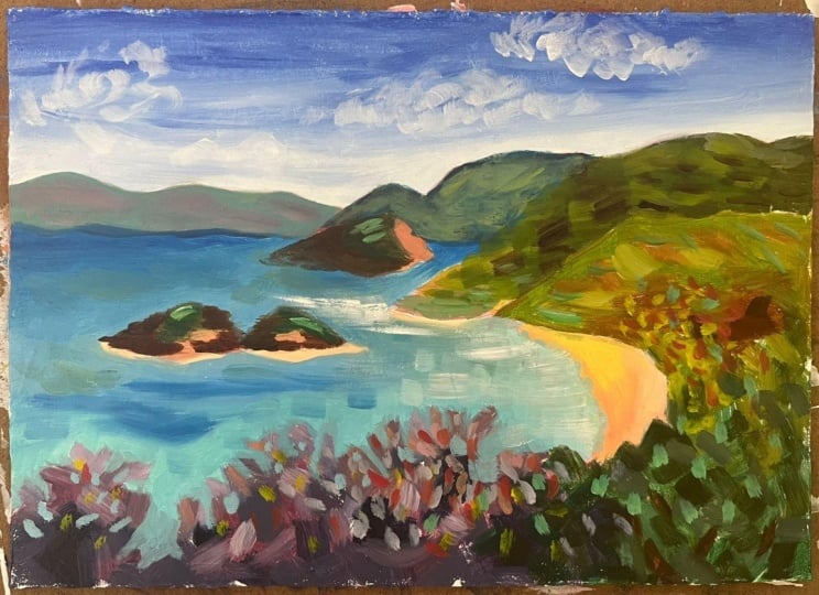
4. Supplies and Beginning: All right. So let's look at the reference
photo for St. Barts. We were lucky enough to go
to St. Bart's years ago, and we hiked up to a
pretty well known lookout. I can't remember the name of it. It's kind of in
the neighborhood. And I took this photo
among many others. It's so beautiful there, and it had been raining,
so things were green. So that's the reference photo. And then I'm using the
eight by ten watercolor. This is the hot press,
so the smooth paper. But then I went
ahead and covered the paper with clear gesso. You don't have to do this.
I just wanted to sometimes I just use the paper this way and sometimes
I just sew it. The difference being
that without the gesso, it soaks into the paper more
and think of the gesso as a paper protector and it just keeps the paint
on top of the paper. So if you find that
you're using a lot of paint and it just keeps soaking in and you
find yourself going, why isn't this sitting here on top and looking
the way I want it to, you might try just so and
you can use clear or white. It doesn't really
matter. I've got my pallet paper here and I've got the aqua che in this
little hairtight compartments. So I'm going to open those up. They look good. I
don't think they need a spray. I was
using them earlier. I've got a flat number six, going to start with
this big brush. Even though I've got a
small piece of paper, try to work with a bigger brush. Then this time to sketch it out, I'm going to try
the oil pastel and, you know, leave bits of that
and see how we like that. All right. So sketching, I'm seeing here that this horizon is kind of
right there in the center, which I don't really like to do. I'm going to move
it up a little. To more like at the third
mark and kind of sketch. Looks like it comes to
about there for that part. And again, nobody is seeing our reference or it's not important to stay
exactly true to it. But I like to use it to
kind of get an idea, so I'm kind of
marking this corner, and then it looks like,
the greenery comes up and it dips down. Got this rounded bit here. The reference is just
a jump off point, but there are pieces of it, you get to decide what
you want to keep. The greenery comes in here and then there's the water line. I want to make I
think two lines. That's the greenery and then it looks like the water
line is something like this. That's the basic
structure there. Then we've got this
mountain range in the back, which we can tell already
from the photo is less saturated and that's
what will help us create that
atmospheric perspective. That's that one. Then I ran
out of room for that one. We're just going to
lump this together because we want to simplify. This is a bit an
island right here. So we'll distinguish that
one maybe. All right. And then right off of here are these kind
of little islands. Yeah, and then we'll just
throw in some bits of cloud. I just kind of use these as a jumping off point,
just a notation. It's almost like you're taking notes with a sketch like this. I think also, I see, and I'm going to
extrapolate from a very subtle change in
color here where this is a little more turquoisy we'll change up the colors
in here a little bit. Then there's a bit
of a ridge there. So that gives us a
nice line because we need some variety in
all of this greenery. We can't I don't want to have just a
big mass of greenery. Just making sure this
point is nice so that I remember what it is. All right. That's a good sketch.
Let's play with that. I'm going to put in
this stuff first because I'm going to want to cut into it with the watercolor, meaning this, not watercolor paint, the color of the water. So I think I'm going to start
with all this greenery, which we're not
going to make green, not all of it anyway. I think I'm going
to make some of this some different colors. So I think I'm going
to go with sort of a burgundy because when we talk about values in this,
this is really the dark. You squint your eyes and you see all of this greener and then the two islands are
about the same value, which is on the darker side. And there's a little
bit of a shadow there that's also same squinting, which makes my
voice sound weird. Then we have some midtone, which is, I would say
the water itself. And these faded mountains here, and then we have the sky. This part of the sky
is a midtone too. Then with the light values, we have the clouds, a little bit of
this lower horizon, of course, the sand, and
some bits around here. Just starting with
some of the darks, I don't want to make
them super dark, but I do want some variety, and I've been liking lately
taking this purple and then the burnt sienna and just getting
some darks in there. If you look closely, there's a lot of different
colors in here and then we can just use our
imagination from there. This allows me to get
in some darker shades. I'm going to make more of
a blue maybe over here. This is dark down in here. I'm just putting those bits
of shadow in maybe in here. Really where I see
any bit of dark. It's a little darker
down here too. It'll probably get covered up. Then what I'm doing
here is thinking, Okay, I want this stuff
different colors. Maybe I'll take
this one in more of a blue direction with various blues and then change the value of those
go a little lighter. Because I don't really
need this over here to be a focal point because it's
way over at the edge. You don't want to
make something at the edge your focal point. So I want to make this some colors that maybe
are more subdued. There is some light at
the end of it, though, so I'm sticking with value, and then it gets darker
as it comes down. We'll put some water holes
in there to show that. Kind of blend in with
the purple here. I'm really blocking
at this point. Some of this may get covered,
some of it may stay. Now we're going to
go back to kind of this burgundy. Get a lighter. I'm just trying to put
different shades of it and I don't need just
burgundy in there, but I'm sticking with that
color family at least for now. Some bits that come
out, remember, we're going to cut into these, I like to put plenty
out there to play with. You don't want to be ready to cut in and there's
nothing to cut into. A little bit more. I really
like that Periwinkle. Isn't that beautiful?
Can't cover everything, though, 'cause then you
don't have the contrast. Covering this up here. And here's where I
might switch gears a little bit to
another color in here. I don't want to use
too much turquoise because I'm really going to
use turquoise in the water. I am going to make that a
little more true to water. But I have this ridian it's
like a dark turquoise, and that is the
color I see in here. So maybe I'll just play
with that a little bit, putting some darks in and then maybe lighting it up with a little bit
of lemon yellow. That's making it too
turquoise, I think. We'll tone it down with some I want it a
little bit lighter. The burnt sienna and
the burnt umbers are great for
toning things down. This come right across
here into the beach. I do want to blend in
the idea of the purple. I don't want a line
between these two colors. I just want to give it a
flavor of something different. I brought some of
the purple over and I'll bring some
of the green in here so that it looks
a little more natural. Then I think this is where
I want to bring more of the yellow greens
because I see them here and it just seems
like a natural transition. I'll keep it darkish here to get the URSI going
into the painting, and then we'll warm it up as
we go, adding more yellow. Yellow ochre is also really
nice way to warm up. You'll notice I haven't
washed my brush yet. I know what colors will turn to mud and if that
starts happening, then I wash my brush. But as long as I'm going the way that I've been going
where I add a little bit, then it helps me get more
of a unified palette or unified composition color
wise because I've got a little bit see still of the purple in here
coming through. We can always go over
with a little bit, something if we want it to
be a little bit different. I'm going to lighten
this up in here. And I'm trying to put down
not always successfully, but trying to put down a
color and then stopping. I'm mixing up a really
dark peachy thing here. Barely a light brown
because I can't all the colors to
be super bright. Just a little bit
of variety there. Maybe I'll hit that right there. The sides of those rocks
will come back to that. Now I'm kind of
cleaning of my brush by just going back into the green. And there's some reds
in here, some rusts. We're just going to
exaggerate that a little bit, maybe bring in a tat of red. Let's see what we think
of that. And then back to some of these
really yellowy greens. So this is that first ridge, and I do want to
distinguish the ridges. The best way to do
that is with value or color because we're not
going to put a line there. So put some of that yellow. We'll probably come back and
add some yellow on there. I want to make sure I kind of lost some of
my darks in here. We might have to come
back in there, so if I'm distinguishing
that ridge, then I can take this in another direction more
back to this ridian maybe. And you know, these are
the kind of paintings, you could literally do them in so many
different color schemes. So I'm changing the value. I'm going a much darker value, and I don't want it to
be that much darker. But I want it to be contrasted
with the other ones, so I'm going to just
lighten it a little bit. And come back to the
yellow a little bit. Grab some of that Benciena. I'm always mixing for
interesting colors. Trying to put my brush
down and lift it. Let's go a little lighter
at the top of that ridge. I just want to show that this
is part of the same thing, so I'm going to bring
some of that in there. This is a nice color
to bring over here. Maybe a little bit of yellow,
bring it up a little bit. I'm going to cut into these. I want to again, leave
plenty there and I see that it's Bark ish around the bottom, which maybe will help it
look like it is in the sea. We'll see how that because
then it's white around that, but we'll just have to see how we deal with
that when we get to it. Now I've got blocked in colors. These ones back here
are going to be much more desaturated and
cooler in temperature. I'm going to grab some of
that I've got going here and then get some white
and a little bit of blue. So for desaturating, blue
and for pushing things back, blue and purple work well. I already have some purple here. I'm going to try it. So
think cool and think light. Um, just how it looks. You see that it's this
might be too greenish. Let's me wipe off my brush. This is what I can do. I
still haven't washed it. I might need to, but let's
see if I can get there with not that there's any big deal about
washing your brush. It's just Okay. I think that's a good Remember, we'll cut into this as well. That's that furthest
one. Then that's going to be the most
whitish looking. Then the ones coming forward are going to have
a little more color. We push things back
with the white. This is probably too
blue. Let's see. It's okay. We'll see if
there's enough contrast with the with the watercolor, there should be because
we'll go turquoise. This is just making
this whole thing in the back one set of islands. These are actually all islands, but they look like
mountains in this photo. That's coming behind there. And then in front of
this is the island. So I'm going to maybe take
that a little more in the Burnt Sienna family, kind of like these
other islands are. But even lighter and less light. Let's clean that off. There is a light side here. One stroke and leave it, and then there's a quite
dark shadow there. So I'm grabbing the
blue and toning it down. Got that where I want it. And now, maybe just
fell in the back of this with Let's do some
yellow ocher mixed with this. Still too dark. Okay. So I got the main pieces. Now I've got to do the beach, but we're going to be cutting
in there and the water, of course, and the sky. So it's a good place
to stop and make sure everything's really dry so that when you're
cutting in, you know, it's not a huge deal if
you end up bleeding in, but it's for this, we're trying to get it dry so that we can cut in
really clearly. All right. We're off
to a good start.
5. Blocking In: Alright, we're back.
I did wash my brush, but I wanted to show
you it's not perfectly clean because I'm
going to want some of that color in some
of these other colors. So they're not too out
of the tube looking. It just works better. Let's see. So I'm thinking about do
I do the beach first? I think I will make the
beach actual beach color. And maybe slightly pink. 'Cause actually
not in St. Barts, but in Harbor Island. Oh, I should find those photos. Um, they do have pink sand. The sand here is more is
really white and powdery. So I'm cutting in still
with my big brush, which keeps me from
getting too fussy. Cut into some of these trees. It's one of my favorite parts. And it's a little bit
lighter on the sand, so I'm just gonna take a
little bit more of the white. I take one stroke here. Alright. Then there are
these bits in here. I'll hold my brush a little differently, like a magic wand. Get some of that in there.
The waves coming up. Even some we'll
probably put this in afterwards on
top of the water, but I can play with it there. Yeah, that'll come
in afterwards. Okay. So now on
to the turquoise. Let's see if I don't need to wash my brush if I can get
the color I'm looking for. I'm gonna put a range
of colors in here. That's what makes
things interesting. If you look, there's
greens in here, blues, and we're
gonna mix it up. The darker blues are out here. I'm not stirring it completely
because with this water. I want some of that variation. That's much closer in. Looks like I forgot
to extend some of that water this way. Do that real quick
with another brush. So I'm taking my brush
in the direction of the way the waters moving. Remembering that Glosh
dries an acrylic also darker than it appears. So coming toward this way, I'm gonna add the tiniest
bit of yellow to get those bits of greenish in here. There's also some
greenish back here. You just learn to
look at what's there and exaggerate it
or knock it back. I need some sand there, too, but I'll come
back in with it. It gets a little lighter as
you get closer to the shore. Tutting into the trees here. That's just something
that you'll practice and do
and find your own. I am looking at the trees, but mostly just, you see, I've got my finger
over here, it's kind of an idea of how
they are breaking there. But I'm not obviously,
hope it's obvious. I'm not trying to copy
each little shape, using it as inspiration
for what's happening here. And I got to get more white cause it's getting lighter and
lighter in here. And it's kind of rough
coming in, right? So I'm not going to
make a line here. The other places I see, it's kind of light is right in here, while I have this light
on my brush right here kind of at the front
and back of that island. And then we talked about that
kind of watery place here. Alright, so now we're
going back to I'll wipe that weight off.
So darker colors. Grab the altamarin blue. Maybe a little us radiant.
Yeah, there we go. Kind of a bit darker in here. Not quite that dark, though. Kind of coming up behind, cutting into this little island. So here's what you learn
to look at value wise. Value wise, this island is quite a bit darker
than this water. But here in the painting, if you squint, they
look much closer. In other words, either
my island is too light, my water is too dark or both. I think a little bit of both. So we can lighten the
water a little bit. And if need be, we can darken
the island a little bit. Let's start here,
though, and see what we think 'cause I do want that water back there
more kind of saturated. And as you go back here,
it gets even cooler. I hear it's nice and straight. I'm just gonna bring it right
behind this little island. I go a little of that radian. Get kind of a little
bit of water, get my paint flowing
a little better. I'm gonna come around here. Come in there a lot of
this will probably stay, but often a lot of this
first layer doesn't. And it's just kind
of the first step. I try not to get too attached. Okay, I'm losing kind
of my green there. And I want to take my colors off the
edge here because you have to think about
that if you go to frame this or you're, you know, painting, which
you will eventually you'll do something
you want to frame. You don't want it not going Unless you do that
all the way around, that can be kind of a
cool effect. Alright. Bringing some of
this blue in here. And tiny bit of yellow. I really like that greeny color. So we're gonna cut in with
that here into these trees. For my cutting in, I like to turn the brush
different ways. And you can get real inspiration by looking at the
photo, you know, I cuts in all different ways, but this is something
that I just love doing. It's also called
negative space painting. But you get these, especially if you're
using a brush like this, these really organic shapes. And then we'll put little
water holes in here, like we talked about,
the water's peeking through, coming through here. This is one of the
things where I think your signature
style comes through because it's really
what your hand does. And so you'll cut in
differently than anybody else. Just like your brush strokes
are different than anyone's. It's like your handwriting. I'm just grabbing a little
bit of weight so that I stay true with how we get to the lighter water here and
maybe a couple water holes. There aren't too many here. It's a little thicker there. There were more over here. Okay, now I'm
cleaning out my brush 'cause we're gonna do the sky. Although, before I
clean out completely, I want to come through
here a little bit. I want to cover. You could leave these little bits of
white showing through, but I want to come through
with another layer. I don't want my brush that wet
and cover up some of this. My brush is still really wet. It's 'cause I
didn't I didn't put both sides of it around my
towel like that, squeeze it. Blend this a little bit. I need to get a little bit darker here. This allows me to put in a
little bit of definition, too. Maybe some lights that
are here in these shrubs, trees, grab some of that purple
mix it in with the green. That's too light.
It's okay for a bit, but I didn't want to
do too much of that. When you get, is it
starting to dry, like, one of my
favorite effects, which is the paint coming up that we did,
but then cut into. And I just love that. Okay, so I think that the little white bits are
a little less distracting. I'm gonna leave them
in the water, though, because water does
that naturally. And I'm looking I'm checking some values now
before we move on to the sky. And one thing that
bothers me is that I think there
should be something darker along here to
delineate this hill island, really, from the water. And so I'm just
gonna grab some of this Prussian Blue with the altamarne but
not go too too dark. Grab some of my watercolor. Again, I meant the
color of the water. Just kind of dragging there. And maybe the same here. Oops, I was a little
too heavy handed. I got to come back over with some turquoise I was too dark. And now it looks just
like the mountain. Alright, so here's what
you do when that happens. Since we let it dry, we ought to be able to
take that right off. Yeah. So that's gone. We'll let it dry again, and actually, I
might just leave it, or I might put my line
on the hill below, which I think is a
little too dark. I mean, above, not below. It's already drying. Alright,
let me just do that now. Makes a little bit of Let's see, is that dark? Too dark. Yeah. So that's the beauty of acrolquas. You
can just wipe it. I just want to make that line of the water there a
little more pronounced. So changing the value
of this mountain. Well, island. It also brings it forward
because remember the darker is more forward, lighter to the back. We'll leave the texture
on that like that. Alright, so I'm happier with
that. It shows up better. Looking at this, we've
got our little we can add that detail later
wherever we need sand when we finish when we do
our finishing touches. So now let's go to the sky. I rinsed my brush, but I didn't
thoroughly rinse it. Let's see what I've got in it. The reason I like to do that is if you leave some
color in there, you might get some
interesting bits for the sky, but it looks like I
rinsed out most of it, but there is kind
of a darker purple and still in the brush. So let's do that
with the clouds. So I've got it on the brush
and then we'll come around. Sometimes I do clouds and
then the rest around it, cutting in and sometimes
the other way around. It's just you can play
with it both ways. And I want to make
my blue a little cooler than the water blue was just so that
there's a difference. So I'm going with the
ultramarine blue. Horizons almost always get
lighter as they go down. You'll notice they're
darker at the top. So just think about that
with whatever color you use, you don't have to use the blue. But whatever it is, you know, maybe think about bringing the value a little bit
lighter as you come down. Might even just take a little
bit in the violet direction so that we really differentiate
it from the water. Sometimes I do that
and I don't like it, and then sometimes I like it. So you're getting
this scumbling. This is called scumbling,
this kind of dry effect. You can do that, or if you
don't want the scumbling, you just use a lot more paint. Okay, let me grab I'm
gonna warm it up, too. So I'm using. That's
why I love the ivory. Oops, that didn't lighten
up the way I wanted it to. Nope. It's taking it too
much in a gray direction. I still want it a lot later. So I'm gonna clean
my brush with water. I mean, no, not with water
with my paper towel. Okay, like that. And I'm going to be cutting in
here. Get those edges. There is not a huge value
difference in the photo between this B
island and the sky, but it needs to be there, obviously, or you
won't see them. So we're coming down here with lighter And just, you know, put the
brush stroke down confidently and
lift up your brush. And it's hard. I still I have to remind
myself all the time. Don't get in there and play. Just put it down and move on. One and done. It won't be perfect, but
that's why it's a painting. You know, we're trying to
give it that character. Okay. I want to bring my lighter color here, do some scumbling there. And then get more of the
ultramarine blue here. I had a little water. I don't want the scumbling that heavy. You can blend the sky as much as you want or as
little as you want, you know, in terms
of the colors. Just careful not to
overwork it so easy to do. I'm gonna let that
dry a little bit, and then we can drop
some clouds back in. Alright, so now I'm standing by, and I'm gonna let it dry and then we'll just really
evaluate where we are.
6. Building Another Layer: And letting it dry overnight. A couple of things that I
want to do to finish up. One is that I want to pull the lighter part
of the sky up more. There's too much
dark here for me. I want it to look bright. It was a cloudy day,
but I just wanted to look brighter. It
feels too heavy. Then, I want to put in maybe some of this remember this white frothy stuff
that got lost there. We'll just do maybe one
brushstroke, keep it minimal. I really like the color in here. I was thinking about do I
want to have more color here, but I'm not sure about that yet. Focal point wise, I
feel like you hit here, then this light patch draws your eye and then you
go out into here, this line takes you out into the water or it could come
the other way around. Let's do the sky and then I might change that color
a little bit. We'll see. Let's see, have to do the thing and then see
how the thing looks. First, I'm going to
mix up a sag color, which sometimes take some finagling to get because I want it to be lighter and I'm going
to warm it up a tiny bit. I know I want to make it different than the
water usually what I'll do is pick warm in the water and then cooler
in the sky or vice versa. But let's see if we
can just get it. Let's see what's
that like? I think I want a little
lighter than that. Maybe just a tad warmer. Just using the tiniest
bit of yellow, maybe more white, easy to add too much color to
the white's probably going to be I
actually like that. Again, we're going
to be minimal. It's definitely a lot
warmer than what I had. I'm holding the
brush lightly to get these scumbly effects.
We'll see if we keep it. Don't know yet. I can help you blend though. If I scumble down here, I can blend that cooler. I don't want that
hard line there. Yeah, I feel like that's
more what I was going for. And then I'm going to
go up into the sky, but I want it to be not as dark. I'm going to gradually
blend in to get darker. You don't have to go in a
straight line like this. This sky is there's not a
whole lot going on in it, but you can invent anything. You can take something up
here like this diagonally, cloud, let's just play
with it. Why not? That's what we're here
to do. Learn. If I bring something down
here like this. I like the clouds a brushstroke. I don't want it to end harsh, do it that way. I
like that better. Okay. I'm going to leave that
kind of scumbling. We have some scumbling
here and here. We can add a little more
here for some interest and just take that
scumbling throughout. So I'm just cleaning my
brush and get some of this turquoise and maybe darken it. Let's
see what that does. Maybe have a little
scumbling here. Scumbling doesn't work if
your brush is too wet, and that's what happened there because I had
put it in the water. You got to really dry it
out with your paper towel, then you can get
some of that effect. Okay. Just a bit of texture. And maybe that's
what I'll do here. This sort of gray
is bothering me. I know I don't want
to make it too bright because it's supposed to
be in the background, but it is so boring. And I don't know. I want to try maybe we'll scumble
a little bit of this same sort of violet just a tab because there are
bits of light on it. It's it's just too monochrome. I'm going to scumble just some bits of something
interesting there. I just wanted to show
you something since this is acrylic basically
acro gouache, if I felt like that came down
too far, since this is dry, you just take a wet paper
towel and dry it off. Same thing for this one,
there's just not enough. There needs to be a little something else
going on in there. So maybe I'll take a
bit of this earthy. I want it very subtle, though. I don't want anything really
calling attention there. I just want a bit of interest. Let me try to see if I got some then maybe just a tad later at the top
of the sun. Okay. That works. We could add here some detail since we're closer up or we could
leave it as is. Sometimes you don't want
to add detail far away, and you usually want to keep
detail for your focal point. Otherwise, you're drawing
people away with the detail. I don't want to do
too much because I have the focal point in here. If I started detailing
a lot over here, it would draw too
much into there. Maybe I'll just do a little
bit of this warm violet here and just put a few little smaller
things to call attention These are not
individual leaves, of course. I really love that Fuchia
that's showing through. Really, we could
stop at any point. I'm going to tone that down. That's too much of a violet. We can tone it down
easily with one of these Bncenas or
even yellow ochres. I just wanted a little
more color there. So pretty. Okay. So we're
done, putting it down, leaving it minimalist or not
minimalist, but at least, trying to control
that tendency to just scrub and blend and do all
that fussing, basically. Minimal fussing
for our painting. A lot of this is going to
be personal preference. You may decide that
you love this effect. You may decide you
don't like it at all. Same with this. I encourage
you to do with all of these. Do them several times, turn the page and do another version. Especially, it's so much easier the second
time because you really already have an idea of where the darkest values are, where the lightest values are, how your sketch is going to go. Do you want to change
it? Do you want to say zero in more and crop it
like the second time? Do you want to do some
other composition? I just encourage you to
do a lot of playing and repetitive painting of
the same exact image. So is often the case after something dries and you have some time to
step away from it, you think, Oh, I want
to change something. So a couple of things
that I want to change. One is related to perspective. So see how this land back
here is further back, so it's faded and it's actually lighter in
value than this one. When I darken this,
I went too dark. I thought that this color
we put over it would do it, but it's still darker, it's throwing things because it should be lighter in value. It doesn't really matter
what color it is, but it should be lighter
in value than this. That's one thing is
the way to solve that is I can either darken this a
little bit, which I may do. Or I can lighten this or both. Then the other thing is, I like the scumbling I
did, but I overdid it. These are just things
that you do when you step away and make changes to get
what you're looking for. I'm going to go I think maybe we'll try a
palish tone down green. So I'm grabbing something. Usually, you can tone down
green with a but Siena or a yellow ochre.
Not that much. And I make most of my greens, but sometimes I make them
from an existing green. So I'm going to
lighten this more. That's too light, let's
see, maybe take it. Let's see if we add a bit
of red, what happens? It's really getting
away from green. Sometimes I mix a
color until I'm just finding I'm grabbing some
blue to put in there. You have to go in a lot of directions before I find
what I'm looking for. I need to put it on
there and try it. Well, that might be still
a little bit too bright. Try a little pink in there, teeny bit and see
what that does. Well, the best way
to find out is to put it in there and
see what we think. A little bit similar to this. I'm going to cool it down a
little bit with ultramarine. White also cools things down. A little bit more white. I'm getting really
close to this color, so I'm seeing now. So what I'll do is probably
end up darkening this. I'm going to leave some
of those bits from before because I like
the variation in it, and then there's some
lighter bits down in here. And I don't want too
much detail on that back that island because it's not really
something I'm featuring. We can have a little variation. I'm cooling that
color down more. Sometimes it'll be one piece of a painting that you just
keep monkeying with. All right, let's stop there. And then going back to this, I'm pretty close to that color,
which I don't need to be, but I'm going to just cover up a little bit
of that scumbling. That's better. So now, I'm going to just saturate
this a little bit more here.
7. Now It's Finished!: Okay. So saturating and darkening this. That's what
we're gonna do. Um, put in some I think I still want it
more yellowy, though. There's so many beautiful
greens you can make. Let's see what that feels like. So I remember how I
had differentiated this by those tones. Now I'm getting back to more like this tone, but that's okay. Well, I don't have to change
this part that's up here. There's some lighter
bits down here. Just putting the brush
down, lifting it up. Oh, so we can put in a bit of differentiating of how there's that reddish here. It's a little more color. There's actually some bits
of it here and here, too. I just felt like overall, I wanted to play with
it a little bit more. Put some little
surprises like some of this green in here up in here. A little more interest. Maybe some brighter
yellow in here. I'm going for the warm yellow. Let's lighten that up. Sort of suggesting
some of these. They're actually palm
trees that are in there, but just a little more detail. I'm kind of you can't see me, but I'm pulling away, pulling my head up to try to
give myself some distance. You know, or I go like
that, but I don't want to take it
out of the camera. But that's the idea. I
also sometimes stand up from my chair. The thing about see
how these have faded, some of these Guash is both acro guash and regular guases they dry darker and especially
the lighter colors. So I'm just watching it
dry and it's lightening up so much that I don't see those highlights
like I wanted to. Okay. And then I still had
forgotten to put in some of that white
here with the water. I'm not gonna make
it a pure white. Soften it with a
little bit of blue. Whoops, not that much blue. Get my fresh kind of dry and see if we can now,
they kind of go this way, so I'm actually going to
flip this to get this, you know, going the
way that I want it. There we go. I like that, so I might just bring a
little bit more here. I could even make it a little bit whiter as it gets closer. Sorry, I'm gonna flip it again. Get a little too heavy. So all I do is wet my brush but then blot it with a paper towel and
pull some of that up. Is pulling the green
out of my brush. Or the yellow from before. There we go. I like that. Paper towel, brush. You got to use what you can use, whatever you need. Okay. Now, to really just give this
a little bit of fun factor, I'm going to take some
of my opera pink, which barely any of it
survived from the oil paste. So I want to maybe
just find some bits, places where maybe it's a highlight of something
shimmering in the sky. No, not that much. Just a
little bit here and there. And I'm adding a
little bit of white, and I could add, you know, yellow, but I'm just varying it. I'm gonna cover some of
that that came out too big. I'm taking the opera pink and throwing in a little bit of this yellow mixture we had. Sometimes just a bit of a color here and there can
just transform something. Putting it down, lifting up. Well, it's getting
much more fun. That's the way it was
feeling is, you know, I like my stuff to
just have a pretty, you know, kind of
energy and color. And I just when I stepped away, I thought, night isn't fun. It's in the eye of the holder, of course, and I don't
want to overdo it. But I'm bringing the
I feel like we're bringing the eye more here now by adding just
a bit of the pink. The only place I feel
like it's still kind of flat is I just want a little
bit more interest here. Not much. So I'm going to go
back to making some greens. Kind of warm it up. Let's see. Maybe just
some small marks to kind of suggest some of this just adding more yellow,
warm it up some more. Some of this detail here
without going too far. Maybe even a bit of turquoise. This is just a
little flat brush. That's a pretty color, isn't it? That turquoise mixed
with that green mixture. Put that here. Maybe just one bit there. But I made the details
clustered here so that I don't have
them down here, if you notice, because
then I'm drawing people out out of the painting. I'm gonna take just a bit
of this highlight green there and change it
a bit for there. Do I want it anywhere else? That's what I'm thinking
about right now? Do I want any of it in there? I think it's a bit
saturated for there. So I'm just gonna darken it. Of course, remember
I always have to remind myself it's
gonna dry darker. Alright. Now, I think I'm
happier with this. I feel like the
values are correct. This, if you squint, these still show the same value. So technically, no, they just
said, you could leave it. I mean, you know, it's minor, but this is still after
it dried, it darkened. And when I squint, these look exactly
the same value wise. So I'm going to just lighten up this a bit more so
I can push it back. And it is challenging when the paints dry a different color because you think, Oh,
okay, I've got that. And then it dries
and like, no, don't. So I do try to paint
thinking about that, but it can be tricky. All right. So let's see how
that I'm going to leave that scumbling and that dark on the top of it's kind of cool. That should be light enough. And I'm trying to
focus the lighter part on against my border there
between the two islands, because that's where
it'll show up to most. No more variation in that. No, I guess my dark
edge is disappearing. This is where you can get
into danger of overworking. So we have the values right now. We can notice that this stuff is pulling us forward and
getting our attention. That stuff kind of just
falls into the background. There is a teeny, tiny bit of the pink oil pastel that's showing through
there, and I love that. You just never know where
it's going to show up. And that makes it kind of fun. Alright, well, thanks
for joining me and the redo kind of bringing it. I'm happier with it now. And
that's what you have to do. You have to just put it away, look at it, ask yourself things like, are
the values right? Are the things that are darker? Darker? Are there things that
should be lighter, lighter? And is there interest? Am I, you know, do I enjoy it? Do I enjoy looking at
it? And then try that. Try some things,
paint it differently, come back, just experiment.
8. Wrap Up and Resources: Well, I hope you enjoyed
this trip to St. Barts. How fun was that? Just looking
at the color of the water, I really like how our
painting turned out. So the I see, it looks pretty saturated. It's not as saturated
in the in real life, is it showing up on the camera. But I really like how
we did the dry brush, especially look at
the water there, the foaminess that we got there, and then leaving that
in the sky and just letting some of the brush letting a lot of the
brush do the work, right? That's I think one of
the great learnings about at least this
style painting, which is what I
love. I don't want. I love those brush
strokes to show. And we've got the color that we went back
in and added them, just a little bit of pop. And learning that when you
look at something, you know, if you look at this
photo, here's what I love about this process. When we look at the photo
that we started with, I want to see if I can get
it to be less saturated, looking really saturated
in the camera. But you look and at first blush, this is all just green, right? These are all just gray, and this is all turquoise, and this is blue with a
couple of clouds, right? And then it just
seems sort of flat. And what you when you use
this process of really kind of looking and then
taking some artistic license, you can change that completely. And you can do that
with any photo, and that's what I hope that
you gain from this class and my other landscape
classes where we do similar things
with different takes. And as far as keeping in
touch and other resources, I just want you to know that
I have an email newsletter that I used to send out
more often than I do. You will not get emailed to
death. Let me tell you that. I think it's been a quarter.
I need to get one out. But I do love sending them out, and I just send studio updates, kind of what I'm working on. Occasionally, if I've
got originals for sale, I'll let you know. The other resources I
have are YouTube channel, just so you know it's out there, where I do supply reviews, I do paint chats, just kind of informal things
that are a lot of fun. And of course, Instagram and
Facebook are good places to follow me to see reels
and stuff like that. I do have a student
only Facebook group that if you don't
get an email invite, just email me at art
at suzanner.com, and I'll send you
an invite to that. It's a really encouraging
student group with, I think, over 20,000 students, something like that
at this point. And I set the tone there to just get us all started
and get us all painting. So people say I've had people on there say
it's the most welcoming, encouraging art community online that they've experienced. So I hope you join, and I'll see you
in the next class.
 Suzanne Allard, Landscape, Floral, Abstract Painting Teacher