Transcripts
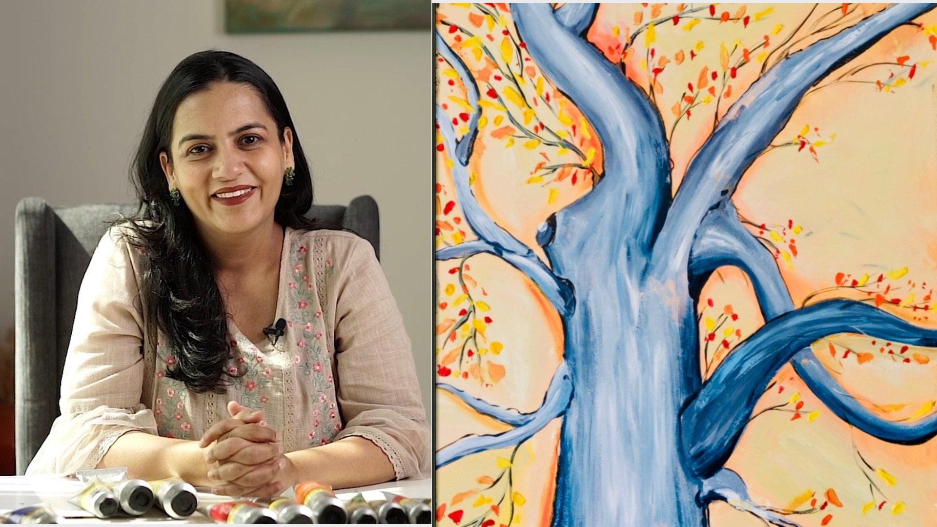
1. Introduction: Hello, everyone. Welcome to
this class. My name is Tina. I am an artist and art teacher. Painting has always been
a huge part of my life. For me, art is just not about making something
look realistic. It is about slowing
down, observing details, and enjoying the process of creating something
with my own hands. I love turning
simple subjects into detail painting and especially enjoy working with texture, light, and color to
bring objects to life. Over the years, I have taught students of all
ages and one thing I always focused on is making art feel
achievable and enjoyable. I believe anyone can learn to paint with the right
guidance and clear steps, and that is exactly what I
aim to share in my classes. In this class, we'll be
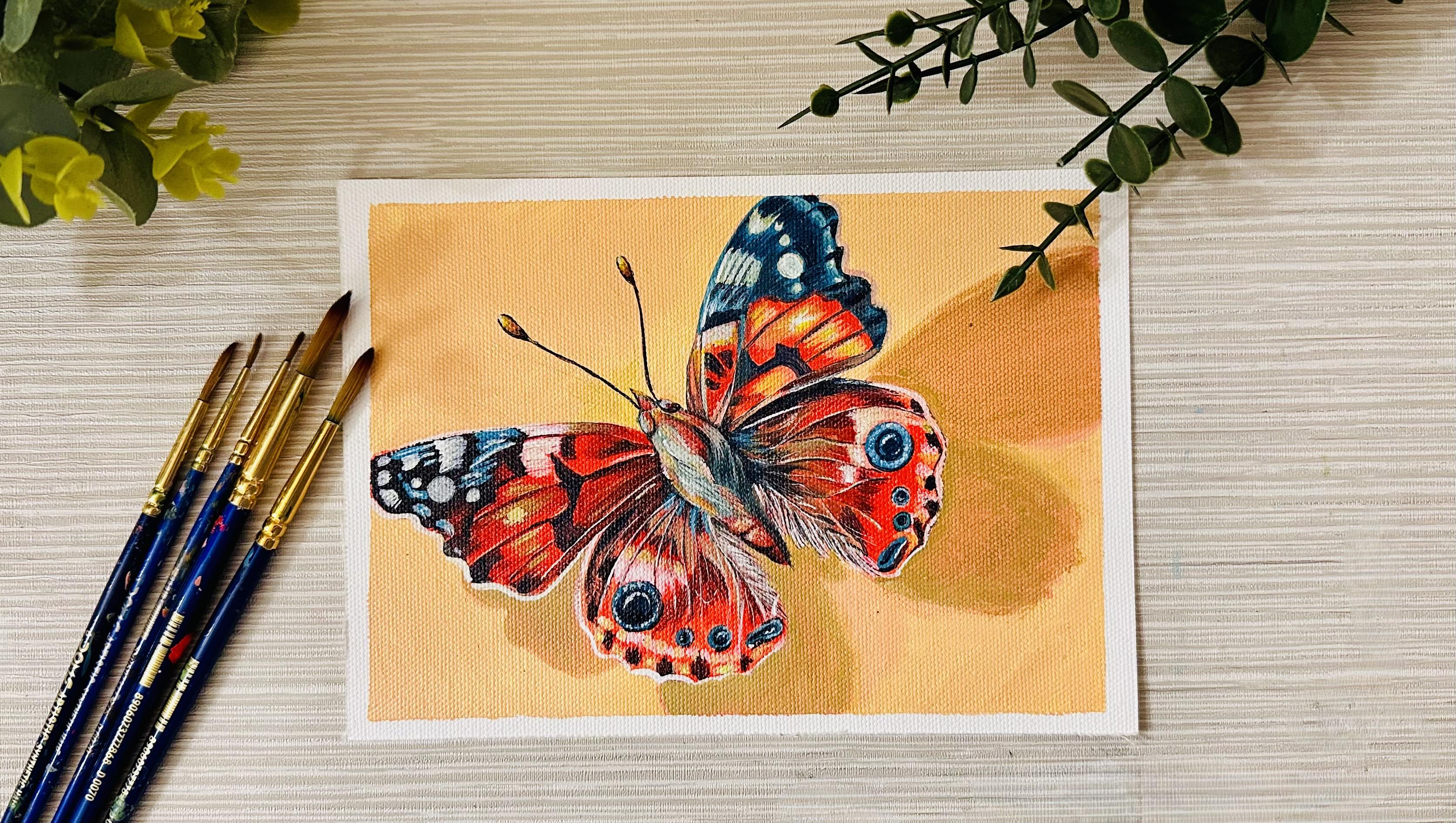
painting a beautiful, realistic butterfly
on textured canvas. This project is perfect
for learning how to build a painting
step by step, starting from simple
shapes and base colors and gradually adding layers and shadows, textures
and highlights. You will learn how to build
realistic color light, create depth using
shadows and highlights, paint fine wing details, work with textured surface, add realistic finishing touches. I will guide you through every step in a clear
and simple way. Even if you are a beginner, you will be able to follow
along with confidence. By the end of the class, you will have a vibrant
butterfly painting and a better understanding of how to create realistic
details in your own artwork. Gather your materials
and let's get started.
2. Art Supplies: Before we start painting, let's go over all
the art supplies you will need for this project. Firstly, I'm using
this canvas paper. You can use a canvas
book like this. It's a normal drawing book, but instead of paper, it has got these canvas sheets. I'm using this in A five size. You can use bigger or smaller. If you don't want canvas, you can also use a normal paper, but use it a little
thicker paper. You can also use
stretched canvas instead of a canvas book. I use canvas because I love
the texture of canvas. It works really well with acrylic paint and gives the painting a
beautiful finish look. You can use any size, but smaller canvas I like because it's perfect
for the details, especially for a
subject like butterfly, which needs a lot of details. The canvas works really well. You can do the exact same
work with paper as well. It's your choice. I am
using acrylic paints. I love this golden brand, but you can use any brand. I'm using these type of colors, but you can use completely
different colors. Your butterfly could
be more greenish or purplish. That's
completely fine. Just follow the art for the details and choose the
colors of your choice. You need different brushes. If you are using a canvas
size paper or canvas, then you need a bigger
brush for background, but I like to use smaller
brushes for detailing. I will be mainly using
these these brushes. You will also need a palette
for mixing colors so you can create a smooth transition
and exact shades you want. Before painting, I lightly
sketch the design using a pencil and I keep the eraser nearby to adjust any shapes
until everything looks right. Before I get started, I make sure my sketch is ready. Finally, I use a masking tape around the edges of the canvas. This keeps the borders clean
and gives the painting a sharp professional finish once we remove the masking tape. But if you're using
a stretch canvas, you don't need this. If you're using a paper or
Canvas paper, you need that. Once you are ready
with all your art supplies, let's get started.
3. Base Layer: Load a medium round brush with paint and begin near
the center of the wing. Then slowly work your way
outward towards the edges. Try to use smooth even strokes that follow the natural
direction of the wing, so the paint goes down evenly
and doesn't look streaky. Keep the layer fairly
thin and consistent. We just want a clean
base to build on later, not a thick coat of paint. As you reach the edges, low down and carefully
follow the outline, so the wing shape stays
neat and defined. If you notice any
lighter patches, gently go back over them to even out the color before the
paint starts to dry. This bright orange layer
will act as a foundation of all the shading and details we will add
in the next step. Now continue filling in the remaining wings with
the same orange tone, so the butterfly develops
a strong unified base, work slowly across each
section of the wing, paying attention to the
direction of the stroke, so the paint sits
smoothly on the surface. If your brush
starts to feel dry, reload it with a small amount of paint rather than
pressing harder, which can create uneven texture. As you move across the wings, try to keep the
color consistent so the butterfly looks
balanced from side to side. If some areas appear
slightly lighter or darker, gently blend them
while the paint is still wet so everything
feels cohesive. This stage is about establishing a solid foundation that will support all the details
we will add later. Take a moment and check the surface from
different angles and make sure there are no patchy areas showing through the
canvas texture. A smooth even base will make the shading and patterns
much easier to apply in the next steps and will help the final colors to look
richer and more vibrant. Now I'm going to
continue building the orange base layer
across all wings. At this stage, the goal
is to create a smooth, consistent foundation that we can later build
details on top of. Slowly spreading
the orange paint outward from the center. Instead of jumping
around and painting, I like to work section by section so the paint stays even. I keep my brush
strokes controlled and follow the natural
direction of the wings, which help the surface look smoother and more intentional. If you notice the paint
starting to drag, that usually means there isn't enough paint
on your brush. Just pick up a little
more and continue. It's better to add thin layer than to press harder
on the brush. Pressing too hard can
create uneven texture, especially on a canvas surface. As I move across the wings, I'm watching for the areas where the canvas texture shows
through more strongly. Those spots may need a little extra paint to make
the color look consistent. I lightly go back over those areas while the
paint is still wet, so the surface blends
together naturally. While the paint is still wet, I gently smooth out any
visible brush marks. Now I'm going to start
painting the center body of the butterfly using
a darker gray shade, using a small round
brush carefully, filling in the body
shape between the wings, keeping your strokes neat and control so the
edges stay clean. Keep the layer thin and
even just like the wings because we will be adding highlights and
texture on top later. Once the area is filled, check the edges are tidy
and the color looks solid before moving
on to the next step.
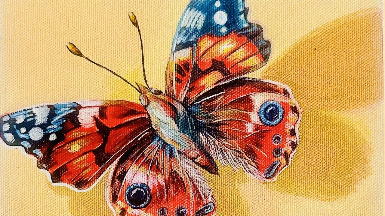
4. Wing 1: Next, soften and blend
the shadow where the upper wing overlaps
the lower one using a darker tone gently
deepen the area right under the wing fold and then lightly
blend it downward. This creates a sense
of depth and makes the upper wing feel like it is sitting above the lower wing. Now begin filling in
the top section of the upper wing with
deep blue tone. Carefully follow
the natural edge of the wing and apply
the color evenly, keeping your strokes smooth and control so the
shape stay clean. Let the blue sit boldly
over the orange base. Now start defining the
pattern on the upper wing by adding the darker black
shapes over the orange area. Use a fine brush to paint these markings
carefully following the natural curves of the wing. Keep the lines slightly
soft at the edges so they blend into the base color
rather than looking too flat. These shapes help break
up the orange and begin building the butterflies
distinctive structure and depth. Now start introducing
lighter values into the orange area to give the wings more depth
and variation. Using a lighter
orange or a mix of orange with a touch
of yellow or white, gently apply soft strokes along the ray section of the wings where the light would
naturally fall. Next, add the light spots and highlights on the blue
section of the upper wing, using a small brush and
a pale minty white tone, gently place irregular dots and patches across
the blue areas, vary their size and spacing so they look organic
and natural. These lighter marks
create contrast against the deep blue and give the wing a more textured,
realistic finish. Now continue adding
the thin veins across the wing using a fine brush
and slightly darker tone. Keep your lines very
light and controlled, letting them follow the
natural direction of the wing so they look
organic rather than stiff. These delicate details
help build realism and give the wing a more
natural layered structure. At subtle highlights along the inner edge of
the upper wing, using a slighter orange
or soft cream tone. Place these highlights along the ray section between the
veins and blend them gently. Now I'm adding a layer
of brighter orange right next to the highlights
we built earlier. This strong color helps
a lighter area stand out more and creates a
smooth transition from light to mid tone. I use the tip of
a small brush and follow the natural direction
of the wing sections, keeping the strokes
short and control. This step makes the wing
look richer and more dimensional while keeping the highlight areas
glowing and clean. Next start defining the outer
edge of the wing by adding a slightly darker outline
along the scalloped border. Work slowly and carefully so the shape stays clean and crisp. This darker edge
makes the wing stand out more clearly against
the background and gives it a sharper finished especially near the top sides where color transitions happen. I continue deepening
the top section of the wing using a
darker blue tone. I carefully follow the
natural curve of the wing, concentrating the
darker color closer to the outer edge while letting it soften
as it moves inward. This subtle shift in the
value helps the wing feel more dimensional and gives the surface
a richer depth. Now begin enhancing the shine on top blue wing by adding
soft white highlights. Using a small brush lightly
place thin strokes and small patches along the raised
areas and near the curves, keeping the paint
slightly dry so the strokes stay textured
and not too thick. These highlights will
make the wing look glossy and give it a
more realistic surface.
5. Wing 2: Next, move down
to the lower wing and start building the
base of the eyespot. With a deep blue tone, gently paint a neat circular
shape on the orange area. Try to keep the edges
smooth and rounded, placing it slightly
away from the body so it sits naturally within
the wing pattern. Now deepen the center of that circle using a
darker shade of blue. Blend it softly
into the outer ring so the circle looks
dimensional instead of flat. This layered begins to form the eye spot detail that will become a key feature
of the lower wing. Now refine the eyespot by
strengthening the outer ring. Next, add a soft
highlight inside the eyespot using a
final touch of white. Now move slightly
downward and begin adding a decorative blue
marking on the lower wing. Paint small oval
and teardrop shape in a gentle vertical line
beneath the eyespot. Vary their size slightly
and keep the edges smooth. These details start to build the characteristic pattern
and balance the wing design. I am layering the
paint gently so the color looks rich
but still smooth. If the edges look too sharp, just soften them with a
tiny amount of blending. At this stage, we
are not rushing. We are slowly building detail. Every small mark adds character and brings
the butterfly to life. I am switching to a slightly darker tone and a thin brush so I can
draw these veins. These lines should feel
natural and flowy, starting from the body and
gently spreading outward. Try not to make them too thick. Keep your hand light so that the lines look
delicate and organic. Now we are moving into
the most satisfying part, building dimension
and bringing the wing to life with highlights
and fine details. First, I'm taking
a lighter tone and gently placing it along the
upper curve of the wing. Notice, I am not
filling everything in, I'm just tapping
and softly dragging the brush where the light
would naturally hit. This instantly start lifting the form and making the
wing feel more rounded. Then I move to the lower
section of the wing and add few more gentle highlight
lines along the ridges. This helps separate
each segment and adds the delicate texture
butterflies have. After that, I reinforce a
couple of darker spots at the bottom just slightly so the highlights about
them stand out more. Contrast is what
makes the details. Now that all the veins
and spots are in place, I am going to start
strengthening the color of the lower wing. I am taking a richer
orange red and gently layering it over
the existing base. Notice I am not
covering everything. I am working around
the veins so they stay visible and continue to guide
the structure of the wing. I'm using very
light strokes here, almost glazing the
paint this helps intensify the color without
making it look too flat, focus more pigmented closer
to the body and just under the upper wing because that area naturally
sits in the shadow. Then I slowly blend
out towards softening the transition so
that the color fades slightly as it
reaches the edges. This creates depth and makes the wing feel curved
instead of flat. Take your time in this step. This is where the butterfly
really starts to look alive. We are just enriching
to tone and adding the final warmth and
dimension to the surface. Next, I'm adding tiny highlights along the edges and around
the circular spots. These small touches
make the wing look more alive and give
it a subtle shine. I'm finishing by refining the edges and adjusting
the contrast where needed. These last delicate
strokes bring the whole butterfly together and make the details stand out. Now I'm adding a thin
white outline along the edge of the wing to help separate it
from the background. I use a very fine brush
and keep my hand steady, following the natural
curve of the wing so the line looks
clean and controlled. This bright edge creates a crisp contrast against
the darker tones. Now I start adding the
delicate feather like texture on the wing using white
paint and a very fine brush. I use light quick strokes that follow the natural
direction of the wing, letting each line taper at the end so it looks
soft and realistic. Now I'm adding the darker
tones to the feather. Using a fine brush and
a deep brown tone, I paint thin strokes that follow the natural
direction of the feathers, starting close to the
body and moving outwards. I keep the line slightly
varied in thickness so the texture looks soft and
natural rather than stiff. These darker strokes increase
the contrast and give the wing a richer sense
of depth and realism. Before moving on
to the next wing, I take a moment and refine all the white areas
we have added so far using a very small brush and a slightly
tinted white paint. I adjust the shape and
edges of each highlight making sure they look clean and intentional
rather than rough. I soften a few spots where the
white feels too strong and sharpen others where the light needs to feel brighter
and more defined. This step really helps
balance the highlights across the wings so
everything looks consistent, polished before we continue building the details
of the next section.
6. Wing 3: We move on to the third wing, following the same approach we used for the first two wings. Once the base is in place, I apply a light glaze of bright orange
over selected areas. For glazing, I use small
amount of paint mixed with a little water so the layer
becomes slightly transparent. Then I brush it gently over
the surface in thin strokes. This allows the
earlier layer to show through while
intensifying the color, giving the wing a richer and
more luminous appearance without covering the
details underneath. Next start placing
small dark dots and shapes along the
lower edge of the wing. Don't make them identical, vary their size slightly so
it looks organic and natural. I apply the paint in
thin controlled strokes, concentrating the
color near the edges and around the natural
fold of the wing. I keep the center areas
lighter and gently blend the darker tones inward so the transition
looks smooth. This contrast between the light and dark helps the
wing look more dimensional and
gives the butterfly a more realistic
layered appearance. Now soften the area where the dark strokes meet the
lighter part of the wing, use very gentle back
and forth strokes so the transition looks
smooth and not patchy. This creates strong
contrast against the orange base and instantly makes the wing
look more realistic. Go over those dark sections again to make them
richer and more solid. Laying the paint like this gives a velvety depth
instead of flat look. First, I begin by applying a soft light tone to the
brighter areas of the wing. Use a small brush and slightly diluted light
orange or peach color, placing it gently where the
light would naturally hit, keeping your stroke smooth and control so the color blends smoothly into the darker areas without creating sharp edges. For this section, tiny light strokes along a few
edges and raised areas. These small highlights
bring the wing forward and make the whole butterfly feel
more alive and dimensional. Once that first light layer
is dry or slightly tacky, go back in with a second
layer of the same light tone. This builds up the
brightness and makes the highlights appear more
luminous and vibrant. Applying the paint
in thin layers rather than one thin coat, the color looks
clean and glowing. Now I refine the circular
eye spot on the lower. I gently brighten the outer
edges and deepen the center. This contrast makes a spot
feel round and dimensional, almost like it's popping out. Here I start refining the
light and dark values across the wing to improve the contrast and make the form
look more realistic. I deepen a few of
the shadow areas and soften some of
the transitions, so the tones flow
smoothly into each other. Then I begin adding touches of light yellow into
the brightest areas. This warm highlight adds
a soft glow to the wing and makes the orange tone appear richer and more luminous. I apply the yellow lightly with a small brush blending gently so it brightens the surface without covering the
details underneath. Just like we did on
the previous wing, I am now building a
soft white outline along the outer edge. Using a small brush
and a steady pressure, I carefully follow the
natural curve of the wing, keeping the line
thin and controlled. This white edge helps
define the shape more clearly and separates the butterfly from
the background. I keep the lines slightly uneven and organic
so it feels natural. Start adding thin light strokes
over the textured area. These highlights sit on top of the darker layer and give
the wing a slight glow. I keep them fine
and control so they don't overpower the
details underneath. This creates more separation and makes the wing looks
fuller and more layered. Now that the structure of
the lower wing is in place, I'm going to start softening and blending the textures
near the body. Using a thin brush, I lightly pull some pale strokes
outward from the center. This steps at contrast. I'm not adding too
much paint here, just gentle control strokes
to build subtle highlights.
7. Wing 4: Now I take my black paint and begin building
the final wing. Using a small round brush, I carefully fill in the
darker sections first, following the natural shapes and patterns of the
butterfly wing. I apply the paint slowly
and keep the edges clean so the wing design
stays sharp and well defined. I focus on placing
the darker areas along the outer edges
and pattern shapes, which helps create
a strong contrast against the bright orange base. Working in control strokes allows the black
area to look bold without overwhelming
the lighter colors that will be added later. As I continue, I slightly
vary the thickness of my stroke so the shapes don't look too flat or mechanical. Some edges are kept crisp while others are
softened just a little, which helps the wing feel
more natural and organic. I also make sure to
leave small gaps where the lighter tone and
highlights will go later. Planning these spaces now
helps the final wing look layered and dimensional
rather than solid and heavy. Take your time in this stage because these dark
shapes act like a structure of the
wing and guide all the details that
will be added next. Now I add a glazed layer of bright orange over the wing
to bring the colors together. I thin the paint slightly with water so the layer
stays transparent, allowing the darker shapes
underneath to remain visible. Using light gentle strokes, I sweep the glaze
across the wing so the color looks richer
and more unified. This transparent layer
softens the transition between the dark and light
areas and gives the wing a warm glowy effect
without covering the details now I start adding some
white highlights to bring this wing to life. Using a small detail brush and a small amount
of white paint, I place thin strokes along the raised areas where the
light would naturally hit. I follow the direction of the wing structure
so the highlights feel natural and help guide
the eye across the surface. Now I add a few yellow
soft highlights to warm up the wing and enhance the glow of
the orange tones. Using a small brush, I lightly place the yellow along the areas where the light
would naturally catch blending gentle now I refine the shadow
underneath the butterfly to make it look more natural and grounded using a lightly
darker warm tone. Now I begin adding the white
pattern details on the wing. Using a fine brush and
thick white paint, I carefully place small
shapes and spots along the dark area of the wing following the natural
pattern of the butterfly. These bright white
accents create strong contrast and help the wing look more
realistic and detail. I apply them slowly and keep the edges clean
and controlled. For the shadow, I mix warm
browns with muted orange so it blends naturally into
the yellow background instead of looking too harsh. Next, I begin adding a soft blue tone right next to the white
areas of the wing. Placing the blue beside the
white helps the highlights look brighter and give the
wings more depth and contrast. Here I go back over the white areas to make them
brighter and more defined. I strengthen the white outline
around the butterflies, so it stands out clearly from the background and looks
more three dimensional. I keep adjusting the
highlights little by little until everything
looks balanced. Small touches of light
on the wings help bring out the texture and makes a butterfly feel more realistic. I continue refining
these details until I'm completely
satisfied with the result. The final highlights help
tie all the layers together and make the butterflies stand out clearly from the background.
8. Center Body: Now I start working on the
center of the butterfly. I begin by layering a warmer red tone
into the center area, which helps tie the
body visually to the surrounding wings and keeps the color
harmony consistent. I keep the strokes soft
and controlled so the red blends gradually into
the darker tones underneath, creating a smooth transition and a more natural
sense of depth. Now I start adding blue tones into the
center of the butterfly, gently layering the color. Now I add lighter blue on
top of the darker tones to build softness and dimension in the center of the butterfly. This lighter layer helps create a smooth transition and gives the body a more rounded
realistic look. Now I start adding
lighter reds to warm up the center and connect it
visually with the rings. These softer red tones sit on top of the base layers and help create a smoother
transition between the darker shadows and
the brighter highlights. The warmer reds make the body
look richer and more alive. Now I begin adding
darker blues to build depth in the
center of the butterfly. These darker tones help
define the shadows and create contrast against
the lighter blues, making the body look
more three dimensional. I keep the strokes soft so the darker blues blend naturally into the surrounding colors. Here I refine small
area of highlights on the body to make the surface
look more dimensional. Using a fine brush, I apply thin strokes
of light paint along the raised areas where the
light would naturally hit, especially along the
center, ridge and edges. These controlled highlights help separate the body
from the wings and give the butterfly a more realistic, slightly
glossy appearance. I keep the highlights
very subtle so they blend naturally into the
surrounding colors instead of looking too harsh. If an area looks too bright, I soften it with a
slightly darker tone to balance the contrast. These small adjustments
help the center look more rounded and make the
butterfly feel more lifelike. I also pay attention to where
the light is coming from, so the highlights stay
consistent across the butterfly. These careful placements help the body connect visually with the wings and make
the whole butterfly look more three dimensional.
9. Adding the Antennas: Now for the antennas, I'm starting with a dark base so they look sharp and delicate. I mix a deep inky tone using a combo of red and blue
and with a fine brush, I pull two smooth confident
lines from the head outwards, keeping the brusher light so
the tips taper naturally. At the very top of each line, I use the same dark base to create a small teardrop shape. This gives the antenna tips
a little structure and helps them look more defined before adding the lighter
colors on top. Next, I build a
little antenna tips with warm light orange, almost like tiny tear
drops to make them glow. I add a soft glaze of orange
and yellow over the top, letting that transparent layer brighten without covering
the darker base underneath. I finish with the
tiniest drop of white right on the highest
point of each tip. That little highlight
is what makes the antennas look
glossy and finished, like they are catching the
same light as the wings. Lastly, I apply soft glaze of orange and yellow
over the antenna tips. This thin layer warms up the color and creates
a subtle glue, helping the tips look
more vibrant while still keeping the darker
base visible underneath. But
10. Final Words: I hope you enjoyed painting
this butterfly with me. Remember, realistic
painting is all about working in layers and
taking your own time. Don't worry about making
everything perfect. Every painting helps you improve and develop
your own style. I would love to see
your finished artwork, please share your project
in the class gallery. Seeing your interpretation
of this butterfly is always inspiring and it helps build a creative
learning community. If you enjoyed this class, feel free to follow me
here on Skillshare. You will be notified whenever
I publish a new class. I regularly share
tutorials where we explore realistic painting techniques in a simple and approachable way. Thank you so much for
painting with me and I hope to see you in the next
class. Happy painting.
 Tina Khetarpal, Artist, Illustrator, Art Teacher