Transcripts
1. Introduction: Hello, everyone.
Welcome to my studio. I am Tina Caterpal and I will take you
through a colorful, creative, magical and
meditative journey. In today's artwork,
we will create art using this humble
yet very versatile, very useful art supply,
the masking tape. Masking tapes are
my best friends. They are always there to help me whenever there is
a painting mishap. I will teach you one
way of using it, but once you understand the flexible nature
of masking tape, you can use your
imagination to let your creativity flow and create something
spectacular from it, which could be completely
different from this one and to share your
creativity with me. Can't wait to learn
from your discovery. So let's get started.
2. Art Supplies: For this artwork, you
will need acrylic paints. I'm including golden color
as well for this artwork, gesso, brushes, palette
knife, and a masking tape. Masking tape comes in a
variety of thickness. You can use a thinner version
or a thicker version of it, or maybe a combination of thick and thick
in your artwork. Different sizes will give a different style
to your artwork. Simple experiments, for example, like choosing a different sizes of masking tape are going to make a huge impact on your
artwork. Let's get started.
3. First Layer: This is a very first
step of the painting. Building the base
layer that will support all the details later. I start by squeezing out
thick paint of white, bright pink, and turquoise
across the canvas. I place the paint
in different areas. The goal here is to build a natural texture that will show through the final painting and make the surface
more interesting. Even though this
layer looks simple, it is really important
because it creates texture, movement, and depth
for the final artwork. Now I start blending everything
with a palette knife. I hold a knife at
slight angle and gently drag the paint across the surface instead of
mixing color completely. I let the white soften
the pink and the blue so they turn into a
light pastel tones. I'm not planning this
movement too much. The organic shapes usually look better than
the perfect ones. I move my hand freely across
the canvas to create curves and loops so the painting already has a sense of movement. I try to spread the color
across the canvas so no section feels too
empty or too heavy. The contrast between
the pink and blue will later glow softly
through the background. I work in long sweeping strokes first to cover the large areas, and then I change the direction. Some strokes go diagonally, some horizontally,
and some vertically. Changing direction helps avoid a flat or mechanical look and creates a natural
textured background. I also vary the pressure, sometimes pressing firmly
to spread the paint thin and sometimes lightly
so thicker ridges remain. These raised areas will catch the light later and give the
painting more dimension. If I notice an area
with too much color, I go back with a little
paint and soften them. White helps create that soft
dreamy background effect. You can see that I'm not trying to make this
layer perfect. Uneven marks and visible strokes actually make the painting
more interesting. This first layer is really
about creating soft textured, colorful base that will make all the details in the final
artwork stand out much more. Before finishing,
I step back for a moment and look at the
painting from a distance. This helps me see whether the background feels
balanced overall. Once everything feels balanced, I leave the painting to dry completely before moving
on to the next step.
4. Sketching the Figure: Now that the background
layer is dry, I begin sketching the
main figure directly onto the canvas using a brush
and diluted black paint. Instead of using
the pencil first, I like working straight
with paint because it keeps the lines
loose and expressive. The diluted paint flows easily across the
textured surface and allows me to create soft natural lines without
making the drawing feel stiff. I start at the top of the figure lightly outlining the
shoulders and arms. I use long continuous
strokes instead of short lines so the shape
looks fluid and confident. Since the paint is diluted, the lines stay soft and
easy to adjust if needed. Then I move down into the body, sketching the curves
in one smooth motion. I try not to stop too much. Keeping the brush moving helps a figure feel
graceful and alive. If a line feels too
straight or too sharp, I gently adjust it by going over it again with
slightly darker paint. Because the background
already has texture and color variation, the lines blend naturally into the surface instead
of looking harsh.
5. Painting the Figure: Now that the sketch is in place, I begin painting the figure using solid black acrylic paint. This step is where the figure
really stands to stand out. Against the soft background. I start at the top of the figure and carefully
filling in the arms, the shoulders, and I use
a medium flat brush. I follow the outline
that I sketched earlier, working from top
downward helps me avoid accidentally smudging
the paint with my hand. I apply the black
paint in smooth, even strokes, making sure the coverage is nice and opaque. Since the background is
very light and textured, the strong contrast immediately
make the figure pop. As I move into the torso, I slow down a little bit and focus on keeping
the edges clean. I use the tip of the brush
to follow the curves of the body so the silhouette
looks elegant and flowing. The goal is to keep the lines
confident and continuous, so the figure looks graceful. Next, I move on to the legs filling in one section
at a time following the direction and the form with my brush strokes so the paint feels natural rather than flat. If any background
color shows through, I go over the area again with a second layer to
deepen the black. Once the main shape
is filled in, I go back around the edges
and refine the outline. This tips makes a big
difference because crisp edges makes the figure look more polished
and intentional. I make sure the paint layer is smooth and consistent across the entire figure so there are no dull or patchy
areas once it dries. I also check the
proportion while I work. If any curve feels
too thin or uneven, I gently adjust it with a little more paint until the
silhouette looks balanced. You can see how the
dark figure creates a strong contrast against
a soft pastel background. The textured colors behind it actually helps the silhouette
stand out even more. At this stage, the figure
doesn't need any details. The focus is simply
on creating a clean, bold shape that becomes the
center of the painting. This solid silhouette will
guide all the next steps.
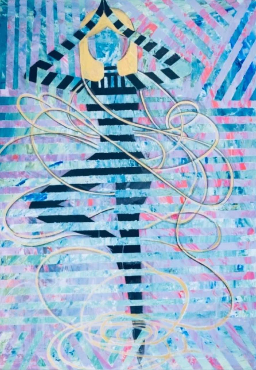
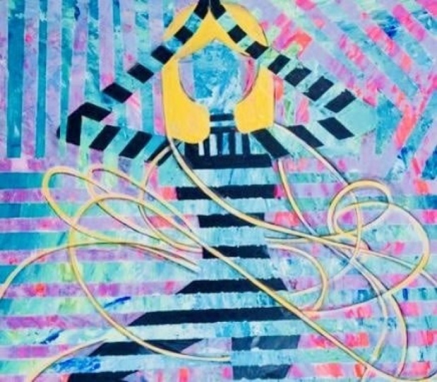
6. Applying the Masking Tape: Now that the figure is
completely painted and dry, I'm going to start creating the striped effect
using masking tape. I begin by placing
long strips of masking tape horizontally
across the canvas. I place them fairly evenly so
the stripes feel balanced. These strips will act as guides and will
help create clean, sharp lines later on. When applying the tape, I press it down firmly with my fingers to make sure the
edges are sealed properly. This step is really important
because it prevents paint from bleeding underneath
and keeps the line crisp. You can already start to see the stripe pattern
on the canvas. The contrast between the
structured tapes lines creates a really
interesting visual effect. This stage might look simple, but the accuracy here determines how clean the final
result will appear. Taking a few extra minutes now saves a lot of fixing later. At this stage, I step back
for a moment and look at the spacing of the stripes
across the entire canvas. Any area feels too
crowded or too wide, I make small adjustments by repositioning the tape so the
pattern looks consistent. I also run my fingers gently along the
edges of each strip. This helps seal the
tape even more. Using a sharp blade helps make smooth cut and keeps
the edges neat. This step takes a
bit of patience, but it makes a big difference
in the final result. After cutting along the edges, I jointly remove the extra
tape pieces that fall outside. Canvas, this reveals clean horizontal sections
across the canvas. I make sure the tape
follows the shape smoothly. Clean curves will
make the stripes look intentional and flowy rather
than stiff or uneven. Before moving on
to the next step, I press all the tape down one more time to make sure
everything is secure, this will help keep the line sharp and professional
when we paint over it. Once everything is secured, the canvas is fully prepared
for the next layer.
7. Background: Now that the masking
tape is in place, I'm going to cover the entire canvas with
a new layer of paint. This time, I'm using cool
colors like blues and greens to create contrast against the warm pink
background underneath. I start by placing large amount of paint
directly onto the canvas. I'm using shades of blue, green, white, so the surface
don't look too flat. Adding multiple colors
right away helps create natural
variation as we blend. Using a palette knife, I begin spreading
the paint across the surface in broad
sweeping motions. I don't try to mix the
colors completely. Instead, I let the blues and
greens blend softly into each other so we get a
layered textured effect. As we move across the canvas, I make sure the paint goes both over the background and
also on the taped areas, the tape is protecting
the stripes underneath. Right now I'm focusing on
covering everything evenly. I work section by section
spreading the paint in curved movements rather
than straight lines, these flowy strokes helps the background feel more
dramatic and natural. Sometimes I press the knife
more firmly to spread the painting and
other times I leave the thicker area so we
get this visible texture. This variation in pressure helps create depth
across the surface. If one area looks
too dark or heavy, I add a little white paint
and blend it lightly. The white soften the
colors and keeps a background feeling
bright instead of muddy. I continue moving
across the canvas until almost all the earlier
pink background is hidden. Small hints of original layer
may still speak through in places which actually
adds more visual interest. Finally, I smooth a few
areas with long strokes to connect the colors together while still keeping
the textured look. As the colors begin
to blend together, you can start to see
subtle transitions between the blues and
the greens and whites. These soft variations give the
background a more natural, flowy look instead of
a flat block of color. Sometimes I lightly
scrape across the surface to reveal small
hint of color underneath, which adds another layer
of texture and depth. As I finish this layer, I check that the paint thickness is fairly even
across the canvas. Areas that are too thick can
take too much longer to dry, so I gently smooth those sections with the
edge of a palette knife. I also make sure the color feels balanced from one
side of the canvas to the other adjusting slightly if an area feels too
heavy or too plain. This final check helps
the background look unified before moving
on to the next step. Right now, the painting
looks completely different, but once the tape is removed, the original striped figure will reappear undernea the
cool blues and greens will contrast beautifully with the warm tones below and make the figure stand out even more.
8. Removing the Tape: Now comes one of the most satisfying parts
of the process, removing the masking tape to reveal the striped
figure underneath. For this step, it
is important not to wait until the paint
dries completely. If the paint dries completely, the edges can crack
or lift it unevenly. Slightly wet or tacky paint
gives a much clearer lines. I start from one
corner and slowly lift the tape at an angle instead
of pulling it straight up. Pulling gently helps protect the surface and keeps
the paint edges sharp. As I peel the first strip away, you can see the original
background colors start to appear underneath. The pinks and the blues
contrast beautifully with the cool green layer at top and the stripped pattern
begins to come to life. I continue removing
each strip one by one, working slowly
across the canvas. I try to keep a steady
motion so the tape comes off in long clean pieces rather than breaking
into small sections. Some areas may have a little resistance because
the paint layer is thick, so I pull extra gently
in those spots. If needed, I slightly change the angle of the tape to
make the removal smoother. With each strip that comes off, more of the figure is revealed. The black silhouette
becomes clearer and the alternating stripes create a strong visual rhythm
across the painting. This step really
transforms the artwork. Before removing the tape, everything looks like
one solid surface, but now the layers
underneath start to show through
and create depth. I continue until all
the horizontal stripes are removed and the entire
stripped figure is visible. You can see how the
crisp tape edges create very clean lines, which contrasts nicely with the loose textured background. This combination
of sharp lines and soft paint textures is what gives the painting
its final character. As I remove the
final few strips, I check the edges closely to make sure the lines
are clean and sharp. If I notice any tiny areas where the paint may
have bled slightly, I leave them for now
and plan to touch them up once the
surface is fully dry. At this stage, the painting already has a strong
visual impact. Once all the tape is removed, I let the painting
dry completely before moving on to
the final refinements.
9. Completing the Artwork: A after removing all the tape, I leave the painting
overnight to dry completely before moving
on to the final stage. This step is important
because the surface needs to be fully dry before adding
the finishing details. The next day, I start by touching up any areas
that need refinement. I check the edges of the
black silhouette and smooth out any uneven lines
with a small brush. If any paint lifted
slightly with the tape, I carefully fill those
areas with black, so the figure looks
clean and strong again. Once the touch ups are complete, I begin adding the flowy lines
that will become the hair. Using thin brush and dark paint, I sketch long continuous
lines starting near the head and moving
outward across the canvas. I let the curved lines
and loop naturally. Almost like ribbons
floating in the air, I keep my hand moving
in one motion so the lines look fluid and
expressive rather than stiff. These lines guide where
the golden paint will go. I take my time to make sure the flow feels balanced
across the painting. I'm happy with the shapes, I switch to the gold paint and begin tracing
over the lines. Before painting the
flowy golden strands, I first paint the
hair on the head. This steps helps anchor
the golden lines and makes the hair look connected to the figure rather than
floating separately. I follow the natural curve
of the head and shoulders carefully defining the hair line so it looks clean
and intentional. I use steady hand to
follow each curve carefully turning
the thick sketches into glowy golden strands. The metallic gold catches the light beautifully
and creates contrast against the
cool background and the black in some areas, I make the lines slightly thicker so the gold
stands out more. Other places I keep the lines thin and delicate and
create a variation. As the gold spread
across the canvas, the paint starts to
feel more energetic. The flowy golden hair
connects different areas of the composition and guide the viewer's eye
around the artwork. The final effect is a figure surrounded by this
glowy golden hair, creating movement, light, and a sense of life
throughout the painting.
10. Final Words: Thank you so much for joining
me in this magical process. Trust you had an amazing
creative experience full of excitement and
relaxation at the same time.
 Tina Khetarpal, Artist, Illustrator, Art Teacher