Expressive Acrylic Painting: Create a Vibrant Bird with Bold Color & Texture | Tina Khetarpal | Skillshare

Playback Speed


1.0x


  • 0.5x
  • 0.75x
  • 1x (Normal)
  • 1.25x
  • 1.5x
  • 1.75x
  • 2x

Expressive Acrylic Painting: Create a Vibrant Bird with Bold Color & Texture

teacher avatar 
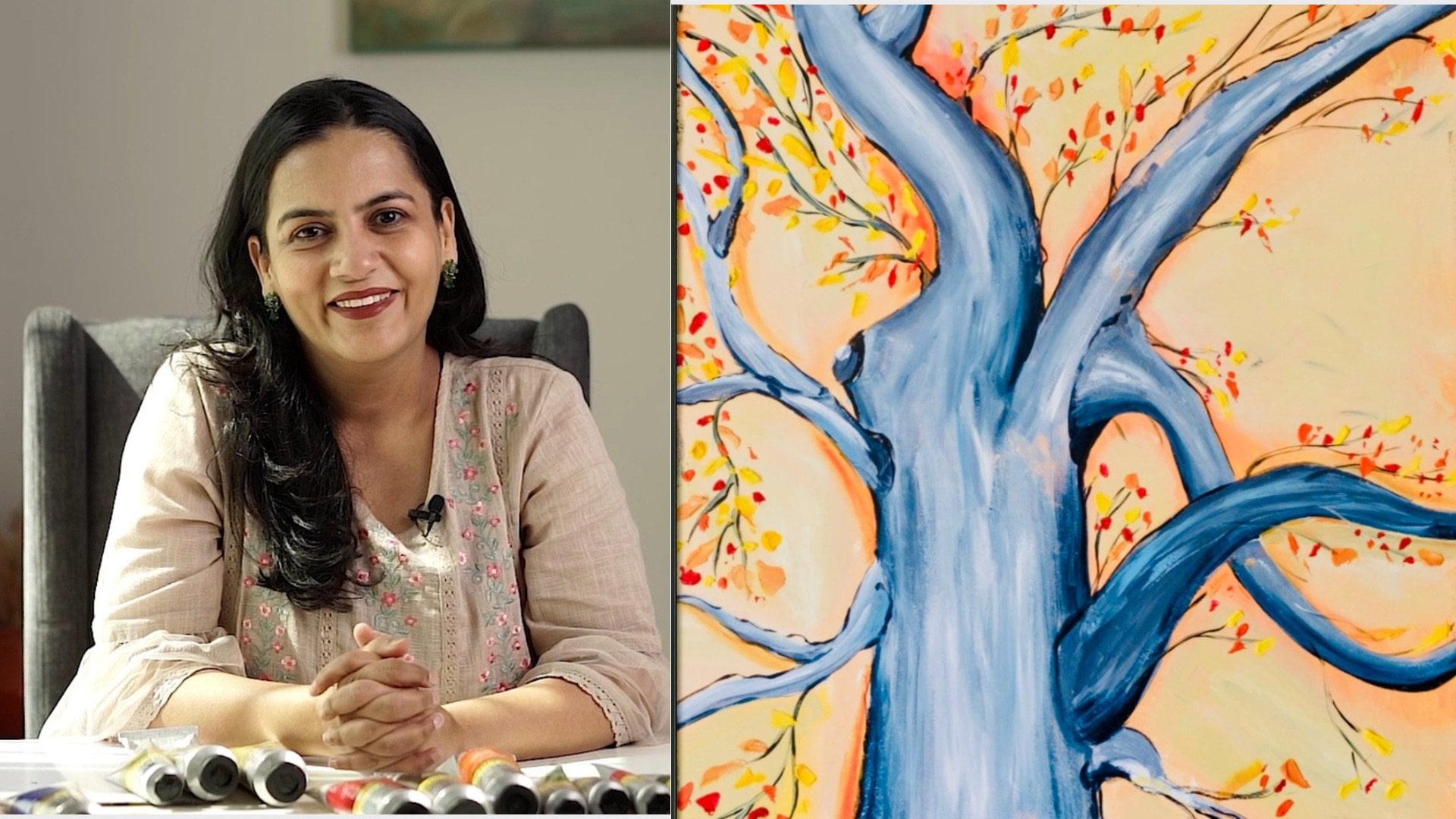
Tina Khetarpal, Artist, Illustrator, Art Teacher

Watch this class and thousands more

Get unlimited access to every class
Taught by industry leaders & working professionals
Topics include illustration, design, photography, and more

Watch this class and thousands more

Get unlimited access to every class
Taught by industry leaders & working professionals
Topics include illustration, design, photography, and more

Lessons in This Class

    • 1.

      Introduction

      0:58

    • 2.

      Art supplies

      0:43

    • 3.

      Prepping the canvas

      1:10

    • 4.

      Sketching

      0:26

    • 5.

      Painting the bird

      1:52

    • 6.

      Tonal contrast

      1:54

    • 7.

      Painting the Circle

      0:50

    • 8.

      Detailing of the bird

      5:23

    • 9.

      Painting the branch

      1:50

    • 10.

      Retarder layer

      2:30

    • 11.

      Painting flows lines

      1:52

    • 12.

      Adding leaves

      1:48

    • 13.

      Final Thoughts

      0:12

  • --
  • Beginner level
  • Intermediate level
  • Advanced level
  • All levels

Community Generated

The level is determined by a majority opinion of students who have reviewed this class. The teacher's recommendation is shown until at least 5 student responses are collected.

3

Students

1

Project

About This Class

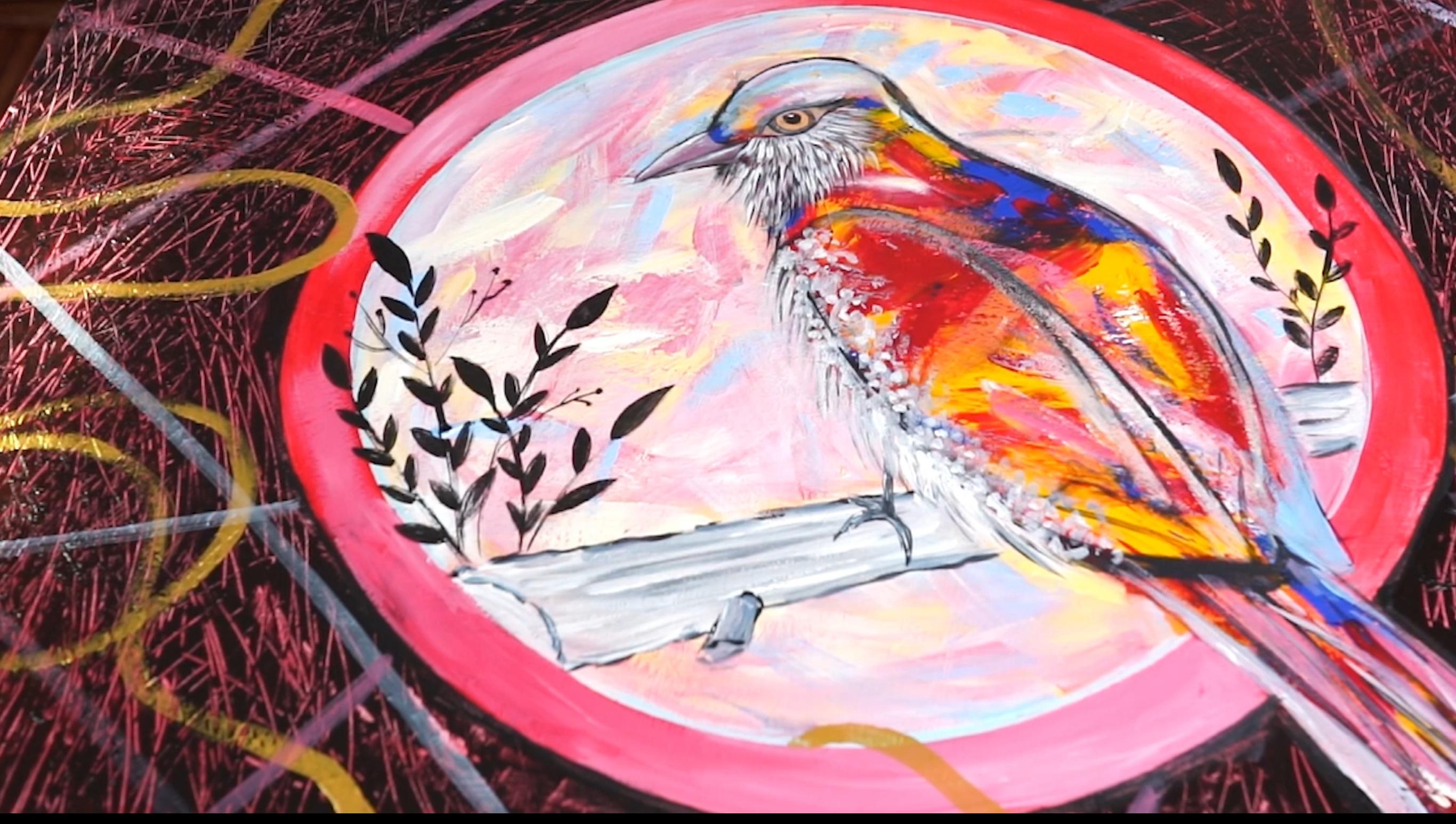
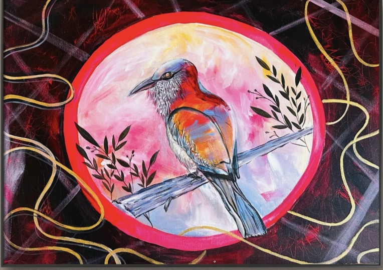
In this class, you’ll learn how to paint a vibrant, expressive bird using acrylics, focusing on freedom, colour confidence, and texture rather than perfection.

This class is perfect if you:

  • Feel stuck using too many colours

  • Want your acrylic paintings to look looser and more expressive

  • Want to learn how to create interest using simple tools and techniques

  • Are looking for a relaxing yet skill-building painting process

We’ll work with a limited colour palette, showing you how fewer colours can actually give your painting more harmony, depth, and impact. You’ll also learn how to build rich backgrounds using layering, resist and scratch techniques, creating movement and energy without overworking the surface.

What you’ll learn:

  • How to paint a bird in a loose, expressive style

  • How to use a limited colour palette to create bold, balanced artwork

  • Techniques for building an interesting acrylic background

  • How to use scratching, resist, and mark-making to add texture

  • How to layer acrylic paint without losing freshness

  • How to let intuition guide your brushstrokes

Who this class is for:

  • Beginners who want to build confidence with acrylics

  • Intermediate artists looking to loosen up their style

  • Anyone interested in expressive, intuitive painting

No detailed drawing skills are required — this class is about process, play, and expression.

Final Project:

By the end of the class, you’ll complete a colourful, expressive bird painting, using a limited palette and layered textures — and you’ll have techniques you can apply to any future acrylic artwork.

Meet Your Teacher

Teacher Profile Image

Tina Khetarpal

Artist, Illustrator, Art Teacher

Teacher
Level: All Levels

Class Ratings

Expectations Met?
    Exceeded!
  • 0%
  • Yes
  • 0%
  • Somewhat
  • 0%
  • Not really
  • 0%

Why Join Skillshare?

Take award-winning Skillshare Original Classes

Each class has short lessons, hands-on projects

Your membership supports Skillshare teachers

Learn From Anywhere

Take classes on the go with the Skillshare app. Stream or download to watch on the plane, the subway, or wherever you learn best.

Transcripts

1. Introduction: Hello, everyone. Welcome to my creative place. We will explore, observe and innovate. I am Tina Kater Pal, and today I will take you through a creative journey. In today's artwork, we will understand how to get a tonal contrast and how a tonal contrast impacts our artwork. Colors play an important role in our art, and using the same colors in a variety of different tones can help us build an eye catching yet soothing artwork. Also, we will learn how to use some additional mediums to get texture in our art. Textures add feelings to our paintings. Adding some extra mediums like a retarder and a glazing liquid can help us achieve an artwork with depth and balance. So let's dive in. 2. Art supplies: Art supplies. For this artwork, we will work with primary colors, red, yellow, and blue. Using a limited palette is a great way to simplify your thought process. Limited palette has great benefits for your art piece, like it brings harmony to your artwork. It's definitely cheaper as you have to buy lesser colors. Other than primary colors, you will also need black and white colors to create tonal contrast. Palette, brushes, and old rag are few other things you will need. For this artwork, you will also need acrylic glazing liquid and a retardant. 3. Prepping the canvas: Prepping the canvas, I have applied gesso to this canvas a day before and left it to dry. Gesso primes a canvas for the paints so that the paints do not get soaked into the fabric of the canvas. Gesso also helps us to get extra texture to our artwork. But today, we will use tardo for this purpose. Let's get started. Before I start working on my basic sketch for today's painting, I'm adding a layer of paint as my first layer after gesso. This is called an underpainting. Underpainting acts as a base for all your future layers. It can be done with a single color or multiple colors, but the colors must not be very thick. The idea is to apply them by thinning them with some water or some mediums. 4. Sketching: Sketching. Now, since my underpainting is dried and I am drawing my bird sketch on my canvas, I'm making sure that the sketch is not too detailed, but not too rough as well. It must not be detailed, but it has to be accurate. 5. Painting the bird: Painting the bird. For painting the bird, I want to introduce you to the process of painting with bold strokes. These strokes are loose and need to be done fast. What you do not want to do in this is blending. Do not blend your strokes, Leave them to dry in their natural form. I'm starting by taking my three primary in their most saturated form and applying them on my bird. As I mentioned earlier, these strokes need to be bold and loose. While painting in the style, be mindful not to blend these colors. Otherwise, you will end up getting muddy colors. You need to color with confidence. Just go with the floor and try and cover the entire bird with all the three colors. Just pick up a big scoop of color on your large brush, and in one smooth movement, apply it on the canvas. Apply more such strokes to get rid of all the remaining paint on the brush. This way, you don't waste any color and you get dimension of the same color on the canvas. It is so mesmerizing to see same hue with variety of dimensions. You can try and cover the entire bird this way, and it's fine if the color comes outside the line. At this stage, we are only trying to color the entire bird. Defining the bird will come at the later steps. 6. Tonal contrast : I tonal contrast. After we have our saturated colors on the bird, now it's time to add tonal contrast to our artwork. In the circle around the bird, add the same three colors, but this time in a lighter version, mix white with all three colors separately and start applying it to the canvas in the same bold stroke style we did for the bird. Again, take a big scoop of color on your brush and apply it on the canvas in bold, fast movement. Thanks. Do not judge your strokes. Just keep going confidently. Other than applying strokes to the background, we also need to outline the bird. Again, do this in bold movement. At this stage, if you cannot see the outline of the bird at all, then let your paint dry completely and then redraw or trace your bird. Once your entire circle is covered with the lighter colors and your bird is defined, let your colours dry while you sit and enjoy your tea or coffee. 7. Painting the Circle: Now paint outside the circle in bright red colour. Simply take your color, mix it with some water, and paint it as smoothly as possible. A 8. Detailing of the bird: And this diluted black color, I will do the detailing of my bird. To start with, I want to correct the shape of my bird. Once I'm satisfied with the shape, I will go ahead and do the rest of the detailing. Understand here we are not looking at painting a super realistic art, so I do not want my bird to be extremely detailed. I just want to do some basic detailing and adding depth to my bird. Same thing with the tail. I will take my diluted black and do the detailing of the tail. Not too detailed, but enough to make it stand out. Once I have my basic shape of the bird, I want to start with the eyes. Once I've spent enough time with the eyes and I am satisfied with the way my eyes has turned out, it's a lot easier for me to work on the rest of the bird. That's why I'm starting with my eyes first. For the eyes, I'm simply applying my black color in the center of the eye, and it is surrounded by orange created by using red and yellow on the outside of the black. Take your time to get it to your satisfaction. Now for the beak, I'm using a mix of blue, red and white, more blue, less red, and lots of white. While the paint is still wet, I will add some black lines and some white highlights. It is better to do this while the paint is still wet as it is easier to blend them together. Now start working on the rest of the bird. Plumage. Plumage is mostly under the eye and chin. Here I am just using small thin strokes. Firstly, I have just decided the area of the plumage and their direction. This is a very important step, the direction of the plumage, the direction in which your strokes will be. Once you know what movement you want for your fur, rest becomes a lot easier. To do these tiny feathers, we will start with a few tiny strokes of a little black mixed with white. So for the feathers, start with gray and then add lighter gray feathers, and then over that, add even lighter gray. So basically, three shades of gray before using your white on top. After doing different shades of gray, we can decide if we need another layer. Once we are satisfied, we can go ahead and add a final white layer. Enjoy the step, but be mindful of the direction. It may seem random, but it is not. It's usually a very well planned step. Now it's time for the white layer. This helps to get all the layers come together and come alive. Once I'm satisfied with the results, I will take my black colour and add thin lines to finish my plumage. Once I'm happy with the overall look of my bird, I will add some effect to give white to show the feathers. A 9. Painting the branch : Time to paint the tree. This is like a thick tree branch. First, we apply a layer of light color to the base and then add lines of dark tone and white tone on it. Since the paint is wet, the lines get blended in the base color on its own, and that's the effect we are going for. Just in few strokes, our branch is ready. To finish it, we will add the darkest tone to the edge of the branch. This should be done in a thick and thin broken line form to give tree a nice tree edge kind of look. 10. Retarder layer: Now comes the fun part. Creating texture is the most fun part for me. I love creating textures. For this one, we are using a medium called retarder. Simply mix your retarder with your colors. Here I'm using a mix of red and black color, plus pure red color as well. Cover the entire outside the circle with this color. There are no rules here. Simply take your mix, apply to your canvas to break the monotonous look at pure red color at certain places. Since the main function of retarder is to increase the drawing time of the color, you have some time to create your texture, but do not apply it and leave it for some time. Apply it completely, and then take the backside of your brush and start creating your texture defect. This is so calming and soothing and relaxing. I do not want to stop doing this. I can go on and on. Once you are done with this, at least leave it for a day to dry. 11. Painting flows lines: Next day, after all the touch ups paint golden flowy lines around the circle of the bird, representing freedom and free movement. The artwork is all about the importance of being rooted and composed with all the opportunities to fly. Now, in the starting of the artwork, we spoke about acrylic gel medium. The main purpose of a gel medium is to increase the drawing time of the acrylic paints, same as retarder, but it can also be used to create dynamic effects in our painting. For this artwork, I'm using gel medium to create transparent effect. I want to add a layer of paint on my painting, but I also want to see the texture underneath it. I will take my gel medium, mix it with my paint, and apply it in a thin layer on my painting. We get this beautiful translucent effect of color on our painting without hiding the texture underneath it. Do it in all the desired areas. Once you are satisfied with the effect, sit back and enjoy your artwork. I 12. Adding leaves: To end this artwork, I'm going to add some leaves next to the bird. For that, I'm using my black and golden colour mixed together, and I'm making some leaves around my bird to give it the finished final touch ups. 13. Final Thoughts: Thank you so much for joining me in my creative journey today. I hope you enjoyed creating this artwork as much as I did. Thank you.