Transcripts
1. Class Intro: Hello, loves. So I love
this series of classes around places I've traveled and taking pictures and then coming back and
painting them with you. We're going to push
color on this one, and the kind of unique feature of this
particular class is going to be starting
with a really big brush. It's a big brush. It's an inch brush, and forcing ourselves to go as far as we can
with this big brush. This is something that's very liberating and a lot of fun. It sounds like it would be
difficult, but it isn't. And you'll see the
magic that comes from using that big brush
in terms of freshness, the surprises you
get in the strokes. We're going to start with
a bright underpainting, which is, you know, what
I do in most paintings, to give us those
pops of hot pink and red or whatever you choose
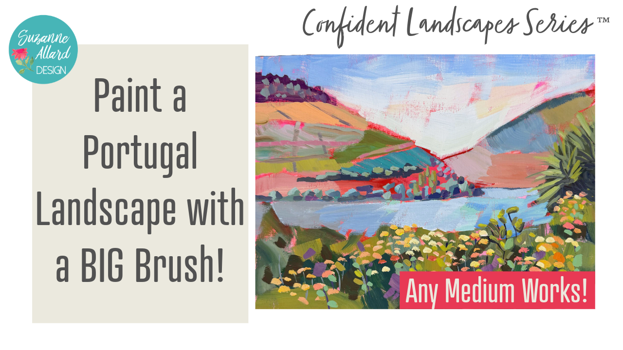
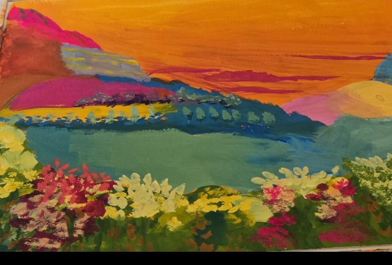
for your underpainting. And we're going to use a photo
that I took when we went to the Duro Valley in
Portugal last year. We had an amazing trip. The Duro Valley is
a huge wine region, and it is incredible. It was hard for me
to pick a photo, one photo for us to do. But it lends itself
to photo to paintings because of the terraced nature of all the vines
on the mountains. So when I saw that
and, you know, I love chunks of
color, I thought, Oh, this is going to be fun. So that's what we're
going to paint. Alright, let's get to it, and I can't wait to
see what you create.
2. About Me: I just thought I'd share a
little bit about myself. If you have not taken
my classes before, I'm a self taught artist, and I came to painting late, probably at the age of 52 or so, about seven years ago. And now I just told
you how old I am. And I would create things all the time, you
know, embroidery. I got into quilting
at one point. I think I did,
let's see, felting, spinning, knitting, crocheting, needlepoint, um and, you know, sometimes I get paint
out, but paint scared me. I thought, No, no, no,
that's for real artists. And I'm just I'm a creative
person, but I'm not that. I didn't go to art
school, and I don't know. I told myself all
kinds of things. And then I told myself I was too old to start, which is crazy. So I finally got tired
of hearing the excuses, and I started painting, and I started posting on Instagram. And that's how I recommend. I mean, Instagram is, you know, has a lot of
content, obviously, but getting that
feedback from people, I think is a great way to start. And so painting, and
then I just kept at it. I just kept at it.
And I didn't give up. And there are many times when I felt like it, you know,
just when I thought, am I really going to get
good ever or better? And that process continues. I mean, obviously, I hope
I continue to get better. So you never sort of get
there. You just improve. But eventually, I got to where I was selling my work
and selling prints, and then I started teaching, and I love teaching as
much as I like painting. And I actually like having
an art business, as well. So if that encourages you
at all or inspires you, I hope it does,
because you just kind of go at it little by
little, stick to it. And if you get
discouraged, that's okay. Take a day or two
off for a week or whatever you need and get
back to it and don't give up. Alright, let's get started.
3. The Paint Palette: Alright, let's talk about
this acro guash palette and how I put it together. These are little
containers that come with these little rubbery tops, and it's been, I want to say three or four weeks that I've
had these in here. And I have replenished
them a little bit. You can see I'm a double dipper. I keep them sprits with either a little spray bottle
or this one's really misty. And I only do that,
maybe once when I start, and then if I'm say
painting an hour, then I hit them again
before I put them away. But all I did is I
took some colors, two, I took two yellows, a cool and a warm,
and then some red. So I've got, you
know, warm, true red, this is a cad red, a magenta, and this is opera
pink, which is, you know, my favorite
fluorescent type color. And then an orange,
a lime green. This is a Prussian blue. It's just a dark blue,
altamarin turquoise. And these are mostly Turner
brand that are in here, if not all, this is an
ivory, of course, white. This is just a peachy. I had a tube of it, so I emptied the entire
tube into there. I think it's called Juan. This is yellow ochre.
This is a pale lilac. It's not this one. This
is a brand new one. It's a little darker, yeah. So I just basically
took what I had, but I made sure the essentials are you don't even need
both these containers. The reason I spilled over, I really only needed from
here, about five wells. I really only needed the white. I like the ivory, the yellow
ochre, and the burnt sienna. I threw the rest of these in
because I have the space. I figured if I was going
to fill that many, I'd fill the rest of
it, but you don't need greens because
you can make greens. Lime green is challenging to
make, so I like that one. But the only
essential colors you really need are a
warm and cool yellow, a warm and cool blue. Warm and cool red.
And then in my view, turquoise is it's easier
to have it than make it, and then opera pink
you can't make. And, of course, you need white. So then but I have a fair
amount in each of these. So like, let's see if
one needs replenishing. The white usually always does. Ultramarine blue is
getting a little low. So let's go ahead and grab some of that and
put that in there, and I'll show you how I mix a little bit of this
blending medium. Alright, so here's some
whole vein ultramarine blue. And I just squeezed
them in here. But you want a fair amount of paint in there because that's partly what keeps them from drying out is the
amount of paint. So don't be I probably should just empty
that completely into there. But don't be too
sparing with the paint. And then this is Windsor
Newton blending medium. It is for watercolor mediums. But even though this is
acrolGlosh, it's been working. You could also use
just acrylic retarder, which I'm also putting, which is what I use
in my acrylic paints. So and I just put a couple drops in and stir
it up. That's it. Um, I like to get
stirs at coffee shops. Those are really
great to stir with. And the blending medium just makes the acrogge flow a
little bit easier, I find. Aqugage can get really
dry and chalky. So this lets it blend easier. It slows drying to
allow blending. We'll see anymore that
need to be filled? Not really at this time. And then the only trick when you close them is you
just want to make sure that you don't
just set it on top. It's sometimes a
little tricky to get the little bits going around each well so that
you've got a good seal. Yeah, so you can kind
of hear it snapping in. Alright. And this one and then I just put
them in a zip lock bag, and I don't even do
this all the time. But let's say I know I'm not gonna use them again
till tomorrow. I just figure it gives
me an extra level of security from them drying out
because this is acro guash. If it dries, it's dry. You're not reconstituting
it with water. It's not like my guash, regular guash, which
has no acrylic in it. See how it can be
trike sometimes. Okay. And then I'll put
it in a ziplock bag and throw in some wet paper towel or even a wet cloth,
not wet, damp. And yeah, and if I'm
gone for even longer, I'll stick them in the fridge. So that's how I've been
using the acro wash. I'll put all the
links to this and this in the supply list. Enjoy.
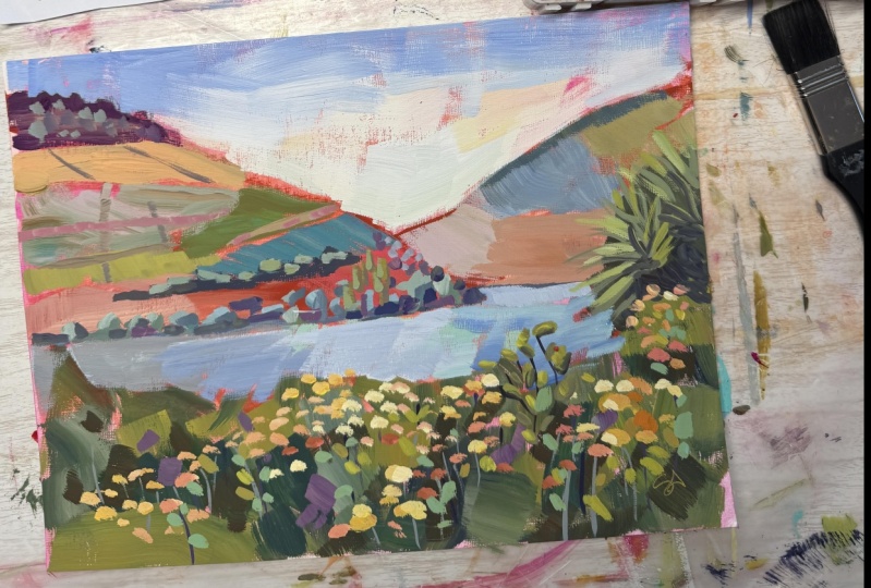
4. Supplies and Getting Started: All right. For this painting,
I want to do one of the photos we took I
took when we went to the Duro Valley and
it's incredible there. The wineries, I think it's the largest wine grape
producer in the world. I might have that wrong, but
it's something like that. But they do it on these
mountains and literally, these are all vines and they might be owned
by different people and the only way they can harvest
that is by hand, really. They're actually inventing
a machine that can help them because they have
a labor shortage, but anyway, it's fascinating. There's just hill or mountain after mountain
carved out like this. I was like, I'm going
to be all over that and I like to paint
colorful sections. Then this boat was going by and now that I
look at it though, I don't think I'm going
to include the boat. I did crop it down to make
the focal point here. And so yeah, that's what
we're going to do here. I've got my nine by
12 acrylic paper. Watercolor paper works fine too. If you use watercolor paper, just make sure and prime it
with a coat of gesso that keeps the paint
from soaking in to the paper and it just keeps
it kind of more on top. Um, first thing I'm going to do and then I'll go over the rest of my supplies, but we'll do this
while it dries is do tone the canvas or tone
the paper in this case. That just means have a color
on it before we start. I like to use some version
of an orangy pink. I'm just grabbing
these NOVA orange. You can grab any
acrylic paint you have and you don't need a high
quality paint for this part because we're going to water it down and it's just going to be in the background with little bits of
it showing through. You can vary how watery
or that you put it on, I just do it this way and make it each one turns out a
little bit differently. But I do use quite a bit of
water to get it translucent. Then if I do have intense bits, they're in the middle there. We're just basically
getting rid of the white and making something
that can peek through. You can even take a paper towel and move it around that way. Really any way you
want to cover it. It ends up being part of
the mystery of the piece. The reason that I use this
or reddish colors when I'm doing landscapes is well, I just like how
it shows through. I peeks through
little bits of it. But also, it's a
good idea to use a complimentary color
for your underpainting. And most landscapes are green, even though you see that I don't really use a
lot of ton of green. I just don't want it to be all monochromatic and a scene like this is mostly green and
blue at first blush, but we're going to of
course, change it up. So all right. Well that dry while we talk about the
rest of the supplies? You can even get
different effects by letting that dry completely versus it being wet
because you'll get more of the paint will just
be a little more blending. But today, I want to
let it dry completely. Brush wise, I want to have us work at least on the initial bits of blocking
in with a larger brush. See what that feels like, learn a little bit about that and stay with a large
brush as long as we can. This is like a I don't know
if it's quite 1 " or not. You don't need to
have one like that. You could grab whatever
large brush you have. Here's another one. But let's start large and that's a great way to stay loose and get some really
interesting brush strokes. I will go smaller when
we get into detail. Here I have a six flat. And I tend to use flats more
than anything on these. Here's a number four flat. Flat means the bristle is long and cut flat
across the top, and then the bright is
also a rectangle shape, but the bristles are shorter. These are called brights.
Then you'll just need something small
for last details. This is a number two flat
here or a small round. I've got palette paper, which
is my favorite way to just mix my colors and then peel
off a sheet and throw it out. Then the acro gouache palette, which I've already talked about. That's what we're
going to use for paint and let's see here. I think that's it,
cut your water and now we're going
to let this dry.
5. Sketching and Blocking In: Okay, this is dry now. And now we're going to sketch. So I'm going to sketch with I usually like to sketch
with something in the I kind of take burnt sienna and then some
reddish, pinkish stuff. But you can, you know,
sketch in anything you want. I'm taking the smaller
filbert. I think I need to. I wonder if I didn't
wash it out last time I used it completely because
it's feeling very stiff. I might might be
guilty of doing that. Okay, let's maybe grab a bit of orange and maybe some red. And my sketch is a bit
watered down, too. Let me sketch paint. I'm really doing a loose sketch, just getting shapes, just
really thinking about shapes. This horizon line there is not quite at half point.
So I'm going to put it here. If it were at the
half point, I would move it because
you don't want to divide your piece in
a whole exact half. It's a little bit higher here because I don't
want to lose that. This piece of land goes the water basically goes around there and
I want to capture that maybe even exaggerate
it a little bit. Then I have that larger ridge
coming down here like this. I'm just drawing with
the side of the flat, holding my brush like
this so I don't get too fussy and start drawing. This goes I'm looking
now because again, I don't want that focal
point right in the center, so it's not, so that's good. Move it over just a
little bit. That's there. Then we have we'll call this
right now one big shape, all these flowers
here in the front. Comes up like this.
That's a shape. Let's count them. One, two, three, four, got the water five. Then we've got this plant here, which I think
is interesting. I'm going to go ahead and
put it in suggestive Anyway, we could take it
out, but I like it. It's kind of just
coming off of there. Okay. And that kind of
comes down into here. Yeah, it's bigger
than I just made it because it comes
down into the water. Okay. So you could count
that as six shapes. Now I'm going to
just make some lines where some of these
variations are over here. Not worrying about
following it exactly. You get the idea that
they criss cross and there's smaller ones
and bigger ones. But this is one of my
favorite things about these vineyards on the hills because I knew
those would be fun. This one's a lot further away, so we'll desaturate it and
we won't have so many, we won't have as many
shapes colored in it. It also seems to
have less pieces. Okay, that's our sketch. Now, because we're
working on using the big brush, barely
fits in there. I'm going to start blocking
in with some colors. And down here, I'm just
going to use a mix of Well, first thing I need to decide is what colors am
I going to where? I'm going to do
different colors here, and then different colors here, but they're going to
be less saturated. So we'll add more white to them. The sky, who knows? Maybe it'll end up being partly what's here as a
sunrise or sunset. Just in case we do
that, I'm going to remove the number four
before I drive too much. Because I just thought of that, we might end up using it as a sunset. We'll see. Let's see here. So
then the water, and then I can do a
variety of colors here. And there won't
be tons of green, but probably most of the
green will be down here. So let me come in with make a little bit of green.
Oh, that's too. This is that
permanent green that I put in that I
just had a tube of, and every time I get it
out, I don't like it. It's too bright. So we'll tone it down
with some burnt sienna. And just put bits of
this in because there are some darker change it. Maybe a little orange, maybe a little of this
lighten it up a little. I'm just making brushstrokes kind of in the direction
of these plants. Adding, you know, basically
creating a variety of shades here. Try some blue. It wasn't much of a variety. They're mostly warm though, so warm and pick up with
some yellow ochre is a nice thing to add to get
some interesting greens. It's kind of a big patch of warm there, a
little bit more here. Then it gets dark again in here. We can leave some of the
pink showing through. Is comes up here. It's a little bit
lighter over here. I'm just looking at the
picture only to say, Well, there's a few lighter
looking leaves. Let's put some of those in. There's some on top
of those darker leaves very loosely,
looking and going, Okay, there's a lot of
warmth over here and we're going to
put the flowers in and then making sure I have enough darks otherwise
it all looks monochrome. There's bits of shading
here and there right there. Maybe some Burnt Sienna for some see how the burnt sienna
really darkens things up. Okay. We did all that
with a large brush, which made it go really fast. That's going to be our
practice with this one. Now, cleaning out my brush, I'm going to come back here and do some desaturated
colors on this one. So I'll take a little
bit of blue and white, maybe some ivory, get some I want it a little
less even more grayish. I'm going to go ahead and
paint what will be underneath this plant because we'll
just paint over it. It comes into there. And maybe divide the remaining into two desaturated sections here. I'm thinking about my brush
direction a little bit. Since the rows here
are going that way, let's try grab a little
orange, desaturated. I'm leaving some bits there. It isn't straight
though. Let's do that. Okay. Let's leave that one alone and then
we'll come over here. This is going to be
the more colorful one. But I'm going to keep
the brighter colors this way because I want to
draw the focal point in. So I've still got some
colors in my brush, but I'm going ahead and
blotting it and we'll get some more saturated colors. Let's just make
colors at this point. I'm thinking about the
brighter ones being closer in. And I'm thinking about
brush direction for those rows of vines. Let's warm that up. I don't want though, this
would be just way too intense. That's why I love
using a yellow ochre. Even that's too intense,
bit of burnt sienna. You know, that's better. I'm going to leave
bits of this red, both the sketch and the
background showing through. No, we're not going to
make all the colors crazy bright because what happens
then is none of them look. It gets too intense.
Here you can see I have some bits in my brush that are
from different colors. I like that here. Let's see. Maybe this is lighter
up here, and more. Let's go with maybe
a peachy color. Try if you can to put the
brush down and leave it. We get that nice bit there. This at the top is dark, I'm going to maybe go in a
little purple direction. There's some little
bits of trees coming up there that we'll cut
into with the sky. I'm just going to put
little bits up there. Also, I notice here, there's
a dark ridge right up here and I'm going to show that. But I've got to desaturate
it, so I'll add some white. Let's see. That's pro good. I do want some of that
red to show, though, so I'm going to
just do it this way and keep some of
that sketch color. Alright, back to here. It's
a little darker. Let's see. I'm trying to think
maybe a reddish, which means I will
have to change wash my brush at this point, 'cause that Vidian that
I have is very intense. Whoops. I think I dragged my
favorite towel there. Let's see if we can I had that pretty brush
mark underneath, but these things happen and something cool ends up being a result. So I
don't worry about them. All right. Let's get some red and maybe warm it up a
little yellow hooker. That can be here. I think it's too dark. I'm going to put a little
bit of fluorescent opera pink there so that we're
intensifying the focal point. Then as we go out here, I'm going to de
intensify the color. That effect there on this
paper, I really like. This paper has a linen texture. Did you see that's a scumbling. It's really pretty.
Okay. Got one more spot here and what color? I think we can grab some green. We didn't use much green in the or maybe a yellow yellowy, brighter, kind of langyGreen. Is just too much like that one. So let's lighten it up. More yellow. So I broke my rule there of putting the brighter
colors here. We'll see how that works as we fill out the
composition. All right. Now, I do want to while I've
got some dark in my brush, put the dark that's here. See how it's really
dark in there. So while we've got
a dirty brush, I'm going to make
some burnt umber and bring that in here. And I always vary the darks. You know, put a little blue, put a little burn dumber. Don't just make one
big patch of dark. But then right against it is this really light bit of flour. I've got more dark
coming down here. It's easier to put light things on top of dark
than the other way around. So It's good to start with the darks.
This is the green here. I just want to show that that's quite a
bit lighter there. Alright. Now, let's
block in the water.
6. Painting Water and Sky: Alright, water. So one of the challenges
with water and I don't know, it's not that much of a
challenge is to not make your water in a scene the
same color as your sky. And in the picture, they often look similar, and this they don't so much, but you want to vary
it a little bit. So I think with the water, I'm going to go with a make of turquoise, but
not super warm. Let's see what we
think. And then, you know, I always vary
what's in the water, too. So I'm going to start
out with some turquoise and use the ivory to warm it up. Let's see what we think of that. That's really bright. But it's still pretty. And then we can have some cooler bits. Yellow ochre will tone
that down really fast, but just be careful it'll take it in a really green direction. It's darker over here. So as soon as you really start to study
something, you see variation. So it's darker here.
It's bluer there, and then it's whiter back there. So let's try to
capture some of that. So the bluer bit is kind of
there's almost a line there. And then I'll grab some of this dark stuff that was already on the palette
to come over here. Maybe even darker. Get some
of that Prussian blue. The whole actually
line here is darker. That's where that corner is. Okay. Got kind of a nice gray
going in on the brush now. But it's darker. We
still need it to be dark over there. Not that dark. I don't want brown. Still want it to feel like blue. Ish. This will also help
guide the eye in because the brighter water is
toward that focal point. Too dark. Hmm. We've got bits of that
turquoise showing through. And then this is where
the waters really light. I've got to clean out my brush. Got too much blue
in it coming down. Okay, I'm gonna leave it that
way and move up to the sky. Skies you can do so
many things with. You could actually
kind of tone down what's there and go with
some sort of sunset. You can make it that would
make it more of a focal point, and I don't want to do
that in this painting. But what's always common is it's always lighter toward the land. So we just decide what
color are we going with? What color family. And I'm gonna go with
really some bits of yellow, especially down at the bottom. Yellowy white, very light. And let's see how we like that. I'm gonna get some of that. I still got some
blue in my brush, which can make the when you add yellow can
turn your sky green. We don't need these
clips anymore. That just helped
it dry straight. A bit of can even take
a bit of this peach. We can let as much
or as little of that background show
through as we want to. Trying not to overwork. I'm gonna go with a cool blue now which is the ultramarine. And then get a little bit
darker as it gets up. It might be too dark. We'll see. Here I'm gonna see if I can
cut in with this big brush. If not, I can grab
a smaller one. I don't want a lot of
detail 'cause this is high, far away. So we should be fine
with this brush. With skies, it really
is less is more. It's taken me a
while to learn that. And, you know, you can just
let it dry and come back. Right now, I'm just trying to I want a little more
blending there. Okay, we're gonna stop and let all this dry and then
have a think about it.
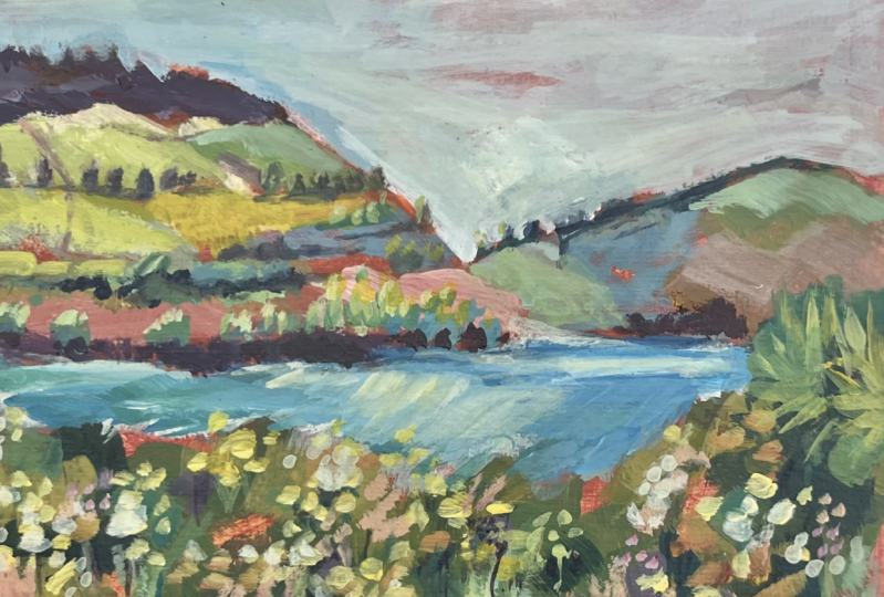
7. Building Layers: Alright, so this
is fully dry and, you know, I had some time
to take a look at it. I really love the bits
that are coming through from the background and the
texture from the paper, and even, like, the pink bits here that almost have
a flower like feel, the strokes of the big brush. So at this stage, one of my
biggest concerns is always, don't cover up all this
stuff that I just listed. You know, don't it, basically. So what I like to do is put a little bit
of detail in here for, you know, some of these to
suggest some of these flowers. And I may add, you know, there's so much good texture here that I don't know
that I need to do much, but may add a little bit here. We can play with this plant because I do like
the feeling of that. So let's just see
where that goes. For brushes for this stage, I am going a little smaller, but still on the larger side. This is a size six I believe. Yeah. Now, and then this
one is the six as well. But I want to show you the bristles are a
little different. So on these two, I have this small one in case we have some details we want
to do at the end. I do like to use the
corner of a brush for details of a larger brush,
so we may not need this. But these are smoother
brisk brushes. This is the Princeton
Aspen and also see if I have any of the brushes that are my branded brushes
are smoother as well. So synthetic smooth. Just I like this because
it's really long. These are called hog bristles. They're rougher. This is a
kind if you live in Europe, that's probably easier for you to get Rosemary and Company, the ultimate long flat. And then this is from Blick. I like it as well, and it's
actually a filbert shape, but it doesn't matter.
I just grabbed. I wanted in case these hog
bristles provide more texture. So depending on what
you're creating, whether you want it
to be kind of more precise or more textured, it can help to play with
those different brushes. Alright, so let's take
these out or uncover them. I've already sprayed them. And let's see what
I want to do first. I think I might bring up
a little bit of detail or just maybe suggest some shrubs there
like there are here to kind of maybe carry
the eye along here. I really like how
the water turned out. I'm not gonna
mess with that. So for color for the shrubs, I think I might actually
do a little bit of a green dark blue green to kind of connect these two a little
bit. Let's see what that. Looks like. But they're a little
further away, so I'm gonna make them a
little less saturated. There is actually
this color here. Sometimes it's fun
to use the color. I probably shouldn't
have done that, so I can use this photo later to film the cover of this class. Oh, well, no, it'll have
a funny little dot, but you can kind of see
that there's, like, this bluish, whitish color. So, and it's really on the one side where the
light's hitting it. So I'm just gonna, again, try and make these shapes
without too much fussing. So around. Oh, change the color a bit so that
we have some variety. I'm kind of making the
lighter side right now. You can see each shape has the light handing it and
then the dark fallow. So I'm just making
you could either do the dark first or the light. You don't it doesn't matter. I want to make that
dark a bit darker. And maybe a little bit more of a yellowy green bit of orange. A bit more white. So I can use one side of the
brush for the darker bit. And then the other
corner for the lighter. Darken this a little bit and suggest some little again,
I'm using the corner. And since I'm working a
little more precisely now, I'm holding the brush
more like a pencil. But you don't have to. You could still hold
it in, you know, a way like this if you
wanted to just not You know, it's a good way to
not get too precise. And if I had this
up on an easel, that's probably the
way I'd hold it. But right here, it's
kind of close to me. Just getting some more darks
in there for the value. Well, I'm just really loosely, playing with what
I'm seeing there. Just painting the shapes. And these little bits
as they get further, get lighter and smaller. I'm trying to think
what color I want these sort of
taller trees there. I don't think I want. I know, maybe just lighter
kind of yellowy brown. With a little bit yellow
with the sun hitting them. There's a darker value here. See that shrubbery there. And I think it would be nice to have a little bit
of contrast there. So I'm gonna wipe my brush and make a dark darkish blue. Got be careful not
to go too dark because I still want to suggest that this
is in the distance. And, uh, less dark. Maybe make a little
light coming on that? It's a little bit of a Even though I'm not really
using the colors in the photo, I do sometimes get
inspired by them, and there's a hint of sort
of turquoise in the photo. So it can kind of help me show some of that light
hitting these things. As long as you
vary it, you know, and don't use the
same color too much. Okay, now there's
sort of a pinky, peachy some of these
lines separating here, and I don't want to
like we talked about, cover up much of our yumminess. But I am gonna
just kind of above these suggest some
of these lines, changing the color
just to give it a little bit more interest. It's kind of a pass. It's
too dark. Coming down here. And when you have these neutrals that I'm just kind of mixing, they can help accentuate
the bright colors. Got a little brighter pink in there, so it shows up better. Taking this purple that
was up there and finding a few little bits of places for it so that it's
spread out more.
8. Refining and Finishing: Okay, I'm gonna
leave this for now. It may be done. And then
work on the flowers. Like I said, at this stage, when you've got an underpainting
that you really like, your biggest challenge
is to not paint over it. Experience. Experience is
a great teacher for that. So now on the front
for these flowers, I'm just going to suggest, I haven't used the
rough brush yet. And actually, it might
be let's play with that. It might be perfect for
some of these remember, I'm not trying to necessarily
make individual flowers. I'm more thinking of clusters. But the filbert makes a nice
kind of flower head shape. I need to make sure
that's showing up enough. And if they're further back, just kind of move your brush because
they're gonna be smaller. That's one way you
can show perspective. And I can make these
any color I want. I do like the yellow in there, so I'm going to do some yellow. You probably add some pink. So up here in front,
let's make them bigger. Lots of little bits. Over here, they're
a bit lighter. See if the brush gets
too much paint on it, you can kind of squish
it out like that, or you can wipe and then
pick some paint up. Let's mix it up to put a
little bit of pink in there. I'm trying to remember to
make my to make varying, uh, turning the brush, you know, to get a different shape
and pushing down some, sometimes not as much. Some of them in here are darker. Just had a bit of
ernienna to darken them. And since, you know, I want
kind of this area to be the focal point I'm not
gonna put even though the picture has the
flowers everywhere, I want to keep the
viewer up in here. I've got two orange. Some really bright ones now with the lemon
yellow and some white. I still haven't washed the
yellow out of the brush. I just wiped it. Gonna wipe it again
because I want it even later. So more white. Okay. I think that's pretty. And I want to also suggest
some of the stems. I'm not gonna get into
attaching individual stems to flowers or anything, but that's where this smaller
brush can be helpful. A rigger works fine, too, if you've got
something like this, usually call a script
liner or rigger. Actually, that'll be
better. Let's do that. And I'm gonna do, let's see what a kind of tone down
turquoise looks like. Like a pale green. Just
something that shows up. So with the stems, we can
go lighter and darker so that we get a variety. And any stems that you make on the foreground
would be a little heavier. Don't make them straight. Okay. Now, let's make
some that are darker. Maybe kind of a dark purple. It might be too
intense. Grab some of this brown atone it down. You need a bit of water
to get the flow on this. Let's go more in
a blue direction, taking some of the
Prussian blue. But you could take ultrariin
and just add a bit of burnt umber to
kind of darken it. I just don't want too much pain. I don't want it too heavy when I'm really thin. Okay. Then I want to do just the tiniest a few leaf
details for the front. And one thing we can do
to kind of draw the eye that way is see how these
plants are going over here. But I'm going to put one here. And it'll be a line, a series of lines
that draw us in. You can use that little trick to direct people where
you want them to look. If I put it over here
especially in the picture, they're angled out,
you would look at that and then just kind of
fall out of the painting. So I'm not gonna make
them super details. Um, putting a little just a bit of a shadow
under mix up the greens. Maybe a bit more
light hitting some of these to really kind
of draw the eye in. Meaning that I'm grabbing a brighter yellow I'm trying to, but I didn't clean
my brush out enough. Here we go. Okay, so now we can come in through here and we're gonna hit,
there's a drop of water there. We're gonna kind of go around
hitting bits of right leaf. But also some more dull colors or dull shades, I should say. I'm going to focus the bright kind of where
I want the action. And let's throw it in. I was gonna say
some pink, but then the leaves are gonna look
just like the flowers. So maybe a bit of
turquoise type green. I just want some variety. And I'm not even looking at really where the leaves
are in the photo, other than to see
that, you know, over here, there are some
bigger ones and do I want that? And maybe to look at, Oh, okay, so sometimes the
leaves face down, face over, just kind of getting inspired by
it but not copying. Alright, so it's time to stop. I like that. I don't
want to do any more. I do want to bring
this spike plant here because it's also going
to bring the viewer's eye. So I'm just gonna
start like that. And I am looking at how the sun is hitting
some of these over here. And up here a little bit. Learning to see the
variety of shades in here. You could use the
rigor for this, too. Okay. The only thing that I want to change maybe is I had brought this greenery up here because I wanted it
to be have flowers, but there's more dark there, and I think I'm gonna knock
some of that back down. So it's not such a line. And then I just brought
it up too high. That's all. And then bring
some flowers back into it. I have to be very careful
because I have not let the this dry. So I'm not gonna I'm gonna try to put it in
without disturbing the dark. But you could always let
it dry or, you know, let it dry and do this and then let it dry and come back
and put it in a bit more. It's probably better
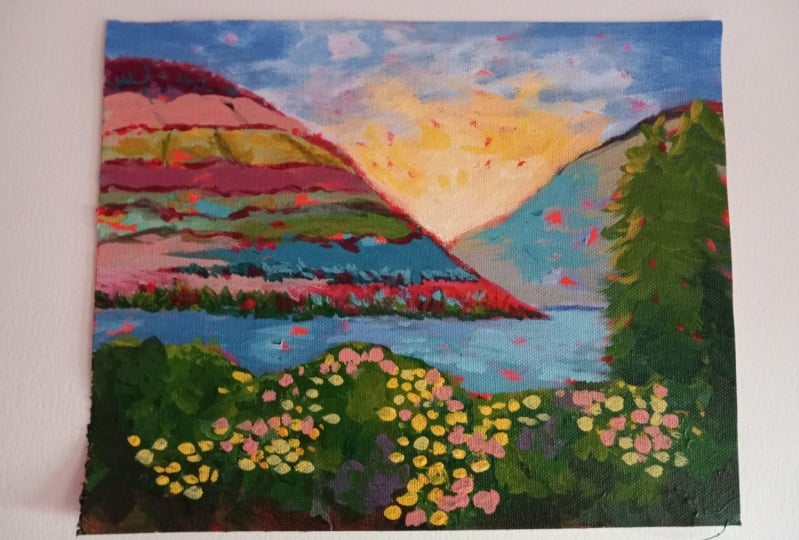
to let it dry it is Alright. I think we're done.
9. Portugal Painting Wrap Up: Well, I hope you had as much fun with this painting as I did. I just love how the right background with
these big juicy brushstrokes, I mean, how magical
is it that you can come in here and do this just with one stroke and be done? You know, no fussing,
no redoing it, and letting that
big old brush work express and do the heavy lifting and the painting and then
coming in with details. I think that and then just
getting the sky done that way, you know, putting it down, letting some of
that show through. You see that yummy texture. Yeah. It's just the big brush is really is really
fun and gratifying. And I think has opened up doors for me to
saying, You know what? Maybe I can just take a big
fat brush and 15 minutes, sketch something
and just see what I can get done in those 15
minutes with the big brush, you know, using this surface, this way, and then the corners. And so I encourage you
to play with that. I want to tell you about
some other resources. If you don't know that I have a email newsletter
that you can sign up for on my website
at susannaer.com. It goes out probably
every few months. Not too often. I should be sending it out more. I do studio updates. If I have an original sale, which is a couple of times
a year, I'll put that out. And I also like just write
essays on the creative life, things that I think insights that I have that
might be helpful. So there's that. I have a YouTube channel,
if you don't know, where I do supply
reviews and paint and chats informal painting and talking sessions, which I love. And I'm on Instagram, of course, and then I
have a Facebook group. I have a Facebook page, but also a student only Facebook group. So if you didn't
get an email with a link to that, or
you don't have that, then just email me at
art at susan aller.com, and I'll get you
an invite to that. It's a really supportive
student only Facebook group. I think it's several thousand
students at this point, but the vibe is just very
encouraging and loving, which is the tone
that I wanted to set. So anyway, keep creating because creating is
good for your soul, which is good for your
family and those around you. And so it's good for the world. And we'll see you in
my next class. Bye.
 Suzanne Allard, Landscape, Floral, Abstract Painting Teacher