Transcripts
1. Course Introduction: Hello, I'm Candice. I'm a UK watercolor artist, and I like to paint landscapes in quite a loose
and minimalist way. So I'm based in the pretty town of Droitwich Spa
in Worcestershire, so there's lots of nice
areas of natural beauty, such as the Cotswolds
and the Morven Hills, which are really nice
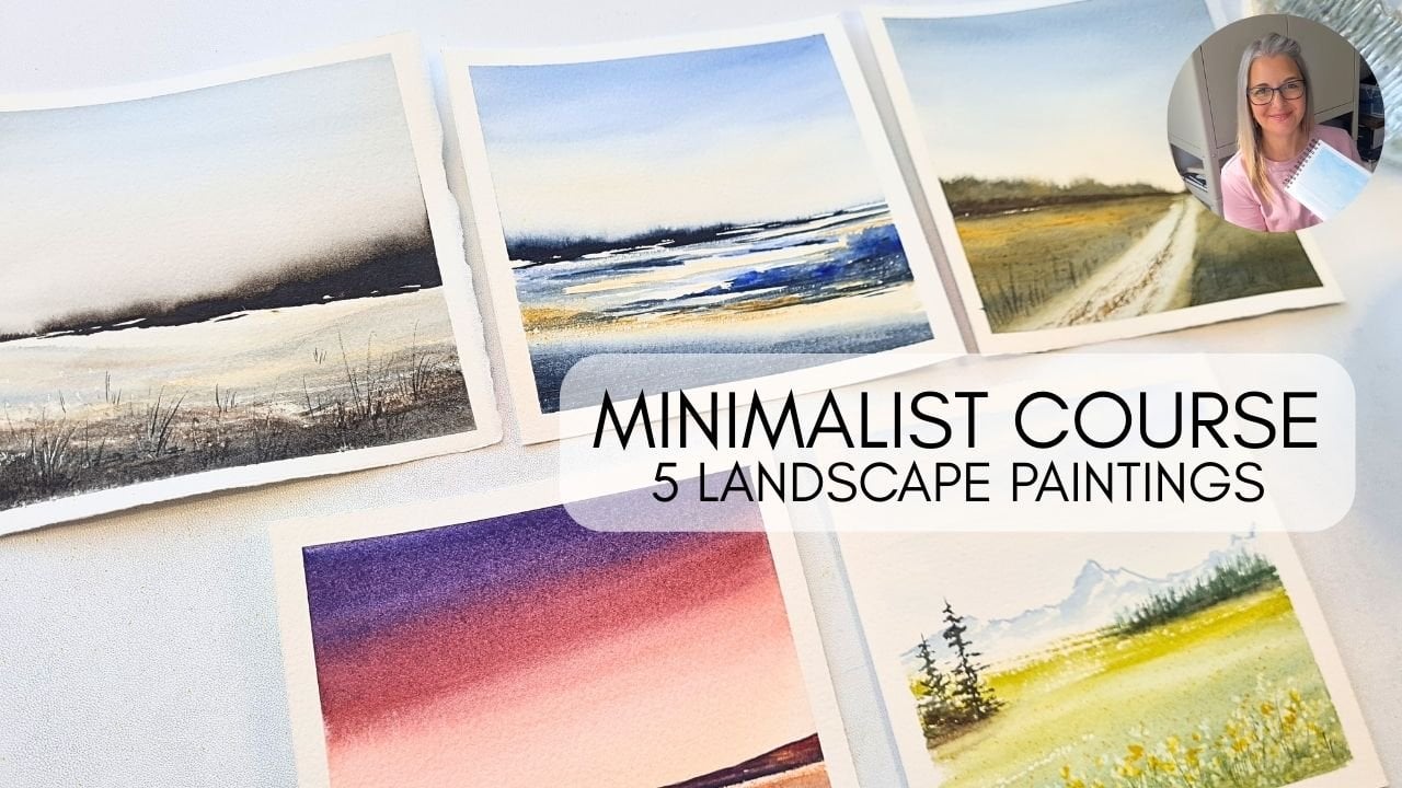
for inspiration. So today's painting
class is going to be about painting very
loosely and minimally, but with four very
small little paintings. So we're not going to get bogged down in the detail of them, and we're going to
use the same colours throughout and paint them
all at the same time. So it should be
quite a fun class. It's suitable for beginners. You don't have much
experience with watercolor, that's
absolutely fine. And if you are slightly
more advanced, then this should hopefully give you another
way of painting. So open up another way of
thinking about your landscapes, focusing on the tonal values and just the shapes
rather than the detail. Okay, so in the next class, we're going to get
started on our materials, what you'll need, and
we'll get straight to it. Okay, let's get started.
2. Course Materials: Welcome to the materials class. So we're going to go through all the things that
you'll need to do these four mini paintings
for your class project. Now, I'm going to be
using Ash colpressPaper, 300 GSM, and I usually
buy it on a pad, and then I cut it down
into these smaller sizes. So today we're
using three inch by three inch little
square pieces of paper. And what we'll do
for our project is we're going to
tape them down on our table in a square
or four pieces. So you'll need
some masking tape, as well, so you can
tape them down. They don't need to be tilted, so you can just keep
them flat on your table or whatever surface
you prefer to work on. So very important
next is paints. So I'm going to be
using indigo blue. This is the Cotman
Winsor and Newton, but you can use professional. You can use any
indigo, any brand, some sepia, which is also
the same, some light red. I've got the professional
Windsor and Newton. And then I'm also using some of this yellow ochre by Rosa. I really like the yellow ochre. Sometimes it varies
between different brands, but I really like the Rosa one. I think it has a really
nice color to it. So those are our colors, limited palettes
for our project. And we're going to use these for all of our four mini paintings. So for our all
important brushes, we're going to do a
lot of the paintings with a three quarter
inch flat brush. I'm using a synthetic
Jackson's art own brand. I'm also going to use a
number 14 round brush. Try not to get bogged
down in the details, so keeping the brushes quite large for quite a
lot of the painting. A silver brush,
number six round, it's got a nice point to it, and then also a 00 liner brush for those few tiny
details at the end. So other materials that
you're going to need? I'm using tube paints, but you can use pans.
That's absolutely fine. Just be careful not to
add too much water to your pans when you're working the paint and bringing it off to then mix
on your palette. I'm using this little
tiny flower palette. I've got my colors laid out. I'll use that maybe for
some of the mixing. But usually, I'll
bring it over to my larger palette to
then mix on there. So our greens, we're
going to be mixing from the indigo and the yellow ochre. Then you're also going to
need some paper towel, of course, 'cause
it's watercolor. Two paint pots, so water
pots, one for dirty water, one for clean water, a
little misting spray bottle just to get that paint
to move a little bit. And then also craft knife. This is great for scraping
through the paint to get some texture and some
little lines and trunks. I might also use a little
piece of plastic card, but you'd be fine
with just the knife, or you could also use a little
palette knife, as well. And then finally, I will use
just a tiny bit of salt, normal table salt,
just a sprinkle on to get a little bit of
texture in our wet paint. So that's it for the materials. So for the first class, we're going to get
started on our project. We're gonna take
down four pieces of paper to get ready
to start painting. And we're gonna paint the sky for each of them to begin with. Okay, so I'll see you
in the next class.
3. Set Up & Skies: The so let's get started on our project
for our mini paintings. So as we're painting
this as a collection, quite an atmospheric collection, we're going to use all of these colors for all
of these paintings. And I've just taped them down to my table using
ordinary masking tape. And what I'm going to do is just start with the skies
for each of them. So I've taken the large
round brush, the number 14. And I'm just putting
some clean water into that first painting or
first little paper section. I'm taking some of the
light red, very watery, very pale, and adding in a
touch of that yellow ochre. So it just takes the
edge off the light red. And I'm just dropping that paint into where the water
is in the sky area. Next, I'm taking my brush still with that mixture
of light red on it, and I've just randomly put that into the other square
just underneath. I'm now taking a richer, darker consistency
of the light red, and I'm just going to sweep
that into that wet area. So that's diffusing
nicely into the water, and it gives us a
little bit more color just for that painting. You can then clean your brush
and sweep off some of it. So the idea is here that we have all light red for
all of our skies, but all just very
slightly different. So we've got a little bit
more color in that one. So taking some of the light
red steel on my palette, I'm using the side of the
brush and I'm twisting it in to that paper just
on the top right. So we've got some dry
sections to there, as well. It's not all one solid color. And then for a final one, we can use that mixture, that watery mixture
and just sweep it into the sky at
a bit of an angle. And those are askeison
nice and easy.
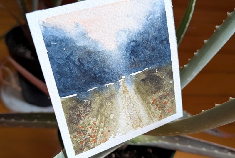
4. The 1st Layer: So for our next chapter, we're going to concentrate
on building up that first layer for
all of our paintings. Now I'm taking
some yellow ochre, mixing it with some indigo
so that I can get a green. And then I'm going to
gradually darken this up. So I've put in quite
a bit of indigo. I'm going to take
quite a section of the yellow ochre until
we've got a nice, rich green, adding in
more indigo to darken it. Now we're going to
try and get some big bold shapes in now. So you can see I'm sticking with the large round brush and
I'm sweeping that color in diagonally left
and right so that I can leave the suggestion of a little path or a lane
in that center section. We're going to concentrate
on those values and the shapes for these
paintings, not on the detail. So here I've gone quite blue in the background so that I
can suggest some distance, but also a real statement
in the distance, as well. So just using the
side of my brush, just wiggling it around
so that I can get those nice big tree
shapes in the background. And then you can use the
tip so you can start to drop in some darker
paint at the bottom. You can lift it up to the top so that you're adding
tiny bits of foliage. But really, all we have here
is two, three, I suppose, with the little lane,
large shapes which are creating that landscape
without any detail already. So just adding a bit
more light red to the sky just to give it a
little bit more atmosphere. We've got the bulk of that
painting done now already. So we don't really need to
fiddle a huge amount with it. It already looks
like a landscape. So that's the purpose
of this class here that we can
paint these all at the same time using the
same colours to get that color harmony and just build up those shapes
with some big brushes. I've added some sepia in there just to get a different tone so it's
not completely flat. And then I've just
swiped out a bit of that paint in the center
with a clean damp brush. Then taking some
of my table salt, I can sprinkle that in right at the bottom of the painting
on the left and right. That should give us some
little blooms underneath. And all I've done here is just taken my number six round brush, a little bit more control, just so I can get
some darker sections up in the back of our trees. So just at the
bottom of the trees, but at a horizon line, and that just builds up a bit of contrast and shadow at
the back of the painting. So adding a touch more
indigo to change the tone. I can just darken that up
a little bit and add in a few little sections of paint just with the
small round brush. And now we can start to
leave that painting. So the salt's going to move
some of that paint around, it's going to create
some little blooms. So we can move to the
bottom right hand painting. And I've mixed up
quite a vibrant green, adding quite a bit
of yellow ochre. And still using the small
round brush number six, I can just randomly
put that in and leave a few dry areas of the
paper to get some whites. I'm then taking my dark mixture, which I used for the trees at the back of the first painting. And I can start to
put those in to give the suggestion
of some bushes, dropping that into the wet area. I'm trying to keep
this fairly dry paint. I'm not adding too much water now because I don't want
it to get too light. I want some nice contrast
here in this section. Now, I'm mixing up what's
left on my palette, checking whether my
paper is dry or not. It's still quite damp, so we should have
a little bit of soft diffusion here
with these trees. And I've mixed in
some indigo and a little bit of
the yellow ochre. And that gives us
quite a dark green. Then adding some
more of the indigo, that gives us much
darker bluy tone to it, and that gives us
our dark shadows at the bottom of that tree mass. So this is quite a
focal point here, this nice big
section of foliage. And I cleaned off my brush
just so that I could use the water to just softly
diffuse that bottom. As it comes into the
rest of the painting. So we've got some big shapes. We've got some big
contrast here already. And now I can add in
a different tone. So I'm using some brown, using the sepio with a
touch of the light red. And we can put in another
shape on that left hand side, just to give some
balance to the painting. I'm doing little
vertical sweeps, so vertical movements
with the small round, and that gives us a little bit of a pointy edge to this one. So it's not quite the same
shape as on the right. And then we can get smaller as we come into that
center section. Just effusing it
and blending it, lifting up some of the taller little sections to
give the impression of maybe some fir trees or a little mountain with
some trees on it. But still, try not to
get into the detail. This is just our first layer. We'll get to the
second layer and the details in a short while. But at the moment, it's
building up those shapes, making sure I'm using the
same colors for each of the paintings and getting that contrasting with
the dark sections. So just darkening up the bottom of that tree on the
right hand side, using a touch more indigo, using that dark mixture
that's left on my palette. And I can just use
the tip to get some little sections
at the top, as well. Now I've put some extra
water on my brush, and I'm just pulling
up that paint just so it looks a little bit lighter
and not quite so stripy. And as though it's sort of a little bit misty going
into the distance. A. Pulling out a few sections of paint with my
damp clean brush just to give it a little bit
more texture and movement. And now we can take
just a little bit more indigo and just put that in right at the bottom of that tree on the
right hand side, and then use the tip to
give the suggestion of some little trunks or some little little branches
right at the bottom. Nothing specific,
nothing detailed. Just the suggestion
of a landscape with the shapes of the landscape
and the tones and the values. So now I've got
some yellow ochre, just to warm up the
painting a little bit. And I can just move
that and pull it around just in the center and the
midground of the painting. Taking my little piece of card. You could use a palette
knife or a craft knife. I'm just pulling up some
little sections of paints, trying to get some white
of the paper underneath, just to give some movement
and some texture. A few little swipes, just pulling at that paint. And then we can put in a few
little trunks and branches, pulling it up through that dark tree on
the right hand side. And then the paints
because it's very wet, should bleed into those
little cut sections and give us some little lines. So I'm mixing up another brown
here with some light red, some sepia and a little
touch of indigo. And I'm just going to create a little bit more movement on the left hand side a
little bit more sepia, so a bit darker and just
dropping that painting randomly. And then with a
clean damp brush, I can just soften
it and blend it a little bit more into
the other background. And that's most of that
painting finished. I'm just building up the darks a tiny bit more on the
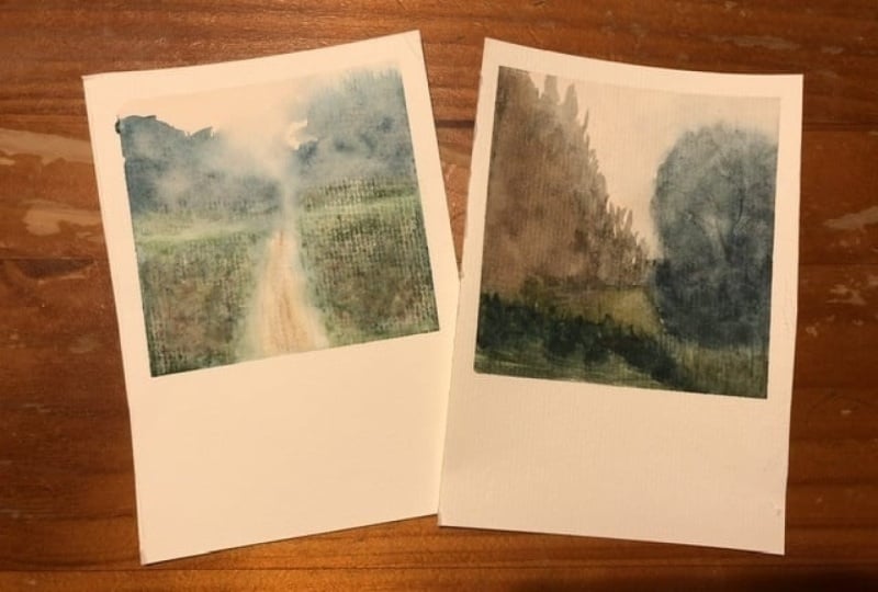
right hand side. And then we can move over to the left hand bottom painting. So I'm using the green that's
still left on my palette. So this will be a mixture, a light watery mixture of the indigo and the yellow ochre. And I'm just randomly putting
that into the bottom. I'm not sure what this
painting's gonna be yet, but we'll see as
we go through it, so here I've got a light gray with some bluish tones
in it from the indigo, and that's just what was left on my palette with a
bit of extra water. And we can put in
the background, something that's misty and looks like some
foliage at the back. Starting off quite light
with this painting, but it did get very
dark towards the end. I'm using the three
quarter inch flat brush, and I'm just wetting the
whole of that paper. Nice even strokes,
horizontal left, right. And I'm going to go for a bit of a wet and wet
technique for this. So this is all nice and wet. And we're going to
start dropping in some paint and get
some diffusion. We've got quite a
lot of hard lines and some quite strong shapes
in the other paintings. And for this one, I wanted to go for a bit of a softer feel, which is why I wet the
paper so that we could work very misty and diffused. And I'm just putting in a
few different grays here. This one has a bit of a brown
tone to it with the sepia, and I'm running my brush up so that we've got some misty
fir trees in the background. Then going a touch darker, I can start to build up a
bit of a shape underneath. I make that smaller slightly as we come over to
the left hand side. And then I will darken
this up, as well. So just running
that thick paint, that darker paint up into
our trees at the back. Adding a little bit more,
going a little bit higher. And then getting a
little bit smaller down on the left hand side. So now I'm adding some more of the indigo to this mixture
it was quite brown. So I've added in a little bit of indigo to give it
a different tone. It was still quite similar, so I've gone for
some more indigo. And I'm just popping in that paint slightly thicker and darker on the
right hand side, a little bit thinner and
lighter on the left hand side. So we're getting some
shapes here now. Taking some of the yellow
ochre, nice and vibrant. And we can start
to drop that into the green area at the
bottom of the painting. So with these
minimalist paintings, we want quite a
bit of atmosphere. So sometimes a little bit misty, a bit diffused like this one. But we also we don't want to be adding in
the detail to it. We just want to be dropping in the colors and the tones and the values and then seeing what emerges and then
working with that. So here I'm dropping in some light reds just with
the tip of the brush. And then I decided the color didn't really go with
the other two paintings. So I blended it all in
with the yellow ochre, and that gave me a few
little light red tones. And then I swept out
some of the paints with my clean damp brush just to get a few
highlights in there. So I decided to leave
that painting so that it could fully dry.
It was very wet. It was all diffusing an
awful lot into each other. So I decided to leave it for now and move on to
the last painting. And here I've got a gray
that's on my palette, has a few little
blue tones to it, so it looks like it's
in the distance. And I'm using the
side of my brush, just a dry brush to get
that shape in there. Taking some more indigo, I can bring that in as well, coming down towards the bottom, and then give it a little
bit of a line underneath. So we've got the suggestion of a horizon line at the bottom. Mixing some of the yellow
ochre into that indigo, that gives me a
really dark green. And that gives us our
shadows and our movement. So this painting is probably
the quickest one that I did. I don't know if I got into the swing of it after
doing three others. But I found that this
one was super fast, and probably the one
that I like the most. So I've got some light
red, some yellow ochre, and I've just dry brushed
that in from the side, leaving lots of
white of the paper. Taking some sepia, I've put in a few little lines to give the suggestion of
maybe a plowed field. And then mixing some indigo
into that brown mixture. I can go really quite dark. And I can get some foliage and some bushes further
forwards into the painting. Getting a little bit smaller
over to the right hand side, and then a few just sit back a little bit on
the right hand side. And that's most of
this painting done. There isn't an awful lot
left to it, to be honest. It was a very simple one. So a little bit more darks, and we can put those in the
bottom of our trees back. And in a little while
when this has dried, we can put a few more
greens in there to get a little bit more tonal
values and colors, et cetera in the background. I'm adding some light red to the brown so that I can sweep in a few more of those sort of lines
for the plowed field. And now we can dry off our first layer so that we can get started on the details.
5. The 2nd Layer & Details: So now that our paintings
are completely dry, we can start to add
in our second layer, which includes our details. And this should bring
all of the paintings together and finish
them off quite nicely. So just using the
number six round, I'm just accentuating that little lane on the
first painting, dry brushing some brown
paint into there. And I'm just brushing
off the salt that was left over from our first layer, and we've got an awful
lot of blooms there. So I probably should have waited a little bit before I put the salt in. But that's fine. We can cover up a few of those just with some
other different colors. So I'm just accentuating the lines down the
side of the lane, putting in a little
bit of paint, and then softening it with
just a clean damp brush. And then I'm dropping in
a few little sections of vibrant light red, which has got some
of the yellow ochre, and then just dabbing it with
my tissue to soften them. Taking a little bit
more of that sort of greeny, orangy mixture. I can just start to run
that across over the top of where those blooms were just to dampen them down slightly. And then switching to
the large round brush, I can go down to
the bottom painting and sweep in some of our sepia. Then taking another
dark green mixture, indigo and yellow ochre. We've got a really dark green, and we can add in
some more contrast to this very soft
diffused painting. So I needed to wait for this to completely dry before I could
put anything coals on it. It was so wet and everything was just softening so so quickly. So I'm using the
large rounds just to get some really dark bold shapes in with some little
tiny little dabs with my point of my
brush at the top. I'm varying the tone by
putting in some more of the indigo to make it even
darker towards the bottom. And then I can sweep it to make a little bit of a bit of
a line, a bit of a hill. And then what we'll do is
on that left hand side, to make it look like it's
receding into the distance, I can pull it off with
a clean damp brush and just soften that area. So it looks like it's going
a little bit lighter, going a little bit off in the distance on the
left hand side. Then taking my brush,
without any paints, I can pull some of that dark
paint across underneath. Pull that into our sepia area, and that gives us some
little tiny shadows underneath without a hard line. And then I've switched
to the zero rigor brush, so we're getting
quite small now. Lots of detail. I'm
going to add in a few little fir trees in the background behind
this mass of trees. And I'm just very
lightly running my liner brush with the same dark mixture
up into the sky area. Now, these fir trees are
not going to be exact. We want it to be a loose
minimalist painting. So I'm just wiggling my brush
from side to side really randomly to get
those suggestions of the little fir trees behind. Making sure that some
are a little bit darker, some are a little bit lighter, and that gives us our
depth and our distance. And then a few very
little light small ones as we come up on the
right hand side. So I've taken my craft
knife and I can start to pull that through that rich
dark paint at the bottom, just to give the suggestions of some branches and some
trunks of the trees. Just be quite light.
Quite a light touch. And then I've gone back to
the number six round brush. And I'm just really
gently sweeping some of that paint again into
that sepia area. So that there's
some color harmony between those two sections. We've got a little bit of indigo over the top of the sepia. So now I've taken
indigo and light red. I'm going really dark, so really dark brown. And I'm using the
liner brush again. And we can put in a few
little branches and trunks into this foliage section on the right hand painting. That few little details that
kind of bring the painting together and accentuate it
make it more like a landscape. But we're not doing any big
changes now at this point. This second layer is all about the details and building up
a little bit more contrast. So we're working wet on dry, and I'm using some of
the dark mixture just to accentuate the darkness of those bushes in the foreground. And then I can use
the liner just to flick up a few little
sections as well. And that just gives
us a little bit of foliage and a bit of texture. But that painting on the right on the bottom is now finished. I'm now carrying on with
the liner brush and doing the same movements on
the left hand side, just pulling a few
little dark sections of paint at the bottom
of those trees, bringing them into the
foreground so that it looks all like part of a landscape rather than two just
distinct shapes. Then darkening up the bottom of our bushes in the top
right hand painting, a little bit more contrast. And then accentuating
those lines that we had as though we've got
a little plowed field. Then taking some more
of the light red, a little bit of water
to loosen it up. This is very vibrant,
very bright. And we're going to put
in some little flowers just in the foreground of
our top left painting. So just randomly dotting these in with the tip
of the liner brush. And then what we'll do
is clean off the brush, and I'll soften the background. So the flowers that
are at the back, I can soften those to make
them a little bit more blood, so they look like they're
a little bit further back. And then the same on
the left hand side. And then later on,
we'll just add a little bit of green
as well over the top. So switching to the
number six round, I've got quite a
dark green here from the indigo and the yellow ochre. And I'm just putting that
into the foregrounds just to give it a little
bit more contrast in that foreground area. Then a little touch
of yellow ochre. And we can put that
into our little lane, just a couple of swipes of the brush and then soften
it with the damp brush. And then you can accentuate
that little section, that little bit in the
middle of the lane, as well. So taking the craft knife and putting some highlights
into that bottom left painting so that we're
just scratching through that top layer of paint to
give the white underneath. So give those little sparkles and brushing off all
the little bits. And then putting a
stronger lighter line on that left hand side
underneath our misty trees. A little bit of texture in the dark section on the
right hand painting. Then we can pull up a
few little branches in the trees on the left. And then the final touch for this top right hand painting was a little bit of
a green mixture, just to dampen down that blue and that gray
in the background. And I've finally taken
just a damp brush, and then I can pull out some of that paint with the tissue.
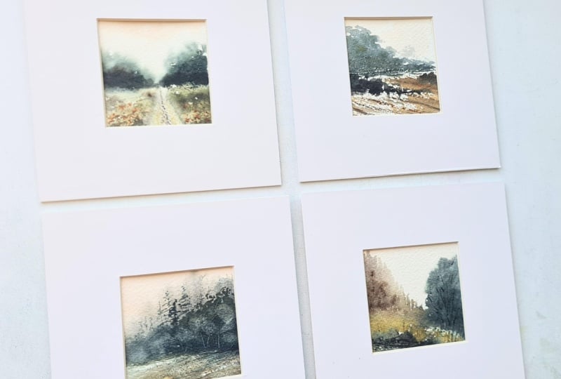
6. Course Outro: And those are our
paintings finished. So that's our project
done for the class. Here they are in all
their little mini glory. They're so tiny. And you can really see that even though there's
no real details, they are very loose, but they are
recognizably landscapes. So as long as you've got some
really nice contrast and tones and values in there and you've got
some nice big shapes, they will look like a landscape, and I think they
look quite effective when they're such a small size. And you can then add them together so that you've
got a nice collection. You can frame them
all together so that you have one big
mount with them all in, or you can just mount them individually and frame
them separately. So these mounts have a four centimeter
border around them. So it does make them quite a
statement with these mounts, and I do cut them myself. So if you'd like to
see a tutorial on cutting your own mounts, let
me know in the comments. I'd be happy to do one of those. And those are our
paintings finished. So I hope you found
the course useful. I really enjoyed painting these and then
explaining my process. And thank you very
much for watching. I'll see you very soon when I do another course and in the
meantime, have fun painting.
 Candice Small, Watercolourist