Transcripts
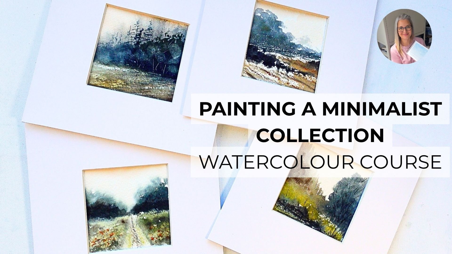
1. Minimalist Watercolour Introduction: Hello, and welcome
to today's course, which is five quite
minimalist paintings in watercolor. So I'm Candice. I'm a watercolor artist based here in the UK in
Worcestershire. I live in Droitwich Spa, which is such a
pretty little town, and it's really close
to the Cotswolds and lots of areas of
real rural beauty. So I love painting landscapes, and I would say that my
style is quite expressive, quite loose, always using large brushes and a
limited palette of paints. So today's class, I'll be
showing you how to paint five mini landscapes
using watercolor paints, and we're going to be
quite loose with them and not get too bogged down in
the detail of the paintings. So we're going to be using some limited palettes
of colors, three, four, maximum, some quite
large brushes, considering our paintings
are only 5 " by 5 ". And we're going to
really focus on keeping a nice minimalistic feel to our landscapes without
being too detailed. Okay. So in the next section, we're going to run through the paintings that we're
going to be doing. And then after that, the
following one will be materials on everything you're
going to need to get started for today's course. Okay, see you in
the next lesson.
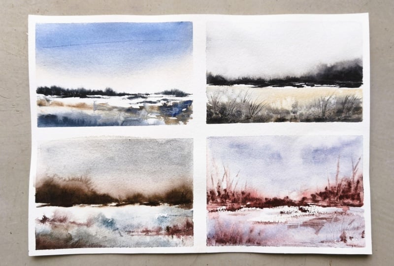
2. Minimalist Course Information: So these are the paintings we're going to be doing in our class. They're all five by 5 ". Obviously on cold press paper, and I'll talk through the
supplies in just a moment. But what you can
do is when you're doing a very small
sort of minimalist, quite loose abstract landscape, if you put a mount
over the top of it, it really gives it that focus, and I think it looks
quite effective. So this mount I have is
the inside is four by 4 ". The outside is eight by eight. So it's got two inch
border on each side. And I think it just gives it
a really nice, modern feel, especially when you're
doing these types of loose, sometimes quite
abstract landscapes. So the idea of this tutorial
is to make sure that we're using some
limited palette paints. So just a few colors, either three colors
or four colors, depending on which of the
paintings we're doing. And we'll go through that for
each class before we start. Now, with the limited palettes, we don't want to
muddy our colors, so that's why I tend to use just a few colors and then just try and mix
two together at a time. Sometimes three, just depending on what kind of tone I need. And but always limited palette, and that's my style of painting. So I've tried to keep
these quite loose. This summary one here, where we've got some nice
pretty flowers in the bottom, and I've used some spattering. There is a little more
detail because we've got the fir trees and those
trees in the background, but these can still be
painted quite loosely, just with the number
six round brush and then a small liner. But generally, we want to
keep it nice and loose, nice sweeping motions
with our brush, trying to use quite
large brushes, and also using the side
of the brush to get this dry brush effect
where we keep underneath that light and that lighter colors shining through
on the top layers. So misty trees in
the background. I'm a big fan of misty trees, so I'll be showing
you how to do those. And these top three
have all used that same technique with our misty trees in
the background. So dropping that paint
into the wet area of the sky and then just running a damp brush along it to get
those bleeds to come up. So we're gonna be quite loose, quite expressive with
our brush strokes. We're going to be
doing mark making with our palette knife. So I've got a Windsoring
Newton palette knife. Again, I'll go through these
supplies in just a moment, and we'll use some salt, as well so we get some
nice little blooms. Okay, so that's just a little
overview of the course. And let's get started
on the next lesson, which is going to be the
supplies that you'll need. So the paints, brushes, paper, et cetera. Okay. See you in the next lesson.
3. Minimalist Course Materials: Hello. Welcome to
the third lesson, where we're going to talk about the materials that you'll need today for all of the paintings
we're going to be doing. So first of all, paper. So my preferred paper is
Ash Cool Press, 300 GSM. And I usually buy in sheets
which come in a loose pad, and then you can cut
them down to size. Or sometimes I will buy the
full sheets from somewhere like Jackson's art here in the UK and then also cut them
down using the gillotin. So the piece of paper
you'll need today will be five by
five inch squares, and we'll use these with just a small
amount of washy tape. To attach them
down to our table. So you don't need a board. You don't need to have the
paintings tilted for this. You can just have them
completely flat on your table, and then just some
ordinary washy tape, and that should
hold it down with a very small border.
So that's our paper. Brushes very important. So we're going to
be using mainly this three quarter inch flat
brush. This is synthetic. I've got a Jackson saro brand, but you can use any brand. Anything that you feel comfortable using
is absolutely fine. So the flat brush is great for getting those nice, big, loose, expressive brush strokes, keeping it all very nice and minimalist without
getting too fussy. Then we're also going to use a medium flat brush.
This is a number ten. A number zero liner brush, which has a really
nice point to it. So we'll be using that
for small grasses, stalks, any little tiny details. So more towards the
end of the paintings when we're just doing those
little finishing touches. Then we have a number
six round brush, and I'm using a silver brush, but you can use, again, whichever you have, whichever
you feel comfortable with. One of the paintings, I
use a squirrel brush, a squirrel mop, because it has a really nice belly
to it nice and wide. You can get a really nice, wide section of paint
onto your paper. But then you also have the tip, which makes it really
multifunctional. Then I also have a
number eight fan brush. And we'll be using
this for doing some spatter in one
of our paintings. So getting quite creative, spattering that paint on. So it all looks quite
random and quite loose. And then the two materials, sorry, I should say, three
that we're going to use. We're going to use
a palette knife to scratch out some texture, a little craft knife to
get some highlights, pulling it through the
paints once it's dried. And then also some
ordinary table salt in a little bowl which we're
going to sprinkle onto our painting when the
paint is nice and wet. And that should give us some
really pretty little blooms. So then paints for
today's paintings. So for all five, you will
need some of these colors. So some of the colors
we will be using for more than one painting,
such as Pains Gray, we'll be using that
quite a lot and also the sepia and
the yellow ochre. So we're going to be
using those quite a bit. And then we're also going
to use a couple of yellows, so Cadman yellow
and naples yellow, some French ultramarine, some burnt sienna
and some raw sienna. Some French
vermilion, which is a really nice, bright,
orangy color. I really like that one
and some raw umber. So for each of the lessons, I will mention at the start
of the lesson which paints you're going to
be using for that class to do that painting, and also which brushes
you need to be using as well to have
them ready to hand, ready to go and
start painting with. And then you're all
important two water pots. One for clean water,
one for dirty. Okay. So I hope you
enjoy the paintings. We're going to get
started on the first one, which is going to
be the lovely blues and we're going to
be really loose and abstract with
this first one. So let's get started. I'll see you in the next lesson.
4. Project 1 Blue Abstract Landscape: So here we are with
our first project, which is our lovely blues painting quite abstract,
very minimalist. And we're using three colors, ultramarine blue, raw
umber and Pains gray. And the two brushes
we're using are three quarter inch flat brush and number ten flat
brush, as well. So just two brushes
and three colors. Now, I've separated my paper probably around
roughly halfway down. I've wet the top section. And I've put in a really, really light wash of raw
umber to begin with, while I'm wetting that paper. And then I'm taking a very
slightly richer mixture, still very watery
and adding that in a few sweeps lower
down in the sky. So taking a still three
quarter inch flat brush, and we're going in with
the ultramarine blue, and we're just
starting at the top of our painting and then just very gently starting
to sweep that down. Now, the sky area should be nice and wet because
we've already pre wet it. And that'll diffuse nicely. And because we're
not really trying to work it into that raw rumbo, we shouldn't get
any green tones. So just a nice,
sweepy, loose sky. Darker at the top,
and then coming down with feathery sections
down into the bottom. So that's our skydon
nice and easy. So still with our
large flat brush, we're taking a really rich
mixture of Pain's gray. Now, you can use pan
paints for this. But I would suggest that
just for this line, you try and use
some tube paints, so you've got that really
nice, rich consistency. So just putting in
a really rough, broken line with the
tip of the flat brush, that started to diffuse
into the sky area, and then taking some damp
clean water for our brush, just starting to really lightly
brush that along the top. And you can see those
little wispy bits as it bleeds up into
our wet sky area. Carrying on with our raw rumba, we're just taking, again, quite a watery
mixture and starting to sweep that in from
the right hand side, sometimes using the
tip of the brush, and then other times using
the belly of the brush to get that nice sideways
dry brush effect. You can be really
random with this. So just start dropping
in those colors. I've taken some of
the ultramarine blue, tiny bit of paints gray, and I've just
started to randomly drop that in mainly on
the right hand side. And the flat brush, especially the large flat
brush, is great for this. You can really drop that
into other paint sections, and it gives you some nice
bleeds, some nice diffusions. And then taking some
darker richer paints, just start to also drop
that in. Quite randomly. So this is expressive
watercolor. We're not trying to
paint anything exactly, and your painting will probably turn out slightly different, but with the same kind
of feel, hopefully. So I dropped in a
little bit more of the ultramarine at the
top, just using the tip. And now I've gone back
to the raw rumba, still with a little bit of the ultramarine on my brush to give a different tone and just
started to wiggle that around, using the tip and the side, little horizontal
sideways movements so that we get that
overall almost, I suppose, almost a
stripy feel to it, but with some soft
effusions, as well. A little bit of a little bit
of clean water on my brush, so it's damp and
just softening up those lines at the back so
they don't look quite so hard. Then cleaning off my
brush completely. I'm just swiping away some of that paint at the bottom
section of the painting, and that should give
it a nice sort of soft layer with just a tiny
bit of color underneath. And then still just using
the tip of my brush, not with any paints, just moving that paint around that's already
on our paper. A little bit more pains gray, dropping that into some
sections at the back, making sure that we leave
some really nice light, white bits of paper underneath. Cause that gives the painting
more of a light feel to it, more of an overall glow. And then just still
carrying on with that same mixture on
the left hand side. Going back in for some
more rich paints gray. I'm sweeping that
down at the bottom of our painting, nice and rich, and then just softening it with a little bit of clean
water on my brush, but try not to add too
much water at this stage, and then darkening
it up at the bottom. So that was all very quick and most of our painting
is now done. So you can be really quick and really expressive with
your minimalist paintings. Just try not to overthink it. Drop that painting, add it
into different sections. I'm adding a little
bit more rich, paint's gray, just so
we've got those values, so those dark areas. And then switching to
my number ten flat. I'm just going to put in just a few little highlights now. So the painting is dry. I've completely dried it off. And I'm just adding in a
little bit more color. So this is a very rich mixture. I haven't added very
much water at all, and I'm just dropping
that in just in some whiter sections and some gray sections just to give it a little
bit more color. You can also use the tip
of your finger like I am just to give it a
little smudge afterwards, and that stops you from
having too many hard lines. So we've got a mixture of
dry brush, soft effusion. And you can just brush that in with the tip of your finger. So a little bit more of the
pan's gray and I'm just popping that in by
where we added that extra color just so we've got some nice contrast against it. Wiggling it around and again giving it
another little sludge. So you can be very
abstract with this. Just pick your three colors, try not to mix them
together too much, so you have a really nice a nice bright color
that isn't muddied. And just keep on dropping those limited palette colors in. You can also take a little step back sometimes,
have a look at it, have a think about
where you want to add a little bit more contrast or where you want to leave
those light sections. So I deliberately haven't touched the area in the
center of the painting. I want that to stay quite light. And then also that sort of
mimics the light in the sky, as well, just above
our misty trees. Taking some more paints
gray on my brush. I've just dry brush that into the bottom area
of the painting. And then taking a craft knife, I'm just going to
get some highlights. So just very gently so that
you don't tear the paper. Just very lightly scratch away some of that paint
on the top of the paper. And those give you
some highlights. So you can do that
in the darker areas where you've got some
more of your paints gray. I'm doing it in the background underneath our misty trees. And that just gives us
some nice highlights. And there's the
finished painting very abstract, very minimalist, three colors and
just two brushes, and we'll move on to
our second project.
5. Project 2 Autumn Field Landscape: So this is our autumn field with a little lane
running through it, and the colors that
we're going to be using are yellow ochre, sepia and Pains gray. I'm just taking a ruler
just so that I can roughly put in a horizon line around two thirds
of the way down. And the brushes
we're going to be using are the three
quarter inch flat, a six round, a medium flat, which is number ten,
and a zero liner brush. So I've used my
three quarter inch flat brush to completely wet the sky area so that we
have a nice bit of diffusion, some nice soft light. But the sky isn't going to be the main focal point for this. It's going to be the landscape. So taking our yellow
ochre, I'm just very, very lightly running that
just above our horizon line. A little bit more in the
center and at the bottom, just so we have a
nice overall glow, which is going to
match the colors that are going to be
in our foreground. Taking a little bit more
of the yellow ochre. I'm just using the tip, so the end of the flat brush
to get a little bit more in that center area and running
it all the way across. And then cleaning off my brush, so it's just swiping away any paint that has run
down a little bit. So I'm taking my
paints gray now, very, very light watery mixture, and I'm just going to sweep
that into the top section of the sky and just bring it down slightly
on the left and right, trying to keep that
nice light feel to it. We're not going to
overwork our sky at all. We're going to keep it
nice and minimalist, just a tiny bit of
extra paint at the top. And then again, softening
it as we bring it down, not putting any extra
paint onto our brush. Now, taking just a little bit more because I decided
I wanted it to be graduated so that it really highlighted that light section as we came down to
the horizon line. So as our paper is nice and wet, it is all diffusing
softly into each other. And we didn't need to tilt
the board or anything. We can just keep it taped down to our table with
our washy tape. And then just very lightly softening it as
we bring it down. Nice, smooth, even
sweeps of the brush, which is great with
the flat brush. Then switching to my
number six silver brush, this is a round brush. It's got a lovely point to it. And I've mixed in
some sepia into that pains gray that we
already had on our palette. I'm using a palette, a ceramic palette because I like to squeeze
out tube paints. But you don't need to do this. You can use whichever
palette you have or use pan paints.
That's absolutely fine. So I've got quite a rich
sort of greeny color. Because I've mixed in the
Sepio with the pain's gray, and cause the pain's grays
got some blue tones to it, it will turn it green. Now, I'm using the tip and the belly of the brush
to put these in, and they should diffuse nicely into that wet sky area behind. So it'll give us that
sense of distance, that sort of misty feel to it. Just taking different sections, adding it in, making sure I keep it nice and straight
along our horizon line. And then having it sort
of about two thirds of the way across the page, having a little dip in those trees because that's where our lane is going to come
up and meet the horizon. So taking some of
our yellow ochre, adding a touch of Paine's
gray into it so that we have lighter green colour with a little bit
more yellow ochre. I'm just going to
start to drop that into those already wet
trees at the back. This just adds a
different tone to the trees so that they don't all look like
one solid color. It gives a little
bit of variety. Then taking my number
ten flat brush, I've wet it, added a tiny, tiny little bit of
Paine's gray to it, and I've just swept it underneath
our trees at the back. Now, this will start
to bleed down into it, so we don't have a hard
line where our trees start. We will have it
diffusing and softening as the paint comes down into
that other wet section. And this is really
great for doing minimalist paintings because
you don't have hard lines. There's not too much detail. So I'm taking some
of the pains gray, a very watery mixture, and I'm starting to sweep
that in for our underlayers. Now, I wanted quite a lot of light and different
tones in this painting. I didn't want it to all
just be green and yellow. So I did an underpainting
of Paine's gray. You don't have to be
very exact with this. You can have a little bit
darker at the bottom. Just get those nice big
expressive brush strokes in with that large flat brush, sweeping it across, using
the belly of the brush. And then taking a little bit
more on the left hand side, just so it looks a
little bit more even. And then in a moment,
what we'll do is we'll clean off our
brush completely, and we'll just start to sweep
that down and that gives us the suggestion of
our little lane because we don't want
the bright white of the paper underneath. We want there to be a
little bit of color there, and we also don't
want hard lines at the edges of our lane. So we don't really want to
draw them in or paint them. And just using a big sweep of the flat brush really
just gives it a nice, graduated look to it so it gets larger as it comes down to
the bottom of the painting. And it's an effective
way of adding in a little lane
or a little path. So now I'm taking Paine's
gray with yellow ochre. So we're having quite a
rich dark green mixture, and I'm going to start to sweep that in over our top layers. So left to right, right to left, keeping
it nice and horizontal. It doesn't matter if it goes
over the edges of where our little lane is going to be because we can
clean that off. It's just to get some color in over the top of
that pains gray. And then I've got a clean, fairly clean damp brush, and I'm just sweeping that down. So taking some of
the yellow ochre, I'm putting that in at
the back of the painting. So underneath our misty trees, nice horizontal
movements, again, using more of the tip so that
we keep it nice and level at our horizon line and
then just bringing it down. Neatening up the sides
of our little lane. But because it's all wet, because it's all diffusing into each other,
it's softening up. So it's a nice, loose, soft lane without too much
detail or any hardness to it. So again, a clean damp brush. And you can just neaten that up by running your brush down. So I've dried off the painting. I've switched to my
number six round brush. And what we're going
to do is put in a little bit of
texture onto our lane. So I've added in some sepia
into the yellow ochre, and I'm going to dry
brush some texture up, just gently sweeping the side of the brush up the center
of our little lane. Still keeping it very loose. So we're not painting
any detail here, taking a little bit more so that it's a little bit
darker in the center, and then a few tiny
little sweeps to give the suggestion of texture further down right
in the foreground. And a tiny bit more sepia, just to darken it up just
in that center section. You can give it a little
smudge with your finger, and that softens it
up so it doesn't look too hard and
too much contrast. And then taking some
of that green mixture we use for the trees, you can also dry brush that in as well in tiny little sections. So very loose. It's just giving the impression
of that lane, and you want to make sure
that it's just getting smaller as it recedes
into the distance. So I've switched to my zero liner brush because
we're going to put in just a few little
details to finish off the painting. We've
done most of it. Another quick one. So I do love these little
mini landscapes. And I've taken a
very dark mixture of Pain's gray and some of the
green and some of the sepia. And I'm just flicking
that line of brush so that we've
got the suggestion of some grass and some
foliage on the sides of our lane and also right in
the foreground, as well. And that should lead the
eye up into the painting. So a little bit more on
the right hand side, just varying the angle
of those little stalks. And just be very gentle
with the liner brush. These are just your
fine little details. They don't need to
be overthought. You can just randomly
flick your brush around varying with the colors that you're using
sometimes dark. I'll switch to the yellow
ochre in a minute. And then that'll give us
some little highlights. So I'm just using a
slightly lighter mixture there as we go up into the distance and getting smaller as we run it along
the side of our lane. But these long liner brushes, they're absolutely great for doing little bits of foliage, great for landscape painting. So I'm using a bit more
of the yellow ochre there just for some little finishing
touches down the sides. And then I've got quite
a dry mixture now, and I'm putting in some
horizontal marks in the distance. So a richer, darker paint. And that just gives a little
bit of added texture. But the overall painting
was quite quick. It kept it very soft and loose, and it all diffuses
nicely into each other. Those fine or little
details just really finish off the painting, but
don't add too many. Don't fiddle too
much at the end. And I've just put in
a few little darks, doing the same motion, and then switching back to
my number six round brush. I'm going to add in a little bit more contrast in
that background. So we've got our
lovely misty trees that are going
into the distance, and then just in front of them, I'm using some rich sepia. Just using the tip of
the brush and putting in a smaller little row of trees
or bushes in front of that. Once you've got the
main shape of it, you can then just clean off your brush so it's damp
and then just soften them up slightly so that they don't look like they've
got too much of a hard line that
might look a little bit out of place in
our loose landscape. So just softening
up those edges. And I think they added an
extra bit of contrast. They led your eye up
into the distance quite nicely and framed a little lane on
either side as well. And that's the
painting finished. So I'll show you how it looks. So here's the final painting. So a nice English
countryside landscape, and we've kept it very soft, very diffused, nice
and loose with just a few little details at the ends just to bring
the painting together. Okay, let's get ready
for our next project.
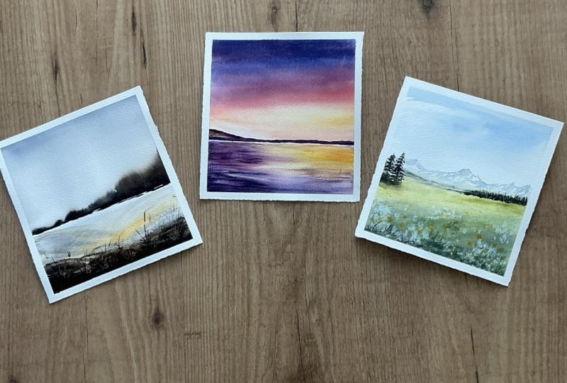
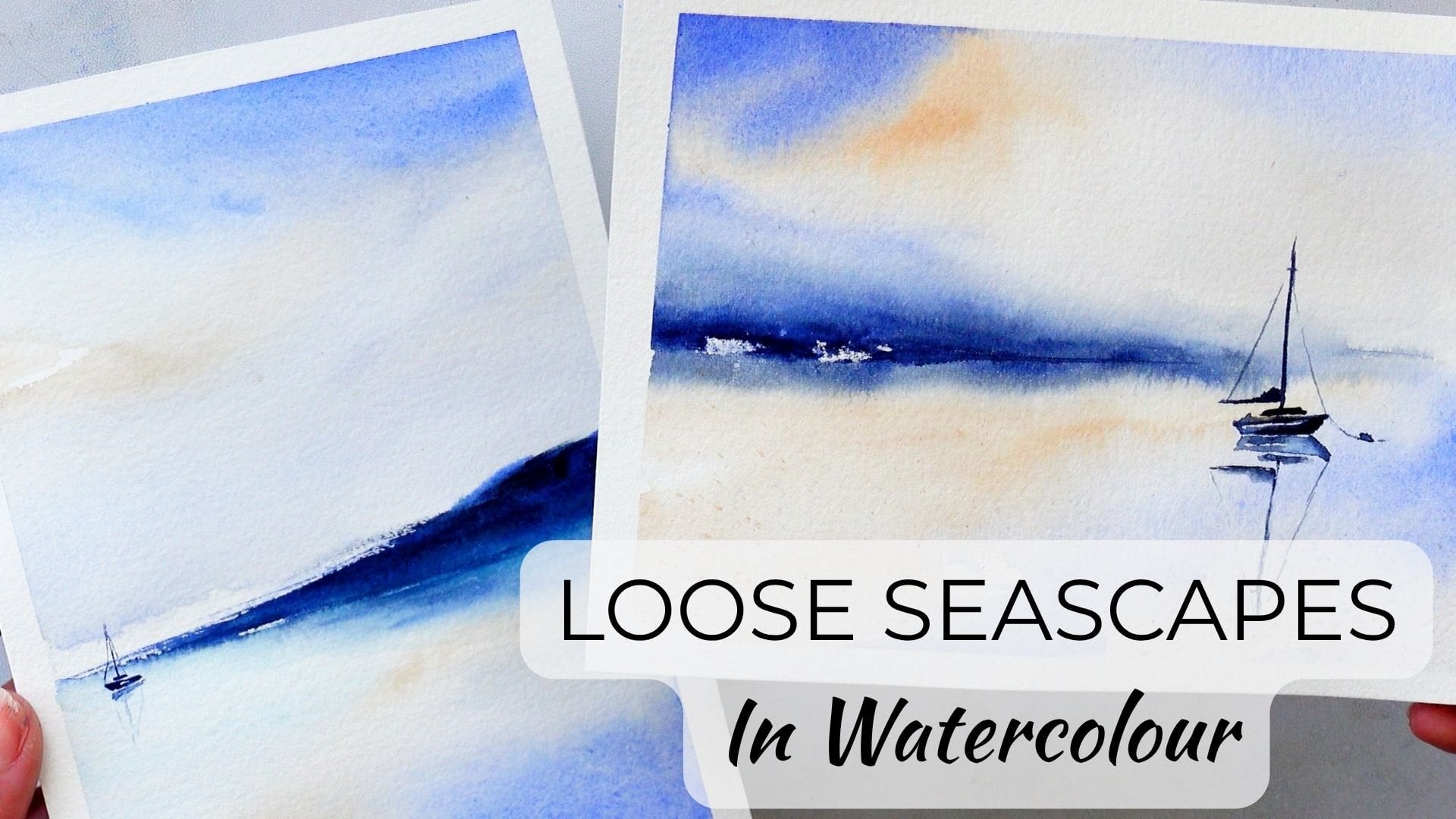
6. Project 3 Sunset Seascape: Welcome to the third project. So this is our sunset scene. We're going to be using
ultramarine blue, naples yellow, and
French vermilion. Although you can use any
vermilion or bright reds, Alizarin crimson, quinone red, anything like that will
work absolutely fine. So the brushes we're going
to be using again are a three quarter inch flat and
a number ten flat brush. So I've put a horizon line about one third up
into the painting, fully wet the sky area
with some clean water. And I'm just using
the large flat brush to sweep in some cadmium yellow. Oh, sorry. I should say,
some naples yellow. So we're going to be putting in a really nicely diffused sunset, and this is going to be a
really minimalist sunset ski, it seem with hardly
anything going on and just focusing on the colors and the diffusion between them. So sweeping in some of
the French vermilion I'm adding just a little
bit of water to my tube paints just
to loosen them up. And again, you can use
pan paints for these. You don't need to
use tube paint. So cleaning off most of
the paint from my brush, I'm just sweeping it across so that it all gently blends
in with each other. And then adding a touch
more of the yellow on the right hand side with a little bit of that
vermilion catching into it. So taking some of
the ultramarine, mixing that into the vermilion, and this gives us a
really rich purple. I haven't mixed it too well, so we've still got
some nice tones of blue in there as well. And just glide it
across that paper, so it just blends nicely and doesn't leave
any sort of streaks. Any streaks that you do find
should diffuse anyway into the wet paints and just adding a touch more of the
darker purple into the top, and that should run down. So taking some very
clean water on my brush, starting
at the bottom, and I'm gently sweeping that up horizontal movements
from left to right, and that just blends it
all in nicely together. So that's our skidon. So again, taking
some of excuse me, taking some cadmium yellow, putting that into the sea area. Little bit richer on
the right hand side. Again, very smooth
movements with the brush. Try to be nice and gentle. If you're finding that you're not being quite loose with
how you're holding it, try and hold the brush
further up towards the end, and that should give you a
little bit more movement. I've taken a bit of that purple and swept it in on
the left hand side, and then taking an even
darker mixture with more blue and putting
that into the bottom, smoothing it out as I go. So the idea here is to just have little gentle
bits of color, pulling out a little bit of that paint with a
clean damp brush, and that gives us some texture and some difference in the sea rather than it
being flat and smooth. So it's just sweeping out a
little bit of that paint. So we've got some white showing. And then just smoothing it
along our horizon line. So taking a little bit
more of a vermilion, I'm adding that into
the purple mixture to give it a little bit more
of a ready touch to it, and then adding a little touch
of the ultramarine again. And I'm going to
start putting in just a really rough sort of almost hills in
the background. Now what I'll do is
I'll just drop in different colors of
paint into this, so a little bit more red, a little bit more of the yellow and try not to blend
it all in together. So you want these differences in the tones to shine
through that section. And a little bit later, we'll
darken that up, as well. So just using the
number ten flat brush, so a little bit smaller now, but just being very smooth along our horizon line and just
some gentle little sweeps, just to get that little
bit of color in. The flat brush is great for this because you
can use the tip. It's got a nice
chisel head to it, so it gives you a
nice flat surface. Then separating out my brush, so the bristles are all
nice and separated, really dry mixture of paint. And I'm going to dry brush some blue over the
top of our sea area. So this gives us a
nice dry brush effect. So we've got some
of the other colors underneath shining through. A little bit more of
the aubergine color, so with a little bit
more of the vermilion, and again, doing the same, a little bit further up
and then bringing it down. So you should have
a little bit of paint that's nice and smooth, and then you should also
get some dry brush, little bit of texture on
that cold press paper. So taking mostly
yellow with a touch of the vermilion in it and sweeping that in from
the right hand side. And then this just mimics
the sky a little bit more, so it creates a bit of harmony. And then just very
gently smoothing it out. I'm not adding any water here. This is just using my damp
brush just to smooth it. Then taking my craft knife. And without using a roller, I'm just free handing this along underneath our
heels at the back. And this just gives an
extra flash of light. So being careful not to
tear the paper, keeping it. Keeping it quite a light touch. Then a little bit
more ultramarine with a vermilion and a little
touch of yellow, as well. A little bit too much blue. Keep mixing, keep mixing. And so we've got a really
nice, dark, rich color. So it's almost gray now, so we've added a little
bit more yellow. So we've got a gray that's got a few sort of
purple tones to it, and then just add this
along the horizon line. This creates a contrast between the light that we've
scratched out underneath. And then it makes that light pop a little bit more
in the landscape. So this is very loose,
very minimalist, still just using three colors, two brushes, and just keeping it a really
simple composition. And then creating a tiny, tiny little reflection
underneath where our heels are. So still using the same mixture, but with hardly any
paint on the brush. And you can just
sweep that across. So it all stays quite smooth. We can see the different
tones of color in the painting shining
through between those layers and with a nice
bit of light in the sky from where we've put our
naples yellow. And all done?
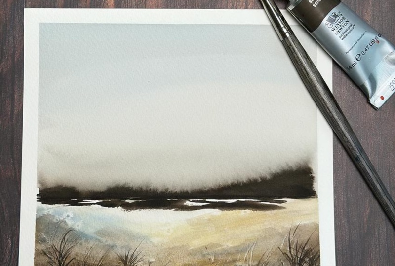
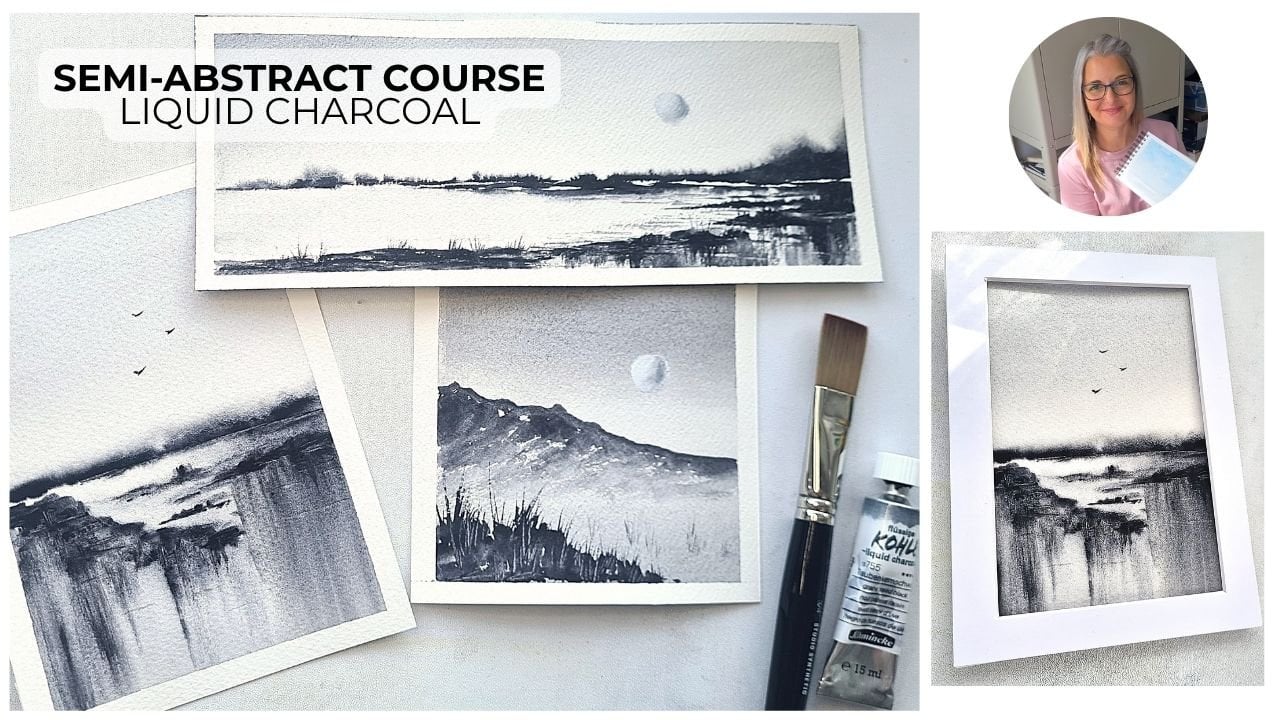
7. Project 4 Winter Minimalist Landscape: So here we are for
project number four, and this is going to be
a nice winter landscape. So it's got a lot of sepia pains gray and then touch of
yellow ochre in it. And I'm going again going to be using my number ten medium flat, along with my three quarter
inch and also a zero liner. Taking the number
ten flat brush, I'm taking a very rich mixture of sepia with a
tiny touch of pains gray and I'm putting in a broken line a little bit thicker on
the right hand side. Taking some clean water, lots of it on my
large flat brush. I'm then just running
that along the top of our Pains gray and
our CPA mixture. So as you can see,
it's starting to bleed up already into the
sky with that water. And then we're just
going to keep running it across nice smooth movement
from left to right, and you can see it
bleeding up into the sky. Adding lots more water now. This is okay if it's got
a touch of sepia in it, that's absolutely
fine, but it just stops us from having
a tide mark above. So taking some more
sepia, this time, a little bit looser, so adding a bit more water to our
tube consistency paint. Tube is always best for doing these kind of misty trees just because it's
richer, it's looser. And just dab that
painting along your line, and then it'll bloom
and it'll bleed. And it just gives us a really nice misty diffuse background without painting any
detail for the trees. So just keep dabbing that painting, getting some movement. You can dab it both
at the bottom, and then also at the top, if you want to lift it
up a little bit more. We want it to be slightly
higher on the right hand side, so just allow the water
to do that work for you. Few more little dabs. And then taking my
large flat brush again with some
more clean water, I'm running that
along the top again. And you can see how it's really flowing up
into that water. So just smoothing it out again so we don't
have any lines or any tide marks and just blend that up into
the rest of the sky area. So make sure it's not streaky. And you can really see
those bleeds coming up, especially on the
right hand side. So switching back to
the smaller flat brush, I'm now doing exactly
the same again, adding in some more paint, and just watching it move, making sure that
it's nice and dark because we want an awful
lot of contrast here. This is going to be probably our main focal point along with a tiny little bit of
detail in our foreground. So again, with the flat brush, and I've started at the
top and then worked my way down and you can see how that's
all smoothed out nicely without those little tendrils
going up into the sky. So taking a really light mixture of the paint's gray with
a touch of the sepia, I'm adding that into the
top of our sky area. And this just adds a little
bit more atmosphere to the painting and a bit of
variation in color, as well. So you can keep on
moving that paint, but don't overwork it. So we don't want it to start
drying and get streaky. Let the water that's on the paper diffuse it and blend it and keep
it nice and smooth. So taking clean
water on my brush. It's got a touch of Paine's gray still in it, and that's fine. And just randomly wet
that foreground area. Take a little touch
of the yellow ochre and start to brush that in
from the right hand side, and then wiggle it
around left to right, just to get some
color on the page. This is expressive watercolor. We're not trying
to paint anything. We're just getting the colors
in and then we'll build up the contrast and have
a little bit of texture. So separating out the
bristles of my flat brush, the brush is only very
slightly damp with a touch of the pines
gray still on the brush. And I'm just sweeping that
in from the right hand side. It's okay that you've
got the separated lines. We're going to take a tissue, and we're going to break
that up so that we've got some texture underneath
our other layers. It looks a little bit ugly. It's the ugly phase. And then just with
that same amount of paint still on my brush, I can start to wiggle that around and do some nice
sweeping movements with it. Using the side of the brush, making sure there's
not too much paint or too much water on it. And we've got a nice
mixture of colors there with some sepia and a little
bit of the pain's gray. So again, a little bit
darker now, pure sepia. Just brush that brush. Use the flat brush, use its large head and
its large bristles, just to sweep on that color. So take in some table salt, fine grains, and I'm just putting these
in the foreground, so you can dot these around in the bottom area
of your painting, where the paint is now
still very wet and thick. And that will give
us some nice blooms. So that should all
have dried now. So if you dry it off and then
brush off all of the salt, you can see those little
speckles of white, which look quite pretty. And I'm taking some sepia
and I'm just putting that over the top of it just so it's not too overpowering. We want those little blooms, but we want them to be
quite dotted around, and then taking a little
bit darker mixture, using the tip, very
dry consistency, not very much water at all, and just roughly brush that
into your foreground area. You can also use the corner. When there's not an awful lot of paint left on your brush, you can just smooth it out. You can wiggle it around,
use the corner of the brush, and then just a little bit
more right at the bottom. And that gives us
some nice contrast against the light that's left in the center
of the painting underneath our misty trees. A few little brushes in from
the left and the right. These can be diagonal. Make sure you're
dry brushing it, so you're catching on that
texture of the paper. And then using my palette knife, we're just going
to scratch through some little grasses in that rich dark paint
that we've just put in. And that will show the white of the paper coming through
from underneath. I don't use white
gouache very often. I find that you can
actually use things like palette knives and craft knives
to get that same effect. As long as your paint is still wet, it's
still quite rich. And then taking a number
two liner, sorry, number zero liner.
I do apologize. Taking a zero liner with the same really dark mixture of sepio with a touch
of Pain's gray. And you can just flick
that really gently to get some more dark
grassies over the top. Be quite random with these
marks and then just make them a little bit smaller as you come back into that middle
of the painting. So it looks like they're
going off into the distance. So now this is just
the finishing touch. Taking a very watery mixture
of pains gray and sepia. I've just roughly put that into the very bottom
of the painting. And I think this gives
quite a nice framing because we've got
a little bit of that pains gray at the top of the sky and then that dark and that texture
at the bottom, with our nice misty trees again, which are so simple to do. They're brilliant for a
nice minimalist painting with not a lot of detail.
8. Project 5 Summers Meadow: And here we are for our
final project, number five. So this is kind of
a summer's meadow in front of some very
distant mountains. And I'm using some cobalt blue, cadmin yellow, burns,
and raw sienna. And these are all
Windsor and Newton paints with a medium
squirrel brush, a six round, a zero rigor, and an eight fan brush. And I haven't wet
the paper first. All I've done is
swept in some very, very watery cobalt blue into the sky just to get a
splash of color in there. Then I've wet some of the
meadow in the foreground, and I'm mixing up
some cobalt blue with some cadmium yellow for
quite a dark green color. And this will be right
in our foreground, sweeping it diagonally
quite loosely, so not always
pressing very hard, so we've got a little
bit of dry brush there, and then having
almost some stripes as we come down into the hill. Then adding some
more of our cadmium yellow to that mixture. Tiny bit more cobalt, then lots of cadmium yellow because I wanted it to
be nice and vibrant. And we're going to put this in starting on the right hand side, and then sweeping
over to the left. So using the tip to begin
with on that right hand side, and then using the
side of the brush, just dry brushing gear across, and then dragging
that paint down. So the idea is to
be quite loose, leave some dry patches, some clear white
patches of paint, but just have those different tones so it looks a little bit more vibrant as though the sun was catching
on that section. And then that little bit
on the right hand side, that's a bit of meadow
that's in shade, and that'll be by our
trees in the distance. So adding a little bit
more blue to the mixture, I've just added that on top of the foreground area just to give a few other little tones, and then taking some table salt, I'm just dotting that in in the foreground and that will
be the start of our meadow. So we should get some
nice white blooms. Taking my number
six round brush. I'm having a watery
mixture of cobalt blue, then add a little bit of burnt
sienna into your mixture. And this is going to
be just the start of our mountains in the distance that sky area should be dry now. Just really roughly put in some distant mountains
with the tip of the brush. And then all we're going to do is just using the
side of the brush, just sweeping some
shadows loosely on the left hand sides of
some of those mountain peaks. There's no detail
involved in this. Just be really loose
with your brush work, sweep in those colour
those bits of color. And because we've got a bit
of a blue cast to them, they should look like
they're in the distance, and they're quite snowy. Then you can use
the tip just to add a few tiny little details. And that's it for our
mountains. Super is they. Taking some burnt sienna, I'm mixing up a very
dark brown mixture of the cobalt blue
with the burnt sienna. And this gives us a
really rich dark, which isn't like lamp
black or pins gray. It's got some of the tones
in it, which is nice. Starting off at the bottom
in our bright section, we're just going to put a
rough trunk in to begin with. And then using the
tip of the brush, starting off at the
very top without very much paint because we
don't want it to get blobby. We can just start to
wiggle it from side to side in very random
brush strokes. So we don't want it
to be symmetrical. We want different branches
on the left to the right, and make sure
you're putting some branches in the center as well as though they're coming out towards us from the trunk. And that makes it look a
little bit more believable. So just keep wiggling your
brush and then making those branches larger as they
come down to the bottom. Then taking a little bit
more of our green mixture, which has a little
touch of brown in it. We're going to sweep in a bit of a shadow on the left hand side. So as though we've got the
sun coming in from the right. And then taking a
little bit more dark, we're going to put up a
smaller fir tree just on the left hand side of it in exactly the same way
as the first one. So wiggling that brush, keeping it very light, really light touch and
not a lot of paints. That's the trick to it and make sure it's not symmetrical. So you want some wonky branches. So I've cleaned off my brush, and I'm just swiping
off a little bit of that paint because it
looked a little bit dark. There was almost too
much shadow under there. I'm just sweeping off a little
bit more of that paint. Now we're taking quite a
bluey mixture of green. So there's an awful lot
of cobalt blue in this. And what we're going to
do is start to put in some trees on the right hand
side, but set further back. So there won't be any detail
at all in these trees. We're just going
to use the brush, starting at the bottom of
where the trees will be, just pulling that paint up, so we've almost got a little line and then a
very light touch at the top, so we have a little point to it. And then getting smaller on the left hand side as though they're receding
into the distance. Then taking some of our
darker browner mixture, which we used for
the other fir trees. We're also going to add that
in as well over the top. So we've got a
mixture of different values and tones here, which gives a bit more
interest to these trees. Remember to be quite
loose with your brush. I am actually holding it
quite close to the brush end, but you can hold it a
little bit further back, and it gives you a little bit more freedom with
your brush movement. Don't give it the death grip. Don't hold on too tight to it. And then taking just a
little bit more dark. I'm just going to add that in to the bottom of those trees as though it's got
a bit of a shadow, and it's a bit darker
at their bases. So now my painting
is completely dry. I've wiped off all of the salt that was on the
foreground of our painting, and I've just placed a
couple of small pieces of paper over the
rest of the painting. So we're going to spatter
with this fan brush, and we're going to use a
nice bright cadmium yellow. So just getting quite
a watery mixture, I'm just knocking my
brushes together and spattering some nice bright
yellow into our meadow. Um then taking a
little bit more, a little bit thicker this time, a little bit richer, and then carrying on with
that spattering. Then adding some
of our raw sienna. So this gives you
a little bit of a darker, browner color. And then we're also
going to spatter this over the top, as well. And you can just see it's adding some nice smaller effects
towards the back of our meadow. And then you can also dip
into the paint and use your finger to just flick the end of your
brush to get some larger, more directional
spatters as well. So using the zero liner, I'm taking some of the
dark green mixture that we used for our trees. And I'm just flicking it to get some nice little grasses in
there in the foreground. So it looks like we've
got the stalks of some flowers and also
a little bit grass, just adding a tiny
bit of detail. So this painting does have a little bit more detail than
some of my other projects. But I think it needed
it, to be honest, in order to give that nice overall landscape of
a bit of a meadow, the mountains, and the trees. Then using my line of brush still with really
rich cadmin yellow, I'm just putting in some little blobs right in the foreground, so we've got some larger
yellow flowers there as well. These can be really random. Just use the tip of the
brush just to dot them in. And because we've got those
small spatters behind, it looks like they're going
back into the distance, taking a tiny bit of the green, still using the line of brush, and just wiggling that darker green around in that foreground, right at the bottom
of the painting. And I think that's
pretty much done. Just a few little darks just at the bottom of our
trees in the background, just to add a little
bit more contrast, and then dragging
that paint up with my number six round brush so that we've still
got the sort of jagged line at the top with
the impression of some trees, and then softening it with a little bit of clean
water underneath. And there's the
finished painting, so nice quick meadow, nice and loose with
a few details.
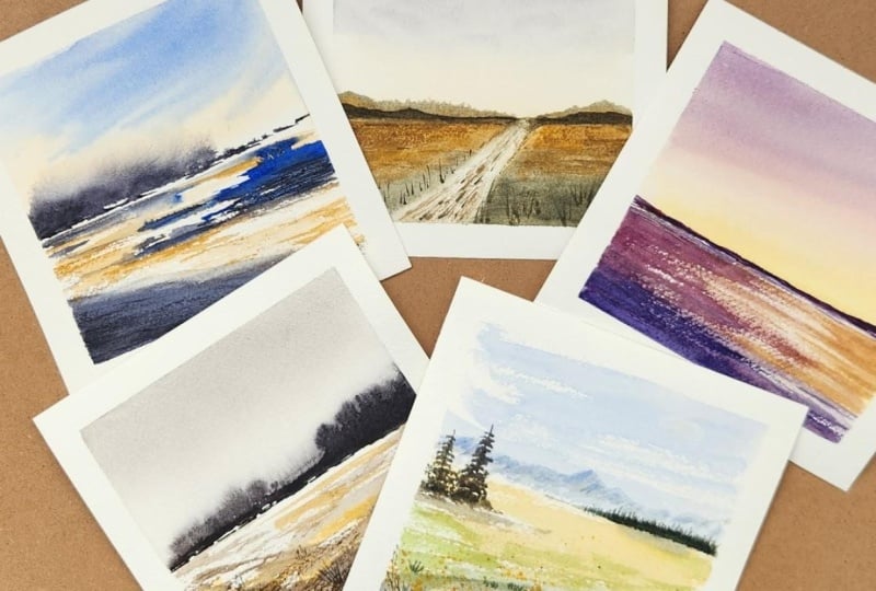
9. Minimalist Course Outro: Here are all our paintings
for the end of the course. So I hope you enjoyed that little five mini
landscape course. I hope it's given you some ideas of how you can paint quite minimally using some
loose brush strokes, some expressive brushstrokes. And you really don't need
to use a lot of colors. So try not to muddy your colors by using too many at one time. Keep your painting
nice and fresh. Use two or three, four maximum. And just make sure
that you're using some nice large brushes, so the three quarter inch
flat brush works great. And just keep it
all nice and loose. So add water, diffuse areas, wiggle your liner brush around. Just keep it nice
and fresh and loose, and don't try and overwork it. Okay, thank you very
much for watching. It's been a pleasure having you. I hope you enjoyed the course, and I'll try and add
some more courses very, very soon. Okay, bye for now.
 Candice Small, Watercolourist