Transcripts
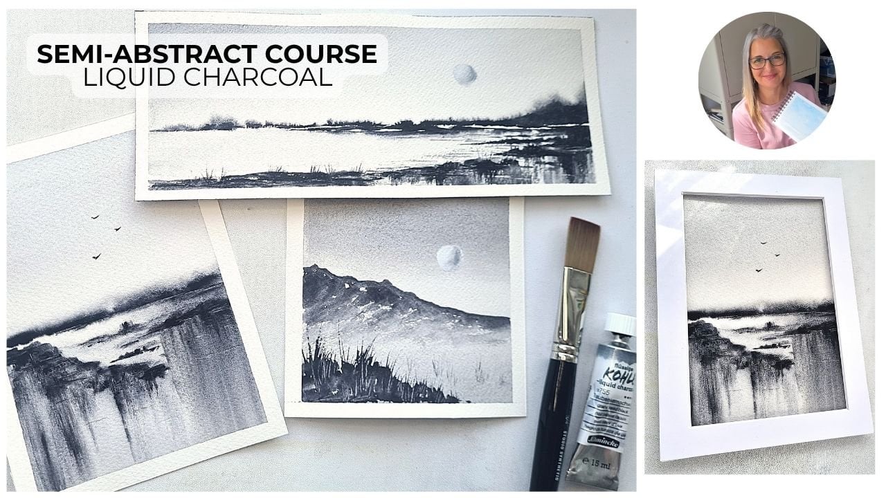
1. Course Introduction: Hello, and welcome to this minimalist seascape
class here on Skillshare. I'm Candice, a watercolor
artist from the UK. And today, I'm going to be
showing you how to paint two very loose and
minimalistic seascapes using the same colours, and we're just going to be
quite expressive and let that water flow to create the scene rather than
adding too much detail. So for our project,
we're going to have two finished seascapes, both with little boats added
in as detail at the end. And this class is perfect for beginners and intermediate
artists who want to paint a little bit more loosely in
watercolor and try and get that water and that
paint mingling on the paper without trying
to control it too much. Okay, so let's get started
with the materials, and I'll see you
in the next class.
2. Materials: Men. So let's go through the materials
that you'll need for your two
projects today. I'm using Ach cold press paper. That's my preferred brand, but any 100% cotton paper
will be absolutely fine. This is cold press, so it's got a little bit
of texture to it, rather than hot press, so you can get some dry
brushing and quite a bit of nice catching on that
texture of the paper. So you'll need 25 by seven
inch pieces of paper, which I use a pad, and then I cut it down to size. And then for our paints today, I'm using all
Windsor and Newton. So we've got some paints gray. Some ultramarine blue,
some burnt sienna, and some turquoise light. We're going to be using all of these colors for
our two paintings, and we're going to use more of the turquoise light for
our second project. I'll also be using this
small ceramic palette, which I have from Medan. I'll be squeezing
out my tube paints and then dipping into them and mixing them on the palette. But you can use pan
paints as well. That would work absolutely fine. In terms of brushes, I'll mainly be using this
number five mop brush by Artwa. And this has got a
really nice belly to it, so it can get lots of
water and paint on it. And then it also comes to a nice point as well for
a little bit of detail. Then we'll also be
using a line of brush. This is a number zero. Any line of brush or even a rigor
brush would work fine. And then just a few others. So a large round brush, any size, this is a number 14, but you can use any
size a very small, synthetic flat brush, just for pulling out a
little bit of paint, just for a few
highlights and ripples. And then finally, a fine detail brush for
our second project, where we're going to be doing
a teeny, tiny little boat. So the liner brush is just a
little bit too big for that. This is a Danci three
slash zero, so very tiny. Right, so those are
all our materials, and we'll get started
on our first project.
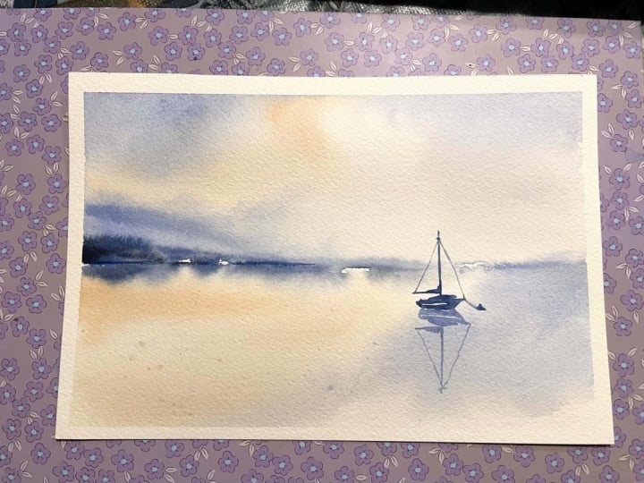
3. Project 1: Hello, welcome to
the first project. So I have my five by seven
piece of wash paper, and I've got it taped
down to my table, so it's flat, and it's just got some washy tape to hold it down in place and give it
a bit of a border. You could use masking
tape for this. I'm taking some clean water on my quill brush,
on my mop brush, and I'm putting just
a bit of water just roughly in the top and the
bottom of the painting, and then leaving that
center section dry. I've got all of my paints
laid out on my palette, and we can start off
with the burnt umber, nice and watery and light, and we're just going
to start to really roughly put this into
that water section. So at the top left
and the bottom left, that's where we're going
to have a bit of a glow with this burnt umber
coming through. Because it's watercolor, it's going to dry nice and light. So this will just give
us a bit of warmth. You can be quite random, so just use the side of your quill brush just
to drop that painting. Then taking some of our
French ultramarine. This is a little bit thicker, not quite so much water, and we can start to sweep that in just in that top section
and then bottom, as well. So just doing the top of
the painting at the moment, and we're just roughly
sweeping that in. I keep cleaning my brush, adding a little bit
more water to it so that I can soften and blend. And your painting
it doesn't have to turn out exactly like this. So just start to drop in that paint and just get it to diffuse and mingle with
the water on your paper. So blending it a little bit
there with some clean water. It's all very wet at the
moment, so don't worry. You can add quite
a bit of water, and it will just soften nicely
without any cauliflowers. So here I'm taking some more of the ultramarine,
cleaning my brush, and then using that water on
the brush just to start to manipulate it and bring it
across the page or the paper. Taking a little bit more, and I can just drop that into that already wet
area with the blue, and then again, soften with
a little bit of clean water. So this is all just our
base layer at the moment. We're just getting
those colors in. And the beauty of watercolor is that the colors shine
through each other. So we should get some nice glow underneath from
those underlayers. So very rich mixture here of the Panes gray
and the ultramarine. And I can just use
the tip of the brush. So start to put it in a where that rough horizon
line is going to be. Be very loose with
your brush marks. So just little sweeps
left and right. We've got some little
areas of dry paper, so you can see we've
got the white there. So try and be quite light as you glide your brush
across the paper, and you will end
up with some nice little white
sections underneath. Then a little bit
of clean water, not too much, just to
blend and soften it. And this will give us the
impression of a landmass, but without painting it with a hard line and making
it too obvious. So just the suggestion of a little bit of a
promontory coming out. Then we can use the tip
with a little bit of dark, richer paint and just try and sort of accentuate a
few little sections. So here, I've got
a little bit of bleeding that I wasn't
very happy with. So I can take some
clean water on my brush just slightly damp, and I can just clear that away. So this is completely dry now, and I really like that
dry brush section there, those little white flecks. So I'm going to
try and accentuate those a little bit more. So just with the
zero line of brush, take your line of brush with quite a rich mixture
of the Paynes gray, the ultramarine
and just start to tap in some little dark sections in the center of our landmass. So your painting it probably won't look
exactly like this. So just try and pick out a little section that
looks a little bit interesting and try
and just highlight it. So get a few little dark, hard lines around it. And then you can use
your liner brush and just soften it with a bit of water so that it blends into the rest
of that blue section. But the idea here is
that we're not painting anything specifically because
it's loose and minimalist. We just want the suggestion
of something there. And if we can get those
really dark values in, then it makes the painting
come together a bit better. We need a little bit
of a focal point. We're obviously going to
have our boat, as well, but we want this to sort of stand out on the left hand
side of the painting. So taking a little bit more. And I'm going to start
to put in a little boat. So I haven't drawn this first. You can pause this and you can feel free to
sketch out the boat. But I find that it can look a little bit
looser and a bit more believable if you just really loosely start
to paint it in. So I'm using the line of brush still this boat's going
to be quite large. And I'm taking
that dark mixture, the same one that we just used. And I'm getting
that rough shaping. Just dropping that paint into
some sections of the boat. Try and leave some little
white areas as well. And then across the top
where the cabin would be, you can put a little
stripe of paint. It doesn't have to
be very detailed. It's just the suggestion of something going
on with the boat. So just a little stripe
of paint across the top. And then you can drop in
some slightly darker paint into some sections of the boat, just to give it a
little bit of contrast. A few little details. And already, it's starting
to look like a boat. I took a bit of
Burns umber and put that into that top section
just below with the cabin. And now I'm putting in a little sail tiny little movements with the line of brush. And then just glide it up very lightly to
give us our mask. Try not to put too much
pressure on the line of brush. Be very light with how you're holding it and so don't
grip it too hard. And just glide it up again just to thicken that mast up and then two very very light lines as we come up to the
top of that mast. So you can do this with a ruler. If you wanted a
really straight mask. You could use pencil just to
sketch the mask out first, and then you could
even still use the ruler with your
liner brush against it. So do whatever makes whatever
you feel comfortable with. Now, just painting the
reflection underneath, using a paler wash of a dark mixture with a
little bit more blue, so more of the ultramarine. And just try and get
an exact replica of the boat above it. So have your boat fainting
in the same direction. And again, just re light
touches with the liner brush. And then when we come down
back into the water section, we can put those ropes in with
a very light touch again. Try and make it a little bit lighter than the
actual boat itself. So switch to your
large round brush, take a little bit
of pale burn timber on your brush and just try and flick to get some spattering to the water area
of your painting. I've got a few little
touches in the sky, so you can use your
round brush with clean water and just dab
it out with the tissue. Taking some French ultramarine,
we can do the same, just flicking your round brush, and that's our
painting finished. So there's the finished piece. There isn't hardly any detail. All we've done is
drop some colors into that sky and
that sea area to give the suggestion of a
seascape and then just got a focal points with
the detail of the boat. So we'll move on to
our second project.
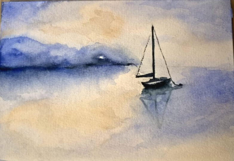
4. Project 2: So welcome to the
second project, where we're going to be
painting this in portrait. So another seascape using
exactly the same colors, but with the touch more of the turquoise light
in this painting. So again, I've got
some washy tape. I've taped down my piece
of paper to my table, and we're going to
start off again with our large quill brush. Again, we're going to keep a little section of white
paper in the center, so we can get a little
bit of dry brush there, hopefully, or just a few flecks of the white paper
coming through. So I'm dropping that
in really randomly, leaving some little white
areas of dry paper. Now, take some of
your turquoise light, very watery and start
to tap that into the top left hand corner
and then take some of the burnt umber and start
to bring that in underneath. You don't have to be very exact about your brush movements here. We're just trying to
get some colors in, so we're using all
the same colors. And we're going to
go in with some of the French ultramarine, using a lot of water. So because our paper is very wet because we've
already pre wet it. Again, it's all going to
diffuse quite nicely, and just keep cleaning off
your brush so that you can add extra clean water
and just soften up edges and just drop it in so
it mingles with each other. So just a damp brush here, blending that so that we
don't have any hard lines. And you can see I've got
my tissue in my left hand, so I use it an awful lot just to keep taking off any
excess water or paint. A little bit more ultramarine, so it's a little bit deeper, bit richer color in that
top right hand corner. But again, this is our
nice base layer for all our colors for the sky and
then the water underneath. So a little bit more
of the burnt umber. And we can get a little
bit more vibrant, a little bit more
clean water again, just to blend that in with
the other section underneath. So we're not painting
a specific sky here. We're just getting
a nice glow from the burnt umber and then
some nice blue tones with the ultramarine. And the mop brush
is great for this, these quill brushes because
they hold so much paint and water that you can just really soften and
blend as you go. So just a damp brush, just sweeping off
some of that paint. And then we can move down into the water underneath
and try and mimic it. So starting off with
the burnt umber, we did lose a lot of
that turquoise light. I seem to have covered it up quite a lot, but that's okay. So going in with the burnt
umber and again, clean water, just randomly dropping in those colors using nice
loose brush strokes. And getting some of
that ultramarine in there to match the sky area. More clean water,
tapping it on my tissue, and then just softening it all. A little touch more
at the bottom, just to make it a little
bit richer so it matches the sky and then some
more clean water just to soften all of those transitions
between the two colors. So taking some more of
the turquoise light. Just pop that in
underneath where you think your rough horizon
line is going to be. Then adding some of the pains
gray to the ultramarine. We're going very dark again. You can put in some turquoise
light as well, very thick, very dark, and just use the
side of your quill brush. So just very gently. So you're only just catching the paper with the
side of your brush, and then go down to the tip as you come across to the left. Taking all of the water and
the paint off my brush, I can just clean that
off a little bit underneath where we had
quite a few bleeds. So we've got the main body
of that shape in now, and you can now just soften it, add in a few more
swipes of paint, so a little bit richer here, taking some more of the blue, and you can see
that I'm just using very quick sharp
swipes of the brush, and then a little bit
softer here at the top. And then a tiny bit of
dry brush there just above as it catches on
that dry section of paper, going darker now to
get those values in and little sideway
swipes of the brush. Taking your very small
synthetic flat brush, damp and just swipe out a little bit of paints to give a little bit
of a ripple there. And then you can use
it nice and clean, just to do some
horizontal movements. So that's all
completely dry now. You've dried off your painting, hopefully, and we're ready
to add in some harder lines. So here I've taken the
synthetic flat brush again, just with a little bit of water, and I've just pulled that paint out and then use
my tissue to dab at it. And then we can switch
to the liner brush. I'm smudging those little lines with that dark paint
just to soften them. And now it's time
for our little boat. So taking your very small, fine detail brush, I'm
using three slash zero, but whichever one you
feel comfortable with, and we're going
to put in a tiny, tiny little boat on
that left hand side. So this is going to be
much less detailed. Just do a tiny little
boat shape at the bottom. Then we can put our
little cabon over the top again with a
little swipe of paint. And then I'm switching
to the liner brush to do the mast because I feel
more comfortable with it. But you can use whichever brush. You can use your fine
detail brush to do this, but just a very gentle
light movement. Again, for the ropes, as well. And then we can add
that reflection in under the water
underneath the boat. So this is very small, so it doesn't need to
have as much detail as the last boat for the
hour of the project. Just make sure it
matches quite nicely, and you're using very
nice light touches. And we're putting
this little boat in because it gives us a bit of a focal point on the left
hand side of the painting. We've got a lot of contrast on the right hand side
with that dark paint. And that boat just
gives us a little bit of something to look
at in the composition. Take a little bit of the
turquoise light with your round brush and just swipe that in for a little
bit of a pop of color. And then you can soften it underneath with a little
bit of clean water. And that's our painting finished
for our second project. So the little tiny
boat has given us a bit of a focal
point on the left. We've got some nice, dark, rich paint there for our values and still getting that
glow in the sky and the sea with the
burnt umber and then leaving those white
sections of paper, as well.
5. Course Completion: So these are our two paintings. I'm hoping that yours will
look very similar to this, but won't be exact replicas. So this should have
given you hopefully a good idea of how to just
drop in those colours, use a limited palette and get a very loose seascape without painting really hard
lines or hard edges. And they're getting
that little focal point with the boats in afterwards. So thank you ever so much for joining me here for this course. I hope you found it useful. And if you'd like
to join me over on Patron and Candy small Art, I'm always regularly bloding loose minimalist
landscape paintings. Bye for now.
 Candice Small, Watercolourist