Transcripts
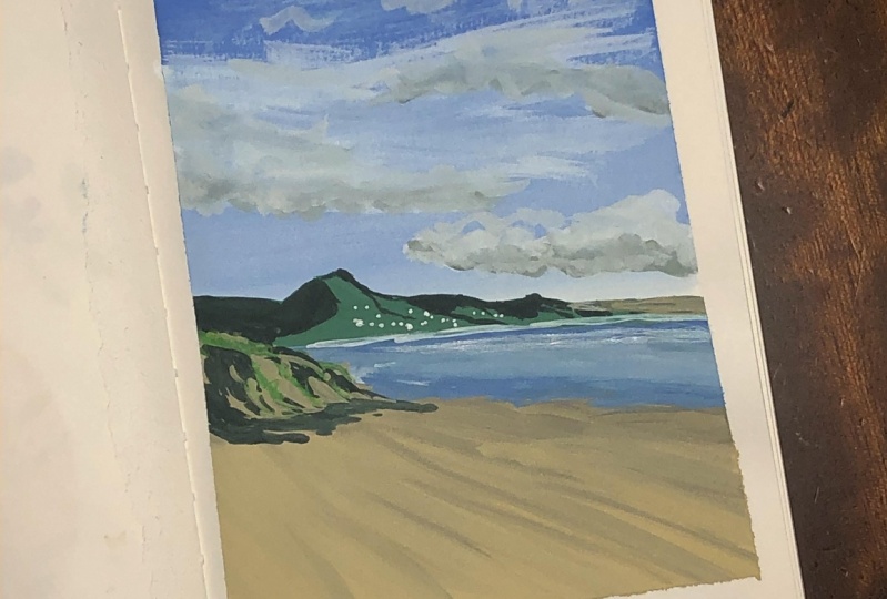
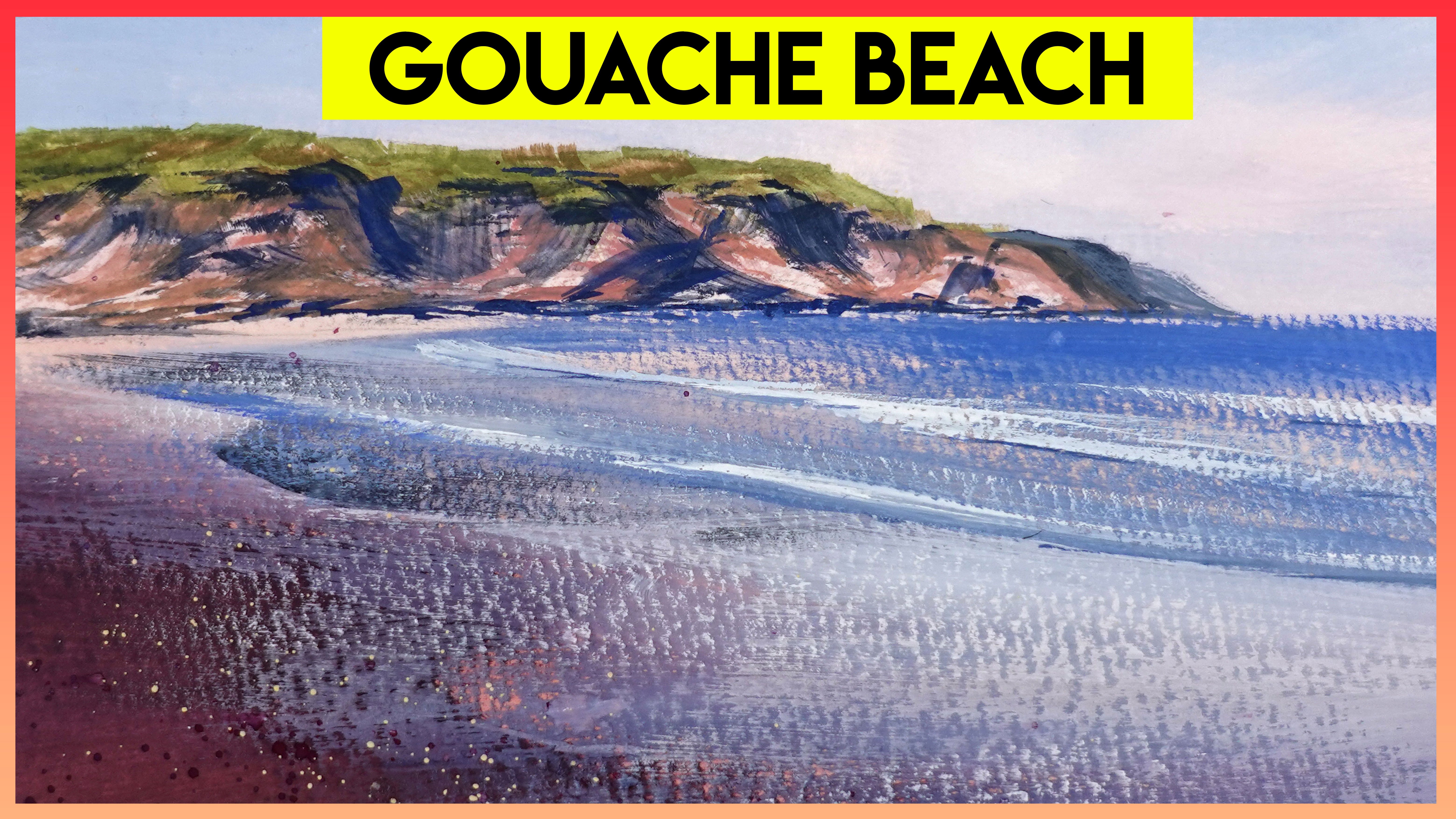
1. Introduction: Hi, I'm eating. I'm a South Pole at us from museum today will be creating a beautiful beach landscape Using wash fights, be creating a radiant layer invites blend it and using different consistencies of wash to achieve the desired if it you'll be able to use these same techniques that create your own landscapes in the future. Now this cost is and its students, who have had some experience with washing the pats, especially if you understand how wash and will work to give it. If you are beginning, however, I will be gone through the process. Sit by sit. So I do encourage you to give it a guard. Please remember to download the reference photo as they took this photo, especially for you for this class. So if you're interested in creating at their flicks of world around you and using a medium that is equally as vibrant as it is forgiving in place, give it a go. It's do this
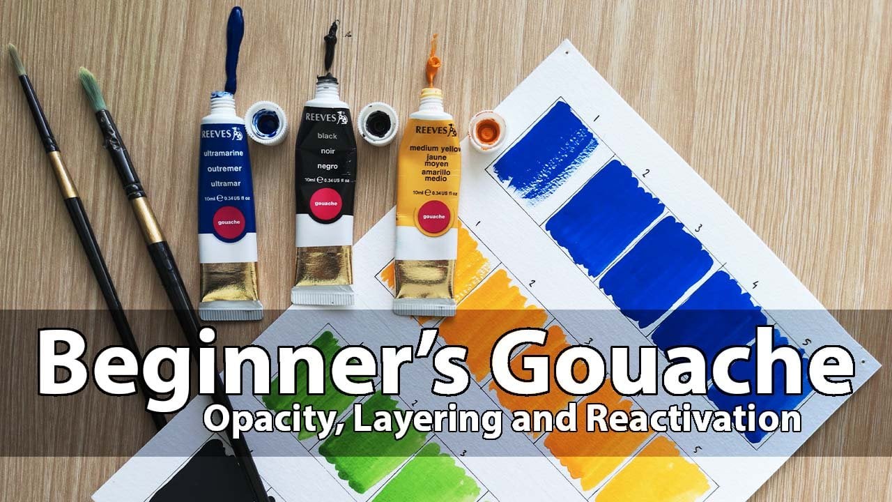
2. Apparatus: now. Firstly, you will need some watercolor paper with the GSC off 200 to 300. Personally, I use a 300 GSM paper when I can't as it's able to handle more water, I would definitely recommend using a 300 GSM paper, especially if you're a beginner. You will need a variety of round brushes on a range of sizes. Your own brushes will provide you with more accuracy and control in comparison to flat brushes. Mine range from a size 11 all the way to a double zero, which I use for smaller finishing details. I do sometimes use a flat brush. However, when painting the first layer off my background, you may like to do this to if you have one. Otherwise, a large round head brush will be fine for this. Also, for this painting I have chosen white black science magenta, lemon, yellow and yellow. OK, I have found that to complete any painting, you really only need a black white and your three primary based colors For this landscape painting. I have also included a yellow polka as it works beautifully with the white to create a sandy color. Although you may add more colors. Please remember that the more you stick to one choice of blue, red and yellow, the more cohesive your painting will look. You will need to containers off water. The first container will be to rent your brush and between colors. The second is to add to your paints to achieve the right consistency. After all, you don't want to be adding your dirty rinse water to your painting. I also use this plastic paint palette. I like that it has several wells of various sizes. If you do not have a pellet, you can use a ceramic plate or the lid off a plastic container. You will also need either a micro fiber cloth or some paper towels for controlling the amount off water on your brushes or drying them after rinsing. I like to keep a piece of scrap watercolor paper on hand to use to test that any colors that I mixed. This is particularly helpful. As with glass. You may find that light shades dry, DACA and dark shades dry, lighter. It may also be helpful to keep the slip with a few annotations as a reminder of what colors you used here. is an example of this. Although this particular painting was done in watercolor, it's the same principle. Lastly, please consider either using a ruler to give yourself a border or some painter's tape. I will be using a ruler to create a border with a one centimeter dicks. Once I have finished my painting, I will cut along the previously ruled lines with a paper Cata. This will allow my painting to reach the very edge of the page, but will make the paper a smaller than a four.
3. A Beginner's Tip: If you happen to make a mistake like this, don't panic. Use a clean debt brush and simply run it across the color That area should be. Be careful not to await your brush to match, especially if it's a section with multiple layers of paint. Otherwise, you may take off more pain than you'd hoped for.
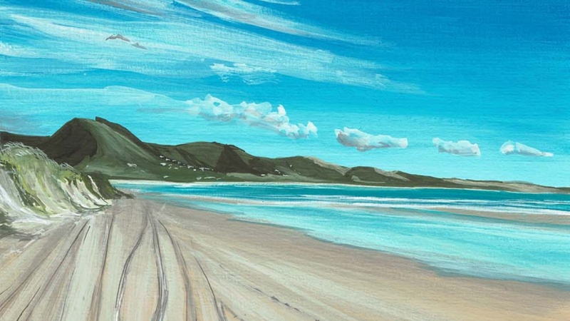
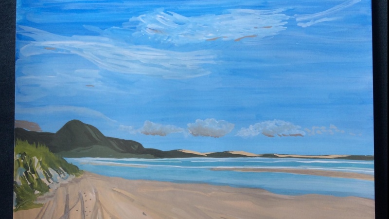
4. Sky and Horizon: makes your choice of blue quash with your water To create a thick, smooth consistency, you need enough paint mix to cover about half of your page. Cover the page with the mixed paint and long horizontal strokes. It's important to keep your brush damp but not dripping with. To encourage the smooth overlay of the paint. Paint your pencil marked horizon line in the separate well or space on your palate. Mix some white clash with water. The consistency should match that off your blue. However, you will not need quite as much painless time. Once mixed. Start in the middle of the page where your blue paint has ended and work your way up painting on top off the first layer. You may need to do this a couple of times until you're happy with the Grady int. I have kept my sky as little docket in comparison with the photo. It's up to you, whether you like this look or what do you want to drag the white up a little higher
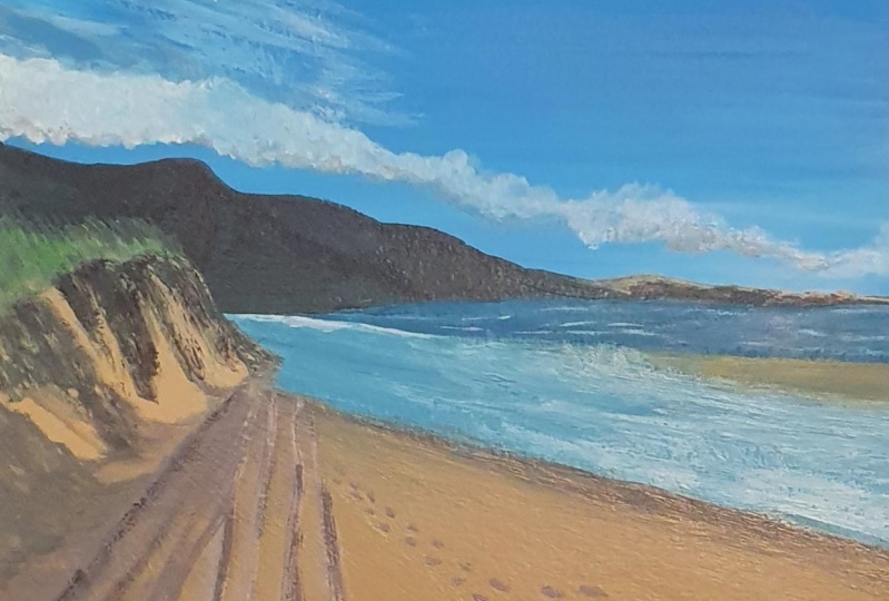
5. Below the Horizon: using the photo as a reference. Lightly mark with your pencil with the water comes down on a slight diagonal. I marked a couple of spots on the age with the waterline. Changes color to next at a little more blue. If you need to reactivate what's there with some water, add a little yellow to appellate and then to the blue mixture. Since we're done blocking in the skies color, we can now use this well for the ocean. Combine the blue and yellow little by little, until you end up with a dark blue green color for the top, but of the ocean closest to the horizon line. Wait in the ocean line, making it a little Feder than in the photo. For the lighter part of the ocean, water makes your white with a touch off the blue you don't need to. Over mix is color as strict of varying light. Blue shades will help make it look more realistic. This part of the water is reflecting sunlight, so all look very light in contrast to the top layer of the water way. Next, we need to block in the lower part of the painting with the sandy color. Using your scrap piece of paper, try mixing white, yellow Oka and a hint of black to get a sand color that you're happy with. This is just the base layer. We will be adding details, shadows and highlights to the sand later on again, you'll need to mix a fair amount of paint to cover the lower half of the paper and paint it in the same way as you painted the sky. You can use a large flat brush for this, but if you have one, the news of brush and stroke outward diagonally across the sand from the lift. Most point off the horizon. These lines help with perspective and for signaling your vanishing point. Next, light in the shade of it with your white and tentative with a tiny bit of black. Once you're happy with the color, draw the same diagonal lines again, this time with a round brush. I used size 11. You can tell if your brush feels to dry if it's that's dragging across the paper instead of gliding. If this happens, just dip your brush into your water to dampen it and continue marking the lines. Blending to your test. You may have noticed in the reference photo that the send peeks through the ocean. In between were the colors change. We'll be adding that now that the water section has dried. I used a round brush size three for this. But as mentioned earlier, light shades tend to dry. Dock it when using quash. If you're ocean has dried a little blacker than you wanted. Like mine. Feel free to add a little light to add shimmer. Keeping in mind that the water does look lighter to the right hand side of your page as opposed to the left. - No , but now we're hitting back into the sand color toe. Outline the shoreline at a little more black to your redeem. Expect and test it out on your scrap paper, then line up where the ocean meets the sand. Don't worry if this line comes out. A little truth. Next step is to blend it out with a clean debt brush. This will thin the line if it needs thinning. - I then used a plane. Want to add some wave details? You can use the photo reference again to better see with places. Uh,
6. Mountain and Cliff Side: using your blue and yellow OCA with a touch of black, start mixing a green, colorful your mountains. It's a good idea to use a very thin brush and outlined the shape of your mountains. Then use the color to block in the shape that you've drawn out. Don't stress if you're mountains. Don't look exactly like the reference photo. It is a reference. After all, - I use the same technique of using small brush toe outline the cliff on the left of the page. The color I used for this was our sand color. With a little extra white, you can always draw shapes that same, a little tricky on a separate piece of paper. I sometimes do this to wrap my head around a shape before I dive right in and stop painting it. This allows me to see the direction off strokes that I need to make. Also, the water was bothering me here. If you feel the same, you can always reactivate the pain in your palate and work on areas as you plays. Just make sure that you clean your brush well in between using different colors. Parts of my painting always seemed to catch my eye. Odd moments. Luckily, with wash, it's easy to make adjustments whenever inspiration strikes well. But if dry, reactivate dot green with a little water and add some more black. Using the reference photo, paint the shadows over the top off the mountain shape to give a dip. Next, use the mountain great with a little lemon yellow toe. Add grass details to your cliffside. You can also use the dot grain it south of us.
7. Shore, Cliff and Mountain Details: Now we're going to add a few more details to the shore, cliff and mountain line. First, make some of your ocean blue with your sand color. You're going to use this new color right along the shoreline. Notice that the shoreline itself is not one straight line, either, but a Siri's off broken lines. This creates a more realistic look off waves lapping up onto the set at different heights with some white paint. Take the time to really get the wave details in place. Remember that the reference photo is the if you to use if you need it. Using a very light sand color, you can now paint on top of your mountains to create the San Jude's in the distance. Now to add shadows to a mountain range by adding some black squash to the well with your dark green point. Then you can follow the reference photo to head the shadows in the right place. Lastly, out, Cliff needs some more attention. Using the already mixed greens and sandy shapes, add some more life to your cliff. Using short, sharp brush strokes, I took advantage of the whitewashing guy toe. Add highlight to the grass is at the very top look, but
8. Sand and Ocean Details: add a little black to the well with your sand colored paint. You should end up with a chalky light gray color so that your line is not to OPEC. The consistency of this paint needs to be a little more watery. Remember that you can try it out on your scrap piece of paper before committing it to the page. Once you're happy with the color and consistency, draw lines on your patch that mimic the tire and by school lines and the reference photo, keeping the paint watery. Thicken the higher line tracks, making sure to thin them out again as they get closer to the horizon line. You may like to do a series of long lines for the light of tire tracks as the dark lines will represent the shadows. You You can also use this color and blend in with the time Max make near the Vanishing Point Doc in the gray color and start to add some more details to the tire tracks you may like to zoom and on your reference photo, don't feel compelled to pick the details. Exactly how I have I do end up going back in and playing with these details a few times before. I'm happy with, um, - all right, going back in with a white or very light sand color at the highlights to a tire. Tracks well, but you can also use your dark grey toe. Add the foot and pull prints along the sand. If they appear a little to die, feel free to run a clean debt brush over them. This will allow the sandy color to cover them slightly, lightning them. Make sure to use a light hand with doing this is not to remove the prince completely, - yeah .
9. Clouds: now that you're finished, your sky, your ocean cliff, the mountains, the sand. It can be tempting to leave a painting here. Everyone loves a bright blue sky. Who needs the clouds anyway, right? I'm going to challenge you to be brave and add some Cloud CEO painting. First, make a watery white mix, then use a medium sized brush and mark strokes along your sky with a light hand. You want to be able to see the sky through some of your stroke max. So don't be alarmed if the white Plains with way way to make the lower clouds use the same watery white and Deborah brush along parallel to the mountain line. At this point, the clouds above would have dried a bit, so you can go back over them and make certain parts of your clouds. Maura Pick It may help to add a little more pain to your white mix to make it slightly less watery For this land, blend out some of the harsh ages off the clouds with the clean depth brush. Cloud safe shadows toe using a little gray from a tire track color dark in the bottom off your lower clouds making sure to add a little shadow to the clouds above water. Look, and that's it. You've painted a beautiful beach landscape and wash well done.
10. Signing and Sizing Your Painting: the very last tips at a sign your work and cut your payment size. So sign your work, making sure to do so within your pencil rolled border or your painter's tape. Then either pail of your painter's tape or cut along the road borderline with the paper cut up or a craft knife you're painting. Is that complete? Please take a photo or scan your work and upload it to the project gallery. I can't wait to see everyone's creative interpretations off this landscape. Thanks again for taking my class.
11. Upload Your Painting: Hi. Thank you so much for taking this class. I really hope you enjoyed it. And I thought that you enjoyed what you've made. Please definitely upload pictures of your work to the project gallery. Whether you have finished the painting or if it's still a work in progress, I don't wait to see what you've met until next time.
 Eden Bourne, Paint and Patience