Transcripts
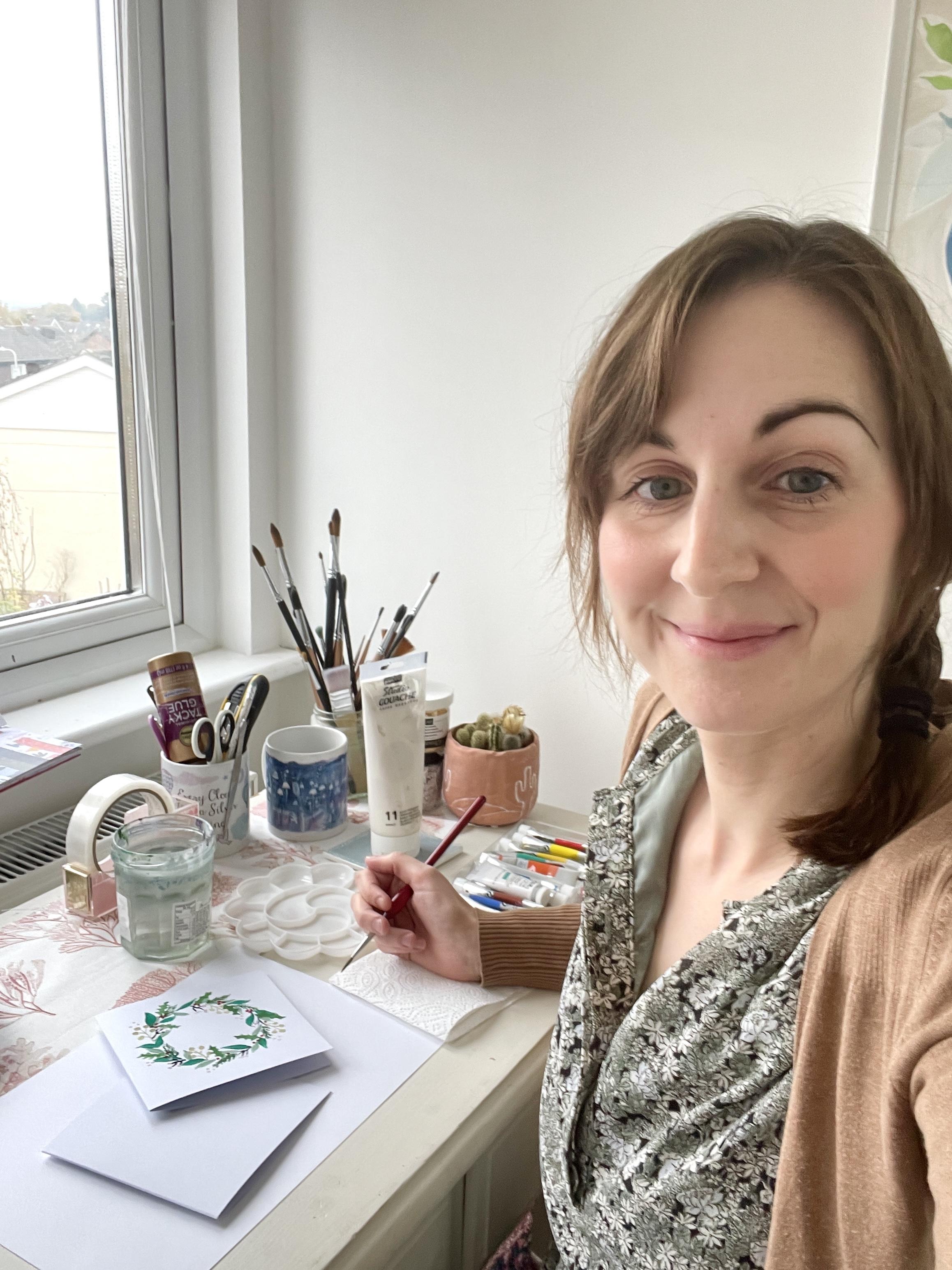
1. Introduction: Hi there. I'm Sarah Douglas, designer, crafter, and
small business owner. I love using paint in
my handmade cards. And in this class, I want
to show you how to create a beautiful hand painted Christmas wreath card
using quash paint. I'll show you step by
step how to create each layer so you can create
a card just like this. Or, of course, you can do this project in your
sketchbook, too. Set aside some time
for your creativity, and let's relax and
enjoy painting together. All you need to get
started is a card blank, paint brush, and gouache paints. This class is suitable
for beginners, and I'll talk about how to achieve the right consistency of gouache paint and how to create soft and pretty pastel colors in amongst all the bright ones. We'll look at how to
shape each leaf and berry with your brush strokes to
create this delicate look. By the end of this class,
not only will you feel more confident painting
delicate leaves and foliage, but you'll have a go
to card design that you can adapt for each
different season, spring, summer, and autumn, too. Are you ready to paint?
Let's get started.
2. Class and Project Overview: Oh. Before we begin, I want to tell you a little bit about how the class
is structured. So first, I'll cover what materials you
need for the class. Next, I'll show you step by
step how to paint the wreath, mixing each color and
practicing as we go. Finally, I have some
great tips for you on other ways you can adapt
and use this design. I'd also like to invite you
all to upload a photo of your finished project to the project gallery
here on Skill Share. I love seeing how everyone's
projects turn out. Everyone has such
a different style. If you have any questions, please do pop them
in the discussions tab and I'll reply
as soon as I can. Now let's dive into looking at the materials that we'll
need for this project.
3. Materials: For this project, you'll
need a card blank. I'm using these five by
five white card blanks. I got mine from Hobby craft in a big pack that comes
with envelopes too. You'll also need quash paint. I'm using Windsor and
Newton guash paints. The colors aren't super important as long as you have
maybe a range of greens, but we can mix different colors. You will need a white. I've got a big one and either a black or maybe a dark blue
that you can mix as well. You'll need a palette for your paints. You'll
need a brush. I'm using this size four brush, but use whatever you're
most comfortable with. Experiment and see
what gives you the best brushstroke and the best control when you're
painting your leaves. You'll also need water
to clean your brush, kitchen roll as well to
dab it off in between colors to create
the wreath shape, find something to draw around. It could be a mug or I'm
using this masking tape, which is the right size
for my card blank. Also some scrap paper. We'll use that to test colors before we use them on our card and to try out the different shapes of
leaves first. Let's begin.
4. Painting Leaves: To create the shape of
your wreath to begin with, find something to draw around. I'm using this masking tape, and I'm going to draw
around the inside. I want to leave space around the outside to fit
all my leaves in, and I'm going to do
it fairly lightly. You can rub out at the end, or you might find
that you've painted over most of it and
you don't need to. Then we're going to start with painting these sage green
leaves in the background. So to mix up a sage green, I'm going to start with a bit of this permanent green
light color in my palette. Which is quite a vibrant color, so we need to mute that down. I'm going to add white first
to make it a paler color. I'm also going to add black to take out some
of the brightness. I don't mind mixing up a
lot of paint in my palette more than I need because I
often just leave the colors. The great thing about gouache is that it's water
soluble so you can reactivate your colors with water anytime similar
to watercolors. It doesn't dry and become
unusable like acrylic paint. I want to add a bit more white
to make that paler again. That's why I've got such
a big tube of white. I find that I use it for
pretty much everything. It helps to make nice
soft pastel shades, which I love using. I'm happy with that color. In terms of the consistency, the ideal consistency I've read should be similar to
that of double cream. But in practice, this means
adding a little bit of water to your paint so
that it's slightly runny, but not so much that it
becomes watercolor like. I found that if I
leave my wash paint too thick without using water, I find it harder to
control the brush marks and sometimes it leaves
a streaky dry effect, which can be good if that's the texture that you
want in your painting, but I don't want that
texture for my wreath today. I've added a little
bit of water to this. But before I start on my card, I want to test out my brush strokes and my leaves
on this scrap paper here. A nice way to create leaves is to let the brush
do the work for you. Gently press down and
then lift off again. Press down and lift off. At this point, you can do as little or as much practice as you want to for your leaves. I quite like painting
just leaves. It can be quite a
calming exercise. But when you're happy
with how they're coming out and the pressure that you need to use for
your brush strokes, then you can start to paint
the leaves on your card. One thing you will
need to do to get the wreath effect is to decide which direction you want
your leaves to go in. Mine are following a
clockwise direction round and I'll paint them by
turning the card as I go. You can space them
out quite far between because we're going to be adding lots of other layers as well. M If you find that your paint is going
on a bit too thickly, you can add a little
more water to your brush as you
pick up the paint. Okay, that's the
first layer done.
5. Fir Leaves: For the next layer,
I'm going to use my permanent green
light gush again, but I'm going to use it
as the original color, which is nice and vibrant. For the next layer of foliage, we are going to do some fir
tree leaves, any branches. So just spend some time getting your paint the right
consistency because we're going to be painting quite fine little
needles on the stems. We need to try and
make our paints a little bit more
fluid, not too blobby. Again, let's test out how
we want to do these leaves. For mine, I'm going to do
a center stem and then come out the smaller lines
again on the other side. Take some time to practice again until
you're happy with the appearance and the amount of pressure you need to use and the amount of paint you
need on your brush. And then when you're
ready, you can start adding them to your card. So again, make sure to go in the direction that your
wreath is flowing. You can come off it
at different angles, but as long as you're
kind of following the same direction
as you paint round, that will give it a
more cohesive look. Okay. I've added a couple of extra
sprigs just to try and balance the way the
foliage is flowing, but don't worry too
much at this stage. We've got lots more elements to add to make the
wreath look balanced. Let's move on to
the next stage. And
6. Mistletoe Berries: Next, we want to paint
these berries or mistletoe type elements using a muted yellowy beige
color. Let's mix that now. I'm going to start with
this medium yellow. We'll add some white and we'll add a teeny weeny
bit of black to take out the brightness and give
us a more meted color. We won't need much black. Now again, let's add a bit of water to get the
right consistency. I've seen some artists use a little spray nozzle to get the right consistency
by just adding a mist of water to
their gouache paint, which is quite a nice idea. Let's test out our
color over here. Then for this element, we want to paint a stem first and then add
some berries on top. Trying not to overload
my brush with paint. You want to do quite a
delicate stem to begin with. Quite a short stem and then 3-5 mini stems
coming off it. I'm finding my paint
a little thick, so I might add some more water. When you're painting delicate
elements like these, I think a lot of it
is down to practice. It's down to practicing brush control to get
the result you want. I found that if I don't
paint for a while, when I come back to
it, everything I do is a lot more blobby and not as defined as
I'd like it to be. Some of that is
down to not getting the right consistency of paint, but some of it is just
down to not having practiced my brush work
enough to have a steady hand. Try and make your
lines thin if you can. If your brush isn't
working for you, swap it out for a different one. I like to paint quickly, so I tend to just use the same brush for the whole card if I'm
doing something this size. You can see whether
you prefer to have larger berries or
smaller berries. And then again
when you're happy, move on to doing
them on your card. Mm. Another thing I love about using gouache paint is that you can
layer it so easily. When I use watercolors, I find that I use a lot of water with them and they take a
long time to dry. I'm too impatient to wait, so I just paint on top and generally make a bit of a mess. But with gouache, it
seems to dry more quickly and you can layer light colors on
top of darker colors, which means I'm not
too worried about the order that I do my colors in because I know that I can paint white on top of a dark
color if I need to. Uh If you overwork them, the colors can mix because
they're activated by water. But if you're just painting over once or twice, you
can layer them. I'm not waiting for my layers to dry in between painting them. I'm finding that
they're just about dry enough by the time I move
on to the next stage. I'm going to add a few extra
dots too just to give it a bit more interest in a
sense of movement, I suppose. This is a Christmas wreath, so perhaps there
could be sparkles. Okay, now we're ready
to do our next layer.
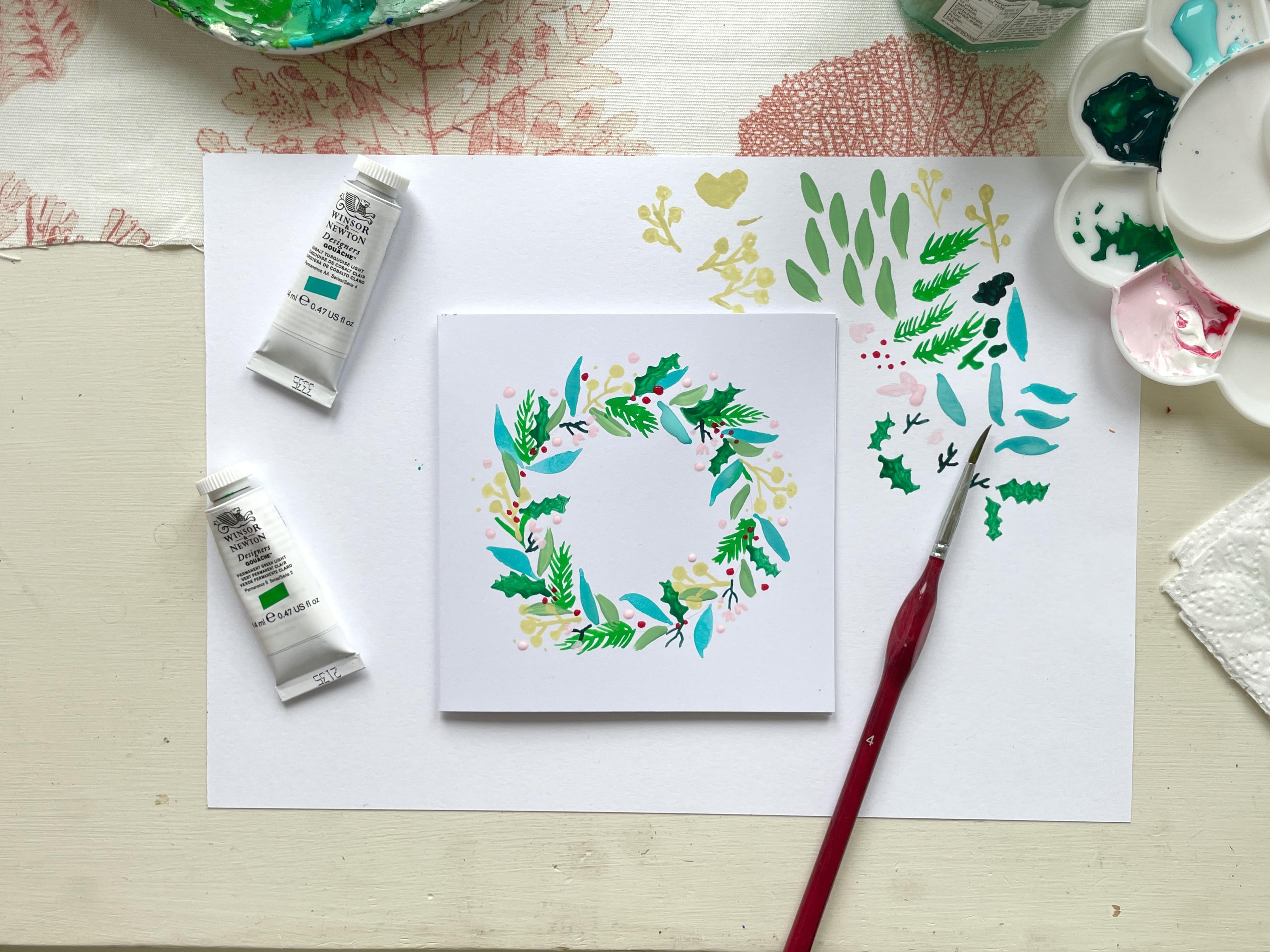
7. Vibrant Leaves: For our next layer, we're going to paint some
more leaves and we are going to choose a really vibrant rich
color this time. I'm using cobalt
turquoise light. I'm going to use that in the color that is
straight from the tube. It's a very vibrant color, almost blue, but it's nice to have a range of different greens and blues and different tones. That's what makes each element
stand out in the wreath. We have a mixture
of light and dark, a mixture of bright and subtle. If you want to practice
your leaves again, you can do on your scrap paper. Remember we're just
using the brush to go down and then lift off down and lift off to
create the leaf shape. You can do it in an
S shape as well, so you're going down
and then a little swish the side and
then back up like that creates a slightly
different shape of leaf, or you can go down and then
flat and then up again. Okay. So on my card, I'm just looking for where
there are large gaps, and I can start to add
leaves in those areas. Again, you can vary the
direction of your leaves. But having them go
around the same way gives a flow to
it, which is nice. So sometimes I'll just
lean back, step back, have a look and
see where I've got some gaps or anywhere
that looks uneven. And then we'll think about
filling those spaces in next. It's okay to go on top of elements to overlap
them and layer them. Okay, this stage is done.
8. Dark Blue Stems: Next, we want to create a very dark color to add
some depth to this wreath, which is looking
slightly flat because it saw one kind of value
of color at the minute. So I'm going to mix up a dark green using this
medium green gouache and a little bit of blue and
darken it with some black. This is a primary blue. So that's made quite a dark
rich shade, which looks nice. Test that out a little in your paper and then we'll add a bit of water to get
the right consistency. With this color, we
are going to paint some small stems that are going to have buds on top,
little flowers on top. We want to do quite small delicate elements in this dark color so they don't overpower the
design too much. We're going to do
short stems like this with maybe two
or three mini stems coming off like that. And we add maybe four or
five of these to the wreath. You'll notice that my last
layer is still not dry. It came out quite watery, so I'm going to avoid those elements with the
dark pink it will mix. Okay. I've done more
than four or five. That's right.
They're quite small. Here we go. And then
we'll do the flowers to go on top of those
stems at the end. Next, we are going to
paint some holly leaves. Okay.
9. Painting Holly Leaves: For the holly leaves, I am going to use this medium
green color again. I don't know whether I
want to use it as it is or whether it
seems too similar to the color of these
elements that we did. Let's have a look. I think maybe I'll take a tiny
bit of this color here to mix in to
darken it slightly. Just give us a little
bit more variation. That seems a good tone. Okay, so for holly leaves, I normally, I'll show
you how I paint them. I do kind of a sort of
flicking outwards type shape. So I curve out out and out and then join them at
the top and fill them in. Curve, curve, curve. Then the other side,
three of them, two or three, and then
join them at the top. And fill them in. Practice
your holly leaves for a while. If you need to. They can
be tricky to get right. But I think with
the holly leaves, it's okay if we do these
quite large in our wreath, I think that's what's
gonna give it, you know, the big indication that this is a Christmas wreath. We are feeling
very festive here. Okay. Like that. So let's do these on our card. God. We'll start here. There's quite a lot of
paint on my brush there. So oh curves out
on the other side, and then join them at the top. Let's see if we can
squeeze one in here. The sky is a little bit
blobby, but never mind. That's a nice thing with
handmade cards, I think, and that's why I
like painting cards. They don't feel too precious. Yeah, this is something that you could give away as a
Christmas card to someone. And even though it took you a long time you
hand painted it, you don't have to
think, Oh, it's going to hang in
someone's living room. It has to be perfect. It
can just be, you know, a way to experiment and then have a use for the things
you've painted. It's practical. There probably is a nicer way
to do these holly leaves, but this is the way I do them. I. This is going to be the last foliage element for our wreath before we
add on berries and flowers. Again, just step back, lean back and have a look
at your wreath as a whole, identify where any gaps are, and just fill those in with more holly leaves
or if you want to add a few simple leaves in this color, you
can do that too. Sometimes find that
when I haven't used any white in my color mix, it's a little bit patchy, it goes on a little bit
more like watercolor. And if you want that
really smooth opaque look, then you do usually have to
use some white in your mix. It took me a long
time to realize that. I got frustrated
with a lot of what I painted before I realized that to get that perfectly
smooth opaque color, it usually always needs
some white to it. Unless you've got
a very bright mix, this one seems to
be quite smooth. This turquoise color sometimes it's just a case of
experimenting with what you've got until you find
the colors and the opacity and the smoothness that you like in your paint. Okay, I think I'll squeeze
in one more holly leaf. Uh here. I know, I at crowded in that corner? Maybe we'll just
add extra berries. Let's leave our holly
leaves there for now.
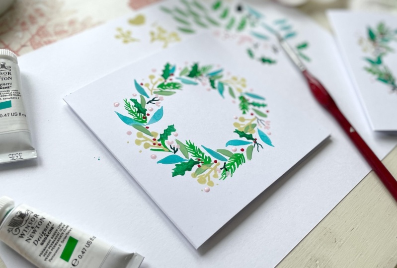
10. Berries and Flowers: For the berries, we are going to use some red paint,
primary red squash, I'm going to use this color
as it is out the tube, we're just going to add some berries near
the holly leaves. They don't have to
be exactly below them or part of the holly. They can just be
around nearby to give the impression of holly
wrapped around the wreath. Oops, that's a bit of a big one. I should have practice first,
shouldn't I? Then we go. Try and get your berry
sizes ripe before you go straight into
doing them on your card. I think the berries
look nice in threes. But you can do kind
of a random berry here and there, or just two. Oh Again, just lean back and
see why you've got some gaps where you
need to balance out the areas that the eye
is drawn to and just add a few extra
berries on their own. Then when you're happy
with the berries, we're going to use this red to make a pink to
do the flowers. For that, we just
need to add white. We don't need much of the red. We want a fairly light pink, but because we're
using white card, it needs to be enough of a pink shade that you
can see on the white. But we can keep it subtle. Again, just add a bit of water to thin that down a little bit, so it's not so gloopy. And then just test
out that color again, make sure you're happy
with how that looks. I think we can pull a
tiny bit more red in. Okay. Now let's paint the flowers on these dark stems
because they're small, I'm just going to do
a simple V shape. It's quite blobby still. Like a V, like this. Then if you've got space,
one in the middle. Or if there's not much space, just a blob on the end
so it's a tiny bud. O. And then we're going to use this color to
finish off the wreath by adding some extra dots or blobs. I'm doing these quite large because they're a light color, so I think it's
okay if they stand out a little bit more in size
when they don't in color. Look. There we go. That is our finished wreath. One more little dt. I hope you're happy with how your lovely wreath has come out. Each time I do one, they come out a bit different. You can see in my first one here, the colors were different. They're darker more
traditional Christmas colors. But this one here feels more modern with that
vibrant turquoise in. Keep going, keep practicing
and hop on over to the next lesson where
we'll talk about some other ideas
that you can try. O
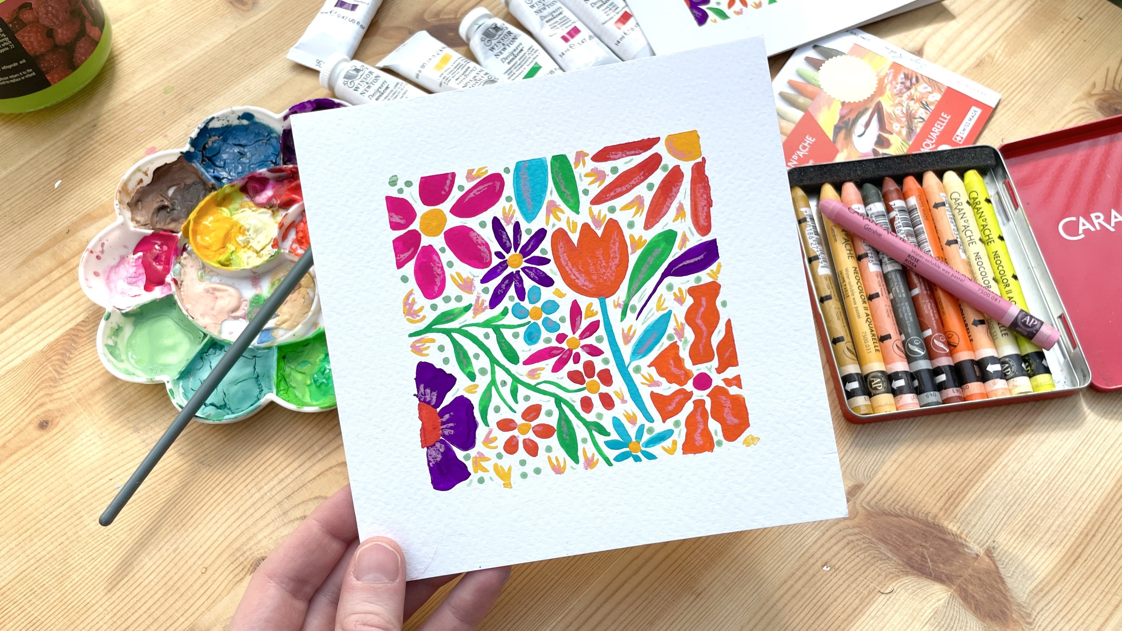
11. More Ideas: As well as varying the
colors for your wreath, you can also adapt it
for different seasons. For example, here, I've created a wreath that
is a bit more summary. I've done some
bright pink flowers and I've used the white quite
thickly to layer on top. Gone for bright oranges
and that bright turquoise again mixed in with the darker
colors to balance it out. I've also used a craft card blank for this because
I wanted to see how the bright colors would stand out on that and I
really like the effect. Your wreath doesn't just
have to be for Christmas. You could try a summer design. You could also try your
spring Easter design, which would be really nice and something else you can try
is to do a large one. Here, I've used watercolor
paper and gouache paint still to create
this larger piece. This would be nice to frame
and put up in your home somewhere something nice and vibrant and beautiful to fill you with joy
whenever you look at it. If you want to finish off
your cards a little bit more, you could add a stamped
sentiment in the middle. You could if you have a little stamp that says Merry Christmas or
something like that, you can use black ink to
stamp that in the center. Or if you've got
beautiful handwriting, you could do some
calligraphy to write season's greetings or happy Christmas or
something like that. My handwriting is a mess, so I will not attempt that. I quite like my
cards as they are. If you're worried about ruining your very carefully
hand painted card by stamping in the middle
and having it go blurry, then have a try at stamping on some separate card and attaching that as a piece in the middle, or you could always
stamp first and then paint around it once you're happy with the
stamped impression.
12. Conclusion: Thank you so much for
joining me in today's class. I really hope you enjoyed
painting your handmade cards. Before you go, I have
three final steps for you. The first one, please
remember to upload a photo of your painted card to the project gallery
here on Skill Share. Second, I would love it if you could please
leave a review. It actually does make a
massive difference to me. It helps this class get discovered in the search
results by the students, and it helps other students to feel confident that they've
picked a good class. And thirdly, if you want
to find out more about me, then please do pop
over to my website, which is stickkitten.co
dot K. If you want to hear more updates from me about when I release new
classes or new products, you can sign up to
my mailing list, which is stikitten.co dot
k forwardslash NELETE. You can also find
me hanging out on Instagram and over on YouTube. That's all for now. Bye.
 Sarah Douglas, Papercraft designer & illustrator