Transcripts
1. Introduction: Hello and welcome to the
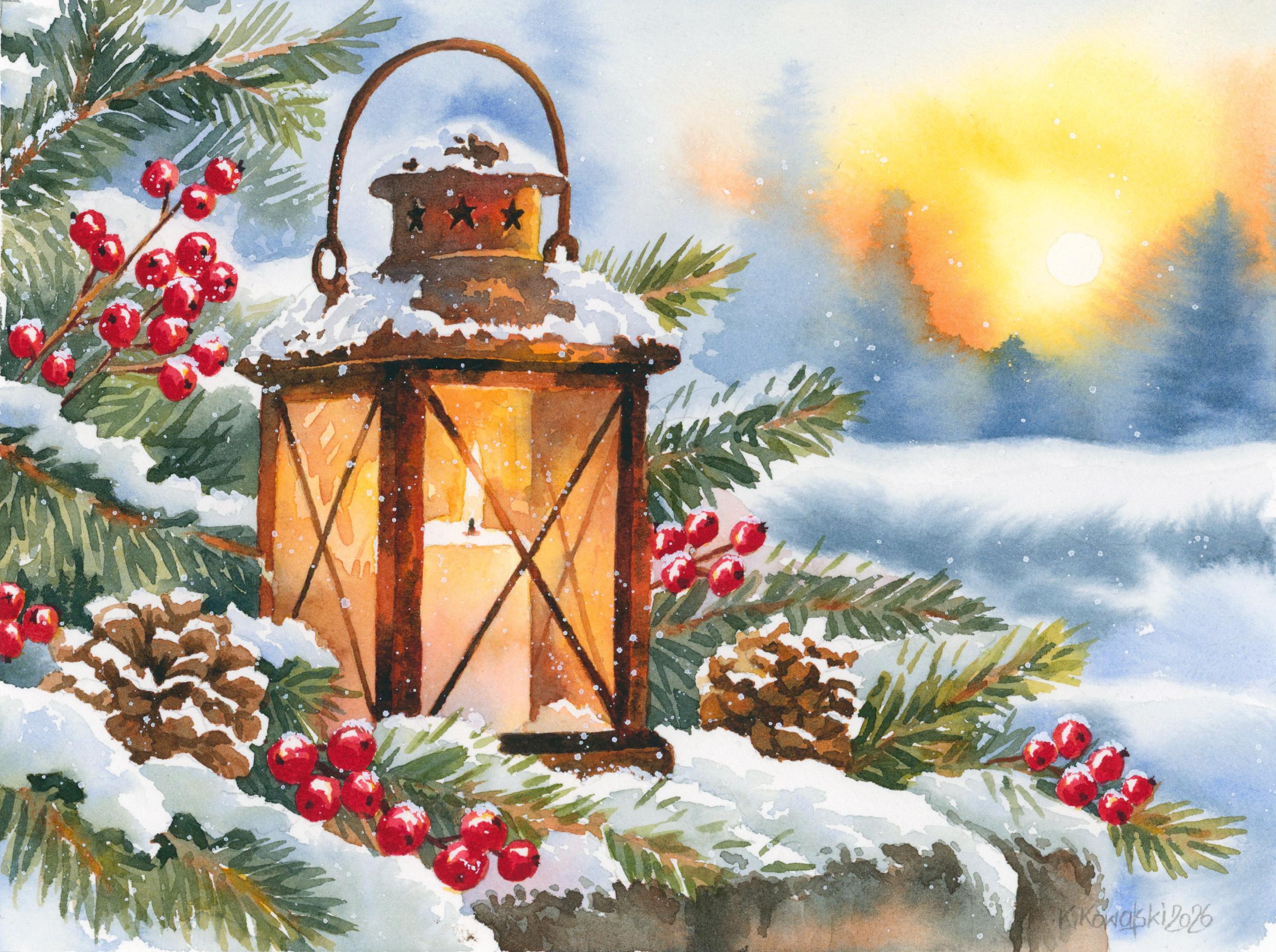
watercolor tutorial. In this class, we'll be painting a beautiful winter scene, featuring a glowing lantern
surrounded by snow covered, evergreen branches, bright
red berries, and pinecones. In the background, we have a soft winter landscape illuminated by the warm
light of the setting sun. One of the things
I love most about this painting is the contrast between warm and cool colors. We have the beautiful
golden glow coming from the lantern, the warm yellows and
oranges in the sky, and all those lovely cool blues and greens surrounding them. This combination creates a
wonderful sense of warmth and coziness in an otherwise
cold winter setting. Throughout this
tutorial, we'll explore several interesting
watercolor techniques. Create a soft
atmospheric background using the wet-on-wet technique, work with different tonal values to give our lantern a sense of depth and learn how to suggest the texture of
evergreen branches, pinecones, and snow without getting lost in
unnecessary details. We'll also pay
particular attention to creating the impression
of glowing light. This is one of the most
interesting aspects of the painting because, of course, we can't
actually paint light. We can do is carefully
arrange our colors, values, and contrasts to create the illusion of
something glowing, and that's exactly what
we'll be exploring here. Although this painting contains quite a few different elements, there's no need to feel
intimidated by all those details. As always, we'll approach
everything gradually, breaking the painting down into smaller manageable stages. We'll begin with the
larger shapes and lighter colors and then
slowly build up the layers, introduce darker values, and add the smaller details that
bring everything together. We'll also take
advantage of some of watercolor's most
beautiful qualities, particularly its
transparency and its ability to create soft natural
transitions between colors. At the same time, we'll use more controlled
brushwork where we need sharper edges
and finer details. Learning when to let the paint flow freely and when to take more control is
an important part of developing our
watercolor skills. And remember, our goal isn't to reproduce every little
detail perfectly. We want to capture
the overall feeling of the winter scene,
the soft snow, the peaceful atmosphere, and especially that lovely warm glow that makes the lantern
feel so inviting. This tutorial is suitable for watercolor painters who already have some basic experience with the medium and would like
to practice combining atmospheric washes with
more detailed subjects. I'll guide you through the
entire process step by step, explaining the techniques
and decisions along the way. So gather your paints, prepare your brushes,
and let's get started. I hope you'll enjoy painting this cozy winter scene with me.
2. Painting Plan: Before we start painting, let's take a quick look at the
entire process so that you know what to expect as we
move through the tutorial. We'll begin with the background using the wet-on-wet technique to create a soft atmospheric
winter landscape. We'll combine cool blues with warm yellows and oranges
to suggest the light of the setting sun and we'll also create the soft silhouettes
of distant trees. At this stage, we'll
carefully work around the main elements
of our composition, preserving the white
paper for the lantern, snow covered branches,
and other details. Once the background is finished, we'll move on to the
evergreen branches. We'll use different shades
of green from lighter, warmer tones to deeper
cooler colors to create variation and suggest the natural structure
of the needles. We'll also introduce
some warm browns for the smaller
branches and twigs. Will be our base layer. Next, we'll add more
needles to the branches and develop the snow resting on the branches and
in the foreground. Although snow is white, it certainly isn't
completely without color. We'll use delicate blues, grays, and other settled tones to suggest shadows and give
the snow a sense of volume while leaving some
untouched white paper for the brightest areas. After that, we will turn our
attention to the pine cones. We will build them up using different shades of
brown carefully placing the darker shapes to suggest their characteristic
overlapping scales. Also preserve the little patches
of snow resting on them. Then we'll move on
to the berries. These beautiful, bright
red accents will introduce another lovely warm color
into our composition. We'll begin with
their basic shapes and colors and then add darker shadows and
small highlights to give them a rounded three
dimensional appearance. Once all these surrounding
elements are in place, we'll finally turn our
attention to the lantern. We'll begin by painting
the worm light inside it using
transparent yellows, oranges and soft brownish tones. Gradually build up the
colors and introduce darker areas to create the impression of a glowing
candle behind the glass. Next, we'll develop the metal
structure of the lantern, including its frame,
decorative top, and handle. We'll use a range of warm browns and
darker values to give the metal a sense of form and depth while preserving
the snow resting on top. Finally, we'll make
our last adjustments, strengthen some of
the darkest accents, and add the finishing touches. We'll also introduce those
delicate white snowflakes scattered throughout the scene, which will help bring
everything together and enhance the peaceful
winter atmosphere. That's our plan. As you can see, we'll be working gradually
one section at a time, starting with a soft background, and then building up the more detailed elements
in the foreground. Although there are quite a few
different things to paint, each stage is relatively straightforward when we
approach it separately. By the time we
reach the lantern, most of the surrounding scene will already be
finished and we'll be able to concentrate entirely on creating that
beautiful warm glow. Now that we know
where we are going, let's get started with
applying the masking fluid.
3. Applying Masking Fluid: Before we start painting
the background, we need to make a
few preparations. In this part, I'll show you how I've prepared my paper and how we'll use masking
fluid to protect some of the smaller elements
of our composition. As you can see, I've already transferred the sketch
onto my watercolor paper. I used a light pad for this, which makes it much easier
to trace the drawing without having to
draw everything directly onto the
watercolor paper. I've also attached my paper to a piece of gator
board using staples. The staples will keep the paper securely
in place and help prevent it from buckling too much when we apply
water and paint. In addition, I've applied masking tape along all
four sides of the paper. The tape isn't necessary
for keeping the paper flat. That's what the staples are for. Its purpose is simply
to create a nice, clean white border around
our finished painting. Before applying
the masking fluid, I want to lighten my
pencil sketch a little. For this, I'm using
a kneaded eraser. Unlike a regular eraser, a kneaded eraser is soft and flexible and we can shape
it however we like. Rather than rubbing the paper, I like to roll it gently
over the pencil lines. This allows the eraser to
pick up some of the graphite without disturbing the surface of the watercolor
paper too much. I don't want to erase the
sketch completely, of course. I still need to see the
outlines when I'm painting. I simply want to make the pencil lines a
little less noticeable. I'm paying particular
attention to the lightest areas
of our composition, especially the sun and the flame of the candle
inside the lantern. These areas will
remain very light, and I don't want
dark pencil lines showing through the
transparent watercolor washes. Once I'm happy with the sketch, we can prepare our
masking fluid. Be using Windsor
Newton masking fluid before opening the battle, I'm gently rolling it
between my hands to help disperse the yellow pigment
that may have settled inside. I prefer rolling the
battle rather than shaking it because I don't want to introduce unnecessary
air bubbles. I'll also need a small container
for the masking fluid. I'm actually using an old
cap from a previous bottle. You can see, quite
a few layers of dried masking fluid have
accumulated inside it over time, and every now and then, I like to peel all that dried masking fluid away and give the
cap a little clean. That's what I'm doing now. There we go. Our little
container is ready to use again. We'll also need
some clean water, an old brush dedicated
specifically to masking fluid, and a piece of ordinary soap. I keep my soap in the small container so that it's always ready
whenever I need it. Now I'm pouring a small amount of masking fluid into the cup. We really don't need very
much for this painting, so I'm only taking
what I expect to use. Once I've poured it out, I'm closing the bottle straightaway. This is important because
prolonged exposure to air can cause the masking fluid to thicken and gradually
deteriorate. By keeping the bottle closed, whenever we're not using it, we can help extend its lifespan. Before dipping my brush
into the masking fluid, I need to protect the bristles. First, I'm dipping
the brush into clean water and then gently rubbing it over
the piece of soap. The soap creates a thin protective coating
around the bristles, which helps prevent
the masking fluid from sticking to them. Is a very useful little
trick because masking fluid can be quite unforgiving
when it comes to brushes. If it dries inside the bristles, it can easily ruin them. That's why I always
recommend using an old or inexpensive
brush rather than one of your favorite
watercolor brushes. Now that the bristles
are protected, I can dip the brush into the masking fluid and begin
applying it to the painting. For this particular painting, I only want to protect
two types of elements, the red berries and the sun. The reason is quite simple. When we start painting
the background and the surrounding
evergreen branches, it would be rather
inconvenient to carefully paint around
every individual berry. There are quite a few of them. By covering them with
masking fluid now, we can work much
more freely later. We won't have to worry
about accidentally painting over the berries while
we're developing the sky, the branches, or the
snow covered twigs. The same applies to the sun. I want to preserve that
bright circular shape so that we can freely
paint the sky around it. I'm applying the masking
fluid carefully, making sure to cover
each berry completely and stay reasonably close
to the pencil outlines. Take your time here. We want
the masking fluid to form a continuous protective
layer without leaving little gaps where
the paint could get through. I'm continuing in the same way until all the
berries are covered, and then I'm applying the masking fluid to
the sun as well. Once everything is protected, we can clean our brush. I'm rinsing it thoroughly
in clean water, rubbing it gently
over the soap again, and then wiping it on a paper towel to remove any
remaining masking fluid. That's another reason
why I like using soap. As long as we prepare and
clean the brush properly, we can use the same
inexpensive brush for masking fluid many times
without damaging it. We need to leave the
masking fluid to dry completely before
we start painting. It's important not
to rush this step. If the masking
fluid is still wet when we begin applying
water or paint, we could disturb it and lose the protection
we've just created. Once it's completely dry, we'll be ready to move
onto the background. Where we'll begin developing
those beautiful soft blues, warm yellows and oranges
of our winter sunset.
4. Painting the Background: Now that our masking
fluid is completely dry, we are ready to start painting. In this part, we'll create
the soft winter sky, the distant trees, and the
gentle shadows in the snow. We'll be working mainly with
the wet-on-wet technique, allowing the colors to
blend naturally and create those beautiful
atmospheric transitions. For this stage, I'll be using
my size ten round brush. Before we begin, let's
prepare our colors. I want to have everything ready on the palette
so that I don't have to stop and mix new
colors while the paper is wet. I'm starting with
Windsor yellow, which is a beautiful,
bright, cool yellow. Next to that, I'm preparing
some Windsor yellow deep, which is warmer and more golden. I'll also need transparent
orange to introduce those lovely warm tones
around the setting sun. But you don't need this color. If you don't have
it, you can also mix quinacrodon red with
Windsor yellow deep. For the cooler areas, I'm mixing ultramarine blue
with a little pains gray. Ultramarine on its own
can be quite bright. Adding a touch of pains gray
helps mute it and gives a slightly more subdued blue that works beautifully for
this winter atmosphere. I'm also preparing some
pure ultramarine blue, which I will use in a few selected areas where I want a cleaner, brighter blue. Now that our colors are
ready, we can begin. We'll be painting wet-on-wet, but rather than wetting the entire background
all at once, I'm going to work in
smaller sections. I'll gradually apply water
only to the area I'm about to paint and then extend that wet area as I
move across the paper. I'm starting around the sun, carefully applying clean water
to the surrounding paper. Remember that we've protected the sun itself with
masking fluid, so we don't need to worry about accidentally painting over it. Once the water is in place, I'm picking up Windsor yellow applying it
close to the sun. As I move further away, I'm gradually
introducing Windsor yellow deep and then
transparent orange. These warmer colors create
a beautiful transition from the bright yellow near
the sun into the richer, warmer tones of the
surrounding sky. Because the paper is wet, the colors can flow
and mingle naturally. We don't need to blend
everything with our brush. Simply place the colors on the wet surface and allow the water to do
some of the work for you. Now I'm extending the
wet area by applying more clean water to the
next section of the sky. This time, I'm picking
up my blue mixture of ultramarine blue and paints gray and beginning to introduce
the cooler tones. Notice how the blue spreads
softly into the wet paper, creating smooth
transitions without the obvious brush strokes. We could certainly paint the entire background
using the wet on dry technique applying the
paint directly onto the paper. But by introducing this
initial layer of water, we give the pigments a
little more freedom to move. They can disperse
more naturally, and it's much easier to achieve those soft gradients and gentle transitions
between colors. As I move closer to the main
elements of our composition, such as the evergreen
branches and the lantern, I'm trying to paint
around their outlines. However, I don't
want to become too concerned about painting
perfectly precise here. If a little blue flows into
one of the branches or slightly crosses
the pencil lines, that's absolutely fine. Most of these elements
will eventually be covered with
darker colors anyway. In fact, I would really like to encourage you
to relax a little with the painting and simply enjoy working with
your watercolors. Probably already
noticed that we are not trying to reproduce the
reference image exactly. I've deliberately simplified
the painting process, and I've also changed or simplified some of the
elements in the drawing. Our goal isn't to recreate every little detail as
realistically as possible. I really want us to capture
is the feeling of the scene, the peaceful winter atmosphere, the cool colors
of the landscape, and the beautiful warm light
shining through the trees. Don't feel that every
shape has to be perfect or that every color has to match the
reference exactly. Allow yourself some freedom
to interpret what you see. As I continue applying the blue, I'm also watching the
edges of the paint. Sometimes as we work from
one section to another, the paper begins to
dry and a harder edge appears where the wet paint
meets the dry surface. If that happens, simply
rinse your brush, remove the excess water, and gently run the clean
damp brush along that edge. This will reactivate the pigment slightly and help
soften the transition. I'm doing this wherever I notice an edge that looks
a little too sharp. Now as we continue working, something important is
happening on the paper. The water is gradually evaporating and the surface
is becoming less wet. This gives us an opportunity to create the soft silhouettes
of the distant trees. For these trees, we need to find just the right amount of
moisture in the paper. Before committing to the trees, I'm testing the moisture of the paper by applying a
small amount of blue. And I can immediately see that the paint is still
spreading quite far. That tells me that
the surface is a little too wet for
the effect I want, so I'm going to give
it some more time. In the meantime, rather
than simply waiting, I can continue working on
other areas of the sky. I'm picking up some
slightly darker blue and dropping it into selected places to introduce more variation in
color and tonal value. Because these areas
are still wet, the dark pigment blend softly
with the existing wash. This creates some lovely
natural variations without making the
sky look too busy. I'm returning to the area where I want to paint
the distant trees. The paper has dried
a little more, so I'm picking up a slightly more
concentrated blue mixture and beginning to suggest
the tree silhouettes. Notice that I'm not painting detailed trees with
individual brush strokes. I'm simply using irregular, mostly vertical shapes to create the impression of trees
standing in the distance. Because the paper is still damp, the edges spread slightly
and become beautifully soft. This is exactly the
effect I was hoping for. In a few places, the paper has dried a little more
than I expected. So some of the
edges are slightly darker and sharper.
But you know what? I'm perfectly happy to
leave them like that. I could try to soften those edges again,
but at this stage, when the paper is partially dry, it's very easy to disturb the existing wash and
create unwanted marks. Sometimes the best decision in watercolor is simply to stop adjusting something and accept what the paint has given us. I actually think a
little variation between softer and slightly
sharper edges makes these distant
trees more interesting. Now that our sky and distant
trees are established, we can move on to the snow covered landscape on the right. Here I want to create a
few soft blue shadows that will suggest the gentle folds and uneven surface of the snow. I'm starting with
the upper section and applying a layer
of clean water, but notice that I'm deliberately leaving
the very top edge dry. There's an important
reason for this. The sky above has already
begun to dry and I don't want the fresh water from
this section to flow back into that
partially dry wash. If that happens, we could
easily create unwanted blooms, sometimes called Bruns
or cauliflowers. These occur when
wetter paint or water pushes into an area that
has already started drying, disturbing the pigment
and creating irregular, often quite noticeable edges, just like on the tree above. And at this stage, that's
something I would rather avoid. Fortunately, we
don't actually need to connect these two wet areas. The upper part of this shape represents bright white snow, so it makes perfect sense
to leave a strip of untouched white paper between the blue sky and the shadows
we're about to paint. Once the water is in place, I'm picking up some of my blue mixture and dropping
it into the wet area. I'm not trying to create any
precise shapes or details. I simply want the blue
to spread naturally and form soft irregular shadows. These subtle changes
in value are enough to suggest that the snow
isn't completely flat. It has gentle raises
and depressions and the cooler blue tones help
us describe those forms. Notice how much of the
paper I'm leaving white. This is very important
when painting snow. We don't need to
cover everything with pale blue to make it look snowy. In fact, it's often the untouched white
paper combined with a few carefully
placed shadows that creates the most convincing
impression of snow. Now before we finish, there is one small thing
I want to take care of. Some paint and water
have collected on top of the masking fluid and
along the masking tape. I'm rolling a small piece
of paper towel into a narrow point and using it to absorb the
excess moisture. This is particularly
useful around the masked areas because
droplets sitting on top of the masking fluid can
sometimes flow back into the paper as the painting
dries, leaving unwanted marks. I think that's all we
need for the background. We now have our warm,
glowing sunset, the soft silhouettes
of distant trees, and those beautiful, cool
blue shadows in the snow. The most important thing at this point is to
leave everything alone and allow the
paper to dry completely. Once it's dry, we'll be ready to move on to the
evergreen branches and begin developing the
more detailed elements of our winter scene.
5. First Layer on the Evergreen Branches: Now that our background
is completely dry, we can move on to the
evergreen branches. In this part, we'll establish their basic colors and shapes, creating a foundation for
the additional needles and details that we'll
paint in the next layer. But before we begin,
I want to make a few adjustments to the background using
my scrubber brush. You followed any of my
previous tutorials, you probably already
know how much I love my Windsor Newton
galeria size four brush. It's my tried and
tested scrubber brush, and I use it in almost
every painting to soften edges and
left out highlights. Recently, though, I bought
myself a Da vinci Nova brush. Because I'm constantly
looking for a good alternative to
the galeria brush. So I thought this would
be a nice opportunity to test it and see
how it performs. I'll begin with my
familiar galeria brush. I'm dipping it into clean water, removing the excess moisture, and then rubbing along one of the harder edges left by the blue paint in
our previous layer. As I move the brush
back and forth, the water gradually
reactivates the dry pigment. Once the paint has loosened, I dab that area with a paper towel to lift
some of it away. And notice how much
softer that edge becomes. Instead of having
a sharp boundary between the blue and
the white paper, we now have a much
softer transition. I think this works
really well in a winter landscape
because those soft, slightly blurred edges
contribute to the peaceful, cozy atmosphere we
are trying to create. I'm going to repeat this process in several areas
of the background, particularly wherever
the blue paint has created a hard edge that
looks a little too prominent. Now I'm switching to
the DaVinci Nova brush to see how it compares. I can tell almost immediately that this isn't quite
what I'm looking for. The bristles are synthetic, but they are simply too soft for the lifting
I like to do. When I rub the brush
against the paper, it doesn't reactivate the paint nearly as quickly
as my galo brush. I have to keep rubbing and
rubbing before I begin to see much of an effect
and that's not ideal. I already know that
this probably won't become my new favorite
scrubber brush. Every now and then, I
like to experiment with different brushes hoping
to find something that works just as
well as the galeria. But so far I keep coming
back to the same one. I've had this brush for
several years now and although it's definitely
showing some signs of wear, it still has exactly the
kind stiffness I need. Interestingly, I think those
slightly worn out bristles are actually quite helpful. They are firm enough to lift the paint, but
at the same time, their softened irregular
tips gently sweep across the surrounding area and help create even
smoother transitions. It's one of those
brushes that has become almost indispensable
in my painting process. So for now, the galeria
remains undefeated. Once I'm happy with
the softened edges, we can finally move on to painting the evergreen branches. For this stage, I'll
mainly be using my size eight silver
black velvet round brush. However, together
with the Nova brush, I also bought the Vinci Casaneo
round brush in size zero, and I'd like to give
that one a try as well. Although it's labeled
as size zero, it's actually very
similar in size to my size eight silver
black velvet. Is a good reminder
that brush sizes aren't standardized
between manufacturers. A size zero from
one brand can be surprisingly similar to a much larger number
from another. Before we start painting, let's prepare our colors. I'm beginning by mixing Windsor yellow deep with
ultramarine blue. This gives me a lovely
muted olive green that I think will work beautifully
for our evergreen branches. You might have noticed that I'm using the same yellows and blues that we already introduced in the background. This
is intentional. By reusing the same pigments throughout different
parts of the painting, we can create a more
harmonious color palette. Even when the mixtures
look quite different, they still share some of
the same underlying color, which helps connect the various elements of
our composition. I also want these
greens to be fairly muted rather than extremely
bright and saturated. I don't want to use exactly
the same green everywhere. We'll also need a slightly
cleaner, fresher green. I'm mixing ultramarine
blue with Windsor yellow or color
yellow that we used around the sun and we'll
use later in the lantern. This mixture gives
us a different shade of green and having both options on the palette will
allow us to introduce some beautiful variations
throughout the branches. I'll also need burnt sienna for the brown twigs
and smaller stems, particularly those running
between the berries. And finally, I'm preparing a
much darker green by mixing ultramarine blue
with Windsor yellow deep and adding
some paints gray. This will be useful for the
deeper shadow areas and for creating contrast between the different groups of needles. Now that our colors are ready, we can begin painting. I'm starting by picking up
some burnt sienna and painting the main brown twig with a simple line using the
wet on dry technique. Then I'm switching to green and beginning to
add the needles. Notice that I'm approaching these evergreen
branches in a very simple, almost
impressionistic way. If you remember my painting
with the Carolina wren, I painted the evergreen
needles much more precisely, carefully defining almost
every individual needle. This time, I want to do
something different. I'm deliberately simplifying the process and using longer, fairly loose brush strokes to suggest the
general appearance of the needles rather than painting every single one with
perfect accuracy. I'm using the tip of my brush to create these elongated marks, allowing them to extend
outward from the main tweak. Try to pay attention to the general direction in
which the needles grow, but don't make every brush
stroke perfectly parallel. Change their direction
slightly here and there, make some needles longer, others shorter, and
allow them to overlap. Nature is full of
irregularities and introducing a little variation will help our branches look
much more natural. I'm also constantly shifting between different
shades of green. Sometimes I'm picking up
the warmer olive green, sometimes the cleaner,
fresher green, and occasionally a little
of the darker mixture. Don't want every branch
to look exactly the same, and we certainly don't need every needle to have
an identical color. And here is something else
I want you to keep in mind. Don't worry if the paint from one needle flows
into another and the two brush strokes merge into one larger shape.
That's perfectly fine. Remember that we are only
painting the first layer. At this stage, our
goal is to establish the main shapes and colors
of the evergreen branches. We can allow the individual brush strokes to
blend together and create larger patches of green
because in the next layer, we'll come back and paint
more needles on top. Additional brush
strokes will be much more visible against
this initial layer, and together they will create a richer, more
interesting texture. So think of what we are
doing now as building the background for the more defined needles that
will come later. You may also notice
that I'm deliberately leaving some areas
completely unpainted. I'm imagining that
little clams of snow are resting
on those branches, some painting
around those shapes and preserving the white paper. You don't need to outline every patch of snow
very precisely. Sometimes simply leaving an
irregular white gap between the green needles is enough to suggest that snow
has collected there. Now, while I'm continuing
with these branches, I'm also getting a better feel for my new DaVinci casano brush. And unfortunately,
I have to say that I'm not particularly happy
with this one either. The brush is extremely soft, which isn't necessarily
a bad thing, but it's not really what I prefer for this
kind of painting. I press the bristles
against the paper, they flatten quite easily, and they don't spring back into a sharp point as quickly
as I would like. I generally prefer brushes that have a little
more resistance and return to their
original shape quickly when I
release the pressure. The Casaneo also has a
fairly short handle, which is another feature I'm
not particularly fond of. Of course, none of this means that it's a bad brush,
quite the opposite. Actually, I can
imagine that it's very soft bristles
would be wonderful for Someone who enjoys a looser, more expressive
painting style or likes working with
generous amounts of water. It's simply not the kind
of brush that suits my personal preferences and
the way I like to paint. So I'm going to switch back to my trusty size eight
silver black velvet. I'm continuing with the
evergreen branches, gradually working my way
through the composition. When I reach the areas
between the berries, I'm being a little more careful with the placement
of the green paint. Notice that I'm leaving
some narrow gaps where the brown twigs will
eventually be visible. We could have protected
these little stems with masking fluid just as we
did with the berries, but I really don't
think that's necessary. Are relatively simple,
narrow shapes, and we can easily
paint around them. And even if you accidentally cover part of a twig with green, it's not a disaster. You can still paint
the brown stem later, and it may simply turn
out a little darker. Remember that we are
not trying to create an exact copy of the
reference photo. We're using it as inspiration, but we're making
our own painting. Can simplify shapes,
change colors, rearrange small
details, and make decisions based on what looks
good in our composition. There is no need to
feel restricted by every little thing we
see in the reference. As I continue, I'm also
leaving some areas lighter, and in a few places, I'm preserving the
completely white paper. These lighter shapes represent the upper surface of the snow
resting on the branches. Since those areas are
catching more light, I want to preserve
their brightness rather than covering them with
unnecessary color. Now, I'm returning
to the brown twigs. There is one important
thing I would like you to notice about the
way I'm painting them. I'm not drawing one long, uninterrupted brown line
through the entire branch. Instead, I'm
deliberately leaving small gaps between different
sections of the brown stem. The reason is that
evergreen needles grow all around the twig, not just behind it. So some of those
needles are pointing towards us and overlap
the brown stem, partially hiding it from view. We painted one
continuous brown line, it could make the branch
look rather flat as though all the needles were growing neatly behind the stem. By breaking up that
brown line and allowing some green brush strokes
to cross in front of it, we create a much more
natural impression of needles growing in
different directions. It's a very simple technique, but it makes a
noticeable difference. We can also use a few
individual needles to suggest that they are
poking through the snow. Here and there, I'm
adding little green tips extending into the white
areas we've preserved. I'm not trying to describe every needle hidden
underneath the snow. Just a few irregular
marks are enough to suggest that the branch
continues beneath it. Is another example of
how we can simplify the subject without losing the impression of
what we are painting. As you can see, I'm constantly switching between
brown and green, gradually developing the main
structure of each branch. Sometimes I paint a section of the brown twig first and then
at the needles around it. Other times I begin
with the green and introduce the
brown afterwards. There is no strict order
that we need to follow. I'm simply looking at
the larger shapes, deciding where I want the
needles to extend and gradually filling
in the branches with different shades of green. And I'm really not worrying
about the small details yet. This is our base layer, and its purpose is to give us a good foundation for the additional needles
we'll paint later. Now I'm moving on
to the branches on the right side of
the composition and repeating the same process. I'm establishing the
main brown twigs, leaving little
gaps between them, and then adding
groups of needles using loose elongated
brush strokes. Again, try to vary the
greens as you work. Introduce some warmer olive
tons, some cooler greens, and a few darker areas
where the needles overlap or where the
branches are more in shadow. These subtle color changes will make the branches much more interesting than if we painted everything with
one uniform green. Don't forget about the snow. Imagine little patches of snow resting on top of some
of those branches, partially covering the
needles underneath. Instead of painting
the snow itself, simply leave those areas white and add a few green needle tips. That's often all we
need to do to create the impression of snow resting naturally
among the branches. At this stage, I would
really encourage you to enjoy the process and experiment a little with
your brush strokes. Make some needles
longer, others shorter, allow some colors
to blend together, leave irregular gaps,
and don't worry if your branches look
slightly different from mine. We're not aiming for
botanical precision here. And I think that's enough
for our first layer. We now have the main
shapes established, a lovely variety of muted greens and plenty of white areas
preserved for the snow. The branches may still look a little flat or simplified
at the moment, but that's exactly what I
would expect at this stage. In the next part, we'll return with another
layer of needles, deepen some of the shadows, and add more definition to
bring the branches to life. For now, let's
leave everything to dry completely
before we continue.
6. Adding More Needles and Finishing the Evergreen Branches: Everything is nice and
dry now and we have a really good foundation for adding more details to
our evergreen branches. In the previous
part, we established the main shapes and colors, but the needles are still
quite loosely defined. Now we're going to build
another layer on top, introducing more
individual needles, strengthening some
of the darker areas, and giving the
branches a fuller, more three dimensional
appearance. Before we begin,
I need to prepare a little more paint because I'm running low on some
of my mixtures. Just a quick reminder, I'm mixing Windsor yellow with ultramarine blue to create
a brighter, fresher green. For the more muted olive green, I'm combining Windsor yellow
deep with ultramarine blue, and for the darkest green, I'm using the same mixture of Windsor yellow deep
and ultramarine. But this time, adding some paints gray to
deepen the value. I'll also need burnt sienna
for the brown twigs and stems and some pure
ultramarine blue for the shadows in the snow. We're working with exactly
the same colors as before. We don't need to introduce any new pigments at this stage, which will help us maintain that lovely color harmony
throughout the painting. For this part, I'll
be using my size eight silver black
velvet round brush. I'm going to start in the
upper left corner and gradually work my way down
and toward the right, adding more needles to all
the evergreen branches. Now there are actually two
different approaches we can use to create this
additional layer of needles. The first and probably
the simplest one is to paint each new needle with
an individual brush stroke. We pick up a slightly darker
or different shade of green and use the tip of the brush to create a
narrow elongated mark. By repeating these marks
in different directions, we gradually build up the
texture of the branch. The second approach involves a little bit of
negative painting. Instead of painting the
needles themselves, we paint the small
spaces between them. By carefully placing
darker green shapes around some of the lighter areas
from our first layer, we can make those lighter shapes appear as individual needles. As I reach one of those white areas that
we left for the snow, I'm going to introduce a
little color there as well. I'm picking up some
ultramarine blue and applying a small amount along the
lower part of the snow patch. Then I'm rinsing my brush, removing the excess water, and gently softening the
edge with a clean de brush. This creates a very subtle, bluish shadow that gradually fades into the
untouched white paper. Notice how that little bit of blue immediately gives
the snow more volume. Before we simply had a white shape between
the green needles. Now with just a
little bit of shadow, it begins to look like a little mount of snow
resting on top of the branch. Now, moving a
little further down and continuing to
add more needles. Again, I'm varying
the direction of my brush strokes and switching between different
shades of green. Some needles are pointing
more to the left, others to the
right, and some are extending slightly
upward and downward. We don't want them all to follow exactly the
same direction because that would
make the branches look rather stiff
and artificial. Instead, try to imagine how the needles grow around
the central twig extending outward in slightly
different directions and overlapping one another. Remember, we're not trying to
paint every single needle. If you look closely at a
real evergreen branch, you'll see an enormous
number of needles, many of them overlapping and partially
hiding one another. Trying to reproduce every one of them would be incredibly
time consuming. And for this painting, it really isn't necessary. What matters is creating the
impression of the texture. We can achieve that
quite effectively with a collection of simple
elongated brush strokes. As long as we have
enough variation in their length,
direction, color, and value, our eyes
will interpret those marks as a dense
cluster of evergreen needles. Now I'm reaching the
small stems that connect the berries
to the main branch. For this, I'm switching
to burnt sienna and carefully painting the
narrow brown twigs between the masked berries. I'm using the tip of
my brush to create these thin lines following the general direction of
the stems in the sketch. Because we've already protected the berries with masking fluid, we can work quite
comfortably around them. Now moving on to another
evergreen branch on the left side of the lantern. Just as before, I'm adding
more individual needles over our first layer using slightly different shades of
green to create variation. I'm also paying attention to the areas where snow is
resting on the branch. Here I want to strengthen the shadow just
underneath the snow. So I'm introducing a little darker green along
the lower edge. This helps create a
stronger separation between the bright snow and the
needles beneath it. Think about how snow
rests on top of a branch. The upper surface catches the
light and appears bright, while the needles underneath receive less light and
naturally appear darker. By placing some of
our darkest greens directly beneath those
white snow patches, we can emphasize
that relationship and make the snow
appear as though it's actually resting on
the branch rather than simply being a white
shape painted over it. We can also introduce a few individual needles
poking through the snow. I'm continuing with the
remaining branches, repeating the same
general process. I'm adding more needles, varying their direction
and length and switching between lighter
and darker greens. As we gradually build
up the second layer, the branches begin
to look much fuller. The first layer provided the
overall color and shape, while these additional
brush strokes introduce more definition and
create the impression of individual needles
overlapping one another. As I work, I'm also
returning to some of the brown twigs
with burnt sienna. In a few places, the brown from our first layer looks
a little too pale, so I'm strengthening the color to make the stems more visible. I'm still leaving little
gaps here and there, just as we did before
so that some of the green needles appear to
overlap the brown twigs. And with that, I think our
branches are finished for now. Now let's leave
everything to dry, and in the next part, we'll add some
shadows to the snow.
7. Adding Shadows to the Snow: Now that our branches
are finished, we can return to the snow and start developing
its shadows. In the previous stage, we left quite a few areas of white paper between the
branches to represent snow. At the moment, these
shapes look fairly flat, so we'll introduce
some subtle shadows to give them more
volume and dimension. We'll also paint the dark
ground underneath the snow. I'm starting on the left side using the wet and dry technique. I'm picking up some of our muted blue mixture and applying it along the
lower part of the snow. Then I'm rinsing my brush, removing the excess water, and gently softening
the upper edge of the blue paint with
a clean damp brush. This creates a smooth
transition from the shadow into the
untouched white paper. Notice that I'm
deliberately leaving the upper parts of
the snow unpainted. The white of our
watercolor paper is the brightest
white we can achieve, and preserving it helps suggest fresh snow
catching the light. We really don't need
much paint here. Sometimes just a little blue along the lower
edge is enough to transform a flat white shape into something soft
and three dimensional. Though we usually associate
snow shadows with blue, snow can actually reflect many colors from
its surroundings. I'm introducing some
cleaner ultramarine blue in selected areas for a
fresher cooler appearance, and I'm also adding
subtle touches of green to suggest reflections from
the evergreen branches. These colors should
remain delicate. We don't want colorful snow, just a little
variation that makes the shadows more
interesting and natural. Now moving towards the
overlapping patches of snow, here I'm placing the
shadows a little more deliberately to
suggest small folds, indentations, and
uneven piles of snow. When we paint a bluish shadow next to an untouched white area, the white appears to come forward while the
darker area recedes. This simple contrast helps create the impression
of overlapping layers. I'm keeping most of the
edges soft by blending the blue into the white paper
with a clean damp brush. We don't need to reproduce every little fold from
the reference photo. A few carefully placed
shadows are enough to suggest the general structure while preserving that soft
fluffy appearance. I approach the berries, I'm also introducing
a tiny amount of quinacridone red into
some of the snow shadows. This suggests that the snow is reflecting a little of the
color from the nearby berries. We don't need much red at all, just a subtle touch blended into the existing blue or green. Repeating these colors
in different parts of the painting also helps create a more
harmonious composition. I'm continuing towards
the right side, adding more blue shadows to
the remaining snow patches. Leave some areas almost
completely white, and remember that the
dark green branches already provide contrast
in certain places, so we don't necessarily need to add a shadow to
every patch of snow. Once I'm happy with the snow, we can move on to
the dark ground at the bottom of the painting. For this area, I'm
mixing burnt sienna with ultramarine blue to create
a muted natural brown. These two pigments neutralize
each other beautifully, and we can easily
adjust the warmth of the mixture by changing
their proportions. Before applying the brown, make sure the snow
is completely dry. Otherwise, the colors might
flow into one another, and we definitely don't want brown paint spreading into
our lovely white snow. You can wait for the
paper to dry naturally or use a hair dryer to
speed up the process. Now I'm applying the
brown mixture to the lower area carefully
painting around the snow. At this stage, I'm
simply establishing the main base color
without worrying about texture or
smaller details. While this layer is still wet, I'm picking up a darker
brown or green mixture with a little paints gray and dropping it into selected areas directly
underneath the snow. The darker pigment spreads
softly into wet brown, creating natural
looking shadows and helping separate the bright snow from the ground beneath it. I think that's enough
for this stage. We've given the snow
more volume with delicate blue shadows and
subtle reflected colors, and we've established
the basic colours and shadows of the ground. In the next part,
we'll return to the brown area to add
a little more texture. For now, let's leave everything
to dry completely. T.
8. Painting the Pinecones: In this part, we'll be
painting the pine cones, mainly using different
shades of brown. But first, I want to return
briefly to the dark ground at the bottom of the painting and add a little more texture. I'm picking up some of our darker brown mixture and strengthening the shadows
directly underneath the snow. These areas should
be quite dark and the stronger contrast will
help the white snow stand out. I'm also pulling some of
the paint downward with a few irregular brush strokes to create subtle
streaks and variations. We don't need much detail here. Just a few darker marks
are enough to break up that flat brown area and suggest a little
natural texture. Now, let's move on
to the pine cones. For the first layer, I'm preparing a warm
brown mixture using burnt sienna with a little
winds are yellow deep and some paints gray to
tone down the saturation. We'll paint the pine
cones in two stages. First, we'll establish
their main color while preserving small
white areas for the snow. Then once everything is dry, we will use darker
browns to define the individual scales
and create more depth. I'm starting with
the first pine cone, applying our brown mixture
directly onto dry paper. At this stage, I'm
treating the pine cone as one larger shape rather than trying to paint every
individual scale. However, I'm
deliberately leaving small irregular
gaps of white paper along the upper edges of some scales to suggest little patches of
snow resting on them. Can lightly mark these
white areas with a pencil beforehand if
you prefer more control. I'm working a little
more intuitively, leaving gaps of different
shapes and sizes as I paint. Snow doesn't settle in
perfectly regular patterns, so a little variation will actually make the result
look more natural. And don't worry if
those white gaps look rather random
at the moment. Once we add the darker shadows, they will begin to
make much more sense. While the brown
layer is still wet, I'm dropping a little
darker brown into the central areas
of the pine cone. The paint spreads softly
into the surrounding color, creating some natural
variation and suggesting the deeper shadows
between overlapping scales. I'm repeating the same process
on the second pine cone, preserving small white
patches and introducing darker brown while the
first layer is still wet. Now we need to let both
pinecones dry completely. This is important
because our next layer will involve more
defined brush strokes, and we don't want
those darker marks to spread uncontrollably. Once everything is dry, I'm picking up a darker, more concentrated brown mixture and beginning to define
the individual scales. The key here is to understand how pinecones scales overlap. Each scale extend
outward from the center, and the area where
it curves inward or disappears beneath another
scale are usually the darkest. So that's where I'm
concentrating my shadows mainly along the lower and
inner parts of the scales. Notice that I'm not outlining every scale or covering it
completely with dark paint. Instead, I'm leaving the
upper surfaces lighter, allowing our first brown
layer to remain visible. This contrast between
the lighter surface and the darker areas creates
the impression of volume and helps separate
the overlapping scales. And we certainly don't need to reproduce every scale
with perfect accuracy. A real pine cone has a very complicated structure,
but in watercolor, we can simplify it into
a loose arrangement of lighter shapes separated
by darker shadows. Some scales can be
clearly defined while others can blend into the
surrounding dark areas. As I work towards the lower
part of the pinecones, I'm using a little
negative painting. Instead of concentrating
on the scales themselves, I'm looking at the lighter
brown shapes that are already there and painting
darker areas around them. This allows the individual
scales to emerge naturally without having to
draw or outline each one. I'm using the same approach
on the second pine cone. First, I'm suggesting
a loose network of overlapping scales with
irregular dark brown marks, almost like a
slightly uneven grid. And then I'm strengthening
selected shadows, especially where one
scale overlaps another. Try to vary the shapes
and thickness of these marks so the texture
doesn't become too repetitive. I'm also introducing a
small amount of Windsor yellow deep along the left
side of the pine cone. This is a subtle touch, but it helps suggest some warm light coming
from our nearby lantern. We don't need much yellow, just a little bit to create
a warm reflection and connect the pine cone with the golden colours
elsewhere in the painting. Finally, I'm taking one last
look at both pinecones and deepening a few of the darkest
areas between the scales. Be careful not to overwork them. If we add too many dark marks, we might lose those
lighter surfaces that give the scales
their volume. It's the combination of light and dark shapes that
make the texture convincing. Let's leave everything
to dry completely. In the next part, we'll move on to those beautiful red berries, which will introduce
a lovely splash of color among our muted greens, browns and cool blues.
9. Painting the Red Berries: Everything is completely
dry now so we can finally move on to painting
those beautiful red berries. This is one of my favorite
stages because introducing such a vibrant color makes an immediate difference
to the painting. Against our muted greens, cool blues and natural browns, these little splashes
of red will provide a lovely contrast and bring much more life to
our winter scene. Before we begin, we need to
remove the masking fluid. I'm using my rubber
masking fluid pickup tool. I'm rubbing it over
the berries to reveal the clean white
paper underneath. I'm also removing the
masking fluid from the sun. I can still see a little of
the original pencil outline. So I'm carefully trying
to remove as much as I can with a regular eraser. The transition between white sun and the sky looks
quite soft already, so I don't think it needs
any further adjustments. However, if your sun
has a very hard edge, you can gently soften it with a damp scrubber brush lifting a little
pigment if necessary. Now, let's prepare our colors. We'll need Windsor yellow
deep, quinacridon red. And permanent Alizarin crimson. Later, we will also use a little paints gray for
the deepest shadows. For the berries, I'm using my rosemary and co size
two spotter brush. Its short bristles give me good control over small shapes. But you can also use regular
size four round brush. We'll paint the berries
in four simple steps. I'm starting with
Windsor yellow deep, applying it roughly to the
lower half of each berry. Although our berries
will eventually be red, this yellow underlayer
introduces a little warmth and helps suggest light coming
from the nearby lantern. Because watercolor
is transparent, the yellow will remain visible through the
red we apply on top, creating a slightly warmer, more orange red appearance
in those areas. It's a simple way to introduce color variation without painting
complicated reflections. I'm repeating this
on all the berries. We don't need to cover the entire shape or make
the yellow perfectly even. Now, I'm picking
up quinacrodon red and applying it over each berry, including the yellow areas. However, I'm deliberately
leaving a tiny spot of white paper unpainted near
the upper part of each berry. This little white
highlight will help create the impression of
a smooth, glossy surface. Because the white of our paper is our brightest possible value, we don't need to add
any white paint later. As I apply the red, notice how the yellow underneath creates a warmer tone
in the lower areas. While the red painted
directly onto white paper remains
cleaner and brighter. If the color looks
a little pale, you can simply drop some additional quinacrodon red into the wet berry
to strengthen it. I'm working wet and dry and because these shapes
are so small, they dry relatively quickly. Already the berries
look beautiful against our muted
evergreen branches, but they still need
a little more depth. For the shadows, I'm using
permanent lizarin crimson, which is a deeper color
red than quinacrodon red. I'm also preparing
a darker mixture by adding a little pains gray. I'm starting with pure
permanent Alizarin crimson, applying it mainly along the left and lower
sides of each berry. I'm leaving enough of the
brighter quinacrodon red visible so we can clearly distinguish the lighter
and darker areas. And here is something
important to remember. We really only need
three main tonal values to suggest a rounded
three dimensional berry. We have the white highlight, the vibrant middle red, and the darker shadow. By placing these
values correctly, we can create a
convincing sense of volume without
complicated shading. I'm repeating this process
on the remaining berries, adjusting the shadows as needed. Notice how much more
rounded they appear now that we've introduced
those darker values. I'm also using a
little burnt sienna mixed with our dark red to strengthen some of
the small twigs connecting the berries
to the branches. Just a few darker accents are enough to give
them more definition. For our final step, we'll add those tiny dark spots at the end of the berries. These are the little
remnants of the flowers and they help make the
berries more recognizable. I'm using our darkest mixture of permanent Alyzain
crimson and paints gray, which is almost
black and painting a tiny dot or cross with the
tip of my spotter brush. What's interesting is
that the position of this little mark can suggest which direction
the berry is facing. If we place it near the center, the berry appears
to face towards us. If we move it
closer to the edge, the berry looks as though it's turned slightly
to the side. By varying the placement
of these tiny marks, we can make the berries
appear to point in different directions
without changing their basic rounded shapes. And that's all we
need. Our berries now have beautiful,
vibrant colors, subtle warm reflections,
delicate white highlights, and darker shadows
that give them volume. The little dark spots add just enough detail to
make them convincing. I particularly like how the red stands out against our
muted olive greens. This is exactly why we kept the evergreen branches
relatively subdued. The contrast allows
the berries to become beautiful little accents without competing with the lantern. Achieved all of this in
just four simple steps, and there is really no
need to add more details. Now that we've completed
the surrounding elements, we are finally
ready to move on to the main subject of our
painting, the Lantern itself. In the next part, we'll begin working on the
warm colors inside the lantern and gradually create that beautiful
golden glow.
10. Painting the Inside of the Lantern: Now that we've finished
the surrounding elements, we can finally begin
painting the lantern itself. This is the main focal
point of our composition, and the warm glow of
the candle will create a beautiful contrast with the cool winter
colors around it. Although the lantern
might look complicated, we'll divide the process
into manageable steps. In this part, we'll
concentrate on the candle and the glass walls. Building up the warm colors
in two transparent layers. We'll paint the dark
metal framework. Later, so far now, our main goal is to create the impression
of glowing light. For the candle, I'm picking
up Windsor yellow and applying it near the top
closest to the flame. As I move downward, I'm introducing
Windsor yellow deep, followed by a little
quinacradon red for a warmer slightly
reddish tone. Finally, I'm adding a touch of ultramarine blue
towards the bottom, where the candle
receives less light. I'm allowing these
colors to blend gently, creating a transition
from bright yellow to warmer and
slightly cooler tones. Notice that I'm keeping everything quite
light at this stage. When painting
something that glows, it's important to preserve
the luminosity of the paper. We can always darken
our colors later, but recovering
those bright areas can be much more difficult. Now let's move on
to the glass walls. I'm starting on the left side
mixing Windsor yellow deep with quinacrodon red to create
a beautiful warm orange. I'm applying the
mixture to the glass, varying it with
some cleaner winds are yellow closer to
the candle flame. And don't worry too
much about painting over the metal bars
at this stage. Most of them will eventually be covered with much darker colors, so there is no need to carefully
paint around them now. This gives us more
freedom to create soft natural transitions
in the glass. As I move toward the bottom
of the left glass wall, I'm introducing more orange and a little ultramarine blue. Ultramarine blue is a
complimentary color to orange. So mixing these colors creates a lovely muted brown and
natural shadow tones. Now I'm moving on to the
right side of the lantern. I'm beginning with Windsor
yellow around the flame, then gradually
introducing Windsor yellow deep and warmer brown
tones toward the corners. This side will generally
be a little darker, helping us suggest the
different directions of the glass surface. Hey. I'm also adding some burnt
CNA near the candle to begin separating
its lighter shape from the surrounding glass. At this stage, everything is still quite soft and simplified, and that's exactly what we want. We're establishing
the main colours and the general impression of warm light rather than painting
individual reflections. Once the first
layer is complete, we need to let it dry
thoroughly before continuing. Now that everything is dry, we can begin our second layer. I'm using the same
colors as before, but this time with slightly
more concentrated mixtures to deepen selected areas
and create more contrast. I'm starting on the
left glass wall introducing richer oranges and browns while leaving some of the lighter first
layer visible. We don't want to cover everything
evenly because glass is a reflected surface
and variation in color and value will help
suggest its appearance. Towards the bottom,
I'm using more brown with a subtle touch
of quinacrodon red. This little reddish accent
can suggest a reflection from the nearby berries and help connect the colors
throughout the composition. As I move toward the
upper part of the glass, I'm allowing some brush
strokes to create slightly harder edges and
leaving a few lighter gaps. Reflections often
have irregular shapes and sudden changes in value. So those variations can suggest
the appearance of glass without requiring us to paint
every reflection precisely. That's something important to remember throughout this stage. We're not aiming for
photographic realism. We simply want to establish convincing relationships
between light and dark areas, warm and cool colors, and the basic structure
of the lantern. Now I'm moving towards
the candle flame and introducing slightly darker
oranges and browns around it. This is one of the most useful principles when painting light. Sometimes the best
way to make something appear brighter is to darken
the area surrounding it. By increasing the contrast
around the pale flame, we make it appear more luminous without adding
any white paint. On the right side, I'm working
a little more loosely. I'm darkening the corner
where the glass was meet and adding some deeper brown next to the candle to help
define its shape. I'm also suggesting
the X shaped structure with a few subtle
darker brush strokes, but we will develop those metal elements
more clearly later. Throughout this
process, I'm keeping the central area relatively
light and yellowish, allowing the colours to
become gradually warmer, browner, and darker
towards the edges. This creates the impression
of light radiating from the candle and fading into
the surrounding glass. I'm adding a few final touches wherever I feel the contrast
needs strengthening, but I'm careful not to
overwork the surface. Remember that much of this
area will eventually be covered by the dark metal
frame of the lantern, so there's no need to perfect every reflection
or small detail. I think that's enough
for this stage, we've established the worm
glow inside the lantern, developed some subtle
reflections and used darker colors to make the candle and flame
stand out more clearly. Let's dry everything
completely before moving on. In the next part, we'll begin painting the metal
structure of the lantern, which will provide a
beautiful dark contrast against the worm
glowing interior.
11. Painting the Metal Structure of the Lantern First Layer: Now that the inside of our
lantern is completely dry, we can move on to painting
its metal structure. We've already established those beautiful warm
colors inside the glass, and now we will begin defining the framework
that surrounds them. Just like with the other
elements of our painting, we'll work in layers. First, we'll establish
the basic colors, and then we will return with darker mixtures to strengthen the shadows and add
more definition. So there's no need to make everything look
finished right away. For this first layer, I'm using burnt sienna for
the warmer brown areas, adding a little paints gray whenever I need
a darker shade. I'm also mixing Windsor
yellow deep with unaqredon red to
create a warm orange. These are colors we've already used throughout
the painting, so they will help maintain a harmonious palette while suggesting the warm light
reflected on the metal. I'm working wet and dry, gradually filling in the
main part of the framework, the vertical support, the
diagonal X shaped bars, the upper section, the
decorative top, and the handle. This stage, I'm concentrating on the basic shapes and colors
rather than small details. Try to keep the edges
of the metal bars reasonably straight
and clearly defined. However, there is no need to use a ruler or worry about
perfect precision. Our lantern is old and
slightly weathered, so a few irregularities can actually contribute
to its character. As I paint, I'm constantly switching between
warmer oranges, burnt sienna, and darker browns. I don't want the entire
framework to look uniform because that would
make it appear rather flat. Instead, I'm allowing some areas to remain brighter and warmer, suggesting that they are
catching the candlelight, while others become
darker and more shadowed. I'm also allowing the colors to mingle naturally
on the paper. Sometimes they blend
smoothly while in other places they create harder edges or
irregular patches, and that's perfectly fine here. Unlike the soft sky or snow, an old metal surface
can have uneven colors, scratches and weather textures. These little variations can actually make it look
more convincing. Now, I'm moving towards the
upper part of the lantern where we have some snow
resting on the metal roof. Here I'm carefully painting
around the white paper, creating a slightly
irregular boundary between the snow and the metal. We don't want a
perfectly straight edge because snow naturally
forms uneven shapes. By painting the darker metal
around those white areas, we're also using a little
negative painting. The surrounding
color helps define the snow without having
to paint the snow itself. Next, I'm working on the decorative
upper section with those little star
shaped openings. I'm keeping the right side relatively bright and yellowish, gradually transitioning towards darker
browns on the left. This variation suggests
the direction of the light and gives the decorative section a
little more dimension. We don't need to define
every tiny detail yet. We'll return to this
area in the next layer. Now, I'm moving on
to the handle and because it's quite
narrow and curved, I want to be a little
more precise here. I'm carefully following the
pencil lines with the tip of my brush trying to maintain
a reasonably even width. If you find this part difficult, don't hesitate to rotate your painting or switch
to a smaller brush. Sometimes simply changing
the position of your paper makes it much easier to paint
a curved line comfortably. Continuing to fill in the handle with our brown and
orange mixtures, allowing a little variation
in color along its length. Some areas can be
warmer and lighter, while others can be
darker suggesting the way the curved metal
catches the light. This is a good moment to remember that we're
working in layers. With transparent watercolor,
we can gradually build up colors and values while allowing the previous
layer to remain visible. We don't have to achieve
everything in one application of paint by starting with simpler shapes and
adding details later, even a relatively
complicated subject becomes much easier to manage. Now looking at the lantern, I realized that I've
forgotten to paint the base. So I'm taking care of that now using the same brown
and orange mixtures, and I'm simply filling in
the lower metal section, introducing a little variation between warmer and darker tones. I'm taking one last
look at the lantern to make sure all the main
metal elements are covered. The colors are still
relatively light, but we've established
a good foundation of warm oranges and natural browns with
some darker areas beginning to suggest
the shadows. The lantern is already
looking much more complete, and the metal
framework is helping those beautiful warm colors
inside the glass stand out. Now I will use my hair dryer to dry everything thoroughly. In the next part will
return with darker, more concentrated mixtures
to strengthen the shadows, define the shapes, and give the metal framework a richer,
more finished appearance.
12. Finishing the Lantern: The first layer is
completely dry, so now we can continue developing the metal
structure of the lantern. In this part, we'll
deepen the shadows, add some texture to suggest the old slightly rusty metal and refine a few
smaller details, including the handle, the decorative elements,
and the candle flame. I'm preparing three mixtures, a very dark brown using burnt
sienna and paints gray, a more neutral brown using burnt sienna and
ultramarine blue. Oh and a warm orange using Windsor yellow
deep and quinacudon red. These are all colors
we've already used, so they will help us maintain
a harmonious palette. I'm going to work
from the top of the lantern towards the bottom, starting with the handle. At first, I'm trying my
small sputter brush, but its tip isn't quite fine enough for the narrow
lines I want to paint. It's a lovely brush for stipling technique
and creating texture. But for this particular jab, I'm switching to my
size zero liner brush. Liner brush has relatively
long narrow bristles that hold enough paint for
thin continuous strokes. It's similar to a rigor brush, although the bristles are
usually a little shorter. I'm using it to paint a
dark brown shadow along the left side of the handle carefully following its curve. I'm leaving the
warmer colors from the first layer visible
on the opposite side. The simple contrast
between light and dark helps suggest the
rounded shape of the metal. Now I'm switching to my size six round brush and moving on to the upper
section of the lantern. I'm strengthening
the dark brown areas between the little patches of snow making those white shapes
stand out more clearly. Remember that we're
using negative painting here by darkening the metal around the snow we define its irregular shape without having to paint the snow itself. Next I'm working on the decorative upper section with the star shaped openings. I'm keeping the left side
generally darker while preserving more of
the warm yellows and oranges on the right. I'm also introducing a
little additional orange and quinacridon red
to enrich the colors. Notice that I'm
deliberately allowing some harder edges and
irregular patches to form. Don't want this metal to look perfectly smooth or polished. The lantern is old, so those variations in
color and texture can actually help suggest a
slightly rusty surface. I'm continuing down the lantern, strengthening the shadows
along the vertical support, corners and diagonal
X shaped bars. However, I'm not covering
everything with dark brown. I'm deliberately leaving some of the lighter orange
and brown colors from the first layer visible, especially in areas that might be catching
the candlelight. This is an important
principle when painting a glowing
light surface. We don't necessarily need to paint the light itself
in great detail. Often it's the contrast between the illuminated and
shadowed surfaces around it that creates
the impression of light. For example, on the
diagonal bar crossing in front of the flame, I'm using a warmer,
lighter orange brown rather than
our darkest mixture. This suggests that the metal is catching some of the candles glow while the surrounding
darker bars provide contrast. I'm also introducing a
little more texture by dropping darker brown into
selected areas of damp paint. The pigment spreads
naturally creating irregular patches that suggest
an aged metal surface. We don't need to paint
individual scratches or rusty spots. A few variations in color
and value are enough, and I don't want to make the
entire framework too busy. Now moving on to the
corners of the lantern. These are particularly
important because they help describe its three
dimensional structure. Each vertical corner support has two sides facing
different directions. So I want to create a
clear edge between them. I'm painting one side first, then using my hair dryer to dry completely before
painting the other. Prevents the colors from
blending across the edge and allows me to maintain a sharper distinction
between the two surfaces. Remember that not everything in watercolor needs
soft transitions. While snow often benefits
from gentle blurred edges, solid objects like metal can require sharper edges to
describe their structure. For the second side
of the corner, I'm using our warm orange
mixture and dropping a little dark brown into the damp paint to create
subtle variations. Gives us a clear division
between the two surfaces while still suggesting the irregular
texture of old metal. Now that most of the
framework is finished, we can turn our attention
to the candle wick. I'm using the tip of my brush and our darkest brown mixture, which is almost black
to paint a tiny, narrow line inside the flame. I'm keeping the upper part
of the wick very dark and adding a subtle touch
of orange near its base. I'm also painting a
tiny horizontal line where the wick emerges
from the candle. These little details
help make the flame look more convincing without
requiring much work. Next I'm adding just a hint of pale orange to the lower
part of the flame, leaving most of it
white or very light. We want to preserve that
beautiful brightness because the flame should remain one of the lightest elements
in our painting. I'm also strengthening
the corner where the two back
walls meet with a little burnt CNM and refining the X shaped structure
on the right glass wall. Just a few darker brush
strokes are enough to make these elements more recognizable and give the interior
a little more depth. Now I will dry everything
completely before making the final adjustments
to the candle and its glow. Once the paint is dry, I'm picking up some clean
Windsor yellow with a touch of Windsor yellow deep and applying a light wash
around the flame. This helps define its shape while maintaining the impression of warm light radiating
into the surrounding glass. Looking at the candle, I can also see that it
appears a little pale compared with the darker
colors we've added around it. I'm returning to it with another transparent
layer of winsor yellow, Windsor yellow deep, and a
little quinacuredon red. I'm keeping the upper part of the candle white or very light, gradually introducing
warmer yellows and oranges as I move downward. This strengthens the color while preserving the
candle's luminosity. And I think that
completes our lantern. We've developed the
dark metal framework, added rusty textures
and warm highlights, strengthened the corners, and refined the
candle and flame. The contrast between
the dark metal and glowing interior creates
a lovely sense of warmth, especially against our cool
blue winter background. Let's dry everything completely. In the next part, we'll add the final touches and bring our winter
scene to completion.
13. Painting the Snow and Adding the Final Touches: Our lantern is now
finished and we're getting very close to
completing the painting. There is just one
important element left to work on the snow resting
on top of the lantern. We've already preserved
the white paper, but we need to add
a few soft shadows to give the snow more volume. After that, we'll create
the effect of falling snow, which is one of my favorite ways to add a little
winter atmosphere. Let's begin by mixing
ultramarine blue with burnt sienna to create a
soft, neutral, bluish gray. These two colors neutralize
each other beautifully, and by adjusting
their proportions, we can make the mixture
warmer or cooler. For our snow shadows, I'm keeping it slightly on
the blue side and adding plenty of water so the color remains light and transparent. I'm applying this
mixture selectively to the snow mainly where the
surface curves downward, where a little mounts overlap and where the snow
meets the metal. Notice how just a few
carefully placed shadows can make those white shapes look
much more three dimensional. Now I'll use my hair dryer to
dry everything completely. As I'm looking at the painting, I've just noticed that
I forgot to finish those little stars in the decorative section at
the top of the lantern. Fortunately, that's
very easy to fix. I'm picking up our
darkest brown mixture, which is almost black
and carefully filling in the little star shaped openings
with the tip of my brush. Now I think all the main
elements are finally finished. We could certainly stop here, but there is one more thing I would love to
add falling snow. This step is
completely optional, but I think those little
snowflakes drifting through the air add a wonderful sense of atmosphere and movement
to a winter scene. For this, I'm using Windsor
Newton white guash. Unlike transparent watercolor,
gouache is opaque, so we can apply it over our darker colors and still
create bright white marks. I'm squeezing a small amount
onto a colored index card. The colored surface
makes it easier to see the white paint and
judge its consistency. I prefer to keep gouache separate from my
transparent watercolors. Now I'm adding a little
clean water to the gouache, mixing it until it's
fluid enough to splatter, but still thick enough
to remain opaque. If the paint is too thick, it won't release
easily from the brush. If it's too watery, the snowflakes may
become too faint. Create the falling snow, I'm loading my brush with
gouache and gently tapping it against the handle of another brush held
above the painting. This releases lots of tiny droplets that scatter
naturally across the paper. The consistency of the paint, the size of the brush, and the distance from the paper, all influence the result. Larger brush can
release more droplets, while holding it
closer to the paper creates a more concentrated
area of splatter. Holding it higher allows the droplets to
spread more widely. If you haven't tried
this technique before, I recommend practicing on a
scrap piece of paper first. That way you can adjust the consistency and
see what kind of droplets you are getting before applying them to your
finished painting. I'm continuing to add the
snowflakes gradually. Some are tiny while others
are slightly larger, and this natural
variation helps create the impression of snow falling
at different distances. While we have the
white quash prepared, we can also use it to add a few small snow accents
in selected areas. For example, I'm adding tiny touches of white
quash to some of the red berries and along the upper edges of a
few pine cone scales. Is especially useful if we
accidentally painted over some of the white areas we originally
intended to preserve. I still prefer to use the white of the paper
whenever possible, but gouache is wonderful for these little finishing touches. And with that, I think our winter lantern
is finally complete. I really like the contrast we've created between the cold, snowy surroundings and the
warm glow of the candle. I'm also happy that
we've managed to keep the painting relatively
loose and painterly. We've simplified the
evergreen branches into small needle
like brush strokes, build the pinecones with
just a couple of layers, and gradually
develop the lantern using manageable
shapes and values. Now that everything is finished, I'm going to sign my painting
and carefully remove the masking tape to reveal that lovely, clean white border. Once the painting
is completely dry, I will also detach it from Gaitor board and trim away the outer edges
with the staples. And there we have it, our finished winter
lantern watercolor. I hope you are happy with
your painting as well. In the final part
of our tutorial, we'll look back at the
process and summarize the most important
techniques and ideas we've explored along the way. H
14. Summary: And here we are. Our winter
lantern painting is complete. I hope you've enjoyed
this tutorial and that you're happy with
your finished painting. Before we finish, let's take a moment to look back at some of the most important techniques we've explored
throughout this lesson. We started with wet
and wet washes to create our soft winter sky using gentle colour transitions
and varying the moisture of the paper to suggest distant trees and peaceful
atmospheric background. Painting the evergreen
branches and pinecones, we explored how
simple brush strokes can suggest quite complicated
natural textures. We didn't need to
paint every needle or every scale perfectly to
create a convincing result. We also practiced
using the white of the paper to represent snow
and bright highlights. By introducing subtle shadows and leaving selected
areas unpainted, we were able to create
a sense of volume without losing the beautiful
brightness of the snow. Painting the lantern,
we worked gradually starting with simple washes
and building up the colors, shadows, and textures through additional
transparent layers. This allowed us to
develop the forms without trying to achieve
everything in a single step. One of the most
important aspects of the painting was the
contrast between warm and cool colors and between light and dark values by keeping the candle and
its surroundings bright, while deepening the
shadows around them, created the impression of a warm glowing lantern against
the cold winter landscape. And finally, we
used white guash to introduce those little
finishing details and create the magical effect
of falling snow adding an extra sense of atmosphere
to our winter scene. But perhaps the most
important thing I'd like you to remember is that even a fairly complicated
subject becomes much easier when we break it down into smaller
manageable steps. We don't need to
reproduce every detail. Sometimes a few carefully
chosen colors, brush strokes, and shadows are all we need to create a convincing and
atmospheric painting. I hope this tutorial has
given you some new ideas and techniques to experiment with in your own
watercolor paintings. And remember, your painting doesn't have to look
exactly like mine. Embrace those
little differences, enjoy the process, and allow your own artistic style
to shine through. Thank you so much for
painting with me. I hope you had a wonderful time, and I look forward
to seeing you in another tutorial,
happy painting by
 Krzysztof Kowalski, Watercolor artist